
Search results for "App's intuitive" in Home Design Ideas
 RWH Architect PLLC
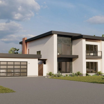
RWH Architect presents the Whistle Hill Lot 8 Residence, a statement home that reflects a bold shift toward modern, refined design. This contemporary residence is defined by its clean lines, dramatic vertical expressions, and a sophisticated mix of architectural forms that culminate in a truly forward-thinking home. From the moment visitors step into the central courtyard that connects the detached garage to the main house, the project introduces a new level of architectural intention rarely seen in the region.
The detached garage, featuring an expansive 18' x 8' door, creates a strong street presence and anchors the courtyard entry sequence. Passing through the courtyard leads to a welcoming entry foyer designed with built-in hooks and a bench, creating a comfortable—and functional—moment of arrival. Just beyond the entry is a private study with custom built-in bookshelves, a space tailored for work, reading, or quiet focus. The main floor unfolds into a sophisticated open-concept layout where the kitchen, great room, and dining areas flow effortlessly together. The kitchen includes a walk-in pantry, a pot filler for convenience, and a dedicated dog-feeding station that integrates seamlessly into the cabinetry. The great room stands as the heart of the home, featuring a built-in wood-burning fireplace and oversized sliding doors that extend the living space out to a covered patio. A centrally located half bath near the kitchen completes the first-floor program.
All bedrooms are located on the second floor to preserve privacy and capitalize on natural light. The master suite is designed as a luxurious retreat, offering a screened-in porch, a spacious walk-in closet, and a unique bathroom where the walk-in shower wraps around a freestanding tub, creating a spa-like environment that blends innovation with comfort. The laundry room is conveniently positioned on the same floor. Two additional bedrooms share a well-appointed bathroom, completing the second-floor layout.
Several design challenges shaped the evolution of this project and ultimately elevated its architectural clarity. One of the primary challenges was organizing the home around a detached garage while maintaining a cohesive architectural experience. RWH resolved this by creating a courtyard that acts as a transitional outdoor room, visually linking the structures and providing a dramatic yet functional entry sequence. Another challenge involved balancing large modern window systems with the bold vertical elements that define the façade. By carefully proportioning the glazing and framing it within thoughtful material changes, RWH maintained a strong contemporary identity while ensuring visual harmony. Integrating the built-in fireplace, open-concept layout, and large patio openings required complex structural solutions; RWH overcame this by using discreetly integrated structural steel that allowed for wide spans without compromising the home’s clean, minimalist interior aesthetic. Designing the master bathroom’s combined shower-and-tub layout also presented a unique challenge, requiring careful grading, waterproofing, and spatial planning. Through strategic detailing and 3D modeling, RWH delivered a seamless spa-like experience that feels both inventive and intuitively functional.
The Whistle Hill Lot 8 Residence stands as a testament to a new architectural direction in the area—one that embraces innovative forms, curated materials, and a lifestyle-driven floor plan. With its modern massing, intentional interior flow, and elevated details, this home reflects RWH Architect’s commitment to pushing residential design into its next era.
 Ashley Kiely Living
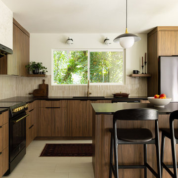
Mid-century modern kitchen remodel in Portland, Oregon, featuring walnut cabinetry, black countertops, a fluted tile backsplash and an island with seating.
 Abda Custom Window Fashions
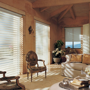
Hunter Douglas Pirouette provides an elegant look with sophisticated functionality.
The Hunter Douglas Pirouette gives the look of a roman shade with the functionality of a silhouette sheer shade. The Pirouette’s fabric vanes open to a sheer fabric to provide a view through area and allowing light into the room. The sheer fabric provides protection from the harsh UV rays. The shade also closes completely for privacy. The Pirouette has the look of roman shades with the functionality of blinds. The Pirouette also comes in specialty shades that can fit many types of windows such as, arches or angles.
The structure of the Pirouette is clean and elegant because the lifting system for the vanes have the patented Invisi-Lift system. This system allows the floating vanes to operate without having the unsightly cords or tapes. The vanes of the Hunter Douglas Pirouette can be flattened or contoured for complete privacy or opened for wide view-through.
Protect your wood flooring, furniture or artwork from the damaging ultraviolet rays. The Pirouette Roman Shades block up to 81% of the harmful UV rays with vanes open and 99% with the vanes closed. There is a large selection of fabrics to choose from and two vane sizes.
The Pirouette can also be operated manually or by remote control. Hunter Douglas has an app that can control the Pirouette on your iPhone or iPad.
At Abda, we make the draperies, curtains, valances, cornices, pillow shams, accent throw pillows, duvet covers, comforters, coverlets and bed skirts…even custom fabric headboards in a variety of styles, sizes and shapes. We also make draperies, roman shades, valances or cornices to coordinate. If you have an existing piece of furniture, we also do upholstery. The possibilities are endless when you go custom. If you’re not sure where to start, no worries because we have design specialists that can help you create the home you’ve always dreamed of!
We’re known for our attention to detail, great quality and outstanding service. We not only work with Indiana clients but also across the nation.
HOW DO WE HAVE QUALITY PRODUCTS WITHOUT BREAKING THE BUDGET?
At Abda, we believe in providing quality products, great customer service without breaking the pocket book for our customers! We’ve been in business since 1998 and have learned a few things over the years. Customers want excellent, reliable products without spending more than necessary. We decided to not have a large flashy retail store and focus on referrals rather than traditional advertising. In doing so, we’re able to provide the same great quality products as our competitors at a better price. And the amazing thing is, we do all of this while putting our focus on excellent customer service for our clients. Don’t take our word for it, check out what some of our customers are saying about us. www.abdawindowfashions.com
LIVE OUT OF STATE OR TOO BUSY?
Talk with our professional design specialists and let them help you transform your home! It’s simple and easy. This is a great solution for persons who live out of state or are too busy for a traditional home consultation. We have a “virtual interior designer” that will work with you each step of the way. With our great reviews, solid company and company values- you know that your home is in great hands!
For more information, contact Talitha at 317-273-8343 or email: talitha@abdawindowfashions.com or check out our houzz.com store!
LIVE IN CENTRAL INDIANA?
For our local customers we offer, FREE In-home consultation or showroom appointment to meet your lifestyle and design needs. At Abda, we have the perfect blend of high-end and affordable solutions for every style and budget. Affordable doesn’t mean cheap! We pride ourselves on quality products with excellent service. We’re so confident of our products that we give our customers more than the manufacturers guarantee!
At Abda, you will find knowledgeable staff that will turn your visions into a reality. Stop in our showroom or schedule a Free In-home consultation today! We know you will be happy with the results but don’t take our word for it, check out what some of our customers say about us on Houzz and Angie’s List!
http://www.angieslist.com/companylist/us/in/indianapolis/abda-inc-custom-window-fashions-reviews-60394.htm?cid=ssabadge
WHY CHOOSE US?
We have been in business since November 1998 and started in the window covering business by cleaning & repairing blinds. This gave us a unique perspective from most window covering dealers. We have always considered how well products hold up and which manufacturers stand behind their products the best. We let our clients know the benefits of more expensive products and give honest feedback. We take pride in showing alternative products to fit all budgets. We also give our customers an additional 2 year warranty on top of the manufacturers guarantee!
Our great testimonials on Angie’s List, Houzz.com and referrals have helped our company grow without the need for “conventional” advertising. Abda means ‘servant’. At Abda, we approach every customer with a servant’s attitude. This philosophy has helped our customers feel confident in their purchases and well-taken care of. Our number one focus is customer service and we believe in putting the customer’s needs first. We offer our clients an additional 2 year warranty on top of the manufacturer’s warranty and want each and every client to be completely happy with their purchase. We’ve been awarded the prestigious 2014 Angie’s List Super Service Award, an honor bestowed annually on approximately 5 percent of all the businesses rated on the nation’s leading provider of consumer reviews. We’ve grown over the years and have added more team members to our company and we’re very excited at the direction our company is going.
Contact us today to get started on your project.
Abda, Inc
1159 Country Club Road
Indianapolis, In 46234
317-273-8343 (Ext. 103)
Other Common Names For Pirouette:
Roman Shades
Roman Blinds
Blinds
Pirouette Blinds
Vertical Blinds
Venetian Blinds
Shades
Fabric Shades
Hunter Douglas Blinds
Hunter Douglas Shades
Hunter Douglas Pirouette
Energy Efficient Blinds
Sun Protection Shades
Sun Protection Blinds
Child Safety Blinds
Child Safety Window Treatments
Indianapolis Blinds
Indianapolis Shades
Indianapolis Fabric Roman Shades
Custom Blinds
www.abdawindowfashions.com
Find the right local pro for your project
 Hi Solutions- The Autonomous Home Company
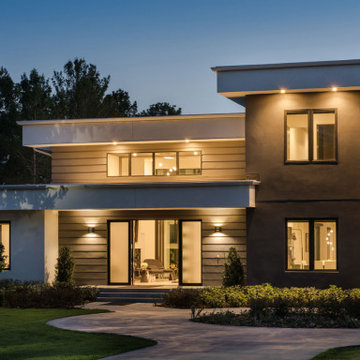
Automated Home Lighting: Revolutionize Your Home with Smart Lighting Solutions
Transform your living space with automated home lighting, the latest innovation in smart home technology. Automated lighting systems provide convenience, energy efficiency, and enhanced security for homeowners. With smart lighting solutions, you can control your home's lighting from anywhere using voice commands, motion, smartphone app, , or automated schedules.
Benefits of Automated Home Lighting
Energy Efficiency: Save on energy bills by using smart bulbs and automated lighting controls that adjust brightness based on natural light or occupancy.
Convenience: Easily manage your home's lighting with smart home integration, including compatibility with Josh AI, Control 4, Amazon Alexa, Google Assistant, and other voice-activated systems.
Enhanced Security: Program your lights to turn on and off at specific times to give the appearance of occupancy, even when you're away, deterring potential intruders.
Customization: Create personalized lighting scenes for different moods and activities, such as reading, watching movies, or hosting a dinner party.
Features of Smart Lighting Systems
Remote Control: Adjust lighting settings from anywhere using your smartphone or tablet.
Voice Activation: Use voice commands to control your lights with popular smart home assistants like Josh AI, Amazon Alexa and Google Assistant.
Scheduling: Set schedules for your lights to turn on and off at specific times, enhancing convenience and security.
Energy Monitoring: Track energy usage and optimize lighting to reduce your carbon footprint.
Why Choose Automated Home Lighting?
Investing in automated home lighting not only adds convenience and style to your home but also increases its value. Smart lighting systems are easy to install and can be customized to meet your unique needs and preferences. Whether you're looking to improve energy efficiency, enhance home security, or simply enjoy the convenience of modern technology, automated home lighting is the perfect solution.
 Fiorito Interior Design
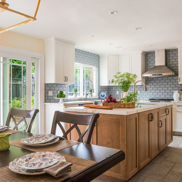
My clients approached this kitchen remodel hoping not only for improved functionality but for a space that invited comfort, warmth, and daily enjoyment. Their existing kitchen was limited in both layout and atmosphere where a small island barely larger than a podium offered little utility. An oversized double-width doorway at the rear of the room leading into the adjacent living space disrupted the flow, making furniture placement nearly impossible. They longed for a kitchen where cooking felt easy and intuitive, but also one where they could sit at the table with a book and a cup of tea, or host friends without feeling cramped or awkwardly positioned.
One of the most impactful decisions we made early on was to close off that extra-wide opening to the living room. Doing so allowed us to reclaim the wall, which not only improved circulation but also gave us the freedom to rethink the spacing of the kitchen and eat-in area. With that change, we could introduce a much larger island—truly functional this time—complete with generous workspace and storage. It became a true centerpiece for meal prep, casual dining, and gathering.
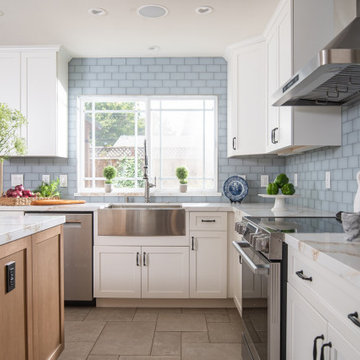
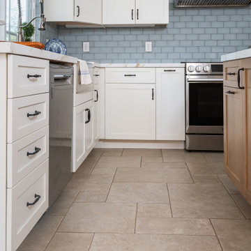
From there I turned my attention to layering in comfort, personality, and style. I curated a color palette of soft white, pale blue, light wood tones, and touches of sunshine yellow. This fresh and uplifting combination feels timeless and relaxed. We chose cabinetry with traditional Shaker-style doors, accented by black forged iron hardware for a subtle hint of contrast and authenticity. For the countertops we chose a Gold Calacatta-look quartz, bringing elegance and warmth with its soft veining and classic appeal.
To elevate the kitchen walls I selected a soft matte glass tile in a moody, sky-blue that blankets the backsplash, providing a gentle wash of color that’s calming and cohesive. On the floors I chose a limestone-look porcelain tile in a classic Versailles pattern as an homage to old English manor houses—bringing character and texture underfoot while remaining durable and low-maintenance for modern life.
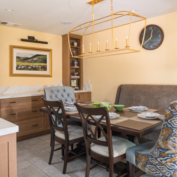
Lastly I transformed the adjacent eat-in area into a cozy, multifunctional space. We added custom built-in bookshelves and a sideboard for serving and display—perfect for entertaining or simply making daily routines feel more special. A black iron picture light softly illuminates the buffet, lending a warm, ambient glow in the evenings. I carefully planned the seating arrangement to include a space-saving banquette along the wall, paired with a trestle-style dining table and side chairs. At either end I placed tufted host chairs upholstered in an exquisite, tonal Chinoiserie dragon pattern that are comfortable enough to sit on for hours. Whether sharing a leisurely meal, reading in the sunlight, or gazing out at the greenery just beyond the windows, this spot now invites my clients to truly enjoy their home in a new, deeper way.
Photo: Bernardo Grijalva
 Lincoln Lighthill Architect
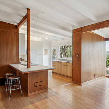
How do you modernize modernism on a budget? This house had charming midcentury character and lots of potential but had been neglected for many years and was sorely in need of a refresh to bring it up to modern standards of comfort, finish, and sustainability. The tight budget dictated that it would not be a down-to-the-studs, gut remodel, but more of a surgical intervention.
Built in 1955, the house had settled on the downhill side, making the floors slope almost 4” from the front to the back of the house. Using an innovative and inexpensive push-pile method, the foundation was reinforced and the house was jacked back up. It now sits solidly on bedrock and the floor is level to within a half-inch throughout.
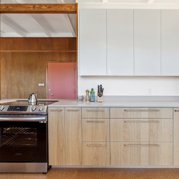
Inside, the original kitchen was worn and needed replacement. This presented an opportunity to remove the walls separating it from the living and dining area and create a wide-open great room with a peninsula counter for guests to gather and an almost continuous wall of windows to take in views of the hills, trees, and bay.
Throughout the rest of the house, most finishes were restored, or replaced when necessary. Wood floors were refinished, and new cork flooring, a slightly less durable but much less expensive alternative to tile and similar materials, was used in all wet areas, with the added benefit of warmth and resiliency. The existing textured walls and ceilings were skim-coated smooth with plaster, dark beams painted white, and existing wood wall paneling in the living room was cleaned and color-matched where new pieces were required. All of the existing frameless, direct-glazed windows were replaced with double pane units, and a new floor-to-ceiling window on the south side of the living room provides a key source of natural light.
In the bathrooms, existing tile and vanities were saved, and a strangely colored tub and sinks were re-glazed. Flooring, toilets, lighting, double medicine cabinets, and paint in each space make these mostly unaltered rooms feel new again.
Sustainability and comfort upgrades include an induction range (step one of an eventual transition to full electrification), spray foam insulation under the floor, spray-in cellulose in the walls, and warm-dim LED lighting throughout on a simple whole-house control system. Combined with a modern thermostat, the house’s systems are all accessible via app from anywhere.
And the most sustainable feature of all? What we didn’t do: tear it down and start over. In a country that demolishes a million homes a year- 1% of our residential housing stock- reusing an existing home is the greenest solution of all.
 Lincoln Lighthill Architect
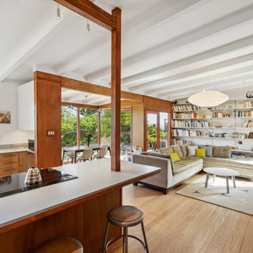
How do you modernize modernism on a budget? This house had charming midcentury character and lots of potential but had been neglected for many years and was sorely in need of a refresh to bring it up to modern standards of comfort, finish, and sustainability. The tight budget dictated that it would not be a down-to-the-studs, gut remodel, but more of a surgical intervention.
Built in 1955, the house had settled on the downhill side, making the floors slope almost 4” from the front to the back of the house. Using an innovative and inexpensive push-pile method, the foundation was reinforced and the house was jacked back up. It now sits solidly on bedrock and the floor is level to within a half-inch throughout.
Inside, the original kitchen was worn and needed replacement. This presented an opportunity to remove the walls separating it from the living and dining area and create a wide-open great room with a peninsula counter for guests to gather and an almost continuous wall of windows to take in views of the hills, trees, and bay.
Throughout the rest of the house, most finishes were restored, or replaced when necessary. Wood floors were refinished, and new cork flooring, a slightly less durable but much less expensive alternative to tile and similar materials, was used in all wet areas, with the added benefit of warmth and resiliency. The existing textured walls and ceilings were skim-coated smooth with plaster, dark beams painted white, and existing wood wall paneling in the living room was cleaned and color-matched where new pieces were required. All of the existing frameless, direct-glazed windows were replaced with double pane units, and a new floor-to-ceiling window on the south side of the living room provides a key source of natural light.
In the bathrooms, existing tile and vanities were saved, and a strangely colored tub and sinks were re-glazed. Flooring, toilets, lighting, double medicine cabinets, and paint in each space make these mostly unaltered rooms feel new again.
Sustainability and comfort upgrades include an induction range (step one of an eventual transition to full electrification), spray foam insulation under the floor, spray-in cellulose in the walls, and warm-dim LED lighting throughout on a simple whole-house control system. Combined with a modern thermostat, the house’s systems are all accessible via app from anywhere.
And the most sustainable feature of all? What we didn’t do: tear it down and start over. In a country that demolishes a million homes a year- 1% of our residential housing stock- reusing an existing home is the greenest solution of all.
Sponsored
Sunbury, OH

J.Holderby - Renovations
Franklin County's Leading General Contractors - 2X Best of Houzz!
 Lincoln Lighthill Architect
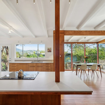
How do you modernize modernism on a budget? This house had charming midcentury character and lots of potential but had been neglected for many years and was sorely in need of a refresh to bring it up to modern standards of comfort, finish, and sustainability. The tight budget dictated that it would not be a down-to-the-studs, gut remodel, but more of a surgical intervention.
Built in 1955, the house had settled on the downhill side, making the floors slope almost 4” from the front to the back of the house. Using an innovative and inexpensive push-pile method, the foundation was reinforced and the house was jacked back up. It now sits solidly on bedrock and the floor is level to within a half-inch throughout.
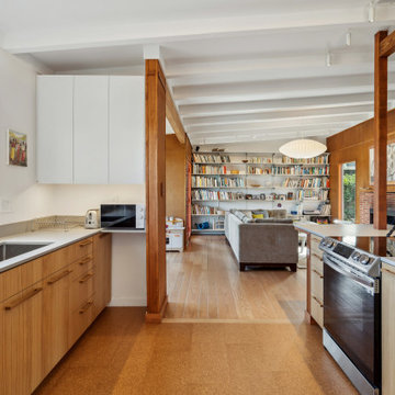
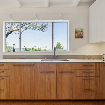
Inside, the original kitchen was worn and needed replacement. This presented an opportunity to remove the walls separating it from the living and dining area and create a wide-open great room with a peninsula counter for guests to gather and an almost continuous wall of windows to take in views of the hills, trees, and bay.
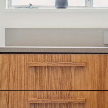
Throughout the rest of the house, most finishes were restored, or replaced when necessary. Wood floors were refinished, and new cork flooring, a slightly less durable but much less expensive alternative to tile and similar materials, was used in all wet areas, with the added benefit of warmth and resiliency. The existing textured walls and ceilings were skim-coated smooth with plaster, dark beams painted white, and existing wood wall paneling in the living room was cleaned and color-matched where new pieces were required. All of the existing frameless, direct-glazed windows were replaced with double pane units, and a new floor-to-ceiling window on the south side of the living room provides a key source of natural light.
In the bathrooms, existing tile and vanities were saved, and a strangely colored tub and sinks were re-glazed. Flooring, toilets, lighting, double medicine cabinets, and paint in each space make these mostly unaltered rooms feel new again.
Sustainability and comfort upgrades include an induction range (step one of an eventual transition to full electrification), spray foam insulation under the floor, spray-in cellulose in the walls, and warm-dim LED lighting throughout on a simple whole-house control system. Combined with a modern thermostat, the house’s systems are all accessible via app from anywhere.
And the most sustainable feature of all? What we didn’t do: tear it down and start over. In a country that demolishes a million homes a year- 1% of our residential housing stock- reusing an existing home is the greenest solution of all.
 Lincoln Lighthill Architect
How do you modernize modernism on a budget? This house had charming midcentury character and lots of potential but had been neglected for many years and was sorely in need of a refresh to bring it up to modern standards of comfort, finish, and sustainability. The tight budget dictated that it would not be a down-to-the-studs, gut remodel, but more of a surgical intervention.
Built in 1955, the house had settled on the downhill side, making the floors slope almost 4” from the front to the back of the house. Using an innovative and inexpensive push-pile method, the foundation was reinforced and the house was jacked back up. It now sits solidly on bedrock and the floor is level to within a half-inch throughout.
Inside, the original kitchen was worn and needed replacement. This presented an opportunity to remove the walls separating it from the living and dining area and create a wide-open great room with a peninsula counter for guests to gather and an almost continuous wall of windows to take in views of the hills, trees, and bay.
Throughout the rest of the house, most finishes were restored, or replaced when necessary. Wood floors were refinished, and new cork flooring, a slightly less durable but much less expensive alternative to tile and similar materials, was used in all wet areas, with the added benefit of warmth and resiliency. The existing textured walls and ceilings were skim-coated smooth with plaster, dark beams painted white, and existing wood wall paneling in the living room was cleaned and color-matched where new pieces were required. All of the existing frameless, direct-glazed windows were replaced with double pane units, and a new floor-to-ceiling window on the south side of the living room provides a key source of natural light.
In the bathrooms, existing tile and vanities were saved, and a strangely colored tub and sinks were re-glazed. Flooring, toilets, lighting, double medicine cabinets, and paint in each space make these mostly unaltered rooms feel new again.
Sustainability and comfort upgrades include an induction range (step one of an eventual transition to full electrification), spray foam insulation under the floor, spray-in cellulose in the walls, and warm-dim LED lighting throughout on a simple whole-house control system. Combined with a modern thermostat, the house’s systems are all accessible via app from anywhere.
And the most sustainable feature of all? What we didn’t do: tear it down and start over. In a country that demolishes a million homes a year- 1% of our residential housing stock- reusing an existing home is the greenest solution of all.
 Lincoln Lighthill Architect
How do you modernize modernism on a budget? This house had charming midcentury character and lots of potential but had been neglected for many years and was sorely in need of a refresh to bring it up to modern standards of comfort, finish, and sustainability. The tight budget dictated that it would not be a down-to-the-studs, gut remodel, but more of a surgical intervention.
Built in 1955, the house had settled on the downhill side, making the floors slope almost 4” from the front to the back of the house. Using an innovative and inexpensive push-pile method, the foundation was reinforced and the house was jacked back up. It now sits solidly on bedrock and the floor is level to within a half-inch throughout.
Inside, the original kitchen was worn and needed replacement. This presented an opportunity to remove the walls separating it from the living and dining area and create a wide-open great room with a peninsula counter for guests to gather and an almost continuous wall of windows to take in views of the hills, trees, and bay.
Throughout the rest of the house, most finishes were restored, or replaced when necessary. Wood floors were refinished, and new cork flooring, a slightly less durable but much less expensive alternative to tile and similar materials, was used in all wet areas, with the added benefit of warmth and resiliency. The existing textured walls and ceilings were skim-coated smooth with plaster, dark beams painted white, and existing wood wall paneling in the living room was cleaned and color-matched where new pieces were required. All of the existing frameless, direct-glazed windows were replaced with double pane units, and a new floor-to-ceiling window on the south side of the living room provides a key source of natural light.
In the bathrooms, existing tile and vanities were saved, and a strangely colored tub and sinks were re-glazed. Flooring, toilets, lighting, double medicine cabinets, and paint in each space make these mostly unaltered rooms feel new again.
Sustainability and comfort upgrades include an induction range (step one of an eventual transition to full electrification), spray foam insulation under the floor, spray-in cellulose in the walls, and warm-dim LED lighting throughout on a simple whole-house control system. Combined with a modern thermostat, the house’s systems are all accessible via app from anywhere.
And the most sustainable feature of all? What we didn’t do: tear it down and start over. In a country that demolishes a million homes a year- 1% of our residential housing stock- reusing an existing home is the greenest solution of all.
 Lincoln Lighthill Architect
How do you modernize modernism on a budget? This house had charming midcentury character and lots of potential but had been neglected for many years and was sorely in need of a refresh to bring it up to modern standards of comfort, finish, and sustainability. The tight budget dictated that it would not be a down-to-the-studs, gut remodel, but more of a surgical intervention.
Built in 1955, the house had settled on the downhill side, making the floors slope almost 4” from the front to the back of the house. Using an innovative and inexpensive push-pile method, the foundation was reinforced and the house was jacked back up. It now sits solidly on bedrock and the floor is level to within a half-inch throughout.
Inside, the original kitchen was worn and needed replacement. This presented an opportunity to remove the walls separating it from the living and dining area and create a wide-open great room with a peninsula counter for guests to gather and an almost continuous wall of windows to take in views of the hills, trees, and bay.
Throughout the rest of the house, most finishes were restored, or replaced when necessary. Wood floors were refinished, and new cork flooring, a slightly less durable but much less expensive alternative to tile and similar materials, was used in all wet areas, with the added benefit of warmth and resiliency. The existing textured walls and ceilings were skim-coated smooth with plaster, dark beams painted white, and existing wood wall paneling in the living room was cleaned and color-matched where new pieces were required. All of the existing frameless, direct-glazed windows were replaced with double pane units, and a new floor-to-ceiling window on the south side of the living room provides a key source of natural light.
In the bathrooms, existing tile and vanities were saved, and a strangely colored tub and sinks were re-glazed. Flooring, toilets, lighting, double medicine cabinets, and paint in each space make these mostly unaltered rooms feel new again.
Sustainability and comfort upgrades include an induction range (step one of an eventual transition to full electrification), spray foam insulation under the floor, spray-in cellulose in the walls, and warm-dim LED lighting throughout on a simple whole-house control system. Combined with a modern thermostat, the house’s systems are all accessible via app from anywhere.
And the most sustainable feature of all? What we didn’t do: tear it down and start over. In a country that demolishes a million homes a year- 1% of our residential housing stock- reusing an existing home is the greenest solution of all.
 Lincoln Lighthill Architect
How do you modernize modernism on a budget? This house had charming midcentury character and lots of potential but had been neglected for many years and was sorely in need of a refresh to bring it up to modern standards of comfort, finish, and sustainability. The tight budget dictated that it would not be a down-to-the-studs, gut remodel, but more of a surgical intervention.
Built in 1955, the house had settled on the downhill side, making the floors slope almost 4” from the front to the back of the house. Using an innovative and inexpensive push-pile method, the foundation was reinforced and the house was jacked back up. It now sits solidly on bedrock and the floor is level to within a half-inch throughout.
Inside, the original kitchen was worn and needed replacement. This presented an opportunity to remove the walls separating it from the living and dining area and create a wide-open great room with a peninsula counter for guests to gather and an almost continuous wall of windows to take in views of the hills, trees, and bay.
Throughout the rest of the house, most finishes were restored, or replaced when necessary. Wood floors were refinished, and new cork flooring, a slightly less durable but much less expensive alternative to tile and similar materials, was used in all wet areas, with the added benefit of warmth and resiliency. The existing textured walls and ceilings were skim-coated smooth with plaster, dark beams painted white, and existing wood wall paneling in the living room was cleaned and color-matched where new pieces were required. All of the existing frameless, direct-glazed windows were replaced with double pane units, and a new floor-to-ceiling window on the south side of the living room provides a key source of natural light.
In the bathrooms, existing tile and vanities were saved, and a strangely colored tub and sinks were re-glazed. Flooring, toilets, lighting, double medicine cabinets, and paint in each space make these mostly unaltered rooms feel new again.
Sustainability and comfort upgrades include an induction range (step one of an eventual transition to full electrification), spray foam insulation under the floor, spray-in cellulose in the walls, and warm-dim LED lighting throughout on a simple whole-house control system. Combined with a modern thermostat, the house’s systems are all accessible via app from anywhere.
And the most sustainable feature of all? What we didn’t do: tear it down and start over. In a country that demolishes a million homes a year- 1% of our residential housing stock- reusing an existing home is the greenest solution of all.

 Change Your Bathroom©
The detailed plans for this bathroom can be purchased here: https://www.changeyourbathroom.com/shop/warm-walnut-bathroom-plans/
Warm walnut vanity with white quartz counter top, sinks and matte black fixtures, stacked stone accent wall with mirrored back recessed shelf, digital shower controls, porcelain floor and wall tiles and marble shower floor.
Sponsored
Columbus, OH

Hope Restoration & General Contracting
Columbus Design-Build, Kitchen & Bath Remodeling, Historic Renovations
 Dimensions in Wood Inc
This Historical Home was built in the Columbia Country Club in 1925 and was ready for a new, modern kitchen which kept the traditional feel of the home. A previous sunroom addition created a dining room, but the original kitchen layout kept the two rooms divided. The kitchen was a small and cramped c-shape with a narrow door leading into the dining area.
The kitchen and dining room were completely opened up, creating a long, galley style, open layout which maximized the space and created a very good flow. Dimensions In Wood worked in conjuction with the client’s architect and contractor to complete this renovation.
Custom cabinets were built to use every square inch of the floorplan, with the cabinets extending all the way to the ceiling for the most storage possible. Our woodworkers even created a step stool, staining it to match the kitchen for reaching these high cabinets. The family already had a kitchen table and chairs they were happy with, so we refurbished them to match the kitchen’s new stain and paint color.
Crown molding top the cabinet boxes and extends across the ceiling where they create a coffered ceiling, highlighting the beautiful light fixtures centered on a wood medallion.
Columns were custom built to provide separation between the different sections of the kitchen, while also providing structural support.
Our master craftsmen kept the original 1925 glass cabinet doors, fitted them with modern hardware, repainted and incorporated them into new cabinet boxes. TASK LED Lighting was added to this china cabinet, highlighting the family’s decorative dishes.
Appliance Garage
On one side of the kitchen we built an appliance garage with doors that slide back into the cabinet, integrated power outlets and door activated lighting. Beside this is a small Galley Workstation for beverage and bar service which has the Galley Bar Kit perfect for sliced limes and more.
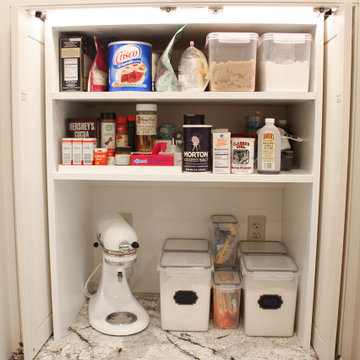
Baking Cabinet with Pocket Doors
On the opposite side, a baking cabinet was built to house a mixer and all the supplies needed for creating confections. Automatic LED lights, triggered by opening the door, create a perfect baker’s workstation. Both pocket doors slide back inside the cabinet for maximum workspace, then close to hide everything, leaving a clean, minimal kitchen devoid of clutter.
Super deep, custom drawers feature custom dividers beneath the baking cabinet. Then beneath the appliance garage another deep drawer has custom crafted produce boxes per the customer’s request.
Central to the kitchen is a walnut accent island with a granite countertop and a Stainless Steel Galley Workstation and an overhang for seating. Matching bar stools slide out of the way, under the overhang, when not in use. A color matched outlet cover hides power for the island whenever appliances are needed during preparation.
The Galley Workstation has several useful attachments like a cutting board, drying rack, colander holder, and more. Integrated into the stone countertops are a drinking water spigot, a soap dispenser, garbage disposal button and the pull out, sprayer integrated faucet.
Directly across from the conveniently positioned stainless steel sink is a Bertazzoni Italia stove with 5 burner cooktop. A custom mosaic tile backsplash makes a beautiful focal point. Then, on opposite sides of the stove, columns conceal Rev-a-Shelf pull out towers which are great for storing small items, spices, and more. All outlets on the stone covered walls also sport dual USB outlets for charging mobile devices.
Stainless Steel Whirlpool appliances throughout keep a consistent and clean look. The oven has a matching microwave above it which also works as a convection oven. Dual Whirlpool dishwashers can handle all the family’s dirty dishes.
The flooring has black, marble tile inlays surrounded by ceramic tile, which are period correct for the age of this home, while still being modern, durable and easy to clean.
Finally, just off the kitchen we also remodeled their bar and snack alcove. A small liquor cabinet, with a refrigerator and wine fridge sits opposite a snack bar and wine glass cabinets. Crown molding, granite countertops and cabinets were all customized to match this space with the rest of the stunning kitchen.
Dimensions In Wood is more than 40 years of custom cabinets. We always have been, but we want YOU to know just how much more there is to our Dimensions.
The Dimensions we cover are endless: custom cabinets, quality water, appliances, countertops, wooden beams, Marvin windows, and more. We can handle every aspect of your kitchen, bathroom or home remodel.
 Fiorito Interior Design
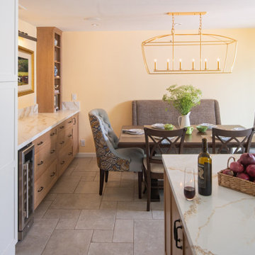
My clients approached this kitchen remodel hoping not only for improved functionality but for a space that invited comfort, warmth, and daily enjoyment. Their existing kitchen was limited in both layout and atmosphere where a small island barely larger than a podium offered little utility. An oversized double-width doorway at the rear of the room leading into the adjacent living space disrupted the flow, making furniture placement nearly impossible. They longed for a kitchen where cooking felt easy and intuitive, but also one where they could sit at the table with a book and a cup of tea, or host friends without feeling cramped or awkwardly positioned.
One of the most impactful decisions we made early on was to close off that extra-wide opening to the living room. Doing so allowed us to reclaim the wall, which not only improved circulation but also gave us the freedom to rethink the spacing of the kitchen and eat-in area. With that change, we could introduce a much larger island—truly functional this time—complete with generous workspace and storage. It became a true centerpiece for meal prep, casual dining, and gathering.
From there I turned my attention to layering in comfort, personality, and style. I curated a color palette of soft white, pale blue, light wood tones, and touches of sunshine yellow. This fresh and uplifting combination feels timeless and relaxed. We chose cabinetry with traditional Shaker-style doors, accented by black forged iron hardware for a subtle hint of contrast and authenticity. For the countertops we chose a Gold Calacatta-look quartz, bringing elegance and warmth with its soft veining and classic appeal.
To elevate the kitchen walls I selected a soft matte glass tile in a moody, sky-blue that blankets the backsplash, providing a gentle wash of color that’s calming and cohesive. On the floors I chose a limestone-look porcelain tile in a classic Versailles pattern as an homage to old English manor houses—bringing character and texture underfoot while remaining durable and low-maintenance for modern life.
Lastly I transformed the adjacent eat-in area into a cozy, multifunctional space. We added custom built-in bookshelves and a sideboard for serving and display—perfect for entertaining or simply making daily routines feel more special. A black iron picture light softly illuminates the buffet, lending a warm, ambient glow in the evenings. I carefully planned the seating arrangement to include a space-saving banquette along the wall, paired with a trestle-style dining table and side chairs. At either end I placed tufted host chairs upholstered in an exquisite, tonal Chinoiserie dragon pattern that are comfortable enough to sit on for hours. Whether sharing a leisurely meal, reading in the sunlight, or gazing out at the greenery just beyond the windows, this spot now invites my clients to truly enjoy their home in a new, deeper way.
Photo: Bernardo Grijalva
 Fiorito Interior Design
My clients approached this kitchen remodel hoping not only for improved functionality but for a space that invited comfort, warmth, and daily enjoyment. Their existing kitchen was limited in both layout and atmosphere where a small island barely larger than a podium offered little utility. An oversized double-width doorway at the rear of the room leading into the adjacent living space disrupted the flow, making furniture placement nearly impossible. They longed for a kitchen where cooking felt easy and intuitive, but also one where they could sit at the table with a book and a cup of tea, or host friends without feeling cramped or awkwardly positioned.
One of the most impactful decisions we made early on was to close off that extra-wide opening to the living room. Doing so allowed us to reclaim the wall, which not only improved circulation but also gave us the freedom to rethink the spacing of the kitchen and eat-in area. With that change, we could introduce a much larger island—truly functional this time—complete with generous workspace and storage. It became a true centerpiece for meal prep, casual dining, and gathering.
From there I turned my attention to layering in comfort, personality, and style. I curated a color palette of soft white, pale blue, light wood tones, and touches of sunshine yellow. This fresh and uplifting combination feels timeless and relaxed. We chose cabinetry with traditional Shaker-style doors, accented by black forged iron hardware for a subtle hint of contrast and authenticity. For the countertops we chose a Gold Calacatta-look quartz, bringing elegance and warmth with its soft veining and classic appeal.
To elevate the kitchen walls I selected a soft matte glass tile in a moody, sky-blue that blankets the backsplash, providing a gentle wash of color that’s calming and cohesive. On the floors I chose a limestone-look porcelain tile in a classic Versailles pattern as an homage to old English manor houses—bringing character and texture underfoot while remaining durable and low-maintenance for modern life.
Lastly I transformed the adjacent eat-in area into a cozy, multifunctional space. We added custom built-in bookshelves and a sideboard for serving and display—perfect for entertaining or simply making daily routines feel more special. A black iron picture light softly illuminates the buffet, lending a warm, ambient glow in the evenings. I carefully planned the seating arrangement to include a space-saving banquette along the wall, paired with a trestle-style dining table and side chairs. At either end I placed tufted host chairs upholstered in an exquisite, tonal Chinoiserie dragon pattern that are comfortable enough to sit on for hours. Whether sharing a leisurely meal, reading in the sunlight, or gazing out at the greenery just beyond the windows, this spot now invites my clients to truly enjoy their home in a new, deeper way.
Photo: Bernardo Grijalva
 Fiorito Interior Design
My clients approached this kitchen remodel hoping not only for improved functionality but for a space that invited comfort, warmth, and daily enjoyment. Their existing kitchen was limited in both layout and atmosphere where a small island barely larger than a podium offered little utility. An oversized double-width doorway at the rear of the room leading into the adjacent living space disrupted the flow, making furniture placement nearly impossible. They longed for a kitchen where cooking felt easy and intuitive, but also one where they could sit at the table with a book and a cup of tea, or host friends without feeling cramped or awkwardly positioned.
One of the most impactful decisions we made early on was to close off that extra-wide opening to the living room. Doing so allowed us to reclaim the wall, which not only improved circulation but also gave us the freedom to rethink the spacing of the kitchen and eat-in area. With that change, we could introduce a much larger island—truly functional this time—complete with generous workspace and storage. It became a true centerpiece for meal prep, casual dining, and gathering.
From there I turned my attention to layering in comfort, personality, and style. I curated a color palette of soft white, pale blue, light wood tones, and touches of sunshine yellow. This fresh and uplifting combination feels timeless and relaxed. We chose cabinetry with traditional Shaker-style doors, accented by black forged iron hardware for a subtle hint of contrast and authenticity. For the countertops we chose a Gold Calacatta-look quartz, bringing elegance and warmth with its soft veining and classic appeal.
To elevate the kitchen walls I selected a soft matte glass tile in a moody, sky-blue that blankets the backsplash, providing a gentle wash of color that’s calming and cohesive. On the floors I chose a limestone-look porcelain tile in a classic Versailles pattern as an homage to old English manor houses—bringing character and texture underfoot while remaining durable and low-maintenance for modern life.
Lastly I transformed the adjacent eat-in area into a cozy, multifunctional space. We added custom built-in bookshelves and a sideboard for serving and display—perfect for entertaining or simply making daily routines feel more special. A black iron picture light softly illuminates the buffet, lending a warm, ambient glow in the evenings. I carefully planned the seating arrangement to include a space-saving banquette along the wall, paired with a trestle-style dining table and side chairs. At either end I placed tufted host chairs upholstered in an exquisite, tonal Chinoiserie dragon pattern that are comfortable enough to sit on for hours. Whether sharing a leisurely meal, reading in the sunlight, or gazing out at the greenery just beyond the windows, this spot now invites my clients to truly enjoy their home in a new, deeper way.
Photo: Bernardo Grijalva

 Fiorito Interior Design
My clients approached this kitchen remodel hoping not only for improved functionality but for a space that invited comfort, warmth, and daily enjoyment. Their existing kitchen was limited in both layout and atmosphere where a small island barely larger than a podium offered little utility. An oversized double-width doorway at the rear of the room leading into the adjacent living space disrupted the flow, making furniture placement nearly impossible. They longed for a kitchen where cooking felt easy and intuitive, but also one where they could sit at the table with a book and a cup of tea, or host friends without feeling cramped or awkwardly positioned.
One of the most impactful decisions we made early on was to close off that extra-wide opening to the living room. Doing so allowed us to reclaim the wall, which not only improved circulation but also gave us the freedom to rethink the spacing of the kitchen and eat-in area. With that change, we could introduce a much larger island—truly functional this time—complete with generous workspace and storage. It became a true centerpiece for meal prep, casual dining, and gathering.
From there I turned my attention to layering in comfort, personality, and style. I curated a color palette of soft white, pale blue, light wood tones, and touches of sunshine yellow. This fresh and uplifting combination feels timeless and relaxed. We chose cabinetry with traditional Shaker-style doors, accented by black forged iron hardware for a subtle hint of contrast and authenticity. For the countertops we chose a Gold Calacatta-look quartz, bringing elegance and warmth with its soft veining and classic appeal.
To elevate the kitchen walls I selected a soft matte glass tile in a moody, sky-blue that blankets the backsplash, providing a gentle wash of color that’s calming and cohesive. On the floors I chose a limestone-look porcelain tile in a classic Versailles pattern as an homage to old English manor houses—bringing character and texture underfoot while remaining durable and low-maintenance for modern life.
Lastly I transformed the adjacent eat-in area into a cozy, multifunctional space. We added custom built-in bookshelves and a sideboard for serving and display—perfect for entertaining or simply making daily routines feel more special. A black iron picture light softly illuminates the buffet, lending a warm, ambient glow in the evenings. I carefully planned the seating arrangement to include a space-saving banquette along the wall, paired with a trestle-style dining table and side chairs. At either end I placed tufted host chairs upholstered in an exquisite, tonal Chinoiserie dragon pattern that are comfortable enough to sit on for hours. Whether sharing a leisurely meal, reading in the sunlight, or gazing out at the greenery just beyond the windows, this spot now invites my clients to truly enjoy their home in a new, deeper way.
Photo: Bernardo Grijalva
 Futuro Futuro Kitchen Range Hoods
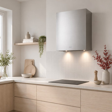
Futuro Futuro 36-Inch Amalfi Wall Range Hood – Modern Italian Design with Powerful Ventilation
The Futuro Futuro 36-Inch Amalfi Wall Range Hood combines contemporary Italian design, premium materials, and advanced ventilation technology to create a statement piece for modern kitchens. Featuring a sleek cubist-inspired design, this luxury wall-mounted range hood delivers both exceptional performance and timeless style.
Premium Italian Craftsmanship and Durable Stainless Steel Construction
Designed and handcrafted in Italy, the Amalfi Series is built with high-quality AISI 304 stainless steel, a material known for its outstanding resistance to rust, corrosion, and everyday wear. This durable construction ensures long-lasting performance while maintaining its elegant appearance for years to come.
The Amalfi’s refined geometric design adds a sophisticated modern touch to any kitchen while providing the reliability expected from premium Italian craftsmanship.
Powerful and Quiet 940 CFM Ventilation System
The Futuro Futuro Amalfi Wall Range Hood features a high-performance 940 CFM internal Whisper tangential blower designed to efficiently remove smoke, grease, steam, and cooking odors from your kitchen.
Despite its powerful airflow, the hood operates quietly thanks to an advanced multi-layer sound-absorbing system. This innovative technology helps reduce operating noise, allowing you to enjoy a cleaner, fresher kitchen environment without unnecessary distractions.
Advanced Perimeter Suction Filtration Technology
The Amalfi Series uses a perimeter suction filtration system that creates an air curtain around your cooktop. This design improves capture efficiency by directing smoke, grease, and odors toward the edges of the hood for more effective filtration.
The hidden metal mesh grease filters maintain the hood’s clean, minimalist appearance while providing reliable grease collection. The filters are easy to remove and dishwasher safe for convenient maintenance.
Smart Controls and Energy-Efficient LED Lighting
The illuminated electronic control panel makes operating the Amalfi Wall Range Hood simple and intuitive. With the push of a button, you can adjust ventilation settings and access built-in features.
A convenient filter-cleaning reminder helps ensure your hood continues performing at its best. Two energy-efficient LED lights provide bright, focused illumination over your cooktop while enhancing visibility during food preparation.
Why Choose the Futuro Futuro Amalfi 36-Inch Wall Range Hood?
36-inch modern wall-mounted range hood design
Premium Italian craftsmanship
Durable AISI 304 stainless steel construction
Powerful 940 CFM internal blower
Quiet operation with advanced sound absorption technology
Perimeter suction filtration system for improved smoke and odor capture
Dishwasher-safe metal mesh grease filters
Energy-efficient LED cooktop lighting
Sleek cubist design for contemporary kitchens
What makes the Futuro Futuro Amalfi range hood different?
The Amalfi stands out with its combination of Italian craftsmanship, premium stainless steel construction, powerful ventilation, quiet operation, and modern architectural design.
How powerful is the Amalfi 36-Inch range hood?
This model features a 940 CFM internal blower designed to handle heavy cooking, smoke, grease, and odors effectively.
Is the Amalfi range hood easy to maintain?
Yes. The removable metal mesh grease filters are dishwasher safe, and the electronic controls include a cleaning reminder for easier upkeep.
What kitchen styles work best with the Amalfi Wall Range Hood?
Its sleek cubist design complements contemporary, modern, minimalist, and luxury kitchen designs.
 Fiorito Interior Design
My clients approached this kitchen remodel hoping not only for improved functionality but for a space that invited comfort, warmth, and daily enjoyment. Their existing kitchen was limited in both layout and atmosphere where a small island barely larger than a podium offered little utility. An oversized double-width doorway at the rear of the room leading into the adjacent living space disrupted the flow, making furniture placement nearly impossible. They longed for a kitchen where cooking felt easy and intuitive, but also one where they could sit at the table with a book and a cup of tea, or host friends without feeling cramped or awkwardly positioned.
One of the most impactful decisions we made early on was to close off that extra-wide opening to the living room. Doing so allowed us to reclaim the wall, which not only improved circulation but also gave us the freedom to rethink the spacing of the kitchen and eat-in area. With that change, we could introduce a much larger island—truly functional this time—complete with generous workspace and storage. It became a true centerpiece for meal prep, casual dining, and gathering.
From there I turned my attention to layering in comfort, personality, and style. I curated a color palette of soft white, pale blue, light wood tones, and touches of sunshine yellow. This fresh and uplifting combination feels timeless and relaxed. We chose cabinetry with traditional Shaker-style doors, accented by black forged iron hardware for a subtle hint of contrast and authenticity. For the countertops we chose a Gold Calacatta-look quartz, bringing elegance and warmth with its soft veining and classic appeal.
To elevate the kitchen walls I selected a soft matte glass tile in a moody, sky-blue that blankets the backsplash, providing a gentle wash of color that’s calming and cohesive. On the floors I chose a limestone-look porcelain tile in a classic Versailles pattern as an homage to old English manor houses—bringing character and texture underfoot while remaining durable and low-maintenance for modern life.
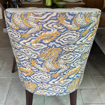
Lastly I transformed the adjacent eat-in area into a cozy, multifunctional space. We added custom built-in bookshelves and a sideboard for serving and display—perfect for entertaining or simply making daily routines feel more special. A black iron picture light softly illuminates the buffet, lending a warm, ambient glow in the evenings. I carefully planned the seating arrangement to include a space-saving banquette along the wall, paired with a trestle-style dining table and side chairs. At either end I placed tufted host chairs upholstered in an exquisite, tonal Chinoiserie dragon pattern that are comfortable enough to sit on for hours. Whether sharing a leisurely meal, reading in the sunlight, or gazing out at the greenery just beyond the windows, this spot now invites my clients to truly enjoy their home in a new, deeper way.
Photo: Bernardo Grijalva
43