
Search results for "Appears apparent" in Home Design Ideas
 Neumann & Rudy Architecture
**Spatial Composition & Architectural Volume**
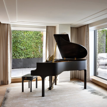
This is a room conceived as a stage for a single object, and the architecture obligingly recedes into the role of proscenium. The plan reads as a generous, laterally-oriented salon — likely a piano room carved from the corner of a metropolitan penthouse — organized around an L-shaped glazing sequence that turns the corner and dissolves two of the four enclosing planes. A dropped soffit tray, articulated as a crisply mitred perimeter reveal with an integrated cove, floats above the seating and instrument zone, its shadow-gap detailing lowering the apparent datum and conferring intimacy on an otherwise expansive volume. The plaster ceiling reads as a single continuous membrane, its recessed channels doubling as concealed curtain tracks and linear light slots, thereby suppressing any surface-mounted apparatus. On the left, a full-height run of hand-carved, ripple-textured oak millwork operates as both threshold and tectonic bookend — a vertical mass that anchors the composition against the weightlessness of the fenestration opposite. The pier between the two window bays is clad in pale ribbed limestone or fluted plaster, functioning as a quiet pilaster that structures the sightlines rather than interrupting them. Circulation is centrifugal: the herringbone-laid oak parquet establishes a diagonal grain that pulls the eye toward the terrace, while the rug's rectilinear footprint carves out a defined *piano nobile* island within the open field. The grand piano, positioned obliquely with its raised lid oriented back into the room, becomes the volume's sculptural fulcrum — its cabriole-derived silhouette and blade-thin tapered legs (a distinctly contemporary reinterpretation, likely a designer-authored instrument) providing curvilinear counterpoint to the room's orthogonal discipline.
**Materiality, Color & Texture**
The palette is a study in monochromatic warmth punctuated by a single decisive act of contrast. Nearly every surface resides within a narrow chromatic band of oatmeal, bone, greige and pale honey — undertones consistently warm-neutral, veering toward the sandy rather than the grey, which prevents the minimalism from reading as clinical. The floor's white-oak herringbone is finished with a matte, lightly limed patina that keeps the grain legible without gloss; the field rug in silk-and-viscose introduces a lustrous, cloud-like abraded pattern, its mineral-grey striations reading almost as sumi-e wash or weathered concrete, and providing the room's only tonal modulation at floor level. The drapery — a densely woven linen or linen-blend in a slubbed sand tone, hung with tightly gathered, full-height pinch pleats — carries a subtle vertical stripe or ribbed jacquard that catches raking light and animates the perimeter. Against this, the carved oak volume at left is the tactile protagonist: a low-relief, chiselled facetting that reads as adze-worked or gouged, generating a shifting moiré of micro-shadow and elevating a utilitarian storage wall into applied art. The piano's satin-black lacquer is the compositional anchor — deep, absorbent, and deliberately non-reflective on its exterior case while its interior lid reveals a mottled, patinated bronze-brown, a warm secret held within the black. Brass appears with real restraint: the lid hinges, the harp and action, the sabot-like disc on the bench flank. Nature supplies the only saturated chroma — the emerald ivy hedge framed in the left window and the topiary beyond the right — treated as living tapestry, effectively a curated *borrowed landscape*.
**Lighting, Atmosphere & Style Profile**
The lighting strategy is almost entirely subtractive: daylight is admitted in broad, low-glare sheets through minimal-sightline steel or slim-profile aluminium glazing, then softened and diffused by the sheer-adjacent linen and the pale, light-returning plaster envelope. The result is a high-key, shadowless luminosity with a distinctly diffuse northern quality, in which form is described by gradient rather than by hard contrast — note how the piano's black mass reads as silhouette against the terrace glare, while its curved bentwood rim catches a single soft specular highlight. Artificial illumination is entirely concealed within the ceiling reveals and coves, ensuring that after dark the room will be washed rather than punctured; the deliberate absence of decorative pendants or table lamps in this frame reinforces the reading of the instrument as the sole permitted ornament. Atmospherically the room is contemplative, acoustically soft, and tuned to a single activity — a *musica da camera* interior in the truest sense. Stylistically it synthesizes into what might best be termed **Soft Minimalism with a couture-craft inflection**: the rigour and reductive detailing of late-modernist practice, warmed by the tactile, hand-worked surfaces and neutral tonalities of Japandi and Belgian-inflected quiet luxury. The governing thesis is one of *sublimated luxury* — value expressed through millwork tolerance, drapery yardage, plaster craft and the confident emptiness of the plan, rather than through pattern, colour or accumulation.


 threshold interiors
Location: New York, NY, United States
This Loft was tastefully renovated back in the '90s, but was due for an update and an expansion of the kitchen and dining areas to accommodate the client's cooking skills and entertaining needs. EnlargIing the island and adding cabinetry to delineate the office, bar and dining areas was a priority. The bathroom was updated to feel like a tranquil spa with beautiful new tile, plumbing fixtures and cabinets. Our biggest challenge was coordinating the entire renovation while our client was out of town for the Summer!
Photographed by: James Salomon
Find the right local pro for your project
 ValHolla LLC
Valerie Holland
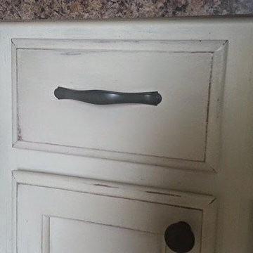
Eat-in kitchen - large cottage u-shaped medium tone wood floor eat-in kitchen idea in Wichita with a double-bowl sink, recessed-panel cabinets, distressed cabinets, granite countertops, white backsplash, ceramic backsplash, stainless steel appliances and an island
Eat-in kitchen - large cottage u-shaped medium tone wood floor eat-in kitchen idea in Wichita with a double-bowl sink, recessed-panel cabinets, distressed cabinets, granite countertops, white backsplash, ceramic backsplash, stainless steel appliances and an island
 User
UserDECO Window Fashions
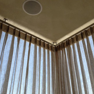
Sheer pleated custom made drapes, ceiling mount metal rod.
Trendy bedroom photo in Austin
Trendy bedroom photo in Austin


 GGL Construction
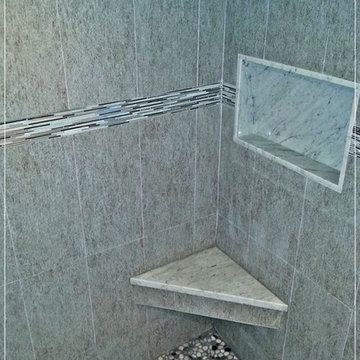
Master shower with marble seat, threshold and nook. Stainless steel and glass accent tile.
Inspiration for a coastal gray tile alcove shower remodel in Miami with marble countertops
Inspiration for a coastal gray tile alcove shower remodel in Miami with marble countertops
 VIVA TILES INC
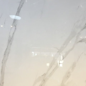
Modern Bathroom Design.
By using Carrera Polished White Porcelain Tiles on the floor you will get the most "wow" reaction from any guest.
You also can use another two selections which are Statuario White Polished and Astoria White Polished porcelain tiles.
Designer & Builder #Alireza Ghanbari
Provided by #Dizeh Design Build
Tile Supplier #VIVA TILES INC
 Build It Right Remodeling
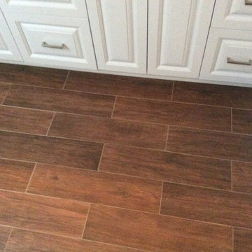
Tile is 6" x 24" Running Bond Lay
Berkshire Hickory with Summer Wheat Grout Color
Inspiration for a mid-sized coastal bathroom remodel in Milwaukee
Inspiration for a mid-sized coastal bathroom remodel in Milwaukee

 Tile Trends, Inc.
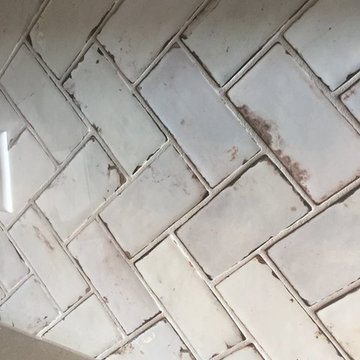
Subway Tile-Herringbone
Inspiration for a mid-sized rustic l-shaped dark wood floor and brown floor eat-in kitchen remodel with a farmhouse sink, raised-panel cabinets, dark wood cabinets, quartz countertops, white backsplash, subway tile backsplash, stainless steel appliances, an island and beige countertops
Inspiration for a mid-sized rustic l-shaped dark wood floor and brown floor eat-in kitchen remodel with a farmhouse sink, raised-panel cabinets, dark wood cabinets, quartz countertops, white backsplash, subway tile backsplash, stainless steel appliances, an island and beige countertops





 Splintered Shop
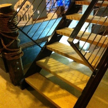
Inspiration for a huge rustic underground carpeted and beige floor staircase remodel in Salt Lake City with gray walls and no fireplace
 Advance Design Studio, Ltd.
Jennifer and Dan have lived in their Deer Park Illinois home for 15 years, slowly making minor fixes like painting and decorating; but they had a new plan for their kitchen the entire time. An awkwardly placed garage door, and an island cooktop with a terrible downdraft made a full-scale kitchen remodel an absolute must. Jennifer had many ideas in mind and wanted to work with a company that could provide high-end work, while partnering with a designer that would tailor the kitchen to her ideas.
She was intrigued by the phrase “Common Sense Remodeling” in Advance Design’s feature she discovered while perusing an issue of the community’s Quintessential Barrington Magazine. Doing further research on the company’s website, as she looked through project profiles and read about Advance Design’s “Common Sense Remodeling” philosophy, she promptly scheduled an appointment to see if the people and ideas she read about were truly who they said they were. The more she read, the more she knew that the “Common Sense” approach to remodeling they described was exactly the type of company she was looking for.
The partnership was sealed after an initial consultation with Owner Todd Jurs and Project Designer Michelle Lecinski. They displayed a combination of friendliness, professionalism and respect that was unmatched by any of the other companies Jennifer talked to. She knew that with Advance Design, she would be able to retain the vision that she had in mind with high-quality craftsmanship.
“I reached out to Advance Design because of the ‘Common Sense Remodeling’ tagline,” Jennifer said. “That’s what lingered for me”. “Advance Design was the most respectful- of the house and of my design ideas, and the most professional of the handful of companies that looked at my project”.
Soon after the meeting Jennifer began working with Michelle on the project design. They quickly developed chemistry. Jennifer loved how Michelle researched and located every detail that Jennifer wanted for the kitchen. Between the two of them, every concept and idea was worked through and perfected. “Jennifer had definite ideas about what she wanted the new kitchen to look like, she just didn’t know how to bring it all together. We worked together really well to make her ideas into the practical reality necessary for a well-functioning kitchen, with the look and feel that she had envisioned”, says Michelle.
“Michelle was wonderful in using the CAD system she would show me new drawings every time we changed the layout while working through the design,” Jennifer said. “She was a really wonderful partner in execution, she made sure everything happened quickly and easily.”
The finished design drew out elements of Jennifer’s style and personality. The pair call the look “sophisticated farmhouse” to describe the kitchen renovation to family and friends. The result was a beautifully crafted, authentic-feeling space that satisfied Jennifer’s dreams 15 years in the making. The whole project consisted of a kitchen remodel, mudroom upgrade with powder room, and garage entry relocation. “The projects I personally like the best, are the ones that put the client’s dreams on display,” Project Designer Michelle said. “And this is one of those projects.”
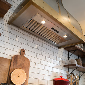
The main focal point of the kitchen is custom zinc and brass ventilation hood with a vintage sheen, which was hand made to order by a small company in Indiana named Vogler Metalworking. “It’s like sculpture, a true work of art”, says Jennifer. Your eye is immediately drawn towards this elegant yet practical hood that eliminated the home’s downdraft problem and added a striking conversation piece at the same time. The carpenters had to use special gloves when transporting and installing it, so they didn’t smudge it with fingerprints. The beautiful hood centers proudly over the stunning black enamel and brass LaCornue Range. “I had a friend who had a LaCornue range and after learning how easy it was to cook perfect meals, I was convinced I wanted to have one”, says Jennifer. This unique, breathtaking combination anchors the entire kitchen and is apparent immediately as you walk into the great room the surrounds the space.
DuraSupreme Crestwood cabinets with a Kendall Panel add function and sophistication. A custom gray paint color paired with a storm blue was developed so that the new kitchen looked like it belonged to the existing space. Unlacquered brass faucets and hardware were important to Jennifer because she wanted the living finishes to age over time. Remarkable brass diamond mesh cabinet door inserts imported from the UK continue to add this one-of-a-kind kitchen renovation; giving it a “you won’t see this everywhere” quality. The use of old railcar flooring for the coffee bar countertop and reclaimed oak for the open shelving gives an authenticity to the space uncommon in kitchens today.
Jennifer and Michelle fell in love with the Limestone Grey Stone while they were investigating unique island countertop ideas. They liked the fact that the limestone as a living finish will age and change over time. Calcutta Miel Quartz countertops made for an excellent pairing around the perimeter, as it’s durable and perfect for cooking preparations. A textured white subway tile backsplash that runs to the ceiling keeps your eye moving towards the open shelving, and to the main focal point of the stunning range hood combination.
“The kitchen functions beautifully, and it’s gorgeous,” beams Jennifer as she gestures with both hands while smiling ear to ear. “The most important thing was I wanted a kitchen that had a wonderful flow, cooked beautiful meals and was a great gathering place for family and friends, and this space does that perfectly! Beauty wise, it turned out exactly how I had envisioned. I felt the function part was the hardest part, and that was nailed”!
Relocating the garage entry to the new mudroom was a huge priority and has finally separated the family’s arriving home functions from their kitchen. Now coats and shoes and bags have their own area for dropping once members arrive home. Matching gray DuraSupreme cabinetry helped create gorgeous, purposeful lockers for the family. A reclaimed vintage sink and custom wall paper were added to the tiny powder room to beautify the once previously only functional space. Advance Design was even able to create a custom space for their dog to sleep while the family is away.
“It was unbelievable that a project of this size was completed in such a short time, and I think that’s because of the large amount of planning and preparation that went into it,” Jennifer marveled, “When we started, we were ready, and everything was prepared”.
When it came to execution, Project Manager Justin Davis and his crew were quick, accessible, and organized. Projects like this kitchen are typically completed in as little as 8-10 weeks. Jennifer’s kitchen however despite the relocation of some challenging HVAC in a soffit and moving of an exterior door was completed remarkably fast in part because the team was working with an existing tile floor that ran throughout the first floor that the client really loved.
“You get to know these people really well because they’re living in your house while you’re living in your house. They were so fast and really good, it didn’t take as long as even planned” reported Jennifer. “I would text Justin and he always responded almost immediately. I got to know all the guys who were working in our house and they were all wonderful people”.
Details in a customized kitchen like this one require skill and care from the people who install it. “All the guys on the job were skilled at what the did. I wanted small details like little feet to look like furniture, that is where their carpentry skill came in to make these all perfect”, said Jennifer. “The tile guys were wonderful. They even let me determine how I wanted the texture with the grout to appear for a salt and pepper look; now that is a very skilled trade person making it custom”.
In Jennifer’s interview, she continued to reference Advance Design’s “Common Sense Remodeling”, so I took a minute to ask her exactly what that phrase meant to her and how it played out in her experience with her project and the Advance Design team. Here is what she said: “I was intrigued about Common Sense Remodeling and in my head that there would be clear costs and prices, great communication between the design team, the execution team and me”, said Jennifer. They did deliver on that, it was so clear about the cost breakdown, what I could expect from everyone who came to my house, and everything that we had ordered. That to me is the Common Sense”!
It’s great to see a client take literally our assertion that a well-planned remodeling project is simply “Common Sense”! She anticipated each step of the way would be clear, concise, and predictable, all the while protecting the outcome due to the careful upfront planning. “Advance Design delivered on their ‘Common Sense Remodeling’ promise,” Jennifer said. “From the design team, to the execution team - everything was straight forward like I imagined. The project turned out exactly how I envisioned, I enjoyed this process and absolutely would recommend Advance Design Studio to anyone.”
 Carpet Design Group, LLC
Example of a large classic master carpeted bedroom design in Detroit with gray walls and no fireplace
 First State Building & Design
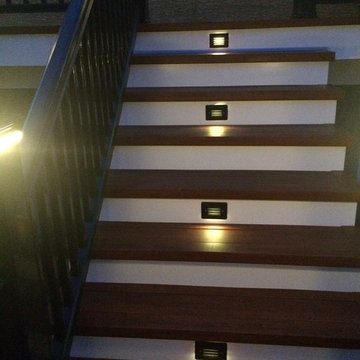
We expanded an existing deck with new stairs, railing, decking, deck board design, lighting, complete with all post and beam wraps. All decking you see is Zuri decking with Timbertech Rail Systems. We installed riser lights up the stairs with post caps on top of all posts.
10