
Search results for "Asserting" in Home Design Ideas
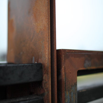
 Wittman Estes Landscape
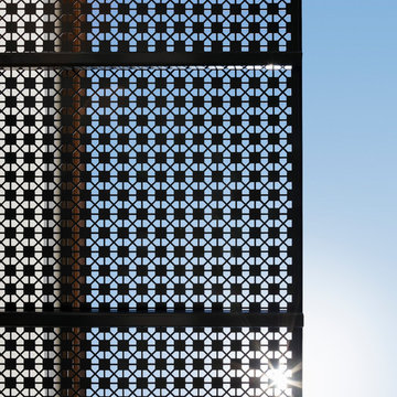
Detail of rusted steel gate structure, with black stained cedar infill.
photo: grant wilds
Inspiration for a modern landscaping in Seattle.
Inspiration for a modern landscaping in Seattle.
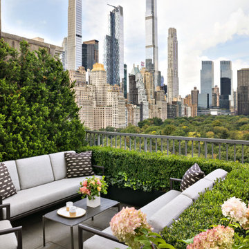
 Neumann & Rudy Architecture
**Paragraph 1: Spatial Composition & Architectural Volume**
This terrace operates as an outdoor room in the fullest architectural sense — a compressed foreground plane opening onto one of the most consequential borrowed landscapes in the world. The composition is organized along a strong diagonal: an L-shaped seating arrangement anchors the lower left and right quadrants, its low-slung horizontality deliberately calibrated to sit beneath the sightline of the parapet rail so that the vista remains uninterrupted from a seated position. The spatial logic is one of layered thresholds. First, the intimate zone of the furniture group; second, the clipped boxwood hedge set within a matte-dark planter, functioning as a green datum line and soft balustrade; third, the slender vertical picket railing, whose rhythmic cadence reads as a fine-grained screen rather than a barrier; and finally the middle-ground canopy of Central Park and the distant supergraphic of the Billionaires' Row skyline. To the left, a mature juniper mass performs as a living pilaster, terminating the composition and screening the adjacent stone masonry wall — a rough-hewn ashlar remnant of the prewar building envelope that grounds the scheme in its architectural provenance. The stepped stone paving and the raked geometry of the railing as it descends to the right introduce a subtle asymmetry, preventing the picturesque from becoming static.
**Paragraph 2: Materiality, Color & Texture**
The material palette is disciplined to the point of austerity, precisely so the horticulture and the skyline may carry the chromatic load. Powder-coated aluminum in a deep graphite-bronze forms the furniture armature — slender, squared-section framing with an almost Miesian restraint — paired with performance-grade upholstery in a warm dove grey whose greige undertone reads neither cold nor sallow against the surrounding foliage. The single decorative gesture, ikat-patterned scatter cushions in charcoal and ecru, introduces a hand-loomed irregularity that humanizes the machined frames. Underfoot, large-format bluestone or cast-stone pavers in a cool grey provide a matte, granular ground plane, echoed in the honed surface of the low cocktail table. Against this monochrome scaffolding, the botanical register supplies saturation: the dense, glossy, small-leaf texture of the boxwood; the feathery, blue-green needling of the juniper; trailing ivy softening the planter edge; and, in the near foreground, the blowsy, dessicating panicles of hydrangea in blush, sage and antique rose. A ceramic vessel of coral-and-butter garden roses and a pair of banded stoneware cups on a rimmed tray introduce warm terracotta accents — small, deliberate points of chromatic heat within an otherwise tonal field.
**Paragraph 3: Lighting, Atmosphere & Style Profile**
The scheme is lit almost entirely by ambient, high-latitude daylight, diffused through a stratus-laced sky that acts as an enormous softbox. The result is shadowless modeling: the upholstery reads as luminous rather than glaring, the foliage retains full chromatic depth without specular hotspots, and the pale limestone and glass towers beyond are rendered in atmospheric perspective, receding into a silvered haze. No artificial fixtures assert themselves in the frame — a confident editorial choice that keeps the scheme legible as a daytime sanctuary and defers entirely to the natural theatre of the site. The prevailing mood is one of cultivated repose: urbane but unhurried, private without being hermetic. Stylistically, the project synthesizes into what might be termed **Refined Metropolitan Naturalism** — a hybrid of Soft Minimalism's tonal restraint and reductive geometry with the structured horticultural formality of a classical English terrace garden. The vocabulary is contemporary and materially honest, yet it observes the compositional manners of the prewar building it inhabits, treating the skyline not as backdrop but as the primary work of art around which the entire interior architecture of the terrace has been quietly framed.
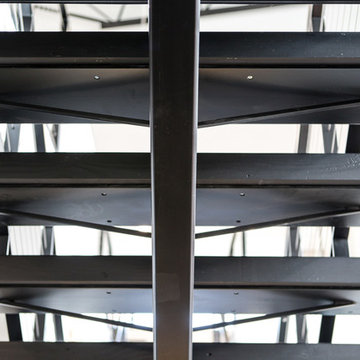
 Heritage Construction Companies, LLC.
Example of a huge trendy metal floating open staircase design in Minneapolis
Find the right local pro for your project
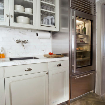 Neumann & Rudy Architecture
**I. Spatial Composition & Architectural Volume**
This is a galley-adjacent service zone — most likely a scullery or butler's pantry annexed to a primary kitchen — and its power derives from compression rather than expanse. The composition is organized along a single working wall that terminates abruptly in a full-height stainless volume, creating a deliberate collision of cabinetry rhythm and monolithic mass. The upper millwork establishes the governing geometry: a run of glazed-front wall cabinets with recessed shaker-profile stiles and rails, capped by a substantial crown assembly that reads as architectural cornice rather than applied trim. Within the second bay, the designer has inserted a period-correct plate rack with fluted vertical dividers and open glassware shelving, converting storage into ordered display and introducing a fine-grain vertical striation that counterpoints the broader panel field below. The base run answers with inset drawer fronts and applied-molding door panels, its cabinetry set on a shallow toe recess that lets the volume appear to float rather than plinth. The sightline is intentionally foreshortened: the eye travels the countertop plane eastward, is arrested by the refrigerator's tall stainless slab, then released through a sliver of hallway and door casing at the far right — a compressed reveal that implies circulation beyond and prevents the corridor from reading as a dead end. Ceiling height is inferred rather than shown, the cabinetry's soffit-scaled crown suggesting generous vertical proportion held in check by the room's narrow footprint.
**II. Materiality, Color & Texture**
The palette is a study in achromatic warmth, restrained to four principal materials and disciplined in its saturation. Cabinetry is finished in a soft greige-white — a putty-leaning off-white with faint green-grey undertone — applied in a low-sheen eggshell that absorbs rather than reflects, allowing the millwork profiles to be read through shadow rather than gloss. The backsplash is a honed marble subway field, laid in running bond with tight joints; its veining is delicate, feathered, and grey-toned, providing textural incident without pattern assertion. This continues seamlessly into the countertop, a thick marble slab with a squared eased edge and an integrated undermount trough sink, the material continuity from horizontal to vertical plane reinforcing the wall as a single stone-clad surface. Against this cool mineral field, the stainless steel refrigerator introduces an industrial register — brushed, directional, faintly grey-violet in its reflected light — while polished nickel hardware (bin pulls, cup pulls, knobs, and a wall-mounted bridge faucet with cross handles) supplies punctuating specular highlights at a consistent scale. The floor is the room's tonal anchor: white oak in a herringbone lay, fumed or grey-washed to a driftwood tone that reveals open grain and medullary ray figure. Small warm accents — a butcher-block cutting board with worn patina, amber glass bottles, a persimmon-toned bowl, the pale green of a champagne label — function as chromatic acupuncture within an otherwise desaturated field.
**III. Lighting, Atmosphere & Style Profile**
Illumination is layered and largely concealed. Ambient daylight enters obliquely from the left, raking across the marble backsplash at a low angle that mobilizes the honed surface's subtle relief and casts the cabinet door profiles into legible shadow. Undercabinet linear lighting washes the countertop and backsplash with a warm, low-kelvin pool, while the refrigerator's interior glazing performs as an unexpected internal lantern — a glowing vitrine that punctures the stainless slab and becomes the composition's focal luminance. This device is the image's most sophisticated gesture: it recasts a utilitarian appliance as an illuminated cabinet of curiosities, echoing the glass-front upper millwork on the opposite wall and completing a diagonal dialogue of lit transparency across the room. The resulting atmosphere is quiet, tempered, and quietly bourgeois — an interior of custodial calm rather than spectacle. Stylistically, the project synthesizes as a **contemporary Anglo-American scullery vernacular**: classical inset millwork and plate-rack joinery inherited from the pre-war service kitchen, reinterpreted through professional-grade stainless equipment, honed rather than polished stone, and a wire-brushed herringbone floor. Call it Refined Utilitarianism — a design position in which historical typology supplies the grammar, industrial hardware supplies the punctuation, and the near-monochrome palette allows craft, profile, and light to carry the entire expressive burden.

 The White Pear LLC, Design & Build
Saucer Magnolia / Magnolia x soulangiana
Photo by Holly@StickleyCreative.com
 Advance Design Studio, Ltd.
Jennifer and Dan have lived in their Deer Park Illinois home for 15 years, slowly making minor fixes like painting and decorating; but they had a new plan for their kitchen the entire time. An awkwardly placed garage door, and an island cooktop with a terrible downdraft made a full-scale kitchen remodel an absolute must. Jennifer had many ideas in mind and wanted to work with a company that could provide high-end work, while partnering with a designer that would tailor the kitchen to her ideas.
She was intrigued by the phrase “Common Sense Remodeling” in Advance Design’s feature she discovered while perusing an issue of the community’s Quintessential Barrington Magazine. Doing further research on the company’s website, as she looked through project profiles and read about Advance Design’s “Common Sense Remodeling” philosophy, she promptly scheduled an appointment to see if the people and ideas she read about were truly who they said they were. The more she read, the more she knew that the “Common Sense” approach to remodeling they described was exactly the type of company she was looking for.
The partnership was sealed after an initial consultation with Owner Todd Jurs and Project Designer Michelle Lecinski. They displayed a combination of friendliness, professionalism and respect that was unmatched by any of the other companies Jennifer talked to. She knew that with Advance Design, she would be able to retain the vision that she had in mind with high-quality craftsmanship.
“I reached out to Advance Design because of the ‘Common Sense Remodeling’ tagline,” Jennifer said. “That’s what lingered for me”. “Advance Design was the most respectful- of the house and of my design ideas, and the most professional of the handful of companies that looked at my project”.
Soon after the meeting Jennifer began working with Michelle on the project design. They quickly developed chemistry. Jennifer loved how Michelle researched and located every detail that Jennifer wanted for the kitchen. Between the two of them, every concept and idea was worked through and perfected. “Jennifer had definite ideas about what she wanted the new kitchen to look like, she just didn’t know how to bring it all together. We worked together really well to make her ideas into the practical reality necessary for a well-functioning kitchen, with the look and feel that she had envisioned”, says Michelle.
“Michelle was wonderful in using the CAD system she would show me new drawings every time we changed the layout while working through the design,” Jennifer said. “She was a really wonderful partner in execution, she made sure everything happened quickly and easily.”
The finished design drew out elements of Jennifer’s style and personality. The pair call the look “sophisticated farmhouse” to describe the kitchen renovation to family and friends. The result was a beautifully crafted, authentic-feeling space that satisfied Jennifer’s dreams 15 years in the making. The whole project consisted of a kitchen remodel, mudroom upgrade with powder room, and garage entry relocation. “The projects I personally like the best, are the ones that put the client’s dreams on display,” Project Designer Michelle said. “And this is one of those projects.”
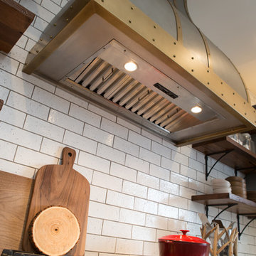
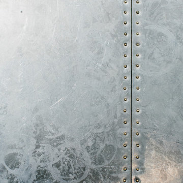
The main focal point of the kitchen is custom zinc and brass ventilation hood with a vintage sheen, which was hand made to order by a small company in Indiana named Vogler Metalworking. “It’s like sculpture, a true work of art”, says Jennifer. Your eye is immediately drawn towards this elegant yet practical hood that eliminated the home’s downdraft problem and added a striking conversation piece at the same time. The carpenters had to use special gloves when transporting and installing it, so they didn’t smudge it with fingerprints. The beautiful hood centers proudly over the stunning black enamel and brass LaCornue Range. “I had a friend who had a LaCornue range and after learning how easy it was to cook perfect meals, I was convinced I wanted to have one”, says Jennifer. This unique, breathtaking combination anchors the entire kitchen and is apparent immediately as you walk into the great room the surrounds the space.
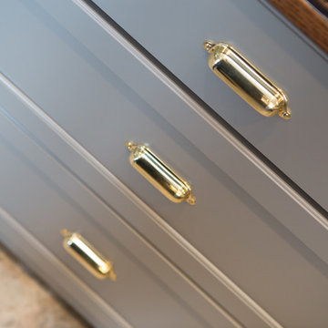
DuraSupreme Crestwood cabinets with a Kendall Panel add function and sophistication. A custom gray paint color paired with a storm blue was developed so that the new kitchen looked like it belonged to the existing space. Unlacquered brass faucets and hardware were important to Jennifer because she wanted the living finishes to age over time. Remarkable brass diamond mesh cabinet door inserts imported from the UK continue to add this one-of-a-kind kitchen renovation; giving it a “you won’t see this everywhere” quality. The use of old railcar flooring for the coffee bar countertop and reclaimed oak for the open shelving gives an authenticity to the space uncommon in kitchens today.
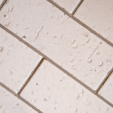
Jennifer and Michelle fell in love with the Limestone Grey Stone while they were investigating unique island countertop ideas. They liked the fact that the limestone as a living finish will age and change over time. Calcutta Miel Quartz countertops made for an excellent pairing around the perimeter, as it’s durable and perfect for cooking preparations. A textured white subway tile backsplash that runs to the ceiling keeps your eye moving towards the open shelving, and to the main focal point of the stunning range hood combination.
“The kitchen functions beautifully, and it’s gorgeous,” beams Jennifer as she gestures with both hands while smiling ear to ear. “The most important thing was I wanted a kitchen that had a wonderful flow, cooked beautiful meals and was a great gathering place for family and friends, and this space does that perfectly! Beauty wise, it turned out exactly how I had envisioned. I felt the function part was the hardest part, and that was nailed”!
Relocating the garage entry to the new mudroom was a huge priority and has finally separated the family’s arriving home functions from their kitchen. Now coats and shoes and bags have their own area for dropping once members arrive home. Matching gray DuraSupreme cabinetry helped create gorgeous, purposeful lockers for the family. A reclaimed vintage sink and custom wall paper were added to the tiny powder room to beautify the once previously only functional space. Advance Design was even able to create a custom space for their dog to sleep while the family is away.
“It was unbelievable that a project of this size was completed in such a short time, and I think that’s because of the large amount of planning and preparation that went into it,” Jennifer marveled, “When we started, we were ready, and everything was prepared”.
When it came to execution, Project Manager Justin Davis and his crew were quick, accessible, and organized. Projects like this kitchen are typically completed in as little as 8-10 weeks. Jennifer’s kitchen however despite the relocation of some challenging HVAC in a soffit and moving of an exterior door was completed remarkably fast in part because the team was working with an existing tile floor that ran throughout the first floor that the client really loved.
“You get to know these people really well because they’re living in your house while you’re living in your house. They were so fast and really good, it didn’t take as long as even planned” reported Jennifer. “I would text Justin and he always responded almost immediately. I got to know all the guys who were working in our house and they were all wonderful people”.
Details in a customized kitchen like this one require skill and care from the people who install it. “All the guys on the job were skilled at what the did. I wanted small details like little feet to look like furniture, that is where their carpentry skill came in to make these all perfect”, said Jennifer. “The tile guys were wonderful. They even let me determine how I wanted the texture with the grout to appear for a salt and pepper look; now that is a very skilled trade person making it custom”.
In Jennifer’s interview, she continued to reference Advance Design’s “Common Sense Remodeling”, so I took a minute to ask her exactly what that phrase meant to her and how it played out in her experience with her project and the Advance Design team. Here is what she said: “I was intrigued about Common Sense Remodeling and in my head that there would be clear costs and prices, great communication between the design team, the execution team and me”, said Jennifer. They did deliver on that, it was so clear about the cost breakdown, what I could expect from everyone who came to my house, and everything that we had ordered. That to me is the Common Sense”!
It’s great to see a client take literally our assertion that a well-planned remodeling project is simply “Common Sense”! She anticipated each step of the way would be clear, concise, and predictable, all the while protecting the outcome due to the careful upfront planning. “Advance Design delivered on their ‘Common Sense Remodeling’ promise,” Jennifer said. “From the design team, to the execution team - everything was straight forward like I imagined. The project turned out exactly how I envisioned, I enjoyed this process and absolutely would recommend Advance Design Studio to anyone.”
 Skylar Morgan Furniture + Design
Bar Countertop
Materials: Zinc
Large transitional u-shaped dark wood floor eat-in kitchen photo in Atlanta with recessed-panel cabinets, distressed cabinets, stainless steel appliances and a peninsula
Large transitional u-shaped dark wood floor eat-in kitchen photo in Atlanta with recessed-panel cabinets, distressed cabinets, stainless steel appliances and a peninsula
 Advance Design Studio, Ltd.
Jennifer and Dan have lived in their Deer Park Illinois home for 15 years, slowly making minor fixes like painting and decorating; but they had a new plan for their kitchen the entire time. An awkwardly placed garage door, and an island cooktop with a terrible downdraft made a full-scale kitchen remodel an absolute must. Jennifer had many ideas in mind and wanted to work with a company that could provide high-end work, while partnering with a designer that would tailor the kitchen to her ideas.
She was intrigued by the phrase “Common Sense Remodeling” in Advance Design’s feature she discovered while perusing an issue of the community’s Quintessential Barrington Magazine. Doing further research on the company’s website, as she looked through project profiles and read about Advance Design’s “Common Sense Remodeling” philosophy, she promptly scheduled an appointment to see if the people and ideas she read about were truly who they said they were. The more she read, the more she knew that the “Common Sense” approach to remodeling they described was exactly the type of company she was looking for.
The partnership was sealed after an initial consultation with Owner Todd Jurs and Project Designer Michelle Lecinski. They displayed a combination of friendliness, professionalism and respect that was unmatched by any of the other companies Jennifer talked to. She knew that with Advance Design, she would be able to retain the vision that she had in mind with high-quality craftsmanship.
“I reached out to Advance Design because of the ‘Common Sense Remodeling’ tagline,” Jennifer said. “That’s what lingered for me”. “Advance Design was the most respectful- of the house and of my design ideas, and the most professional of the handful of companies that looked at my project”.
Soon after the meeting Jennifer began working with Michelle on the project design. They quickly developed chemistry. Jennifer loved how Michelle researched and located every detail that Jennifer wanted for the kitchen. Between the two of them, every concept and idea was worked through and perfected. “Jennifer had definite ideas about what she wanted the new kitchen to look like, she just didn’t know how to bring it all together. We worked together really well to make her ideas into the practical reality necessary for a well-functioning kitchen, with the look and feel that she had envisioned”, says Michelle.
“Michelle was wonderful in using the CAD system she would show me new drawings every time we changed the layout while working through the design,” Jennifer said. “She was a really wonderful partner in execution, she made sure everything happened quickly and easily.”
The finished design drew out elements of Jennifer’s style and personality. The pair call the look “sophisticated farmhouse” to describe the kitchen renovation to family and friends. The result was a beautifully crafted, authentic-feeling space that satisfied Jennifer’s dreams 15 years in the making. The whole project consisted of a kitchen remodel, mudroom upgrade with powder room, and garage entry relocation. “The projects I personally like the best, are the ones that put the client’s dreams on display,” Project Designer Michelle said. “And this is one of those projects.”
The main focal point of the kitchen is custom zinc and brass ventilation hood with a vintage sheen, which was hand made to order by a small company in Indiana named Vogler Metalworking. “It’s like sculpture, a true work of art”, says Jennifer. Your eye is immediately drawn towards this elegant yet practical hood that eliminated the home’s downdraft problem and added a striking conversation piece at the same time. The carpenters had to use special gloves when transporting and installing it, so they didn’t smudge it with fingerprints. The beautiful hood centers proudly over the stunning black enamel and brass LaCornue Range. “I had a friend who had a LaCornue range and after learning how easy it was to cook perfect meals, I was convinced I wanted to have one”, says Jennifer. This unique, breathtaking combination anchors the entire kitchen and is apparent immediately as you walk into the great room the surrounds the space.
DuraSupreme Crestwood cabinets with a Kendall Panel add function and sophistication. A custom gray paint color paired with a storm blue was developed so that the new kitchen looked like it belonged to the existing space. Unlacquered brass faucets and hardware were important to Jennifer because she wanted the living finishes to age over time. Remarkable brass diamond mesh cabinet door inserts imported from the UK continue to add this one-of-a-kind kitchen renovation; giving it a “you won’t see this everywhere” quality. The use of old railcar flooring for the coffee bar countertop and reclaimed oak for the open shelving gives an authenticity to the space uncommon in kitchens today.
Jennifer and Michelle fell in love with the Limestone Grey Stone while they were investigating unique island countertop ideas. They liked the fact that the limestone as a living finish will age and change over time. Calcutta Miel Quartz countertops made for an excellent pairing around the perimeter, as it’s durable and perfect for cooking preparations. A textured white subway tile backsplash that runs to the ceiling keeps your eye moving towards the open shelving, and to the main focal point of the stunning range hood combination.
“The kitchen functions beautifully, and it’s gorgeous,” beams Jennifer as she gestures with both hands while smiling ear to ear. “The most important thing was I wanted a kitchen that had a wonderful flow, cooked beautiful meals and was a great gathering place for family and friends, and this space does that perfectly! Beauty wise, it turned out exactly how I had envisioned. I felt the function part was the hardest part, and that was nailed”!
Relocating the garage entry to the new mudroom was a huge priority and has finally separated the family’s arriving home functions from their kitchen. Now coats and shoes and bags have their own area for dropping once members arrive home. Matching gray DuraSupreme cabinetry helped create gorgeous, purposeful lockers for the family. A reclaimed vintage sink and custom wall paper were added to the tiny powder room to beautify the once previously only functional space. Advance Design was even able to create a custom space for their dog to sleep while the family is away.
“It was unbelievable that a project of this size was completed in such a short time, and I think that’s because of the large amount of planning and preparation that went into it,” Jennifer marveled, “When we started, we were ready, and everything was prepared”.
When it came to execution, Project Manager Justin Davis and his crew were quick, accessible, and organized. Projects like this kitchen are typically completed in as little as 8-10 weeks. Jennifer’s kitchen however despite the relocation of some challenging HVAC in a soffit and moving of an exterior door was completed remarkably fast in part because the team was working with an existing tile floor that ran throughout the first floor that the client really loved.
“You get to know these people really well because they’re living in your house while you’re living in your house. They were so fast and really good, it didn’t take as long as even planned” reported Jennifer. “I would text Justin and he always responded almost immediately. I got to know all the guys who were working in our house and they were all wonderful people”.
Details in a customized kitchen like this one require skill and care from the people who install it. “All the guys on the job were skilled at what the did. I wanted small details like little feet to look like furniture, that is where their carpentry skill came in to make these all perfect”, said Jennifer. “The tile guys were wonderful. They even let me determine how I wanted the texture with the grout to appear for a salt and pepper look; now that is a very skilled trade person making it custom”.
In Jennifer’s interview, she continued to reference Advance Design’s “Common Sense Remodeling”, so I took a minute to ask her exactly what that phrase meant to her and how it played out in her experience with her project and the Advance Design team. Here is what she said: “I was intrigued about Common Sense Remodeling and in my head that there would be clear costs and prices, great communication between the design team, the execution team and me”, said Jennifer. They did deliver on that, it was so clear about the cost breakdown, what I could expect from everyone who came to my house, and everything that we had ordered. That to me is the Common Sense”!
It’s great to see a client take literally our assertion that a well-planned remodeling project is simply “Common Sense”! She anticipated each step of the way would be clear, concise, and predictable, all the while protecting the outcome due to the careful upfront planning. “Advance Design delivered on their ‘Common Sense Remodeling’ promise,” Jennifer said. “From the design team, to the execution team - everything was straight forward like I imagined. The project turned out exactly how I envisioned, I enjoyed this process and absolutely would recommend Advance Design Studio to anyone.”
 Neumann & Rudy Architecture
**I. Spatial Composition & Architectural Volume**
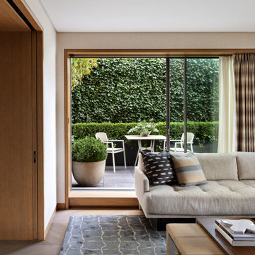
This interior operates on a strategy of framed extension, in which the room's perceived volume is borrowed from the garden beyond rather than asserted through internal grandeur. The composition is governed by a rigorous orthogonal discipline: a full-height sliding glazing system, set within a deep oak-lined reveal, functions as both aperture and proscenium, its slender mullions dividing the exterior into a triptych of vegetal planes. The generous depth of that reveal — expressed as a substantial threshold plinth and continuous jamb casing — reads less as trim than as tectonic gesture, giving weight and thickness to the enclosure and reinforcing the sense of a pavilion pressed against a green wall. To the left, a floor-to-ceiling pocketing door of book-matched, quarter-sawn oak establishes a monolithic vertical counterpoint, its recessed flush pull the only interruption of an otherwise uninflected plane; the shallow return of the wall beyond it creates a compressed entry sequence that releases into the primary volume. The flat, shadowless plaster ceiling maintains a neutral lid over the composition, while the furniture plan is deliberately low-slung and horizontal — a deep sectional set parallel to the glazing, a leather-topped ottoman, and a low occasional table — so that no element rises to compete with the sightline. Circulation is implied along the wall's edge, funnelling toward the terrace and its al fresco dining vignette, which acts as the room's terminal focal point and extends the interior axis outward.
**II. Materiality, Color & Texture**
The palette is a study in low-contrast tonal layering, calibrated within a narrow band of warm neutrals and animated almost entirely by the saturated chlorophyll green of the ivy screen. Rift-cut white oak, finished in a matte oil that reveals rather than glosses its medullary figure, provides the room's structural warmth — appearing in the joinery, the window surround, and the herringbone parquet, whose fine chevron rhythm introduces a subtle graphic pattern at foot level. Walls are treated in what appears to be a woven grasscloth or linen-effect wallcovering in a pale oatmeal tone, its faint horizontal striation catching raking light and lending textile softness to the perimeter. Against this, the seating is upholstered in a tightly woven, undyed linen-cotton blend with a biscuit-tufted seat platform, its slubbed irregularity a deliberate foil to the precision of the millwork. The cushion program provides the composition's only chromatic incident: an indigo-ground ikat or *kasuri* resist-dyed weave, with its blurred weft-broken banding, paired with a heavier blanket-stitched wool in glaucous blue-grey and buff stripes. Underfoot, a hand-knotted silk-and-wool rug in slate and mineral grey carries an attenuated ogee lattice, its lustrous pile providing cool relief beneath the warmer wood tones. The plinth-mounted travertine or reconstituted-stone planter — matte, porous, faintly chalky — and the honed grey stone paving beyond introduce lithic gravity, balancing the prevailing softness with a mineral edge.
**III. Lighting, Atmosphere & Style Profile**
Illumination here is almost entirely diurnal and indirect: north-oriented or hedge-filtered daylight arrives diffuse and green-cast, washing the space in a soft, even luminance that suppresses hard shadow and privileges texture over drama. The ivory sheer, hung on a discreet recessed track, tempers glare while retaining silhouette legibility, and the adjacent pinch-pleated overdrape in a taupe-bronze silk-blend — with its subtle vertical striation and slight sheen — offers the option of full blackout while contributing a note of drapery-weight formality. Artificial sources are conspicuously concealed; no decorative fixture interrupts the ceiling plane, implying a scheme of recessed low-glare downlights or perimeter cove washing designed to sustain the daytime ambience after dusk. The resulting atmosphere is one of composed reticence — quiet, tactile, and deeply oriented toward the garden. Stylistically, the project synthesises Japandi restraint (the pocketing timber plane, the shadow-gap detailing, the reverence for the framed view) with the material sensuality and drapery conventions of European Soft Modernism, yielding a warm minimalism in which luxury is communicated through joinery tolerance, textile hand, and the disciplined editing of the palette rather than through ornament or statement furniture. It is an interior conceived as a calm neutral ground — an armature for light, landscape, and the slow accretion of daily life.
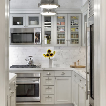 Neumann & Rudy Architecture
**I. Spatial Composition & Architectural Volume**
The photograph frames the space through a deep, cased opening — a device that immediately establishes a proscenium condition, compressing the viewer's aperture and heightening the sense of discovery beyond. The room reads as an ancillary galley or scullery-pantry: a compact, U-shaped plan whose counter runs return at the right to form an L, generating an efficient work triangle within a footprint of considerable modesty. Vertical ambition compensates for lateral restraint. The wall cabinetry rises in a tall, unbroken register, terminating in a stepped cornice and a subtle crown that carries the eye to a ceiling plane of generous height, while a bracketed corbel at the upper left signals the transition to the adjoining volume. The millwork is the primary architectural gesture here: inset, beaded-face frame construction with recessed panel doors, mitred stiles and rails, and a rhythmic alternation between solid and glazed fronts. Those mullioned glass doors — divided into two- and three-light configurations — perforate the cabinet mass, dissolving what could have been a monolithic wall into a permeable, vitrine-like screen. The lower casework counters this with a disciplined stack of graduated drawer banks, the deepest at the counter line and diminishing downward, a compositional hierarchy borrowed from classical apothecary and butler's-pantry precedent. Sightlines are deliberately layered: the herringbone floor draws forward, the sunflower stem anchors the center axis, and the pendant fixtures descend in perspectival sequence, reinforcing depth along the room's short axis.
**II. Materiality, Color & Texture**
The palette operates within a narrow tonal bandwidth, deriving its interest from textural rather than chromatic contrast. Cabinetry is finished in a cool, greige-inflected pale gray — a low-saturation hue with just enough green-gray undertone to read as architectural rather than decorative — hand-applied to a satin sheen that registers the shadow-lines of the beaded frames with precision. Against this, the backsplash of honed marble subway tile, laid in a running bond with tight, matched grout, introduces linear grain and soft gray veining that echoes the cabinetry's undertone. The countertop and the returning waterfall-edge marble continue the vein pattern in a broader, more sculptural expression, its polished-to-honed surface catching light in diffuse planes. Metals are curated with restraint and consistency: polished nickel bin pulls, knobs, and cup handles supply a warm-silver punctuation across the casework, while brushed and mirror-polished stainless steel — the wall oven, the microwave drawer, the professional refrigerator with its cylindrical tubular handle — introduces a cooler, more industrial register. The oak flooring, laid in a fine-scale herringbone with a pale, wire-brushed, matte finish, delivers the room's essential warmth and its only pronounced pattern, grounding the cool upper volume. Small accents of natural material — an end-grain butcher block, turned wooden pepper mills, a hammered silver kettle — reintroduce the tactile and the hand-made against so much precision-milled surface. The sunflowers, in a matte white vessel, provide the single saturated chromatic event, and their yellow is deliberately reprised in the pantry's glazed shelves of packaged goods, transforming provisions into intentional color composition.
**III. Lighting, Atmosphere & Style Profile**
The lighting strategy is unapologetically artificial and theatrical. Three oversized, spun-metal industrial pendants — polished nickel or chrome domes with heavy cast collars and flush opal-glass diffusers — hang in a linear array, their scale intentionally disproportionate to the room, which is precisely the source of their impact. They function simultaneously as luminaires and as sculptural objects, their reflective canopies mirroring the ceiling and multiplying the light. Illumination beneath the wall cabinets grazes the marble tile at a raking angle, revealing its subtle relief and the depth of its veining, while the interior-lit glazed cabinets glow as illuminated vitrines, converting storage into display. Natural light is inferred rather than shown — a suggestion of daylight from the right — leaving the space in a controlled, even, shadow-managed luminosity that reads as both crisp and enveloping. The atmosphere is one of ordered domestic industry: pristine, quietly luxurious, and legibly functional. Stylistically, the room resolves as *Transitional Classicism with a Warm Industrial inflection* — the inset, beaded millwork and stepped cornices citing Georgian and Edwardian butler's-pantry tradition; the professional-grade stainless appliances and factory-scale pendants asserting a contemporary, utilitarian counterpoint; and the herringbone oak and marble mediating between them. It is a synthesis in which historical grammar governs the composition while modern hardware and lighting supply the accent, producing a space that feels neither pastiche nor austere, but assured, timeless, and thoroughly of the present moment.

 ILT Vignocchi
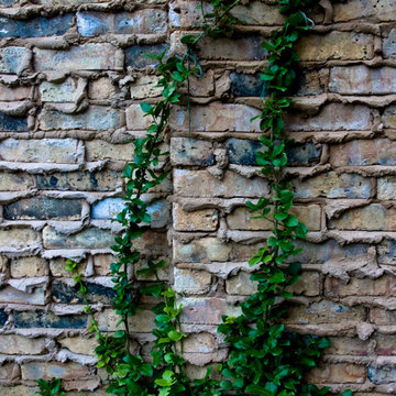
Weeping mortared joints
This is an example of a large traditional full sun backyard stone formal garden in Chicago for summer.
This is an example of a large traditional full sun backyard stone formal garden in Chicago for summer.
 186 Lighting Design Group - Gregg Mackell
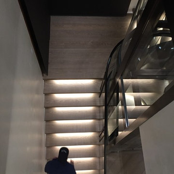
Stair were illuminated with linear light channels integrated into the underside of each stair nosing to float the stair with light while providing functional lighting as the stair wraps the curved glass elevator.

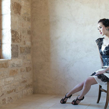
 Ancient Surfaces
Wall Cladding Stone by 'Ancient Surfaces'
Product: Antique 'Mesa' Wall Cladding Stone
Contacts: (212) 461-0245
Email: Sales@ancientsurfaces.com
Website: www.AncientSurfaces.com
The Antique Reclaimed 'Mesa' Limestone Wall Cladding selection is unique in its blend and authenticity, rare in it's hardness and beauty.
Draping your inside and outside walls with the 'Mesa' Stone, gives you a feel of timelessness allowing you to travel back in time into the untouched North Mediterranean domains of fallen Empires and ancient bustling coastal trading villages, where a mercantile class have built some of the most luxurious estates out of the breath taking local stone blocks all along the shoreline of Southern Europe.
This exclusive 'Ancient Surfaces' stone wall cladding blend might just be the missing link needed to transform your home from a logging space to your dream space....
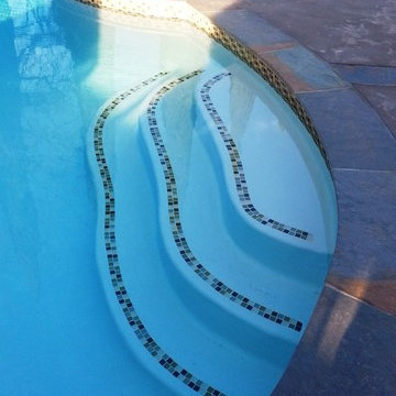
 Coral Pool's
Coral Pool and Spa
Hot tub - large contemporary backyard stamped concrete and custom-shaped natural hot tub idea in San Francisco
Hot tub - large contemporary backyard stamped concrete and custom-shaped natural hot tub idea in San Francisco

 Knoll Landscape Design Miami
Landscape Designer Brent Knoll of Knoll
Landscape Design
lotus flower
Photo of a tropical landscaping in Miami.
Photo of a tropical landscaping in Miami.

 User
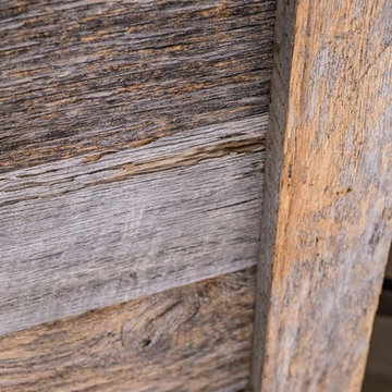
UserGiving reclaimed barnboard new life.
A blend of classic style and reclaimed materials creates an organic and stylish kitchen space.
Photography by Eric Roth
 Advance Design Studio, Ltd.
Jennifer and Dan have lived in their Deer Park Illinois home for 15 years, slowly making minor fixes like painting and decorating; but they had a new plan for their kitchen the entire time. An awkwardly placed garage door, and an island cooktop with a terrible downdraft made a full-scale kitchen remodel an absolute must. Jennifer had many ideas in mind and wanted to work with a company that could provide high-end work, while partnering with a designer that would tailor the kitchen to her ideas.
She was intrigued by the phrase “Common Sense Remodeling” in Advance Design’s feature she discovered while perusing an issue of the community’s Quintessential Barrington Magazine. Doing further research on the company’s website, as she looked through project profiles and read about Advance Design’s “Common Sense Remodeling” philosophy, she promptly scheduled an appointment to see if the people and ideas she read about were truly who they said they were. The more she read, the more she knew that the “Common Sense” approach to remodeling they described was exactly the type of company she was looking for.
The partnership was sealed after an initial consultation with Owner Todd Jurs and Project Designer Michelle Lecinski. They displayed a combination of friendliness, professionalism and respect that was unmatched by any of the other companies Jennifer talked to. She knew that with Advance Design, she would be able to retain the vision that she had in mind with high-quality craftsmanship.
“I reached out to Advance Design because of the ‘Common Sense Remodeling’ tagline,” Jennifer said. “That’s what lingered for me”. “Advance Design was the most respectful- of the house and of my design ideas, and the most professional of the handful of companies that looked at my project”.
Soon after the meeting Jennifer began working with Michelle on the project design. They quickly developed chemistry. Jennifer loved how Michelle researched and located every detail that Jennifer wanted for the kitchen. Between the two of them, every concept and idea was worked through and perfected. “Jennifer had definite ideas about what she wanted the new kitchen to look like, she just didn’t know how to bring it all together. We worked together really well to make her ideas into the practical reality necessary for a well-functioning kitchen, with the look and feel that she had envisioned”, says Michelle.
“Michelle was wonderful in using the CAD system she would show me new drawings every time we changed the layout while working through the design,” Jennifer said. “She was a really wonderful partner in execution, she made sure everything happened quickly and easily.”
The finished design drew out elements of Jennifer’s style and personality. The pair call the look “sophisticated farmhouse” to describe the kitchen renovation to family and friends. The result was a beautifully crafted, authentic-feeling space that satisfied Jennifer’s dreams 15 years in the making. The whole project consisted of a kitchen remodel, mudroom upgrade with powder room, and garage entry relocation. “The projects I personally like the best, are the ones that put the client’s dreams on display,” Project Designer Michelle said. “And this is one of those projects.”
The main focal point of the kitchen is custom zinc and brass ventilation hood with a vintage sheen, which was hand made to order by a small company in Indiana named Vogler Metalworking. “It’s like sculpture, a true work of art”, says Jennifer. Your eye is immediately drawn towards this elegant yet practical hood that eliminated the home’s downdraft problem and added a striking conversation piece at the same time. The carpenters had to use special gloves when transporting and installing it, so they didn’t smudge it with fingerprints. The beautiful hood centers proudly over the stunning black enamel and brass LaCornue Range. “I had a friend who had a LaCornue range and after learning how easy it was to cook perfect meals, I was convinced I wanted to have one”, says Jennifer. This unique, breathtaking combination anchors the entire kitchen and is apparent immediately as you walk into the great room the surrounds the space.
DuraSupreme Crestwood cabinets with a Kendall Panel add function and sophistication. A custom gray paint color paired with a storm blue was developed so that the new kitchen looked like it belonged to the existing space. Unlacquered brass faucets and hardware were important to Jennifer because she wanted the living finishes to age over time. Remarkable brass diamond mesh cabinet door inserts imported from the UK continue to add this one-of-a-kind kitchen renovation; giving it a “you won’t see this everywhere” quality. The use of old railcar flooring for the coffee bar countertop and reclaimed oak for the open shelving gives an authenticity to the space uncommon in kitchens today.
Jennifer and Michelle fell in love with the Limestone Grey Stone while they were investigating unique island countertop ideas. They liked the fact that the limestone as a living finish will age and change over time. Calcutta Miel Quartz countertops made for an excellent pairing around the perimeter, as it’s durable and perfect for cooking preparations. A textured white subway tile backsplash that runs to the ceiling keeps your eye moving towards the open shelving, and to the main focal point of the stunning range hood combination.
“The kitchen functions beautifully, and it’s gorgeous,” beams Jennifer as she gestures with both hands while smiling ear to ear. “The most important thing was I wanted a kitchen that had a wonderful flow, cooked beautiful meals and was a great gathering place for family and friends, and this space does that perfectly! Beauty wise, it turned out exactly how I had envisioned. I felt the function part was the hardest part, and that was nailed”!
Relocating the garage entry to the new mudroom was a huge priority and has finally separated the family’s arriving home functions from their kitchen. Now coats and shoes and bags have their own area for dropping once members arrive home. Matching gray DuraSupreme cabinetry helped create gorgeous, purposeful lockers for the family. A reclaimed vintage sink and custom wall paper were added to the tiny powder room to beautify the once previously only functional space. Advance Design was even able to create a custom space for their dog to sleep while the family is away.
“It was unbelievable that a project of this size was completed in such a short time, and I think that’s because of the large amount of planning and preparation that went into it,” Jennifer marveled, “When we started, we were ready, and everything was prepared”.
When it came to execution, Project Manager Justin Davis and his crew were quick, accessible, and organized. Projects like this kitchen are typically completed in as little as 8-10 weeks. Jennifer’s kitchen however despite the relocation of some challenging HVAC in a soffit and moving of an exterior door was completed remarkably fast in part because the team was working with an existing tile floor that ran throughout the first floor that the client really loved.
“You get to know these people really well because they’re living in your house while you’re living in your house. They were so fast and really good, it didn’t take as long as even planned” reported Jennifer. “I would text Justin and he always responded almost immediately. I got to know all the guys who were working in our house and they were all wonderful people”.
Details in a customized kitchen like this one require skill and care from the people who install it. “All the guys on the job were skilled at what the did. I wanted small details like little feet to look like furniture, that is where their carpentry skill came in to make these all perfect”, said Jennifer. “The tile guys were wonderful. They even let me determine how I wanted the texture with the grout to appear for a salt and pepper look; now that is a very skilled trade person making it custom”.
In Jennifer’s interview, she continued to reference Advance Design’s “Common Sense Remodeling”, so I took a minute to ask her exactly what that phrase meant to her and how it played out in her experience with her project and the Advance Design team. Here is what she said: “I was intrigued about Common Sense Remodeling and in my head that there would be clear costs and prices, great communication between the design team, the execution team and me”, said Jennifer. They did deliver on that, it was so clear about the cost breakdown, what I could expect from everyone who came to my house, and everything that we had ordered. That to me is the Common Sense”!
It’s great to see a client take literally our assertion that a well-planned remodeling project is simply “Common Sense”! She anticipated each step of the way would be clear, concise, and predictable, all the while protecting the outcome due to the careful upfront planning. “Advance Design delivered on their ‘Common Sense Remodeling’ promise,” Jennifer said. “From the design team, to the execution team - everything was straight forward like I imagined. The project turned out exactly how I envisioned, I enjoyed this process and absolutely would recommend Advance Design Studio to anyone.”
9