
Search results for "Background movement" in Home Design Ideas
 Rocky Tops Granite & Marble LLC
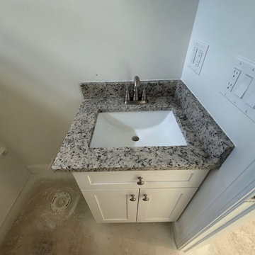
This kitchen in Bamberg came together in Dallas White granite, a stone that reads clean and bright without going stark. The background carries soft grays with subtle movement through it, enough character to keep the eye interested but calm enough to work with just about any cabinet color a builder picks for a spec house like this one. That's part of why it gets used so often in kitchens meant to show well and live well at the same time.
Granite's still one of the best choices you can make for a kitchen countertop, and Dallas White in particular holds up the way granite's supposed to. It's dense, it resists heat, and you can set a hot pan on it without worrying about scorching. Scratches aren't a concern with normal use, and the surface takes a polish that lasts for years. We seal it going in and that's about all the maintenance it ever needs.
Getting a granite slab like this into a kitchen right takes more than just cutting to size. We template the space first to make sure the seams land where they won't draw attention, usually tucked near the sink or stove, and any countertop longer than about 8 to 9 feet is going to need one. Matching the pattern across a seam so it reads as one continuous piece is where the work actually happens. The edge here is eased, a clean, simple line that lets the stone itself do the talking instead of competing with it.
Day to day, this is the kind of countertop that just works. Wipe it down, don't worry about it, and it'll look the same ten years from now as it does today. That durability is exactly what a spec house kitchen needs, something that shows well to a buyer walking through and keeps performing long after they've moved in.
We do a lot of work through the Midlands, and Bamberg jobs like this one are a good example of what granite still does better than almost anything else on the market. It's a straightforward material that never stops earning its keep in a kitchen, and this one turned out exactly the way it should.
 Rocky Tops Granite & Marble LLC
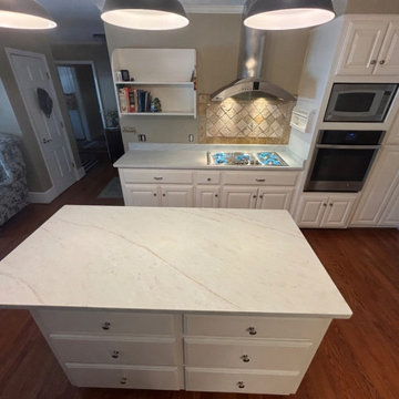
We put GK Carrara Gold quartz into a kitchen in West Columbia, and it's the kind of stone that gives a bright, classic look without asking the homeowner to babysit it. White background, soft gray veining moving through it, a clean bright field that works with just about any cabinet color. Engineered quartz gives us that light, veined look with a material that's built for how a kitchen actually gets used, day in and day out, with hot pans and spills and everything else that happens on a counter.
The templating on a job like this is where the work really happens before it ever shows up on a truck. We measure the cabinets and openings on site, build a template that accounts for every corner and cutout, and send it to the shop so the slab gets cut once, correctly. With a veining pattern like Carrara Gold's, we're paying close attention to how it flows across seams, especially anywhere two pieces meet on an island or a run of countertop that turns a corner. You want the eye to read it as one continuous piece, not two slabs bolted together.
Quartz like this is engineered to be non-porous, so there's no sealing required and no worrying about wine or oil soaking into the surface the way you'd have to watch with some natural stones. It resists scratching and staining well under normal kitchen use, though we still tell people to use a cutting board and a trivet for anything straight off the stove, since sustained high heat can still cause trouble at a seam or in the material itself. Day to day, it wipes clean with soap and water and holds its color and shine for years without a lot of fuss.
We finished the edge simple and eased, which keeps the whole thing looking clean and doesn't compete with the veining for attention. That's a small decision, but it's the right one on a stone with this much movement in the pattern already.
West Columbia's seen a good bit of kitchen work like this lately, and it's easy to see why a bright, veined quartz keeps coming up. It gives a kitchen that clean, timeless feel homeowners are after, backed by a material that's built to actually live in a working kitchen for the long haul.
 Rocky Tops Granite & Marble LLC
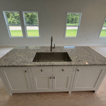
This kitchen in Bamberg came together in Dallas White granite, a stone that reads clean and bright without going stark. The background carries soft grays with subtle movement through it, enough character to keep the eye interested but calm enough to work with just about any cabinet color a builder picks for a spec house like this one. That's part of why it gets used so often in kitchens meant to show well and live well at the same time.
Granite's still one of the best choices you can make for a kitchen countertop, and Dallas White in particular holds up the way granite's supposed to. It's dense, it resists heat, and you can set a hot pan on it without worrying about scorching. Scratches aren't a concern with normal use, and the surface takes a polish that lasts for years. We seal it going in and that's about all the maintenance it ever needs.
Getting a granite slab like this into a kitchen right takes more than just cutting to size. We template the space first to make sure the seams land where they won't draw attention, usually tucked near the sink or stove, and any countertop longer than about 8 to 9 feet is going to need one. Matching the pattern across a seam so it reads as one continuous piece is where the work actually happens. The edge here is eased, a clean, simple line that lets the stone itself do the talking instead of competing with it.
Day to day, this is the kind of countertop that just works. Wipe it down, don't worry about it, and it'll look the same ten years from now as it does today. That durability is exactly what a spec house kitchen needs, something that shows well to a buyer walking through and keeps performing long after they've moved in.
We do a lot of work through the Midlands, and Bamberg jobs like this one are a good example of what granite still does better than almost anything else on the market. It's a straightforward material that never stops earning its keep in a kitchen, and this one turned out exactly the way it should.
Find the right local pro for your project
 Rocky Tops Granite & Marble LLC
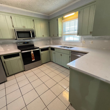
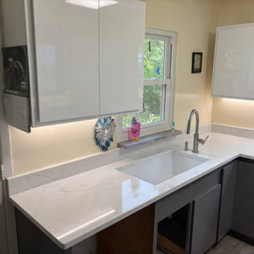
Spectrum Quartz Splendid went into this kitchen in West Columbia, and it's the kind of stone that does a lot of the work in a room without shouting about it. It's an engineered quartz, so what you're looking at is a mix of ground quartz and resin, pressed and cured until it's hard, dense, and consistent from one end of the slab to the other. The background reads soft and light, with a scatter of movement through it that keeps the surface from looking flat under kitchen lighting.
We templated the counters the way we do every job, laser measuring the base cabinets so the slabs come back from the shop cut to the exact lines of that kitchen. With quartz, that precision matters a lot, because the pattern repeats in a controlled way and you can plan your layout and your seams instead of chasing anything. That's part of why quartz suits a working kitchen so well. What you see in the showroom is what you get on the counter, corner to corner, with the pattern lining up the way it should.
Day to day, this material is about as forgiving as it gets. It doesn't need sealing, ever, because it's non-porous straight out of the fabrication shop. Wine, coffee, tomato sauce, none of it soaks in if you wipe it up in a reasonable time. It stands up to knives and daily wear better than most kitchen surfaces, though we still tell folks to use a trivet, since quartz doesn't love direct heat from a hot pan sitting right on it. Scratches aren't something you have to worry about with normal use in a busy kitchen.
We set the counters with an eased edge, clean and simple, which is what most of our customers land on once they see it doesn't take anything away from the stone itself.
Jobs like this one are what keep us busy across the Midlands. West Columbia kitchens see a lot of quartz these days, and Spectrum Quartz Splendid is a slab that holds up to real cooking and real family life while still looking sharp enough to notice the first time you walk into the room.
 Rocky Tops Granite & Marble LLC
We put MSI Calacatta Aidana quartz into a kitchen out in Hopkins, and it's the kind of stone that changes how a room feels the day it goes in. Aidana's got that bright white background with soft veining moving through it, the kind of pattern that reads clean and calm from across the room but still has movement when you get up close to it. For a kitchen that gets used every day, that's exactly what you want. It doesn't compete with cabinets or fight the light coming through the windows, it just sits there looking good year after year.
Quartz like this is engineered, so the slabs come off the line consistent. That matters more than people think when you're templating a kitchen with a lot of linear footage, corners, and a sink cutout to deal with. We're not chasing a wild vein across a seam or hoping two slabs happen to match. The veining in Aidana is soft enough that seams disappear into the field instead of announcing themselves, and that's a craftsmanship thing as much as a material thing. Getting a seam tight and a pattern lined up right takes patience at the saw and patience setting it, not just a good slab to start with.
The kitchen itself got the full treatment, counters and an eased edge, which is the right call for a stone with this kind of quiet pattern. An eased edge keeps the eye on the surface and the veining instead of on the edge detail, and it's a practical choice too, it holds up well and doesn't chip the way a sharper profile can over time.
Day to day, this is a stone that just works. Quartz doesn't need sealing, it resists staining better than natural stone, and it shrugs off the usual kitchen abuse, knives set down too hard, hot pans set too close, kids leaning on the counter doing homework. It's a surface built for a family that actually cooks and lives in the space rather than one that's roped off for company.
Hopkins has been getting more of these kitchen jobs lately, and it's easy to see why homeowners out that way keep landing on Calacatta Aidana. It's a stone that photographs well and lives even better, bright and clean without being cold, and it gives a kitchen that finished, put-together look the moment you walk in.
 Rocky Tops Granite & Marble LLC
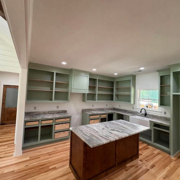
This one covered the whole house, or close to it. A kitchen and the bathrooms all done in Fantasy Brown dolomite with a leathered finish, out near Orangeburg. The photos catch it mid-install with Lowe's floor protection still down, so you can see the tops going in before the space gets dressed up. There's an island, a farmhouse apron sink, some open shelving, and undermount bowls in the baths. It's the kind of job we like, where one stone carries through the whole home and ties everything together.
Fantasy Brown is a dolomite, and that matters. People see the soft browns and grays and the flowing veins and assume it's a marble, but dolomite sits a step harder and holds up better in a working kitchen. The movement in it runs long and watery, brown and taupe drifting through a lighter background. No two slabs are the same, so a big part of the job is laying out the material and deciding which piece goes where. On the island we want the veining to feel like it belongs, and across a corner we do our best to keep the flow moving instead of stopping cold at the seam.
The farmhouse apron sink is where the extra work shows. That kind of sink needs the front edge of the stone cut just right, and the reveal has to be even the whole way across. The undermount bowls in the bathrooms get polished on the inside edge so there's nothing rough to catch on. We template tight, cut to the template, and set the seams where they're least likely to bother you. An eased edge keeps it simple and easy to wipe down, which fits a house that's actually lived in.
Dolomite likes to be sealed and it likes to be wiped up after acidic things like lemon or wine, but treated with a little sense it wears beautifully for years. It takes heat better than a lot of people expect, though we still say use a trivet. In a kitchen and baths that get daily use, it's a stone that looks high-end without being fussy to the point of stress.
Orangeburg's a bit of a drive for us, but we go where the work is, and this was a repeat customer we think a lot of. Running the same dolomite through the kitchen and the bathrooms gave the whole place one voice. That's the payoff on a job like this, one material, careful layout, and a finish that reads the same room to room.
 Drury Design
THE SETUP
Client Background: Our clients, a couple who have transitioned into the empty nest phase, have cherished their home for over three decades without undergoing any significant renovations. With a newfound desire to adapt their living space to better suit their current lifestyle, they’ve embarked on a journey to reimagine their kitchen — the heart of their home. Their aspiration is to cultivate a serene, neutral-toned sanctuary on the first floor that seamlessly merges with their family room, ensuring a harmonious and inviting environment.
Design Inspiration: The renovation is inspired by the couple’s penchant for soft, calming neutrals, using their cherished family room and the kitchen’s existing tile flooring as the cornerstone for the color scheme. This approach aims to foster a sense of warmth and tranquility throughout.
Design Objectives:
Harmonize the kitchen with the family room by adopting a soothing, neutral color scheme, ensuring a seamless flow across the first floor.
Enhance kitchen functionality with thoughtfully designed cabinetry, providing a designated place for every item and maximizing storage efficiency.
Cultivate an inviting and comfortable atmosphere that reflects the homeowners’ desire for a calm and relaxing space.
Design Challenges:
The homeowners wish to retain the existing kitchen tile flooring and integrate it into a refreshed, modern design.
Accommodating a dining area spacious enough for family visits without compromising the kitchen’s open feel or functional layout.
Despite liking the current placement of plumbing and appliances, the homeowners aspire for a more open floor plan to facilitate better movement and interaction.
The need to amplify natural light in the kitchen, especially around the sink area, where existing lighting is insufficient.
Preserving the half-wall between the kitchen and family room, a feature the homeowners want to keep, while ensuring it complements the new design.
THE RENEWED SPACE
Design Solutions:
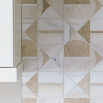
By choosing a neutral color palette that complements the existing tile, the design unifies the kitchen with the adjacent spaces. The tile’s grout was cleaned and restored, enhancing the floor’s appearance and integrating it seamlessly with the new kitchen aesthetic.
The inclusion of a larger island with seating for two, alongside maintaining a substantial dining table, was achieved by optimizing the spatial layout. This allowed for a sociable yet functional kitchen, accommodating large family gatherings without feeling crowded.
Minor adjustments to the kitchen’s layout maintained the preferred locations for plumbing and appliances while introducing an ‘open’ design concept. Strategic modifications, such as angling the pantry wall, improved the flow and accessibility within the space.
Replacing the garden window with a broader, standard window significantly increased natural light, transforming the sink area into a bright, welcoming space with enhanced views of the outdoors.
The decision to keep the half-wall was ingeniously leveraged to define the dining area while maintaining an open connection to the family room. This feature not only serves as a visual separator but also ties the two spaces together through the shared color scheme and design elements.
The homeowners are thrilled with their newly remodeled kitchen, which has become a hub of warmth and hospitality. Hosting a wedding shower and a birthday party, they have shared their renewed space with friends and family, who have been equally enamored. This remodel has not only met their functional and aesthetic desires but has also enriched their home with a fresh sense of serenity and joy.
The upstairs part of the home is shaping up nicely. Here’s their newly remodeled primary bathroom.
 Banker Wire
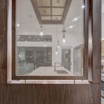
’s architectural woven mesh is a key design element in the Willow Park Showhome, built by Zen Custom Homes and designed by AstonMorrone Designs. Utilized in two separate applications within the home—as a wall divider in the office, and as a statement kitchen island feature—the designer relied on Banker Wire’s M22-83 wire mesh pattern to create visual separations that allow the light to pass through, without impeding the flow of the open-planned space.
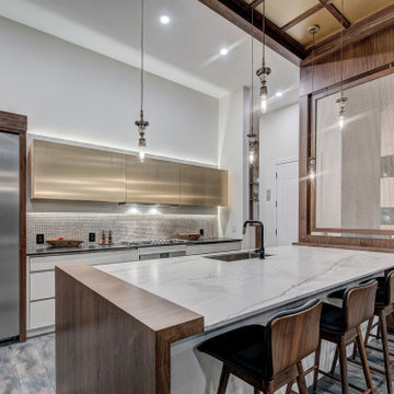
Acting as a statement kitchen counter partition, M22-83’s stainless steel and brass finish brings warmth to the expansive, open kitchen. Fabricated within a red maple-colored wood frame, the wire mesh creates a dividing screen by connecting the bottom of the kitchen counter with the wood ceiling accent above, which spans the length and width of the counter. When lit by the kitchen ceiling lighting source, M22-83 is brought to life; created using a pair of nested helical crimped woven wires to define the circular mesh shape, this pattern’s doubled circle mesh creates unique reflective surfaces, allowing the light to pass through the mesh in varying ways. Similarly, this combination of stainless steel and brass gives off a colorful, luxurious aesthetic, where the depth and movement of the contrasting woven wires—of silver and gold tones—dynamically change as the viewer’s perspective shifts. In addition to creating a striking, statement background for the lights to reflect off of, this wood-mesh divider installation directs the line of sight towards the outside view of the home’s backyard.
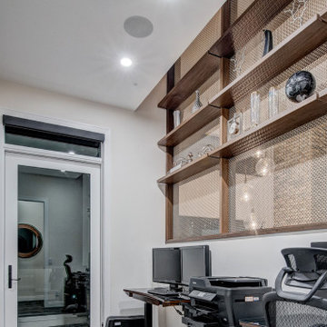
The double woven nature of the M22-83 pattern gives strength to this weave, making it a suitable option for a screen wall or space divider. The wire mesh application within this showhome office space acts as a partition that visually divides the front foyer while doubling as the back of a shelving wall. With the goal of creating a space that can be used as a flex-room or a working studio, the design team prioritized having natural light and a connection to the rest of the home. The Banker Wire mesh allows the sound and light to pass from the peripheral spaces through the length of the office space, with the trees in the transom windows located in the front foyer visible from behind the wire mesh divider wall. Additionally, the stainless steel and brass finish mirrors the wood millwork accents within the space, further adding to the masculine aesthetic of the design scheme while providing contrasting texture.

 Banker Wire
’s architectural woven mesh is a key design element in the Willow Park Showhome, built by Zen Custom Homes and designed by AstonMorrone Designs. Utilized in two separate applications within the home—as a wall divider in the office, and as a statement kitchen island feature—the designer relied on Banker Wire’s M22-83 wire mesh pattern to create visual separations that allow the light to pass through, without impeding the flow of the open-planned space.
Acting as a statement kitchen counter partition, M22-83’s stainless steel and brass finish brings warmth to the expansive, open kitchen. Fabricated within a red maple-colored wood frame, the wire mesh creates a dividing screen by connecting the bottom of the kitchen counter with the wood ceiling accent above, which spans the length and width of the counter. When lit by the kitchen ceiling lighting source, M22-83 is brought to life; created using a pair of nested helical crimped woven wires to define the circular mesh shape, this pattern’s doubled circle mesh creates unique reflective surfaces, allowing the light to pass through the mesh in varying ways. Similarly, this combination of stainless steel and brass gives off a colorful, luxurious aesthetic, where the depth and movement of the contrasting woven wires—of silver and gold tones—dynamically change as the viewer’s perspective shifts. In addition to creating a striking, statement background for the lights to reflect off of, this wood-mesh divider installation directs the line of sight towards the outside view of the home’s backyard.
The double woven nature of the M22-83 pattern gives strength to this weave, making it a suitable option for a screen wall or space divider. The wire mesh application within this showhome office space acts as a partition that visually divides the front foyer while doubling as the back of a shelving wall. With the goal of creating a space that can be used as a flex-room or a working studio, the design team prioritized having natural light and a connection to the rest of the home. The Banker Wire mesh allows the sound and light to pass from the peripheral spaces through the length of the office space, with the trees in the transom windows located in the front foyer visible from behind the wire mesh divider wall. Additionally, the stainless steel and brass finish mirrors the wood millwork accents within the space, further adding to the masculine aesthetic of the design scheme while providing contrasting texture.
 Rocky Tops Granite & Marble LLC
This project in Northeast Columbia brought together three different stones across the house, and that's not something we get to do every day. Marble in one space, quartzite in another, dolomite doing its own quiet work somewhere else. It's the kind of job that makes you slow down and think about where each material actually belongs instead of just picking one slab and running it everywhere.
The kitchen called for something that could handle the daily grind while still looking like a piece of natural stone should look, full of movement and depth. Quartzite earns its keep here. It reads like marble with all that soft veining and cool background color, but it's far harder and more resistant to etching from citrus, wine, or vinegar splashing around a busy counter. We templated it carefully to keep the veining moving in a way that feels natural across the runs, not chopped up or mismatched at the seams. That takes patience on the slab yard picking the right book match before it ever hits a saw.
The bathroom vanity is where the marble gets to shine. Marble on a vanity top makes sense in a way it doesn't always in a kitchen. Less traffic, less acid exposure, and it gets to just look good day after day with the veining catching the light over the sink. We kept the edge eased throughout the project, a simple softened line that doesn't compete with the stone itself. An eased edge is subtle, it just takes the sharp corner off the top so it feels comfortable under your hand and doesn't chip as easy as a square edge would over the years.
Dolomite showed up in the other space, and it's one of our favorite stones to work with because it splits the difference. It looks a lot like marble, softer tones, that same classic veining, but it's a good bit tougher and more stain resistant, which makes it a smart call anywhere you want that marble look without babying it constantly. Sealing still matters with all three of these stones. A good penetrating sealer keeps them looking right for years and makes cleanup simple, no special stuff needed, just soap and water day to day.
Jobs like this are why we like working across the Midlands. Northeast Columbia homes run the gamut from new builds to older houses getting a real refresh, and getting to move between marble, quartzite, and dolomite in one project keeps the work honest. Every stone got fabricated and set the way it should be, tight seams, clean eased edges, and a finish that'll hold up to real life in that kitchen and that bath for a long time to come.
 Banker Wire
’s architectural woven mesh is a key design element in the Willow Park Showhome, built by Zen Custom Homes and designed by AstonMorrone Designs. Utilized in two separate applications within the home—as a wall divider in the office, and as a statement kitchen island feature—the designer relied on Banker Wire’s M22-83 wire mesh pattern to create visual separations that allow the light to pass through, without impeding the flow of the open-planned space.
Acting as a statement kitchen counter partition, M22-83’s stainless steel and brass finish brings warmth to the expansive, open kitchen. Fabricated within a red maple-colored wood frame, the wire mesh creates a dividing screen by connecting the bottom of the kitchen counter with the wood ceiling accent above, which spans the length and width of the counter. When lit by the kitchen ceiling lighting source, M22-83 is brought to life; created using a pair of nested helical crimped woven wires to define the circular mesh shape, this pattern’s doubled circle mesh creates unique reflective surfaces, allowing the light to pass through the mesh in varying ways. Similarly, this combination of stainless steel and brass gives off a colorful, luxurious aesthetic, where the depth and movement of the contrasting woven wires—of silver and gold tones—dynamically change as the viewer’s perspective shifts. In addition to creating a striking, statement background for the lights to reflect off of, this wood-mesh divider installation directs the line of sight towards the outside view of the home’s backyard.
The double woven nature of the M22-83 pattern gives strength to this weave, making it a suitable option for a screen wall or space divider. The wire mesh application within this showhome office space acts as a partition that visually divides the front foyer while doubling as the back of a shelving wall. With the goal of creating a space that can be used as a flex-room or a working studio, the design team prioritized having natural light and a connection to the rest of the home. The Banker Wire mesh allows the sound and light to pass from the peripheral spaces through the length of the office space, with the trees in the transom windows located in the front foyer visible from behind the wire mesh divider wall. Additionally, the stainless steel and brass finish mirrors the wood millwork accents within the space, further adding to the masculine aesthetic of the design scheme while providing contrasting texture.
 Rocky Tops Granite & Marble LLC
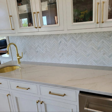
This project in Northeast Columbia brought together three different stones across the house, and that's not something we get to do every day. Marble in one space, quartzite in another, dolomite doing its own quiet work somewhere else. It's the kind of job that makes you slow down and think about where each material actually belongs instead of just picking one slab and running it everywhere.
The kitchen called for something that could handle the daily grind while still looking like a piece of natural stone should look, full of movement and depth. Quartzite earns its keep here. It reads like marble with all that soft veining and cool background color, but it's far harder and more resistant to etching from citrus, wine, or vinegar splashing around a busy counter. We templated it carefully to keep the veining moving in a way that feels natural across the runs, not chopped up or mismatched at the seams. That takes patience on the slab yard picking the right book match before it ever hits a saw.
The bathroom vanity is where the marble gets to shine. Marble on a vanity top makes sense in a way it doesn't always in a kitchen. Less traffic, less acid exposure, and it gets to just look good day after day with the veining catching the light over the sink. We kept the edge eased throughout the project, a simple softened line that doesn't compete with the stone itself. An eased edge is subtle, it just takes the sharp corner off the top so it feels comfortable under your hand and doesn't chip as easy as a square edge would over the years.
Dolomite showed up in the other space, and it's one of our favorite stones to work with because it splits the difference. It looks a lot like marble, softer tones, that same classic veining, but it's a good bit tougher and more stain resistant, which makes it a smart call anywhere you want that marble look without babying it constantly. Sealing still matters with all three of these stones. A good penetrating sealer keeps them looking right for years and makes cleanup simple, no special stuff needed, just soap and water day to day.
Jobs like this are why we like working across the Midlands. Northeast Columbia homes run the gamut from new builds to older houses getting a real refresh, and getting to move between marble, quartzite, and dolomite in one project keeps the work honest. Every stone got fabricated and set the way it should be, tight seams, clean eased edges, and a finish that'll hold up to real life in that kitchen and that bath for a long time to come.
 Rocky Tops Granite & Marble LLC
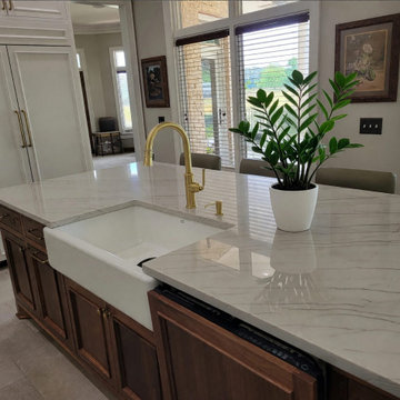
This project in Northeast Columbia brought together three different stones across the house, and that's not something we get to do every day. Marble in one space, quartzite in another, dolomite doing its own quiet work somewhere else. It's the kind of job that makes you slow down and think about where each material actually belongs instead of just picking one slab and running it everywhere.
The kitchen called for something that could handle the daily grind while still looking like a piece of natural stone should look, full of movement and depth. Quartzite earns its keep here. It reads like marble with all that soft veining and cool background color, but it's far harder and more resistant to etching from citrus, wine, or vinegar splashing around a busy counter. We templated it carefully to keep the veining moving in a way that feels natural across the runs, not chopped up or mismatched at the seams. That takes patience on the slab yard picking the right book match before it ever hits a saw.
The bathroom vanity is where the marble gets to shine. Marble on a vanity top makes sense in a way it doesn't always in a kitchen. Less traffic, less acid exposure, and it gets to just look good day after day with the veining catching the light over the sink. We kept the edge eased throughout the project, a simple softened line that doesn't compete with the stone itself. An eased edge is subtle, it just takes the sharp corner off the top so it feels comfortable under your hand and doesn't chip as easy as a square edge would over the years.
Dolomite showed up in the other space, and it's one of our favorite stones to work with because it splits the difference. It looks a lot like marble, softer tones, that same classic veining, but it's a good bit tougher and more stain resistant, which makes it a smart call anywhere you want that marble look without babying it constantly. Sealing still matters with all three of these stones. A good penetrating sealer keeps them looking right for years and makes cleanup simple, no special stuff needed, just soap and water day to day.
Jobs like this are why we like working across the Midlands. Northeast Columbia homes run the gamut from new builds to older houses getting a real refresh, and getting to move between marble, quartzite, and dolomite in one project keeps the work honest. Every stone got fabricated and set the way it should be, tight seams, clean eased edges, and a finish that'll hold up to real life in that kitchen and that bath for a long time to come.
 Drury Design
THE SETUP
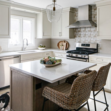
Client Background: Our clients, a couple who have transitioned into the empty nest phase, have cherished their home for over three decades without undergoing any significant renovations. With a newfound desire to adapt their living space to better suit their current lifestyle, they’ve embarked on a journey to reimagine their kitchen — the heart of their home. Their aspiration is to cultivate a serene, neutral-toned sanctuary on the first floor that seamlessly merges with their family room, ensuring a harmonious and inviting environment.
Design Inspiration: The renovation is inspired by the couple’s penchant for soft, calming neutrals, using their cherished family room and the kitchen’s existing tile flooring as the cornerstone for the color scheme. This approach aims to foster a sense of warmth and tranquility throughout.
Design Objectives:
Harmonize the kitchen with the family room by adopting a soothing, neutral color scheme, ensuring a seamless flow across the first floor.
Enhance kitchen functionality with thoughtfully designed cabinetry, providing a designated place for every item and maximizing storage efficiency.
Cultivate an inviting and comfortable atmosphere that reflects the homeowners’ desire for a calm and relaxing space.
Design Challenges:
The homeowners wish to retain the existing kitchen tile flooring and integrate it into a refreshed, modern design.
Accommodating a dining area spacious enough for family visits without compromising the kitchen’s open feel or functional layout.
Despite liking the current placement of plumbing and appliances, the homeowners aspire for a more open floor plan to facilitate better movement and interaction.
The need to amplify natural light in the kitchen, especially around the sink area, where existing lighting is insufficient.
Preserving the half-wall between the kitchen and family room, a feature the homeowners want to keep, while ensuring it complements the new design.
THE RENEWED SPACE
Design Solutions:
By choosing a neutral color palette that complements the existing tile, the design unifies the kitchen with the adjacent spaces. The tile’s grout was cleaned and restored, enhancing the floor’s appearance and integrating it seamlessly with the new kitchen aesthetic.
The inclusion of a larger island with seating for two, alongside maintaining a substantial dining table, was achieved by optimizing the spatial layout. This allowed for a sociable yet functional kitchen, accommodating large family gatherings without feeling crowded.
Minor adjustments to the kitchen’s layout maintained the preferred locations for plumbing and appliances while introducing an ‘open’ design concept. Strategic modifications, such as angling the pantry wall, improved the flow and accessibility within the space.
Replacing the garden window with a broader, standard window significantly increased natural light, transforming the sink area into a bright, welcoming space with enhanced views of the outdoors.
The decision to keep the half-wall was ingeniously leveraged to define the dining area while maintaining an open connection to the family room. This feature not only serves as a visual separator but also ties the two spaces together through the shared color scheme and design elements.
The homeowners are thrilled with their newly remodeled kitchen, which has become a hub of warmth and hospitality. Hosting a wedding shower and a birthday party, they have shared their renewed space with friends and family, who have been equally enamored. This remodel has not only met their functional and aesthetic desires but has also enriched their home with a fresh sense of serenity and joy.
The upstairs part of the home is shaping up nicely. Here’s their newly remodeled primary bathroom.
 Rocky Tops Granite & Marble LLC
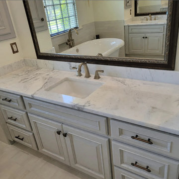
This project in Northeast Columbia brought together three different stones across the house, and that's not something we get to do every day. Marble in one space, quartzite in another, dolomite doing its own quiet work somewhere else. It's the kind of job that makes you slow down and think about where each material actually belongs instead of just picking one slab and running it everywhere.
The kitchen called for something that could handle the daily grind while still looking like a piece of natural stone should look, full of movement and depth. Quartzite earns its keep here. It reads like marble with all that soft veining and cool background color, but it's far harder and more resistant to etching from citrus, wine, or vinegar splashing around a busy counter. We templated it carefully to keep the veining moving in a way that feels natural across the runs, not chopped up or mismatched at the seams. That takes patience on the slab yard picking the right book match before it ever hits a saw.
The bathroom vanity is where the marble gets to shine. Marble on a vanity top makes sense in a way it doesn't always in a kitchen. Less traffic, less acid exposure, and it gets to just look good day after day with the veining catching the light over the sink. We kept the edge eased throughout the project, a simple softened line that doesn't compete with the stone itself. An eased edge is subtle, it just takes the sharp corner off the top so it feels comfortable under your hand and doesn't chip as easy as a square edge would over the years.
Dolomite showed up in the other space, and it's one of our favorite stones to work with because it splits the difference. It looks a lot like marble, softer tones, that same classic veining, but it's a good bit tougher and more stain resistant, which makes it a smart call anywhere you want that marble look without babying it constantly. Sealing still matters with all three of these stones. A good penetrating sealer keeps them looking right for years and makes cleanup simple, no special stuff needed, just soap and water day to day.
Jobs like this are why we like working across the Midlands. Northeast Columbia homes run the gamut from new builds to older houses getting a real refresh, and getting to move between marble, quartzite, and dolomite in one project keeps the work honest. Every stone got fabricated and set the way it should be, tight seams, clean eased edges, and a finish that'll hold up to real life in that kitchen and that bath for a long time to come.
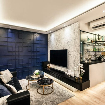
 M Atelier
Using the right furniture is an essential element of living room design. Interior designers take this into substantial consideration when planning a home design as it consumes the most space in the living room area. These furniture pieces are treated as “constants,” as once they are positioned in the room, other installments will adjust based on how and where they are placed.
You may not realise it right away, but there are things to consider when buying new living room furniture. If you happen to be thinking about changing your current living room design by purchasing new furniture pieces, then below are a few factors to look at:
1. Size of the home.
The furniture you intend to buy should not only fit in your home but leave enough room for you to move freely. You may want to look at the floor space of the living room first and then inquire about furniture sets that will fit in your allocated space.
A bulky 7-seater may eat up most of your living room space, and this will limit your freedom of movement. Perhaps it would be better to settle with a three or five-seater at the most whose make and structure do not impede your mobility.
2. Durability of the furniture.
Another reason interior designers have high regard for furniture when designing home interiors is that sofas and couches are intended to be used for several years. Hence, you should look for a set that can last for a long time.
You may want to check out furniture sets and compare their form, structure, and material. It is also great to look into the background of their makers, so you have an idea that your sofa is done by a reputable brand.
3. Comfortability.
Not all fluffy cushioned sofas are comfortable. Some of them can be stiff and may cause you pain the long run. Thus, when shopping for a couch, better test its comfortability before purchasing it.
You can check the ergonomics of the sofa or couch to see whether it accommodates your need for comfort without putting your posture at risk. Also, you should know the type of cushion used on the furniture. This way, you know when and how to have your sofa reupholstered or when it is time to dispose it.
4. Form and style.
It is also right that you look into the aesthetics of the furniture. You may have to go through several renovations in your home, and the style you will go for might not always adhere to the style of your sofa.
Hence, you may want to invest in living room furniture that can keep up with the sign of the times, or one that is not difficult to dress up. Some homeowners opt for a sofa set that is made of wood or minimalist steel due to their durability and flexibility to blend in with different home interior trends.
The living room often serves as a witness to your life as a homeowner. With the right choice of furniture, you can enjoy every memory you make in your home.

 Prestige Custom Building & Construction, Inc.
Staircase - mid-sized traditional wooden straight wood railing staircase idea in New York with painted risers
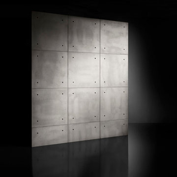
 Elit inc
Concrete wall paneling
Home design - mid-sized industrial one-story concrete gray home design idea in New York
Home design - mid-sized industrial one-story concrete gray home design idea in New York

 Budget Blinds of Cedar Falls / Waterloo, IA
Budget Blinds blackout roller shades, photo credit installer Adam Brannick
Example of a mid-sized transitional guest bedroom design in Cedar Rapids with gray walls and no fireplace
Example of a mid-sized transitional guest bedroom design in Cedar Rapids with gray walls and no fireplace
23