
Search results for "Bare bones" in Home Design Ideas
 Cape Associates, Inc.
Overthinking a situation isn’t always a bad thing, particularly when the home in question is one in which the past is suddenly meeting the present. Originally designed by Finnish architect Olav Hammarstrom in 1952 for fellow architect Eero Saarinen, this unique home recently received its first transformation in decades. Still in its 1950s skin, it was completely gutted, inside and out. It was a serious undertaking, as the homeowner wanted modern upgrades, while keeping an eye toward retaining the home’s 1950s charm. She had a vision for her home, and she stuck to it from beginning to end.
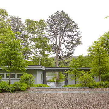
Perched on a rise of land and overlooking the tranquil Wellfleet Herring Pond, the home initially appears split, with the guest house on the left, and the main house of the right, but both ends are connected with a breezeway. The original home’s bones were in good shape, but many upgrades and replacements were necessary to bring the house up to date.
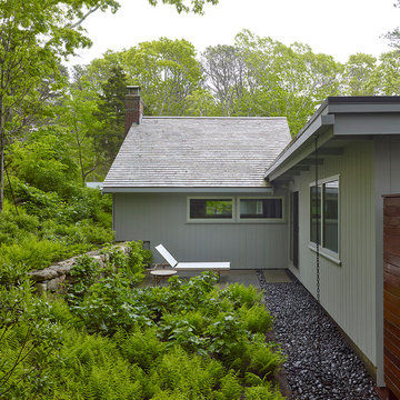
New siding, roofing, gutters, insulation and mechanical systems were all replaced. Doors and windows with metal frames were custom made by a company in Long Island that fabricates doors for office buildings. Modern heating and cooling systems were added, and the three bathrooms were all updated. The footprint of the home remained unchanged. Inside, the only expansion was more closet space.
The attention to detail in retaining the 50s-style look took a lot of online searching, from handles and knobs to lighting fixtures, with bits and pieces arriving from all over the world, including a doorstop from New Zealand. The homeowner selected many of the fixtures herself, while a very detail-oriented foreman exhaustively researched as well, looking for just the right piece for each and every location.
High-end appliances were purchased to modernize the kitchen and all of the old cabinetry was removed, replaced and refaced with NUVACOR, a versatile surfacing material that not only provided a sleek, modern look, but added convenience and ease of use.
Bare, wood-beamed ceilings throughout give a nod to the home’s natural surroundings, while the main living area (formerly a fisherman’s cabin), with a brick fireplace, was completely trimmed in walnut, while multiple windows of varying sizes welcome sunlight to brighten the home. Here, the sheetrock ceiling with faux rafters provides an interesting and room-brightening feature.
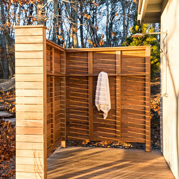
Behind the house sits the serene pond, which can now be enjoyed from the stunning new deck. Here, decking material was not laid out side by side, as it typically is but, instead, meticulously laid out on edge, creating an unusual and eye-catching effect. A railing of tempered glass panels allows unobstructed views of the surrounding natural beauty, and keeps consistent with the open, airy feel of the place. A new outdoor shower is accessible via the deck and left open to the wilderness and the pond below, completing the bold yet sophisticated feeling of this retro-modern home.
 Cape Associates, Inc.
Overthinking a situation isn’t always a bad thing, particularly when the home in question is one in which the past is suddenly meeting the present. Originally designed by Finnish architect Olav Hammarstrom in 1952 for fellow architect Eero Saarinen, this unique home recently received its first transformation in decades. Still in its 1950s skin, it was completely gutted, inside and out. It was a serious undertaking, as the homeowner wanted modern upgrades, while keeping an eye toward retaining the home’s 1950s charm. She had a vision for her home, and she stuck to it from beginning to end.
Perched on a rise of land and overlooking the tranquil Wellfleet Herring Pond, the home initially appears split, with the guest house on the left, and the main house of the right, but both ends are connected with a breezeway. The original home’s bones were in good shape, but many upgrades and replacements were necessary to bring the house up to date.
New siding, roofing, gutters, insulation and mechanical systems were all replaced. Doors and windows with metal frames were custom made by a company in Long Island that fabricates doors for office buildings. Modern heating and cooling systems were added, and the three bathrooms were all updated. The footprint of the home remained unchanged. Inside, the only expansion was more closet space.
The attention to detail in retaining the 50s-style look took a lot of online searching, from handles and knobs to lighting fixtures, with bits and pieces arriving from all over the world, including a doorstop from New Zealand. The homeowner selected many of the fixtures herself, while a very detail-oriented foreman exhaustively researched as well, looking for just the right piece for each and every location.
High-end appliances were purchased to modernize the kitchen and all of the old cabinetry was removed, replaced and refaced with NUVACOR, a versatile surfacing material that not only provided a sleek, modern look, but added convenience and ease of use.
Bare, wood-beamed ceilings throughout give a nod to the home’s natural surroundings, while the main living area (formerly a fisherman’s cabin), with a brick fireplace, was completely trimmed in walnut, while multiple windows of varying sizes welcome sunlight to brighten the home. Here, the sheetrock ceiling with faux rafters provides an interesting and room-brightening feature.
Behind the house sits the serene pond, which can now be enjoyed from the stunning new deck. Here, decking material was not laid out side by side, as it typically is but, instead, meticulously laid out on edge, creating an unusual and eye-catching effect. A railing of tempered glass panels allows unobstructed views of the surrounding natural beauty, and keeps consistent with the open, airy feel of the place. A new outdoor shower is accessible via the deck and left open to the wilderness and the pond below, completing the bold yet sophisticated feeling of this retro-modern home.
 Corinthian Fine Homes
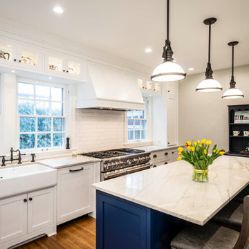
Our homeowners purchased this home for its excellent location and great bones. They were desirous of returning it to the era of it’s time while updating and modernizing it with the elegance it deserved. To add to our challenges, they were living out of the country during our design and renovation, making for great communications utilizing modern technology to ensure we could deliver what they hoped to achieve. We opened some space in the kitchen to create an updated and more functional kitchen for this active family, relocating appliances for efficiency, adding an island and relocating a chimney. We had structural challenges with the sagging hardwood floors, which required us to reframe floor systems, and while we were at it, we antique finished the hardwoods reminiscent of the 1940’s. We added wainscoting in the dining room and entry stair hallway to enhance the old-world look and added some arched openings to match other areas of the home. We also added custom moldings to the fireplace wall to allow it to shine as a focal point in the space, utilizing restored antique light fixtures. The finished result is stunning and truly honors the integrity of the original time period of this home.
Find the right local pro for your project
 Cape Associates, Inc.
Overthinking a situation isn’t always a bad thing, particularly when the home in question is one in which the past is suddenly meeting the present. Originally designed by Finnish architect Olav Hammarstrom in 1952 for fellow architect Eero Saarinen, this unique home recently received its first transformation in decades. Still in its 1950s skin, it was completely gutted, inside and out. It was a serious undertaking, as the homeowner wanted modern upgrades, while keeping an eye toward retaining the home’s 1950s charm. She had a vision for her home, and she stuck to it from beginning to end.
Perched on a rise of land and overlooking the tranquil Wellfleet Herring Pond, the home initially appears split, with the guest house on the left, and the main house of the right, but both ends are connected with a breezeway. The original home’s bones were in good shape, but many upgrades and replacements were necessary to bring the house up to date.
New siding, roofing, gutters, insulation and mechanical systems were all replaced. Doors and windows with metal frames were custom made by a company in Long Island that fabricates doors for office buildings. Modern heating and cooling systems were added, and the three bathrooms were all updated. The footprint of the home remained unchanged. Inside, the only expansion was more closet space.
The attention to detail in retaining the 50s-style look took a lot of online searching, from handles and knobs to lighting fixtures, with bits and pieces arriving from all over the world, including a doorstop from New Zealand. The homeowner selected many of the fixtures herself, while a very detail-oriented foreman exhaustively researched as well, looking for just the right piece for each and every location.
High-end appliances were purchased to modernize the kitchen and all of the old cabinetry was removed, replaced and refaced with NUVACOR, a versatile surfacing material that not only provided a sleek, modern look, but added convenience and ease of use.
Bare, wood-beamed ceilings throughout give a nod to the home’s natural surroundings, while the main living area (formerly a fisherman’s cabin), with a brick fireplace, was completely trimmed in walnut, while multiple windows of varying sizes welcome sunlight to brighten the home. Here, the sheetrock ceiling with faux rafters provides an interesting and room-brightening feature.
Behind the house sits the serene pond, which can now be enjoyed from the stunning new deck. Here, decking material was not laid out side by side, as it typically is but, instead, meticulously laid out on edge, creating an unusual and eye-catching effect. A railing of tempered glass panels allows unobstructed views of the surrounding natural beauty, and keeps consistent with the open, airy feel of the place. A new outdoor shower is accessible via the deck and left open to the wilderness and the pond below, completing the bold yet sophisticated feeling of this retro-modern home.
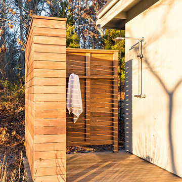 Cape Associates, Inc.
Overthinking a situation isn’t always a bad thing, particularly when the home in question is one in which the past is suddenly meeting the present. Originally designed by Finnish architect Olav Hammarstrom in 1952 for fellow architect Eero Saarinen, this unique home recently received its first transformation in decades. Still in its 1950s skin, it was completely gutted, inside and out. It was a serious undertaking, as the homeowner wanted modern upgrades, while keeping an eye toward retaining the home’s 1950s charm. She had a vision for her home, and she stuck to it from beginning to end.
Perched on a rise of land and overlooking the tranquil Wellfleet Herring Pond, the home initially appears split, with the guest house on the left, and the main house of the right, but both ends are connected with a breezeway. The original home’s bones were in good shape, but many upgrades and replacements were necessary to bring the house up to date.
New siding, roofing, gutters, insulation and mechanical systems were all replaced. Doors and windows with metal frames were custom made by a company in Long Island that fabricates doors for office buildings. Modern heating and cooling systems were added, and the three bathrooms were all updated. The footprint of the home remained unchanged. Inside, the only expansion was more closet space.
The attention to detail in retaining the 50s-style look took a lot of online searching, from handles and knobs to lighting fixtures, with bits and pieces arriving from all over the world, including a doorstop from New Zealand. The homeowner selected many of the fixtures herself, while a very detail-oriented foreman exhaustively researched as well, looking for just the right piece for each and every location.
High-end appliances were purchased to modernize the kitchen and all of the old cabinetry was removed, replaced and refaced with NUVACOR, a versatile surfacing material that not only provided a sleek, modern look, but added convenience and ease of use.
Bare, wood-beamed ceilings throughout give a nod to the home’s natural surroundings, while the main living area (formerly a fisherman’s cabin), with a brick fireplace, was completely trimmed in walnut, while multiple windows of varying sizes welcome sunlight to brighten the home. Here, the sheetrock ceiling with faux rafters provides an interesting and room-brightening feature.
Behind the house sits the serene pond, which can now be enjoyed from the stunning new deck. Here, decking material was not laid out side by side, as it typically is but, instead, meticulously laid out on edge, creating an unusual and eye-catching effect. A railing of tempered glass panels allows unobstructed views of the surrounding natural beauty, and keeps consistent with the open, airy feel of the place. A new outdoor shower is accessible via the deck and left open to the wilderness and the pond below, completing the bold yet sophisticated feeling of this retro-modern home.
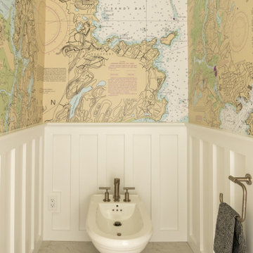
 Walczak Design And Build
When our clients came to us, their master bathroom was doing them no favors. An awkwardly oversized corner tub that hadn't seen a bubble bath in years, a shower barely large enough to turn around in, and a color palette best described as "contractor default." The bones were there — a generously sized footprint — but the space had zero personality and even less function.
Our first move was rethinking how the square footage was being used. Out went the hulking corner tub, and in its place: a spa-worthy walk-in shower that finally earns the space it occupies. Classic white subway tile with soft gray grout lines gives it a timeless foundation, while dual showerheads — a traditional wall-mount and a ceiling-mounted rain shower — turn every morning into something worth waking up for. Built-in niches keep everything organized without interrupting the clean aesthetic.
The commode room got a full character transplant. Wainscoting grounds the space with architectural detail, while a custom nautical map wallcovering wraps the room in something deeply personal — a curated cartographic love letter to the waterways and places that matter most to this family. The addition of a traditional pedestal bidet elevates both the function and the feeling of the space.
Back in the main bathroom, the clients' personality finally has a place to live. A bold, saturated blue on the custom double vanity cabinetry makes an unapologetic statement — the kind that makes you smile every time you walk in. Wall-mounted brushed nickel faucets and coordinating hardware keep the look polished and cohesive throughout. A heated towel rack and radiant heated floors are the quiet luxuries that tip this bathroom from "really nice" into "I never want to leave."
New windows flood the space with natural light, making the already generous footprint feel even more expansive and bringing out the best in every finish and material choice.
The result is a bathroom that works as hard as it looks good — and one that finally, unmistakably, feels like them.
 The Creative Kitchen Company
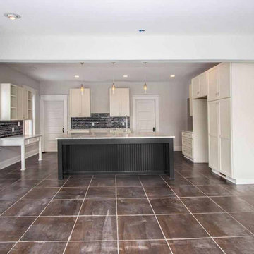
Built in 1889, this spacious farmhouse had great bones but the kitchen and mudroom area was stripped to the bare walls and left abandoned by previous occupants. The new owners wanted to create an open airy kitchen/dining gathering space. The kitchen includes a small desk space and opens to an expansive dining space.

 Cape Associates, Inc.
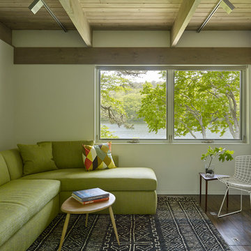
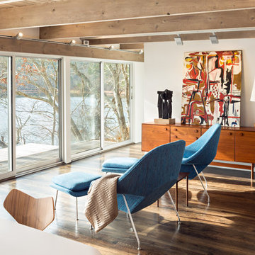
Overthinking a situation isn’t always a bad thing, particularly when the home in question is one in which the past is suddenly meeting the present. Originally designed by Finnish architect Olav Hammarstrom in 1952 for fellow architect Eero Saarinen, this unique home recently received its first transformation in decades. Still in its 1950s skin, it was completely gutted, inside and out. It was a serious undertaking, as the homeowner wanted modern upgrades, while keeping an eye toward retaining the home’s 1950s charm. She had a vision for her home, and she stuck to it from beginning to end.
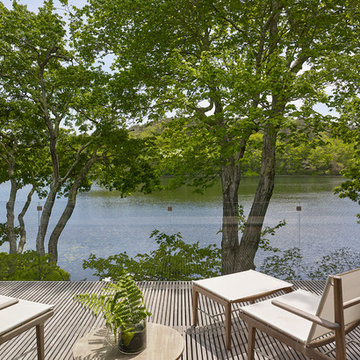
Perched on a rise of land and overlooking the tranquil Wellfleet Herring Pond, the home initially appears split, with the guest house on the left, and the main house of the right, but both ends are connected with a breezeway. The original home’s bones were in good shape, but many upgrades and replacements were necessary to bring the house up to date.
New siding, roofing, gutters, insulation and mechanical systems were all replaced. Doors and windows with metal frames were custom made by a company in Long Island that fabricates doors for office buildings. Modern heating and cooling systems were added, and the three bathrooms were all updated. The footprint of the home remained unchanged. Inside, the only expansion was more closet space.
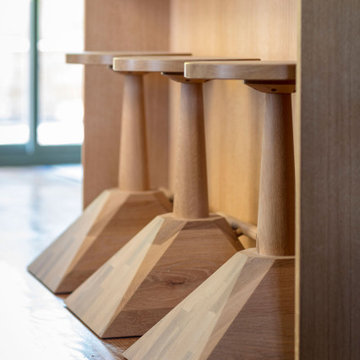
The attention to detail in retaining the 50s-style look took a lot of online searching, from handles and knobs to lighting fixtures, with bits and pieces arriving from all over the world, including a doorstop from New Zealand. The homeowner selected many of the fixtures herself, while a very detail-oriented foreman exhaustively researched as well, looking for just the right piece for each and every location.
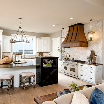
High-end appliances were purchased to modernize the kitchen and all of the old cabinetry was removed, replaced and refaced with NUVACOR, a versatile surfacing material that not only provided a sleek, modern look, but added convenience and ease of use.
Bare, wood-beamed ceilings throughout give a nod to the home’s natural surroundings, while the main living area (formerly a fisherman’s cabin), with a brick fireplace, was completely trimmed in walnut, while multiple windows of varying sizes welcome sunlight to brighten the home. Here, the sheetrock ceiling with faux rafters provides an interesting and room-brightening feature.
Behind the house sits the serene pond, which can now be enjoyed from the stunning new deck. Here, decking material was not laid out side by side, as it typically is but, instead, meticulously laid out on edge, creating an unusual and eye-catching effect. A railing of tempered glass panels allows unobstructed views of the surrounding natural beauty, and keeps consistent with the open, airy feel of the place. A new outdoor shower is accessible via the deck and left open to the wilderness and the pond below, completing the bold yet sophisticated feeling of this retro-modern home.
 Cape Associates, Inc.
Overthinking a situation isn’t always a bad thing, particularly when the home in question is one in which the past is suddenly meeting the present. Originally designed by Finnish architect Olav Hammarstrom in 1952 for fellow architect Eero Saarinen, this unique home recently received its first transformation in decades. Still in its 1950s skin, it was completely gutted, inside and out. It was a serious undertaking, as the homeowner wanted modern upgrades, while keeping an eye toward retaining the home’s 1950s charm. She had a vision for her home, and she stuck to it from beginning to end.
Perched on a rise of land and overlooking the tranquil Wellfleet Herring Pond, the home initially appears split, with the guest house on the left, and the main house of the right, but both ends are connected with a breezeway. The original home’s bones were in good shape, but many upgrades and replacements were necessary to bring the house up to date.
New siding, roofing, gutters, insulation and mechanical systems were all replaced. Doors and windows with metal frames were custom made by a company in Long Island that fabricates doors for office buildings. Modern heating and cooling systems were added, and the three bathrooms were all updated. The footprint of the home remained unchanged. Inside, the only expansion was more closet space.
The attention to detail in retaining the 50s-style look took a lot of online searching, from handles and knobs to lighting fixtures, with bits and pieces arriving from all over the world, including a doorstop from New Zealand. The homeowner selected many of the fixtures herself, while a very detail-oriented foreman exhaustively researched as well, looking for just the right piece for each and every location.
High-end appliances were purchased to modernize the kitchen and all of the old cabinetry was removed, replaced and refaced with NUVACOR, a versatile surfacing material that not only provided a sleek, modern look, but added convenience and ease of use.
Bare, wood-beamed ceilings throughout give a nod to the home’s natural surroundings, while the main living area (formerly a fisherman’s cabin), with a brick fireplace, was completely trimmed in walnut, while multiple windows of varying sizes welcome sunlight to brighten the home. Here, the sheetrock ceiling with faux rafters provides an interesting and room-brightening feature.
Behind the house sits the serene pond, which can now be enjoyed from the stunning new deck. Here, decking material was not laid out side by side, as it typically is but, instead, meticulously laid out on edge, creating an unusual and eye-catching effect. A railing of tempered glass panels allows unobstructed views of the surrounding natural beauty, and keeps consistent with the open, airy feel of the place. A new outdoor shower is accessible via the deck and left open to the wilderness and the pond below, completing the bold yet sophisticated feeling of this retro-modern home.
 Ana Claudia Design
Tucked into a leafy street in Sleightsburgh across from Kingston’s Rondout waterfront sits a freshly reborn 19th-century Second Empire home with a mansard roof that gleams like an epaulet in the autumn light. It’s the site of the seventh annual Kingston Design Showhouse—an event that’s equal parts creative laboratory, professional showcase, and social mixer for the Hudson Valley design community—that runs through October 26.
The house at 271 Second Avenue had good bones when designer Ana Claudia of Rhinebeck-based Ana Claudia Design took on its gut renovation earlier this year. The transformation added a third bedroom and bath, and—hallelujah—closets in every bedroom. Claudia oversaw the architectural overhaul and designed the showhouse’s open kitchen and dining room, a bright, breezy space that wears its sophistication lightly. Her bird-patterned green wallpaper from Fromental flutters above a handcrafted dining table, bench, and stools by Stone Ridge woodworker Andrew Finnegan. Ceiling lights and sconces from Kingston-based RBW cast the room in warm modern light, while clear switch plates by Corston add a note of barely-there precision. It’s the sort of room that makes you think life could be this orderly and elegant, if only for a weekend.
 Cape Associates, Inc.
Overthinking a situation isn’t always a bad thing, particularly when the home in question is one in which the past is suddenly meeting the present. Originally designed by Finnish architect Olav Hammarstrom in 1952 for fellow architect Eero Saarinen, this unique home recently received its first transformation in decades. Still in its 1950s skin, it was completely gutted, inside and out. It was a serious undertaking, as the homeowner wanted modern upgrades, while keeping an eye toward retaining the home’s 1950s charm. She had a vision for her home, and she stuck to it from beginning to end.
Perched on a rise of land and overlooking the tranquil Wellfleet Herring Pond, the home initially appears split, with the guest house on the left, and the main house of the right, but both ends are connected with a breezeway. The original home’s bones were in good shape, but many upgrades and replacements were necessary to bring the house up to date.
New siding, roofing, gutters, insulation and mechanical systems were all replaced. Doors and windows with metal frames were custom made by a company in Long Island that fabricates doors for office buildings. Modern heating and cooling systems were added, and the three bathrooms were all updated. The footprint of the home remained unchanged. Inside, the only expansion was more closet space.
The attention to detail in retaining the 50s-style look took a lot of online searching, from handles and knobs to lighting fixtures, with bits and pieces arriving from all over the world, including a doorstop from New Zealand. The homeowner selected many of the fixtures herself, while a very detail-oriented foreman exhaustively researched as well, looking for just the right piece for each and every location.
High-end appliances were purchased to modernize the kitchen and all of the old cabinetry was removed, replaced and refaced with NUVACOR, a versatile surfacing material that not only provided a sleek, modern look, but added convenience and ease of use.
Bare, wood-beamed ceilings throughout give a nod to the home’s natural surroundings, while the main living area (formerly a fisherman’s cabin), with a brick fireplace, was completely trimmed in walnut, while multiple windows of varying sizes welcome sunlight to brighten the home. Here, the sheetrock ceiling with faux rafters provides an interesting and room-brightening feature.
Behind the house sits the serene pond, which can now be enjoyed from the stunning new deck. Here, decking material was not laid out side by side, as it typically is but, instead, meticulously laid out on edge, creating an unusual and eye-catching effect. A railing of tempered glass panels allows unobstructed views of the surrounding natural beauty, and keeps consistent with the open, airy feel of the place. A new outdoor shower is accessible via the deck and left open to the wilderness and the pond below, completing the bold yet sophisticated feeling of this retro-modern home.
 Kate Roos Design LLC
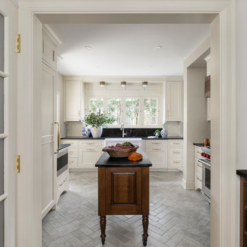
This 1930’s gem did not have a functional, beautiful kitchen. In fact, many cabinets barely opened, and some appliances didn’t even work.
The top priority was to replace the cabinetry, appliances, and finishes in the main kitchen and butler’s pantry for better functionality. The original footprint was kept mostly intact, with only minor adjustments to improve flow, connectivity, and layout. Custom cabinetry was designed to enhance storage, and a suite of high-performance appliances was installed. Finishes like a herringbone tile floor and soapstone countertops were chosen for longevity and durability.
The secondary goal was to match the beauty of the rest of the home, with traditional elements, symmetry, and warmth. Details like fluting on the range hood and a unique corbel shape mirror original moldings. Stained oak accents were color-matched to the home’s existing woodwork. White oak cabinet interiors and custom inserts create a furniture-like feel.
The finished design blends seamlessly into the historic home, and also enhances functionality for day-to-day living, hosting, and gathering.
 Walczak Design And Build
When our clients came to us, their master bathroom was doing them no favors. An awkwardly oversized corner tub that hadn't seen a bubble bath in years, a shower barely large enough to turn around in, and a color palette best described as "contractor default." The bones were there — a generously sized footprint — but the space had zero personality and even less function.
Our first move was rethinking how the square footage was being used. Out went the hulking corner tub, and in its place: a spa-worthy walk-in shower that finally earns the space it occupies. Classic white subway tile with soft gray grout lines gives it a timeless foundation, while dual showerheads — a traditional wall-mount and a ceiling-mounted rain shower — turn every morning into something worth waking up for. Built-in niches keep everything organized without interrupting the clean aesthetic.
The commode room got a full character transplant. Wainscoting grounds the space with architectural detail, while a custom nautical map wallcovering wraps the room in something deeply personal — a curated cartographic love letter to the waterways and places that matter most to this family. The addition of a traditional pedestal bidet elevates both the function and the feeling of the space.
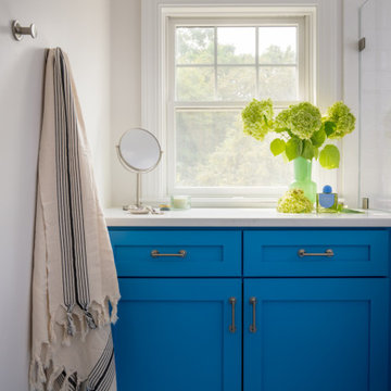
Back in the main bathroom, the clients' personality finally has a place to live. A bold, saturated blue on the custom double vanity cabinetry makes an unapologetic statement — the kind that makes you smile every time you walk in. Wall-mounted brushed nickel faucets and coordinating hardware keep the look polished and cohesive throughout. A heated towel rack and radiant heated floors are the quiet luxuries that tip this bathroom from "really nice" into "I never want to leave."
New windows flood the space with natural light, making the already generous footprint feel even more expansive and bringing out the best in every finish and material choice.
The result is a bathroom that works as hard as it looks good — and one that finally, unmistakably, feels like them.
 Walczak Design And Build
When our clients came to us, their master bathroom was doing them no favors. An awkwardly oversized corner tub that hadn't seen a bubble bath in years, a shower barely large enough to turn around in, and a color palette best described as "contractor default." The bones were there — a generously sized footprint — but the space had zero personality and even less function.
Our first move was rethinking how the square footage was being used. Out went the hulking corner tub, and in its place: a spa-worthy walk-in shower that finally earns the space it occupies. Classic white subway tile with soft gray grout lines gives it a timeless foundation, while dual showerheads — a traditional wall-mount and a ceiling-mounted rain shower — turn every morning into something worth waking up for. Built-in niches keep everything organized without interrupting the clean aesthetic.
The commode room got a full character transplant. Wainscoting grounds the space with architectural detail, while a custom nautical map wallcovering wraps the room in something deeply personal — a curated cartographic love letter to the waterways and places that matter most to this family. The addition of a traditional pedestal bidet elevates both the function and the feeling of the space.
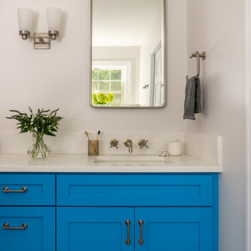
Back in the main bathroom, the clients' personality finally has a place to live. A bold, saturated blue on the custom double vanity cabinetry makes an unapologetic statement — the kind that makes you smile every time you walk in. Wall-mounted brushed nickel faucets and coordinating hardware keep the look polished and cohesive throughout. A heated towel rack and radiant heated floors are the quiet luxuries that tip this bathroom from "really nice" into "I never want to leave."
New windows flood the space with natural light, making the already generous footprint feel even more expansive and bringing out the best in every finish and material choice.
The result is a bathroom that works as hard as it looks good — and one that finally, unmistakably, feels like them.
 Phoenix Home Remodeling
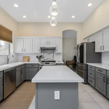
Mary & Bohan were fun to work with. They loved their home and have plans to live there for the long term, However, their kitchen did not reflect who they were, and wanted to have a modern kitchen to enjoy and add functionalities.
The layout and function met their needs, but the overall all colors fell flat when it came to the cabinetry and countertops. The bones of the cabinets were strong, so they opted to have the cabinetry refinished. This created an opportunity to have a two-toned cabinet package. The upper cabinets we refinished to Pure White, and the base cabinets are Dovetail, both colors are from Sherwin Williams.
Simple, but supportive quartz was selected for the countertops. Portofino Classico Quartz countertops from Arizona Tile, which along with the refinished cabinets give a clean and elegant feel.
The backsplash tile was installed using Arizona Tile Bare White Subway 3X12 in a offset pattern. To break up the repetitive pattern we used dome liner that frames accent tile above range, and Arizona Tile Themar Statuario Matte 24X24 accent tile above range.
 Ana Claudia Design
Tucked into a leafy street in Sleightsburgh across from Kingston’s Rondout waterfront sits a freshly reborn 19th-century Second Empire home with a mansard roof that gleams like an epaulet in the autumn light. It’s the site of the seventh annual Kingston Design Showhouse—an event that’s equal parts creative laboratory, professional showcase, and social mixer for the Hudson Valley design community—that runs through October 26.
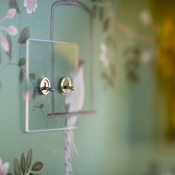
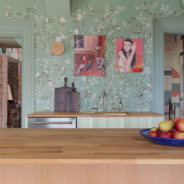
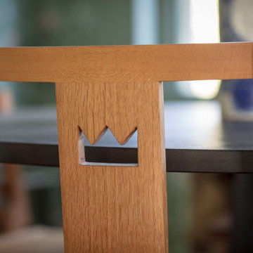
The house at 271 Second Avenue had good bones when designer Ana Claudia of Rhinebeck-based Ana Claudia Design took on its gut renovation earlier this year. The transformation added a third bedroom and bath, and—hallelujah—closets in every bedroom. Claudia oversaw the architectural overhaul and designed the showhouse’s open kitchen and dining room, a bright, breezy space that wears its sophistication lightly. Her bird-patterned green wallpaper from Fromental flutters above a handcrafted dining table, bench, and stools by Stone Ridge woodworker Andrew Finnegan. Ceiling lights and sconces from Kingston-based RBW cast the room in warm modern light, while clear switch plates by Corston add a note of barely-there precision. It’s the sort of room that makes you think life could be this orderly and elegant, if only for a weekend.
 Ana Claudia Design
Tucked into a leafy street in Sleightsburgh across from Kingston’s Rondout waterfront sits a freshly reborn 19th-century Second Empire home with a mansard roof that gleams like an epaulet in the autumn light. It’s the site of the seventh annual Kingston Design Showhouse—an event that’s equal parts creative laboratory, professional showcase, and social mixer for the Hudson Valley design community—that runs through October 26.
The house at 271 Second Avenue had good bones when designer Ana Claudia of Rhinebeck-based Ana Claudia Design took on its gut renovation earlier this year. The transformation added a third bedroom and bath, and—hallelujah—closets in every bedroom. Claudia oversaw the architectural overhaul and designed the showhouse’s open kitchen and dining room, a bright, breezy space that wears its sophistication lightly. Her bird-patterned green wallpaper from Fromental flutters above a handcrafted dining table, bench, and stools by Stone Ridge woodworker Andrew Finnegan. Ceiling lights and sconces from Kingston-based RBW cast the room in warm modern light, while clear switch plates by Corston add a note of barely-there precision. It’s the sort of room that makes you think life could be this orderly and elegant, if only for a weekend.
 Ana Claudia Design
Tucked into a leafy street in Sleightsburgh across from Kingston’s Rondout waterfront sits a freshly reborn 19th-century Second Empire home with a mansard roof that gleams like an epaulet in the autumn light. It’s the site of the seventh annual Kingston Design Showhouse—an event that’s equal parts creative laboratory, professional showcase, and social mixer for the Hudson Valley design community—that runs through October 26.
The house at 271 Second Avenue had good bones when designer Ana Claudia of Rhinebeck-based Ana Claudia Design took on its gut renovation earlier this year. The transformation added a third bedroom and bath, and—hallelujah—closets in every bedroom. Claudia oversaw the architectural overhaul and designed the showhouse’s open kitchen and dining room, a bright, breezy space that wears its sophistication lightly. Her bird-patterned green wallpaper from Fromental flutters above a handcrafted dining table, bench, and stools by Stone Ridge woodworker Andrew Finnegan. Ceiling lights and sconces from Kingston-based RBW cast the room in warm modern light, while clear switch plates by Corston add a note of barely-there precision. It’s the sort of room that makes you think life could be this orderly and elegant, if only for a weekend.
 Walczak Design And Build
When our clients came to us, their master bathroom was doing them no favors. An awkwardly oversized corner tub that hadn't seen a bubble bath in years, a shower barely large enough to turn around in, and a color palette best described as "contractor default." The bones were there — a generously sized footprint — but the space had zero personality and even less function.
Our first move was rethinking how the square footage was being used. Out went the hulking corner tub, and in its place: a spa-worthy walk-in shower that finally earns the space it occupies. Classic white subway tile with soft gray grout lines gives it a timeless foundation, while dual showerheads — a traditional wall-mount and a ceiling-mounted rain shower — turn every morning into something worth waking up for. Built-in niches keep everything organized without interrupting the clean aesthetic.
The commode room got a full character transplant. Wainscoting grounds the space with architectural detail, while a custom nautical map wallcovering wraps the room in something deeply personal — a curated cartographic love letter to the waterways and places that matter most to this family. The addition of a traditional pedestal bidet elevates both the function and the feeling of the space.
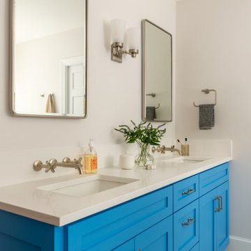
Back in the main bathroom, the clients' personality finally has a place to live. A bold, saturated blue on the custom double vanity cabinetry makes an unapologetic statement — the kind that makes you smile every time you walk in. Wall-mounted brushed nickel faucets and coordinating hardware keep the look polished and cohesive throughout. A heated towel rack and radiant heated floors are the quiet luxuries that tip this bathroom from "really nice" into "I never want to leave."
New windows flood the space with natural light, making the already generous footprint feel even more expansive and bringing out the best in every finish and material choice.
The result is a bathroom that works as hard as it looks good — and one that finally, unmistakably, feels like them.
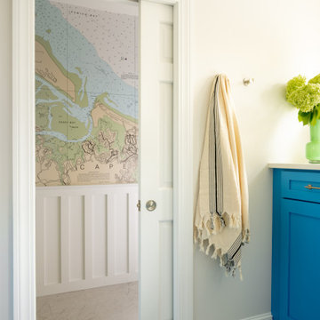 Walczak Design And Build
When our clients came to us, their master bathroom was doing them no favors. An awkwardly oversized corner tub that hadn't seen a bubble bath in years, a shower barely large enough to turn around in, and a color palette best described as "contractor default." The bones were there — a generously sized footprint — but the space had zero personality and even less function.
Our first move was rethinking how the square footage was being used. Out went the hulking corner tub, and in its place: a spa-worthy walk-in shower that finally earns the space it occupies. Classic white subway tile with soft gray grout lines gives it a timeless foundation, while dual showerheads — a traditional wall-mount and a ceiling-mounted rain shower — turn every morning into something worth waking up for. Built-in niches keep everything organized without interrupting the clean aesthetic.
The commode room got a full character transplant. Wainscoting grounds the space with architectural detail, while a custom nautical map wallcovering wraps the room in something deeply personal — a curated cartographic love letter to the waterways and places that matter most to this family. The addition of a traditional pedestal bidet elevates both the function and the feeling of the space.
Back in the main bathroom, the clients' personality finally has a place to live. A bold, saturated blue on the custom double vanity cabinetry makes an unapologetic statement — the kind that makes you smile every time you walk in. Wall-mounted brushed nickel faucets and coordinating hardware keep the look polished and cohesive throughout. A heated towel rack and radiant heated floors are the quiet luxuries that tip this bathroom from "really nice" into "I never want to leave."
New windows flood the space with natural light, making the already generous footprint feel even more expansive and bringing out the best in every finish and material choice.
The result is a bathroom that works as hard as it looks good — and one that finally, unmistakably, feels like them.
14