
Search results for "Base understanding" in Home Design Ideas
 Tile Doctor Ltd
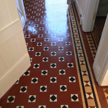
This Victorian tiled hallway was one of the most beautiful Victorian floors I have ever had the pleasure to work on. With the wide range of patterns and colours they are available in, it seems no two Victorian tiled floors are exactly the same, and this uniqueness is part of what makes them so appealing to property owners.
Unfortunately, this floor had been poorly maintained over the years, even suffering from a few loose and missing tiles. There was a thick coating of dust and dirt soiling its appearance, and the property owner was understandably keen to remedy the situation. Having realised that everyday household cleaners are not likely to achieve great results, she asked me to carry out a full professional restoration, including making some repairs where necessary. I was pleasantly surprised to find out that this property was situated in the town of Wyken, which is a few miles outside of Coventry city centre and in fact just down the road from where I live myself!
Before making a start on the cleaning process, it was first necessary to re-fix the small number of loose tiles and replace a single missing tile by the radiator. Fortunately, I’ve been working on these types of floors for some time and have built up a good collection of replacement Victorian tiles so I was able to find one that matched in nicely with the rest of the floor without too much problem.
To clean the tiles, I began by applying a layer of Tile Doctor Oxy-Gel directly into the floor with a small brush. This product is very similar to the popular Tile Doctor Pro Clean: both are strong alkaline cleaners, strippers and degreasers, with the main difference being that Oxy-Clean comes in a gel form, making it easier to control and therefore ideal for precise cleaning, or for application to vertical surfaces. Like Pro Clean and being an alkaline base it is suitable for use on all types of natural stone and tile. The Oxy-Gel was left to soak into the tiles for around ten minutes before being scrubbed in and then rinsed off carefully with water, I then used a wet vacuum to extract the now soiled cleaning solution off the floor.
The next step was to acid wash the floor using Tile Doctor Acid Gel; this served to break down alkaline mineral deposits inherent in the grout along with some excess grout that had been left on the untidily left on tile from installation. It is recommended not to use this product on acid-sensitive soon such as Marble and Limestone as it can cause irreparable etching but its fine on Victorian tiles as long as you don’t leave it on too long.
Finally, the floor was given a rinse with clean water to remove any trace of chemicals from the cleaning and to neutralise the area in preparation for sealing.
I left the floor for 48 hours to dry before returning to the property to seal the tiles. This allowed plenty of time for the floor to dry completely, which is important as any excess moisture can damage the ability of the sealer to protect against dirt and stains.
My choice of sealer for this floor was Tile Doctor High Shine; three coats in total were applied, providing – as the product name suggests – the high shine finish that the customer had requested. The sealer will provide durable surface protection going forward preventing dirt from becoming ingrained into the pores of the tile and ensuring it remains easy to clean and keeping its appearance for some time to come.
As a big fan of Victorian tiles, it was a great pleasure to restore this floor, and my customer was certainly pleased too. It’s amazing how far a little professional maintenance can go to improving the appearance of these fantastic types of floor.
Mick Gayton
Warwickshire Tile Doctor
 Rudloff Custom Builders
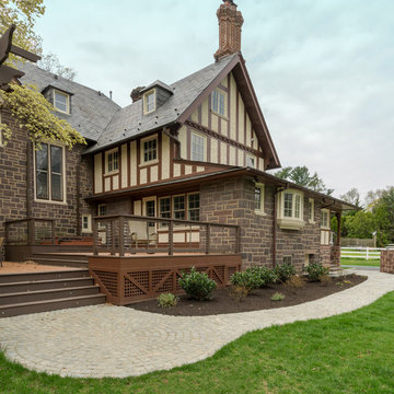
Off the back of the house is a very private deck made of Azek. It has a redwood cedar open trellis over the hot tub. The stone walkway was constructed out of reclaimed Belgian block and was laid in circular pattern.
In this classic English Tudor home located in Penn Valley, PA, we renovated the kitchen, mudroom, deck, patio, and the exterior walkways and driveway. The European kitchen features high end finishes and appliances, and heated floors for year-round comfort! The outdoor areas are spacious and inviting. The open trellis over the hot tub provides just the right amount of shelter. These clients were referred to us by their architect, and we had a great time working with them to mix classic European styles in with contemporary, current spaces.
Rudloff Custom Builders has won Best of Houzz for Customer Service in 2014, 2015 2016, 2017 and 2019. We also were voted Best of Design in 2016, 2017, 2018, 2019 which only 2% of professionals receive. Rudloff Custom Builders has been featured on Houzz in their Kitchen of the Week, What to Know About Using Reclaimed Wood in the Kitchen as well as included in their Bathroom WorkBook article. We are a full service, certified remodeling company that covers all of the Philadelphia suburban area. This business, like most others, developed from a friendship of young entrepreneurs who wanted to make a difference in their clients’ lives, one household at a time. This relationship between partners is much more than a friendship. Edward and Stephen Rudloff are brothers who have renovated and built custom homes together paying close attention to detail. They are carpenters by trade and understand concept and execution. Rudloff Custom Builders will provide services for you with the highest level of professionalism, quality, detail, punctuality and craftsmanship, every step of the way along our journey together.
Specializing in residential construction allows us to connect with our clients early in the design phase to ensure that every detail is captured as you imagined. One stop shopping is essentially what you will receive with Rudloff Custom Builders from design of your project to the construction of your dreams, executed by on-site project managers and skilled craftsmen. Our concept: envision our client’s ideas and make them a reality. Our mission: CREATING LIFETIME RELATIONSHIPS BUILT ON TRUST AND INTEGRITY.
Photo Credit: Linda McManus Images
 San Luis Kitchen Co.
When the homeowners decided to move from San Francisco to the Central Coast, they were looking for a more relaxed lifestyle, a unique place to call their own, and an environment conducive to raising their young children. They found it all in San Luis Obispo. They had owned a house here in SLO for several years that they had used as a rental. As the homeowners own and run a contracting business and relocation was not impossible, they decided to move their business and make this SLO rental into their dream home.
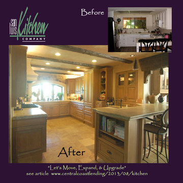
As a rental, the house was in a bare-bones condition. The kitchen had old white cabinets, boring white tile counters, and a horrendous vinyl tile floor. Not only was the kitchen out-of-date and old-fashioned, it was also pretty worn out. The tiles were cracking and the grout was stained, the cabinet doors were sagging, and the appliances were conflicting (ie: you could not open the stove and dishwasher at the same time).
To top it all off, the kitchen was just too small for the custom home the homeowners wanted to create.
Thus enters San Luis Kitchen. At the beginning of their quest to remodel, the homeowners visited San Luis Kitchen’s showroom and fell in love with our Tuscan Grotto display. They sat down with our designers and together we worked out the scope of the project, the budget for cabinetry and how that fit into their overall budget, and then we worked on the new design for the home starting with the kitchen.
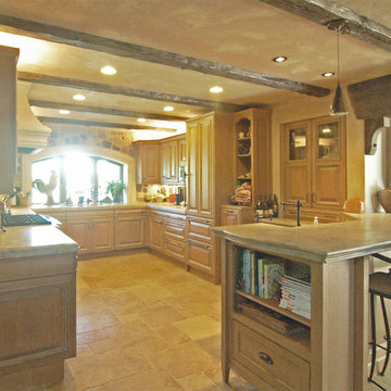
As the homeowners felt the kitchen was cramped, it was decided to expand by moving the window wall out onto the existing porch. Besides the extra space gained, moving the wall brought the kitchen window out from under the porch roof – increasing the natural light available in the space. (It really helps when the homeowner both understands building and can do his own contracting and construction.) A new arched window and stone clad wall now highlights the end of the kitchen. As we gained wall space, we were able to move the range and add a plaster hood, creating a focal nice focal point for the kitchen.
The other long wall now houses a Sub-Zero refrigerator and lots of counter workspace. Then we completed the kitchen by adding a wrap-around wet bar extending into the old dining space. We included a pull-out pantry unit with open shelves above it, wine cubbies, a cabinet for glassware recessed into the wall, under-counter refrigerator drawers, sink base and trash cabinet, along with a decorative bookcase cabinet and bar seating. Lots of function in this corner of the kitchen; a bar for entertaining and a snack station for the kids.
After the kitchen design was finalized and ordered, the homeowners turned their attention to the rest of the house. They asked San Luis Kitchen to help with their master suite, a guest bath, their home control center (essentially a deck tucked under the main staircase) and finally their laundry room. Here are the photos:
I wish I could show you the rest of the house. The homeowners took a poor rental house and turned it into a showpiece! They added custom concrete floors, unique fiber optic lighting, large picture windows, and much more. There is now an outdoor kitchen complete with pizza oven, an outdoor shower and exquisite garden. They added a dedicated dog run to the side yard for their pooches and a rooftop deck at the very peak. Such a fun house.
Wood-Mode Fine Custom Cabinetry, Barcelona
Find the right local pro for your project
 San Luis Kitchen Co.
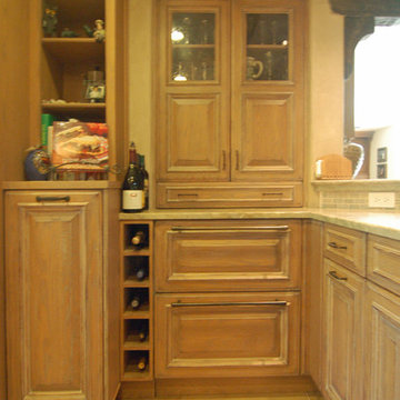
Tuscan design using a burnished & glazed finish on oak cabinets by Wood-Mode. The columns either side of the range pull out with spice and bottle storage behind. The curved profile of the top drawer-heads extends around the kitchen.
When the homeowners decided to move from San Francisco to the Central Coast, they were looking for a more relaxed lifestyle, a unique place to call their own, and an environment conducive to raising their young children. They found it all in San Luis Obispo. They had owned a house here in SLO for several years that they had used as a rental. As the homeowners own and run a contracting business and relocation was not impossible, they decided to move their business and make this SLO rental into their dream home.
As a rental, the house was in a bare-bones condition. The kitchen had old white cabinets, boring white tile counters, and a horrendous vinyl tile floor. Not only was the kitchen out-of-date and old-fashioned, it was also pretty worn out. The tiles were cracking and the grout was stained, the cabinet doors were sagging, and the appliances were conflicting (ie: you could not open the stove and dishwasher at the same time).
To top it all off, the kitchen was just too small for the custom home the homeowners wanted to create.
Thus enters San Luis Kitchen. At the beginning of their quest to remodel, the homeowners visited San Luis Kitchen’s showroom and fell in love with our Tuscan Grotto display. They sat down with our designers and together we worked out the scope of the project, the budget for cabinetry and how that fit into their overall budget, and then we worked on the new design for the home starting with the kitchen.
As the homeowners felt the kitchen was cramped, it was decided to expand by moving the window wall out onto the existing porch. Besides the extra space gained, moving the wall brought the kitchen window out from under the porch roof – increasing the natural light available in the space. (It really helps when the homeowner both understands building and can do his own contracting and construction.) A new arched window and stone clad wall now highlights the end of the kitchen. As we gained wall space, we were able to move the range and add a plaster hood, creating a focal nice focal point for the kitchen.
The other long wall now houses a Sub-Zero refrigerator and lots of counter workspace. Then we completed the kitchen by adding a wrap-around wet bar extending into the old dining space. We included a pull-out pantry unit with open shelves above it, wine cubbies, a cabinet for glassware recessed into the wall, under-counter refrigerator drawers, sink base and trash cabinet, along with a decorative bookcase cabinet and bar seating. Lots of function in this corner of the kitchen; a bar for entertaining and a snack station for the kids.
After the kitchen design was finalized and ordered, the homeowners turned their attention to the rest of the house. They asked San Luis Kitchen to help with their master suite, a guest bath, their home control center (essentially a deck tucked under the main staircase) and finally their laundry room. Here are the photos:
I wish I could show you the rest of the house. The homeowners took a poor rental house and turned it into a showpiece! They added custom concrete floors, unique fiber optic lighting, large picture windows, and much more. There is now an outdoor kitchen complete with pizza oven, an outdoor shower and exquisite garden. They added a dedicated dog run to the side yard for their pooches and a rooftop deck at the very peak. Such a fun house.
 Vintage Cellars - Luxury Custom Wine Cellars LA
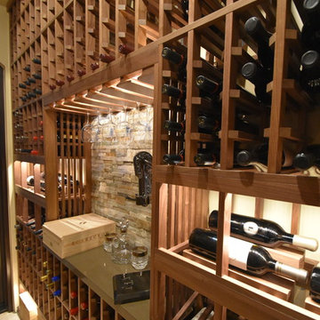
This project is more than meets the eye! In a gorgeous neighborhood in Del Mar, San Diego, California, This unique small custom wine cellar truly acts as a showstopper. Originally within this house, the door which now faces outward used to be around the corner in a small hallway, virtually eliminating any visibility into this contemporary walk in custom wine cellar. Upon seeing the location of this space within the house, Gene Walder and the knowledgeable team at Vintage Cellars knew that to really take advantage of the room provided, (which is actually below the stairs), they needed to get rid of the original door and add a brand new one facing the main living space.
Just a small feat in a series of unique custom features within this cellar!
Here at Vintage Cellars, before any design takes shape, it is vital to understand what the clients wants and needs are based on their growing collection of wine. With a good idea of bottle sizes, shapes (some pinot noir bottles, for example have a wider bottom than a typical cabernet sauvignon bottle) and unique features desired, the team of wine cellar designers and wine cellar builders at Vintage Cellars are able to create a very special and desirable wine cellar for each client.
The owners of this beautiful home collaborated heavily with the Vintage Cellars team in the design process of this rustic custom wine cellar - something that we aim to do with every project. The homeowners wanted to showcase some of their favorite Magnum sized bottles in a high reveal horizontal display row, directly on top of another area highlighting the best 750 ml's in their collection.
This small custom wine room fills most of the left wall with single deep, individual bottle storage. Directly below this wine racking is room for wine case / wine bin storage. Centered within this wall is a nice space for opening and decanting wines with a gorgeous dark stone countertop and room for hanging wine glasses above.
The opposite wall is filled floor to ceiling with label revealing horizontal display rows. Again, this type of feature is very desirable in recent years. Homeowners want to be able to showcase the best bottles they own within their custom wine cellars in the most stunning and beautiful ways possible. Additionally, this feature is commonly replicated with metal bars for a more contemporary and modern look and feel.
Within Beach Cities such as Del Mar, La Jolla, Cardiff, Coronado, Rancho Santa Fe, Encinitas, Solana Beach, Newport Beach and Orange County alike, small walk wine cellars are all the rage. Custom Wine Closet s and Under the Stairs Custom Wine Room s are quickly becoming a commonplace feature within modern luxury homes.
Funny enough, because San Diego has become such a hub and mecca for craft beer breweries, luxury homes within communities such as La Jolla, Del Mar, Encinitas, Coronado, Cardiff, Rancho Santa Fe, Solana Beach, Carlsbad, La Costa and Torrey Pines have taken notice and began including space for unique beer storage within their custom wine cellars as well.
This right side wall horizontal display racking does just that. If you look closely, those intricately labeled bottles are craft brews kept at a chill and refreshing 55 Degrees- just waiting to be opened and enjoyed immediately.
Just when you thought the custom wine cellar tour was over, another unique feature catches your eye. You see the back stone wall? Press ever so gently in the top left corner two thirds of the way up and - Voila! - a secret door appears and slowly reveals more room under the stairway for case storage and the like.
The homeowner also decided to add interesting lighting to this cellar. The Custom wine room can turn any color of the rainbow - allowing you to focus on all lights or just one a time, creating that perfect mood lighting for the holidays, springtime, or summer.
This entire custom wine cellar and all wine racking were done in raw black walnut.
Vintage Cellars has built gorgeous custom wine cellars and wine storage rooms across the United States and World for over 25 years. We are your go-to business for anything wine cellar and wine storage related! Whether you're interested in a wine closet, wine racking, custom wine racks, a custom wine cellar door, or a cooling system for your existing space, Vintage Cellars has you covered!
We carry all kinds of wine cellar cooling and refrigeration systems, incuding: Breezaire, CellarCool, WhisperKool, Wine Guardian, CellarPro and Commercial systems.
We also carry many types of Wine Refrigerators, Wine Cabinets, and wine racking types, including La Cache, Marvel, N'Finity, Transtherm, Vinotheque, Vintage Series, Credenza, Walk in wine rooms, Climadiff, Riedel, Fontenay, and VintageView.
Vintage Cellars also does work in many styles, including Contemporary and Modern, Rustic, Farmhouse, Traditional, Craftsman, Industrial, Mediterranean, Mid-Century, Industrial and Eclectic.
Some locations we cover often include: San Diego, Rancho Santa Fe, Corona Del Mar, Del Mar, La Jolla, Newport Beach, Newport Coast, Huntington Beach, Del Mar, Solana Beach, Carlsbad, Orange County, Beverly Hills, Malibu, Pacific Palisades, Santa Monica, Bel Air, Los Angeles, Encinitas, Cardiff, Coronado, Manhattan Beach, Palos Verdes, San Marino, Ladera Heights, Santa Monica, Brentwood, Westwood, Hancock Park, Laguna Beach, Crystal Cove, Laguna Niguel, Torrey Pines, Thousand Oaks, Coto De Caza, Coronado Island, San Francisco, Danville, Walnut Creek, Marin, Tiburon, Hillsborough, Berkeley, Oakland, Napa, Sonoma, Agoura Hills, Hollywood Hills, Laurel Canyon, Sausalito, Mill Valley, San Rafael, Piedmont, Paso Robles, Carmel, Pebble Beach
Contact Vintage Cellars today with any of your Wine Cellar needs!
(800) 876-8789
Vintage Cellars
904 Rancheros Drive
San Marcos, California 92069
(800) 876-8789
 San Luis Kitchen Co.
When the homeowners decided to move from San Francisco to the Central Coast, they were looking for a more relaxed lifestyle, a unique place to call their own, and an environment conducive to raising their young children. They found it all in San Luis Obispo. They had owned a house here in SLO for several years that they had used as a rental. As the homeowners own and run a contracting business and relocation was not impossible, they decided to move their business and make this SLO rental into their dream home.
As a rental, the house was in a bare-bones condition. The kitchen had old white cabinets, boring white tile counters, and a horrendous vinyl tile floor. Not only was the kitchen out-of-date and old-fashioned, it was also pretty worn out. The tiles were cracking and the grout was stained, the cabinet doors were sagging, and the appliances were conflicting (ie: you could not open the stove and dishwasher at the same time).
To top it all off, the kitchen was just too small for the custom home the homeowners wanted to create.
Thus enters San Luis Kitchen. At the beginning of their quest to remodel, the homeowners visited San Luis Kitchen’s showroom and fell in love with our Tuscan Grotto display. They sat down with our designers and together we worked out the scope of the project, the budget for cabinetry and how that fit into their overall budget, and then we worked on the new design for the home starting with the kitchen.
As the homeowners felt the kitchen was cramped, it was decided to expand by moving the window wall out onto the existing porch. Besides the extra space gained, moving the wall brought the kitchen window out from under the porch roof – increasing the natural light available in the space. (It really helps when the homeowner both understands building and can do his own contracting and construction.) A new arched window and stone clad wall now highlights the end of the kitchen. As we gained wall space, we were able to move the range and add a plaster hood, creating a focal nice focal point for the kitchen.
The other long wall now houses a Sub-Zero refrigerator and lots of counter workspace. Then we completed the kitchen by adding a wrap-around wet bar extending into the old dining space. We included a pull-out pantry unit with open shelves above it, wine cubbies, a cabinet for glassware recessed into the wall, under-counter refrigerator drawers, sink base and trash cabinet, along with a decorative bookcase cabinet and bar seating. Lots of function in this corner of the kitchen; a bar for entertaining and a snack station for the kids.
After the kitchen design was finalized and ordered, the homeowners turned their attention to the rest of the house. They asked San Luis Kitchen to help with their master suite, a guest bath, their home control center (essentially a deck tucked under the main staircase) and finally their laundry room. Here are the photos:
I wish I could show you the rest of the house. The homeowners took a poor rental house and turned it into a showpiece! They added custom concrete floors, unique fiber optic lighting, large picture windows, and much more. There is now an outdoor kitchen complete with pizza oven, an outdoor shower and exquisite garden. They added a dedicated dog run to the side yard for their pooches and a rooftop deck at the very peak. Such a fun house.
Wood-Mode Fine Custom Cabinetry, Barcelona
 Modern Citi Group: Renovations & Remodeling
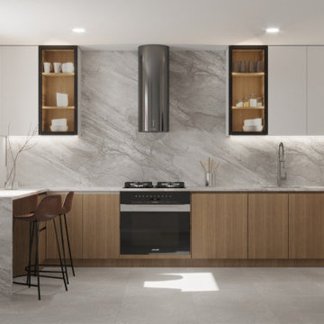
Gorgeous high end Modern kitchen remodel project offered in two color palettes. The kitchen features an open layout, concealed appliances and washer/dryer, additional china cabinets, and island range exhaust hood. Breakfast bar with two bar stools against the window for a great morning coffee routine.

 Simply Perfect
With Pinterest, Houzz and HGTV, homeowners have more sources for inspiration than ever before. You may have found, however, that replicating what you see online or on TV isn’t always that simple. Mastering proportion and scale can be especially challenging.
Let’s say you fall in love with an oversized vase which looks like it will fit with the colors and textures in your living room. But once it’s there, the vase doesn’t look the way you expected and you don’t know now to make it work.
Fortunately, designers are experienced not only in dealing with proportion and scale, but in handling multiple elements at once.
In the meantime, here are a few tips to help you understand some of the considerations regarding size.
Proportion Tips
1. Less is more
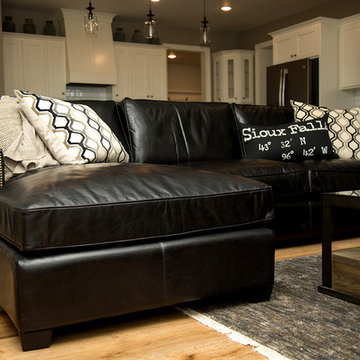
In the home shown here, the rooms are on the smaller side, where it would seem counterintuitive to use oversized pieces. But using smaller pieces can look busy—and can actually make the rooms feel smaller, especially when you add personal belongings to the space.
2. Keep it simple
Several oversized pieces can create clean, simple lines. We put this principle to work using oversized items as anchors on both sides of the fireplace in the living room.
On one side, we have two oversized blown-glass vases with amber, silver and purple tones. The irregular shapes in these beautiful pieces create interest and contrast; you can see through them and you can see the room reflected in them.
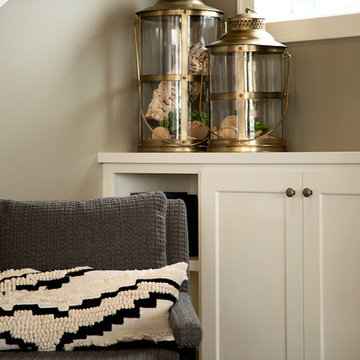
On the other side of the fireplace sit two oversized brass lanterns filled with driftwood and greenery; the contents can be switched out seasonally, as well.
The vases on one side and lanterns on the other side establish pattern (two of each, in descending order), balance and simplicity.
3. Embrace the unexpected
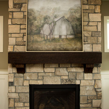
On the mantle above the fireplace rests another oversized piece—a painting of a barn. Its neutral colors pick up the tones in the stone behind it and again, it works to bring simplicity to the space, rather than overly fussy detail.
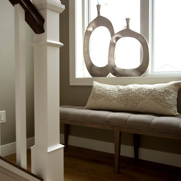
Nearby, just up the stairs, is an unusually spacious landing. A bench and pillows transform it into a special reading or conversation spot. The pair of hammered nickel vases on the window sill repeats the pattern established on either side of the fireplace. Using oversized vases in lieu of a window treatment is unexpected—as is incorporating sleek, modern-shaped vases like these in a farmhouse-style home. Yet because of the other oversized objects nearby, the vases feel distinctive and delightful.
4. Coordinate pattern and rhythm
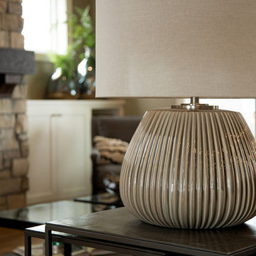
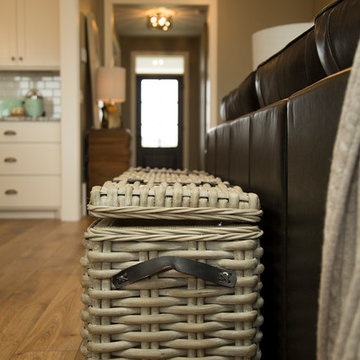
Another oversized item is the table lamp in the living room. It’s a powerful light; aside from the overhead can lights, it’s the room’s only light source. The ridges on its ceramic base echo the pieces of wicker in the stunning basket behind the sofa.
This oversized wicker basket, which we’re a bit in love with, features a very large weave along with elegant leather straps. It’s ideal for storing throws, cushions, board games or anything else you want out of sight.
5. Proximity matters
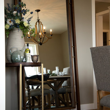
This home’s dining room is just to the right of the entry. An immense floor mirror—double-framed in weathered wood—is placed opposite the front windows. Measuring seven feet high, it’s a bold piece. And it works perfectly in this space to reflect light and make the room feel larger.
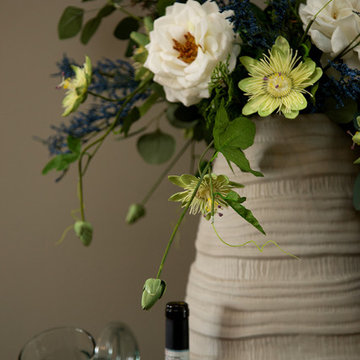
An oversized ceramic vase, with a porous, matte-stone finish, sits atop a table next to the mirror. Other regular-sized items share the small table, including a bottle of wine and a glass vase. But because of the enormous mirror, it was important to have one oversized item on that table, for balance.
 Simply Perfect
With Pinterest, Houzz and HGTV, homeowners have more sources for inspiration than ever before. You may have found, however, that replicating what you see online or on TV isn’t always that simple. Mastering proportion and scale can be especially challenging.
Let’s say you fall in love with an oversized vase which looks like it will fit with the colors and textures in your living room. But once it’s there, the vase doesn’t look the way you expected and you don’t know now to make it work.
Fortunately, designers are experienced not only in dealing with proportion and scale, but in handling multiple elements at once.
In the meantime, here are a few tips to help you understand some of the considerations regarding size.
Proportion Tips
1. Less is more
In the home shown here, the rooms are on the smaller side, where it would seem counterintuitive to use oversized pieces. But using smaller pieces can look busy—and can actually make the rooms feel smaller, especially when you add personal belongings to the space.
2. Keep it simple
Several oversized pieces can create clean, simple lines. We put this principle to work using oversized items as anchors on both sides of the fireplace in the living room.
On one side, we have two oversized blown-glass vases with amber, silver and purple tones. The irregular shapes in these beautiful pieces create interest and contrast; you can see through them and you can see the room reflected in them.
On the other side of the fireplace sit two oversized brass lanterns filled with driftwood and greenery; the contents can be switched out seasonally, as well.
The vases on one side and lanterns on the other side establish pattern (two of each, in descending order), balance and simplicity.
3. Embrace the unexpected
On the mantle above the fireplace rests another oversized piece—a painting of a barn. Its neutral colors pick up the tones in the stone behind it and again, it works to bring simplicity to the space, rather than overly fussy detail.
Nearby, just up the stairs, is an unusually spacious landing. A bench and pillows transform it into a special reading or conversation spot. The pair of hammered nickel vases on the window sill repeats the pattern established on either side of the fireplace. Using oversized vases in lieu of a window treatment is unexpected—as is incorporating sleek, modern-shaped vases like these in a farmhouse-style home. Yet because of the other oversized objects nearby, the vases feel distinctive and delightful.
4. Coordinate pattern and rhythm
Another oversized item is the table lamp in the living room. It’s a powerful light; aside from the overhead can lights, it’s the room’s only light source. The ridges on its ceramic base echo the pieces of wicker in the stunning basket behind the sofa.
This oversized wicker basket, which we’re a bit in love with, features a very large weave along with elegant leather straps. It’s ideal for storing throws, cushions, board games or anything else you want out of sight.
5. Proximity matters
This home’s dining room is just to the right of the entry. An immense floor mirror—double-framed in weathered wood—is placed opposite the front windows. Measuring seven feet high, it’s a bold piece. And it works perfectly in this space to reflect light and make the room feel larger.
An oversized ceramic vase, with a porous, matte-stone finish, sits atop a table next to the mirror. Other regular-sized items share the small table, including a bottle of wine and a glass vase. But because of the enormous mirror, it was important to have one oversized item on that table, for balance.
 Simply Perfect
With Pinterest, Houzz and HGTV, homeowners have more sources for inspiration than ever before. You may have found, however, that replicating what you see online or on TV isn’t always that simple. Mastering proportion and scale can be especially challenging.
Let’s say you fall in love with an oversized vase which looks like it will fit with the colors and textures in your living room. But once it’s there, the vase doesn’t look the way you expected and you don’t know now to make it work.
Fortunately, designers are experienced not only in dealing with proportion and scale, but in handling multiple elements at once.
In the meantime, here are a few tips to help you understand some of the considerations regarding size.
Proportion Tips
1. Less is more
In the home shown here, the rooms are on the smaller side, where it would seem counterintuitive to use oversized pieces. But using smaller pieces can look busy—and can actually make the rooms feel smaller, especially when you add personal belongings to the space.
2. Keep it simple
Several oversized pieces can create clean, simple lines. We put this principle to work using oversized items as anchors on both sides of the fireplace in the living room.
On one side, we have two oversized blown-glass vases with amber, silver and purple tones. The irregular shapes in these beautiful pieces create interest and contrast; you can see through them and you can see the room reflected in them.
On the other side of the fireplace sit two oversized brass lanterns filled with driftwood and greenery; the contents can be switched out seasonally, as well.
The vases on one side and lanterns on the other side establish pattern (two of each, in descending order), balance and simplicity.
3. Embrace the unexpected
On the mantle above the fireplace rests another oversized piece—a painting of a barn. Its neutral colors pick up the tones in the stone behind it and again, it works to bring simplicity to the space, rather than overly fussy detail.
Nearby, just up the stairs, is an unusually spacious landing. A bench and pillows transform it into a special reading or conversation spot. The pair of hammered nickel vases on the window sill repeats the pattern established on either side of the fireplace. Using oversized vases in lieu of a window treatment is unexpected—as is incorporating sleek, modern-shaped vases like these in a farmhouse-style home. Yet because of the other oversized objects nearby, the vases feel distinctive and delightful.
4. Coordinate pattern and rhythm
Another oversized item is the table lamp in the living room. It’s a powerful light; aside from the overhead can lights, it’s the room’s only light source. The ridges on its ceramic base echo the pieces of wicker in the stunning basket behind the sofa.
This oversized wicker basket, which we’re a bit in love with, features a very large weave along with elegant leather straps. It’s ideal for storing throws, cushions, board games or anything else you want out of sight.
5. Proximity matters
This home’s dining room is just to the right of the entry. An immense floor mirror—double-framed in weathered wood—is placed opposite the front windows. Measuring seven feet high, it’s a bold piece. And it works perfectly in this space to reflect light and make the room feel larger.
An oversized ceramic vase, with a porous, matte-stone finish, sits atop a table next to the mirror. Other regular-sized items share the small table, including a bottle of wine and a glass vase. But because of the enormous mirror, it was important to have one oversized item on that table, for balance.
 Edgewater Design Group
As written in Northern Home & Cottage by Elizabeth Edwards
Sara and Paul Matthews call their head-turning home, located in a sweet neighborhood just up the hill from downtown Petoskey, “a very human story.” Indeed it is. Sara and her husband, Paul, have a special-needs son as well as an energetic middle-school daughter. This home has an answer for everyone. Located down the street from the school, it is ideally situated for their daughter and a self-contained apartment off the great room accommodates all their son’s needs while giving his caretakers privacy—and the family theirs. The Matthews began the building process by taking their thoughts and
needs to Stephanie Baldwin and her team at Edgewater Design Group. Beyond the above considerations, they wanted their new home to be low maintenance and to stand out architecturally, “But not so much that anyone would complain that it didn’t work in our neighborhood,” says Sara. “We
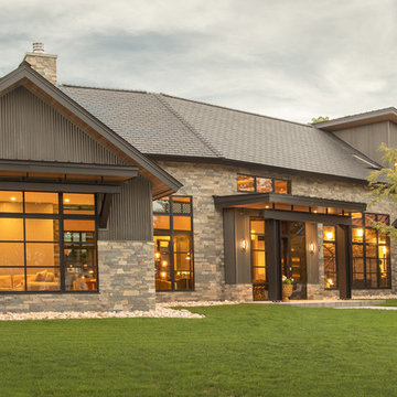
were thrilled that Edgewater listened to us and were able to give us a unique-looking house that is meeting all our needs.” Lombardy LLC built this handsome home with Paul working alongside the construction crew throughout the project. The low maintenance exterior is a cutting-edge blend of stacked stone, black corrugated steel, black framed windows and Douglas fir soffits—elements that add up to an organic contemporary look. The use of black steel, including interior beams and the staircase system, lend an industrial vibe that is courtesy of the Matthews’ friend Dan Mello of Trimet Industries in Traverse City. The couple first met Dan, a metal fabricator, a number of years ago, right around the time they found out that their then two-year-old son would never be able to walk. After the couple explained to Dan that they couldn’t find a solution for a child who wasn’t big enough for a wheelchair, he designed a comfortable, rolling chair that was just perfect. They still use it. The couple’s gratitude for the chair resulted in a trusting relationship with Dan, so it was natural for them to welcome his talents into their home-building process. A maple floor finished to bring out all of its color-tones envelops the room in warmth. Alder doors and trim and a Doug fir ceiling reflect that warmth. Clearstory windows and floor-to-ceiling window banks fill the space with light—and with views of the spacious grounds that will
become a canvas for Paul, a retired landscaper. The couple’s vibrant art pieces play off against modernist furniture and lighting that is due to an inspired collaboration between Sara and interior designer Kelly Paulsen. “She was absolutely instrumental to the project,” Sara says. “I went through
two designers before I finally found Kelly.” The open clean-lined kitchen, butler’s pantry outfitted with a beverage center and Miele coffee machine (that allows guests to wait on themselves when Sara is cooking), and an outdoor room that centers around a wood-burning fireplace, all make for easy,
fabulous entertaining. A den just off the great room houses the big-screen television and Sara’s loom—
making for relaxing evenings of weaving, game watching and togetherness. Tourgoers will leave understanding that this house is everything great design should be. Form following function—and solving very human issues with soul-soothing style.
 Simply Perfect
With Pinterest, Houzz and HGTV, homeowners have more sources for inspiration than ever before. You may have found, however, that replicating what you see online or on TV isn’t always that simple. Mastering proportion and scale can be especially challenging.
Let’s say you fall in love with an oversized vase which looks like it will fit with the colors and textures in your living room. But once it’s there, the vase doesn’t look the way you expected and you don’t know now to make it work.
Fortunately, designers are experienced not only in dealing with proportion and scale, but in handling multiple elements at once.
In the meantime, here are a few tips to help you understand some of the considerations regarding size.
Proportion Tips
1. Less is more
In the home shown here, the rooms are on the smaller side, where it would seem counterintuitive to use oversized pieces. But using smaller pieces can look busy—and can actually make the rooms feel smaller, especially when you add personal belongings to the space.
2. Keep it simple
Several oversized pieces can create clean, simple lines. We put this principle to work using oversized items as anchors on both sides of the fireplace in the living room.
On one side, we have two oversized blown-glass vases with amber, silver and purple tones. The irregular shapes in these beautiful pieces create interest and contrast; you can see through them and you can see the room reflected in them.
On the other side of the fireplace sit two oversized brass lanterns filled with driftwood and greenery; the contents can be switched out seasonally, as well.
The vases on one side and lanterns on the other side establish pattern (two of each, in descending order), balance and simplicity.
3. Embrace the unexpected
On the mantle above the fireplace rests another oversized piece—a painting of a barn. Its neutral colors pick up the tones in the stone behind it and again, it works to bring simplicity to the space, rather than overly fussy detail.
Nearby, just up the stairs, is an unusually spacious landing. A bench and pillows transform it into a special reading or conversation spot. The pair of hammered nickel vases on the window sill repeats the pattern established on either side of the fireplace. Using oversized vases in lieu of a window treatment is unexpected—as is incorporating sleek, modern-shaped vases like these in a farmhouse-style home. Yet because of the other oversized objects nearby, the vases feel distinctive and delightful.
4. Coordinate pattern and rhythm
Another oversized item is the table lamp in the living room. It’s a powerful light; aside from the overhead can lights, it’s the room’s only light source. The ridges on its ceramic base echo the pieces of wicker in the stunning basket behind the sofa.
This oversized wicker basket, which we’re a bit in love with, features a very large weave along with elegant leather straps. It’s ideal for storing throws, cushions, board games or anything else you want out of sight.
5. Proximity matters
This home’s dining room is just to the right of the entry. An immense floor mirror—double-framed in weathered wood—is placed opposite the front windows. Measuring seven feet high, it’s a bold piece. And it works perfectly in this space to reflect light and make the room feel larger.
An oversized ceramic vase, with a porous, matte-stone finish, sits atop a table next to the mirror. Other regular-sized items share the small table, including a bottle of wine and a glass vase. But because of the enormous mirror, it was important to have one oversized item on that table, for balance.
 Simply Perfect
With Pinterest, Houzz and HGTV, homeowners have more sources for inspiration than ever before. You may have found, however, that replicating what you see online or on TV isn’t always that simple. Mastering proportion and scale can be especially challenging.
Let’s say you fall in love with an oversized vase which looks like it will fit with the colors and textures in your living room. But once it’s there, the vase doesn’t look the way you expected and you don’t know now to make it work.
Fortunately, designers are experienced not only in dealing with proportion and scale, but in handling multiple elements at once.
In the meantime, here are a few tips to help you understand some of the considerations regarding size.
Proportion Tips
1. Less is more
In the home shown here, the rooms are on the smaller side, where it would seem counterintuitive to use oversized pieces. But using smaller pieces can look busy—and can actually make the rooms feel smaller, especially when you add personal belongings to the space.
2. Keep it simple
Several oversized pieces can create clean, simple lines. We put this principle to work using oversized items as anchors on both sides of the fireplace in the living room.
On one side, we have two oversized blown-glass vases with amber, silver and purple tones. The irregular shapes in these beautiful pieces create interest and contrast; you can see through them and you can see the room reflected in them.
On the other side of the fireplace sit two oversized brass lanterns filled with driftwood and greenery; the contents can be switched out seasonally, as well.
The vases on one side and lanterns on the other side establish pattern (two of each, in descending order), balance and simplicity.
3. Embrace the unexpected
On the mantle above the fireplace rests another oversized piece—a painting of a barn. Its neutral colors pick up the tones in the stone behind it and again, it works to bring simplicity to the space, rather than overly fussy detail.
Nearby, just up the stairs, is an unusually spacious landing. A bench and pillows transform it into a special reading or conversation spot. The pair of hammered nickel vases on the window sill repeats the pattern established on either side of the fireplace. Using oversized vases in lieu of a window treatment is unexpected—as is incorporating sleek, modern-shaped vases like these in a farmhouse-style home. Yet because of the other oversized objects nearby, the vases feel distinctive and delightful.
4. Coordinate pattern and rhythm
Another oversized item is the table lamp in the living room. It’s a powerful light; aside from the overhead can lights, it’s the room’s only light source. The ridges on its ceramic base echo the pieces of wicker in the stunning basket behind the sofa.
This oversized wicker basket, which we’re a bit in love with, features a very large weave along with elegant leather straps. It’s ideal for storing throws, cushions, board games or anything else you want out of sight.
5. Proximity matters
This home’s dining room is just to the right of the entry. An immense floor mirror—double-framed in weathered wood—is placed opposite the front windows. Measuring seven feet high, it’s a bold piece. And it works perfectly in this space to reflect light and make the room feel larger.
An oversized ceramic vase, with a porous, matte-stone finish, sits atop a table next to the mirror. Other regular-sized items share the small table, including a bottle of wine and a glass vase. But because of the enormous mirror, it was important to have one oversized item on that table, for balance.
Sponsored
Columbus, OH

Snider & Metcalf Interior Design, LTD
Leading Interior Designers in Columbus, Ohio & Ponte Vedra, Florida
 Simply Perfect
With Pinterest, Houzz and HGTV, homeowners have more sources for inspiration than ever before. You may have found, however, that replicating what you see online or on TV isn’t always that simple. Mastering proportion and scale can be especially challenging.
Let’s say you fall in love with an oversized vase which looks like it will fit with the colors and textures in your living room. But once it’s there, the vase doesn’t look the way you expected and you don’t know now to make it work.
Fortunately, designers are experienced not only in dealing with proportion and scale, but in handling multiple elements at once.
In the meantime, here are a few tips to help you understand some of the considerations regarding size.
Proportion Tips
1. Less is more
In the home shown here, the rooms are on the smaller side, where it would seem counterintuitive to use oversized pieces. But using smaller pieces can look busy—and can actually make the rooms feel smaller, especially when you add personal belongings to the space.
2. Keep it simple
Several oversized pieces can create clean, simple lines. We put this principle to work using oversized items as anchors on both sides of the fireplace in the living room.
On one side, we have two oversized blown-glass vases with amber, silver and purple tones. The irregular shapes in these beautiful pieces create interest and contrast; you can see through them and you can see the room reflected in them.
On the other side of the fireplace sit two oversized brass lanterns filled with driftwood and greenery; the contents can be switched out seasonally, as well.
The vases on one side and lanterns on the other side establish pattern (two of each, in descending order), balance and simplicity.
3. Embrace the unexpected
On the mantle above the fireplace rests another oversized piece—a painting of a barn. Its neutral colors pick up the tones in the stone behind it and again, it works to bring simplicity to the space, rather than overly fussy detail.
Nearby, just up the stairs, is an unusually spacious landing. A bench and pillows transform it into a special reading or conversation spot. The pair of hammered nickel vases on the window sill repeats the pattern established on either side of the fireplace. Using oversized vases in lieu of a window treatment is unexpected—as is incorporating sleek, modern-shaped vases like these in a farmhouse-style home. Yet because of the other oversized objects nearby, the vases feel distinctive and delightful.
4. Coordinate pattern and rhythm
Another oversized item is the table lamp in the living room. It’s a powerful light; aside from the overhead can lights, it’s the room’s only light source. The ridges on its ceramic base echo the pieces of wicker in the stunning basket behind the sofa.
This oversized wicker basket, which we’re a bit in love with, features a very large weave along with elegant leather straps. It’s ideal for storing throws, cushions, board games or anything else you want out of sight.
5. Proximity matters
This home’s dining room is just to the right of the entry. An immense floor mirror—double-framed in weathered wood—is placed opposite the front windows. Measuring seven feet high, it’s a bold piece. And it works perfectly in this space to reflect light and make the room feel larger.
An oversized ceramic vase, with a porous, matte-stone finish, sits atop a table next to the mirror. Other regular-sized items share the small table, including a bottle of wine and a glass vase. But because of the enormous mirror, it was important to have one oversized item on that table, for balance.
 San Luis Kitchen Co.
When the homeowners decided to move from San Francisco to the Central Coast, they were looking for a more relaxed lifestyle, a unique place to call their own, and an environment conducive to raising their young children. They found it all in San Luis Obispo. They had owned a house here in SLO for several years that they had used as a rental. As the homeowners own and run a contracting business and relocation was not impossible, they decided to move their business and make this SLO rental into their dream home.
As a rental, the house was in a bare-bones condition. The kitchen had old white cabinets, boring white tile counters, and a horrendous vinyl tile floor. Not only was the kitchen out-of-date and old-fashioned, it was also pretty worn out. The tiles were cracking and the grout was stained, the cabinet doors were sagging, and the appliances were conflicting (ie: you could not open the stove and dishwasher at the same time).
To top it all off, the kitchen was just too small for the custom home the homeowners wanted to create.
Thus enters San Luis Kitchen. At the beginning of their quest to remodel, the homeowners visited San Luis Kitchen’s showroom and fell in love with our Tuscan Grotto display. They sat down with our designers and together we worked out the scope of the project, the budget for cabinetry and how that fit into their overall budget, and then we worked on the new design for the home starting with the kitchen.
As the homeowners felt the kitchen was cramped, it was decided to expand by moving the window wall out onto the existing porch. Besides the extra space gained, moving the wall brought the kitchen window out from under the porch roof – increasing the natural light available in the space. (It really helps when the homeowner both understands building and can do his own contracting and construction.) A new arched window and stone clad wall now highlights the end of the kitchen. As we gained wall space, we were able to move the range and add a plaster hood, creating a focal nice focal point for the kitchen.
The other long wall now houses a Sub-Zero refrigerator and lots of counter workspace. Then we completed the kitchen by adding a wrap-around wet bar extending into the old dining space. We included a pull-out pantry unit with open shelves above it, wine cubbies, a cabinet for glassware recessed into the wall, under-counter refrigerator drawers, sink base and trash cabinet, along with a decorative bookcase cabinet and bar seating. Lots of function in this corner of the kitchen; a bar for entertaining and a snack station for the kids.
After the kitchen design was finalized and ordered, the homeowners turned their attention to the rest of the house. They asked San Luis Kitchen to help with their master suite, a guest bath, their home control center (essentially a deck tucked under the main staircase) and finally their laundry room. Here are the photos:
I wish I could show you the rest of the house. The homeowners took a poor rental house and turned it into a showpiece! They added custom concrete floors, unique fiber optic lighting, large picture windows, and much more. There is now an outdoor kitchen complete with pizza oven, an outdoor shower and exquisite garden. They added a dedicated dog run to the side yard for their pooches and a rooftop deck at the very peak. Such a fun house.
Wood-Mode Fine Custom Cabinetry, Barcelona
 Simply Perfect
With Pinterest, Houzz and HGTV, homeowners have more sources for inspiration than ever before. You may have found, however, that replicating what you see online or on TV isn’t always that simple. Mastering proportion and scale can be especially challenging.
Let’s say you fall in love with an oversized vase which looks like it will fit with the colors and textures in your living room. But once it’s there, the vase doesn’t look the way you expected and you don’t know now to make it work.
Fortunately, designers are experienced not only in dealing with proportion and scale, but in handling multiple elements at once.
In the meantime, here are a few tips to help you understand some of the considerations regarding size.
Proportion Tips
1. Less is more
In the home shown here, the rooms are on the smaller side, where it would seem counterintuitive to use oversized pieces. But using smaller pieces can look busy—and can actually make the rooms feel smaller, especially when you add personal belongings to the space.
2. Keep it simple
Several oversized pieces can create clean, simple lines. We put this principle to work using oversized items as anchors on both sides of the fireplace in the living room.
On one side, we have two oversized blown-glass vases with amber, silver and purple tones. The irregular shapes in these beautiful pieces create interest and contrast; you can see through them and you can see the room reflected in them.
On the other side of the fireplace sit two oversized brass lanterns filled with driftwood and greenery; the contents can be switched out seasonally, as well.
The vases on one side and lanterns on the other side establish pattern (two of each, in descending order), balance and simplicity.
3. Embrace the unexpected
On the mantle above the fireplace rests another oversized piece—a painting of a barn. Its neutral colors pick up the tones in the stone behind it and again, it works to bring simplicity to the space, rather than overly fussy detail.
Nearby, just up the stairs, is an unusually spacious landing. A bench and pillows transform it into a special reading or conversation spot. The pair of hammered nickel vases on the window sill repeats the pattern established on either side of the fireplace. Using oversized vases in lieu of a window treatment is unexpected—as is incorporating sleek, modern-shaped vases like these in a farmhouse-style home. Yet because of the other oversized objects nearby, the vases feel distinctive and delightful.
4. Coordinate pattern and rhythm
Another oversized item is the table lamp in the living room. It’s a powerful light; aside from the overhead can lights, it’s the room’s only light source. The ridges on its ceramic base echo the pieces of wicker in the stunning basket behind the sofa.
This oversized wicker basket, which we’re a bit in love with, features a very large weave along with elegant leather straps. It’s ideal for storing throws, cushions, board games or anything else you want out of sight.
5. Proximity matters
This home’s dining room is just to the right of the entry. An immense floor mirror—double-framed in weathered wood—is placed opposite the front windows. Measuring seven feet high, it’s a bold piece. And it works perfectly in this space to reflect light and make the room feel larger.
An oversized ceramic vase, with a porous, matte-stone finish, sits atop a table next to the mirror. Other regular-sized items share the small table, including a bottle of wine and a glass vase. But because of the enormous mirror, it was important to have one oversized item on that table, for balance.
 Windy City Painters
Iron Fence Painting Lincoln Park Chicago - Professional Metal Refinishing
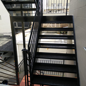
Windy City Painters completed this comprehensive iron fence painting project for a beautiful Lincoln Park greystone property. Lincoln Park's historic architecture demands careful attention to detail, and furthermore, Chicago's harsh weather conditions require professional-grade materials and techniques for lasting protection.
We utilized premium Sherwin-Williams rust inhibiting primer and Benjamin Moore exterior metal paint for maximum durability. Additionally, our team employed specialized rust removal tools and surface preparation equipment to ensure optimal adhesion and longevity.
Our four-step process included complete rust removal and surface cleaning, minor repairs to damaged sections, premium primer application with proper curing time, and final topcoat application using spray and brush techniques for even coverage.
Chicago's unique challenges include extreme temperature fluctuations, salt exposure from winter treatments, and moisture from Lake Michigan. Moreover, older properties often have multiple paint layers requiring careful removal. Therefore, professional expertise ensures proper preparation and material selection.
The results exceeded client expectations with a smooth, durable finish that enhances the property's curb appeal. Subsequently, the fence now provides years of protection while complementing the neighborhood's architectural character perfectly.
Before starting similar projects, homeowners should understand that proper surface preparation accounts for 80% of project success. Additionally, weather conditions significantly impact application timing and results.
See more work and request free estimate at windypainters.com.
Frequently Asked Questions:
Q: How much does iron fence painting cost in Lincoln Park Chicago?
A: Iron fence painting costs vary based on fence size, existing condition, rust damage extent, and preparation requirements needed.
Q: What preparation is required for successful iron fence painting projects?
A: Iron fence painting requires thorough rust removal, surface cleaning, minor repairs, primer application, and proper weather conditions.
Q: How long does professional iron fence painting last in Chicago weather?
A: Professional iron fence painting typically lasts 8-12 years with quality materials, proper preparation, and regular maintenance.
Q: When is the best season for iron fence painting in Chicago?
A: Spring through early fall provides optimal conditions for iron fence painting with appropriate temperature and humidity levels.
Q: Can you match existing colors for iron fence painting restoration projects?
A: Yes, we provide custom color matching services for iron fence painting to complement existing architectural elements perfectly.
Q: Do you warranty iron fence painting work in Lincoln Park?
A: Windy City Painters provides comprehensive warranties on all iron fence painting projects ensuring quality and customer satisfaction.
Q: What makes professional iron fence painting worth the investment cost?
A: Professional iron fence painting ensures proper preparation, quality materials, expert application techniques, and significantly extended fence lifespan.
Q: How do you prevent rust from returning after iron fence painting?
A: Our iron fence painting process includes rust inhibiting primer, quality topcoats, and proper surface preparation for maximum protection.
Q: Can iron fence painting increase Lincoln Park property values significantly?
A: Professional iron fence painting enhances curb appeal, property aesthetics, and market value in desirable Lincoln Park neighborhood.
Q: What safety precautions are necessary during iron fence painting projects?
A: Iron fence painting requires proper ventilation, protective equipment, lead paint testing, and professional safety protocols throughout.
 Simply Perfect
With Pinterest, Houzz and HGTV, homeowners have more sources for inspiration than ever before. You may have found, however, that replicating what you see online or on TV isn’t always that simple. Mastering proportion and scale can be especially challenging.
Let’s say you fall in love with an oversized vase which looks like it will fit with the colors and textures in your living room. But once it’s there, the vase doesn’t look the way you expected and you don’t know now to make it work.
Fortunately, designers are experienced not only in dealing with proportion and scale, but in handling multiple elements at once.
In the meantime, here are a few tips to help you understand some of the considerations regarding size.
Proportion Tips
1. Less is more
In the home shown here, the rooms are on the smaller side, where it would seem counterintuitive to use oversized pieces. But using smaller pieces can look busy—and can actually make the rooms feel smaller, especially when you add personal belongings to the space.
2. Keep it simple
Several oversized pieces can create clean, simple lines. We put this principle to work using oversized items as anchors on both sides of the fireplace in the living room.
On one side, we have two oversized blown-glass vases with amber, silver and purple tones. The irregular shapes in these beautiful pieces create interest and contrast; you can see through them and you can see the room reflected in them.
On the other side of the fireplace sit two oversized brass lanterns filled with driftwood and greenery; the contents can be switched out seasonally, as well.
The vases on one side and lanterns on the other side establish pattern (two of each, in descending order), balance and simplicity.
3. Embrace the unexpected
On the mantle above the fireplace rests another oversized piece—a painting of a barn. Its neutral colors pick up the tones in the stone behind it and again, it works to bring simplicity to the space, rather than overly fussy detail.
Nearby, just up the stairs, is an unusually spacious landing. A bench and pillows transform it into a special reading or conversation spot. The pair of hammered nickel vases on the window sill repeats the pattern established on either side of the fireplace. Using oversized vases in lieu of a window treatment is unexpected—as is incorporating sleek, modern-shaped vases like these in a farmhouse-style home. Yet because of the other oversized objects nearby, the vases feel distinctive and delightful.
4. Coordinate pattern and rhythm
Another oversized item is the table lamp in the living room. It’s a powerful light; aside from the overhead can lights, it’s the room’s only light source. The ridges on its ceramic base echo the pieces of wicker in the stunning basket behind the sofa.
This oversized wicker basket, which we’re a bit in love with, features a very large weave along with elegant leather straps. It’s ideal for storing throws, cushions, board games or anything else you want out of sight.
5. Proximity matters
This home’s dining room is just to the right of the entry. An immense floor mirror—double-framed in weathered wood—is placed opposite the front windows. Measuring seven feet high, it’s a bold piece. And it works perfectly in this space to reflect light and make the room feel larger.
An oversized ceramic vase, with a porous, matte-stone finish, sits atop a table next to the mirror. Other regular-sized items share the small table, including a bottle of wine and a glass vase. But because of the enormous mirror, it was important to have one oversized item on that table, for balance.
 Save home
For the best effect when looking for fabrics to furnish your house, it is best to use fabrics that have varying textures. This is the only way to avoid getting a flat and bland look. When furnishing, consider collecting different types of fabrics and then mixing them until you get a result you find appealing. Do not be afraid of trying out as many fabrics as possible. Remember it is only through carrying out trials that you will be able to identify the right color schemes as well as find what works best for your items or house. Voyage Maison share some tips to make the most of your soft furnishing.
When Choosing Fabrics, Consider Where You Want Them To Go
When selecting a fabric scheme, consider where you want the fabrics to go. If you look at the back of most fabrics, you will find that most manufacturers usually indicate the most suitable area where they should be placed such as on upholstery or for windows. You will also find that most fabrics usually come with labelled with their composition and rubs. Understanding the rubs on a fabric will help you know more about the durability of the material as well as the most suitable areas of use. The number of rubs on a fabric are typically found on little icons on the material or they can be indicated in the form of a number after a Martindale test has been carried out by the manufacturer. The number of rubs is the best way to know how to purpose a fabric. For example: • Fabrics with less than 10,000 rubs are most ideal for decorative uses • Fabrics with between 10,000-15,000 rubs are ideal for light domestic uses • Fabrics with between 15,000-25,000 rubs are ideal for general domestic uses • Fabrics with between 25,000-30,000 rubs are ideal for heavy duty uses When Choosing Fabrics For Furnishing, Consider Their Practicality and Maintenance Needs
It is best that you select your fabrics based on your existing needs while at the same time looking at the care that will be required to keep the material in prime condition. For example, if you have pets and kids, you should go for fabrics that can easily be wiped or cleaned. Most of the fabrics in the market today can be easily cleaned but you should ensure that you specify to your retailer that you need a material that is easy to clean when making a purchase. On finding your fabric of choice, you can also acquire Scotchgard – A strong fabric cover that repels most spills making cleaning of fabrics easier.
When selecting fabrics, you should also consider the orientation of the room where they will be used. This will help you pick the right material of fabric as well as select the right fabric color. For example, if your room has a southern orientation, light will be filtering into the room in such a way that it will not be prudent to use fabrics made of silk material for your cushions and windows.
Tips On How To Accentuate The Appeal Of a Room By Adding Throws & Cushions
In the market, you will find cushions and throws in all shapes, sizes and colors. These fittings can essentially be said to be the cherry on top of the cake when it comes to accentuating the décor in a room. After planning out the furnishings for the rest of the room, cushions and throws can help you brighten up a room and further, they can help you transform it entirely. For example, you can change the look of a room from formal to informal just by selecting the right cushions. You can also transform the look of a room to suit the season at hand, say from summer to winter by simply changing cushions and playing around with the fabric covers. You can also achieve different effects by changing the sizes of cushions and throws in a room. Changing cushions and fabrics to suit different occasions, moods or seasons is a great way to achieve your desired look without breaking the bank.
When selecting a fabric scheme, consider where you want the fabrics to go. If you look at the back of most fabrics, you will find that most manufacturers usually indicate the most suitable area where they should be placed such as on upholstery or for windows. You will also find that most fabrics usually come with labelled with their composition and rubs. Understanding the rubs on a fabric will help you know more about the durability of the material as well as the most suitable areas of use. The number of rubs on a fabric are typically found on little icons on the material or they can be indicated in the form of a number after a Martindale test has been carried out by the manufacturer. The number of rubs is the best way to know how to purpose a fabric. For example: • Fabrics with less than 10,000 rubs are most ideal for decorative uses • Fabrics with between 10,000-15,000 rubs are ideal for light domestic uses • Fabrics with between 15,000-25,000 rubs are ideal for general domestic uses • Fabrics with between 25,000-30,000 rubs are ideal for heavy duty uses When Choosing Fabrics For Furnishing, Consider Their Practicality and Maintenance Needs
It is best that you select your fabrics based on your existing needs while at the same time looking at the care that will be required to keep the material in prime condition. For example, if you have pets and kids, you should go for fabrics that can easily be wiped or cleaned. Most of the fabrics in the market today can be easily cleaned but you should ensure that you specify to your retailer that you need a material that is easy to clean when making a purchase. On finding your fabric of choice, you can also acquire Scotchgard – A strong fabric cover that repels most spills making cleaning of fabrics easier.
When selecting fabrics, you should also consider the orientation of the room where they will be used. This will help you pick the right material of fabric as well as select the right fabric color. For example, if your room has a southern orientation, light will be filtering into the room in such a way that it will not be prudent to use fabrics made of silk material for your cushions and windows.
Tips On How To Accentuate The Appeal Of a Room By Adding Throws & Cushions
In the market, you will find cushions and throws in all shapes, sizes and colors. These fittings can essentially be said to be the cherry on top of the cake when it comes to accentuating the décor in a room. After planning out the furnishings for the rest of the room, cushions and throws can help you brighten up a room and further, they can help you transform it entirely. For example, you can change the look of a room from formal to informal just by selecting the right cushions. You can also transform the look of a room to suit the season at hand, say from summer to winter by simply changing cushions and playing around with the fabric covers. You can also achieve different effects by changing the sizes of cushions and throws in a room. Changing cushions and fabrics to suit different occasions, moods or seasons is a great way to achieve your desired look without breaking the bank.
 Interior Pros - Design Studio
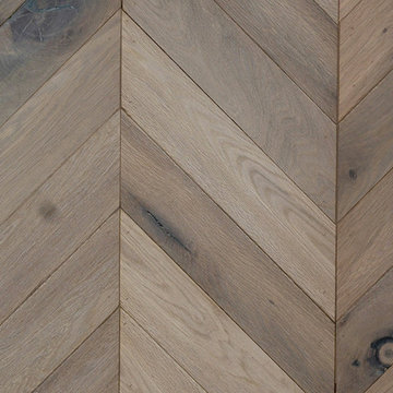
The grey trend has evolved in the last twelve months. Nowadays browns, beige and a touch of grey are in demand. Greige is the new buzzword.
Heavier hand scraped or contoured products, the rage that started around 2005 has taken a back seat in most areas, while a softer wire brushed "ceruse effect" seen mostly on White Oak has been remarkably strong showing no effects of becoming “dated” like the others mentioned.
Ceruse Color Possibilities
There are numerous color combinations to the "cerused" process with the most popular being white or off white. This design trend in hardwood flooring can have darker gray white oak with a mild ceruse off white effect.
There are limitless possibilities in either a prefinished hardwood floor or with what we can create for you in a custom on-site finished hardwood floor.
If something suits your fancy, contact us and we can work on creating just the look and sense of style you are looking for.
33