
Search results for "Borrowed" in Home Design Ideas


 Bosch Services Ltd.
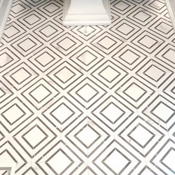
Powder room floor tile with custom tile vent
Inspiration for a small contemporary bathroom remodel in Toronto
Inspiration for a small contemporary bathroom remodel in Toronto

Find the right local pro for your project
 Neumann & Rudy Architecture
## I. Spatial Composition & Architectural Volume
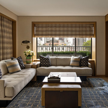
This is a compact urban salon organized with almost Miesian discipline around a single, decisive gesture: the L-configuration of low, tuxedo-armed banquette seating that hugs two perimeter walls and turns the room inward upon itself. The plan reads as a conversation pit without excavation—the seat heights are deliberately suppressed, the backs held low, so that the horizon of upholstery never competes with the aperture behind it. Above, a flat, unadorned plaster soffit-plane is held tight to the wall line, its perimeter reveal drawing a crisp shadow-gap that lets the ceiling appear to float free of the fabric-wrapped walls. The architectural protagonist is the millwork: a deep-jambed picture window recessed within a wide, radiused casing of pale rift-sawn oak, its returns thickened into a continuous window seat and low credenza that transitions seamlessly into flanking cabinetry. This joinery performs double duty as tectonic frame and furniture, resolving the corner where the sofa arm meets the wall with a fitted oak console rather than a leftover void. On the right, a taller oak portal—part case-goods, part passage—houses a monolithic dark media volume, its recessive blackness anchoring the composition's east edge and countering the pull of the glazing. Sightlines are carefully triangulated: the low furniture, the horizontal blind valance, and the parapet railing beyond stack into a series of registers that push the eye out over the rooftops, borrowing the cityscape as a fourth wall.
## II. Materiality, Color & Texture
The palette is a study in warm neutrality calibrated across a very narrow tonal band, where interest is generated by texture rather than chroma. Walls are sheathed in a woven grasscloth or linen-weave wallcovering in oatmeal-taupe, its subtle grain absorbing light and lending the envelope a matte, tactile softness that reads almost suede-like in raking illumination. Against this, the oak millwork supplies a honeyed mid-tone with visible cathedral figure, satin-lacquered rather than glossed, so the wood glows without reflecting. Upholstery is a heavy natural linen in flax, deeply channel-tufted and biscuit-quilted—an insistent geometry of dimples and seams that catches light and prevents the mass from flattening. The textile program is where the room permits itself wit: indigo-and-ecru ikat or resist-dyed pillows introduce the only true saturation and the only irregular, hand-made mark; a wool blanket-stripe cushion in wheat, dove, and slate mediates between them; and the tailored roman shade and pinch-pleat drapery, in a subtly striated ombré weave of bronze, sand, and pewter, act as a tonal bridge between wall and wood. Below, the field shifts cool—an abrasi or silk-and-wool rug in ink and petrol blue, overlaid with a sinuous ogee lattice in muted gold, whose viscose sheen produces directional shimmer against the room's otherwise matte disposition. Leather appears twice, in caramel-toned saddle upholstery on the twin benches and ottoman, its topstitched panels and strap-pull detailing offering the crispest edge in the room; the espresso-stained coffee table and plinths supply the necessary chromatic bass note. A single celadon-and-blush ceramic vessel, with its banded, glazed belly, functions as a deliberate polychrome accent—an object of arrested attention within a rigorously restrained field.
## III. Lighting, Atmosphere & Style Profile
Daylight is the primary luminaire and it is meticulously managed. The roman shade is dropped to roughly one-third, cropping the sky and glare while framing the mid-ground rooftops—a device that converts an ordinary window into a horizontal, cinematic panorama. Concealed cove or integrated LED lighting within the oak jamb washes the reveal from within, so the window surround reads as a self-illuminated frame and the transition from interior brightness to exterior daylight is softened rather than silhouetted; the same strategy grazes the wall panel behind the sofa, producing a gentle vertical gradient. Artificial light is otherwise almost entirely decorative and directional: a swing-arm wall sconce in antiqued brass with a domed, spun-metal shade cantilevers over the corner console, its low placement establishing a task-scaled pool of warmth and reinforcing the room's insistent horizontality. The resultant atmosphere is hushed, enveloping, and distinctly crepuscular—a lounge tuned for late-afternoon light and low conversation. Stylistically, the project synthesizes a mid-century modern armature—low-slung planar seating, tuxedo arms, brass and dark wood—with the tactile restraint of contemporary Warm Minimalism and a discernible strain of Japanese-influenced spatial editing: deep reveals, floating planes, an appreciation for the void, and objects placed with ikebana-like economy. One might classify it as Refined Urban Modernism, or a bespoke Warm Minimalism, in which luxury is expressed not through ornament but through the precision of joinery, the depth of the material palette, and the discipline with which the view is framed.

 Steve Lopes, Custom Metalwork Design & Fabrication
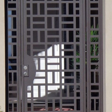
Detail of mesh screen.
Example of an eclectic closet design in Sacramento
Example of an eclectic closet design in Sacramento
 Neumann & Rudy Architecture
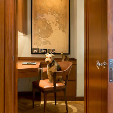
This image performs an act of deliberate spatial framing: we are positioned as intruders in a threshold, the photograph's foreground bracketed by two monumental slabs of mahogany-toned door leaf and jamb that compress the visual field into a portal roughly one-third the width of the frame. The composition is therefore a study in *enfilade* logic — a controlled, telescoping sightline that draws the eye through a narrow aperture into a recessed alcove, a purpose-built writing niche carved from what appears to be a corridor or dressing-room vestibule. The niche itself is architecturally modest in footprint but generous in vertical proportion; the ceiling reads as a plain plastered plane, unadorned save for a surface-mounted linear picture light on a slender drop stem, and the wall is treated as a full-height field for a single dominant object. The joinery is the true architecture here: a continuous run of casework establishes a horizontal datum at desk height, with a cantilevered writing surface returning perpendicular to the left-hand wall and a lower bank of drawers and a shallow ledge running right. That ledge functions as a *cimaise* or picture shelf, resolving the base of the framed nautical chart and giving the composition a plinth. Above, an integrated soffit or upper cabinet with concealed under-lighting terminates the left elevation, reinforcing the sense of an inhabited, tailored recess rather than a room. The herringbone parquet in the foreground introduces a diagonal geometry that runs counter to the orthogonal grid of doors, casework and picture frame, and this friction — chevron against rectilinear — animates what would otherwise be a static, axial composition. The single chair, canted slightly off-axis and pulled away from the desk, is the compositional pivot: it breaks the symmetry, occupies the exact center of the aperture, and converts an architectural vignette into a narrative one.
The palette is a disciplined exercise in the warm end of the spectrum, essentially monochromatic in hue and differentiated almost entirely by value, sheen and grain. The dominant material is timber, deployed in at least three distinct registers: the foreground door and jamb in a deeply saturated, red-brown mahogany or sapele with a high-build lacquer or French-polish sheen that catches light in long vertical highlights; the desk and casework in a lighter, honeyed figured wood — quartered cherry or anigre — finished to a satin rather than gloss, so that the eye reads it as a working surface rather than a ceremonial one; and finally the pale, blond oak of the herringbone floor, cerused or naturally oxidized to a straw tonality that lifts the lower register of the frame. Against this timber triad, the walls provide a chalky, low-saturation ground: a limewashed or flat-emulsion cream with a distinctly yellow-warm undertone that absorbs rather than reflects. The upholstery is the room's chromatic keynote — a saddle-tan or cognac leather, semi-aniline, already developing patina and slight slouch at the seat, its edge articulated by a close-set brass or antique-nickel nailhead trim that reads as a stitched seam of tiny metallic points. Metals are used sparingly and with historical precision: the polished chrome rosette and knob of the door with its heavy escutcheon and mortise strike plate, the slim brushed housing of the picture light. Texturally, the room stages a dialogue between the hard, reflective and the soft, absorbent: lacquer against limewash, taut leather against the friable, foxed paper of the antique chart. That chart — a hydrographic survey rendered in ochre, sepia and faded aqua, its ebonized frame supplying the composition's only true black — is the material anchor, its aged paper introducing a granular, time-worn texture that no new surface in the room could supply. The terrier, coincidentally or not, participates in this material scheme: a wiry tan-and-black coat that reads as a textile in its own right, tonally identical to the leather beneath it.
The lighting design is layered, warm-Kelvin and almost entirely artificial in its narrative effect, though the scene depends on a critical unseen source. A shaft of low, raking daylight enters from the right — presumably a window outside the frame — and lands as a hard-edged parallelogram across the parquet and the chair's front rail, creating the image's strongest contrast and lending the floor a sense of temporal specificity: late afternoon, low sun. Against this, three artificial layers operate. The surface-mounted picture light washes the nautical chart in an even, slightly amber flood, functioning as accent lighting that establishes the chart as the room's hierarchical focus. Concealed strip lighting beneath the upper casework grazes the left-hand desk return, providing task illumination and articulating the millwork's shadow line. Ambient fill is minimal and deliberately so; the corners of the niche fall into soft, unresolved shadow, and the whole tableau is rendered in a narrow tonal band of amber and umber that suppresses cool light almost entirely. The resulting atmosphere is one of burnished interiority — hushed, crepuscular, protective. Stylistically, the room resists easy categorization but sits most comfortably within a contemporary *Warm Traditionalism* or refined **Anglo-American Modern Classic** idiom: the vocabulary is unmistakably tailored-traditional (nailhead-trimmed leather, mortise hardware, framed cartography, a Deco-inflected barrel-back desk chair), yet the detailing is stripped of ornament — no cornice, no panel molding, no applied millwork profile — and the casework is resolved with the flush, planar minimalism of a mid-century yacht interior. It is, in essence, a *cabinet de travail* reimagined through the discipline of modern joinery: a room that borrows the emotional register of the club library while adopting the reductive geometry of contemporary architecture. The dog, unhurried and centrally enthroned, is the final aesthetic argument — evidence that the space is not a set piece but a lived, occupied, and evidently affectionate interior.

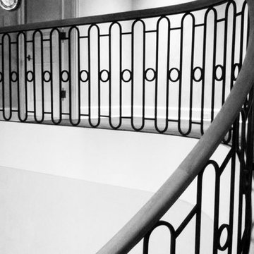
 Southern Staircase
Ornamental Iron Handrail System
Inspiration for a timeless home design remodel in Atlanta
Inspiration for a timeless home design remodel in Atlanta

 Skill Construction & Design, LLC
There are so many design elements to this kitchen, I almost don’t know where to start. Bright and airy with crisp clean white cabinets, the kitchen is open and welcoming. Still crisp but gently contrasting, the stainless steel appliance add depth amid the white. To keep this kitchen warm, natural oak covers the floors and a toasted wheat color washes the walls. And then there is the architectural elements. You know. That post and beam in the middle of the room. It’s the center of attention.
When you walk into a room your eyes roam around, establishing the size and shape of the room as your feet take you forward. From the front door of this home straight ahead you encountered this wall. The dining area to the right gives you a glimpse of things to come. Where there is a dining room you will usually find a kitchen.
The architecture of years gone by consistently hides the kitchen, the heart of the home, behind walls. I sympathize with my Mom, and all the other Moms, who have had to spend so much time tucked into a tight kitchen, away from the family. This wall had to go, but it was structural. We needed its support but not its bulk.
So we got rid of the bulk and only the bulk. Instead of a wall we have a post and beam, offering all of the structure we need. We could have installed a huge steel beam and reconfigure the joists to upset the beam, but why? The small beam and post add an incredible architectural element. It’s turning lemons into lemon, we simply made the most of what we had. It may be functional but it’s so fantastic. It looks like we created the effect just for the drama.
The original kitchen may have had a working triangle and some counter space, but it was fairly small, with each area only a step or two away. The dark cabinets made the space feel even smaller and the butcher block patterned laminate counter tops were very dated. The appliances were feeling their age as well, from a coil burner electric stove to a top freezer refrigerator. To keep this kitchen within its space, a half wall separated it from the dining area.
With the wall gone we borrowed some space from the living room and extended what was a U shaped kitchen into an L. At the living room window we start our new kitchen. We kept a small part of the wall to support the other end of our decorative beam. Sandwiched between a large pantry and our new French door refrigerator, the wall disappears. With our new open floor plan a sizable island was in order.
We split our cooking areas and installed a continuous grill gas cooktop into the island. A sleek island hood takes care of exhaust and adds an extra element to our architectural feature. Under the cooktop we added over-sized drawers for pots and pan storage. The frameless cabinets from New River Cabinetry are maple, painted white, with the Herndon door style. With the cooktop safely nestled into our island, we still had to add an oven.
We used the space where the old range sat for a large single oven of stainless steel and glass. If it worked for one, why not two? We created a home for a microwave in the wall cabinets. It’s perfect for heating leftovers so close to the refrigerator.
An important consideration for hot spots in your kitchen is landing zones. Each of our cooking areas have generous landing zones, one on each side of the cooktop and an entire counter area above or below the ovens, depending on which one you’re using.
We wanted to give the sink area more room so the half wall had to come out. We moved the trash and recycle cans into a cabinet, removed the heavy soffits and kept the sink under the window.
With that little bit of extra space we were able to add a larger cabinet above the dishwasher and slide it all down. This used to be where the carpeting met the vinyl floor, but all of it is gone. Long oak planks eliminate that final divide between the kitchen and the dining area, while adding visual length to the area. White wall cabinets on each side of the window reflect the sunlight for a brighter view.
With all of the darker cabinetry the backsplash walls had been painted white. Even still, there was a darkness in the corners and it wasn’t very exciting. We wanted to add visual interest and reflect the new under-cabinet lighting, eliminating the shadows in this corner.
With 1″x 2″ Arabescato Honed marble mosaics and those under-cabinet lights, we achieved the perfect balance. The marble has subtle swirls in gray and beige on a clean white background, but with the honed finish the light is softly reflected instead of glaring. For granite, we chose the soft gray tones of Luna Pearl. The speckles of gray and beige are a gentle contrast to the white cabinets and emulate the color of the stainless steel.
Between the carpet, red half wall, dark railing and dated light fixture, the dining area felt tired. Since the kitchen lacked sufficient storage, a large utility cabinet crowded the table space without adding any decorate elements.
Although it didn’t get any bigger, our dining area feels fresher and more open too. With the oak flooring joining the area to the rest of our space and the toasted wheat on the walls, the white table and chairs compliment the cabinetry while contrasting the warmer colors. We replaced the chandelier with recessed lighting and changed that railing too.
With our new open floor plan, we ended up with a fairly open area in between our foyer closet and the living room window. Not one to miss an opportunity, we filled the space with a multi-functional work space.
With the sunlight streaming in this bright corner works for anything this family needs.
There’s plenty of space for a chair under this large desk drawer. A closed cabinet below, glass doors above and lots of open shelving let you store and or showcase your belongings. We added a lite area at the top to keep away the darker corners.
The transformation is complete. This kitchen and all of its features are truly the center of attention in this home.
http://www.designsbyskill.com/
http://www.rjkconstructioninc.com/
 Skill Construction & Design, LLC
There are so many design elements to this kitchen, I almost don’t know where to start. Bright and airy with crisp clean white cabinets, the kitchen is open and welcoming. Still crisp but gently contrasting, the stainless steel appliance add depth amid the white. To keep this kitchen warm, natural oak covers the floors and a toasted wheat color washes the walls. And then there is the architectural elements. You know. That post and beam in the middle of the room. It’s the center of attention.
When you walk into a room your eyes roam around, establishing the size and shape of the room as your feet take you forward. From the front door of this home straight ahead you encountered this wall. The dining area to the right gives you a glimpse of things to come. Where there is a dining room you will usually find a kitchen.
The architecture of years gone by consistently hides the kitchen, the heart of the home, behind walls. I sympathize with my Mom, and all the other Moms, who have had to spend so much time tucked into a tight kitchen, away from the family. This wall had to go, but it was structural. We needed its support but not its bulk.
So we got rid of the bulk and only the bulk. Instead of a wall we have a post and beam, offering all of the structure we need. We could have installed a huge steel beam and reconfigure the joists to upset the beam, but why? The small beam and post add an incredible architectural element. It’s turning lemons into lemon, we simply made the most of what we had. It may be functional but it’s so fantastic. It looks like we created the effect just for the drama.
The original kitchen may have had a working triangle and some counter space, but it was fairly small, with each area only a step or two away. The dark cabinets made the space feel even smaller and the butcher block patterned laminate counter tops were very dated. The appliances were feeling their age as well, from a coil burner electric stove to a top freezer refrigerator. To keep this kitchen within its space, a half wall separated it from the dining area.
With the wall gone we borrowed some space from the living room and extended what was a U shaped kitchen into an L. At the living room window we start our new kitchen. We kept a small part of the wall to support the other end of our decorative beam. Sandwiched between a large pantry and our new French door refrigerator, the wall disappears. With our new open floor plan a sizable island was in order.
We split our cooking areas and installed a continuous grill gas cooktop into the island. A sleek island hood takes care of exhaust and adds an extra element to our architectural feature. Under the cooktop we added over-sized drawers for pots and pan storage. The frameless cabinets from New River Cabinetry are maple, painted white, with the Herndon door style. With the cooktop safely nestled into our island, we still had to add an oven.
We used the space where the old range sat for a large single oven of stainless steel and glass. If it worked for one, why not two? We created a home for a microwave in the wall cabinets. It’s perfect for heating leftovers so close to the refrigerator.
An important consideration for hot spots in your kitchen is landing zones. Each of our cooking areas have generous landing zones, one on each side of the cooktop and an entire counter area above or below the ovens, depending on which one you’re using.
We wanted to give the sink area more room so the half wall had to come out. We moved the trash and recycle cans into a cabinet, removed the heavy soffits and kept the sink under the window.
With that little bit of extra space we were able to add a larger cabinet above the dishwasher and slide it all down. This used to be where the carpeting met the vinyl floor, but all of it is gone. Long oak planks eliminate that final divide between the kitchen and the dining area, while adding visual length to the area. White wall cabinets on each side of the window reflect the sunlight for a brighter view.
With all of the darker cabinetry the backsplash walls had been painted white. Even still, there was a darkness in the corners and it wasn’t very exciting. We wanted to add visual interest and reflect the new under-cabinet lighting, eliminating the shadows in this corner.
With 1″x 2″ Arabescato Honed marble mosaics and those under-cabinet lights, we achieved the perfect balance. The marble has subtle swirls in gray and beige on a clean white background, but with the honed finish the light is softly reflected instead of glaring. For granite, we chose the soft gray tones of Luna Pearl. The speckles of gray and beige are a gentle contrast to the white cabinets and emulate the color of the stainless steel.
Between the carpet, red half wall, dark railing and dated light fixture, the dining area felt tired. Since the kitchen lacked sufficient storage, a large utility cabinet crowded the table space without adding any decorate elements.
Although it didn’t get any bigger, our dining area feels fresher and more open too. With the oak flooring joining the area to the rest of our space and the toasted wheat on the walls, the white table and chairs compliment the cabinetry while contrasting the warmer colors. We replaced the chandelier with recessed lighting and changed that railing too.
With our new open floor plan, we ended up with a fairly open area in between our foyer closet and the living room window. Not one to miss an opportunity, we filled the space with a multi-functional work space.
With the sunlight streaming in this bright corner works for anything this family needs.
There’s plenty of space for a chair under this large desk drawer. A closed cabinet below, glass doors above and lots of open shelving let you store and or showcase your belongings. We added a lite area at the top to keep away the darker corners.
The transformation is complete. This kitchen and all of its features are truly the center of attention in this home.
http://www.designsbyskill.com/
http://www.rjkconstructioninc.com/


 OVKO Art & Design
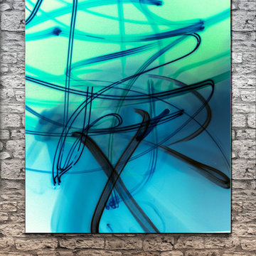
Blue Urban Abstract Wall Art has an undeniably modern hip flow. A futuristic digital painting, created with the technique of long exposure photography captures the motion of light as brushstrokes. A blend of blue green colors provides a soothing and calm expression. The lines are curvy and rhythmic adding to the smooth style. The overall style is reminiscent of graffiti, pushing the boundaries of new media art to the future. The work is mounted under a stunning plexiglass which provides a sleek finish and ultra modern feel.

 Venetian Stairs
For the Orpen’s remodel we sanded and refinished all newel posts and handrail to ebony / red mahogany color stain, then installed our powder coated PC4/1 Single Twist, PC6/1 Single Basket and PC6/4 Double Basket balusters in Classic Black. To finish, we repainted the end caps and balcony caps and applied at least two coats of satin polyurethane on all the stained wood.


 Contempo Studio
Inspiration for a mid-sized transitional gender-neutral light wood floor and white floor built-in closet remodel in Toronto with flat-panel cabinets and white cabinets

 StoneTileDepot
Mosaics are quite popular among homeowners and business owners alike because of their beauty, sophistication, and variety. You can also install artistic mosaic floors in your living room to enhance its appearance. You can place them anywhere in your house or commercial space that needs a visual uplift. They are versatile and bring about a sense of purity and hygiene in any space, be it a residential or business area.
At StonetileDepot, we offer a plethora of styles and shades in mosaic tiles. Ranging from the sophisticated and conventional Royal Beige and the Calacatta T-Honed marble mosaics to the chic and trendy Balastina Honed basalt mosaic, we have everything to meet your specific preferences, needs, and budget.
 User
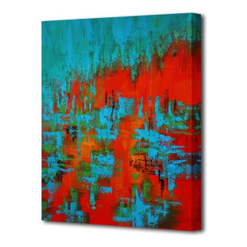
This is a wonderful colorful painting used only highest quality Winsor & Newton art materials, and painted on acid free gallery museum quality canvas.
It's not an identical copy.it's a recreation of an old subject. This recreation will have texture unique just to this painting, a fingerprint that can never be repeated. This recreation will look similar but will have different texture, each knife stroke is unique and impossible to repeat. Each paintingis one of a kind.
The recreation has a very high gallery value of thousands of dollars just like the first originally created painting. Investing into recreations is worthwhile just like investing into original work.
Shipping: The painting will be shipped and packed professionally. In order to protect your painting, we will pack your painting with great care using high quality, shipping industry approved packing materials.


128