
Search results for "Bot like behavior" in Home Design Ideas
 Teakwood Builders, Inc.
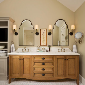
A clean, contemporary, spa-like master bathroom was on the list for this new construction home. The floating double vanity and linen storage feature sealed and varnished plank sap walnut doors with the horizontal grain matching end to end, contrasting with the dark gray tile throughout. The freestanding soaking tub is constructed of blue-stone, a composite of quartzite and bio-resin that is durable, anti-microbial, eco-friendly, and feels like natural stone. The expansive shower is adorned with modern Milano fixtures and integrated lighting for a true luxurious experience. This is appealing to the professional who desires a Pacific West Coast feel in Upstate NY
 Winder Gibson Architects
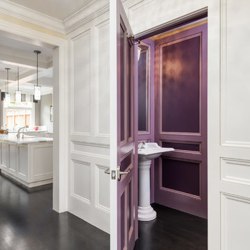
Working from the existing home’s deficits, we designed a bright and classic home well-suited to today’s living. Instead of a dark tunnel-like entry, we have a skylight custom curving stair that no one can believe is not original. Instead of a maze of rooms to reach the gorgeous park-like backyard, we have a clear central axis, allowing a sightline right through from the top of the stairs. Instead of three bedrooms scattered all over the house, we have zoned them to the second floor, each well-proportioned with a true master suite. Painted wood paneling, face-frame cabinets, box-beam beilings and Calacatta counters express the classic grandeur of the home.
 LABLstudio
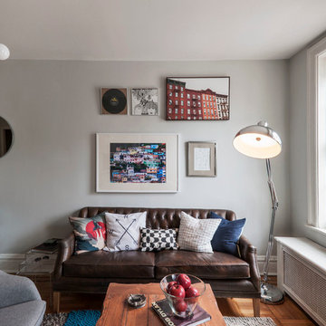
A pre-war West Village bachelor pad inspired by classic mid-century modern designs, mixed with some industrial, traveled, and street style influences. Our client took inspiration from both his travels as well as his city (NY!), and we really wanted to incorporate that into the design. For the living room we painted the walls a warm but light grey, and we mixed some more rustic furniture elements, (like the reclaimed wood coffee table) with some classic mid-century pieces (like the womb chair) to create a multi-functional kitchen/living/dining space. Using a versatile kitchen cart with a mirror above it, we created a small bar area, which was definitely on our client's wish list!
Photos by Matthew Williams
Find the right local pro for your project
 transFORM Home
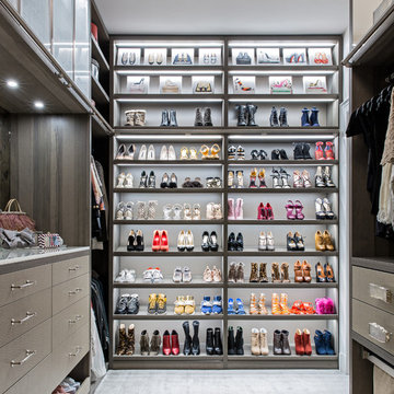
This breathtaking project by transFORM is just part of a larger renovation led by Becky Shea Design that transformed the maisonette of a historical building into a home as stylish and elegant as its owners.
Attention to detail was key in the configuration of the master closets and dressing rooms. The women’s master closet greatly elevated the aesthetic of the space with the inclusion of posh items like ostrich drawer faces, jewelry-like hardware, a dedicated shoe section, and glass doors. The boutique-inspired LED lighting system notably added a luxe look that’s both polished and functional.
Custom Closet by transFORM
Interior Design by Becky Shea Design
Photography by Sean Litchfield Photography
 Milgard Windows & Doors
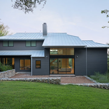
The Kiguchi family moved into their Austin, Texas home in 1994. Built in the 1980’s as part of a neighborhood development, they happily raised their family here but longed for something more contemporary. Once they became empty nesters, they decided it was time for a major remodel. After spending many years visiting Austin AIA Home Tours that highlight contemporary residential architecture, they had a lot of ideas and in 2013 were ready to interview architects and get their renovation underway.
The project turned into a major remodel due to an unstable foundation. Architects Ben Arbib and Ed Hughey, of Arbib Hughey Design were hired to solve the structural issue and look for inspiration in the bones of the house, which sat on top of a hillside and was surrounded by great views.
Unfortunately, with the old floor plan, the beautiful views were hidden by small windows that were poorly placed. In order to bring more natural light into the house the window sizes and configurations had to be addressed, all while keeping in mind the homeowners desire for a modern look and feel.
To achieve a more contemporary and sophisticated front of house, a new entry was designed that included removing a two-story bay window and porch. The entrance of the home also became more integrated with the landscape creating a template for new foliage to be planted. Older exterior materials were updated to incorporate a more muted palette of colors with a metal roof, dark grey siding in the back and white stucco in the front. Deep eaves were added over many of the new large windows for clean lines and sun protection.
“Inside it was about opening up the floor plan, expanding the views throughout the house, and updating the material palette to get a modern look that was also warm and inviting,” said Ben from Arbib Hughey Design. “Prior to the remodel, the house had the typical separation of rooms. We removed the walls between them and changed all of the windows to Milgard Thermally Improved Aluminum to connect the inside with the outside. No matter where you are you get nice views and natural light.”
The architects wanted to create some drama, which they accomplished with the window placement and opening up the interior floor plan to an open concept approach. Cabinetry was used to help delineate intimate spaces. To add warmth to an all-white living room, white-washed oak wood floors were installed and pine planks were used around the fireplace. The large windows served as artwork bringing the color of nature into the space.
An octagon shaped, elevated dining room, (named “the turret”), had a big impact on the design of the house. They architects rounded the corners and added larger window openings overlooking a new sunken garden. The great room was also softened by rounding out the corners and that circular theme continued throughout the house, being picked up in skylight wells and kitchen cabinetry. A staircase leading to a catwalk was added and the result was a two-story window wall that flooded the home with natural light.
When asked why Milgard® Thermally Improved Aluminum windows were selected, the architectural team listed many reasons:
1) Aesthetics: “We liked the slim profiles and narrow sightlines. The window frames never get in the way of the view and that was important to us. They also have a very contemporary look that went well with our design.”
2) Options: “We liked that we could get large sliding doors that matched the windows, giving us a very cohesive look and feel throughout the project.”
3) Cost Effective: “Milgard windows are affordable. You get a good product at a good price.”
4) Custom Sizes: “Milgard windows are customizable, which allowed us to get the right window for each location.”
Ready to take on your own traditional to modern home remodeling project? Arbib Hughey Design advises, “Work with a good architect. That means picking a team that is creative, communicative, listens well and is responsive. We think it’s important for an architect to listen to their clients and give them something they want, not something the architect thinks they should have. At the same time you want an architect who is willing and able to think outside the box and offer up design options that you may not have considered. Design is about a lot of back and forth, trying out ideas, getting feedback and trying again.”
The home was completely transformed into a unique, contemporary house perfectly integrated with its site. Internally the home has a natural flow for the occupants and externally it is integrated with the surroundings taking advantage of great natural light. As a side note, it was highly praised as part of the Austin AIA homes tour.

 Jinx McDonald Interior Designs
Kitchen by Jinx McDonald Interior Designs
Example of a transitional l-shaped kitchen design in Tampa with an undermount sink, recessed-panel cabinets, white cabinets, multicolored backsplash, stainless steel appliances and an island
Example of a transitional l-shaped kitchen design in Tampa with an undermount sink, recessed-panel cabinets, white cabinets, multicolored backsplash, stainless steel appliances and an island
 JM Lifestyles
WoodForm Concrete® is a lightweight engineered composite that looks like wood and acts like stone. It will not split, crack, splinter, stain or rot. Multiple color choices, edge details, accessories and more make this material a must-have if you truly want the look of, “wood without the worry”. This revolutionary product enables wood to be used in areas that real wood would be impossible or impractical. This product has more than 50% recycled content, 0% waste in its production, it's lightweight and easy to transport, will last longer than wood and has a lower Embodied Energy in its production.
Sponsored
Columbus, OH

Hope Restoration & General Contracting
Columbus Design-Build, Kitchen & Bath Remodeling, Historic Renovations
 Amethyst Home
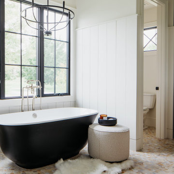
This fall, Amethyst had the opportunity to partner with Freeman Custom Homes of Kansas City to furnish this 5000 sq ft European Modern designed home for the Artisan Home Tour 2020!
Every square inch of this home was magical -- from the secret staircase in the master bath leading to a private shuttered plunge pool to the vaulted kitchen with sky high mushroom colored cabinetry and handmade zellige tile.
We met the builders during the cabinetry phase and watching their final, thoughtful design details evolve was such full of over-the-top surprises like the unique valet-like storage in the entry and limestone fireplace!
As soon as we saw their vision for the home, we knew our furnishings would be a great match as our design style celebrates handmade rugs, artisan handmade custom seating, old-meets-new art, and let's be honest -- we love to go big! They trusted us to do our thing on the entire main level and we enjoyed every minute.
The load in took 3 full trucks and fortunately for us -- the homeowners fell in love with several pieces so our uninstall trip was significantly lighter. I think we were all a little emotional leaving this masterpiece but sooooo happy for the owners and just hoping we get invited to a Christmas party...
Here are some of the highlights -- 90% of the furnishings and rugs were from our shop and we filled in the gaps with some extra special pieces!
 FineLine Kitchens, Inc.
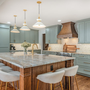
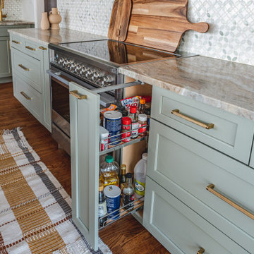
Hi everyone, I'm Sarah and Ogun we are here with fine line kitchens. So we are a couple working together. I do the interior design and remodeling of the space material selection meeting with the clients. And I handled operations outside, you know meaning all the construction work that is taking place the inside. The houses that we work in. I handle all the aspects of the construction, so today's project is very special. We're in Vienna and the client had a very big family. It's a family of seven that lives here. So we had a few aspects that we needed to keep in mind while designing this one. Having everybody be able to sit on the island. So we wanted plenty of seating all the way around. We didn't want anybody standing or anything like that. So what we did is we maximize the space. The center island is the biggest part of the kitchen. We use a natural stone to kind of give it a beautiful texture versus quartz. It's kind of standard white or kind of fabricated, so I wanted something very natural. We did this because I took my inspiration from the outside, so the inspiration if you look at the view right in front of me is there are so many greens there's a lot of brass accents and I wanted to bring this. Into this kitchen while designing it for my clients. She is very warm very. She wanted a very homey, comfy kind of look for the kitchen. So that's what we did today. As you can see, the cabinets are sage green, very light, so I still think it's a neutral, but it's a lighter color that again brings the outside in and we combine that with the oak right behind me so it's a slightly warm oak. It's not very dark. It's not very light. It's a medium brown and the same color went on the island. To kind of tie these two in and the backsplash, my favorite part is where you can see a little bit of design. It is, in my opinion still classic, but includes a pattern so the outside part is as we said in the beginning, is handled by my husband. I'd like him to speak a little bit about that. Thanks, Sarah, I want to talk to you guys a little bit about the construction part of this project. Originally this kitchen was located mostly in this area. They had their stove there sing. It was more of a peninsula layout in Sarah's and the customer vision they wanted. They wanted to get rid of the peninsula and they want to be able to have a huge island that can at least sit seven people because they're familiar with seven. So we wanted to make sure that we can achieve this design and bring it to life so that they can be happy with this layout. Some of the challenges we had, the house, the home being, you know, old home. There were a lot of you know the older electrical and plumbing that had to be replaced. We had to relocate the stove from here to this area. Over here we had put a nice foot fan that we had to relocate all the ductwork and the plumbing. Was being on the peninsula area. We had to relocate it to the center islands. So we achieved all this and kind of like bring it to bring in this kitchen up to date it looks beautiful. That's true, so yes, the old layout did not function for my clients because everything was kind of gathered on one side of the kitchen. So there was like a peninsula right there. So the end of this island kind of continued straight. And that was just the L shape. Kind of where everything was and there used to be another big table here, so they were using only kind of half of the space. So like I said at the beginning, our vision was to kind of feed everybody at the island, create some symmetry. 'cause I love that. So as you can see behind me, this is kind of the focal point symmetrical. Everything is kind of even we wanted to also panel the fridge here so it mimics the pantry and another size. So when you're looking at it, it is bringing again that symmetry back again. I hope you enjoyed this kitchen and this video and I'll see you soon. So how do you think this project turned out? It's nice. I like the color. I think it turned out nice. It's kind of like a little bit different color than what we always do. So I realize. Are you giving me a little bit of credit here that I did something different? Are you proud? I'm so proud of you. Other than that I like it. That they have kind of like a two sink. So if this was our kitchen, if we ever like you can have your own. I can have mine if we ever get into a fight then this can be like my own kitchen. Why are we gonna bring in a fight right now? So I'm cooking anyway. You're grilling most of the time, So what are you even talking about? My kitchen? That's my kitchen. You can just take the small sink. That's fine. It's always good to have your own space right there, so anyways. Thank you guys for watching. We hope to see you soon and if you have any questions please click the link below. It'll lead you to our website, house, YouTube and all of the social media is so nice to have you guys. We'll see you soon. Thanks bye bye-bye.
 User
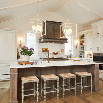
UserThis French country-inspired kitchen shows off a mixture of natural materials like marble and alder wood. The cabinetry from Grabill Cabinets was thoughtfully designed to look like furniture. The island, dining table, and bar work table allow for enjoying good food and company throughout the space. The large metal range hood from Raw Urth stands sentinel over the professional range, creating a contrasting focal point in the design. Cabinetry that stretches from floor to ceiling eliminates the look of floating upper cabinets while providing ample storage space.
Cabinetry: Grabill Cabinets,
Countertops: Grothouse, Great Lakes Granite,
Range Hood: Raw Urth,
Builder: Ron Wassenaar,
Interior Designer: Diane Hasso Studios,
Photography: Ashley Avila Photography
 Tiffany Brooks, HGTV Host & Interior Designer
Inquire About Our Design Services
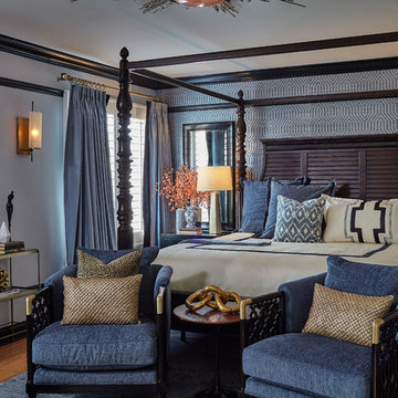
When we first started talking in the spring of 2015, I was impressed. She was witty, realistic, and understood that as much as she loves my shows on HGTV, design does not does not happen in 43 minutes! She told me about her space, and how she felt that her bedroom seemed “blah” to her. She had no retreat. Molly desperately longed for a place that she could spend time in, read in, play in and above all, relax in.
What we did:
Many people are terrified of hiring a designer. Rightfully so, they are investing a pretty penny in their homes. They want to make sure that everything, down to the last floral arrangement, is to their liking, because they will have to live it (and pay for it). Unfortunately, a client can unintentionally stifle a designer’s creativity through micro-management. This can produce lackluster results and ultimately cause more time (and money) to be spent on a project than is really necessary.
With Molly, that was never an issue. Before she even showed me the room in question, she said that I could have full creative license to do what I needed to do to her bedroom. SAY WHAAH!?
With Molly giving me complete creative freedom, I planned everything out and got down to business. The result: Bite-your-bottom-lip sexy. I don’t get jealous of too many of my clients’ spaces, but this one still takes my breath away every time I look at the pics!
The craziest part was that by adding more furniture, it actually made the space feel larger.
Molly and her husband Patrick loved the finished space, and promised me I will be back to finish the rest of the house!
Here’s the highlights of the rest of the project:
I came up with a space plan with three options.
Next, we reviewed mood boards and fabric schemes that would work for both Molly and her hubby Patrick.
We started with the bed. My goal was to add edge to its otherwise traditional style.
We decided to spice things up by painting the trim work in the room black.
We built in layers of lighting with dimmers. In a bedroom everything should be on dimmers, right? Right.
We designed and customized bedding, chairs and window treatments.
Together with Molly, we selected the most perfect wallpaper. This geometric “grasscloth” adds so much depth and dimension that was just missing before.
What I love:
That light fixture. I mean it is really, really amazing in person.
The porcupine mirror. This thing came packaged like it was the hope diamond, and everyone was terrified to handle it. But it really became a highlight of the room.
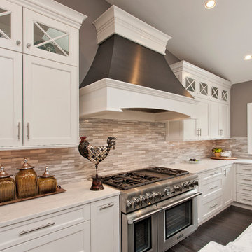
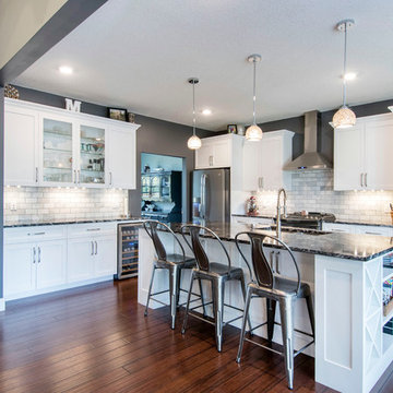
Example of a large transitional kitchen design in DC Metro with shaker cabinets, white cabinets, marble countertops, stone tile backsplash and white countertops
 Shakuff
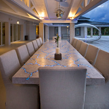
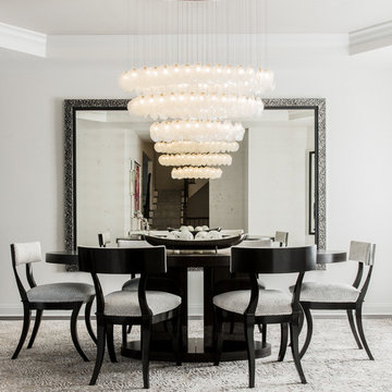
Crystal Shell Custom Blown Glass Chandelier. Sea inspired glass shells glisten from their crackle-like texture. Available as individual pendants or multi-pendant chandeliers. Multiple sizes and colors are available.
Modern Custom Glass Lighting perfect for your entryway / foyer, stairwell, living room, dining room, kitchen, and any room in your home. Dramatic lighting that is fully customizable and tailored to fit your space perfectly. No two pieces are the same.
Visit our website: www.shakuff.com for more details.
Tel. 212.675.0383
info@shakuff.com
Photo Credit: Sean Litchenfield Photography
Interior Design By: MacWright Interiors LLC

 Corine Maggio Design
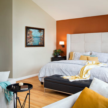
This bedroom on Sunset Cliffs in Sand Diego was designed for a lovely and well-traveled couple who likes to keep their space minimal and organized. They like color and simplicity. We played with scale and pattern to create interest to make this their ideal retreat at the end of the day.
Photo cred: Chipper Hatter: www.chipperhatter.com
 Artistic Design And Remodeling
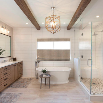
Light and Airy shiplap bathroom was the dream for this hard working couple. The goal was to totally re-create a space that was both beautiful, that made sense functionally and a place to remind the clients of their vacation time. A peaceful oasis. We knew we wanted to use tile that looks like shiplap. A cost effective way to create a timeless look. By cladding the entire tub shower wall it really looks more like real shiplap planked walls.
The center point of the room is the new window and two new rustic beams. Centered in the beams is the rustic chandelier.
Design by Signature Designs Kitchen Bath
Contractor ADR Design & Remodel
Photos by Gail Owens
 FineLine Kitchens, Inc.
Hi everyone, I'm Sarah and Ogun we are here with fine line kitchens. So we are a couple working together. I do the interior design and remodeling of the space material selection meeting with the clients. And I handled operations outside, you know meaning all the construction work that is taking place the inside. The houses that we work in. I handle all the aspects of the construction, so today's project is very special. We're in Vienna and the client had a very big family. It's a family of seven that lives here. So we had a few aspects that we needed to keep in mind while designing this one. Having everybody be able to sit on the island. So we wanted plenty of seating all the way around. We didn't want anybody standing or anything like that. So what we did is we maximize the space. The center island is the biggest part of the kitchen. We use a natural stone to kind of give it a beautiful texture versus quartz. It's kind of standard white or kind of fabricated, so I wanted something very natural. We did this because I took my inspiration from the outside, so the inspiration if you look at the view right in front of me is there are so many greens there's a lot of brass accents and I wanted to bring this. Into this kitchen while designing it for my clients. She is very warm very. She wanted a very homey, comfy kind of look for the kitchen. So that's what we did today. As you can see, the cabinets are sage green, very light, so I still think it's a neutral, but it's a lighter color that again brings the outside in and we combine that with the oak right behind me so it's a slightly warm oak. It's not very dark. It's not very light. It's a medium brown and the same color went on the island. To kind of tie these two in and the backsplash, my favorite part is where you can see a little bit of design. It is, in my opinion still classic, but includes a pattern so the outside part is as we said in the beginning, is handled by my husband. I'd like him to speak a little bit about that. Thanks, Sarah, I want to talk to you guys a little bit about the construction part of this project. Originally this kitchen was located mostly in this area. They had their stove there sing. It was more of a peninsula layout in Sarah's and the customer vision they wanted. They wanted to get rid of the peninsula and they want to be able to have a huge island that can at least sit seven people because they're familiar with seven. So we wanted to make sure that we can achieve this design and bring it to life so that they can be happy with this layout. Some of the challenges we had, the house, the home being, you know, old home. There were a lot of you know the older electrical and plumbing that had to be replaced. We had to relocate the stove from here to this area. Over here we had put a nice foot fan that we had to relocate all the ductwork and the plumbing. Was being on the peninsula area. We had to relocate it to the center islands. So we achieved all this and kind of like bring it to bring in this kitchen up to date it looks beautiful. That's true, so yes, the old layout did not function for my clients because everything was kind of gathered on one side of the kitchen. So there was like a peninsula right there. So the end of this island kind of continued straight. And that was just the L shape. Kind of where everything was and there used to be another big table here, so they were using only kind of half of the space. So like I said at the beginning, our vision was to kind of feed everybody at the island, create some symmetry. 'cause I love that. So as you can see behind me, this is kind of the focal point symmetrical. Everything is kind of even we wanted to also panel the fridge here so it mimics the pantry and another size. So when you're looking at it, it is bringing again that symmetry back again. I hope you enjoyed this kitchen and this video and I'll see you soon. So how do you think this project turned out? It's nice. I like the color. I think it turned out nice. It's kind of like a little bit different color than what we always do. So I realize. Are you giving me a little bit of credit here that I did something different? Are you proud? I'm so proud of you. Other than that I like it. That they have kind of like a two sink. So if this was our kitchen, if we ever like you can have your own. I can have mine if we ever get into a fight then this can be like my own kitchen. Why are we gonna bring in a fight right now? So I'm cooking anyway. You're grilling most of the time, So what are you even talking about? My kitchen? That's my kitchen. You can just take the small sink. That's fine. It's always good to have your own space right there, so anyways. Thank you guys for watching. We hope to see you soon and if you have any questions please click the link below. It'll lead you to our website, house, YouTube and all of the social media is so nice to have you guys. We'll see you soon. Thanks bye bye-bye.
 Lumar Interiors
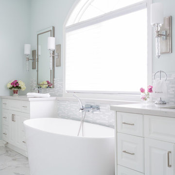
This couple’s main request was for a calming spa like ensuite bath.
The original floor plan was not changed but all the finishes and fixtures were replaced. Porcelain tile, glass and stone mosaic tile, custom vanities, new plumbing fixtures, shower and mirrors and lights replaced the builder grade materials. The new spa-like colour scheme and custom vanity table finished the room off – mission accomplished!
Photographer:
Jason Hartog
Project by Richmond Hill interior design firm Lumar Interiors. Also serving Aurora, Newmarket, King City, Markham, Thornhill, Vaughan, York Region, and the Greater Toronto Area.
For more about Lumar Interiors, click here: https://www.lumarinteriors.com/
To learn more about this project, click here: https://www.lumarinteriors.com/portfolio/richmond-hill-bathroom-renovation/
Sponsored
Fredericksburg, OH

High Point Cabinets
Columbus' Experienced Custom Cabinet Builder | 4x Best of Houzz Winner
 FineLine Kitchens, Inc.
Hi everyone, I'm Sarah and Ogun we are here with fine line kitchens. So we are a couple working together. I do the interior design and remodeling of the space material selection meeting with the clients. And I handled operations outside, you know meaning all the construction work that is taking place the inside. The houses that we work in. I handle all the aspects of the construction, so today's project is very special. We're in Vienna and the client had a very big family. It's a family of seven that lives here. So we had a few aspects that we needed to keep in mind while designing this one. Having everybody be able to sit on the island. So we wanted plenty of seating all the way around. We didn't want anybody standing or anything like that. So what we did is we maximize the space. The center island is the biggest part of the kitchen. We use a natural stone to kind of give it a beautiful texture versus quartz. It's kind of standard white or kind of fabricated, so I wanted something very natural. We did this because I took my inspiration from the outside, so the inspiration if you look at the view right in front of me is there are so many greens there's a lot of brass accents and I wanted to bring this. Into this kitchen while designing it for my clients. She is very warm very. She wanted a very homey, comfy kind of look for the kitchen. So that's what we did today. As you can see, the cabinets are sage green, very light, so I still think it's a neutral, but it's a lighter color that again brings the outside in and we combine that with the oak right behind me so it's a slightly warm oak. It's not very dark. It's not very light. It's a medium brown and the same color went on the island. To kind of tie these two in and the backsplash, my favorite part is where you can see a little bit of design. It is, in my opinion still classic, but includes a pattern so the outside part is as we said in the beginning, is handled by my husband. I'd like him to speak a little bit about that. Thanks, Sarah, I want to talk to you guys a little bit about the construction part of this project. Originally this kitchen was located mostly in this area. They had their stove there sing. It was more of a peninsula layout in Sarah's and the customer vision they wanted. They wanted to get rid of the peninsula and they want to be able to have a huge island that can at least sit seven people because they're familiar with seven. So we wanted to make sure that we can achieve this design and bring it to life so that they can be happy with this layout. Some of the challenges we had, the house, the home being, you know, old home. There were a lot of you know the older electrical and plumbing that had to be replaced. We had to relocate the stove from here to this area. Over here we had put a nice foot fan that we had to relocate all the ductwork and the plumbing. Was being on the peninsula area. We had to relocate it to the center islands. So we achieved all this and kind of like bring it to bring in this kitchen up to date it looks beautiful. That's true, so yes, the old layout did not function for my clients because everything was kind of gathered on one side of the kitchen. So there was like a peninsula right there. So the end of this island kind of continued straight. And that was just the L shape. Kind of where everything was and there used to be another big table here, so they were using only kind of half of the space. So like I said at the beginning, our vision was to kind of feed everybody at the island, create some symmetry. 'cause I love that. So as you can see behind me, this is kind of the focal point symmetrical. Everything is kind of even we wanted to also panel the fridge here so it mimics the pantry and another size. So when you're looking at it, it is bringing again that symmetry back again. I hope you enjoyed this kitchen and this video and I'll see you soon. So how do you think this project turned out? It's nice. I like the color. I think it turned out nice. It's kind of like a little bit different color than what we always do. So I realize. Are you giving me a little bit of credit here that I did something different? Are you proud? I'm so proud of you. Other than that I like it. That they have kind of like a two sink. So if this was our kitchen, if we ever like you can have your own. I can have mine if we ever get into a fight then this can be like my own kitchen. Why are we gonna bring in a fight right now? So I'm cooking anyway. You're grilling most of the time, So what are you even talking about? My kitchen? That's my kitchen. You can just take the small sink. That's fine. It's always good to have your own space right there, so anyways. Thank you guys for watching. We hope to see you soon and if you have any questions please click the link below. It'll lead you to our website, house, YouTube and all of the social media is so nice to have you guys. We'll see you soon. Thanks bye bye-bye.
 Spazio LA
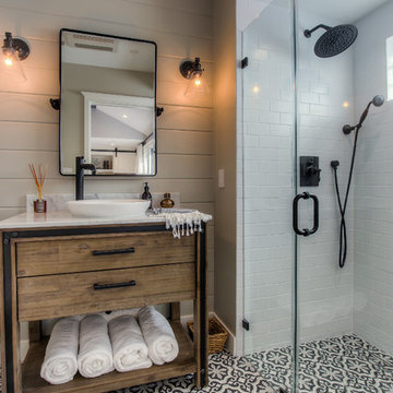
This beautiful bathroom features cement tiles (from Cement Tile Shop) on the floors with an infinity drain a custom frameless shower door and custom lighting. Vanity is Signature Hardware, and mirror is from Pottery Barn.
 Ulrich Inc
Ulrich Designer: Tom Santarsiero
Photography by Peter Rymwid
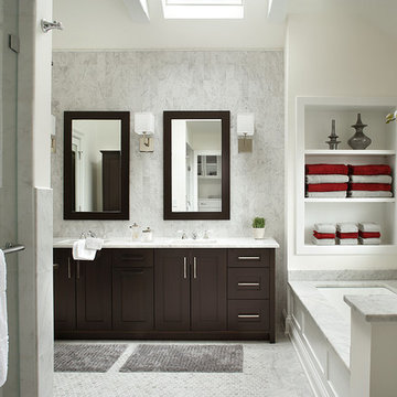
This is a master bath with subtle sophistication and understated elegance. The cabinets were custom designed by Tom, with straight, simple lines, and custom built by Draper DBS of walnut, with a deep, rich brown finish. The richness of the dark cabinetry juxtaposed with the elegance of the white carrara marble on the countertop, wall and floors contributes to the room's sophistication. Ample storage is found in the large vanity and an armoire style cabinet, designed to mimic a free-standing furniture piece, that is positioned behind the door. Architectural beams placed across the vaulted ceiling bring a sense of scale to the room and invite natural light in through the skylight.
11