
Search results for "Briefing" in Home Design Ideas
 Granit Architects + Interiors
The brief:
Our clients own an apartment in a mansion block overlooking Clapham Common. They wanted to modernise and bring the apartment up to date and had a few goals:
To change the existing small cellular spaces in the apartment to create a new open-plan room
To extend into the loft and create a new master bedroom suite
To create a roof terrace for some much-needed private outdoor space
The key to the brief was to ensure a good connection between the different levels of the apartment and ensure natural light could flood into all spaces. The apartment is in a conservation area, which was an important consideration.
The solution:
We changed the primary room space to run from the front to the back of the building. This change created the large kitchen dining living space our clients wanted, an area with good natural light throughout and at all times of the day.
We created a master bedroom suite in the loft space, with generous room size and lots of natural light.
The limitations of the building’s form meant that a critical aspect to creating these larger living spaces was carefully considered smaller areas, including the bathrooms and a pocket utility room. The circulation space was carefully considered, too, with the landings used for storage in the form of new joinery.
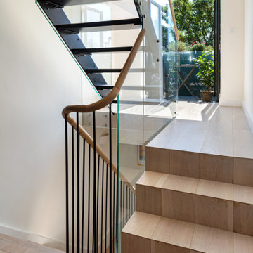
The stairs were vital in the design. Creating an in-between/half level meant we made the most of the flat roof extension for a bedroom suite and terrace. It also helped natural light get into the centre of the apartment, creating a clear connection between the different floors.
The stairs also help to mark the difference between the existing and the new. We shifted the design from a minimalist take on traditional metal balustraded stairs to open tread steel stairs with a glazed balustrade.
Externally, we kept the design quite simple and in keeping with the context. By adding dormers to the front and back, we created a sculptural and fun loft space.
The result:
A spacious, light and luxurious apartment for our clients Gareth and Mary in a Clapham Common Conservation area.
We asked about their experience with Granit, and we are pleased with their response:
Our experience overall is very good, even with the unexpected difficulties created by Covid.
If you are thinking of appointing an architect and interior design firm, Granit should be seriously considered.
 Building Designers Association of Australia
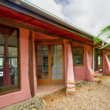
This is a great little house that has used back to basics construction methods that utilise ancient building techniques to help be a solution for the modern problem of climate change. The brief was a challenging one; build a beautiful, sustainable home for a family in a short period of time with a very small budget. The brief was fulfilled through the use of efficient design, second hand materials and the use of cob (earth) wall construction - which cost next to nothing but allowed for sculptural beauty. An amazing effort from a determined client then turned that into reality.
 Living Interiors
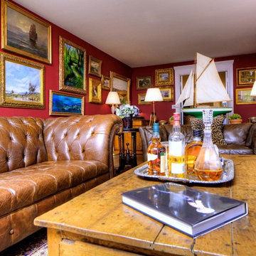
The brief here was 'gentleman's club' - vintage leather Chesterfield sofas, claret colored walls and a gallery style wall of oil paintings answer the brief.
Find the right local pro for your project
 Jim Sharples Furniture
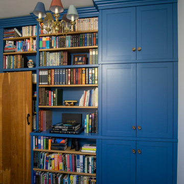
Bespoke Blue Library for a lovely cottage near Bristol.
The problem:
The room was going to be their office, it didn’t have much storage and it wasn’t very big. It had a difficult wall nib sticking out behind the door running the length of the wall and the room and had very high ceilings 3.2 metres high. This is precisely why they decided to go bespoke.
The brief:
The clients wanted lots of cabinets and shelves to make a library / bookcase for an awkward wall in a small room. The clients initially wanted ‘L’ shaped cabinets.
Lots of bookshelves, and I mean lots, like a bookcase wall and somewhere to hide office equipment like the printer and phone chargers.
Book shelves needed to be strong so they wouldn’t sag under the weight of the books – this was of utmost importance to the brief, these clients love books and reading.
Adjustable book shelves so they could fit their books exactly and change it up when needed.
The bespoke library was to go right up to the very high ceiling and finish in a cornice.
The cornice needed a particular profile to match their existing furniture.
“It’s better than we imagined it could be” was the first thing they said when they saw it complete!
When we first visited and discussed the design for this bespoke library in Bristol with them, it became obvious that an ‘L’ shape wouldn’t work in the room, so the first draft was to have the shelves and cabinets along one wall.
There were around 5 revisions in the end, until the design was approved. The design was intricate and had to be spot on taking the wall nib and the opening door and latch into account.
The whole bookcase cabinetry was made from solid tulip wood, this is a strong and stable material to take the weight of the books. The cornice was specially commissioned to match the profile of their existing furniture. For the adjustable shelves we used brass bookcase strips.
The bookshelves are all solid English oak from our favourite local supplier a family run business called Interesting Timbers these were all finished in our rollered Osmo oil finish.
Jo hand painted the whole piece, inside and out, it in their choice of colour (Woad’ by Little Greene). Jim installed it to our meticulous standards and the clients were very happy with the results.
We are also delighted with the finished result! Do let us know what you think or get in touch if you would like to discuss your own project.
 Building Designers Association of Australia
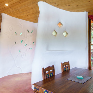
This is a great little house that has used back to basics construction methods that utilise ancient building techniques to help be a solution for the modern problem of climate change. The brief was a challenging one; build a beautiful, sustainable home for a family in a short period of time with a very small budget. The brief was fulfilled through the use of efficient design, second hand materials and the use of cob (earth) wall construction - which cost next to nothing but allowed for sculptural beauty. An amazing effort from a determined client then turned that into reality.
 Jim Sharples Furniture
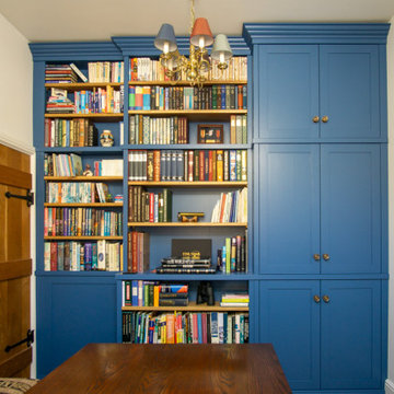
Bespoke Blue Library for a lovely cottage near Bristol.
The problem:
The room was going to be their office, it didn’t have much storage and it wasn’t very big. It had a difficult wall nib sticking out behind the door running the length of the wall and the room and had very high ceilings 3.2 metres high. This is precisely why they decided to go bespoke.
The brief:
The clients wanted lots of cabinets and shelves to make a library / bookcase for an awkward wall in a small room. The clients initially wanted ‘L’ shaped cabinets.
Lots of bookshelves, and I mean lots, like a bookcase wall and somewhere to hide office equipment like the printer and phone chargers.
Book shelves needed to be strong so they wouldn’t sag under the weight of the books – this was of utmost importance to the brief, these clients love books and reading.
Adjustable book shelves so they could fit their books exactly and change it up when needed.
The bespoke library was to go right up to the very high ceiling and finish in a cornice.
The cornice needed a particular profile to match their existing furniture.
“It’s better than we imagined it could be” was the first thing they said when they saw it complete!
When we first visited and discussed the design for this bespoke library in Bristol with them, it became obvious that an ‘L’ shape wouldn’t work in the room, so the first draft was to have the shelves and cabinets along one wall.
There were around 5 revisions in the end, until the design was approved. The design was intricate and had to be spot on taking the wall nib and the opening door and latch into account.
The whole bookcase cabinetry was made from solid tulip wood, this is a strong and stable material to take the weight of the books. The cornice was specially commissioned to match the profile of their existing furniture. For the adjustable shelves we used brass bookcase strips.
The bookshelves are all solid English oak from our favourite local supplier a family run business called Interesting Timbers these were all finished in our rollered Osmo oil finish.
Jo hand painted the whole piece, inside and out, it in their choice of colour (Woad’ by Little Greene). Jim installed it to our meticulous standards and the clients were very happy with the results.
We are also delighted with the finished result! Do let us know what you think or get in touch if you would like to discuss your own project.
 Jim Sharples Furniture
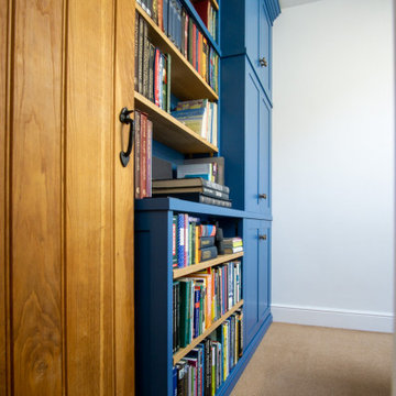
Bespoke Blue Library for a lovely cottage near Bristol.
The problem:
The room was going to be their office, it didn’t have much storage and it wasn’t very big. It had a difficult wall nib sticking out behind the door running the length of the wall and the room and had very high ceilings 3.2 metres high. This is precisely why they decided to go bespoke.
The brief:
The clients wanted lots of cabinets and shelves to make a library / bookcase for an awkward wall in a small room. The clients initially wanted ‘L’ shaped cabinets.
Lots of bookshelves, and I mean lots, like a bookcase wall and somewhere to hide office equipment like the printer and phone chargers.
Book shelves needed to be strong so they wouldn’t sag under the weight of the books – this was of utmost importance to the brief, these clients love books and reading.
Adjustable book shelves so they could fit their books exactly and change it up when needed.
The bespoke library was to go right up to the very high ceiling and finish in a cornice.
The cornice needed a particular profile to match their existing furniture.
“It’s better than we imagined it could be” was the first thing they said when they saw it complete!
When we first visited and discussed the design for this bespoke library in Bristol with them, it became obvious that an ‘L’ shape wouldn’t work in the room, so the first draft was to have the shelves and cabinets along one wall.
There were around 5 revisions in the end, until the design was approved. The design was intricate and had to be spot on taking the wall nib and the opening door and latch into account.
The whole bookcase cabinetry was made from solid tulip wood, this is a strong and stable material to take the weight of the books. The cornice was specially commissioned to match the profile of their existing furniture. For the adjustable shelves we used brass bookcase strips.
The bookshelves are all solid English oak from our favourite local supplier a family run business called Interesting Timbers these were all finished in our rollered Osmo oil finish.
Jo hand painted the whole piece, inside and out, it in their choice of colour (Woad’ by Little Greene). Jim installed it to our meticulous standards and the clients were very happy with the results.
We are also delighted with the finished result! Do let us know what you think or get in touch if you would like to discuss your own project.
 Granit Architects + Interiors
The brief:
Our clients own an apartment in a mansion block overlooking Clapham Common. They wanted to modernise and bring the apartment up to date and had a few goals:
To change the existing small cellular spaces in the apartment to create a new open-plan room
To extend into the loft and create a new master bedroom suite
To create a roof terrace for some much-needed private outdoor space
The key to the brief was to ensure a good connection between the different levels of the apartment and ensure natural light could flood into all spaces. The apartment is in a conservation area, which was an important consideration.
The solution:
We changed the primary room space to run from the front to the back of the building. This change created the large kitchen dining living space our clients wanted, an area with good natural light throughout and at all times of the day.
We created a master bedroom suite in the loft space, with generous room size and lots of natural light.
The limitations of the building’s form meant that a critical aspect to creating these larger living spaces was carefully considered smaller areas, including the bathrooms and a pocket utility room. The circulation space was carefully considered, too, with the landings used for storage in the form of new joinery.
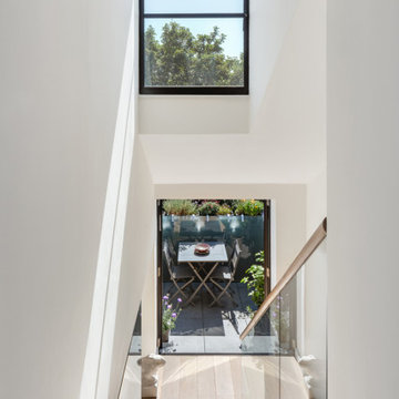
The stairs were vital in the design. Creating an in-between/half level meant we made the most of the flat roof extension for a bedroom suite and terrace. It also helped natural light get into the centre of the apartment, creating a clear connection between the different floors.
The stairs also help to mark the difference between the existing and the new. We shifted the design from a minimalist take on traditional metal balustraded stairs to open tread steel stairs with a glazed balustrade.
Externally, we kept the design quite simple and in keeping with the context. By adding dormers to the front and back, we created a sculptural and fun loft space.
The result:
A spacious, light and luxurious apartment for our clients Gareth and Mary in a Clapham Common Conservation area.
We asked about their experience with Granit, and we are pleased with their response:
Our experience overall is very good, even with the unexpected difficulties created by Covid.
If you are thinking of appointing an architect and interior design firm, Granit should be seriously considered.
 Monarch & Maker
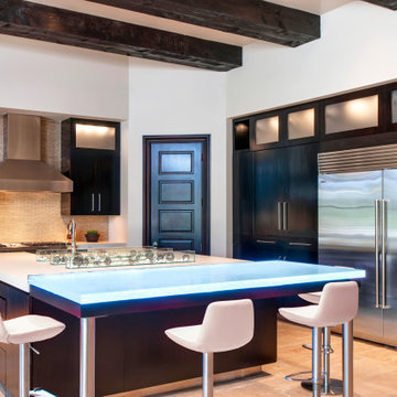
The client wished to create a unique kitchen within a Mediterranean-style home. A practical workflow from food preparation to entertaining was critical, with hidden storage and other features to allow functional living.
We set out to create a very large central island that needed to incorporate 2 inch thick custom glass and caesar stone.
To use the space effectively and incorporate appliances that would meet the client’s brief to create a practical kitchen, we sourced two 36” fridge and freezer towers. This allowed us to create symmetry and contemporary beauty.
From flip-down charging stations to hidden drawers, the kitchen looks extremely modern but supports everyday living and meets the client’s brief to deliver a space that would enable cooking and informal entertaining. The island has achieved all of our design goals and the imported custom glass countertop has met the vision to fuse contemporary with traditional.
Find out more http://www.designbycrimson.com/news/2015-01-07-contemporary-kitchen-design-carlton-woods
 Granit Architects + Interiors
The brief:
Our clients own an apartment in a mansion block overlooking Clapham Common. They wanted to modernise and bring the apartment up to date and had a few goals:
To change the existing small cellular spaces in the apartment to create a new open-plan room
To extend into the loft and create a new master bedroom suite
To create a roof terrace for some much-needed private outdoor space
The key to the brief was to ensure a good connection between the different levels of the apartment and ensure natural light could flood into all spaces. The apartment is in a conservation area, which was an important consideration.
The solution:
We changed the primary room space to run from the front to the back of the building. This change created the large kitchen dining living space our clients wanted, an area with good natural light throughout and at all times of the day.
We created a master bedroom suite in the loft space, with generous room size and lots of natural light.
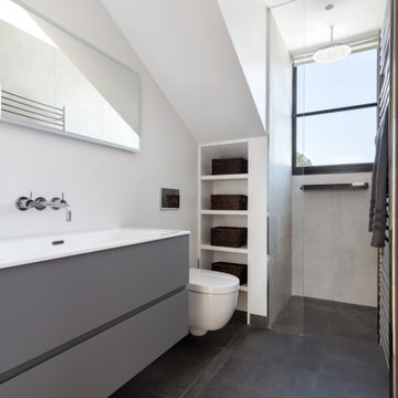
The limitations of the building’s form meant that a critical aspect to creating these larger living spaces was carefully considered smaller areas, including the bathrooms and a pocket utility room. The circulation space was carefully considered, too, with the landings used for storage in the form of new joinery.
The stairs were vital in the design. Creating an in-between/half level meant we made the most of the flat roof extension for a bedroom suite and terrace. It also helped natural light get into the centre of the apartment, creating a clear connection between the different floors.
The stairs also help to mark the difference between the existing and the new. We shifted the design from a minimalist take on traditional metal balustraded stairs to open tread steel stairs with a glazed balustrade.
Externally, we kept the design quite simple and in keeping with the context. By adding dormers to the front and back, we created a sculptural and fun loft space.
The result:
A spacious, light and luxurious apartment for our clients Gareth and Mary in a Clapham Common Conservation area.
We asked about their experience with Granit, and we are pleased with their response:
Our experience overall is very good, even with the unexpected difficulties created by Covid.
If you are thinking of appointing an architect and interior design firm, Granit should be seriously considered.
 Best Redwood
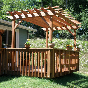
Customer review: The pergola was well built to my measurements. Craftsmanship is excellent. I went with 4x4 posts to match the deck. Some hardware may have to be trimmed when assembled. A shade cloth was added for additional protection. While the wood looks great the first year, it will darken after a Northwest winter.
Experience the natural beauty of Best Redwood Super Deck Pergola. Create the perfect spot for lounging, dining, and relaxation in your outdoor patio. Make this Redwood Deck Pergola your own!
100% solid redwood.
Features plenty long term benefits, such as reliability, strength, and resistance to decay, rot, and weather elements.
Post sizes are built at 6 in. x 6 in. and rafters at 2 in. x 6 in.
Custom combinations that are smaller than 10ft. x 10ft. Post sizes will be built at 4 in. x 4 in. and rafters at 2 in. x 4 in.
Standard height of pergola is 8ft. (If you are looking for a higher roof, contact us for a custom request).
Standard separation between rafters is 18" approximately. (looking for more shade? contact us and we can accomodate your needs).
Assembly instructions and hardware are included.
Anchors are not included, but can be requested and sold separately.
Your choice of premium sealant applied.
Your choice of end rafter design.
Includes 4 bottom of posts trim boxes.
Excellent craftsmanship and quality.
Home Delivery.
With over 50 different combinations in sizes and styles, your can customize your Best Redwood Pergola the way you want. If you are looking for a special design, please contact us. Choose from:
Deck Pergolas.
Attached Pergolas.
Arched Pergolas.
Lattice Pergolas.
Custom Pergolas.
There are 4 different designs of end rafters, or customize your own design, just send us a brief design, and we can develop and improve what you have in mind.
Posts can be 6"x 6" or 4"x 4" of solid redwood.
Rafters can be 2"x 6" or 2"x 4".
Separation between rafters can be from 12" to 24".
Height can be 8ft to 12ft.
Length of pergola is measured from rafter to rafter. Therefore a 12ft x 12ft pergola would be 10ft x 10ft from post to post.
Custom Design Services
Arched Redwood Pergola
So, if you are looking for a Custom Pergola, or to fine tune our Super Deck Redwood Pergola to fit your needs, we can offer custom made services as well. Just send us a brief design of what you require and we can develop together a new design! See here an example of an Arched Redwood Pergola measuring 20ft long and 16ft Wide, 12ft Tall with arched rafters and lattice cover!
Your Best Redwood Furniture will last a lifetime! But we'll guarantee your product for at least 5 years all-round weather conditions with normal maintenance every year or so.
California redwood is one of nature’s most maintenance-free building materials. It has a natural resistance to decay and insects. Redwood’s natural stability means it shrinks, warps, and splits less than most other woods. In addition, no other wood takes and holds finishes better than redwood.
If you want to apply your choice of premium stain sealant or if you enjoy the natural color of redwood lumber, then clear no stain finish is perfect for you. This finish has no sealant applied; we deliver the product with a fine sanded finish only.
Best Redwood offers 4 types of Redwood Finishes. Here are images showing the different types of redwood sealant options applied. From left to right: 1912 -Mission Brown, 1905 -Super Deck, 1910 -Super Deck and Clear No Stain finish.
If you have any questions, special requests or looking to create your custom redwood pergola please contact us via email to info@best-redwood.com or give us a call at (619) 391-9913 or toll free to 1800-393-4128.
 Jim Sharples Furniture
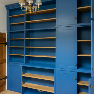
Bespoke Blue Library for a lovely cottage near Bristol.
The problem:
The room was going to be their office, it didn’t have much storage and it wasn’t very big. It had a difficult wall nib sticking out behind the door running the length of the wall and the room and had very high ceilings 3.2 metres high. This is precisely why they decided to go bespoke.
The brief:
The clients wanted lots of cabinets and shelves to make a library / bookcase for an awkward wall in a small room. The clients initially wanted ‘L’ shaped cabinets.
Lots of bookshelves, and I mean lots, like a bookcase wall and somewhere to hide office equipment like the printer and phone chargers.
Book shelves needed to be strong so they wouldn’t sag under the weight of the books – this was of utmost importance to the brief, these clients love books and reading.
Adjustable book shelves so they could fit their books exactly and change it up when needed.
The bespoke library was to go right up to the very high ceiling and finish in a cornice.
The cornice needed a particular profile to match their existing furniture.
“It’s better than we imagined it could be” was the first thing they said when they saw it complete!
When we first visited and discussed the design for this bespoke library in Bristol with them, it became obvious that an ‘L’ shape wouldn’t work in the room, so the first draft was to have the shelves and cabinets along one wall.
There were around 5 revisions in the end, until the design was approved. The design was intricate and had to be spot on taking the wall nib and the opening door and latch into account.
The whole bookcase cabinetry was made from solid tulip wood, this is a strong and stable material to take the weight of the books. The cornice was specially commissioned to match the profile of their existing furniture. For the adjustable shelves we used brass bookcase strips.
The bookshelves are all solid English oak from our favourite local supplier a family run business called Interesting Timbers these were all finished in our rollered Osmo oil finish.
Jo hand painted the whole piece, inside and out, it in their choice of colour (Woad’ by Little Greene). Jim installed it to our meticulous standards and the clients were very happy with the results.
We are also delighted with the finished result! Do let us know what you think or get in touch if you would like to discuss your own project.
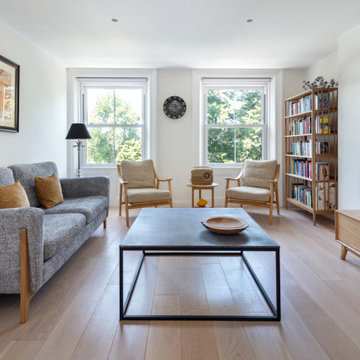 Granit Architects + Interiors
The brief:
Our clients own an apartment in a mansion block overlooking Clapham Common. They wanted to modernise and bring the apartment up to date and had a few goals:
To change the existing small cellular spaces in the apartment to create a new open-plan room
To extend into the loft and create a new master bedroom suite
To create a roof terrace for some much-needed private outdoor space
The key to the brief was to ensure a good connection between the different levels of the apartment and ensure natural light could flood into all spaces. The apartment is in a conservation area, which was an important consideration.
The solution:
We changed the primary room space to run from the front to the back of the building. This change created the large kitchen dining living space our clients wanted, an area with good natural light throughout and at all times of the day.
We created a master bedroom suite in the loft space, with generous room size and lots of natural light.
The limitations of the building’s form meant that a critical aspect to creating these larger living spaces was carefully considered smaller areas, including the bathrooms and a pocket utility room. The circulation space was carefully considered, too, with the landings used for storage in the form of new joinery.
The stairs were vital in the design. Creating an in-between/half level meant we made the most of the flat roof extension for a bedroom suite and terrace. It also helped natural light get into the centre of the apartment, creating a clear connection between the different floors.
The stairs also help to mark the difference between the existing and the new. We shifted the design from a minimalist take on traditional metal balustraded stairs to open tread steel stairs with a glazed balustrade.
Externally, we kept the design quite simple and in keeping with the context. By adding dormers to the front and back, we created a sculptural and fun loft space.
The result:
A spacious, light and luxurious apartment for our clients Gareth and Mary in a Clapham Common Conservation area.
We asked about their experience with Granit, and we are pleased with their response:
Our experience overall is very good, even with the unexpected difficulties created by Covid.
If you are thinking of appointing an architect and interior design firm, Granit should be seriously considered.
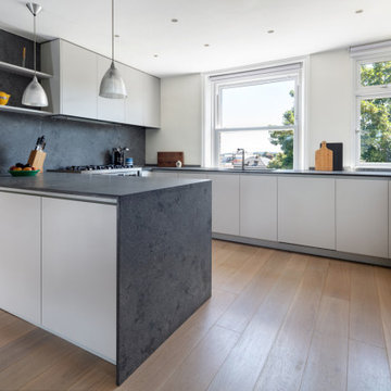 Granit Architects + Interiors
The brief:
Our clients own an apartment in a mansion block overlooking Clapham Common. They wanted to modernise and bring the apartment up to date and had a few goals:
To change the existing small cellular spaces in the apartment to create a new open-plan room
To extend into the loft and create a new master bedroom suite
To create a roof terrace for some much-needed private outdoor space
The key to the brief was to ensure a good connection between the different levels of the apartment and ensure natural light could flood into all spaces. The apartment is in a conservation area, which was an important consideration.
The solution:
We changed the primary room space to run from the front to the back of the building. This change created the large kitchen dining living space our clients wanted, an area with good natural light throughout and at all times of the day.
We created a master bedroom suite in the loft space, with generous room size and lots of natural light.
The limitations of the building’s form meant that a critical aspect to creating these larger living spaces was carefully considered smaller areas, including the bathrooms and a pocket utility room. The circulation space was carefully considered, too, with the landings used for storage in the form of new joinery.
The stairs were vital in the design. Creating an in-between/half level meant we made the most of the flat roof extension for a bedroom suite and terrace. It also helped natural light get into the centre of the apartment, creating a clear connection between the different floors.
The stairs also help to mark the difference between the existing and the new. We shifted the design from a minimalist take on traditional metal balustraded stairs to open tread steel stairs with a glazed balustrade.
Externally, we kept the design quite simple and in keeping with the context. By adding dormers to the front and back, we created a sculptural and fun loft space.
The result:
A spacious, light and luxurious apartment for our clients Gareth and Mary in a Clapham Common Conservation area.
We asked about their experience with Granit, and we are pleased with their response:
Our experience overall is very good, even with the unexpected difficulties created by Covid.
If you are thinking of appointing an architect and interior design firm, Granit should be seriously considered.
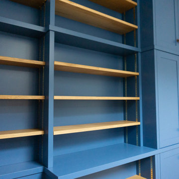 Jim Sharples Furniture
Bespoke Blue Library for a lovely cottage near Bristol.
The problem:
The room was going to be their office, it didn’t have much storage and it wasn’t very big. It had a difficult wall nib sticking out behind the door running the length of the wall and the room and had very high ceilings 3.2 metres high. This is precisely why they decided to go bespoke.
The brief:
The clients wanted lots of cabinets and shelves to make a library / bookcase for an awkward wall in a small room. The clients initially wanted ‘L’ shaped cabinets.
Lots of bookshelves, and I mean lots, like a bookcase wall and somewhere to hide office equipment like the printer and phone chargers.
Book shelves needed to be strong so they wouldn’t sag under the weight of the books – this was of utmost importance to the brief, these clients love books and reading.
Adjustable book shelves so they could fit their books exactly and change it up when needed.
The bespoke library was to go right up to the very high ceiling and finish in a cornice.
The cornice needed a particular profile to match their existing furniture.
“It’s better than we imagined it could be” was the first thing they said when they saw it complete!
When we first visited and discussed the design for this bespoke library in Bristol with them, it became obvious that an ‘L’ shape wouldn’t work in the room, so the first draft was to have the shelves and cabinets along one wall.
There were around 5 revisions in the end, until the design was approved. The design was intricate and had to be spot on taking the wall nib and the opening door and latch into account.
The whole bookcase cabinetry was made from solid tulip wood, this is a strong and stable material to take the weight of the books. The cornice was specially commissioned to match the profile of their existing furniture. For the adjustable shelves we used brass bookcase strips.
The bookshelves are all solid English oak from our favourite local supplier a family run business called Interesting Timbers these were all finished in our rollered Osmo oil finish.
Jo hand painted the whole piece, inside and out, it in their choice of colour (Woad’ by Little Greene). Jim installed it to our meticulous standards and the clients were very happy with the results.
We are also delighted with the finished result! Do let us know what you think or get in touch if you would like to discuss your own project.
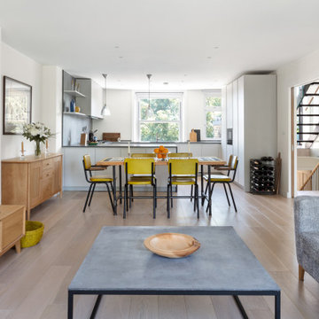 Granit Architects + Interiors
The brief:
Our clients own an apartment in a mansion block overlooking Clapham Common. They wanted to modernise and bring the apartment up to date and had a few goals:
To change the existing small cellular spaces in the apartment to create a new open-plan room
To extend into the loft and create a new master bedroom suite
To create a roof terrace for some much-needed private outdoor space
The key to the brief was to ensure a good connection between the different levels of the apartment and ensure natural light could flood into all spaces. The apartment is in a conservation area, which was an important consideration.
The solution:
We changed the primary room space to run from the front to the back of the building. This change created the large kitchen dining living space our clients wanted, an area with good natural light throughout and at all times of the day.
We created a master bedroom suite in the loft space, with generous room size and lots of natural light.
The limitations of the building’s form meant that a critical aspect to creating these larger living spaces was carefully considered smaller areas, including the bathrooms and a pocket utility room. The circulation space was carefully considered, too, with the landings used for storage in the form of new joinery.
The stairs were vital in the design. Creating an in-between/half level meant we made the most of the flat roof extension for a bedroom suite and terrace. It also helped natural light get into the centre of the apartment, creating a clear connection between the different floors.
The stairs also help to mark the difference between the existing and the new. We shifted the design from a minimalist take on traditional metal balustraded stairs to open tread steel stairs with a glazed balustrade.
Externally, we kept the design quite simple and in keeping with the context. By adding dormers to the front and back, we created a sculptural and fun loft space.
The result:
A spacious, light and luxurious apartment for our clients Gareth and Mary in a Clapham Common Conservation area.
We asked about their experience with Granit, and we are pleased with their response:
Our experience overall is very good, even with the unexpected difficulties created by Covid.
If you are thinking of appointing an architect and interior design firm, Granit should be seriously considered.
 dSPACE Studio Architecture
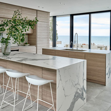
This home evokes a sensuous St. Barth lifestyle on Lake Michigan, designed for globetrotting clients who wanted a weekend sanctuary near their primary residence in Chicago. The project brief included open plan living for entertaining, a family lounge, and bedroom suites for houseguests.
The first level is a glass rectangular volume that makes the second level appear to float over the dune and offers water views through the structure. Clad in Accoya, the upper level will gray with age and blend into the landscape. These two horizontal volumes are connected by a double-height glass entry space that reveals a floating staircase.
A contemporary beach aesthetic unifies the interior through an edited palette of materials, including white oak millwork, large-format porcelain tile, and a range of warm whites. Interior tile extends out to the pool terrace, uniting the spaces and amplifying the connection to the outdoors.
The landscape design enhances the experience. A courtyard with sculptural Ginkgo trees offers refuge from lake breezes. On the pool terrace, custom Cor-Ten planters overflow with Russian Sage, selected for graceful foliage that sways in the breeze and offers a relaxing herbal aroma.
 Mark English Architects, AIA
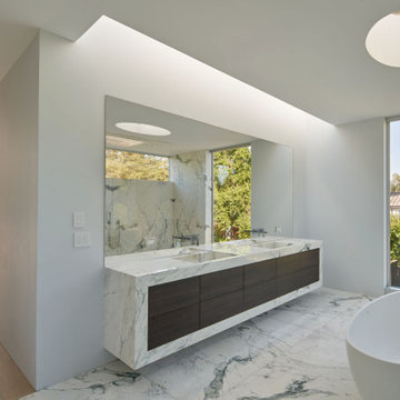
The Atherton House is a family compound for a professional couple in the tech industry, and their two teenage children. After living in Singapore, then Hong Kong, and building homes there, they looked forward to continuing their search for a new place to start a life and set down roots.
The site is located on Atherton Avenue on a flat, 1 acre lot. The neighboring lots are of a similar size, and are filled with mature planting and gardens. The brief on this site was to create a house that would comfortably accommodate the busy lives of each of the family members, as well as provide opportunities for wonder and awe. Views on the site are internal. Our goal was to create an indoor- outdoor home that embraced the benign California climate.
The building was conceived as a classic “H” plan with two wings attached by a double height entertaining space. The “H” shape allows for alcoves of the yard to be embraced by the mass of the building, creating different types of exterior space. The two wings of the home provide some sense of enclosure and privacy along the side property lines. The south wing contains three bedroom suites at the second level, as well as laundry. At the first level there is a guest suite facing east, powder room and a Library facing west.
The north wing is entirely given over to the Primary suite at the top level, including the main bedroom, dressing and bathroom. The bedroom opens out to a roof terrace to the west, overlooking a pool and courtyard below. At the ground floor, the north wing contains the family room, kitchen and dining room. The family room and dining room each have pocketing sliding glass doors that dissolve the boundary between inside and outside.
Connecting the wings is a double high living space meant to be comfortable, delightful and awe-inspiring. A custom fabricated two story circular stair of steel and glass connects the upper level to the main level, and down to the basement “lounge” below. An acrylic and steel bridge begins near one end of the stair landing and flies 40 feet to the children’s bedroom wing. People going about their day moving through the stair and bridge become both observed and observer.
The front (EAST) wall is the all important receiving place for guests and family alike. There the interplay between yin and yang, weathering steel and the mature olive tree, empower the entrance. Most other materials are white and pure.
The mechanical systems are efficiently combined hydronic heating and cooling, with no forced air required.
 Studio Roundtop
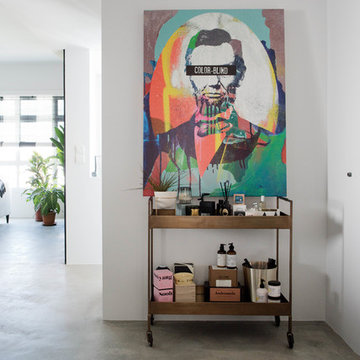
The brief was to transform the apartment into a home that was suited to our client’s (a young married couple) needs of entertainment and desire for an open plan.
By reimagining the spatial hierarchy of a typical Singaporean home, the existing living room was converted nto a guest room, 2 bedrooms were also transformed into a single living space centered in the heart of the apartment.
White frameless doors were used in the master and guest bedrooms, extending and brightening the hallway when left open. Accents of graphic and color were also used against a pared down material palette to form the backdrop for the owners’ collection of objects and artwork that was a reflection of the young couple’s vibrant personalities.
Photographer: Tessa Choo
 Fabco Sanctuary
The architect and designer Guy Derwent was approached by his client with a clear and compelling brief: to completely transform a grand Victorian terrace house they were planning to renovate. The client envisioned something far beyond a standard renovation – this was to be a bold and dramatic reimagining of a family home that could grow with them over time.
With the property having remained largely untouched for more than fifty years, the architects saw an opportunity to unlock its potential and deliver a contemporary design that would contrast beautifully with its Victorian heritage.
The existing layout consisted of a series of small, disconnected rooms to the rear of the house. To respond to the client’s need for openness and flexibility, the architect proposed a radical restructuring of the ground floor:
The rear rooms were completely removed
Suspended timber floors were lowered by up to two metres to align with the garden
Two bold extensions were added
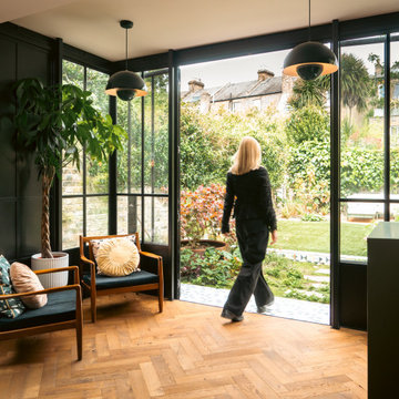
The first extension filled in the side return with a London stock brick facade and a glazed roof, while the second – a striking black steel and glass pavilion was glazed on three sides and placed along the garden elevation.
This new pavilion redefined the building’s relationship with the garden. Its steel-framed glazing created a seamless dialogue between interior and exterior, offering a sense of immersion in the surrounding landscape.
At the heart of the plan sits a dramatic, five-metre-tall dining space that acts as a transition from the original entrance hall into the new addition. A large, circular cast-glass window, framed in steel, provides a visual and spatial link between old and new, allowing light and movement to travel through the depth of the home.
Throughout the project, a series of black metal elements were introduced as sculptural interventions – each marking moments of transformation within the house. These included the bespoke steel framed circular window, a custom metal staircase, a cylindrical support column, and the striking steel and glass garden pavilion. Together, they formed a coherent architectural language that underscored the project’s bold intent.
Our steel windows and doors played a vital role in delivering the project’s vision. The architects chose steel for its refined sight lines and distinctive material character, which helped bridge the gap between the historical context of the building and the bold new additions.
The black steel frames provided a crisp contrast to the pale London stock brick and added definition to the glazed pavilion, reinforcing the sense of architectural precision. In particular, the fine steel profiles of the garden room allowed the extension to feel both lightweight and immersive, blurring the boundary between the house and its garden.
The architect drew inspiration from the Bauhaus Movement, particularly the work of Walter Gropius, whose approach to functional beauty and industrial materials informed the design of the garden pavilion.
Here, our glazing system was used not just for transparency, but as an expressive architectural element. The carefully proportioned panels help to conceal the roof thickness and reinforce the pavilion’s industrial yet abstract character – a deliberate nod to product design and modernist detailing.
Sustainability was an important factor in the selection of materials. Our steel systems, made from 99% recycled content and 100% recyclable, aligned with the project’s broader environmental goals.
The architects noted that this commitment to material longevity and circularity was central to their decision to use steel. The durability and recyclability of the windows and doors ensured the project met both aesthetic and ethical criteria.
This London terrace house now stands as a celebration of contrast – between heritage and innovation, solidity and transparency, tradition and transformation. Our steel windows and doors were not simply components; they were essential tools in crafting a home that is as bold and expressive as it is functional.
The result is a home designed for modern family life, where light, space, and materiality come together in perfect harmony.
20