
Search results for "Brighter future" in Home Design Ideas
 iFloors Kitchen & Bath
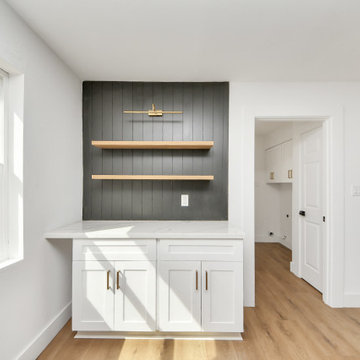
This thoughtfully renovated flip was designed with both beauty and longevity in mind, featuring an ADA-accessible private suite tailored for aging in place. The layout was fully re-imagined to improve flow and daily functionality—most notably by opening up the main living areas and removing an outdated corner brick fireplace, allowing for smoother circulation and a brighter, more connected home.
The primary suite was significantly expanded to create a spacious bedroom, an oversized walk-in closet, and a serene master bathroom, transforming it into a true retreat. A new patio door was added to enhance indoor-outdoor connection and bring in natural light.
The kitchen was refreshed with a timeless black-and-white palette, elevated by champagne bronze hardware, updated lighting, and charming shiplap accents. A dedicated coffee bar adds both function and personality, making the space perfect for everyday living and entertaining.
Bathrooms were finished with extra-large format porcelain tile on both floors and walls, creating a clean, seamless, and spa-like feel while ensuring durability and easy maintenance. Throughout the main living areas, we installed rustic waterproof wood-look flooring in a mid-tone oak, offering warmth, texture, and long-term performance—ideal for multi-generational living.
This renovation balances accessibility, comfort, and modern elegance, proving that a well-designed home can be both future-ready and beautifully timeless.
 Modern Citi Group: Renovations & Remodeling
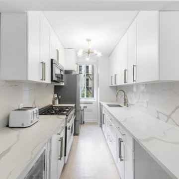
Modern Citi Group helped our clients Chris & Cinzia complete a full renovation of their three-bedroom Upper East Side apartment: master bedroom, guest bedroom, office, living room, hallway, closets, kitchen, and two bathrooms. Clients wanted the apartment to feel like their own with a modern style and fresh look.
The design challenge was to deliver an upscale aesthetic for the entire apartment at a feasible price. Chris & Cinzia wanted to open up their space, make it brighter, and also focus on making sure they have a lot of closet space. The designers worked on several layouts and design visualizations so they had options. Finally, the choice was made and the family felt confident in their decision.
Once the permits were filed and approved, the full apartment renovation began. During the building phase, the construction team renovated two bathrooms, completely reconfigured closets in all rooms, and made layout changes. They meticulously placed the exquisite and unique, Calacatta Classique quartz to serve as a floating countertop with a waterfall on both sides, and a backsplash slab, to give the kitchen a luxurious look. In order to maximize the space, the kitchen was opened up towards the dining area for an open concept that is sure to impress. In a matter of twelve weeks, Chris & Cinzia had a new three-bedroom home that fits their style, and vision and increased their home value for future resale.

Find the right local pro for your project
 Drury Design
THE SETUP
This client lives in a great high-rise condo in downtown Chicago. Alicia has already remodeled a few areas of her home, including her kitchen and home office. The bathroom is one of the last big places the client wanted to update. The existing bathroom had a large, outdated whirlpool tub in the corner. It was a darker space that had a lack of natural light. There are no windows (due to the bathroom’s location within the high-rise building). So, the idea was to brighten up the space and give the client an updated, elegant primary bathroom that is more her style and tailor-made for her routines.
Design Objectives:
- Make the space brighter.
- Create different daily routine stations to maximize functionality while keeping things clutter-free – a makeup station, a blow-dry station, and a sink-needs station.
- Achieve the client’s specific style and function needs while also keeping the look and design open to future possibilities: different users of the space/resale clients.
Design Challenges:
- Toilet cannot be moved. (In a high-rise, you can’t really move plumbing around too much when reimagining a space)
- Existing bathroom had a soffit that hid a lot of electrical wiring, so completely removing the soffit wasn’t an option.
- The blow-dry station needs to accommodate the client’s preference for standing up.
- Finding a place for the make-up station, which the client wants oriented for sitting.
- Create storage within the shower that can eliminate the clutter of personal care products that are actually needed every day. Do this, while keeping the client’s favorite things about the existing shower: the shower bench, a tub filler faucet (for rinsing shaving cream when shaving legs) and a low niche for placing her foot when shaving her legs.
THE RENEWED SPACE
Design Solutions:
- Extended a bit of wall near the toilet to give the commode its own area within the space, but without closing it off into a claustrophobic WC.
- Worked within the reality of the existing soffit situation, reshaping it to align with the new shower. Can lights were also added. Installed a beautiful ceiling light fixture that works within the new soffit shape, commanding attention and adding light, as if the sofit shape was chosen for it.
- Created a nice, furniture-looking 42”-high cabinet with pullout drawers to be the blow-dry station, complete with a mirror and a nice top. The pullout drawers are all powered, concealing a Dyson dryer and curling iron (and all the accoutrements) while keeping them plugged in, which is ideal for easy usage and put away. A stylish mirror on the wall above the cabinet, and proper lighting, make this the perfect blow-dry station. The top has a grommet that can accommodate a power cord should the client ever want to have a powered device on top of the cabinet.
- Put the sit-down makeup station where the tub used to be, putting the mirror back into a new recessed wall just a bit, allowing the area to have more room.
- Created a niche in the shower’s inner wall so that you can’t see it unless you are literally inside the shower. At the client’s request, it also has a hook so she can hang her loofa. Hiding the utility niche in this way allowed us to use the full main wall of the shower as a canvas for a beautiful accent stripe of raised decorative tile. The new shower has her old favorites, too: the tub filler, foot niche and bench.
Alicia’s client loves her new primary bathroom, especially the blow dry area. It is very accommodating for her, as a tall lady, while being very easy to use. The drawers store everything. Being powered, they make using already-plugged in appliances very easy to use and put away.
Her previous makeup station was a freestanding vanity with a single drawer, so beauty products were all over the surface top. With her new makeup station, everything is nicely tucked away and organized in drawers.
The new lighting is fantastic and the colors are light and soft. The clients loves the overall look and feel of her new bathroom and raves about how well the functionality-minded design makes her morning routine – and her life – easier and enjoyable!
 Vital Space Designs
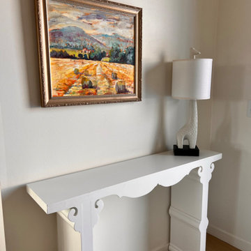
Old world and contemporary art for an unusual and joyful combination.
Trendy hallway photo in Other
Trendy hallway photo in Other
 iFloors Kitchen & Bath
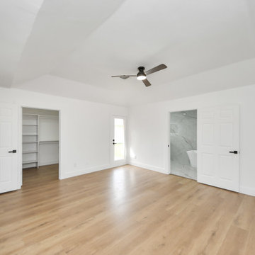
This thoughtfully renovated flip was designed with both beauty and longevity in mind, featuring an ADA-accessible private suite tailored for aging in place. The layout was fully re-imagined to improve flow and daily functionality—most notably by opening up the main living areas and removing an outdated corner brick fireplace, allowing for smoother circulation and a brighter, more connected home.
The primary suite was significantly expanded to create a spacious bedroom, an oversized walk-in closet, and a serene master bathroom, transforming it into a true retreat. A new patio door was added to enhance indoor-outdoor connection and bring in natural light.
The kitchen was refreshed with a timeless black-and-white palette, elevated by champagne bronze hardware, updated lighting, and charming shiplap accents. A dedicated coffee bar adds both function and personality, making the space perfect for everyday living and entertaining.
Bathrooms were finished with extra-large format porcelain tile on both floors and walls, creating a clean, seamless, and spa-like feel while ensuring durability and easy maintenance. Throughout the main living areas, we installed rustic waterproof wood-look flooring in a mid-tone oak, offering warmth, texture, and long-term performance—ideal for multi-generational living.
This renovation balances accessibility, comfort, and modern elegance, proving that a well-designed home can be both future-ready and beautifully timeless.
Sponsored
Delaware, OH

Buckeye Basements, Inc.
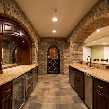
Central Ohio's Basement Finishing ExpertsBest Of Houzz '13-'21
 Drury Design
THE SETUP
This client lives in a great high-rise condo in downtown Chicago. Alicia has already remodeled a few areas of her home, including her kitchen and home office. The bathroom is one of the last big places the client wanted to update. The existing bathroom had a large, outdated whirlpool tub in the corner. It was a darker space that had a lack of natural light. There are no windows (due to the bathroom’s location within the high-rise building). So, the idea was to brighten up the space and give the client an updated, elegant primary bathroom that is more her style and tailor-made for her routines.
Design Objectives:
- Make the space brighter.
- Create different daily routine stations to maximize functionality while keeping things clutter-free – a makeup station, a blow-dry station, and a sink-needs station.
- Achieve the client’s specific style and function needs while also keeping the look and design open to future possibilities: different users of the space/resale clients.
Design Challenges:
- Toilet cannot be moved. (In a high-rise, you can’t really move plumbing around too much when reimagining a space)
- Existing bathroom had a soffit that hid a lot of electrical wiring, so completely removing the soffit wasn’t an option.
- The blow-dry station needs to accommodate the client’s preference for standing up.
- Finding a place for the make-up station, which the client wants oriented for sitting.
- Create storage within the shower that can eliminate the clutter of personal care products that are actually needed every day. Do this, while keeping the client’s favorite things about the existing shower: the shower bench, a tub filler faucet (for rinsing shaving cream when shaving legs) and a low niche for placing her foot when shaving her legs.
THE RENEWED SPACE
Design Solutions:
- Extended a bit of wall near the toilet to give the commode its own area within the space, but without closing it off into a claustrophobic WC.
- Worked within the reality of the existing soffit situation, reshaping it to align with the new shower. Can lights were also added. Installed a beautiful ceiling light fixture that works within the new soffit shape, commanding attention and adding light, as if the sofit shape was chosen for it.
- Created a nice, furniture-looking 42”-high cabinet with pullout drawers to be the blow-dry station, complete with a mirror and a nice top. The pullout drawers are all powered, concealing a Dyson dryer and curling iron (and all the accoutrements) while keeping them plugged in, which is ideal for easy usage and put away. A stylish mirror on the wall above the cabinet, and proper lighting, make this the perfect blow-dry station. The top has a grommet that can accommodate a power cord should the client ever want to have a powered device on top of the cabinet.
- Put the sit-down makeup station where the tub used to be, putting the mirror back into a new recessed wall just a bit, allowing the area to have more room.
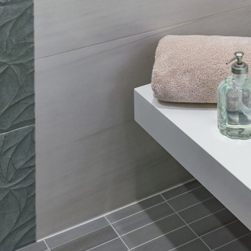
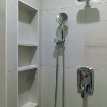
- Created a niche in the shower’s inner wall so that you can’t see it unless you are literally inside the shower. At the client’s request, it also has a hook so she can hang her loofa. Hiding the utility niche in this way allowed us to use the full main wall of the shower as a canvas for a beautiful accent stripe of raised decorative tile. The new shower has her old favorites, too: the tub filler, foot niche and bench.
Alicia’s client loves her new primary bathroom, especially the blow dry area. It is very accommodating for her, as a tall lady, while being very easy to use. The drawers store everything. Being powered, they make using already-plugged in appliances very easy to use and put away.
Her previous makeup station was a freestanding vanity with a single drawer, so beauty products were all over the surface top. With her new makeup station, everything is nicely tucked away and organized in drawers.
The new lighting is fantastic and the colors are light and soft. The clients loves the overall look and feel of her new bathroom and raves about how well the functionality-minded design makes her morning routine – and her life – easier and enjoyable!
 Drury Design
THE SETUP
This client lives in a great high-rise condo in downtown Chicago. Alicia has already remodeled a few areas of her home, including her kitchen and home office. The bathroom is one of the last big places the client wanted to update. The existing bathroom had a large, outdated whirlpool tub in the corner. It was a darker space that had a lack of natural light. There are no windows (due to the bathroom’s location within the high-rise building). So, the idea was to brighten up the space and give the client an updated, elegant primary bathroom that is more her style and tailor-made for her routines.
Design Objectives:
- Make the space brighter.
- Create different daily routine stations to maximize functionality while keeping things clutter-free – a makeup station, a blow-dry station, and a sink-needs station.
- Achieve the client’s specific style and function needs while also keeping the look and design open to future possibilities: different users of the space/resale clients.
Design Challenges:
- Toilet cannot be moved. (In a high-rise, you can’t really move plumbing around too much when reimagining a space)
- Existing bathroom had a soffit that hid a lot of electrical wiring, so completely removing the soffit wasn’t an option.
- The blow-dry station needs to accommodate the client’s preference for standing up.
- Finding a place for the make-up station, which the client wants oriented for sitting.
- Create storage within the shower that can eliminate the clutter of personal care products that are actually needed every day. Do this, while keeping the client’s favorite things about the existing shower: the shower bench, a tub filler faucet (for rinsing shaving cream when shaving legs) and a low niche for placing her foot when shaving her legs.
THE RENEWED SPACE
Design Solutions:
- Extended a bit of wall near the toilet to give the commode its own area within the space, but without closing it off into a claustrophobic WC.
- Worked within the reality of the existing soffit situation, reshaping it to align with the new shower. Can lights were also added. Installed a beautiful ceiling light fixture that works within the new soffit shape, commanding attention and adding light, as if the sofit shape was chosen for it.
- Created a nice, furniture-looking 42”-high cabinet with pullout drawers to be the blow-dry station, complete with a mirror and a nice top. The pullout drawers are all powered, concealing a Dyson dryer and curling iron (and all the accoutrements) while keeping them plugged in, which is ideal for easy usage and put away. A stylish mirror on the wall above the cabinet, and proper lighting, make this the perfect blow-dry station. The top has a grommet that can accommodate a power cord should the client ever want to have a powered device on top of the cabinet.
- Put the sit-down makeup station where the tub used to be, putting the mirror back into a new recessed wall just a bit, allowing the area to have more room.
- Created a niche in the shower’s inner wall so that you can’t see it unless you are literally inside the shower. At the client’s request, it also has a hook so she can hang her loofa. Hiding the utility niche in this way allowed us to use the full main wall of the shower as a canvas for a beautiful accent stripe of raised decorative tile. The new shower has her old favorites, too: the tub filler, foot niche and bench.
Alicia’s client loves her new primary bathroom, especially the blow dry area. It is very accommodating for her, as a tall lady, while being very easy to use. The drawers store everything. Being powered, they make using already-plugged in appliances very easy to use and put away.
Her previous makeup station was a freestanding vanity with a single drawer, so beauty products were all over the surface top. With her new makeup station, everything is nicely tucked away and organized in drawers.
The new lighting is fantastic and the colors are light and soft. The clients loves the overall look and feel of her new bathroom and raves about how well the functionality-minded design makes her morning routine – and her life – easier and enjoyable!
 Drury Design
THE SETUP
This client lives in a great high-rise condo in downtown Chicago. Alicia has already remodeled a few areas of her home, including her kitchen and home office. The bathroom is one of the last big places the client wanted to update. The existing bathroom had a large, outdated whirlpool tub in the corner. It was a darker space that had a lack of natural light. There are no windows (due to the bathroom’s location within the high-rise building). So, the idea was to brighten up the space and give the client an updated, elegant primary bathroom that is more her style and tailor-made for her routines.
Design Objectives:
- Make the space brighter.
- Create different daily routine stations to maximize functionality while keeping things clutter-free – a makeup station, a blow-dry station, and a sink-needs station.
- Achieve the client’s specific style and function needs while also keeping the look and design open to future possibilities: different users of the space/resale clients.
Design Challenges:
- Toilet cannot be moved. (In a high-rise, you can’t really move plumbing around too much when reimagining a space)
- Existing bathroom had a soffit that hid a lot of electrical wiring, so completely removing the soffit wasn’t an option.
- The blow-dry station needs to accommodate the client’s preference for standing up.
- Finding a place for the make-up station, which the client wants oriented for sitting.
- Create storage within the shower that can eliminate the clutter of personal care products that are actually needed every day. Do this, while keeping the client’s favorite things about the existing shower: the shower bench, a tub filler faucet (for rinsing shaving cream when shaving legs) and a low niche for placing her foot when shaving her legs.
THE RENEWED SPACE
Design Solutions:
- Extended a bit of wall near the toilet to give the commode its own area within the space, but without closing it off into a claustrophobic WC.
- Worked within the reality of the existing soffit situation, reshaping it to align with the new shower. Can lights were also added. Installed a beautiful ceiling light fixture that works within the new soffit shape, commanding attention and adding light, as if the sofit shape was chosen for it.
- Created a nice, furniture-looking 42”-high cabinet with pullout drawers to be the blow-dry station, complete with a mirror and a nice top. The pullout drawers are all powered, concealing a Dyson dryer and curling iron (and all the accoutrements) while keeping them plugged in, which is ideal for easy usage and put away. A stylish mirror on the wall above the cabinet, and proper lighting, make this the perfect blow-dry station. The top has a grommet that can accommodate a power cord should the client ever want to have a powered device on top of the cabinet.
- Put the sit-down makeup station where the tub used to be, putting the mirror back into a new recessed wall just a bit, allowing the area to have more room.
- Created a niche in the shower’s inner wall so that you can’t see it unless you are literally inside the shower. At the client’s request, it also has a hook so she can hang her loofa. Hiding the utility niche in this way allowed us to use the full main wall of the shower as a canvas for a beautiful accent stripe of raised decorative tile. The new shower has her old favorites, too: the tub filler, foot niche and bench.
Alicia’s client loves her new primary bathroom, especially the blow dry area. It is very accommodating for her, as a tall lady, while being very easy to use. The drawers store everything. Being powered, they make using already-plugged in appliances very easy to use and put away.
Her previous makeup station was a freestanding vanity with a single drawer, so beauty products were all over the surface top. With her new makeup station, everything is nicely tucked away and organized in drawers.
The new lighting is fantastic and the colors are light and soft. The clients loves the overall look and feel of her new bathroom and raves about how well the functionality-minded design makes her morning routine – and her life – easier and enjoyable!
 Drury Design
The Setup
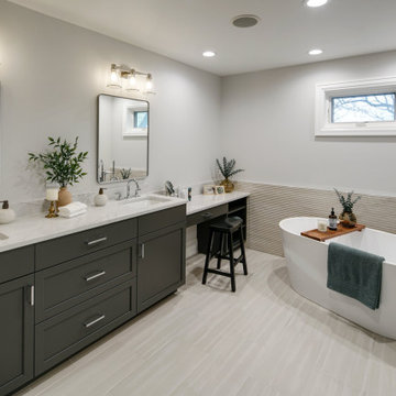
When our clients decided to remodel their primary bathroom, the goal was to transform the space into a brighter, more open retreat tailored to their needs. The previous layout, with its enclosed zones and limited functionality, no longer met their needs. By reimagining the layout and introducing thoughtful design choices, we created a modern, elegant bathroom that serves their current and future lifestyle.
Design objectives:
- Create a brighter, more open bathroom while maintaining privacy.
- Provide functional storage solutions without relying on the old linen closet.
- Incorporate a freestanding tub, large shower, and a makeup area for added versatility.
- Retain natural light from existing windows.
- Introduce elegant finishes and accents for a timeless aesthetic.
The Remodel
Design challenges to be solved:
- Reconfiguring the layout while keeping the existing plumbing for the toilet.
- Creating storage that houses everything that resided within the linen closet.
- Designing clearance and functionality for a freestanding tub, shower, and makeup area within the limited space.
- Accommodating the client’s desire for a pocket door in the commode room despite spatial constraints.
Introducing accent tile and cabinetry colors that align with the client’s vision yet maintain a cohesive look with the rest of the home.
The Renewed Space
Design solutions:
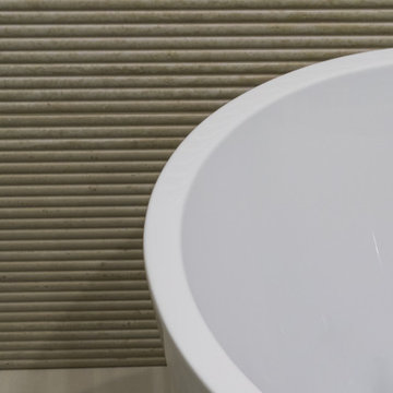
- Reimagined Layout: Moved the shower from the back of the room, creating a more open feel with additional glass while preserving privacy with a wing wall and bench. The freestanding tub was angled to optimize space and enhance circulation, with textured tile behind it adding visual interest.
- Efficient Storage: Eliminated the original linen closet and incorporated functional base cabinet storage and a designated makeup area for added utility.
- Optimized Access: Adjusted the depth of the makeup vanity to provide sufficient walkway clearance, ensuring a comfortable flow around the tub.
- Tailored Features: Installed a smaller pocket door in the commode room to resolve framing and plumbing limitations.
- Elegant Accents: Introduced a subtle marble herringbone mosaic tile in the shower and textured tile behind the tub to enhance the monochromatic palette. Painted cabinetry in a dark gray finish provided a bold yet refined contrast to the light countertops.
Final Thoughts:
The reimagined primary bathroom is a true reflection of the client’s needs and style preferences. By thoughtfully reworking the layout and incorporating functional yet elegant design elements, we created a serene and practical space that serves as a personal retreat. The result is a timeless bathroom that supports their busy lifestyle while providing moments of tranquility.
 Drury Design
The Setup
When our clients decided to remodel their primary bathroom, the goal was to transform the space into a brighter, more open retreat tailored to their needs. The previous layout, with its enclosed zones and limited functionality, no longer met their needs. By reimagining the layout and introducing thoughtful design choices, we created a modern, elegant bathroom that serves their current and future lifestyle.
Design objectives:
- Create a brighter, more open bathroom while maintaining privacy.
- Provide functional storage solutions without relying on the old linen closet.
- Incorporate a freestanding tub, large shower, and a makeup area for added versatility.
- Retain natural light from existing windows.
- Introduce elegant finishes and accents for a timeless aesthetic.
The Remodel
Design challenges to be solved:
- Reconfiguring the layout while keeping the existing plumbing for the toilet.
- Creating storage that houses everything that resided within the linen closet.
- Designing clearance and functionality for a freestanding tub, shower, and makeup area within the limited space.
- Accommodating the client’s desire for a pocket door in the commode room despite spatial constraints.
Introducing accent tile and cabinetry colors that align with the client’s vision yet maintain a cohesive look with the rest of the home.
The Renewed Space
Design solutions:
- Reimagined Layout: Moved the shower from the back of the room, creating a more open feel with additional glass while preserving privacy with a wing wall and bench. The freestanding tub was angled to optimize space and enhance circulation, with textured tile behind it adding visual interest.
- Efficient Storage: Eliminated the original linen closet and incorporated functional base cabinet storage and a designated makeup area for added utility.
- Optimized Access: Adjusted the depth of the makeup vanity to provide sufficient walkway clearance, ensuring a comfortable flow around the tub.
- Tailored Features: Installed a smaller pocket door in the commode room to resolve framing and plumbing limitations.
- Elegant Accents: Introduced a subtle marble herringbone mosaic tile in the shower and textured tile behind the tub to enhance the monochromatic palette. Painted cabinetry in a dark gray finish provided a bold yet refined contrast to the light countertops.
Final Thoughts:
The reimagined primary bathroom is a true reflection of the client’s needs and style preferences. By thoughtfully reworking the layout and incorporating functional yet elegant design elements, we created a serene and practical space that serves as a personal retreat. The result is a timeless bathroom that supports their busy lifestyle while providing moments of tranquility.


 Modern Citi Group: Renovations & Remodeling
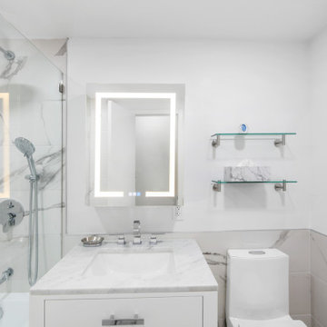
Modern Citi Group helped our clients Chris & Cinzia complete a full renovation of their three-bedroom Upper East Side apartment: master bedroom, guest bedroom, office, living room, hallway, closets, kitchen, and two bathrooms. Clients wanted the apartment to feel like their own with a modern style and fresh look.
The design challenge was to deliver an upscale aesthetic for the entire apartment at a feasible price. Chris & Cinzia wanted to open up their space, make it brighter, and also focus on making sure they have a lot of closet space. The designers worked on several layouts and design visualizations so they had options. Finally, the choice was made and the family felt confident in their decision.
Once the permits were filed and approved, the full apartment renovation began. During the building phase, the construction team renovated two bathrooms, completely reconfigured closets in all rooms, and made layout changes. They meticulously placed the exquisite and unique, Calacatta Classique quartz to serve as a floating countertop with waterfall on both sides, and backsplash slab, to give the kitchen a luxurious look. In order to maximize the space, the kitchen was opened up towards the dining area for an open concept that is sure to impress. In a matter of twelve weeks, Chris & Cinzia had a new three bedroom home that fit their style, vision and increased their home value for future resale.
 Drury Design
The Setup
When our clients decided to remodel their primary bathroom, the goal was to transform the space into a brighter, more open retreat tailored to their needs. The previous layout, with its enclosed zones and limited functionality, no longer met their needs. By reimagining the layout and introducing thoughtful design choices, we created a modern, elegant bathroom that serves their current and future lifestyle.
Design objectives:
- Create a brighter, more open bathroom while maintaining privacy.
- Provide functional storage solutions without relying on the old linen closet.
- Incorporate a freestanding tub, large shower, and a makeup area for added versatility.
- Retain natural light from existing windows.
- Introduce elegant finishes and accents for a timeless aesthetic.
The Remodel
Design challenges to be solved:
- Reconfiguring the layout while keeping the existing plumbing for the toilet.
- Creating storage that houses everything that resided within the linen closet.
- Designing clearance and functionality for a freestanding tub, shower, and makeup area within the limited space.
- Accommodating the client’s desire for a pocket door in the commode room despite spatial constraints.
Introducing accent tile and cabinetry colors that align with the client’s vision yet maintain a cohesive look with the rest of the home.
The Renewed Space
Design solutions:
- Reimagined Layout: Moved the shower from the back of the room, creating a more open feel with additional glass while preserving privacy with a wing wall and bench. The freestanding tub was angled to optimize space and enhance circulation, with textured tile behind it adding visual interest.
- Efficient Storage: Eliminated the original linen closet and incorporated functional base cabinet storage and a designated makeup area for added utility.
- Optimized Access: Adjusted the depth of the makeup vanity to provide sufficient walkway clearance, ensuring a comfortable flow around the tub.
- Tailored Features: Installed a smaller pocket door in the commode room to resolve framing and plumbing limitations.
- Elegant Accents: Introduced a subtle marble herringbone mosaic tile in the shower and textured tile behind the tub to enhance the monochromatic palette. Painted cabinetry in a dark gray finish provided a bold yet refined contrast to the light countertops.
Final Thoughts:
The reimagined primary bathroom is a true reflection of the client’s needs and style preferences. By thoughtfully reworking the layout and incorporating functional yet elegant design elements, we created a serene and practical space that serves as a personal retreat. The result is a timeless bathroom that supports their busy lifestyle while providing moments of tranquility.
 EnergyPal Solar
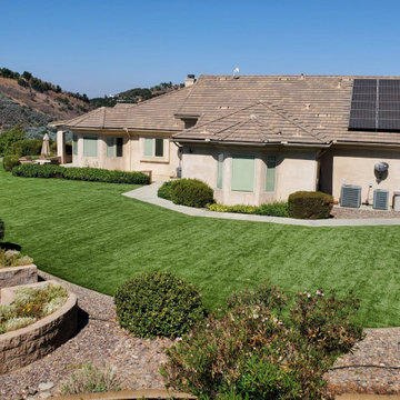
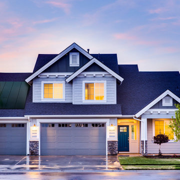
This exquisite San Jose model home with a subtly placed solar panel system on top of the garage roof. This model home enjoys nearly free energy produced by the solar panels while the sun is shining! Thanks to the long hours of sunlight in San Jose, the energy generated is enough to power every aspect of the home for days on end, thanks to a backup battery to store all that excess power. At EnergyPal, we've contributed thousands of projects like this across United States and Canada. We're happy to contribute to a brighter, and cleaner future.

 Lionel F Bailey AIA Architect LLC
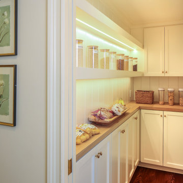
A renovation to bring the most important area of the house up to date with their family’s present and future needs was sorely needed. New brighter, more colorful finishes are added throughout! It starts with a face lift of the Den with new French doors and a large window opening to the back porch. Also, a second back stairway is removed to allow room for a new arched circulation hallway to the kitchen. Along this path one can get to a new pantry and wet bar. The new kitchen now features updated appliances with an enhanced plastered hood design over the stove and a large island with additional seating and serving space. The laundry room is expanded providing a drop-off area and a new French door allowing easy access from the driveway. An adjacent game room and bathroom are updated as well.
 Advance Design Studio, Ltd.
Richard and Monica of Huntley, IL, needed to make better use of their kitchen as well as more storage for pots, pans, and countertop appliances. Their space was laid out unconventionally, making cooking a challenge. A triangular nook held their refrigerator, hard-to-reach cabinets, and a cramped pantry. They needed to find a solution, so they searched Facebook for home remodeling companies in their area. Soon they found Advance Design Studio’s profile and were immediately impressed.
“Advance Design was the first and last studio I contacted,” Richard said.
Richard called Advance Design and felt an immediate connection with Project Designer Nicole. She was knowledgeable and thorough and offered many unique solutions to their kitchen layout problem.
A week later, Nicole came out to their home to meet the couple. They talked about their kitchen remodeling project and told Nicole what they wanted in their dream kitchen. Nicole saw that the kitchen had weird angles that hindered the cabinets you could use. She knew that designing a space that met both the client’s needs and dreams would be challenging.
Nicole worked with Richard and Monica to create an innovative design. When the couple came out to Advance Design Studio in Gilberts, they were blown away by the 3D illustrations Nicole showed them.
“I incorporated a hidden pantry cabinet to not only be a cool feature but also allowed me to square off the walls to gain more cabinet space,” Nicole said.
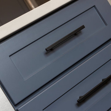
The hidden pantry added storage and squared off the strange triangular nook, creating a more traditional and functional kitchen layout. With the layout problems solved, they worked together to select materials. Richard and Monica wanted something brighter than their previous dark brown kitchen. They chose a combination of blue and white cabinetry with a white subway tile backsplash and white quartz countertops. The design was finalized, the materials were selected. It was time to begin construction.
One fear most homeowners have when beginning a home remodel is dust. Advance Design uses BuildClean HEPA filters to eliminate dust throughout the house while construction is going on. Project Manager Jason and his crew created temporary walls and cleaned up after every day of work.
“We were very impressed with how clean and organized the crew kept things while the remodeling process was underway,” Richard said.
The result is just what Richard and Monica envisioned when they began the process. Richard’s love for cooking can be explored through all-new Thermador appliances, featuring an easy-to-use induction cooktop, built-in double oven, and spacious refrigerator. Matte black hardware contrasts the bright white backsplash, countertops, and cabinets, while the stunning blue cabinets complement the dark hardwood floor and stainless-steel appliances. The dual pendant light fixtures over the reconfigured island are eye-catching and add necessary lighting.
This Huntley kitchen renovation turned out better than Richard and Monica hoped. Their experience with Advance Design’s Common Sense Remodeling process has them thinking about other projects they could do in the future.
Our award-winning design team would love to create a beautiful, functional, and spacious place for you and your family. With our “Common Sense Remodeling” approach, the process of renovating your home has never been easier. Contact us today at 847-665-1711 or schedule an appointment.
3