
Search results for "Changing field" in Home Design Ideas
 Charlie Allen Renovations, Inc.
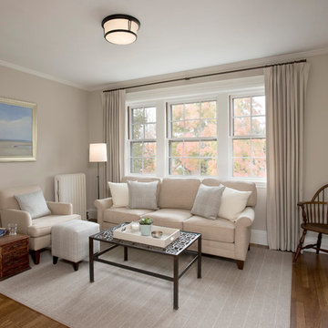
Our clients, a busy husband and wife, live in a top floor condo in an historic brick townhouse. With hectic professional lives, they had not had much time for home improvement but finally felt ready to make some changes.
At the top of their to-do list were the kitchen and bathroom. The kitchen, a small, enclosed utility space, featured dated tile flooring and backsplash and a floor plan that made the small space feel even more cramped. Meanwhile, the bathroom was also in need of a refresh, and the homeowners hoped to replace their tub with a safer walk-in shower with bench seating.
We began by introducing subtle changes to stitch together the home’s living areas. We opened the wall between the kitchen and dining room, which had been mostly enclosed. The small kitchen had featured a traditional work triangle with refrigerator, stove, and sink/prep/cleaning area along three separate walls. Unfortunately the room was too cramped for this particular layout. Instead, we placed the stove on the same wall as the fridge, which allowed a larger opening to the dining room. We kept the overhanging cabinetry in the kitchen but chose a new unit with separate cabinets facing both the kitchen and dining room for extra storage opportunities. With extra countertop at the sink, the half-wall, and on either side of the stove, the homeowners now have plenty of cooking prep space.
The homeowners favor a crisp white palette, and the pearl Omega cabinets that they selected are a perfect fit. A mix of brushed nickel and glass knob pulls offer visual and textile variety. For the countertops, we installed elegant white Quartz Calacatta Novus with a graceful dark wave pattern. The backsplash is Feather Gray Manhattan Field Tile.
Refinished and repainted moulding creates a seamless flow among the living spaces. In the dining and living rooms, the color-averse homeowners decided to try Benjamin Moore’s Edgecomb Gray. We also removed tile flooring from the kitchen in favor of restoring the original oak hardwoods, uniting this room with the rest of the condo.
In the bathroom, we removed the tub in favor of a curb-less walk-in shower with built-in marble bench seating. We fitted Vintage Studio’s Starry White wall tile and Bianco Carrera honed floor tile, and installed a new vanity (with a Cambria Queen Anne marble top) and Robern medicine cabinet.
We were delighted to work on the project with Elizabeth Tanny – a New York-based interior designer who is also the sister and sister-in-law of the homeowners. Elizabeth worked with our clients on artwork and furniture selections, as well as paint colors.
Photo by Shelly Harrison
 Charlie Allen Renovations, Inc.
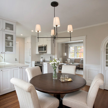
Our clients, a busy husband and wife, live in a top floor condo in an historic brick townhouse. With hectic professional lives, they had not had much time for home improvement but finally felt ready to make some changes.
At the top of their to-do list were the kitchen and bathroom. The kitchen, a small, enclosed utility space, featured dated tile flooring and backsplash and a floor plan that made the small space feel even more cramped. Meanwhile, the bathroom was also in need of a refresh, and the homeowners hoped to replace their tub with a safer walk-in shower with bench seating.
We began by introducing subtle changes to stitch together the home’s living areas. We opened the wall between the kitchen and dining room, which had been mostly enclosed. The small kitchen had featured a traditional work triangle with refrigerator, stove, and sink/prep/cleaning area along three separate walls. Unfortunately the room was too cramped for this particular layout. Instead, we placed the stove on the same wall as the fridge, which allowed a larger opening to the dining room. We kept the overhanging cabinetry in the kitchen but chose a new unit with separate cabinets facing both the kitchen and dining room for extra storage opportunities. With extra countertop at the sink, the half-wall, and on either side of the stove, the homeowners now have plenty of cooking prep space.
The homeowners favor a crisp white palette, and the pearl Omega cabinets that they selected are a perfect fit. A mix of brushed nickel and glass knob pulls offer visual and textile variety. For the countertops, we installed elegant white Quartz Calacatta Novus with a graceful dark wave pattern. The backsplash is Feather Gray Manhattan Field Tile.
Refinished and repainted moulding creates a seamless flow among the living spaces. In the dining and living rooms, the color-averse homeowners decided to try Benjamin Moore’s Edgecomb Gray. We also removed tile flooring from the kitchen in favor of restoring the original oak hardwoods, uniting this room with the rest of the condo.
In the bathroom, we removed the tub in favor of a curb-less walk-in shower with built-in marble bench seating. We fitted Vintage Studio’s Starry White wall tile and Bianco Carrera honed floor tile, and installed a new vanity (with a Cambria Queen Anne marble top) and Robern medicine cabinet.
We were delighted to work on the project with Elizabeth Tanny – a New York-based interior designer who is also the sister and sister-in-law of the homeowners. Elizabeth worked with our clients on artwork and furniture selections, as well as paint colors.
Photo by Shelly Harrison
 Charlie Allen Renovations, Inc.
Our clients, a busy husband and wife, live in a top floor condo in an historic brick townhouse. With hectic professional lives, they had not had much time for home improvement but finally felt ready to make some changes.
At the top of their to-do list were the kitchen and bathroom. The kitchen, a small, enclosed utility space, featured dated tile flooring and backsplash and a floor plan that made the small space feel even more cramped. Meanwhile, the bathroom was also in need of a refresh, and the homeowners hoped to replace their tub with a safer walk-in shower with bench seating.
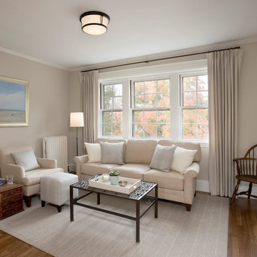
We began by introducing subtle changes to stitch together the home’s living areas. We opened the wall between the kitchen and dining room, which had been mostly enclosed. The small kitchen had featured a traditional work triangle with refrigerator, stove, and sink/prep/cleaning area along three separate walls. Unfortunately the room was too cramped for this particular layout. Instead, we placed the stove on the same wall as the fridge, which allowed a larger opening to the dining room. We kept the overhanging cabinetry in the kitchen but chose a new unit with separate cabinets facing both the kitchen and dining room for extra storage opportunities. With extra countertop at the sink, the half-wall, and on either side of the stove, the homeowners now have plenty of cooking prep space.
The homeowners favor a crisp white palette, and the pearl Omega cabinets that they selected are a perfect fit. A mix of brushed nickel and glass knob pulls offer visual and textile variety. For the countertops, we installed elegant white Quartz Calacatta Novus with a graceful dark wave pattern. The backsplash is Feather Gray Manhattan Field Tile.
Refinished and repainted moulding creates a seamless flow among the living spaces. In the dining and living rooms, the color-averse homeowners decided to try Benjamin Moore’s Edgecomb Gray. We also removed tile flooring from the kitchen in favor of restoring the original oak hardwoods, uniting this room with the rest of the condo.
In the bathroom, we removed the tub in favor of a curb-less walk-in shower with built-in marble bench seating. We fitted Vintage Studio’s Starry White wall tile and Bianco Carrera honed floor tile, and installed a new vanity (with a Cambria Queen Anne marble top) and Robern medicine cabinet.
We were delighted to work on the project with Elizabeth Tanny – a New York-based interior designer who is also the sister and sister-in-law of the homeowners. Elizabeth worked with our clients on artwork and furniture selections, as well as paint colors.
Photo by Shelly Harrison
Find the right local pro for your project
 Synergy Design & Construction
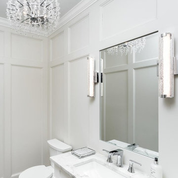
The main level Powder Room was originally dark with dated fixtures. Not anymore! Field-built wood paneling was added and painted in Benjamin Moore “Winds Breath” to completely change the look and feel of the space. A Home Decorators Collection “Woodfall” vanity cabinet with lucite & silver drawer pulls, “Mattaraso” polished Quartzite countertop and Pfister “Kelen” faucet in chrome are perfect together. The two Feiss “Cutler” bathroom sconces in polished chrome flank either side of the custom glass mirror to complete the space.
 Crystal Kitchen + Bath
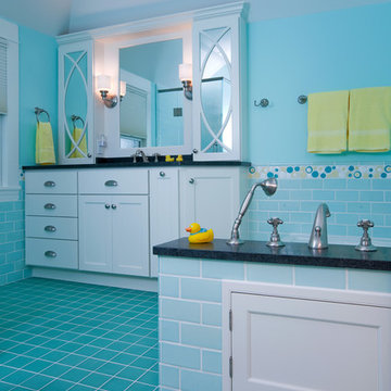
This is the main bath in a 1913 Linden Hills, 2-story home for a young family. The new owner wanted a separate shower from the tub, updated plumbing fixtures and color. A small linen closet in the corner of the bathroom and second stairway from kitchen was removed to provide space for a shower. Just outside the bathroom, a new linen closet was created by borrowing some space from the bedroom closet. White vanity cabinets and honed black granite were chosen to match the finishes in the kitchen. The dramatic change was the colored tile. Blue glass floor tile makes you feel like you are walking on water. A similar color of ceramic tile covers the walls. While a band of bubbles float around the room and settle in two niches. The final affect is youthful and colorful. The remodeled bath respects the vintage of the home and functions in the 21st century.
 Chapman Design Group, Inc.
Mark Hoyle
Originally, this 3700 SF two level eclectic farmhouse from the mid 1980’s underwent design changes to reflect a more colonial style. Now, after being completely renovated with additional 2800 SF living space, it’s combined total of 6500 SF boasts an Energy Star certification of 5 stars.
Approaching this completed home, you will meander along a new driveway through the dense buffer of trees until you reach the clearing, and then circle a tiered fountain on axis with the front entry accentuating the symmetrical main structure. Many of the exterior changes included enclosing the front porch and rear screened porch, replacing windows, replacing all the vinyl siding with and fiber cement siding, creating a new front stoop with winding brick stairs and wrought iron railings as will as other additions to the left and rear of the home.
The existing interior was completely fro the studs and included modifying uses of many of the existing rooms such as converting the original dining room into an oval shaped theater with reclining theater seats, fiber-optic starlight ceiling and an 80” television with built-in surround sound. The laundry room increased in size by taking in the porch and received all new cabinets and finishes. The screened porch across the back of the house was enclosed to create a new dining room, enlarged the kitchen, all of which allows for a commanding view of the beautifully landscaped pool. The upper master suite begins by entering a private office then leads to a newly vaulted bedroom, a new master bathroom with natural light and an enlarged closet.
The major portion of the addition space was added to the left side as a part time home for the owner’s brother. This new addition boasts an open plan living, dining and kitchen, a master suite with a luxurious bathroom and walk–in closet, a guest suite, a garage and its own private gated brick courtyard entry and direct access to the well appointed pool patio.
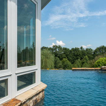
And finally the last part of the project is the sunroom and new lagoon style pool. Tucked tightly against the rear of the home. This room was created to feel like a gazebo including a metal roof and stained wood ceiling, the foundation of this room was constructed with the pool to insure the look as if it is floating on the water. The pool’s negative edge opposite side allows open views of the trees beyond. There is a natural stone waterfall on one side of the pool and a shallow area on the opposite side for lounge chairs to be placed in it along with a hot tub that spills into the pool. The coping completes the pool’s natural shape and continues to the patio utilizing the same stone but separated by Zoysia grass keeping the natural theme. The finishing touches to this backyard oasis is completed utilizing large boulders, Tempest Torches, architectural lighting and abundant variety of landscaping complete the oasis for all to enjoy.
 Kitchen Solvers of Rochester
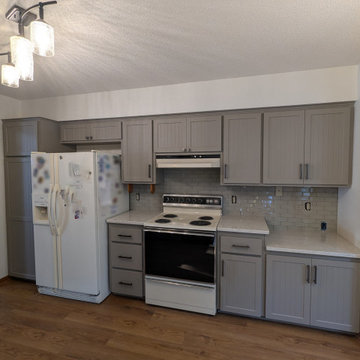
For this kitchen remodeling project, our clients wanted to change the look of their existing cabinets to something more modern. After looking at their existing cabinets, we determined that cabinet refacing was a good solution for them. They picked a Shaker Elite door style in a Silt color. Next, we installed a new Viatera Soprano quartz countertop along with a 2” x 8” Glass Mosaic backsplash. To finish this new look, a new Sovereign Butterscotch Field luxury vinyl plank floor was installed. Another beautiful kitchen for our clients!
Sponsored
Fredericksburg, OH

High Point Cabinets
Columbus' Experienced Custom Cabinet Builder | 4x Best of Houzz Winner
 Kitchen Design Concepts
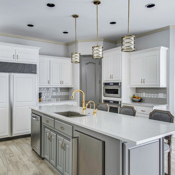
This super transformative kitchen has become one of our favorites when it comes to how much it changed! Plus, not only does It have all the qualities of what’s on trend, but also has qualities of what’s going to last long-term. We love the brightness of the white cabinets on the perimeter paired with the warmer grey cabinets on the island. If you compare it with the original, it’s essentially night and day! Curious to learn more? Keep reading!
Cabinets
The biggest change to the space is the cabinetry. For the perimeter, we painted it white while painting the island a dark grey. In addition, the bar-height walls surrounding the island was reduced to a counter-height which helped open up the kitchen even more.
Countertops
Introducing even more warmth to the space, we spec’ed a 3 cm Caesarstone Quartz in London Grey. This is a great option if you’re looking for a material that has a marble look but want something a little more durable and low maintenance.
Backsplash
For backsplash we selected a 3×6 Arizona Tile H-Line series, in Pumice installed in a brick lay as field tile. As an insert in the main backsplash, we installed a Soci Oxford Blend in a Valencia Pattern.
remodel your kitchen island
Fixtures and Finishes
From Blanco, we have a Silgranit 1 & ¾ sink in the color Truffle. From Newport Brass, we have a Jacobean pulldown faucet in Satin Gold and a Jacobean cold water dispenser also in Satin Gold. From Mountain Plumbing, we have an air disposal switch in satin gold. As for hardware, we installed Top Knobs pulls on doors and drawer fronts in their gold finish.
 Pegasus Lighting
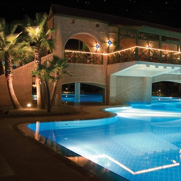
Highlight water features, pool areas, and other interesting aspects of your landscaping with this color changing tape light. This outdoor tape light can be submerged in up to 5-feet of water and can be programmed to display the full color spectrum for custom lighting effects. This LED tape light is UL listed for wet locations, has a rated life of 80,000 hours, and is backed by a 5-year warranty.
LIGHT FIXTURE
3 Lengths: choose from tape light lengths 1ft, 5ft, or 10 sections
Male/Female Connectors: each section has male connectors on one end and female connectors on the other for easily linking and connecting to layout accessories
Low Profile: only 1/8in thick and only 5/8in wide
Construction: flexible silicone cased tape light
3M Adhesive Backing: sturdy adhesive allows for easy mounting to wood, metals, and most other smooth surfaces
Minimum Run 1ft
Maximum Run 40ft
Dimmable: yes, with controller
Field Cuttable: every 2in at the end of a run. Indicator marks on back for field cutting.
2 Mounting Methods: two mounting methods provided: retrofit channel or mounting clips sold separately)
LIGHT SOURCE
LEDs: 12 LEDs per foot evenly spaced every 1in on center
Wattage: 1.5 watts/foot
Voltage: 24 volts AC
Variable Colors OR Neutral White Color Temperature
Excellent Rated Life: 80,000 hours of rated life on average
 Amy Patterson
1504 Polo Fields Place, Kingsport TN 37663
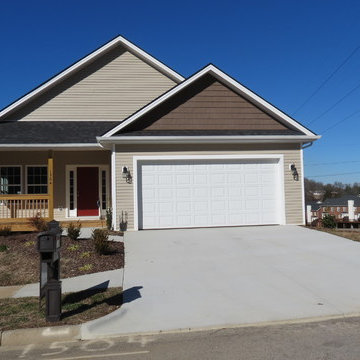
NEW BUILD!! Come check out this new construction in Polo Fields. This home not only comes with all the advantages of new construction, BUT a full unfinished basement! Perfect for storage or future expansion. This home has access to the John Adams school district along with many other amenities. Dreaming of move in ready and nothing to change or fix? Don't waste anymore time!
 Kitchen Design Concepts
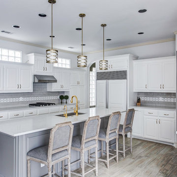
This super transformative kitchen has become one of our favorites when it comes to how much it changed! Plus, not only does It have all the qualities of what’s on trend, but also has qualities of what’s going to last long-term. We love the brightness of the white cabinets on the perimeter paired with the warmer grey cabinets on the island. If you compare it with the original, it’s essentially night and day! Curious to learn more? Keep reading!
Cabinets
The biggest change to the space is the cabinetry. For the perimeter, we painted it white while painting the island a dark grey. In addition, the bar-height walls surrounding the island was reduced to a counter-height which helped open up the kitchen even more.
Countertops
Introducing even more warmth to the space, we spec’ed a 3 cm Caesarstone Quartz in London Grey. This is a great option if you’re looking for a material that has a marble look but want something a little more durable and low maintenance.
Backsplash
For backsplash we selected a 3×6 Arizona Tile H-Line series, in Pumice installed in a brick lay as field tile. As an insert in the main backsplash, we installed a Soci Oxford Blend in a Valencia Pattern.
remodel your kitchen island
Fixtures and Finishes
From Blanco, we have a Silgranit 1 & ¾ sink in the color Truffle. From Newport Brass, we have a Jacobean pulldown faucet in Satin Gold and a Jacobean cold water dispenser also in Satin Gold. From Mountain Plumbing, we have an air disposal switch in satin gold. As for hardware, we installed Top Knobs pulls on doors and drawer fronts in their gold finish.
 Shutter Revolution
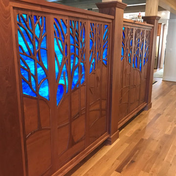
This room divider defines the hallway. It is constructed of Sapele with stained glass that is backlit with LED's with an acrylic diffuser and baffles. There are four panels in all as the opposite side mirrors this photograph. The tree and branches are cut from solid wood while the field is inlaid panels of Pommele Sapele. The lights have a DMX controller to allow static color change or run a program to change colors automatically.
 Chapman Design Group, Inc.
Mark Hoyle
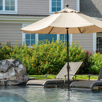
Originally, this 3700 SF two level eclectic farmhouse from the mid 1980’s underwent design changes to reflect a more colonial style. Now, after being completely renovated with additional 2800 SF living space, it’s combined total of 6500 SF boasts an Energy Star certification of 5 stars.
Approaching this completed home, you will meander along a new driveway through the dense buffer of trees until you reach the clearing, and then circle a tiered fountain on axis with the front entry accentuating the symmetrical main structure. Many of the exterior changes included enclosing the front porch and rear screened porch, replacing windows, replacing all the vinyl siding with and fiber cement siding, creating a new front stoop with winding brick stairs and wrought iron railings as will as other additions to the left and rear of the home.
The existing interior was completely fro the studs and included modifying uses of many of the existing rooms such as converting the original dining room into an oval shaped theater with reclining theater seats, fiber-optic starlight ceiling and an 80” television with built-in surround sound. The laundry room increased in size by taking in the porch and received all new cabinets and finishes. The screened porch across the back of the house was enclosed to create a new dining room, enlarged the kitchen, all of which allows for a commanding view of the beautifully landscaped pool. The upper master suite begins by entering a private office then leads to a newly vaulted bedroom, a new master bathroom with natural light and an enlarged closet.
The major portion of the addition space was added to the left side as a part time home for the owner’s brother. This new addition boasts an open plan living, dining and kitchen, a master suite with a luxurious bathroom and walk–in closet, a guest suite, a garage and its own private gated brick courtyard entry and direct access to the well appointed pool patio.
And finally the last part of the project is the sunroom and new lagoon style pool. Tucked tightly against the rear of the home. This room was created to feel like a gazebo including a metal roof and stained wood ceiling, the foundation of this room was constructed with the pool to insure the look as if it is floating on the water. The pool’s negative edge opposite side allows open views of the trees beyond. There is a natural stone waterfall on one side of the pool and a shallow area on the opposite side for lounge chairs to be placed in it along with a hot tub that spills into the pool. The coping completes the pool’s natural shape and continues to the patio utilizing the same stone but separated by Zoysia grass keeping the natural theme. The finishing touches to this backyard oasis is completed utilizing large boulders, Tempest Torches, architectural lighting and abundant variety of landscaping complete the oasis for all to enjoy.
Sponsored
Fredericksburg, OH
High Point Cabinets
Columbus' Experienced Custom Cabinet Builder | 4x Best of Houzz Winner
 Wolfgang Pichler Design Inc.
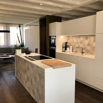
A vacant, worn office space should be transformed into a show apartment / showroom. The existing space had been used as an office structure since the 1960s. Located on the 4th floor of a ten-floor reinforced concrete skeleton, the area is already high enough to receive a great amount of light, which is particularly noticeable at dawn and dusk: sunrises and sunsets conjure up the most spellbinding blends of light.
The existing structure and also the technical equipment were completely outdated and needed to be completely rebuilt: suspended ceilings were removed and walls changed. The result is a modern city apartment of almost 100 m2 (about 1,070 sqft) – divided into a large living space, 2 rooms, 1 bathroom, 1 powder room and 1 utility room. The existing window facades could not be changed, but they are part of the concept anyway, namely to bring as much light as possible into the room. A controlled ventilation system ensures optimal air quality even with closed windows. The central kitchen element serves as a kind of separation of the living area and the dining area. Here customers and guests are served, people communicate, cook together, drink a glass of wine. Clients experience living.
The rough reinforced concrete ribbed slaps were uncovered and painted white to give the room more height, which is accentuated by the lighting concept with ceiling-mounted spotlights. The dark oak floor creates a successful contrast to the brightly designed rooms. The wittily positioned pedestal areas hide all technical elements, such as the supply air openings of the living room ventilation. Flush-fitting door elements in the walls with a chalked brick look show in detail the special feature of the room. The central wall elements were deliberately not pulled up to the ceiling, but are separated by a glass element to show the continuity of the construction.
Most of the furniture was designed by Wolfgang Pichler. Within the course of this project he was able to implement his holistic approach in the field of construction technology, architecture and furniture design and skillfully combine it with design classics. Scandinavian classics can be found in the concept just as much as pieces he collected during his career and furniture he developed for the company VITEO, which he founded in 2002. The project illustrates the added value of an architectural holistic approach.
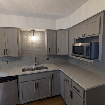 Kitchen Solvers of Rochester
For this kitchen remodeling project, our clients wanted to change the look of their existing cabinets to something more modern. After looking at their existing cabinets, we determined that cabinet refacing was a good solution for them. They picked a Shaker Elite door style in a Silt color. Next, we installed a new Viatera Soprano quartz countertop along with a 2” x 8” Glass Mosaic backsplash. To finish this new look, a new Sovereign Butterscotch Field luxury vinyl plank floor was installed. Another beautiful kitchen for our clients!
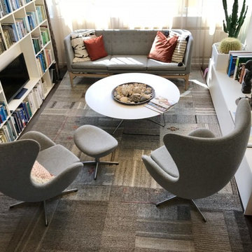 Wolfgang Pichler Design Inc.
A vacant, worn office space should be transformed into a show apartment / showroom. The existing space had been used as an office structure since the 1960s. Located on the 4th floor of a ten-floor reinforced concrete skeleton, the area is already high enough to receive a great amount of light, which is particularly noticeable at dawn and dusk: sunrises and sunsets conjure up the most spellbinding blends of light.
The existing structure and also the technical equipment were completely outdated and needed to be completely rebuilt: suspended ceilings were removed and walls changed. The result is a modern city apartment of almost 100 m2 (about 1,070 sqft) – divided into a large living space, 2 rooms, 1 bathroom, 1 powder room and 1 utility room. The existing window facades could not be changed, but they are part of the concept anyway, namely to bring as much light as possible into the room. A controlled ventilation system ensures optimal air quality even with closed windows. The central kitchen element serves as a kind of separation of the living area and the dining area. Here customers and guests are served, people communicate, cook together, drink a glass of wine. Clients experience living.
The rough reinforced concrete ribbed slaps were uncovered and painted white to give the room more height, which is accentuated by the lighting concept with ceiling-mounted spotlights. The dark oak floor creates a successful contrast to the brightly designed rooms. The wittily positioned pedestal areas hide all technical elements, such as the supply air openings of the living room ventilation. Flush-fitting door elements in the walls with a chalked brick look show in detail the special feature of the room. The central wall elements were deliberately not pulled up to the ceiling, but are separated by a glass element to show the continuity of the construction.
Most of the furniture was designed by Wolfgang Pichler. Within the course of this project he was able to implement his holistic approach in the field of construction technology, architecture and furniture design and skillfully combine it with design classics. Scandinavian classics can be found in the concept just as much as pieces he collected during his career and furniture he developed for the company VITEO, which he founded in 2002. The project illustrates the added value of an architectural holistic approach.
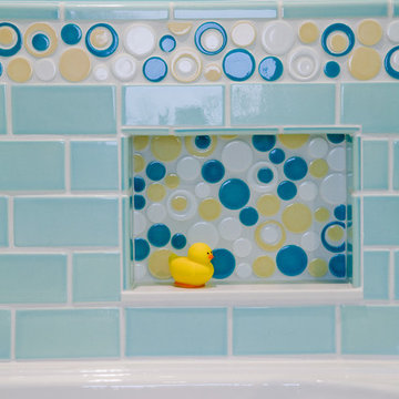 Crystal Kitchen + Bath
This is the main bath in a 1913 Linden Hills, 2-story home for a young family. The new owner wanted a separate shower from the tub, updated plumbing fixtures and color. A small linen closet in the corner of the bathroom and second stairway from kitchen was removed to provide space for a shower. Just outside the bathroom, a new linen closet was created by borrowing some space from the bedroom closet. White vanity cabinets and honed black granite were chosen to match the finishes in the kitchen. The dramatic change was the colored tile. Blue glass floor tile makes you feel like you are walking on water. A similar color of ceramic tile covers the walls. While a band of bubbles float around the room and settle in two niches. The final affect is youthful and colorful. The remodeled bath respects the vintage of the home and functions in the 21st century.
 Charlie Allen Renovations, Inc.
Our clients, a busy husband and wife, live in a top floor condo in an historic brick townhouse. With hectic professional lives, they had not had much time for home improvement but finally felt ready to make some changes.
At the top of their to-do list were the kitchen and bathroom. The kitchen, a small, enclosed utility space, featured dated tile flooring and backsplash and a floor plan that made the small space feel even more cramped. Meanwhile, the bathroom was also in need of a refresh, and the homeowners hoped to replace their tub with a safer walk-in shower with bench seating.
We began by introducing subtle changes to stitch together the home’s living areas. We opened the wall between the kitchen and dining room, which had been mostly enclosed. The small kitchen had featured a traditional work triangle with refrigerator, stove, and sink/prep/cleaning area along three separate walls. Unfortunately the room was too cramped for this particular layout. Instead, we placed the stove on the same wall as the fridge, which allowed a larger opening to the dining room. We kept the overhanging cabinetry in the kitchen but chose a new unit with separate cabinets facing both the kitchen and dining room for extra storage opportunities. With extra countertop at the sink, the half-wall, and on either side of the stove, the homeowners now have plenty of cooking prep space.
The homeowners favor a crisp white palette, and the pearl Omega cabinets that they selected are a perfect fit. A mix of brushed nickel and glass knob pulls offer visual and textile variety. For the countertops, we installed elegant white Quartz Calacatta Novus with a graceful dark wave pattern. The backsplash is Feather Gray Manhattan Field Tile.
Refinished and repainted moulding creates a seamless flow among the living spaces. In the dining and living rooms, the color-averse homeowners decided to try Benjamin Moore’s Edgecomb Gray. We also removed tile flooring from the kitchen in favor of restoring the original oak hardwoods, uniting this room with the rest of the condo.
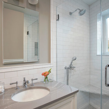
In the bathroom, we removed the tub in favor of a curb-less walk-in shower with built-in marble bench seating. We fitted Vintage Studio’s Starry White wall tile and Bianco Carrera honed floor tile, and installed a new vanity (with a Cambria Queen Anne marble top) and Robern medicine cabinet.
We were delighted to work on the project with Elizabeth Tanny – a New York-based interior designer who is also the sister and sister-in-law of the homeowners. Elizabeth worked with our clients on artwork and furniture selections, as well as paint colors.
Photo by Shelly Harrison
 Pegasus Lighting
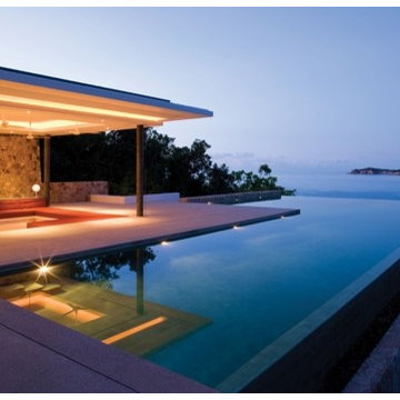
Highlight water features, pool areas, and other interesting aspects of your landscaping with this color changing tape light. This outdoor tape light can be submerged in up to 5-feet of water and can be programmed to display the full color spectrum for custom lighting effects. This LED tape light is UL listed for wet locations, has a rated life of 80,000 hours, and is backed by a 5-year warranty.
LIGHT FIXTURE
3 Lengths: choose from tape light lengths 1ft, 5ft, or 10 sections
Male/Female Connectors: each section has male connectors on one end and female connectors on the other for easily linking and connecting to layout accessories
Low Profile: only 1/8in thick and only 5/8in wide
Construction: flexible silicone cased tape light
3M Adhesive Backing: sturdy adhesive allows for easy mounting to wood, metals, and most other smooth surfaces
Minimum Run 1ft
Maximum Run 40ft
Dimmable: yes, with controller
Field Cuttable: every 2in at the end of a run. Indicator marks on back for field cutting.
2 Mounting Methods: two mounting methods provided: retrofit channel or mounting clips sold separately)
LIGHT SOURCE
LEDs: 12 LEDs per foot evenly spaced every 1in on center
Wattage: 1.5 watts/foot
Voltage: 24 volts AC
Variable Colors OR Neutral White Color Temperature
Excellent Rated Life: 80,000 hours of rated life on average
 Kitchen Design Concepts
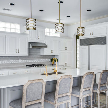
This super transformative kitchen has become one of our favorites when it comes to how much it changed! Plus, not only does It have all the qualities of what’s on trend, but also has qualities of what’s going to last long-term. We love the brightness of the white cabinets on the perimeter paired with the warmer grey cabinets on the island. If you compare it with the original, it’s essentially night and day! Curious to learn more? Keep reading!
Cabinets
The biggest change to the space is the cabinetry. For the perimeter, we painted it white while painting the island a dark grey. In addition, the bar-height walls surrounding the island was reduced to a counter-height which helped open up the kitchen even more.
Countertops
Introducing even more warmth to the space, we spec’ed a 3 cm Caesarstone Quartz in London Grey. This is a great option if you’re looking for a material that has a marble look but want something a little more durable and low maintenance.
Backsplash
For backsplash we selected a 3×6 Arizona Tile H-Line series, in Pumice installed in a brick lay as field tile. As an insert in the main backsplash, we installed a Soci Oxford Blend in a Valencia Pattern.
remodel your kitchen island
Fixtures and Finishes
From Blanco, we have a Silgranit 1 & ¾ sink in the color Truffle. From Newport Brass, we have a Jacobean pulldown faucet in Satin Gold and a Jacobean cold water dispenser also in Satin Gold. From Mountain Plumbing, we have an air disposal switch in satin gold. As for hardware, we installed Top Knobs pulls on doors and drawer fronts in their gold finish.
15