
Search results for "Characters typically" in Home Design Ideas
 Historic Flooring LLC
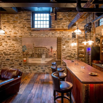
This gorgeous wide plank antique Oak is our most requested floor! With dramatic widths ranging from 6 to 12 inches (14 inches in some cases), you can easily bring an old-world charm into your home. This product comes to you completely pre-finished and ready to install.
We start by hand sanding the surface, beveling the edges ever so slightly, and being careful to preserve the historical integrity of the planks. Typically, about 80% of your flooring will be "Smooth" with the remaining 20% having a slight texture from the original saw kerfs. This material will also have nail holes, knots, and checks which only adds to the unique character.
Next, we apply Waterlox, a tung oil based sealant with or without stain added. Finally, 3 coats of Vermont Polywhey finish are added with a hand buffing between coats. The result is a luxurious satiny finish that you can only get from Historic Flooring!
Photos by Steven Dolinsky
 Joni Spear Interior Design
A typical product of the mid 80s, before its transformation, this St. Louis home was largely devoid character and detail.
An early primary objective of the client was to transform the lackluster foyer into an impressive appetizer of things to come inside the now-grand home.
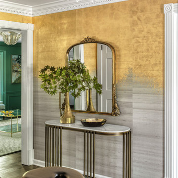
An upmarket Art Deco-inspired light fixture with cascading fluted glass tubes arranged around a brass frame replaces a common low-quality Big Box affair. The fixture emits a serviceable, but subtle warm skin-flattering glow.
To encapsulate the space and make a grand first impression, walls are elevated with distinctive, dimensional wallcoverings with authentic metallic leafing on horsehair panels. A simple, but striking bench with tufted ebony leather and curved brass legs offers plentiful and functional seating.
The oval console with sensual brass legs and a honed marble top, soften the space’s angles.
An iconic, arch-topped, vintage-inspired brass mirror intentionally contrasts with the modern space adding a splash of femininity.
The delicate buffet lamp offers old world charm, while the rug is weather resistant to help contain the detritus of real-family living.
 Brickhouse Design and Build
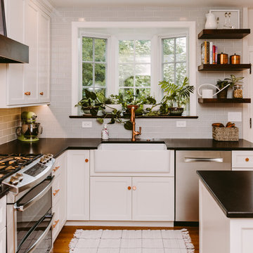
Eat-in kitchen - mid-sized transitional u-shaped medium tone wood floor and brown floor eat-in kitchen idea in Baltimore with a farmhouse sink, white cabinets, quartz countertops, glass tile backsplash, stainless steel appliances, an island, black countertops, recessed-panel cabinets and blue backsplash
Find the right local pro for your project
 Ventura Homes
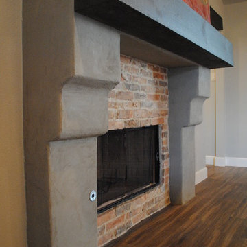
The interior design has modern touches with gorgeous stained wood beam work. All of the custom details add a lot of character to the home.
Large eclectic open concept vinyl floor living room photo in Austin with gray walls, a standard fireplace, a brick fireplace and a wall-mounted tv
Large eclectic open concept vinyl floor living room photo in Austin with gray walls, a standard fireplace, a brick fireplace and a wall-mounted tv
 Gardner/Fox Associates, Inc
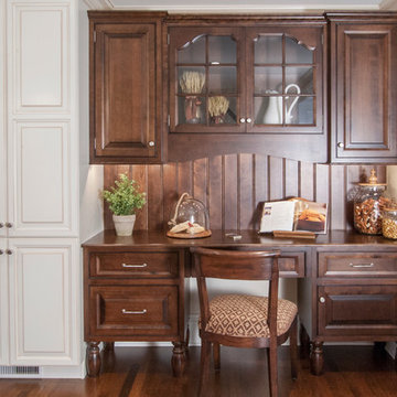
The owners of this 1950s colonial on Philadelphia’s Main Line wanted to preserve its traditional architecture and take advantage of the kitchen’s ample footprint. In addition to reworking the floorplan and improving the flow, the owner wanted a large island with several seating options, a desk area and a small table for dining.
One of the design goals was to transform the spacious room into a functional kitchen that still felt intimate and comfortable for everyday use. Furniture style inset cabinetry kept the room in tune with the home’s original character and made it feel less utilitarian. Removing the wall that hindered the flow and views between the kitchen and the adjacent family room ensured that the main entertaining areas flowed together. Stylistically, we wanted to avoid the typical white kitchen, opting instead to pull in rich wood tones to create a warmer and more classic look.
 SH interiors
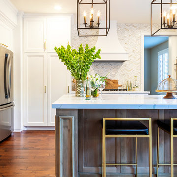
Kitchen renovation featured on HGTV 's House Hunters Renovation "Type A Reno". The original kitchen had an angled wall where the pantry currently is and that made it difficult to maximize storage. We had the pantry section custom made to fit the angle of the wall and it houses double the storage that the original upper section used to. The finishes are classic with modern touches throughout such as the overscaled pendant lights over the island and the full wall of mosaic backsplash. White kitchens will always be a popular choice and you can go wrong if you stick with classics. Shaker cabinet door with a added door detail, so it's not your typical Shaker. The island was custom made with raised panel details and a gray wash stain. We mixed gold and black hardware to add character to the space.
 Quarry Mill
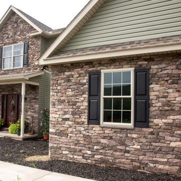
Whitney natural thin stone veneer adds character and color to the exterior of this traditional home. Whitney is a natural hand-picked fieldstone veneer in a rough ledgestone style. Each individual piece of stone has some weathering giving it a variety of color and texture. Whitney falls into the ledgestone category, but it is more irregular than a typical ledgestone. This irregularity is due to the sawing process. The thin veneer is created by sawing only the natural edges of the pieces of raw fieldstone. The pieces of fieldstone used to create Whitney are about the size of a small tire but not necessarily round. Whitney is only cut from the outside edge where the tread on a tire would be. The stone retains its rustic appeal with a natural top and bottom.
 SH interiors
Kitchen renovation featured on HGTV 's House Hunters Renovation "Type A Reno". The original kitchen had an angled wall where the pantry currently is and that made it difficult to maximize storage. We had the pantry section custom made to fit the angle of the wall and it houses double the storage that the original upper section used to. The finishes are classic with modern touches throughout such as the overscaled pendant lights over the island and the full wall of mosaic backsplash. White kitchens will always be a popular choice and you can go wrong if you stick with classics. Shaker cabinet door with a added door detail, so it's not your typical Shaker. The island was custom made with raised panel details and a gray wash stain. We mixed gold and black hardware to add character to the space.
 Dianne Davant and Associates
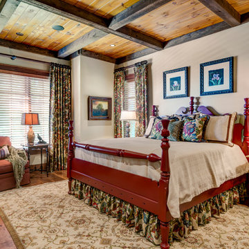
Master Bedroom with Red Bed Frame and custom drapery and bedding.
Bedroom - traditional master light wood floor bedroom idea in Charlotte
Bedroom - traditional master light wood floor bedroom idea in Charlotte
 Gardner/Fox Associates, Inc
The owners of this 1950s colonial on Philadelphia’s Main Line wanted to preserve its traditional architecture and take advantage of the kitchen’s ample footprint. In addition to reworking the floorplan and improving the flow, the owner wanted a large island with several seating options, a desk area and a small table for dining.
One of the design goals was to transform the spacious room into a functional kitchen that still felt intimate and comfortable for everyday use. Furniture style inset cabinetry kept the room in tune with the home’s original character and made it feel less utilitarian. Removing the wall that hindered the flow and views between the kitchen and the adjacent family room ensured that the main entertaining areas flowed together. Stylistically, we wanted to avoid the typical white kitchen, opting instead to pull in rich wood tones to create a warmer and more classic look.
 Arani Construction
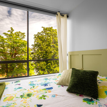
This guest bedroom renovation in Hollyburn, West Vancouver was designed to introduce warmth and architectural detail within a compact condo layout. Custom wall paneling adds dimension and subtle character, elevating the space beyond standard painted finishes while maintaining a clean, contemporary aesthetic.
Large-format windows maximize natural light and connect the interior to the surrounding greenery typical of the Hollyburn neighbourhood. The updated trim, refined wall detailing, and balanced colour palette create a calm and inviting atmosphere suitable for both guests and everyday living.
Arani Construction delivers organized condo renovations throughout West Vancouver, combining disciplined finish execution with thoughtful design integration tailored to North Shore residences.
 Gardner/Fox Associates, Inc
The owners of this 1950s colonial on Philadelphia’s Main Line wanted to preserve its traditional architecture and take advantage of the kitchen’s ample footprint. In addition to reworking the floorplan and improving the flow, the owner wanted a large island with several seating options, a desk area and a small table for dining.
One of the design goals was to transform the spacious room into a functional kitchen that still felt intimate and comfortable for everyday use. Furniture style inset cabinetry kept the room in tune with the home’s original character and made it feel less utilitarian. Removing the wall that hindered the flow and views between the kitchen and the adjacent family room ensured that the main entertaining areas flowed together. Stylistically, we wanted to avoid the typical white kitchen, opting instead to pull in rich wood tones to create a warmer and more classic look.
 UpperKey
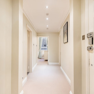
London's apartments have a variety of entrances, depending on the building and its location. Some apartments have a grand entrance with a doorman or concierge to greet residents and guests. These entrances are typically well-maintained and impressive, giving residents a sense of luxury and prestige.
Other apartments have more modest entrances, such as a simple door or gate that leads directly to the apartment. These entrances may be less glamorous, but they can offer a greater sense of privacy and security.
Regardless of the type of entrance, London's apartments are known for their charm and character. Many buildings have historic architecture, with intricate details and ornate features that make them stand out from modern construction. These entrances are often the first impression visitors have of the building, and they can set the tone for the entire living experience.
Whether you prefer a grand entrance or a more understated one, London's apartments offer a range of options to suit your style and needs.
 Revival House
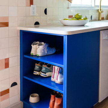
These clients are your typical, plant-loving millennials who, slowly and on a budget, are bringing a unique vision for their home to life. Color, while important to every homeowner, was clearly important to these homeowners. With one homeowner being an artist with an affinity for pink, the couple went through a gamut of cabinet color options including olive, teal, navy, and mustard. Assisted by interior designer Erinn Farrell, they landed on a custom paint color – Benjamin Moore’s Evening Blue – for the cabinetry, complemented by clear Alder in a natural stain. The retro, Mid-Mod Squares tile backsplash in custom colors from Mercury Mosaics gives a nod to the original style of the home built in the 1950's.
The overall layout of the kitchen didn't change much, but the pantry and baking center on the refrigerator wall are new features that provide much needed storage. The main living area, however, did go through some major changes. The wall separating the kitchen and dining room came down, and the small doorway connecting the dining and living rooms was transformed into a larger arch. The original wood floors (found beneath not one, but two layers of linoleum) received a fresh stain. The homeowners also knocked down the wall that sectioned off the stairs and built a slatted wood partition themselves. It was originally going to be a reeded wall, but they added the boxes for extra support, giving it more character in the end.
At Revival House we love a unique, bold project. However, the fact that these clients love the new kitchen and can’t believe they get to use it every day is the best compliment!
 Peter de Bretteville Architect
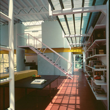
The project is for two single family dwellings for close friends who wish to live cooperatively rather than in more typical LA isolation. The site slopes up steeply to the west from the street such that the two houses are cut deeply into the hill for basements and garages. The main levels are reached through a shared central exterior stair. Entry is from the common landing overlooking the street. The stair can also be taken directly up into the garden. While to two houses have the same structure and materials, the uniqueness of each families structure and interest is expressed in fundamentally different plan arrangements and different interior finishes such that each house has its own character internally. This is possible because the basic loft like structure frames two story spaces within which are placed bedrooms as mezzanines. Both buildings are relatively closed to the street and open to the garden side where overhanging balconies and canvas shade the glass walls. The skylights that run continuously along the street balance the light through the interior especially in the two story living room and studio spaces.
 Gardner/Fox Associates, Inc
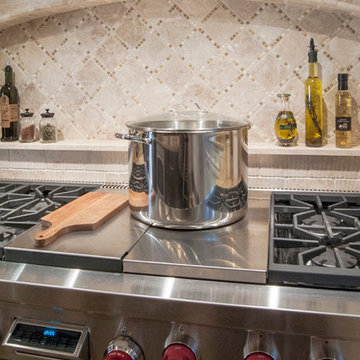
The owners of this 1950s colonial on Philadelphia’s Main Line wanted to preserve its traditional architecture and take advantage of the kitchen’s ample footprint. In addition to reworking the floorplan and improving the flow, the owner wanted a large island with several seating options, a desk area and a small table for dining.
One of the design goals was to transform the spacious room into a functional kitchen that still felt intimate and comfortable for everyday use. Furniture style inset cabinetry kept the room in tune with the home’s original character and made it feel less utilitarian. Removing the wall that hindered the flow and views between the kitchen and the adjacent family room ensured that the main entertaining areas flowed together. Stylistically, we wanted to avoid the typical white kitchen, opting instead to pull in rich wood tones to create a warmer and more classic look.
 Historic Flooring LLC
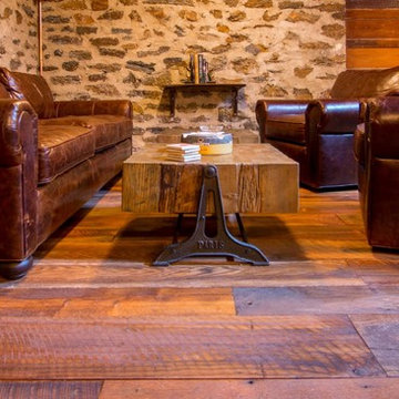
This gorgeous wide plank antique Oak is our most requested floor! With dramatic widths ranging from 6 to 12 inches (14 inches in some cases), you can easily bring an old-world charm into your home. This product comes to you completely pre-finished and ready to install.
We start by hand sanding the surface, beveling the edges ever so slightly, and being careful to preserve the historical integrity of the planks. Typically, about 80% of your flooring will be "Smooth" with the remaining 20% having a slight texture from the original saw kerfs. This material will also have nail holes, knots, and checks which only adds to the unique character.
Next, we apply Waterlox, a tung oil based sealant with or without stain added. Finally, 3 coats of Vermont Polywhey finish are added with a hand buffing between coats. The result is a luxurious satiny finish that you can only get from Historic Flooring!
Photos by Steven Dolinsky
 User
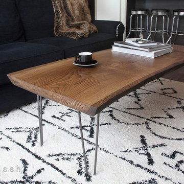
UserSpaces by jacflash inexpensively spruced up this client's condo by using several of his existing furniture pieces but adding more organic touches to create this memorable and refreshing space. Based off of his existing bed and the sentiments of his favourite world map painting, we created a frame wall and small work area tying in the fascinating map theme. The central living room wall displayed a sophisticated matte black wainscoting and a satin finished, custom live edge oak coffee table with modern hairpin legs matching a reclaimed wood media shelf mated with industrial pipe shelf brackets. The second bedroom featured a classic barn board headboard with incorporated shelves to hold LED reading lights. Each piece of reclaimed grey barn board has it's own character and textured from 100 years of exposure to Ontario's sun, rain, snow and wind. This created a cozy and organic vibe to a typical stark, cookie cutter condo room. Even the washroom contained reclaimed, grey, barn board shelves which were paired with stylish, brushed nickel shelf mounts.
 Gardner/Fox Associates, Inc
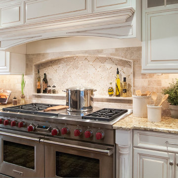
The owners of this 1950s colonial on Philadelphia’s Main Line wanted to preserve its traditional architecture and take advantage of the kitchen’s ample footprint. In addition to reworking the floorplan and improving the flow, the owner wanted a large island with several seating options, a desk area and a small table for dining.
One of the design goals was to transform the spacious room into a functional kitchen that still felt intimate and comfortable for everyday use. Furniture style inset cabinetry kept the room in tune with the home’s original character and made it feel less utilitarian. Removing the wall that hindered the flow and views between the kitchen and the adjacent family room ensured that the main entertaining areas flowed together. Stylistically, we wanted to avoid the typical white kitchen, opting instead to pull in rich wood tones to create a warmer and more classic look.
 Joy Street Design
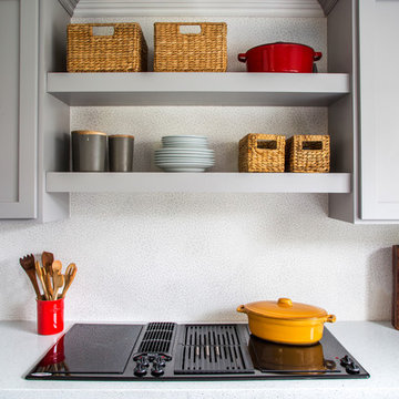
A gorgeous kitchen showcasing a brand new color palette of gray and bold blue! As this was the client’s childhood home, we wanted to preserve her memories while still refreshing the interior and bringing it up-to-date. We started with a new spatial layout and increased the size of wall openings to create the sense of an open plan without removing all the walls. By adding a more functional layout and pops of color throughout the space, we were able to achieve a youthful update to a cherished space without losing all the character and memories that the homeowner loved.
Designed by Joy Street Design serving Oakland, Berkeley, San Francisco, and the whole of the East Bay.
For more about Joy Street Design, click here: https://www.joystreetdesign.com/
To learn more about this project, click here: https://www.joystreetdesign.com/portfolio/randolph-street
16