
Search results for "Circulate" in Home Design Ideas
 Custom Design & Construction
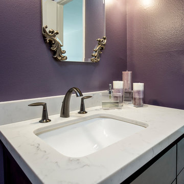
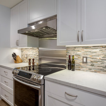
This Playa Del Rey, CA. design / build project began after our client had a terrible flood ruin her kitchen. In truth, she had been unhappy with her galley kitchen prior to the flood. She felt it was dark and deep with poor air conditioning circulating through it. She enjoys entertaining and hosting dinner parties and felt that this was the perfect opportunity to reimagine her galley kitchen into a space that would reflect her lifestyle. Since this is a condominium, we decided the best way to open up the floorplan was to wrap the counter around the wall into the dining area and make the peninsula the same height as the work surface. The result is an open kitchen with extensive counter space. Keeping it light and bright was important but she also wanted some texture and color too. The stacked stone backsplash has slivers of glass that reflect the light. Her vineyard palette was tied into the backsplash and accented by the painted walls. The floating glass shelves are highlighted with LED lights on a dimmer switch. We were able to space plan to incorporate her wine rack into the peninsula. We reconfigured the HVAC vent so more air circulated into the far end of the kitchen and added a ceiling fan. This project also included replacing the carpet and 12X12 beige tile with some “wood look” porcelain tile throughout the first floor. Since the powder room was receiving new flooring our client decided to add the powder room project which included giving it a deep plum paint job and a new chocolate cherry vanity. The white quartz counter and crystal hardware balance the dark hues in the wall and vanity.
 Granit Architects + Interiors
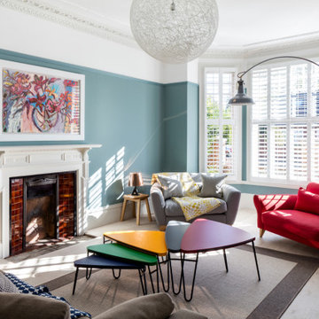
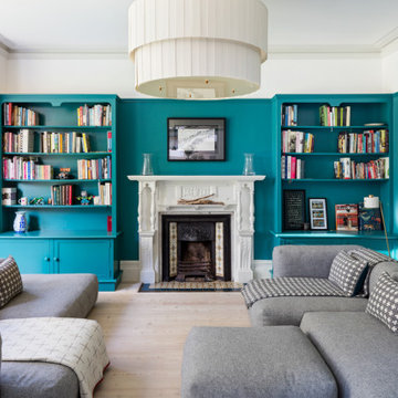
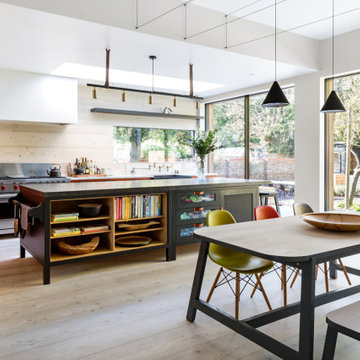
We are delighted to have completed the radical transformation of a tired detached property in South Croydon.
When they appointed Granit, our clients were living in the property which had previously been divided into a number of flats.
The historic sub-division had resulted in an extremely poor use of space with redundant staircases, kitchens and bathrooms throughout.
Our clients sought to reconfigure the property back into a single dwelling for his growing family.
Our client had an eye for design and was keen to balance contemporary design whilst maintaining as much of the character of the original house.
Maximising natural light, space and establishing a visual and physical connection were also key drivers for the design. Owing to the size of the property, it became apparent that reconfiguration rather than extension provided the solution to meet the brief.
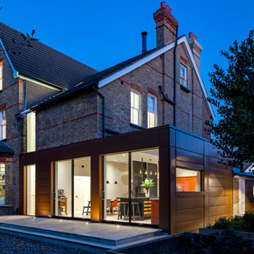
A metal clad ‘intervention’ was introduced to the rear facade. This created a strong horizontal element creating a visual balance with the vertical nature of the three storey gable.
The metal cladding specified echoed the colour of the red brick string courses tying old with new. Slender frame sliding doors provide access and views of the large garden.
The central circulation space was transformed by the introduction of a double height glazed slot wrapping up the rear facade and onto the roof. This allows daylight to permeate into the heart of the otherwise dark deep floor plan. The staircase was reconfigured into a series of landings looking down over the main void space below and out towards the tree canopies at the rear of the garden.
The introduction of double pocket doors throughout the ground floor creates a series of interconnected spaces and the whitewashed Larch flooring flows seamlessly from room to room. A bold palette of colours and materials lends character and texture throughout the property.
The end result is a spacious yet cosy environment for the family to inhabit for years to come.
 Cedarstone Group Inc.
Upper Hallway – Refined Transition Space | Second Floor Addition, Toronto
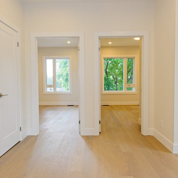
This upper hallway was designed as a clean, intentional transition space within the second floor addition, connecting bedrooms, the bathroom, and shared living areas while maintaining a sense of openness and flow. Rather than feeling purely functional, the hallway was proportioned to feel calm, bright, and cohesive with the rest of the upper level.
Natural light, simple lines, and a restrained material palette allow the hallway to visually extend the surrounding rooms, avoiding the boxed-in feel common in older second-storey layouts. The circulation supports easy movement while reinforcing privacy and separation between sleeping areas and shared spaces.
As part of the complete home transformation, this hallway reflects Cedarstone Group Inc.’s focus on thoughtful planning and livability, where even transitional spaces are carefully designed to enhance how the home functions day to day.
Find the right local pro for your project
 EAG Studio
On a quiet street just steps from San Francisco’s beloved Dolores Park, a formerly modest urban structure has been transformed into a luminous vertical residence that quietly redefines contemporary city living. Through a comprehensive remodel and both vertical and horizontal expansion, the project turns a constrained urban footprint into a sequence of serene, art-forward living spaces that unfold upward toward expansive city views.
The architecture balances restraint and warmth: crisp contemporary geometry softened by natural materials, artful lighting, and carefully curated interiors. The result is a home that feels simultaneously grounded and elevated—deeply connected to its neighborhood yet remarkably private.
Reimagining the Urban Envelope
The original building has been almost entirely reconceived. The facade now reads as a disciplined composition of plaster volumes and precisely detailed window openings framed by subtle projecting bands. The geometry references San Francisco’s classic rhythm of bayed facades while stripping the language down to a refined modern expression.
Behind this quiet exterior lies a dramatically expanded interior volume. The redesign adds both additional floor area and new vertical circulation, transforming what was once a conventional city house into a multi-level architectural sequence organized around light, art, and views.
At the roofline, planted terraces soften the building’s silhouette and create a green crown visible from surrounding hillsides.
Interiors as a Sequence of Galleries
Inside, the home unfolds as a series of spatial moments connected by a sculptural stair and gallery-like corridors.
Wide plank oak floors run throughout, providing continuity and warmth against a palette of plaster walls, dark steel detailing, and natural stone. The hallways function almost as curated galleries, with layered artworks suspended in front of mesh panels that create depth and subtle shadow.
Light filters through carefully placed windows and stair openings, transforming circulation spaces into contemplative transitions rather than mere passageways.
A Living Room Anchored by Stone and Light
The primary living room occupies one of the home’s central floors, where a quiet interplay of texture and geometry defines the space.
A monumental fireplace wrapped in dark stone forms the room’s anchor, its mass contrasting with a recessed ceiling plane that seems to float above the seating area. Integrated perimeter lighting creates a soft architectural glow that washes the ceiling and walls.
Furniture is sculptural yet understated—rounded lounge chairs in warm ochre velvet, tailored sofas, and a striking marble cocktail table whose expressive veining becomes a focal artwork in itself. Deep blue carpeting grounds the seating arrangement and subtly absorbs light, enhancing the calm atmosphere.
Above the fireplace, a delicate projection artwork introduces a moment of visual poetry—an unexpected cinematic gesture that transforms the wall into a quietly animated canvas.
Kitchen as Architectural Furniture
The kitchen expresses a different register: crisp, tactile, and materially rich.
Custom walnut cabinetry spans the wall in a continuous plane, punctuated only by the sculpted hood and integrated appliances. The wood’s depth and warmth are balanced by expanses of pale marble that flow seamlessly from countertop to backsplash.
Three dome pendants hover above the island like industrial sculptures, casting pools of warm light onto the stone surface.
A row of vivid red stools introduces a controlled burst of color, a small but confident departure from the otherwise restrained palette.
Dining With a Living Backdrop
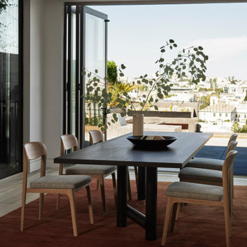
Adjacent to the kitchen, the dining room opens toward a glass wall overlooking a vertical garden of climbing ivy. The greenery becomes a constantly changing backdrop—lush and shadowy during the day, atmospheric and cinematic after sunset.
A dark wood table anchors the room, surrounded by pale oak chairs whose understated forms echo Scandinavian design traditions. The simplicity of the furniture allows the view and natural light to become the dominant experience.
Intimate Spaces and Material Contrast
Throughout the home, smaller rooms offer moments of intimacy and material experimentation.
The powder room pairs textured wall coverings with a dramatic black marble vanity whose bold veining feels almost geological. A suspended mirror and slender pendant create a sculptural composition against the tactile backdrop.
The primary bedroom, by contrast, feels serene and expansive. Floor-to-ceiling glazing frames sweeping views of the city, while soft textiles and warm wood paneling create a cocooning effect. Slender black columns subtly define a sitting area without interrupting the openness of the space.
Bathing Above the City
In the primary bathroom, a sculptural freestanding tub sits beside a panoramic window overlooking San Francisco’s hills and rooftops.
The room’s palette—light oak, grey stone, and matte metals—reinforces the spa-like atmosphere. Floating cabinetry and integrated lighting maintain a sense of visual lightness despite the richness of the materials.
Entertaining Above the Park
Higher in the house, a lounge and bar area becomes the social heart of the home. Here, dark stone slabs with dramatic veining wrap the bar wall like a piece of monumental art.
Open shelving displays glassware and spirits, while integrated wine storage hints at the home’s entertaining ambitions. A soft leather sectional and low glass table create a relaxed setting for conversation, framed by expansive views of the city skyline.
Cinema and Retreat
The lower level introduces yet another atmosphere: a dedicated media room designed for immersive viewing.
Dark walls, plush seating, and soft lighting create a cinematic environment that contrasts intentionally with the airy upper floors. It’s a retreat within the home—intimate, quiet, and removed from the brightness above.
Architecture That Balances Discipline and Warmth
What makes the project particularly compelling is its balance between architectural discipline and lived warmth.
Every element—from the carefully framed views to the restrained material palette—contributes to a cohesive spatial narrative. Yet the home never feels austere. Natural materials, curated art, and layered lighting create a sense of comfort and depth.
The result is a house that feels both architecturally rigorous and deeply human.
A Contemporary Interpretation of San Francisco Living
In a neighborhood defined by historic homes and iconic park views, this transformation offers a contemporary interpretation of San Francisco living.
It respects the city’s urban density while embracing openness, light, and vertical living. The home rises quietly above its surroundings, culminating in panoramic vistas that stretch across rooftops, hills, and sky.
What began as a conventional structure has become something far more nuanced: a modern urban sanctuary—part gallery, part retreat, and wholly connected to the vibrant city just beyond its walls.
 Granit Architects + Interiors
We are delighted to have completed the radical transformation of a tired detached property in South Croydon.
When they appointed Granit, our clients were living in the property which had previously been divided into a number of flats.
The historic sub-division had resulted in an extremely poor use of space with redundant staircases, kitchens and bathrooms throughout.
Our clients sought to reconfigure the property back into a single dwelling for his growing family.
Our client had an eye for design and was keen to balance contemporary design whilst maintaining as much of the character of the original house.
Maximising natural light, space and establishing a visual and physical connection were also key drivers for the design. Owing to the size of the property, it became apparent that reconfiguration rather than extension provided the solution to meet the brief.
A metal clad ‘intervention’ was introduced to the rear facade. This created a strong horizontal element creating a visual balance with the vertical nature of the three storey gable.
The metal cladding specified echoed the colour of the red brick string courses tying old with new. Slender frame sliding doors provide access and views of the large garden.
The central circulation space was transformed by the introduction of a double height glazed slot wrapping up the rear facade and onto the roof. This allows daylight to permeate into the heart of the otherwise dark deep floor plan. The staircase was reconfigured into a series of landings looking down over the main void space below and out towards the tree canopies at the rear of the garden.
The introduction of double pocket doors throughout the ground floor creates a series of interconnected spaces and the whitewashed Larch flooring flows seamlessly from room to room. A bold palette of colours and materials lends character and texture throughout the property.
The end result is a spacious yet cosy environment for the family to inhabit for years to come.
 Granit Architects + Interiors
We are delighted to have completed the radical transformation of a tired detached property in South Croydon.
When they appointed Granit, our clients were living in the property which had previously been divided into a number of flats.
The historic sub-division had resulted in an extremely poor use of space with redundant staircases, kitchens and bathrooms throughout.
Our clients sought to reconfigure the property back into a single dwelling for his growing family.
Our client had an eye for design and was keen to balance contemporary design whilst maintaining as much of the character of the original house.
Maximising natural light, space and establishing a visual and physical connection were also key drivers for the design. Owing to the size of the property, it became apparent that reconfiguration rather than extension provided the solution to meet the brief.
A metal clad ‘intervention’ was introduced to the rear facade. This created a strong horizontal element creating a visual balance with the vertical nature of the three storey gable.
The metal cladding specified echoed the colour of the red brick string courses tying old with new. Slender frame sliding doors provide access and views of the large garden.
The central circulation space was transformed by the introduction of a double height glazed slot wrapping up the rear facade and onto the roof. This allows daylight to permeate into the heart of the otherwise dark deep floor plan. The staircase was reconfigured into a series of landings looking down over the main void space below and out towards the tree canopies at the rear of the garden.
The introduction of double pocket doors throughout the ground floor creates a series of interconnected spaces and the whitewashed Larch flooring flows seamlessly from room to room. A bold palette of colours and materials lends character and texture throughout the property.
The end result is a spacious yet cosy environment for the family to inhabit for years to come.
 Custom Design & Construction
This Playa Del Rey, CA. design / build project began after our client had a terrible flood ruin her kitchen. In truth, she had been unhappy with her galley kitchen prior to the flood. She felt it was dark and deep with poor air conditioning circulating through it. She enjoys entertaining and hosting dinner parties and felt that this was the perfect opportunity to reimagine her galley kitchen into a space that would reflect her lifestyle. Since this is a condominium, we decided the best way to open up the floorplan was to wrap the counter around the wall into the dining area and make the peninsula the same height as the work surface. The result is an open kitchen with extensive counter space. Keeping it light and bright was important but she also wanted some texture and color too. The stacked stone backsplash has slivers of glass that reflect the light. Her vineyard palette was tied into the backsplash and accented by the painted walls. The floating glass shelves are highlighted with LED lights on a dimmer switch. We were able to space plan to incorporate her wine rack into the peninsula. We reconfigured the HVAC vent so more air circulated into the far end of the kitchen and added a ceiling fan. This project also included replacing the carpet and 12X12 beige tile with some “wood look” porcelain tile throughout the first floor. Since the powder room was receiving new flooring our client decided to add the powder room project which included giving it a deep plum paint job and a new chocolate cherry vanity. The white quartz counter and crystal hardware balance the dark hues in the wall and vanity.
 Strobel Design Build
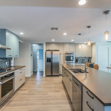
The existing kitchen did not allow good circulation between the family room and kitchen. The pass-through window to the family room was made into a wider walk-through opening to allow easy entry into the kitchen and circulation around the new island. Gourmet cooking is important to the client, along with safety and aesthetics. An induction cooktop was selected for a clean look and safe operation while a wall oven was built into the cabinet below to allow east transfer of pans into the oven for finishing.
 Granit Architects + Interiors
We are delighted to have completed the radical transformation of a tired detached property in South Croydon.
When they appointed Granit, our clients were living in the property which had previously been divided into a number of flats.
The historic sub-division had resulted in an extremely poor use of space with redundant staircases, kitchens and bathrooms throughout.
Our clients sought to reconfigure the property back into a single dwelling for his growing family.
Our client had an eye for design and was keen to balance contemporary design whilst maintaining as much of the character of the original house.
Maximising natural light, space and establishing a visual and physical connection were also key drivers for the design. Owing to the size of the property, it became apparent that reconfiguration rather than extension provided the solution to meet the brief.
A metal clad ‘intervention’ was introduced to the rear facade. This created a strong horizontal element creating a visual balance with the vertical nature of the three storey gable.
The metal cladding specified echoed the colour of the red brick string courses tying old with new. Slender frame sliding doors provide access and views of the large garden.
The central circulation space was transformed by the introduction of a double height glazed slot wrapping up the rear facade and onto the roof. This allows daylight to permeate into the heart of the otherwise dark deep floor plan. The staircase was reconfigured into a series of landings looking down over the main void space below and out towards the tree canopies at the rear of the garden.
The introduction of double pocket doors throughout the ground floor creates a series of interconnected spaces and the whitewashed Larch flooring flows seamlessly from room to room. A bold palette of colours and materials lends character and texture throughout the property.
The end result is a spacious yet cosy environment for the family to inhabit for years to come.
 Independent Home Walk In Tubs New York
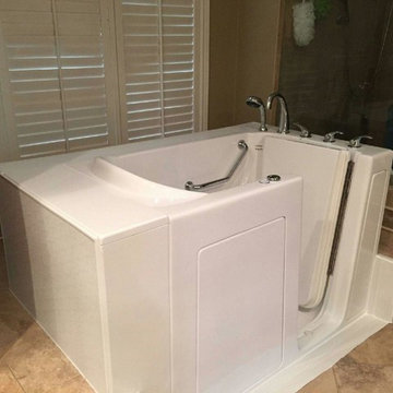
Independent Home just completed a walk in tub installation for a couple in West Chester. Check out how our installation process works and how a walk in tub could benefit you.
Our installation process starts with a pre-installation meeting. Our experts met with Allison and Greg to find out what type of walk in tub would best fit their needs, the best location, and what type of finish they would want. At the meeting, our experts learned that Allison and Greg already had a walk in shower. However, it wasn’t providing them with what they needed. They both suffer from arthritis and restless leg syndrome and were looking for relief.
The Supreme Walk in Bathtub model was the perfect solution for Allison and Greg because not only do they suffer from arthritis and restless leg syndrome they also are bariatric clients and needed a wider tub. The Supreme model is large, has a non-slip floor, two safety grab bars, and hydrotherapy.
Hydrotherapy is what will help reduce Allison and Greg’s pain. Their pain will decrease each time they enjoy a deep soaking massage that is provided by the air and whirlpool jets. The jets work in a greater range of motion that causes an increase in circulation. As Allison and Greg’s circulation increase, their muscles will begin to rehabilitate and reduce the pain.
The installation only took a couple days to complete. That included taking out their old shower along with removing the foundation, bringing in the new bathtub, making sure the legs are level, hooking up the new plumbing, and making sure that there aren’t any leaks. The last part of the installation is building the finish. Allison and Greg had wanted our experts to maintain their bathroom tile.
 Drury Design
The Setup
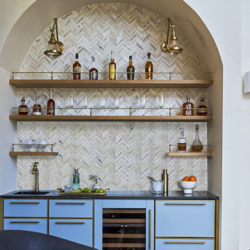
Situated between the front kitchen and the home’s primary living spaces, this bar was originally conceived as a modest bistro-style nook – a place to sit, watch TV, and enjoy a drink. As the design process evolved, both the homeowners and the design team recognized an opportunity to let the bar become something more: a visually compelling focal point that anchors circulation through the home while offering a distinct moment of hospitality.
Set within an arched recess and framed by a partial glass wall, the bar is visible from much of the public area of the home. Its location places it directly along the natural path between the kitchen, dining room, and family room, making it both highly accessible and impossible to ignore. From the outset, the goal was to ensure the bar felt intentional and complete – not an afterthought – while still complementing the adjacent kitchens rather than competing with them.
Design objectives:
Create a fully functional wet bar with refrigeration, ice, sink, waste storage, and liquor storage
Allow the bar to feel visually distinct while remaining cohesive with the surrounding spaces
Introduce color and character in a controlled, intentional way
Design the bar as a focal point within a highly visible circulation zone
Balance everyday usability with refined, layered design details
Design challenges to be solved:
Fitting a complete wet bar – including refrigeration, ice, sink, storage, and waste — into a base cabinetry run measuring under eight feet wide
Determining which appliances and storage functions were essential once upper cabinetry was eliminated
Providing adequate task lighting while also highlighting bottles and glassware on open shelving
Introducing texture and visual interest within the arched recess without overdesigning a compact space
Giving the bar a distinct identity that complements – but does not compete with – the adjacent kitchens
Design solutions:
Designing fully custom base cabinetry that prioritized core bar functions and used every inch efficiently, including split cabinetry and compact waste storage
Selecting a drawer-style refrigeration unit that combines refrigeration and freezer capabilities, allowing ice storage without sacrificing valuable width
Layering lighting with integrated LED strip lighting above and below the shelves, paired with decorative articulating fixtures to support both display and task lighting
Using a chevron-patterned natural stone tile backsplash to introduce movement, texture, and subtle color variation while keeping surrounding surfaces intentionally restrained
Specifying metal cabinetry in a soft blue tone with integrated brass framing to establish a distinctive visual identity that harmonizes with the home’s broader palette
A Space That Works on Its Own — and Within the Whole
Though compact in size, the bar carries significant visual and functional weight within the home. It stands confidently on its own as a richly detailed, fully functional destination, while also flowing naturally into the adjacent kitchens and living spaces. The result is a bar that feels purposeful rather than ornamental – a space designed to be used daily, noticed often, and appreciated over time.
 USI Design & Remodeling
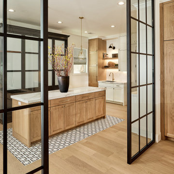
 USI Design & Remodeling reimagined the home's interior architecture, transforming a collection of compartmentalized rooms into a cohesive environment designed for modern living, entertaining, and daily comfort. The project encompassed the kitchen, family room, dining room, lounge, office, primary bathroom, and supporting circulation spaces, creating a unified experience that feels both expansive and intentional.
At the heart of the renovation is a completely reconfigured kitchen and gathering space designed around functionality, hospitality, and visual connection. Architectural barriers were removed to improve sightlines and circulation, allowing the kitchen, dining, and family spaces to function as a single integrated living environment. Adjacent to the kitchen, the former pantry, laundry, and service corridor were reimagined as a hybrid scullery and utility suite, creating a highly functional support space that discreetly accommodates food preparation, storage, organization, and household operations without compromising the elegance of the primary living areas.
 Custom Design & Construction
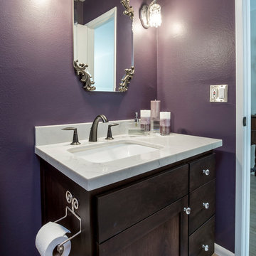
This Playa Del Rey, CA. design / build project began after our client had a terrible flood ruin her kitchen. In truth, she had been unhappy with her galley kitchen prior to the flood. She felt it was dark and deep with poor air conditioning circulating through it. She enjoys entertaining and hosting dinner parties and felt that this was the perfect opportunity to reimagine her galley kitchen into a space that would reflect her lifestyle. Since this is a condominium, we decided the best way to open up the floorplan was to wrap the counter around the wall into the dining area and make the peninsula the same height as the work surface. The result is an open kitchen with extensive counter space. Keeping it light and bright was important but she also wanted some texture and color too. The stacked stone backsplash has slivers of glass that reflect the light. Her vineyard palette was tied into the backsplash and accented by the painted walls. The floating glass shelves are highlighted with LED lights on a dimmer switch. We were able to space plan to incorporate her wine rack into the peninsula. We reconfigured the HVAC vent so more air circulated into the far end of the kitchen and added a ceiling fan. This project also included replacing the carpet and 12X12 beige tile with some “wood look” porcelain tile throughout the first floor. Since the powder room was receiving new flooring our client decided to add the powder room project which included giving it a deep plum paint job and a new chocolate cherry vanity. The white quartz counter and crystal hardware balance the dark hues in the wall and vanity.
 Forward Design Build Remodel
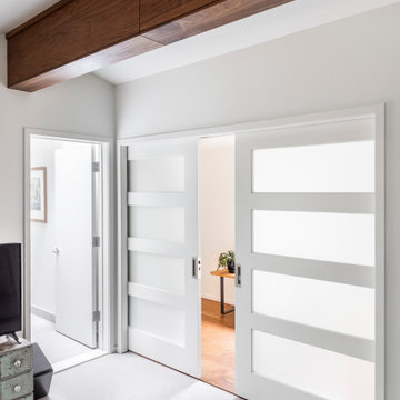
Our clients came to us with specific remodeling goals: to create a more functional mid-century home with an updated and larger kitchen, to resolve the public circulation through their master bedroom, have a unified feel versus a house with multiple additions, and expanded views of the lovely Huron River, which is right outside their backyard.
Our solutions focused on creating a new circulation system that reconnects the entire floor plan into a cohesive whole, and reinforces the connection to the outdoor courtyards.
 Eyoh Design
Louisa, San Clemente Coastal Modern Architecture
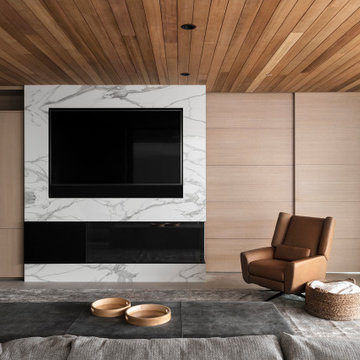
The brief for this modern coastal home was to create a place where the clients and their children and their families could gather to enjoy all the beauty of living in Southern California. Maximizing the lot was key to unlocking the potential of this property so the decision was made to excavate the entire property to allow natural light and ventilation to circulate through the lower level of the home.
A courtyard with a green wall and olive tree act as the lung for the building as the coastal breeze brings fresh air in and circulates out the old through the courtyard.
The concept for the home was to be living on a deck, so the large expanse of glass doors fold away to allow a seamless connection between the indoor and outdoors and feeling of being out on the deck is felt on the interior. A huge cantilevered beam in the roof allows for corner to completely disappear as the home looks to a beautiful ocean view and Dana Point harbor in the distance. All of the spaces throughout the home have a connection to the outdoors and this creates a light, bright and healthy environment.
Passive design principles were employed to ensure the building is as energy efficient as possible. Solar panels keep the building off the grid and and deep overhangs help in reducing the solar heat gains of the building. Ultimately this home has become a place that the families can all enjoy together as the grand kids create those memories of spending time at the beach.
Images and Video by Aandid Media.
 EAG Studio
On a quiet street just steps from San Francisco’s beloved Dolores Park, a formerly modest urban structure has been transformed into a luminous vertical residence that quietly redefines contemporary city living. Through a comprehensive remodel and both vertical and horizontal expansion, the project turns a constrained urban footprint into a sequence of serene, art-forward living spaces that unfold upward toward expansive city views.
The architecture balances restraint and warmth: crisp contemporary geometry softened by natural materials, artful lighting, and carefully curated interiors. The result is a home that feels simultaneously grounded and elevated—deeply connected to its neighborhood yet remarkably private.
Reimagining the Urban Envelope
The original building has been almost entirely reconceived. The facade now reads as a disciplined composition of plaster volumes and precisely detailed window openings framed by subtle projecting bands. The geometry references San Francisco’s classic rhythm of bayed facades while stripping the language down to a refined modern expression.
Behind this quiet exterior lies a dramatically expanded interior volume. The redesign adds both additional floor area and new vertical circulation, transforming what was once a conventional city house into a multi-level architectural sequence organized around light, art, and views.
At the roofline, planted terraces soften the building’s silhouette and create a green crown visible from surrounding hillsides.
Interiors as a Sequence of Galleries
Inside, the home unfolds as a series of spatial moments connected by a sculptural stair and gallery-like corridors.
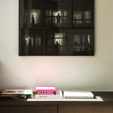
Wide plank oak floors run throughout, providing continuity and warmth against a palette of plaster walls, dark steel detailing, and natural stone. The hallways function almost as curated galleries, with layered artworks suspended in front of mesh panels that create depth and subtle shadow.
Light filters through carefully placed windows and stair openings, transforming circulation spaces into contemplative transitions rather than mere passageways.
A Living Room Anchored by Stone and Light
The primary living room occupies one of the home’s central floors, where a quiet interplay of texture and geometry defines the space.
A monumental fireplace wrapped in dark stone forms the room’s anchor, its mass contrasting with a recessed ceiling plane that seems to float above the seating area. Integrated perimeter lighting creates a soft architectural glow that washes the ceiling and walls.
Furniture is sculptural yet understated—rounded lounge chairs in warm ochre velvet, tailored sofas, and a striking marble cocktail table whose expressive veining becomes a focal artwork in itself. Deep blue carpeting grounds the seating arrangement and subtly absorbs light, enhancing the calm atmosphere.
Above the fireplace, a delicate projection artwork introduces a moment of visual poetry—an unexpected cinematic gesture that transforms the wall into a quietly animated canvas.
Kitchen as Architectural Furniture
The kitchen expresses a different register: crisp, tactile, and materially rich.
Custom walnut cabinetry spans the wall in a continuous plane, punctuated only by the sculpted hood and integrated appliances. The wood’s depth and warmth are balanced by expanses of pale marble that flow seamlessly from countertop to backsplash.
Three dome pendants hover above the island like industrial sculptures, casting pools of warm light onto the stone surface.
A row of vivid red stools introduces a controlled burst of color, a small but confident departure from the otherwise restrained palette.
Dining With a Living Backdrop
Adjacent to the kitchen, the dining room opens toward a glass wall overlooking a vertical garden of climbing ivy. The greenery becomes a constantly changing backdrop—lush and shadowy during the day, atmospheric and cinematic after sunset.
A dark wood table anchors the room, surrounded by pale oak chairs whose understated forms echo Scandinavian design traditions. The simplicity of the furniture allows the view and natural light to become the dominant experience.
Intimate Spaces and Material Contrast
Throughout the home, smaller rooms offer moments of intimacy and material experimentation.
The powder room pairs textured wall coverings with a dramatic black marble vanity whose bold veining feels almost geological. A suspended mirror and slender pendant create a sculptural composition against the tactile backdrop.
The primary bedroom, by contrast, feels serene and expansive. Floor-to-ceiling glazing frames sweeping views of the city, while soft textiles and warm wood paneling create a cocooning effect. Slender black columns subtly define a sitting area without interrupting the openness of the space.
Bathing Above the City
In the primary bathroom, a sculptural freestanding tub sits beside a panoramic window overlooking San Francisco’s hills and rooftops.
The room’s palette—light oak, grey stone, and matte metals—reinforces the spa-like atmosphere. Floating cabinetry and integrated lighting maintain a sense of visual lightness despite the richness of the materials.
Entertaining Above the Park
Higher in the house, a lounge and bar area becomes the social heart of the home. Here, dark stone slabs with dramatic veining wrap the bar wall like a piece of monumental art.
Open shelving displays glassware and spirits, while integrated wine storage hints at the home’s entertaining ambitions. A soft leather sectional and low glass table create a relaxed setting for conversation, framed by expansive views of the city skyline.
Cinema and Retreat
The lower level introduces yet another atmosphere: a dedicated media room designed for immersive viewing.
Dark walls, plush seating, and soft lighting create a cinematic environment that contrasts intentionally with the airy upper floors. It’s a retreat within the home—intimate, quiet, and removed from the brightness above.
Architecture That Balances Discipline and Warmth
What makes the project particularly compelling is its balance between architectural discipline and lived warmth.
Every element—from the carefully framed views to the restrained material palette—contributes to a cohesive spatial narrative. Yet the home never feels austere. Natural materials, curated art, and layered lighting create a sense of comfort and depth.
The result is a house that feels both architecturally rigorous and deeply human.
A Contemporary Interpretation of San Francisco Living
In a neighborhood defined by historic homes and iconic park views, this transformation offers a contemporary interpretation of San Francisco living.
It respects the city’s urban density while embracing openness, light, and vertical living. The home rises quietly above its surroundings, culminating in panoramic vistas that stretch across rooftops, hills, and sky.
What began as a conventional structure has become something far more nuanced: a modern urban sanctuary—part gallery, part retreat, and wholly connected to the vibrant city just beyond its walls.
 Forward Design Build Remodel
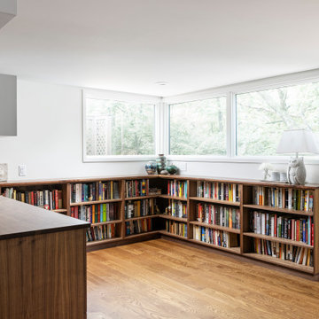
Our clients came to us with specific remodeling goals: to create a more functional mid-century home with an updated and larger kitchen, to resolve the public circulation through their master bedroom, have a unified feel versus a house with multiple additions, and expanded views of the lovely Huron River, which is right outside their backyard.
Our solutions focused on creating a new circulation system that reconnects the entire floor plan into a cohesive whole, and reinforces the connection to the outdoor courtyards.
 Granit Architects + Interiors
We are delighted to have completed the radical transformation of a tired detached property in South Croydon.
When they appointed Granit, our clients were living in the property which had previously been divided into a number of flats.
The historic sub-division had resulted in an extremely poor use of space with redundant staircases, kitchens and bathrooms throughout.
Our clients sought to reconfigure the property back into a single dwelling for his growing family.
Our client had an eye for design and was keen to balance contemporary design whilst maintaining as much of the character of the original house.
Maximising natural light, space and establishing a visual and physical connection were also key drivers for the design. Owing to the size of the property, it became apparent that reconfiguration rather than extension provided the solution to meet the brief.
A metal clad ‘intervention’ was introduced to the rear facade. This created a strong horizontal element creating a visual balance with the vertical nature of the three storey gable.
The metal cladding specified echoed the colour of the red brick string courses tying old with new. Slender frame sliding doors provide access and views of the large garden.
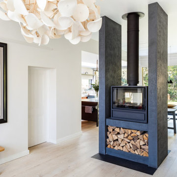
The central circulation space was transformed by the introduction of a double height glazed slot wrapping up the rear facade and onto the roof. This allows daylight to permeate into the heart of the otherwise dark deep floor plan. The staircase was reconfigured into a series of landings looking down over the main void space below and out towards the tree canopies at the rear of the garden.
The introduction of double pocket doors throughout the ground floor creates a series of interconnected spaces and the whitewashed Larch flooring flows seamlessly from room to room. A bold palette of colours and materials lends character and texture throughout the property.
The end result is a spacious yet cosy environment for the family to inhabit for years to come.
 Outdoor Makeover & Living Spaces
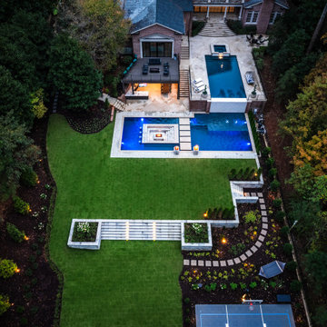
Aerial view highlights the master-planned landscape design of the Rose Home, showcasing a thoughtfully organized outdoor environment with defined activity zones, clean circulation paths, layered lighting, and seamless transitions between lawn, pool, and entertainment spaces. The design balances structure and openness to create a cohesive, resort-style outdoor living experience.
 ESUVA Glazing Expert
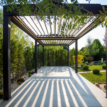
MERZOUGA BioClimatic pergola with mobile blades results from the adjustable and remote-controlled opening. Through their opening action, the portable blades make it easier for air to circulate and heat to escape. As a result, a fresher air flow dynamic is established beneath the MERZOUGA BioClimatic pergola, providing comfort despite the outdoor heat.
This significant benefit of the MERZOUGA BioClimatic pergola keeps the space from turning into an oven in high summer or mid-season, as is typical of a veranda or conservatory. This means that you can continue to take advantage of your terrace even when it’s extremely hot outside.
MERZOUGA BioClimatic pergola is an extra living space, modular and usable all year long. It provides comfort, a place to entertain, and a boost to the value of your home. The roof of a MERZOUGA BioClimatic, composed of mobile blades, can be closed hermetically to protect it from the rain.
MERZOUGA BioClimatic pergola can be customized with equipment such as infrared heating and practical or ambient lighting modules.As they are realized with recyclable materials at 98%, which offer a natural circulation and avoid the greenhouse effect, the MERZOUGA BioClimatic pergola aim to limit the impact on the environment the most possible. Aluminum is a sustainable and recyclable component.
38