Search results for "Clarifies" in Home Design Ideas
This is our first time decorating a house. Starting from knowing nothing at all to now having the hard decoration completed, we have experienced every emotion along the way—anxiety, doubt, tiredness, hesitation, joy, satisfaction, and touch. We learned and explored on our own, and bit by bit, we finished decorating our home. We’ve accumulated so much experience in this process, and now we want to share it, hoping it can be of a little help to all of you who are doing your own home decoration.
Preparations in Advance
1、Clarify your own ideas: Whether you are looking online, talking to designers, or copying ideas from friends' homes, you should have a clear vision of what your home should look like before designing—such as the style, color scheme, and elements to be used... It is crucial to avoid wanting to install everything that looks good in others' homes in your own. This way, you can clearly put forward your requirements during the design and decoration process, and also avoid frequent revisions to the plan, which may lead to unnecessary rework.
2、Understand your own needs: You need to first figure out the needs of your family, such as how many people live in the house permanently, how many rooms are needed, everyone's living habits, and daily preferences... A home is always for living in, so functionality is always the most important. It is best to list these needs and give priority to meeting them during the design and decoration. This way, you won't find out after decoration that many necessary things are missing, while a bunch of installed things are useless.
3、Determine your budget: There are ways to decorate with more money, and also ways to do it with less. No matter how much money you have, the decorated house can be both beautiful and practical. Therefore, it is essential to decide exactly how much you want to spend on decoration. In every link, such as designing the plan, making a budget table, selecting materials, and construction, you should act in accordance with your own budget.
4、Understand the advantages and disadvantages of your house: There is no perfect house in the world, and every house has its pros and cons. Your design plan should avoid its shortcomings and amplify its advantages. I once wrote an article about the drawbacks of my house ("My house is not perfect, but I still want to find ways to save it"), so we figured out solutions to these problems during the decoration.
5、Learn as much decoration knowledge as possible in advance: Although you can pick up this knowledge in the subsequent decoration process, it is better to learn more beforehand. This will make you much more calm when facing problems.
6、Know your strengths: Before decoration, you must be clear about what you are good at and what you are not. If you are good at design, do the design yourself; if you are skilled at bargaining, go buy building materials on your own; if you have strong hands-on ability, you can even do the decoration and repairs yourself... During the decoration process, you should focus on what you are good at, and leave what you are not good at to others.

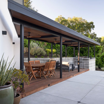
Set in a quiet neighborhood and framed by mature trees, this residence presented a unique opportunity: to thoughtfully evolve a custom mid-century modern home into a space that supports the everyday rhythms of a growing family. With a deep respect for the home’s original architecture, Klopf Architecture reimagined the house to better meet the needs of its owners—introducing functional improvements while preserving the spirit and character of its mid-century roots.
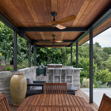
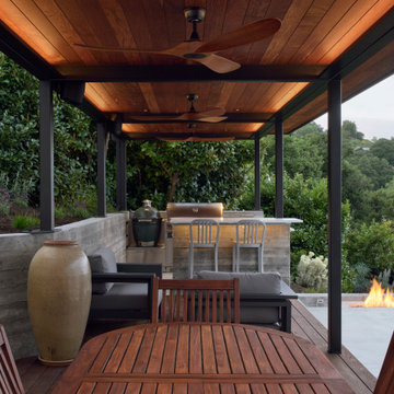
The clients approached Klopf Architecture with a clear vision: refresh their home while seamlessly integrating new programmatic elements. Key goals included clarifying and enhancing the entry sequence; connecting the detached garage to the main house with a practical yet architecturally intentional intervention; adding functional spaces such as a mudroom and laundry room; expanding and remodeling the primary suite’s bathroom and closet; and creating a more engaging outdoor space that capitalized on the site’s impressive views, featuring a fire pit and outdoor kitchen.
As a couple with distinct yet complementary perspectives—one focused on modern functionality and technology, and the other dedicated to preserving the home’s architectural integrity—their collaboration with Klopf Architecture resulted in a solution that harmonized both ideals. Their shared commitment to improving the livability of their home led to a design dialogue rooted in balance. This dynamic partnership shaped the direction of the renovation, ensuring that every decision honored the spirit of the original home while aligning with the practical needs of their growing family.
Designing within the constraints of the sloped site posed one of the project’s central challenges. The detached garage sat at a higher elevation than the main house, requiring a solution that ensured architectural and geometric compatibility between the two structures. Rather than create a purely utilitarian link, Klopf Architecture introduced an intentional connection that contributes to the overall architectural language. A notable pinch point in the plan—where differing geometries converged—was treated as a hinge point, turning a potentially awkward juncture into an architectural feature. This area now functions as both a transition and a moment of design interest that unifies the overall plan.
The design also addressed the underutilized outdoor area, which was located in a shadowed portion of the site with geometrical limitations. A new connection to the rear deck was created in this same area, making the outdoor space more useful and inviting. Klopf Architecture introduced carefully positioned openings and spatial improvements that forged a strong visual and functional connection between indoor and outdoor spaces. The outdoor area now reads as a deliberate extension of the home, embracing natural light and emphasizing the dramatic views.
Working through multiple design iterations, Klopf Architecture crafted a solution that preserved the architectural language of the original home while supporting the functional needs of modern life. The garage-to-house connection became more than a passage—it evolved into an architectural moment of transition. A new mudroom and laundry space enhanced convenience without compromising the clean lines of the design. The primary suite was expanded to create a private, serene retreat. The reimagined backyard, complete with fire pit and kitchen, now plays a vital role in the family’s daily routine and social life.
Outcomes and Lasting Impact
The result is a home that balances heritage with contemporary design, technical precision with design sensibility. The redesign not only met the clients’ initial goals but also exceeded expectations in its ability to seamlessly blend past and present, function and beauty, making the outdoor kitchen a favorite gathering place.
Beyond aesthetics, the renovation has significantly improved daily life for the family. The newly integrated garage connection has streamlined routines, providing a seamless transition between arriving home, storing belongings, and entering the main living spaces. The expanded primary suite offers a retreat-like atmosphere, creating a private space to unwind at the end of the day. The redesigned outdoor areas have also become an extension of their lifestyle—whether it's casual family dinners around the fire pit, entertaining friends in the outdoor kitchen, or simply enjoying the view from the reimagined backyard.
Through a thoughtful and strategic approach, the house has been successfully evolved into a home that remains true to its mid-century modern roots while enhancing livability, functionality, and the overall quality of life for the modern-day owners.
Klopf Architecture Team: Geoffrey Campen, Fernanda Bernardes
Architectural Interior Design: Klopf Architecture
Structural Engineer: Base Design Inc.
Contractor: Golden Snail Builders
Photography: Mariko Reed
Year Completed:2022

Boulevard Real Estate Photography
Sunroom - large cottage dark wood floor sunroom idea in Minneapolis with a two-sided fireplace, a stone fireplace and a standard ceiling
Find the right local pro for your project

Malibu Glass Box House by Klopf Architecture
Following the devastating Woolsey Fire of 2018, the site in Malibu offered a unique opportunity to rebuild not just a home, but a new architectural composition that highlighted the property’s potential while navigating strict fire-rebuild codes in the area. Designed by Klopf Architecture, this project embraced a set of limitations and translated them into an architectural asset.
The city’s fire-rebuild process required the new structure to remain close to the original footprint, size and bulk, a constraint that ultimately clarified the architectural direction. Perched near the front of a long, narrow lot, the new home frames and overlooks a private, park-like rear expanse, an uncommon luxury especially in this part of Malibu .
Without a fixed program, the design process allowed for a different kind of creative focus allowing Klopf Architecture the opportunity to explore how a modernist home could best respond to this site. The team approached the project not with a list of requirements, but with a question: How might a modernist live here? What spatial qualities would inspire calm, connection, and a sense of wonder in this setting? The process became less about problem-solving and more about architectural storytelling—letting the site, the light, and the principles of modern design guide the form and flow of the home.
The response emerged in the form of a glass-box pavilion, an open, Mid-Century Modern inspired living, dining, and kitchen space that floats at the edge of the property’s natural descent. Connected to the more enclosed, private areas of the home by a glass-walled hallway, the living pavilion becomes a distinct centerpiece of the design. It opens on all four sides to the landscape with decks and patios on the flanks, an internal garden and water feature to the north, and a dramatic unguarded view of the expansive backyard and ocean horizon to the south.
Because of the mandated footprint, careful planning was required to ensure every space could still engage with light, landscape, or both. Strategic voids in the form of atriums and courtyards allow daylight to filter deep into the home’s core, while offering moments of surprise and retreat. These design gestures allow natural light to filter deep into the interior, creating a sense of brightness and openness throughout the day. At the same time, they expand the perceptual boundaries between inside and out, making the home feel more expansive while anchoring its connection to the surrounding landscape.
The siting of the house is what gives it its unique character. Rather than receding into the backyard like the neighboring homes, the house holds a slight prominence. From the central living pavilion, stepping down into the landscape feels more like entering a secluded park where a separate existing accessory structure, trail, and recreational areas await. The home’s modest street presence gives way to this unfolding drama of space, view, and nature.
Fire-resilient materials and assemblies are integrated seamlessly throughout including triple-pane glazing, under-slab and roof insulation, and locally sourced fire-rated cladding ensure the house not only meets Calfornia’s rigorous wildland-urban interface (WUI) standards, but feels effortlessly aligned with them. While technical decisions like fire-hardening and mechanical systems presented some construction challenges, particularly around the cantilevered glass box, the team found a functional compromise that preserved the integrity of the design.
Inside, a restrained palette and exposed post and beam design celebrate the ethos of mid-century modernism. A central circulation spine extends from the entry to the rear glass wall, offering a continuous visual link from street to ocean. Spaces such as the library and office, though more intimate in scale, are never cut off from nature as each opens to its own unique courtyard or garden view.
Though born out of a strict regulatory framework and developed without a specific client, the rebuild design unfolded with remarkable clarity. Grounded in site logic, refined by limitations and an emphasis on timeless spatial relationships – light, proportion, and a strong connection to nature, the resulting design feels both effortless and uplifting. The home lives lightly on the land, opens generously to its surroundings, and strikes a careful balance between privacy, openness, and calm. For Klopf Architecture, it stands as a compelling case study in how site, code, and circumstantial constraints can inspire enduring, modernist architecture. With years of experience reimagining mid-century modern design for how people live today, the firm took the project’s limitations as an opportunity. The result is a home shaped by open, flowing spaces, strong indoor-outdoor connections, and a calm, clear sense of structure. It’s a good reminder that even with strict constraints, there’s still room for architecture to breathe—and for modernism to keep moving forward.
Klopf Architecture project team: Geoff Campen, John Klopf, AIA, and Sherry Tan
Structural Engineer: ZFA
Contractor: Maison D’Artiste
Photography: ©2025 Mariko Reed
Year Completed: 2023

In the living room in combination with the accent orange color of furnishings, the color takes on a sophisticated aura as it makes for a befitting partner for the warmth of wood. This home is not a design of the excess. The design fabric is extremely simple and minimal. But we'd like to clarify one thing here. Simple, in no way means or translates into being uninteresting or less intriguing. It's easy to create a layered space when take the maximalist route. But to ensure that a minimalist, almost bare is space is equally layered and intriguing is the real challenge .

Although these clients wanted a more traditional look, they kept their design crisp and modern with a light color palette and modern finishings. Traditional style cabinets and built-ins are offset by fun design elements, like the window seat. Vibrate prints and accessories add charm and appeal. Modern, clean lines combined with intricate details and materials with natural movement give character and warmth making this modern yet traditional home inviting to everyone.
Photo Credit: Clarified Studios

Pegboard storage in deep drawers provides an excellent spot for plates, bowls and platters.
Epiq Photography
Example of a large classic galley medium tone wood floor eat-in kitchen design in Charleston with a single-bowl sink, shaker cabinets, white cabinets, granite countertops, white backsplash, subway tile backsplash, stainless steel appliances and an island

Malibu Glass Box House by Klopf Architecture
Following the devastating Woolsey Fire of 2018, the site in Malibu offered a unique opportunity to rebuild not just a home, but a new architectural composition that highlighted the property’s potential while navigating strict fire-rebuild codes in the area. Designed by Klopf Architecture, this project embraced a set of limitations and translated them into an architectural asset.
The city’s fire-rebuild process required the new structure to remain close to the original footprint, size and bulk, a constraint that ultimately clarified the architectural direction. Perched near the front of a long, narrow lot, the new home frames and overlooks a private, park-like rear expanse, an uncommon luxury especially in this part of Malibu .
Without a fixed program, the design process allowed for a different kind of creative focus allowing Klopf Architecture the opportunity to explore how a modernist home could best respond to this site. The team approached the project not with a list of requirements, but with a question: How might a modernist live here? What spatial qualities would inspire calm, connection, and a sense of wonder in this setting? The process became less about problem-solving and more about architectural storytelling—letting the site, the light, and the principles of modern design guide the form and flow of the home.
The response emerged in the form of a glass-box pavilion, an open, Mid-Century Modern inspired living, dining, and kitchen space that floats at the edge of the property’s natural descent. Connected to the more enclosed, private areas of the home by a glass-walled hallway, the living pavilion becomes a distinct centerpiece of the design. It opens on all four sides to the landscape with decks and patios on the flanks, an internal garden and water feature to the north, and a dramatic unguarded view of the expansive backyard and ocean horizon to the south.
Because of the mandated footprint, careful planning was required to ensure every space could still engage with light, landscape, or both. Strategic voids in the form of atriums and courtyards allow daylight to filter deep into the home’s core, while offering moments of surprise and retreat. These design gestures allow natural light to filter deep into the interior, creating a sense of brightness and openness throughout the day. At the same time, they expand the perceptual boundaries between inside and out, making the home feel more expansive while anchoring its connection to the surrounding landscape.
The siting of the house is what gives it its unique character. Rather than receding into the backyard like the neighboring homes, the house holds a slight prominence. From the central living pavilion, stepping down into the landscape feels more like entering a secluded park where a separate existing accessory structure, trail, and recreational areas await. The home’s modest street presence gives way to this unfolding drama of space, view, and nature.
Fire-resilient materials and assemblies are integrated seamlessly throughout including triple-pane glazing, under-slab and roof insulation, and locally sourced fire-rated cladding ensure the house not only meets Calfornia’s rigorous wildland-urban interface (WUI) standards, but feels effortlessly aligned with them. While technical decisions like fire-hardening and mechanical systems presented some construction challenges, particularly around the cantilevered glass box, the team found a functional compromise that preserved the integrity of the design.
Inside, a restrained palette and exposed post and beam design celebrate the ethos of mid-century modernism. A central circulation spine extends from the entry to the rear glass wall, offering a continuous visual link from street to ocean. Spaces such as the library and office, though more intimate in scale, are never cut off from nature as each opens to its own unique courtyard or garden view.
Though born out of a strict regulatory framework and developed without a specific client, the rebuild design unfolded with remarkable clarity. Grounded in site logic, refined by limitations and an emphasis on timeless spatial relationships – light, proportion, and a strong connection to nature, the resulting design feels both effortless and uplifting. The home lives lightly on the land, opens generously to its surroundings, and strikes a careful balance between privacy, openness, and calm. For Klopf Architecture, it stands as a compelling case study in how site, code, and circumstantial constraints can inspire enduring, modernist architecture. With years of experience reimagining mid-century modern design for how people live today, the firm took the project’s limitations as an opportunity. The result is a home shaped by open, flowing spaces, strong indoor-outdoor connections, and a calm, clear sense of structure. It’s a good reminder that even with strict constraints, there’s still room for architecture to breathe—and for modernism to keep moving forward.
Klopf Architecture project team: Geoff Campen, John Klopf, AIA, and Sherry Tan
Structural Engineer: ZFA
Contractor: Maison D’Artiste
Photography: ©2025 Mariko Reed
Year Completed: 2023

Set in a quiet neighborhood and framed by mature trees, this residence presented a unique opportunity: to thoughtfully evolve a custom mid-century modern home into a space that supports the everyday rhythms of a growing family. With a deep respect for the home’s original architecture, Klopf Architecture reimagined the house to better meet the needs of its owners—introducing functional improvements while preserving the spirit and character of its mid-century roots.
The clients approached Klopf Architecture with a clear vision: refresh their home while seamlessly integrating new programmatic elements. Key goals included clarifying and enhancing the entry sequence; connecting the detached garage to the main house with a practical yet architecturally intentional intervention; adding functional spaces such as a mudroom and laundry room; expanding and remodeling the primary suite’s bathroom and closet; and creating a more engaging outdoor space that capitalized on the site’s impressive views, featuring a fire pit and outdoor kitchen.
As a couple with distinct yet complementary perspectives—one focused on modern functionality and technology, and the other dedicated to preserving the home’s architectural integrity—their collaboration with Klopf Architecture resulted in a solution that harmonized both ideals. Their shared commitment to improving the livability of their home led to a design dialogue rooted in balance. This dynamic partnership shaped the direction of the renovation, ensuring that every decision honored the spirit of the original home while aligning with the practical needs of their growing family.
Designing within the constraints of the sloped site posed one of the project’s central challenges. The detached garage sat at a higher elevation than the main house, requiring a solution that ensured architectural and geometric compatibility between the two structures. Rather than create a purely utilitarian link, Klopf Architecture introduced an intentional connection that contributes to the overall architectural language. A notable pinch point in the plan—where differing geometries converged—was treated as a hinge point, turning a potentially awkward juncture into an architectural feature. This area now functions as both a transition and a moment of design interest that unifies the overall plan.
The design also addressed the underutilized outdoor area, which was located in a shadowed portion of the site with geometrical limitations. A new connection to the rear deck was created in this same area, making the outdoor space more useful and inviting. Klopf Architecture introduced carefully positioned openings and spatial improvements that forged a strong visual and functional connection between indoor and outdoor spaces. The outdoor area now reads as a deliberate extension of the home, embracing natural light and emphasizing the dramatic views.
Working through multiple design iterations, Klopf Architecture crafted a solution that preserved the architectural language of the original home while supporting the functional needs of modern life. The garage-to-house connection became more than a passage—it evolved into an architectural moment of transition. A new mudroom and laundry space enhanced convenience without compromising the clean lines of the design. The primary suite was expanded to create a private, serene retreat. The reimagined backyard, complete with fire pit and kitchen, now plays a vital role in the family’s daily routine and social life.
Outcomes and Lasting Impact
The result is a home that balances heritage with contemporary design, technical precision with design sensibility. The redesign not only met the clients’ initial goals but also exceeded expectations in its ability to seamlessly blend past and present, function and beauty, making the outdoor kitchen a favorite gathering place.
Beyond aesthetics, the renovation has significantly improved daily life for the family. The newly integrated garage connection has streamlined routines, providing a seamless transition between arriving home, storing belongings, and entering the main living spaces. The expanded primary suite offers a retreat-like atmosphere, creating a private space to unwind at the end of the day. The redesigned outdoor areas have also become an extension of their lifestyle—whether it's casual family dinners around the fire pit, entertaining friends in the outdoor kitchen, or simply enjoying the view from the reimagined backyard.
Through a thoughtful and strategic approach, the house has been successfully evolved into a home that remains true to its mid-century modern roots while enhancing livability, functionality, and the overall quality of life for the modern-day owners.
Klopf Architecture Team: Geoffrey Campen, Fernanda Bernardes
Architectural Interior Design: Klopf Architecture
Structural Engineer: Base Design Inc.
Contractor: Golden Snail Builders
Photography: Mariko Reed
Year Completed:2022

With the same Bellmont Stockholm cabinetry carried through the bathroom to the closet, this space achieves an elongated and flowing effect. Top Knobs Square Pulls and Rohl “Wave” wall-mount faucets add a contemporary flare to the rich, wood-grain cabinets. Delicate pendants offer a dainty touch to the strong edges of the honed Caesarstone “Pebble” countertops and mimic the visually understated Kohler “Kathryn” sink. Limestone floors echo the natural cabinets and the Brizo “Siderna” tub faucet lends modern, simple sophistication.
Clarified Studios

Transform your relaxation space into a sanctuary of elegance and wellness. White is pure and clarifying to the senses as well as the mind. This freestanding air-jet tub has thin and modern lines. The compact, streamlined one-piece intelligent toilet has integrated personal cleaning.

Even with a monochromatic palette, this transitional master bathroom stays fresh and interesting with texture and touches of glam and rustic charm. The bathtub beneath the large arched window becomes a stunning focal point – traditional shutters coupled with rich marble blend old world and new world sophistication.
Photo Credit: Clarified Studios

It's known as the PISA/TIMSS voyaging convoy. Every time worldwide tests results are discharged with association tables indicating champs and failures a gaggle of scientists, scholastics and grouped kindred explorers plummet on the most astounding performing nation or instruction framework to break down and write about "world's best practice".
The objective continues evolving
One issue with thusly of deduction is that nobody framework reliably beats the rest. In light of the 1995 and 1999 TIMSS (Trends in International Math and Science Study) results, Asian instruction frameworks in Singapore, Japan, South Korea and Taiwan overwhelmed. Accordingly, the emphasis was immovably on recognizing the reasons the Asian tigers were performing so well.
In the PISA (Program for International Student Assessment) 2000 results, Finland positioned first in education, fourth in arithmetic and third in science. Finland became the overwhelming focus and specialists and scholastics ran to Helsinki to find the reasons Finnish understudies performed at or close to the highest point of the table.
By 2012, at the end of the day, an alternate training framework turned into the focal point of consideration. Finland descended the PISA rankings as another champ, Shanghai, rose as first in arithmetic, science and perusing.
Apples aren't being contrasted with apples
A second issue when making correlations is that the spots we've recognized as examples of overcoming adversity are distinctive to Australia. City-states like Singapore and instruction frameworks in profoundly performing spots like Hong Kong and Shanghai have remarkable qualities that separate them from nations like Australia, England and the USA.
Contrasts in topography, the quantities of understudies and schools, the understudy cosmetics (as far as dialect, society and financial profile) and how schools, including educational modules and appraisal, are organized and oversaw significantly affect results.
Singapore, when contrasted with Australia, is little topographically, more homogenous as far as dialect and culture and utilizes instructive practices that have long been out of support in Australia. These incorporate gushing kids in view of their abilities, and high-chance, focused tests and examinations.
As noted in a paper titled How not to prevail upon PISA information: an unexpected examination, there are additionally social components clarifying solid execution that are troublesome, if not unimaginable, to exchange starting with one instruction framework then onto the next.
Evident cases incorporate the effect of Confucian qualities and morals that stretch appreciation for power (particularly instructors), the conviction that achievement is conceivable with inspiration, fixation and diligent work, and the thought that training is focal if one is to accomplish a superior life.
Confounding circumstances and end results
Befuddling what has driven these nations to achievement speaks to the third trouble in expecting that what seems to prompt accomplishment in one nation can without much of a stretch be exchanged to another.
To expect that everything we need to do in Australia to enhance test outcomes is to lessen the impact of the Australian Education Union, while being appealing to some, is both undemocratic and blameworthy of accepting circumstances and end results.
There are a few advantages of abroad correlations
PISA and TIMSS tests have been held for a long time. Thus, there is a decent arrangement of examination recognizing the attributes of more grounded performing instruction frameworks from which states and domains can learn.
The early ethnographic work recording Japanese and American classes nitty gritty in Harvard distribution The Teaching Gap uncovers how the lessons in Asian classrooms are more unequivocal, obviously organized and sound and there is a desire that all understudies, with the essential offer and applications, some assistance with canning succeed.
A later distribution by the Grattan Institute, Catching up: gaining from the best educational systems in East Asia, likewise distinguishes imperative lessons from fruitful Asian instruction frameworks.
Positive variables incorporate giving instructors more opportunity to work cooperatively and to tutor each other, guaranteeing that educator training, course readings and the educational modules are commonly steady and concentrate on enhancing classroom rehearse.
It ought to additionally be noticed that while Australian understudies don't perform in the top level in PISA and TIMSS tests, there is some reason for festivity. Understudies in the Australian Capital Territory perform well over the Australian normal and frequently coordinate the execution of top-performing abroad instruction frameworks.
As far as lifting the execution of understudies from distraught foundations it is additionally critical to take note of that Catholic schools, in light of an investigation of the 2009 PISA results completed by the Australian Council for Educational Research, accomplish a value rating surpassing that of Finland.
About the Author: Amy Parker writes too many academic papers for people who have troubles with it. She always gives needed advices, shows the examples of the papers and helps with writing at http://papersnetwork.net

The apartment occupies the third floor of a prominent corner property originally constructed in 1860.
The building was formerly two neighbouring town houses, reconfigured in 1939 as a residential school for girls. In 1968, the State of Kuwait purchased the property which became their London Embassy until 2000 at which time the two houses were converted into 13 flats.
Amos Goldreich Architecture was appointed as lead architects to create a contemporary 3 bedroom home within this Grade II Listed Building.
AGA has sought to rationalise the formerly over-complex configuration, clarifying spatial sequences and creating a coherent visual palette. The apartment is finished to a high standard, with bespoke joinery and ingenious storage solutions.

So often our task as residential architects is not to create something out of nothing. Instead, it is to help evolve, or bring forward something that is already there; to see with new eyes the best of what exists and to clarify and expand it, so that the house supports and celebrates how the client lives, and hopes to live, in the home.
So was the case with our House of Blues. The house was already wonderful. There was plenty of space, good views, a functioning floor plan, and the home was in overall good condition. The best features however, were embedded in the time it was built – mid 1960’s. The views were good, but too small. The kitchen location worked well, but is was closed off, cramped, and lacking counter space. The dining room was elegant, but too large and isolated. The graceful central hallway remained the homes most unique feature, but it was dark and the entry to the rooms on either side were accessed via small doorways. The bathrooms were large enough, and in the right locations, but they were tired and dated, and there was no mudroom.
We created something out of something. Beautiful shades of blue permeated the owner’s things and became a central theme in new elements. Daylight was expanded and brought deeper into the space. Doorways were widened and walls removed. The central hallway was fully opened at the end with two-story glass to improve on an already good idea. The kitchen was wholly new and expanded by borrowing space from the dining room. A mudroom was carved out of the garage. All the bathrooms were remodeled with fresh materials and new features. The gracious concrete stoop was reclad in stone and the front door was changed out for a splash of color. Light now permeates all the rooms and spaces flow together without losing their identity or function. The owners no longer feel blue in their House of Blues!
Location: St Paul, MN
Project Team:
Ben Awes, AIA, Principal- in -Charge
Nate Dodge

Charisma meets order in this personalized office, set for productivity and delight. The crisp articulation of these office cabinets clarifies and makes the most of each space: from well planned storage and book shelves, to desk and table, to the ultimate in dream-ready window seats.
From Decora in Chantille Espresso

Interior Design and Exterior Design by SONJA ROGERS, INTERIOR & EXTERIOR DESIGN LLC
Built by Campbell Custom Homes
Photography by Orlando Interior Photography

So often our task as residential architects is not to create something out of nothing. Instead, it is to help evolve, or bring forward something that is already there; to see with new eyes the best of what exists and to clarify and expand it, so that the house supports and celebrates how the client lives, and hopes to live, in the home.
So was the case with our House of Blues. The house was already wonderful. There was plenty of space, good views, a functioning floor plan, and the home was in overall good condition. The best features however, were embedded in the time it was built – mid 1960’s. The views were good, but too small. The kitchen location worked well, but is was closed off, cramped, and lacking counter space. The dining room was elegant, but too large and isolated. The graceful central hallway remained the homes most unique feature, but it was dark and the entry to the rooms on either side were accessed via small doorways. The bathrooms were large enough, and in the right locations, but they were tired and dated, and there was no mudroom.
We created something out of something. Beautiful shades of blue permeated the owner’s things and became a central theme in new elements. Daylight was expanded and brought deeper into the space. Doorways were widened and walls removed. The central hallway was fully opened at the end with two-story glass to improve on an already good idea. The kitchen was wholly new and expanded by borrowing space from the dining room. A mudroom was carved out of the garage. All the bathrooms were remodeled with fresh materials and new features. The gracious concrete stoop was reclad in stone and the front door was changed out for a splash of color. Light now permeates all the rooms and spaces flow together without losing their identity or function. The owners no longer feel blue in their House of Blues!
Location: St Paul, MN
Project Team:
Ben Awes, AIA, Principal- in -Charge
Nate Dodge

Malibu Glass Box House by Klopf Architecture
Following the devastating Woolsey Fire of 2018, the site in Malibu offered a unique opportunity to rebuild not just a home, but a new architectural composition that highlighted the property’s potential while navigating strict fire-rebuild codes in the area. Designed by Klopf Architecture, this project embraced a set of limitations and translated them into an architectural asset.
The city’s fire-rebuild process required the new structure to remain close to the original footprint, size and bulk, a constraint that ultimately clarified the architectural direction. Perched near the front of a long, narrow lot, the new home frames and overlooks a private, park-like rear expanse, an uncommon luxury especially in this part of Malibu .
Without a fixed program, the design process allowed for a different kind of creative focus allowing Klopf Architecture the opportunity to explore how a modernist home could best respond to this site. The team approached the project not with a list of requirements, but with a question: How might a modernist live here? What spatial qualities would inspire calm, connection, and a sense of wonder in this setting? The process became less about problem-solving and more about architectural storytelling—letting the site, the light, and the principles of modern design guide the form and flow of the home.
The response emerged in the form of a glass-box pavilion, an open, Mid-Century Modern inspired living, dining, and kitchen space that floats at the edge of the property’s natural descent. Connected to the more enclosed, private areas of the home by a glass-walled hallway, the living pavilion becomes a distinct centerpiece of the design. It opens on all four sides to the landscape with decks and patios on the flanks, an internal garden and water feature to the north, and a dramatic unguarded view of the expansive backyard and ocean horizon to the south.
Because of the mandated footprint, careful planning was required to ensure every space could still engage with light, landscape, or both. Strategic voids in the form of atriums and courtyards allow daylight to filter deep into the home’s core, while offering moments of surprise and retreat. These design gestures allow natural light to filter deep into the interior, creating a sense of brightness and openness throughout the day. At the same time, they expand the perceptual boundaries between inside and out, making the home feel more expansive while anchoring its connection to the surrounding landscape.
The siting of the house is what gives it its unique character. Rather than receding into the backyard like the neighboring homes, the house holds a slight prominence. From the central living pavilion, stepping down into the landscape feels more like entering a secluded park where a separate existing accessory structure, trail, and recreational areas await. The home’s modest street presence gives way to this unfolding drama of space, view, and nature.
Fire-resilient materials and assemblies are integrated seamlessly throughout including triple-pane glazing, under-slab and roof insulation, and locally sourced fire-rated cladding ensure the house not only meets Calfornia’s rigorous wildland-urban interface (WUI) standards, but feels effortlessly aligned with them. While technical decisions like fire-hardening and mechanical systems presented some construction challenges, particularly around the cantilevered glass box, the team found a functional compromise that preserved the integrity of the design.
Inside, a restrained palette and exposed post and beam design celebrate the ethos of mid-century modernism. A central circulation spine extends from the entry to the rear glass wall, offering a continuous visual link from street to ocean. Spaces such as the library and office, though more intimate in scale, are never cut off from nature as each opens to its own unique courtyard or garden view.
Though born out of a strict regulatory framework and developed without a specific client, the rebuild design unfolded with remarkable clarity. Grounded in site logic, refined by limitations and an emphasis on timeless spatial relationships – light, proportion, and a strong connection to nature, the resulting design feels both effortless and uplifting. The home lives lightly on the land, opens generously to its surroundings, and strikes a careful balance between privacy, openness, and calm. For Klopf Architecture, it stands as a compelling case study in how site, code, and circumstantial constraints can inspire enduring, modernist architecture. With years of experience reimagining mid-century modern design for how people live today, the firm took the project’s limitations as an opportunity. The result is a home shaped by open, flowing spaces, strong indoor-outdoor connections, and a calm, clear sense of structure. It’s a good reminder that even with strict constraints, there’s still room for architecture to breathe—and for modernism to keep moving forward.
Klopf Architecture project team: Geoff Campen, John Klopf, AIA, and Sherry Tan
Structural Engineer: ZFA
Contractor: Maison D’Artiste
Photography: ©2025 Mariko Reed
Year Completed: 2023
25