
Search results for "Cleaner hearing" in Home Design Ideas




 Tailored Closet and Premier Garage of Central NJ
This floor is the original from the mid 1960's. It was unsuccessfully patched in a few spots. It had a variety of typical problems including spawling, efflorescence, cracking, and sinking sections. You can see where it fell off the footer around the perimeter. On top of all that, it had high moisture content, and required a moisture barrier primer. High moisture content is common in older homes as the garage concrete is commonly on top of little or no stone, the area under the pad has settled, and there is no plastic between the concrete and what is below it. We did this over a period of 3 days, and the results were outstanding, as you can see.
Find the right local pro for your project

 Dust to Diamonds Designs
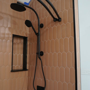
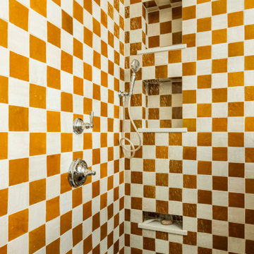
Super Fun Kids bathroom that is also utilized for out of town visitors. The Family is young and fun so the bathroom had to match their vibrancy! Terrazo hexagon floor tiles, Parry Matte and Shiny white fishscale tile behind vanity and Terracotta in the Shower. Sherwin Williams Danube blue vanity and Bosc Pear walls.



 PWF Floors & Decors Inc.
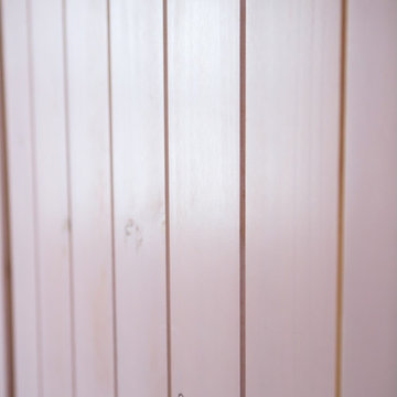
Our pearl series tile installed on one of the show homes
Inspiration for a modern living room remodel in Edmonton with brown walls
Inspiration for a modern living room remodel in Edmonton with brown walls

 Sam Peet
Mid-sized elegant master ceramic tile bathroom photo in Dallas with shaker cabinets
Mid-sized elegant master ceramic tile bathroom photo in Dallas with shaker cabinets








 KURV Architecture DPC (Alex Hughes Architects)
Located in the heart of Manhattan’s Lower East Side, the building was erected on a shallow commercial lot between two 120 year old masonry buildings and a new residential rental building. 330 Grand Street is a mix of 725 SF 1BRs and 1050 SF 2BR apartments. It also contains a 1100 SF two story duplex as well as private and public rooftop space, large private balconies for most units and two large private terraces for the ground floor units.
330 Grand Street was originally designed and approved at the NYC DOB as a prefabricated modular building. During the pandemic, as shipping costs skyrocketed putting the project at risk, we suggested redesigning the building as a reinforced cast-in-place concrete structure. Concrete was readily available and prices had not been affected by the demand increase that many other materials suffered in the pandemic. We took this opportunity to raise floor to ceiling heights, enlarge high performance windows and redistribute the buildings MEPFS and Structural Systems to create very open floor plans.
The challenge was to create a luxurious sensorial living experience with very limited means. In a city with very high construction costs, low cost residential buildings in the area are usually devoid of good quality, design and character. Our approach was to aim high for the end user, prioritizing natural light, open space with long visual perspectives, high ceilings and as always, rejecting the use of predefined building templates.
Our biggest challenge was to ensure that the small spaces feel as clean cut, large and bright as possible. Several unique design decisions were made to ensure low cost and high quality;
Floor plans were laid out so that spaces were wide open and free of clutter from mechanical or structural interruptions. Therefore all infrastructure was placed in lateral demising walls, which in turn act as the unit’s storage and kitchen. The apartments feel wide open, are super quiet and have more storage space than any other comparable apartment in the city.
To solve the problem of the site’s shallow commercial lot which is typically prone to dark interior spaces we focused our attention on the building’s envelope. Instead of the usual small punched window openings, oversized high performance windows were designed to ensure that light penetrated as far as possible into the units. In the smaller 1BR units, the full 50’ depth of the lot is perceived by partitioning spaces with sliding pocket doors that can be retracted to allow deep visual perspectives, making the sight lines in the space feel longer, larger, more ample than normal. In addition to the full height glazing, each unit above the 2nd floor receives a 7 foot covered balcony, adding 120 to 240 sf to each apartment, something unusual in New York City buildings. The space is large enough for a full size dining table, when the weather permits being outside.
We also worked hard to ensure modularity. For example, all kitchen units are all identical throughout the building. The idea of modularity and the economy of the repetitive unit is exercised to the maximum through the building.
Hardware, appliances, flooring, wall coverings and material finishes are all carefully selected to feel bespoke, high quality and unique.
It was important to KURV that the result of this work manifest into something that would deeply connect with the end user and sustain relationships with the consumers of this space.
All images by KURV Architecture ©

 Frank's Home Maintenance and General Contracting
This bathroom is built around a stained glass window that the customer had made for her in Arizona about twenty years ago. I put the shower where the old tub was and put a makeup station where the old shower was. I removed the current window, then installed the stained glass behind a custom sized tempered insulation window. Sheri Oneal Photography (sheri@sherioneal.com)


47