
Search results for "Coherence" in Home Design Ideas

 WPA San Francisco
Stainless Steel cabinetry with Italia handle. Arclinea stainless steel countertop with welded sink. Wall units with Clay Oak finish.
Photography: David Duncan Livingston
 Byggmeister Inc
Photo by Jim Raycroft
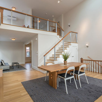
Our client for this project, an amateur pianist, wanted to create a music room for a nice new piano he was planning to purchase. The project scope would also include a new kitchen, bathroom, bedroom and living space, but the new piano was the priority.
LIFTING THE CEILING
The client was moving into a row house, and hoped to accommodate occasional gatherings of musician friends for informal recitals. Because acoustics were important we asked sound engineers from Acentech to visit the site. They noted that the ideal space would have higher ceilings and would be more like a cube than the “half a cube” we were dealing with. “How can we raise the ceiling and make the space a cube?” our client asked.
Designer Josy Raycroft started to explore the possibility of combining the second and third floor units by removing the front half of second floor ceiling, thereby opening up a 2-story music space in the shape of a nearly perfect cube. Thus, the project turned from a straightforward floor plan modification into a complete reimagining of the whole row house, with the client’s new Steinway D as the focal point. Josy and the client started with the piano and created the space around it.
ADDRESSING EVERYDAY NEEDS
For the client’s more mundane needs, Josy switched the location of the bathroom and kitchen—moving the bathroom towards the middle of the second floor where it would be convenient to the rest of the spaces, and placing the kitchen towards the back. The remainder of the third floor was transformed into bedroom and office space open to the music room below.
Products and finishes coordinator Karin Mahdavi worked with the client to select understated finishes for the living spaces so that they would support the piano room without competing with it. As a result the living spaces flow seamlessly into the piano space, creating a coherent whole out of the different parts, kind of like a Schubert piano sonata.
 Byggmeister Inc
Photo by Jim Raycroft
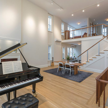
Our client for this project, an amateur pianist, wanted to create a music room for a nice new piano he was planning to purchase. The project scope would also include a new kitchen, bathroom, bedroom and living space, but the new piano was the priority.
LIFTING THE CEILING
The client was moving into a row house, and hoped to accommodate occasional gatherings of musician friends for informal recitals. Because acoustics were important we asked sound engineers from Acentech to visit the site. They noted that the ideal space would have higher ceilings and would be more like a cube than the “half a cube” we were dealing with. “How can we raise the ceiling and make the space a cube?” our client asked.
Designer Josy Raycroft started to explore the possibility of combining the second and third floor units by removing the front half of second floor ceiling, thereby opening up a 2-story music space in the shape of a nearly perfect cube. Thus, the project turned from a straightforward floor plan modification into a complete reimagining of the whole row house, with the client’s new Steinway D as the focal point. Josy and the client started with the piano and created the space around it.
ADDRESSING EVERYDAY NEEDS
For the client’s more mundane needs, Josy switched the location of the bathroom and kitchen—moving the bathroom towards the middle of the second floor where it would be convenient to the rest of the spaces, and placing the kitchen towards the back. The remainder of the third floor was transformed into bedroom and office space open to the music room below.
Products and finishes coordinator Karin Mahdavi worked with the client to select understated finishes for the living spaces so that they would support the piano room without competing with it. As a result the living spaces flow seamlessly into the piano space, creating a coherent whole out of the different parts, kind of like a Schubert piano sonata.
Find the right local pro for your project
 Brooklyn City Furniture
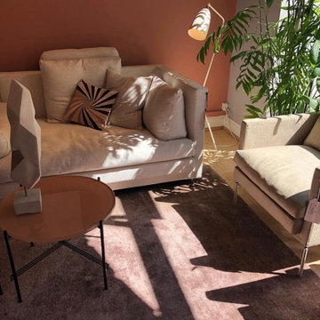
The Drop sofa is in stock in the US for quick delivery at 94 1/2" x 133 1/2" in Gravel 07. Includes Three Back Cushions 21 3/4" Pillows, a 21 3/4 x 29.5" Pillow, and two 21 3/4 x 37.5" Pillows. Find fabric images Nueva, Bakar, Bubble II, Gravel, Plindy, Tangent, Desert, Herring and Nature, all available for special order with promotional pricing. Inquire for more info.
Design: Jens Juul Eilersen
Drop is Eilersen's latest interpretation of the classic corner sofa. The seat is low and wide to ensure optimum comfort; and even though the sofa invites hours of relaxation, extra foam with fiberfill has been added to the seat cushions to ensure that you are able to get up again without any trouble. The short, concealed legs create an optical illusion, which makes it appear as though Drop is floating surreally a few centimetres above the living room floor. But don’t worry. As with all other Eilersen models, the sofa has its feet planted firmly in a handwork tradition where aesthetics and practical experience don’t serve to contradict but are prerequisites. It is, therefore, nothing less than contemplated proportionality combined with uncompromising choices of material that hold Drop together and ensure the tight look that has become synonymous with Eilersen.
“Drop’s clean lines are precisely coherent with our tradition of discreet quality down to even the smallest of details. The sofa can be combined with a host of veritable modules and upholstery, and the extra wide design provides our customers with the optimal prerequisites for allowing their thoughts to fly around,” says designer Jens Juul Eilersen. Simplicity is the ultimate kind of finesse Drop is a confident and stylish manifestation of stringency. The corner sofa integrates both tight and soft lines in the usual Eilersen manner. The vertical arms provide a contrast to the ultra-soft cushions. This is a combination that helps to ensure the playfully light expression, which is essential for a piece of furniture of this size. In addition, the sofa can be made even softer and more luxurious by purchasing a range of down filled cushions in different sizes.
 Byggmeister Inc
Photo by Jim Raycroft
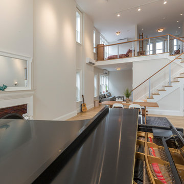
Our client for this project, an amateur pianist, wanted to create a music room for a nice new piano he was planning to purchase. The project scope would also include a new kitchen, bathroom, bedroom and living space, but the new piano was the priority.
LIFTING THE CEILING
The client was moving into a row house, and hoped to accommodate occasional gatherings of musician friends for informal recitals. Because acoustics were important we asked sound engineers from Acentech to visit the site. They noted that the ideal space would have higher ceilings and would be more like a cube than the “half a cube” we were dealing with. “How can we raise the ceiling and make the space a cube?” our client asked.
Designer Josy Raycroft started to explore the possibility of combining the second and third floor units by removing the front half of second floor ceiling, thereby opening up a 2-story music space in the shape of a nearly perfect cube. Thus, the project turned from a straightforward floor plan modification into a complete reimagining of the whole row house, with the client’s new Steinway D as the focal point. Josy and the client started with the piano and created the space around it.
ADDRESSING EVERYDAY NEEDS
For the client’s more mundane needs, Josy switched the location of the bathroom and kitchen—moving the bathroom towards the middle of the second floor where it would be convenient to the rest of the spaces, and placing the kitchen towards the back. The remainder of the third floor was transformed into bedroom and office space open to the music room below.
Products and finishes coordinator Karin Mahdavi worked with the client to select understated finishes for the living spaces so that they would support the piano room without competing with it. As a result the living spaces flow seamlessly into the piano space, creating a coherent whole out of the different parts, kind of like a Schubert piano sonata.

 Sierra Living Concepts Inc
Dimension:
Upper Rack: 34" L X 11" D X 16" H
Storage Box: 34" L X 18" D X 26" H
Emulate a visual and functional coherence in your entryways, foyers, and corridors by furnishing with our stylish Sapinero Rustic Solid Wood Wall Hanging Hall Tree Bench with Storage!
It’s absolutely stylish and has been sleekly designed to suit the architecture of all transitional spaces quite well. It has a gorgeous solid wood build and has a plethora of compartments where you can store personal items and even feature accessories. The sturdy hand craftsmanship ensures that it has a great heirloom quality!
The design of this solid wood hall tree is divided into 2 distinct parts. The top half comprises a floating shelf that hangs a few feet above the bottom credenza. It has an open shelf on top with 3 open cubbies underneath where you can showcase trendy decoration pieces or neatly organize your shoes. Below the cubbies are 3 double prong stainless steel hooks, which can be used to hang coats whenever you arrive back home.
The bottom half is just as simple and pragmatic with the design of a low back bench. It has a top that is framed by extended dips and cuts, and here you can place a bowl for keys and whatever else you may need for going to-and-fro from the foyer and also use to sit while putting on your shoes. There are 2 pullout filing-cabinet style drawers at the bottom for extra storage and the base is supported by simple feet.
The sleek hand-rubbed finish and gorgeous wood grain of this solid Rosewood hall tree give it an interesting and visually versatile quality. You can definitely match it with any and all kinds of interior design settings.
Special Features:
• 100% Handcrafted
• Solid Rosewood craftsmanship
• Rustic style
• Floating cabinet with 3 open cubbies and open shelf
• 3 double prong hooks
• Bottom storage bench with a smooth top frame
• 2 large pullout drawers
• Stylish hand-wrought metal hardware
• Sleek designing
• Gorgeous wood grain
• Stunning hand-rubbed finish
• Heirloom quality
• Visually versatile
• Easy maintenance
Note: Real wood is a product of nature, and as such, no two pieces are alike. Variations in solid wood grain patterns are to be expected and make each furniture uniquely beautiful, just like us humans.

 MATHISON | MATHISON ARCHITECTS
A primary project goal was to reimagine the relationship of the house to its surroundings while remaining sensitive to the communal context of the neighboring properties. The design seed of the new project included rotating the footprint of the existing house 90 degrees to open the long side of the home toward the lake, maximizing views and gaining optimal benefit of the linear site. Drawing inspiration from the traditional lake vernacular of the neighboring houses, the two principal roof forms of the new house reciprocate the setting -- the modern, clean lines of the upper gable roof upholds the clarity and tradition of the neighborhood, while the lower roof mimics the extension of the landscape and invites improvisational use. The horizontal flat roof allows use of the deck in all weather and cantilevers the most used public spaces into the landscape in a band of captured horizontal space. A wood-clad retaining wall refines a cut into the earth and harbors a transitional, outdoor room between the water and the basement.
At 2200 finished square feet, the conditioned building envelope is compact. And like the exterior, the interior form responds directly to its use. The upper floor is a monastic repetition of modest sleeping cells and bathrooms with unique directional views, combined with a grand central stair and master bedroom at each corner that captures myriad views of the water, over the trees, in all directions.
The main floor utilizes a core of small, functional spaces to shield the adjacent road, and forms a backdrop to the open interior spaces. Aided by the reaching, cedar-bellied roof, the living, dining, and kitchen spaces spill to the outdoors through an unusually porous exterior wall. Three sliding glass doors–including one at 20 feet wide–and a finished, surrounding ground plane cohere the landscape to the main living level.
Super-insulated wood-framed walls, triple-paned aluminum-clad wood windows, and a structurally insulated roof panels make-up the core of the building envelope, and additional exterior high-performance design features include geothermal heating/cooling and a green roof. Cementitious lap siding, concrete panels, hardwood decking, cedar soffits, and river rock comprise the exterior finish. In addition to cedar ceilings, interior finishes include porcelain ceramic tile, cork flooring, tight pile wool carpet, and neutral painted walls -- designed in quiet tones to highlight the most important interior ingredient: views outside.
 MATHISON | MATHISON ARCHITECTS
A primary project goal was to reimagine the relationship of the house to its surroundings while remaining sensitive to the communal context of the neighboring properties. The design seed of the new project included rotating the footprint of the existing house 90 degrees to open the long side of the home toward the lake, maximizing views and gaining optimal benefit of the linear site. Drawing inspiration from the traditional lake vernacular of the neighboring houses, the two principal roof forms of the new house reciprocate the setting -- the modern, clean lines of the upper gable roof upholds the clarity and tradition of the neighborhood, while the lower roof mimics the extension of the landscape and invites improvisational use. The horizontal flat roof allows use of the deck in all weather and cantilevers the most used public spaces into the landscape in a band of captured horizontal space. A wood-clad retaining wall refines a cut into the earth and harbors a transitional, outdoor room between the water and the basement.
At 2200 finished square feet, the conditioned building envelope is compact. And like the exterior, the interior form responds directly to its use. The upper floor is a monastic repetition of modest sleeping cells and bathrooms with unique directional views, combined with a grand central stair and master bedroom at each corner that captures myriad views of the water, over the trees, in all directions.
The main floor utilizes a core of small, functional spaces to shield the adjacent road, and forms a backdrop to the open interior spaces. Aided by the reaching, cedar-bellied roof, the living, dining, and kitchen spaces spill to the outdoors through an unusually porous exterior wall. Three sliding glass doors–including one at 20 feet wide–and a finished, surrounding ground plane cohere the landscape to the main living level.
Super-insulated wood-framed walls, triple-paned aluminum-clad wood windows, and a structurally insulated roof panels make-up the core of the building envelope, and additional exterior high-performance design features include geothermal heating/cooling and a green roof. Cementitious lap siding, concrete panels, hardwood decking, cedar soffits, and river rock comprise the exterior finish. In addition to cedar ceilings, interior finishes include porcelain ceramic tile, cork flooring, tight pile wool carpet, and neutral painted walls -- designed in quiet tones to highlight the most important interior ingredient: views outside.

 Meyer Design
This expansive outdoor living room is adjacent to the port cochere; giving the occupants a view of the front and back yards. The ceiling is stained bead board, the flooring is natural stone.
Architect: Meyer Design
Builder: Lakewest Custom Homes

 DRB Homes and Design
Barn door breezeway between the Kitchen and Great Room and the Family room, finished with the same Navy Damask blue and Champagne finger pulls as the island cabinets
 Lindy Architect
This project was never really about the architecture. It was about a family that collects — art, ceramics, books, ideas — and needed a home that could hold all of that without turning into a museum.
The existing unit had good bones: generous ceiling heights, a floating stair, and enough square footage to work with. What it lacked was a coherent logic — a way of moving through the space that felt intentional, where each transition earned its moment.
We rebuilt that logic from the ground up.
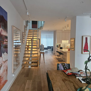
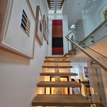
The ground floor is organized around a single corridor that runs from the kitchen island through to the living room, with the staircase serving as the spine of the whole sequence. Rather than treating the stair as purely functional, we kept the glass balustrade open and lit the treads from below, so it reads as a light source as much as a passage. The console beneath it became a natural landing for ceramics and found objects — not styled, just placed.
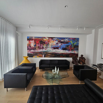
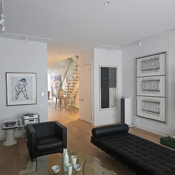
In the living room, the brief was simple: make room for a very large painting without the room feeling like a gallery. The answer was to keep everything else quiet — a white built-in that does its job, sheer linen curtains that diffuse the light, black leather chairs that anchor the space without competing. The painting does the rest.
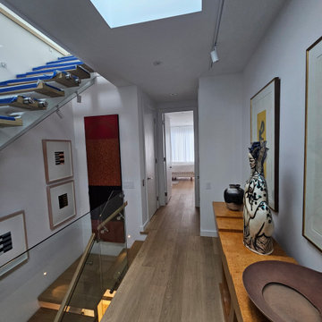
Upstairs, the landing is lit by a skylight that washes the hallway in natural light through most of the day. We lined one side with a burl wood console and let the ceramics and framed works speak for themselves. The mix of abstract prints, a bold red canvas, and handmade vessels gives the corridor a rhythm that feels accumulated over time rather than installed all at once — because it was.
Throughout, the material palette is deliberately restrained: white oak floors, white walls, white millwork. The restraint isn't minimalism for its own sake — it's a backdrop. The owners bring the color, texture, and personality. Our job was to give them the right walls to hang things on.
 Lindy Architect
This project was never really about the architecture. It was about a family that collects — art, ceramics, books, ideas — and needed a home that could hold all of that without turning into a museum.
The existing unit had good bones: generous ceiling heights, a floating stair, and enough square footage to work with. What it lacked was a coherent logic — a way of moving through the space that felt intentional, where each transition earned its moment.
We rebuilt that logic from the ground up.
The ground floor is organized around a single corridor that runs from the kitchen island through to the living room, with the staircase serving as the spine of the whole sequence. Rather than treating the stair as purely functional, we kept the glass balustrade open and lit the treads from below, so it reads as a light source as much as a passage. The console beneath it became a natural landing for ceramics and found objects — not styled, just placed.
In the living room, the brief was simple: make room for a very large painting without the room feeling like a gallery. The answer was to keep everything else quiet — a white built-in that does its job, sheer linen curtains that diffuse the light, black leather chairs that anchor the space without competing. The painting does the rest.
Upstairs, the landing is lit by a skylight that washes the hallway in natural light through most of the day. We lined one side with a burl wood console and let the ceramics and framed works speak for themselves. The mix of abstract prints, a bold red canvas, and handmade vessels gives the corridor a rhythm that feels accumulated over time rather than installed all at once — because it was.
Throughout, the material palette is deliberately restrained: white oak floors, white walls, white millwork. The restraint isn't minimalism for its own sake — it's a backdrop. The owners bring the color, texture, and personality. Our job was to give them the right walls to hang things on.
 Lindy Architect
This project was never really about the architecture. It was about a family that collects — art, ceramics, books, ideas — and needed a home that could hold all of that without turning into a museum.
The existing unit had good bones: generous ceiling heights, a floating stair, and enough square footage to work with. What it lacked was a coherent logic — a way of moving through the space that felt intentional, where each transition earned its moment.
We rebuilt that logic from the ground up.
The ground floor is organized around a single corridor that runs from the kitchen island through to the living room, with the staircase serving as the spine of the whole sequence. Rather than treating the stair as purely functional, we kept the glass balustrade open and lit the treads from below, so it reads as a light source as much as a passage. The console beneath it became a natural landing for ceramics and found objects — not styled, just placed.
In the living room, the brief was simple: make room for a very large painting without the room feeling like a gallery. The answer was to keep everything else quiet — a white built-in that does its job, sheer linen curtains that diffuse the light, black leather chairs that anchor the space without competing. The painting does the rest.
Upstairs, the landing is lit by a skylight that washes the hallway in natural light through most of the day. We lined one side with a burl wood console and let the ceramics and framed works speak for themselves. The mix of abstract prints, a bold red canvas, and handmade vessels gives the corridor a rhythm that feels accumulated over time rather than installed all at once — because it was.
Throughout, the material palette is deliberately restrained: white oak floors, white walls, white millwork. The restraint isn't minimalism for its own sake — it's a backdrop. The owners bring the color, texture, and personality. Our job was to give them the right walls to hang things on.
 Lindy Architect
This project was never really about the architecture. It was about a family that collects — art, ceramics, books, ideas — and needed a home that could hold all of that without turning into a museum.
The existing unit had good bones: generous ceiling heights, a floating stair, and enough square footage to work with. What it lacked was a coherent logic — a way of moving through the space that felt intentional, where each transition earned its moment.
We rebuilt that logic from the ground up.
The ground floor is organized around a single corridor that runs from the kitchen island through to the living room, with the staircase serving as the spine of the whole sequence. Rather than treating the stair as purely functional, we kept the glass balustrade open and lit the treads from below, so it reads as a light source as much as a passage. The console beneath it became a natural landing for ceramics and found objects — not styled, just placed.
In the living room, the brief was simple: make room for a very large painting without the room feeling like a gallery. The answer was to keep everything else quiet — a white built-in that does its job, sheer linen curtains that diffuse the light, black leather chairs that anchor the space without competing. The painting does the rest.
Upstairs, the landing is lit by a skylight that washes the hallway in natural light through most of the day. We lined one side with a burl wood console and let the ceramics and framed works speak for themselves. The mix of abstract prints, a bold red canvas, and handmade vessels gives the corridor a rhythm that feels accumulated over time rather than installed all at once — because it was.
Throughout, the material palette is deliberately restrained: white oak floors, white walls, white millwork. The restraint isn't minimalism for its own sake — it's a backdrop. The owners bring the color, texture, and personality. Our job was to give them the right walls to hang things on.
 Lindy Architect
This project was never really about the architecture. It was about a family that collects — art, ceramics, books, ideas — and needed a home that could hold all of that without turning into a museum.
The existing unit had good bones: generous ceiling heights, a floating stair, and enough square footage to work with. What it lacked was a coherent logic — a way of moving through the space that felt intentional, where each transition earned its moment.
We rebuilt that logic from the ground up.
The ground floor is organized around a single corridor that runs from the kitchen island through to the living room, with the staircase serving as the spine of the whole sequence. Rather than treating the stair as purely functional, we kept the glass balustrade open and lit the treads from below, so it reads as a light source as much as a passage. The console beneath it became a natural landing for ceramics and found objects — not styled, just placed.
In the living room, the brief was simple: make room for a very large painting without the room feeling like a gallery. The answer was to keep everything else quiet — a white built-in that does its job, sheer linen curtains that diffuse the light, black leather chairs that anchor the space without competing. The painting does the rest.
Upstairs, the landing is lit by a skylight that washes the hallway in natural light through most of the day. We lined one side with a burl wood console and let the ceramics and framed works speak for themselves. The mix of abstract prints, a bold red canvas, and handmade vessels gives the corridor a rhythm that feels accumulated over time rather than installed all at once — because it was.
Throughout, the material palette is deliberately restrained: white oak floors, white walls, white millwork. The restraint isn't minimalism for its own sake — it's a backdrop. The owners bring the color, texture, and personality. Our job was to give them the right walls to hang things on.
 Lindy Architect
This project was never really about the architecture. It was about a family that collects — art, ceramics, books, ideas — and needed a home that could hold all of that without turning into a museum.
The existing unit had good bones: generous ceiling heights, a floating stair, and enough square footage to work with. What it lacked was a coherent logic — a way of moving through the space that felt intentional, where each transition earned its moment.
We rebuilt that logic from the ground up.
The ground floor is organized around a single corridor that runs from the kitchen island through to the living room, with the staircase serving as the spine of the whole sequence. Rather than treating the stair as purely functional, we kept the glass balustrade open and lit the treads from below, so it reads as a light source as much as a passage. The console beneath it became a natural landing for ceramics and found objects — not styled, just placed.
In the living room, the brief was simple: make room for a very large painting without the room feeling like a gallery. The answer was to keep everything else quiet — a white built-in that does its job, sheer linen curtains that diffuse the light, black leather chairs that anchor the space without competing. The painting does the rest.
Upstairs, the landing is lit by a skylight that washes the hallway in natural light through most of the day. We lined one side with a burl wood console and let the ceramics and framed works speak for themselves. The mix of abstract prints, a bold red canvas, and handmade vessels gives the corridor a rhythm that feels accumulated over time rather than installed all at once — because it was.
Throughout, the material palette is deliberately restrained: white oak floors, white walls, white millwork. The restraint isn't minimalism for its own sake — it's a backdrop. The owners bring the color, texture, and personality. Our job was to give them the right walls to hang things on.
 MATHISON | MATHISON ARCHITECTS
The Gun Lake Residence replaces a small, aging, existing house located on a narrow peninsula on Gun Lake, in west Michigan. The peninsula is neatly populated with century-old homes that quietly occupy this uncommon setting. The project site offers extraordinary views of the water in multiple directions and extends to the east with open space, bordering on an historic, 19th-century community ice house.
A primary project goal was to reimagine the relationship of the house to its surroundings while remaining sensitive to the communal context of the neighboring properties. The design seed of the new project included rotating the footprint of the existing house 90 degrees to open the long side of the home toward the lake, maximizing views and gaining optimal benefit of the linear site. Drawing inspiration from the traditional lake vernacular of the neighboring houses, the two principal roof forms of the new house reciprocate the setting -- the modern, clean lines of the upper gable roof upholds the clarity and tradition of the neighborhood, while the lower roof mimics the extension of the landscape and invites improvisational use. The horizontal flat roof allows use of the deck in all weather and cantilevers the most used public spaces into the landscape in a band of captured horizontal space. A wood-clad retaining wall refines a cut into the earth and harbors a transitional, outdoor room between the water and the basement.
At 2200 finished square feet, the conditioned building envelope is compact. And like the exterior, the interior form responds directly to its use. The upper floor is a monastic repetition of modest sleeping cells and bathrooms with unique directional views, combined with a grand central stair and master bedroom at each corner that captures myriad views of the water, over the trees, in all directions.
The main floor utilizes a core of small, functional spaces to shield the adjacent road, and forms a backdrop to the open interior spaces. Aided by the reaching, cedar-bellied roof, the living, dining, and kitchen spaces spill to the outdoors through an unusually porous exterior wall. Three sliding glass doors–including one at 20 feet wide–and a finished, surrounding ground plane cohere the landscape to the main living level.
Super-insulated wood-framed walls, triple-paned aluminum-clad wood windows, and a structurally insulated roof panels make-up the core of the building envelope, and additional exterior high-performance design features include geothermal heating/cooling and a green roof. Cementitious lap siding, concrete panels, hardwood decking, cedar soffits, and river rock comprise the exterior finish. In addition to cedar ceilings, interior finishes include porcelain ceramic tile, cork flooring, tight pile wool carpet, and neutral painted walls -- designed in quiet tones to highlight the most important interior ingredient: views outside.
 MATHISON | MATHISON ARCHITECTS
The Gun Lake Residence replaces a small, aging, existing house located on a narrow peninsula on Gun Lake, in west Michigan. The peninsula is neatly populated with century-old homes that quietly occupy this uncommon setting. The project site offers extraordinary views of the water in multiple directions and extends to the east with open space, bordering on an historic, 19th-century community ice house.
A primary project goal was to reimagine the relationship of the house to its surroundings while remaining sensitive to the communal context of the neighboring properties. The design seed of the new project included rotating the footprint of the existing house 90 degrees to open the long side of the home toward the lake, maximizing views and gaining optimal benefit of the linear site. Drawing inspiration from the traditional lake vernacular of the neighboring houses, the two principal roof forms of the new house reciprocate the setting -- the modern, clean lines of the upper gable roof upholds the clarity and tradition of the neighborhood, while the lower roof mimics the extension of the landscape and invites improvisational use. The horizontal flat roof allows use of the deck in all weather and cantilevers the most used public spaces into the landscape in a band of captured horizontal space. A wood-clad retaining wall refines a cut into the earth and harbors a transitional, outdoor room between the water and the basement.
At 2200 finished square feet, the conditioned building envelope is compact. And like the exterior, the interior form responds directly to its use. The upper floor is a monastic repetition of modest sleeping cells and bathrooms with unique directional views, combined with a grand central stair and master bedroom at each corner that captures myriad views of the water, over the trees, in all directions.
The main floor utilizes a core of small, functional spaces to shield the adjacent road, and forms a backdrop to the open interior spaces. Aided by the reaching, cedar-bellied roof, the living, dining, and kitchen spaces spill to the outdoors through an unusually porous exterior wall. Three sliding glass doors–including one at 20 feet wide–and a finished, surrounding ground plane cohere the landscape to the main living level.
Super-insulated wood-framed walls, triple-paned aluminum-clad wood windows, and a structurally insulated roof panels make-up the core of the building envelope, and additional exterior high-performance design features include geothermal heating/cooling and a green roof. Cementitious lap siding, concrete panels, hardwood decking, cedar soffits, and river rock comprise the exterior finish. In addition to cedar ceilings, interior finishes include porcelain ceramic tile, cork flooring, tight pile wool carpet, and neutral painted walls -- designed in quiet tones to highlight the most important interior ingredient: views outside.
 MATHISON | MATHISON ARCHITECTS
The Gun Lake Residence replaces a small, aging, existing house located on a narrow peninsula on Gun Lake, in west Michigan. The peninsula is neatly populated with century-old homes that quietly occupy this uncommon setting. The project site offers extraordinary views of the water in multiple directions and extends to the east with open space, bordering on an historic, 19th-century community ice house.
A primary project goal was to reimagine the relationship of the house to its surroundings while remaining sensitive to the communal context of the neighboring properties. The design seed of the new project included rotating the footprint of the existing house 90 degrees to open the long side of the home toward the lake, maximizing views and gaining optimal benefit of the linear site. Drawing inspiration from the traditional lake vernacular of the neighboring houses, the two principal roof forms of the new house reciprocate the setting -- the modern, clean lines of the upper gable roof upholds the clarity and tradition of the neighborhood, while the lower roof mimics the extension of the landscape and invites improvisational use. The horizontal flat roof allows use of the deck in all weather and cantilevers the most used public spaces into the landscape in a band of captured horizontal space. A wood-clad retaining wall refines a cut into the earth and harbors a transitional, outdoor room between the water and the basement.
At 2200 finished square feet, the conditioned building envelope is compact. And like the exterior, the interior form responds directly to its use. The upper floor is a monastic repetition of modest sleeping cells and bathrooms with unique directional views, combined with a grand central stair and master bedroom at each corner that captures myriad views of the water, over the trees, in all directions.
The main floor utilizes a core of small, functional spaces to shield the adjacent road, and forms a backdrop to the open interior spaces. Aided by the reaching, cedar-bellied roof, the living, dining, and kitchen spaces spill to the outdoors through an unusually porous exterior wall. Three sliding glass doors–including one at 20 feet wide–and a finished, surrounding ground plane cohere the landscape to the main living level.
Super-insulated wood-framed walls, triple-paned aluminum-clad wood windows, and a structurally insulated roof panels make-up the core of the building envelope, and additional exterior high-performance design features include geothermal heating/cooling and a green roof. Cementitious lap siding, concrete panels, hardwood decking, cedar soffits, and river rock comprise the exterior finish. In addition to cedar ceilings, interior finishes include porcelain ceramic tile, cork flooring, tight pile wool carpet, and neutral painted walls -- designed in quiet tones to highlight the most important interior ingredient: views outside.
 Fabco Sanctuary
The architect and designer Guy Derwent was approached by his client with a clear and compelling brief: to completely transform a grand Victorian terrace house they were planning to renovate. The client envisioned something far beyond a standard renovation – this was to be a bold and dramatic reimagining of a family home that could grow with them over time.
With the property having remained largely untouched for more than fifty years, the architects saw an opportunity to unlock its potential and deliver a contemporary design that would contrast beautifully with its Victorian heritage.
The existing layout consisted of a series of small, disconnected rooms to the rear of the house. To respond to the client’s need for openness and flexibility, the architect proposed a radical restructuring of the ground floor:
The rear rooms were completely removed
Suspended timber floors were lowered by up to two metres to align with the garden
Two bold extensions were added
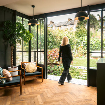
The first extension filled in the side return with a London stock brick facade and a glazed roof, while the second – a striking black steel and glass pavilion was glazed on three sides and placed along the garden elevation.
This new pavilion redefined the building’s relationship with the garden. Its steel-framed glazing created a seamless dialogue between interior and exterior, offering a sense of immersion in the surrounding landscape.
At the heart of the plan sits a dramatic, five-metre-tall dining space that acts as a transition from the original entrance hall into the new addition. A large, circular cast-glass window, framed in steel, provides a visual and spatial link between old and new, allowing light and movement to travel through the depth of the home.
Throughout the project, a series of black metal elements were introduced as sculptural interventions – each marking moments of transformation within the house. These included the bespoke steel framed circular window, a custom metal staircase, a cylindrical support column, and the striking steel and glass garden pavilion. Together, they formed a coherent architectural language that underscored the project’s bold intent.
Our steel windows and doors played a vital role in delivering the project’s vision. The architects chose steel for its refined sight lines and distinctive material character, which helped bridge the gap between the historical context of the building and the bold new additions.
The black steel frames provided a crisp contrast to the pale London stock brick and added definition to the glazed pavilion, reinforcing the sense of architectural precision. In particular, the fine steel profiles of the garden room allowed the extension to feel both lightweight and immersive, blurring the boundary between the house and its garden.
The architect drew inspiration from the Bauhaus Movement, particularly the work of Walter Gropius, whose approach to functional beauty and industrial materials informed the design of the garden pavilion.
Here, our glazing system was used not just for transparency, but as an expressive architectural element. The carefully proportioned panels help to conceal the roof thickness and reinforce the pavilion’s industrial yet abstract character – a deliberate nod to product design and modernist detailing.
Sustainability was an important factor in the selection of materials. Our steel systems, made from 99% recycled content and 100% recyclable, aligned with the project’s broader environmental goals.
The architects noted that this commitment to material longevity and circularity was central to their decision to use steel. The durability and recyclability of the windows and doors ensured the project met both aesthetic and ethical criteria.
This London terrace house now stands as a celebration of contrast – between heritage and innovation, solidity and transparency, tradition and transformation. Our steel windows and doors were not simply components; they were essential tools in crafting a home that is as bold and expressive as it is functional.
The result is a home designed for modern family life, where light, space, and materiality come together in perfect harmony.
24