
Search results for "Coherence" in Home Design Ideas
 Bplan
Bplan
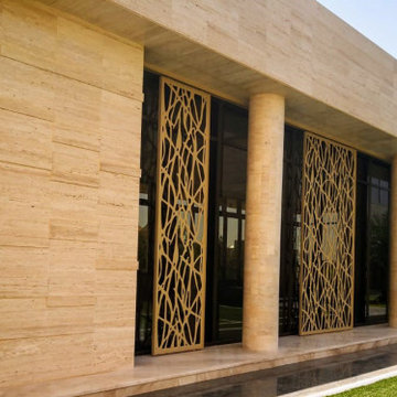
BPLAN panels can be applied anywhere in the world and in different contexts, in the same project, given the properties of the materials you use, the quality of production processes and finishes.
In the United Arab Emirates, BPLAN panels were applied in the same project, from the outside, giving elegance, dynamism and versatility to the elevations, to the interior, with panels that divide the spaces with formal wealth grid.
Outside, BPLAN panels mark the main entry points, in large spans, in a formal and calculation exercise that confers the continuity of the pattern, without structural elements that could disturb the reading of the same. This exercise of commitment between elegance and resistance was incorporated in aluminum with 8mm thickness, combined with a peripheral structure in stainless steel.
The other elements that punctuate the elevations consist of self-supporting panels that give formal versatility and the use of the elevation, because they are associated with sliding rails.
In all applications abroad, it is evident the interrelationship with the interior of the building, in a gesture of continuity and coherence.
The separation of spaces is punctuated by panels obtained through the same processes and materials, particularly at the level of finishing, in a gold of extreme elegance in a building of great conceptual robustness.


 Bplan
Bplan
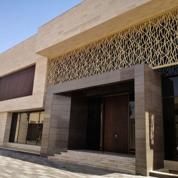
BPLAN panels can be applied anywhere in the world and in different contexts, in the same project, given the properties of the materials you use, the quality of production processes and finishes.
In the United Arab Emirates, BPLAN panels were applied in the same project, from the outside, giving elegance, dynamism and versatility to the elevations, to the interior, with panels that divide the spaces with formal wealth grid.
Outside, BPLAN panels mark the main entry points, in large spans, in a formal and calculation exercise that confers the continuity of the pattern, without structural elements that could disturb the reading of the same. This exercise of commitment between elegance and resistance was incorporated in aluminum with 8mm thickness, combined with a peripheral structure in stainless steel.
The other elements that punctuate the elevations consist of self-supporting panels that give formal versatility and the use of the elevation, because they are associated with sliding rails.
In all applications abroad, it is evident the interrelationship with the interior of the building, in a gesture of continuity and coherence.
The separation of spaces is punctuated by panels obtained through the same processes and materials, particularly at the level of finishing, in a gold of extreme elegance in a building of great conceptual robustness.
Find the right local pro for your project

 Boston Counters
Greg Premru
Example of a mid-sized transitional single-wall dark wood floor and brown floor eat-in kitchen design in Boston with an undermount sink, quartzite countertops, glass tile backsplash, an island, white cabinets, raised-panel cabinets, blue backsplash and stainless steel appliances
Example of a mid-sized transitional single-wall dark wood floor and brown floor eat-in kitchen design in Boston with an undermount sink, quartzite countertops, glass tile backsplash, an island, white cabinets, raised-panel cabinets, blue backsplash and stainless steel appliances

 Wiedemann Architects LLC
This home on the Eastern Shore of Maryland began as a modest 1927 home with a central hall plan. Renovations included reversing the kitchen and dining room layout , adding a large central island and hood to anchor the center of the kitchen. The island has a walnut counter encircling the working island and accommodates additional seating. The main sink looks out to the north with beautiful water views. The southwest bay window affords a seating area with built-in bookshelves adjoining the breakfast room while the one in the kitchen provides for the secondary sink and clean-up area. By capturing the additional depth in the bay window, a large TV is concealed below the countertop and can emerge with a press of a button or retract out of sight to enjoy views of the water.
A separate butler's pantry and wine bar were designed adjoining the breakfast room. The original fireplace was retained and became the center of the large Breakfast Room. Wood paneling lines the Breakfast Room which helps to integrate the new kitchen and the adjoining spaces into a coherent whole, all accessible from the informal entry.
This was a highly collaborative project with Jennifer Gilmer Kitchen and Bath LTD of Chevy Chase, MD.
Bob Narod, Photographer, LLC
 Wiedemann Architects LLC
This home on the Eastern Shore of Maryland began as a modest 1927 home with a central hall plan. Renovations included reversing the kitchen and dining room layout , adding a large central island and hood to anchor the center of the kitchen. The island has a walnut counter encircling the working island and accommodates additional seating. The main sink looks out to the north with beautiful water views. The southwest bay window affords a seating area with built-in bookshelves adjoining the breakfast room while the one in the kitchen provides for the secondary sink and clean-up area. By capturing the additional depth in the bay window, a large TV is concealed below the countertop and can emerge with a press of a button or retract out of sight to enjoy views of the water.
A separate butler's pantry and wine bar were designed adjoining the breakfast room. The original fireplace was retained and became the center of the large Breakfast Room. Wood paneling lines the Breakfast Room which helps to integrate the new kitchen and the adjoining spaces into a coherent whole, all accessible from the informal entry.
This was a highly collaborative project with Jennifer Gilmer Kitchen and Bath LTD of Chevy Chase, MD.
Bob Narod, Photographer, LLC
 Leicht San Diego
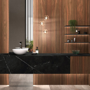
LEICHT is compelling with cross-room planning diversity in modern interior design
The interior frame M8 and the real wood surface programme BOSSA combine to create a holistic concept
with which individual solutions can be realised throughout the entire living space. Whether in the cooking,
dining or living area, the dressing room, bathroom, entrée or hallway: with the two main components of
the 2022 collection, both surfaces and furniture can be designed in a uniform material and colour scheme,
thus uniting them in a coherent overall architectural structure. On the outside, BOSSA defines the
look and gives the interior a warm, homely atmosphere. Inside, the filigree yet robust frame maintains the
high-quality, minimalist overall appearance when drawers are opened. Together they make a statement
for a timeless look – with a puristically luxurious elegance right down to the very last detail.

 Main Street Custom Homes & Remodeling
Rather than renovating their own home, this couple decided to remodel and move into the mother's home to keep her in a familiar setting and create a multi-generational home under one roof.
Careful consideration was given to the design of the exterior of the home so that the second floor addition blended with the original home creating a unified façade. In addition, a portico was installed over the front entry, giving a more formal appearance and offering shelter from the elements.
It was necessary to design a single-floor living space for the aging parent who had recently broken a hip. The entire first floor layout was renovated with the focus on ease of mobility while maintaining a coherent, balanced design throughout the house. To allow for a “no-step” main level, the existing sunken family room floor was raised to bring it flush with the adjacent kitchen floor then converted into a spacious dining room. A new great room was constructed which boasts a beautiful corner wood burning stove. This addition created a comfortable and accessible place to relax, at the same time offering a space for larger family gatherings.

 The Brooklyn Studio
Photography by Catherine Tighe
This 1890s tenement apartment, also known as a cold water flat, was ripe for a renovation. With a shower and toilet/sink located at opposite ends and a cooktop in the living room, the railroad layout was a disjointed jumble in need of coherent modernization. Our first step was to move the poche -- the cluster of plumbing and storage space -- into one centralized location. We created a European-styled bathroom with a Carrara marble stall shower and a space-saving wall-hung toilet. Opposite the bathroom are built-in closets constructed to detailed specification to accommodate the couple's wardrobe. The resulting corridor space acts as a fluid connector between the apartments's public living area and the private bedroom. Open walnut shelving in the kitchen lends a "floating" appearance to stacked dishes and glassware, while concealed, small-sized appliances maintain the sleek look. The stove and refrigerator are installed on the stairwell wall, so that the exposed brick of the opposite wall appears to flow through the unit. The living room fireplace was restored to working condition while the bedroom fireplace, a likely fire hazard located so close to the foot of the bed, was ingeniously fitted with a custom shoe cabinet.
 SERGIO HALFON | Architecture & Interior Design
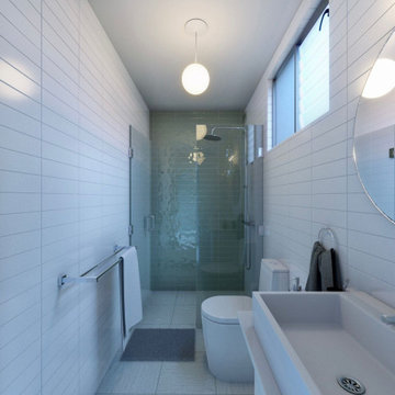
This project transformed a narrow and outdated bathroom into a bright, functional, and contemporary space. The design focused on improving spatial clarity, enhancing natural light, and creating visual continuity through a restrained material palette.
Light-toned wall tiles were used to visually expand the space, while a frameless glass shower enclosure preserves openness and allows light to flow throughout the room. Carefully selected fixtures and clean geometric forms reinforce a calm and timeless aesthetic.
The result is a bathroom that feels more spacious, coherent, and architecturally refined within the existing footprint.
Location: Oaxaca, Mexico
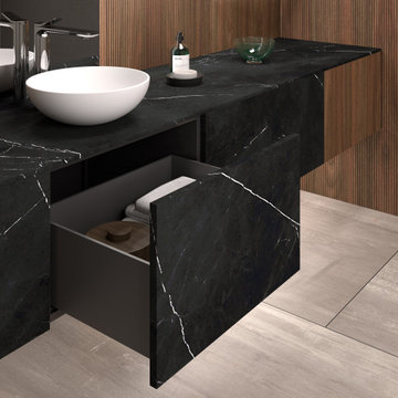 Leicht San Diego
LEICHT is compelling with cross-room planning diversity in modern interior design
The interior frame M8 and the real wood surface programme BOSSA combine to create a holistic concept
with which individual solutions can be realised throughout the entire living space. Whether in the cooking,
dining or living area, the dressing room, bathroom, entrée or hallway: with the two main components of
the 2022 collection, both surfaces and furniture can be designed in a uniform material and colour scheme,
thus uniting them in a coherent overall architectural structure. On the outside, BOSSA defines the
look and gives the interior a warm, homely atmosphere. Inside, the filigree yet robust frame maintains the
high-quality, minimalist overall appearance when drawers are opened. Together they make a statement
for a timeless look – with a puristically luxurious elegance right down to the very last detail.

 Atwood Custom Homes
This is an example of a huge contemporary partial sun backyard stone landscaping in Dallas with a fire pit for spring.
 Leicht San Diego
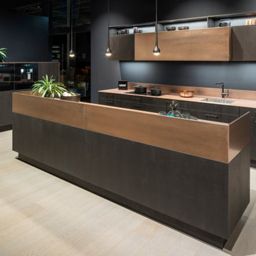
Copper-coloured effect lacquer fronts from the LAIKA range generate visual drama with a metallic effect in this horizontally planned kitchen of the product line PRIMO with a carbon grey carcase. In addition to various unit elements and a satin-finished glass worktop, the metallic look is also reflected in the raised frame of the kitchen island – an architectural detail reminiscent of a bar situation. The colour-contrasting wall unit consists of individual elements placed in front of each other, but, due to the clasping of the side panels in the upper row of shelves, it looks like a coherent furniture soloist. The metallic lacquer in “copper shadow” clearly emphasises the spatially offset part and creates a three-dimensional look. In this way, this kitchen design dissolves the classic arrangement of wall units strung together and creates a completely new look. To match this, the planners of this ensemble chose the MADERO programme in dark “wild oak marsh” and created a modern, trendy flair with a contrast to the copper tone implemented throughout.
 Wiedemann Architects LLC
This home on the Eastern Shore of Maryland began as a modest 1927 home with a central hall plan. Renovations included reversing the kitchen and dining room layout , adding a large central island and hood to anchor the center of the kitchen. The island has a walnut counter encircling the working island and accommodates additional seating. The main sink looks out to the north with beautiful water views. The southwest bay window affords a seating area with built-in bookshelves adjoining the breakfast room while the one in the kitchen provides for the secondary sink and clean-up area. By capturing the additional depth in the bay window, a large TV is concealed below the countertop and can emerge with a press of a button or retract out of sight to enjoy views of the water.
A separate butler's pantry and wine bar were designed adjoining the breakfast room. The original fireplace was retained and became the center of the large Breakfast Room. Wood paneling lines the Breakfast Room which helps to integrate the new kitchen and the adjoining spaces into a coherent whole, all accessible from the informal entry.
This was a highly collaborative project with Jennifer Gilmer Kitchen and Bath LTD of Chevy Chase, MD.
Bob Narod, Photographer, LLC
 The Brooklyn Studio
Photography by Catherine Tighe
This 1890s tenement apartment, also known as a cold water flat, was ripe for a renovation. With a shower and toilet/sink located at opposite ends and a cooktop in the living room, the railroad layout was a disjointed jumble in need of coherent modernization. Our first step was to move the poche -- the cluster of plumbing and storage space -- into one centralized location. We created a European-styled bathroom with a Carrara marble stall shower and a space-saving wall-hung toilet. Opposite the bathroom are built-in closets constructed to detailed specification to accommodate the couple's wardrobe. The resulting corridor space acts as a fluid connector between the apartments's public living area and the private bedroom. Open walnut shelving in the kitchen lends a "floating" appearance to stacked dishes and glassware, while concealed, small-sized appliances maintain the sleek look. The stove and refrigerator are installed on the stairwell wall, so that the exposed brick of the opposite wall appears to flow through the unit. The living room fireplace was restored to working condition while the bedroom fireplace, a likely fire hazard located so close to the foot of the bed, was ingeniously fitted with a custom shoe cabinet.
 Sandrin Construction Ltd
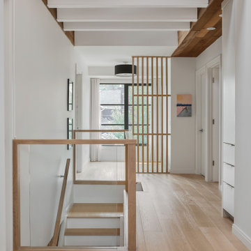
This Elbow Park bungalow had a second storey added in the 1970s, leaving behind cedar ceilings and clerestory light that had become part of the character of the house.
More recently, the main floor introduced a different material language of white oak and slatted woodwork.
Rather than choosing between the two, this second-floor renovation brought them together. We retained the warmth and natural light of the existing upper floor while introducing white oak flooring, custom millwork, glass railings and slatted woodwork that connect it to the rest of the home.
The layout and built-ins were also updated around the family's current needs, allowing different generations of the house to remain visible while making the second floor feel like part of a coherent whole.
Construction budget: approximately $140,000.
 Leicht San Diego
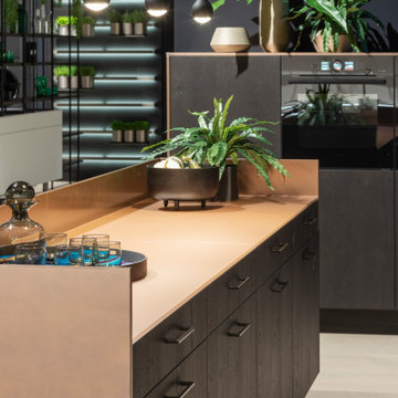
Copper-coloured effect lacquer fronts from the LAIKA range generate visual drama with a metallic effect in this horizontally planned kitchen of the product line PRIMO with a carbon grey carcase. In addition to various unit elements and a satin-finished glass worktop, the metallic look is also reflected in the raised frame of the kitchen island – an architectural detail reminiscent of a bar situation. The colour-contrasting wall unit consists of individual elements placed in front of each other, but, due to the clasping of the side panels in the upper row of shelves, it looks like a coherent furniture soloist. The metallic lacquer in “copper shadow” clearly emphasises the spatially offset part and creates a three-dimensional look. In this way, this kitchen design dissolves the classic arrangement of wall units strung together and creates a completely new look. To match this, the planners of this ensemble chose the MADERO programme in dark “wild oak marsh” and created a modern, trendy flair with a contrast to the copper tone implemented throughout.

 Kelsey Ann Rose
Eclectic medium tone wood floor and brown floor dining room photo in New York with white walls and a wood stove

 Gail Green
The Living room and foyer requires a coherent decoration scheme. This involves refurbishing the existing details as well as introducing some sleek modern elements which highlight the traditional feeling. The expansive living room easily becomes a combination of living / dining room. The dining area is placed on axis with the foyer and the front door of the apartment. The axial relationship of the living and dining furniture (table and chairs designed by David Estreich) lends harmony to the overall architecture / decorating scheme. The dining room furniture combines a traditional feel with modern sensibility, reflecting the overall conception of the room as a synthesis of old and new.
 Mullaly and Company LLC
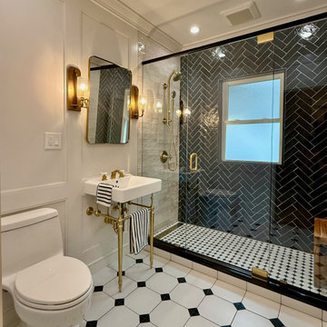
This full bathroom renovation was designed and built around an Art Deco sensibility — a style grounded in the early 20th century’s love of geometric precision, rich material contrast, and architectural detailing that elevates even the most utilitarian spaces. Every element of the carpentry in this room was designed to work as a coherent whole rather than a collection of individual pieces.
Full-height frame-and-panel wainscoting wraps the entire room, running continuous from floor to crown. The paneling was designed with proportions drawn from classical American interior traditions, scaled to the room’s dimensions and detailed to read as architecture rather than decoration. Crown moulding transitions the wainscoting to the ceiling with a clean, room-enclosing profile.
The built-in linen tower — the centerpiece of the storage wall — was fabricated entirely in-house and designed to read as an integral part of the paneling system rather than a freestanding cabinet. Shaker-profiled doors with period-appropriate hardware, adjustable interior shelving, and seamless integration with the surrounding wainscoting and upper panel fields give the unit the appearance of having always been there.
20