
Search results for "Compare limits" in Home Design Ideas
 Irene Designs
Kitchen — Project Description (Bolton, CT)
(Full Renovation • Reconfiguration • Architectural Corrections)
The original kitchen suffered from spatial imbalance and limited functionality: the right side was visually and physically heavy with cabinetry and appliances, the 135-degree angled walls lacked symmetry due to a missing window on the driveway side, and the small island could only seat two. Circulation was obstructed by a desk positioned in the main traffic flow, and the low French door felt disproportionate in scale compared to the large windows and adjacent two-story Great Room.
Major Structural & Functional Improvements
Repositioned window on the front elevation to the right, creating a long-desired view to the driveway while freeing space for a centered cooktop and statement hood — visually aligning with the Great Room’s redesigned fireplace focal wall.
Installed a new custom sliding door, significantly taller and wider than the original French door. This upgrade enhances natural light, visually opens the kitchen to the deck, and provides unobstructed traffic flow thanks to its sliding operation.
New Kitchen Layout & Enhanced Functionality
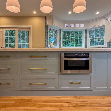
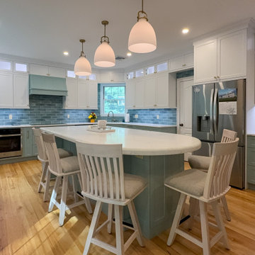
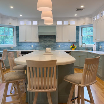
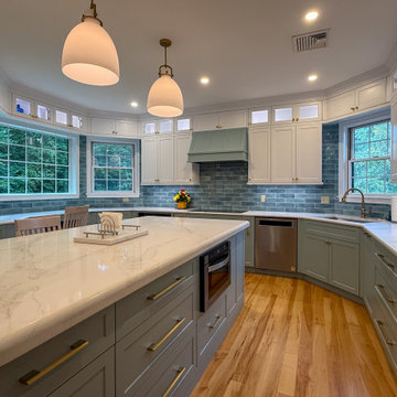
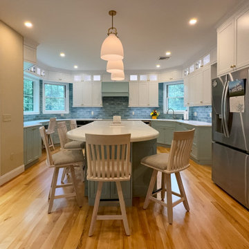
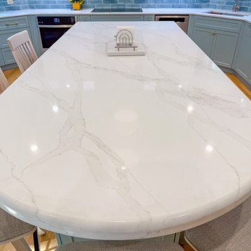
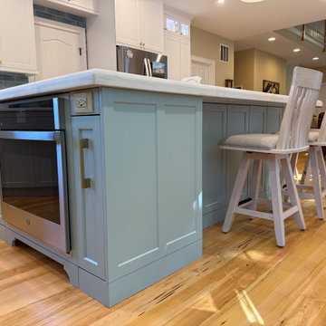
Designed an entirely new layout centered around a 10' double-slab island, providing expansive workspace and a natural gathering zone.
Added conversational seating for the whole family, allowing comfortable interaction on all sides of the island.
Introduced purpose-designed storage solutions, including pullouts, rollouts, spice towers, tray organizers, and deep drawers to maximize usability.
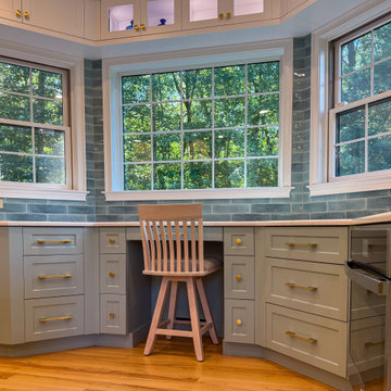
Reallocated the desk area to a dedicated window spot overlooking the backyard, removing it from traffic paths and improving both functionality and comfort.
Cabinetry & Architectural Detailing
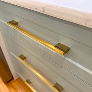
Custom two-tone cabinetry in soft white and a serene blue-green tone reflects the visual language of the adjacent Great Room, creating whole-home cohesion.
Installed lit upper glass cabinets along the entire perimeter, balancing vertical proportions and creating an elegant display band throughout the kitchen.
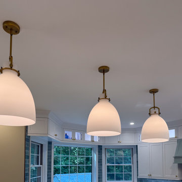
A custom range hood was designed and painted to match the base cabinetry, becoming a focal point framed by symmetrical windows.
Surfaces, Lighting & Finishes
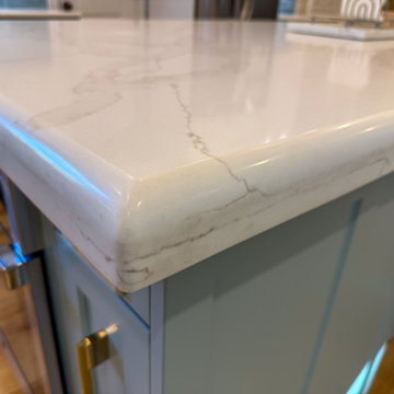
The island features a double-thickness quartz slab with a soft ogee radius for a timeless, furniture-like feel.
A full-height, handcrafted aqua subway tile backsplash introduces depth, texture, and a gentle reflective quality.
New layered lighting concept, including recessed lights, pendants, task lighting, and integrated cabinet lighting, ensures a warm and functional workspace at any time of day.
 Irene Designs
Kitchen — Project Description (Bolton, CT)
(Full Renovation • Reconfiguration • Architectural Corrections)
The original kitchen suffered from spatial imbalance and limited functionality: the right side was visually and physically heavy with cabinetry and appliances, the 135-degree angled walls lacked symmetry due to a missing window on the driveway side, and the small island could only seat two. Circulation was obstructed by a desk positioned in the main traffic flow, and the low French door felt disproportionate in scale compared to the large windows and adjacent two-story Great Room.
Major Structural & Functional Improvements
Repositioned window on the front elevation to the right, creating a long-desired view to the driveway while freeing space for a centered cooktop and statement hood — visually aligning with the Great Room’s redesigned fireplace focal wall.
Installed a new custom sliding door, significantly taller and wider than the original French door. This upgrade enhances natural light, visually opens the kitchen to the deck, and provides unobstructed traffic flow thanks to its sliding operation.
New Kitchen Layout & Enhanced Functionality
Designed an entirely new layout centered around a 10' double-slab island, providing expansive workspace and a natural gathering zone.
Added conversational seating for the whole family, allowing comfortable interaction on all sides of the island.
Introduced purpose-designed storage solutions, including pullouts, rollouts, spice towers, tray organizers, and deep drawers to maximize usability.
Reallocated the desk area to a dedicated window spot overlooking the backyard, removing it from traffic paths and improving both functionality and comfort.
Cabinetry & Architectural Detailing
Custom two-tone cabinetry in soft white and a serene blue-green tone reflects the visual language of the adjacent Great Room, creating whole-home cohesion.
Installed lit upper glass cabinets along the entire perimeter, balancing vertical proportions and creating an elegant display band throughout the kitchen.
A custom range hood was designed and painted to match the base cabinetry, becoming a focal point framed by symmetrical windows.
Surfaces, Lighting & Finishes
The island features a double-thickness quartz slab with a soft ogee radius for a timeless, furniture-like feel.
A full-height, handcrafted aqua subway tile backsplash introduces depth, texture, and a gentle reflective quality.
New layered lighting concept, including recessed lights, pendants, task lighting, and integrated cabinet lighting, ensures a warm and functional workspace at any time of day.
 Irene Designs
Kitchen — Project Description (Bolton, CT)
(Full Renovation • Reconfiguration • Architectural Corrections)
The original kitchen suffered from spatial imbalance and limited functionality: the right side was visually and physically heavy with cabinetry and appliances, the 135-degree angled walls lacked symmetry due to a missing window on the driveway side, and the small island could only seat two. Circulation was obstructed by a desk positioned in the main traffic flow, and the low French door felt disproportionate in scale compared to the large windows and adjacent two-story Great Room.
Major Structural & Functional Improvements
Repositioned window on the front elevation to the right, creating a long-desired view to the driveway while freeing space for a centered cooktop and statement hood — visually aligning with the Great Room’s redesigned fireplace focal wall.
Installed a new custom sliding door, significantly taller and wider than the original French door. This upgrade enhances natural light, visually opens the kitchen to the deck, and provides unobstructed traffic flow thanks to its sliding operation.
New Kitchen Layout & Enhanced Functionality
Designed an entirely new layout centered around a 10' double-slab island, providing expansive workspace and a natural gathering zone.
Added conversational seating for the whole family, allowing comfortable interaction on all sides of the island.
Introduced purpose-designed storage solutions, including pullouts, rollouts, spice towers, tray organizers, and deep drawers to maximize usability.
Reallocated the desk area to a dedicated window spot overlooking the backyard, removing it from traffic paths and improving both functionality and comfort.
Cabinetry & Architectural Detailing
Custom two-tone cabinetry in soft white and a serene blue-green tone reflects the visual language of the adjacent Great Room, creating whole-home cohesion.
Installed lit upper glass cabinets along the entire perimeter, balancing vertical proportions and creating an elegant display band throughout the kitchen.
A custom range hood was designed and painted to match the base cabinetry, becoming a focal point framed by symmetrical windows.
Surfaces, Lighting & Finishes
The island features a double-thickness quartz slab with a soft ogee radius for a timeless, furniture-like feel.
A full-height, handcrafted aqua subway tile backsplash introduces depth, texture, and a gentle reflective quality.
New layered lighting concept, including recessed lights, pendants, task lighting, and integrated cabinet lighting, ensures a warm and functional workspace at any time of day.
Find the right local pro for your project
 Irene Designs
Kitchen — Project Description (Bolton, CT)
(Full Renovation • Reconfiguration • Architectural Corrections)
The original kitchen suffered from spatial imbalance and limited functionality: the right side was visually and physically heavy with cabinetry and appliances, the 135-degree angled walls lacked symmetry due to a missing window on the driveway side, and the small island could only seat two. Circulation was obstructed by a desk positioned in the main traffic flow, and the low French door felt disproportionate in scale compared to the large windows and adjacent two-story Great Room.
Major Structural & Functional Improvements
Repositioned window on the front elevation to the right, creating a long-desired view to the driveway while freeing space for a centered cooktop and statement hood — visually aligning with the Great Room’s redesigned fireplace focal wall.
Installed a new custom sliding door, significantly taller and wider than the original French door. This upgrade enhances natural light, visually opens the kitchen to the deck, and provides unobstructed traffic flow thanks to its sliding operation.
New Kitchen Layout & Enhanced Functionality
Designed an entirely new layout centered around a 10' double-slab island, providing expansive workspace and a natural gathering zone.
Added conversational seating for the whole family, allowing comfortable interaction on all sides of the island.
Introduced purpose-designed storage solutions, including pullouts, rollouts, spice towers, tray organizers, and deep drawers to maximize usability.
Reallocated the desk area to a dedicated window spot overlooking the backyard, removing it from traffic paths and improving both functionality and comfort.
Cabinetry & Architectural Detailing
Custom two-tone cabinetry in soft white and a serene blue-green tone reflects the visual language of the adjacent Great Room, creating whole-home cohesion.
Installed lit upper glass cabinets along the entire perimeter, balancing vertical proportions and creating an elegant display band throughout the kitchen.
A custom range hood was designed and painted to match the base cabinetry, becoming a focal point framed by symmetrical windows.
Surfaces, Lighting & Finishes
The island features a double-thickness quartz slab with a soft ogee radius for a timeless, furniture-like feel.
A full-height, handcrafted aqua subway tile backsplash introduces depth, texture, and a gentle reflective quality.
New layered lighting concept, including recessed lights, pendants, task lighting, and integrated cabinet lighting, ensures a warm and functional workspace at any time of day.
 Irene Designs
Kitchen — Project Description (Bolton, CT)
(Full Renovation • Reconfiguration • Architectural Corrections)
The original kitchen suffered from spatial imbalance and limited functionality: the right side was visually and physically heavy with cabinetry and appliances, the 135-degree angled walls lacked symmetry due to a missing window on the driveway side, and the small island could only seat two. Circulation was obstructed by a desk positioned in the main traffic flow, and the low French door felt disproportionate in scale compared to the large windows and adjacent two-story Great Room.
Major Structural & Functional Improvements
Repositioned window on the front elevation to the right, creating a long-desired view to the driveway while freeing space for a centered cooktop and statement hood — visually aligning with the Great Room’s redesigned fireplace focal wall.
Installed a new custom sliding door, significantly taller and wider than the original French door. This upgrade enhances natural light, visually opens the kitchen to the deck, and provides unobstructed traffic flow thanks to its sliding operation.
New Kitchen Layout & Enhanced Functionality
Designed an entirely new layout centered around a 10' double-slab island, providing expansive workspace and a natural gathering zone.
Added conversational seating for the whole family, allowing comfortable interaction on all sides of the island.
Introduced purpose-designed storage solutions, including pullouts, rollouts, spice towers, tray organizers, and deep drawers to maximize usability.
Reallocated the desk area to a dedicated window spot overlooking the backyard, removing it from traffic paths and improving both functionality and comfort.
Cabinetry & Architectural Detailing
Custom two-tone cabinetry in soft white and a serene blue-green tone reflects the visual language of the adjacent Great Room, creating whole-home cohesion.
Installed lit upper glass cabinets along the entire perimeter, balancing vertical proportions and creating an elegant display band throughout the kitchen.
A custom range hood was designed and painted to match the base cabinetry, becoming a focal point framed by symmetrical windows.
Surfaces, Lighting & Finishes
The island features a double-thickness quartz slab with a soft ogee radius for a timeless, furniture-like feel.
A full-height, handcrafted aqua subway tile backsplash introduces depth, texture, and a gentle reflective quality.
New layered lighting concept, including recessed lights, pendants, task lighting, and integrated cabinet lighting, ensures a warm and functional workspace at any time of day.
 Irene Designs
Kitchen — Project Description (Bolton, CT)
(Full Renovation • Reconfiguration • Architectural Corrections)
The original kitchen suffered from spatial imbalance and limited functionality: the right side was visually and physically heavy with cabinetry and appliances, the 135-degree angled walls lacked symmetry due to a missing window on the driveway side, and the small island could only seat two. Circulation was obstructed by a desk positioned in the main traffic flow, and the low French door felt disproportionate in scale compared to the large windows and adjacent two-story Great Room.
Major Structural & Functional Improvements
Repositioned window on the front elevation to the right, creating a long-desired view to the driveway while freeing space for a centered cooktop and statement hood — visually aligning with the Great Room’s redesigned fireplace focal wall.
Installed a new custom sliding door, significantly taller and wider than the original French door. This upgrade enhances natural light, visually opens the kitchen to the deck, and provides unobstructed traffic flow thanks to its sliding operation.
New Kitchen Layout & Enhanced Functionality
Designed an entirely new layout centered around a 10' double-slab island, providing expansive workspace and a natural gathering zone.
Added conversational seating for the whole family, allowing comfortable interaction on all sides of the island.
Introduced purpose-designed storage solutions, including pullouts, rollouts, spice towers, tray organizers, and deep drawers to maximize usability.
Reallocated the desk area to a dedicated window spot overlooking the backyard, removing it from traffic paths and improving both functionality and comfort.
Cabinetry & Architectural Detailing
Custom two-tone cabinetry in soft white and a serene blue-green tone reflects the visual language of the adjacent Great Room, creating whole-home cohesion.
Installed lit upper glass cabinets along the entire perimeter, balancing vertical proportions and creating an elegant display band throughout the kitchen.
A custom range hood was designed and painted to match the base cabinetry, becoming a focal point framed by symmetrical windows.
Surfaces, Lighting & Finishes
The island features a double-thickness quartz slab with a soft ogee radius for a timeless, furniture-like feel.
A full-height, handcrafted aqua subway tile backsplash introduces depth, texture, and a gentle reflective quality.
New layered lighting concept, including recessed lights, pendants, task lighting, and integrated cabinet lighting, ensures a warm and functional workspace at any time of day.
 Irene Designs
Kitchen — Project Description (Bolton, CT)
(Full Renovation • Reconfiguration • Architectural Corrections)
The original kitchen suffered from spatial imbalance and limited functionality: the right side was visually and physically heavy with cabinetry and appliances, the 135-degree angled walls lacked symmetry due to a missing window on the driveway side, and the small island could only seat two. Circulation was obstructed by a desk positioned in the main traffic flow, and the low French door felt disproportionate in scale compared to the large windows and adjacent two-story Great Room.
Major Structural & Functional Improvements
Repositioned window on the front elevation to the right, creating a long-desired view to the driveway while freeing space for a centered cooktop and statement hood — visually aligning with the Great Room’s redesigned fireplace focal wall.
Installed a new custom sliding door, significantly taller and wider than the original French door. This upgrade enhances natural light, visually opens the kitchen to the deck, and provides unobstructed traffic flow thanks to its sliding operation.
New Kitchen Layout & Enhanced Functionality
Designed an entirely new layout centered around a 10' double-slab island, providing expansive workspace and a natural gathering zone.
Added conversational seating for the whole family, allowing comfortable interaction on all sides of the island.
Introduced purpose-designed storage solutions, including pullouts, rollouts, spice towers, tray organizers, and deep drawers to maximize usability.
Reallocated the desk area to a dedicated window spot overlooking the backyard, removing it from traffic paths and improving both functionality and comfort.
Cabinetry & Architectural Detailing
Custom two-tone cabinetry in soft white and a serene blue-green tone reflects the visual language of the adjacent Great Room, creating whole-home cohesion.
Installed lit upper glass cabinets along the entire perimeter, balancing vertical proportions and creating an elegant display band throughout the kitchen.
A custom range hood was designed and painted to match the base cabinetry, becoming a focal point framed by symmetrical windows.
Surfaces, Lighting & Finishes
The island features a double-thickness quartz slab with a soft ogee radius for a timeless, furniture-like feel.
A full-height, handcrafted aqua subway tile backsplash introduces depth, texture, and a gentle reflective quality.
New layered lighting concept, including recessed lights, pendants, task lighting, and integrated cabinet lighting, ensures a warm and functional workspace at any time of day.
 Irene Designs
Kitchen — Project Description (Bolton, CT)
(Full Renovation • Reconfiguration • Architectural Corrections)
The original kitchen suffered from spatial imbalance and limited functionality: the right side was visually and physically heavy with cabinetry and appliances, the 135-degree angled walls lacked symmetry due to a missing window on the driveway side, and the small island could only seat two. Circulation was obstructed by a desk positioned in the main traffic flow, and the low French door felt disproportionate in scale compared to the large windows and adjacent two-story Great Room.
Major Structural & Functional Improvements
Repositioned window on the front elevation to the right, creating a long-desired view to the driveway while freeing space for a centered cooktop and statement hood — visually aligning with the Great Room’s redesigned fireplace focal wall.
Installed a new custom sliding door, significantly taller and wider than the original French door. This upgrade enhances natural light, visually opens the kitchen to the deck, and provides unobstructed traffic flow thanks to its sliding operation.
New Kitchen Layout & Enhanced Functionality
Designed an entirely new layout centered around a 10' double-slab island, providing expansive workspace and a natural gathering zone.
Added conversational seating for the whole family, allowing comfortable interaction on all sides of the island.
Introduced purpose-designed storage solutions, including pullouts, rollouts, spice towers, tray organizers, and deep drawers to maximize usability.
Reallocated the desk area to a dedicated window spot overlooking the backyard, removing it from traffic paths and improving both functionality and comfort.
Cabinetry & Architectural Detailing
Custom two-tone cabinetry in soft white and a serene blue-green tone reflects the visual language of the adjacent Great Room, creating whole-home cohesion.
Installed lit upper glass cabinets along the entire perimeter, balancing vertical proportions and creating an elegant display band throughout the kitchen.
A custom range hood was designed and painted to match the base cabinetry, becoming a focal point framed by symmetrical windows.
Surfaces, Lighting & Finishes
The island features a double-thickness quartz slab with a soft ogee radius for a timeless, furniture-like feel.
A full-height, handcrafted aqua subway tile backsplash introduces depth, texture, and a gentle reflective quality.
New layered lighting concept, including recessed lights, pendants, task lighting, and integrated cabinet lighting, ensures a warm and functional workspace at any time of day.
 Irene Designs
Kitchen — Project Description (Bolton, CT)
(Full Renovation • Reconfiguration • Architectural Corrections)
The original kitchen suffered from spatial imbalance and limited functionality: the right side was visually and physically heavy with cabinetry and appliances, the 135-degree angled walls lacked symmetry due to a missing window on the driveway side, and the small island could only seat two. Circulation was obstructed by a desk positioned in the main traffic flow, and the low French door felt disproportionate in scale compared to the large windows and adjacent two-story Great Room.
Major Structural & Functional Improvements
Repositioned window on the front elevation to the right, creating a long-desired view to the driveway while freeing space for a centered cooktop and statement hood — visually aligning with the Great Room’s redesigned fireplace focal wall.
Installed a new custom sliding door, significantly taller and wider than the original French door. This upgrade enhances natural light, visually opens the kitchen to the deck, and provides unobstructed traffic flow thanks to its sliding operation.
New Kitchen Layout & Enhanced Functionality
Designed an entirely new layout centered around a 10' double-slab island, providing expansive workspace and a natural gathering zone.
Added conversational seating for the whole family, allowing comfortable interaction on all sides of the island.
Introduced purpose-designed storage solutions, including pullouts, rollouts, spice towers, tray organizers, and deep drawers to maximize usability.
Reallocated the desk area to a dedicated window spot overlooking the backyard, removing it from traffic paths and improving both functionality and comfort.
Cabinetry & Architectural Detailing
Custom two-tone cabinetry in soft white and a serene blue-green tone reflects the visual language of the adjacent Great Room, creating whole-home cohesion.
Installed lit upper glass cabinets along the entire perimeter, balancing vertical proportions and creating an elegant display band throughout the kitchen.
A custom range hood was designed and painted to match the base cabinetry, becoming a focal point framed by symmetrical windows.
Surfaces, Lighting & Finishes
The island features a double-thickness quartz slab with a soft ogee radius for a timeless, furniture-like feel.
A full-height, handcrafted aqua subway tile backsplash introduces depth, texture, and a gentle reflective quality.
New layered lighting concept, including recessed lights, pendants, task lighting, and integrated cabinet lighting, ensures a warm and functional workspace at any time of day.
 Irene Designs
Kitchen — Project Description (Bolton, CT)
(Full Renovation • Reconfiguration • Architectural Corrections)
The original kitchen suffered from spatial imbalance and limited functionality: the right side was visually and physically heavy with cabinetry and appliances, the 135-degree angled walls lacked symmetry due to a missing window on the driveway side, and the small island could only seat two. Circulation was obstructed by a desk positioned in the main traffic flow, and the low French door felt disproportionate in scale compared to the large windows and adjacent two-story Great Room.
Major Structural & Functional Improvements
Repositioned window on the front elevation to the right, creating a long-desired view to the driveway while freeing space for a centered cooktop and statement hood — visually aligning with the Great Room’s redesigned fireplace focal wall.
Installed a new custom sliding door, significantly taller and wider than the original French door. This upgrade enhances natural light, visually opens the kitchen to the deck, and provides unobstructed traffic flow thanks to its sliding operation.
New Kitchen Layout & Enhanced Functionality
Designed an entirely new layout centered around a 10' double-slab island, providing expansive workspace and a natural gathering zone.
Added conversational seating for the whole family, allowing comfortable interaction on all sides of the island.
Introduced purpose-designed storage solutions, including pullouts, rollouts, spice towers, tray organizers, and deep drawers to maximize usability.
Reallocated the desk area to a dedicated window spot overlooking the backyard, removing it from traffic paths and improving both functionality and comfort.
Cabinetry & Architectural Detailing
Custom two-tone cabinetry in soft white and a serene blue-green tone reflects the visual language of the adjacent Great Room, creating whole-home cohesion.
Installed lit upper glass cabinets along the entire perimeter, balancing vertical proportions and creating an elegant display band throughout the kitchen.
A custom range hood was designed and painted to match the base cabinetry, becoming a focal point framed by symmetrical windows.
Surfaces, Lighting & Finishes
The island features a double-thickness quartz slab with a soft ogee radius for a timeless, furniture-like feel.
A full-height, handcrafted aqua subway tile backsplash introduces depth, texture, and a gentle reflective quality.
New layered lighting concept, including recessed lights, pendants, task lighting, and integrated cabinet lighting, ensures a warm and functional workspace at any time of day.
 Irene Designs
Kitchen — Project Description (Bolton, CT)
(Full Renovation • Reconfiguration • Architectural Corrections)
The original kitchen suffered from spatial imbalance and limited functionality: the right side was visually and physically heavy with cabinetry and appliances, the 135-degree angled walls lacked symmetry due to a missing window on the driveway side, and the small island could only seat two. Circulation was obstructed by a desk positioned in the main traffic flow, and the low French door felt disproportionate in scale compared to the large windows and adjacent two-story Great Room.
Major Structural & Functional Improvements
Repositioned window on the front elevation to the right, creating a long-desired view to the driveway while freeing space for a centered cooktop and statement hood — visually aligning with the Great Room’s redesigned fireplace focal wall.
Installed a new custom sliding door, significantly taller and wider than the original French door. This upgrade enhances natural light, visually opens the kitchen to the deck, and provides unobstructed traffic flow thanks to its sliding operation.
New Kitchen Layout & Enhanced Functionality
Designed an entirely new layout centered around a 10' double-slab island, providing expansive workspace and a natural gathering zone.
Added conversational seating for the whole family, allowing comfortable interaction on all sides of the island.
Introduced purpose-designed storage solutions, including pullouts, rollouts, spice towers, tray organizers, and deep drawers to maximize usability.
Reallocated the desk area to a dedicated window spot overlooking the backyard, removing it from traffic paths and improving both functionality and comfort.
Cabinetry & Architectural Detailing
Custom two-tone cabinetry in soft white and a serene blue-green tone reflects the visual language of the adjacent Great Room, creating whole-home cohesion.
Installed lit upper glass cabinets along the entire perimeter, balancing vertical proportions and creating an elegant display band throughout the kitchen.
A custom range hood was designed and painted to match the base cabinetry, becoming a focal point framed by symmetrical windows.
Surfaces, Lighting & Finishes
The island features a double-thickness quartz slab with a soft ogee radius for a timeless, furniture-like feel.
A full-height, handcrafted aqua subway tile backsplash introduces depth, texture, and a gentle reflective quality.
New layered lighting concept, including recessed lights, pendants, task lighting, and integrated cabinet lighting, ensures a warm and functional workspace at any time of day.

 Dianne Davant and Associates
Master Bedroom with Red Bed Frame and custom drapery and bedding.
Bedroom - traditional master light wood floor bedroom idea in Charlotte
Bedroom - traditional master light wood floor bedroom idea in Charlotte

 Highland Builders LLC
Powder room with glam geometric wallpaper complimented with a vessel sink rustic vanity with riveted hardware. Counter top is quartz Viatera - Truffle. Mirror framed wall mirror.
Ryan Hainey
 Inhabit | Space
Whon Photography
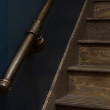
Large urban underground carpeted staircase photo in Indianapolis with gray walls and no fireplace
Large urban underground carpeted staircase photo in Indianapolis with gray walls and no fireplace
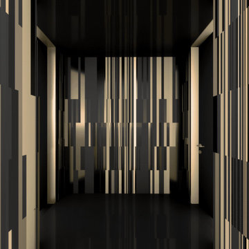
 KURV Architecture DPC (Alex Hughes Architects)
Located in the heart of Manhattan’s Lower East Side, the building was erected on a shallow commercial lot between two 120 year old masonry buildings and a new residential rental building. 330 Grand Street is a mix of 725 SF 1BRs and 1050 SF 2BR apartments. It also contains a 1100 SF two story duplex as well as private and public rooftop space, large private balconies for most units and two large private terraces for the ground floor units.
330 Grand Street was originally designed and approved at the NYC DOB as a prefabricated modular building. During the pandemic, as shipping costs skyrocketed putting the project at risk, we suggested redesigning the building as a reinforced cast-in-place concrete structure. Concrete was readily available and prices had not been affected by the demand increase that many other materials suffered in the pandemic. We took this opportunity to raise floor to ceiling heights, enlarge high performance windows and redistribute the buildings MEPFS and Structural Systems to create very open floor plans.
The challenge was to create a luxurious sensorial living experience with very limited means. In a city with very high construction costs, low cost residential buildings in the area are usually devoid of good quality, design and character. Our approach was to aim high for the end user, prioritizing natural light, open space with long visual perspectives, high ceilings and as always, rejecting the use of predefined building templates.
Our biggest challenge was to ensure that the small spaces feel as clean cut, large and bright as possible. Several unique design decisions were made to ensure low cost and high quality;
Floor plans were laid out so that spaces were wide open and free of clutter from mechanical or structural interruptions. Therefore all infrastructure was placed in lateral demising walls, which in turn act as the unit’s storage and kitchen. The apartments feel wide open, are super quiet and have more storage space than any other comparable apartment in the city.
To solve the problem of the site’s shallow commercial lot which is typically prone to dark interior spaces we focused our attention on the building’s envelope. Instead of the usual small punched window openings, oversized high performance windows were designed to ensure that light penetrated as far as possible into the units. In the smaller 1BR units, the full 50’ depth of the lot is perceived by partitioning spaces with sliding pocket doors that can be retracted to allow deep visual perspectives, making the sight lines in the space feel longer, larger, more ample than normal. In addition to the full height glazing, each unit above the 2nd floor receives a 7 foot covered balcony, adding 120 to 240 sf to each apartment, something unusual in New York City buildings. The space is large enough for a full size dining table, when the weather permits being outside.
We also worked hard to ensure modularity. For example, all kitchen units are all identical throughout the building. The idea of modularity and the economy of the repetitive unit is exercised to the maximum through the building.
Hardware, appliances, flooring, wall coverings and material finishes are all carefully selected to feel bespoke, high quality and unique.
It was important to KURV that the result of this work manifest into something that would deeply connect with the end user and sustain relationships with the consumers of this space.
All images by KURV Architecture ©
 InnovationLand
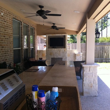
This outdoor media room and kitchen had to meet the needs of a Houston family needing kid space and adult space.
The kids wanted an outdoor audio visual area watch TV and movies. The grownups wanted an outdoor kitchen, bar and grilling area where they could enjoy themselves while watching the kids. And they all wanted a covered patio with places to sit between dips in the pool.
However, the family had very limited space between the back of their house and their pool, and no room for anything in either of the side yards:
Stringent homeowner association rules also required that any home modifications match the existing home's architecture, color and finishing materials. The pitch of the roof also had to be such that it didn't overlap the bottom of the second-story windows above.
So here's what we came up with: A 40-foot-long by 11-foot- deep roof extension off the back of the house (longer than most, but with good engineering specs and design work, we were able to preserve the structural integrity):
At one end of the covered patio below is a 12-foot by 8-foot outdoor living room with a custom audio-visual cabinet. At the other is an L-shaped, 8-foot-square outdoor kitchen island with a built-in commercial-grade RCS grill, a 4-by-8-foot outdoor refrigerator and a outdoor icemaker.
Keeping in line with the existing home's beige siding, white trim and brown accent façade, we helped the homeowner choose appropriate finishing materials: Austin Western limestone (mostly white with beige accents) for the TV cabinet, kitchen island and column supports; Old English travertine (beige) for the countertops) and white, fluted columns.
The Old English travertine countertop has a raised back for a bar with counter seating. The diamond-pattern tile backsplash also features inset fleur de lis accents.
The family is more than pleased with the results - two outdoor rooms with two different functions - all within the same covered outdoor living space!
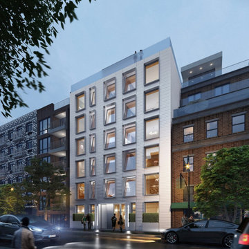 KURV Architecture DPC (Alex Hughes Architects)
Located in the heart of Manhattan’s Lower East Side, the building was erected on a shallow commercial lot between two 120 year old masonry buildings and a new residential rental building. 330 Grand Street is a mix of 725 SF 1BRs and 1050 SF 2BR apartments. It also contains a 1100 SF two story duplex as well as private and public rooftop space, large private balconies for most units and two large private terraces for the ground floor units.
330 Grand Street was originally designed and approved at the NYC DOB as a prefabricated modular building. During the pandemic, as shipping costs skyrocketed putting the project at risk, we suggested redesigning the building as a reinforced cast-in-place concrete structure. Concrete was readily available and prices had not been affected by the demand increase that many other materials suffered in the pandemic. We took this opportunity to raise floor to ceiling heights, enlarge high performance windows and redistribute the buildings MEPFS and Structural Systems to create very open floor plans.
The challenge was to create a luxurious sensorial living experience with very limited means. In a city with very high construction costs, low cost residential buildings in the area are usually devoid of good quality, design and character. Our approach was to aim high for the end user, prioritizing natural light, open space with long visual perspectives, high ceilings and as always, rejecting the use of predefined building templates.
Our biggest challenge was to ensure that the small spaces feel as clean cut, large and bright as possible. Several unique design decisions were made to ensure low cost and high quality;
Floor plans were laid out so that spaces were wide open and free of clutter from mechanical or structural interruptions. Therefore all infrastructure was placed in lateral demising walls, which in turn act as the unit’s storage and kitchen. The apartments feel wide open, are super quiet and have more storage space than any other comparable apartment in the city.
To solve the problem of the site’s shallow commercial lot which is typically prone to dark interior spaces we focused our attention on the building’s envelope. Instead of the usual small punched window openings, oversized high performance windows were designed to ensure that light penetrated as far as possible into the units. In the smaller 1BR units, the full 50’ depth of the lot is perceived by partitioning spaces with sliding pocket doors that can be retracted to allow deep visual perspectives, making the sight lines in the space feel longer, larger, more ample than normal. In addition to the full height glazing, each unit above the 2nd floor receives a 7 foot covered balcony, adding 120 to 240 sf to each apartment, something unusual in New York City buildings. The space is large enough for a full size dining table, when the weather permits being outside.
We also worked hard to ensure modularity. For example, all kitchen units are all identical throughout the building. The idea of modularity and the economy of the repetitive unit is exercised to the maximum through the building.
Hardware, appliances, flooring, wall coverings and material finishes are all carefully selected to feel bespoke, high quality and unique.
It was important to KURV that the result of this work manifest into something that would deeply connect with the end user and sustain relationships with the consumers of this space.
All images by KURV Architecture ©
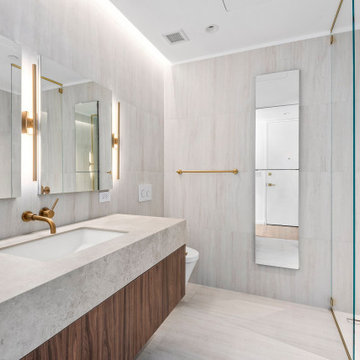 KURV Architecture DPC (Alex Hughes Architects)
Located in the heart of Manhattan’s Lower East Side, the building was erected on a shallow commercial lot between two 120 year old masonry buildings and a new residential rental building. 330 Grand Street is a mix of 725 SF 1BRs and 1050 SF 2BR apartments. It also contains a 1100 SF two story duplex as well as private and public rooftop space, large private balconies for most units and two large private terraces for the ground floor units.
330 Grand Street was originally designed and approved at the NYC DOB as a prefabricated modular building. During the pandemic, as shipping costs skyrocketed putting the project at risk, we suggested redesigning the building as a reinforced cast-in-place concrete structure. Concrete was readily available and prices had not been affected by the demand increase that many other materials suffered in the pandemic. We took this opportunity to raise floor to ceiling heights, enlarge high performance windows and redistribute the buildings MEPFS and Structural Systems to create very open floor plans.
The challenge was to create a luxurious sensorial living experience with very limited means. In a city with very high construction costs, low cost residential buildings in the area are usually devoid of good quality, design and character. Our approach was to aim high for the end user, prioritizing natural light, open space with long visual perspectives, high ceilings and as always, rejecting the use of predefined building templates.
Our biggest challenge was to ensure that the small spaces feel as clean cut, large and bright as possible. Several unique design decisions were made to ensure low cost and high quality;
Floor plans were laid out so that spaces were wide open and free of clutter from mechanical or structural interruptions. Therefore all infrastructure was placed in lateral demising walls, which in turn act as the unit’s storage and kitchen. The apartments feel wide open, are super quiet and have more storage space than any other comparable apartment in the city.
To solve the problem of the site’s shallow commercial lot which is typically prone to dark interior spaces we focused our attention on the building’s envelope. Instead of the usual small punched window openings, oversized high performance windows were designed to ensure that light penetrated as far as possible into the units. In the smaller 1BR units, the full 50’ depth of the lot is perceived by partitioning spaces with sliding pocket doors that can be retracted to allow deep visual perspectives, making the sight lines in the space feel longer, larger, more ample than normal. In addition to the full height glazing, each unit above the 2nd floor receives a 7 foot covered balcony, adding 120 to 240 sf to each apartment, something unusual in New York City buildings. The space is large enough for a full size dining table, when the weather permits being outside.
We also worked hard to ensure modularity. For example, all kitchen units are all identical throughout the building. The idea of modularity and the economy of the repetitive unit is exercised to the maximum through the building.
Hardware, appliances, flooring, wall coverings and material finishes are all carefully selected to feel bespoke, high quality and unique.
It was important to KURV that the result of this work manifest into something that would deeply connect with the end user and sustain relationships with the consumers of this space.
All images by KURV Architecture ©
 KURV Architecture DPC (Alex Hughes Architects)
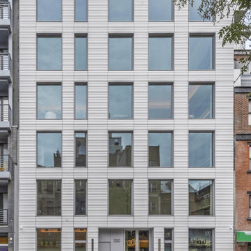
Located in the heart of Manhattan’s Lower East Side, the building was erected on a shallow commercial lot between two 120 year old masonry buildings and a new residential rental building. 330 Grand Street is a mix of 725 SF 1BRs and 1050 SF 2BR apartments. It also contains a 1100 SF two story duplex as well as private and public rooftop space, large private balconies for most units and two large private terraces for the ground floor units.
330 Grand Street was originally designed and approved at the NYC DOB as a prefabricated modular building. During the pandemic, as shipping costs skyrocketed putting the project at risk, we suggested redesigning the building as a reinforced cast-in-place concrete structure. Concrete was readily available and prices had not been affected by the demand increase that many other materials suffered in the pandemic. We took this opportunity to raise floor to ceiling heights, enlarge high performance windows and redistribute the buildings MEPFS and Structural Systems to create very open floor plans.
The challenge was to create a luxurious sensorial living experience with very limited means. In a city with very high construction costs, low cost residential buildings in the area are usually devoid of good quality, design and character. Our approach was to aim high for the end user, prioritizing natural light, open space with long visual perspectives, high ceilings and as always, rejecting the use of predefined building templates.
Our biggest challenge was to ensure that the small spaces feel as clean cut, large and bright as possible. Several unique design decisions were made to ensure low cost and high quality;
Floor plans were laid out so that spaces were wide open and free of clutter from mechanical or structural interruptions. Therefore all infrastructure was placed in lateral demising walls, which in turn act as the unit’s storage and kitchen. The apartments feel wide open, are super quiet and have more storage space than any other comparable apartment in the city.
To solve the problem of the site’s shallow commercial lot which is typically prone to dark interior spaces we focused our attention on the building’s envelope. Instead of the usual small punched window openings, oversized high performance windows were designed to ensure that light penetrated as far as possible into the units. In the smaller 1BR units, the full 50’ depth of the lot is perceived by partitioning spaces with sliding pocket doors that can be retracted to allow deep visual perspectives, making the sight lines in the space feel longer, larger, more ample than normal. In addition to the full height glazing, each unit above the 2nd floor receives a 7 foot covered balcony, adding 120 to 240 sf to each apartment, something unusual in New York City buildings. The space is large enough for a full size dining table, when the weather permits being outside.
We also worked hard to ensure modularity. For example, all kitchen units are all identical throughout the building. The idea of modularity and the economy of the repetitive unit is exercised to the maximum through the building.
Hardware, appliances, flooring, wall coverings and material finishes are all carefully selected to feel bespoke, high quality and unique.
It was important to KURV that the result of this work manifest into something that would deeply connect with the end user and sustain relationships with the consumers of this space.
All images by KURV Architecture ©
 KURV Architecture DPC (Alex Hughes Architects)
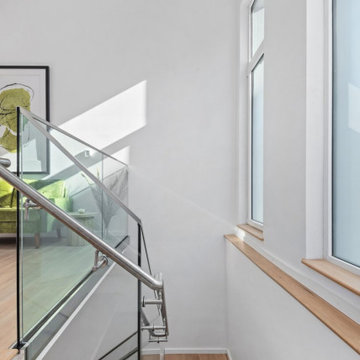
Located in the heart of Manhattan’s Lower East Side, the building was erected on a shallow commercial lot between two 120 year old masonry buildings and a new residential rental building. 330 Grand Street is a mix of 725 SF 1BRs and 1050 SF 2BR apartments. It also contains a 1100 SF two story duplex as well as private and public rooftop space, large private balconies for most units and two large private terraces for the ground floor units.
330 Grand Street was originally designed and approved at the NYC DOB as a prefabricated modular building. During the pandemic, as shipping costs skyrocketed putting the project at risk, we suggested redesigning the building as a reinforced cast-in-place concrete structure. Concrete was readily available and prices had not been affected by the demand increase that many other materials suffered in the pandemic. We took this opportunity to raise floor to ceiling heights, enlarge high performance windows and redistribute the buildings MEPFS and Structural Systems to create very open floor plans.
The challenge was to create a luxurious sensorial living experience with very limited means. In a city with very high construction costs, low cost residential buildings in the area are usually devoid of good quality, design and character. Our approach was to aim high for the end user, prioritizing natural light, open space with long visual perspectives, high ceilings and as always, rejecting the use of predefined building templates.
Our biggest challenge was to ensure that the small spaces feel as clean cut, large and bright as possible. Several unique design decisions were made to ensure low cost and high quality;
Floor plans were laid out so that spaces were wide open and free of clutter from mechanical or structural interruptions. Therefore all infrastructure was placed in lateral demising walls, which in turn act as the unit’s storage and kitchen. The apartments feel wide open, are super quiet and have more storage space than any other comparable apartment in the city.
To solve the problem of the site’s shallow commercial lot which is typically prone to dark interior spaces we focused our attention on the building’s envelope. Instead of the usual small punched window openings, oversized high performance windows were designed to ensure that light penetrated as far as possible into the units. In the smaller 1BR units, the full 50’ depth of the lot is perceived by partitioning spaces with sliding pocket doors that can be retracted to allow deep visual perspectives, making the sight lines in the space feel longer, larger, more ample than normal. In addition to the full height glazing, each unit above the 2nd floor receives a 7 foot covered balcony, adding 120 to 240 sf to each apartment, something unusual in New York City buildings. The space is large enough for a full size dining table, when the weather permits being outside.
We also worked hard to ensure modularity. For example, all kitchen units are all identical throughout the building. The idea of modularity and the economy of the repetitive unit is exercised to the maximum through the building.
Hardware, appliances, flooring, wall coverings and material finishes are all carefully selected to feel bespoke, high quality and unique.
It was important to KURV that the result of this work manifest into something that would deeply connect with the end user and sustain relationships with the consumers of this space.
All images by KURV Architecture ©
8