
Search results for "Comparing multiple" in Home Design Ideas
 Mamaar Studio
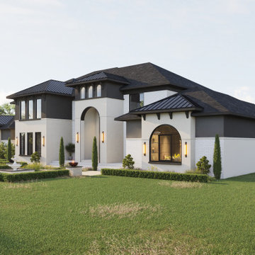
This luxury transitional residence was visualized to help the client evaluate and finalize the exterior material palette and landscape design before construction. The project focused on exploring various combinations of finishes, allowing the client to compare different design directions and understand how each choice would influence the overall character of the home.
Throughout the design process, multiple options were tested for the roofing materials, exterior wall finishes, and window trims. These visualizations provided a clear representation of the subtle differences in texture, color, and architectural expression, helping the client make confident design decisions.
The version presented here is the final selected scheme, combining timeless materials with refined detailing to create a sophisticated and elegant appearance that perfectly complements the home's transitional architecture.
The project was modeled in SketchUp and rendered using D5 Render, delivering high-quality visuals that streamlined the material selection process and brought the design vision to life.
 TVL Creative Ltd.
Cramped kitchen be gone! That was the project motto and top priority. The goal was to transform the current layout from multiple smaller spaces into a connected whole that would activate the main level for our clients, a young family of four.
The biggest obstacle was the wall dividing the kitchen and the dining room. Removing this wall was central to opening up and integrating the main living spaces, but the existing ductwork that ran right through the center of the wall posed a design challenge, er design opportunity. The resulting design solution features a central pantry that captures the ductwork and provides valuable storage- especially when compared to the original kitchen's 18" wide pantry cabinet. The pantry also anchors the kitchen island and serves as a visual separation of space between the kitchen and homework area.
Through our design development process, we learned the formal living room was of no service to their lifestyle and therefore space they rarely spent time in. With that in mind, we proposed to eliminate the unused living room and make it the new dining room. Relocating the dining room to this space inherently felt right given the soaring ceiling and ample room for holiday dinners and celebrations. The new dining room was spacious enough for us to incorporate a conversational seating area in the warm, south-facing window alcove.
Now what to do with the old dining room?! To answer that question we took inspiration from our clients' shared profession in education and developed a craft area/homework station for both of their boys. The semi-custom cabinetry of the desk area carries over to the adjacent wall and forms window bench base with storage that we topped with butcher block for a touch of warmth. While the boys are young, the bench drawers are the perfect place for a stash of toys close to the kitchen.
The kitchen begins just beyond the window seat with their refrigerator enclosure. Opposite the refrigerator is the new pantry with twenty linear feet of shelving and space for brooms and a stick vacuum. Extending from the backside of the pantry the kitchen island design incorporates counter seating on the family room side and a cabinetry configuration on the kitchen side with drawer storage, a trashcan center, farmhouse sink, and dishwasher.
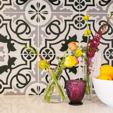
We took careful time in design and execution to align the range and sink because while it might seem like a small detail, it plays an important role in supporting the symmetrical configuration of the back wall of the kitchen. The rear wall design utilizes an appliance garage mirrors the visual impact of the refrigerator enclosure and helps keep the now open kitchen tidy. Between the appliance garage and refrigerator enclosure is the cooking zone with 30" of cabinetry and work surface on either side of the range, a chimney style vent hood, and a bold graphic tile backsplash.
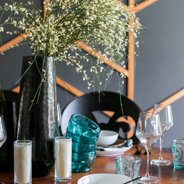
The backsplash is just one of many personal touches we added to the space to reflect our client's modern eclectic style and love of color. Swooping lines of the mid-mod style barstools compliment the pendants and backsplash pattern. A pop of vibrant green on the frame of the pantry door adds a fresh wash of color to an otherwise neutral space. The big show stopper is the custom charcoal gray and copper chevron wall installation in the dining room. This was an idea our clients softly suggested, and we excitedly embraced the opportunity. It is also a kickass solution to the head-scratching design dilemma of how to fill a large and lofty wall.
We are so grateful to bring this design to life for our clients and now dear friends.
 TVL Creative Ltd.
Cramped kitchen be gone! That was the project motto and top priority. The goal was to transform the current layout from multiple smaller spaces into a connected whole that would activate the main level for our clients, a young family of four.
The biggest obstacle was the wall dividing the kitchen and the dining room. Removing this wall was central to opening up and integrating the main living spaces, but the existing ductwork that ran right through the center of the wall posed a design challenge, er design opportunity. The resulting design solution features a central pantry that captures the ductwork and provides valuable storage- especially when compared to the original kitchen's 18" wide pantry cabinet. The pantry also anchors the kitchen island and serves as a visual separation of space between the kitchen and homework area.
Through our design development process, we learned the formal living room was of no service to their lifestyle and therefore space they rarely spent time in. With that in mind, we proposed to eliminate the unused living room and make it the new dining room. Relocating the dining room to this space inherently felt right given the soaring ceiling and ample room for holiday dinners and celebrations. The new dining room was spacious enough for us to incorporate a conversational seating area in the warm, south-facing window alcove.
Now what to do with the old dining room?! To answer that question we took inspiration from our clients' shared profession in education and developed a craft area/homework station for both of their boys. The semi-custom cabinetry of the desk area carries over to the adjacent wall and forms window bench base with storage that we topped with butcher block for a touch of warmth. While the boys are young, the bench drawers are the perfect place for a stash of toys close to the kitchen.
The kitchen begins just beyond the window seat with their refrigerator enclosure. Opposite the refrigerator is the new pantry with twenty linear feet of shelving and space for brooms and a stick vacuum. Extending from the backside of the pantry the kitchen island design incorporates counter seating on the family room side and a cabinetry configuration on the kitchen side with drawer storage, a trashcan center, farmhouse sink, and dishwasher.
We took careful time in design and execution to align the range and sink because while it might seem like a small detail, it plays an important role in supporting the symmetrical configuration of the back wall of the kitchen. The rear wall design utilizes an appliance garage mirrors the visual impact of the refrigerator enclosure and helps keep the now open kitchen tidy. Between the appliance garage and refrigerator enclosure is the cooking zone with 30" of cabinetry and work surface on either side of the range, a chimney style vent hood, and a bold graphic tile backsplash.
The backsplash is just one of many personal touches we added to the space to reflect our client's modern eclectic style and love of color. Swooping lines of the mid-mod style barstools compliment the pendants and backsplash pattern. A pop of vibrant green on the frame of the pantry door adds a fresh wash of color to an otherwise neutral space. The big show stopper is the custom charcoal gray and copper chevron wall installation in the dining room. This was an idea our clients softly suggested, and we excitedly embraced the opportunity. It is also a kickass solution to the head-scratching design dilemma of how to fill a large and lofty wall.
We are so grateful to bring this design to life for our clients and now dear friends.
Find the right local pro for your project
 DeVance Electronic Lifestyle
Suad Bejtovic
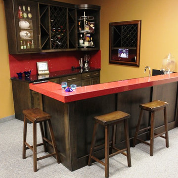
The DeVance Team has collaborated with various synergistic partners in order to create a one-of-a-kind ‘Experience Center’ in the North Dallas corridor. This Electronic Lifestyle facility has quickly become a savvy social and entertaining environment; set up to demonstrate just a few things one can do in their home or office to enhance their quality of life through the use of technology. Guests are dazzled by a plethora of custom electronic selections, incorporated into the latest technology in a cozy, yet high-end residential-style environment. The entire space is home to dozens of custom paintings by local artists and master-crafted wood works and built in cabinetry. The reception area is complimented with a 55” custom designed Art Screen TV with retractable art that rolls up into a motorized casing to reveal a 4K TV screen. The additional spaces show beautifully, with a modern family room, a sophisticated entertainment lounge, and fully functional, stocked wet bar. An acoustically treated 2-Channel listening room houses the finest in McIntosh audio equipment complete with a turntable. This room was designed for vinyl record or streaming music for ‘audiophile enthusiasts.’ The DeVance 18 seat movie theater boasts a state-of-the-art perforated ten foot screen, JBL Synthesis 7.1 surround sound system and crystal clear Runco projection system. Guests enjoy luxurious motorized leather theater seating complete with warm throws and leather ottomans for comfortable movie viewing. The DeVance restrooms continue the Electronic Lifestyle theme on a more personal level, as they are equipped with the top of the line sensor faucets and sinks by TOTO USA, Electric Mirror TVs and the ‘cleaner and greener’ electronic TOTO USA Washlets!
The ultimate vision for the DeVance Experience was to create an environment unlike any retail storefront or big box shop, where a unique and exciting experience awaits existing and prospective clients, guests, trade partners and business associates. Collaborating partners are encouraged to utilize the space as a mini-custom showroom of their own; accessing a relaxing environment to lay out clients’ space plans and select samples for custom countertops, specialized cabinet designs, fabrics, paint, carpets, etc. Essentially, The DeVance Experience Center is the hottest design/build/electronic lifestyle showroom around, lending a whole new meaning to “industry partnerships!” Based on current knowledge, there is no other showroom that is comparable.
The layout of the new Experience Center was designed specifically for event marketing. To name a few, continuing education classes and training seminars for builders, remodelers, architects, and interior designers, professional meet up groups and local business functions. Private client tours, relationship appreciation functions, sports and movie watching parties are just a smattering of the promotional campaign lineup. The center provides a professional, yet relaxing and entertaining venue for professional industry trade gatherings and events.
The Experience Center offers a showcase for user-friendly automation and control and variety of electronic lifestyle systems throughout the space via the use of an iPhone, iPad or smart tablet. With ease and elegance, guests may choose to control the lighting, shades and draperies, thermostats, whole house music, multiple televisions and video displays (many of which are concealed behind beautifully framed artwork). Mimicking many of the latest possibilities for the high-end homeowner, all of this in a comfortable and luxurious environment that makes them feel right at home!
Showroom Exchange Partners include woodworking cabinetry Concepts Realized by Walt Ring, custom artwork by Mark Whitmarsh, Ric Falster, Dawn Cleaves, and Jenny Williamson. Theater millwork interiors by Mancave DFW, custom theater seating, leather furnishings, and wood tables by Touch of France, Silestone surfaces by Cosentino USA, stone fabrication services by A-A Marble also contributing exotic granite vanity tops, faucets, sinks and toilets by TOTO USA, and Kane theater carpeting by Natural Selections.
 TVL Creative Ltd.
Cramped kitchen be gone! That was the project motto and top priority. The goal was to transform the current layout from multiple smaller spaces into a connected whole that would activate the main level for our clients, a young family of four.
The biggest obstacle was the wall dividing the kitchen and the dining room. Removing this wall was central to opening up and integrating the main living spaces, but the existing ductwork that ran right through the center of the wall posed a design challenge, er design opportunity. The resulting design solution features a central pantry that captures the ductwork and provides valuable storage- especially when compared to the original kitchen's 18" wide pantry cabinet. The pantry also anchors the kitchen island and serves as a visual separation of space between the kitchen and homework area.
Through our design development process, we learned the formal living room was of no service to their lifestyle and therefore space they rarely spent time in. With that in mind, we proposed to eliminate the unused living room and make it the new dining room. Relocating the dining room to this space inherently felt right given the soaring ceiling and ample room for holiday dinners and celebrations. The new dining room was spacious enough for us to incorporate a conversational seating area in the warm, south-facing window alcove.
Now what to do with the old dining room?! To answer that question we took inspiration from our clients' shared profession in education and developed a craft area/homework station for both of their boys. The semi-custom cabinetry of the desk area carries over to the adjacent wall and forms window bench base with storage that we topped with butcher block for a touch of warmth. While the boys are young, the bench drawers are the perfect place for a stash of toys close to the kitchen.
The kitchen begins just beyond the window seat with their refrigerator enclosure. Opposite the refrigerator is the new pantry with twenty linear feet of shelving and space for brooms and a stick vacuum. Extending from the backside of the pantry the kitchen island design incorporates counter seating on the family room side and a cabinetry configuration on the kitchen side with drawer storage, a trashcan center, farmhouse sink, and dishwasher.
We took careful time in design and execution to align the range and sink because while it might seem like a small detail, it plays an important role in supporting the symmetrical configuration of the back wall of the kitchen. The rear wall design utilizes an appliance garage mirrors the visual impact of the refrigerator enclosure and helps keep the now open kitchen tidy. Between the appliance garage and refrigerator enclosure is the cooking zone with 30" of cabinetry and work surface on either side of the range, a chimney style vent hood, and a bold graphic tile backsplash.
The backsplash is just one of many personal touches we added to the space to reflect our client's modern eclectic style and love of color. Swooping lines of the mid-mod style barstools compliment the pendants and backsplash pattern. A pop of vibrant green on the frame of the pantry door adds a fresh wash of color to an otherwise neutral space. The big show stopper is the custom charcoal gray and copper chevron wall installation in the dining room. This was an idea our clients softly suggested, and we excitedly embraced the opportunity. It is also a kickass solution to the head-scratching design dilemma of how to fill a large and lofty wall.
We are so grateful to bring this design to life for our clients and now dear friends.
 Van Zelst Inc
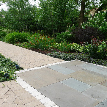
Multiple paths meet to form a type of garden landing. The landing is bluestone lined in natural Valders cobble stone. The path is tumbled concrete pavers. Photo by Terra Jenkins and Kirsten Gentry
 Reico Kitchen & Bath
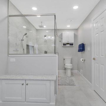
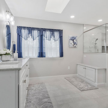
Jen Denham of Reico Kitchen and Bath in White Plains, MD collaborated with Personal Touch Installation to design a transitional style inspired primary bathroom featuring Merillat Classic Cabinetry.
The vanity cabinets are the Fox Harbor door style in Maple with a Cotton finish with MSI Q Galant Gray vanity countertops.
The bathroom includes Nashville Bianco Coveland gloss shower wall tile, Nashville Moss Greige shower floor tile and Ceracasa Filita White floor tile.
“Jennifer was absolutely fantastic; we couldn’t ask for anyone better. She made suggestions, listened to concerns, answered questions, and was exceptionally patient through multiple color changes. We never felt rushed to make a decision. Having previously worked with Jen on a complete remodel, it was an easy decision to return for our bath project," said the client.
“The master bath was original to the house and was chopped up into two rooms, a huge wasted area for a giant soaker tub that was never used and small cramped spot for their shower toilet and vanity,” said Jen.
"We all agreed that the design didn't quite fit their needs. After exploring several options, we settled on a spacious shower with aging-in-place features like a bench and handheld. We added more storage with the large vanity and bench off the back end of the shower. We also created a huge custom shower that is easier to get in and out of, with plenty of space compared to their tiny shower from before."
“The clients were extremely kind, patient and understanding through the entire project. It was a huge undertaking and we were essentially creating a whole new room. It's hard to picture what it looked like before!”
Photos courtesy of BTW Images.

 Reico Kitchen & Bath
Jen Denham of Reico Kitchen and Bath in White Plains, MD collaborated with Personal Touch Installation to design a transitional style inspired primary bathroom featuring Merillat Classic Cabinetry.
The vanity cabinets are the Fox Harbor door style in Maple with a Cotton finish with MSI Q Galant Gray vanity countertops.
The bathroom includes Nashville Bianco Coveland gloss shower wall tile, Nashville Moss Greige shower floor tile and Ceracasa Filita White floor tile.
“Jennifer was absolutely fantastic; we couldn’t ask for anyone better. She made suggestions, listened to concerns, answered questions, and was exceptionally patient through multiple color changes. We never felt rushed to make a decision. Having previously worked with Jen on a complete remodel, it was an easy decision to return for our bath project," said the client.
“The master bath was original to the house and was chopped up into two rooms, a huge wasted area for a giant soaker tub that was never used and small cramped spot for their shower toilet and vanity,” said Jen.
"We all agreed that the design didn't quite fit their needs. After exploring several options, we settled on a spacious shower with aging-in-place features like a bench and handheld. We added more storage with the large vanity and bench off the back end of the shower. We also created a huge custom shower that is easier to get in and out of, with plenty of space compared to their tiny shower from before."
“The clients were extremely kind, patient and understanding through the entire project. It was a huge undertaking and we were essentially creating a whole new room. It's hard to picture what it looked like before!”
Photos courtesy of BTW Images.
 House of L
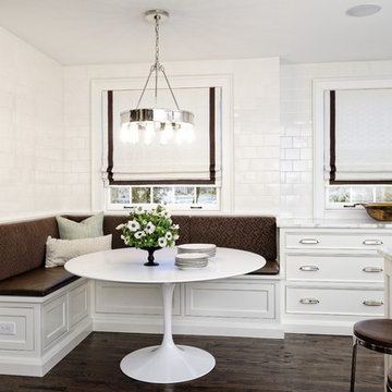
A 1927 colonial home in Shaker Heights, Ohio, received a breathtaking renovation that required extensive work, transforming it from a tucked away, utilitarian space, to an all-purpose gathering room, a role that most kitchens embrace in a home today. The scope of work changed over the course of the project, starting more minimalistically and then quickly becoming the main focus of the house's remodeling, resulting in a staircase being relocated and walls being torn down to create an inviting focal point to the home where family and friends could connect. The focus of the functionality was to allow for multiple prep areas with the inclusion of two islands and sinks, two eating areas (one for impromptu snacking and small meals of younger family members and friends on island no. two and a built-in bench seat for everyday meals in the immediate family). The kitchen was equipped with all Subzero and Wolf appliances, including a 48" range top with a 12" griddle, two double ovens, a 42" built-in side by side refrigerator and freezer, a microwave drawer on island no. one and a beverage center and icemaker in island no. two. The aesthetic feeling embraces the architectural feel of the home while adding a modern sensibility with the revamped layout and graphic elements that tie the color palette of whites, chocolate and charcoal. The cabinets were custom made and outfitted with beaded inset doors with a Shaker panel frame and finished in Benjamin Moore's OC-17 White Dove, a soft white that allowed for the kitchen to feel warm while still maintaining its brightness. Accents of walnut were added to create a sense of warmth, including a custom premium grade walnut countertop on island no. one from Brooks Custom and a TV cabinet with a doggie feeding station beneath. Bringing the cabinet line to the 8'6" ceiling height helps the room feel taller and bold light fixtures at the islands and eating area add detail to an otherwise simpler ceiling detail. The 1 1/4" countertops feature Calacatta Gold Marble with an ogee edge detail. Special touches on the interiors include secret storage panels, an appliance garage, breadbox, pull-out drawers behind the cabinet doors and all soft-close hinges and drawer glides. A kneading area was made as a part of island no. one for the homeowners' love of baking, complete with a stone top allowing for dough to stay cool. Baskets beneath store kitchen essentials that need air circulation. The room adjacent to the kitchen was converted to a hearth room (from a formal dining room) to extend the kitchen's living space and allow for a natural spillover for family and guests to spill into.
Jason Miller, Pixelate
 TVL Creative Ltd.
Cramped kitchen be gone! That was the project motto and top priority. The goal was to transform the current layout from multiple smaller spaces into a connected whole that would activate the main level for our clients, a young family of four.
The biggest obstacle was the wall dividing the kitchen and the dining room. Removing this wall was central to opening up and integrating the main living spaces, but the existing ductwork that ran right through the center of the wall posed a design challenge, er design opportunity. The resulting design solution features a central pantry that captures the ductwork and provides valuable storage- especially when compared to the original kitchen's 18" wide pantry cabinet. The pantry also anchors the kitchen island and serves as a visual separation of space between the kitchen and homework area.
Through our design development process, we learned the formal living room was of no service to their lifestyle and therefore space they rarely spent time in. With that in mind, we proposed to eliminate the unused living room and make it the new dining room. Relocating the dining room to this space inherently felt right given the soaring ceiling and ample room for holiday dinners and celebrations. The new dining room was spacious enough for us to incorporate a conversational seating area in the warm, south-facing window alcove.
Now what to do with the old dining room?! To answer that question we took inspiration from our clients' shared profession in education and developed a craft area/homework station for both of their boys. The semi-custom cabinetry of the desk area carries over to the adjacent wall and forms window bench base with storage that we topped with butcher block for a touch of warmth. While the boys are young, the bench drawers are the perfect place for a stash of toys close to the kitchen.
The kitchen begins just beyond the window seat with their refrigerator enclosure. Opposite the refrigerator is the new pantry with twenty linear feet of shelving and space for brooms and a stick vacuum. Extending from the backside of the pantry the kitchen island design incorporates counter seating on the family room side and a cabinetry configuration on the kitchen side with drawer storage, a trashcan center, farmhouse sink, and dishwasher.
We took careful time in design and execution to align the range and sink because while it might seem like a small detail, it plays an important role in supporting the symmetrical configuration of the back wall of the kitchen. The rear wall design utilizes an appliance garage mirrors the visual impact of the refrigerator enclosure and helps keep the now open kitchen tidy. Between the appliance garage and refrigerator enclosure is the cooking zone with 30" of cabinetry and work surface on either side of the range, a chimney style vent hood, and a bold graphic tile backsplash.
The backsplash is just one of many personal touches we added to the space to reflect our client's modern eclectic style and love of color. Swooping lines of the mid-mod style barstools compliment the pendants and backsplash pattern. A pop of vibrant green on the frame of the pantry door adds a fresh wash of color to an otherwise neutral space. The big show stopper is the custom charcoal gray and copper chevron wall installation in the dining room. This was an idea our clients softly suggested, and we excitedly embraced the opportunity. It is also a kickass solution to the head-scratching design dilemma of how to fill a large and lofty wall.
We are so grateful to bring this design to life for our clients and now dear friends.

 safe ZOnea
If you’re active on GardenWeb sharing plant photos, asking for advice, tracking seasonal progress you already understand how much detail goes into gardening. Soil pH, rainfall, emerging leaves, bloom counts, fertilizer schedules it adds up fast. But all that rich information often remains buried in posts, lists or memory. What if you could visualize that data and turn it into clear quick insights? That’s where a graph maker becomes a game-changer for your gardening workflow.
1. Why garden data belongs on a graph
On GardenWeb, you’ll find forums for everything from perennial care, vegetable gardening, patios, herbs, even cooking and craft projects. While plant lovers share observations and ask questions, many track progress manually in spreadsheets or memory. A graph maker flips that around:
Instead of a list of numbers (e.g., “Soil test: pH 6.4 in May, 6.1 in October”), you get a line graph showing the decline over time.
Instead of guessing which plant bloomed most, you see a bar chart comparing counts across plants.
Instead of manually calculating average rainfall effect, you plot scatter points of bloom count vs. rainfall.
By turning your data into visuals, you’re not just recording—you’re analysing, learning and improving. For GardenWeb users this means smarter decisions: Which fertilizer actually improves bloom count? Which shady spot recovers slower? A graph maker gives clarity.
2. What is a graph maker and how to use one
A graph maker is a web tool or software that lets you input raw data (numbers, dates, categories) and output visual charts like line graphs, bar charts, scatter plots, etc. It might allow you to import a spreadsheet, select chart type, customize colours, label axes, and export the image for your blog, forum post or personal log.
Here’s how you could apply it for gardening:
Log blooms per week for each rose plant.
Using the graph maker, choose line graph to track changes over weeks.
Label your y-axis “Number of Blooms”, x-axis “Week of Year”.
Add colour lines for each plant for easy comparison.
Export as PNG and embed it in a GardenWeb forum post: “See bloom trend for my ‘Peace’ vs ‘Knock Out’ roses”.
This isn’t just pretty-to-look-at: it makes the trend obvious, invites discussion (“Hey, your ‘Knock Out’ line dips after week 28—what changed?”) and helps you refine your routine.
3. Use these specific scenarios on GardenWeb
A. Soil pH and plant health tracking
After multiple tests you have pH values over time and bloom results. Upload both datasets into the graph maker, produce a dual-axis line graph: soil pH on one axis, bloom count on the other. Post your findings in the “Soil, Fertility & Nutrients” forum and get feedback.
B. Seasonal pest or disease appearance
Record number of aphids spotted each month and whether you used treatment. A bar chart via the graph maker can show pre- and post-treatment figures. Then ask the “Insect & Disease Control” forum for advice based on your visual data.
C. Yield comparison between varieties
You grow two zucchini varieties. You keep weekly yield in pounds. Use the graph maker for a side-by-side bar chart. Share in the “Vegetable Gardening” forum: “Which was better this year? See the chart”.
D. Rainfall vs growth rate
You log weekly rainfall and growth (in cm) of your tomato plants. Use scatter plot in graph maker. If a pattern emerges, you’re ready to post: “Is my growth plateau due to drought? Chart shows a clear correlation.”
4. Why this elevates your GardenWeb contributions
When you post with a chart made by a graph maker, you’re doing more than asking or showing off. You’re investigating. You’re analysing. You invite the community to give feedback on data, not just anecdotes. That elevates the discussion. Instead of “My plant died, any ideas?” you post “See this graph of pH drop and bloom count—what might be the limiting factor?” High-quality visuals raise your post’s value and garner more thoughtful responses.
Plus, your posts become useful references for others: someone else can say, “Cool graphic, can you share your data sheet?” You build credibility and help the forum become a learning hub—not just a Q&A board.
5. Tips for using a graph maker effectively in the GardenWeb context
Keep it simple: One chart, one insight. Don’t overcrowd.
Label clearly: Titles, axis labels, units (e.g., cm/week, mg/L, °F).
Use readable colours: Avoid faint tones that vanish on mobile.
Annotate when needed: Add notes like “Fertiliser switched week 12” or “Shade cloth added”.
Provide context in your post: Don’t leave the chart alone—write a few sentences explaining what it shows and what you’re seeking.
Embed carefully: Make sure your image displays properly in GardenWeb; check mobile view.
Share raw data: If possible link to your spreadsheet so others can replicate or comment.
Be open to feedback: The chart invites questions; embrace them.
6. Possible pitfalls and how to avoid them
Bad data = bad chart: If your measurements aren’t consistent, your graph will mislead. Use standardized data collection.
Too much complexity: Multi-axis charts, too many variables—confusing. Stick to one or two variables.
Overlooking mobile viewers: Many GardenWeb users browse via phones. Use large fonts and simple visuals.
Ignoring the narrative: Chart alone won’t answer. Explain what it means and what you need.
Outdated charts: If you update your data annually, keep your visuals current or label them clearly as “2024 data”.
7. Final thoughts
On GardenWeb you’ll find a vibrant community of gardeners, DIYers, cooks and design lovers.Using a graph maker for your posts and progress turns your experience from casual hobby-logging into smart data-driven gardening. You’ll not only learn more—your peers will learn more, too.
So next time you log your plant growth, record your yield, test your soil or track pests—don’t just note it. Plot it. Use a graph maker. Share it in the forum. Let your garden tell the story, and let the community help you write the next chapter.
 Hastens & American Mattress
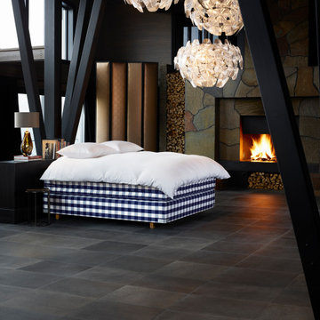
The Hästens 2000T® is the pinnacle of sleep craftsmanship — a true icon in the world of luxury beds. Meticulously handcrafted in Sweden using time-honored techniques and the world’s finest natural materials, the 2000T is the bed that redefined what deep, restorative sleep should feel like.
Layer by layer, the 2000T offers a perfect balance of support, responsiveness, and softness, adapting to your body with effortless precision. Built with multiple interacting spring systems, pure horsehair, cotton, wool, and flax, every element breathes naturally — creating an ideal microclimate for your best night’s rest.
From its sculpted form to its elegant tailoring, the 2000T is more than a bed — it is a legacy of luxury, comfort, and unmatched design.
Key Features:
Triple-layer spring system for enhanced support and pressure relief
Hand-layered with natural, breathable materials: horsehair, wool, cotton, and flax
Tailored to order with a choice of fabrics, firmness levels, and detailing
Crafted entirely by hand in Köping, Sweden
Designed to last for generations
Once you’ve slept in the 2000T, nothing else compares.
Experience the difference at our private showroom in Birmingham, MI.
 Reico Kitchen & Bath
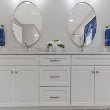
Jen Denham of Reico Kitchen and Bath in White Plains, MD collaborated with Personal Touch Installation to design a transitional style inspired primary bathroom featuring Merillat Classic Cabinetry.
The vanity cabinets are the Fox Harbor door style in Maple with a Cotton finish with MSI Q Galant Gray vanity countertops.
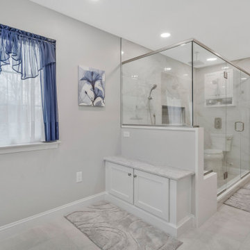
The bathroom includes Nashville Bianco Coveland gloss shower wall tile, Nashville Moss Greige shower floor tile and Ceracasa Filita White floor tile.
“Jennifer was absolutely fantastic; we couldn’t ask for anyone better. She made suggestions, listened to concerns, answered questions, and was exceptionally patient through multiple color changes. We never felt rushed to make a decision. Having previously worked with Jen on a complete remodel, it was an easy decision to return for our bath project," said the client.
“The master bath was original to the house and was chopped up into two rooms, a huge wasted area for a giant soaker tub that was never used and small cramped spot for their shower toilet and vanity,” said Jen.
"We all agreed that the design didn't quite fit their needs. After exploring several options, we settled on a spacious shower with aging-in-place features like a bench and handheld. We added more storage with the large vanity and bench off the back end of the shower. We also created a huge custom shower that is easier to get in and out of, with plenty of space compared to their tiny shower from before."
“The clients were extremely kind, patient and understanding through the entire project. It was a huge undertaking and we were essentially creating a whole new room. It's hard to picture what it looked like before!”
Photos courtesy of BTW Images.
 Reico Kitchen & Bath
Jen Denham of Reico Kitchen and Bath in White Plains, MD collaborated with Personal Touch Installation to design a transitional style inspired primary bathroom featuring Merillat Classic Cabinetry.
The vanity cabinets are the Fox Harbor door style in Maple with a Cotton finish with MSI Q Galant Gray vanity countertops.
The bathroom includes Nashville Bianco Coveland gloss shower wall tile, Nashville Moss Greige shower floor tile and Ceracasa Filita White floor tile.
“Jennifer was absolutely fantastic; we couldn’t ask for anyone better. She made suggestions, listened to concerns, answered questions, and was exceptionally patient through multiple color changes. We never felt rushed to make a decision. Having previously worked with Jen on a complete remodel, it was an easy decision to return for our bath project," said the client.
“The master bath was original to the house and was chopped up into two rooms, a huge wasted area for a giant soaker tub that was never used and small cramped spot for their shower toilet and vanity,” said Jen.
"We all agreed that the design didn't quite fit their needs. After exploring several options, we settled on a spacious shower with aging-in-place features like a bench and handheld. We added more storage with the large vanity and bench off the back end of the shower. We also created a huge custom shower that is easier to get in and out of, with plenty of space compared to their tiny shower from before."
“The clients were extremely kind, patient and understanding through the entire project. It was a huge undertaking and we were essentially creating a whole new room. It's hard to picture what it looked like before!”
Photos courtesy of BTW Images.
 Mamaar Studio
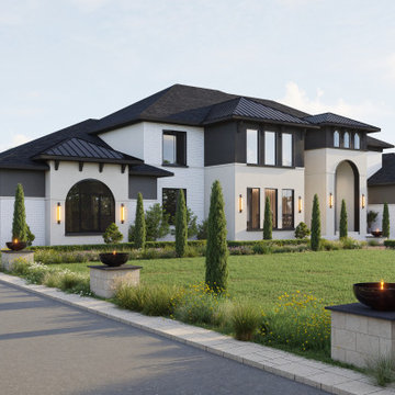
This luxury transitional residence was visualized to help the client evaluate and finalize the exterior material palette and landscape design before construction. The project focused on exploring various combinations of finishes, allowing the client to compare different design directions and understand how each choice would influence the overall character of the home.
Throughout the design process, multiple options were tested for the roofing materials, exterior wall finishes, and window trims. These visualizations provided a clear representation of the subtle differences in texture, color, and architectural expression, helping the client make confident design decisions.
The version presented here is the final selected scheme, combining timeless materials with refined detailing to create a sophisticated and elegant appearance that perfectly complements the home's transitional architecture.
The project was modeled in SketchUp and rendered using D5 Render, delivering high-quality visuals that streamlined the material selection process and brought the design vision to life.
 Greg Hasler
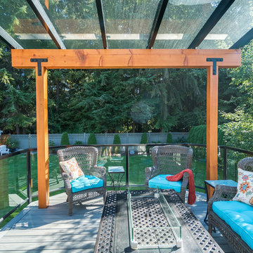
We completed this exterior renovation just in time for our clients to enjoy the last days of summer. In order to bring new life to this backyard, we built a multi-level deck using Trex composite decking. The home-owner wanted a bit of overhead protection for the upper deck so we had a local glass company install a frameless lami-glass canopy, which we supported with fir beams. They completed the design for the upper deck with side-mounted glass guard rails for a cleaner look.
 Reico Kitchen & Bath
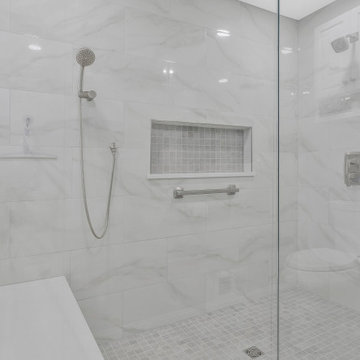
Jen Denham of Reico Kitchen and Bath in White Plains, MD collaborated with Personal Touch Installation to design a transitional style inspired primary bathroom featuring Merillat Classic Cabinetry.
The vanity cabinets are the Fox Harbor door style in Maple with a Cotton finish with MSI Q Galant Gray vanity countertops.
The bathroom includes Nashville Bianco Coveland gloss shower wall tile, Nashville Moss Greige shower floor tile and Ceracasa Filita White floor tile.
“Jennifer was absolutely fantastic; we couldn’t ask for anyone better. She made suggestions, listened to concerns, answered questions, and was exceptionally patient through multiple color changes. We never felt rushed to make a decision. Having previously worked with Jen on a complete remodel, it was an easy decision to return for our bath project," said the client.
“The master bath was original to the house and was chopped up into two rooms, a huge wasted area for a giant soaker tub that was never used and small cramped spot for their shower toilet and vanity,” said Jen.
"We all agreed that the design didn't quite fit their needs. After exploring several options, we settled on a spacious shower with aging-in-place features like a bench and handheld. We added more storage with the large vanity and bench off the back end of the shower. We also created a huge custom shower that is easier to get in and out of, with plenty of space compared to their tiny shower from before."
“The clients were extremely kind, patient and understanding through the entire project. It was a huge undertaking and we were essentially creating a whole new room. It's hard to picture what it looked like before!”
Photos courtesy of BTW Images.
 Mamaar Studio
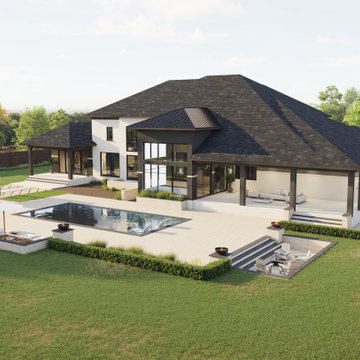
This luxury transitional residence was visualized to help the client evaluate and finalize the exterior material palette and landscape design before construction. The project focused on exploring various combinations of finishes, allowing the client to compare different design directions and understand how each choice would influence the overall character of the home.
Throughout the design process, multiple options were tested for the roofing materials, exterior wall finishes, and window trims. These visualizations provided a clear representation of the subtle differences in texture, color, and architectural expression, helping the client make confident design decisions.
The version presented here is the final selected scheme, combining timeless materials with refined detailing to create a sophisticated and elegant appearance that perfectly complements the home's transitional architecture.
The project was modeled in SketchUp and rendered using D5 Render, delivering high-quality visuals that streamlined the material selection process and brought the design vision to life.
 CAST architecture
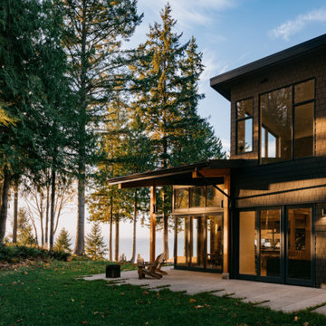
Just north of Seattle, this family home is tucked away on a magical parcel of land within the Edmonds city limits. Designed to maximize the site’s breathtaking views, it is carefully sited to blend into its wooded setting while opening fully to expansive views.
On our first visit, we found a secluded forest glade with stunning vistas of Puget Sound and the Olympic Mountains perched atop a high seaside bluff. Preserving and enhancing this singular landscape as the surrounding neighborhood fills in with development was central to our design.
The approach is intentionally restrained—the home does not reveal itself entirely upon arrival. The house is composed of two wings that cradle the meadow, making it the most important “room.” Interior spaces are oriented towards the lush landscape and impressive views framed by mature trees.
The structures are kept close to the perimeter, leaving the center of the site unbuilt. A covered bridge with a green roof acts as a front porch, linking the upslope garage/office with the main house. A gentle stair flows through the gap between the structures, drawing visitors into the clearing.
The floorplan is highly efficient, carefully tuned to the family’s daily routines. Each room is exactly suited to its purpose, yet no larger than needed.
An open corner with double-height windows creates a jewel-box dining room. Free of a corner structure, the home expands to encompass the covered patio for outdoor cooking and dining, plus easy access to the kitchen, encouraging year-round outdoor living.
Human-scale moments are intentionally created, from a stairway window seat with peekaboo views to a covered outdoor extension of the great room that fosters a cozy relationship between interior and exterior.
Much of the light-filled interior is wrapped in clear-finished fir, giving it a warm glow even on rainy winter days. White oak cabinets and black soapstone countertops add warmth to the kitchen. The built-in furniture in the library loft and the cold-rolled steel fireplace surround were crafted by the owner’s father, an expert woodworker, increasing the connection between the home and its occupants. The second story includes the primary suite with treehouse vibes.
Located on a steep slope in a landslide-prone area, the Edmonds Overlook overcame numerous technical and engineering challenges to address vehicle and fire access, stormwater and erosion mitigation, and potential earth movement.
Green Design:
Compact footprint and conditioned area compared to comparable homes, reducing carbon and ongoing energy use
Green roof at covered entry
Heat-pump air and water heating with multiple zones to maximize efficiency
Whole-house Heat Recovery Ventilation system
Engineered On-Site Stormwater Management System
Landscape restoration using 100% native species, added 47 trees to site, plus meadow plantings
 Home Improvements
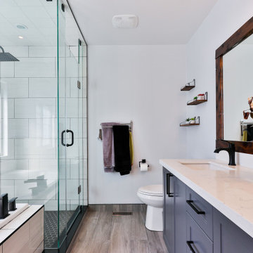
Embarking on a bathroom remodeling project is an exciting endeavor that can greatly enhance the functionality, aesthetics, and value of your home. However, finding a reliable and skilled contractor in a bustling city like Los Angeles can be a daunting task. To simplify the process and ensure a successful bathroom renovation, we have compiled a comprehensive guide on how to find a reputable bathroom remodeling contractor in Los Angeles, California.
Start with Online Research:
The first step in your quest for a reliable contractor is to conduct thorough online research. Utilize search engines like Google to find bathroom remodeling contractors in Los Angeles. Be sure to include specific keywords such as "bathroom remodeling," "contractor," and "Los Angeles" to refine your search results.
Check Online Directories and Review Platforms:
Explore online directories and review platforms like Yelp, Angie's List, and Houzz to find a curated list of bathroom remodeling contractors in Los Angeles. These platforms often provide detailed information about contractors, including customer reviews, ratings, project photos, and contact details. Assess the overall rating and read through multiple reviews to gauge the contractor's reputation and reliability.
Seek Recommendations:
Ask friends, family, neighbors, and colleagues who have recently undergone a bathroom remodeling project in Los Angeles for recommendations. Personal referrals can provide valuable insights and firsthand experiences that online research may not uncover. Inquire about the contractor's professionalism, craftsmanship, adherence to timelines, and overall satisfaction with the project.
Verify Credentials and Licensing:
Once you have shortlisted potential contractors, it is crucial to verify their credentials and licensing. Check if they are licensed by the Contractors State License Board (CSLB) in California. A valid license ensures that the contractor meets the state's requirements and regulations. Additionally, inquire about their insurance coverage to protect against any potential liabilities during the remodeling process.
Evaluate Experience and Expertise:
Assess the experience and expertise of the contractors on your list. Look for contractors who specialize in bathroom remodeling and have a proven track record of successful projects. Review their portfolios or ask for references to see examples of their previous work. A skilled contractor should be able to handle a variety of bathroom designs and styles, and provide creative solutions to meet your specific needs.
Schedule In-Person Consultations:
Arrange in-person consultations with the shortlisted contractors. Use this opportunity to discuss your remodeling goals, budget, timeline, and any specific requirements you may have. A reputable contractor will listen attentively, provide insights, and offer suggestions based on their expertise. Pay attention to their communication style, professionalism, and responsiveness, as these qualities are crucial for a smooth working relationship.
Request Detailed Quotes and Contracts:
Ask the contractors for detailed written quotes that outline the project's scope, materials, labor costs, and any additional expenses. A comprehensive quote will help you compare the estimates provided by different contractors effectively. Once you have selected a contractor, ensure that you have a detailed contract in place that covers all aspects of the project, including timelines, payment schedules, warranties, and dispute resolution processes.
Seek Permits and Building Code Compliance:
Bathroom remodeling projects often require permits and adherence to building codes. A reputable contractor will be familiar with the local building regulations in Los Angeles and should handle the permit application process on your behalf. Verify that the contractor will obtain the necessary permits and ensure that all work is compliant with local codes and regulations.
Conclusion:
Finding a bathroom remodeling contractor in Los Angeles, California, may seem overwhelming, but by following these guidelines, you can streamline the process and select a contractor who meets your expectations. Conduct thorough online research, seek recommendations, verify credentials, evaluate experience, and schedule in-person consultations to make an informed decision.
8