
Search results for "Compete" in Home Design Ideas
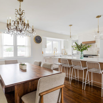

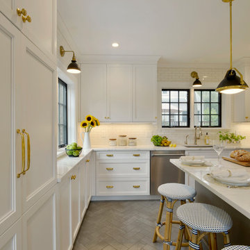
 Bilotta Kitchen & Home
For this kitchen, designed by Peter Bittner, the client had a very clear idea of what she wanted right from the start. She did her research. The mother of a fast growing, young family, she wanted something as efficient as it was beautiful – on the simple, yet elegant side. Her requests were straightforward: white and light grey Bilotta cabinetry in a transitional style so as not to compete with the detailing inside her 1950s Tudor-style home; a heated tile floor (By Rye Ridge Tile); stainless appliances; white subway tile backsplash by Walker Zanger (again to keep it clean and not compete with its surroundings); and seating at the island for snacks and homework. The “pop” suggested by Peter was done through the satin brass hardware and lighting fixtures. The real challenge with this space was to fit as much as possible into the existing footprint which was overall on the smaller side. The solution was eliminating a doorway (with a swinging door that opened into the kitchen) and stairs from the kitchen to the basement. By moving the stairs and doorway, the usable space increased considerably. The typical working triangle became the focus for one side of the kitchen and the island overhang and seating became available on the other side. To make up for the limited amount of wall cabinets Peter designed shallow pantry-style cabinets along the back wall. Quartz Countertops by Rom Stone Fabrication. Designer: Peter Bittner Photographer: Peter Krupenye


Find the right local pro for your project
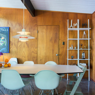
 Margot Hartford Photography
Photo: Margot Hartford © 2017 Houzz
Design: Scandinavian Home Staging
Dining room - 1960s dining room idea
Dining room - 1960s dining room idea
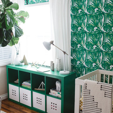
 Emerson Grey Designs
Taylor Cole Photography
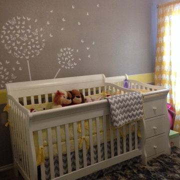
Mid-sized eclectic gender-neutral medium tone wood floor nursery photo in Orange County with beige walls
Mid-sized eclectic gender-neutral medium tone wood floor nursery photo in Orange County with beige walls

 Décor Aid
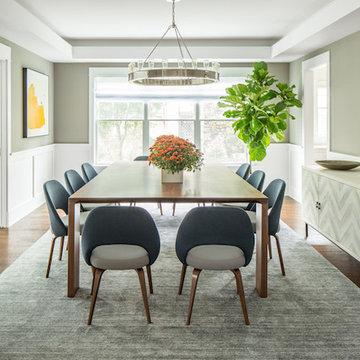
When Charlene’s family of four decided to move out of Manhattan, she reached out to Decor Aid, for assistance in furnishing and decorating the family’s new home in Westchester. Although she had already decorated a few upstairs rooms, Charlene needed help in sourcing and decorating the entire bottom floor of her house, and wanted the new home to feel reflective of her young family.
The original goal for the project was to infuse three separate design influences. First and foremost, we had to account for Charlene’s personal taste, which is a contemporary take on the mid-century modernist aesthetic. Second, we had to account for the house’s country-modern stylings. And finally, at the request of Charlene’s two young children, we had to incorporate primary colors, to fit the family’s fun and comfortable vibe.
Charlene wanted to furnish her home with a blue and grey color scheme, but didn’t want her new space to be stifled by this preference. To keep the home from feeling sterile, we incorporated heavily-textured accessories, fabrics, and rugs. And to contrast the modern with the familial, primary-colored art pieces were set against larger, neutral furnishings. We sourced a custom-made wood dining-room table, and other wood furniture pieces, to bridge the gap between the house’s country-modern vibe and Charlene’s own personal aesthetic.
Because of the home’s open floor plan, all of the rooms had to feel continuous, while being differentiated from each-other. So we added large area rugs, in the dining room, living room, and foyer, to distinguish each room. A large sectional sofa faces away from the kitchen, and is backed by a custom-made wood console table, to further separate the rooms.
Colorful accent pillows and decorative geometric objects were added throughout the home, to further distinguish each room, and to offset the tasteful, neutral palette. The final effect is a highly elegant and wholly modern interpretation of the American suburban home.
 Competent Builders
Inspiration for a large open concept medium tone wood floor living room remodel in Baltimore
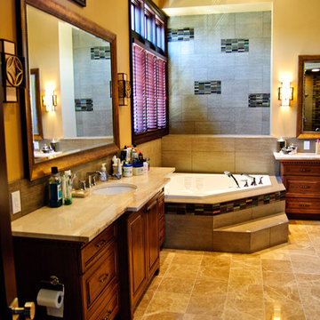 Competent Builders
Example of a large master beige tile porcelain tile drop-in bathtub design in Baltimore with an undermount sink, dark wood cabinets, a one-piece toilet and yellow walls
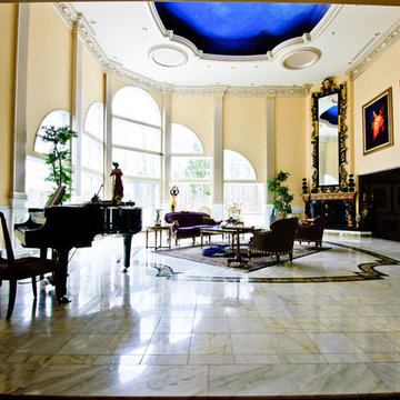 Competent Builders
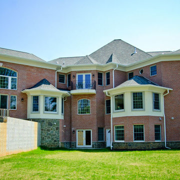
Example of a large formal and open concept marble floor living room design in Baltimore with beige walls, a standard fireplace and a stone fireplace

 Klopf Architecture
Built for the Bluff, A Sea Ranch Home is Remade from the Inside Out
The house had always been grounded, on an ocean bluff at The Sea Ranch. It sits unencumbered, adjacent to one of the most dramatic stretches of the Sonoma coast with protected commons meadow to the east, uninterrupted Pacific views to the west, and a bluff trail running alongside. What it lacked was the feeling of home, one that could hold up its own against the natural landscape.
The owners are entrepreneurs with deep involvement across tech, real estate, and development and they know how things are built. The Sea Ranch house had been in their lives for years, a second residence and a place for family to gather. Built for a different time, it felt more compromising than comfortable. Sitting in a closed off nook, the kitchen fit one cook at a time and turned its back on the rest of the house. The entry was dim and compressed, divided by a structural column that presented itself at exactly the wrong moment. The primary suite was small relative to the view outside it. A large rear bedroom sat behind a lowered ceiling with a bathroom that had never been added. The house was certainly worth the trouble of doing it right.
What followed was not one project but four, each with its own design challenge, each addressed over a period of time.
Where the House Meets the Ocean
The most complex piece of the project, in both structural and spatial terms, was the kitchen expansion. The existing room was a single-person galley squeezed in as an afterthought with no meaningful connection to the dining room, the living space, or the deck outside. To make it useful for a family that cooks and gathers, it needed to grow outward into an existing patio and flow into the rooms around it.
A big challenge was the roofline. Several planes at different pitches and angles converged directly where additional volume was needed. A new form had to join that geometry without reading as a correction. The solution found the simplest possible connection between the existing angles, a roofline that from outside the structure, appears entirely original. From the bluff trail where the addition is visible, there is no discernible seam.
Inside, the kitchen is now open to the living and dining rooms without interruption. A large sliding glass door connects the space onto the rear deck. The deck itself was expanded and oriented so that the body of the house shields it from the coastal wind which is a common consideration that determines whether outdoor space at The Sea Ranch actually gets used. The result is a room that works for large family gatherings where no one feels cutoff, and one that makes the boundary between being inside and outside easy to ignore.
Welcoming Light
A structural column stood at the convergence of eight distinct roof planes in the entry. It was load-bearing, but it was also the reason the entry had always felt like a hallway rather than a welcoming arrival.
With the structural engineer, a custom steel connector was designed to receive beams from six separate directions, redistributing the load through a single new continuous beam. The column was surgically removed. Three triangular skylights were then cut into the roof above, their shapes drawn from the
existing geometry of the planes around them. The entry is now bright and open. The skylights feel native to the structure because they follow the logic already present in the roof.
Two Suites, Two Views
At opposite ends of the house, the two bedroom suites were each reconfigured, and each found a different way to introduce more of the landscape into the room.
An addition to the primary suite extended the structure outward to create a wraparound plan with a loop from the bedroom through bath and closet that had not been possible before. The expansion opened a slot view from the tub and shower toward the ocean. The view is precise and private. The ocean view is present and deliberate.
The rear bedroom absorbed an adjacent storage room to transform it into a full second suite with a vaulted ceiling, a large bathroom with a tub, a shower, and a sauna. A private fenced garden courtyard sits just beyond the glass bringing the outdoors inside. The tub was placed so that, looking past the courtyard and through the bedroom beyond, the ocean is visible at the far end. It is a long view and it makes the room feel larger and more settled than its footprint would suggest.
Glass on Four Sides, Fire at the Center
The main living and gathering room had always been caught between two competing facts: glass on four sides meant exceptional views but at The Sea Ranch, it also meant a cold room. A 360-degree cylindrical fireplace was added at the center on a raised stone base, providing radiant heat in every direction and giving the room a focal point around which a group naturally orients itself, whether that means two people at the end of the day or the whole family after dinner.
Owners Who Picked Up the Tools
The owner was not a passive client. they came with construction knowledge, specific ideas, and the desire to be an active part of the process, a dynamic that other architects may had found difficult, which Klopf Architecture accepted as an asset. They took it upon themselves to complete some of the work during construction, including the installation of a new radiant heating system beneath the floors.
The radiant system added to the older and less-desirable forced-air setup. At The Sea Ranch, that change matters as the house sits close enough to the ocean and moving air competes with the sound of it, where radiant heat does not. Solar panels were added to the roof as part of the new system. Insulation was upgraded throughout the walls, roof, and crawl space. The house that had always had the right setting now holds warmth the way a house on the bluff should.
They were also deeply involved in the design and selections throughout, and the finished house reflects both of them in ways that are specific rather than generic. The process took longer and moved through more iterations than a more arms-length relationship might have allowed. The result is more defined and personal because of it.
The Landscape Holds Priority
Every exterior decision was shaped by The Sea Ranch Design Standards, which require that buildings defer to the landscape around them rather than compete with it. Because this house sits on the bluff and is visible from the public trail, the additions faced a close review. Existing materials were matched. Geometries were resolved. The additions had to become indistinguishable from the original building.
From the trail, the house reads exactly as it always has — low, cedar-clad, secondary to the meadow and the water. The setting holds priority. Inside, the house has been remade.
Klopf Architecture Project Team: Geoff Campen and Trenton Jewett
Contractor: Shawn Bettega Construction
Photography: ©2025 Mariko Reed
Year Completed: 2023
Location: The Sea Ranch, CA
 Karin Bennett Designs
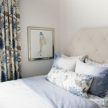
Bedroom - small transitional guest carpeted and beige floor bedroom idea in Toronto with beige walls
 Alderidge Construction Ltd.
Photo Credit: Ian Akers Photography
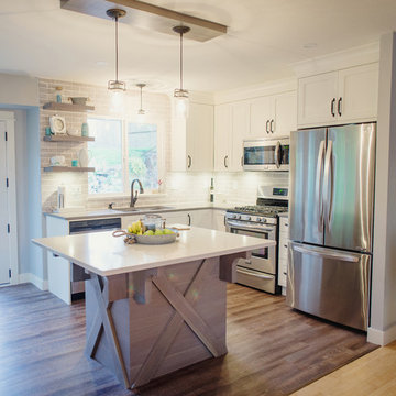
Inspiration for a mid-sized transitional l-shaped open concept kitchen remodel in Vancouver with an undermount sink, shaker cabinets, white cabinets, quartz countertops, gray backsplash, stainless steel appliances and an island
Inspiration for a mid-sized transitional l-shaped open concept kitchen remodel in Vancouver with an undermount sink, shaker cabinets, white cabinets, quartz countertops, gray backsplash, stainless steel appliances and an island

5