
Search results for "Concentration" in Home Design Ideas



Find the right local pro for your project


 Atkinson Concrete Construction, Inc.
Atkinson Concrete
Example of a backyard concrete and rectangular pool design in San Luis Obispo
Example of a backyard concrete and rectangular pool design in San Luis Obispo
 Paul Castrucci Architect
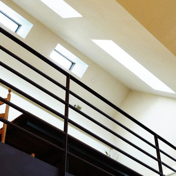
Rivington Street Building is a multi-family residential building in New York City that was designed, developed and constructed from the ground up by Paul A. Castrucci, Architect. In order to successfully take on the roles of developer and contractor, Castrucci utilized his ability to balance budget, schedule and constructability.
The building is a part of its community and its facade responds to the human and contextual scale. The base of the building utilizes brick, tying it into the surrounding neighborhood. The top floors of the building break from the contextual base in form and material. The corrugated metal saw tooth roofline is a response to the environment, bringing in soft, northern light while providing roof area for a Photovoltaic array of solar panels. The top floor is connected to a roof garden filled with native plants. The result is a light-filled, dynamic space that is shaped by its relationship to daylight and connections to the exterior.
Constructed in 2003, Rivington Street Building is an example of the firm’s energy efficient design that utilizes sustainable methods such as a high-performance envelope, a solar Photovoltaic (PV) array and rainwater collection/grey water system.
 dp Design Studio+
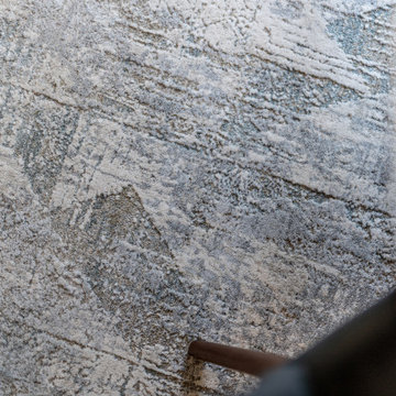
This dining room combines abstract and geometric shapes to create harmony and class.
Mid-sized trendy vinyl floor and gray floor kitchen/dining room combo photo in Toronto with white walls
Mid-sized trendy vinyl floor and gray floor kitchen/dining room combo photo in Toronto with white walls


 Arte Living Design Studio Pte Ltd
Martin T
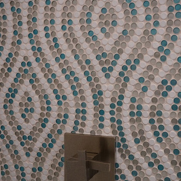
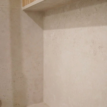
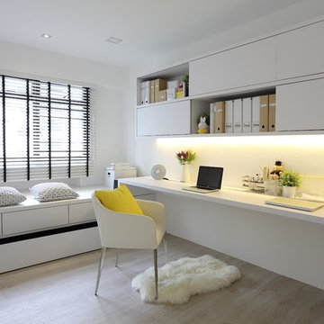
Danish built-in desk light wood floor study room photo in Singapore with white walls
Danish built-in desk light wood floor study room photo in Singapore with white walls


 Fabric Wall Concepts
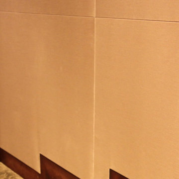
Our stretched fabric acoustical wall panels provide excellent sound control for interior spaces as well as a very clean and interesting aesthetic!
Inspiration for a contemporary home theater remodel in Phoenix
Inspiration for a contemporary home theater remodel in Phoenix
 Stevens Kitchens
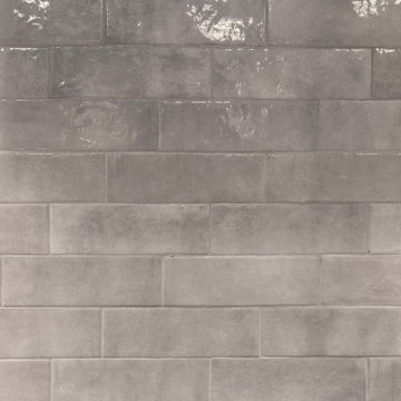
Example of a trendy brown floor eat-in kitchen design in Orlando with a drop-in sink, shaker cabinets, gray cabinets, quartz countertops, gray backsplash, porcelain backsplash, stainless steel appliances, an island and white countertops



 KO Architecture
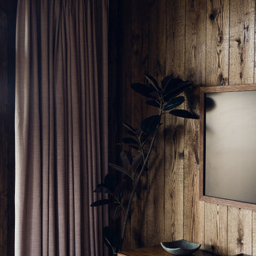
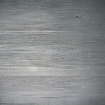
3/8" thick Stainless steel counter top with mill texture
Trendy home design photo in Vancouver
Trendy home design photo in Vancouver
 Devore's Land & Water Gardens
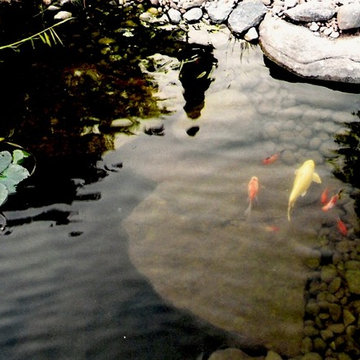
Close up of slow 'creek' with cascade and pond areas for koi in customer's back yard. Includes meandering gravel pathways and planted bed areas, as well as stone seat. Design by John DeVore
 TDM Tiling
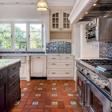
Tuscan terra-cotta tile kitchen photo in San Francisco with a farmhouse sink, white cabinets, blue backsplash, custom tile backsplash and stainless steel appliances

 FineLine Kitchens, Inc.
Hi everyone, I'm Sarah and Ogun we are here with fine line kitchens. So we are a couple working together. I do the interior design and remodeling of the space material selection meeting with the clients. And I handled operations outside, you know meaning all the construction work that is taking place the inside. The houses that we work in. I handle all the aspects of the construction, so today's project is very special. We're in Vienna and the client had a very big family. It's a family of seven that lives here. So we had a few aspects that we needed to keep in mind while designing this one. Having everybody be able to sit on the island. So we wanted plenty of seating all the way around. We didn't want anybody standing or anything like that. So what we did is we maximize the space. The center island is the biggest part of the kitchen. We use a natural stone to kind of give it a beautiful texture versus quartz. It's kind of standard white or kind of fabricated, so I wanted something very natural. We did this because I took my inspiration from the outside, so the inspiration if you look at the view right in front of me is there are so many greens there's a lot of brass accents and I wanted to bring this. Into this kitchen while designing it for my clients. She is very warm very. She wanted a very homey, comfy kind of look for the kitchen. So that's what we did today. As you can see, the cabinets are sage green, very light, so I still think it's a neutral, but it's a lighter color that again brings the outside in and we combine that with the oak right behind me so it's a slightly warm oak. It's not very dark. It's not very light. It's a medium brown and the same color went on the island. To kind of tie these two in and the backsplash, my favorite part is where you can see a little bit of design. It is, in my opinion still classic, but includes a pattern so the outside part is as we said in the beginning, is handled by my husband. I'd like him to speak a little bit about that. Thanks, Sarah, I want to talk to you guys a little bit about the construction part of this project. Originally this kitchen was located mostly in this area. They had their stove there sing. It was more of a peninsula layout in Sarah's and the customer vision they wanted. They wanted to get rid of the peninsula and they want to be able to have a huge island that can at least sit seven people because they're familiar with seven. So we wanted to make sure that we can achieve this design and bring it to life so that they can be happy with this layout. Some of the challenges we had, the house, the home being, you know, old home. There were a lot of you know the older electrical and plumbing that had to be replaced. We had to relocate the stove from here to this area. Over here we had put a nice foot fan that we had to relocate all the ductwork and the plumbing. Was being on the peninsula area. We had to relocate it to the center islands. So we achieved all this and kind of like bring it to bring in this kitchen up to date it looks beautiful. That's true, so yes, the old layout did not function for my clients because everything was kind of gathered on one side of the kitchen. So there was like a peninsula right there. So the end of this island kind of continued straight. And that was just the L shape. Kind of where everything was and there used to be another big table here, so they were using only kind of half of the space. So like I said at the beginning, our vision was to kind of feed everybody at the island, create some symmetry. 'cause I love that. So as you can see behind me, this is kind of the focal point symmetrical. Everything is kind of even we wanted to also panel the fridge here so it mimics the pantry and another size. So when you're looking at it, it is bringing again that symmetry back again. I hope you enjoyed this kitchen and this video and I'll see you soon. So how do you think this project turned out? It's nice. I like the color. I think it turned out nice. It's kind of like a little bit different color than what we always do. So I realize. Are you giving me a little bit of credit here that I did something different? Are you proud? I'm so proud of you. Other than that I like it. That they have kind of like a two sink. So if this was our kitchen, if we ever like you can have your own. I can have mine if we ever get into a fight then this can be like my own kitchen. Why are we gonna bring in a fight right now? So I'm cooking anyway. You're grilling most of the time, So what are you even talking about? My kitchen? That's my kitchen. You can just take the small sink. That's fine. It's always good to have your own space right there, so anyways. Thank you guys for watching. We hope to see you soon and if you have any questions please click the link below. It'll lead you to our website, house, YouTube and all of the social media is so nice to have you guys. We'll see you soon. Thanks bye bye-bye.
8