
Search results for "Conducive environment" in Home Design Ideas

 San Luis Kitchen Co.
Tuscan design using a burnished & glazed finish on oak cabinets by Wood-Mode. The columns either side of the range pull out with spice and bottle storage behind. The curved profile of the top drawer-heads extends around the kitchen.
When the homeowners decided to move from San Francisco to the Central Coast, they were looking for a more relaxed lifestyle, a unique place to call their own, and an environment conducive to raising their young children. They found it all in San Luis Obispo. They had owned a house here in SLO for several years that they had used as a rental. As the homeowners own and run a contracting business and relocation was not impossible, they decided to move their business and make this SLO rental into their dream home.
As a rental, the house was in a bare-bones condition. The kitchen had old white cabinets, boring white tile counters, and a horrendous vinyl tile floor. Not only was the kitchen out-of-date and old-fashioned, it was also pretty worn out. The tiles were cracking and the grout was stained, the cabinet doors were sagging, and the appliances were conflicting (ie: you could not open the stove and dishwasher at the same time).
To top it all off, the kitchen was just too small for the custom home the homeowners wanted to create.
Thus enters San Luis Kitchen. At the beginning of their quest to remodel, the homeowners visited San Luis Kitchen’s showroom and fell in love with our Tuscan Grotto display. They sat down with our designers and together we worked out the scope of the project, the budget for cabinetry and how that fit into their overall budget, and then we worked on the new design for the home starting with the kitchen.
As the homeowners felt the kitchen was cramped, it was decided to expand by moving the window wall out onto the existing porch. Besides the extra space gained, moving the wall brought the kitchen window out from under the porch roof – increasing the natural light available in the space. (It really helps when the homeowner both understands building and can do his own contracting and construction.) A new arched window and stone clad wall now highlights the end of the kitchen. As we gained wall space, we were able to move the range and add a plaster hood, creating a focal nice focal point for the kitchen.
The other long wall now houses a Sub-Zero refrigerator and lots of counter workspace. Then we completed the kitchen by adding a wrap-around wet bar extending into the old dining space. We included a pull-out pantry unit with open shelves above it, wine cubbies, a cabinet for glassware recessed into the wall, under-counter refrigerator drawers, sink base and trash cabinet, along with a decorative bookcase cabinet and bar seating. Lots of function in this corner of the kitchen; a bar for entertaining and a snack station for the kids.
After the kitchen design was finalized and ordered, the homeowners turned their attention to the rest of the house. They asked San Luis Kitchen to help with their master suite, a guest bath, their home control center (essentially a deck tucked under the main staircase) and finally their laundry room. Here are the photos:
I wish I could show you the rest of the house. The homeowners took a poor rental house and turned it into a showpiece! They added custom concrete floors, unique fiber optic lighting, large picture windows, and much more. There is now an outdoor kitchen complete with pizza oven, an outdoor shower and exquisite garden. They added a dedicated dog run to the side yard for their pooches and a rooftop deck at the very peak. Such a fun house.
 San Luis Kitchen Co.
When the homeowners decided to move from San Francisco to the Central Coast, they were looking for a more relaxed lifestyle, a unique place to call their own, and an environment conducive to raising their young children. They found it all in San Luis Obispo. They had owned a house here in SLO for several years that they had used as a rental. As the homeowners own and run a contracting business and relocation was not impossible, they decided to move their business and make this SLO rental into their dream home.
As a rental, the house was in a bare-bones condition. The kitchen had old white cabinets, boring white tile counters, and a horrendous vinyl tile floor. Not only was the kitchen out-of-date and old-fashioned, it was also pretty worn out. The tiles were cracking and the grout was stained, the cabinet doors were sagging, and the appliances were conflicting (ie: you could not open the stove and dishwasher at the same time).
To top it all off, the kitchen was just too small for the custom home the homeowners wanted to create.
Thus enters San Luis Kitchen. At the beginning of their quest to remodel, the homeowners visited San Luis Kitchen’s showroom and fell in love with our Tuscan Grotto display. They sat down with our designers and together we worked out the scope of the project, the budget for cabinetry and how that fit into their overall budget, and then we worked on the new design for the home starting with the kitchen.
As the homeowners felt the kitchen was cramped, it was decided to expand by moving the window wall out onto the existing porch. Besides the extra space gained, moving the wall brought the kitchen window out from under the porch roof – increasing the natural light available in the space. (It really helps when the homeowner both understands building and can do his own contracting and construction.) A new arched window and stone clad wall now highlights the end of the kitchen. As we gained wall space, we were able to move the range and add a plaster hood, creating a focal nice focal point for the kitchen.
The other long wall now houses a Sub-Zero refrigerator and lots of counter workspace. Then we completed the kitchen by adding a wrap-around wet bar extending into the old dining space. We included a pull-out pantry unit with open shelves above it, wine cubbies, a cabinet for glassware recessed into the wall, under-counter refrigerator drawers, sink base and trash cabinet, along with a decorative bookcase cabinet and bar seating. Lots of function in this corner of the kitchen; a bar for entertaining and a snack station for the kids.
After the kitchen design was finalized and ordered, the homeowners turned their attention to the rest of the house. They asked San Luis Kitchen to help with their master suite, a guest bath, their home control center (essentially a deck tucked under the main staircase) and finally their laundry room. Here are the photos:
I wish I could show you the rest of the house. The homeowners took a poor rental house and turned it into a showpiece! They added custom concrete floors, unique fiber optic lighting, large picture windows, and much more. There is now an outdoor kitchen complete with pizza oven, an outdoor shower and exquisite garden. They added a dedicated dog run to the side yard for their pooches and a rooftop deck at the very peak. Such a fun house.
Wood-Mode Fine Custom Cabinetry, Barcelona
 San Luis Kitchen Co.
When the homeowners decided to move from San Francisco to the Central Coast, they were looking for a more relaxed lifestyle, a unique place to call their own, and an environment conducive to raising their young children. They found it all in San Luis Obispo. They had owned a house here in SLO for several years that they had used as a rental. As the homeowners own and run a contracting business and relocation was not impossible, they decided to move their business and make this SLO rental into their dream home.
As a rental, the house was in a bare-bones condition. The kitchen had old white cabinets, boring white tile counters, and a horrendous vinyl tile floor. Not only was the kitchen out-of-date and old-fashioned, it was also pretty worn out. The tiles were cracking and the grout was stained, the cabinet doors were sagging, and the appliances were conflicting (ie: you could not open the stove and dishwasher at the same time).
To top it all off, the kitchen was just too small for the custom home the homeowners wanted to create.
Thus enters San Luis Kitchen. At the beginning of their quest to remodel, the homeowners visited San Luis Kitchen’s showroom and fell in love with our Tuscan Grotto display. They sat down with our designers and together we worked out the scope of the project, the budget for cabinetry and how that fit into their overall budget, and then we worked on the new design for the home starting with the kitchen.
As the homeowners felt the kitchen was cramped, it was decided to expand by moving the window wall out onto the existing porch. Besides the extra space gained, moving the wall brought the kitchen window out from under the porch roof – increasing the natural light available in the space. (It really helps when the homeowner both understands building and can do his own contracting and construction.) A new arched window and stone clad wall now highlights the end of the kitchen. As we gained wall space, we were able to move the range and add a plaster hood, creating a focal nice focal point for the kitchen.
The other long wall now houses a Sub-Zero refrigerator and lots of counter workspace. Then we completed the kitchen by adding a wrap-around wet bar extending into the old dining space. We included a pull-out pantry unit with open shelves above it, wine cubbies, a cabinet for glassware recessed into the wall, under-counter refrigerator drawers, sink base and trash cabinet, along with a decorative bookcase cabinet and bar seating. Lots of function in this corner of the kitchen; a bar for entertaining and a snack station for the kids.
After the kitchen design was finalized and ordered, the homeowners turned their attention to the rest of the house. They asked San Luis Kitchen to help with their master suite, a guest bath, their home control center (essentially a deck tucked under the main staircase) and finally their laundry room. Here are the photos:
I wish I could show you the rest of the house. The homeowners took a poor rental house and turned it into a showpiece! They added custom concrete floors, unique fiber optic lighting, large picture windows, and much more. There is now an outdoor kitchen complete with pizza oven, an outdoor shower and exquisite garden. They added a dedicated dog run to the side yard for their pooches and a rooftop deck at the very peak. Such a fun house.
Wood-Mode Fine Custom Cabinetry, Barcelona
Find the right local pro for your project


 Edger Landscape Design
Arbutus Marina, a good CA Madrone substitute, and low shrubs welcome homeowners and visitors. Cathy Edger, Edger Landscape Design
Design ideas for a small contemporary full sun front yard concrete paver garden path in San Francisco.
Design ideas for a small contemporary full sun front yard concrete paver garden path in San Francisco.
 San Luis Kitchen Co.
When the homeowners decided to move from San Francisco to the Central Coast, they were looking for a more relaxed lifestyle, a unique place to call their own, and an environment conducive to raising their young children. They found it all in San Luis Obispo. They had owned a house here in SLO for several years that they had used as a rental. As the homeowners own and run a contracting business and relocation was not impossible, they decided to move their business and make this SLO rental into their dream home.
As a rental, the house was in a bare-bones condition. The kitchen had old white cabinets, boring white tile counters, and a horrendous vinyl tile floor. Not only was the kitchen out-of-date and old-fashioned, it was also pretty worn out. The tiles were cracking and the grout was stained, the cabinet doors were sagging, and the appliances were conflicting (ie: you could not open the stove and dishwasher at the same time).
To top it all off, the kitchen was just too small for the custom home the homeowners wanted to create.
Thus enters San Luis Kitchen. At the beginning of their quest to remodel, the homeowners visited San Luis Kitchen’s showroom and fell in love with our Tuscan Grotto display. They sat down with our designers and together we worked out the scope of the project, the budget for cabinetry and how that fit into their overall budget, and then we worked on the new design for the home starting with the kitchen.
As the homeowners felt the kitchen was cramped, it was decided to expand by moving the window wall out onto the existing porch. Besides the extra space gained, moving the wall brought the kitchen window out from under the porch roof – increasing the natural light available in the space. (It really helps when the homeowner both understands building and can do his own contracting and construction.) A new arched window and stone clad wall now highlights the end of the kitchen. As we gained wall space, we were able to move the range and add a plaster hood, creating a focal nice focal point for the kitchen.
The other long wall now houses a Sub-Zero refrigerator and lots of counter workspace. Then we completed the kitchen by adding a wrap-around wet bar extending into the old dining space. We included a pull-out pantry unit with open shelves above it, wine cubbies, a cabinet for glassware recessed into the wall, under-counter refrigerator drawers, sink base and trash cabinet, along with a decorative bookcase cabinet and bar seating. Lots of function in this corner of the kitchen; a bar for entertaining and a snack station for the kids.
After the kitchen design was finalized and ordered, the homeowners turned their attention to the rest of the house. They asked San Luis Kitchen to help with their master suite, a guest bath, their home control center (essentially a deck tucked under the main staircase) and finally their laundry room. Here are the photos:
I wish I could show you the rest of the house. The homeowners took a poor rental house and turned it into a showpiece! They added custom concrete floors, unique fiber optic lighting, large picture windows, and much more. There is now an outdoor kitchen complete with pizza oven, an outdoor shower and exquisite garden. They added a dedicated dog run to the side yard for their pooches and a rooftop deck at the very peak. Such a fun house.
Wood-Mode Fine Custom Cabinetry, Barcelona
 Flooret
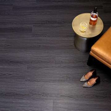
Sleek and chic. In terms of high-impact, going with a dark wire-brush pattern is a sure way to quickly define a space. Never boring, this modern pattern will set the mood immediately.
The most important specification for determining the durability of vinyl flooring is the thickness of the wear-layer. The best wear-layers are made of thick, clear virgin PVC, which covers the paper print-film that gives the floor its unique appearance. Once the wear-layer wears through, the paper is damaged and the floor will need replacement.
Most vinyl floors come with a 8-12 mil wear-layer (0.2-3 mm). The top commercial specs in the industry are higher, at 20-22 mil (0.5 mm). A select few manufacturers offer a “super” commercial spec of 28 mil (0.7 mm).
For Modin, we decided to set a new standard: 40 mil (1.0 mm) of premium virgin PVC. This allows us to offer an industry-leading 20 year Commercial Warranty (Lifetime Residential), compared to nearly all other commercial vinyl floors’ 10 year Commercial Warranty.
Beyond our superior wear-layer, we also use a patented click mechanism for superior hold, and a ceramic-bead coating.
SIZE MATTERS
Wider and longer planks create a sense of space and luxury. Most vinyl floors come in 6” or 7” widths, and 36” or 48” lengths.
For Modin, we designed our planks to be 9” wide, and 60” long. This extra large size allows our gorgeous designs to be fully expressed.
DETAILS THAT COUNT
We made sure to get all the details right. Real texture, to create the feel of wire-brushed wood. Low sheen level, to ensure a natural look that wears well over time. 4-sided bevels, to more accurately emulate the look of real planks. When added together they help create the unique look that is Modin.
DESIGNS THAT INSPIRE
We spent nearly a year just focusing on our designs, to ensure they provide the right mix of color and depth. Focusing on timeless wire-brush and European Oak styles, as well as more contemporary modern washes, our collection offers truly beautiful design that is both functional and inspiring.


 User
UserInspiration for a mid-sized cottage freestanding desk home office library remodel in Salt Lake City with gray walls

 Jackie and the Beanstalk
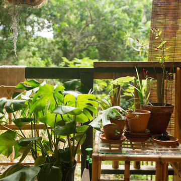
I planted Marvel of Four Season lettuce seeds, which are heat tolerant, directly next to the soaker hose so they stay constantly moist. Seeds must never be allowed to dry out. I will divide these seedlings in the next few weeks

 Ashley Camper Photography
Photo: Ashley Camper Photography © 2014 Houzz
Example of an island style home design design in Hawaii
Example of an island style home design design in Hawaii


 Heritage Construction Companies, LLC.
Example of a huge trendy metal floating open staircase design in Minneapolis


 Drury Design
THE SETUP
Multiple ovens, multiple workspaces, multiple sinks – when you think about it, non-jewish kitchens have been adapting the criteria of kosher kitchens for years.
Gladys’ clients in West Rogers Park are Orthodox Jewish. The house they bought already had a kosher kitchen – it just wasn’t done that well. It needed some more things to be duplicated for the dairy side and the meat side. Plus, it was dark and the configuration wasn’t very conducive for a family of eight.
It was time for a remodel.
Design Objectives
Improve kosher kitchen
Add more storage in the island
Better lighting
More open, lighter feel
Change the wood floor in the kitchen to tile
THE REMODEL
Design Challenges
- We had originally planned on removing a wing wall by the breakfast area. During demolition, we learned it contained a support beam.
- The kitchen is a substantial size, but having two sinks, dishwashers, and ovens presented a challenge – how do we fit it all in and make it flow with the storage still accessible near the work areas?
Where do you stop the materials for the new space? - -- The right tile, paint, lighting, etc. would be needed to make the remodeled area cohesive with the rest of the main floor.
- An existing column limited cabinet options and thus, storage capacity. Could we conceal it without disrupting the cabinetry flow?
Design Solutions
- We had to keep the wing wall, but decided to continue the tile on the sides of the cabinets and maintain the height of the tile to line up with the rest of the backsplash. This actually presented a very nice and cohesive look, especially since the opposite side has a wing wall to the left of the refrigerator.
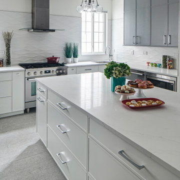
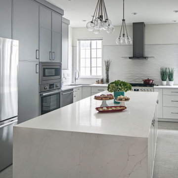
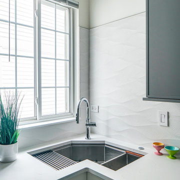
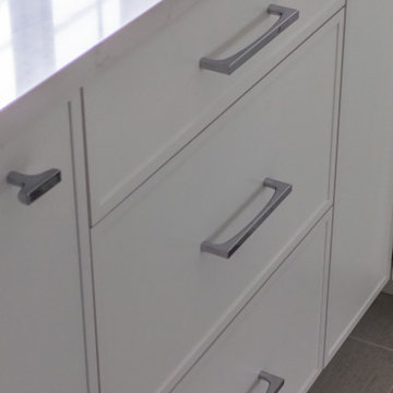
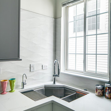
- We used “L-shaped” corner sinks instead of the rectangular ones set on an angle. This gave us more of the legs of the triangles versus the hypotenuse, which allowed for the two dishwashers, and the pullout utensil canisters and spice pullouts while still keeping the 3-drawer cabinets on either side of the range (by the sinks). The old island had the recess for stools which the family never used. By extending the width of the island 6” and utilizing this leg space, we were able to fit 18”-deep cabinets on this side – adding lots of accessible storage. The family can now work simultaneously on the dairy side (the side with the fridge) and the meat side (opposite) without getting in each other’s way. We separated the cooking by using the range oven for the meat and a built-in microwave in the base cabinet. The wall oven with built-in microwave on top is for dairy.
- Corner sinks opened up the middle area for a wider range – we went from a 30” to a 36”. Removing all the wall cabinets (on the range wall) made a big difference. That opened up the entire space while adding some visual impact. (Not pictured: We also made the cabinets directly opposite the range wall tall and removed the countertop, resulting in more room for rollouts and even more storage!) The kitchen now has more storage than it did before.
- We ended up painting the ceiling of the kitchen into the hallway that leads to the foyer. The living and dining rooms were separated by a soffit, so that became a natural boundary. We kept the tile in the kitchen by stopping it short of the hallway and lining it up with the pantry wall. This creates a border between the breakfast area and family room. The rest of the existing wood floors were refinished to refresh and make the hue darker. We also painted a dark accent wall and carried it into the breakfast area to make the rooms look deeper.
- The in-the-way column housed plumbing and couldn’t be moved. We still built cabinets in that spot – we just had to build a chase inside it to conceal the pipes. There was still plenty of room for new storage. We also took the cabinets all the way to the ceiling. The continuous tall cabinets added a functional elegance to the space.
THE RENEWED SPACE
The client’s long-awaited dream of a better kosher kitchen has finally been achieved, beautifully combining enhanced storage solutions with adherence to the family’s orthodox dietary laws. The kitchen’s standout feature, an expanded island, now offers a spacious and efficient workspace. This allows several family members to cook together comfortably, without the inconvenience of bumping into each other, ensuring a harmonious and productive cooking environment.
 Drury Design
THE SETUP
Multiple ovens, multiple workspaces, multiple sinks – when you think about it, non-jewish kitchens have been adapting the criteria of kosher kitchens for years.
Gladys’ clients in West Rogers Park are Orthodox Jewish. The house they bought already had a kosher kitchen – it just wasn’t done that well. It needed some more things to be duplicated for the dairy side and the meat side. Plus, it was dark and the configuration wasn’t very conducive for a family of eight.
It was time for a remodel.
Design Objectives
Improve kosher kitchen
Add more storage in the island
Better lighting
More open, lighter feel
Change the wood floor in the kitchen to tile
THE REMODEL
Design Challenges
- We had originally planned on removing a wing wall by the breakfast area. During demolition, we learned it contained a support beam.
- The kitchen is a substantial size, but having two sinks, dishwashers, and ovens presented a challenge – how do we fit it all in and make it flow with the storage still accessible near the work areas?
Where do you stop the materials for the new space? - -- The right tile, paint, lighting, etc. would be needed to make the remodeled area cohesive with the rest of the main floor.
- An existing column limited cabinet options and thus, storage capacity. Could we conceal it without disrupting the cabinetry flow?
Design Solutions
- We had to keep the wing wall, but decided to continue the tile on the sides of the cabinets and maintain the height of the tile to line up with the rest of the backsplash. This actually presented a very nice and cohesive look, especially since the opposite side has a wing wall to the left of the refrigerator.
- We used “L-shaped” corner sinks instead of the rectangular ones set on an angle. This gave us more of the legs of the triangles versus the hypotenuse, which allowed for the two dishwashers, and the pullout utensil canisters and spice pullouts while still keeping the 3-drawer cabinets on either side of the range (by the sinks). The old island had the recess for stools which the family never used. By extending the width of the island 6” and utilizing this leg space, we were able to fit 18”-deep cabinets on this side – adding lots of accessible storage. The family can now work simultaneously on the dairy side (the side with the fridge) and the meat side (opposite) without getting in each other’s way. We separated the cooking by using the range oven for the meat and a built-in microwave in the base cabinet. The wall oven with built-in microwave on top is for dairy.
- Corner sinks opened up the middle area for a wider range – we went from a 30” to a 36”. Removing all the wall cabinets (on the range wall) made a big difference. That opened up the entire space while adding some visual impact. (Not pictured: We also made the cabinets directly opposite the range wall tall and removed the countertop, resulting in more room for rollouts and even more storage!) The kitchen now has more storage than it did before.
- We ended up painting the ceiling of the kitchen into the hallway that leads to the foyer. The living and dining rooms were separated by a soffit, so that became a natural boundary. We kept the tile in the kitchen by stopping it short of the hallway and lining it up with the pantry wall. This creates a border between the breakfast area and family room. The rest of the existing wood floors were refinished to refresh and make the hue darker. We also painted a dark accent wall and carried it into the breakfast area to make the rooms look deeper.
- The in-the-way column housed plumbing and couldn’t be moved. We still built cabinets in that spot – we just had to build a chase inside it to conceal the pipes. There was still plenty of room for new storage. We also took the cabinets all the way to the ceiling. The continuous tall cabinets added a functional elegance to the space.
THE RENEWED SPACE
The client’s long-awaited dream of a better kosher kitchen has finally been achieved, beautifully combining enhanced storage solutions with adherence to the family’s orthodox dietary laws. The kitchen’s standout feature, an expanded island, now offers a spacious and efficient workspace. This allows several family members to cook together comfortably, without the inconvenience of bumping into each other, ensuring a harmonious and productive cooking environment.
 Drury Design
THE SETUP
Multiple ovens, multiple workspaces, multiple sinks – when you think about it, non-jewish kitchens have been adapting the criteria of kosher kitchens for years.
Gladys’ clients in West Rogers Park are Orthodox Jewish. The house they bought already had a kosher kitchen – it just wasn’t done that well. It needed some more things to be duplicated for the dairy side and the meat side. Plus, it was dark and the configuration wasn’t very conducive for a family of eight.
It was time for a remodel.
Design Objectives
Improve kosher kitchen
Add more storage in the island
Better lighting
More open, lighter feel
Change the wood floor in the kitchen to tile
THE REMODEL
Design Challenges
- We had originally planned on removing a wing wall by the breakfast area. During demolition, we learned it contained a support beam.
- The kitchen is a substantial size, but having two sinks, dishwashers, and ovens presented a challenge – how do we fit it all in and make it flow with the storage still accessible near the work areas?
Where do you stop the materials for the new space? - -- The right tile, paint, lighting, etc. would be needed to make the remodeled area cohesive with the rest of the main floor.
- An existing column limited cabinet options and thus, storage capacity. Could we conceal it without disrupting the cabinetry flow?
Design Solutions
- We had to keep the wing wall, but decided to continue the tile on the sides of the cabinets and maintain the height of the tile to line up with the rest of the backsplash. This actually presented a very nice and cohesive look, especially since the opposite side has a wing wall to the left of the refrigerator.
- We used “L-shaped” corner sinks instead of the rectangular ones set on an angle. This gave us more of the legs of the triangles versus the hypotenuse, which allowed for the two dishwashers, and the pullout utensil canisters and spice pullouts while still keeping the 3-drawer cabinets on either side of the range (by the sinks). The old island had the recess for stools which the family never used. By extending the width of the island 6” and utilizing this leg space, we were able to fit 18”-deep cabinets on this side – adding lots of accessible storage. The family can now work simultaneously on the dairy side (the side with the fridge) and the meat side (opposite) without getting in each other’s way. We separated the cooking by using the range oven for the meat and a built-in microwave in the base cabinet. The wall oven with built-in microwave on top is for dairy.
- Corner sinks opened up the middle area for a wider range – we went from a 30” to a 36”. Removing all the wall cabinets (on the range wall) made a big difference. That opened up the entire space while adding some visual impact. (Not pictured: We also made the cabinets directly opposite the range wall tall and removed the countertop, resulting in more room for rollouts and even more storage!) The kitchen now has more storage than it did before.
- We ended up painting the ceiling of the kitchen into the hallway that leads to the foyer. The living and dining rooms were separated by a soffit, so that became a natural boundary. We kept the tile in the kitchen by stopping it short of the hallway and lining it up with the pantry wall. This creates a border between the breakfast area and family room. The rest of the existing wood floors were refinished to refresh and make the hue darker. We also painted a dark accent wall and carried it into the breakfast area to make the rooms look deeper.
- The in-the-way column housed plumbing and couldn’t be moved. We still built cabinets in that spot – we just had to build a chase inside it to conceal the pipes. There was still plenty of room for new storage. We also took the cabinets all the way to the ceiling. The continuous tall cabinets added a functional elegance to the space.
THE RENEWED SPACE
The client’s long-awaited dream of a better kosher kitchen has finally been achieved, beautifully combining enhanced storage solutions with adherence to the family’s orthodox dietary laws. The kitchen’s standout feature, an expanded island, now offers a spacious and efficient workspace. This allows several family members to cook together comfortably, without the inconvenience of bumping into each other, ensuring a harmonious and productive cooking environment.
 Drury Design
THE SETUP
Multiple ovens, multiple workspaces, multiple sinks – when you think about it, non-jewish kitchens have been adapting the criteria of kosher kitchens for years.
Gladys’ clients in West Rogers Park are Orthodox Jewish. The house they bought already had a kosher kitchen – it just wasn’t done that well. It needed some more things to be duplicated for the dairy side and the meat side. Plus, it was dark and the configuration wasn’t very conducive for a family of eight.
It was time for a remodel.
Design Objectives
Improve kosher kitchen
Add more storage in the island
Better lighting
More open, lighter feel
Change the wood floor in the kitchen to tile
THE REMODEL
Design Challenges
- We had originally planned on removing a wing wall by the breakfast area. During demolition, we learned it contained a support beam.
- The kitchen is a substantial size, but having two sinks, dishwashers, and ovens presented a challenge – how do we fit it all in and make it flow with the storage still accessible near the work areas?
Where do you stop the materials for the new space? - -- The right tile, paint, lighting, etc. would be needed to make the remodeled area cohesive with the rest of the main floor.
- An existing column limited cabinet options and thus, storage capacity. Could we conceal it without disrupting the cabinetry flow?
Design Solutions
- We had to keep the wing wall, but decided to continue the tile on the sides of the cabinets and maintain the height of the tile to line up with the rest of the backsplash. This actually presented a very nice and cohesive look, especially since the opposite side has a wing wall to the left of the refrigerator.
- We used “L-shaped” corner sinks instead of the rectangular ones set on an angle. This gave us more of the legs of the triangles versus the hypotenuse, which allowed for the two dishwashers, and the pullout utensil canisters and spice pullouts while still keeping the 3-drawer cabinets on either side of the range (by the sinks). The old island had the recess for stools which the family never used. By extending the width of the island 6” and utilizing this leg space, we were able to fit 18”-deep cabinets on this side – adding lots of accessible storage. The family can now work simultaneously on the dairy side (the side with the fridge) and the meat side (opposite) without getting in each other’s way. We separated the cooking by using the range oven for the meat and a built-in microwave in the base cabinet. The wall oven with built-in microwave on top is for dairy.
- Corner sinks opened up the middle area for a wider range – we went from a 30” to a 36”. Removing all the wall cabinets (on the range wall) made a big difference. That opened up the entire space while adding some visual impact. (Not pictured: We also made the cabinets directly opposite the range wall tall and removed the countertop, resulting in more room for rollouts and even more storage!) The kitchen now has more storage than it did before.
- We ended up painting the ceiling of the kitchen into the hallway that leads to the foyer. The living and dining rooms were separated by a soffit, so that became a natural boundary. We kept the tile in the kitchen by stopping it short of the hallway and lining it up with the pantry wall. This creates a border between the breakfast area and family room. The rest of the existing wood floors were refinished to refresh and make the hue darker. We also painted a dark accent wall and carried it into the breakfast area to make the rooms look deeper.
- The in-the-way column housed plumbing and couldn’t be moved. We still built cabinets in that spot – we just had to build a chase inside it to conceal the pipes. There was still plenty of room for new storage. We also took the cabinets all the way to the ceiling. The continuous tall cabinets added a functional elegance to the space.
THE RENEWED SPACE
The client’s long-awaited dream of a better kosher kitchen has finally been achieved, beautifully combining enhanced storage solutions with adherence to the family’s orthodox dietary laws. The kitchen’s standout feature, an expanded island, now offers a spacious and efficient workspace. This allows several family members to cook together comfortably, without the inconvenience of bumping into each other, ensuring a harmonious and productive cooking environment.
 Drury Design
THE SETUP
Multiple ovens, multiple workspaces, multiple sinks – when you think about it, non-jewish kitchens have been adapting the criteria of kosher kitchens for years.
Gladys’ clients in West Rogers Park are Orthodox Jewish. The house they bought already had a kosher kitchen – it just wasn’t done that well. It needed some more things to be duplicated for the dairy side and the meat side. Plus, it was dark and the configuration wasn’t very conducive for a family of eight.
It was time for a remodel.
Design Objectives
Improve kosher kitchen
Add more storage in the island
Better lighting
More open, lighter feel
Change the wood floor in the kitchen to tile
THE REMODEL
Design Challenges
- We had originally planned on removing a wing wall by the breakfast area. During demolition, we learned it contained a support beam.
- The kitchen is a substantial size, but having two sinks, dishwashers, and ovens presented a challenge – how do we fit it all in and make it flow with the storage still accessible near the work areas?
Where do you stop the materials for the new space? - -- The right tile, paint, lighting, etc. would be needed to make the remodeled area cohesive with the rest of the main floor.
- An existing column limited cabinet options and thus, storage capacity. Could we conceal it without disrupting the cabinetry flow?
Design Solutions
- We had to keep the wing wall, but decided to continue the tile on the sides of the cabinets and maintain the height of the tile to line up with the rest of the backsplash. This actually presented a very nice and cohesive look, especially since the opposite side has a wing wall to the left of the refrigerator.
- We used “L-shaped” corner sinks instead of the rectangular ones set on an angle. This gave us more of the legs of the triangles versus the hypotenuse, which allowed for the two dishwashers, and the pullout utensil canisters and spice pullouts while still keeping the 3-drawer cabinets on either side of the range (by the sinks). The old island had the recess for stools which the family never used. By extending the width of the island 6” and utilizing this leg space, we were able to fit 18”-deep cabinets on this side – adding lots of accessible storage. The family can now work simultaneously on the dairy side (the side with the fridge) and the meat side (opposite) without getting in each other’s way. We separated the cooking by using the range oven for the meat and a built-in microwave in the base cabinet. The wall oven with built-in microwave on top is for dairy.
- Corner sinks opened up the middle area for a wider range – we went from a 30” to a 36”. Removing all the wall cabinets (on the range wall) made a big difference. That opened up the entire space while adding some visual impact. (Not pictured: We also made the cabinets directly opposite the range wall tall and removed the countertop, resulting in more room for rollouts and even more storage!) The kitchen now has more storage than it did before.
- We ended up painting the ceiling of the kitchen into the hallway that leads to the foyer. The living and dining rooms were separated by a soffit, so that became a natural boundary. We kept the tile in the kitchen by stopping it short of the hallway and lining it up with the pantry wall. This creates a border between the breakfast area and family room. The rest of the existing wood floors were refinished to refresh and make the hue darker. We also painted a dark accent wall and carried it into the breakfast area to make the rooms look deeper.
- The in-the-way column housed plumbing and couldn’t be moved. We still built cabinets in that spot – we just had to build a chase inside it to conceal the pipes. There was still plenty of room for new storage. We also took the cabinets all the way to the ceiling. The continuous tall cabinets added a functional elegance to the space.
THE RENEWED SPACE
The client’s long-awaited dream of a better kosher kitchen has finally been achieved, beautifully combining enhanced storage solutions with adherence to the family’s orthodox dietary laws. The kitchen’s standout feature, an expanded island, now offers a spacious and efficient workspace. This allows several family members to cook together comfortably, without the inconvenience of bumping into each other, ensuring a harmonious and productive cooking environment.
9