
Search results for "Conduit" in Home Design Ideas
 Lindsay O. Creative
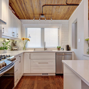
Eat-in kitchen - transitional u-shaped medium tone wood floor eat-in kitchen idea in Calgary with an undermount sink, shaker cabinets, white cabinets, quartzite countertops, white backsplash, subway tile backsplash, stainless steel appliances and an island
 Paradise Found Construction
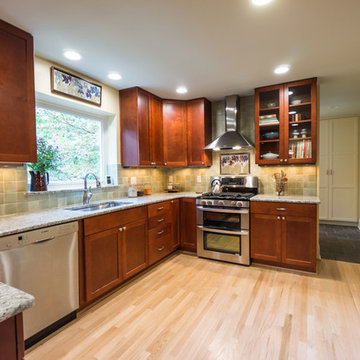
The homes in Heritage Hills in Chapel Hill, NC are representative of the popularity and explosive growth of American Home Ownership that occurred during the economic expansion that followed the end of WW II. They were designed and built to foster the benefits and sense of “community”, where families could come together and share theirs and their children’s lives. They are typically in very desirable locations within their larger communities, and remodeling them with modern amenities, increasing the performance and efficiency of them, and having them Green Certified (independent third-party verified) makes them extremely attractive to buyers, and helps to raise other property values within the neighborhood.
Green Certified Remodeled Homes offer significant value and advantage in the marketplace over similar homes in their area, which is especially important as a new, younger era of home buyers enter the market. Current trends suggest that younger (as well as many “seasoned”) homeowners are interested in smaller, more efficient (and thus affordable) homes situated closer to shopping, their work, entertainment opportunities, and access to the economic and environmental benefits of mass transit.
These older homes also offer an additional value that is continuing to gain visibility and appreciation in the market place. They were built from lumber from slower-growth trees (denser and harder wood), and as such offer superior structural support compared to the same home built using lumber from today’s faster-growing (softer and less-dense wood) trees.
Robin and Kent had lived in their 2-story Gambrel Roof home in Heritage Hills since 1994. The house was structurally sound, due in large part to the old-growth (and denser) yellow pine that was used in its framing. They loved the quiet neighborhood, its sense of community and amenities, and their home. It suited their life-style and needs; and they had decided that they would remain in the home. It was showing its age, and was in need of general repairs and maintenance, and its energy, water, and indoor air quality performance was continuing to increase their ongoing cost of ownership.
Robin loved the screen porch that looked out on their private and nicely landscaped back yard, but she wanted to be able to use it in the colder months of the year. She was unsatisfied with the kitchen and the mud room / laundry room, and the darkness of other living spaces. A previous water leak in the laundry room had resulted in a large patch of mold that had compromised flooring, wall board, and insulation and contributed to the homes reduced indoor air quality.
The home lacked insulation in the crawl, and inadequate insulation in the attic. The single HVAC unit had been replaced a few years earlier with a more efficient unit, but with a single programmable thermostat control on the first floor and aging and un-insulated ducting, the second floor was often over-heated in the summer months.
The original wood windows had begun to deteriorate and were drafty and inefficient, and the original wood-burning fireplace was an open conduit for escaping conditioned air as well as an inlet for wood-smoke smelling air being pulled into the home. The siding had been replaced a few years earlier with a cement-fiber product, but the exterior wood trim was compromised and beginning to look unsightly. Its original architecture had been altered over the years in ways that presented ongoing maintenance and durability issues, as well as disrupting the elegance of the original design.
Kent has worked for over 30 years in the Environmental Sciences field, and is considered to be a national expert in understanding the sources of, and human exposure to pollutants in indoor environments. He had always been very conscious and cautious about the effects on indoor air quality that the construction, furnishings, and products used in home had on him and his family.
Project Goals
Increase the performance of their home by improving energy efficiency by at least 40% and lowering their natural gas and electric utility costs.
Increase the performance of their home by reducing water usage by at least 40% and lowering the water utility costs.
Increase the comfort of their home that was being compromised by an inadequate HVAC design, inadequate insulation, inefficient and compromised wood windows, and copious air intrusions and drafts.
Improve the healthiness of the homes indoor air quality that was being compromised by an open wood-burning fireplace, and prior water intrusion that had allowed colonies of mold to thrive.
Create a new Kitchen, Family Room, Home Office, Mudroom, and Laundry Room that featured some of the latest designs and trends and harmonized with the rest of the homes charm.
Increase the usefulness and aesthetics of the screened porch by creating a warm and inviting semi-conditioned 3-Season Room that extended the times during the year that it was comfortable.
Introduce day-lighting into areas of the home that were dark and uninviting.
Brighten and harmonize all of the interior finishes.
Protect and restore the exterior of the home with superior-performing products and finishes.
Achieve Gold Level Green Home Certification in conformance with the ICC 700-2012 National Green Building Standards (NGBS).


Find the right local pro for your project

 ZODEGA | TIS
Front beds two months post-installation. Please forgive the tree stakes and the landscape lighting conduit (not installed as of the day this picture was taken).

 Subcomm Pools
 Main Pool: Striping 7 layers old plaster; New coping stones; New tiles; New racing line tile and targets; New 12'' dual main drain box; New returns; New pool perimeter caulking; New plaster; New under water lights installation (1-running electrical conduit to each light, 2-instaling junk box for each light, 3-running bonding wires to each light, 4-installing 9 new LED lights).
Wading Pool: Striping 7 layers old plaster; New coping stones; New tiles; Deck sprayers; New plaster.
 Studio IQL
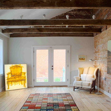
The richness of the raw materials warm this white room.
Living room - mid-sized eclectic loft-style light wood floor living room idea in Philadelphia with white walls, no fireplace and no tv
Living room - mid-sized eclectic loft-style light wood floor living room idea in Philadelphia with white walls, no fireplace and no tv

 InnovationLand
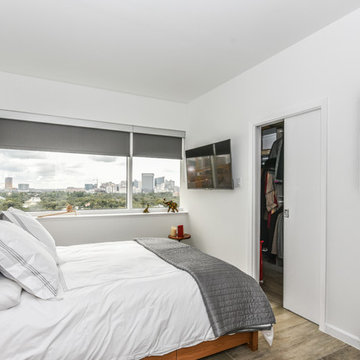
Houston Interior Designer Lisha Maxey took this Museum District condo from the dated, mirrored walls of the 1980s to Mid Century Modern with a gallery look featuring the client's art collection.
"The place was covered with glued-down, floor-to-ceiling mirrors," says Lisha Maxey, senior designer for Homescapes of Houston and principal at LGH Design Services in Houston. "When we took them off the walls, the walls came apart. We ended up taking them down to the studs."
The makeover took six months to complete, primarily because of strict condo association rules that only gave the Houston interior designers very limited access to the elevator - through which all materials and team members had to go.
"Monday through Friday, we could only be noisy from 10 a.m. to 2 p.m., and if we had to do something extra loud, like sawing or drilling, we had to schedule it with the management and they had to communicate that to the condo owners. So it was just a lot of coordination. But a lot of Inner City Loopers live in these kinds of buildings, so we're used to handling that kind of thing."
The client, a child psychiatrist in her 60s, recently moved to Houston from northeast Texas to be with friends. After being widowed three years ago, she decided it was time to let go of the traditionally styled estate that wasn't really her style anyway. An avid diver who has traveled around the world to pursue her passion, she has amassed a large collection of art from her travels. Downsizing to 1,600 feet and wanting to go more contemporary, she wanted the display - and the look - more streamlined.
"She wanted clean lines and muted colors, with the main focus being her artwork," says Maxey. "So we made the space a palette for that."
Enter the white, gallery-grade paint she chose for the walls: "It's halfway between satin and flat," explains Maxey. "It's not glossy and it's not chalky - just very smooth and clean."
Adding to the gallery theme is the satin nickel track lighting with lamps aimed to highlight pieces of art. "This lighting has no wires," notes Maxey. "It's powered by a positive and negative conduit."
The new flooring throughout is a blended-grey porcelain tile that looks like wood planks. "It's gorgeous, natural-looking and combines all the beauty of wood with the durability of tile," says Maxey. "We used it throughout the condo to unify the space."
After Maxey started looking at the client's bright, vibrant, colorful artwork, she felt the palette couldn't stay as muted anymore. Hence the Mid Century Modern orange leather sofas from West Elm and bright green chairs from Joybird, plus the throw pillows in different textures, patterns and shades of gold, orange and green.
The concave lines of the Danish-inspired chairs, she notes, help them look beautiful from all the way around - a key to designing spaces for loft living.
"The table in the living room is very interesting," notes Maxey. "It was handmade for the client in 1974 and has a signature on it from the artist. She was adamant about including the piece, which has all these hand-painted black-and-white art tiles on the top. I took one look at it and said 'It's not really going to go.'"
However, after cutting 6 inches off the bottom and making it look a little distressed, the table ended up being the perfect complement to the sofas.
The dining room table - from Design Within Reach - is a solid piece of mahogany, the chair upholstery a mix of grey velvet and leather and the legs a shiny brass. "The side chairs are leather and the end ones are velvet," says Maxey. "It's a nice textural mix that lends depth and texture."
The galley kitchen, meanwhile, has been lightened and brightened, with white quartz countertops and backsplashes mimicking the look of Carrara marble, stainless steel appliances and a velvet green bench seat for a punch of color. The cabinets are painted a cool grey color called "Silverplate."
The two bathrooms have been updated with contemporary white vanities and vessel sinks and the master bath now features a walk-in shower tiled in Dolomite white marble (the floor is Bianco Carrara marble mosaic, done in a herringbone pattern.
In the master bedroom, Homescapes of Houston knocked down a wall between two smaller closets with swing doors to make one large walk-in closet with pocket doors. The closet in the guest bedroom also came out 13 more inches.
The client's artwork throughout personalizes the space and tells the story of a life. There's a huge bowl of shells from the client's diving adventures, framed art from her child psychiatry patients and a 16th century wood carving from a monastery that's been in her family forever.
"Her collection is quite impressive," says Maxey. "There's even a framed piece of autographed songs written by John Lennon." (You can see this black-framed piece of art on the wall in the photo above of two green chairs).
"We're extremely happy with how the project turned out, and so is the client," says Maxey. "No expense was spared for her. It was a labor of love and we were excited to do it."
 Alair Homes South Tampa
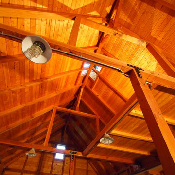
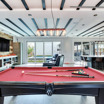
During the planning phase we undertook a fairly major Value Engineering of the design to ensure that the project would be completed within the clients budget. The client identified a ‘Fords Garage’ style that they wanted to incorporate. They wanted an open, industrial feel, however, we wanted to ensure that the property felt more like a welcoming, home environment; not a commercial space. A Fords Garage typically has exposed beams, ductwork, lighting, conduits, etc. But this extent of an Industrial style is not ‘homely’. So we incorporated tongue and groove ceilings with beams, concrete colored tiled floors, and industrial style lighting fixtures.
During construction the client designed the courtyard, which involved a large permit revision and we went through the full planning process to add that scope of work.
The finished project is a gorgeous blend of industrial and contemporary home style.
 Alair Homes South Tampa
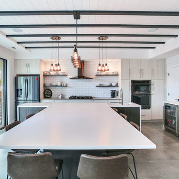
During the planning phase we undertook a fairly major Value Engineering of the design to ensure that the project would be completed within the clients budget. The client identified a ‘Fords Garage’ style that they wanted to incorporate. They wanted an open, industrial feel, however, we wanted to ensure that the property felt more like a welcoming, home environment; not a commercial space. A Fords Garage typically has exposed beams, ductwork, lighting, conduits, etc. But this extent of an Industrial style is not ‘homely’. So we incorporated tongue and groove ceilings with beams, concrete colored tiled floors, and industrial style lighting fixtures.
During construction the client designed the courtyard, which involved a large permit revision and we went through the full planning process to add that scope of work.
The finished project is a gorgeous blend of industrial and contemporary home style.
 Alexander Butler | Design Services, LLC
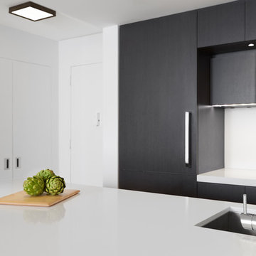
This project was a bachelor pad for a tech-oriented entrepreneur. We focused on the main Living & Kitchen areas, as well as the Master Bathroom. A 'black-and-white' motif was employed, and a particular focus was paid to the lighting. The kitchen ceiling was dropped to full depth to accommodate recessed lighting, and the living room was slightly dropped so we could 'slot in' modern Neoray light fixtures.
We were able to remove a dividing wall housing only an outdated intercom conduit, which allowed us to significantly change the feel of the space by completely opening things up.
Cabinets featured Abet Laminati 657 Holz Laminate, which not only is a budget friendly alternative to natural wood veneers, but is also easy to clean and maintain, and still manages to look great.
Countertops and Window Sills were Caesarstone Pure White and Espresso, respectively.
Erin & Erica Photography
 Kay Green Design
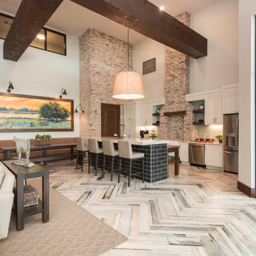
Chic is a French word associated with stylishness, while Rustic means related to, or suitable for the country.Together, Rustic Chic is an interior design alchemy, the chic suggesting culture, fashion and trendiness, while the Rustic element idealizes a natural pastoral charm.
This style tends to reclaim the old, and reinvent materials characterized by imperfect finishes. Rough-hewn finishes, marks, divots, scratches and imperfections are purposeful. The materials themselves often provide historical reference (either real or imagined) and are incorporated to balance hardness (think steel, iron and brick) with the softness of modern furniture and softgoods.
Exposed brick walls can be a key component of this look, but wallpapers can do the job if you aren’t fortunate enough to have the real thing.
Scaffold planks, exposed conduit, timber and fencing can be added to create a depth of character; and when paired with modern styled furnishings and accoutrements – this is a fresh, nostalgic minded trend that we’ll be seeing well through 2019.
 User
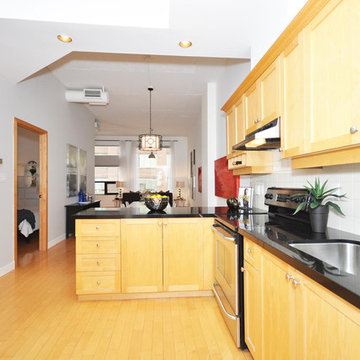
UserThis boutique loft is located in the heart of the St. Lawrence Market District in downtown Toronto. There are only 12 units in the entire building which makes it a hot commodity!
When we went to meet the clients for our initial consultation we were immediately struck by the 11' 6" high ceilings and the 10 x 25ft windows.
This unit had plenty of original charm i.e. exposed ductwork, exposed electrical conduits and junction boxes but it lacked in the finishings and decor department.
The Hope Designs Team was hired to stage the loft and bring in the "wow factor".
Utilizing the some of the clients existing furnishings in combination with Hope Designs furniture, art, decor and accessories we able to transform the space.
 Southern Dogface Properties, LLC
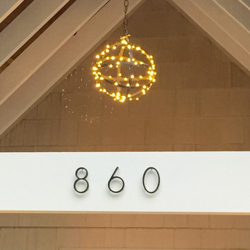
AFTER: Kellum created her own light fixture before the porch was ever built. Because the LED string lights have their own miniature transformer, she planned ahead to have an exterior power receptacle run through conduit along the ridge beam. An inside switch controls the receptacle, a feature that will also come in handy for holiday lights. / address numbers from Ace Hardware / photo by Jo Kellum
 InnovationLand
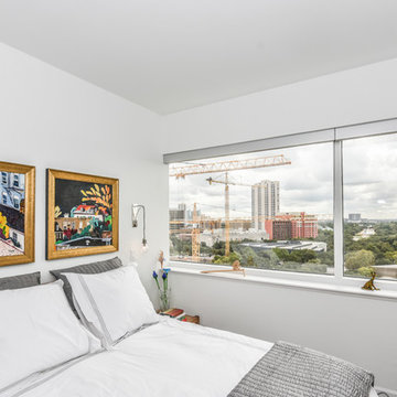
Houston Interior Designer Lisha Maxey took this Museum District condo from the dated, mirrored walls of the 1980s to Mid Century Modern with a gallery look featuring the client's art collection.
"The place was covered with glued-down, floor-to-ceiling mirrors," says Lisha Maxey, senior designer for Homescapes of Houston and principal at LGH Design Services in Houston. "When we took them off the walls, the walls came apart. We ended up taking them down to the studs."
The makeover took six months to complete, primarily because of strict condo association rules that only gave the Houston interior designers very limited access to the elevator - through which all materials and team members had to go.
"Monday through Friday, we could only be noisy from 10 a.m. to 2 p.m., and if we had to do something extra loud, like sawing or drilling, we had to schedule it with the management and they had to communicate that to the condo owners. So it was just a lot of coordination. But a lot of Inner City Loopers live in these kinds of buildings, so we're used to handling that kind of thing."
The client, a child psychiatrist in her 60s, recently moved to Houston from northeast Texas to be with friends. After being widowed three years ago, she decided it was time to let go of the traditionally styled estate that wasn't really her style anyway. An avid diver who has traveled around the world to pursue her passion, she has amassed a large collection of art from her travels. Downsizing to 1,600 feet and wanting to go more contemporary, she wanted the display - and the look - more streamlined.
"She wanted clean lines and muted colors, with the main focus being her artwork," says Maxey. "So we made the space a palette for that."
Enter the white, gallery-grade paint she chose for the walls: "It's halfway between satin and flat," explains Maxey. "It's not glossy and it's not chalky - just very smooth and clean."
Adding to the gallery theme is the satin nickel track lighting with lamps aimed to highlight pieces of art. "This lighting has no wires," notes Maxey. "It's powered by a positive and negative conduit."
The new flooring throughout is a blended-grey porcelain tile that looks like wood planks. "It's gorgeous, natural-looking and combines all the beauty of wood with the durability of tile," says Maxey. "We used it throughout the condo to unify the space."
After Maxey started looking at the client's bright, vibrant, colorful artwork, she felt the palette couldn't stay as muted anymore. Hence the Mid Century Modern orange leather sofas from West Elm and bright green chairs from Joybird, plus the throw pillows in different textures, patterns and shades of gold, orange and green.
The concave lines of the Danish-inspired chairs, she notes, help them look beautiful from all the way around - a key to designing spaces for loft living.
"The table in the living room is very interesting," notes Maxey. "It was handmade for the client in 1974 and has a signature on it from the artist. She was adamant about including the piece, which has all these hand-painted black-and-white art tiles on the top. I took one look at it and said 'It's not really going to go.'"
However, after cutting 6 inches off the bottom and making it look a little distressed, the table ended up being the perfect complement to the sofas.
The dining room table - from Design Within Reach - is a solid piece of mahogany, the chair upholstery a mix of grey velvet and leather and the legs a shiny brass. "The side chairs are leather and the end ones are velvet," says Maxey. "It's a nice textural mix that lends depth and texture."
The galley kitchen, meanwhile, has been lightened and brightened, with white quartz countertops and backsplashes mimicking the look of Carrara marble, stainless steel appliances and a velvet green bench seat for a punch of color. The cabinets are painted a cool grey color called "Silverplate."
The two bathrooms have been updated with contemporary white vanities and vessel sinks and the master bath now features a walk-in shower tiled in Dolomite white marble (the floor is Bianco Carrara marble mosaic, done in a herringbone pattern.
In the master bedroom, Homescapes of Houston knocked down a wall between two smaller closets with swing doors to make one large walk-in closet with pocket doors. The closet in the guest bedroom also came out 13 more inches.
The client's artwork throughout personalizes the space and tells the story of a life. There's a huge bowl of shells from the client's diving adventures, framed art from her child psychiatry patients and a 16th century wood carving from a monastery that's been in her family forever.
"Her collection is quite impressive," says Maxey. "There's even a framed piece of autographed songs written by John Lennon." (You can see this black-framed piece of art on the wall in the photo above of two green chairs).
"We're extremely happy with how the project turned out, and so is the client," says Maxey. "No expense was spared for her. It was a labor of love and we were excited to do it."
 kimberly peck architect
photos by Pedro Marti
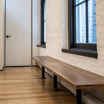
This large light-filled open loft in the Tribeca neighborhood of New York City was purchased by a growing family to make into their family home. The loft, previously a lighting showroom, had been converted for residential use with the standard amenities but was entirely open and therefore needed to be reconfigured. One of the best attributes of this particular loft is its extremely large windows situated on all four sides due to the locations of neighboring buildings. This unusual condition allowed much of the rear of the space to be divided into 3 bedrooms/3 bathrooms, all of which had ample windows. The kitchen and the utilities were moved to the center of the space as they did not require as much natural lighting, leaving the entire front of the loft as an open dining/living area. The overall space was given a more modern feel while emphasizing it’s industrial character. The original tin ceiling was preserved throughout the loft with all new lighting run in orderly conduit beneath it, much of which is exposed light bulbs. In a play on the ceiling material the main wall opposite the kitchen was clad in unfinished, distressed tin panels creating a focal point in the home. Traditional baseboards and door casings were thrown out in lieu of blackened steel angle throughout the loft. Blackened steel was also used in combination with glass panels to create an enclosure for the office at the end of the main corridor; this allowed the light from the large window in the office to pass though while creating a private yet open space to work. The master suite features a large open bath with a sculptural freestanding tub all clad in a serene beige tile that has the feel of concrete. The kids bath is a fun play of large cobalt blue hexagon tile on the floor and rear wall of the tub juxtaposed with a bright white subway tile on the remaining walls. The kitchen features a long wall of floor to ceiling white and navy cabinetry with an adjacent 15 foot island of which half is a table for casual dining. Other interesting features of the loft are the industrial ladder up to the small elevated play area in the living room, the navy cabinetry and antique mirror clad dining niche, and the wallpapered powder room with antique mirror and blackened steel accessories.


 InnovationLand
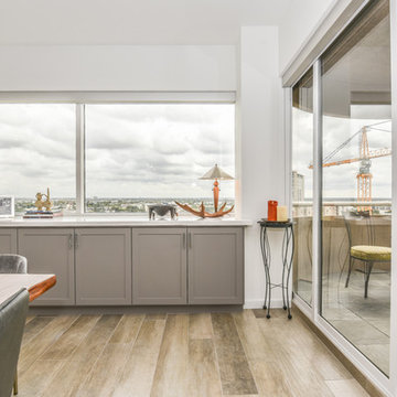
Houston Interior Designer Lisha Maxey took this Museum District condo from the dated, mirrored walls of the 1980s to Mid Century Modern with a gallery look featuring the client’s art collection.
The place was covered with glued-down, floor-to-ceiling mirrors,” says Lisha Maxey, senior designer for Homescapes of Houston and principal at LGH Design Services in Houston. “When we took them off the walls, the walls came apart. We ended up taking them down to the studs."
The makeover took six months to complete, primarily because of strict condo association rules that only gave the Houston interior designers very limited access to the elevator – through which all materials and team members had to go.
“Monday through Friday, we could only be noisy from 10 a.m. to 2 p.m., and if we had to do something extra loud, like sawing or drilling, we had to schedule it with the management and they had to communicate that to the condo owners. So it was just a lot of coordination. But a lot of Inner City Loopers live in these kinds of buildings, so we’re used to handling that kind of thing.”
The client, a child psychiatrist in her 60s, recently moved to Houston from northeast Texas to be with friends. After being widowed three years ago, she decided it was time to let go of the traditionally styled estate that wasn’t really her style anyway. An avid diver who has traveled around the world to pursue her passion, she has amassed a large collection of art from her travels. Downsizing to 1,600 feet and wanting to go more contemporary, she wanted the display – and the look – more streamlined.
“She wanted clean lines and muted colors, with the main focus being her artwork,” says Maxey. “So we made the space a palette for that.”
Enter the white, gallery-grade paint she chose for the walls: “It’s halfway between satin and flat,” explains Maxey. “It’s not glossy and it’s not chalky – just very smooth and clean."
Adding to the gallery theme is the satin nickel track lighting with lamps aimed to highlight pieces of art. “This lighting has no wires,” notes Maxey. “It’s powered by a positive and negative conduit.”
The new flooring throughout is a blended-grey porcelain tile that looks like wood planks. “It’s gorgeous, natural-looking and combines all the beauty of wood with the durability of tile,” says Maxey. “We used it throughout the condo to unify the space.”
After Maxey started looking at the client’s bright, vibrant, colorful artwork, she felt the palette couldn’t stay as muted anymore. Hence the Mid Century Modern orange leather sofas from West Elm and bright green chairs from Joybird, plus the throw pillows in different textures, patterns and shades of gold, orange and green.
The concave lines of the Danish-inspired chairs, she notes, help them look beautiful from all the way around – a key to designing spaces for loft living.
“The table in the living room is very interesting,” notes Maxey. “It was handmade for the client in 1974 and has a signature on it from the artist. She was adamant about including the piece, which has all these hand-painted black-and-white art tiles on the top. I took one look at it and said ‘It’s not really going to go.’”
However, after cutting 6 inches off the bottom and making it look a little distressed, the table ended up being the perfect complement to the sofas.
The dining room table – from Design Within Reach – is a solid piece of mahogany, the chair upholstery a mix of grey velvet and leather and the legs a shiny brass. “The side chairs are leather and the end ones are velvet,” says Maxey. “It’s a nice textural mix that lends depth and texture.”The galley kitchen, meanwhile, has been lightened and brightened, with new, white contemporary cabinetry, quartz countertops mimicking the look of Carrara marble, stainless steel appliances and a velvet green bench seat for a punch of color.The two bathrooms have been updated with contemporary white vanities and vessel sinks and the master bath now features a walk-in shower tiled in Dolomite white marble (the floor is Bianco Carrara marble mosaic, done in a herringbone pattern).In the master bedroom, Homescapes of Houston knocked down a wall between two smaller closets with swing doors to make one large walk-in closet with pocket doors. The closet in the guest bedroom also came out 13 more inches.The client’s artwork throughout personalizes the space and tells the story of a life. There’s a huge bowl of shells from the client’s diving adventures, framed art from her child psychiatry patients and a 16th century wood carving from a monastery that’s been in her family forever.
“Her collection is quite impressive,” says Maxey. “There’s even a framed piece of autographed songs written by John Lennon.” (You can see this black-framed piece of art on the wall in the photo above of two green chairs).
“We’re extremely happy with how the project turned out, and so is the client,” says Maxey. “No expense was spared for her. It was a labor of love and we were excited to do it.”
 Steiner Remodel LLC
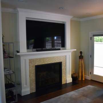
An old, unusable wood-burning fireplace was removed and replaced with a new gas fireplace with a custom- built mantel and entertainment center. The existing wall and framing were modified and a new gas line, new electrical and low voltage wiring were run. We installed new tile, new baseboard and crown and refurbished a beat up column. Carpet was removed and a new hardwood floor was installed. We even ran conduit in the wall for the TV and PlayStation cables.
 Gina Hadfield with Champions Real Estate Group
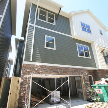
This new home will be completed and move-in ready in late May, 2014. Ideal for commuters & downtown workers, these homes are centrally located with easy,
almost immediate access to many freeways. The charming community is close to hike and bike trails, shops and many neighborhood restaurants the Houston Heights has to offer. The homes are enhanced with many energy features and fine finishes.
Photos taken by Gina Hadfield
21