
Search results for "Conduit" in Home Design Ideas
 Alair Homes South Tampa
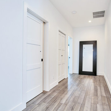
During the planning phase we undertook a fairly major Value Engineering of the design to ensure that the project would be completed within the clients budget. The client identified a ‘Fords Garage’ style that they wanted to incorporate. They wanted an open, industrial feel, however, we wanted to ensure that the property felt more like a welcoming, home environment; not a commercial space. A Fords Garage typically has exposed beams, ductwork, lighting, conduits, etc. But this extent of an Industrial style is not ‘homely’. So we incorporated tongue and groove ceilings with beams, concrete colored tiled floors, and industrial style lighting fixtures.
During construction the client designed the courtyard, which involved a large permit revision and we went through the full planning process to add that scope of work.
The finished project is a gorgeous blend of industrial and contemporary home style.
 MAIDEN Steel
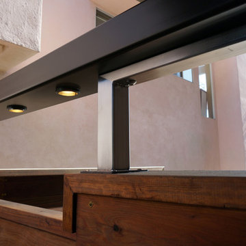
Stainless Steel and powdercoated Steel overhead light fixture with with recessed LEDs. Designed and built by NOE design Co. This custom piece illuminates the walkway while also acting as a hidden conduit to conceal the wiring for the rest of the front yard.
 Laqfoil Ltd.
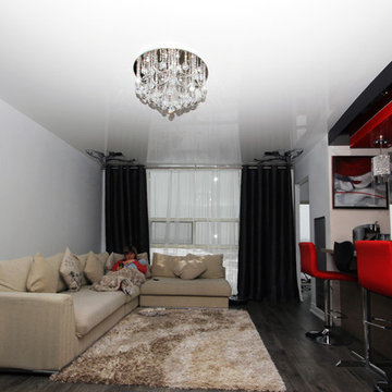
The issues that annoyed the family in this condo are common to new condo units: Low ceilings covered with a popcorn finish, small rooms, low light in the bedrooms and living room, and no ceiling light fixtures. Concrete ceilings are not only difficult to drill into to install fixtures, installing wiring behind them for such fixtures is impossible. There are often conduits for building services embedded in the concrete along with structural steel reinforcements, so drilling without x-raying first is dangerous.
Laqfoil stretch ceiling provided a solution to all of these issues for this condo unit. A high gloss finish was chosen, as the reflections visually double the height of the space. Installing a stretch ceiling also naturally conceals the popcorn ceiling behind it, but in this case, was also used to conceal the wiring necessary to add ceiling lights in every room. The wiring was simply attached to the existing popcorn ceiling. Laqfoil stretch ceiling is supported around the perimeter only, by tracks, or profiles which are only about 0.75" thick. The ceiling membrane itself is less than one millimetre thick.
We also added a small vector graphic, printed in each corner of the living room ceiling, for a unique aesthetic effect.
We constructed a suspended bulkhead above the island and covered it with red high gloss membrane, to visually separate the kitchen and living room while keeping the design's open concept. This also provided a supporting structure for 3 mini chandelier pendant lights.
A red rose depicted on a black and white textured ground was chosen for the kitchen ceiling and applied using digital wide format printing technology, to tie the red, black and white colour scheme with the kitchen cabinets' texture.
Find the right local pro for your project
 Oran Remodeling Inc.
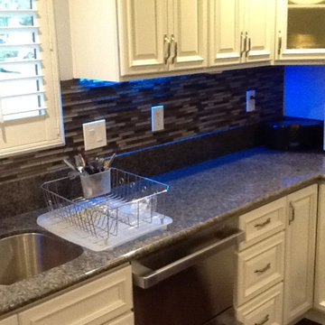
We began this project by having the client meet with our kitchen designer and coming up with the best use of their galley/wall style kitchen and bathroom. We ended on a layout that relocated some of the appliances and installed a new kitchen island and vanity for the bathroom. We also added electrical and gas lines for an oven, cook-top, outlets and hood vent.
In addition we also:
Demo all heater, cap, patch, and repair wall.
Replace 6 cans in small office space- customer to provide cans and lightbulbs.
Install new light fixture in the hall.
Move hall receptacle down.
Remove door, molding hinges between kitchen and front room. (NOT MAIN STUDIO. Enlarge opening/ move light switch and Recep. Remove molding around bath door and main studio door (one side), no patching needed- painters will do.
Demo all tile on walls and in shower in the bathroom, hand bars, soap dispenser, medicine cabinet, mirror, 4 light fixtures, paper towel holder, the cabinet on the wall over toilet, shelf over toilet, toilet paper holder, towel holder on door and walls.
Enlarge opening of the shower,- Ok to demo shower for all glass enclosure- If the cost is the same- as just enlarging opening with new glass door.
Install new tile on walls in bathroom from top to bottom (exclude floor and ceiling).
Create a place in the shower for shower niche and install niche.
Install tile on shower walls and floor.
Install shower door – customer to supply.
Install bath hardware- TP holder, towel rod, bath hooks, tower shelf.
Replace shower head and knobs (like for like).
New hot mop, new wood stud as necessary, replace fan to code install new shower door (customer will supply).
Install new toilet, vanity, mirrored medicine cabinet, replace 2 light fixtures.
Install in the kitchen faucet and sink.
Replace current light with chandelier light (like for like).
Replace kitchen track light with new track light.
Install 9 LED fluorescent lights in loft space (above small office)- customer to supply.
Build and install a 8’x10’ wall, drywall both sides. Reduced size of the wall- Revise Bid (was 12’x12).
Move 2 track lights in the main workspace.
Replace (4) fluorescents lights in the studio.
Install Polycarbonate cover over bath skylight.
Replace dimmer switches and timers (4).
Install vinyl cove base under kitchen cabinets.
Remove black cabinet conversing fire sprinkler pipes- install modify existing bookcase cabinets.
Bury electrical flexible conduit and box (next to back door).
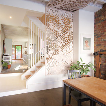

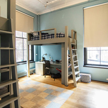
 kimberly peck architect
photos by Pedro Marti
This large light-filled open loft in the Tribeca neighborhood of New York City was purchased by a growing family to make into their family home. The loft, previously a lighting showroom, had been converted for residential use with the standard amenities but was entirely open and therefore needed to be reconfigured. One of the best attributes of this particular loft is its extremely large windows situated on all four sides due to the locations of neighboring buildings. This unusual condition allowed much of the rear of the space to be divided into 3 bedrooms/3 bathrooms, all of which had ample windows. The kitchen and the utilities were moved to the center of the space as they did not require as much natural lighting, leaving the entire front of the loft as an open dining/living area. The overall space was given a more modern feel while emphasizing it’s industrial character. The original tin ceiling was preserved throughout the loft with all new lighting run in orderly conduit beneath it, much of which is exposed light bulbs. In a play on the ceiling material the main wall opposite the kitchen was clad in unfinished, distressed tin panels creating a focal point in the home. Traditional baseboards and door casings were thrown out in lieu of blackened steel angle throughout the loft. Blackened steel was also used in combination with glass panels to create an enclosure for the office at the end of the main corridor; this allowed the light from the large window in the office to pass though while creating a private yet open space to work. The master suite features a large open bath with a sculptural freestanding tub all clad in a serene beige tile that has the feel of concrete. The kids bath is a fun play of large cobalt blue hexagon tile on the floor and rear wall of the tub juxtaposed with a bright white subway tile on the remaining walls. The kitchen features a long wall of floor to ceiling white and navy cabinetry with an adjacent 15 foot island of which half is a table for casual dining. Other interesting features of the loft are the industrial ladder up to the small elevated play area in the living room, the navy cabinetry and antique mirror clad dining niche, and the wallpapered powder room with antique mirror and blackened steel accessories.
 Biehl Brothers Contracting LLC
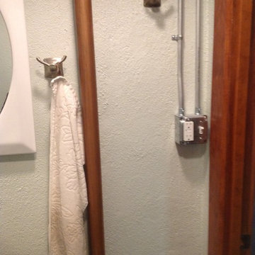
Exposed electric in conduit finishes the look our customers were looking for.
Example of a small trendy concrete floor walk-in shower design in Cincinnati with a two-piece toilet, green walls and a wall-mount sink
Example of a small trendy concrete floor walk-in shower design in Cincinnati with a two-piece toilet, green walls and a wall-mount sink
 Sydney Design & Landscape Creations Pty Ltd
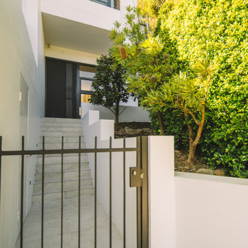
This comprehensive Northbridge project involved a complete site transformation, beginning with land preparations, demolition, and waste removal. The team dismantled unwanted structures, cleared vegetation, and prepared the site with machine earthworks and leveling. Drainage and electrical provisions were installed, including trenching for pipes and conduits.
Concrete works laid the foundation for walls, stairs, and driveways, followed by masonry construction for retaining and garden walls, complete with drainage and waterproofing. Masonry work added elegance with rendered finishes, and new tiling revitalized stairs, paths, and the driveway. Landscaping included garden restoration, turf installation, and pathway enhancements. The project concluded with pool area repairs, waste removal, and detailed finishing touches.
 CHAATRIK Architecture & Urban Design
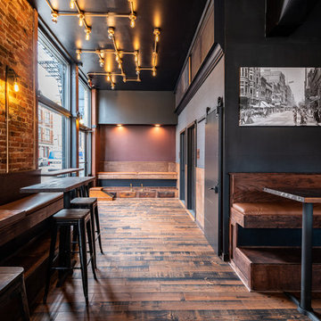
The Cobblestone Bar - This corner was an eyesore in Cincinnati's OTR neighborhood for several decades. Our team gave this old bar a new life with a modern rustic aesthetic preserving the original brick and incorporating leather, wood and brass details throughout to create an elegant bar with a neighborhood feel where connections are made. We completely restored an existing, broken backbar into a historic gem, installed a new concrete front bar with brass inlay with a custom tap system connected into a renovated basement cellar below. Customers can enjoy a variety of seating and intimate, thoughtful details. The name 'Cobblestone' came from Cincinnati’s history - old horse-drawn carriages, historic streetcar, pathways through the city - and the ceiling design enhances the concept of pathways and connections using simple electric conduit and junction boxes. Visit www.cobblestoneotr.com for more info!
 Alair Homes South Tampa
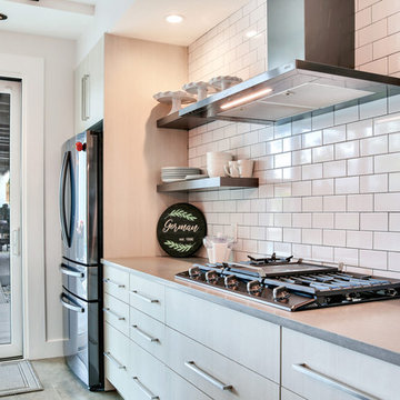
During the planning phase we undertook a fairly major Value Engineering of the design to ensure that the project would be completed within the clients budget. The client identified a ‘Fords Garage’ style that they wanted to incorporate. They wanted an open, industrial feel, however, we wanted to ensure that the property felt more like a welcoming, home environment; not a commercial space. A Fords Garage typically has exposed beams, ductwork, lighting, conduits, etc. But this extent of an Industrial style is not ‘homely’. So we incorporated tongue and groove ceilings with beams, concrete colored tiled floors, and industrial style lighting fixtures.
During construction the client designed the courtyard, which involved a large permit revision and we went through the full planning process to add that scope of work.
The finished project is a gorgeous blend of industrial and contemporary home style.
 fuse57 llc architecture
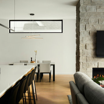
This new Lake Minnetonka custom home was designed for a young growing family that decided to trade uptown Minneapolis condo life for lake living. Located on a narrow 40-foot-wide lot, this 2,850sf modern home provides a strong connection to the lake while also balancing privacy from the neighbors. The main level comprises a three-car tandem garage and public living spaces, the upper level consists of private spaces while the finished basement serves as a flexible space.
High performance triple pane European windows were strategically placed to frame views of the lake while interior facing windows were placed to frame tree and sky views. A stone clad fireplace acts as a spatial anchor that helps define the interior spaces as well as encourages the transition from interior to exterior spaces. Future solar panel conduits to the roof were installed as were EV charging stations in the garage and at the dock for future EV boat charging. Site water runoff is managed through an underground retention system.
The exterior cement board siding is painted black to recede into the landscape while accents of thermally modified wood, custom steel slats and stone add visual interest at the street and lake facing sides. The interior material palette is purposefully simple and consists of stained white oak flooring, ebony stained white oak cabinetry and millwork, white quartz counters, powder coated steel railings and stone veneer. The final result is a vibrant home for this young family that infuses warmth with a modern aesthetic.
 kimberly peck architect
photos by Pedro Marti
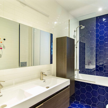
This large light-filled open loft in the Tribeca neighborhood of New York City was purchased by a growing family to make into their family home. The loft, previously a lighting showroom, had been converted for residential use with the standard amenities but was entirely open and therefore needed to be reconfigured. One of the best attributes of this particular loft is its extremely large windows situated on all four sides due to the locations of neighboring buildings. This unusual condition allowed much of the rear of the space to be divided into 3 bedrooms/3 bathrooms, all of which had ample windows. The kitchen and the utilities were moved to the center of the space as they did not require as much natural lighting, leaving the entire front of the loft as an open dining/living area. The overall space was given a more modern feel while emphasizing it’s industrial character. The original tin ceiling was preserved throughout the loft with all new lighting run in orderly conduit beneath it, much of which is exposed light bulbs. In a play on the ceiling material the main wall opposite the kitchen was clad in unfinished, distressed tin panels creating a focal point in the home. Traditional baseboards and door casings were thrown out in lieu of blackened steel angle throughout the loft. Blackened steel was also used in combination with glass panels to create an enclosure for the office at the end of the main corridor; this allowed the light from the large window in the office to pass though while creating a private yet open space to work. The master suite features a large open bath with a sculptural freestanding tub all clad in a serene beige tile that has the feel of concrete. The kids bath is a fun play of large cobalt blue hexagon tile on the floor and rear wall of the tub juxtaposed with a bright white subway tile on the remaining walls. The kitchen features a long wall of floor to ceiling white and navy cabinetry with an adjacent 15 foot island of which half is a table for casual dining. Other interesting features of the loft are the industrial ladder up to the small elevated play area in the living room, the navy cabinetry and antique mirror clad dining niche, and the wallpapered powder room with antique mirror and blackened steel accessories.
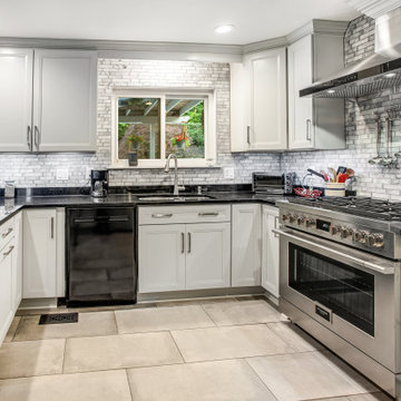
 Reico Kitchen & Bath
Dave Wilhide of Reico Kitchen and Bath in Woodbridge, VA collaborated with Professional Home Improvements to create a transitional kitchen remodel featuring Merillat Classic cabinetry.
The kitchen cabinets are the Rowan 5-piece door style in a Mist finish. The countertop is Absolute Black granite.
Also included in the remodel is a Maravilla Aleutian Isles Aluminum Linear Marble Mosaic backsplash.
The client expressed their satisfaction with Dave's coordination of the project. “Determining color scheme took time as supply chain issues and using multiple vendors for appliances was a challenge. Working with Dave was the bright spot as he was the conduit who made everything easier. The suggestions made by Dave to find the right cabinets balancing costs and objectives especially on the pantry cabinet and wine rack helped keep everything in a budget.”
“My favorite part of the new kitchen is the larger look gained by removing the soffit and raising the cabinets to the ceiling. My favorite cabinet is the three drawer base cabinet made for pots and pans. No more bending over to dig around and find cooking pots. Everything is now easy to get to,” said the client.
Photos courtesy of BTW Images.
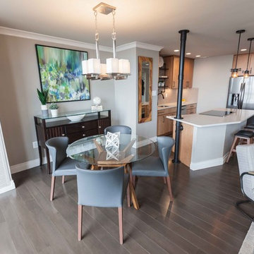
 Revitalize Design by Val Valdez
The outer kitchen walls and bulkheads were removed to create an open feel. The main challenge in opening up the space was the building restricting the removal of the existing telephone wires that were located in one of the walls. To maintain compliance with the building rules, I designed an "iron pipe" to house the phone wires which also serves as a conduit for the required wiring to the island. This pipe has an industrial influence which ties in perfectly with the custom-made shelving over the kitchen sink.
The property is a 700 square foot condo. The homeowner's goal was to have his 40+ year old unit transformed into a brand new space. To accomplish this, we gutted the entire unit; we replaced the popcorn ceiling with new drywall, replaced the old flooring with maple engineered wood flooring, removed the mirrored walls and painted the drywall a soothing neutral gray, and removed the kitchen walls and bulkheads to create an open concept. The bathroom and kitchen were totally renovated as well.
Additions include: Handsome crown moulding and custom baseboards, Sherwin Williams wall, ceiling and trim paint (the ceiling is NOT white), LED recessed light fixtures, custom island pendants, Quartz countertops, custom dining chandelier, custom shelving over the kitchen sink and custom "iron pipe" designed to house existing telephone wires (building restricted the removal of existing phone line).
Photography by Michael Anthony Harrison, www.MikeAntPhotography.com
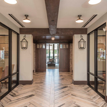
 Kay Green Design
Chic is a French word associated with stylishness, while Rustic means related to, or suitable for the country.Together, Rustic Chic is an interior design alchemy, the chic suggesting culture, fashion and trendiness, while the Rustic element idealizes a natural pastoral charm.
This style tends to reclaim the old, and reinvent materials characterized by imperfect finishes. Rough-hewn finishes, marks, divots, scratches and imperfections are purposeful. The materials themselves often provide historical reference (either real or imagined) and are incorporated to balance hardness (think steel, iron and brick) with the softness of modern furniture and softgoods.
Exposed brick walls can be a key component of this look, but wallpapers can do the job if you aren’t fortunate enough to have the real thing.
Scaffold planks, exposed conduit, timber and fencing can be added to create a depth of character; and when paired with modern styled furnishings and accoutrements – this is a fresh, nostalgic minded trend that we’ll be seeing well through 2019.
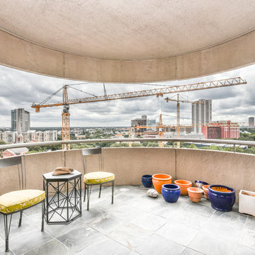
 InnovationLand
Houston Interior Designer Lisha Maxey took this Museum District condo from the dated, mirrored walls of the 1980s to Mid Century Modern with a gallery look featuring the client’s art collection.
The place was covered with glued-down, floor-to-ceiling mirrors,” says Lisha Maxey, senior designer for Homescapes of Houston and principal at LGH Design Services in Houston. “When we took them off the walls, the walls came apart. We ended up taking them down to the studs."
The makeover took six months to complete, primarily because of strict condo association rules that only gave the Houston interior designers very limited access to the elevator – through which all materials and team members had to go.
“Monday through Friday, we could only be noisy from 10 a.m. to 2 p.m., and if we had to do something extra loud, like sawing or drilling, we had to schedule it with the management and they had to communicate that to the condo owners. So it was just a lot of coordination. But a lot of Inner City Loopers live in these kinds of buildings, so we’re used to handling that kind of thing.”
The client, a child psychiatrist in her 60s, recently moved to Houston from northeast Texas to be with friends. After being widowed three years ago, she decided it was time to let go of the traditionally styled estate that wasn’t really her style anyway. An avid diver who has traveled around the world to pursue her passion, she has amassed a large collection of art from her travels. Downsizing to 1,600 feet and wanting to go more contemporary, she wanted the display – and the look – more streamlined.
“She wanted clean lines and muted colors, with the main focus being her artwork,” says Maxey. “So we made the space a palette for that.”
Enter the white, gallery-grade paint she chose for the walls: “It’s halfway between satin and flat,” explains Maxey. “It’s not glossy and it’s not chalky – just very smooth and clean."
Adding to the gallery theme is the satin nickel track lighting with lamps aimed to highlight pieces of art. “This lighting has no wires,” notes Maxey. “It’s powered by a positive and negative conduit.”
The new flooring throughout is a blended-grey porcelain tile that looks like wood planks. “It’s gorgeous, natural-looking and combines all the beauty of wood with the durability of tile,” says Maxey. “We used it throughout the condo to unify the space.”
After Maxey started looking at the client’s bright, vibrant, colorful artwork, she felt the palette couldn’t stay as muted anymore. Hence the Mid Century Modern orange leather sofas from West Elm and bright green chairs from Joybird, plus the throw pillows in different textures, patterns and shades of gold, orange and green.
The concave lines of the Danish-inspired chairs, she notes, help them look beautiful from all the way around – a key to designing spaces for loft living.
“The table in the living room is very interesting,” notes Maxey. “It was handmade for the client in 1974 and has a signature on it from the artist. She was adamant about including the piece, which has all these hand-painted black-and-white art tiles on the top. I took one look at it and said ‘It’s not really going to go.’”
However, after cutting 6 inches off the bottom and making it look a little distressed, the table ended up being the perfect complement to the sofas.
The dining room table – from Design Within Reach – is a solid piece of mahogany, the chair upholstery a mix of grey velvet and leather and the legs a shiny brass. “The side chairs are leather and the end ones are velvet,” says Maxey. “It’s a nice textural mix that lends depth and texture.”The galley kitchen, meanwhile, has been lightened and brightened, with new, white contemporary cabinetry, quartz countertops mimicking the look of Carrara marble, stainless steel appliances and a velvet green bench seat for a punch of color.The two bathrooms have been updated with contemporary white vanities and vessel sinks and the master bath now features a walk-in shower tiled in Dolomite white marble (the floor is Bianco Carrara marble mosaic, done in a herringbone pattern).In the master bedroom, Homescapes of Houston knocked down a wall between two smaller closets with swing doors to make one large walk-in closet with pocket doors. The closet in the guest bedroom also came out 13 more inches.The client’s artwork throughout personalizes the space and tells the story of a life. There’s a huge bowl of shells from the client’s diving adventures, framed art from her child psychiatry patients and a 16th century wood carving from a monastery that’s been in her family forever.
“Her collection is quite impressive,” says Maxey. “There’s even a framed piece of autographed songs written by John Lennon.” (You can see this black-framed piece of art on the wall in the photo above of two green chairs).
“We’re extremely happy with how the project turned out, and so is the client,” says Maxey. “No expense was spared for her. It was a labor of love and we were excited to do it.”

 Subcomm Pools
 Main Pool: Striping 7 layers old plaster; New coping stones; New tiles; New racing line tile and targets; New 12'' dual main drain box; New returns; New pool perimeter caulking; New plaster; New under water lights installation (1-running electrical conduit to each light, 2-instaling junk box for each light, 3-running bonding wires to each light, 4-installing 9 new LED lights).
Wading Pool: Striping 7 layers old plaster; New coping stones; New tiles; Deck sprayers; New plaster.
 Eric S. Perry Design & Build, Inc.
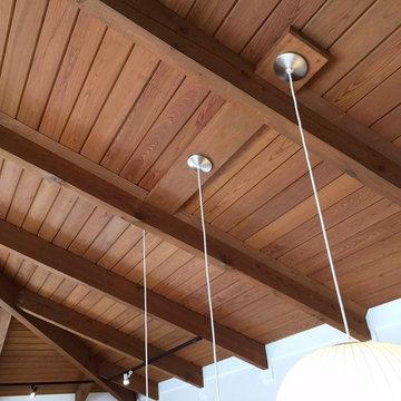
The old lighting was run inside painted metal conduit... We took the old paneling and made custom wire cover and light box covers... Really pretty carpentry!.. This is when having my own guys do all the finish work really shows..
 InnovationLand
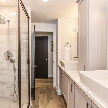
Houston Interior Designer Lisha Maxey took this Museum District condo from the dated, mirrored walls of the 1980s to Mid Century Modern with a gallery look featuring the client's art collection.
"The place was covered with glued-down, floor-to-ceiling mirrors," says Lisha Maxey, senior designer for Homescapes of Houston and principal at LGH Design Services in Houston. "When we took them off the walls, the walls came apart. We ended up taking them down to the studs."
The makeover took six months to complete, primarily because of strict condo association rules that only gave the Houston interior designers very limited access to the elevator - through which all materials and team members had to go.
"Monday through Friday, we could only be noisy from 10 a.m. to 2 p.m., and if we had to do something extra loud, like sawing or drilling, we had to schedule it with the management and they had to communicate that to the condo owners. So it was just a lot of coordination. But a lot of Inner City Loopers live in these kinds of buildings, so we're used to handling that kind of thing."
The client, a child psychiatrist in her 60s, recently moved to Houston from northeast Texas to be with friends. After being widowed three years ago, she decided it was time to let go of the traditionally styled estate that wasn't really her style anyway. An avid diver who has traveled around the world to pursue her passion, she has amassed a large collection of art from her travels. Downsizing to 1,600 feet and wanting to go more contemporary, she wanted the display - and the look - more streamlined.
"She wanted clean lines and muted colors, with the main focus being her artwork," says Maxey. "So we made the space a palette for that."
Enter the white, gallery-grade paint she chose for the walls: "It's halfway between satin and flat," explains Maxey. "It's not glossy and it's not chalky - just very smooth and clean."
Adding to the gallery theme is the satin nickel track lighting with lamps aimed to highlight pieces of art. "This lighting has no wires," notes Maxey. "It's powered by a positive and negative conduit."
The new flooring throughout is a blended-grey porcelain tile that looks like wood planks. "It's gorgeous, natural-looking and combines all the beauty of wood with the durability of tile," says Maxey. "We used it throughout the condo to unify the space."
After Maxey started looking at the client's bright, vibrant, colorful artwork, she felt the palette couldn't stay as muted anymore. Hence the Mid Century Modern orange leather sofas from West Elm and bright green chairs from Joybird, plus the throw pillows in different textures, patterns and shades of gold, orange and green.
The concave lines of the Danish-inspired chairs, she notes, help them look beautiful from all the way around - a key to designing spaces for loft living.
"The table in the living room is very interesting," notes Maxey. "It was handmade for the client in 1974 and has a signature on it from the artist. She was adamant about including the piece, which has all these hand-painted black-and-white art tiles on the top. I took one look at it and said 'It's not really going to go.'"
However, after cutting 6 inches off the bottom and making it look a little distressed, the table ended up being the perfect complement to the sofas.
The dining room table - from Design Within Reach - is a solid piece of mahogany, the chair upholstery a mix of grey velvet and leather and the legs a shiny brass. "The side chairs are leather and the end ones are velvet," says Maxey. "It's a nice textural mix that lends depth and texture."
The galley kitchen, meanwhile, has been lightened and brightened, with white quartz countertops and backsplashes mimicking the look of Carrara marble, stainless steel appliances and a velvet green bench seat for a punch of color. The cabinets are painted a cool grey color called "Silverplate."
The two bathrooms have been updated with contemporary white vanities and vessel sinks and the master bath now features a walk-in shower tiled in Dolomite white marble (the floor is Bianco Carrara marble mosaic, done in a herringbone pattern.
In the master bedroom, Homescapes of Houston knocked down a wall between two smaller closets with swing doors to make one large walk-in closet with pocket doors. The closet in the guest bedroom also came out 13 more inches.
The client's artwork throughout personalizes the space and tells the story of a life. There's a huge bowl of shells from the client's diving adventures, framed art from her child psychiatry patients and a 16th century wood carving from a monastery that's been in her family forever.
"Her collection is quite impressive," says Maxey. "There's even a framed piece of autographed songs written by John Lennon." (You can see this black-framed piece of art on the wall in the photo above of two green chairs).
"We're extremely happy with how the project turned out, and so is the client," says Maxey. "No expense was spared for her. It was a labor of love and we were excited to do it."
 The Eklektik Atelier Pte. Ltd.
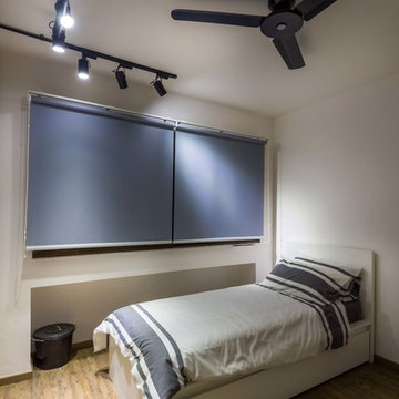
Simple bedroom concept with track lights and exposed electrical conduit
Bedroom - scandinavian bedroom idea in Singapore
Bedroom - scandinavian bedroom idea in Singapore
31