
Search results for "Conduit" in Home Design Ideas
 Tall Pines Construction
Reclaimed brick wall in dining area. Custom built bookcase built into the side of the stairs. Hardwood is reclaimed wood with metal trim. Exposed conduit with cages and LED for lighting.
Photo credit Scott Zimmerman
 CHAATRIK Architecture & Urban Design
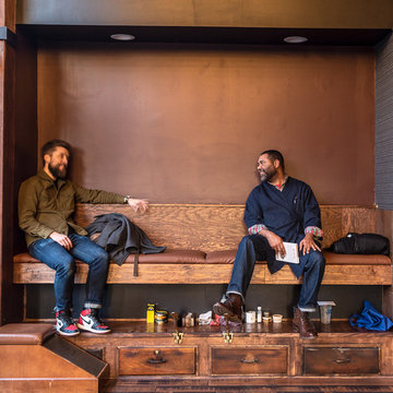
The Cobblestone Bar - This corner was an eyesore in Cincinnati's OTR neighborhood for several decades. Our team gave this old bar a new life with a modern rustic aesthetic preserving the original brick and incorporating leather, wood and brass details throughout to create an elegant bar with a neighborhood feel where connections are made. We completely restored an existing, broken backbar into a historic gem, installed a new concrete front bar with brass inlay with a custom tap system connected into a renovated basement cellar below. Customers can enjoy a variety of seating and intimate, thoughtful details. The name 'Cobblestone' came from Cincinnati’s history - old horse-drawn carriages, historic streetcar, pathways through the city - and the ceiling design enhances the concept of pathways and connections using simple electric conduit and junction boxes. Visit www.cobblestoneotr.com for more info!
 Newschool Builders LLC
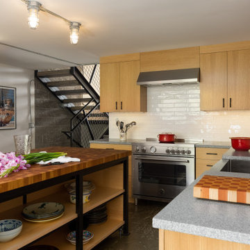
Embracing the natural elements of this circa 1960’s Condo development in Stowe Vermont was a priority for our clients. We worked closely with a great design team and our clients to create this simple, but beautiful minimalist retreat. Our clients, both authors, wanted a place to withdraw from the endless distractions and fast pace rhythms of the city. Custom made cabinets, bookshelves and built ins helped off set the sandblasted CMU block walls and ground concrete floors. A beautiful handcrafted stairwell was a center piece connecting the three floors. A handcrafted integrated concrete sink in the master is was another testament to the mixed mediums used to create this space. We embraced exposed conduit and commercial grade light fixtures throughout which helped add to the overall minimalist feel of the space. There is a beautiful rawness to this project which everyone came to admire.
Find the right local pro for your project
 kimberly peck architect
photos by Pedro Marti
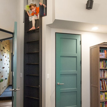
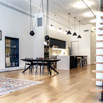
This large light-filled open loft in the Tribeca neighborhood of New York City was purchased by a growing family to make into their family home. The loft, previously a lighting showroom, had been converted for residential use with the standard amenities but was entirely open and therefore needed to be reconfigured. One of the best attributes of this particular loft is its extremely large windows situated on all four sides due to the locations of neighboring buildings. This unusual condition allowed much of the rear of the space to be divided into 3 bedrooms/3 bathrooms, all of which had ample windows. The kitchen and the utilities were moved to the center of the space as they did not require as much natural lighting, leaving the entire front of the loft as an open dining/living area. The overall space was given a more modern feel while emphasizing it’s industrial character. The original tin ceiling was preserved throughout the loft with all new lighting run in orderly conduit beneath it, much of which is exposed light bulbs. In a play on the ceiling material the main wall opposite the kitchen was clad in unfinished, distressed tin panels creating a focal point in the home. Traditional baseboards and door casings were thrown out in lieu of blackened steel angle throughout the loft. Blackened steel was also used in combination with glass panels to create an enclosure for the office at the end of the main corridor; this allowed the light from the large window in the office to pass though while creating a private yet open space to work. The master suite features a large open bath with a sculptural freestanding tub all clad in a serene beige tile that has the feel of concrete. The kids bath is a fun play of large cobalt blue hexagon tile on the floor and rear wall of the tub juxtaposed with a bright white subway tile on the remaining walls. The kitchen features a long wall of floor to ceiling white and navy cabinetry with an adjacent 15 foot island of which half is a table for casual dining. Other interesting features of the loft are the industrial ladder up to the small elevated play area in the living room, the navy cabinetry and antique mirror clad dining niche, and the wallpapered powder room with antique mirror and blackened steel accessories.
 Pennsylvania Landscape & Nursery Association
Kimicata Brothers, INC http://www.kimicatabrothers.com
Project Entry: Johnson
2014 PLNA Awards for Landscape Excellence Winner
Category: Hardscaping-Residential $30,000-$60,000
Award Level: Honorable Mention
Photo Description:
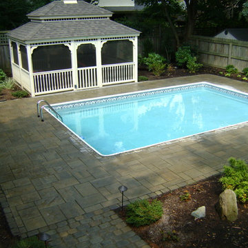
We were contacted by the Johnson’s to update their backyard fenced in pool area in the summer of 2012. Over the years the deck around the pool had deteriorated and the plants had become over grown and made walking around the deck difficult. The old concrete patio was small and only lit by bright 120 volt spot lights. What made this job difficult was the access to the backyard was limited to using a neighbor’s backyard for the project. We had to bring all debris out and materials in from a neighboring street, down the neighbor’s driveway, across the backyard, through an 8’ section that was in the far corner of the neighbor’s yard that corresponded to the entrance to Johnson’s backyard. They had a plan that they wanted to work from. Since access was a problem, we had to secure permission from the neighbor before we could consider bidding the job. After the neighbor’s permission was obtained we discussed materials for the drawing they had. It only included the hardscape and gazebo. Other difficulties included not damaging lighting and plumbing for the pool during excavation and construction. Also the ladders into the pool fit into cups screwed to the deck. These had to be replaced with precisely placed pipes mounted into the base for stability. Care had to be taken to make sure water would not drain from the deck into the pool. So we had to place channel drains between the patio area and pool deck area. A channel drain was placed between the exposed aggregate finished slab for the gazebo and the pool deck. This allowed for proper sloping of the hardscape to provide the drains to move rain away from the pool. We used polymeric sand in the paver joints to prevent breakdown of the installation and avoid wind and water moving sand into the pool. The slab for the gazebo was an exposed aggregate finish that measured 12’ 6” x 16’ 6”. The pagoda style roof for the gazebo and screening make it attractive and functional as a bug free area to entertain in. We discussed adding low voltage lighting, 120 volt plugs and drip irrigation early on so we could place conduits during the construction. After the hardscape installation we installed the low voltage lighting. We installed a transformer with a timer and an optional dusk to dawn photocell. The Johnsons did not like the old 120 volt spot light to light the back, they wanted something softer. We installed 20 path lights to illuminate the hardscape and 3 wall wash lights to add evening depth to the yard. We installed the plantings and Hunter drip irrigation system in the spring of 2013. It was easy to convince them that the drip system was the proper way to irrigate the area. There would be no spray to blow onto patio furniture or into the gazebo. Also drip irrigation uses less water so they are economical to operate. This gave them a low maintenance yard, a nice finished look and something blooming throughout the growing season. The Johnsons have been very happy with the look and the functionality of the pool deck, patio, lights, irrigation and gazebo.
 Northwest Outdoor Lighting
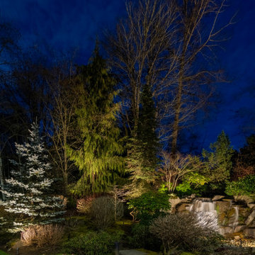
“The Falls” at Snohomish Cascade, located in Snohomish, Washington, is a planned community of three divisions that was developed by Donald Leavitt from March 2, 1988 – August 9, 1989. The community is a family friendly neighborhood with cul-de-sacs, a waterfall, parks, trails, Totem Falls Elementary School, and nearby shopping.
The HOA contacted Northwest Outdoor Lighting in the fall of 2019 for a landscape lighting quote. They had old lighting that was constantly being damaged or buried under foliage. After renovating their electrical and signage, they finally called to say they were ready for the new outdoor lighting we quoted. We installed 6w LED uplights and washes with all wiring in conduit. We highlighted the totem poles, trees and the new sign for easy visibility at night. The water fall falls 15-20 feet from top.
It took our team one day to complete the lighting installation and now the whole street corner is welcoming and bright!
 kimberly peck architect
photos by Pedro Marti
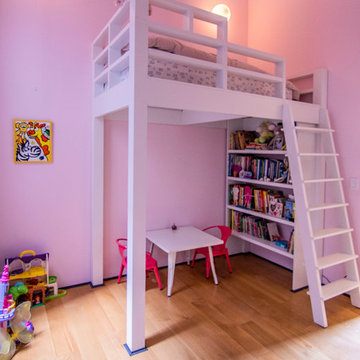
This large light-filled open loft in the Tribeca neighborhood of New York City was purchased by a growing family to make into their family home. The loft, previously a lighting showroom, had been converted for residential use with the standard amenities but was entirely open and therefore needed to be reconfigured. One of the best attributes of this particular loft is its extremely large windows situated on all four sides due to the locations of neighboring buildings. This unusual condition allowed much of the rear of the space to be divided into 3 bedrooms/3 bathrooms, all of which had ample windows. The kitchen and the utilities were moved to the center of the space as they did not require as much natural lighting, leaving the entire front of the loft as an open dining/living area. The overall space was given a more modern feel while emphasizing it’s industrial character. The original tin ceiling was preserved throughout the loft with all new lighting run in orderly conduit beneath it, much of which is exposed light bulbs. In a play on the ceiling material the main wall opposite the kitchen was clad in unfinished, distressed tin panels creating a focal point in the home. Traditional baseboards and door casings were thrown out in lieu of blackened steel angle throughout the loft. Blackened steel was also used in combination with glass panels to create an enclosure for the office at the end of the main corridor; this allowed the light from the large window in the office to pass though while creating a private yet open space to work. The master suite features a large open bath with a sculptural freestanding tub all clad in a serene beige tile that has the feel of concrete. The kids bath is a fun play of large cobalt blue hexagon tile on the floor and rear wall of the tub juxtaposed with a bright white subway tile on the remaining walls. The kitchen features a long wall of floor to ceiling white and navy cabinetry with an adjacent 15 foot island of which half is a table for casual dining. Other interesting features of the loft are the industrial ladder up to the small elevated play area in the living room, the navy cabinetry and antique mirror clad dining niche, and the wallpapered powder room with antique mirror and blackened steel accessories.
 Home System Solutions
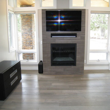
Master Bedroom: Sonos Playbar with Samsung 55inch UHD TV and Control4 automation system.
HSSbend
Inspiration for a contemporary home design remodel in Other
Inspiration for a contemporary home design remodel in Other
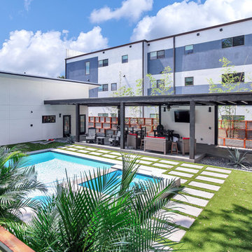
 Alair Homes South Tampa
During the planning phase we undertook a fairly major Value Engineering of the design to ensure that the project would be completed within the clients budget. The client identified a ‘Fords Garage’ style that they wanted to incorporate. They wanted an open, industrial feel, however, we wanted to ensure that the property felt more like a welcoming, home environment; not a commercial space. A Fords Garage typically has exposed beams, ductwork, lighting, conduits, etc. But this extent of an Industrial style is not ‘homely’. So we incorporated tongue and groove ceilings with beams, concrete colored tiled floors, and industrial style lighting fixtures.
During construction the client designed the courtyard, which involved a large permit revision and we went through the full planning process to add that scope of work.
The finished project is a gorgeous blend of industrial and contemporary home style.
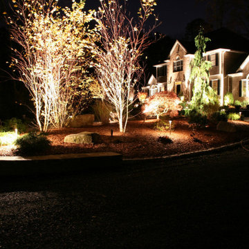
 Outdoor Lighting Design by Preferred Properties
When the Landscape design build presentation had an accompanying Landscape Lighting design that would be implemented all at the same time. Not only was that a plus for the client but almost a must have as the masonry Columns, walls and paver driveway limited access to the thoughts of lighting at a later phase. Atleast conduits, wiring and transformer locations would have to be at a minimum placed onsite. After an initial consultation and walk around to let the homeowners know we were thinking about all the facets of project and that it was a one stop shop for design, build and light. We were up for the challenge and thrilled to hear the approval and we were gearing up to be able to deliver a complete project.
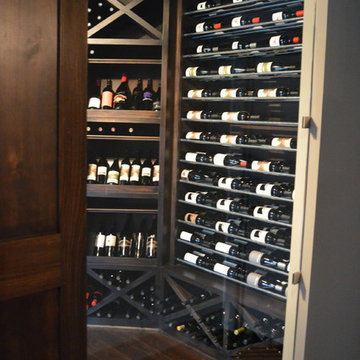

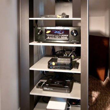
 CUSTOM CRAFT - Design Build Remodel
To avoid the unattractive jumble of too many wires and boxes, we included an AV closet in our design. The basement ceiling has speakers embedded in multiple zones which are wired via hidden conduit to the television and music systems in the closet. The systems are controlled remotely. In this way, our clients can watch or listen to different games or music in each zone with a click of a button--without the clutter.

 Adcock-Smith Design
Dan Piassick Photography
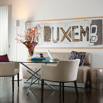
Great room - mid-sized contemporary dark wood floor great room idea in Dallas with white walls and no fireplace
Great room - mid-sized contemporary dark wood floor great room idea in Dallas with white walls and no fireplace

 Xavieras Inc.
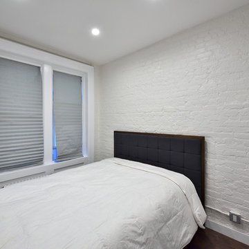
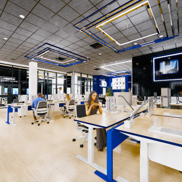
IQ Business Media Inc. wishes to expand the programming of their business brand by connecting with their audience in more dynamic ways and further enhance their position as a viable partner to national and international design markets. Bringing diverse stakeholders together to facilitate ongoing dialogue in the areas of design and architecture is a key goal of the organization.
Design Solutions:
Quality of space and brand delivery provide state-of-the-art technology in all the spaces.
Spaces can adapt to support the project and business needs. Onsite staff act as a conduit for culture, community, connecting people, companies, and industries by sharing expertise and developing meaningful relationships. Therefore, the spaces are flexible, easy to reconfigure, and adapt to diverse uses.
Software: Revit with Enscape plugin, Photoshop.
Designer Credit: www.linkedin.com/in/mahsa-taskini
 InnovationLand
Houston Interior Designer Lisha Maxey took this Museum District condo from the dated, mirrored walls of the 1980s to Mid Century Modern with a gallery look featuring the client's art collection.
"The place was covered with glued-down, floor-to-ceiling mirrors," says Lisha Maxey, senior designer for Homescapes of Houston and principal at LGH Design Services in Houston. "When we took them off the walls, the walls came apart. We ended up taking them down to the studs."
The makeover took six months to complete, primarily because of strict condo association rules that only gave the Houston interior designers very limited access to the elevator - through which all materials and team members had to go.
"Monday through Friday, we could only be noisy from 10 a.m. to 2 p.m., and if we had to do something extra loud, like sawing or drilling, we had to schedule it with the management and they had to communicate that to the condo owners. So it was just a lot of coordination. But a lot of Inner City Loopers live in these kinds of buildings, so we're used to handling that kind of thing."
The client, a child psychiatrist in her 60s, recently moved to Houston from northeast Texas to be with friends. After being widowed three years ago, she decided it was time to let go of the traditionally styled estate that wasn't really her style anyway. An avid diver who has traveled around the world to pursue her passion, she has amassed a large collection of art from her travels. Downsizing to 1,600 feet and wanting to go more contemporary, she wanted the display - and the look - more streamlined.
"She wanted clean lines and muted colors, with the main focus being her artwork," says Maxey. "So we made the space a palette for that."
Enter the white, gallery-grade paint she chose for the walls: "It's halfway between satin and flat," explains Maxey. "It's not glossy and it's not chalky - just very smooth and clean."
Adding to the gallery theme is the satin nickel track lighting with lamps aimed to highlight pieces of art. "This lighting has no wires," notes Maxey. "It's powered by a positive and negative conduit."
The new flooring throughout is a blended-grey porcelain tile that looks like wood planks. "It's gorgeous, natural-looking and combines all the beauty of wood with the durability of tile," says Maxey. "We used it throughout the condo to unify the space."
After Maxey started looking at the client's bright, vibrant, colorful artwork, she felt the palette couldn't stay as muted anymore. Hence the Mid Century Modern orange leather sofas from West Elm and bright green chairs from Joybird, plus the throw pillows in different textures, patterns and shades of gold, orange and green.
The concave lines of the Danish-inspired chairs, she notes, help them look beautiful from all the way around - a key to designing spaces for loft living.
"The table in the living room is very interesting," notes Maxey. "It was handmade for the client in 1974 and has a signature on it from the artist. She was adamant about including the piece, which has all these hand-painted black-and-white art tiles on the top. I took one look at it and said 'It's not really going to go.'"
However, after cutting 6 inches off the bottom and making it look a little distressed, the table ended up being the perfect complement to the sofas.
The dining room table - from Design Within Reach - is a solid piece of mahogany, the chair upholstery a mix of grey velvet and leather and the legs a shiny brass. "The side chairs are leather and the end ones are velvet," says Maxey. "It's a nice textural mix that lends depth and texture."
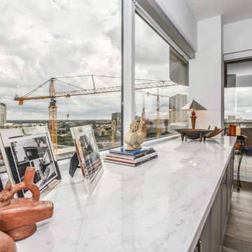
The galley kitchen, meanwhile, has been lightened and brightened, with new, white contemporary cabinetry, quartz countertops mimicking the look of Carrara marble, stainless steel appliances and a velvet green bench seat for a punch of color.
The two bathrooms have been updated with contemporary white vanities and vessel sinks and the master bath now features a walk-in shower tiled in Dolomite white marble (the floor is Bianco Carrara marble mosaic, done in a herringbone pattern.
In the master bedroom, Homescapes of Houston knocked down a wall between two smaller closets with swing doors to make one large walk-in closet with pocket doors. The closet in the guest bedroom also came out 13 more inches.
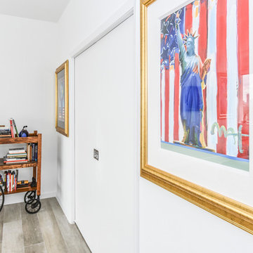
The client's artwork throughout personalizes the space and tells the story of a life. There's a huge bowl of shells from the client's diving adventures, framed art from her child psychiatry patients and a 16th century wood carving from a monastery that's been in her family forever.
"Her collection is quite impressive," says Maxey. "There's even a framed piece of autographed songs written by John Lennon." (You can see this black-framed piece of art on the wall in the photo above of two green chairs).
"We're extremely happy with how the project turned out, and so is the client," says Maxey. "No expense was spared for her. It was a labor of love and we were excited to do it."
 InnovationLand
Houston Interior Designer Lisha Maxey took this Museum District condo from the dated, mirrored walls of the 1980s to Mid Century Modern with a gallery look featuring the client's art collection.
"The place was covered with glued-down, floor-to-ceiling mirrors," says Lisha Maxey, senior designer for Homescapes of Houston and principal at LGH Design Services in Houston. "When we took them off the walls, the walls came apart. We ended up taking them down to the studs."
The makeover took six months to complete, primarily because of strict condo association rules that only gave the Houston interior designers very limited access to the elevator - through which all materials and team members had to go.
"Monday through Friday, we could only be noisy from 10 a.m. to 2 p.m., and if we had to do something extra loud, like sawing or drilling, we had to schedule it with the management and they had to communicate that to the condo owners. So it was just a lot of coordination. But a lot of Inner City Loopers live in these kinds of buildings, so we're used to handling that kind of thing."
The client, a child psychiatrist in her 60s, recently moved to Houston from northeast Texas to be with friends. After being widowed three years ago, she decided it was time to let go of the traditionally styled estate that wasn't really her style anyway. An avid diver who has traveled around the world to pursue her passion, she has amassed a large collection of art from her travels. Downsizing to 1,600 feet and wanting to go more contemporary, she wanted the display - and the look - more streamlined.
"She wanted clean lines and muted colors, with the main focus being her artwork," says Maxey. "So we made the space a palette for that."
Enter the white, gallery-grade paint she chose for the walls: "It's halfway between satin and flat," explains Maxey. "It's not glossy and it's not chalky - just very smooth and clean."
Adding to the gallery theme is the satin nickel track lighting with lamps aimed to highlight pieces of art. "This lighting has no wires," notes Maxey. "It's powered by a positive and negative conduit."
The new flooring throughout is a blended-grey porcelain tile that looks like wood planks. "It's gorgeous, natural-looking and combines all the beauty of wood with the durability of tile," says Maxey. "We used it throughout the condo to unify the space."
After Maxey started looking at the client's bright, vibrant, colorful artwork, she felt the palette couldn't stay as muted anymore. Hence the Mid Century Modern orange leather sofas from West Elm and bright green chairs from Joybird, plus the throw pillows in different textures, patterns and shades of gold, orange and green.
The concave lines of the Danish-inspired chairs, she notes, help them look beautiful from all the way around - a key to designing spaces for loft living.
"The table in the living room is very interesting," notes Maxey. "It was handmade for the client in 1974 and has a signature on it from the artist. She was adamant about including the piece, which has all these hand-painted black-and-white art tiles on the top. I took one look at it and said 'It's not really going to go.'"
However, after cutting 6 inches off the bottom and making it look a little distressed, the table ended up being the perfect complement to the sofas.
The dining room table - from Design Within Reach - is a solid piece of mahogany, the chair upholstery a mix of grey velvet and leather and the legs a shiny brass. "The side chairs are leather and the end ones are velvet," says Maxey. "It's a nice textural mix that lends depth and texture."
The galley kitchen, meanwhile, has been lightened and brightened, with white quartz countertops and backsplashes mimicking the look of Carrara marble, stainless steel appliances and a velvet green bench seat for a punch of color. The cabinets are painted a cool grey color called "Silverplate."
The two bathrooms have been updated with contemporary white vanities and vessel sinks and the master bath now features a walk-in shower tiled in Dolomite white marble (the floor is Bianco Carrara marble mosaic, done in a herringbone pattern.
In the master bedroom, Homescapes of Houston knocked down a wall between two smaller closets with swing doors to make one large walk-in closet with pocket doors. The closet in the guest bedroom also came out 13 more inches.
The client's artwork throughout personalizes the space and tells the story of a life. There's a huge bowl of shells from the client's diving adventures, framed art from her child psychiatry patients and a 16th century wood carving from a monastery that's been in her family forever.
"Her collection is quite impressive," says Maxey. "There's even a framed piece of autographed songs written by John Lennon." (You can see this black-framed piece of art on the wall in the photo above of two green chairs).
"We're extremely happy with how the project turned out, and so is the client," says Maxey. "No expense was spared for her. It was a labor of love and we were excited to do it."
 Newschool Builders LLC
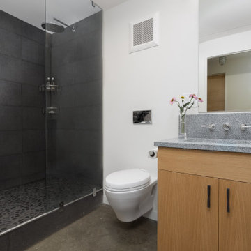
Embracing the natural elements of this circa 1960’s Condo development in Stowe Vermont was a priority for our clients. We worked closely with a great design team and our clients to create this simple, but beautiful minimalist retreat. Our clients, both authors, wanted a place to withdraw from the endless distractions and fast pace rhythms of the city. Custom made cabinets, bookshelves and built ins helped off set the sandblasted CMU block walls and ground concrete floors. A beautiful handcrafted stairwell was a center piece connecting the three floors. A handcrafted integrated concrete sink in the master is was another testament to the mixed mediums used to create this space. We embraced exposed conduit and commercial grade light fixtures throughout which helped add to the overall minimalist feel of the space. There is a beautiful rawness to this project which everyone came to admire.
 Sydney Design & Landscape Creations Pty Ltd
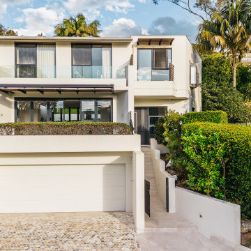
This comprehensive Northbridge project involved a complete site transformation, beginning with land preparations, demolition, and waste removal. The team dismantled unwanted structures, cleared vegetation, and prepared the site with machine earthworks and leveling. Drainage and electrical provisions were installed, including trenching for pipes and conduits.
Concrete works laid the foundation for walls, stairs, and driveways, followed by masonry construction for retaining and garden walls, complete with drainage and waterproofing. Masonry work added elegance with rendered finishes, and new tiling revitalized stairs, paths, and the driveway. Landscaping included garden restoration, turf installation, and pathway enhancements. The project concluded with pool area repairs, waste removal, and detailed finishing touches.
33