Search results for "Confuse" in Home Design Ideas

The foyer adds a sense of wonder. The walls are hewn from solid pieces of Florida keystone, a native oolitic limestone filled with fossilized shells and other mementos of the sea.

With the Pedestal Collection, Eero Saarinen resolved the "ugly, confusing, unrestful world" underneath tables and chairs. The collection is a defining accomplishment of modern design and a timeless addition to your home—a true classic.
www.softsquare.com
Find the right local pro for your project

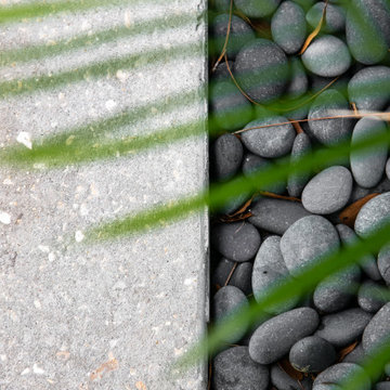
Example of a large beach style backyard stone patio design in San Francisco with no cover

These wonderful clients returned to us for their newest home remodel adventure. Their newly purchased custom built 1970s modern ranch sits in one of the loveliest neighborhoods south of the city but the current conditions of the home were out-dated and not so lovely. Upon entering the front door through the court you were greeted abruptly by a very boring staircase and an excessive number of doors. Just to the left of the double door entry was a large slider and on your right once inside the home was a soldier line up of doors. This made for an uneasy and uninviting entry that guests would quickly forget and our clients would often avoid. We also had our hands full in the kitchen. The existing space included many elements that felt out of place in a modern ranch including a rustic mountain scene backsplash, cherry cabinets with raised panel and detailed profile, and an island so massive you couldn’t pass a drink across the stone. Our design sought to address the functional pain points of the home and transform the overall aesthetic into something that felt like home for our clients.
For the entry, we re-worked the front door configuration by switching from the double door to a large single door with side lights. The sliding door next to the main entry door was replaced with a large window to eliminate entry door confusion. In our re-work of the entry staircase, guesta are now greeted into the foyer which features the Coral Pendant by David Trubridge. Guests are drawn into the home by stunning views of the front range via the large floor-to-ceiling glass wall in the living room. To the left, the staircases leading down to the basement and up to the master bedroom received a massive aesthetic upgrade. The rebuilt 2nd-floor staircase has a center spine with wood rise and run appearing to float upwards towards the master suite. A slatted wall of wood separates the two staircases which brings more light into the basement stairwell. Black metal railings add a stunning contrast to the light wood.
Other fabulous upgrades to this home included new wide plank flooring throughout the home, which offers both modernity and warmth. The once too-large kitchen island was downsized to create a functional focal point that is still accessible and intimate. The old dark and heavy kitchen cabinetry was replaced with sleek white cabinets, brightening up the space and elevating the aesthetic of the entire room. The kitchen countertops are marble look quartz with dramatic veining that offers an artistic feature behind the range and across all horizontal surfaces in the kitchen. As a final touch, cascading island pendants were installed which emphasize the gorgeous ceiling vault and provide warm feature lighting over the central point of the kitchen.
This transformation reintroduces light and simplicity to this gorgeous home, and we are so happy that our clients can reap the benefits of this elegant and functional design for years to come.

A transformation of a modest raised ranch into a modern oasis. I was the interior designer and general contractor from mechanicals to finishing. It’s also my personal home.
The interior design style is that of modern minimalist meets organic modern. I wanted a space that reduced distractions and let the eyes, head, and soul rest. Where everything inside the home has a specific use and purpose. The objects in our home are fewer but each hold a great personal value. You might expect to see this airy aesthetic, with its gallery white walls, in California or New York. Not nestled in a modest 50 year old neighborhood in Omaha, Nebraska. Creating a minimal aesthetic is one of the trickiest design styles to pull off. It is more than just less stuff and lots of white. It means sticking to these design principals:
-weaving in an abundance of textures
-incorporating natural finishes
-keenly curating art
-giving extra attention to scale
-limiting purely decorative items
-maximizing natural light
This style is not to be confused with the frugality of reductive design. I have incorporated many elevated basics that create an aesthetic of quiet luxury:
-architectural bead for trim-less doors
-first-of-its kind interior door hardware made of terrazzo
-historical marble found in landmark interiors like the NY Public Library
-premium flush air vents that disappear out of site
-luxury appliances from GE Café and Signature
-elegant and resilient terrazzo field tiles
Ours was not a simple interior remodel and addition:
-gutted and remodeled the existing 2,000 SF
-added on approximately another 1,000 SF
-moved and installed all new major mechanicals i.e. heating, plumbing and electrical.
-knocked through foundation walls to extend the space back
-dug down and built up

A pergola is an outdoor garden feature forming a shaded walkway, passageway, or sitting area of vertical posts or pillars that usually support cross-beams and a sturdy open lattice, often upon which woody vines are trained.[1] The origin of the word is the Late Latin pergula, referring to a projecting eave.
As a type of gazebo, it also may be an extension of a building or serve as protection for an open terrace or a link between pavilions. They are different from green tunnels, with a green tunnel being a type of road under a canopy of trees.
Sometimes, pergolas are confused with arbours (arbors in American English) and often, the terms are used interchangeably. Generally, an arbour is regarded as wooden bench seats with a roof, usually enclosed by lattice panels forming a framework for climbing plants; in evangelical Christianity, brush arbour revivals occur under such structures.[2]
A pergola, on the other hand, is a much larger and more open structure. Normally, a pergola does not include integral seating.

This may be my favorite use of floating shelves because an entire space is created with it. When you have a free wall in your office, it can often feel a little confusing to figure out what to do with the free space, where to put your books and little decorations. This is a great way to get all of that, and throw in a little decor, too!

Entrance is provided to the home via a carved wood door with a depiction of Aspen trees.
Large elegant limestone floor and beige floor entryway photo in Denver with red walls and a light wood front door

Located on a marsh in the upper reaches of the Lieutenant River in Old Lyme, the existing house was well-sited and well-built, but the design failed to exploit the views and more importantly was a confused combination of contemporary and traditional elements. The new homeowners, a successful businesswoman and an accomplished artist and photographer, were interested in creating a fully-contemporary environment to open up space, connect indoors with outdoors, display artwork and showcase the husband’s distinctive photographs.
One glaring deficiency was the curb appeal and approach sequence: the grade sloped down and the path to the house followed, but this led to an uncomfortable dip and abrupt rise to the front door. By creating a virtual “moat,” occupied by a grid of raised-bed grasses contained in aluminum-clad boxes, and spanning the moat with an ipe bridge, the approach becomes level and engaging. The façade of the existing house was blank and bland, and with no cover. Adding a deep overhang with a wide porch creates a welcoming, covered condition, accentuated by a 6’ wide pivoting front door that feels more like a moving piece of wall.
Another deficiency was the connection to the outdoors. By adding glass to the front and back of the house, and removing interior walls selectively, the house takes on a diaphanous quality that allows one to see through to the marsh beyond, even when in the driveway. The raised-bed grasses act as abstract, geometric versions of the marsh beyond. A large, pyramidal skylight establishes a spatial hierarchy around which the rooms revolve.
The house featured several tray-ceilinged spaces – living room, kitchen, and master bedroom – that were poorly-proportioned and with panels at the top that resembled inset flat panel doors. The solution was to use a different strategy for each: the bedroom turns the ceiling into an eggshell through the use of a creative trim detail; the living room has an oversized sculptural, backlit lighting element; and the kitchen has a collage of painted rectangular forms that support or include lighting pieces.
A palette of concrete, blackened steel, stainless steel and colors carefully chosen by homeowner and architect create an interior and exterior environment punctuated by moments that are as artistic as the featured works in the black-ceilinged gallery.

Transitional meets Traditional, somewhere in Atlanta, Georgia. If you're looking for sophisticated comfort, intertwined with easy living, this home provides just that. The mixtures of textures and styles allows this home owner the luxury of entertaining for the Super Bowl, all the way to gathering colleagues for an intimate dinner. You will find a little modern push, as you walk through this home, along with a New England flavor. It can be confusing on how so many flavors can be mixed into one space and still find a brilliant flow for the home. Part of the secrete is; undertones. The undertones of paint are the foundation to the ability to work with warms and cools together as a team, and within a flowing palette. Silver pushes through color, and can become different in undertones, depending on what is sitting near that particular color or texture that has the silver undertone.

Glamorous Bathroom Remodel
Example of a mid-sized eclectic master beige tile and metal tile porcelain tile and brown floor drop-in bathtub design in St Louis with flat-panel cabinets, dark wood cabinets, beige walls, a vessel sink, quartz countertops and black countertops

The Chisum Quill Barstool is stunning, not only for its solid hardwood framing, but particularly for its hand burnished-tufted leather with a contrasting ostrich pattern leather on the outback. Crafted to be either bar or counter height, this fine rustic barstool will make a statement in any home dining room or living area. Brass-studded accents and solid hardwood framing provide the perfect motif for this accent piece. The armrests' gentle sloping feature is a juxtaposition to the sturdily squared hard lines of the base of the barstool. All handcrafted and designed, the Chisum Quill Stool provides a uniquely authentic experience and rustic elegant charm to any space. If beauty and charm along with a stand alone character are what you seek, dive into the experience with our Chisum Quill Barstool and bring life to your home. Best as a dynamic set, these barstools are hand made classics for you. 100% American Made to the highest standards of quality and craftsmanship.
Overall Barstool Dimensions: 43" H x 26" W x 22" D
Seat Height: 30"
Top of Arm Height: 40"
Overall Counter Stool Dimension: 38" H x 26" W x 22" D
Seat Height: 25"
Top of Arm Height: 35"
Leather Description: Dyes and waxes are hand applied to South American raw material to impart a transparent clarity. This coupled with substrate gives the leather a sophisticated, pebble grain appearance. All of the aniline dyes applied to the hides are hand rubbed in North Carolina by skilled artisans drawing from years of creative experience creating an impressive patina. The absence of pigments adds to the natural softness of the hides. A light protective top, utilizing a proprietary formulation developed by the tannery creates the exquisite touch Legends is know for and makes the leather suitable for active family homes. Because of the depth and transparency of this leather, natural markings will be exposed and should not be confused as defects or deficiencies, but appreciated as Nature's Autograph of Authenticity found in the finest full grain leathers.
Embossed Leather Description: The leather hide is first embossed with an ostrich pattern and then colored by applying two base color coats of micro pigments. The leather is then wiped-off to give it a contrast of colors utilizing the base color combination. This color contrast is further accented by two additional top coat colors that are wiped-on by hand to give the leather a beautiful antique look. The last step is to slightly protect the hand work of the leather hide with a lacquer topcoat that provides great depth and warmth to the finished product.
100% top grain cowhide leather is characterized by variations in shade, texture, color and grain. Healed marks and scars are to be expected and enhance the natural beauty of the hides. These variations should not be considered defects as they are normal and unique features of genuine 100% top grain cowhide leather.
Frame Construction: Made with American Alder Wood, our frames are glued, screwed and dowelled at the joints. Two coats of high quality stain is hand rubbed on the wood finish and then sealed with industrial grade clear coat.

Photo of a large traditional side yard gravel garden path in New York for summer.

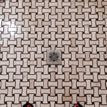
Master bath "Confusion" marble countertop detail with biscuit undermount sink and single handle faucet.
Large island style master beige tile and marble tile ceramic tile and beige floor bathroom photo in Hawaii with flat-panel cabinets, brown cabinets, an undermount tub, a one-piece toilet, beige walls, an undermount sink, marble countertops and brown countertops

With the Pedestal Collection, Eero Saarinen resolved the "ugly, confusing, unrestful world" underneath tables and chairs. The collection is a defining accomplishment of modern design and a timeless addition to your home—a true classic.
www.softsquare.com

Challenges can be blessing in disguise. A very narrow space can be transformed by creating a focal point and building around that strength. Rearranging this floor plan and creating a conversational space with the correct size furniture and purpose transformed this confusing space into a show stopper. Multiple mirrors created a dramatic focal point to the fireplace as well as spread light into a tall room with little lighting. Neutral walls and warm pops of color updated this space into a transitionally styled family living space.

"Go That Way" brass plated plaque by Ketti Kupper. A little neighborhood boy asked me why I put that plaque there, and I said 'to confuse you and make you think'. Then I got a hug. Photo by Ashley Elizabeth Ford.

A transformation of a modest raised ranch into a modern oasis. I was the interior designer and general contractor from mechanicals to finishing. It’s also my personal home.
The interior design style is that of modern minimalist meets organic modern. I wanted a space that reduced distractions and let the eyes, head, and soul rest. Where everything inside the home has a specific use and purpose. The objects in our home are fewer but each hold a great personal value. You might expect to see this airy aesthetic, with its gallery white walls, in California or New York. Not nestled in a modest 50 year old neighborhood in Omaha, Nebraska. Creating a minimal aesthetic is one of the trickiest design styles to pull off. It is more than just less stuff and lots of white. It means sticking to these design principals:
-weaving in an abundance of textures
-incorporating natural finishes
-keenly curating art
-giving extra attention to scale
-limiting purely decorative items
-maximizing natural light
This style is not to be confused with the frugality of reductive design. I have incorporated many elevated basics that create an aesthetic of quiet luxury:
-architectural bead for trim-less doors
-first-of-its kind interior door hardware made of terrazzo
-historical marble found in landmark interiors like the NY Public Library
-premium flush air vents that disappear out of site
-luxury appliances from GE Café and Signature
-elegant and resilient terrazzo field tiles
Ours was not a simple interior remodel and addition:
-gutted and remodeled the existing 2,000 SF
-added on approximately another 1,000 SF
-moved and installed all new major mechanicals i.e. heating, plumbing and electrical.
-knocked through foundation walls to extend the space back
-dug down and built up
46