
Search results for "Connection abilities" in Home Design Ideas
 TKS Design Group
Download our free ebook, Creating the Ideal Kitchen. DOWNLOAD NOW
Lakefront property in the northwest suburbs of Chicago is hard to come by, so when we were hired by this young family with exactly that, we were immediately inspired by not just the unusually large footprint of this 1950’s colonial revival but also the lovely views of the manmade lake it was sited on. The large 5-bedroom home was solidly stuck in the 1980’s, but we saw tons of potential. We started out by updating the existing staircase with a fresh coat of paint and adding new herringbone slate to the entry hall.
The powder room off the entryway also got a refresh - new flooring, new cabinets and fixtures. We ran the new slate right through into this space for some consistency. A fun wallpaper and shiplap trim add a welcoming feel and set the tone for the home.
Next, we tackled the kitchen. Located away from the rest of the first floor, the kitchen felt a little isolated, so we immediately began planning for how to better connect it to the rest of the first floor. We landed on removing the wall between the kitchen and dining room and designed a modified galley style space with separate cooking and clean up zones. The cooking zone consists of the refrigerator, prep sink and cooktop, along with a nice long run of prep space at the island. The cleanup side of the kitchen consists of the main sink and dishwasher. Both areas are situated so that the user can view the lake during prep work and cleanup!
One of the home’s main puzzles was how to incorporate the mudroom and area in front of the patio doors at the back of the house. We already had a breakfast table area, so the space by the patio doors was a bit of a no man’s land. We decided to separate the kitchen proper from what became the new mudroom with a large set of barn doors. That way you can quickly hide any mudroom messes but have easy access to the light coming in through the patio doors as well as the outdoor grilling station. We also love the impact the barn doors add to the overall space.
The homeowners’ first words to us were “it’s time to ditch the brown,” so we did! We chose a lovely blue pallet that reflects the home’s location on the lake which is also vibrant yet easy on the eye. Countertops are white quartz, and the natural oak floor works well with the other honey accents. The breakfast table was given a refresh with new chairs, chandelier and window treatments that frame the gorgeous views of the lake out the back.
We coordinated the slate mudroom flooring with that used in the home’s main entrance for a consistent feel. The storage area consists of open and closed storage to allow for some clutter control as needed.
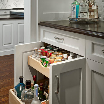
Next on our “to do” list was revamping the dated brown bar area in the neighboring dining room. We eliminated the clutter by adding some closed cabinets and did some easy updates to help the space feel more current. One snag we ran into here was the discovery of a beam above the existing open shelving that had to be modified with a smaller structural beam to allow for our new design to work. This was an unexpected surprise, but in the end we think it was well worth it!
We kept the colors here a bit more muted to blend with the homeowner’s existing furnishings. Open shelving and polished nickel hardware add some simple detail to the new entertainment zone which also looks out onto the lake!
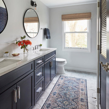
Next we tackled the upstairs starting with the homeowner’s son’s bath. The bath originally had both a tub shower and a separate shower, so we decided to swap out the shower for a new laundry area. This freed up some space downstairs in what used to be the mudroom/laundry room and is much more convenient for daily laundry needs.
We continued the blue palette here with navy cabinetry and the navy tile in the shower. Porcelain floor tile and chrome fixtures keep maintenance to a minimum while matte black mirrors and lighting add some depth the design. A low maintenance runner adds some warmth underfoot and ties the whole space together.
We added a pocket door to the bathroom to minimize interference with the door swings. The left door of the laundry closet is on a 180 degree hinge to allow for easy full access to the machines. Next we tackled the master bath which is an en suite arrangement. The original was typical of the 1980’s with the vanity outside of the bathroom, situated near the master closet. And the brown theme continued here with multiple shades of brown.
Our first move was to segment off the bath and the closet from the master bedroom. We created a short hall from the bedroom to the bathroom with his and hers walk-in closets on the left and right as well as a separate toilet closet outside of the main bathroom for privacy and flexibility.
The original bathroom had a giant soaking tub with steps (dangerous!) as well as a small shower that did not work well for our homeowner who is 6’3”. With other bathtubs in the home, they decided to eliminate the tub and create an oversized shower which takes up the space where the old tub was located. The double vanity is on the opposite wall and a bench is located under the window for morning conversations and a place to set a couple of towels.
The pallet in here is light and airy with a mix of blond wood, creamy porcelain and marble tile, and brass accents. A simple roman shade adds some texture and it’s top-down mechanism allows for light and privacy.
This large whole house remodel gave our homeowners not only the ability to maximize the potential of their home but also created a lovely new frame from which to view their fabulous lake views.
Designed by: Susan Klimala, CKD, CBD
Photography by: Michael Kaskel
For more information on kitchen and bath design ideas go to: www.kitchenstudio-ge.com
 TKS Design Group
Download our free ebook, Creating the Ideal Kitchen. DOWNLOAD NOW
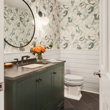
Lakefront property in the northwest suburbs of Chicago is hard to come by, so when we were hired by this young family with exactly that, we were immediately inspired by not just the unusually large footprint of this 1950’s colonial revival but also the lovely views of the manmade lake it was sited on. The large 5-bedroom home was solidly stuck in the 1980’s, but we saw tons of potential. We started out by updating the existing staircase with a fresh coat of paint and adding new herringbone slate to the entry hall.
The powder room off the entryway also got a refresh - new flooring, new cabinets and fixtures. We ran the new slate right through into this space for some consistency. A fun wallpaper and shiplap trim add a welcoming feel and set the tone for the home.
Next, we tackled the kitchen. Located away from the rest of the first floor, the kitchen felt a little isolated, so we immediately began planning for how to better connect it to the rest of the first floor. We landed on removing the wall between the kitchen and dining room and designed a modified galley style space with separate cooking and clean up zones. The cooking zone consists of the refrigerator, prep sink and cooktop, along with a nice long run of prep space at the island. The cleanup side of the kitchen consists of the main sink and dishwasher. Both areas are situated so that the user can view the lake during prep work and cleanup!
One of the home’s main puzzles was how to incorporate the mudroom and area in front of the patio doors at the back of the house. We already had a breakfast table area, so the space by the patio doors was a bit of a no man’s land. We decided to separate the kitchen proper from what became the new mudroom with a large set of barn doors. That way you can quickly hide any mudroom messes but have easy access to the light coming in through the patio doors as well as the outdoor grilling station. We also love the impact the barn doors add to the overall space.
The homeowners’ first words to us were “it’s time to ditch the brown,” so we did! We chose a lovely blue pallet that reflects the home’s location on the lake which is also vibrant yet easy on the eye. Countertops are white quartz, and the natural oak floor works well with the other honey accents. The breakfast table was given a refresh with new chairs, chandelier and window treatments that frame the gorgeous views of the lake out the back.
We coordinated the slate mudroom flooring with that used in the home’s main entrance for a consistent feel. The storage area consists of open and closed storage to allow for some clutter control as needed.
Next on our “to do” list was revamping the dated brown bar area in the neighboring dining room. We eliminated the clutter by adding some closed cabinets and did some easy updates to help the space feel more current. One snag we ran into here was the discovery of a beam above the existing open shelving that had to be modified with a smaller structural beam to allow for our new design to work. This was an unexpected surprise, but in the end we think it was well worth it!
We kept the colors here a bit more muted to blend with the homeowner’s existing furnishings. Open shelving and polished nickel hardware add some simple detail to the new entertainment zone which also looks out onto the lake!
Next we tackled the upstairs starting with the homeowner’s son’s bath. The bath originally had both a tub shower and a separate shower, so we decided to swap out the shower for a new laundry area. This freed up some space downstairs in what used to be the mudroom/laundry room and is much more convenient for daily laundry needs.
We continued the blue palette here with navy cabinetry and the navy tile in the shower. Porcelain floor tile and chrome fixtures keep maintenance to a minimum while matte black mirrors and lighting add some depth the design. A low maintenance runner adds some warmth underfoot and ties the whole space together.
We added a pocket door to the bathroom to minimize interference with the door swings. The left door of the laundry closet is on a 180 degree hinge to allow for easy full access to the machines. Next we tackled the master bath which is an en suite arrangement. The original was typical of the 1980’s with the vanity outside of the bathroom, situated near the master closet. And the brown theme continued here with multiple shades of brown.
Our first move was to segment off the bath and the closet from the master bedroom. We created a short hall from the bedroom to the bathroom with his and hers walk-in closets on the left and right as well as a separate toilet closet outside of the main bathroom for privacy and flexibility.
The original bathroom had a giant soaking tub with steps (dangerous!) as well as a small shower that did not work well for our homeowner who is 6’3”. With other bathtubs in the home, they decided to eliminate the tub and create an oversized shower which takes up the space where the old tub was located. The double vanity is on the opposite wall and a bench is located under the window for morning conversations and a place to set a couple of towels.
The pallet in here is light and airy with a mix of blond wood, creamy porcelain and marble tile, and brass accents. A simple roman shade adds some texture and it’s top-down mechanism allows for light and privacy.
This large whole house remodel gave our homeowners not only the ability to maximize the potential of their home but also created a lovely new frame from which to view their fabulous lake views.
Designed by: Susan Klimala, CKD, CBD
Photography by: Michael Kaskel
For more information on kitchen and bath design ideas go to: www.kitchenstudio-ge.com

Find the right local pro for your project
 ZEPHYR
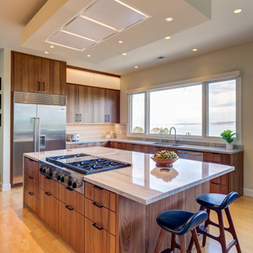
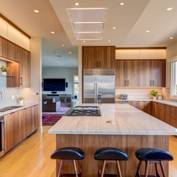
This sleek, minimalist hood features Zephyr Connect, giving you the ability to control it from anywhere, including from your smart speaker — and it discreetly mounts into the ceiling above your cooking surface for power and an unobstructed view. Your kitchen will stay clean and smoke free with the Perimeter Aspiration System and multiple blower options, and the tri-level BriteStrip™ LED lighting ensures a good-looking glow. Available in white and stainless steel.
Control your range hood from anywhere using your mobile device with the Zephyr Connect app. Get real-time diagnostics and product information, and connect to smart devices such as Amazon Alexa or Google Home smart speakers. Download on mobile from the Apple App Store and Google Play today.
 emily lauderback stewart design and renovation
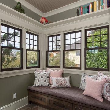
A true Seattle Craftsman with original dark stained fir finish carpentry. When I first worked with this family nearly five years ago, we created a color design for all of the communal areas of the home, except the kitchen. They knew they would be remodeling the kitchen at some point in the future. With lovely furnishings that fit the period and aesthetic of the home, establishing a palette was easy.
Four years later and after helping with the exterior and their home on Orcas Island, I was asked to design their kitchen! Truly a dream project. The new kitchen countertops provided the foundation for the expansion of the home's palette. Creating a much lighter aesthetic was the goal, which is where my ability to find the right balance really came into play. I knew having some of the very dark wood elements would be important to connect the new kitchen and sunroom to the rest of the house. Staining the window sashes only, the interior of the glass-front cabinets, bookcases and bench in sunroom, and floating shelves in baking center provided the connection to the rest of the home, while the painted cabinets and woodwork provided the light freshness they were after to the flow with the countertops.
I was responsible for the custom cabinet design (layout, function, and aesthetic) and coordination and selection of all hard surfaces and color.
 ZEPHYR
This sleek, minimalist hood features Zephyr Connect, giving you the ability to control it from anywhere, including from your smart speaker — and it discreetly mounts into the ceiling above your cooking surface for power and an unobstructed view. Your kitchen will stay clean and smoke free with the Perimeter Aspiration System and multiple blower options, and the tri-level BriteStrip™ LED lighting ensures a good-looking glow. Available in white and stainless steel.
Control your range hood from anywhere using your mobile device with the Zephyr Connect app. Get real-time diagnostics and product information, and connect to smart devices such as Amazon Alexa or Google Home smart speakers. Download on mobile from the Apple App Store and Google Play today.
 emily lauderback stewart design and renovation
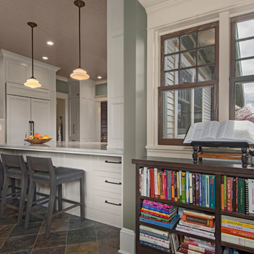
A true Seattle Craftsman with original dark stained fir finish carpentry. When I first worked with this family nearly five years ago, we created a color design for all of the communal areas of the home, except the kitchen. They knew they would be remodeling the kitchen at some point in the future. With lovely furnishings that fit the period and aesthetic of the home, establishing a palette was easy.
Four years later and after helping with the exterior and their home on Orcas Island, I was asked to design their kitchen! Truly a dream project. The new kitchen countertops provided the foundation for the expansion of the home's palette. Creating a much lighter aesthetic was the goal, which is where my ability to find the right balance really came into play. I knew having some of the very dark wood elements would be important to connect the new kitchen and sunroom to the rest of the house. Staining the window sashes only, the interior of the glass-front cabinets, bookcases and bench in sunroom, and floating shelves in baking center provided the connection to the rest of the home, while the painted cabinets and woodwork provided the light freshness they were after to the flow with the countertops.
I was responsible for the custom cabinet design (layout, function, and aesthetic) and coordination and selection of all hard surfaces and color.
 Paul Castrucci Architect
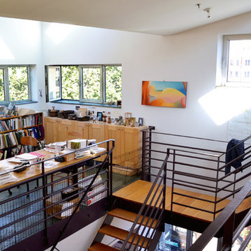
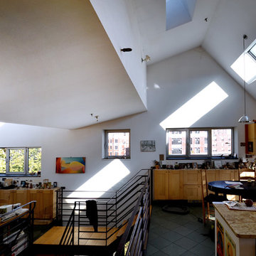
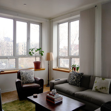
Rivington Street Building is a multi-family residential building in New York City that was designed, developed and constructed from the ground up by Paul A. Castrucci, Architect. In order to successfully take on the roles of developer and contractor, Castrucci utilized his ability to balance budget, schedule and constructability.
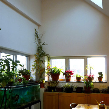
The building is a part of its community and its facade responds to the human and contextual scale. The base of the building utilizes brick, tying it into the surrounding neighborhood. The top floors of the building break from the contextual base in form and material. The corrugated metal saw tooth roofline is a response to the environment, bringing in soft, northern light while providing roof area for a Photovoltaic array of solar panels. The top floor is connected to a roof garden filled with native plants. The result is a light-filled, dynamic space that is shaped by its relationship to daylight and connections to the exterior.
Constructed in 2003, Rivington Street Building is an example of the firm’s energy efficient design that utilizes sustainable methods such as a high-performance envelope, a solar Photovoltaic (PV) array and rainwater collection/grey water system.
 Paul Castrucci Architect
Rivington Street Building is a multi-family residential building in New York City that was designed, developed and constructed from the ground up by Paul A. Castrucci, Architect. In order to successfully take on the roles of developer and contractor, Castrucci utilized his ability to balance budget, schedule and constructability.
The building is a part of its community and its facade responds to the human and contextual scale. The base of the building utilizes brick, tying it into the surrounding neighborhood. The top floors of the building break from the contextual base in form and material. The corrugated metal saw tooth roofline is a response to the environment, bringing in soft, northern light while providing roof area for a Photovoltaic array of solar panels. The top floor is connected to a roof garden filled with native plants. The result is a light-filled, dynamic space that is shaped by its relationship to daylight and connections to the exterior.
Constructed in 2003, Rivington Street Building is an example of the firm’s energy efficient design that utilizes sustainable methods such as a high-performance envelope, a solar Photovoltaic (PV) array and rainwater collection/grey water system.
 Platinum Poolcare
Request Free Quote
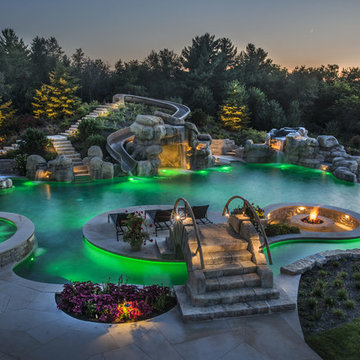
This amazing home features a backyard patio and pool area with a spectacular custom pool with many features including island which feature sitting areas and fire pit a spa as well as incredible slide which goes into the swimming pool. The pool measures roughly 2300 square feet, and has a deep end of 10'0". The spa is raised and has 12 therapy heads. There is LED colored lighting throughout the project. There is a 300 square foot zero depth beach entry into the pool with agitator jets to keep the water moving. There is also a sunshelf within the pool. The lazy river wraps around the sunken island, and the current in the lazy river is propelled by a commercial waterpark quality pumping system. The sunken island has lighting, a fire pit, and a bridge connecting it to the decking area. There is an infinity edge on one edge of the pool. The pool also has an in-floor cleaning system to keep it clean and sanitary. The swimming pool also has the ability to change colors at night utilizing the amazing LED lighting system. The pool and spa exposed aggregate finish is French Gray color. The slide that cascades down the grotto is custom built. The waterfall grotto also provide a thrilling jump off point into the deepest part of the pool. This amazing backyard was designed and built for a home in Bull Valley Illinois.
 TKS Design Group
Download our free ebook, Creating the Ideal Kitchen. DOWNLOAD NOW
Lakefront property in the northwest suburbs of Chicago is hard to come by, so when we were hired by this young family with exactly that, we were immediately inspired by not just the unusually large footprint of this 1950’s colonial revival but also the lovely views of the manmade lake it was sited on. The large 5-bedroom home was solidly stuck in the 1980’s, but we saw tons of potential. We started out by updating the existing staircase with a fresh coat of paint and adding new herringbone slate to the entry hall.
The powder room off the entryway also got a refresh - new flooring, new cabinets and fixtures. We ran the new slate right through into this space for some consistency. A fun wallpaper and shiplap trim add a welcoming feel and set the tone for the home.
Next, we tackled the kitchen. Located away from the rest of the first floor, the kitchen felt a little isolated, so we immediately began planning for how to better connect it to the rest of the first floor. We landed on removing the wall between the kitchen and dining room and designed a modified galley style space with separate cooking and clean up zones. The cooking zone consists of the refrigerator, prep sink and cooktop, along with a nice long run of prep space at the island. The cleanup side of the kitchen consists of the main sink and dishwasher. Both areas are situated so that the user can view the lake during prep work and cleanup!
One of the home’s main puzzles was how to incorporate the mudroom and area in front of the patio doors at the back of the house. We already had a breakfast table area, so the space by the patio doors was a bit of a no man’s land. We decided to separate the kitchen proper from what became the new mudroom with a large set of barn doors. That way you can quickly hide any mudroom messes but have easy access to the light coming in through the patio doors as well as the outdoor grilling station. We also love the impact the barn doors add to the overall space.
The homeowners’ first words to us were “it’s time to ditch the brown,” so we did! We chose a lovely blue pallet that reflects the home’s location on the lake which is also vibrant yet easy on the eye. Countertops are white quartz, and the natural oak floor works well with the other honey accents. The breakfast table was given a refresh with new chairs, chandelier and window treatments that frame the gorgeous views of the lake out the back.
We coordinated the slate mudroom flooring with that used in the home’s main entrance for a consistent feel. The storage area consists of open and closed storage to allow for some clutter control as needed.
Next on our “to do” list was revamping the dated brown bar area in the neighboring dining room. We eliminated the clutter by adding some closed cabinets and did some easy updates to help the space feel more current. One snag we ran into here was the discovery of a beam above the existing open shelving that had to be modified with a smaller structural beam to allow for our new design to work. This was an unexpected surprise, but in the end we think it was well worth it!
We kept the colors here a bit more muted to blend with the homeowner’s existing furnishings. Open shelving and polished nickel hardware add some simple detail to the new entertainment zone which also looks out onto the lake!
Next we tackled the upstairs starting with the homeowner’s son’s bath. The bath originally had both a tub shower and a separate shower, so we decided to swap out the shower for a new laundry area. This freed up some space downstairs in what used to be the mudroom/laundry room and is much more convenient for daily laundry needs.
We continued the blue palette here with navy cabinetry and the navy tile in the shower. Porcelain floor tile and chrome fixtures keep maintenance to a minimum while matte black mirrors and lighting add some depth the design. A low maintenance runner adds some warmth underfoot and ties the whole space together.
We added a pocket door to the bathroom to minimize interference with the door swings. The left door of the laundry closet is on a 180 degree hinge to allow for easy full access to the machines. Next we tackled the master bath which is an en suite arrangement. The original was typical of the 1980’s with the vanity outside of the bathroom, situated near the master closet. And the brown theme continued here with multiple shades of brown.
Our first move was to segment off the bath and the closet from the master bedroom. We created a short hall from the bedroom to the bathroom with his and hers walk-in closets on the left and right as well as a separate toilet closet outside of the main bathroom for privacy and flexibility.
The original bathroom had a giant soaking tub with steps (dangerous!) as well as a small shower that did not work well for our homeowner who is 6’3”. With other bathtubs in the home, they decided to eliminate the tub and create an oversized shower which takes up the space where the old tub was located. The double vanity is on the opposite wall and a bench is located under the window for morning conversations and a place to set a couple of towels.
The pallet in here is light and airy with a mix of blond wood, creamy porcelain and marble tile, and brass accents. A simple roman shade adds some texture and it’s top-down mechanism allows for light and privacy.
This large whole house remodel gave our homeowners not only the ability to maximize the potential of their home but also created a lovely new frame from which to view their fabulous lake views.
Designed by: Susan Klimala, CKD, CBD
Photography by: Michael Kaskel
For more information on kitchen and bath design ideas go to: www.kitchenstudio-ge.com
 Paul Castrucci Architect
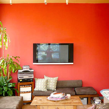
Rivington Street Building is a multi-family residential building in New York City that was designed, developed and constructed from the ground up by Paul A. Castrucci, Architect. In order to successfully take on the roles of developer and contractor, Castrucci utilized his ability to balance budget, schedule and constructability.
The building is a part of its community and its facade responds to the human and contextual scale. The base of the building utilizes brick, tying it into the surrounding neighborhood. The top floors of the building break from the contextual base in form and material. The corrugated metal saw tooth roofline is a response to the environment, bringing in soft, northern light while providing roof area for a Photovoltaic array of solar panels. The top floor is connected to a roof garden filled with native plants. The result is a light-filled, dynamic space that is shaped by its relationship to daylight and connections to the exterior.
Constructed in 2003, Rivington Street Building is an example of the firm’s energy efficient design that utilizes sustainable methods such as a high-performance envelope, a solar Photovoltaic (PV) array and rainwater collection/grey water system.
 Paul Castrucci Architect
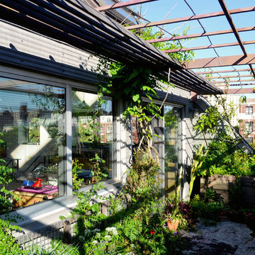
Rivington Street Building is a multi-family residential building in New York City that was designed, developed and constructed from the ground up by Paul A. Castrucci, Architect. In order to successfully take on the roles of developer and contractor, Castrucci utilized his ability to balance budget, schedule and constructability.
The building is a part of its community and its facade responds to the human and contextual scale. The base of the building utilizes brick, tying it into the surrounding neighborhood. The top floors of the building break from the contextual base in form and material. The corrugated metal saw tooth roofline is a response to the environment, bringing in soft, northern light while providing roof area for a Photovoltaic array of solar panels. The top floor is connected to a roof garden filled with native plants. The result is a light-filled, dynamic space that is shaped by its relationship to daylight and connections to the exterior.
Constructed in 2003, Rivington Street Building is an example of the firm’s energy efficient design that utilizes sustainable methods such as a high-performance envelope, a solar Photovoltaic (PV) array and rainwater collection/grey water system.
 Middlefork Luxury Home Builders
Middlefork was retained to update and revitalize this North Shore home to a family of six.
The primary goal of this project was to update and expand the home's small, eat-in kitchen. The existing space was gutted and a 1,500-square-foot addition was built to house a gourmet kitchen, connected breakfast room, fireside seating, butler's pantry, and a small office.
The family desired nice, timeless spaces that were also durable and family-friendly. As such, great consideration was given to the interior finishes. The 10' kitchen island, for instance, is a solid slab of white velvet quartzite, selected for its ability to withstand mustard, ketchup and finger-paint. There are shorter, walnut extensions off either end of the island that support the children's involvement in meal preparation and crafts. Low-maintenance Atlantic Blue Stone was selected for the perimeter counters.
The scope of this phase grew to include re-trimming the front façade and entry to emphasize the Georgian detailing of the home. In addition, the balance of the first floor was gutted; existing plumbing and electrical systems were updated; all windows were replaced; two powder rooms were updated; a low-voltage distribution system for HDTV and audio was added; and, the interior of the home was re-trimmed. Two new patios were also added, providing outdoor areas for entertaining, dining and cooking.
Tom Harris, Hedrich Blessing
 TKS Design Group
Download our free ebook, Creating the Ideal Kitchen. DOWNLOAD NOW
Lakefront property in the northwest suburbs of Chicago is hard to come by, so when we were hired by this young family with exactly that, we were immediately inspired by not just the unusually large footprint of this 1950’s colonial revival but also the lovely views of the manmade lake it was sited on. The large 5-bedroom home was solidly stuck in the 1980’s, but we saw tons of potential. We started out by updating the existing staircase with a fresh coat of paint and adding new herringbone slate to the entry hall.
The powder room off the entryway also got a refresh - new flooring, new cabinets and fixtures. We ran the new slate right through into this space for some consistency. A fun wallpaper and shiplap trim add a welcoming feel and set the tone for the home.
Next, we tackled the kitchen. Located away from the rest of the first floor, the kitchen felt a little isolated, so we immediately began planning for how to better connect it to the rest of the first floor. We landed on removing the wall between the kitchen and dining room and designed a modified galley style space with separate cooking and clean up zones. The cooking zone consists of the refrigerator, prep sink and cooktop, along with a nice long run of prep space at the island. The cleanup side of the kitchen consists of the main sink and dishwasher. Both areas are situated so that the user can view the lake during prep work and cleanup!
One of the home’s main puzzles was how to incorporate the mudroom and area in front of the patio doors at the back of the house. We already had a breakfast table area, so the space by the patio doors was a bit of a no man’s land. We decided to separate the kitchen proper from what became the new mudroom with a large set of barn doors. That way you can quickly hide any mudroom messes but have easy access to the light coming in through the patio doors as well as the outdoor grilling station. We also love the impact the barn doors add to the overall space.
The homeowners’ first words to us were “it’s time to ditch the brown,” so we did! We chose a lovely blue pallet that reflects the home’s location on the lake which is also vibrant yet easy on the eye. Countertops are white quartz, and the natural oak floor works well with the other honey accents. The breakfast table was given a refresh with new chairs, chandelier and window treatments that frame the gorgeous views of the lake out the back.
We coordinated the slate mudroom flooring with that used in the home’s main entrance for a consistent feel. The storage area consists of open and closed storage to allow for some clutter control as needed.
Next on our “to do” list was revamping the dated brown bar area in the neighboring dining room. We eliminated the clutter by adding some closed cabinets and did some easy updates to help the space feel more current. One snag we ran into here was the discovery of a beam above the existing open shelving that had to be modified with a smaller structural beam to allow for our new design to work. This was an unexpected surprise, but in the end we think it was well worth it!
We kept the colors here a bit more muted to blend with the homeowner’s existing furnishings. Open shelving and polished nickel hardware add some simple detail to the new entertainment zone which also looks out onto the lake!
Next we tackled the upstairs starting with the homeowner’s son’s bath. The bath originally had both a tub shower and a separate shower, so we decided to swap out the shower for a new laundry area. This freed up some space downstairs in what used to be the mudroom/laundry room and is much more convenient for daily laundry needs.
We continued the blue palette here with navy cabinetry and the navy tile in the shower. Porcelain floor tile and chrome fixtures keep maintenance to a minimum while matte black mirrors and lighting add some depth the design. A low maintenance runner adds some warmth underfoot and ties the whole space together.
We added a pocket door to the bathroom to minimize interference with the door swings. The left door of the laundry closet is on a 180 degree hinge to allow for easy full access to the machines. Next we tackled the master bath which is an en suite arrangement. The original was typical of the 1980’s with the vanity outside of the bathroom, situated near the master closet. And the brown theme continued here with multiple shades of brown.
Our first move was to segment off the bath and the closet from the master bedroom. We created a short hall from the bedroom to the bathroom with his and hers walk-in closets on the left and right as well as a separate toilet closet outside of the main bathroom for privacy and flexibility.
The original bathroom had a giant soaking tub with steps (dangerous!) as well as a small shower that did not work well for our homeowner who is 6’3”. With other bathtubs in the home, they decided to eliminate the tub and create an oversized shower which takes up the space where the old tub was located. The double vanity is on the opposite wall and a bench is located under the window for morning conversations and a place to set a couple of towels.
The pallet in here is light and airy with a mix of blond wood, creamy porcelain and marble tile, and brass accents. A simple roman shade adds some texture and it’s top-down mechanism allows for light and privacy.
This large whole house remodel gave our homeowners not only the ability to maximize the potential of their home but also created a lovely new frame from which to view their fabulous lake views.
Designed by: Susan Klimala, CKD, CBD
Photography by: Michael Kaskel
For more information on kitchen and bath design ideas go to: www.kitchenstudio-ge.com
 Paul Castrucci Architect
Rivington Street Building is a multi-family residential building in New York City that was designed, developed and constructed from the ground up by Paul A. Castrucci, Architect. In order to successfully take on the roles of developer and contractor, Castrucci utilized his ability to balance budget, schedule and constructability.
The building is a part of its community and its facade responds to the human and contextual scale. The base of the building utilizes brick, tying it into the surrounding neighborhood. The top floors of the building break from the contextual base in form and material. The corrugated metal saw tooth roofline is a response to the environment, bringing in soft, northern light while providing roof area for a Photovoltaic array of solar panels. The top floor is connected to a roof garden filled with native plants. The result is a light-filled, dynamic space that is shaped by its relationship to daylight and connections to the exterior.
Constructed in 2003, Rivington Street Building is an example of the firm’s energy efficient design that utilizes sustainable methods such as a high-performance envelope, a solar Photovoltaic (PV) array and rainwater collection/grey water system.
 Promise Path Landscaping Inc
zack Benson photography
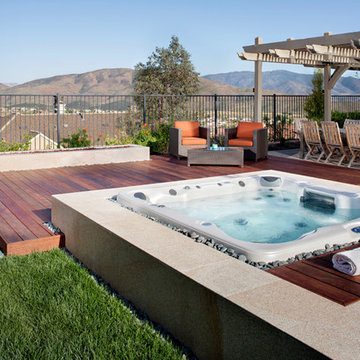
Design ideas for a mid-sized contemporary full sun backyard water fountain landscape in San Diego with decking.
Design ideas for a mid-sized contemporary full sun backyard water fountain landscape in San Diego with decking.
 Paul Castrucci Architect
Rivington Street Building is a multi-family residential building in New York City that was designed, developed and constructed from the ground up by Paul A. Castrucci, Architect. In order to successfully take on the roles of developer and contractor, Castrucci utilized his ability to balance budget, schedule and constructability.
The building is a part of its community and its facade responds to the human and contextual scale. The base of the building utilizes brick, tying it into the surrounding neighborhood. The top floors of the building break from the contextual base in form and material. The corrugated metal saw tooth roofline is a response to the environment, bringing in soft, northern light while providing roof area for a Photovoltaic array of solar panels. The top floor is connected to a roof garden filled with native plants. The result is a light-filled, dynamic space that is shaped by its relationship to daylight and connections to the exterior.
Constructed in 2003, Rivington Street Building is an example of the firm’s energy efficient design that utilizes sustainable methods such as a high-performance envelope, a solar Photovoltaic (PV) array and rainwater collection/grey water system.
 JFKDESiGN landscape | buildings | interiors
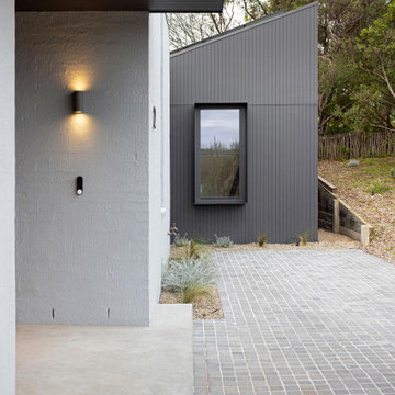
Location: Situated on Bunurong country near the town of Sorrento, the site was uniquely positioned between the back beach and the footy oval. The broad wedge-shaped site featured a steep vegetated dune climbing 6 meters to the rear and remnant coastal Moonah trees at the front, providing a distinctive natural context.
Design Brief: The objective was to create an enduring 4-bedroom holiday house that harmonized with its coastal environment. The design was intended to be both stylish and robust, offering high amenity and serviceability. This house was envisioned as a long-term investment, serving the dual purpose of accommodating a growing family and functioning as a part-time rental property.
Architectural Features:
Contextual Integration: The architectural response meticulously respected and enhanced the site's natural features, seamlessly integrating the vegetated dune and preserving the Moonah trees within the landscape strategy.
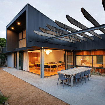
Materiality and Aesthetics: The material palette was selected for its durability and ability to withstand the harsh coastal conditions while maintaining a refined and stylish appearance. This included the use of resilient, high-quality materials that age gracefully over time.
Spatial Versatility: The spatial configuration was designed to adapt to the evolving needs of a growing family and the demands of a rental property. Flexible spaces were created to provide a balance between communal living areas and private retreats.
Indoor-Outdoor Connectivity: Emphasizing seamless indoor-outdoor connections, the design featured expansive glazing, outdoor terraces, and integrated landscaping to blur the boundaries between interior and exterior spaces.
High Amenity and Comfort: The house boasted a laminate black-butt chef's kitchen, stone and tile surfaces, and state-of-the-art climate control systems, including integrated heating and cooling, to ensure year-round comfort and ease of maintenance.
The architectural vision aimed to create a timeless residence that would serve as a cherished family retreat and a sought-after rental property, responding elegantly to its coastal context and the demands of modern living.
 JFKDESiGN landscape | buildings | interiors
Location: Situated on Bunurong country near the town of Sorrento, the site was uniquely positioned between the back beach and the footy oval. The broad wedge-shaped site featured a steep vegetated dune climbing 6 meters to the rear and remnant coastal Moonah trees at the front, providing a distinctive natural context.
Design Brief: The objective was to create an enduring 4-bedroom holiday house that harmonized with its coastal environment. The design was intended to be both stylish and robust, offering high amenity and serviceability. This house was envisioned as a long-term investment, serving the dual purpose of accommodating a growing family and functioning as a part-time rental property.
Architectural Features:
Contextual Integration: The architectural response meticulously respected and enhanced the site's natural features, seamlessly integrating the vegetated dune and preserving the Moonah trees within the landscape strategy.
Materiality and Aesthetics: The material palette was selected for its durability and ability to withstand the harsh coastal conditions while maintaining a refined and stylish appearance. This included the use of resilient, high-quality materials that age gracefully over time.
Spatial Versatility: The spatial configuration was designed to adapt to the evolving needs of a growing family and the demands of a rental property. Flexible spaces were created to provide a balance between communal living areas and private retreats.
Indoor-Outdoor Connectivity: Emphasizing seamless indoor-outdoor connections, the design featured expansive glazing, outdoor terraces, and integrated landscaping to blur the boundaries between interior and exterior spaces.
High Amenity and Comfort: The house boasted a laminate black-butt chef's kitchen, stone and tile surfaces, and state-of-the-art climate control systems, including integrated heating and cooling, to ensure year-round comfort and ease of maintenance.
The architectural vision aimed to create a timeless residence that would serve as a cherished family retreat and a sought-after rental property, responding elegantly to its coastal context and the demands of modern living.
9