
Search results for "Considerable opportunities" in Home Design Ideas
 Klopf Architecture
From Mid-Century Classic to the Present
An iconic design updated with comfort, function, and flow for today.
A Remodel That Balances Past and Present
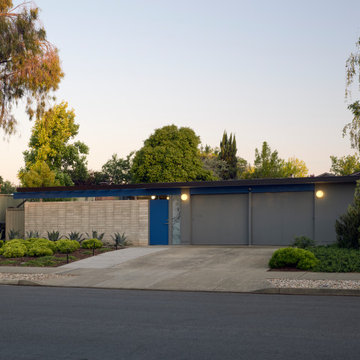
What started as a desire to update a classic Eichler soon became an exploration of how Mid-Century Modern design can successfully evolve for today. The client, a tech professional with a passion for scuba diving and underwater photography, wanted a home that would both honor its original character and feel tailored to his daily life. A lifelong technology enthusiast, he still owns the very first Mac desktop he saved up for as a teenager working at Radio Shack, a detail that underscores his appreciation for design that melds function and form.
Honoring Separation While Expanding Possibility
Unlike many contemporary remodels where walls are opened up to create expansive living spaces, this project took a more restrained approach. The client valued the defined rooms of the original plan and wanted to preserve as much wall space as possible for displaying his large-format underwater photography. The emphasis was not on dramatic spatial reinvention, but on thoughtful refinements. Klopf Architecture shaped a gallery-like backdrop while also expanding the primary suite, modernizing materials and fixtures throughout the home, and improving the functionality and layout of the kitchen. The finished home feels at once timeless and renewed, an Eichler that continues to inspire while fully supporting the lifestyle of its present-day owner.
A major turning point came mid-design. The original project brief had not included an addition, but as the reconfiguration of the primary bedroom and bath unfolded, it became clear that an expansion was the best approach to achieve the client’s vision of a more spacious suite. Fortunately, the adjustment came at a stage when revisions were still manageable and was integrated seamlessly, showing how thoughtful course corrections can strengthen a project rather than hinder it.
Navigating Challenges With Precision
The design development included multiple conceptual rounds, balancing preservation with subtle expansion. During construction, an existing post previously thought to be load-bearing turned out not to be. The structural engineer was able to pivot quickly, and both the post and the cross beam that had been intended to replace it could be omitted, allowing the original rhythm of the Eichler beam bays to be preserved.
Sustainability was not just a checklist item, but a way to align the home with the client’s values of simplicity, efficiency, and long-term functionality. R-38 roof insulation reduced energy usage, solar panels with battery storage provided independence and resilience, and passive comfort strategies eliminated the need forenergy-intensive air conditioning. An electric vehicle charger and an on-demand hot water recirculation system (with call buttons as opposed to having constant circulation) add to the home’s long-term efficiency factors. Together, these moves created a home that is quieter, more comfortable, and better equipped for the future, qualities that supported the client’s pragmatic approach to design and living lightly.
Details That Respect the Eichler DNA
The remodel carries forward the Eichler’s original spirit while introducing new layers of modern livability. Originally, the house was approached along a deep, narrow walk, with the garage on one side and the house on the other, leaving the front door tucked far back within this chasm-like space. By pulling the entry forward, the design reshaped the arrival experience, creating a clearer threshold and a natural drop-off zone for bags, shoes, and keys. This shift also made room for a custom bench at the entry that extends seamlessly through the glass sidelight. The bench and drop-off zone now work together as a single, integrated sequence that supports everyday living while offering a tactile reminder of Eichler’s philosophy of connectedness.
At the client’s request, Klopf reintroduced a classic Eichler gesture by extending the exterior siding into the entry and living room. The detail reinforces a sense of indoor/outdoor continuity while providing a subtle architectural surface that allows the client’s photography to take visual precedence.
The signature concrete masonry wall at the front was reconstructed using blocks sourced to match the originals, now strengthened with rebar for seismic resilience while maintaining a private outdoor courtyard, visually extending the kitchen outward. A decorative trellis element, a detail borrowed from a neighboring Eichler, restores a familiar mid-century modern architectural motif. At the courtyard entry door, a custom etched glass sidelight with an ocean-themed design featuring kelp and jellyfish serves as a subtle homage to the client’s passion for deep-sea diving.
Landscaping became an integral part of the overall transformation. The homeowner engaged landscape architect Randi Johnsen of Third Nature Studio to shape a series of calm, inviting outdoor rooms that read as a natural extension of the interiors. While technically outside of the core construction scope, the landscape design proved central to achieving a sense of completeness and connectedness across the property. Such whole-property considerations often emerge as design ideas take shape, underscoring the importance of flexibility in planning and budgeting, as well as close collaboration among the design team starting early in the process.
The Value of Evolving Scope
As with many custom residential projects, the scope evolved during the design process. What began as a targeted remodel grew to include a new/expanded primary suite, a rebuilt CMU patio wall for strength and longevity, and a solar panel array and battery storage for energy resilience and carbon-reduction. Each thoughtful decision represented a conscious investment in the home’s performance and character, rather than a cost overrun.
The result was a project delivered on schedule, tailored precisely to the client’s lifestyle, and positioned to add long-term value both functionally and aesthetically. By embracing scope evolution as an opportunity rather than a challenge, and relying on good design paired with transparent communication, this remodel demonstrates how Eichler homes can be adapted for contemporary living without erasing their DNA.
Klopf Architecture project team: John Klopf, AIA, and Klara Kevane, Elise Webb and Nicholas LaNasa.
Contractor: Golden Cove Construction
Landscape Design: Third Nature Studio
Structural Engineer: Daniel Bastiao Design
Photography: ©2025 Mariko Reed
Year Completed: 2024
Location: Sunnyvale, CA
 DMB Interior Design-Build
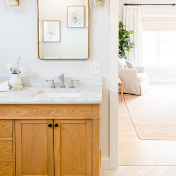
The Master Suite of the Elmwood project was formulated from scratch in the spacious addition of a branching household. Our clients wanted to keep the neighborhood they loved while creating space for a growing family. DMB Design came into the project at the blueprint phase, offering our intentional consideration to the layout of the space before its physical creation. This offered us an opportunity to present our idealized iteration of a self-contained sanctuary space. We created a spa-inspired atmosphere, starting with the floating tub that captured our hearts from the very beginning. You'll find plenty of space to hang your robe in the 15-foot walk in closet complete with floor-to-ceiling custom built-ins. The suite maintains an aura of romance, creating a sense of delicacy without an ounce of fussiness.
 Skill Construction & Design, LLC
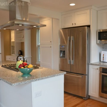
There are so many design elements to this kitchen, I almost don’t know where to start. Bright and airy with crisp clean white cabinets, the kitchen is open and welcoming. Still crisp but gently contrasting, the stainless steel appliance add depth amid the white. To keep this kitchen warm, natural oak covers the floors and a toasted wheat color washes the walls. And then there is the architectural elements. You know. That post and beam in the middle of the room. It’s the center of attention.
When you walk into a room your eyes roam around, establishing the size and shape of the room as your feet take you forward. From the front door of this home straight ahead you encountered this wall. The dining area to the right gives you a glimpse of things to come. Where there is a dining room you will usually find a kitchen.
The architecture of years gone by consistently hides the kitchen, the heart of the home, behind walls. I sympathize with my Mom, and all the other Moms, who have had to spend so much time tucked into a tight kitchen, away from the family. This wall had to go, but it was structural. We needed its support but not its bulk.
So we got rid of the bulk and only the bulk. Instead of a wall we have a post and beam, offering all of the structure we need. We could have installed a huge steel beam and reconfigure the joists to upset the beam, but why? The small beam and post add an incredible architectural element. It’s turning lemons into lemon, we simply made the most of what we had. It may be functional but it’s so fantastic. It looks like we created the effect just for the drama.
The original kitchen may have had a working triangle and some counter space, but it was fairly small, with each area only a step or two away. The dark cabinets made the space feel even smaller and the butcher block patterned laminate counter tops were very dated. The appliances were feeling their age as well, from a coil burner electric stove to a top freezer refrigerator. To keep this kitchen within its space, a half wall separated it from the dining area.
With the wall gone we borrowed some space from the living room and extended what was a U shaped kitchen into an L. At the living room window we start our new kitchen. We kept a small part of the wall to support the other end of our decorative beam. Sandwiched between a large pantry and our new French door refrigerator, the wall disappears. With our new open floor plan a sizable island was in order.
We split our cooking areas and installed a continuous grill gas cooktop into the island. A sleek island hood takes care of exhaust and adds an extra element to our architectural feature. Under the cooktop we added over-sized drawers for pots and pan storage. The frameless cabinets from New River Cabinetry are maple, painted white, with the Herndon door style. With the cooktop safely nestled into our island, we still had to add an oven.
We used the space where the old range sat for a large single oven of stainless steel and glass. If it worked for one, why not two? We created a home for a microwave in the wall cabinets. It’s perfect for heating leftovers so close to the refrigerator.
An important consideration for hot spots in your kitchen is landing zones. Each of our cooking areas have generous landing zones, one on each side of the cooktop and an entire counter area above or below the ovens, depending on which one you’re using.
We wanted to give the sink area more room so the half wall had to come out. We moved the trash and recycle cans into a cabinet, removed the heavy soffits and kept the sink under the window.
With that little bit of extra space we were able to add a larger cabinet above the dishwasher and slide it all down. This used to be where the carpeting met the vinyl floor, but all of it is gone. Long oak planks eliminate that final divide between the kitchen and the dining area, while adding visual length to the area. White wall cabinets on each side of the window reflect the sunlight for a brighter view.
With all of the darker cabinetry the backsplash walls had been painted white. Even still, there was a darkness in the corners and it wasn’t very exciting. We wanted to add visual interest and reflect the new under-cabinet lighting, eliminating the shadows in this corner.
With 1″x 2″ Arabescato Honed marble mosaics and those under-cabinet lights, we achieved the perfect balance. The marble has subtle swirls in gray and beige on a clean white background, but with the honed finish the light is softly reflected instead of glaring. For granite, we chose the soft gray tones of Luna Pearl. The speckles of gray and beige are a gentle contrast to the white cabinets and emulate the color of the stainless steel.
Between the carpet, red half wall, dark railing and dated light fixture, the dining area felt tired. Since the kitchen lacked sufficient storage, a large utility cabinet crowded the table space without adding any decorate elements.
Although it didn’t get any bigger, our dining area feels fresher and more open too. With the oak flooring joining the area to the rest of our space and the toasted wheat on the walls, the white table and chairs compliment the cabinetry while contrasting the warmer colors. We replaced the chandelier with recessed lighting and changed that railing too.
With our new open floor plan, we ended up with a fairly open area in between our foyer closet and the living room window. Not one to miss an opportunity, we filled the space with a multi-functional work space.
With the sunlight streaming in this bright corner works for anything this family needs.
There’s plenty of space for a chair under this large desk drawer. A closed cabinet below, glass doors above and lots of open shelving let you store and or showcase your belongings. We added a lite area at the top to keep away the darker corners.
The transformation is complete. This kitchen and all of its features are truly the center of attention in this home.
http://www.designsbyskill.com/
http://www.rjkconstructioninc.com/
Find the right local pro for your project
 Cape Associates, Inc.
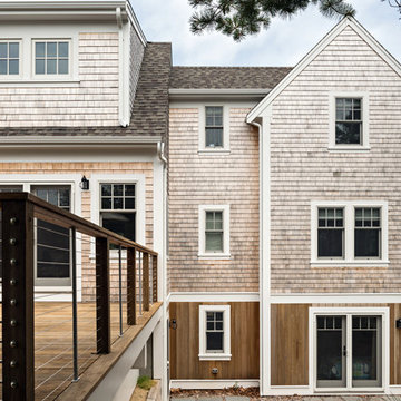
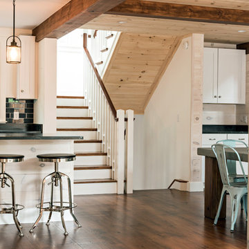
The little cottage on Turnip Field Road in Eastham had been owned by the same couple since 1940, until they built a new, adjacent house on the property. The cottage was then handed down to the next generation, who began spending more and more time at the cottage. It was then that they contacted Cape Associates to construct a more livable home in place of that little cottage. It was crucial to the owners however, that the home keep with the understated charm and Cape Cod-feel of the neighborhood.
The primary challenge was to keep it humble, while building the owners their well-deserved vacation retreat. The original cottage had no air conditioning, and renovating was quickly dismissed because of the inadequacies and the cost of modernizing. Building new allowed the team to relocate the house further back from the street, and it meant meeting the owners’ needs without compromise.
Cape Associates’ project manager Lance LaLone said the owners expressed their desire to incorporate lots of wood and the types of materials that were in the old cottage. Most of the interior is pine, which was used on the flooring, the walls, and wrapped around the ceiling’s beams, giving the owners what they desired on a grander scale – a beautiful, modern dwelling that still held the personality of that little cottage that held such cherished memories.
The front of the home has a two-car garage and breezeway entrance, while the rear reveals an entertainer’s paradise, with an enormous mahogany deck with an outdoor shower, a stunning Connecticut-fieldstone fireplace with a chimney that reaches around 30 feet in height, and multiple sliders to access the home. The finished basement opens to the ground level, and above the entrance breezeway is another small deck with a great view. It’s the best of indoor/outdoor living.
Movement patterns from beach to house to bedroom were an important consideration. The site also provided an excellent opportunity to visually connect the basement level patio visually to the main level deck and finally the master bedroom deck. The finished home provides year-round living, with a summer-getaway atmosphere.
 Cape Associates, Inc.
The little cottage on Turnip Field Road in Eastham had been owned by the same couple since 1940, until they built a new, adjacent house on the property. The cottage was then handed down to the next generation, who began spending more and more time at the cottage. It was then that they contacted Cape Associates to construct a more livable home in place of that little cottage. It was crucial to the owners however, that the home keep with the understated charm and Cape Cod-feel of the neighborhood.
The primary challenge was to keep it humble, while building the owners their well-deserved vacation retreat. The original cottage had no air conditioning, and renovating was quickly dismissed because of the inadequacies and the cost of modernizing. Building new allowed the team to relocate the house further back from the street, and it meant meeting the owners’ needs without compromise.
Cape Associates’ project manager Lance LaLone said the owners expressed their desire to incorporate lots of wood and the types of materials that were in the old cottage. Most of the interior is pine, which was used on the flooring, the walls, and wrapped around the ceiling’s beams, giving the owners what they desired on a grander scale – a beautiful, modern dwelling that still held the personality of that little cottage that held such cherished memories.
The front of the home has a two-car garage and breezeway entrance, while the rear reveals an entertainer’s paradise, with an enormous mahogany deck with an outdoor shower, a stunning Connecticut-fieldstone fireplace with a chimney that reaches around 30 feet in height, and multiple sliders to access the home. The finished basement opens to the ground level, and above the entrance breezeway is another small deck with a great view. It’s the best of indoor/outdoor living.
Movement patterns from beach to house to bedroom were an important consideration. The site also provided an excellent opportunity to visually connect the basement level patio visually to the main level deck and finally the master bedroom deck. The finished home provides year-round living, with a summer-getaway atmosphere.
 CARTA NOVA : Architecture & Beyond
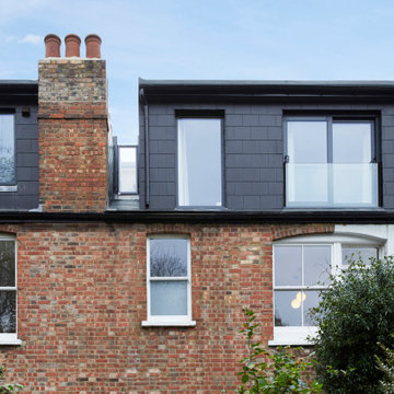
Contemporary loft design. Open spaces.
Trendy exterior home photo in London
Trendy exterior home photo in London
 Habitat Architecture
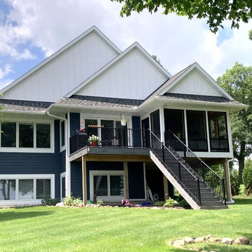
A new cabin on this property overlooking Sugar Lake near Annandale, Minnesota, was built in place of an old cabin. The existing cabin was in desperate need of some major maintenance and updating, however due to a number of issues and problems, it seemed like a compelling case for a total rebuild. Therefore, to design a new cabin, a number of important considerations had to be made. Most importantly, the cabin orientation to the lake. To take advantage of the best views, the original cabin was sited diagonally with respect to its lot. However, as the result parts of the cabin was non-conforming! Meaning, it was intruding into the lot setbacks, violating the local zoning requirements. To address this concern and to maintain the desired sights and views of the lake, the architect approached the problem by introducing a system of layers at the exterior walls, to expose the views, seamlessly to the cabin's interior.
This approach was the basis for the design concept and the exterior architecture. The open floor plan, extended the views throughout the interior spaces and provided ample natural lighting by utilizing a number of windows, located strategically. Another concern with the old cabin was about flooding and water intrusion. The architect observed the existing grades and by elevating the new cabin and proper grading around the new cabin, not only solved the drainage issue, he introduced the opportunity for daylight windows in the new basement. The new windows also provided the means of egress and addition living space, as the result.
The homeowners were also concerned about the afternoon sun and how the old Maple tree which had to be removed earlier provide much needed shade during the afternoon. The design addressed that issue by adopting deeper eaves and overhang around the perimeter, including the gable ends and utilizing roof eyebrows, as architectural elements.
 Christopher @ Architects LLC
Kevin Reeves, Photographer
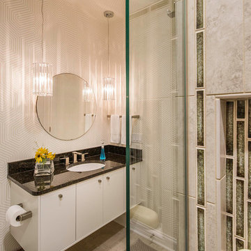
Updated kitchen with center island with chat-seating. Spigot just for dog bowl. Towel rack that can act as a grab bar. Flush white cabinetry with mosaic tile accents. Top cornice trim is actually horizontal mechanical vent. Semi-retired, art-oriented, community-oriented couple that entertain wanted a space to fit their lifestyle and needs for the next chapter in their lives. Driven by aging-in-place considerations - starting with a residential elevator - the entire home is gutted and re-purposed to create spaces to support their aesthetics and commitments. Kitchen island with a water spigot for the dog. "His" office off "Her" kitchen. Automated shades on the skylights. A hidden room behind a bookcase. Hanging pulley-system in the laundry room. Towel racks that also work as grab bars. A lot of catalyzed-finish built-in cabinetry and some window seats. Televisions on swinging wall brackets. Magnet board in the kitchen next to the stainless steel refrigerator. A lot of opportunities for locating artwork. Comfortable and bright. Cozy and stylistic. They love it.
 Famaliving San Diego
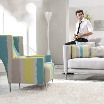
Seven is a unique accent lounge chair custom made by Famaliving in Spain. It is available in over 600 fabrics to be able to compliment any decor of your home, from wild and very modern to traditional and very conservative. This lounge chair represents everything Famaliving stands for: quality, unique design, unmatched comfort and very high quality standards. Now you have a unique opportunity to purchase the Seven Lounge chair in the United States and make your house look better. If you do not want your living room looking like every other living room, the Seven Chair is a very strong and absolutely gorgeous consideration.
Dimensions:
31"W x 39"D x 35.5"H
We deliver Nationwide!
Visit our showroom at:
Famaliving San Diego
401 University Ave,
San Diego, CA 92103
Questions? Ready to purchase?
Tel. 1-619-900-7674
sandiego@famaliving.com
 Michael Nash Design, Build & Homes
Starting Each Day Clean and Refreshed In This Classically-Modern, Marble Masterpiece
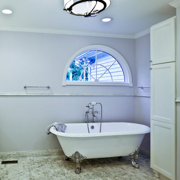
In 1985, the previous owner of the house had added an addition of which part included a 17 feet by 13 feet space off the master bedroom for both a master bath and walk-in closet. Irrespective of the dated red carpet that blanketed the entire bathroom of this 1964 colonial in Annandale, VA, the combination bathroom/closet space had its other oddities, primarily in that there was no shower. The current homeowners -- a family of five, who has been in the home for 7 years, was tired of going down the hall to use the kids’ bathroom to take a shower before work. The renovation that they have created now is a bright and luxurious space that one could bask in all day. They used this bathroom renovation opportunity to total remake the layout and function of this essential room that sets the tone for the day ahead.
Prior to the renovation, the existing bathroom oddly had two entrances, a typical one off of the master bedroom, but another straight off the upstairs hallway. As the toilet was out in the open in the previous design, ensuring that this second door was closed when company was in town was essential and a nuisance. As you entered the room, situated below the arc window, a large soaking tub that was covered on three sides with wooden steps dominated the room from the corner it projected. A relatively small 42” single bowl sink did not leave much space for his and hers toiletries, and there was no other linen closet or cabinetry for storage in the bathroom. The 8 foot by 5 foot closet with accordion doors had poorly laid out rungs not letting the storage space to be fully utilized. At over 220 square feet, the room did offer considerable space to work with, yet the existing layout, which even included a partition wall behind the vanity, felt cramped and dysfunctional.
The homeowners wished to create a classic yet modern, private, deluxe bathroom that would better integrate into their master suite and enable them to start and end each day in a luxurious way. They wanted to maintain having a soaking tub, add in a large shower, have an enclosed commode, expand to include double sinks, and add more storage for toiletries and linens. We worked with the customer to develop a creative design with extensive plumbing rework that accomplished all these needs and more.
The first order of business was to gut out all the carpet, tub, cabinetry, and non-load bearing partition walls. The new tub would be generally in the same location, but as the previous walk-in closet would be repurposed for the commode and the walk-in shower additional water lines, plumbing, and draining needed to be added; fortunately the room below is the garage, which enabled the team to frame out some bulkheads to accomplish this complex plumbing. Following the framing, including walling up the second entrance to the bathroom, adding in a pocket door for the commode, and creating the shape of the new shower, the team also laid down the wiring for one of the luxuries of this room – heated flooring. A glossy percaline boarder, and two-inch hexagon shape percaline tiles cover the entire floor, making it much easier and cleaner than the previous carpet.
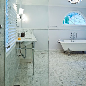
Marble look tile is predominant throughout the bathroom as despite the angled frameless glass door, the entire shower is covered in 18 inch polished marble look tiles. The shower coats the user in water from either the overhead rain head, large main showerhead and/or the hand held sprayer. Over 7 feet of white Italian Statuetto marble countertop, enable the couple to have two sink bowls and plenty of room on each side. The bowls are exposed in this stainless steel console sink design which required the team to ensure that the exposed plumbing looked pristine, and painting the bottom of the porcelain bowl to match the coloring.
The white cast-iron 72-inch Cecilia claw-foot soaking tub and its chrome lion’s paws complement that other chrome and white used throughout the room. A tall, almost floor-to-ceiling linen closet finished in arctic white is nestled in the corner near the tub, enabling ample storage of towels, etc. Other cabinetry includes an 18 inch-wide vanity with decorative footing is centered between the two sinks, and a 27 inch wall mounted cabinet with shelf is above the Kohler Devonshire elongated toilet.
Billowing cloud colored grey blue paint was a great choice for this room to pick up on the veining in the marble. Mirrored medicine chests, a chandelier, wall sconces, and overhead recessed lighting also were incorporated into the design and function of the new room.
The artful combination of classic design from material choices, such as free-standing Victorian claw-foot tub along with the modern design as seen in the angled shower, frameless medicine cabinet mirrors, and frosted glass pocket door on the commode, make this bathroom quite a masterpiece.
The clients are enjoying having their private space and not having the use the kids’ bathroom anymore.
 DMB Interior Design-Build
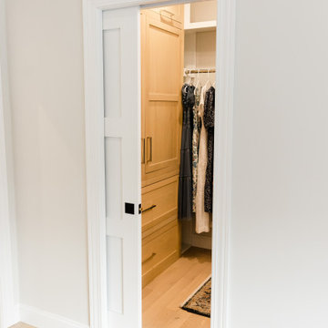
The Master Suite of the Elmwood project was formulated from scratch in the spacious addition of a branching household. Our clients wanted to keep the neighborhood they loved while creating space for a growing family. DMB Design came into the project at the blueprint phase, offering our intentional consideration to the layout of the space before its physical creation. This offered us an opportunity to present our idealized iteration of a self-contained sanctuary space. We created a spa-inspired atmosphere, starting with the floating tub that captured our hearts from the very beginning. You'll find plenty of space to hang your robe in the 15-foot walk in closet complete with floor-to-ceiling custom built-ins. The suite maintains an aura of romance, creating a sense of delicacy without an ounce of fussiness.
 Michael Nash Design, Build & Homes
Starting Each Day Clean and Refreshed In This Classically-Modern, Marble Masterpiece
In 1985, the previous owner of the house had added an addition of which part included a 17 feet by 13 feet space off the master bedroom for both a master bath and walk-in closet. Irrespective of the dated red carpet that blanketed the entire bathroom of this 1964 colonial in Annandale, VA, the combination bathroom/closet space had its other oddities, primarily in that there was no shower. The current homeowners -- a family of five, who has been in the home for 7 years, was tired of going down the hall to use the kids’ bathroom to take a shower before work. The renovation that they have created now is a bright and luxurious space that one could bask in all day. They used this bathroom renovation opportunity to total remake the layout and function of this essential room that sets the tone for the day ahead.
Prior to the renovation, the existing bathroom oddly had two entrances, a typical one off of the master bedroom, but another straight off the upstairs hallway. As the toilet was out in the open in the previous design, ensuring that this second door was closed when company was in town was essential and a nuisance. As you entered the room, situated below the arc window, a large soaking tub that was covered on three sides with wooden steps dominated the room from the corner it projected. A relatively small 42” single bowl sink did not leave much space for his and hers toiletries, and there was no other linen closet or cabinetry for storage in the bathroom. The 8 foot by 5 foot closet with accordion doors had poorly laid out rungs not letting the storage space to be fully utilized. At over 220 square feet, the room did offer considerable space to work with, yet the existing layout, which even included a partition wall behind the vanity, felt cramped and dysfunctional.
The homeowners wished to create a classic yet modern, private, deluxe bathroom that would better integrate into their master suite and enable them to start and end each day in a luxurious way. They wanted to maintain having a soaking tub, add in a large shower, have an enclosed commode, expand to include double sinks, and add more storage for toiletries and linens. We worked with the customer to develop a creative design with extensive plumbing rework that accomplished all these needs and more.
The first order of business was to gut out all the carpet, tub, cabinetry, and non-load bearing partition walls. The new tub would be generally in the same location, but as the previous walk-in closet would be repurposed for the commode and the walk-in shower additional water lines, plumbing, and draining needed to be added; fortunately the room below is the garage, which enabled the team to frame out some bulkheads to accomplish this complex plumbing. Following the framing, including walling up the second entrance to the bathroom, adding in a pocket door for the commode, and creating the shape of the new shower, the team also laid down the wiring for one of the luxuries of this room – heated flooring. A glossy percaline boarder, and two-inch hexagon shape percaline tiles cover the entire floor, making it much easier and cleaner than the previous carpet.
Marble look tile is predominant throughout the bathroom as despite the angled frameless glass door, the entire shower is covered in 18 inch polished marble look tiles. The shower coats the user in water from either the overhead rain head, large main showerhead and/or the hand held sprayer. Over 7 feet of white Italian Statuetto marble countertop, enable the couple to have two sink bowls and plenty of room on each side. The bowls are exposed in this stainless steel console sink design which required the team to ensure that the exposed plumbing looked pristine, and painting the bottom of the porcelain bowl to match the coloring.
The white cast-iron 72-inch Cecilia claw-foot soaking tub and its chrome lion’s paws complement that other chrome and white used throughout the room. A tall, almost floor-to-ceiling linen closet finished in arctic white is nestled in the corner near the tub, enabling ample storage of towels, etc. Other cabinetry includes an 18 inch-wide vanity with decorative footing is centered between the two sinks, and a 27 inch wall mounted cabinet with shelf is above the Kohler Devonshire elongated toilet.
Billowing cloud colored grey blue paint was a great choice for this room to pick up on the veining in the marble. Mirrored medicine chests, a chandelier, wall sconces, and overhead recessed lighting also were incorporated into the design and function of the new room.
The artful combination of classic design from material choices, such as free-standing Victorian claw-foot tub along with the modern design as seen in the angled shower, frameless medicine cabinet mirrors, and frosted glass pocket door on the commode, make this bathroom quite a masterpiece.
The clients are enjoying having their private space and not having the use the kids’ bathroom anymore.
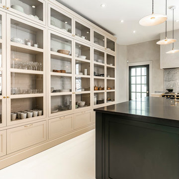
 Soll.Solutions
Example of a large arts and crafts u-shaped light wood floor and white floor kitchen design in Montreal with an undermount sink, shaker cabinets, beige cabinets, granite countertops, beige backsplash, an island and black countertops
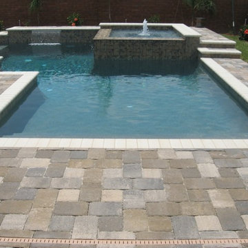
 All Seasons Pools
Your family is unique and has specific desires, wishes, wants, and needs. Additionally, every backyard and home has its own special charm and set of opportunities and challenges. At All Seasons Pools, we take all of these details into consideration to create a truly custom Pool design that is sure to delight and inspire for years to come.
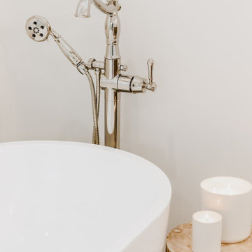 DMB Interior Design-Build
The Master Suite of the Elmwood project was formulated from scratch in the spacious addition of a branching household. Our clients wanted to keep the neighborhood they loved while creating space for a growing family. DMB Design came into the project at the blueprint phase, offering our intentional consideration to the layout of the space before its physical creation. This offered us an opportunity to present our idealized iteration of a self-contained sanctuary space. We created a spa-inspired atmosphere, starting with the floating tub that captured our hearts from the very beginning. You'll find plenty of space to hang your robe in the 15-foot walk in closet complete with floor-to-ceiling custom built-ins. The suite maintains an aura of romance, creating a sense of delicacy without an ounce of fussiness.
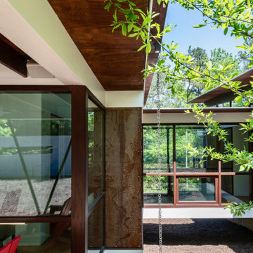
 Robert M. Cain, Architect
Holly Hill, a retirement home, whose owner's hobbies are gardening and restoration of classic cars, is nestled into the site contours to maximize views of the lake and minimize impact on the site.
Holly Hill is comprised of three wings joined by bridges: A wing facing a master garden to the east, another wing with workshop and a central activity, living, dining wing. Similar to a radiator the design increases the amount of exterior wall maximizing opportunities for natural ventilation during temperate months.
Other passive solar design features will include extensive eaves, sheltering porches and high-albedo roofs, as strategies for considerably reducing solar heat gain.
Daylighting with clerestories and solar tubes reduce daytime lighting requirements. Ground source geothermal heat pumps and superior to code insulation ensure minimal space conditioning costs. Corten steel siding and concrete foundation walls satisfy client requirements for low maintenance and durability. All light fixtures are LEDs.
Open and screened porches are strategically located to allow pleasant outdoor use at any time of day, particular season or, if necessary, insect challenge. Dramatic cantilevers allow the porches to project into the site’s beautiful mixed hardwood tree canopy without damaging root systems.
Guest arrive by vehicle with glimpses of the house and grounds through penetrations in the concrete wall enclosing the garden. One parked they are led through a garden composed of pavers, a fountain, benches, sculpture and plants. Views of the lake can be seen through and below the bridges.
Primary client goals were a sustainable low-maintenance house, primarily single floor living, orientation to views, natural light to interiors, maximization of individual privacy, creation of a formal outdoor space for gardening, incorporation of a full workshop for cars, generous indoor and outdoor social space for guests and parties.
 Nar Design Group
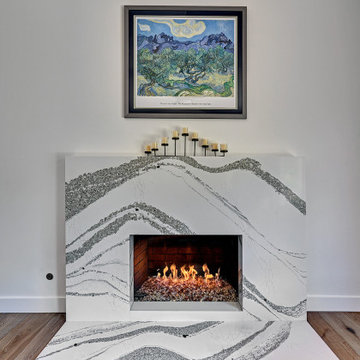
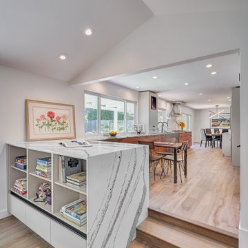
This kitchen is full of fun elements that reflect the clients personality. Taking their favorite color into consideration, purple was used as an accent and incorporated into the display cube making it a focal point in the kitchen. This accent color highlights the small flecks of amethyst within the countertop material that is continued through the waterfall peninsula and surrounds the fireplace in the adjacent room.
Because of the long run of large windows in this kitchen, we had the opportunity to design with primarily base cabinets making the space feel very open and airy and maximized the amount of natural light coming in. In order to break up the long run of cabinetry, we intentionally designed a darker finish around the Galley Workstation. Having a great view of the beautiful backyard is an added bonus!
 Nar Design Group
This kitchen is full of fun elements that reflect the clients personality. Taking their favorite color into consideration, purple was used as an accent and incorporated into the display cube making it a focal point in the kitchen. This accent color highlights the small flecks of amethyst within the countertop material that is continued through the waterfall peninsula and surrounds the fireplace in the adjacent room.
Because of the long run of large windows in this kitchen, we had the opportunity to design with primarily base cabinets making the space feel very open and airy and maximized the amount of natural light coming in. In order to break up the long run of cabinetry, we intentionally designed a darker finish around the Galley Workstation. Having a great view of the beautiful backyard is an added bonus!
 Skill Construction & Design, LLC
There are so many design elements to this kitchen, I almost don’t know where to start. Bright and airy with crisp clean white cabinets, the kitchen is open and welcoming. Still crisp but gently contrasting, the stainless steel appliance add depth amid the white. To keep this kitchen warm, natural oak covers the floors and a toasted wheat color washes the walls. And then there is the architectural elements. You know. That post and beam in the middle of the room. It’s the center of attention.
When you walk into a room your eyes roam around, establishing the size and shape of the room as your feet take you forward. From the front door of this home straight ahead you encountered this wall. The dining area to the right gives you a glimpse of things to come. Where there is a dining room you will usually find a kitchen.
The architecture of years gone by consistently hides the kitchen, the heart of the home, behind walls. I sympathize with my Mom, and all the other Moms, who have had to spend so much time tucked into a tight kitchen, away from the family. This wall had to go, but it was structural. We needed its support but not its bulk.
So we got rid of the bulk and only the bulk. Instead of a wall we have a post and beam, offering all of the structure we need. We could have installed a huge steel beam and reconfigure the joists to upset the beam, but why? The small beam and post add an incredible architectural element. It’s turning lemons into lemon, we simply made the most of what we had. It may be functional but it’s so fantastic. It looks like we created the effect just for the drama.
The original kitchen may have had a working triangle and some counter space, but it was fairly small, with each area only a step or two away. The dark cabinets made the space feel even smaller and the butcher block patterned laminate counter tops were very dated. The appliances were feeling their age as well, from a coil burner electric stove to a top freezer refrigerator. To keep this kitchen within its space, a half wall separated it from the dining area.
With the wall gone we borrowed some space from the living room and extended what was a U shaped kitchen into an L. At the living room window we start our new kitchen. We kept a small part of the wall to support the other end of our decorative beam. Sandwiched between a large pantry and our new French door refrigerator, the wall disappears. With our new open floor plan a sizable island was in order.
We split our cooking areas and installed a continuous grill gas cooktop into the island. A sleek island hood takes care of exhaust and adds an extra element to our architectural feature. Under the cooktop we added over-sized drawers for pots and pan storage. The frameless cabinets from New River Cabinetry are maple, painted white, with the Herndon door style. With the cooktop safely nestled into our island, we still had to add an oven.
We used the space where the old range sat for a large single oven of stainless steel and glass. If it worked for one, why not two? We created a home for a microwave in the wall cabinets. It’s perfect for heating leftovers so close to the refrigerator.
An important consideration for hot spots in your kitchen is landing zones. Each of our cooking areas have generous landing zones, one on each side of the cooktop and an entire counter area above or below the ovens, depending on which one you’re using.
We wanted to give the sink area more room so the half wall had to come out. We moved the trash and recycle cans into a cabinet, removed the heavy soffits and kept the sink under the window.
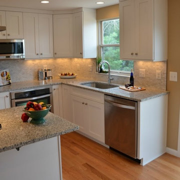
With that little bit of extra space we were able to add a larger cabinet above the dishwasher and slide it all down. This used to be where the carpeting met the vinyl floor, but all of it is gone. Long oak planks eliminate that final divide between the kitchen and the dining area, while adding visual length to the area. White wall cabinets on each side of the window reflect the sunlight for a brighter view.
With all of the darker cabinetry the backsplash walls had been painted white. Even still, there was a darkness in the corners and it wasn’t very exciting. We wanted to add visual interest and reflect the new under-cabinet lighting, eliminating the shadows in this corner.
With 1″x 2″ Arabescato Honed marble mosaics and those under-cabinet lights, we achieved the perfect balance. The marble has subtle swirls in gray and beige on a clean white background, but with the honed finish the light is softly reflected instead of glaring. For granite, we chose the soft gray tones of Luna Pearl. The speckles of gray and beige are a gentle contrast to the white cabinets and emulate the color of the stainless steel.
Between the carpet, red half wall, dark railing and dated light fixture, the dining area felt tired. Since the kitchen lacked sufficient storage, a large utility cabinet crowded the table space without adding any decorate elements.
Although it didn’t get any bigger, our dining area feels fresher and more open too. With the oak flooring joining the area to the rest of our space and the toasted wheat on the walls, the white table and chairs compliment the cabinetry while contrasting the warmer colors. We replaced the chandelier with recessed lighting and changed that railing too.
With our new open floor plan, we ended up with a fairly open area in between our foyer closet and the living room window. Not one to miss an opportunity, we filled the space with a multi-functional work space.
With the sunlight streaming in this bright corner works for anything this family needs.
There’s plenty of space for a chair under this large desk drawer. A closed cabinet below, glass doors above and lots of open shelving let you store and or showcase your belongings. We added a lite area at the top to keep away the darker corners.
The transformation is complete. This kitchen and all of its features are truly the center of attention in this home.
http://www.designsbyskill.com/
http://www.rjkconstructioninc.com/
 Klopf Architecture
From Mid-Century Classic to the Present
An iconic design updated with comfort, function, and flow for today.
A Remodel That Balances Past and Present
What started as a desire to update a classic Eichler soon became an exploration of how Mid-Century Modern design can successfully evolve for today. The client, a tech professional with a passion for scuba diving and underwater photography, wanted a home that would both honor its original character and feel tailored to his daily life. A lifelong technology enthusiast, he still owns the very first Mac desktop he saved up for as a teenager working at Radio Shack, a detail that underscores his appreciation for design that melds function and form.
Honoring Separation While Expanding Possibility
Unlike many contemporary remodels where walls are opened up to create expansive living spaces, this project took a more restrained approach. The client valued the defined rooms of the original plan and wanted to preserve as much wall space as possible for displaying his large-format underwater photography. The emphasis was not on dramatic spatial reinvention, but on thoughtful refinements. Klopf Architecture shaped a gallery-like backdrop while also expanding the primary suite, modernizing materials and fixtures throughout the home, and improving the functionality and layout of the kitchen. The finished home feels at once timeless and renewed, an Eichler that continues to inspire while fully supporting the lifestyle of its present-day owner.
A major turning point came mid-design. The original project brief had not included an addition, but as the reconfiguration of the primary bedroom and bath unfolded, it became clear that an expansion was the best approach to achieve the client’s vision of a more spacious suite. Fortunately, the adjustment came at a stage when revisions were still manageable and was integrated seamlessly, showing how thoughtful course corrections can strengthen a project rather than hinder it.
Navigating Challenges With Precision
The design development included multiple conceptual rounds, balancing preservation with subtle expansion. During construction, an existing post previously thought to be load-bearing turned out not to be. The structural engineer was able to pivot quickly, and both the post and the cross beam that had been intended to replace it could be omitted, allowing the original rhythm of the Eichler beam bays to be preserved.
Sustainability was not just a checklist item, but a way to align the home with the client’s values of simplicity, efficiency, and long-term functionality. R-38 roof insulation reduced energy usage, solar panels with battery storage provided independence and resilience, and passive comfort strategies eliminated the need forenergy-intensive air conditioning. An electric vehicle charger and an on-demand hot water recirculation system (with call buttons as opposed to having constant circulation) add to the home’s long-term efficiency factors. Together, these moves created a home that is quieter, more comfortable, and better equipped for the future, qualities that supported the client’s pragmatic approach to design and living lightly.
Details That Respect the Eichler DNA
The remodel carries forward the Eichler’s original spirit while introducing new layers of modern livability. Originally, the house was approached along a deep, narrow walk, with the garage on one side and the house on the other, leaving the front door tucked far back within this chasm-like space. By pulling the entry forward, the design reshaped the arrival experience, creating a clearer threshold and a natural drop-off zone for bags, shoes, and keys. This shift also made room for a custom bench at the entry that extends seamlessly through the glass sidelight. The bench and drop-off zone now work together as a single, integrated sequence that supports everyday living while offering a tactile reminder of Eichler’s philosophy of connectedness.
At the client’s request, Klopf reintroduced a classic Eichler gesture by extending the exterior siding into the entry and living room. The detail reinforces a sense of indoor/outdoor continuity while providing a subtle architectural surface that allows the client’s photography to take visual precedence.
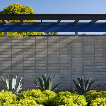
The signature concrete masonry wall at the front was reconstructed using blocks sourced to match the originals, now strengthened with rebar for seismic resilience while maintaining a private outdoor courtyard, visually extending the kitchen outward. A decorative trellis element, a detail borrowed from a neighboring Eichler, restores a familiar mid-century modern architectural motif. At the courtyard entry door, a custom etched glass sidelight with an ocean-themed design featuring kelp and jellyfish serves as a subtle homage to the client’s passion for deep-sea diving.
Landscaping became an integral part of the overall transformation. The homeowner engaged landscape architect Randi Johnsen of Third Nature Studio to shape a series of calm, inviting outdoor rooms that read as a natural extension of the interiors. While technically outside of the core construction scope, the landscape design proved central to achieving a sense of completeness and connectedness across the property. Such whole-property considerations often emerge as design ideas take shape, underscoring the importance of flexibility in planning and budgeting, as well as close collaboration among the design team starting early in the process.
The Value of Evolving Scope
As with many custom residential projects, the scope evolved during the design process. What began as a targeted remodel grew to include a new/expanded primary suite, a rebuilt CMU patio wall for strength and longevity, and a solar panel array and battery storage for energy resilience and carbon-reduction. Each thoughtful decision represented a conscious investment in the home’s performance and character, rather than a cost overrun.
The result was a project delivered on schedule, tailored precisely to the client’s lifestyle, and positioned to add long-term value both functionally and aesthetically. By embracing scope evolution as an opportunity rather than a challenge, and relying on good design paired with transparent communication, this remodel demonstrates how Eichler homes can be adapted for contemporary living without erasing their DNA.
Klopf Architecture project team: John Klopf, AIA, and Klara Kevane, Elise Webb and Nicholas LaNasa.
Contractor: Golden Cove Construction
Landscape Design: Third Nature Studio
Structural Engineer: Daniel Bastiao Design
Photography: ©2025 Mariko Reed
Year Completed: 2024
Location: Sunnyvale, CA
12