
Search results for "Constant" in Home Design Ideas
 PK Painting and Contracting LLC
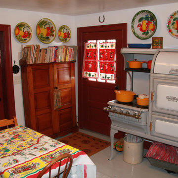
Technological advancements in the kitchen were constant, most of which aimed at reducing labor and time. From the small turnspit dog trained to turn the roasting wheel, to the use of coal then gas, the invention of cast iron, electricity, and plumbed water, kitchen conveniences were constantly changing the look of the kitchen.
 UpScapers: Landscape, Elevated
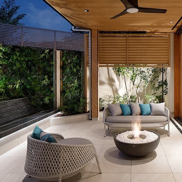
Gardens are constantly evolving, and homeowners and designers alike are constantly searching for the latest trends and innovative products. This modern, stylish garden in Las Angeles, Ca encapsulates some of the very best in contemporary architecture and décor, all set against the background of a luxury artificial green walls.
Vistafolia’s was able to provide this customer with a lush, beautiful instant design feature to cover the boundary partition that makes the customer the envy of their friends. The low maintenance nature of the product means that the client will never have to worry about watering, chemical use or labor-intensive pruning. Instead, their time can be better spent enjoying the stunning view that Vistafolia’s Signature panels offer.
 PK Painting and Contracting LLC
Technological advancements in the kitchen were constant, most of which aimed at reducing labor and time. From the small turnspit dog trained to turn the roasting wheel, to the use of coal then gas, the invention of cast iron, electricity, and plumbed water, kitchen conveniences were constantly changing the look of the kitchen.
Find the right local pro for your project

 safe ZOnea
Ask a kitchen designer in Chicago which countertop question comes up most and you will hear the same answer: white or off-white quartz, and which shade. Homeowners walk into showrooms with a photo saved on their phone, usually a bright, veined slab from a magazine spread, and leave an hour later realizing there are a dozen versions of that same look. The confusion is not about taste. It is about the fact that "white quartz" covers a huge range of patterns, undertones, and price points, and nobody explains the differences before the sale.
Older bungalows and newer builds alike are getting stripped of their dated laminate and butcher block in favor of quartz, and the reasons are practical rather than trendy. Quartz does not need sealing, resists the kind of staining that granite can suffer over decades, and holds up to the freeze-thaw humidity swings that Chicago basements and kitchens go through every year. Once a homeowner commits to quartz, though, the real decision starts: which white, and does the pattern justify the difference in cost.
This piece walks through three specific slabs that keep showing up in Chicago renovation projects, why designers reach for them in different rooms, and what actually separates a flat white surface from one with real depth. None of this requires a design background to follow. It is mostly about paying attention to how a slab behaves under kitchen lighting, how busy the vending gets, and how it photographs versus how it looks in person.
Why White Quartz Took Over Chicago Kitchens
Ten years ago, granite dominated Chicago kitchen remodels almost by default. It was durable, it looked expensive, and every fabricator in the metro area carried a wide range of colors. Quartz has since taken over that position, and the shift happened faster than most contractors expected. Engineered stone gave homeowners a more predictable surface, since natural granite varies slab to slab while quartz is manufactured to a consistent pattern batch after batch.
The other driver is light. Chicago winters are long and gray, and a lot of kitchens, especially in older two-flats and courtyard buildings, do not get much direct sun. A dark granite countertop in a dim kitchen can make the whole room feel smaller. White and light-toned quartz reflects what little natural light comes through the windows, and it makes a galley kitchen or a north-facing space feel noticeably brighter without touching the cabinetry or the layout.
There is also a resale argument that local real estate agents bring up constantly. White quartz photographs well for listings, reads as updated and low-maintenance to buyers touring in person, and does not compete visually with whatever cabinet color the next owner might prefer. It is a safer bet than a bold veined marble look or a colored quartz that might feel dated in five years.
Arctic White and the Cost Question
Among the flatter, more uniform whites, arctic white quartz price comes up constantly in budget conversations because the slab sits at a more approachable point than the heavily veined Italian-marble-inspired patterns. It reads as clean and bright without the busy movement that some homeowners find overwhelming in a small kitchen. Fabricators in the Chicago area tend to keep it in stock precisely because demand stays steady across both new construction and remodel projects.
Part of what keeps this slab affordable relative to its heavily patterned cousins comes down to manufacturing complexity. A quartz surface with minimal veining and a consistent white base is simpler to produce at scale than one that mimics the irregular, high-contrast movement of natural Calacatta marble. That production difference shows up directly in what a homeowner pays per square foot, and it is worth asking a fabricator to walk through that pricing before assuming every white quartz costs the same.
Homeowners planning a full kitchen, including an island, backsplash, and perimeter counters, often use a flatter white like this specifically because it lets other elements carry the visual interest. A patterned tile backsplash or a bold cabinet color reads more clearly against a calm countertop than against one already fighting for attention with heavy veining. Designers frequently pair simpler whites with statement lighting fixtures for exactly this reason.
What Makes Calacatta Patterns Different
Calacatta refers to a family of marble originally quarried in Italy, known for a bright white background broken up by bold, often gold-toned veining that moves in thick, dramatic streaks rather than thin gray lines. Natural Calacatta marble is soft, porous, and expensive to maintain, which is exactly why quartz manufacturers spent years developing engineered versions that replicate the look without the upkeep headaches.
The challenge with any Calacatta-style quartz is getting the veining to look organic instead of printed. Early generations of engineered stone struggled with repetitive patterns that gave away the fact the slab was manufactured rather than cut from actual marble. Modern digital printing and layering techniques have closed that gap considerably, and the better Calacatta-inspired quartz lines now vary the veining across each slab batch so two counters in the same kitchen do not look identical.
Chicago designers gravitate toward Calacatta patterns for kitchens that function as the visual centerpiece of an open floor plan, which describes a large share of the gut renovations happening in neighborhoods like Lincoln Park, Roscoe Village, and the North Shore suburbs. When the kitchen island is visible from the living room and dining area, a dramatic veined surface becomes part of the home's overall design language rather than a purely functional work surface.
Calacatta Arno Under Kitchen Lighting
One of the more popular options in this category, calacatta arno quartz, balances a warm white base with soft gray and gold veining that avoids looking too stark under the cooler LED lighting common in newer Chicago builds. Homeowners touring showrooms sometimes make the mistake of judging a slab entirely under warm incandescent lighting, then get surprised when the same surface looks slightly different once installed under their kitchen's actual fixtures.
What separates this particular pattern from flatter competitors is how the veining clusters rather than spreading evenly across the slab. That clustering mimics the way real quarried marble forms, with denser mineral deposits in some sections and cleaner stretches in others. Fabricators cutting a large island slab from a single piece will often orient the pattern intentionally so the busiest veining lands somewhere visually interesting rather than getting cut off at an edge.
Because the background reads warmer than a stark white, this pattern tends to pair well with brass or matte gold hardware, a combination that has been showing up repeatedly in Chicago kitchen remodels over the past few renovation seasons. Cabinet painters report a similar trend, with more clients requesting warm white or greige cabinet colors specifically because they complement this kind of veined quartz better than a cooler, blue-toned white would.
Silestone's Version of the Calacatta Look
Manufacturers compete directly in this Calacatta-inspired category, and silestone eternal calacatta gold represents one brand's specific take on the pattern, distinguished by richer gold veining set against a brighter white base than some competing slabs in the same family. Silestone has built a reputation around anti-bacterial surface treatments in addition to the standard quartz durability, a detail some homeowners specifically ask about for kitchens used heavily by families with young children.
The veining in this particular slab tends to run in longer, more continuous lines compared to the clustered pattern found in some other Calacatta-style options, which gives large island surfaces a sense of visual flow from one end to the other. Fabricators working with bigger islands, the kind increasingly common in open-concept Chicago remodels, often favor patterns like this because there is less need to worry about seams interrupting a busy, disconnected pattern.
Price positioning for this slab tends to sit toward the upper end of the engineered quartz category, reflecting both the brand's manufacturing process and the complexity of replicating that continuous gold veining consistently across production batches. Homeowners weighing this option against other Calacatta-style quartz should ask their fabricator directly about batch availability, since premium patterns sometimes have longer lead times than standard stock colors.
Living With Quartz Day to Day
Beyond how a slab looks in a showroom or a listing photo, the daily experience of owning quartz countertops matters more once the renovation dust settles. Quartz resists scratching far better than laminate and holds up to the acidic spills, hot pans, and general abuse of an active kitchen without the sealing maintenance that natural stone requires every year or two. That low-maintenance reputation is a large part of why quartz overtook granite in the first place.
Heat resistance is a detail that gets less attention than it should. While quartz handles moderate heat well, manufacturers generally recommend using a trivet or pad for very hot pots straight off the stove, since sudden temperature shock can occasionally cause stress marks in the resin binder that holds the engineered stone together. This is a minor precaution rather than a major limitation, but it is worth mentioning to anyone assuming quartz is entirely indestructible.
Cleaning routines stay simple across almost every pattern in this category. A damp cloth and mild soap handle daily messes, and the nonporous surface means wine, coffee, and tomato-based sauces do not soak in the way they can with unsealed granite or marble. Homeowners moving from an older stone counter often mention how much less they worry about everyday spills once quartz is installed, which is a quality-of-life change that rarely makes it into the initial design conversation.
Choosing Between the Three
There is no single correct answer among these three slabs, and that is exactly why they keep coming up together in the same design conversations across Chicago renovation projects. A flatter white with minimal veining suits kitchens where other elements need to carry the visual interest, while a bolder Calacatta-inspired pattern makes sense when the countertop itself is meant to be the centerpiece of an open floor plan.
Budget matters too, and it is worth having a direct conversation with a fabricator about where each option lands before falling in love with a specific slab in a showroom. Lighting, cabinet color, and how the kitchen connects to the rest of the home all play into which pattern will actually look right once installation is finished rather than just in a photo.
Whatever direction a homeowner leans, seeing a full slab in person under actual kitchen lighting remains the single most useful step before signing off. Photos only go so far once the countertop is sitting in the room it will live in for years.
 Kathleen Jennison
An Arts & Crafts Bungalow is one of my favorite styles of homes. We have quite a few of them in our Stockton Mid-Town area. And when C&L called us to help them remodel their 1923 American Bungalow, I was beyond thrilled.
As per usual, when we get a new inquiry, we quickly Google the project location while we are talking to you on the phone. My excitement escalated when I saw the Google Earth Image of the sweet Sage Green bungalow in Mid-Town Stockton. "Yes, we would be interested in working with you," I said trying to keep my cool.
But what made it even better was meeting C&L and touring their home, because they are the nicest young couple, eager to make their home period perfect. Unfortunately, it had been slightly molested by some bad house-flippers, and we needed to bring the bathroom back to it "roots."
We knew we had to banish the hideous brown tile and cheap vanity quickly. But C&L complained about the condensation problems and the constant fight with mold. This immediately told me that improper remodeling had occurred and we needed to remedy that right away.
The Before: Frustrations with a Botched Remodel
The bathroom needed to be brought back to period appropriate design with all the functionality of a modern bathroom. We thought of things like marble countertop, white mosaic floor tiles, white subway tile, board and batten molding, and of course a fabulous wallpaper.
This small (and only) bathroom on a tight budget required a little bit of design sleuthing to figure out how we could get the proper look and feel. Our goal was to determine where to splurge and where to economize and how to complete the remodel as quickly as possible because C&L would have to move out while construction was going on.
The Process: Hard Work to Remedy Design and Function
During our initial design study, (which included 2 hours in the owners’ home), we noticed framed images of William Morris Arts and Crafts textile patterns and knew this would be our design inspiration. We presented C&L with three options and they quickly selected the Pimpernel Design Concept.
We had originally selected the Black and Olive colors with a black vanity, mirror, and black and white floor tile. C&L liked it but weren’t quite sure about the black, We went back to the drawing board and decided the William & Co Pimpernel Wallpaper in Bayleaf and Manilla color with a softer gray painted vanity and mirror and white floor tile was more to their liking.
After the Design Concept was approved, we went to work securing the building permit, procuring all the elements, and scheduling our trusted tradesmen to perform the work.
We did uncover some shoddy work by the flippers such as live electrical wires hidden behind the wall, plumbing venting cut-off and buried in the walls (hence the constant dampness), the tub barely balancing on two fence boards across the floor joist, and no insulation on the exterior wall.
All of the previous blunders were fixed and the bathroom put back to its previous glory. We could feel the house thanking us for making it pretty again.
The After Reveal: Cohesive Design Decisions
We selected a simple white subway tile for the tub/shower. This is always classic and in keeping with the style of the house.
We selected a pre-fab vanity and mirror, but they look rich with the quartz countertop. There is much more storage in this small vanity than you would think.
The Transformation: A Period Perfect Refresh
We began the remodel just as the pandemic reared and stay-in-place orders went into effect. As C&L were already moved out and living with relatives, we got the go-ahead from city officials to get the work done (after all, how can you shelter in place without a bathroom?).
All our tradesmen were scheduled to work so that only one crew was on the job site at a time. We stayed on the original schedule with only a one week delay.
The end result is the sweetest little bathroom I've ever seen (and I can't wait to start work on C&L's kitchen next).
Thank you for joining me in this project transformation. I hope this inspired you to think about being creative with your design projects, determining what works best in keeping with the architecture of your space, and carefully assessing how you can have the best life in your home.
 Art Fireplace Technology Limited
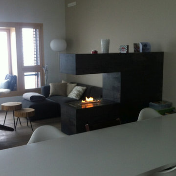
Among the best in art fireplace design, the AF100 Remote Controlled Electronic Bio Ethanol Burner Insert is favored by architects, contractors and high-end designers and offers the discerning client unprecedented quality and safety. In addition to the same vent-free and clean burning flames as manual ethanol fireplace inserts, this art-Fire bio ethanol burner offers much more for both residential and commercial applications:
Remote Control Capability. Due to its electronic operation, powered by a twelve-volt power source, this ethanol fireplace insert may be ignited and extinguished through an on/off switch located on the burner itself, a one-button remote control or through your smart phone by integrating with your Smart Home System.
On-Board Safety Monitoring. The motherboard of this fireplace insert is safety-central. Constantly self-evaluating its operation, this intelligent burner reacts to any condition that appears atypical. Should it sense an excess amount of carbon dioxide emission or heat output, it will automatically cease operation, extinguish the flame and maintain the lock mechanism of the fuel chamber. Additionally, it will self-extinguish should it sense seismic motion or level of tilt making it a shock-proof device. Fuel and battery levels are also constantly evaluated for optimal performance and will give notification through the burner’s LED display, which will indicate operation times and alert you by sound and error message should an event occur.
Sturdy Construction. Constructed of Grade 304 stainless steel, the ethanol burner is corrosion resistant and exhibits excellent resistance to atmospheric, chemical and other exposures. Its top plate measures three millimeters in thickness (3/32 inches). This allows sturdiness, yet promotes a low profile. For added safety, the bio ethanol burner AF100 offers insulated double hearth construction.
Separate Fuel Reservoir and Burner Tray. Continuing with the unprecedented safety features of this ethanol burner, excess fuel is housed in a sealed reservoir. This not only prevents fuel evaporation and the aromatic release of the raw ethanol, but lessens the amount of “exposed” fuel at any given time. Through a medical grade fuel pump, the ethanol is delivered into the burner tray. Only allowing the burner tray to manage a few centiliters of ethanol fuel at a given time promotes additional safety and minimizes the risk of fire-related dangers.
 Blackband Design
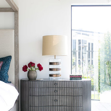
Master Bedroom
Interior Design by Blackband Design
Home Build by SC Homes
Photography by Ryan Garvin
Bedroom - mid-sized master carpeted bedroom idea in Orange County with white walls
Bedroom - mid-sized master carpeted bedroom idea in Orange County with white walls

 Advance Design Studio, Ltd.
Karen and Chad of Tower Lakes, IL were tired of their unfinished basement functioning as nothing more than a storage area and depressing gym. They wanted to increase the livable square footage of their home with a cohesive finished basement design, while incorporating space for the kids and adults to hang out.
“We wanted to make sure that upon renovating the basement, that we can have a place where we can spend time and watch movies, but also entertain and showcase the wine collection that we have,” Karen said.
After a long search comparing many different remodeling companies, Karen and Chad found Advance Design Studio. They were drawn towards the unique “Common Sense Remodeling” process that simplifies the renovation experience into predictable steps focused on customer satisfaction.
“There are so many other design/build companies, who may not have transparency, or a focused process in mind and I think that is what separated Advance Design Studio from the rest,” Karen said.
Karen loved how designer Claudia Pop was able to take very high-level concepts, “non-negotiable items” and implement them in the initial 3D drawings. Claudia and Project Manager DJ Yurik kept the couple in constant communication through the project. “Claudia was very receptive to the ideas we had, but she was also very good at infusing her own points and thoughts, she was very responsive, and we had an open line of communication,” Karen said.
A very important part of the basement renovation for the couple was the home gym and sauna. The “high-end hotel” look and feel of the openly blended work out area is both highly functional and beautiful to look at. The home sauna gives them a place to relax after a long day of work or a tough workout. “The gym was a very important feature for us,” Karen said. “And I think (Advance Design) did a very great job in not only making the gym a functional area, but also an aesthetic point in our basement”.
An extremely unique wow-factor in this basement is the walk in glass wine cellar that elegantly displays Karen and Chad’s extensive wine collection. Immediate access to the stunning wet bar accompanies the wine cellar to make this basement a popular spot for friends and family.
The custom-built wine bar brings together two natural elements; Calacatta Vicenza Quartz and thick distressed Black Walnut. Sophisticated yet warm Graphite Dura Supreme cabinetry provides contrast to the soft beige walls and the Calacatta Gold backsplash. An undermount sink across from the bar in a matching Calacatta Vicenza Quartz countertop adds functionality and convenience to the bar, while identical distressed walnut floating shelves add an interesting design element and increased storage. Rich true brown Rustic Oak hardwood floors soften and warm the space drawing all the areas together.
Across from the bar is a comfortable living area perfect for the family to sit down at a watch a movie. A full bath completes this finished basement with a spacious walk-in shower, Cocoa Brown Dura Supreme vanity with Calacatta Vicenza Quartz countertop, a crisp white sink and a stainless-steel Voss faucet.
Advance Design’s Common Sense process gives clients the opportunity to walk through the basement renovation process one step at a time, in a completely predictable and controlled environment. “Everything was designed and built exactly how we envisioned it, and we are really enjoying it to it’s full potential,” Karen said.
Constantly striving for customer satisfaction, Advance Design’s success is heavily reliant upon happy clients referring their friends and family. “We definitely will and have recommended Advance Design Studio to friends who are looking to embark on a remodeling project small or large,” Karen exclaimed at the completion of her project.
 Advance Design Studio, Ltd.
Karen and Chad of Tower Lakes, IL were tired of their unfinished basement functioning as nothing more than a storage area and depressing gym. They wanted to increase the livable square footage of their home with a cohesive finished basement design, while incorporating space for the kids and adults to hang out.
“We wanted to make sure that upon renovating the basement, that we can have a place where we can spend time and watch movies, but also entertain and showcase the wine collection that we have,” Karen said.
After a long search comparing many different remodeling companies, Karen and Chad found Advance Design Studio. They were drawn towards the unique “Common Sense Remodeling” process that simplifies the renovation experience into predictable steps focused on customer satisfaction.
“There are so many other design/build companies, who may not have transparency, or a focused process in mind and I think that is what separated Advance Design Studio from the rest,” Karen said.
Karen loved how designer Claudia Pop was able to take very high-level concepts, “non-negotiable items” and implement them in the initial 3D drawings. Claudia and Project Manager DJ Yurik kept the couple in constant communication through the project. “Claudia was very receptive to the ideas we had, but she was also very good at infusing her own points and thoughts, she was very responsive, and we had an open line of communication,” Karen said.
A very important part of the basement renovation for the couple was the home gym and sauna. The “high-end hotel” look and feel of the openly blended work out area is both highly functional and beautiful to look at. The home sauna gives them a place to relax after a long day of work or a tough workout. “The gym was a very important feature for us,” Karen said. “And I think (Advance Design) did a very great job in not only making the gym a functional area, but also an aesthetic point in our basement”.
An extremely unique wow-factor in this basement is the walk in glass wine cellar that elegantly displays Karen and Chad’s extensive wine collection. Immediate access to the stunning wet bar accompanies the wine cellar to make this basement a popular spot for friends and family.
The custom-built wine bar brings together two natural elements; Calacatta Vicenza Quartz and thick distressed Black Walnut. Sophisticated yet warm Graphite Dura Supreme cabinetry provides contrast to the soft beige walls and the Calacatta Gold backsplash. An undermount sink across from the bar in a matching Calacatta Vicenza Quartz countertop adds functionality and convenience to the bar, while identical distressed walnut floating shelves add an interesting design element and increased storage. Rich true brown Rustic Oak hardwood floors soften and warm the space drawing all the areas together.
Across from the bar is a comfortable living area perfect for the family to sit down at a watch a movie. A full bath completes this finished basement with a spacious walk-in shower, Cocoa Brown Dura Supreme vanity with Calacatta Vicenza Quartz countertop, a crisp white sink and a stainless-steel Voss faucet.
Advance Design’s Common Sense process gives clients the opportunity to walk through the basement renovation process one step at a time, in a completely predictable and controlled environment. “Everything was designed and built exactly how we envisioned it, and we are really enjoying it to it’s full potential,” Karen said.
Constantly striving for customer satisfaction, Advance Design’s success is heavily reliant upon happy clients referring their friends and family. “We definitely will and have recommended Advance Design Studio to friends who are looking to embark on a remodeling project small or large,” Karen exclaimed at the completion of her project.

 MIDWEST CONSTRUCTION & SUPPLY INC
Paul Despenas: Mason City, Iowa: Homeowners in Asbury Neighborhood see new type of siding being installed.
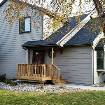
Since the neighborhood was built from the late 1970’s through the late 1980’s homeowners were restricted to using only wood or masonry products on their homes.
This meant, homeowners were stuck with painting, staining and constant repairing of the wood trims, siding and window sills and casings. If you have ever owned a home with wood siding you know what kind of maintenance needs to be done with the type of weather conditions Iowa delivers. On an average those homeowners could realistically spend $1,000.00 per year maintaining the home.
Back in the early 2000’s this neighborhood accepted the installation of fiber cement siding. Little did homeowners realize, they still had to maintain the home, painting, and constant caulking of the siding joints and around the trim boards to prevent any water and /or air infiltration.
After many homeowners from this neighborhood inquired about American Classic Cedar Grain Polymeric Siding and 2 years of working with the neighborhood association, American Classic Cedar Grain Polymeric Siding has been approved for installation.
American Classic Polymeric Cladding was designed for those home owners who were considering a fiber cement product on their home. They liked the appearance not because it was energy efficient or maintenance free they just liked the plank appearance.
American Classic Polymeric Cladding exhibits the perfect blend of natural beauty and rugged construction. It combines a resilient polymer base with an inorganic mineral to yield performance and long lasting good looks, And, unlike wood cladding and fiber cement, it won’t absorb moisture that can lead to warping, swelling and rotting.
American Classic Polymeric Cladding is available in 2 different profiles and colors ranging from bold to subtle, striking to soothing.
American Classic Cedar Grain Plank Polymeric Siding carries a Life Time Limited Warranty with Lifetime Fade Protection. Midwest Construction is a Progressive Foam Platinum Dealer and that allows use to issue a Lifetime Warranty on the Thermal Performance of the insulation used and 10 year labor warranty.
You siding project will be done in a timely professional manner by our VSI trained siding crews. The job site is cleaned up daily and all tools secured. All of our crews are insured for your peace of mind and comfort
 katherine
Office Workstations and Cubicles: The Unsung Heroes of Efficient Team Environments
In today's fast-paced business world, the hum of productivity is the sweetest sound an office can produce. But what fuels this symphony of efficiency?
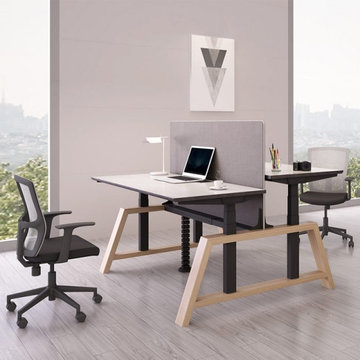
While leadership and strategy are crucial, the physical environment in which a team operates plays a role that is just as vital. The debate between open-plan offices and traditional cubicles has raged for years, yet the truth is that a well-designed space incorporating both office workstations cubicles can be the key to unlocking a team's full potential. This isn't just about furniture; it's about creating a habitat for success.
The Evolution of the Workspace: Beyond the Beige Box
Gone are the days of monotonous rows of identical, soul-crushing cubicles. Modern office design has embraced a more nuanced understanding of worker needs. The contemporary workstation is a far cry from its predecessors, offering flexibility, ergonomic support, and a nod to aesthetic appeal. This evolution recognizes that a one-size-fits-all approach stifles creativity and productivity.
Fostering Focus in a Sea of Collaboration
While collaboration is a cornerstone of modern business, the need for individual, focused work remains paramount. This is where the modern cubicle shines. It provides a sanctuary from the constant distractions of a completely open office, allowing employees to delve deep into tasks that require concentration. This dedicated space minimizes interruptions, leading to higher quality work and reduced stress levels.
The Power of Personalization and Ownership
Giving employees a degree of control over their immediate environment can have a profound impact on morale and engagement. Modern workstations and cubicles that allow for personalization be it through adjustable shelving, pinboards for personal items, or even the choice of chair foster a sense of ownership. This small act of empowerment can translate into a greater sense of belonging and commitment to the organization.
Ergonomics: The Foundation of Employee Well-being and Productivity
A comfortable employee is a productive employee. Ergonomics is not a luxury; it's a fundamental necessity in any office environment. Poorly designed workstations can lead to a host of musculoskeletal issues, from back pain to carpal tunnel syndrome, resulting in increased absenteeism and decreased efficiency. Investing in ergonomic chairs, adjustable-height desks, and properly positioned monitors is an investment in the long-term health and performance of your team.
Designing for Synergy: The Strategic office layout design
The arrangement of workstations and cubicles is as important as the furniture itself. A strategic office layout design can facilitate seamless communication and collaboration while still providing pockets of privacy for focused work. This involves creating "neighborhoods" for different teams, placing collaborative zones in central, easily accessible areas, and ensuring that high-traffic pathways don't cut through quiet work zones.
Breaking Down Barriers with Hybrid Designs
The most effective office environments often feature a hybrid approach. This might involve clusters of cubicles for focused work, interspersed with open, collaborative "huddle spaces" equipped with whiteboards and comfortable seating. This variety allows employees to choose the environment that best suits the task at hand, offering the best of both worlds.
The Role of Acoustics in a Thriving Workplace
Noise is one of the biggest complaints in open-plan offices. Well-designed cubicles with sound-dampening panels can significantly mitigate this issue. Furthermore, incorporating acoustic solutions throughout the office, such as sound-absorbing materials on walls and ceilings, can create a more pleasant and productive auditory environment for everyone.
Integrating Technology for a Seamless Workflow
In the digital age, technology is the lifeblood of any business. Modern office workstations are designed with this in mind, featuring integrated power and data ports, cable management systems, and ample space for multiple monitors. This seamless integration of technology ensures that employees have the tools they need to work efficiently and without frustration.
Choosing the Right Partner for Your Office Environment
The task of outfitting an office can be daunting. Partnering with a knowledgeable and reputable Meet&Co commercial furniture supplier is crucial to creating an environment that is both functional and inspiring. A good supplier will not only offer a wide range of high-quality products but will also provide expert advice on space planning and ergonomic best practices, ensuring that your investment yields the best possible return.
The Future of the Office: Flexibility and Adaptability
The world of work is constantly evolving, and office design must evolve with it. The future lies in creating flexible and adaptable spaces that can be easily reconfigured to meet the changing needs of a business. Modular furniture and movable partitions are key components of this future-proof approach, allowing organizations to scale and adapt without the need for costly and disruptive renovations.
Conclusion: A Strategic Investment in Your Greatest Asset
Ultimately, the design of your office is a direct reflection of your company's culture and values. By investing in high-quality, ergonomic, and well-designed office workstations and cubicles, you are sending a clear message to your employees: their well-being and productivity matter. This strategic investment in your physical workspace is, in fact, an investment in your most valuable asset your people. The result is a more engaged, efficient, and innovative team, ready to tackle the challenges of tomorrow.

 euchips
www.euchips.com
Beijing Kerry Hotel used Shanghai Euchips dali constant voltage dimmable led driver. What a beautiful hotel.
 STUDIO 3087, Vadodara
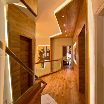
Developed two skins. A constant skin and the travelling skin that wraps the property giving a continuous and connected feel in house.
Indirectly trying to bring a sense of travel through the graphics begging from the floor creating a diagonal pattern to the inclined dropped surfaces stimulating a single unit.
Design Team - Ar. Manish Shah,
Schoen D'Lyma.
Photography - Tejas Shah.
 Crescent Garden
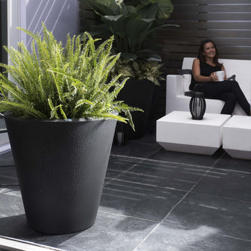
Elevate your gardening experience with the Dot TruDrop Modern Self Watering Planter by Crescent Garden. Its minimalist design seamlessly fits into any indoor or outdoor space, while its double-wall construction provides insulation for plant roots, ensuring their longevity through temperature shifts. The TruDrop system caters to all gardening styles, from beginners to enthusiasts, offering optimal plant hydration without constant watering. Whether you tend to over-water or under-water, or if you're just beginning your gardening journey, our TruDrop system offers a lifeline for your plants, adapting to their needs without constant monitoring. The modern round planter's Braille texture celebrates the beauty of communication. Effortlessly merge traditional and modern aesthetics by grouping different sizes of Dot planters together. Featuring the TruDrop One system, this self-watering marvel frees you from daily watering duties, granting you more time to savor the joys of gardening and worry-free travels.
 Modenese Gastone Group SRL
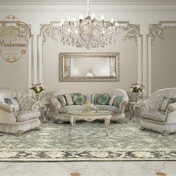
World well-known furniture brands are in constant experiment. Products of popular furniture factories include both classic, modern, and sometimes futuristic models. In order to always keep abreast of the latest trends in the world of interior design, Modenese Gastone does not stand still.
Modenese Gastone is a confidently developing, well-known company in the furniture market of Europe, the USA, UAE and Africa. The development strategy, which was correctly built by the company's management, initially provides stability and ability to constantly develop its production. The main goal of the company is to improve the quality of people life by providing them with beautiful, high-quality, comfortable furniture that will create luxurious coziness in their homes and warmth in their families.
 Le Groupe SP Reno Urbaine Inc.
Photo at work
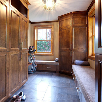
Dressing room - huge contemporary gender-neutral porcelain tile dressing room idea in Montreal with shaker cabinets and dark wood cabinets
Dressing room - huge contemporary gender-neutral porcelain tile dressing room idea in Montreal with shaker cabinets and dark wood cabinets
 Kathleen Jennison
An Arts & Crafts Bungalow is one of my favorite styles of homes. We have quite a few of them in our Stockton Mid-Town area. And when C&L called us to help them remodel their 1923 American Bungalow, I was beyond thrilled.
As per usual, when we get a new inquiry, we quickly Google the project location while we are talking to you on the phone. My excitement escalated when I saw the Google Earth Image of the sweet Sage Green bungalow in Mid-Town Stockton. "Yes, we would be interested in working with you," I said trying to keep my cool.
But what made it even better was meeting C&L and touring their home, because they are the nicest young couple, eager to make their home period perfect. Unfortunately, it had been slightly molested by some bad house-flippers, and we needed to bring the bathroom back to it "roots."
We knew we had to banish the hideous brown tile and cheap vanity quickly. But C&L complained about the condensation problems and the constant fight with mold. This immediately told me that improper remodeling had occurred and we needed to remedy that right away.
The Before: Frustrations with a Botched Remodel
The bathroom needed to be brought back to period appropriate design with all the functionality of a modern bathroom. We thought of things like marble countertop, white mosaic floor tiles, white subway tile, board and batten molding, and of course a fabulous wallpaper.
This small (and only) bathroom on a tight budget required a little bit of design sleuthing to figure out how we could get the proper look and feel. Our goal was to determine where to splurge and where to economize and how to complete the remodel as quickly as possible because C&L would have to move out while construction was going on.
The Process: Hard Work to Remedy Design and Function
During our initial design study, (which included 2 hours in the owners’ home), we noticed framed images of William Morris Arts and Crafts textile patterns and knew this would be our design inspiration. We presented C&L with three options and they quickly selected the Pimpernel Design Concept.
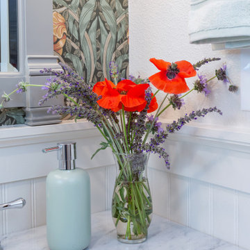
We had originally selected the Black and Olive colors with a black vanity, mirror, and black and white floor tile. C&L liked it but weren’t quite sure about the black, We went back to the drawing board and decided the William & Co Pimpernel Wallpaper in Bayleaf and Manilla color with a softer gray painted vanity and mirror and white floor tile was more to their liking.
After the Design Concept was approved, we went to work securing the building permit, procuring all the elements, and scheduling our trusted tradesmen to perform the work.
We did uncover some shoddy work by the flippers such as live electrical wires hidden behind the wall, plumbing venting cut-off and buried in the walls (hence the constant dampness), the tub barely balancing on two fence boards across the floor joist, and no insulation on the exterior wall.
All of the previous blunders were fixed and the bathroom put back to its previous glory. We could feel the house thanking us for making it pretty again.
The After Reveal: Cohesive Design Decisions
We selected a simple white subway tile for the tub/shower. This is always classic and in keeping with the style of the house.
We selected a pre-fab vanity and mirror, but they look rich with the quartz countertop. There is much more storage in this small vanity than you would think.
The Transformation: A Period Perfect Refresh
We began the remodel just as the pandemic reared and stay-in-place orders went into effect. As C&L were already moved out and living with relatives, we got the go-ahead from city officials to get the work done (after all, how can you shelter in place without a bathroom?).
All our tradesmen were scheduled to work so that only one crew was on the job site at a time. We stayed on the original schedule with only a one week delay.
The end result is the sweetest little bathroom I've ever seen (and I can't wait to start work on C&L's kitchen next).
Thank you for joining me in this project transformation. I hope this inspired you to think about being creative with your design projects, determining what works best in keeping with the architecture of your space, and carefully assessing how you can have the best life in your home.
37