
Search results for "Constructed precisely" in Home Design Ideas
 kimberly peck architect
Photo by Pedro Marti
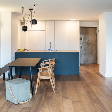
The client’s hired us to update this small post war apartment which didn’t appear to have ever been renovated since the buildings construction in 1964. The kitchen and bathroom were outdated and were fully gutted. In doing so we decided to open up the apartment in general by removing the wall that separated the kitchen from the living space to create a more open plan. The resulting design is an exercise in ultra-minimalism. The rear wall of the kitchen was outfitted with floor to ceiling cabinetry fit with custom satin lacquer doors and minimal white pulls. The custom paneled refrigerator integrates seamlessly within this wall to create a white backdrop for the kitchen. A peninsula was created opposite to give a work surface and to house the sink and range. Starkly contrasting black metal clad doors were chosen for this run of cabinetry. The unique metal doors have integrated pulls that are cut and folded from the metal cladding. The peninsula is topped in a faux concrete quartz surface. New wide plank walnut flooring was laid throughout the kitchen, living, and bedroom to giving the space a look of continuity. Trim was kept to a minimum, removing from all doors and windows and using only where absolutely necessary at the base of the walls. To achieve the look in the monochromatic bathroom, large format grey porcelain tile was laid in a careful grid; white metal floating shelves and the medicine cabinet were installed to precisely align with both the tile grid and the overhead linear LED fixture.
 George Ocampo
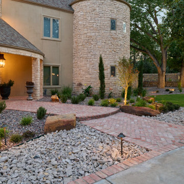
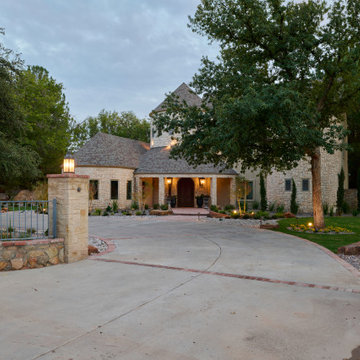
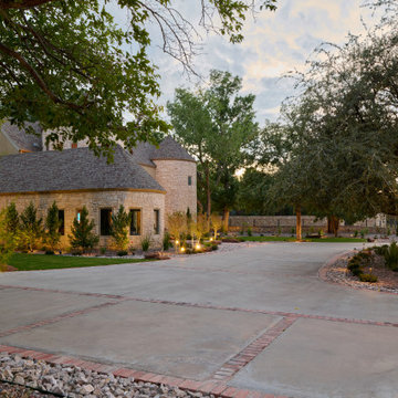
Upper Valley Estate Curb Appeal – El Paso, Texas
This curb appeal transformation was conceived as a deliberate sequence—an arrival experience where architecture, landscape, and lighting work together as one. Every element was designed to honor the home’s stone construction, turreted forms, and Old World character while responding precisely to the Upper Valley climate and lifestyle.
By day, the experience is grounded and composed. Brick-edged concrete drives establish order and permanence, guiding movement through the property with clarity and intention. Natural stone walls and columns anchor the architecture, while layered gravel beds, drought-tolerant plantings, and manicured turf soften transitions and connect the home to its desert setting. Mature trees were preserved and carefully integrated, providing scale, shade, and a sense of continuity.
As afternoon shifts toward sunset, the materials begin to speak differently. Stone warms, textures deepen, and sightlines subtly draw the eye toward the front entry. The landscape narrows the focus, creating a moment of pause before arrival—calm, quiet, and refined.
At night, the design reveals its final layer. Low-voltage lighting is integrated with precision, washing stone surfaces, tracing architectural curves, and uplighting specimen trees to create depth without glare. The drive, walkways, and entry feel safe, legible, and inviting, while the home itself glows with a restrained elegance. Coming home after dark feels intentional—protected, welcoming, and unmistakably yours.
What was created is more than curb appeal. It is a cohesive design-build solution where nothing is ornamental without purpose and nothing is built without intention. A daily experience of arrival that reflects craftsmanship, care, and the enduring character of the Upper Valley.
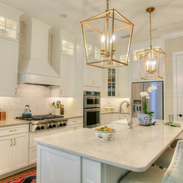
 Cabinetry by Better Bilt
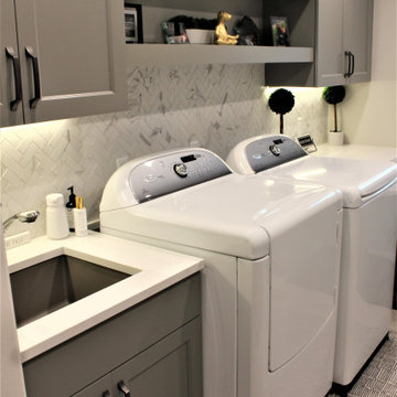
Cabinetry: Showplace EVO
Style: Concord
Finish: (Cabinetry/Panels) Paint Grade/Dovetail; (Shelving/Bench Seating) Hickory Cognac
Countertop: Solid Surface Unlimited – Snowy River Quartz
Hardware: Richelieu – Transitional Metal Pull in Antique Nickel
Sink: Blanco Precis in Truffle
Faucet: Delta Signature Pull Down in Chrome
All Tile: (Customer’s Own)
Designer: Andrea Yeip
Interior Designer: Amy Termarsch (Amy Elizabeth Design)
Contractor: Langtry Construction, LLC
Find the right local pro for your project
 Cabinetry by Better Bilt
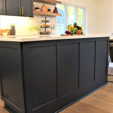
Cabinetry: Starmark
Style: Bridgeport w/ Five Piece Drawer Headers
Finish: (Cabinetry) Maple Blueberry; (Shelving) Walnut Oregano
Countertop: Solid Surface Unlimited – Snowy River Quartz
Sink: Blanco Precis in Truffle
Faucet: Delta Broderick in Champagne Bronze
Hardware: Richelieu – Pulls in Champagne Bronze
Backsplash: (Customer’s Own)
Floor: (Customer’s Own)
Designer: Andrea Yeip
Interior Designer: Amy Termarsch (Amy Elizabeth Design)
Contractor: Langtry Construction, LLC
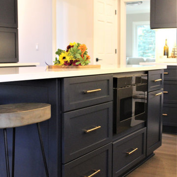 Cabinetry by Better Bilt
Cabinetry: Starmark
Style: Bridgeport w/ Five Piece Drawer Headers
Finish: (Cabinetry) Maple Blueberry; (Shelving) Walnut Oregano
Countertop: Solid Surface Unlimited – Snowy River Quartz
Sink: Blanco Precis in Truffle
Faucet: Delta Broderick in Champagne Bronze
Hardware: Richelieu – Pulls in Champagne Bronze
Backsplash: (Customer’s Own)
Floor: (Customer’s Own)
Designer: Andrea Yeip
Interior Designer: Amy Termarsch (Amy Elizabeth Design)
Contractor: Langtry Construction, LLC

 safe ZOnea
Ask a kitchen designer in Chicago which countertop question comes up most and you will hear the same answer: white or off-white quartz, and which shade. Homeowners walk into showrooms with a photo saved on their phone, usually a bright, veined slab from a magazine spread, and leave an hour later realizing there are a dozen versions of that same look. The confusion is not about taste. It is about the fact that "white quartz" covers a huge range of patterns, undertones, and price points, and nobody explains the differences before the sale.
Older bungalows and newer builds alike are getting stripped of their dated laminate and butcher block in favor of quartz, and the reasons are practical rather than trendy. Quartz does not need sealing, resists the kind of staining that granite can suffer over decades, and holds up to the freeze-thaw humidity swings that Chicago basements and kitchens go through every year. Once a homeowner commits to quartz, though, the real decision starts: which white, and does the pattern justify the difference in cost.
This piece walks through three specific slabs that keep showing up in Chicago renovation projects, why designers reach for them in different rooms, and what actually separates a flat white surface from one with real depth. None of this requires a design background to follow. It is mostly about paying attention to how a slab behaves under kitchen lighting, how busy the vending gets, and how it photographs versus how it looks in person.
Why White Quartz Took Over Chicago Kitchens
Ten years ago, granite dominated Chicago kitchen remodels almost by default. It was durable, it looked expensive, and every fabricator in the metro area carried a wide range of colors. Quartz has since taken over that position, and the shift happened faster than most contractors expected. Engineered stone gave homeowners a more predictable surface, since natural granite varies slab to slab while quartz is manufactured to a consistent pattern batch after batch.
The other driver is light. Chicago winters are long and gray, and a lot of kitchens, especially in older two-flats and courtyard buildings, do not get much direct sun. A dark granite countertop in a dim kitchen can make the whole room feel smaller. White and light-toned quartz reflects what little natural light comes through the windows, and it makes a galley kitchen or a north-facing space feel noticeably brighter without touching the cabinetry or the layout.
There is also a resale argument that local real estate agents bring up constantly. White quartz photographs well for listings, reads as updated and low-maintenance to buyers touring in person, and does not compete visually with whatever cabinet color the next owner might prefer. It is a safer bet than a bold veined marble look or a colored quartz that might feel dated in five years.
Arctic White and the Cost Question
Among the flatter, more uniform whites, arctic white quartz price comes up constantly in budget conversations because the slab sits at a more approachable point than the heavily veined Italian-marble-inspired patterns. It reads as clean and bright without the busy movement that some homeowners find overwhelming in a small kitchen. Fabricators in the Chicago area tend to keep it in stock precisely because demand stays steady across both new construction and remodel projects.
Part of what keeps this slab affordable relative to its heavily patterned cousins comes down to manufacturing complexity. A quartz surface with minimal veining and a consistent white base is simpler to produce at scale than one that mimics the irregular, high-contrast movement of natural Calacatta marble. That production difference shows up directly in what a homeowner pays per square foot, and it is worth asking a fabricator to walk through that pricing before assuming every white quartz costs the same.
Homeowners planning a full kitchen, including an island, backsplash, and perimeter counters, often use a flatter white like this specifically because it lets other elements carry the visual interest. A patterned tile backsplash or a bold cabinet color reads more clearly against a calm countertop than against one already fighting for attention with heavy veining. Designers frequently pair simpler whites with statement lighting fixtures for exactly this reason.
What Makes Calacatta Patterns Different
Calacatta refers to a family of marble originally quarried in Italy, known for a bright white background broken up by bold, often gold-toned veining that moves in thick, dramatic streaks rather than thin gray lines. Natural Calacatta marble is soft, porous, and expensive to maintain, which is exactly why quartz manufacturers spent years developing engineered versions that replicate the look without the upkeep headaches.
The challenge with any Calacatta-style quartz is getting the veining to look organic instead of printed. Early generations of engineered stone struggled with repetitive patterns that gave away the fact the slab was manufactured rather than cut from actual marble. Modern digital printing and layering techniques have closed that gap considerably, and the better Calacatta-inspired quartz lines now vary the veining across each slab batch so two counters in the same kitchen do not look identical.
Chicago designers gravitate toward Calacatta patterns for kitchens that function as the visual centerpiece of an open floor plan, which describes a large share of the gut renovations happening in neighborhoods like Lincoln Park, Roscoe Village, and the North Shore suburbs. When the kitchen island is visible from the living room and dining area, a dramatic veined surface becomes part of the home's overall design language rather than a purely functional work surface.
Calacatta Arno Under Kitchen Lighting
One of the more popular options in this category, calacatta arno quartz, balances a warm white base with soft gray and gold veining that avoids looking too stark under the cooler LED lighting common in newer Chicago builds. Homeowners touring showrooms sometimes make the mistake of judging a slab entirely under warm incandescent lighting, then get surprised when the same surface looks slightly different once installed under their kitchen's actual fixtures.
What separates this particular pattern from flatter competitors is how the veining clusters rather than spreading evenly across the slab. That clustering mimics the way real quarried marble forms, with denser mineral deposits in some sections and cleaner stretches in others. Fabricators cutting a large island slab from a single piece will often orient the pattern intentionally so the busiest veining lands somewhere visually interesting rather than getting cut off at an edge.
Because the background reads warmer than a stark white, this pattern tends to pair well with brass or matte gold hardware, a combination that has been showing up repeatedly in Chicago kitchen remodels over the past few renovation seasons. Cabinet painters report a similar trend, with more clients requesting warm white or greige cabinet colors specifically because they complement this kind of veined quartz better than a cooler, blue-toned white would.
Silestone's Version of the Calacatta Look
Manufacturers compete directly in this Calacatta-inspired category, and silestone eternal calacatta gold represents one brand's specific take on the pattern, distinguished by richer gold veining set against a brighter white base than some competing slabs in the same family. Silestone has built a reputation around anti-bacterial surface treatments in addition to the standard quartz durability, a detail some homeowners specifically ask about for kitchens used heavily by families with young children.
The veining in this particular slab tends to run in longer, more continuous lines compared to the clustered pattern found in some other Calacatta-style options, which gives large island surfaces a sense of visual flow from one end to the other. Fabricators working with bigger islands, the kind increasingly common in open-concept Chicago remodels, often favor patterns like this because there is less need to worry about seams interrupting a busy, disconnected pattern.
Price positioning for this slab tends to sit toward the upper end of the engineered quartz category, reflecting both the brand's manufacturing process and the complexity of replicating that continuous gold veining consistently across production batches. Homeowners weighing this option against other Calacatta-style quartz should ask their fabricator directly about batch availability, since premium patterns sometimes have longer lead times than standard stock colors.
Living With Quartz Day to Day
Beyond how a slab looks in a showroom or a listing photo, the daily experience of owning quartz countertops matters more once the renovation dust settles. Quartz resists scratching far better than laminate and holds up to the acidic spills, hot pans, and general abuse of an active kitchen without the sealing maintenance that natural stone requires every year or two. That low-maintenance reputation is a large part of why quartz overtook granite in the first place.
Heat resistance is a detail that gets less attention than it should. While quartz handles moderate heat well, manufacturers generally recommend using a trivet or pad for very hot pots straight off the stove, since sudden temperature shock can occasionally cause stress marks in the resin binder that holds the engineered stone together. This is a minor precaution rather than a major limitation, but it is worth mentioning to anyone assuming quartz is entirely indestructible.
Cleaning routines stay simple across almost every pattern in this category. A damp cloth and mild soap handle daily messes, and the nonporous surface means wine, coffee, and tomato-based sauces do not soak in the way they can with unsealed granite or marble. Homeowners moving from an older stone counter often mention how much less they worry about everyday spills once quartz is installed, which is a quality-of-life change that rarely makes it into the initial design conversation.
Choosing Between the Three
There is no single correct answer among these three slabs, and that is exactly why they keep coming up together in the same design conversations across Chicago renovation projects. A flatter white with minimal veining suits kitchens where other elements need to carry the visual interest, while a bolder Calacatta-inspired pattern makes sense when the countertop itself is meant to be the centerpiece of an open floor plan.
Budget matters too, and it is worth having a direct conversation with a fabricator about where each option lands before falling in love with a specific slab in a showroom. Lighting, cabinet color, and how the kitchen connects to the rest of the home all play into which pattern will actually look right once installation is finished rather than just in a photo.
Whatever direction a homeowner leans, seeing a full slab in person under actual kitchen lighting remains the single most useful step before signing off. Photos only go so far once the countertop is sitting in the room it will live in for years.
 ALVAREZ-DIAZ & VILLALON
Photography by Carlos Esteva.
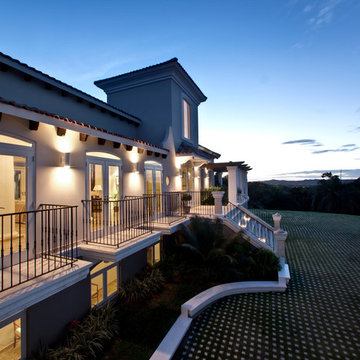
When this private client, a married couple, first approached Álvarez-Díaz & Villalón to build ‘the house of their dreams’ on the grounds of their sprawling family estate, the first challenge was to identify the exact location that would maximize the positive aspects of the topography while affording the most gracious views. Propped up on scaffolding, juggling digital cameras and folding ladders, the design team photographed the property from hundreds of angles before the ideal site was selected.
Once the site was selected, construction could begin.
The building’s foundation was raised slightly off the ground to disperse geothermal heat. In addition, the designers studied daily sunlight patterns and positioned the structure accordingly in order to warm the swimming pool during the cooler morning hours and illuminate the principal living quarters during the late afternoon. Finally, the main house was designed with functional balconies on all sides: each balcony meticulously planned ~ and precisely positioned ~ to
both optimize wind flow and frame the property’s most breath-taking views.
Stylistically, the goal was to create an authentic Spanish hacienda. Following Old World tradition, the house was anchored around a centralized interior patio
in the Moorish style: enclosed on three sides ~ yet
open on the fourth (similar to the Alcázar of Seville) ~ to reveal a reflecting pool ~ and mirror the water motif of the home’s magnificent marble fountain. A bell tower, horseshoe arches, a colonnaded,vineyard-style patio, and
ornamental Moorish mosaic tilework (“azulejos”) completed this picturesque portrait of a faraway fantasy world of castles, chivalry, and swordsplay, reminiscent of Medieval Spain.
Shortly after completion, this showcase home was showcased on the TVE Spanish television series Spaniards Around The World (Españoles Alrededor
Del Mundo) as a prime example of authentic Spanish architecture designed outside the peninsula. Not surprising. After all, the story of a fairy-tale retreat as
magical as this one deserves a happy ending.

 Chopper Landscaping
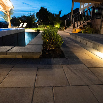
The backbone of the entire design is the multilevel paver system — installed using Belgard pavers, the professional-grade hardscape brand trusted by premium landscape contractors across North America for their durability, freeze-thaw resistance, and the quality of their surface and color consistency.
Belgard pavers were selected for this project because this backyard needed to perform at the highest level — aesthetically and structurally — through Utah's demanding seasonal range. The multilevel layout creates distinct zones at different grades: an upper entertaining level, a main patio zone, and the sunken spa level below. Each level transitions to the next through precisely constructed steps and retaining wall elements, all in the same Belgard material palette, creating visual continuity across the full space.
As a CMHA-certified contractor in pavers, Chopper Landscaping's paver installation standards go beyond surface appearance. Base preparation, drainage engineering, edge restraint specification, and compaction standards ensure that the Belgard paver system performs for decades — not just looks good on installation day.
 George Ocampo
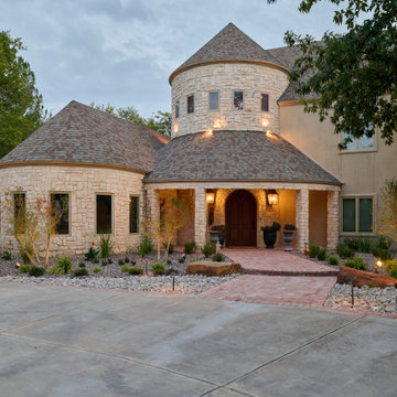
Upper Valley Estate Curb Appeal – El Paso, Texas
This curb appeal transformation was conceived as a deliberate sequence—an arrival experience where architecture, landscape, and lighting work together as one. Every element was designed to honor the home’s stone construction, turreted forms, and Old World character while responding precisely to the Upper Valley climate and lifestyle.
By day, the experience is grounded and composed. Brick-edged concrete drives establish order and permanence, guiding movement through the property with clarity and intention. Natural stone walls and columns anchor the architecture, while layered gravel beds, drought-tolerant plantings, and manicured turf soften transitions and connect the home to its desert setting. Mature trees were preserved and carefully integrated, providing scale, shade, and a sense of continuity.
As afternoon shifts toward sunset, the materials begin to speak differently. Stone warms, textures deepen, and sightlines subtly draw the eye toward the front entry. The landscape narrows the focus, creating a moment of pause before arrival—calm, quiet, and refined.
At night, the design reveals its final layer. Low-voltage lighting is integrated with precision, washing stone surfaces, tracing architectural curves, and uplighting specimen trees to create depth without glare. The drive, walkways, and entry feel safe, legible, and inviting, while the home itself glows with a restrained elegance. Coming home after dark feels intentional—protected, welcoming, and unmistakably yours.
What was created is more than curb appeal. It is a cohesive design-build solution where nothing is ornamental without purpose and nothing is built without intention. A daily experience of arrival that reflects craftsmanship, care, and the enduring character of the Upper Valley.
 Seattle Cabinets
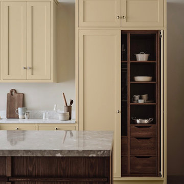
This bespoke kitchen cabinetry showcases inset face frame construction, a timeless and refined technique where the cabinet doors and drawer fronts are precisely fitted within the frame openings. This style offers clean lines, a flush front, and a high-end furniture-like appearance, emphasizing craftsmanship and precision.
The cabinet design features a mix of slab and shaker doors for a balanced aesthetic—slab drawer fronts bring a modern, streamlined look, while the shaker doors offer classic character and subtle detail. This thoughtful combination blends contemporary minimalism with traditional warmth.
All cabinetry is finished in a soft, cheerful butter yellow—a warm, creamy hue that adds a cozy, inviting glow to the space without overpowering. It pairs beautifully with both natural wood and neutral countertops, contributing to a fresh, uplifting ambiance.
A standout element is the pocket door pantry cabinet, cleverly designed with doors that slide back into the cabinet sides to reveal a full-height storage area. This feature is ideal for small appliances, coffee stations, or a hidden pantry setup, allowing for both functionality and a tidy appearance when closed.
 George Ocampo
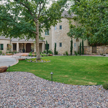
Upper Valley Estate Curb Appeal – El Paso, Texas
This curb appeal transformation was conceived as a deliberate sequence—an arrival experience where architecture, landscape, and lighting work together as one. Every element was designed to honor the home’s stone construction, turreted forms, and Old World character while responding precisely to the Upper Valley climate and lifestyle.
By day, the experience is grounded and composed. Brick-edged concrete drives establish order and permanence, guiding movement through the property with clarity and intention. Natural stone walls and columns anchor the architecture, while layered gravel beds, drought-tolerant plantings, and manicured turf soften transitions and connect the home to its desert setting. Mature trees were preserved and carefully integrated, providing scale, shade, and a sense of continuity.
As afternoon shifts toward sunset, the materials begin to speak differently. Stone warms, textures deepen, and sightlines subtly draw the eye toward the front entry. The landscape narrows the focus, creating a moment of pause before arrival—calm, quiet, and refined.
At night, the design reveals its final layer. Low-voltage lighting is integrated with precision, washing stone surfaces, tracing architectural curves, and uplighting specimen trees to create depth without glare. The drive, walkways, and entry feel safe, legible, and inviting, while the home itself glows with a restrained elegance. Coming home after dark feels intentional—protected, welcoming, and unmistakably yours.
What was created is more than curb appeal. It is a cohesive design-build solution where nothing is ornamental without purpose and nothing is built without intention. A daily experience of arrival that reflects craftsmanship, care, and the enduring character of the Upper Valley.
 George Ocampo
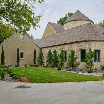
Upper Valley Estate Curb Appeal – El Paso, Texas
This curb appeal transformation was conceived as a deliberate sequence—an arrival experience where architecture, landscape, and lighting work together as one. Every element was designed to honor the home’s stone construction, turreted forms, and Old World character while responding precisely to the Upper Valley climate and lifestyle.
By day, the experience is grounded and composed. Brick-edged concrete drives establish order and permanence, guiding movement through the property with clarity and intention. Natural stone walls and columns anchor the architecture, while layered gravel beds, drought-tolerant plantings, and manicured turf soften transitions and connect the home to its desert setting. Mature trees were preserved and carefully integrated, providing scale, shade, and a sense of continuity.
As afternoon shifts toward sunset, the materials begin to speak differently. Stone warms, textures deepen, and sightlines subtly draw the eye toward the front entry. The landscape narrows the focus, creating a moment of pause before arrival—calm, quiet, and refined.
At night, the design reveals its final layer. Low-voltage lighting is integrated with precision, washing stone surfaces, tracing architectural curves, and uplighting specimen trees to create depth without glare. The drive, walkways, and entry feel safe, legible, and inviting, while the home itself glows with a restrained elegance. Coming home after dark feels intentional—protected, welcoming, and unmistakably yours.
What was created is more than curb appeal. It is a cohesive design-build solution where nothing is ornamental without purpose and nothing is built without intention. A daily experience of arrival that reflects craftsmanship, care, and the enduring character of the Upper Valley.
 George Ocampo
Upper Valley Estate Curb Appeal – El Paso, Texas
This curb appeal transformation was conceived as a deliberate sequence—an arrival experience where architecture, landscape, and lighting work together as one. Every element was designed to honor the home’s stone construction, turreted forms, and Old World character while responding precisely to the Upper Valley climate and lifestyle.
By day, the experience is grounded and composed. Brick-edged concrete drives establish order and permanence, guiding movement through the property with clarity and intention. Natural stone walls and columns anchor the architecture, while layered gravel beds, drought-tolerant plantings, and manicured turf soften transitions and connect the home to its desert setting. Mature trees were preserved and carefully integrated, providing scale, shade, and a sense of continuity.
As afternoon shifts toward sunset, the materials begin to speak differently. Stone warms, textures deepen, and sightlines subtly draw the eye toward the front entry. The landscape narrows the focus, creating a moment of pause before arrival—calm, quiet, and refined.
At night, the design reveals its final layer. Low-voltage lighting is integrated with precision, washing stone surfaces, tracing architectural curves, and uplighting specimen trees to create depth without glare. The drive, walkways, and entry feel safe, legible, and inviting, while the home itself glows with a restrained elegance. Coming home after dark feels intentional—protected, welcoming, and unmistakably yours.
What was created is more than curb appeal. It is a cohesive design-build solution where nothing is ornamental without purpose and nothing is built without intention. A daily experience of arrival that reflects craftsmanship, care, and the enduring character of the Upper Valley.
Sponsored
Columbus, OH

Snider & Metcalf Interior Design, LTD
Leading Interior Designers in Columbus, Ohio & Ponte Vedra, Florida
 George Ocampo
Upper Valley Estate Curb Appeal – El Paso, Texas
This curb appeal transformation was conceived as a deliberate sequence—an arrival experience where architecture, landscape, and lighting work together as one. Every element was designed to honor the home’s stone construction, turreted forms, and Old World character while responding precisely to the Upper Valley climate and lifestyle.
By day, the experience is grounded and composed. Brick-edged concrete drives establish order and permanence, guiding movement through the property with clarity and intention. Natural stone walls and columns anchor the architecture, while layered gravel beds, drought-tolerant plantings, and manicured turf soften transitions and connect the home to its desert setting. Mature trees were preserved and carefully integrated, providing scale, shade, and a sense of continuity.
As afternoon shifts toward sunset, the materials begin to speak differently. Stone warms, textures deepen, and sightlines subtly draw the eye toward the front entry. The landscape narrows the focus, creating a moment of pause before arrival—calm, quiet, and refined.
At night, the design reveals its final layer. Low-voltage lighting is integrated with precision, washing stone surfaces, tracing architectural curves, and uplighting specimen trees to create depth without glare. The drive, walkways, and entry feel safe, legible, and inviting, while the home itself glows with a restrained elegance. Coming home after dark feels intentional—protected, welcoming, and unmistakably yours.
What was created is more than curb appeal. It is a cohesive design-build solution where nothing is ornamental without purpose and nothing is built without intention. A daily experience of arrival that reflects craftsmanship, care, and the enduring character of the Upper Valley.
 EcoCraft Homes
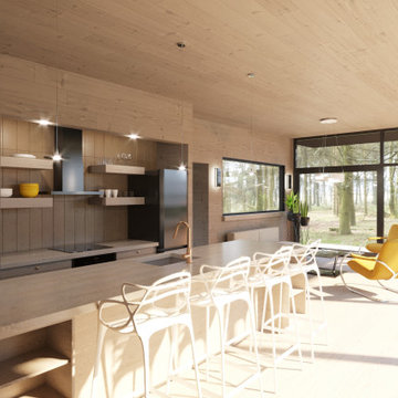
Featuring clean, crisp lines and a minimalist yet contemporary exterior; the EcoMod 2.0 offers 3 - 5 spacious bedrooms, and 2-4 modern bathrooms all within a modest 1,900-2,460 sq. ft. Designed to blend seamlessly with its natural surroundings and truly connect you to the outdoors, the EcoRanch is redefining prefabricated, contemporary architecture. With a unique cantilevered deck, expansive glazing, flexible open layout, and unique outdoor spaces, this home will leave you speechless. Precisely engineering to pushing the boundaries of timber construction our team has crafted a home that is distinctive, environmentally friendly, and quite simply, a work of art.
 Vitruvius Built
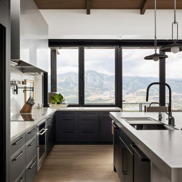
Set against Deer Valley with expansive views toward Bald Mountain and Mount Timpanogos, Axis is a 6,000-square-foot modern mountain residence that feels inevitable within the landscape. The home is positioned with an exceptional depth of field, allowing the ridgelines, changing alpine light, and long mountain views to remain a defining part of daily life.
Inside, refined interiors and storied personal collections bring warmth, depth, and a strong sense of identity. The result is a deeply personal, precisely executed residence designed for generations.
 Chopper Landscaping
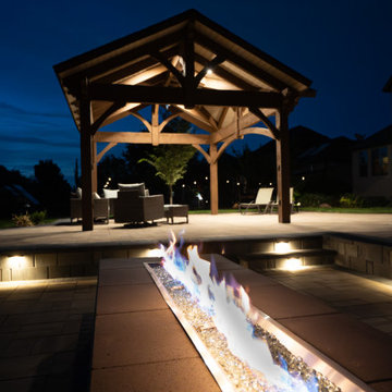
The backbone of the entire design is the multilevel paver system — installed using Belgard pavers, the professional-grade hardscape brand trusted by premium landscape contractors across North America for their durability, freeze-thaw resistance, and the quality of their surface and color consistency.
Belgard pavers were selected for this project because this backyard needed to perform at the highest level — aesthetically and structurally — through Utah's demanding seasonal range. The multilevel layout creates distinct zones at different grades: an upper entertaining level, a main patio zone, and the sunken spa level below. Each level transitions to the next through precisely constructed steps and retaining wall elements, all in the same Belgard material palette, creating visual continuity across the full space.
As a CMHA-certified contractor in pavers, Chopper Landscaping's paver installation standards go beyond surface appearance. Base preparation, drainage engineering, edge restraint specification, and compaction standards ensure that the Belgard paver system performs for decades — not just looks good on installation day.
 Vitruvius Built
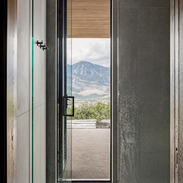
Set against Deer Valley with expansive views toward Bald Mountain and Mount Timpanogos, Axis is a 6,000-square-foot modern mountain residence that feels inevitable within the landscape. The home is positioned with an exceptional depth of field, allowing the ridgelines, changing alpine light, and long mountain views to remain a defining part of daily life.
Inside, refined interiors and storied personal collections bring warmth, depth, and a strong sense of identity. The result is a deeply personal, precisely executed residence designed for generations.
 ALVAREZ-DIAZ & VILLALON
Photography by Carlos Esteva.
When this private client, a married couple, first approached Álvarez-Díaz & Villalón to build ‘the house of their dreams’ on the grounds of their sprawling family estate, the first challenge was to identify the exact location that would maximize the positive aspects of the topography while affording the most gracious views. Propped up on scaffolding, juggling digital cameras and folding ladders, the design team photographed the property from hundreds of angles before the ideal site was selected.
Once the site was selected, construction could begin.
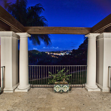
The building’s foundation was raised slightly off the ground to disperse geothermal heat. In addition, the designers studied daily sunlight patterns and positioned the structure accordingly in order to warm the swimming pool during the cooler morning hours and illuminate the principal living quarters during the late afternoon. Finally, the main house was designed with functional balconies on all sides: each balcony meticulously planned ~ and precisely positioned ~ to
both optimize wind flow and frame the property’s most breath-taking views.
Stylistically, the goal was to create an authentic Spanish hacienda. Following Old World tradition, the house was anchored around a centralized interior patio
in the Moorish style: enclosed on three sides ~ yet
open on the fourth (similar to the Alcázar of Seville) ~ to reveal a reflecting pool ~ and mirror the water motif of the home’s magnificent marble fountain. A bell tower, horseshoe arches, a colonnaded,vineyard-style patio, and
ornamental Moorish mosaic tilework (“azulejos”) completed this picturesque portrait of a faraway fantasy world of castles, chivalry, and swordsplay, reminiscent of Medieval Spain.
Shortly after completion, this showcase home was showcased on the TVE Spanish television series Spaniards Around The World (Españoles Alrededor
Del Mundo) as a prime example of authentic Spanish architecture designed outside the peninsula. Not surprising. After all, the story of a fairy-tale retreat as
magical as this one deserves a happy ending.
 Morpurgo Architects
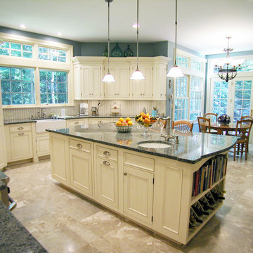
A steeply sloping site posed considerable challenges for Morpurgo Architects’ expansion and renovation of this front to back split-level house. To provide a gradual transition for the family from their home, situated on a high plateau, to the brook and pool below, we designed numerous patios and decks at multiple levels.
The house features large, divided light arched windows. Throughout the first floor, we created lit vaulted ceilings that give the living areas a spacious, open quality. A wide central hallway forms the spine of the house, opening onto a dining room, with columns that support a curved yoke-shaped header that is repeated in the entrance gate on the grounds.
Renovations were scheduled in four precisely planned construction phases that allowed the family to continue living in the house during the building process.
This elegant, yet informal home, in its serene setting, is the product of Morpurgo Architects’ seamless union of the house and the site.
23