
Search results for "Context" in Home Design Ideas
 DJK Custom Homes
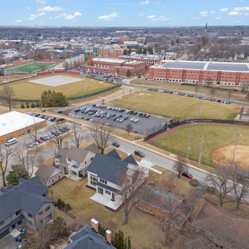
This aerial view provides a comprehensive look at the home’s surrounding neighborhood, highlighting its placement within a vibrant and well-connected community.
 Blondie's Treehouse Inc
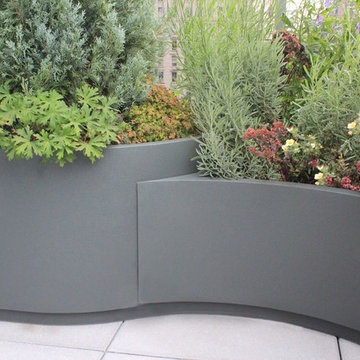
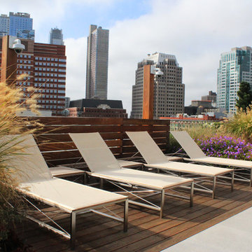
Often times, the smallest of spaces prove to be the largest design challenge. Clients desire functional spaces which exude the lush, organic beauty they glimpse at spaces which tend to garner more of the press attention, which usually suggests they are greater in scale. In order for form and function to be joined in spiritual union, we can look to the context of the space in order to garner inspiration.
Introducing curved containers into the garden not only minimizes the angular impact of the space and its surrounding vertical neighbors, but borrows from the ebb and flow of the river passing by to the west. The containers vary in height so as to provide an accented and unimpeded view from the inside to the outside. The lush plantings reflect some of the leafy residents of nearby Riverside Park as well as reinforcing the movement of the Hudson as the grasses sway in the breezes high above the street.
 Dillon Kyle Architects (DKA)
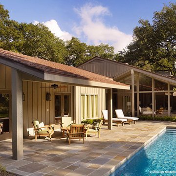
This renovation and addition responds to its context of a neighborhood of existing 1960s vintage single-story ranch houses that is being transformed by the appearance of new two-story homes. The renovation and addition stay within the language of the existing house, especially on the exterior, and create a relaxed, unpretentious, and comfortable atmosphere.
Casey Dunn Photography
Find the right local pro for your project
 Mottram Architecture
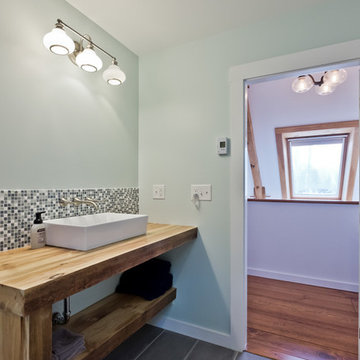
Timber frame homes offer unique challenges during a remodel. What often makes them beautiful and attractive to most homeowners, also makes them challenging for space requirements.
Context: The lovely couple that owned this home were struggling with some interesting floor plan challenges that just didn't work for their family. The loved the beautiful timbers and woodwork of their home, but the dramatically sloping ceilings on the second floor, particularly in the bathroom, just didn't work for this 1 1/2 bath home. Needing to use the skylight to approach the toilet was a less then ideal scenario. Although the bathroom footprint was more then adequate, the sloped ceiling only made half of the space useable. Check out the Before/After post on our blog to see the photos of the house pre-renovation. As much as they loved all the wood features in their home, another challenge they had was light. The wood ceiling made everything inside the house darker, even with a fantastic array of south facing windows, there were spaces in the home that felt dark and small. When they contacted us they wanted to know how could they make their brighter and more inviting, were there solutions to the 2nd floor sloped ceiling issues, and if they were going to do all of this work, how could they make their home more comfortable and efficient. A nagging water leak in the upstairs bathroom spurred them into action and here is how we solved their dilemma.
Conclusion: First, we added a little dormer to the rear of the house so we could get full headroom in nearly all of the upstairs bathroom! Then we decided to extend that dormer one more timber bay over to create a walk in closet with natural light and plenty of space. Since we were contemplating energy efficiency, we resolved a nagging issue that is present in a lot of timber frame construction, air tightness. Commonly found in timber frame construction, fiberglass insulation is installed in the rafter bays and board ceilings are installed over top. Unfortunately, board ceilings are anything but air tight, and fiberglass insulation needs to be in an airtight cavity for maximum effectiveness. So we were able to solve two issues at the same time for this homeowner. We removed the board ceiling and fiberglass insulation, we dense packed the rafter bays with cellulose insulation, and installed sheetrock in place of the boards. The boards were salvaged for re-use by the homeowner, and the space and light quality was dramatically improved. Some may think that losing the board ceiling took something away from the space, but what you'll see in the pictures is that it highly accentuates the heavy timbers and really makes them stand out in a beautiful way. Now with this added airtightness, better insulation, and brighter space, the homeowner hardly runs their wood stove, and it's so quiet in the space, an added bonus from changing the insulation. It became necessary to also add a sheetrock ceiling to the living room to hide the plumbing from the new bathroom layout above. Changing this ceiling gave the homeowner some real quality lighting that was lacking in the living room before. The brighter ceiling and new lighting layout completely transforms the living room into a space you want to hang out, even though the layout didn't change at all. When the homeowner saw the finished spaces she said "I can't believe this is my house, I want to live in this house"
Energy Efficiency: I touched a little on the efficiency above, but like all projects done with Mottram Architecture, we always want to leave you with a little extra. Timber frame construction with board ceilings and fiberglass insulation are notoriously leaky! If you want to know what we think about fiberglass insulation, check our our blog post on Why Fiberglass Insulation Sucks. By installing cellulose insulation and covering it with sheetrock we were able to greatly reduce the heat flowing out of this home. It not only improves cashflow it improves the comfort level in the space. Who wants to sit in their living room and feel a draft? Let us remind you, we are not saying cellulose insulation is an air barrier, we use the sheetrock to help with that, but it does significantly reduce the air flow over fiberglass insulation. And when we reduce the airflow, we reduce the heat flow. And when we reduce the heat flow, we reduce the need to re-heat that drafty air from outside. When it comes to energy efficiency the first and best place to start is air infiltration. We greatly reduced the air infiltration with the new insulation, but we also added a hat and warm boots. What I mean by that is, we improved the insulation in the roof, and we installed insulation in the basement. Maybe it's a silly analogy, but when you think about keeping warm, we always start with the hat and boots! With sustainability in mind, the next project will be to add a deck to the front of this house with rain catchment barrels from the metal roof. They are planning to plant a garden in the spring and the rain catchment system will help to irrigate the new garden.
Builder: East Shore Builders
Photographer: Michael Eric Berube
 Blondie's Treehouse Inc
As Brooklyn continues to reach upward, its newest denizens demand an aesthetic which marries the past with the present. For the latest buildings, rooftop spaces are not an after-thought but are carefully engineered and planned early in the design phase, often long before there is a semblance of a space to survey.
The primary challenge with common spaces for residential buildings is to provide some level of individual privacy while developing an overall spatial design which will also foster social interaction between users. In order to achieve this balance, smaller conversational spaces which are defined through the rigid face of the wood-clad planters and accented by hearty plantings and provide a diverse mix of seating types from long benches attached to the face of the planters to moveable chairs and tables allowing for maximum flexibility. The smaller conversational spaces take advantage of the views from the outside edges of the roof while the larger common spaces are defined by plant-softened wood fences.
The materials of the space borrow from the buildings context, reclaiming many of the materials which permeated Brooklyn’s industrial heritage. Concrete, steel, aluminum and various fabrics are some of the elements which help to unite the past with the present. Transferring the feel of the sidewalk planting bed to the rooftop is achieved through the raw steel-edged green-roof garden areas which help define the spaces.
 Battle Associates, Architects
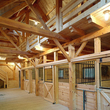
Outbuildings grow out of their particular function and context. Design maintains unity with the main house and yet creates interesting elements to the outbuildings itself, treating it like an accent piece.
 HS3D VISUALIZATION PVT. LTD.
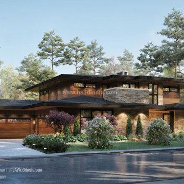
We present to you a beautiful designed and rendered residential exterior maintaining the correct balances and proportions in design aspects and capturing all the intricate details with their contexts, lights, shadows, colours, textures, which makes this residence look in its real beauty.
Stay tuned for more such works from our team!
 CITYDESKSTUDIO, Inc.
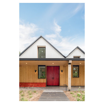
Perched on a ridge 20 feet above a private lake in Stillwater, Minnesota, the clients wanted an age-in-place home where strong design influenced by the natural surroundings informed the space and shape of the project. CITYDESKSTUDIO carefully sited the home in one of the many natural clearings within their wooded property alongside a private lake, maximizing connection to the land, while preserving trees and natural topography. The home is distinguished by a light-filled, vaulted living area, a continuous timber loggia forming the entry court and connection to the garage, and a landscape design filled with rain gardens and indigenous rocks and plantings. The home features one-level living with a walk-out lower level which maintains a low profile upon approach, allowing the home to fit gracefully within its context. Sustainable features include landscaping with rain gardens to control rainwater, thermal mass concrete, geothermal in-floor heating, and a 10 kilowatt photovoltaic array with home batteries to allow fully off-grid living. Locally sourced building materials were used where possible for cedar siding and patio paving, including re-used soapstone counters. Select trees were harvested directly off the land for the staircase, interior wall finishes and the 10-foot dining table.
Project Team:
Ben Awes AIA, Principal-In-Charge
 Talon Construction Inc.
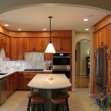
In Frederick, Maryland, a design-build kitchen remodel incorporates local charm with modern touches, creating a functional and inviting space. This kitchen remodel blends traditional elements with contemporary design, making the space ideal for both daily use and entertaining. Here's a breakdown of the remodel, featuring a large island, a beverage station, and an Icelandic Picket ceramic tile backsplash above the gas range.
1. Large Island:
The focal point of the kitchen is a spacious island, perfect for meal preparation, casual dining, and socializing. At about 8 to 10 feet long, the island features a high-end engineered quartz countertop, with subtle veining in shades of gray and white. This island is designed for both functionality and beauty, with ample storage beneath in custom cabinetry, including pull-out drawers, open shelves and deep cabinets. The island is finished with painted cabinetry in soft olive-green color, balancing the space with a touch of elegance.
2. Beverage Station:
Adjacent to the island is a dedicated beverage station, positioned for convenience and style. This cozy nook includes a built-in coffee bar, and a sleek under-counter wine cooler, and drawers to store glassware and coffee mugs. The beverage station provides plenty of counter space for drink preparation and is thoughtfully integrated into the kitchen layout, so it’s easily accessible from both the dining area and living spaces.
3. Icelandic Picket Ceramic Tile Backsplash Above the Gas Range:
Above the gas range, the Icelandic Picket ceramic tile backsplash makes a bold statement, drawing attention with its unique design and color palette. These elongated, picket-shaped tiles come in a range of soft, natural tones – think cool whites, subtle greens, and light grays – that evoke the serene beauty of Iceland’s landscapes. The tiles are installed in a chic, geometric pattern, creating a contemporary feel that contrasts beautifully with the traditional elements of the kitchen. Their glossy finish adds a sense of brightness, reflecting natural light from the large windows. The backsplash not only serves as a practical, easy-to-clean surface but also acts as a visually dynamic feature that ties the entire kitchen design together.
4. Overall Aesthetic and Materials:
The kitchen remodel brings a blend of modern sophistication and rustic charm, perfectly suited to Frederick’s historic character. Light-colored cherry cabinetry provides warmth and a timeless feel, while stainless steel appliances contribute a sleek, polished contrast. The flooring consists of large ceramic tiles in a soft, natural finish, tying the kitchen's elements together and ensuring a cohesive, inviting atmosphere. Large windows bring in plenty of natural light, enhancing the airy, open feel of the space. The addition of subtle, muted lighting throughout creates a soft, welcoming glow for evening meals and gatherings.
5. Local Touches and Context:
Incorporating elements of the local Frederick style, the remodel emphasizes craftsmanship and functional beauty. The kitchen’s open-plan layout flows seamlessly into the dining and living areas, creating an inviting space for both intimate family dinners and larger gatherings..
This remodel captures the essence of Frederick, combining contemporary style with local tradition, all while making a bold statement with design choices that are both elegant and functional.
 Melinda Gunther Naples Realtor
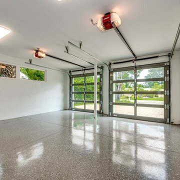
Contemporary glass and metal garage doors. Impact rated glass. Epoxy coated floor. Photo credit: Context Media Naples
Example of a trendy attached two-car garage design in Miami
Example of a trendy attached two-car garage design in Miami
 Informalcraft LLC
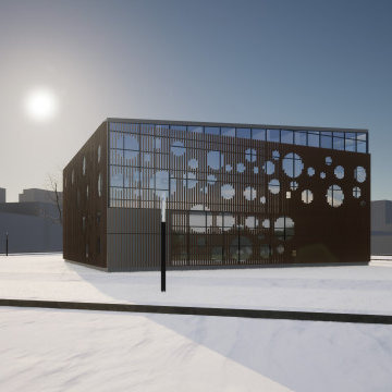
This proposed project, nestled within a residential neighborhood surrounded by four-story row houses and low-rise apartment buildings, envisions the creation of a neighborhood chapel. Beyond its spiritual purpose, the chapel serves as a foundational element for community development, fostering a sense of unity and shared purpose within the vibrant residential context. It stands as a testament to our commitment to enriching the fabric of community life through thoughtful architectural interventions.
 Battle Associates, Architects
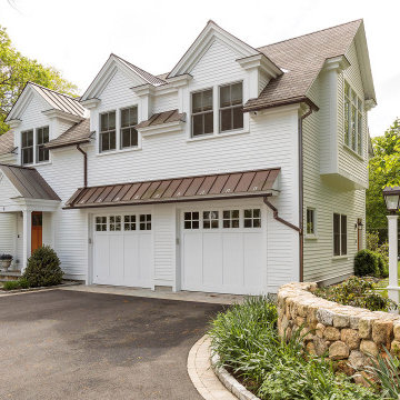
Outbuildings grow out of their particular function and context. Design maintains unity with the main house and yet creates interesting elements to the Outbuilding itself, treating it like an accent piece.
 Architecture Office
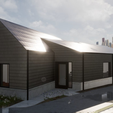
The single family dwelling resides on Cleveland’s westside near Kaams Corner and is a replacement home to one that had recently burnt down. The client, Eden Inc. provides subsidized housing for those facing challenges of housing insecurities and homelessness.
The single level home merges accessibility with a contextually sensitive design. The property is situated amongst a neighborhood full of post war housing. The wedge shaped lot informed the houses geometry, creating a design opportunity with two rectangular volumes overlapping. One simple volume maintains it’s rectangularity and houses bedrooms and accessible bathroom while the other volume houses public functions such as entry, living, kitchen and dining.
The project merges contemporary detailing with a traditional material and form resulting in a project that fits in the neighborhood and responds to the context while remaining functional to the diverse needs of today.
 Habanero Architecture, PLLC
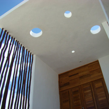
San Benito is a beach located near the town of Telchac in Mexico. The main body of this house is suspended on a massive three-axis foundation system that uniformly supports this home and will not allow any type of flooding during and after a hurricane. Austere and in symphony with its context, this house is a symbol of a natural connection relative to the inside/outside elements. TEPY allows natural air cross-ventilation taking advantage of its relative northeast position to the coast, where primary winds flow during most of the year.
 Spratley & Partners
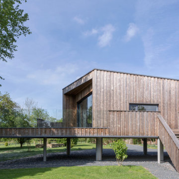
A robust, modern, riverside home with minimalist detailing that blends seamlessly into the surroundings. The home is used as a year-round weekend retreat for a family with children and as such they wanted it to be private and offer a sense of escape and freedom. The clients wanted it to be a low maintenance, energy efficient home making use of natural materials.
Clad with innovative treated timber, the house nestles harmoniously into its rural, riverside setting; making the most of its context, orientation and views while minimising any impact on the surrounding area. Two opposing blocks, forming a 'T' shape in plan, taper up in height towards the river to the east and fields to the south and define the internal spaces. The open-plan living, kitchen and dining areas benefit from fully-glazed sliding doors set in a deep reveal to the south which maximises light and provides shelter above. Large windows look out over the river and a raised, cantilevered deck wraps around the east and south elevations, creating an extension to the internal space that bleeds out into the landscape beyond.
 (r)evolution architecture, llc
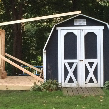
transformation of backyard shed
c.frye
Inspiration for a shed remodel in Chicago
Inspiration for a shed remodel in Chicago
 KoDA
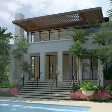
KoDAWhen asked to renovate an existing pseudo-Mediterranean home located directly on the ocean, the owner had one main request; to open up the views towards the ocean. Architecturally, it was important to respect the character of the existing house but larger openings would evidently alter the appearance of the house. Therefore, the design approach became one of reduction, rather than addition. Using order, proportion and more subdued color tones drawn from a limited material palette, the house naturally started to appear more sophisticated. On the exterior, a theater style stair leads you from an exterior loggia to the pool deck all the while never taking the focus of your attention away from the serenity of the ocean ahead. The procession of spaces from exterior, covered trellis, covered loggia, interior and vice versa became the driving force behind the spatial experience of the home and its relationship to its beach-front context.
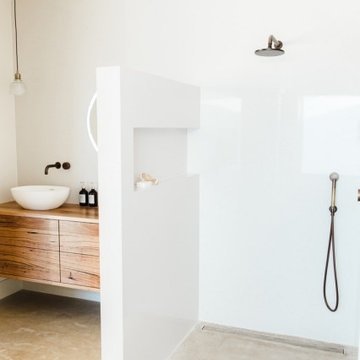
 Building Designers Association of Australia
"Gavin Dale is a registered building designer of works primarily focused within the rural landscape of western New South Wales.
Origami House looks at the core idea of the iconic Australian rural shed in an exposed environment. Open spaces that contain the necessary activities of daily life that can be easily manipulated to provide for large family gatherings or quieter spaces of reflection.
The residence sets out primarily to achieve the expectations of the clients and reinforce the rural context of corrugated iron and raw and robust building materials.
Two rectangular ‘tubes’ were aligned to the North then slid apart. This provided for unobstructed views combined with effective cross ventilation. The gabled roof line folds along a branched ridge, which in turn creates a vanishing point for the internal timber lined ceilings.
The simple palette of grey metal, Barestone and radial sawn timber blends with the subdued basalt geology and agricultural landscape. This robust exterior is warmed internally by local crushed granite rammed earth thermal mass spline walls. These walls separate bedroom and living spaces that reach out beyond the façade to integrate with the landscaping and provide the robust shelter and protection from the elements."
 CITYDESKSTUDIO, Inc.
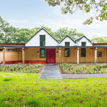
Perched on a ridge 20 feet above a private lake in Stillwater, Minnesota, the clients wanted an age-in-place home where strong design influenced by the natural surroundings informed the space and shape of the project. CITYDESKSTUDIO carefully sited the home in one of the many natural clearings within their wooded property alongside a private lake, maximizing connection to the land, while preserving trees and natural topography. The home is distinguished by a light-filled, vaulted living area, a continuous timber loggia forming the entry court and connection to the garage, and a landscape design filled with rain gardens and indigenous rocks and plantings. The home features one-level living with a walk-out lower level which maintains a low profile upon approach, allowing the home to fit gracefully within its context. Sustainable features include landscaping with rain gardens to control rainwater, thermal mass concrete, geothermal in-floor heating, and a 10 kilowatt photovoltaic array with home batteries to allow fully off-grid living. Locally sourced building materials were used where possible for cedar siding and patio paving, including re-used soapstone counters. Select trees were harvested directly off the land for the staircase, interior wall finishes and the 10-foot dining table.
Project Team:
Ben Awes AIA, Principal-In-Charge
 JDI Construction NW
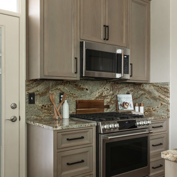
Our Mid-Century Elegance kitchen remodel is a visual delight that seamlessly blends classic mid-century aesthetics with contemporary functionality. The focal point is the stunning granite countertops, providing both luxury and durability. Paired with wood-look cabinets featuring sleek black pulls, the design achieves a perfect balance of warmth and modern sophistication.
Stainless steel appliances add a touch of sleekness to the space, marrying the timeless charm of mid-century design with the efficiency of modern living. Thoughtfully placed lighting enhances the ambiance, making this kitchen remodel a well-lit and inviting hub for daily culinary activities.
Experience the best of both worlds with Mid-Century Elegance—a space where striking granite, wood-look cabinets, black pulls, and stainless steel appliances converge to create a kitchen that's not only visually appealing but also highly functional, embodying the spirit of mid-century charm in a modern context.
47