
Search results for "Continually adapt" in Home Design Ideas
 Drury Design
THE SETUP
Multiple ovens, multiple workspaces, multiple sinks – when you think about it, non-jewish kitchens have been adapting the criteria of kosher kitchens for years.
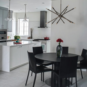
Gladys’ clients in West Rogers Park are Orthodox Jewish. The house they bought already had a kosher kitchen – it just wasn’t done that well. It needed some more things to be duplicated for the dairy side and the meat side. Plus, it was dark and the configuration wasn’t very conducive for a family of eight.
It was time for a remodel.
Design Objectives
Improve kosher kitchen
Add more storage in the island
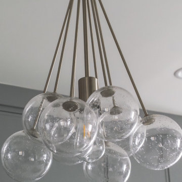
Better lighting
More open, lighter feel
Change the wood floor in the kitchen to tile
THE REMODEL
Design Challenges
- We had originally planned on removing a wing wall by the breakfast area. During demolition, we learned it contained a support beam.
- The kitchen is a substantial size, but having two sinks, dishwashers, and ovens presented a challenge – how do we fit it all in and make it flow with the storage still accessible near the work areas?
Where do you stop the materials for the new space? - -- The right tile, paint, lighting, etc. would be needed to make the remodeled area cohesive with the rest of the main floor.
- An existing column limited cabinet options and thus, storage capacity. Could we conceal it without disrupting the cabinetry flow?
Design Solutions
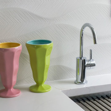
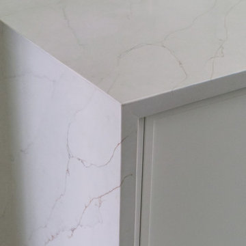
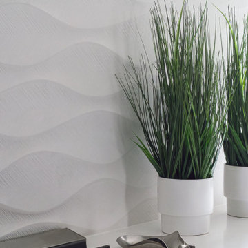
- We had to keep the wing wall, but decided to continue the tile on the sides of the cabinets and maintain the height of the tile to line up with the rest of the backsplash. This actually presented a very nice and cohesive look, especially since the opposite side has a wing wall to the left of the refrigerator.
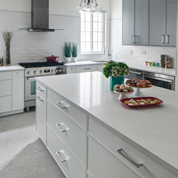
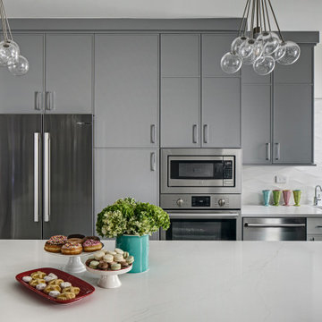
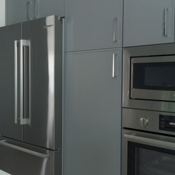
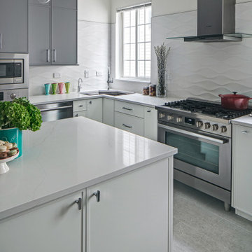
- We used “L-shaped” corner sinks instead of the rectangular ones set on an angle. This gave us more of the legs of the triangles versus the hypotenuse, which allowed for the two dishwashers, and the pullout utensil canisters and spice pullouts while still keeping the 3-drawer cabinets on either side of the range (by the sinks). The old island had the recess for stools which the family never used. By extending the width of the island 6” and utilizing this leg space, we were able to fit 18”-deep cabinets on this side – adding lots of accessible storage. The family can now work simultaneously on the dairy side (the side with the fridge) and the meat side (opposite) without getting in each other’s way. We separated the cooking by using the range oven for the meat and a built-in microwave in the base cabinet. The wall oven with built-in microwave on top is for dairy.
- Corner sinks opened up the middle area for a wider range – we went from a 30” to a 36”. Removing all the wall cabinets (on the range wall) made a big difference. That opened up the entire space while adding some visual impact. (Not pictured: We also made the cabinets directly opposite the range wall tall and removed the countertop, resulting in more room for rollouts and even more storage!) The kitchen now has more storage than it did before.
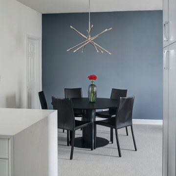
- We ended up painting the ceiling of the kitchen into the hallway that leads to the foyer. The living and dining rooms were separated by a soffit, so that became a natural boundary. We kept the tile in the kitchen by stopping it short of the hallway and lining it up with the pantry wall. This creates a border between the breakfast area and family room. The rest of the existing wood floors were refinished to refresh and make the hue darker. We also painted a dark accent wall and carried it into the breakfast area to make the rooms look deeper.
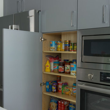
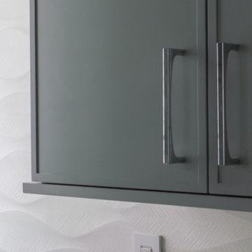
- The in-the-way column housed plumbing and couldn’t be moved. We still built cabinets in that spot – we just had to build a chase inside it to conceal the pipes. There was still plenty of room for new storage. We also took the cabinets all the way to the ceiling. The continuous tall cabinets added a functional elegance to the space.
THE RENEWED SPACE
The client’s long-awaited dream of a better kosher kitchen has finally been achieved, beautifully combining enhanced storage solutions with adherence to the family’s orthodox dietary laws. The kitchen’s standout feature, an expanded island, now offers a spacious and efficient workspace. This allows several family members to cook together comfortably, without the inconvenience of bumping into each other, ensuring a harmonious and productive cooking environment.
 Drury Design
THE SETUP
Multiple ovens, multiple workspaces, multiple sinks – when you think about it, non-jewish kitchens have been adapting the criteria of kosher kitchens for years.
Gladys’ clients in West Rogers Park are Orthodox Jewish. The house they bought already had a kosher kitchen – it just wasn’t done that well. It needed some more things to be duplicated for the dairy side and the meat side. Plus, it was dark and the configuration wasn’t very conducive for a family of eight.
It was time for a remodel.
Design Objectives
Improve kosher kitchen
Add more storage in the island
Better lighting
More open, lighter feel
Change the wood floor in the kitchen to tile
THE REMODEL
Design Challenges
- We had originally planned on removing a wing wall by the breakfast area. During demolition, we learned it contained a support beam.
- The kitchen is a substantial size, but having two sinks, dishwashers, and ovens presented a challenge – how do we fit it all in and make it flow with the storage still accessible near the work areas?
Where do you stop the materials for the new space? - -- The right tile, paint, lighting, etc. would be needed to make the remodeled area cohesive with the rest of the main floor.
- An existing column limited cabinet options and thus, storage capacity. Could we conceal it without disrupting the cabinetry flow?
Design Solutions
- We had to keep the wing wall, but decided to continue the tile on the sides of the cabinets and maintain the height of the tile to line up with the rest of the backsplash. This actually presented a very nice and cohesive look, especially since the opposite side has a wing wall to the left of the refrigerator.
- We used “L-shaped” corner sinks instead of the rectangular ones set on an angle. This gave us more of the legs of the triangles versus the hypotenuse, which allowed for the two dishwashers, and the pullout utensil canisters and spice pullouts while still keeping the 3-drawer cabinets on either side of the range (by the sinks). The old island had the recess for stools which the family never used. By extending the width of the island 6” and utilizing this leg space, we were able to fit 18”-deep cabinets on this side – adding lots of accessible storage. The family can now work simultaneously on the dairy side (the side with the fridge) and the meat side (opposite) without getting in each other’s way. We separated the cooking by using the range oven for the meat and a built-in microwave in the base cabinet. The wall oven with built-in microwave on top is for dairy.
- Corner sinks opened up the middle area for a wider range – we went from a 30” to a 36”. Removing all the wall cabinets (on the range wall) made a big difference. That opened up the entire space while adding some visual impact. (Not pictured: We also made the cabinets directly opposite the range wall tall and removed the countertop, resulting in more room for rollouts and even more storage!) The kitchen now has more storage than it did before.
- We ended up painting the ceiling of the kitchen into the hallway that leads to the foyer. The living and dining rooms were separated by a soffit, so that became a natural boundary. We kept the tile in the kitchen by stopping it short of the hallway and lining it up with the pantry wall. This creates a border between the breakfast area and family room. The rest of the existing wood floors were refinished to refresh and make the hue darker. We also painted a dark accent wall and carried it into the breakfast area to make the rooms look deeper.
- The in-the-way column housed plumbing and couldn’t be moved. We still built cabinets in that spot – we just had to build a chase inside it to conceal the pipes. There was still plenty of room for new storage. We also took the cabinets all the way to the ceiling. The continuous tall cabinets added a functional elegance to the space.
THE RENEWED SPACE
The client’s long-awaited dream of a better kosher kitchen has finally been achieved, beautifully combining enhanced storage solutions with adherence to the family’s orthodox dietary laws. The kitchen’s standout feature, an expanded island, now offers a spacious and efficient workspace. This allows several family members to cook together comfortably, without the inconvenience of bumping into each other, ensuring a harmonious and productive cooking environment.
 Drury Design
THE SETUP
Multiple ovens, multiple workspaces, multiple sinks – when you think about it, non-jewish kitchens have been adapting the criteria of kosher kitchens for years.
Gladys’ clients in West Rogers Park are Orthodox Jewish. The house they bought already had a kosher kitchen – it just wasn’t done that well. It needed some more things to be duplicated for the dairy side and the meat side. Plus, it was dark and the configuration wasn’t very conducive for a family of eight.
It was time for a remodel.
Design Objectives
Improve kosher kitchen
Add more storage in the island
Better lighting
More open, lighter feel
Change the wood floor in the kitchen to tile
THE REMODEL
Design Challenges
- We had originally planned on removing a wing wall by the breakfast area. During demolition, we learned it contained a support beam.
- The kitchen is a substantial size, but having two sinks, dishwashers, and ovens presented a challenge – how do we fit it all in and make it flow with the storage still accessible near the work areas?
Where do you stop the materials for the new space? - -- The right tile, paint, lighting, etc. would be needed to make the remodeled area cohesive with the rest of the main floor.
- An existing column limited cabinet options and thus, storage capacity. Could we conceal it without disrupting the cabinetry flow?
Design Solutions
- We had to keep the wing wall, but decided to continue the tile on the sides of the cabinets and maintain the height of the tile to line up with the rest of the backsplash. This actually presented a very nice and cohesive look, especially since the opposite side has a wing wall to the left of the refrigerator.
- We used “L-shaped” corner sinks instead of the rectangular ones set on an angle. This gave us more of the legs of the triangles versus the hypotenuse, which allowed for the two dishwashers, and the pullout utensil canisters and spice pullouts while still keeping the 3-drawer cabinets on either side of the range (by the sinks). The old island had the recess for stools which the family never used. By extending the width of the island 6” and utilizing this leg space, we were able to fit 18”-deep cabinets on this side – adding lots of accessible storage. The family can now work simultaneously on the dairy side (the side with the fridge) and the meat side (opposite) without getting in each other’s way. We separated the cooking by using the range oven for the meat and a built-in microwave in the base cabinet. The wall oven with built-in microwave on top is for dairy.
- Corner sinks opened up the middle area for a wider range – we went from a 30” to a 36”. Removing all the wall cabinets (on the range wall) made a big difference. That opened up the entire space while adding some visual impact. (Not pictured: We also made the cabinets directly opposite the range wall tall and removed the countertop, resulting in more room for rollouts and even more storage!) The kitchen now has more storage than it did before.
- We ended up painting the ceiling of the kitchen into the hallway that leads to the foyer. The living and dining rooms were separated by a soffit, so that became a natural boundary. We kept the tile in the kitchen by stopping it short of the hallway and lining it up with the pantry wall. This creates a border between the breakfast area and family room. The rest of the existing wood floors were refinished to refresh and make the hue darker. We also painted a dark accent wall and carried it into the breakfast area to make the rooms look deeper.
- The in-the-way column housed plumbing and couldn’t be moved. We still built cabinets in that spot – we just had to build a chase inside it to conceal the pipes. There was still plenty of room for new storage. We also took the cabinets all the way to the ceiling. The continuous tall cabinets added a functional elegance to the space.
THE RENEWED SPACE
The client’s long-awaited dream of a better kosher kitchen has finally been achieved, beautifully combining enhanced storage solutions with adherence to the family’s orthodox dietary laws. The kitchen’s standout feature, an expanded island, now offers a spacious and efficient workspace. This allows several family members to cook together comfortably, without the inconvenience of bumping into each other, ensuring a harmonious and productive cooking environment.
Find the right local pro for your project
 Drury Design
THE SETUP
Multiple ovens, multiple workspaces, multiple sinks – when you think about it, non-jewish kitchens have been adapting the criteria of kosher kitchens for years.
Gladys’ clients in West Rogers Park are Orthodox Jewish. The house they bought already had a kosher kitchen – it just wasn’t done that well. It needed some more things to be duplicated for the dairy side and the meat side. Plus, it was dark and the configuration wasn’t very conducive for a family of eight.
It was time for a remodel.
Design Objectives
Improve kosher kitchen
Add more storage in the island
Better lighting
More open, lighter feel
Change the wood floor in the kitchen to tile
THE REMODEL
Design Challenges
- We had originally planned on removing a wing wall by the breakfast area. During demolition, we learned it contained a support beam.
- The kitchen is a substantial size, but having two sinks, dishwashers, and ovens presented a challenge – how do we fit it all in and make it flow with the storage still accessible near the work areas?
Where do you stop the materials for the new space? - -- The right tile, paint, lighting, etc. would be needed to make the remodeled area cohesive with the rest of the main floor.
- An existing column limited cabinet options and thus, storage capacity. Could we conceal it without disrupting the cabinetry flow?
Design Solutions
- We had to keep the wing wall, but decided to continue the tile on the sides of the cabinets and maintain the height of the tile to line up with the rest of the backsplash. This actually presented a very nice and cohesive look, especially since the opposite side has a wing wall to the left of the refrigerator.
- We used “L-shaped” corner sinks instead of the rectangular ones set on an angle. This gave us more of the legs of the triangles versus the hypotenuse, which allowed for the two dishwashers, and the pullout utensil canisters and spice pullouts while still keeping the 3-drawer cabinets on either side of the range (by the sinks). The old island had the recess for stools which the family never used. By extending the width of the island 6” and utilizing this leg space, we were able to fit 18”-deep cabinets on this side – adding lots of accessible storage. The family can now work simultaneously on the dairy side (the side with the fridge) and the meat side (opposite) without getting in each other’s way. We separated the cooking by using the range oven for the meat and a built-in microwave in the base cabinet. The wall oven with built-in microwave on top is for dairy.
- Corner sinks opened up the middle area for a wider range – we went from a 30” to a 36”. Removing all the wall cabinets (on the range wall) made a big difference. That opened up the entire space while adding some visual impact. (Not pictured: We also made the cabinets directly opposite the range wall tall and removed the countertop, resulting in more room for rollouts and even more storage!) The kitchen now has more storage than it did before.
- We ended up painting the ceiling of the kitchen into the hallway that leads to the foyer. The living and dining rooms were separated by a soffit, so that became a natural boundary. We kept the tile in the kitchen by stopping it short of the hallway and lining it up with the pantry wall. This creates a border between the breakfast area and family room. The rest of the existing wood floors were refinished to refresh and make the hue darker. We also painted a dark accent wall and carried it into the breakfast area to make the rooms look deeper.
- The in-the-way column housed plumbing and couldn’t be moved. We still built cabinets in that spot – we just had to build a chase inside it to conceal the pipes. There was still plenty of room for new storage. We also took the cabinets all the way to the ceiling. The continuous tall cabinets added a functional elegance to the space.
THE RENEWED SPACE
The client’s long-awaited dream of a better kosher kitchen has finally been achieved, beautifully combining enhanced storage solutions with adherence to the family’s orthodox dietary laws. The kitchen’s standout feature, an expanded island, now offers a spacious and efficient workspace. This allows several family members to cook together comfortably, without the inconvenience of bumping into each other, ensuring a harmonious and productive cooking environment.
 Drury Design
THE SETUP
Multiple ovens, multiple workspaces, multiple sinks – when you think about it, non-jewish kitchens have been adapting the criteria of kosher kitchens for years.
Gladys’ clients in West Rogers Park are Orthodox Jewish. The house they bought already had a kosher kitchen – it just wasn’t done that well. It needed some more things to be duplicated for the dairy side and the meat side. Plus, it was dark and the configuration wasn’t very conducive for a family of eight.
It was time for a remodel.
Design Objectives
Improve kosher kitchen
Add more storage in the island
Better lighting
More open, lighter feel
Change the wood floor in the kitchen to tile
THE REMODEL
Design Challenges
- We had originally planned on removing a wing wall by the breakfast area. During demolition, we learned it contained a support beam.
- The kitchen is a substantial size, but having two sinks, dishwashers, and ovens presented a challenge – how do we fit it all in and make it flow with the storage still accessible near the work areas?
Where do you stop the materials for the new space? - -- The right tile, paint, lighting, etc. would be needed to make the remodeled area cohesive with the rest of the main floor.
- An existing column limited cabinet options and thus, storage capacity. Could we conceal it without disrupting the cabinetry flow?
Design Solutions
- We had to keep the wing wall, but decided to continue the tile on the sides of the cabinets and maintain the height of the tile to line up with the rest of the backsplash. This actually presented a very nice and cohesive look, especially since the opposite side has a wing wall to the left of the refrigerator.
- We used “L-shaped” corner sinks instead of the rectangular ones set on an angle. This gave us more of the legs of the triangles versus the hypotenuse, which allowed for the two dishwashers, and the pullout utensil canisters and spice pullouts while still keeping the 3-drawer cabinets on either side of the range (by the sinks). The old island had the recess for stools which the family never used. By extending the width of the island 6” and utilizing this leg space, we were able to fit 18”-deep cabinets on this side – adding lots of accessible storage. The family can now work simultaneously on the dairy side (the side with the fridge) and the meat side (opposite) without getting in each other’s way. We separated the cooking by using the range oven for the meat and a built-in microwave in the base cabinet. The wall oven with built-in microwave on top is for dairy.
- Corner sinks opened up the middle area for a wider range – we went from a 30” to a 36”. Removing all the wall cabinets (on the range wall) made a big difference. That opened up the entire space while adding some visual impact. (Not pictured: We also made the cabinets directly opposite the range wall tall and removed the countertop, resulting in more room for rollouts and even more storage!) The kitchen now has more storage than it did before.
- We ended up painting the ceiling of the kitchen into the hallway that leads to the foyer. The living and dining rooms were separated by a soffit, so that became a natural boundary. We kept the tile in the kitchen by stopping it short of the hallway and lining it up with the pantry wall. This creates a border between the breakfast area and family room. The rest of the existing wood floors were refinished to refresh and make the hue darker. We also painted a dark accent wall and carried it into the breakfast area to make the rooms look deeper.
- The in-the-way column housed plumbing and couldn’t be moved. We still built cabinets in that spot – we just had to build a chase inside it to conceal the pipes. There was still plenty of room for new storage. We also took the cabinets all the way to the ceiling. The continuous tall cabinets added a functional elegance to the space.
THE RENEWED SPACE
The client’s long-awaited dream of a better kosher kitchen has finally been achieved, beautifully combining enhanced storage solutions with adherence to the family’s orthodox dietary laws. The kitchen’s standout feature, an expanded island, now offers a spacious and efficient workspace. This allows several family members to cook together comfortably, without the inconvenience of bumping into each other, ensuring a harmonious and productive cooking environment.
 Drury Design
THE SETUP
Multiple ovens, multiple workspaces, multiple sinks – when you think about it, non-jewish kitchens have been adapting the criteria of kosher kitchens for years.
Gladys’ clients in West Rogers Park are Orthodox Jewish. The house they bought already had a kosher kitchen – it just wasn’t done that well. It needed some more things to be duplicated for the dairy side and the meat side. Plus, it was dark and the configuration wasn’t very conducive for a family of eight.
It was time for a remodel.
Design Objectives
Improve kosher kitchen
Add more storage in the island
Better lighting
More open, lighter feel
Change the wood floor in the kitchen to tile
THE REMODEL
Design Challenges
- We had originally planned on removing a wing wall by the breakfast area. During demolition, we learned it contained a support beam.
- The kitchen is a substantial size, but having two sinks, dishwashers, and ovens presented a challenge – how do we fit it all in and make it flow with the storage still accessible near the work areas?
Where do you stop the materials for the new space? - -- The right tile, paint, lighting, etc. would be needed to make the remodeled area cohesive with the rest of the main floor.
- An existing column limited cabinet options and thus, storage capacity. Could we conceal it without disrupting the cabinetry flow?
Design Solutions
- We had to keep the wing wall, but decided to continue the tile on the sides of the cabinets and maintain the height of the tile to line up with the rest of the backsplash. This actually presented a very nice and cohesive look, especially since the opposite side has a wing wall to the left of the refrigerator.
- We used “L-shaped” corner sinks instead of the rectangular ones set on an angle. This gave us more of the legs of the triangles versus the hypotenuse, which allowed for the two dishwashers, and the pullout utensil canisters and spice pullouts while still keeping the 3-drawer cabinets on either side of the range (by the sinks). The old island had the recess for stools which the family never used. By extending the width of the island 6” and utilizing this leg space, we were able to fit 18”-deep cabinets on this side – adding lots of accessible storage. The family can now work simultaneously on the dairy side (the side with the fridge) and the meat side (opposite) without getting in each other’s way. We separated the cooking by using the range oven for the meat and a built-in microwave in the base cabinet. The wall oven with built-in microwave on top is for dairy.
- Corner sinks opened up the middle area for a wider range – we went from a 30” to a 36”. Removing all the wall cabinets (on the range wall) made a big difference. That opened up the entire space while adding some visual impact. (Not pictured: We also made the cabinets directly opposite the range wall tall and removed the countertop, resulting in more room for rollouts and even more storage!) The kitchen now has more storage than it did before.
- We ended up painting the ceiling of the kitchen into the hallway that leads to the foyer. The living and dining rooms were separated by a soffit, so that became a natural boundary. We kept the tile in the kitchen by stopping it short of the hallway and lining it up with the pantry wall. This creates a border between the breakfast area and family room. The rest of the existing wood floors were refinished to refresh and make the hue darker. We also painted a dark accent wall and carried it into the breakfast area to make the rooms look deeper.
- The in-the-way column housed plumbing and couldn’t be moved. We still built cabinets in that spot – we just had to build a chase inside it to conceal the pipes. There was still plenty of room for new storage. We also took the cabinets all the way to the ceiling. The continuous tall cabinets added a functional elegance to the space.
THE RENEWED SPACE
The client’s long-awaited dream of a better kosher kitchen has finally been achieved, beautifully combining enhanced storage solutions with adherence to the family’s orthodox dietary laws. The kitchen’s standout feature, an expanded island, now offers a spacious and efficient workspace. This allows several family members to cook together comfortably, without the inconvenience of bumping into each other, ensuring a harmonious and productive cooking environment.
 Drury Design
THE SETUP
Multiple ovens, multiple workspaces, multiple sinks – when you think about it, non-jewish kitchens have been adapting the criteria of kosher kitchens for years.
Gladys’ clients in West Rogers Park are Orthodox Jewish. The house they bought already had a kosher kitchen – it just wasn’t done that well. It needed some more things to be duplicated for the dairy side and the meat side. Plus, it was dark and the configuration wasn’t very conducive for a family of eight.
It was time for a remodel.
Design Objectives
Improve kosher kitchen
Add more storage in the island
Better lighting
More open, lighter feel
Change the wood floor in the kitchen to tile
THE REMODEL
Design Challenges
- We had originally planned on removing a wing wall by the breakfast area. During demolition, we learned it contained a support beam.
- The kitchen is a substantial size, but having two sinks, dishwashers, and ovens presented a challenge – how do we fit it all in and make it flow with the storage still accessible near the work areas?
Where do you stop the materials for the new space? - -- The right tile, paint, lighting, etc. would be needed to make the remodeled area cohesive with the rest of the main floor.
- An existing column limited cabinet options and thus, storage capacity. Could we conceal it without disrupting the cabinetry flow?
Design Solutions
- We had to keep the wing wall, but decided to continue the tile on the sides of the cabinets and maintain the height of the tile to line up with the rest of the backsplash. This actually presented a very nice and cohesive look, especially since the opposite side has a wing wall to the left of the refrigerator.
- We used “L-shaped” corner sinks instead of the rectangular ones set on an angle. This gave us more of the legs of the triangles versus the hypotenuse, which allowed for the two dishwashers, and the pullout utensil canisters and spice pullouts while still keeping the 3-drawer cabinets on either side of the range (by the sinks). The old island had the recess for stools which the family never used. By extending the width of the island 6” and utilizing this leg space, we were able to fit 18”-deep cabinets on this side – adding lots of accessible storage. The family can now work simultaneously on the dairy side (the side with the fridge) and the meat side (opposite) without getting in each other’s way. We separated the cooking by using the range oven for the meat and a built-in microwave in the base cabinet. The wall oven with built-in microwave on top is for dairy.
- Corner sinks opened up the middle area for a wider range – we went from a 30” to a 36”. Removing all the wall cabinets (on the range wall) made a big difference. That opened up the entire space while adding some visual impact. (Not pictured: We also made the cabinets directly opposite the range wall tall and removed the countertop, resulting in more room for rollouts and even more storage!) The kitchen now has more storage than it did before.
- We ended up painting the ceiling of the kitchen into the hallway that leads to the foyer. The living and dining rooms were separated by a soffit, so that became a natural boundary. We kept the tile in the kitchen by stopping it short of the hallway and lining it up with the pantry wall. This creates a border between the breakfast area and family room. The rest of the existing wood floors were refinished to refresh and make the hue darker. We also painted a dark accent wall and carried it into the breakfast area to make the rooms look deeper.
- The in-the-way column housed plumbing and couldn’t be moved. We still built cabinets in that spot – we just had to build a chase inside it to conceal the pipes. There was still plenty of room for new storage. We also took the cabinets all the way to the ceiling. The continuous tall cabinets added a functional elegance to the space.
THE RENEWED SPACE
The client’s long-awaited dream of a better kosher kitchen has finally been achieved, beautifully combining enhanced storage solutions with adherence to the family’s orthodox dietary laws. The kitchen’s standout feature, an expanded island, now offers a spacious and efficient workspace. This allows several family members to cook together comfortably, without the inconvenience of bumping into each other, ensuring a harmonious and productive cooking environment.

 Drury Design
THE SETUP
Multiple ovens, multiple workspaces, multiple sinks – when you think about it, non-jewish kitchens have been adapting the criteria of kosher kitchens for years.
Gladys’ clients in West Rogers Park are Orthodox Jewish. The house they bought already had a kosher kitchen – it just wasn’t done that well. It needed some more things to be duplicated for the dairy side and the meat side. Plus, it was dark and the configuration wasn’t very conducive for a family of eight.
It was time for a remodel.
Design Objectives
Improve kosher kitchen
Add more storage in the island
Better lighting
More open, lighter feel
Change the wood floor in the kitchen to tile
THE REMODEL
Design Challenges
- We had originally planned on removing a wing wall by the breakfast area. During demolition, we learned it contained a support beam.
- The kitchen is a substantial size, but having two sinks, dishwashers, and ovens presented a challenge – how do we fit it all in and make it flow with the storage still accessible near the work areas?
Where do you stop the materials for the new space? - -- The right tile, paint, lighting, etc. would be needed to make the remodeled area cohesive with the rest of the main floor.
- An existing column limited cabinet options and thus, storage capacity. Could we conceal it without disrupting the cabinetry flow?
Design Solutions
- We had to keep the wing wall, but decided to continue the tile on the sides of the cabinets and maintain the height of the tile to line up with the rest of the backsplash. This actually presented a very nice and cohesive look, especially since the opposite side has a wing wall to the left of the refrigerator.
- We used “L-shaped” corner sinks instead of the rectangular ones set on an angle. This gave us more of the legs of the triangles versus the hypotenuse, which allowed for the two dishwashers, and the pullout utensil canisters and spice pullouts while still keeping the 3-drawer cabinets on either side of the range (by the sinks). The old island had the recess for stools which the family never used. By extending the width of the island 6” and utilizing this leg space, we were able to fit 18”-deep cabinets on this side – adding lots of accessible storage. The family can now work simultaneously on the dairy side (the side with the fridge) and the meat side (opposite) without getting in each other’s way. We separated the cooking by using the range oven for the meat and a built-in microwave in the base cabinet. The wall oven with built-in microwave on top is for dairy.
- Corner sinks opened up the middle area for a wider range – we went from a 30” to a 36”. Removing all the wall cabinets (on the range wall) made a big difference. That opened up the entire space while adding some visual impact. (Not pictured: We also made the cabinets directly opposite the range wall tall and removed the countertop, resulting in more room for rollouts and even more storage!) The kitchen now has more storage than it did before.
- We ended up painting the ceiling of the kitchen into the hallway that leads to the foyer. The living and dining rooms were separated by a soffit, so that became a natural boundary. We kept the tile in the kitchen by stopping it short of the hallway and lining it up with the pantry wall. This creates a border between the breakfast area and family room. The rest of the existing wood floors were refinished to refresh and make the hue darker. We also painted a dark accent wall and carried it into the breakfast area to make the rooms look deeper.
- The in-the-way column housed plumbing and couldn’t be moved. We still built cabinets in that spot – we just had to build a chase inside it to conceal the pipes. There was still plenty of room for new storage. We also took the cabinets all the way to the ceiling. The continuous tall cabinets added a functional elegance to the space.
THE RENEWED SPACE
The client’s long-awaited dream of a better kosher kitchen has finally been achieved, beautifully combining enhanced storage solutions with adherence to the family’s orthodox dietary laws. The kitchen’s standout feature, an expanded island, now offers a spacious and efficient workspace. This allows several family members to cook together comfortably, without the inconvenience of bumping into each other, ensuring a harmonious and productive cooking environment.
 Drury Design
THE SETUP
Multiple ovens, multiple workspaces, multiple sinks – when you think about it, non-jewish kitchens have been adapting the criteria of kosher kitchens for years.
Gladys’ clients in West Rogers Park are Orthodox Jewish. The house they bought already had a kosher kitchen – it just wasn’t done that well. It needed some more things to be duplicated for the dairy side and the meat side. Plus, it was dark and the configuration wasn’t very conducive for a family of eight.
It was time for a remodel.
Design Objectives
Improve kosher kitchen
Add more storage in the island
Better lighting
More open, lighter feel
Change the wood floor in the kitchen to tile
THE REMODEL
Design Challenges
- We had originally planned on removing a wing wall by the breakfast area. During demolition, we learned it contained a support beam.
- The kitchen is a substantial size, but having two sinks, dishwashers, and ovens presented a challenge – how do we fit it all in and make it flow with the storage still accessible near the work areas?
Where do you stop the materials for the new space? - -- The right tile, paint, lighting, etc. would be needed to make the remodeled area cohesive with the rest of the main floor.
- An existing column limited cabinet options and thus, storage capacity. Could we conceal it without disrupting the cabinetry flow?
Design Solutions
- We had to keep the wing wall, but decided to continue the tile on the sides of the cabinets and maintain the height of the tile to line up with the rest of the backsplash. This actually presented a very nice and cohesive look, especially since the opposite side has a wing wall to the left of the refrigerator.
- We used “L-shaped” corner sinks instead of the rectangular ones set on an angle. This gave us more of the legs of the triangles versus the hypotenuse, which allowed for the two dishwashers, and the pullout utensil canisters and spice pullouts while still keeping the 3-drawer cabinets on either side of the range (by the sinks). The old island had the recess for stools which the family never used. By extending the width of the island 6” and utilizing this leg space, we were able to fit 18”-deep cabinets on this side – adding lots of accessible storage. The family can now work simultaneously on the dairy side (the side with the fridge) and the meat side (opposite) without getting in each other’s way. We separated the cooking by using the range oven for the meat and a built-in microwave in the base cabinet. The wall oven with built-in microwave on top is for dairy.
- Corner sinks opened up the middle area for a wider range – we went from a 30” to a 36”. Removing all the wall cabinets (on the range wall) made a big difference. That opened up the entire space while adding some visual impact. (Not pictured: We also made the cabinets directly opposite the range wall tall and removed the countertop, resulting in more room for rollouts and even more storage!) The kitchen now has more storage than it did before.
- We ended up painting the ceiling of the kitchen into the hallway that leads to the foyer. The living and dining rooms were separated by a soffit, so that became a natural boundary. We kept the tile in the kitchen by stopping it short of the hallway and lining it up with the pantry wall. This creates a border between the breakfast area and family room. The rest of the existing wood floors were refinished to refresh and make the hue darker. We also painted a dark accent wall and carried it into the breakfast area to make the rooms look deeper.
- The in-the-way column housed plumbing and couldn’t be moved. We still built cabinets in that spot – we just had to build a chase inside it to conceal the pipes. There was still plenty of room for new storage. We also took the cabinets all the way to the ceiling. The continuous tall cabinets added a functional elegance to the space.
THE RENEWED SPACE
The client’s long-awaited dream of a better kosher kitchen has finally been achieved, beautifully combining enhanced storage solutions with adherence to the family’s orthodox dietary laws. The kitchen’s standout feature, an expanded island, now offers a spacious and efficient workspace. This allows several family members to cook together comfortably, without the inconvenience of bumping into each other, ensuring a harmonious and productive cooking environment.
 Drury Design
THE SETUP
Multiple ovens, multiple workspaces, multiple sinks – when you think about it, non-jewish kitchens have been adapting the criteria of kosher kitchens for years.
Gladys’ clients in West Rogers Park are Orthodox Jewish. The house they bought already had a kosher kitchen – it just wasn’t done that well. It needed some more things to be duplicated for the dairy side and the meat side. Plus, it was dark and the configuration wasn’t very conducive for a family of eight.
It was time for a remodel.
Design Objectives
Improve kosher kitchen
Add more storage in the island
Better lighting
More open, lighter feel
Change the wood floor in the kitchen to tile
THE REMODEL
Design Challenges
- We had originally planned on removing a wing wall by the breakfast area. During demolition, we learned it contained a support beam.
- The kitchen is a substantial size, but having two sinks, dishwashers, and ovens presented a challenge – how do we fit it all in and make it flow with the storage still accessible near the work areas?
Where do you stop the materials for the new space? - -- The right tile, paint, lighting, etc. would be needed to make the remodeled area cohesive with the rest of the main floor.
- An existing column limited cabinet options and thus, storage capacity. Could we conceal it without disrupting the cabinetry flow?
Design Solutions
- We had to keep the wing wall, but decided to continue the tile on the sides of the cabinets and maintain the height of the tile to line up with the rest of the backsplash. This actually presented a very nice and cohesive look, especially since the opposite side has a wing wall to the left of the refrigerator.
- We used “L-shaped” corner sinks instead of the rectangular ones set on an angle. This gave us more of the legs of the triangles versus the hypotenuse, which allowed for the two dishwashers, and the pullout utensil canisters and spice pullouts while still keeping the 3-drawer cabinets on either side of the range (by the sinks). The old island had the recess for stools which the family never used. By extending the width of the island 6” and utilizing this leg space, we were able to fit 18”-deep cabinets on this side – adding lots of accessible storage. The family can now work simultaneously on the dairy side (the side with the fridge) and the meat side (opposite) without getting in each other’s way. We separated the cooking by using the range oven for the meat and a built-in microwave in the base cabinet. The wall oven with built-in microwave on top is for dairy.
- Corner sinks opened up the middle area for a wider range – we went from a 30” to a 36”. Removing all the wall cabinets (on the range wall) made a big difference. That opened up the entire space while adding some visual impact. (Not pictured: We also made the cabinets directly opposite the range wall tall and removed the countertop, resulting in more room for rollouts and even more storage!) The kitchen now has more storage than it did before.
- We ended up painting the ceiling of the kitchen into the hallway that leads to the foyer. The living and dining rooms were separated by a soffit, so that became a natural boundary. We kept the tile in the kitchen by stopping it short of the hallway and lining it up with the pantry wall. This creates a border between the breakfast area and family room. The rest of the existing wood floors were refinished to refresh and make the hue darker. We also painted a dark accent wall and carried it into the breakfast area to make the rooms look deeper.
- The in-the-way column housed plumbing and couldn’t be moved. We still built cabinets in that spot – we just had to build a chase inside it to conceal the pipes. There was still plenty of room for new storage. We also took the cabinets all the way to the ceiling. The continuous tall cabinets added a functional elegance to the space.
THE RENEWED SPACE
The client’s long-awaited dream of a better kosher kitchen has finally been achieved, beautifully combining enhanced storage solutions with adherence to the family’s orthodox dietary laws. The kitchen’s standout feature, an expanded island, now offers a spacious and efficient workspace. This allows several family members to cook together comfortably, without the inconvenience of bumping into each other, ensuring a harmonious and productive cooking environment.
 Drury Design
THE SETUP
Multiple ovens, multiple workspaces, multiple sinks – when you think about it, non-jewish kitchens have been adapting the criteria of kosher kitchens for years.
Gladys’ clients in West Rogers Park are Orthodox Jewish. The house they bought already had a kosher kitchen – it just wasn’t done that well. It needed some more things to be duplicated for the dairy side and the meat side. Plus, it was dark and the configuration wasn’t very conducive for a family of eight.
It was time for a remodel.
Design Objectives
Improve kosher kitchen
Add more storage in the island
Better lighting
More open, lighter feel
Change the wood floor in the kitchen to tile
THE REMODEL
Design Challenges
- We had originally planned on removing a wing wall by the breakfast area. During demolition, we learned it contained a support beam.
- The kitchen is a substantial size, but having two sinks, dishwashers, and ovens presented a challenge – how do we fit it all in and make it flow with the storage still accessible near the work areas?
Where do you stop the materials for the new space? - -- The right tile, paint, lighting, etc. would be needed to make the remodeled area cohesive with the rest of the main floor.
- An existing column limited cabinet options and thus, storage capacity. Could we conceal it without disrupting the cabinetry flow?
Design Solutions
- We had to keep the wing wall, but decided to continue the tile on the sides of the cabinets and maintain the height of the tile to line up with the rest of the backsplash. This actually presented a very nice and cohesive look, especially since the opposite side has a wing wall to the left of the refrigerator.
- We used “L-shaped” corner sinks instead of the rectangular ones set on an angle. This gave us more of the legs of the triangles versus the hypotenuse, which allowed for the two dishwashers, and the pullout utensil canisters and spice pullouts while still keeping the 3-drawer cabinets on either side of the range (by the sinks). The old island had the recess for stools which the family never used. By extending the width of the island 6” and utilizing this leg space, we were able to fit 18”-deep cabinets on this side – adding lots of accessible storage. The family can now work simultaneously on the dairy side (the side with the fridge) and the meat side (opposite) without getting in each other’s way. We separated the cooking by using the range oven for the meat and a built-in microwave in the base cabinet. The wall oven with built-in microwave on top is for dairy.
- Corner sinks opened up the middle area for a wider range – we went from a 30” to a 36”. Removing all the wall cabinets (on the range wall) made a big difference. That opened up the entire space while adding some visual impact. (Not pictured: We also made the cabinets directly opposite the range wall tall and removed the countertop, resulting in more room for rollouts and even more storage!) The kitchen now has more storage than it did before.
- We ended up painting the ceiling of the kitchen into the hallway that leads to the foyer. The living and dining rooms were separated by a soffit, so that became a natural boundary. We kept the tile in the kitchen by stopping it short of the hallway and lining it up with the pantry wall. This creates a border between the breakfast area and family room. The rest of the existing wood floors were refinished to refresh and make the hue darker. We also painted a dark accent wall and carried it into the breakfast area to make the rooms look deeper.
- The in-the-way column housed plumbing and couldn’t be moved. We still built cabinets in that spot – we just had to build a chase inside it to conceal the pipes. There was still plenty of room for new storage. We also took the cabinets all the way to the ceiling. The continuous tall cabinets added a functional elegance to the space.
THE RENEWED SPACE
The client’s long-awaited dream of a better kosher kitchen has finally been achieved, beautifully combining enhanced storage solutions with adherence to the family’s orthodox dietary laws. The kitchen’s standout feature, an expanded island, now offers a spacious and efficient workspace. This allows several family members to cook together comfortably, without the inconvenience of bumping into each other, ensuring a harmonious and productive cooking environment.
 Drury Design
THE SETUP
Multiple ovens, multiple workspaces, multiple sinks – when you think about it, non-jewish kitchens have been adapting the criteria of kosher kitchens for years.
Gladys’ clients in West Rogers Park are Orthodox Jewish. The house they bought already had a kosher kitchen – it just wasn’t done that well. It needed some more things to be duplicated for the dairy side and the meat side. Plus, it was dark and the configuration wasn’t very conducive for a family of eight.
It was time for a remodel.
Design Objectives
Improve kosher kitchen
Add more storage in the island
Better lighting
More open, lighter feel
Change the wood floor in the kitchen to tile
THE REMODEL
Design Challenges
- We had originally planned on removing a wing wall by the breakfast area. During demolition, we learned it contained a support beam.
- The kitchen is a substantial size, but having two sinks, dishwashers, and ovens presented a challenge – how do we fit it all in and make it flow with the storage still accessible near the work areas?
Where do you stop the materials for the new space? - -- The right tile, paint, lighting, etc. would be needed to make the remodeled area cohesive with the rest of the main floor.
- An existing column limited cabinet options and thus, storage capacity. Could we conceal it without disrupting the cabinetry flow?
Design Solutions
- We had to keep the wing wall, but decided to continue the tile on the sides of the cabinets and maintain the height of the tile to line up with the rest of the backsplash. This actually presented a very nice and cohesive look, especially since the opposite side has a wing wall to the left of the refrigerator.
- We used “L-shaped” corner sinks instead of the rectangular ones set on an angle. This gave us more of the legs of the triangles versus the hypotenuse, which allowed for the two dishwashers, and the pullout utensil canisters and spice pullouts while still keeping the 3-drawer cabinets on either side of the range (by the sinks). The old island had the recess for stools which the family never used. By extending the width of the island 6” and utilizing this leg space, we were able to fit 18”-deep cabinets on this side – adding lots of accessible storage. The family can now work simultaneously on the dairy side (the side with the fridge) and the meat side (opposite) without getting in each other’s way. We separated the cooking by using the range oven for the meat and a built-in microwave in the base cabinet. The wall oven with built-in microwave on top is for dairy.
- Corner sinks opened up the middle area for a wider range – we went from a 30” to a 36”. Removing all the wall cabinets (on the range wall) made a big difference. That opened up the entire space while adding some visual impact. (Not pictured: We also made the cabinets directly opposite the range wall tall and removed the countertop, resulting in more room for rollouts and even more storage!) The kitchen now has more storage than it did before.
- We ended up painting the ceiling of the kitchen into the hallway that leads to the foyer. The living and dining rooms were separated by a soffit, so that became a natural boundary. We kept the tile in the kitchen by stopping it short of the hallway and lining it up with the pantry wall. This creates a border between the breakfast area and family room. The rest of the existing wood floors were refinished to refresh and make the hue darker. We also painted a dark accent wall and carried it into the breakfast area to make the rooms look deeper.
- The in-the-way column housed plumbing and couldn’t be moved. We still built cabinets in that spot – we just had to build a chase inside it to conceal the pipes. There was still plenty of room for new storage. We also took the cabinets all the way to the ceiling. The continuous tall cabinets added a functional elegance to the space.
THE RENEWED SPACE
The client’s long-awaited dream of a better kosher kitchen has finally been achieved, beautifully combining enhanced storage solutions with adherence to the family’s orthodox dietary laws. The kitchen’s standout feature, an expanded island, now offers a spacious and efficient workspace. This allows several family members to cook together comfortably, without the inconvenience of bumping into each other, ensuring a harmonious and productive cooking environment.

 Highland Builders LLC
Powder room with glam geometric wallpaper complimented with a vessel sink rustic vanity with riveted hardware. Counter top is quartz Viatera - Truffle. Mirror framed wall mirror.
Ryan Hainey
 THE Remodel Group
Creating a forever home requires more than beautiful finishes. It requires thoughtful planning, adaptable design, and spaces that can evolve alongside the people who live in them. This NE Portland remodel combined a complete kitchen transformation with a custom aging-in-place addition, allowing the homeowners to enjoy greater comfort, accessibility, and independence for years to come.
At the heart of the project was a kitchen that no longer served the homeowners' needs. The original space felt cramped and inefficient, with limited countertop workspace, underutilized corner storage, and numerous circulation pinch points. An awkward dining nook offered little functionality, while a soffit ceiling unnecessarily reduced cabinet height and valuable storage potential. Even simple everyday tasks were becoming increasingly challenging within the confined layout.
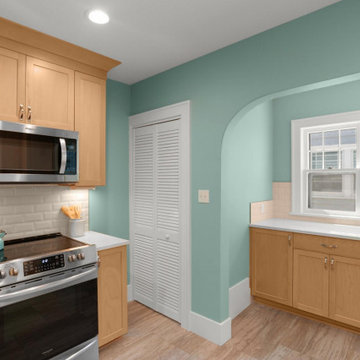
Through a comprehensive design-build approach, the kitchen was completely reimagined to improve both function and flow. While maintaining the existing sink and range locations to maximize budget efficiency, the layout was strategically redesigned to create significantly more usable workspace and storage. A previously wasted corner now houses a functional lazy Susan, the dishwasher was relocated beside the sink for improved workflow, and custom cabinet solutions provide dedicated storage for spices, oils, pots, and pans. Replacing the former sliding glass door with a window allowed for an expansive L-shaped countertop and cabinetry run, transforming the former dining nook into a highly functional extension of the kitchen.
The updated material palette reflects a warm Northwest aesthetic. Lightly stained cabinetry, a timeless cream subway tile backsplash, and crisp white trim create an inviting foundation, while durable luxury vinyl tile flooring offers the appearance of natural stone with the comfort, resiliency, and water resistance needed for everyday living. A robin's egg blue granite composite sink, chosen in the homeowner's favorite color, introduces a playful yet sophisticated focal point within the otherwise neutral space. Preserving the home's original archway helped maintain architectural character while seamlessly connecting the renovated spaces.
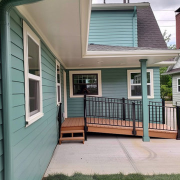
Equally transformative was the addition of a 441-square-foot aging-in-place suite designed to support long-term independence while feeling fully integrated with the existing home. Built off the dining room, the addition provides a future-ready living environment that can function as a private primary suite should mobility challenges arise. Covered pathways connect the home and detached garage, while a sheltered accessibility ramp offers an alternative entrance, ensuring safe and convenient access regardless of weather conditions.
Inside, universal design principles guided every decision. The spacious bedroom comfortably accommodates sleeping and sitting areas while allowing room for mobility aids if needed in the future. A walk-in closet includes a secondary laundry area with side-by-side washer and dryer access, eliminating the need to navigate basement stairs for essential daily tasks.
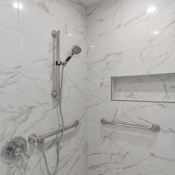
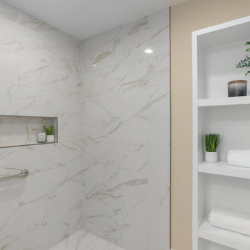
The bathroom was thoughtfully designed to support changing mobility needs without sacrificing style. A generous vanity provides knee clearance for seated use, while the layout includes ample transfer space around the toilet for accessibility. The oversized curbless shower offers exceptional maneuverability, including space for wheelchair turning radii and future adaptability. Multiple showering options, including a hand shower mounted to a grab bar system, provide flexibility, comfort, and additional support. Integrated grab bars, slip-resistant porcelain tile flooring, and strategic lighting solutions further enhance safety while maintaining a refined residential aesthetic.
Natural light was another priority. A new skylight floods the bathroom with daylight while also providing soft moonlight illumination after dark. An LED medicine cabinet delivers additional task lighting, storage, and nighttime visibility without relying solely on overhead fixtures.
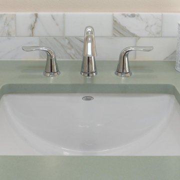
Throughout the addition, careful material selections create continuity with the remodeled kitchen. Warm-toned luxury vinyl plank flooring, coordinating cabinetry finishes, chrome plumbing fixtures, and a soft sage-green quartz countertop contribute to a calming and cohesive environment. On the exterior, matching siding, paint colors, rooflines, and black-framed windows ensure the addition blends seamlessly with the original architecture, making it appear as though it has always been part of the home.
What makes this project especially meaningful is how it balances immediate lifestyle improvements with long-term planning. By incorporating universal design strategies, accessibility features, and aging-in-place considerations into a beautiful and highly functional remodel, the homeowners gained both peace of mind and enhanced everyday living. The result is a home that supports independence, promotes comfort, and remains ready for whatever the future may bring.
 THE Remodel Group
Creating a forever home requires more than beautiful finishes. It requires thoughtful planning, adaptable design, and spaces that can evolve alongside the people who live in them. This NE Portland remodel combined a complete kitchen transformation with a custom aging-in-place addition, allowing the homeowners to enjoy greater comfort, accessibility, and independence for years to come.
At the heart of the project was a kitchen that no longer served the homeowners' needs. The original space felt cramped and inefficient, with limited countertop workspace, underutilized corner storage, and numerous circulation pinch points. An awkward dining nook offered little functionality, while a soffit ceiling unnecessarily reduced cabinet height and valuable storage potential. Even simple everyday tasks were becoming increasingly challenging within the confined layout.
Through a comprehensive design-build approach, the kitchen was completely reimagined to improve both function and flow. While maintaining the existing sink and range locations to maximize budget efficiency, the layout was strategically redesigned to create significantly more usable workspace and storage. A previously wasted corner now houses a functional lazy Susan, the dishwasher was relocated beside the sink for improved workflow, and custom cabinet solutions provide dedicated storage for spices, oils, pots, and pans. Replacing the former sliding glass door with a window allowed for an expansive L-shaped countertop and cabinetry run, transforming the former dining nook into a highly functional extension of the kitchen.
The updated material palette reflects a warm Northwest aesthetic. Lightly stained cabinetry, a timeless cream subway tile backsplash, and crisp white trim create an inviting foundation, while durable luxury vinyl tile flooring offers the appearance of natural stone with the comfort, resiliency, and water resistance needed for everyday living. A robin's egg blue granite composite sink, chosen in the homeowner's favorite color, introduces a playful yet sophisticated focal point within the otherwise neutral space. Preserving the home's original archway helped maintain architectural character while seamlessly connecting the renovated spaces.
Equally transformative was the addition of a 441-square-foot aging-in-place suite designed to support long-term independence while feeling fully integrated with the existing home. Built off the dining room, the addition provides a future-ready living environment that can function as a private primary suite should mobility challenges arise. Covered pathways connect the home and detached garage, while a sheltered accessibility ramp offers an alternative entrance, ensuring safe and convenient access regardless of weather conditions.
Inside, universal design principles guided every decision. The spacious bedroom comfortably accommodates sleeping and sitting areas while allowing room for mobility aids if needed in the future. A walk-in closet includes a secondary laundry area with side-by-side washer and dryer access, eliminating the need to navigate basement stairs for essential daily tasks.
The bathroom was thoughtfully designed to support changing mobility needs without sacrificing style. A generous vanity provides knee clearance for seated use, while the layout includes ample transfer space around the toilet for accessibility. The oversized curbless shower offers exceptional maneuverability, including space for wheelchair turning radii and future adaptability. Multiple showering options, including a hand shower mounted to a grab bar system, provide flexibility, comfort, and additional support. Integrated grab bars, slip-resistant porcelain tile flooring, and strategic lighting solutions further enhance safety while maintaining a refined residential aesthetic.
Natural light was another priority. A new skylight floods the bathroom with daylight while also providing soft moonlight illumination after dark. An LED medicine cabinet delivers additional task lighting, storage, and nighttime visibility without relying solely on overhead fixtures.
Throughout the addition, careful material selections create continuity with the remodeled kitchen. Warm-toned luxury vinyl plank flooring, coordinating cabinetry finishes, chrome plumbing fixtures, and a soft sage-green quartz countertop contribute to a calming and cohesive environment. On the exterior, matching siding, paint colors, rooflines, and black-framed windows ensure the addition blends seamlessly with the original architecture, making it appear as though it has always been part of the home.
What makes this project especially meaningful is how it balances immediate lifestyle improvements with long-term planning. By incorporating universal design strategies, accessibility features, and aging-in-place considerations into a beautiful and highly functional remodel, the homeowners gained both peace of mind and enhanced everyday living. The result is a home that supports independence, promotes comfort, and remains ready for whatever the future may bring.
 THE Remodel Group
Creating a forever home requires more than beautiful finishes. It requires thoughtful planning, adaptable design, and spaces that can evolve alongside the people who live in them. This NE Portland remodel combined a complete kitchen transformation with a custom aging-in-place addition, allowing the homeowners to enjoy greater comfort, accessibility, and independence for years to come.
At the heart of the project was a kitchen that no longer served the homeowners' needs. The original space felt cramped and inefficient, with limited countertop workspace, underutilized corner storage, and numerous circulation pinch points. An awkward dining nook offered little functionality, while a soffit ceiling unnecessarily reduced cabinet height and valuable storage potential. Even simple everyday tasks were becoming increasingly challenging within the confined layout.
Through a comprehensive design-build approach, the kitchen was completely reimagined to improve both function and flow. While maintaining the existing sink and range locations to maximize budget efficiency, the layout was strategically redesigned to create significantly more usable workspace and storage. A previously wasted corner now houses a functional lazy Susan, the dishwasher was relocated beside the sink for improved workflow, and custom cabinet solutions provide dedicated storage for spices, oils, pots, and pans. Replacing the former sliding glass door with a window allowed for an expansive L-shaped countertop and cabinetry run, transforming the former dining nook into a highly functional extension of the kitchen.
The updated material palette reflects a warm Northwest aesthetic. Lightly stained cabinetry, a timeless cream subway tile backsplash, and crisp white trim create an inviting foundation, while durable luxury vinyl tile flooring offers the appearance of natural stone with the comfort, resiliency, and water resistance needed for everyday living. A robin's egg blue granite composite sink, chosen in the homeowner's favorite color, introduces a playful yet sophisticated focal point within the otherwise neutral space. Preserving the home's original archway helped maintain architectural character while seamlessly connecting the renovated spaces.
Equally transformative was the addition of a 441-square-foot aging-in-place suite designed to support long-term independence while feeling fully integrated with the existing home. Built off the dining room, the addition provides a future-ready living environment that can function as a private primary suite should mobility challenges arise. Covered pathways connect the home and detached garage, while a sheltered accessibility ramp offers an alternative entrance, ensuring safe and convenient access regardless of weather conditions.
Inside, universal design principles guided every decision. The spacious bedroom comfortably accommodates sleeping and sitting areas while allowing room for mobility aids if needed in the future. A walk-in closet includes a secondary laundry area with side-by-side washer and dryer access, eliminating the need to navigate basement stairs for essential daily tasks.
The bathroom was thoughtfully designed to support changing mobility needs without sacrificing style. A generous vanity provides knee clearance for seated use, while the layout includes ample transfer space around the toilet for accessibility. The oversized curbless shower offers exceptional maneuverability, including space for wheelchair turning radii and future adaptability. Multiple showering options, including a hand shower mounted to a grab bar system, provide flexibility, comfort, and additional support. Integrated grab bars, slip-resistant porcelain tile flooring, and strategic lighting solutions further enhance safety while maintaining a refined residential aesthetic.
Natural light was another priority. A new skylight floods the bathroom with daylight while also providing soft moonlight illumination after dark. An LED medicine cabinet delivers additional task lighting, storage, and nighttime visibility without relying solely on overhead fixtures.
Throughout the addition, careful material selections create continuity with the remodeled kitchen. Warm-toned luxury vinyl plank flooring, coordinating cabinetry finishes, chrome plumbing fixtures, and a soft sage-green quartz countertop contribute to a calming and cohesive environment. On the exterior, matching siding, paint colors, rooflines, and black-framed windows ensure the addition blends seamlessly with the original architecture, making it appear as though it has always been part of the home.
What makes this project especially meaningful is how it balances immediate lifestyle improvements with long-term planning. By incorporating universal design strategies, accessibility features, and aging-in-place considerations into a beautiful and highly functional remodel, the homeowners gained both peace of mind and enhanced everyday living. The result is a home that supports independence, promotes comfort, and remains ready for whatever the future may bring.
 THE Remodel Group
Creating a forever home requires more than beautiful finishes. It requires thoughtful planning, adaptable design, and spaces that can evolve alongside the people who live in them. This NE Portland remodel combined a complete kitchen transformation with a custom aging-in-place addition, allowing the homeowners to enjoy greater comfort, accessibility, and independence for years to come.
At the heart of the project was a kitchen that no longer served the homeowners' needs. The original space felt cramped and inefficient, with limited countertop workspace, underutilized corner storage, and numerous circulation pinch points. An awkward dining nook offered little functionality, while a soffit ceiling unnecessarily reduced cabinet height and valuable storage potential. Even simple everyday tasks were becoming increasingly challenging within the confined layout.
Through a comprehensive design-build approach, the kitchen was completely reimagined to improve both function and flow. While maintaining the existing sink and range locations to maximize budget efficiency, the layout was strategically redesigned to create significantly more usable workspace and storage. A previously wasted corner now houses a functional lazy Susan, the dishwasher was relocated beside the sink for improved workflow, and custom cabinet solutions provide dedicated storage for spices, oils, pots, and pans. Replacing the former sliding glass door with a window allowed for an expansive L-shaped countertop and cabinetry run, transforming the former dining nook into a highly functional extension of the kitchen.
The updated material palette reflects a warm Northwest aesthetic. Lightly stained cabinetry, a timeless cream subway tile backsplash, and crisp white trim create an inviting foundation, while durable luxury vinyl tile flooring offers the appearance of natural stone with the comfort, resiliency, and water resistance needed for everyday living. A robin's egg blue granite composite sink, chosen in the homeowner's favorite color, introduces a playful yet sophisticated focal point within the otherwise neutral space. Preserving the home's original archway helped maintain architectural character while seamlessly connecting the renovated spaces.
Equally transformative was the addition of a 441-square-foot aging-in-place suite designed to support long-term independence while feeling fully integrated with the existing home. Built off the dining room, the addition provides a future-ready living environment that can function as a private primary suite should mobility challenges arise. Covered pathways connect the home and detached garage, while a sheltered accessibility ramp offers an alternative entrance, ensuring safe and convenient access regardless of weather conditions.
Inside, universal design principles guided every decision. The spacious bedroom comfortably accommodates sleeping and sitting areas while allowing room for mobility aids if needed in the future. A walk-in closet includes a secondary laundry area with side-by-side washer and dryer access, eliminating the need to navigate basement stairs for essential daily tasks.
The bathroom was thoughtfully designed to support changing mobility needs without sacrificing style. A generous vanity provides knee clearance for seated use, while the layout includes ample transfer space around the toilet for accessibility. The oversized curbless shower offers exceptional maneuverability, including space for wheelchair turning radii and future adaptability. Multiple showering options, including a hand shower mounted to a grab bar system, provide flexibility, comfort, and additional support. Integrated grab bars, slip-resistant porcelain tile flooring, and strategic lighting solutions further enhance safety while maintaining a refined residential aesthetic.
Natural light was another priority. A new skylight floods the bathroom with daylight while also providing soft moonlight illumination after dark. An LED medicine cabinet delivers additional task lighting, storage, and nighttime visibility without relying solely on overhead fixtures.
Throughout the addition, careful material selections create continuity with the remodeled kitchen. Warm-toned luxury vinyl plank flooring, coordinating cabinetry finishes, chrome plumbing fixtures, and a soft sage-green quartz countertop contribute to a calming and cohesive environment. On the exterior, matching siding, paint colors, rooflines, and black-framed windows ensure the addition blends seamlessly with the original architecture, making it appear as though it has always been part of the home.
What makes this project especially meaningful is how it balances immediate lifestyle improvements with long-term planning. By incorporating universal design strategies, accessibility features, and aging-in-place considerations into a beautiful and highly functional remodel, the homeowners gained both peace of mind and enhanced everyday living. The result is a home that supports independence, promotes comfort, and remains ready for whatever the future may bring.
 THE Remodel Group
Creating a forever home requires more than beautiful finishes. It requires thoughtful planning, adaptable design, and spaces that can evolve alongside the people who live in them. This NE Portland remodel combined a complete kitchen transformation with a custom aging-in-place addition, allowing the homeowners to enjoy greater comfort, accessibility, and independence for years to come.
At the heart of the project was a kitchen that no longer served the homeowners' needs. The original space felt cramped and inefficient, with limited countertop workspace, underutilized corner storage, and numerous circulation pinch points. An awkward dining nook offered little functionality, while a soffit ceiling unnecessarily reduced cabinet height and valuable storage potential. Even simple everyday tasks were becoming increasingly challenging within the confined layout.
Through a comprehensive design-build approach, the kitchen was completely reimagined to improve both function and flow. While maintaining the existing sink and range locations to maximize budget efficiency, the layout was strategically redesigned to create significantly more usable workspace and storage. A previously wasted corner now houses a functional lazy Susan, the dishwasher was relocated beside the sink for improved workflow, and custom cabinet solutions provide dedicated storage for spices, oils, pots, and pans. Replacing the former sliding glass door with a window allowed for an expansive L-shaped countertop and cabinetry run, transforming the former dining nook into a highly functional extension of the kitchen.
The updated material palette reflects a warm Northwest aesthetic. Lightly stained cabinetry, a timeless cream subway tile backsplash, and crisp white trim create an inviting foundation, while durable luxury vinyl tile flooring offers the appearance of natural stone with the comfort, resiliency, and water resistance needed for everyday living. A robin's egg blue granite composite sink, chosen in the homeowner's favorite color, introduces a playful yet sophisticated focal point within the otherwise neutral space. Preserving the home's original archway helped maintain architectural character while seamlessly connecting the renovated spaces.
Equally transformative was the addition of a 441-square-foot aging-in-place suite designed to support long-term independence while feeling fully integrated with the existing home. Built off the dining room, the addition provides a future-ready living environment that can function as a private primary suite should mobility challenges arise. Covered pathways connect the home and detached garage, while a sheltered accessibility ramp offers an alternative entrance, ensuring safe and convenient access regardless of weather conditions.
Inside, universal design principles guided every decision. The spacious bedroom comfortably accommodates sleeping and sitting areas while allowing room for mobility aids if needed in the future. A walk-in closet includes a secondary laundry area with side-by-side washer and dryer access, eliminating the need to navigate basement stairs for essential daily tasks.
The bathroom was thoughtfully designed to support changing mobility needs without sacrificing style. A generous vanity provides knee clearance for seated use, while the layout includes ample transfer space around the toilet for accessibility. The oversized curbless shower offers exceptional maneuverability, including space for wheelchair turning radii and future adaptability. Multiple showering options, including a hand shower mounted to a grab bar system, provide flexibility, comfort, and additional support. Integrated grab bars, slip-resistant porcelain tile flooring, and strategic lighting solutions further enhance safety while maintaining a refined residential aesthetic.
Natural light was another priority. A new skylight floods the bathroom with daylight while also providing soft moonlight illumination after dark. An LED medicine cabinet delivers additional task lighting, storage, and nighttime visibility without relying solely on overhead fixtures.
Throughout the addition, careful material selections create continuity with the remodeled kitchen. Warm-toned luxury vinyl plank flooring, coordinating cabinetry finishes, chrome plumbing fixtures, and a soft sage-green quartz countertop contribute to a calming and cohesive environment. On the exterior, matching siding, paint colors, rooflines, and black-framed windows ensure the addition blends seamlessly with the original architecture, making it appear as though it has always been part of the home.
What makes this project especially meaningful is how it balances immediate lifestyle improvements with long-term planning. By incorporating universal design strategies, accessibility features, and aging-in-place considerations into a beautiful and highly functional remodel, the homeowners gained both peace of mind and enhanced everyday living. The result is a home that supports independence, promotes comfort, and remains ready for whatever the future may bring.
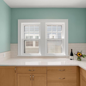 THE Remodel Group
Creating a forever home requires more than beautiful finishes. It requires thoughtful planning, adaptable design, and spaces that can evolve alongside the people who live in them. This NE Portland remodel combined a complete kitchen transformation with a custom aging-in-place addition, allowing the homeowners to enjoy greater comfort, accessibility, and independence for years to come.
At the heart of the project was a kitchen that no longer served the homeowners' needs. The original space felt cramped and inefficient, with limited countertop workspace, underutilized corner storage, and numerous circulation pinch points. An awkward dining nook offered little functionality, while a soffit ceiling unnecessarily reduced cabinet height and valuable storage potential. Even simple everyday tasks were becoming increasingly challenging within the confined layout.
Through a comprehensive design-build approach, the kitchen was completely reimagined to improve both function and flow. While maintaining the existing sink and range locations to maximize budget efficiency, the layout was strategically redesigned to create significantly more usable workspace and storage. A previously wasted corner now houses a functional lazy Susan, the dishwasher was relocated beside the sink for improved workflow, and custom cabinet solutions provide dedicated storage for spices, oils, pots, and pans. Replacing the former sliding glass door with a window allowed for an expansive L-shaped countertop and cabinetry run, transforming the former dining nook into a highly functional extension of the kitchen.
The updated material palette reflects a warm Northwest aesthetic. Lightly stained cabinetry, a timeless cream subway tile backsplash, and crisp white trim create an inviting foundation, while durable luxury vinyl tile flooring offers the appearance of natural stone with the comfort, resiliency, and water resistance needed for everyday living. A robin's egg blue granite composite sink, chosen in the homeowner's favorite color, introduces a playful yet sophisticated focal point within the otherwise neutral space. Preserving the home's original archway helped maintain architectural character while seamlessly connecting the renovated spaces.
Equally transformative was the addition of a 441-square-foot aging-in-place suite designed to support long-term independence while feeling fully integrated with the existing home. Built off the dining room, the addition provides a future-ready living environment that can function as a private primary suite should mobility challenges arise. Covered pathways connect the home and detached garage, while a sheltered accessibility ramp offers an alternative entrance, ensuring safe and convenient access regardless of weather conditions.
Inside, universal design principles guided every decision. The spacious bedroom comfortably accommodates sleeping and sitting areas while allowing room for mobility aids if needed in the future. A walk-in closet includes a secondary laundry area with side-by-side washer and dryer access, eliminating the need to navigate basement stairs for essential daily tasks.
The bathroom was thoughtfully designed to support changing mobility needs without sacrificing style. A generous vanity provides knee clearance for seated use, while the layout includes ample transfer space around the toilet for accessibility. The oversized curbless shower offers exceptional maneuverability, including space for wheelchair turning radii and future adaptability. Multiple showering options, including a hand shower mounted to a grab bar system, provide flexibility, comfort, and additional support. Integrated grab bars, slip-resistant porcelain tile flooring, and strategic lighting solutions further enhance safety while maintaining a refined residential aesthetic.
Natural light was another priority. A new skylight floods the bathroom with daylight while also providing soft moonlight illumination after dark. An LED medicine cabinet delivers additional task lighting, storage, and nighttime visibility without relying solely on overhead fixtures.
Throughout the addition, careful material selections create continuity with the remodeled kitchen. Warm-toned luxury vinyl plank flooring, coordinating cabinetry finishes, chrome plumbing fixtures, and a soft sage-green quartz countertop contribute to a calming and cohesive environment. On the exterior, matching siding, paint colors, rooflines, and black-framed windows ensure the addition blends seamlessly with the original architecture, making it appear as though it has always been part of the home.
What makes this project especially meaningful is how it balances immediate lifestyle improvements with long-term planning. By incorporating universal design strategies, accessibility features, and aging-in-place considerations into a beautiful and highly functional remodel, the homeowners gained both peace of mind and enhanced everyday living. The result is a home that supports independence, promotes comfort, and remains ready for whatever the future may bring.
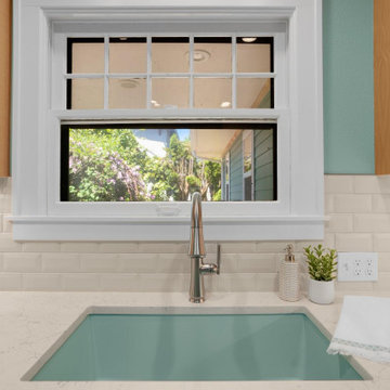 THE Remodel Group
Creating a forever home requires more than beautiful finishes. It requires thoughtful planning, adaptable design, and spaces that can evolve alongside the people who live in them. This NE Portland remodel combined a complete kitchen transformation with a custom aging-in-place addition, allowing the homeowners to enjoy greater comfort, accessibility, and independence for years to come.
At the heart of the project was a kitchen that no longer served the homeowners' needs. The original space felt cramped and inefficient, with limited countertop workspace, underutilized corner storage, and numerous circulation pinch points. An awkward dining nook offered little functionality, while a soffit ceiling unnecessarily reduced cabinet height and valuable storage potential. Even simple everyday tasks were becoming increasingly challenging within the confined layout.
Through a comprehensive design-build approach, the kitchen was completely reimagined to improve both function and flow. While maintaining the existing sink and range locations to maximize budget efficiency, the layout was strategically redesigned to create significantly more usable workspace and storage. A previously wasted corner now houses a functional lazy Susan, the dishwasher was relocated beside the sink for improved workflow, and custom cabinet solutions provide dedicated storage for spices, oils, pots, and pans. Replacing the former sliding glass door with a window allowed for an expansive L-shaped countertop and cabinetry run, transforming the former dining nook into a highly functional extension of the kitchen.
The updated material palette reflects a warm Northwest aesthetic. Lightly stained cabinetry, a timeless cream subway tile backsplash, and crisp white trim create an inviting foundation, while durable luxury vinyl tile flooring offers the appearance of natural stone with the comfort, resiliency, and water resistance needed for everyday living. A robin's egg blue granite composite sink, chosen in the homeowner's favorite color, introduces a playful yet sophisticated focal point within the otherwise neutral space. Preserving the home's original archway helped maintain architectural character while seamlessly connecting the renovated spaces.
Equally transformative was the addition of a 441-square-foot aging-in-place suite designed to support long-term independence while feeling fully integrated with the existing home. Built off the dining room, the addition provides a future-ready living environment that can function as a private primary suite should mobility challenges arise. Covered pathways connect the home and detached garage, while a sheltered accessibility ramp offers an alternative entrance, ensuring safe and convenient access regardless of weather conditions.
Inside, universal design principles guided every decision. The spacious bedroom comfortably accommodates sleeping and sitting areas while allowing room for mobility aids if needed in the future. A walk-in closet includes a secondary laundry area with side-by-side washer and dryer access, eliminating the need to navigate basement stairs for essential daily tasks.
The bathroom was thoughtfully designed to support changing mobility needs without sacrificing style. A generous vanity provides knee clearance for seated use, while the layout includes ample transfer space around the toilet for accessibility. The oversized curbless shower offers exceptional maneuverability, including space for wheelchair turning radii and future adaptability. Multiple showering options, including a hand shower mounted to a grab bar system, provide flexibility, comfort, and additional support. Integrated grab bars, slip-resistant porcelain tile flooring, and strategic lighting solutions further enhance safety while maintaining a refined residential aesthetic.
Natural light was another priority. A new skylight floods the bathroom with daylight while also providing soft moonlight illumination after dark. An LED medicine cabinet delivers additional task lighting, storage, and nighttime visibility without relying solely on overhead fixtures.
Throughout the addition, careful material selections create continuity with the remodeled kitchen. Warm-toned luxury vinyl plank flooring, coordinating cabinetry finishes, chrome plumbing fixtures, and a soft sage-green quartz countertop contribute to a calming and cohesive environment. On the exterior, matching siding, paint colors, rooflines, and black-framed windows ensure the addition blends seamlessly with the original architecture, making it appear as though it has always been part of the home.
What makes this project especially meaningful is how it balances immediate lifestyle improvements with long-term planning. By incorporating universal design strategies, accessibility features, and aging-in-place considerations into a beautiful and highly functional remodel, the homeowners gained both peace of mind and enhanced everyday living. The result is a home that supports independence, promotes comfort, and remains ready for whatever the future may bring.
27