
Search results for "Continually increasing" in Home Design Ideas
 Century Tile
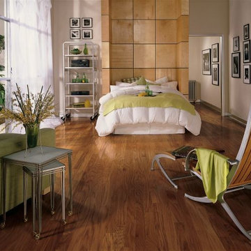
Oak - Gunstock
We are a customer-driven company, focused on increasing our sales and market share. We differ from our competition by our products, presentation, and service while continuing to support our reputation for value and selection. Quickly put…to make Century Tile “simply the best."
 Captivate Inc.
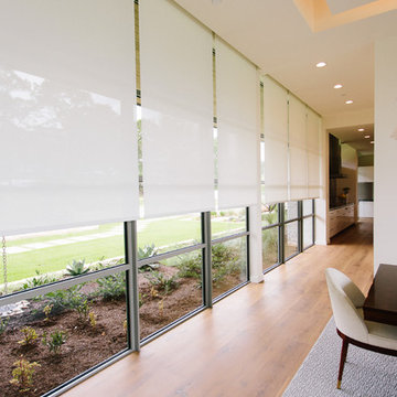
Continuing the theme of amplifying natural lighting, the dining room has a whole wall dedicated to floor-to-ceiling windows. Custom shade panels silently drop at the press of a button to increase security, regulate temperature and set the mood of the room.
Photographer: Alexandra White Photography
 Halflants + Pichette
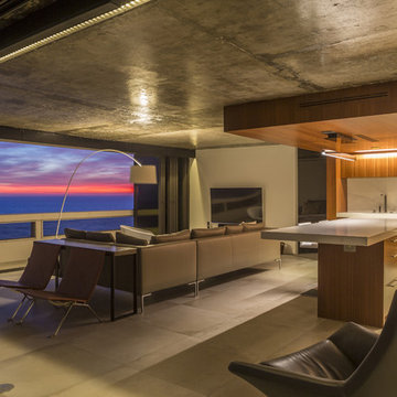
Besides designing and building the unit, Halflants + Pichette Studio for Modern Architecture also selected the furniture which includes a lounge chair by Poul Kjaerholm, a B&B Italia couch by Antonio Citterio, and a swivel chair by Jeffrey Bernett. All furniture were selected for their sculptural form, comfort, and for their weightlessness. The designers wanted pieces that floated above the large porcelain tiles to add to the sense of a continuous fluid space. The architects took care not to design the condominium room by room, but as an uninterrupted sequence of spaces to increase the perceived dimensions of the unit.
Find the right local pro for your project
 Simply Home Decorating
This beautiful North Vancouver home belongs to a nature-loving and health-conscious couple, Emma and Vince (names changed), their two young children, and their dog, Jasper. When they contacted us about renovating and furnishing their kitchen and family room, we walked in and saw a world of potential waiting to be uncovered.
Before: Larkhall Crescent Home:
Like many original North Vancouver homes, the interior was definitely dated. We encountered late ‘80s finishes in powder pink and teal green, old carpet, and a kitchen that wasn’t maximized to suit this family’s modern-day lifestyle. However, the size of the rooms offered us a ton of space with which to get creative.
Knowing our clients’ love of cooking, need for work spaces (Emma and Vince both work remotely), and growing family, we developed a design concept that would increase usable space, optimize storage, and create intimacy in this large area. As for the style, we were inspired by their European roots, inventing a new and modern take on “Belgian Farmhouse” style. Now, the home is truly one-of-a-kind.
After: Warm & Cozy Family Room:
Fresh, bright, and comfortable, this living area has been transformed! We started with the fireplace as a focal point, selecting aged brick tiles for added texture and a crisp wood mantle. The taupe-coloured sectional infuses the room with visual warmth and serves the added purpose of separating the family room from the kitchen.
Emma and Vince were also keen on using non-toxic materials in their home, and we were happy to oblige. To meet their needs, we sourced natural wood elements and sought out Canadian-made products - that adhere to high health standards - whenever possible.
Look closer at the elements of this space, and you will find this stunning, honeycomb-patterned rug in earthy gold, beige, and charcoal tones. It’s plush to the touch and full of visual texture that brings this room’s colour palette together. We sourced these two-tone chairs with caning, petrified wood side table, black sconces, and botanical prints in greyscale from local artist, Heather Johnston.
We topped off the space with this dark wood and rattan console that offers storage facing the kitchen and presents an opportunity to display cherished items. The result is a cozy lounging space brimming with comfort and functionality. It’s perfect for enjoying quality family time, or Emma can simply slide the coffee table away to make room for her morning yoga practice.
Now, let’s turn around and give some attention to the kitchen. Do you remember what the original kitchen looked like? If not, scroll back up, because the transformation is shocking…
Moody & Welcoming Kitchen for Healthy Living:
This kitchen looks very different from how it started, right? Though we didn’t touch any walls, the kitchen has almost doubled in usable space! We created a long, extended island with storage, an outlet for small appliances, and seating for comfortable prep, after-school snacking, or mingling among friends.
On the other side of the island, the family has even more storage and an integrated dishwasher within easy reach of the sink, perfect for quick clean-up. From this angle, you can also see the expansive custom Shaker cabinetry in white and the integrated double ovens. These facilitate their cooking experience and gave us the opportunity to add an additional surprise…
A coffee garage station and more hidden storage! Keeping these items located along the perimeter allows them to be accessed by the family or their guests without someone getting under the cook’s feet. These are the little details that make everyday life easier and more enjoyable.
Moving deeper into the kitchen, the seamless induction cooktop topped with a freestanding concealed hood fan commands attention in a soft yet prominent way. The natural wood accent mirrors the fireplace mantle, and the choice of off-black wood-grain cabinets not only continues our black-and-white colour palette but adds a sense of depth and contrast. The corner sink is located to the right and perfectly positioned with a view of their thriving backyard.
To invite more of this family’s character into the space, we mixed metals for interest — matte black, dark pewter, and warm brass — and created open shelves in white oak for their plants and decor. You can also glimpse the tumbled edge of the backsplash tile, which echoes the rustic brick of the fireplace. It adds that farmhouse charm while still feeling timeless and sophisticated.
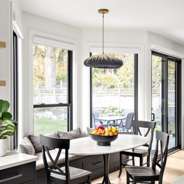
Last but not least, we designed this dining banquette in the bay window (with integrated bench storage, of course), where the family can share a meal together, the kids can do homework, or Emma and Vince can work and enjoy a change of scenery from their offices. Like the other spaces in the home, it was designed to be beautiful, multi-functional, and long-lasting.
Praise from Our Clients:
It is clear that we love this home, but what did our clients have to say?
“Lori is a visionary and masters execution to the finest detail all at the same time. When she first met us to know more about who we are and how we live, she could right away envision how we could use the space in our kitchen and living room…The results exceeded our expectations.
Lori and her team were also a delight to work with — coordination with all the trades, fast problem-solving, regular updates, professional and friendly attitude of her entire team — made it the dream team. Thank you SHD for making our space so beautiful!”
In turn, we are so grateful for this family’s trust, their open communication, and for being wonderful people with whom to work. (So, thank you!)
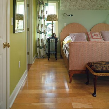 Century Tile
We are a customer-driven company, focused on increasing our sales and market share. We differ from our competition by our products, presentation, and service while continuing to support our reputation for value and selection. Quickly put…to make Century Tile “simply the best."
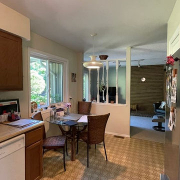
 MAC Reno Design Build LTD ( MAC Renovations)
BEFORE PHOTO:
This thoughtfully executed renovation has transformed a beloved family home into a retirement-ready haven. The design, anchored by a family heirloom—a shoji door made by the owner's father—brings a sense of history and warmth with its rich wood tones. The reimagined kitchen shines with increased space and light, becoming a baker's dream, while maintaining its functionality for everyday use. Alongside, the powder room and laundry have received functional upgrades, enhancing the home's overall efficiency. Every detail is a blend of personal legacy and modern living, ensuring this home continues to be a place of comfort and ease for years to come.
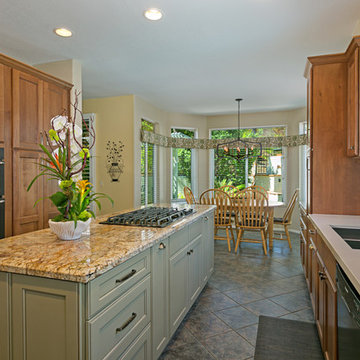
 Tracy Berman Interiors
Raising the visual presence of this kitchen was the first priority. Removing the soffit that went around most of the kitchen allowed the cabinets to be taller. We raised the backsplash from 18" to 21" to further add to the visual lift. The previous foot print stopped after the sink area. By continuing the cabinets down the wall we increased the square footage of the room and were able to increase the size of the island as well. A sage brown cabinet warmed up the room and a pesto green island added a modern flair. A beautiful slab of granite on the island helped tie all of the choices together.
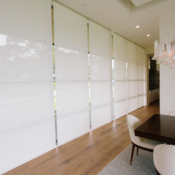 Captivate Inc.
Continuing the theme of amplifying natural lighting, the dining room has a whole wall dedicated to floor-to-ceiling windows. Custom shade panels silently drop at the press of a button to increase security, regulate temperature and set the mood of the room.
Photographer: Alexandra White Photography
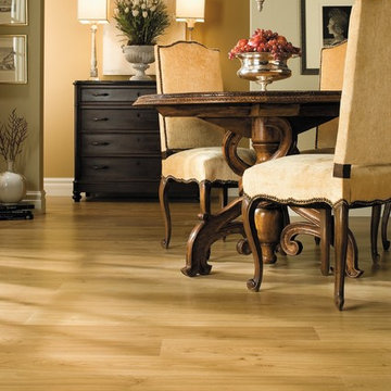 Century Tile
QS_Country_U1160_RM_CU
Armstrong Hardwood.
We are a customer-driven company, focused on increasing our sales and market share. We differ from our competition by our products, presentation, and service while continuing to support our reputation for value and selection. Quickly put…to make Century Tile “simply the best."
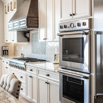
 Spaces Renewed
The transformation of this home was extensive. We removed walls, creating connectivity between rooms and an updated open concept floor plan. We did a complete redesign the layout of the kitchen, tripling the size, storage, and counter space for the whole family to enjoy. We created a built-in bar in the dining room and separate media room, opening up the entertaining options for both kids and adults. For the finishes throughout, the family was able to capture their love of Spanish and old-world design. We used warm neutral colors for the pallet, antique and worn textures throughout the surfaces, and pops of color and personality to make it uniquely theirs. Touches of brass and wrought iron in the lighting and railings continued the theme. The enlarged glass door systems and windows all increased the natural light and opened up the viewing area to capture the panoramic ocean view.
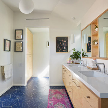
 Lewis / Schoeplein architects
Remodel and addition to classic California bungalow.
Example of a 1950s master blue tile and porcelain tile porcelain tile and blue floor freestanding bathtub design in Los Angeles with flat-panel cabinets, light wood cabinets, white walls, an undermount sink, quartz countertops and white countertops
Example of a 1950s master blue tile and porcelain tile porcelain tile and blue floor freestanding bathtub design in Los Angeles with flat-panel cabinets, light wood cabinets, white walls, an undermount sink, quartz countertops and white countertops
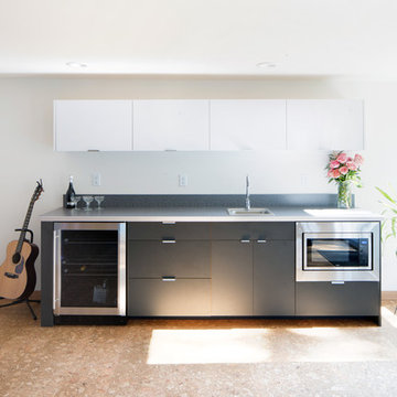
 The Artisans Group, Inc.
Winner of the 2018 Tour of Homes Best Remodel, this whole house re-design of a 1963 Bennet & Johnson mid-century raised ranch home is a beautiful example of the magic we can weave through the application of more sustainable modern design principles to existing spaces.
We worked closely with our client on extensive updates to create a modernized MCM gem.
Extensive alterations include:
- a completely redesigned floor plan to promote a more intuitive flow throughout
- vaulted the ceilings over the great room to create an amazing entrance and feeling of inspired openness
- redesigned entry and driveway to be more inviting and welcoming as well as to experientially set the mid-century modern stage
- the removal of a visually disruptive load bearing central wall and chimney system that formerly partitioned the homes’ entry, dining, kitchen and living rooms from each other
- added clerestory windows above the new kitchen to accentuate the new vaulted ceiling line and create a greater visual continuation of indoor to outdoor space
- drastically increased the access to natural light by increasing window sizes and opening up the floor plan
- placed natural wood elements throughout to provide a calming palette and cohesive Pacific Northwest feel
- incorporated Universal Design principles to make the home Aging In Place ready with wide hallways and accessible spaces, including single-floor living if needed
- moved and completely redesigned the stairway to work for the home’s occupants and be a part of the cohesive design aesthetic
- mixed custom tile layouts with more traditional tiling to create fun and playful visual experiences
- custom designed and sourced MCM specific elements such as the entry screen, cabinetry and lighting
- development of the downstairs for potential future use by an assisted living caretaker
- energy efficiency upgrades seamlessly woven in with much improved insulation, ductless mini splits and solar gain
 de Reus Architects
Photography by Petr Myska
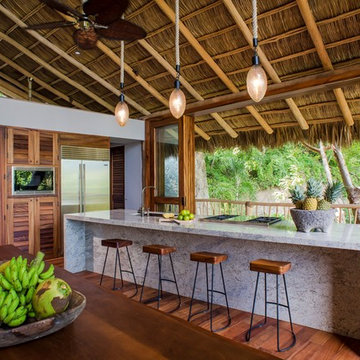
Example of an island style medium tone wood floor open concept kitchen design in Hawaii with louvered cabinets, medium tone wood cabinets and an island
Example of an island style medium tone wood floor open concept kitchen design in Hawaii with louvered cabinets, medium tone wood cabinets and an island
 Archatrak Inc.
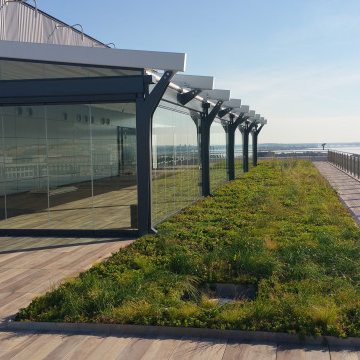
Green roofs have become increasingly popular recently, and in some locations have become mandatory, with rooftop plantings reducing energy costs, improving air quality, increasing biodiversity and reducing storm water runoff. One of the easiest methods of creating an instant green roof is to use plastic planter trays pre-filled with growing medium and plants. This 4,600 sq. ft. rooftop terrace on the 8th floor showcases Archatrak porcelain planks in the color Oak and provides breathtaking views from the Washington Monument to the Potomac River. Hickok Cole Architects are responsible for the beautifully designed rooftop. This installation is a beautiful example of interior to exterior paving, as the porcelain planks give a look of seamless continuity as they flow from the interior atrium to the outside rooftop.
 Spaces Renewed
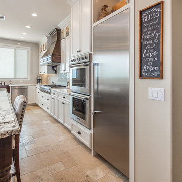
The transformation of this home was extensive. We removed walls, creating connectivity between rooms and an updated open concept floor plan. We did a complete redesign the layout of the kitchen, tripling the size, storage, and counter space for the whole family to enjoy. We created a built-in bar in the dining room and separate media room, opening up the entertaining options for both kids and adults. For the finishes throughout, the family was able to capture their love of Spanish and old-world design. We used warm neutral colors for the pallet, antique and worn textures throughout the surfaces, and pops of color and personality to make it uniquely theirs. Touches of brass and wrought iron in the lighting and railings continued the theme. The enlarged glass door systems and windows all increased the natural light and opened up the viewing area to capture the panoramic ocean view.
 Tracy Berman Interiors
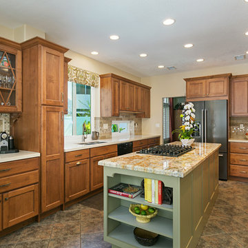
Raising the visual presence of this kitchen was the first priority. Removing the soffit that went around most of the kitchen allowed the cabinets to be taller. We raised the backsplash from 18" to 21" to further add to the visual lift. The previous foot print stopped after the sink area. By continuing the cabinets down the wall we increased the square footage of the room and were able to increase the size of the island as well. A sage brown cabinet warmed up the room and a pesto green island added a modern flair. A beautiful slab of granite on the island helped tie all of the choices together.
 Spaces Renewed
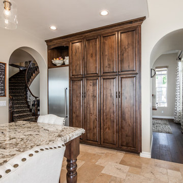
The transformation of this home was extensive. We removed walls, creating connectivity between rooms and an updated open concept floor plan. We did a complete redesign the layout of the kitchen, tripling the size, storage, and counter space for the whole family to enjoy. We created a built-in bar in the dining room and separate media room, opening up the entertaining options for both kids and adults. For the finishes throughout, the family was able to capture their love of Spanish and old-world design. We used warm neutral colors for the pallet, antique and worn textures throughout the surfaces, and pops of color and personality to make it uniquely theirs. Touches of brass and wrought iron in the lighting and railings continued the theme. The enlarged glass door systems and windows all increased the natural light and opened up the viewing area to capture the panoramic ocean view.
 Thyme & Place Design LLC
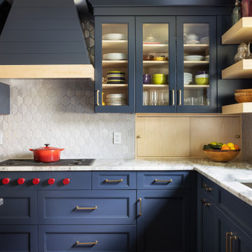
The client requested a kitchen that would not only provide a great space to cook and enjoy family meals but one that would fit in with her unique design sense. An avid collector of contemporary art, she wanted something unexpected in her 100-year-old home in both color and finishes but still providing a great layout with improved lighting, storage, and superior cooking abilities. The existing kitchen was in a closed off space trapped between the family room and the living. If you were in the kitchen, you were isolated from the rest of the house. Making the kitchen an integrated part of the home was a paramount request.
Step one, remove the wall separating the kitchen from the other rooms in the home which allowed the new kitchen to become an integrated space instead of an isolation room for the cook. Next, we relocated the pantry access which was in the family room to the kitchen integrating a poorly used recess which had become a catch all area which did not provide any usable space for storage or working area. To add valuable function in the kitchen we began by capturing unused "cubbies", adding a walk-in pantry from the kitchen, increasing the storage lost to un-needed drop ceilings and bring light and design to the space with a new large awning window, improved lighting, and combining interesting finishes and colors to reflect the artistic attitude of the client.
A bathroom located above the kitchen had been leaking into the plaster ceiling for several years. That along with knob and tube wiring, rotted beams and a brick wall from the back of the fireplace in the adjacent living room all needed to be brought to code. The walls, ceiling and floors in this 100+ year old home were completely out of level and the room’s foot print could not be increased.
The choice of a Sub-Zero wolf product is a standard in my kitchen designs. The quality of the product, its manufacturing and commitment to food preservation is the reason I specify Sub Zero Wolf. For the cook top, the integrated line of the contemporary cooktop and the signature red knobs against the navy blue of the cabinets added to the design vibe of the kitchen. The cooking performance and the large continuous grate on the cooktop makes it an obvious choice for a cook looking for a great cook top with professional results in a more streamlined profile. We selected a Sharp microwave drawer for the island, an XO wine refrigerator, Bosch dishwasher and Kitchen Aid double convection wall ovens to round out the appliance package.
A recess created by the fireplace was outfitted with a cabinet which now holds small appliances within easy reach of my very petite client. Natural maple accents were used inside all the wall cabinets and repeated on the front of the hood and for the sliding door appliance cabinet and the floating shelves. This allows a brighter interior for the painted cabinets instead of the traditional same interior as exterior finish choice. The was an amazing transformation from the old to the new.
The final touches are the honey bronze hardware from Top Knobs, Mitzi pendants from Hudson Valley Lighting group,
a fabulous faucet from Brizo. To eliminate the old freestanding bottled water cooler, we specified a matching water filter faucet.
 Bespoke Kitchens and Baths
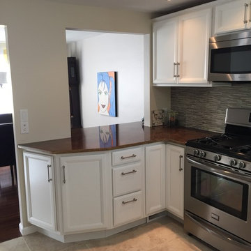
Remodeling project on the budget. Medium size kitchen with no island. Opening from kitchen into dining room helps create continued space for entertaining. By moving range location from original (old location where opening is now) to adjoined wall also helped to increase working surface in kitchen.
 Tracy Berman Interiors
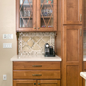
Raising the visual presence of this kitchen was the first priority. Removing the soffit that went around most of the kitchen allowed the cabinets to be taller. We raised the backsplash from 18" to 21" to further add to the visual lift. The previous foot print stopped after the sink area. By continuing the cabinets down the wall we increased the square footage of the room and were able to increase the size of the island as well. A sage brown cabinet warmed up the room and a pesto green island added a modern flair. A beautiful slab of granite on the island helped tie all of the choices together.
14