
Search results for "Continually increasing" in Home Design Ideas
 Drury Design
THE SETUP
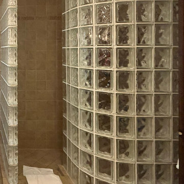
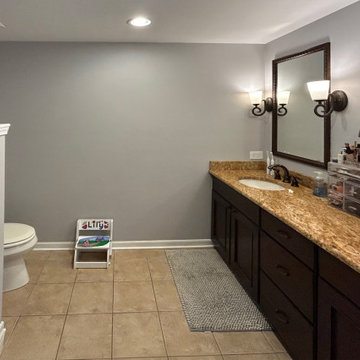
The original primary bathroom was characterized by a disjointed and segmented layout. The shower featured a bulky glass-block enclosure that overwhelmed the space visually. There was a considerable amount of open, unused space, and despite having a his and hers vanity, the arrangement lacked personal space for each user, as they shared the conjoined space between the sinks. The toilet was inconveniently located right by the door, with a half-wall partition meant to provide privacy but instead contributing to a cramped and unbalanced feel. Overall, the bathroom’s layout and design were fragmented, failing to make the most of the available space and lacking adequate storage solutions.
Design objectives:
- Reconfigure the layout to enhance functionality and flow.
- Create an elegant, upscale aesthetic that is light and bright.
- Incorporate specialized storage solutions for female hair care needs.
- Increase overall storage capacity.
- Develop a spa-like shower experience.
- Provide a significant wow factor to the space.
THE REMODEL
Design challenges to be solved:
- Repositioning the toilet to a more suitable location.
- Designing hair care storage solutions without cluttering the elegant space.
- Balancing an upscale, elegant design with a feminine touch in the color palette.
- Increasing the brightness of the room without adding windows.
- Completely replacing the existing shower to create a spa-like experience.
- Planning new storage solutions without adding bulkiness or clutter to the cabinetry.
THE RENEWED SPACE
Design solutions:
Toilet Relocation: Moved the toilet by the window, creating a better overall layout that also opened up two full walls for cabinetry and storage solutions.
Specialized Vanity Storage: The left side of the left vanity is the wife’s. Open shelves facing across the vanity can be used for decorative or daily needs items. Pull-out docking drawers with power outlets and metal basins handle hot hair appliances.
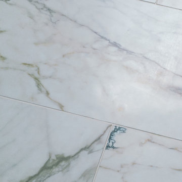
Bright and Elegant Color Scheme: White cabinets, countertops, floors, and shower walls keep the space bright. The just-off-white wall color with a hint of pink adds a feminine touch. Thin wainscoting with white trim offers traditional-leaning elegance.
Layered Lighting Strategy: Ceiling can lights, sconces, lighted mirrors, and toe-kick lighting were installed. Natural light-rated bulbs keep the space bright and natural-feeling.
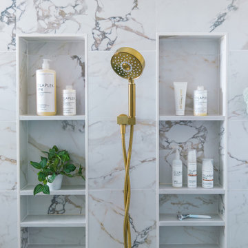
Spa-Like Shower: An extra-large shower was created using the same floor tile materials for continuity. Equipped with a Kohler Anthem system with a shower head, hand-held, and four body sprays. His and Hers niches for separate body care product storage.
Enhanced Storage Solutions: Added a linen cabinet within the vanity area for efficient storage of towels and bathroom essentials.
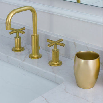
This elegant bathroom feels incredibly spacious now. The color palette and lights keep the room bright and cheery. Gold fixtures, the herringbone pattern on the floor, and exquisite trim work add an elegant touch. With the husband and wife having their own vanity wall sections joined at the corner, each user truly has their own space within the space. The clients are very happy with the final result.
 PURE Design Inc.
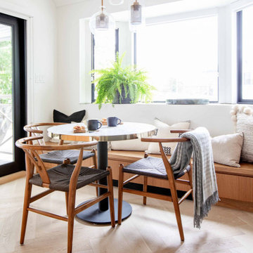
Example of a trendy light wood floor and beige floor breakfast nook design in Vancouver with white walls
 Drury Design
THE SETUP
The original primary bathroom was characterized by a disjointed and segmented layout. The shower featured a bulky glass-block enclosure that overwhelmed the space visually. There was a considerable amount of open, unused space, and despite having a his and hers vanity, the arrangement lacked personal space for each user, as they shared the conjoined space between the sinks. The toilet was inconveniently located right by the door, with a half-wall partition meant to provide privacy but instead contributing to a cramped and unbalanced feel. Overall, the bathroom’s layout and design were fragmented, failing to make the most of the available space and lacking adequate storage solutions.
Design objectives:
- Reconfigure the layout to enhance functionality and flow.
- Create an elegant, upscale aesthetic that is light and bright.
- Incorporate specialized storage solutions for female hair care needs.
- Increase overall storage capacity.
- Develop a spa-like shower experience.
- Provide a significant wow factor to the space.
THE REMODEL
Design challenges to be solved:
- Repositioning the toilet to a more suitable location.
- Designing hair care storage solutions without cluttering the elegant space.
- Balancing an upscale, elegant design with a feminine touch in the color palette.
- Increasing the brightness of the room without adding windows.
- Completely replacing the existing shower to create a spa-like experience.
- Planning new storage solutions without adding bulkiness or clutter to the cabinetry.
THE RENEWED SPACE
Design solutions:
Toilet Relocation: Moved the toilet by the window, creating a better overall layout that also opened up two full walls for cabinetry and storage solutions.
Specialized Vanity Storage: The left side of the left vanity is the wife’s. Open shelves facing across the vanity can be used for decorative or daily needs items. Pull-out docking drawers with power outlets and metal basins handle hot hair appliances.
Bright and Elegant Color Scheme: White cabinets, countertops, floors, and shower walls keep the space bright. The just-off-white wall color with a hint of pink adds a feminine touch. Thin wainscoting with white trim offers traditional-leaning elegance.
Layered Lighting Strategy: Ceiling can lights, sconces, lighted mirrors, and toe-kick lighting were installed. Natural light-rated bulbs keep the space bright and natural-feeling.
Spa-Like Shower: An extra-large shower was created using the same floor tile materials for continuity. Equipped with a Kohler Anthem system with a shower head, hand-held, and four body sprays. His and Hers niches for separate body care product storage.
Enhanced Storage Solutions: Added a linen cabinet within the vanity area for efficient storage of towels and bathroom essentials.
This elegant bathroom feels incredibly spacious now. The color palette and lights keep the room bright and cheery. Gold fixtures, the herringbone pattern on the floor, and exquisite trim work add an elegant touch. With the husband and wife having their own vanity wall sections joined at the corner, each user truly has their own space within the space. The clients are very happy with the final result.
Find the right local pro for your project
 Astria Fireplaces
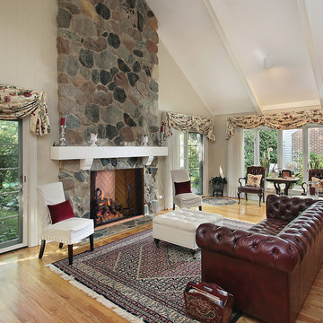
The Rapture B-Vent Gas Fireplace features the revolutionary Mosaic Masonry™ firebrick wall system that brings the realistic look of a true masonry fireplace to life. Combine that with the use of a unique fiber burner system and rustic oak logs to deliver tall dancing flames with a beautiful glowing ember bed and you create a cozy and inviting room for any home.
Aesthetics
Tall opening provides an exceptional view of the flame presentation.
Beautiful oak styled gas log set and hand forged andirons are included.
Real kiln-fired clay firebrick interior panels consist of split stacked or herringbone patterns in warm red and ivory colors.
Gas controls are conveniently located below the hearth for easy installation, finishing and operation.
Regal hand-forged andirons with heavy duty log grate.
Chain-mesh pull screen and a detailed hearth media kit complete the look.
Comfort
Powerful burner system produces impressive heat and tall, dancing flames with patented radiant heat technology.
Intermittent pilot ignition system with battery backup provides continued operation in the event of a power outage.
Fireplace operates with included remote control or wall switch for added convenience.
Outside combustion air kit available.
Performance
Fully insulated firebox for increased performance in colder climates.
Easy access damper control.
Uses either 8DM wood burning chimney or standard 8" b-vent (requires BTC-8 transition collar).
 Drury Design
THE SETUP
The original primary bathroom was characterized by a disjointed and segmented layout. The shower featured a bulky glass-block enclosure that overwhelmed the space visually. There was a considerable amount of open, unused space, and despite having a his and hers vanity, the arrangement lacked personal space for each user, as they shared the conjoined space between the sinks. The toilet was inconveniently located right by the door, with a half-wall partition meant to provide privacy but instead contributing to a cramped and unbalanced feel. Overall, the bathroom’s layout and design were fragmented, failing to make the most of the available space and lacking adequate storage solutions.
Design objectives:
- Reconfigure the layout to enhance functionality and flow.
- Create an elegant, upscale aesthetic that is light and bright.
- Incorporate specialized storage solutions for female hair care needs.
- Increase overall storage capacity.
- Develop a spa-like shower experience.
- Provide a significant wow factor to the space.
THE REMODEL
Design challenges to be solved:
- Repositioning the toilet to a more suitable location.
- Designing hair care storage solutions without cluttering the elegant space.
- Balancing an upscale, elegant design with a feminine touch in the color palette.
- Increasing the brightness of the room without adding windows.
- Completely replacing the existing shower to create a spa-like experience.
- Planning new storage solutions without adding bulkiness or clutter to the cabinetry.
THE RENEWED SPACE
Design solutions:
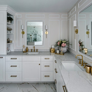
Toilet Relocation: Moved the toilet by the window, creating a better overall layout that also opened up two full walls for cabinetry and storage solutions.
Specialized Vanity Storage: The left side of the left vanity is the wife’s. Open shelves facing across the vanity can be used for decorative or daily needs items. Pull-out docking drawers with power outlets and metal basins handle hot hair appliances.
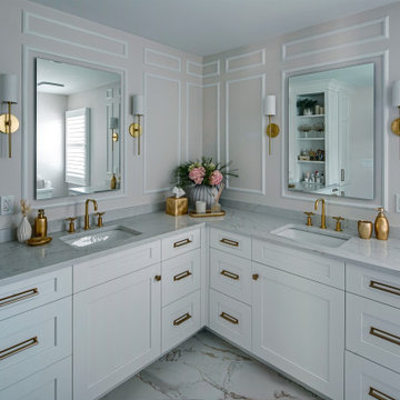
Bright and Elegant Color Scheme: White cabinets, countertops, floors, and shower walls keep the space bright. The just-off-white wall color with a hint of pink adds a feminine touch. Thin wainscoting with white trim offers traditional-leaning elegance.
Layered Lighting Strategy: Ceiling can lights, sconces, lighted mirrors, and toe-kick lighting were installed. Natural light-rated bulbs keep the space bright and natural-feeling.
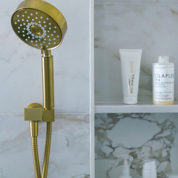
Spa-Like Shower: An extra-large shower was created using the same floor tile materials for continuity. Equipped with a Kohler Anthem system with a shower head, hand-held, and four body sprays. His and Hers niches for separate body care product storage.
Enhanced Storage Solutions: Added a linen cabinet within the vanity area for efficient storage of towels and bathroom essentials.
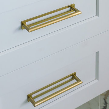
This elegant bathroom feels incredibly spacious now. The color palette and lights keep the room bright and cheery. Gold fixtures, the herringbone pattern on the floor, and exquisite trim work add an elegant touch. With the husband and wife having their own vanity wall sections joined at the corner, each user truly has their own space within the space. The clients are very happy with the final result.
 Drury Design
THE SETUP
The original primary bathroom was characterized by a disjointed and segmented layout. The shower featured a bulky glass-block enclosure that overwhelmed the space visually. There was a considerable amount of open, unused space, and despite having a his and hers vanity, the arrangement lacked personal space for each user, as they shared the conjoined space between the sinks. The toilet was inconveniently located right by the door, with a half-wall partition meant to provide privacy but instead contributing to a cramped and unbalanced feel. Overall, the bathroom’s layout and design were fragmented, failing to make the most of the available space and lacking adequate storage solutions.
Design objectives:
- Reconfigure the layout to enhance functionality and flow.
- Create an elegant, upscale aesthetic that is light and bright.
- Incorporate specialized storage solutions for female hair care needs.
- Increase overall storage capacity.
- Develop a spa-like shower experience.
- Provide a significant wow factor to the space.
THE REMODEL
Design challenges to be solved:
- Repositioning the toilet to a more suitable location.
- Designing hair care storage solutions without cluttering the elegant space.
- Balancing an upscale, elegant design with a feminine touch in the color palette.
- Increasing the brightness of the room without adding windows.
- Completely replacing the existing shower to create a spa-like experience.
- Planning new storage solutions without adding bulkiness or clutter to the cabinetry.
THE RENEWED SPACE
Design solutions:
Toilet Relocation: Moved the toilet by the window, creating a better overall layout that also opened up two full walls for cabinetry and storage solutions.
Specialized Vanity Storage: The left side of the left vanity is the wife’s. Open shelves facing across the vanity can be used for decorative or daily needs items. Pull-out docking drawers with power outlets and metal basins handle hot hair appliances.
Bright and Elegant Color Scheme: White cabinets, countertops, floors, and shower walls keep the space bright. The just-off-white wall color with a hint of pink adds a feminine touch. Thin wainscoting with white trim offers traditional-leaning elegance.
Layered Lighting Strategy: Ceiling can lights, sconces, lighted mirrors, and toe-kick lighting were installed. Natural light-rated bulbs keep the space bright and natural-feeling.
Spa-Like Shower: An extra-large shower was created using the same floor tile materials for continuity. Equipped with a Kohler Anthem system with a shower head, hand-held, and four body sprays. His and Hers niches for separate body care product storage.
Enhanced Storage Solutions: Added a linen cabinet within the vanity area for efficient storage of towels and bathroom essentials.
This elegant bathroom feels incredibly spacious now. The color palette and lights keep the room bright and cheery. Gold fixtures, the herringbone pattern on the floor, and exquisite trim work add an elegant touch. With the husband and wife having their own vanity wall sections joined at the corner, each user truly has their own space within the space. The clients are very happy with the final result.
 Drury Design
THE SETUP
The original primary bathroom was characterized by a disjointed and segmented layout. The shower featured a bulky glass-block enclosure that overwhelmed the space visually. There was a considerable amount of open, unused space, and despite having a his and hers vanity, the arrangement lacked personal space for each user, as they shared the conjoined space between the sinks. The toilet was inconveniently located right by the door, with a half-wall partition meant to provide privacy but instead contributing to a cramped and unbalanced feel. Overall, the bathroom’s layout and design were fragmented, failing to make the most of the available space and lacking adequate storage solutions.
Design objectives:
- Reconfigure the layout to enhance functionality and flow.
- Create an elegant, upscale aesthetic that is light and bright.
- Incorporate specialized storage solutions for female hair care needs.
- Increase overall storage capacity.
- Develop a spa-like shower experience.
- Provide a significant wow factor to the space.
THE REMODEL
Design challenges to be solved:
- Repositioning the toilet to a more suitable location.
- Designing hair care storage solutions without cluttering the elegant space.
- Balancing an upscale, elegant design with a feminine touch in the color palette.
- Increasing the brightness of the room without adding windows.
- Completely replacing the existing shower to create a spa-like experience.
- Planning new storage solutions without adding bulkiness or clutter to the cabinetry.
THE RENEWED SPACE
Design solutions:
Toilet Relocation: Moved the toilet by the window, creating a better overall layout that also opened up two full walls for cabinetry and storage solutions.
Specialized Vanity Storage: The left side of the left vanity is the wife’s. Open shelves facing across the vanity can be used for decorative or daily needs items. Pull-out docking drawers with power outlets and metal basins handle hot hair appliances.
Bright and Elegant Color Scheme: White cabinets, countertops, floors, and shower walls keep the space bright. The just-off-white wall color with a hint of pink adds a feminine touch. Thin wainscoting with white trim offers traditional-leaning elegance.
Layered Lighting Strategy: Ceiling can lights, sconces, lighted mirrors, and toe-kick lighting were installed. Natural light-rated bulbs keep the space bright and natural-feeling.
Spa-Like Shower: An extra-large shower was created using the same floor tile materials for continuity. Equipped with a Kohler Anthem system with a shower head, hand-held, and four body sprays. His and Hers niches for separate body care product storage.
Enhanced Storage Solutions: Added a linen cabinet within the vanity area for efficient storage of towels and bathroom essentials.
This elegant bathroom feels incredibly spacious now. The color palette and lights keep the room bright and cheery. Gold fixtures, the herringbone pattern on the floor, and exquisite trim work add an elegant touch. With the husband and wife having their own vanity wall sections joined at the corner, each user truly has their own space within the space. The clients are very happy with the final result.
 Drury Design
THE SETUP
The original primary bathroom was characterized by a disjointed and segmented layout. The shower featured a bulky glass-block enclosure that overwhelmed the space visually. There was a considerable amount of open, unused space, and despite having a his and hers vanity, the arrangement lacked personal space for each user, as they shared the conjoined space between the sinks. The toilet was inconveniently located right by the door, with a half-wall partition meant to provide privacy but instead contributing to a cramped and unbalanced feel. Overall, the bathroom’s layout and design were fragmented, failing to make the most of the available space and lacking adequate storage solutions.
Design objectives:
- Reconfigure the layout to enhance functionality and flow.
- Create an elegant, upscale aesthetic that is light and bright.
- Incorporate specialized storage solutions for female hair care needs.
- Increase overall storage capacity.
- Develop a spa-like shower experience.
- Provide a significant wow factor to the space.
THE REMODEL
Design challenges to be solved:
- Repositioning the toilet to a more suitable location.
- Designing hair care storage solutions without cluttering the elegant space.
- Balancing an upscale, elegant design with a feminine touch in the color palette.
- Increasing the brightness of the room without adding windows.
- Completely replacing the existing shower to create a spa-like experience.
- Planning new storage solutions without adding bulkiness or clutter to the cabinetry.
THE RENEWED SPACE
Design solutions:
Toilet Relocation: Moved the toilet by the window, creating a better overall layout that also opened up two full walls for cabinetry and storage solutions.
Specialized Vanity Storage: The left side of the left vanity is the wife’s. Open shelves facing across the vanity can be used for decorative or daily needs items. Pull-out docking drawers with power outlets and metal basins handle hot hair appliances.
Bright and Elegant Color Scheme: White cabinets, countertops, floors, and shower walls keep the space bright. The just-off-white wall color with a hint of pink adds a feminine touch. Thin wainscoting with white trim offers traditional-leaning elegance.
Layered Lighting Strategy: Ceiling can lights, sconces, lighted mirrors, and toe-kick lighting were installed. Natural light-rated bulbs keep the space bright and natural-feeling.
Spa-Like Shower: An extra-large shower was created using the same floor tile materials for continuity. Equipped with a Kohler Anthem system with a shower head, hand-held, and four body sprays. His and Hers niches for separate body care product storage.
Enhanced Storage Solutions: Added a linen cabinet within the vanity area for efficient storage of towels and bathroom essentials.
This elegant bathroom feels incredibly spacious now. The color palette and lights keep the room bright and cheery. Gold fixtures, the herringbone pattern on the floor, and exquisite trim work add an elegant touch. With the husband and wife having their own vanity wall sections joined at the corner, each user truly has their own space within the space. The clients are very happy with the final result.
 Drury Design
THE SETUP
The original primary bathroom was characterized by a disjointed and segmented layout. The shower featured a bulky glass-block enclosure that overwhelmed the space visually. There was a considerable amount of open, unused space, and despite having a his and hers vanity, the arrangement lacked personal space for each user, as they shared the conjoined space between the sinks. The toilet was inconveniently located right by the door, with a half-wall partition meant to provide privacy but instead contributing to a cramped and unbalanced feel. Overall, the bathroom’s layout and design were fragmented, failing to make the most of the available space and lacking adequate storage solutions.
Design objectives:
- Reconfigure the layout to enhance functionality and flow.
- Create an elegant, upscale aesthetic that is light and bright.
- Incorporate specialized storage solutions for female hair care needs.
- Increase overall storage capacity.
- Develop a spa-like shower experience.
- Provide a significant wow factor to the space.
THE REMODEL
Design challenges to be solved:
- Repositioning the toilet to a more suitable location.
- Designing hair care storage solutions without cluttering the elegant space.
- Balancing an upscale, elegant design with a feminine touch in the color palette.
- Increasing the brightness of the room without adding windows.
- Completely replacing the existing shower to create a spa-like experience.
- Planning new storage solutions without adding bulkiness or clutter to the cabinetry.
THE RENEWED SPACE
Design solutions:
Toilet Relocation: Moved the toilet by the window, creating a better overall layout that also opened up two full walls for cabinetry and storage solutions.
Specialized Vanity Storage: The left side of the left vanity is the wife’s. Open shelves facing across the vanity can be used for decorative or daily needs items. Pull-out docking drawers with power outlets and metal basins handle hot hair appliances.
Bright and Elegant Color Scheme: White cabinets, countertops, floors, and shower walls keep the space bright. The just-off-white wall color with a hint of pink adds a feminine touch. Thin wainscoting with white trim offers traditional-leaning elegance.
Layered Lighting Strategy: Ceiling can lights, sconces, lighted mirrors, and toe-kick lighting were installed. Natural light-rated bulbs keep the space bright and natural-feeling.
Spa-Like Shower: An extra-large shower was created using the same floor tile materials for continuity. Equipped with a Kohler Anthem system with a shower head, hand-held, and four body sprays. His and Hers niches for separate body care product storage.
Enhanced Storage Solutions: Added a linen cabinet within the vanity area for efficient storage of towels and bathroom essentials.
This elegant bathroom feels incredibly spacious now. The color palette and lights keep the room bright and cheery. Gold fixtures, the herringbone pattern on the floor, and exquisite trim work add an elegant touch. With the husband and wife having their own vanity wall sections joined at the corner, each user truly has their own space within the space. The clients are very happy with the final result.
 Drury Design
THE SETUP
The original primary bathroom was characterized by a disjointed and segmented layout. The shower featured a bulky glass-block enclosure that overwhelmed the space visually. There was a considerable amount of open, unused space, and despite having a his and hers vanity, the arrangement lacked personal space for each user, as they shared the conjoined space between the sinks. The toilet was inconveniently located right by the door, with a half-wall partition meant to provide privacy but instead contributing to a cramped and unbalanced feel. Overall, the bathroom’s layout and design were fragmented, failing to make the most of the available space and lacking adequate storage solutions.
Design objectives:
- Reconfigure the layout to enhance functionality and flow.
- Create an elegant, upscale aesthetic that is light and bright.
- Incorporate specialized storage solutions for female hair care needs.
- Increase overall storage capacity.
- Develop a spa-like shower experience.
- Provide a significant wow factor to the space.
THE REMODEL
Design challenges to be solved:
- Repositioning the toilet to a more suitable location.
- Designing hair care storage solutions without cluttering the elegant space.
- Balancing an upscale, elegant design with a feminine touch in the color palette.
- Increasing the brightness of the room without adding windows.
- Completely replacing the existing shower to create a spa-like experience.
- Planning new storage solutions without adding bulkiness or clutter to the cabinetry.
THE RENEWED SPACE
Design solutions:
Toilet Relocation: Moved the toilet by the window, creating a better overall layout that also opened up two full walls for cabinetry and storage solutions.
Specialized Vanity Storage: The left side of the left vanity is the wife’s. Open shelves facing across the vanity can be used for decorative or daily needs items. Pull-out docking drawers with power outlets and metal basins handle hot hair appliances.
Bright and Elegant Color Scheme: White cabinets, countertops, floors, and shower walls keep the space bright. The just-off-white wall color with a hint of pink adds a feminine touch. Thin wainscoting with white trim offers traditional-leaning elegance.
Layered Lighting Strategy: Ceiling can lights, sconces, lighted mirrors, and toe-kick lighting were installed. Natural light-rated bulbs keep the space bright and natural-feeling.
Spa-Like Shower: An extra-large shower was created using the same floor tile materials for continuity. Equipped with a Kohler Anthem system with a shower head, hand-held, and four body sprays. His and Hers niches for separate body care product storage.
Enhanced Storage Solutions: Added a linen cabinet within the vanity area for efficient storage of towels and bathroom essentials.
This elegant bathroom feels incredibly spacious now. The color palette and lights keep the room bright and cheery. Gold fixtures, the herringbone pattern on the floor, and exquisite trim work add an elegant touch. With the husband and wife having their own vanity wall sections joined at the corner, each user truly has their own space within the space. The clients are very happy with the final result.
 Drury Design
THE SETUP
The original primary bathroom was characterized by a disjointed and segmented layout. The shower featured a bulky glass-block enclosure that overwhelmed the space visually. There was a considerable amount of open, unused space, and despite having a his and hers vanity, the arrangement lacked personal space for each user, as they shared the conjoined space between the sinks. The toilet was inconveniently located right by the door, with a half-wall partition meant to provide privacy but instead contributing to a cramped and unbalanced feel. Overall, the bathroom’s layout and design were fragmented, failing to make the most of the available space and lacking adequate storage solutions.
Design objectives:
- Reconfigure the layout to enhance functionality and flow.
- Create an elegant, upscale aesthetic that is light and bright.
- Incorporate specialized storage solutions for female hair care needs.
- Increase overall storage capacity.
- Develop a spa-like shower experience.
- Provide a significant wow factor to the space.
THE REMODEL
Design challenges to be solved:
- Repositioning the toilet to a more suitable location.
- Designing hair care storage solutions without cluttering the elegant space.
- Balancing an upscale, elegant design with a feminine touch in the color palette.
- Increasing the brightness of the room without adding windows.
- Completely replacing the existing shower to create a spa-like experience.
- Planning new storage solutions without adding bulkiness or clutter to the cabinetry.
THE RENEWED SPACE
Design solutions:
Toilet Relocation: Moved the toilet by the window, creating a better overall layout that also opened up two full walls for cabinetry and storage solutions.
Specialized Vanity Storage: The left side of the left vanity is the wife’s. Open shelves facing across the vanity can be used for decorative or daily needs items. Pull-out docking drawers with power outlets and metal basins handle hot hair appliances.
Bright and Elegant Color Scheme: White cabinets, countertops, floors, and shower walls keep the space bright. The just-off-white wall color with a hint of pink adds a feminine touch. Thin wainscoting with white trim offers traditional-leaning elegance.
Layered Lighting Strategy: Ceiling can lights, sconces, lighted mirrors, and toe-kick lighting were installed. Natural light-rated bulbs keep the space bright and natural-feeling.
Spa-Like Shower: An extra-large shower was created using the same floor tile materials for continuity. Equipped with a Kohler Anthem system with a shower head, hand-held, and four body sprays. His and Hers niches for separate body care product storage.
Enhanced Storage Solutions: Added a linen cabinet within the vanity area for efficient storage of towels and bathroom essentials.
This elegant bathroom feels incredibly spacious now. The color palette and lights keep the room bright and cheery. Gold fixtures, the herringbone pattern on the floor, and exquisite trim work add an elegant touch. With the husband and wife having their own vanity wall sections joined at the corner, each user truly has their own space within the space. The clients are very happy with the final result.
 Chapman Design Group, Inc.
Mark Hoyle
Originally, this 3700 SF two level eclectic farmhouse from the mid 1980’s underwent design changes to reflect a more colonial style. Now, after being completely renovated with additional 2800 SF living space, it’s combined total of 6500 SF boasts an Energy Star certification of 5 stars.
Approaching this completed home, you will meander along a new driveway through the dense buffer of trees until you reach the clearing, and then circle a tiered fountain on axis with the front entry accentuating the symmetrical main structure. Many of the exterior changes included enclosing the front porch and rear screened porch, replacing windows, replacing all the vinyl siding with and fiber cement siding, creating a new front stoop with winding brick stairs and wrought iron railings as will as other additions to the left and rear of the home.
The existing interior was completely fro the studs and included modifying uses of many of the existing rooms such as converting the original dining room into an oval shaped theater with reclining theater seats, fiber-optic starlight ceiling and an 80” television with built-in surround sound. The laundry room increased in size by taking in the porch and received all new cabinets and finishes. The screened porch across the back of the house was enclosed to create a new dining room, enlarged the kitchen, all of which allows for a commanding view of the beautifully landscaped pool. The upper master suite begins by entering a private office then leads to a newly vaulted bedroom, a new master bathroom with natural light and an enlarged closet.
The major portion of the addition space was added to the left side as a part time home for the owner’s brother. This new addition boasts an open plan living, dining and kitchen, a master suite with a luxurious bathroom and walk–in closet, a guest suite, a garage and its own private gated brick courtyard entry and direct access to the well appointed pool patio.
And finally the last part of the project is the sunroom and new lagoon style pool. Tucked tightly against the rear of the home. This room was created to feel like a gazebo including a metal roof and stained wood ceiling, the foundation of this room was constructed with the pool to insure the look as if it is floating on the water. The pool’s negative edge opposite side allows open views of the trees beyond. There is a natural stone waterfall on one side of the pool and a shallow area on the opposite side for lounge chairs to be placed in it along with a hot tub that spills into the pool. The coping completes the pool’s natural shape and continues to the patio utilizing the same stone but separated by Zoysia grass keeping the natural theme. The finishing touches to this backyard oasis is completed utilizing large boulders, Tempest Torches, architectural lighting and abundant variety of landscaping complete the oasis for all to enjoy.
 Envision Web
Stuart Wade, Envision Virtual Tours
The second-largest and most developed of Georgia's barrier islands, St. Simons is approximately twelve miles long and nearly three miles wide at its widest stretch (roughly the size of Manhattan Island in New York). The island is located in Glynn County on Georgia's coast and lies east of Brunswick (the seat of Glynn County), south of Little St. Simons Island and the Hampton River, and north of Jekyll Island. The resort community of Sea Island is separated from St. Simons on the east by the Black Banks River. Known for its oak tree canopies and historic landmarks, St. Simons is both a tourist destination and, according to the 2010 U.S. census, home to 12,743 residents.
Early History
The earliest
St. Simons Island Village
record of human habitation on the island dates to the Late Archaic Period, about 5,000 to 3,000 years ago. Remnants of shell rings left behind by Native Americans from this era survive on many of the barrier islands, including St. Simons. Centuries later, during the period known by historians as the chiefdom era, the Guale Indians established a chiefdom centered on St. Catherines Island and used St. Simons as their hunting and fishing grounds. By 1500 the Guale had established a permanent village of about 200 people on St. Simons, which they called Guadalquini.
Beginning in 1568, the Spanish attempted to create missions along the Georgia coast. Catholic missions were the primary means by which Georgia's indigenous Native American chiefdoms were assimilated into the Spanish colonial system along the northern frontier of greater Spanish Florida. In the 1600s St. Simons became home to two Spanish missions: San Buenaventura de Guadalquini, on the southern tip of the island, and Santo Domingo de Asao (or Asajo), on the northern tip. Located on the inland side of the island were the pagan refugee villages of San Simón, the island's namesake, and Ocotonico. In 1684 pirate raids left the missions and villages largely abandoned.
Colonial History
As
Fort Frederica
early as 1670, with Great Britain's establishment of the colony of Carolina and its expansion into Georgia territory, Spanish rule was threatened by the English. The Georgia coast was considered "debatable land" by England and Spain, even though Spain had fully retreated from St. Simons by 1702. Thirty-one years later General James Edward Oglethorpe founded the English settlement of Savannah. In 1736 he established Fort Frederica, named after the heir to the British throne, Frederick Louis, prince of Wales, on the west side of St. Simons Island to protect Savannah and the Carolinas from the Spanish threat.
Between 1736 and 1749 Fort Frederica was the hub of British military operations along the Georgia frontier. A town of the same name grew up around the fort and was of great importance to the new colony. By 1740 Frederica's population was 1,000. In 1736 the congregation of what would become Christ Church was organized within Fort Frederica as a mission of the Church of England. Charles Wesley led the first services. In 1742 Britain's decisive victory over Spain in the Battle of Bloody Marsh, during the War of Jenkins' Ear, ended the Spanish threat to the Georgia coast. When the British regimen disbanded in 1749, most of the townspeople relocated to the mainland. Fort Frederica went into decline and, except for a short time of prosperity during the 1760s and 1770s under the leadership of merchant James Spalding, never fully recovered. Today the historic citadel's tabby ruins are maintained by the National Park Service.
Plantation Era
By the start of the American Revolution (1775-83), Fort Frederica was obsolete, and St. Simons was left largely uninhabited as most of its residents joined the patriot army. Besides hosting a small Georgia naval victory on the Fort Frederica River, providing guns from its famous fort for use at Fort Morris in Sunbury, and serving as an arena for pillaging by privateers and British soldiers, the island played almost no role in the war.
Following the war, many of the townspeople, their businesses destroyed, turned to agriculture. The island was transformed into fourteen cotton plantations after acres of live oak trees were cleared for farm land and used for building American warships, including the famous USS Constitution, or "Old Ironsides." Although rice was the predominant crop along the neighboring Altamaha River, St. Simons was known for its production of long-staple cotton, which soon came to be known as Sea Island cotton.
Between
Ebos Landing
the 1780s and the outbreak of the Civil War (1861-65), St. Simons's plantation culture flourished. The saline atmosphere and the availability of cheap slave labor proved an ideal combination for the cultivation of Sea Island cotton. In 1803 a group of Ebo slaves who survived the Middle Passage and arrived on the west side of St. Simons staged a rebellion and drowned themselves. The sacred site is known today as Ebos Landing.
One of the largest owners of land and slaves on St. Simons was Pierce Butler, master of Hampton Point Plantation, located on the northern end of the island. By 1793 Butler owned more than 500 slaves, who cultivated 800 acres of cotton on St. Simons and 300 acres of rice on Butler's Island in the Altamaha River delta. Butler's grandson, Pierce Mease Butler, who at the age of sixteen inherited a share of his grandfather's estate in 1826, was responsible for the largest sale of human beings in the history of the United States: in 1859, to restore his squandered fortune, he sold 429 slaves in Savannah for more than $300,000. The British actress and writer Fanny Kemble, whose tumultuous marriage to Pierce ended in divorce in 1849, published an eyewitness account of the evils of slavery on St. Simons in her book Journal of a Residence on a Georgian Plantation in 1838-1839 (1863).
Another
Retreat Plantation
large owner of land and slaves on St. Simons was Major William Page, a friend and employee of Pierce Butler Sr. Before purchasing Retreat Plantation on the southwestern tip of the island in 1804, Page managed the Hampton plantation and Butler's Island. Upon Page's death in 1827, Thomas Butler King inherited the land together with his wife, Page's daughter, Anna Matilda Page King. King expanded his father-in-law's planting empire on St. Simons as well as on the mainland, and by 1835 Retreat Plantation alone was home to as many as 355 slaves.
The center of life during the island's plantation era was Christ Church, Frederica. Organized in 1807 by a group of island planters, the Episcopal church is the second oldest in the Diocese of Georgia. Embargoes imposed by the War of 1812 (1812-15) prevented the parishioners from building a church structure, so they worshiped in the home of John Beck, which stood on the site of Oglethorpe's only St. Simons residence, Orange Hall.
The first Christ Church building, finished on the present site in 1820, was ruined by occupying Union troops during the Civil War. In 1884 the Reverend Anson Dodge Jr. rebuilt the church as a memorial to his first wife, Ellen. The cruciform building with a trussed gothic roof and stained-glass windows remains active today as Christ Church.
Civil War and Beyond
The
St. Simons Island Lighthouse
outbreak of the Civil War in 1861 put a sudden end to St. Simons's lucrative plantation era. In January of that year, Confederate troops were stationed at the south end of the island to guard the entrance to Brunswick Harbor. Slaves from Retreat Plantation, owned by Thomas Butler King, built earthworks and batteries. Plantation residents were scattered—the men joined the Confederate army and their families moved to the mainland. Cannon fire was heard on the island in December 1861, and Confederate troops retreated in February 1862, after dynamiting the lighthouse to keep its beacon from aiding Union troops. Soon thereafter, Union troops occupied the island, which was used as a camp for freed slaves. By August 1862 more than 500 former slaves lived on St. Simons, including Susie King Taylor, who organized a school for freed slave children. But in November the ex-slaves were taken to Hilton Head, South Carolina, and Fernandina, Florida, leaving the island abandoned.
After the Civil War the island never returned to its status as an agricultural community. The plantations lay dormant because there were no slaves to work the fields. After Union general William T. Sherman's January 1865 Special Field Order No. 15 —a demand that former plantations be divided and distributed to former slaves—was overturned by U.S. president Andrew Johnson less than a year later, freedmen and women were forced to work as sharecroppers on the small farms that dotted the land previously occupied by the sprawling plantations.
By
St. Simons Lumber Mills
1870 real economic recovery began with the reestablishment of the timber industry. Norman Dodge and Titus G. Meigs of New York set up lumber mill operations at Gascoigne Bluff, formerly Hamilton Plantation. The lumber mills provided welcome employment for both blacks and whites and also provided mail and passenger boats to the mainland. Such water traffic, together with the construction of a new lighthouse in 1872, designed by architect Charles B. Cluskey, marked the beginning of St. Simons's tourism industry. The keeper of the lighthouse created a small amusement park, which drew many visitors, as did the seemingly miraculous light that traveled from the top of the lighthouse tower to the bottom. The island became a summer retreat for families from the mainland, particularly from Baxley, Brunswick, and Waycross.
The island's resort industry was thriving by the 1880s. Beachfront structures, such as a new pier and grand hotel, were built on the southeastern end of the island and could be accessed by ferry. Around this time wealthy northerners began vacationing on the island.
Twentieth Century
The
St. Simons Island Pier and Village
opening in 1924 of the Brunswick–St. Simons Highway, today known as the Torras Causeway, was a milestone in the development of resorts in the area. St. Simons's beaches were now easily accessible to locals and tourists alike. More than 5,000 automobiles took the short drive from Brunswick to St. Simons via the causeway on its opening day, paving the way for convenient residential and resort development.
In 1926 automotive pioneer Howard Coffin of Detroit, Michigan, bought large tracts of land on St. Simons, including the former Retreat Plantation, and constructed a golf course, yacht club, paved roads, and a residential subdivision. Although the causeway had brought large numbers of summer people to the island, St. Simons remained a small community with only a few hundred permanent residents until the 1940s.
The
St. Simons Island
outbreak of World War II (1941-45) brought more visitors and residents to St. Simons. Troops stationed at Jacksonville, Florida; Savannah; and nearby Camp Stewart took weekend vacations on the island, and a new naval air base and radar school became home to even more officers and soldiers. The increased wartime population brought the island its first public school. With a major shipyard for the production of Liberty ships in nearby Brunswick, the waters of St. Simons became active with German U-boats. In April 1942, just off the coast, the Texas Company oil tanker S. S. Oklahoma and the S. S. Esso Baton Rouge were torpedoed by the Germans, bringing the war very close to home for island residents.
Due in large part to the military's improvement of the island's infrastructure during the war, development on the island boomed in the 1950s and 1960s. More permanent homes and subdivisions were built, and the island was no longer just a summer resort but also a thriving community. In 1950 the Methodist conference and retreat center Epworth by the Sea opened on Gascoigne Bluff. In 1961 novelist Eugenia Price visited St. Simons and began work on her first works of fiction, known as the St. Simons Trilogy. Inspired by real events on the island, Price's trilogy renewed interest in the history of Georgia's coast, and the novelist herself relocated to the island in 1965 and lived there for thirty-one years. St. Simons is also home to contemporary Georgia writer Tina McElroy Ansa.
Since
Epworth by the Sea
1980 St. Simons's population has doubled. The island's continued status as a vacation destination and its ongoing development boom have put historic landmarks and natural areas at risk. While such landmarks as the Fort Frederica ruins and the Battle of Bloody Marsh site are preserved and maintained by the National Park Service, and while the historic lighthouse is maintained by the Coastal Georgia Historical Society, historic Ebos Landing has been taken over by a sewage treatment plant.
Several coastal organizations have formed in recent years to save natural areas on the island. The St. Simons Land Trust, for example, has received donations of large tracts of land and plans to protect property in the island's three traditional African American neighborhoods. Despite its rapid growth and development, St. Simons remains one of the most beautiful and important islands on the Georgia coast.
 Kitchen & Floor Concepts
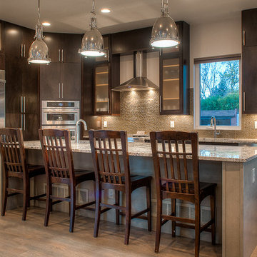
Canyon Creek Cabinetry. Cabinets and countertops done by Kitchen and Floor concepts.
Eat-in kitchen - mid-sized transitional l-shaped light wood floor and beige floor eat-in kitchen idea in Denver with an undermount sink, flat-panel cabinets, dark wood cabinets, granite countertops, beige backsplash, stone tile backsplash, stainless steel appliances and an island
Eat-in kitchen - mid-sized transitional l-shaped light wood floor and beige floor eat-in kitchen idea in Denver with an undermount sink, flat-panel cabinets, dark wood cabinets, granite countertops, beige backsplash, stone tile backsplash, stainless steel appliances and an island
 Glenview Haus – Custom Doors & Wine Cellars
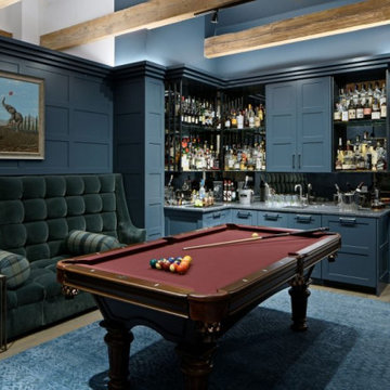
On this ultra-custom pool hall design, we had the pleasure of working with Lonnie Unger, currently with Stones Throw Interiors. Our team worked closely with Lonnie to come up with the custom design for the wall paneling, custom cabinetry, as well as the wine cellar door. This project allowed us to showcase our many different design skills and expertise. Our collaborative design work created this beautiful speak-easy style pool room and lounge. From sleek and classic shaker style paneling, to dramatic 3-step crown molding, this project makes a theatrical statement that is sure to impress all guests.
Custom Design Application
A modern design element that we utilized, was carrying over the wall paneling design to the cabinetry. This design element creates a continuous appearance that ties together the entire room, making the pool table and accessories stand out. The same paint for the walls and cabinets was also used for the custom wine cellar door. One special feature that is important to notice, is the wood threshold at the bottom of the wine cellar door. This piece is crucial for maintaining a temperature-controlled wine cellar. Without this piece, there would be a dramatic increase in temperature within the wine cellar. Wine cellars are recommended to be kept at a strict 55 degrees to ensure wine preservation. The threshold stops the air from escaping.
Collaboration with Designers
With a showroom in River North, Chicago, we pride ourselves on being in the middle of the River North Design District. We are lucky to have the opportunity to collaborate with top Designers and Professional Individuals in Downtown Chicago. We cherish our connections and are always pleased to combine efforts to create a beautiful outcome. Working together on projects in high rises, or in single family homes, we can provide a solution for any request.
 Klopf Architecture
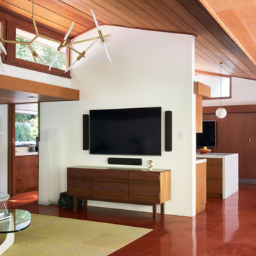
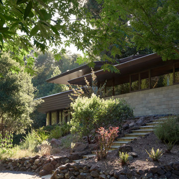
Nestled in the hills of Orinda, California, this 1951 residence is one of only seven extant homes, now known as “The Magnificent Seven”, designed by architect Olof Dahlstrand, a protégé of Frank Lloyd Wright. With its low-slung rooflines, natural materials, and deep integration with the sloping landscape, the home is a pristine example of mid-century modern design inspired by Wright’s organic principles. Over the years, prior homeowners have emphasized preservation, ensuring that the house remained relatively untouched. Each owner has respected the original architecture and stayed true to Dahlstrand’s intent. When a family of five—two college-aged sons and a middle school-aged daughter—acquired the property, they were captivated by its history, legacy of care, and architectural significance. While they appreciated Dahlstrand’s original vision, they also recognized the need to adapt the home for contemporary living while preserving its design integrity.
The remodel was conceived as a thoughtful response to the past—an effort to bring the house into the 21st century without compromising its soul. The primary mandate was to maintain architectural continuity while improving the functionality, comfort, and livability for a modern family. The design team—architects and contractor alike—worked with a shared reverence for the original architecture, allowing that mindset to guide even the most technical or pragmatic decisions.
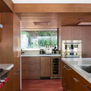
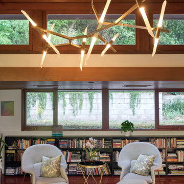
A key objective was to increase natural light in the kitchen—a departure from Wrightian principles of enclosed, intimate cooking spaces—while maintaining the home’s architectural language. The kitchen was reconfigured to foster a stronger connection to adjacent living spaces while retaining the underlying concept of spatial separation. One of the most transformative architectural changes was the removal of a ridge beam that was originally planned to remain visible through the kitchen. During construction, the team collaborated on a better solution: a wide-flanged steel beam concealed within the roof envelope. This subtle move preserved the clean lines and ceiling continuity, a modern update carried out with utmost respect for the existing framework.
The home’s original powder room, previously accessible only through the kitchen, was relocated for better flow and privacy. A new powder room was carved out of former kitchen cabinetry—a narrow, interior space that could have felt dark and enclosed. To avoid this, the design extended the line of original transom windows into the new powder room and added a skylight above the vanity. The result is a bright and airy space that feels consistent with the rest of the home. Other updates included the installation of new solid-core interior doors with veneers carefully matched to the original mahogany, enhancing the continuity of the interiors. Even smaller decisions, such as placing the door knobs at 42 inches high, mirrored the original proportions. Every choice reflected a shared belief between the architect, contractor, and client: that new work should serve the integrity of the old.
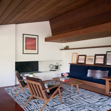
The home’s extensive interior redwood millwork and paneling was meticulously restored. Where new materials were introduced—such as the replacement redwood soffit paneling—the contractor took pains to find finish nails that matched the original, rather than using modern equivalents. This level of craftsmanship and collaboration defined the project. It extended even to the detailing of a blind door to the new powder room, which had to disappear into the existing redwood board-and-batten wall. It was a team effort: the owner found a suitable handle, the architects devised the custom in-swing mechanism, and the contractor executed it so the door aligned precisely with the battens. Throughout, the homeowners were deeply engaged in the design process. One, a meticulous design enthusiast, focused on aesthetic integrity and historic detail. The other brought a practical and function-driven perspective, ensuring that new fixtures and materials would be durable and require minimal maintenance.
While the home’s location posed no major site challenges, sustainability was a key concern. The team upgraded the roof insulation, installed solar panels with battery storage, and added ductless mini-split cooling systems. Lighting was another area where modern technology was woven into a historic framework: new square LED fixtures echo the original custom perimeter soffit lights, maintaining the design language while offering advanced performance.
A planned expansion of a bedroom into suite with a bathroom had to be shelved due to budget constraints and the high cost of below-grade foundation work. Still, the team focused their efforts on making the most of the existing footprint, resolving constraints through design ingenuity rather than adding square footage. This renovation represents a collaborative achievement in preserving and evolving a historically significant home. Every decision was shaped by a shared ethos among clients, architects, and contractor: to maintain the home’s architectural soul while updating it for contemporary life. The result is a timeless modernist residence that continues Olof Dahlstrand’s legacy, remaining grounded in nature, craftsmanship, and human-scale design.
Klopf Architecture Team: John Klopf, AIA, Klara Kevane, Fernanda Bernardes
Interior Architectural Design: Klopf Architecture
Structural Engineer: Daniel Bastiao
Contractor: Don Larwood, Larwood Construction
Photography: Mariko Reed
Year Completed: 2022
 Klopf Architecture
Nestled in the hills of Orinda, California, this 1951 residence is one of only seven extant homes, now known as “The Magnificent Seven”, designed by architect Olof Dahlstrand, a protégé of Frank Lloyd Wright. With its low-slung rooflines, natural materials, and deep integration with the sloping landscape, the home is a pristine example of mid-century modern design inspired by Wright’s organic principles. Over the years, prior homeowners have emphasized preservation, ensuring that the house remained relatively untouched. Each owner has respected the original architecture and stayed true to Dahlstrand’s intent. When a family of five—two college-aged sons and a middle school-aged daughter—acquired the property, they were captivated by its history, legacy of care, and architectural significance. While they appreciated Dahlstrand’s original vision, they also recognized the need to adapt the home for contemporary living while preserving its design integrity.
The remodel was conceived as a thoughtful response to the past—an effort to bring the house into the 21st century without compromising its soul. The primary mandate was to maintain architectural continuity while improving the functionality, comfort, and livability for a modern family. The design team—architects and contractor alike—worked with a shared reverence for the original architecture, allowing that mindset to guide even the most technical or pragmatic decisions.
A key objective was to increase natural light in the kitchen—a departure from Wrightian principles of enclosed, intimate cooking spaces—while maintaining the home’s architectural language. The kitchen was reconfigured to foster a stronger connection to adjacent living spaces while retaining the underlying concept of spatial separation. One of the most transformative architectural changes was the removal of a ridge beam that was originally planned to remain visible through the kitchen. During construction, the team collaborated on a better solution: a wide-flanged steel beam concealed within the roof envelope. This subtle move preserved the clean lines and ceiling continuity, a modern update carried out with utmost respect for the existing framework.
The home’s original powder room, previously accessible only through the kitchen, was relocated for better flow and privacy. A new powder room was carved out of former kitchen cabinetry—a narrow, interior space that could have felt dark and enclosed. To avoid this, the design extended the line of original transom windows into the new powder room and added a skylight above the vanity. The result is a bright and airy space that feels consistent with the rest of the home. Other updates included the installation of new solid-core interior doors with veneers carefully matched to the original mahogany, enhancing the continuity of the interiors. Even smaller decisions, such as placing the door knobs at 42 inches high, mirrored the original proportions. Every choice reflected a shared belief between the architect, contractor, and client: that new work should serve the integrity of the old.
The home’s extensive interior redwood millwork and paneling was meticulously restored. Where new materials were introduced—such as the replacement redwood soffit paneling—the contractor took pains to find finish nails that matched the original, rather than using modern equivalents. This level of craftsmanship and collaboration defined the project. It extended even to the detailing of a blind door to the new powder room, which had to disappear into the existing redwood board-and-batten wall. It was a team effort: the owner found a suitable handle, the architects devised the custom in-swing mechanism, and the contractor executed it so the door aligned precisely with the battens. Throughout, the homeowners were deeply engaged in the design process. One, a meticulous design enthusiast, focused on aesthetic integrity and historic detail. The other brought a practical and function-driven perspective, ensuring that new fixtures and materials would be durable and require minimal maintenance.
While the home’s location posed no major site challenges, sustainability was a key concern. The team upgraded the roof insulation, installed solar panels with battery storage, and added ductless mini-split cooling systems. Lighting was another area where modern technology was woven into a historic framework: new square LED fixtures echo the original custom perimeter soffit lights, maintaining the design language while offering advanced performance.
A planned expansion of a bedroom into suite with a bathroom had to be shelved due to budget constraints and the high cost of below-grade foundation work. Still, the team focused their efforts on making the most of the existing footprint, resolving constraints through design ingenuity rather than adding square footage. This renovation represents a collaborative achievement in preserving and evolving a historically significant home. Every decision was shaped by a shared ethos among clients, architects, and contractor: to maintain the home’s architectural soul while updating it for contemporary life. The result is a timeless modernist residence that continues Olof Dahlstrand’s legacy, remaining grounded in nature, craftsmanship, and human-scale design.
Klopf Architecture Team: John Klopf, AIA, Klara Kevane, Fernanda Bernardes
Interior Architectural Design: Klopf Architecture
Structural Engineer: Daniel Bastiao
Contractor: Don Larwood, Larwood Construction
Photography: Mariko Reed
Year Completed: 2022
 Klopf Architecture
Nestled in the hills of Orinda, California, this 1951 residence is one of only seven extant homes, now known as “The Magnificent Seven”, designed by architect Olof Dahlstrand, a protégé of Frank Lloyd Wright. With its low-slung rooflines, natural materials, and deep integration with the sloping landscape, the home is a pristine example of mid-century modern design inspired by Wright’s organic principles. Over the years, prior homeowners have emphasized preservation, ensuring that the house remained relatively untouched. Each owner has respected the original architecture and stayed true to Dahlstrand’s intent. When a family of five—two college-aged sons and a middle school-aged daughter—acquired the property, they were captivated by its history, legacy of care, and architectural significance. While they appreciated Dahlstrand’s original vision, they also recognized the need to adapt the home for contemporary living while preserving its design integrity.
The remodel was conceived as a thoughtful response to the past—an effort to bring the house into the 21st century without compromising its soul. The primary mandate was to maintain architectural continuity while improving the functionality, comfort, and livability for a modern family. The design team—architects and contractor alike—worked with a shared reverence for the original architecture, allowing that mindset to guide even the most technical or pragmatic decisions.
A key objective was to increase natural light in the kitchen—a departure from Wrightian principles of enclosed, intimate cooking spaces—while maintaining the home’s architectural language. The kitchen was reconfigured to foster a stronger connection to adjacent living spaces while retaining the underlying concept of spatial separation. One of the most transformative architectural changes was the removal of a ridge beam that was originally planned to remain visible through the kitchen. During construction, the team collaborated on a better solution: a wide-flanged steel beam concealed within the roof envelope. This subtle move preserved the clean lines and ceiling continuity, a modern update carried out with utmost respect for the existing framework.
The home’s original powder room, previously accessible only through the kitchen, was relocated for better flow and privacy. A new powder room was carved out of former kitchen cabinetry—a narrow, interior space that could have felt dark and enclosed. To avoid this, the design extended the line of original transom windows into the new powder room and added a skylight above the vanity. The result is a bright and airy space that feels consistent with the rest of the home. Other updates included the installation of new solid-core interior doors with veneers carefully matched to the original mahogany, enhancing the continuity of the interiors. Even smaller decisions, such as placing the door knobs at 42 inches high, mirrored the original proportions. Every choice reflected a shared belief between the architect, contractor, and client: that new work should serve the integrity of the old.
The home’s extensive interior redwood millwork and paneling was meticulously restored. Where new materials were introduced—such as the replacement redwood soffit paneling—the contractor took pains to find finish nails that matched the original, rather than using modern equivalents. This level of craftsmanship and collaboration defined the project. It extended even to the detailing of a blind door to the new powder room, which had to disappear into the existing redwood board-and-batten wall. It was a team effort: the owner found a suitable handle, the architects devised the custom in-swing mechanism, and the contractor executed it so the door aligned precisely with the battens. Throughout, the homeowners were deeply engaged in the design process. One, a meticulous design enthusiast, focused on aesthetic integrity and historic detail. The other brought a practical and function-driven perspective, ensuring that new fixtures and materials would be durable and require minimal maintenance.
While the home’s location posed no major site challenges, sustainability was a key concern. The team upgraded the roof insulation, installed solar panels with battery storage, and added ductless mini-split cooling systems. Lighting was another area where modern technology was woven into a historic framework: new square LED fixtures echo the original custom perimeter soffit lights, maintaining the design language while offering advanced performance.
A planned expansion of a bedroom into suite with a bathroom had to be shelved due to budget constraints and the high cost of below-grade foundation work. Still, the team focused their efforts on making the most of the existing footprint, resolving constraints through design ingenuity rather than adding square footage. This renovation represents a collaborative achievement in preserving and evolving a historically significant home. Every decision was shaped by a shared ethos among clients, architects, and contractor: to maintain the home’s architectural soul while updating it for contemporary life. The result is a timeless modernist residence that continues Olof Dahlstrand’s legacy, remaining grounded in nature, craftsmanship, and human-scale design.
Klopf Architecture Team: John Klopf, AIA, Klara Kevane, Fernanda Bernardes
Interior Architectural Design: Klopf Architecture
Structural Engineer: Daniel Bastiao
Contractor: Don Larwood, Larwood Construction
Photography: Mariko Reed
Year Completed: 2022
 Klopf Architecture
Nestled in the hills of Orinda, California, this 1951 residence is one of only seven extant homes, now known as “The Magnificent Seven”, designed by architect Olof Dahlstrand, a protégé of Frank Lloyd Wright. With its low-slung rooflines, natural materials, and deep integration with the sloping landscape, the home is a pristine example of mid-century modern design inspired by Wright’s organic principles. Over the years, prior homeowners have emphasized preservation, ensuring that the house remained relatively untouched. Each owner has respected the original architecture and stayed true to Dahlstrand’s intent. When a family of five—two college-aged sons and a middle school-aged daughter—acquired the property, they were captivated by its history, legacy of care, and architectural significance. While they appreciated Dahlstrand’s original vision, they also recognized the need to adapt the home for contemporary living while preserving its design integrity.
The remodel was conceived as a thoughtful response to the past—an effort to bring the house into the 21st century without compromising its soul. The primary mandate was to maintain architectural continuity while improving the functionality, comfort, and livability for a modern family. The design team—architects and contractor alike—worked with a shared reverence for the original architecture, allowing that mindset to guide even the most technical or pragmatic decisions.
A key objective was to increase natural light in the kitchen—a departure from Wrightian principles of enclosed, intimate cooking spaces—while maintaining the home’s architectural language. The kitchen was reconfigured to foster a stronger connection to adjacent living spaces while retaining the underlying concept of spatial separation. One of the most transformative architectural changes was the removal of a ridge beam that was originally planned to remain visible through the kitchen. During construction, the team collaborated on a better solution: a wide-flanged steel beam concealed within the roof envelope. This subtle move preserved the clean lines and ceiling continuity, a modern update carried out with utmost respect for the existing framework.
The home’s original powder room, previously accessible only through the kitchen, was relocated for better flow and privacy. A new powder room was carved out of former kitchen cabinetry—a narrow, interior space that could have felt dark and enclosed. To avoid this, the design extended the line of original transom windows into the new powder room and added a skylight above the vanity. The result is a bright and airy space that feels consistent with the rest of the home. Other updates included the installation of new solid-core interior doors with veneers carefully matched to the original mahogany, enhancing the continuity of the interiors. Even smaller decisions, such as placing the door knobs at 42 inches high, mirrored the original proportions. Every choice reflected a shared belief between the architect, contractor, and client: that new work should serve the integrity of the old.
The home’s extensive interior redwood millwork and paneling was meticulously restored. Where new materials were introduced—such as the replacement redwood soffit paneling—the contractor took pains to find finish nails that matched the original, rather than using modern equivalents. This level of craftsmanship and collaboration defined the project. It extended even to the detailing of a blind door to the new powder room, which had to disappear into the existing redwood board-and-batten wall. It was a team effort: the owner found a suitable handle, the architects devised the custom in-swing mechanism, and the contractor executed it so the door aligned precisely with the battens. Throughout, the homeowners were deeply engaged in the design process. One, a meticulous design enthusiast, focused on aesthetic integrity and historic detail. The other brought a practical and function-driven perspective, ensuring that new fixtures and materials would be durable and require minimal maintenance.
While the home’s location posed no major site challenges, sustainability was a key concern. The team upgraded the roof insulation, installed solar panels with battery storage, and added ductless mini-split cooling systems. Lighting was another area where modern technology was woven into a historic framework: new square LED fixtures echo the original custom perimeter soffit lights, maintaining the design language while offering advanced performance.
A planned expansion of a bedroom into suite with a bathroom had to be shelved due to budget constraints and the high cost of below-grade foundation work. Still, the team focused their efforts on making the most of the existing footprint, resolving constraints through design ingenuity rather than adding square footage. This renovation represents a collaborative achievement in preserving and evolving a historically significant home. Every decision was shaped by a shared ethos among clients, architects, and contractor: to maintain the home’s architectural soul while updating it for contemporary life. The result is a timeless modernist residence that continues Olof Dahlstrand’s legacy, remaining grounded in nature, craftsmanship, and human-scale design.
Klopf Architecture Team: John Klopf, AIA, Klara Kevane, Fernanda Bernardes
Interior Architectural Design: Klopf Architecture
Structural Engineer: Daniel Bastiao
Contractor: Don Larwood, Larwood Construction
Photography: Mariko Reed
Year Completed: 2022
 Klopf Architecture
Nestled in the hills of Orinda, California, this 1951 residence is one of only seven extant homes, now known as “The Magnificent Seven”, designed by architect Olof Dahlstrand, a protégé of Frank Lloyd Wright. With its low-slung rooflines, natural materials, and deep integration with the sloping landscape, the home is a pristine example of mid-century modern design inspired by Wright’s organic principles. Over the years, prior homeowners have emphasized preservation, ensuring that the house remained relatively untouched. Each owner has respected the original architecture and stayed true to Dahlstrand’s intent. When a family of five—two college-aged sons and a middle school-aged daughter—acquired the property, they were captivated by its history, legacy of care, and architectural significance. While they appreciated Dahlstrand’s original vision, they also recognized the need to adapt the home for contemporary living while preserving its design integrity.
The remodel was conceived as a thoughtful response to the past—an effort to bring the house into the 21st century without compromising its soul. The primary mandate was to maintain architectural continuity while improving the functionality, comfort, and livability for a modern family. The design team—architects and contractor alike—worked with a shared reverence for the original architecture, allowing that mindset to guide even the most technical or pragmatic decisions.
A key objective was to increase natural light in the kitchen—a departure from Wrightian principles of enclosed, intimate cooking spaces—while maintaining the home’s architectural language. The kitchen was reconfigured to foster a stronger connection to adjacent living spaces while retaining the underlying concept of spatial separation. One of the most transformative architectural changes was the removal of a ridge beam that was originally planned to remain visible through the kitchen. During construction, the team collaborated on a better solution: a wide-flanged steel beam concealed within the roof envelope. This subtle move preserved the clean lines and ceiling continuity, a modern update carried out with utmost respect for the existing framework.
The home’s original powder room, previously accessible only through the kitchen, was relocated for better flow and privacy. A new powder room was carved out of former kitchen cabinetry—a narrow, interior space that could have felt dark and enclosed. To avoid this, the design extended the line of original transom windows into the new powder room and added a skylight above the vanity. The result is a bright and airy space that feels consistent with the rest of the home. Other updates included the installation of new solid-core interior doors with veneers carefully matched to the original mahogany, enhancing the continuity of the interiors. Even smaller decisions, such as placing the door knobs at 42 inches high, mirrored the original proportions. Every choice reflected a shared belief between the architect, contractor, and client: that new work should serve the integrity of the old.
The home’s extensive interior redwood millwork and paneling was meticulously restored. Where new materials were introduced—such as the replacement redwood soffit paneling—the contractor took pains to find finish nails that matched the original, rather than using modern equivalents. This level of craftsmanship and collaboration defined the project. It extended even to the detailing of a blind door to the new powder room, which had to disappear into the existing redwood board-and-batten wall. It was a team effort: the owner found a suitable handle, the architects devised the custom in-swing mechanism, and the contractor executed it so the door aligned precisely with the battens. Throughout, the homeowners were deeply engaged in the design process. One, a meticulous design enthusiast, focused on aesthetic integrity and historic detail. The other brought a practical and function-driven perspective, ensuring that new fixtures and materials would be durable and require minimal maintenance.
While the home’s location posed no major site challenges, sustainability was a key concern. The team upgraded the roof insulation, installed solar panels with battery storage, and added ductless mini-split cooling systems. Lighting was another area where modern technology was woven into a historic framework: new square LED fixtures echo the original custom perimeter soffit lights, maintaining the design language while offering advanced performance.
A planned expansion of a bedroom into suite with a bathroom had to be shelved due to budget constraints and the high cost of below-grade foundation work. Still, the team focused their efforts on making the most of the existing footprint, resolving constraints through design ingenuity rather than adding square footage. This renovation represents a collaborative achievement in preserving and evolving a historically significant home. Every decision was shaped by a shared ethos among clients, architects, and contractor: to maintain the home’s architectural soul while updating it for contemporary life. The result is a timeless modernist residence that continues Olof Dahlstrand’s legacy, remaining grounded in nature, craftsmanship, and human-scale design.
Klopf Architecture Team: John Klopf, AIA, Klara Kevane, Fernanda Bernardes
Interior Architectural Design: Klopf Architecture
Structural Engineer: Daniel Bastiao
Contractor: Don Larwood, Larwood Construction
Photography: Mariko Reed
Year Completed: 2022
51