
Search results for "Continually increasing" in Home Design Ideas
 Thyme & Place Design LLC
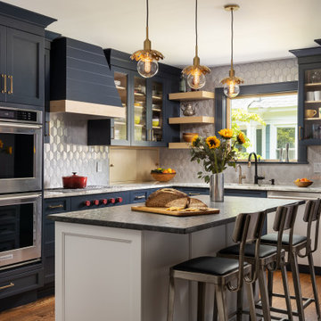
The client requested a kitchen that would not only provide a great space to cook and enjoy family meals but one that would fit in with her unique design sense. An avid collector of contemporary art, she wanted something unexpected in her 100-year-old home in both color and finishes but still providing a great layout with improved lighting, storage, and superior cooking abilities. The existing kitchen was in a closed off space trapped between the family room and the living. If you were in the kitchen, you were isolated from the rest of the house. Making the kitchen an integrated part of the home was a paramount request.
Step one, remove the wall separating the kitchen from the other rooms in the home which allowed the new kitchen to become an integrated space instead of an isolation room for the cook. Next, we relocated the pantry access which was in the family room to the kitchen integrating a poorly used recess which had become a catch all area which did not provide any usable space for storage or working area. To add valuable function in the kitchen we began by capturing unused "cubbies", adding a walk-in pantry from the kitchen, increasing the storage lost to un-needed drop ceilings and bring light and design to the space with a new large awning window, improved lighting, and combining interesting finishes and colors to reflect the artistic attitude of the client.
A bathroom located above the kitchen had been leaking into the plaster ceiling for several years. That along with knob and tube wiring, rotted beams and a brick wall from the back of the fireplace in the adjacent living room all needed to be brought to code. The walls, ceiling and floors in this 100+ year old home were completely out of level and the room’s foot print could not be increased.
The choice of a Sub-Zero wolf product is a standard in my kitchen designs. The quality of the product, its manufacturing and commitment to food preservation is the reason I specify Sub Zero Wolf. For the cook top, the integrated line of the contemporary cooktop and the signature red knobs against the navy blue of the cabinets added to the design vibe of the kitchen. The cooking performance and the large continuous grate on the cooktop makes it an obvious choice for a cook looking for a great cook top with professional results in a more streamlined profile. We selected a Sharp microwave drawer for the island, an XO wine refrigerator, Bosch dishwasher and Kitchen Aid double convection wall ovens to round out the appliance package.
A recess created by the fireplace was outfitted with a cabinet which now holds small appliances within easy reach of my very petite client. Natural maple accents were used inside all the wall cabinets and repeated on the front of the hood and for the sliding door appliance cabinet and the floating shelves. This allows a brighter interior for the painted cabinets instead of the traditional same interior as exterior finish choice. The was an amazing transformation from the old to the new.
The final touches are the honey bronze hardware from Top Knobs, Mitzi pendants from Hudson Valley Lighting group,
a fabulous faucet from Brizo. To eliminate the old freestanding bottled water cooler, we specified a matching water filter faucet.

 The Artisans Group, Inc.
Winner of the 2018 Tour of Homes Best Remodel, this whole house re-design of a 1963 Bennet & Johnson mid-century raised ranch home is a beautiful example of the magic we can weave through the application of more sustainable modern design principles to existing spaces.
We worked closely with our client on extensive updates to create a modernized MCM gem.
Extensive alterations include:
- a completely redesigned floor plan to promote a more intuitive flow throughout
- vaulted the ceilings over the great room to create an amazing entrance and feeling of inspired openness
- redesigned entry and driveway to be more inviting and welcoming as well as to experientially set the mid-century modern stage
- the removal of a visually disruptive load bearing central wall and chimney system that formerly partitioned the homes’ entry, dining, kitchen and living rooms from each other
- added clerestory windows above the new kitchen to accentuate the new vaulted ceiling line and create a greater visual continuation of indoor to outdoor space
- drastically increased the access to natural light by increasing window sizes and opening up the floor plan
- placed natural wood elements throughout to provide a calming palette and cohesive Pacific Northwest feel
- incorporated Universal Design principles to make the home Aging In Place ready with wide hallways and accessible spaces, including single-floor living if needed
- moved and completely redesigned the stairway to work for the home’s occupants and be a part of the cohesive design aesthetic
- mixed custom tile layouts with more traditional tiling to create fun and playful visual experiences
- custom designed and sourced MCM specific elements such as the entry screen, cabinetry and lighting
- development of the downstairs for potential future use by an assisted living caretaker
- energy efficiency upgrades seamlessly woven in with much improved insulation, ductless mini splits and solar gain

 Fowlkes Studio
Small trendy 3/4 marble tile mosaic tile floor and black floor alcove shower photo in New York with flat-panel cabinets, medium tone wood cabinets, white walls, a vessel sink, a hinged shower door and white countertops
Find the right local pro for your project

 ZeroEnergy Design
This renovated brick rowhome in Boston’s South End offers a modern aesthetic within a historic structure, creative use of space, exceptional thermal comfort, a reduced carbon footprint, and a passive stream of income.
DESIGN PRIORITIES. The goals for the project were clear - design the primary unit to accommodate the family’s modern lifestyle, rework the layout to create a desirable rental unit, improve thermal comfort and introduce a modern aesthetic. We designed the street-level entry as a shared entrance for both the primary and rental unit. The family uses it as their everyday entrance - we planned for bike storage and an open mudroom with bench and shoe storage to facilitate the change from shoes to slippers or bare feet as they enter their home. On the main level, we expanded the kitchen into the dining room to create an eat-in space with generous counter space and storage, as well as a comfortable connection to the living space. The second floor serves as master suite for the couple - a bedroom with a walk-in-closet and ensuite bathroom, and an adjacent study, with refinished original pumpkin pine floors. The upper floor, aside from a guest bedroom, is the child's domain with interconnected spaces for sleeping, work and play. In the play space, which can be separated from the work space with new translucent sliding doors, we incorporated recreational features inspired by adventurous and competitive television shows, at their son’s request.
MODERN MEETS TRADITIONAL. We left the historic front facade of the building largely unchanged - the security bars were removed from the windows and the single pane windows were replaced with higher performing historic replicas. We designed the interior and rear facade with a vision of warm modernism, weaving in the notable period features. Each element was either restored or reinterpreted to blend with the modern aesthetic. The detailed ceiling in the living space, for example, has a new matte monochromatic finish, and the wood stairs are covered in a dark grey floor paint, whereas the mahogany doors were simply refinished. New wide plank wood flooring with a neutral finish, floor-to-ceiling casework, and bold splashes of color in wall paint and tile, and oversized high-performance windows (on the rear facade) round out the modern aesthetic.
RENTAL INCOME. The existing rowhome was zoned for a 2-family dwelling but included an undesirable, single-floor studio apartment at the garden level with low ceiling heights and questionable emergency egress. In order to increase the quality and quantity of space in the rental unit, we reimagined it as a two-floor, 1 or 2 bedroom, 2 bathroom apartment with a modern aesthetic, increased ceiling height on the lowest level and provided an in-unit washer/dryer. The apartment was listed with Jackie O'Connor Real Estate and rented immediately, providing the owners with a source of passive income.
ENCLOSURE WITH BENEFITS. The homeowners sought a minimal carbon footprint, enabled by their urban location and lifestyle decisions, paired with the benefits of a high-performance home. The extent of the renovation allowed us to implement a deep energy retrofit (DER) to address air tightness, insulation, and high-performance windows. The historic front facade is insulated from the interior, while the rear facade is insulated on the exterior. Together with these building enclosure improvements, we designed an HVAC system comprised of continuous fresh air ventilation, and an efficient, all-electric heating and cooling system to decouple the house from natural gas. This strategy provides optimal thermal comfort and indoor air quality, improved acoustic isolation from street noise and neighbors, as well as a further reduced carbon footprint. We also took measures to prepare the roof for future solar panels, for when the South End neighborhood’s aging electrical infrastructure is upgraded to allow them.
URBAN LIVING. The desirable neighborhood location allows the both the homeowners and tenant to walk, bike, and use public transportation to access the city, while each charging their respective plug-in electric cars behind the building to travel greater distances.
OVERALL. The understated rowhouse is now ready for another century of urban living, offering the owners comfort and convenience as they live life as an expression of their values.
Eric Roth Photo
 Rodwin Architecture & Skycastle Construction
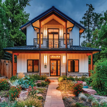
This lovely little modern farmhouse is located at the base of the foothills in one of Boulder’s most prized neighborhoods. Tucked onto a challenging narrow lot, this inviting and sustainably designed 2400 sf., 4 bedroom home lives much larger than its compact form. The open floor plan and vaulted ceilings of the Great room, kitchen and dining room lead to a beautiful covered back patio and lush, private back yard. These rooms are flooded with natural light and blend a warm Colorado material palette and heavy timber accents with a modern sensibility. A lyrical open-riser steel and wood stair floats above the baby grand in the center of the home and takes you to three bedrooms on the second floor. The Master has a covered balcony with exposed beamwork & warm Beetle-kill pine soffits, framing their million-dollar view of the Flatirons.
Its simple and familiar style is a modern twist on a classic farmhouse vernacular. The stone, Hardie board siding and standing seam metal roofing create a resilient and low-maintenance shell. The alley-loaded home has a solar-panel covered garage that was custom designed for the family’s active & athletic lifestyle (aka “lots of toys”). The front yard is a local food & water-wise Master-class, with beautiful rain-chains delivering roof run-off straight to the family garden.
 The Artisans Group, Inc.
Winner of the 2018 Tour of Homes Best Remodel, this whole house re-design of a 1963 Bennet & Johnson mid-century raised ranch home is a beautiful example of the magic we can weave through the application of more sustainable modern design principles to existing spaces.
We worked closely with our client on extensive updates to create a modernized MCM gem.
Extensive alterations include:
- a completely redesigned floor plan to promote a more intuitive flow throughout
- vaulted the ceilings over the great room to create an amazing entrance and feeling of inspired openness
- redesigned entry and driveway to be more inviting and welcoming as well as to experientially set the mid-century modern stage
- the removal of a visually disruptive load bearing central wall and chimney system that formerly partitioned the homes’ entry, dining, kitchen and living rooms from each other
- added clerestory windows above the new kitchen to accentuate the new vaulted ceiling line and create a greater visual continuation of indoor to outdoor space
- drastically increased the access to natural light by increasing window sizes and opening up the floor plan
- placed natural wood elements throughout to provide a calming palette and cohesive Pacific Northwest feel
- incorporated Universal Design principles to make the home Aging In Place ready with wide hallways and accessible spaces, including single-floor living if needed
- moved and completely redesigned the stairway to work for the home’s occupants and be a part of the cohesive design aesthetic
- mixed custom tile layouts with more traditional tiling to create fun and playful visual experiences
- custom designed and sourced MCM specific elements such as the entry screen, cabinetry and lighting
- development of the downstairs for potential future use by an assisted living caretaker
- energy efficiency upgrades seamlessly woven in with much improved insulation, ductless mini splits and solar gain

 Pineapple House Interior Design
The shower is universally designed and has no curb or step at its entry. The drawer pulls are also designed for easy use.
A Bonisolli Photography
Mid-sized transitional white tile walk-in shower photo in Miami with an undermount sink, flat-panel cabinets, white cabinets and marble countertops
Mid-sized transitional white tile walk-in shower photo in Miami with an undermount sink, flat-panel cabinets, white cabinets and marble countertops
 ZeroEnergy Design
This renovated brick rowhome in Boston’s South End offers a modern aesthetic within a historic structure, creative use of space, exceptional thermal comfort, a reduced carbon footprint, and a passive stream of income.
DESIGN PRIORITIES. The goals for the project were clear - design the primary unit to accommodate the family’s modern lifestyle, rework the layout to create a desirable rental unit, improve thermal comfort and introduce a modern aesthetic. We designed the street-level entry as a shared entrance for both the primary and rental unit. The family uses it as their everyday entrance - we planned for bike storage and an open mudroom with bench and shoe storage to facilitate the change from shoes to slippers or bare feet as they enter their home. On the main level, we expanded the kitchen into the dining room to create an eat-in space with generous counter space and storage, as well as a comfortable connection to the living space. The second floor serves as master suite for the couple - a bedroom with a walk-in-closet and ensuite bathroom, and an adjacent study, with refinished original pumpkin pine floors. The upper floor, aside from a guest bedroom, is the child's domain with interconnected spaces for sleeping, work and play. In the play space, which can be separated from the work space with new translucent sliding doors, we incorporated recreational features inspired by adventurous and competitive television shows, at their son’s request.
MODERN MEETS TRADITIONAL. We left the historic front facade of the building largely unchanged - the security bars were removed from the windows and the single pane windows were replaced with higher performing historic replicas. We designed the interior and rear facade with a vision of warm modernism, weaving in the notable period features. Each element was either restored or reinterpreted to blend with the modern aesthetic. The detailed ceiling in the living space, for example, has a new matte monochromatic finish, and the wood stairs are covered in a dark grey floor paint, whereas the mahogany doors were simply refinished. New wide plank wood flooring with a neutral finish, floor-to-ceiling casework, and bold splashes of color in wall paint and tile, and oversized high-performance windows (on the rear facade) round out the modern aesthetic.
RENTAL INCOME. The existing rowhome was zoned for a 2-family dwelling but included an undesirable, single-floor studio apartment at the garden level with low ceiling heights and questionable emergency egress. In order to increase the quality and quantity of space in the rental unit, we reimagined it as a two-floor, 1 or 2 bedroom, 2 bathroom apartment with a modern aesthetic, increased ceiling height on the lowest level and provided an in-unit washer/dryer. The apartment was listed with Jackie O'Connor Real Estate and rented immediately, providing the owners with a source of passive income.
ENCLOSURE WITH BENEFITS. The homeowners sought a minimal carbon footprint, enabled by their urban location and lifestyle decisions, paired with the benefits of a high-performance home. The extent of the renovation allowed us to implement a deep energy retrofit (DER) to address air tightness, insulation, and high-performance windows. The historic front facade is insulated from the interior, while the rear facade is insulated on the exterior. Together with these building enclosure improvements, we designed an HVAC system comprised of continuous fresh air ventilation, and an efficient, all-electric heating and cooling system to decouple the house from natural gas. This strategy provides optimal thermal comfort and indoor air quality, improved acoustic isolation from street noise and neighbors, as well as a further reduced carbon footprint. We also took measures to prepare the roof for future solar panels, for when the South End neighborhood’s aging electrical infrastructure is upgraded to allow them.
URBAN LIVING. The desirable neighborhood location allows the both the homeowners and tenant to walk, bike, and use public transportation to access the city, while each charging their respective plug-in electric cars behind the building to travel greater distances.
OVERALL. The understated rowhouse is now ready for another century of urban living, offering the owners comfort and convenience as they live life as an expression of their values.
Photography: Eric Roth Photo
 The Artisans Group, Inc.
Winner of the 2018 Tour of Homes Best Remodel, this whole house re-design of a 1963 Bennet & Johnson mid-century raised ranch home is a beautiful example of the magic we can weave through the application of more sustainable modern design principles to existing spaces.
We worked closely with our client on extensive updates to create a modernized MCM gem.
Extensive alterations include:
- a completely redesigned floor plan to promote a more intuitive flow throughout
- vaulted the ceilings over the great room to create an amazing entrance and feeling of inspired openness
- redesigned entry and driveway to be more inviting and welcoming as well as to experientially set the mid-century modern stage
- the removal of a visually disruptive load bearing central wall and chimney system that formerly partitioned the homes’ entry, dining, kitchen and living rooms from each other
- added clerestory windows above the new kitchen to accentuate the new vaulted ceiling line and create a greater visual continuation of indoor to outdoor space
- drastically increased the access to natural light by increasing window sizes and opening up the floor plan
- placed natural wood elements throughout to provide a calming palette and cohesive Pacific Northwest feel
- incorporated Universal Design principles to make the home Aging In Place ready with wide hallways and accessible spaces, including single-floor living if needed
- moved and completely redesigned the stairway to work for the home’s occupants and be a part of the cohesive design aesthetic
- mixed custom tile layouts with more traditional tiling to create fun and playful visual experiences
- custom designed and sourced MCM specific elements such as the entry screen, cabinetry and lighting
- development of the downstairs for potential future use by an assisted living caretaker
- energy efficiency upgrades seamlessly woven in with much improved insulation, ductless mini splits and solar gain

 Omicron Granite & Tile
Inspiration for a contemporary galley kitchen remodel in Miami with flat-panel cabinets, white cabinets, white backsplash, stainless steel appliances, an island and a double-bowl sink
Inspiration for a contemporary galley kitchen remodel in Miami with flat-panel cabinets, white cabinets, white backsplash, stainless steel appliances, an island and a double-bowl sink
 Klopf Architecture
Nestled in the hills of Orinda, California, this 1951 residence is one of only seven extant homes, now known as “The Magnificent Seven”, designed by architect Olof Dahlstrand, a protégé of Frank Lloyd Wright. With its low-slung rooflines, natural materials, and deep integration with the sloping landscape, the home is a pristine example of mid-century modern design inspired by Wright’s organic principles. Over the years, prior homeowners have emphasized preservation, ensuring that the house remained relatively untouched. Each owner has respected the original architecture and stayed true to Dahlstrand’s intent. When a family of five—two college-aged sons and a middle school-aged daughter—acquired the property, they were captivated by its history, legacy of care, and architectural significance. While they appreciated Dahlstrand’s original vision, they also recognized the need to adapt the home for contemporary living while preserving its design integrity.
The remodel was conceived as a thoughtful response to the past—an effort to bring the house into the 21st century without compromising its soul. The primary mandate was to maintain architectural continuity while improving the functionality, comfort, and livability for a modern family. The design team—architects and contractor alike—worked with a shared reverence for the original architecture, allowing that mindset to guide even the most technical or pragmatic decisions.
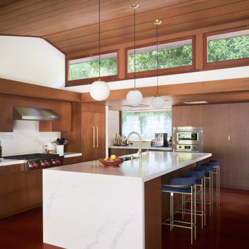
A key objective was to increase natural light in the kitchen—a departure from Wrightian principles of enclosed, intimate cooking spaces—while maintaining the home’s architectural language. The kitchen was reconfigured to foster a stronger connection to adjacent living spaces while retaining the underlying concept of spatial separation. One of the most transformative architectural changes was the removal of a ridge beam that was originally planned to remain visible through the kitchen. During construction, the team collaborated on a better solution: a wide-flanged steel beam concealed within the roof envelope. This subtle move preserved the clean lines and ceiling continuity, a modern update carried out with utmost respect for the existing framework.
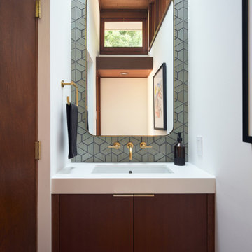
The home’s original powder room, previously accessible only through the kitchen, was relocated for better flow and privacy. A new powder room was carved out of former kitchen cabinetry—a narrow, interior space that could have felt dark and enclosed. To avoid this, the design extended the line of original transom windows into the new powder room and added a skylight above the vanity. The result is a bright and airy space that feels consistent with the rest of the home. Other updates included the installation of new solid-core interior doors with veneers carefully matched to the original mahogany, enhancing the continuity of the interiors. Even smaller decisions, such as placing the door knobs at 42 inches high, mirrored the original proportions. Every choice reflected a shared belief between the architect, contractor, and client: that new work should serve the integrity of the old.
The home’s extensive interior redwood millwork and paneling was meticulously restored. Where new materials were introduced—such as the replacement redwood soffit paneling—the contractor took pains to find finish nails that matched the original, rather than using modern equivalents. This level of craftsmanship and collaboration defined the project. It extended even to the detailing of a blind door to the new powder room, which had to disappear into the existing redwood board-and-batten wall. It was a team effort: the owner found a suitable handle, the architects devised the custom in-swing mechanism, and the contractor executed it so the door aligned precisely with the battens. Throughout, the homeowners were deeply engaged in the design process. One, a meticulous design enthusiast, focused on aesthetic integrity and historic detail. The other brought a practical and function-driven perspective, ensuring that new fixtures and materials would be durable and require minimal maintenance.
While the home’s location posed no major site challenges, sustainability was a key concern. The team upgraded the roof insulation, installed solar panels with battery storage, and added ductless mini-split cooling systems. Lighting was another area where modern technology was woven into a historic framework: new square LED fixtures echo the original custom perimeter soffit lights, maintaining the design language while offering advanced performance.
A planned expansion of a bedroom into suite with a bathroom had to be shelved due to budget constraints and the high cost of below-grade foundation work. Still, the team focused their efforts on making the most of the existing footprint, resolving constraints through design ingenuity rather than adding square footage. This renovation represents a collaborative achievement in preserving and evolving a historically significant home. Every decision was shaped by a shared ethos among clients, architects, and contractor: to maintain the home’s architectural soul while updating it for contemporary life. The result is a timeless modernist residence that continues Olof Dahlstrand’s legacy, remaining grounded in nature, craftsmanship, and human-scale design.
Klopf Architecture Team: John Klopf, AIA, Klara Kevane, Fernanda Bernardes
Interior Architectural Design: Klopf Architecture
Structural Engineer: Daniel Bastiao
Contractor: Don Larwood, Larwood Construction
Photography: Mariko Reed
Year Completed: 2022
 Klopf Architecture
Nestled in the hills of Orinda, California, this 1951 residence is one of only seven extant homes, now known as “The Magnificent Seven”, designed by architect Olof Dahlstrand, a protégé of Frank Lloyd Wright. With its low-slung rooflines, natural materials, and deep integration with the sloping landscape, the home is a pristine example of mid-century modern design inspired by Wright’s organic principles. Over the years, prior homeowners have emphasized preservation, ensuring that the house remained relatively untouched. Each owner has respected the original architecture and stayed true to Dahlstrand’s intent. When a family of five—two college-aged sons and a middle school-aged daughter—acquired the property, they were captivated by its history, legacy of care, and architectural significance. While they appreciated Dahlstrand’s original vision, they also recognized the need to adapt the home for contemporary living while preserving its design integrity.
The remodel was conceived as a thoughtful response to the past—an effort to bring the house into the 21st century without compromising its soul. The primary mandate was to maintain architectural continuity while improving the functionality, comfort, and livability for a modern family. The design team—architects and contractor alike—worked with a shared reverence for the original architecture, allowing that mindset to guide even the most technical or pragmatic decisions.
A key objective was to increase natural light in the kitchen—a departure from Wrightian principles of enclosed, intimate cooking spaces—while maintaining the home’s architectural language. The kitchen was reconfigured to foster a stronger connection to adjacent living spaces while retaining the underlying concept of spatial separation. One of the most transformative architectural changes was the removal of a ridge beam that was originally planned to remain visible through the kitchen. During construction, the team collaborated on a better solution: a wide-flanged steel beam concealed within the roof envelope. This subtle move preserved the clean lines and ceiling continuity, a modern update carried out with utmost respect for the existing framework.
The home’s original powder room, previously accessible only through the kitchen, was relocated for better flow and privacy. A new powder room was carved out of former kitchen cabinetry—a narrow, interior space that could have felt dark and enclosed. To avoid this, the design extended the line of original transom windows into the new powder room and added a skylight above the vanity. The result is a bright and airy space that feels consistent with the rest of the home. Other updates included the installation of new solid-core interior doors with veneers carefully matched to the original mahogany, enhancing the continuity of the interiors. Even smaller decisions, such as placing the door knobs at 42 inches high, mirrored the original proportions. Every choice reflected a shared belief between the architect, contractor, and client: that new work should serve the integrity of the old.
The home’s extensive interior redwood millwork and paneling was meticulously restored. Where new materials were introduced—such as the replacement redwood soffit paneling—the contractor took pains to find finish nails that matched the original, rather than using modern equivalents. This level of craftsmanship and collaboration defined the project. It extended even to the detailing of a blind door to the new powder room, which had to disappear into the existing redwood board-and-batten wall. It was a team effort: the owner found a suitable handle, the architects devised the custom in-swing mechanism, and the contractor executed it so the door aligned precisely with the battens. Throughout, the homeowners were deeply engaged in the design process. One, a meticulous design enthusiast, focused on aesthetic integrity and historic detail. The other brought a practical and function-driven perspective, ensuring that new fixtures and materials would be durable and require minimal maintenance.
While the home’s location posed no major site challenges, sustainability was a key concern. The team upgraded the roof insulation, installed solar panels with battery storage, and added ductless mini-split cooling systems. Lighting was another area where modern technology was woven into a historic framework: new square LED fixtures echo the original custom perimeter soffit lights, maintaining the design language while offering advanced performance.
A planned expansion of a bedroom into suite with a bathroom had to be shelved due to budget constraints and the high cost of below-grade foundation work. Still, the team focused their efforts on making the most of the existing footprint, resolving constraints through design ingenuity rather than adding square footage. This renovation represents a collaborative achievement in preserving and evolving a historically significant home. Every decision was shaped by a shared ethos among clients, architects, and contractor: to maintain the home’s architectural soul while updating it for contemporary life. The result is a timeless modernist residence that continues Olof Dahlstrand’s legacy, remaining grounded in nature, craftsmanship, and human-scale design.
Klopf Architecture Team: John Klopf, AIA, Klara Kevane, Fernanda Bernardes
Interior Architectural Design: Klopf Architecture
Structural Engineer: Daniel Bastiao
Contractor: Don Larwood, Larwood Construction
Photography: Mariko Reed
Year Completed: 2022

 DKOR Interiors Inc.- Interior Designers Miami, FL
Miami Interior Designers - Residential Interior Design Project in Aventura, FL. A classic Mediterranean home turns Transitional and Contemporary by DKOR Interiors. Photo: Alexia Fodere Interior Design by Miami and Ft. Lauderdale Interior Designers, DKOR Interiors. www.dkorinteriors.com
 Klopf Architecture
Three Phases, One Family: Inside a Klopf Eichler Remodel
When an executive mom and her two young children moved into their Eichler, she made a deliberate choice: to renovate the home in a way that honored, rather than erased, the qualities that make Eichlers distinctive in the first place. That decision set the tone for what would become a five-year, three-phase collaboration with architecture and interior design firm Klopf Architecture and general contractor Keycon, that touched nearly every room in the house and, along the way, turned a client-architect relationship into something closer.
Living Through the Work
Unlike many remodels where clients decamp to a rental during construction, this family stayed put through all three phases. That meant the Klopf team didn't just design the home, they watched it get lived in room by room in real time. Phase 1 covered the kitchen and living areas; by the time the team moved into later phases, they had already seen how the family actually used the spaces they'd designed earlier.
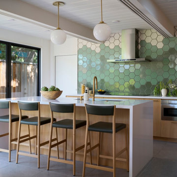
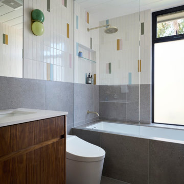
That feedback loop and conversations with the client shaped the rest of the project directly. She said “throughout the various phases as they were completed, each day I noticed a new detail,” and shared her feedback with the design team. For instance, she loved the countertops chosen for the kitchen in Phase 1, so those same countertops appeared in the bathrooms designed in later phases. She loved the playful backsplash tile in the kitchen, so a similar sense of pattern and play carried into her bathroom in Phase 2 and a second bath in Phase 3. The result is a home where each phase speaks to the ones before it, rather than reading as a series of disconnected updates.
Opening Up the Center of the House
At the heart of the project was a reorganization of the home's most-used spaces. Klopf reclaimed a former dining area off the great room to build a larger kitchen, opening it directly onto the living space and freeing up room for the family to actually gather for reading, games, meals, TV, and the ordinary business of daily life with two kids and a dog.
New floor-to-ceiling glass panels now connect the living space to the home's atrium, pulling light and views in from both directions, doubling down on the indoor-outdoor connection the style is known for. But more glass also meant less privacy, particularly at the entry, where a new wall of glass would otherwise open the courtyard directly to the street. Klopf's solution was a custom-designed slanted wood slat pivot gate at the front of the house: a piece that lets light filter through while blocking sight lines from passersby. It's a small architectural gesture that solves a real problem, creating privacy without sacrificing the light-filled openness the redesign was built around.
Each of the children's bedrooms was custom-tailored to its occupant, a detail that mattered more with each passing year as the "young kids" in Phase 1 grew into the teenagers they became by the project's close.
Five Years and Increased Capabilities
A project of this length rarely survives with the same team intact, and this one didn't. Klopf’s original project leader left the firm part way through, but John Klopf and Elise Webb remained on the project from start to finish for continuity. Instead of shrinking, the Klopf team actually grew when their new interior design department was formed in 2024. The client was excited about Klopf’s new interiors capabilities, and welcomed Justine Alvarez and Ekaterina Nesterova on board to expand what had been an architectural scope into an architecture-plus-interiors effort. In the end Klopf handled the design from exterior envelope and layout down to the materials, colors, furnishings, décor, and finishing touches.
What began as an architectural renovation ended up as something more comprehensive: a complete reimagining of the home's interiors as well as its bones, extending down to details as small as the containers on the bathroom counter.
Carrying the Vision Through to the Furnishings
Klopf's interior design department helped turn good architecture into a place a family actually lives. The interiors team worked closely with the client on furniture, fabrics, lighting, and accessories, sourcing and coordinating with makers and vendors in both the U.S. and Europe.
The guiding idea was continuity: every piece needed to feel like it belonged in the house, not added to it. The custom counter stools are a good example. Intended to pick up on the cabinetry materials already in the kitchen, they were designed with carefully selected leather so the seating reads as part of the same architectural language. The sofa, rug, pillows, and other pieces followed the same logic, with material, color, and proportion all considered against the architecture they'd sit inside. Even the playful character of the bathroom tile found its way into the furnishings, translating into fun, playful accents in the textiles and finishes while staying period-appropriate to the Eichler itself.
Benefitting from the feedback loop that shaped the architecture from phase to phase, the interiors team took cues from material and design decisions made in earlier phases when selecting the furnishings, so that the finished home reads as one continuous idea rather than a set of separate decisions layered on top of each other.
That continuity came with its own hardships. A few months after furniture purchasing began, new tariffs took effect, affecting the overall furniture budget and adding complexity to ordering and expediting pieces. Developing custom furniture added a further layer of coordination on top of that: aligning fabric and leather samples and wood finishes with the architecture meant close, ongoing communication with makers throughout fabrication. With some pieces produced internationally, lead times, shipping, and customs all had to be carefully managed; in a few instances, that pushed the timeline out further still. In the end, the extra time was worth it: it's what allowed the team to get the materials and details right and keep the design cohesive throughout the home.
A Relationship, Not Just a Project
Ask the Klopf team what made this project unique, and the answer isn't really about square footage or finishes. It's about time. Over five years, the team got to know the family in a way a shorter project never allows — watching the kids head off to summer camp, meeting the foster kittens that passed through the house, getting to know the dog walker's daily routine. It became a professional relationship that was also a personal one.
That closeness extended into the design process itself once the interiors team came on board. The client made a point of involving her kids in meetings about their own rooms, letting them weigh in on the vision and hopes they had for the spaces. Her daughter, in particular, was thrilled at the chance to work with an interior designer and help build her dream room, a small detail that speaks to how thoroughly this project became a family effort, not just a service delivered to one.
That closeness shows up in the house itself. During Phase 1, the client asked everyone involved to sign the pony wall in the new kitchen. The Klopf team, the client, her kids, and the Keycon crew all left their names there, a permanent record of the people who built the house together. The Client said: “I am filled with joy and gratitude to be able to live in such a beautiful space and to have gotten the chance to work with such a talented team. The mark of true artistry is the attention to detail that allows one to experience the design in different ways. One might be looking at the same view, but because of the way the light moves, it’s a totally different perspective.”
By the time the third phase wrapped, there was a running joke on site: nobody actually wanted the project to end, and the team half-seriously floated the idea of a "Phase 4." It's a fitting note for a project defined less by any single renovation than by five years of a family and their architects growing, quite literally, alongside one another.
Klopf Architecture Team: John Klopf, AIA, Elise Webb, Yegvenia Torres-Zavala, Justine Alvarez, and Ekaterina Nesterova
Interior Design and FF&E: Klopf Architecture
Structural Engineer: BASE Design Inc.
Contractor: Keycon Inc.
Photography: ©2026 Mariko Reed
Year Completed: 2026
Location: Palo Alto, CA


 Paradise Found Construction
The homes in Heritage Hills in Chapel Hill, NC are representative of the popularity and explosive growth of American Home Ownership that occurred during the economic expansion that followed the end of WW II. They were designed and built to foster the benefits and sense of “community”, where families could come together and share theirs and their children’s lives. They are typically in very desirable locations within their larger communities, and remodeling them with modern amenities, increasing the performance and efficiency of them, and having them Green Certified (independent third-party verified) makes them extremely attractive to buyers, and helps to raise other property values within the neighborhood.
Green Certified Remodeled Homes offer significant value and advantage in the marketplace over similar homes in their area, which is especially important as a new, younger era of home buyers enter the market. Current trends suggest that younger (as well as many “seasoned”) homeowners are interested in smaller, more efficient (and thus affordable) homes situated closer to shopping, their work, entertainment opportunities, and access to the economic and environmental benefits of mass transit.
These older homes also offer an additional value that is continuing to gain visibility and appreciation in the market place. They were built from lumber from slower-growth trees (denser and harder wood), and as such offer superior structural support compared to the same home built using lumber from today’s faster-growing (softer and less-dense wood) trees.
Robin and Kent had lived in their 2-story Gambrel Roof home in Heritage Hills since 1994. The house was structurally sound, due in large part to the old-growth (and denser) yellow pine that was used in its framing. They loved the quiet neighborhood, its sense of community and amenities, and their home. It suited their life-style and needs; and they had decided that they would remain in the home. It was showing its age, and was in need of general repairs and maintenance, and its energy, water, and indoor air quality performance was continuing to increase their ongoing cost of ownership.
Robin loved the screen porch that looked out on their private and nicely landscaped back yard, but she wanted to be able to use it in the colder months of the year. She was unsatisfied with the kitchen and the mud room / laundry room, and the darkness of other living spaces. A previous water leak in the laundry room had resulted in a large patch of mold that had compromised flooring, wall board, and insulation and contributed to the homes reduced indoor air quality.
The home lacked insulation in the crawl, and inadequate insulation in the attic. The single HVAC unit had been replaced a few years earlier with a more efficient unit, but with a single programmable thermostat control on the first floor and aging and un-insulated ducting, the second floor was often over-heated in the summer months.
The original wood windows had begun to deteriorate and were drafty and inefficient, and the original wood-burning fireplace was an open conduit for escaping conditioned air as well as an inlet for wood-smoke smelling air being pulled into the home. The siding had been replaced a few years earlier with a cement-fiber product, but the exterior wood trim was compromised and beginning to look unsightly. Its original architecture had been altered over the years in ways that presented ongoing maintenance and durability issues, as well as disrupting the elegance of the original design.
Kent has worked for over 30 years in the Environmental Sciences field, and is considered to be a national expert in understanding the sources of, and human exposure to pollutants in indoor environments. He had always been very conscious and cautious about the effects on indoor air quality that the construction, furnishings, and products used in home had on him and his family.
Project Goals
Increase the performance of their home by improving energy efficiency by at least 40% and lowering their natural gas and electric utility costs.
Increase the performance of their home by reducing water usage by at least 40% and lowering the water utility costs.
Increase the comfort of their home that was being compromised by an inadequate HVAC design, inadequate insulation, inefficient and compromised wood windows, and copious air intrusions and drafts.
Improve the healthiness of the homes indoor air quality that was being compromised by an open wood-burning fireplace, and prior water intrusion that had allowed colonies of mold to thrive.
Create a new Kitchen, Family Room, Home Office, Mudroom, and Laundry Room that featured some of the latest designs and trends and harmonized with the rest of the homes charm.
Increase the usefulness and aesthetics of the screened porch by creating a warm and inviting semi-conditioned 3-Season Room that extended the times during the year that it was comfortable.
Introduce day-lighting into areas of the home that were dark and uninviting.
Brighten and harmonize all of the interior finishes.
Protect and restore the exterior of the home with superior-performing products and finishes.
Achieve Gold Level Green Home Certification in conformance with the ICC 700-2012 National Green Building Standards (NGBS).
 Klopf Architecture
Three Phases, One Family: Inside a Klopf Eichler Remodel
When an executive mom and her two young children moved into their Eichler, she made a deliberate choice: to renovate the home in a way that honored, rather than erased, the qualities that make Eichlers distinctive in the first place. That decision set the tone for what would become a five-year, three-phase collaboration with architecture and interior design firm Klopf Architecture and general contractor Keycon, that touched nearly every room in the house and, along the way, turned a client-architect relationship into something closer.
Living Through the Work
Unlike many remodels where clients decamp to a rental during construction, this family stayed put through all three phases. That meant the Klopf team didn't just design the home, they watched it get lived in room by room in real time. Phase 1 covered the kitchen and living areas; by the time the team moved into later phases, they had already seen how the family actually used the spaces they'd designed earlier.
That feedback loop and conversations with the client shaped the rest of the project directly. She said “throughout the various phases as they were completed, each day I noticed a new detail,” and shared her feedback with the design team. For instance, she loved the countertops chosen for the kitchen in Phase 1, so those same countertops appeared in the bathrooms designed in later phases. She loved the playful backsplash tile in the kitchen, so a similar sense of pattern and play carried into her bathroom in Phase 2 and a second bath in Phase 3. The result is a home where each phase speaks to the ones before it, rather than reading as a series of disconnected updates.
Opening Up the Center of the House
At the heart of the project was a reorganization of the home's most-used spaces. Klopf reclaimed a former dining area off the great room to build a larger kitchen, opening it directly onto the living space and freeing up room for the family to actually gather for reading, games, meals, TV, and the ordinary business of daily life with two kids and a dog.
New floor-to-ceiling glass panels now connect the living space to the home's atrium, pulling light and views in from both directions, doubling down on the indoor-outdoor connection the style is known for. But more glass also meant less privacy, particularly at the entry, where a new wall of glass would otherwise open the courtyard directly to the street. Klopf's solution was a custom-designed slanted wood slat pivot gate at the front of the house: a piece that lets light filter through while blocking sight lines from passersby. It's a small architectural gesture that solves a real problem, creating privacy without sacrificing the light-filled openness the redesign was built around.
Each of the children's bedrooms was custom-tailored to its occupant, a detail that mattered more with each passing year as the "young kids" in Phase 1 grew into the teenagers they became by the project's close.
Five Years and Increased Capabilities
A project of this length rarely survives with the same team intact, and this one didn't. Klopf’s original project leader left the firm part way through, but John Klopf and Elise Webb remained on the project from start to finish for continuity. Instead of shrinking, the Klopf team actually grew when their new interior design department was formed in 2024. The client was excited about Klopf’s new interiors capabilities, and welcomed Justine Alvarez and Ekaterina Nesterova on board to expand what had been an architectural scope into an architecture-plus-interiors effort. In the end Klopf handled the design from exterior envelope and layout down to the materials, colors, furnishings, décor, and finishing touches.
What began as an architectural renovation ended up as something more comprehensive: a complete reimagining of the home's interiors as well as its bones, extending down to details as small as the containers on the bathroom counter.
Carrying the Vision Through to the Furnishings
Klopf's interior design department helped turn good architecture into a place a family actually lives. The interiors team worked closely with the client on furniture, fabrics, lighting, and accessories, sourcing and coordinating with makers and vendors in both the U.S. and Europe.
The guiding idea was continuity: every piece needed to feel like it belonged in the house, not added to it. The custom counter stools are a good example. Intended to pick up on the cabinetry materials already in the kitchen, they were designed with carefully selected leather so the seating reads as part of the same architectural language. The sofa, rug, pillows, and other pieces followed the same logic, with material, color, and proportion all considered against the architecture they'd sit inside. Even the playful character of the bathroom tile found its way into the furnishings, translating into fun, playful accents in the textiles and finishes while staying period-appropriate to the Eichler itself.
Benefitting from the feedback loop that shaped the architecture from phase to phase, the interiors team took cues from material and design decisions made in earlier phases when selecting the furnishings, so that the finished home reads as one continuous idea rather than a set of separate decisions layered on top of each other.
That continuity came with its own hardships. A few months after furniture purchasing began, new tariffs took effect, affecting the overall furniture budget and adding complexity to ordering and expediting pieces. Developing custom furniture added a further layer of coordination on top of that: aligning fabric and leather samples and wood finishes with the architecture meant close, ongoing communication with makers throughout fabrication. With some pieces produced internationally, lead times, shipping, and customs all had to be carefully managed; in a few instances, that pushed the timeline out further still. In the end, the extra time was worth it: it's what allowed the team to get the materials and details right and keep the design cohesive throughout the home.
A Relationship, Not Just a Project
Ask the Klopf team what made this project unique, and the answer isn't really about square footage or finishes. It's about time. Over five years, the team got to know the family in a way a shorter project never allows — watching the kids head off to summer camp, meeting the foster kittens that passed through the house, getting to know the dog walker's daily routine. It became a professional relationship that was also a personal one.
That closeness extended into the design process itself once the interiors team came on board. The client made a point of involving her kids in meetings about their own rooms, letting them weigh in on the vision and hopes they had for the spaces. Her daughter, in particular, was thrilled at the chance to work with an interior designer and help build her dream room, a small detail that speaks to how thoroughly this project became a family effort, not just a service delivered to one.
That closeness shows up in the house itself. During Phase 1, the client asked everyone involved to sign the pony wall in the new kitchen. The Klopf team, the client, her kids, and the Keycon crew all left their names there, a permanent record of the people who built the house together. The Client said: “I am filled with joy and gratitude to be able to live in such a beautiful space and to have gotten the chance to work with such a talented team. The mark of true artistry is the attention to detail that allows one to experience the design in different ways. One might be looking at the same view, but because of the way the light moves, it’s a totally different perspective.”
By the time the third phase wrapped, there was a running joke on site: nobody actually wanted the project to end, and the team half-seriously floated the idea of a "Phase 4." It's a fitting note for a project defined less by any single renovation than by five years of a family and their architects growing, quite literally, alongside one another.
Klopf Architecture Team: John Klopf, AIA, Elise Webb, Yegvenia Torres-Zavala, Justine Alvarez, and Ekaterina Nesterova
Interior Design and FF&E: Klopf Architecture
Structural Engineer: BASE Design Inc.
Contractor: Keycon Inc.
Photography: ©2026 Mariko Reed
Year Completed: 2026
Location: Palo Alto, CA
 The Artisans Group, Inc.
Winner of the 2018 Tour of Homes Best Remodel, this whole house re-design of a 1963 Bennet & Johnson mid-century raised ranch home is a beautiful example of the magic we can weave through the application of more sustainable modern design principles to existing spaces.
We worked closely with our client on extensive updates to create a modernized MCM gem.
Extensive alterations include:
- a completely redesigned floor plan to promote a more intuitive flow throughout
- vaulted the ceilings over the great room to create an amazing entrance and feeling of inspired openness
- redesigned entry and driveway to be more inviting and welcoming as well as to experientially set the mid-century modern stage
- the removal of a visually disruptive load bearing central wall and chimney system that formerly partitioned the homes’ entry, dining, kitchen and living rooms from each other
- added clerestory windows above the new kitchen to accentuate the new vaulted ceiling line and create a greater visual continuation of indoor to outdoor space
- drastically increased the access to natural light by increasing window sizes and opening up the floor plan
- placed natural wood elements throughout to provide a calming palette and cohesive Pacific Northwest feel
- incorporated Universal Design principles to make the home Aging In Place ready with wide hallways and accessible spaces, including single-floor living if needed
- moved and completely redesigned the stairway to work for the home’s occupants and be a part of the cohesive design aesthetic
- mixed custom tile layouts with more traditional tiling to create fun and playful visual experiences
- custom designed and sourced MCM specific elements such as the entry screen, cabinetry and lighting
- development of the downstairs for potential future use by an assisted living caretaker
- energy efficiency upgrades seamlessly woven in with much improved insulation, ductless mini splits and solar gain
2