
Search results for "Continuous improvement" in Home Design Ideas
 USI Design & Remodeling
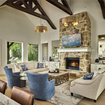
Located in Argyle, Texas, this comprehensive whole-home renovation was conceived by USI Design & Remodeling who reimagined the home's interior architecture, transforming a collection of compartmentalized rooms into a cohesive environment designed for modern living, entertaining, and daily comfort. The project encompassed the kitchen, family room, dining room, lounge, office, primary bathroom, and supporting circulation spaces, creating a unified experience that feels both expansive and intentional. Throughout the home, refined materials, custom millwork, and carefully curated finishes establish a sense of understated luxury while maintaining warmth and livability.
At the heart of the renovation is a completely reconfigured kitchen and gathering space designed around functionality, hospitality, and visual connection. Architectural barriers were removed to improve sightlines and circulation, allowing the kitchen, dining, and family spaces to function as a single integrated living environment. A dramatic five-foot workstation sink anchors the kitchen, while custom cabinetry and furniture-inspired details elevate the space beyond conventional residential design. Adjacent to the kitchen, the former pantry, laundry, and service corridor were reimagined as a hybrid scullery and utility suite, creating a highly functional support space that discreetly accommodates food preparation, storage, organization, and household operations without compromising the elegance of the primary living areas.
The renovation extends beyond aesthetics to create a home tailored to the family's evolving needs. The primary bathroom was transformed into a spa-inspired retreat, while the lounge, office, and dining spaces were redesigned to support both everyday living and entertaining. Consistent architectural detailing, layered textures, and thoughtful proportions establish continuity throughout the residence, allowing each room to feel connected to the larger design narrative. The result is a sophisticated yet approachable home that balances practical performance with timeless design, delivering a renewed living experience that is both highly functional and distinctly luxurious.
 Kebony
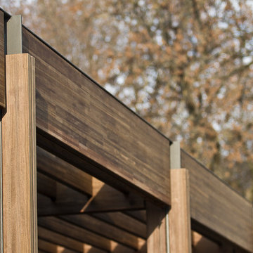
M-S Pro Architects announce the completion of an indoor swimming pool in a state-of-the-art, single storey family home set in a picturesque location on the outskirts of Bratislava - one of Europe’s youngest capital cities. Kebony, a beautiful wood recommended by leading architects, was chosen to craft the ceiling of the swimming pool, which is designed to emulate rippling waves as well as for the terrace deck and structural beams.
Sustainability and a desire to recreate the close proximity often seen between wood and water in the natural environment were primary focuses in the design of this project. This led a requirement for a low maintenance wood, compatible humidity and with advanced durability, for the swimming pool ceiling. In addition, a high level of precision when cutting the wood was required in order to achieve the desired appearance of waves.
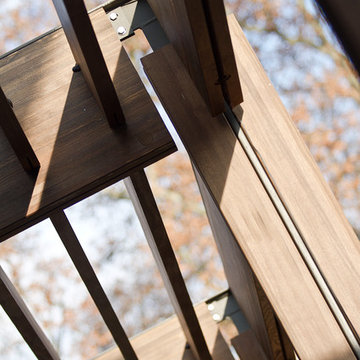
Supplied by Leading Market, Kebony was carefully selected for the pool ceiling, which consists of 490 lamellae of timber, due to its versatility, durability and environmental credentials. Kebony was also installed throughout the exterior of this property, both for the spacious outdoor terrace and the exterior and interior beams. One of the reasons to choose Kebony was the unified look of wood in all these different applications.
Developed in Norway, the patented Kebony technology uses an environmentally friendly process, which permanently enhances the properties of sustainable softwood with a bio-based liquid derived from agricultural crop waste. By polymerising the wood’s cell wall with furfuryl alcohol, the wood gains greatly improved durability and dimensional stability, giving it characteristics similar to those of tropical hardwood. In creating a wood with comparable properties to tropical hardwood that can be grown in a FSC certified, sustainably managed forest, the demand for tropical woods is reduced, allowing timber to once again be an important part of sustainable construction.
Tomáš Hubinský, Lead Architect at M-S Pro, commented: “From conception through to completion, the creation of this ceiling has been a real feat. Despite the challenges faced by such an intricate design, Kebony was the perfect material to convey our desired effect of waves rippling along the ceiling. We will continue to incorporate Kebony into our interior and exterior designs, with wood fast becoming the first choice material for all architects.”
Mette Valen, Sales Manager Norway at Kebony, explained: “The distinctive nature of this design cleverly portrays the capability of Kebony, demonstrating both the aesthetic and performance qualities of the product. We would be honoured to work with M-S Pro in the future and look forward to seeing how they utilise Kebony in their future projects.”
 Jarrett Design
Jarrett Design is grateful for repeat clients, especially when they have impeccable taste.
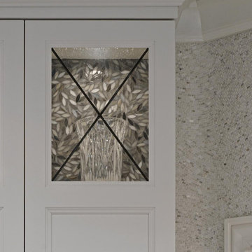
In this case, we started with their guest bath. An antique-inspired, hand-pegged vanity from our Nest collection, in hand-planed quarter-sawn cherry with metal capped feet, sets the tone. Calcutta Gold marble warms the room while being complimented by a white marble top and traditional backsplash. Polished nickel fixtures, lighting, and hardware selected by the client add elegance. A special bathroom for special guests.
Next on the list were the laundry area, bar and fireplace. The laundry area greets those who enter through the casual back foyer of the home. It also backs up to the kitchen and breakfast nook. The clients wanted this area to be as beautiful as the other areas of the home and the visible washer and dryer were detracting from their vision. They also were hoping to allow this area to serve double duty as a buffet when they were entertaining. So, the decision was made to hide the washer and dryer with pocket doors. The new cabinetry had to match the existing wall cabinets in style and finish, which is no small task. Our Nest artist came to the rescue. A five-piece soapstone sink and distressed counter top complete the space with a nod to the past.
Our clients wished to add a beverage refrigerator to the existing bar. The wall cabinets were kept in place again. Inspired by a beloved antique corner cupboard also in this sitting room, we decided to use stained cabinetry for the base and refrigerator panel. Soapstone was used for the top and new fireplace surround, bringing continuity from the nearby back foyer.
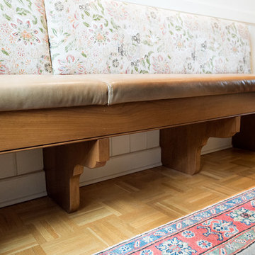
Last, but definitely not least, the kitchen, banquette and powder room were addressed. The clients removed a glass door in lieu of a wide window to create a cozy breakfast nook featuring a Nest banquette base and table. Brackets for the bench were designed in keeping with the traditional details of the home. A handy drawer was incorporated. The double vase pedestal table with breadboard ends seats six comfortably.
The powder room was updated with another antique reproduction vanity and beautiful vessel sink.
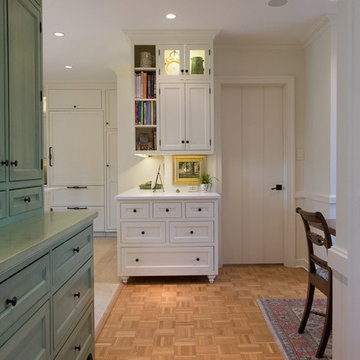
While the kitchen was beautifully done, it was showing its age and functional improvements were desired. This room, like the laundry room, was a project that included existing cabinetry mixed with matching new cabinetry. Precision was necessary. For better function and flow, the cooking surface was relocated from the island to the side wall. Instead of a cooktop with separate wall ovens, the clients opted for a pro style range. These design changes not only make prepping and cooking in the space much more enjoyable, but also allow for a wood hood flanked by bracketed glass cabinets to act a gorgeous focal point. Other changes included removing a small desk in lieu of a dresser style counter height base cabinet. This provided improved counter space and storage. The new island gave better storage, uninterrupted counter space and a perch for the cook or company. Calacatta Gold quartz tops are complimented by a natural limestone floor. A classic apron sink and faucet along with thoughtful cabinetry details are the icing on the cake. Don’t miss the clients’ fabulous collection of serving and display pieces! We told you they have impeccable taste!
Find the right local pro for your project
 Jarrett Design
Jarrett Design is grateful for repeat clients, especially when they have impeccable taste.
In this case, we started with their guest bath. An antique-inspired, hand-pegged vanity from our Nest collection, in hand-planed quarter-sawn cherry with metal capped feet, sets the tone. Calcutta Gold marble warms the room while being complimented by a white marble top and traditional backsplash. Polished nickel fixtures, lighting, and hardware selected by the client add elegance. A special bathroom for special guests.
Next on the list were the laundry area, bar and fireplace. The laundry area greets those who enter through the casual back foyer of the home. It also backs up to the kitchen and breakfast nook. The clients wanted this area to be as beautiful as the other areas of the home and the visible washer and dryer were detracting from their vision. They also were hoping to allow this area to serve double duty as a buffet when they were entertaining. So, the decision was made to hide the washer and dryer with pocket doors. The new cabinetry had to match the existing wall cabinets in style and finish, which is no small task. Our Nest artist came to the rescue. A five-piece soapstone sink and distressed counter top complete the space with a nod to the past.
Our clients wished to add a beverage refrigerator to the existing bar. The wall cabinets were kept in place again. Inspired by a beloved antique corner cupboard also in this sitting room, we decided to use stained cabinetry for the base and refrigerator panel. Soapstone was used for the top and new fireplace surround, bringing continuity from the nearby back foyer.
Last, but definitely not least, the kitchen, banquette and powder room were addressed. The clients removed a glass door in lieu of a wide window to create a cozy breakfast nook featuring a Nest banquette base and table. Brackets for the bench were designed in keeping with the traditional details of the home. A handy drawer was incorporated. The double vase pedestal table with breadboard ends seats six comfortably.
The powder room was updated with another antique reproduction vanity and beautiful vessel sink.
While the kitchen was beautifully done, it was showing its age and functional improvements were desired. This room, like the laundry room, was a project that included existing cabinetry mixed with matching new cabinetry. Precision was necessary. For better function and flow, the cooking surface was relocated from the island to the side wall. Instead of a cooktop with separate wall ovens, the clients opted for a pro style range. These design changes not only make prepping and cooking in the space much more enjoyable, but also allow for a wood hood flanked by bracketed glass cabinets to act a gorgeous focal point. Other changes included removing a small desk in lieu of a dresser style counter height base cabinet. This provided improved counter space and storage. The new island gave better storage, uninterrupted counter space and a perch for the cook or company. Calacatta Gold quartz tops are complimented by a natural limestone floor. A classic apron sink and faucet along with thoughtful cabinetry details are the icing on the cake. Don’t miss the clients’ fabulous collection of serving and display pieces! We told you they have impeccable taste!
 Drury Design
Maybe you can relate to these empty nesters who reached out to us to design and build a new kitchen for their current and long term needs. They do lots of entertaining, have an extensive wine collection and enjoy welcoming more grandchildren into the family. Both cook, although he prefers his grill. They wanted their new kitchen to be an open space that is easier to move around in. They were also looking forward to more storage and new, state-of-the-art appliances.
Design objectives:
-New layout to accommodate large groups for frequent entertaining
-Big island to seat as many people as possible
Improve traffic flow by omitting a counter peninsula by the family room and other cabinet barriers
-Main cooktop to face visitors with point-of-use spices, utensils, pots & pans nearby
-Multiple cooking & refrigeration appliances
-Plan for as much countertop space as possible for multiple cooks
-Dedicated spaces needed for wine, liquor, cold drinks & decorative glassware
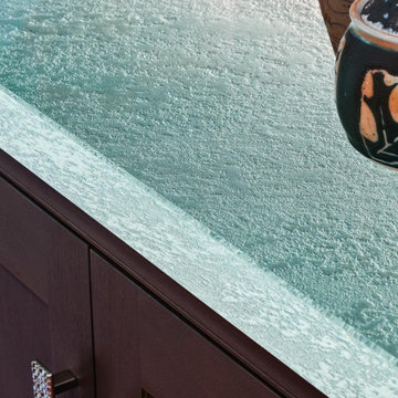
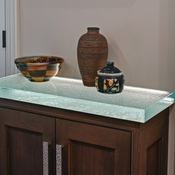
-Incorporate special details such as thick or waterfall countertops, unique backsplash, wood accents
-Need better task, ambient and general lighting
-Make it beautiful – a kitchen the homeowners could be proud of
-Seamlessly join kitchen with breakfast room, given load-bearing wall & various ceiling heights
-Ensure the large, newly opened space remains intimate and inclusive
-Determine how to best utilize the breakfast room, given limited availability of wall space with two sets of French doors and a large window
-Relocating two ventilation ducts currently in a wall to be removed
-Incorporate multiple appliances while adding functional storage
-Integrate special details that wouldn’t be lost in a large room
-Utilize multiple finishes and colors that provide continuity
Design solutions:
-The wall between the kitchen & breakfast nook was completely removed – the structural beam was shortened, providing the largest opening possible
-One small wall section remained intact to relocate ductwork, which conveniently created an alcove for the dual refrigerator armoire
-Two islands in the same finish visually join the elongated room
-The cooking island includes necessary point-of-use storage along with a steam oven and additional storage on the opposite side
The wide cooking island allows for two cooks to comfortably share the counter space, allowing casual interaction
-The second island fills the center of the former breakfast room; tall cabinets in a contrasting finish flank the French doors and provide visual balance
-The sizable second island provides seating for six on a conversation-conducive curve. It houses freezer drawers, a microwave drawer, an under-counter refrigerator, plus additional storage
-Docking station inside drawer
-Two cabinet styles in three finishes provide continuity, balance and interest in the large room
While the clients didn’t have a specific vision of the remodeled space, they were completely open to new ideas and knew which features they wanted when they saw them. They were truly doing the project for their own enjoyment and that of their family and guests. We’re happy to know they are thrilled with the end result. In fact, we had so much fun working together we’re now talking about a new project!
 Milgard Windows & Doors
The Kiguchi family moved into their Austin, Texas home in 1994. Built in the 1980’s as part of a neighborhood development, they happily raised their family here but longed for something more contemporary. Once they became empty nesters, they decided it was time for a major remodel. After spending many years visiting Austin AIA Home Tours that highlight contemporary residential architecture, they had a lot of ideas and in 2013 were ready to interview architects and get their renovation underway.
The project turned into a major remodel due to an unstable foundation. Architects Ben Arbib and Ed Hughey, of Arbib Hughey Design were hired to solve the structural issue and look for inspiration in the bones of the house, which sat on top of a hillside and was surrounded by great views.
Unfortunately, with the old floor plan, the beautiful views were hidden by small windows that were poorly placed. In order to bring more natural light into the house the window sizes and configurations had to be addressed, all while keeping in mind the homeowners desire for a modern look and feel.
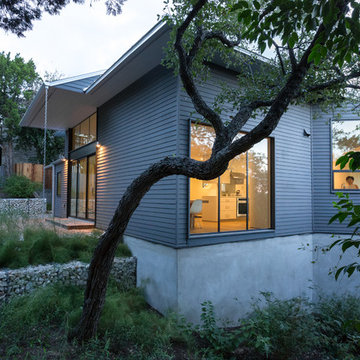
To achieve a more contemporary and sophisticated front of house, a new entry was designed that included removing a two-story bay window and porch. The entrance of the home also became more integrated with the landscape creating a template for new foliage to be planted. Older exterior materials were updated to incorporate a more muted palette of colors with a metal roof, dark grey siding in the back and white stucco in the front. Deep eaves were added over many of the new large windows for clean lines and sun protection.
“Inside it was about opening up the floor plan, expanding the views throughout the house, and updating the material palette to get a modern look that was also warm and inviting,” said Ben from Arbib Hughey Design. “Prior to the remodel, the house had the typical separation of rooms. We removed the walls between them and changed all of the windows to Milgard Thermally Improved Aluminum to connect the inside with the outside. No matter where you are you get nice views and natural light.”
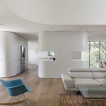
The architects wanted to create some drama, which they accomplished with the window placement and opening up the interior floor plan to an open concept approach. Cabinetry was used to help delineate intimate spaces. To add warmth to an all-white living room, white-washed oak wood floors were installed and pine planks were used around the fireplace. The large windows served as artwork bringing the color of nature into the space.
An octagon shaped, elevated dining room, (named “the turret”), had a big impact on the design of the house. They architects rounded the corners and added larger window openings overlooking a new sunken garden. The great room was also softened by rounding out the corners and that circular theme continued throughout the house, being picked up in skylight wells and kitchen cabinetry. A staircase leading to a catwalk was added and the result was a two-story window wall that flooded the home with natural light.
When asked why Milgard® Thermally Improved Aluminum windows were selected, the architectural team listed many reasons:
1) Aesthetics: “We liked the slim profiles and narrow sightlines. The window frames never get in the way of the view and that was important to us. They also have a very contemporary look that went well with our design.”
2) Options: “We liked that we could get large sliding doors that matched the windows, giving us a very cohesive look and feel throughout the project.”
3) Cost Effective: “Milgard windows are affordable. You get a good product at a good price.”
4) Custom Sizes: “Milgard windows are customizable, which allowed us to get the right window for each location.”
Ready to take on your own traditional to modern home remodeling project? Arbib Hughey Design advises, “Work with a good architect. That means picking a team that is creative, communicative, listens well and is responsive. We think it’s important for an architect to listen to their clients and give them something they want, not something the architect thinks they should have. At the same time you want an architect who is willing and able to think outside the box and offer up design options that you may not have considered. Design is about a lot of back and forth, trying out ideas, getting feedback and trying again.”
The home was completely transformed into a unique, contemporary house perfectly integrated with its site. Internally the home has a natural flow for the occupants and externally it is integrated with the surroundings taking advantage of great natural light. As a side note, it was highly praised as part of the Austin AIA homes tour.
 Katie Hutchison Studio
Constructed in two phases, this renovation, with a few small additions, touched nearly every room in this late ‘50’s ranch house. The owners raised their family within the original walls and love the house’s location, which is not far from town and also borders conservation land. But they didn’t love how chopped up the house was and the lack of exposure to natural daylight and views of the lush rear woods. Plus, they were ready to de-clutter for a more stream-lined look. As a result, KHS collaborated with them to create a quiet, clean design to support the lifestyle they aspire to in retirement.
To transform the original ranch house, KHS proposed several significant changes that would make way for a number of related improvements. Proposed changes included the removal of the attached enclosed breezeway (which had included a stair to the basement living space) and the two-car garage it partially wrapped, which had blocked vital eastern daylight from accessing the interior. Together the breezeway and garage had also contributed to a long, flush front façade. In its stead, KHS proposed a new two-car carport, attached storage shed, and exterior basement stair in a new location. The carport is bumped closer to the street to relieve the flush front facade and to allow access behind it to eastern daylight in a relocated rear kitchen. KHS also proposed a new, single, more prominent front entry, closer to the driveway to replace the former secondary entrance into the dark breezeway and a more formal main entrance that had been located much farther down the facade and curiously bordered the bedroom wing.
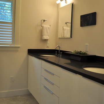
Inside, low ceilings and soffits in the primary family common areas were removed to create a cathedral ceiling (with rod ties) over a reconfigured semi-open living, dining, and kitchen space. A new gas fireplace serving the relocated dining area -- defined by a new built-in banquette in a new bay window -- was designed to back up on the existing wood-burning fireplace that continues to serve the living area. A shared full bath, serving two guest bedrooms on the main level, was reconfigured, and additional square footage was captured for a reconfigured master bathroom off the existing master bedroom. A new whole-house color palette, including new finishes and new cabinetry, complete the transformation. Today, the owners enjoy a fresh and airy re-imagining of their familiar ranch house.
Photos by Katie Hutchison

 Kebony
M-S Pro Architects announce the completion of an indoor swimming pool in a state-of-the-art, single storey family home set in a picturesque location on the outskirts of Bratislava - one of Europe’s youngest capital cities. Kebony, a beautiful wood recommended by leading architects, was chosen to craft the ceiling of the swimming pool, which is designed to emulate rippling waves as well as for the terrace deck and structural beams.
Sustainability and a desire to recreate the close proximity often seen between wood and water in the natural environment were primary focuses in the design of this project. This led a requirement for a low maintenance wood, compatible humidity and with advanced durability, for the swimming pool ceiling. In addition, a high level of precision when cutting the wood was required in order to achieve the desired appearance of waves.
Supplied by Leading Market, Kebony was carefully selected for the pool ceiling, which consists of 490 lamellae of timber, due to its versatility, durability and environmental credentials. Kebony was also installed throughout the exterior of this property, both for the spacious outdoor terrace and the exterior and interior beams. One of the reasons to choose Kebony was the unified look of wood in all these different applications.
Developed in Norway, the patented Kebony technology uses an environmentally friendly process, which permanently enhances the properties of sustainable softwood with a bio-based liquid derived from agricultural crop waste. By polymerising the wood’s cell wall with furfuryl alcohol, the wood gains greatly improved durability and dimensional stability, giving it characteristics similar to those of tropical hardwood. In creating a wood with comparable properties to tropical hardwood that can be grown in a FSC certified, sustainably managed forest, the demand for tropical woods is reduced, allowing timber to once again be an important part of sustainable construction.
Tomáš Hubinský, Lead Architect at M-S Pro, commented: “From conception through to completion, the creation of this ceiling has been a real feat. Despite the challenges faced by such an intricate design, Kebony was the perfect material to convey our desired effect of waves rippling along the ceiling. We will continue to incorporate Kebony into our interior and exterior designs, with wood fast becoming the first choice material for all architects.”
Mette Valen, Sales Manager Norway at Kebony, explained: “The distinctive nature of this design cleverly portrays the capability of Kebony, demonstrating both the aesthetic and performance qualities of the product. We would be honoured to work with M-S Pro in the future and look forward to seeing how they utilise Kebony in their future projects.”
 Drury Design
Maybe you can relate to these empty nesters who reached out to us to design and build a new kitchen for their current and long term needs. They do lots of entertaining, have an extensive wine collection and enjoy welcoming more grandchildren into the family. Both cook, although he prefers his grill. They wanted their new kitchen to be an open space that is easier to move around in. They were also looking forward to more storage and new, state-of-the-art appliances.
Design objectives:
-New layout to accommodate large groups for frequent entertaining
-Big island to seat as many people as possible
Improve traffic flow by omitting a counter peninsula by the family room and other cabinet barriers
-Main cooktop to face visitors with point-of-use spices, utensils, pots & pans nearby
-Multiple cooking & refrigeration appliances
-Plan for as much countertop space as possible for multiple cooks
-Dedicated spaces needed for wine, liquor, cold drinks & decorative glassware
-Incorporate special details such as thick or waterfall countertops, unique backsplash, wood accents
-Need better task, ambient and general lighting
-Make it beautiful – a kitchen the homeowners could be proud of
-Seamlessly join kitchen with breakfast room, given load-bearing wall & various ceiling heights
-Ensure the large, newly opened space remains intimate and inclusive
-Determine how to best utilize the breakfast room, given limited availability of wall space with two sets of French doors and a large window
-Relocating two ventilation ducts currently in a wall to be removed
-Incorporate multiple appliances while adding functional storage
-Integrate special details that wouldn’t be lost in a large room
-Utilize multiple finishes and colors that provide continuity
Design solutions:
-The wall between the kitchen & breakfast nook was completely removed – the structural beam was shortened, providing the largest opening possible
-One small wall section remained intact to relocate ductwork, which conveniently created an alcove for the dual refrigerator armoire
-Two islands in the same finish visually join the elongated room
-The cooking island includes necessary point-of-use storage along with a steam oven and additional storage on the opposite side
The wide cooking island allows for two cooks to comfortably share the counter space, allowing casual interaction
-The second island fills the center of the former breakfast room; tall cabinets in a contrasting finish flank the French doors and provide visual balance
-The sizable second island provides seating for six on a conversation-conducive curve. It houses freezer drawers, a microwave drawer, an under-counter refrigerator, plus additional storage
-Docking station inside drawer
-Two cabinet styles in three finishes provide continuity, balance and interest in the large room
While the clients didn’t have a specific vision of the remodeled space, they were completely open to new ideas and knew which features they wanted when they saw them. They were truly doing the project for their own enjoyment and that of their family and guests. We’re happy to know they are thrilled with the end result. In fact, we had so much fun working together we’re now talking about a new project!
 Drury Design
Maybe you can relate to these empty nesters who reached out to us to design and build a new kitchen for their current and long term needs. They do lots of entertaining, have an extensive wine collection and enjoy welcoming more grandchildren into the family. Both cook, although he prefers his grill. They wanted their new kitchen to be an open space that is easier to move around in. They were also looking forward to more storage and new, state-of-the-art appliances.
Design objectives:
-New layout to accommodate large groups for frequent entertaining
-Big island to seat as many people as possible
Improve traffic flow by omitting a counter peninsula by the family room and other cabinet barriers
-Main cooktop to face visitors with point-of-use spices, utensils, pots & pans nearby
-Multiple cooking & refrigeration appliances
-Plan for as much countertop space as possible for multiple cooks
-Dedicated spaces needed for wine, liquor, cold drinks & decorative glassware
-Incorporate special details such as thick or waterfall countertops, unique backsplash, wood accents
-Need better task, ambient and general lighting
-Make it beautiful – a kitchen the homeowners could be proud of
-Seamlessly join kitchen with breakfast room, given load-bearing wall & various ceiling heights
-Ensure the large, newly opened space remains intimate and inclusive
-Determine how to best utilize the breakfast room, given limited availability of wall space with two sets of French doors and a large window
-Relocating two ventilation ducts currently in a wall to be removed
-Incorporate multiple appliances while adding functional storage
-Integrate special details that wouldn’t be lost in a large room
-Utilize multiple finishes and colors that provide continuity
Design solutions:
-The wall between the kitchen & breakfast nook was completely removed – the structural beam was shortened, providing the largest opening possible
-One small wall section remained intact to relocate ductwork, which conveniently created an alcove for the dual refrigerator armoire
-Two islands in the same finish visually join the elongated room
-The cooking island includes necessary point-of-use storage along with a steam oven and additional storage on the opposite side
The wide cooking island allows for two cooks to comfortably share the counter space, allowing casual interaction
-The second island fills the center of the former breakfast room; tall cabinets in a contrasting finish flank the French doors and provide visual balance
-The sizable second island provides seating for six on a conversation-conducive curve. It houses freezer drawers, a microwave drawer, an under-counter refrigerator, plus additional storage
-Docking station inside drawer
-Two cabinet styles in three finishes provide continuity, balance and interest in the large room
While the clients didn’t have a specific vision of the remodeled space, they were completely open to new ideas and knew which features they wanted when they saw them. They were truly doing the project for their own enjoyment and that of their family and guests. We’re happy to know they are thrilled with the end result. In fact, we had so much fun working together we’re now talking about a new project!
 Milgard Windows & Doors
The Kiguchi family moved into their Austin, Texas home in 1994. Built in the 1980’s as part of a neighborhood development, they happily raised their family here but longed for something more contemporary. Once they became empty nesters, they decided it was time for a major remodel. After spending many years visiting Austin AIA Home Tours that highlight contemporary residential architecture, they had a lot of ideas and in 2013 were ready to interview architects and get their renovation underway.
The project turned into a major remodel due to an unstable foundation. Architects Ben Arbib and Ed Hughey, of Arbib Hughey Design were hired to solve the structural issue and look for inspiration in the bones of the house, which sat on top of a hillside and was surrounded by great views.
Unfortunately, with the old floor plan, the beautiful views were hidden by small windows that were poorly placed. In order to bring more natural light into the house the window sizes and configurations had to be addressed, all while keeping in mind the homeowners desire for a modern look and feel.
To achieve a more contemporary and sophisticated front of house, a new entry was designed that included removing a two-story bay window and porch. The entrance of the home also became more integrated with the landscape creating a template for new foliage to be planted. Older exterior materials were updated to incorporate a more muted palette of colors with a metal roof, dark grey siding in the back and white stucco in the front. Deep eaves were added over many of the new large windows for clean lines and sun protection.
“Inside it was about opening up the floor plan, expanding the views throughout the house, and updating the material palette to get a modern look that was also warm and inviting,” said Ben from Arbib Hughey Design. “Prior to the remodel, the house had the typical separation of rooms. We removed the walls between them and changed all of the windows to Milgard Thermally Improved Aluminum to connect the inside with the outside. No matter where you are you get nice views and natural light.”
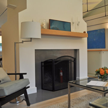
The architects wanted to create some drama, which they accomplished with the window placement and opening up the interior floor plan to an open concept approach. Cabinetry was used to help delineate intimate spaces. To add warmth to an all-white living room, white-washed oak wood floors were installed and pine planks were used around the fireplace. The large windows served as artwork bringing the color of nature into the space.
An octagon shaped, elevated dining room, (named “the turret”), had a big impact on the design of the house. They architects rounded the corners and added larger window openings overlooking a new sunken garden. The great room was also softened by rounding out the corners and that circular theme continued throughout the house, being picked up in skylight wells and kitchen cabinetry. A staircase leading to a catwalk was added and the result was a two-story window wall that flooded the home with natural light.
When asked why Milgard® Thermally Improved Aluminum windows were selected, the architectural team listed many reasons:
1) Aesthetics: “We liked the slim profiles and narrow sightlines. The window frames never get in the way of the view and that was important to us. They also have a very contemporary look that went well with our design.”
2) Options: “We liked that we could get large sliding doors that matched the windows, giving us a very cohesive look and feel throughout the project.”
3) Cost Effective: “Milgard windows are affordable. You get a good product at a good price.”
4) Custom Sizes: “Milgard windows are customizable, which allowed us to get the right window for each location.”
Ready to take on your own traditional to modern home remodeling project? Arbib Hughey Design advises, “Work with a good architect. That means picking a team that is creative, communicative, listens well and is responsive. We think it’s important for an architect to listen to their clients and give them something they want, not something the architect thinks they should have. At the same time you want an architect who is willing and able to think outside the box and offer up design options that you may not have considered. Design is about a lot of back and forth, trying out ideas, getting feedback and trying again.”
The home was completely transformed into a unique, contemporary house perfectly integrated with its site. Internally the home has a natural flow for the occupants and externally it is integrated with the surroundings taking advantage of great natural light. As a side note, it was highly praised as part of the Austin AIA homes tour.
 Katie Hutchison Studio
Constructed in two phases, this renovation, with a few small additions, touched nearly every room in this late ‘50’s ranch house. The owners raised their family within the original walls and love the house’s location, which is not far from town and also borders conservation land. But they didn’t love how chopped up the house was and the lack of exposure to natural daylight and views of the lush rear woods. Plus, they were ready to de-clutter for a more stream-lined look. As a result, KHS collaborated with them to create a quiet, clean design to support the lifestyle they aspire to in retirement.
To transform the original ranch house, KHS proposed several significant changes that would make way for a number of related improvements. Proposed changes included the removal of the attached enclosed breezeway (which had included a stair to the basement living space) and the two-car garage it partially wrapped, which had blocked vital eastern daylight from accessing the interior. Together the breezeway and garage had also contributed to a long, flush front façade. In its stead, KHS proposed a new two-car carport, attached storage shed, and exterior basement stair in a new location. The carport is bumped closer to the street to relieve the flush front facade and to allow access behind it to eastern daylight in a relocated rear kitchen. KHS also proposed a new, single, more prominent front entry, closer to the driveway to replace the former secondary entrance into the dark breezeway and a more formal main entrance that had been located much farther down the facade and curiously bordered the bedroom wing.
Inside, low ceilings and soffits in the primary family common areas were removed to create a cathedral ceiling (with rod ties) over a reconfigured semi-open living, dining, and kitchen space. A new gas fireplace serving the relocated dining area -- defined by a new built-in banquette in a new bay window -- was designed to back up on the existing wood-burning fireplace that continues to serve the living area. A shared full bath, serving two guest bedrooms on the main level, was reconfigured, and additional square footage was captured for a reconfigured master bathroom off the existing master bedroom. A new whole-house color palette, including new finishes and new cabinetry, complete the transformation. Today, the owners enjoy a fresh and airy re-imagining of their familiar ranch house.
Photos by Katie Hutchison
 Katie Hutchison Studio
Constructed in two phases, this renovation, with a few small additions, touched nearly every room in this late ‘50’s ranch house. The owners raised their family within the original walls and love the house’s location, which is not far from town and also borders conservation land. But they didn’t love how chopped up the house was and the lack of exposure to natural daylight and views of the lush rear woods. Plus, they were ready to de-clutter for a more stream-lined look. As a result, KHS collaborated with them to create a quiet, clean design to support the lifestyle they aspire to in retirement.
To transform the original ranch house, KHS proposed several significant changes that would make way for a number of related improvements. Proposed changes included the removal of the attached enclosed breezeway (which had included a stair to the basement living space) and the two-car garage it partially wrapped, which had blocked vital eastern daylight from accessing the interior. Together the breezeway and garage had also contributed to a long, flush front façade. In its stead, KHS proposed a new two-car carport, attached storage shed, and exterior basement stair in a new location. The carport is bumped closer to the street to relieve the flush front facade and to allow access behind it to eastern daylight in a relocated rear kitchen. KHS also proposed a new, single, more prominent front entry, closer to the driveway to replace the former secondary entrance into the dark breezeway and a more formal main entrance that had been located much farther down the facade and curiously bordered the bedroom wing.
Inside, low ceilings and soffits in the primary family common areas were removed to create a cathedral ceiling (with rod ties) over a reconfigured semi-open living, dining, and kitchen space. A new gas fireplace serving the relocated dining area -- defined by a new built-in banquette in a new bay window -- was designed to back up on the existing wood-burning fireplace that continues to serve the living area. A shared full bath, serving two guest bedrooms on the main level, was reconfigured, and additional square footage was captured for a reconfigured master bathroom off the existing master bedroom. A new whole-house color palette, including new finishes and new cabinetry, complete the transformation. Today, the owners enjoy a fresh and airy re-imagining of their familiar ranch house.
Photos by Katie Hutchison
 User
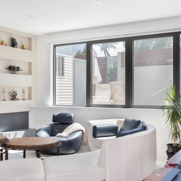
UserThe open space plan on the main level of the Prairie Style home is deceiving of the actual separation of spaces. This home packs a punch with a private hot tub, craft room, library, and even a theater. The interior of the home features the same attention to place, as the natural world is evident in the use of granite, basalt, walnut, poplar, and natural river rock throughout. Floor to ceiling windows in strategic locations eliminates the sense of compression on the interior, while the overall window design promotes natural daylighting and cross-ventilation in nearly every space of the home.
Glo’s A5 Series in double pane was selected for the high performance values and clean, minimal frame profiles. High performance spacers, double pane glass, multiple air seals, and a larger continuous thermal break combine to reduce convection and eliminate condensation, ultimately providing energy efficiency and thermal performance unheard of in traditional aluminum windows. The A5 Series provides smooth operation and long-lasting durability without sacrificing style for this Prairie Style home.
 Batt + Lear
“House with the Common View,” Wallingford
AWARDS: Best of Wallingford, Built Green Hammer Award
Description
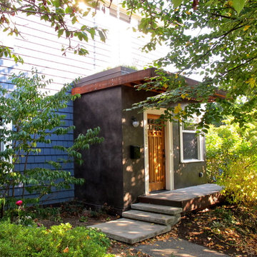
Artistic, sustainable addition to a small Wallingford bungalow which was necessary to allow a growing family to continue to thrive in a neighborhood that they love.
Challenge
Growing family needed more space but they didn’t want to move. They knew that they would have to build up but don’t want to block views or ruin the experience for their neighbor friends. Because of the size and shape of the lot, there were also permitting and structuring challenges.
Inspiration
We found inspiration in the family and their commitment to the place, neighborhood and friends. We wanted to create a house that is not only functional and respectful of the neighbor’s view, but that actually gives back to the neighborhood. We had to lean in hard in the design process to pull all of that off.
Solutions + Innovations
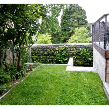
We engaged in a meticulous design process included literal “boots on the ground” elements like standing on the property with sticks to measure the neighbor’s view. We not only maintained that view but enhanced it by giving the neighbors a view of green roof gardens on 4 sides of the house. To support that work, we had to rebuild the foundation. As an amenity for the neighborhood at large, we created a rain path that channeled into living wall and structured rain garden that was adjacent to the sidewalk.
How is it sustainable?
We salvaged or repurposed all of the materials that we could, including salvaging painted shingles on from house and repurposing them for a tiny play house (which also has a green roof). The old beams from basement became a cabinet in the new bathroom. We also used orchard-salvaged walnut which matched the horizontal grain already existing in the kitchen.
We economized on space, saving the footprint on the main floor, and only added 600 feet upstairs which house two bedrooms and one batch. We used casework to create walls, used the stairs for part of the cabinets, and built walk-n cabinets, creating adaptable space for long term needs. More adaptable space included a sharable bathroom/wetroom which is functional for both adults and kids.
We developed a green roof system, rain gardens, and a green wall along sidewalk.
We took the opportunity to improve the envelope, insulating outside the building before the siding went back on. We also incorporated solar into the design, created the opportunity for natural daylighting all day on upper level and stairwell, as well as using resin-based eco countertops.
 Batt + Lear
“House with the Common View,” Wallingford
AWARDS: Best of Wallingford, Built Green Hammer Award
Description
Artistic, sustainable addition to a small Wallingford bungalow which was necessary to allow a growing family to continue to thrive in a neighborhood that they love.
Challenge
Growing family needed more space but they didn’t want to move. They knew that they would have to build up but don’t want to block views or ruin the experience for their neighbor friends. Because of the size and shape of the lot, there were also permitting and structuring challenges.
Inspiration
We found inspiration in the family and their commitment to the place, neighborhood and friends. We wanted to create a house that is not only functional and respectful of the neighbor’s view, but that actually gives back to the neighborhood. We had to lean in hard in the design process to pull all of that off.
Solutions + Innovations
We engaged in a meticulous design process included literal “boots on the ground” elements like standing on the property with sticks to measure the neighbor’s view. We not only maintained that view but enhanced it by giving the neighbors a view of green roof gardens on 4 sides of the house. To support that work, we had to rebuild the foundation. As an amenity for the neighborhood at large, we created a rain path that channeled into living wall and structured rain garden that was adjacent to the sidewalk.
How is it sustainable?
We salvaged or repurposed all of the materials that we could, including salvaging painted shingles on from house and repurposing them for a tiny play house (which also has a green roof). The old beams from basement became a cabinet in the new bathroom. We also used orchard-salvaged walnut which matched the horizontal grain already existing in the kitchen.
We economized on space, saving the footprint on the main floor, and only added 600 feet upstairs which house two bedrooms and one batch. We used casework to create walls, used the stairs for part of the cabinets, and built walk-n cabinets, creating adaptable space for long term needs. More adaptable space included a sharable bathroom/wetroom which is functional for both adults and kids.
We developed a green roof system, rain gardens, and a green wall along sidewalk.
We took the opportunity to improve the envelope, insulating outside the building before the siding went back on. We also incorporated solar into the design, created the opportunity for natural daylighting all day on upper level and stairwell, as well as using resin-based eco countertops.
 Hahka Kitchens
PAT RICE KITCHEN
This Santa Barbara Bungalow, located in an historical area of Santa Barbara, had tons of charm, but the kitchen was small, cramped and lacked modern day function and storage.
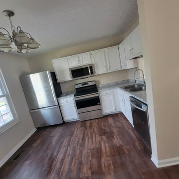
The kitchen you see today was achieved in 2 phases, by 2 different homeowners. It’s bright and sunny, with ample storage, generous amounts of countertop space and an Island perfect for meal prep. This is a classic kitchen, with white inset Shaker style doors, which continues to be the hottest look on the market.
Phase 1 improved the small kitchen by eliminating a side door and taking out a built-in banquette, thus increasing kitchen size. A small island was added and a washer & dryer area was included. Perfect for a young family.
Phase 2 enlarged the kitchen even more. A back bedroom was opened up to the kitchen, providing space for the office and bookcase areas. The laundry was moved to another part of the house, thus allowing for more cabinetry and countertop space. Two pantries were added, along with open shelving, plus alcoves for a microwave and a kitchen TV. A maple free standing Island is a classic contrast to the white cabinetry. By specifying maple countertops for the office area, it ties the kitchen and office areas together.
Hahka Kitchens handled both phases of the kitchen remodel, and we were able to order matching cabinets and obtain the same countertop material. The result is that the kitchen is completely integrated with no evidence that this amazing kitchen was done in 2 stages, 8 years apart. The new homeowner did replace knobs and pulls from phase 1, and more ordered for the new cabinets, thus putting her mark on the kitchen. And the new homeowner found the sturdy and functional Island, which was a perfect complement to the white shaker cabinets.
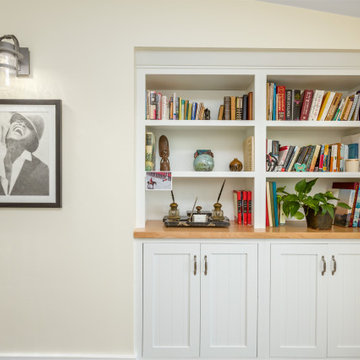
One last note about the office area, which is flooded with light from patio doors and large windows. The desk, with white shaker doors that match the kitchen, has loads of functionality. 2 large desk drawers, with hanging file folders, a pull-out trash can, small desk drawers and open shelving meet the needs of a home office. The built-in bookcase, which was fitted into an existing recessed alcove, was expertly installed and provides both open display areas and hidden storage. The “V groove doors” complement the Shaker doors, adding a furniture charm to the office.
This expanded kitchen is truly the “heart of this historic home”.

 Kebony
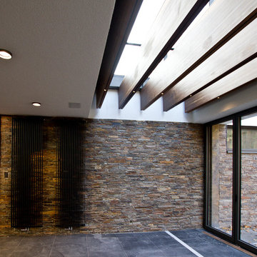
M-S Pro Architects announce the completion of an indoor swimming pool in a state-of-the-art, single storey family home set in a picturesque location on the outskirts of Bratislava - one of Europe’s youngest capital cities. Kebony, a beautiful wood recommended by leading architects, was chosen to craft the ceiling of the swimming pool, which is designed to emulate rippling waves as well as for the terrace deck and structural beams.
Sustainability and a desire to recreate the close proximity often seen between wood and water in the natural environment were primary focuses in the design of this project. This led a requirement for a low maintenance wood, compatible humidity and with advanced durability, for the swimming pool ceiling. In addition, a high level of precision when cutting the wood was required in order to achieve the desired appearance of waves.
Supplied by Leading Market, Kebony was carefully selected for the pool ceiling, which consists of 490 lamellae of timber, due to its versatility, durability and environmental credentials. Kebony was also installed throughout the exterior of this property, both for the spacious outdoor terrace and the exterior and interior beams. One of the reasons to choose Kebony was the unified look of wood in all these different applications.
Developed in Norway, the patented Kebony technology uses an environmentally friendly process, which permanently enhances the properties of sustainable softwood with a bio-based liquid derived from agricultural crop waste. By polymerising the wood’s cell wall with furfuryl alcohol, the wood gains greatly improved durability and dimensional stability, giving it characteristics similar to those of tropical hardwood. In creating a wood with comparable properties to tropical hardwood that can be grown in a FSC certified, sustainably managed forest, the demand for tropical woods is reduced, allowing timber to once again be an important part of sustainable construction.
Tomáš Hubinský, Lead Architect at M-S Pro, commented: “From conception through to completion, the creation of this ceiling has been a real feat. Despite the challenges faced by such an intricate design, Kebony was the perfect material to convey our desired effect of waves rippling along the ceiling. We will continue to incorporate Kebony into our interior and exterior designs, with wood fast becoming the first choice material for all architects.”
Mette Valen, Sales Manager Norway at Kebony, explained: “The distinctive nature of this design cleverly portrays the capability of Kebony, demonstrating both the aesthetic and performance qualities of the product. We would be honoured to work with M-S Pro in the future and look forward to seeing how they utilise Kebony in their future projects.”
 Michael Nash Design, Build & Homes
Side Addition to Oak Hill Home
After living in their Oak Hill home for several years, they decided that they needed a larger, multi-functional laundry room, a side entrance and mudroom that suited their busy lifestyles.
A small powder room was a closet placed in the middle of the kitchen, while a tight laundry closet space overflowed into the kitchen.
After meeting with Michael Nash Custom Kitchens, plans were drawn for a side addition to the right elevation of the home. This modification filled in an open space at end of driveway which helped boost the front elevation of this home.
Covering it with matching brick facade made it appear as a seamless addition.
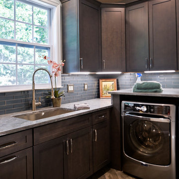
The side entrance allows kids easy access to mudroom, for hang clothes in new lockers and storing used clothes in new large laundry room. This new state of the art, 10 feet by 12 feet laundry room is wrapped up with upscale cabinetry and a quartzite counter top.
The garage entrance door was relocated into the new mudroom, with a large side closet allowing the old doorway to become a pantry for the kitchen, while the old powder room was converted into a walk-in pantry.
A new adjacent powder room covered in plank looking porcelain tile was furnished with embedded black toilet tanks. A wall mounted custom vanity covered with stunning one-piece concrete and sink top and inlay mirror in stone covered black wall with gorgeous surround lighting. Smart use of intense and bold color tones, help improve this amazing side addition.
Dark grey built-in lockers complementing slate finished in place stone floors created a continuous floor place with the adjacent kitchen flooring.
Now this family are getting to enjoy every bit of the added space which makes life easier for all.
82