
Search results for "Cookie sheet storage" in Home Design Ideas
 Riverside Construction, LLC
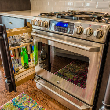
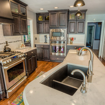
A love of cooking and baking led this Monticello homeowner to remodel her kitchen. The cabinets were upgraded to a more sophisticated, classic- yet trendy style. Special touches included a specialty storage space in the toe kick, along with traditional vertical storage space for cookie sheets and pots and pans. Riverside Construction swapped the double ovens and refrigerator to create a proper cooking zone while adding the functionality of double ovens. We also removed soffits to gain a valuable glass cabinet display area. New quartz countertops created a clean and elegant work surface and a white 3×6 beveled backsplash with an art deco border and under-cabinet lighting rounded out this sophisticated kitchen design.
 Bullseye Wood Specialties, L.L.C
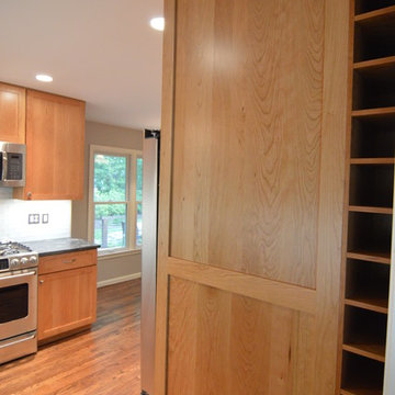
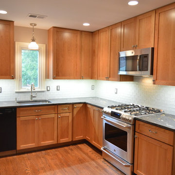
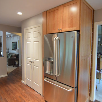
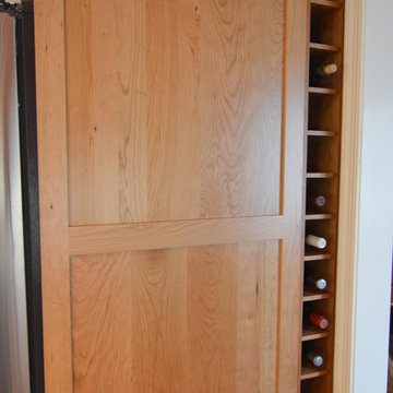
Kitchen remodel with shaker style cherry cabinetry with leathered counter top, slide in range, custom wine cubbies, lazy susan, double trash pull out and glass tile back splash.
 Bullseye Wood Specialties, L.L.C
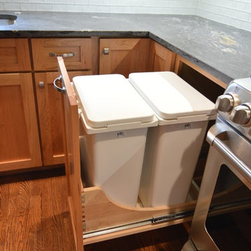
Kitchen remodel with shaker style cherry cabinetry with leathered counter top, slide in range, custom wine cubbies, lazy susan, double trash pull out and glass tile back splash.
Find the right local pro for your project
 North Shore Kitchen & Bath
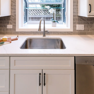
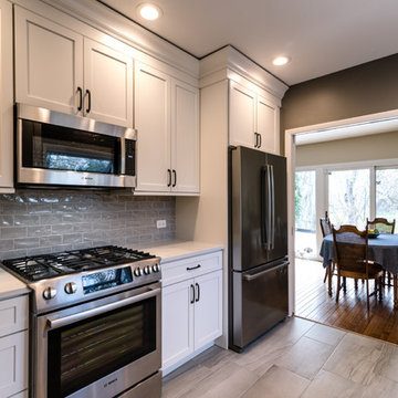
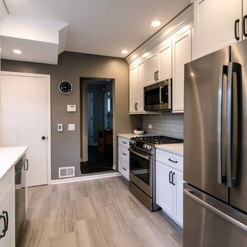
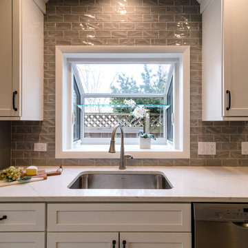
With this kitchen needing an update, we took the opportunity to move things around slightly to greatly improve the flow of the kitchen. By moving the refrigerator to the dining room side, it increased the flow coming into the kitchen from the entryway significantly. We also moved the sink to be centered on the window, allowing us a creative storage solution at the end of the dishwasher for cookie sheets, trays or cutting boards. We also removed the very large soffits (nearly 2' high) and were able to gain additional storage by taking the cabinetry all the way to the ceiling. By adding heated floors in this kitchen, it helps make this a nice cozy space to cook in. Using white cabinetry and adding in extra can lighting this space now looks and feel larger, brighter and more open. The grey textured subway tile and dark gunmetal hardware adds a bit of fun to the space, along with some contrast against the white cabinetry and countertops.
 Riverside Construction, LLC
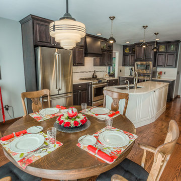
A love of cooking and baking led this Monticello homeowner to remodel her kitchen. The cabinets were upgraded to a more sophisticated, classic- yet trendy style. Special touches included a specialty storage space in the toe kick, along with traditional vertical storage space for cookie sheets and pots and pans. Riverside Construction swapped the double ovens and refrigerator to create a proper cooking zone while adding the functionality of double ovens. We also removed soffits to gain a valuable glass cabinet display area. New quartz countertops created a clean and elegant work surface and a white 3×6 beveled backsplash with an art deco border and under-cabinet lighting rounded out this sophisticated kitchen design.
 Bullseye Wood Specialties, L.L.C
Kitchen remodel with shaker style cherry cabinetry with leathered counter top, slide in range, custom wine cubbies, lazy susan, double trash pull out and glass tile back splash.
 North Shore Kitchen & Bath
With this kitchen needing an update, we took the opportunity to move things around slightly to greatly improve the flow of the kitchen. By moving the refrigerator to the dining room side, it increased the flow coming into the kitchen from the entryway significantly. We also moved the sink to be centered on the window, allowing us a creative storage solution at the end of the dishwasher for cookie sheets, trays or cutting boards. We also removed the very large soffits (nearly 2' high) and were able to gain additional storage by taking the cabinetry all the way to the ceiling. By adding heated floors in this kitchen, it helps make this a nice cozy space to cook in. Using white cabinetry and adding in extra can lighting this space now looks and feel larger, brighter and more open. The grey textured subway tile and dark gunmetal hardware adds a bit of fun to the space, along with some contrast against the white cabinetry and countertops.

 North Shore Kitchen & Bath
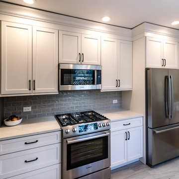
With this kitchen needing an update, we took the opportunity to move things around slightly to greatly improve the flow of the kitchen. By moving the refrigerator to the dining room side, it increased the flow coming into the kitchen from the entryway significantly. We also moved the sink to be centered on the window, allowing us a creative storage solution at the end of the dishwasher for cookie sheets, trays or cutting boards. We also removed the very large soffits (nearly 2' high) and were able to gain additional storage by taking the cabinetry all the way to the ceiling. By adding heated floors in this kitchen, it helps make this a nice cozy space to cook in. Using white cabinetry and adding in extra can lighting this space now looks and feel larger, brighter and more open. The grey textured subway tile and dark gunmetal hardware adds a bit of fun to the space, along with some contrast against the white cabinetry and countertops.
 KitchensNClosets of Charleston
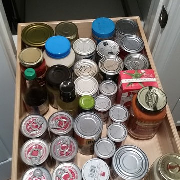
Glideouts have to fit between opening; but have no fear, the sides can still be used (see the Pam Spray). High deep areas are great for trays and cookie sheets.
 Abbas Rachaman, Designer, Board&Vellum
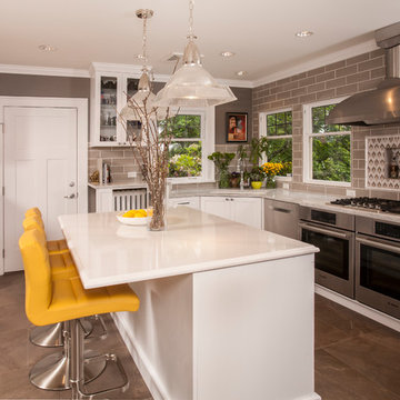
This is major kitchen remodel done on a tight budget!
1st thing I noticed in the original kitchen (please refer to before pictures) was that the ceiling height was lower than both the adjacent rooms, and of course the soffit cabinets made everything lower so I suggested we take the ceiling height up the match the other rooms. Through process of elimination I found the best place for the sink was in the corner because she would now have 2 windows for views of the neighborhood and a place to put the plants that once sat on the floor in the “breakfast nook”. Moving the gas cook top the exterior wall allowed for ease of installation and venting out also this was the best place to put it given the amount of windows. It is very important to me to design every kitchen with surface space on either side of the cook top so that you have enough room for baking racks, cookie sheets, etc.. to spread out. The solution to the double oven request was to put 2 of them under the counter instead of stacking them which would have taken up surface space. During the design meeting I asked how often to you close that door to the dining room? To which they replied “never, we always leave it open”. I knew then that door was a waste of space so I decided to toss that to make a bigger opening to make the kitchen more inviting as you enter from the dining room. Another thing I always talk about during kitchen designs is “landing zone”. You must have a surface to place things on once you enter the kitchen, be it groceries, keys, phone, wallet, etc.. But I find it functional and it keeps you from walking into a room with large things on either side of you. Again relating back to making sure the kitchen felt inviting. Definitely wanted make sure we had as much pullout kitchen accessories and deep drawers for ease of use because we did not have room for a lot of upper cabinets. I decided to take full advantage of those large open windows buy taking the tile to the ceiling and picture framing them with tile liners. The effect is that you see more light coming in because of the contrast of the darker tile. My solution to the clients request to get as much light in from the adjacent family room was to take out that kitchen desk and frame in a large opening. I needed to make sure that opening made a statement so instead of doing a standard door casing I added architectural details of molding around the doorway and highlighted by insetting the molding into the wall and painting the inset a different color. Once I was able to achieve bringing in the most light, I decided I could bring in a little drama by going with a dark wall color! It is okay to use dark wall colors as long as you have enough light so it still feels inviting. My solution to the radiator was to move it over to give us just enough room to squeeze in another cabinet for capturing as much storage as I could. I needed to make sure I had that “landing zone” so I wanted to place a counter top over the radiator, but how? I used a decorative post to give the kitchen a little something extra and to tie back in with the cabinets. Then I added a counter top above the wine refrigerator but both had to be the same height because they were across from each other. So what a great challenge this turned out be. Because of me needing to make the wine refrigerator counter top higher to match the other counter top, I was able to fit in a little drawer for wine accessories above the wine refrigerator. More storage! Yes!! Painting the radiator white to give it a fresh new look added a lot and was relatively simple in the grand scheme of things. Solution to pantry was to make it a cabinet pantry so that we didn’t have to work around the thickness of walls and a door. Island size was determined by NKBA standards of having enough room for traffic flow around the kitchen which allowed us 3 chairs. And if someone ever wanted to, they could use the counter above the radiator as a surface to work on. Of course we updated all the lighting, made sure we had under counter lighting, and they are all LED. Lastly porcelain floor tiles , ceramic backsplash and quartz counter tops were the material of choice for ease of maintenance and budget.
 Hager Cabinets Inc.
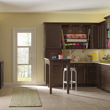
Thatch is beautiful new #Diamond stain. As shown in this #craftroom with so many storage and innovation ideas you just cant wait to have your own just like this!
Featuring 3 corner stacked drawers for much more functional storage. No more digging in the back of a lazy Susan!
A 6" wide full height base single door cabinet. After all, you can never have to many cookie sheets or shopping bags within easy reach!
A two drawer base cabinet. Heavy duty, under mount glides support drawers so you can store in bulk and search with ease. A very streamline look for a #contemporary design.
 Parr Cabinet Design Center
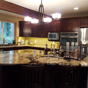
This sophisticated kitchen incorporates elements traditionally found in a Craftsman style space.
The homeowner selected the AristoKraft Winstead doorstyle, which is a full overlay shaker available in Maple, in the Umber finish. Incorporating the dark, rich woods reinforces the Craftsman style and places an emphasis on the cabinet’s natural beauty.
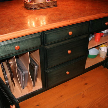
Maximizing storage while still making sure everything was easily accessible was the biggest concern. Adding several interior conveniences such as tip out trays in the sink base, garbage and recycle pullouts in the island, and roll out shelving below the cooktop helped immensely with accessibility. The customer also opted to include a tray divider cabinet for cookie sheets and spice pullouts.
The designers were able to find the right color of AristoKraft cabinets by pulling woodsy brown hues from the perimeter and island countertops.
When designing the island, having plenty of space for preparation was crucial. The original kitchen design started with a smaller island, approximately 54x48”. By the third revision, the island had grown to roughly 96 x 84”, including space for barstools on the back side and additional storage for wine below the overhang.
The stainless steel appliances and hardware ties the space together and creates cohesiveness.
Undercabinet lighting is highly functional and enhances the lush colors found in the cabinets and countertops.
The exposed wood beam is an excellent design element. Not only does it compliment the rich cabinetry, it also adds a unique component found in most Craftman style kitchens. Additionally, the beam shows the location of the original exterior wall.
 KitchensNClosets of Charleston
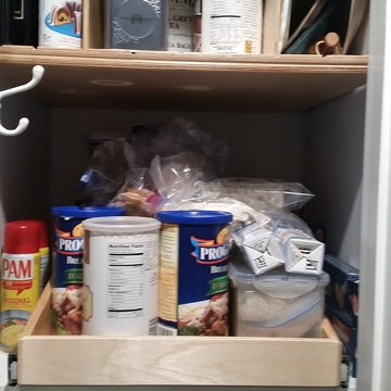
Glideouts have to fit between opening; but have no fear, the sides can still be used (see the Pam Spray). High deep areas are great for trays and cookie sheets.
 Michelle Lawrence Interior Design
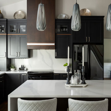
This home was a builder grade entry level home 22+ years ago, it has been transformed to the original owner's dream home. The kitchen is open to the family room and has very tall ceilings, but there was no way to extend the kitchen out. By going up, we were able to add much needed storage and utilize space already there. A custom cabinet above the refrigerator has vertical and horizontal storage to house cookie sheets, platters and even the turkey roasting pan all in the kitchen space. An appliance garage helps keep daily small appliances within reach without being on display. The tall kitchen commanded a more sophisticated range hood than a microwave. I designed a custom hood to better fit the space and bring in a little drama and sophistication to an elegant kitchen. Made of stained walnut with a natural walnut detail. Lighting control was important. Layered lighting to include accent, in cabinet, under cabinet, toe kick lighting all remote controlled and dimmable. The door activated in- cabinet lighting in the blind corner custom cabinet and the pantry make prepping easier. Pendants and canned lighting on dimmers.
 Bullseye Wood Specialties, L.L.C
Kitchen remodel with shaker style cherry cabinetry with leathered counter top, slide in range, custom wine cubbies, lazy susan, double trash pull out and glass tile back splash.
 Bullseye Wood Specialties, L.L.C
Kitchen remodel with shaker style cherry cabinetry with leathered counter top, slide in range, custom wine cubbies, lazy susan, double trash pull out and glass tile back splash.
 North Shore Kitchen & Bath
With this kitchen needing an update, we took the opportunity to move things around slightly to greatly improve the flow of the kitchen. By moving the refrigerator to the dining room side, it increased the flow coming into the kitchen from the entryway significantly. We also moved the sink to be centered on the window, allowing us a creative storage solution at the end of the dishwasher for cookie sheets, trays or cutting boards. We also removed the very large soffits (nearly 2' high) and were able to gain additional storage by taking the cabinetry all the way to the ceiling. By adding heated floors in this kitchen, it helps make this a nice cozy space to cook in. Using white cabinetry and adding in extra can lighting this space now looks and feel larger, brighter and more open. The grey textured subway tile and dark gunmetal hardware adds a bit of fun to the space, along with some contrast against the white cabinetry and countertops.
 North Shore Kitchen & Bath
With this kitchen needing an update, we took the opportunity to move things around slightly to greatly improve the flow of the kitchen. By moving the refrigerator to the dining room side, it increased the flow coming into the kitchen from the entryway significantly. We also moved the sink to be centered on the window, allowing us a creative storage solution at the end of the dishwasher for cookie sheets, trays or cutting boards. We also removed the very large soffits (nearly 2' high) and were able to gain additional storage by taking the cabinetry all the way to the ceiling. By adding heated floors in this kitchen, it helps make this a nice cozy space to cook in. Using white cabinetry and adding in extra can lighting this space now looks and feel larger, brighter and more open. The grey textured subway tile and dark gunmetal hardware adds a bit of fun to the space, along with some contrast against the white cabinetry and countertops.
 Riverside Construction, LLC
A love of cooking and baking led this Monticello homeowner to remodel her kitchen. The cabinets were upgraded to a more sophisticated, classic- yet trendy style. Special touches included a specialty storage space in the toe kick, along with traditional vertical storage space for cookie sheets and pots and pans. Riverside Construction swapped the double ovens and refrigerator to create a proper cooking zone while adding the functionality of double ovens. We also removed soffits to gain a valuable glass cabinet display area. New quartz countertops created a clean and elegant work surface and a white 3×6 beveled backsplash with an art deco border and under-cabinet lighting rounded out this sophisticated kitchen design.

27