
Search results for "Core public" in Home Design Ideas

 Dynia Architects
This residence is located on the banks of the Snake River. Drawing inspiration from the adjacent braided river channels, the precise layout form unique relationships to the site from each room, as well as dynamic views and spatial experiences. The sequence of interior spaces gradually unfolds to reveal views of the pond, river and mountains beyond. The skewed geometry creates shifting views between interior spaces and levels.
A three-story stair atrium brings light into the core of the house, gracefully connects floor levels, and creates a transition from the public to private zones of the house. The volume of the house cantilevers to cover an exterior dining area and spans to frame the entrance into the house and the river beyond. The exterior rain screen on the clean modern forms creates continuity with the surrounding cottonwood forest.

 The Jack + Mare | Portland Design & Build
Split Level 1970 home of a young and active family of four. The main public spaces in this home were remodeled to create a fresh, clean look.
The Jack + Mare demo'd the kitchen and dining room down to studs and removed the wall between the kitchen/dining and living room to create an open concept space with a clean and fresh new kitchen and dining with ample storage. Now the family can all be together and enjoy one another's company even if mom or dad is busy in the kitchen prepping the next meal.
The custom white cabinets and the blue accent island (and walls) really give a nice clean and fun feel to the space. The island has a gorgeous local solid slab of wood on top. A local artisan salvaged and milled up the big leaf maple for this project. In fact, the tree was from the University of Portland's campus located right where the client once rode the bus to school when she was a child. So it's an extra special custom piece! (fun fact: there is a bullet lodged in the wood that is visible...we estimate it was shot into the tree 30-35 years ago!)
The 'public' spaces were given a brand new waterproof luxury vinyl wide plank tile. With 2 young daughters, a large golden retriever and elderly cat, the durable floor was a must.
project scope at quick glance:
- demo'd and rebuild kitchen and dining room.
- removed wall separating kitchen/dining and living room
- removed carpet and installed new flooring in public spaces
- removed stair carpet and gave fresh black and white paint
- painted all public spaces
- new hallway doorknob harware
- all new LED lighting (kitchen, dining, living room and hallway)
Jason Quigley Photography

 Siegler Design Services + INTERIORS
Older home in desirable Phoenix central core neighborhood gets Hall Guest / Family bathroom makeover. New materials and look pays tribute to American and French Industrial vibe influences, European Boutique Hotels and classical old world stone finishing seen throughout public spaces across Europe. The vibe is old world and warm but, the plumbing fixtures & lighting are 2019 new.
Find the right local pro for your project
 Siegler Design Services + INTERIORS
Older home in desirable Phoenix central core neighborhood gets Hall Guest / Family bathroom makeover. New materials and look pays tribute to American and French Industrial vibe influences, European Boutique Hotels and classical old world stone finishing seen throughout public spaces across Europe. The vibe is old world and warm but, the plumbing fixtures & lighting are 2019 new.

 Breathe Design Studio
Completed in 2015, this project incorporates a Scandinavian vibe to enhance the modern architecture and farmhouse details. The vision was to create a balanced and consistent design to reflect clean lines and subtle rustic details, which creates a calm sanctuary. The whole home is not based on a design aesthetic, but rather how someone wants to feel in a space, specifically the feeling of being cozy, calm, and clean. This home is an interpretation of modern design without focusing on one specific genre; it boasts a midcentury master bedroom, stark and minimal bathrooms, an office that doubles as a music den, and modern open concept on the first floor. It’s the winner of the 2017 design award from the Austin Chapter of the American Institute of Architects and has been on the Tribeza Home Tour; in addition to being published in numerous magazines such as on the cover of Austin Home as well as Dwell Magazine, the cover of Seasonal Living Magazine, Tribeza, Rue Daily, HGTV, Hunker Home, and other international publications.
Featured on Dwell!
https://www.dwell.com/article/sustainability-is-the-centerpiece-of-this-new-austin-development-071e1a55
 Matt Fajkus Architecture
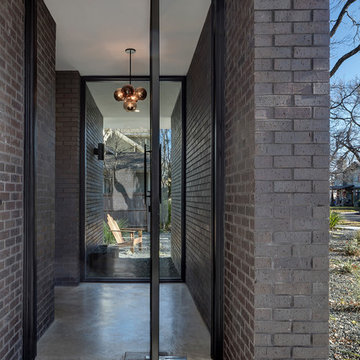
The Main Stay House exists as a straightforward proposal on an urban infill lot, paring down the components of a house to a minimal amount of planes and openings. The scheme is anchored by a modern entry sequence and a staircase volume, both clad in iron spot masonry externally and internally, creating thresholds between the respective realms of public, common and private, by minimal means. The masonry contrasts with an otherwise muted interior atmosphere of smooth, desaturated surfaces.
The entry sequence is a twist upon the conventional domestic front door, front facade, and fence. The front masonry wall replaces the typical residential fence and frames an indirect access to the front door, functioning as a privacy barrier while revealing slices of the interior to the public street.
The staircase bifurcates the layout to provide a clear division between the common and private zones of the house, while clearly reading as a mass from all outside view. Brick and glass become portals between common and private zones.
The design consolidates the service core along the west façade, allowing the structure to fully open the living zone to the pool court and existing trees. This directly connects interior and exterior, as well as human and nature. Freedom to vary the program or functional use of the area is enabled and strongly encouraged.
Photography: Charles Davis Smith
 Matt Fajkus Architecture
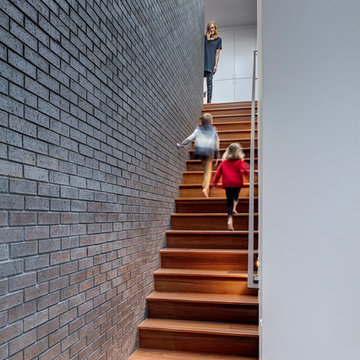
The Main Stay House exists as a straightforward proposal on an urban infill lot, paring down the components of a house to a minimal amount of planes and openings. The scheme is anchored by a modern entry sequence and a staircase volume, both clad in iron spot masonry externally and internally, creating thresholds between the respective realms of public, common and private, by minimal means. The masonry contrasts with an otherwise muted interior atmosphere of smooth, desaturated surfaces.
The entry sequence is a twist upon the conventional domestic front door, front facade, and fence. The front masonry wall replaces the typical residential fence and frames an indirect access to the front door, functioning as a privacy barrier while revealing slices of the interior to the public street.
The staircase bifurcates the layout to provide a clear division between the common and private zones of the house, while clearly reading as a mass from all outside view. Brick and glass become portals between common and private zones.
The design consolidates the service core along the west façade, allowing the structure to fully open the living zone to the pool court and existing trees. This directly connects interior and exterior, as well as human and nature. Freedom to vary the program or functional use of the area is enabled and strongly encouraged.
Photography: Charles Davis Smith
 Matt Fajkus Architecture
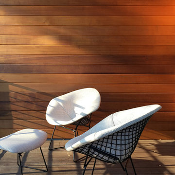
The Main Stay House exists as a straightforward proposal on an urban infill lot, paring down the components of a house to a minimal amount of planes and openings. The scheme is anchored by a modern entry sequence and a staircase volume, both clad in iron spot masonry externally and internally, creating thresholds between the respective realms of public, common and private, by minimal means. The masonry contrasts with an otherwise muted interior atmosphere of smooth, desaturated surfaces.
The entry sequence is a twist upon the conventional domestic front door, front facade, and fence. The front masonry wall replaces the typical residential fence and frames an indirect access to the front door, functioning as a privacy barrier while revealing slices of the interior to the public street.
The staircase bifurcates the layout to provide a clear division between the common and private zones of the house, while clearly reading as a mass from all outside view. Brick and glass become portals between common and private zones.
The design consolidates the service core along the west façade, allowing the structure to fully open the living zone to the pool court and existing trees. This directly connects interior and exterior, as well as human and nature. Freedom to vary the program or functional use of the area is enabled and strongly encouraged.
Photography: Matt Fajkus
 Dynia Architects
This residence is located on the banks of the Snake River. Drawing inspiration from the adjacent braided river channels, the precise layout form unique relationships to the site from each room, as well as dynamic views and spatial experiences. The sequence of interior spaces gradually unfolds to reveal views of the pond, river and mountains beyond. The skewed geometry creates shifting views between interior spaces and levels.
A three-story stair atrium brings light into the core of the house, gracefully connects floor levels, and creates a transition from the public to private zones of the house. The volume of the house cantilevers to cover an exterior dining area and spans to frame the entrance into the house and the river beyond. The exterior rain screen on the clean modern forms creates continuity with the surrounding cottonwood forest.
 Dynia Architects
This residence is located on the banks of the Snake River. Drawing inspiration from the adjacent braided river channels, the precise layout form unique relationships to the site from each room, as well as dynamic views and spatial experiences. The sequence of interior spaces gradually unfolds to reveal views of the pond, river and mountains beyond. The skewed geometry creates shifting views between interior spaces and levels.
A three-story stair atrium brings light into the core of the house, gracefully connects floor levels, and creates a transition from the public to private zones of the house. The volume of the house cantilevers to cover an exterior dining area and spans to frame the entrance into the house and the river beyond. The exterior rain screen on the clean modern forms creates continuity with the surrounding cottonwood forest.
 Matt Fajkus Architecture
The Main Stay House exists as a straightforward proposal on an urban infill lot, paring down the components of a house to a minimal amount of planes and openings. The scheme is anchored by a modern entry sequence and a staircase volume, both clad in iron spot masonry externally and internally, creating thresholds between the respective realms of public, common and private, by minimal means. The masonry contrasts with an otherwise muted interior atmosphere of smooth, desaturated surfaces.
The entry sequence is a twist upon the conventional domestic front door, front facade, and fence. The front masonry wall replaces the typical residential fence and frames an indirect access to the front door, functioning as a privacy barrier while revealing slices of the interior to the public street.
The staircase bifurcates the layout to provide a clear division between the common and private zones of the house, while clearly reading as a mass from all outside view. Brick and glass become portals between common and private zones.
The design consolidates the service core along the west façade, allowing the structure to fully open the living zone to the pool court and existing trees. This directly connects interior and exterior, as well as human and nature. Freedom to vary the program or functional use of the area is enabled and strongly encouraged.
Photography: Twist Tours
 Architects DCA
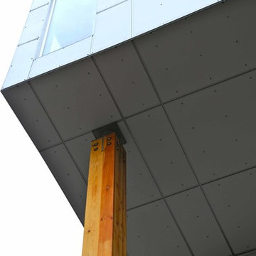
Located on the west side of Cumberland Avenue, between York and George, this condo development includes 38 units within walking distance of core amenities. The building features different materials and bold colours to clad the building at the street level and creates a sense of rhythm and articulation. The cantilevered third floor projects out past the front and side of the building to create a dynamic form. Space for a public art installation was created on the building façade which formed part of the planning approval through consultation with the City. A forecourt is created at the street level with a dramatic exposed wood column that helps to form a sheltered recess near the entry. The wood frame structure is sustainable by nature; the project received the prestigious WoodWorks 2012 Design Excellence Award (Multi-Unit) in recognition of this achievement and for its contribution to awareness of the appeal of wood construction in Ontario. This project showcases a successful contemporary, in-fill construction in the four to six storey scale and demonstrates that design quality does not need to be compromised in modestly scaled developments.
Photos: www.mivphotography,com
 Matt Fajkus Architecture
The Main Stay House exists as a straightforward proposal on an urban infill lot, paring down the components of a house to a minimal amount of planes and openings. The scheme is anchored by a modern entry sequence and a staircase volume, both clad in iron spot masonry externally and internally, creating thresholds between the respective realms of public, common and private, by minimal means. The masonry contrasts with an otherwise muted interior atmosphere of smooth, desaturated surfaces.
The entry sequence is a twist upon the conventional domestic front door, front facade, and fence. The front masonry wall replaces the typical residential fence and frames an indirect access to the front door, functioning as a privacy barrier while revealing slices of the interior to the public street.
The staircase bifurcates the layout to provide a clear division between the common and private zones of the house, while clearly reading as a mass from all outside view. Brick and glass become portals between common and private zones.
The design consolidates the service core along the west façade, allowing the structure to fully open the living zone to the pool court and existing trees. This directly connects interior and exterior, as well as human and nature. Freedom to vary the program or functional use of the area is enabled and strongly encouraged.
Photography: Charles Davis Smith

 Amanda Martocchio Architecture
When a world class sailing champion approached us to design a Newport home for his family, with lodging for his sailing crew, we set out to create a clean, light-filled modern home that would integrate with the natural surroundings of the waterfront property, and respect the character of the historic district.
Our approach was to make the marine landscape an integral feature throughout the home. One hundred eighty degree views of the ocean from the top floors are the result of the pinwheel massing. The home is designed as an extension of the curvilinear approach to the property through the woods and reflects the gentle undulating waterline of the adjacent saltwater marsh. Floodplain regulations dictated that the primary occupied spaces be located significantly above grade; accordingly, we designed the first and second floors on a stone “plinth” above a walk-out basement with ample storage for sailing equipment. The curved stone base slopes to grade and houses the shallow entry stair, while the same stone clads the interior’s vertical core to the roof, along which the wood, glass and stainless steel stair ascends to the upper level.
One critical programmatic requirement was enough sleeping space for the sailing crew, and informal party spaces for the end of race-day gatherings. The private master suite is situated on one side of the public central volume, giving the homeowners views of approaching visitors. A “bedroom bar,” designed to accommodate a full house of guests, emerges from the other side of the central volume, and serves as a backdrop for the infinity pool and the cove beyond.
Also essential to the design process was ecological sensitivity and stewardship. The wetlands of the adjacent saltwater marsh were designed to be restored; an extensive geo-thermal heating and cooling system was implemented; low carbon footprint materials and permeable surfaces were used where possible. Native and non-invasive plant species were utilized in the landscape. The abundance of windows and glass railings maximize views of the landscape, and, in deference to the adjacent bird sanctuary, bird-friendly glazing was used throughout.
Photo: Michael Moran/OTTO Photography
 Matt Fajkus Architecture
The Main Stay House exists as a straightforward proposal on an urban infill lot, paring down the components of a house to a minimal amount of planes and openings. The scheme is anchored by a modern entry sequence and a staircase volume, both clad in iron spot masonry externally and internally, creating thresholds between the respective realms of public, common and private, by minimal means. The masonry contrasts with an otherwise muted interior atmosphere of smooth, desaturated surfaces.
The entry sequence is a twist upon the conventional domestic front door, front facade, and fence. The front masonry wall replaces the typical residential fence and frames an indirect access to the front door, functioning as a privacy barrier while revealing slices of the interior to the public street.
The staircase bifurcates the layout to provide a clear division between the common and private zones of the house, while clearly reading as a mass from all outside view. Brick and glass become portals between common and private zones.
The design consolidates the service core along the west façade, allowing the structure to fully open the living zone to the pool court and existing trees. This directly connects interior and exterior, as well as human and nature. Freedom to vary the program or functional use of the area is enabled and strongly encouraged.
Photography: Charles Davis Smith
 Dynia Architects
This residence is located on the banks of the Snake River. Drawing inspiration from the adjacent braided river channels, the precise layout form unique relationships to the site from each room, as well as dynamic views and spatial experiences. The sequence of interior spaces gradually unfolds to reveal views of the pond, river and mountains beyond. The skewed geometry creates shifting views between interior spaces and levels.
A three-story stair atrium brings light into the core of the house, gracefully connects floor levels, and creates a transition from the public to private zones of the house. The volume of the house cantilevers to cover an exterior dining area and spans to frame the entrance into the house and the river beyond. The exterior rain screen on the clean modern forms creates continuity with the surrounding cottonwood forest.

 User
UserThe new kitchen . . .
Sometimes, in remodel designs, it is best to keep things simple. Do small things to affect utility, flow and aesthetics. For this mid-century modern, for all their noted openness, the kitchen was closed off from the public, living areas. Hard to entertain to a wall. This we fixed. The other big flaw was the flow. While there was no way to economically change the path of travel through the kitchen. Nudging here and there could at least reduce the disruption at the core kitchen work areas. See the before and after plans and the photos:
Photo Credits - Beatrice McGinnis
 User
Userthe new kitchen
Sometimes, in remodel designs, it is best to keep things simple. Do small things to affect utility, flow and aesthetics. For this mid-century modern, for all their noted openness, the kitchen was closed off from the public, living areas. Hard to entertain to a wall. This we fixed. The other big flaw was the flow. While there was no way to economically change the path of travel through the kitchen. Nudging here and there could at least reduce the disruption at the core kitchen work areas. See the before and after plans and the photos:
Photo Credits - Beatrice McGinnis
 User
Userthe new kitchen
Sometimes, in remodel designs, it is best to keep things simple. Do small things to affect utility, flow and aesthetics. For this mid-century modern, for all their noted openness, the kitchen was closed off from the public, living areas. Hard to entertain to a wall. This we fixed. The other big flaw was the flow. While there was no way to economically change the path of travel through the kitchen. Nudging here and there could at least reduce the disruption at the core kitchen work areas. See the before and after plans and the photos:
Photo Credits - Beatrice McGinnis
 User
Userthe new kitchen . . .
Sometimes, in remodel designs, it is best to keep things simple. Do small things to affect utility, flow and aesthetics. For this mid-century modern, for all their noted openness, the kitchen was closed off from the public, living areas. Hard to entertain to a wall. This we fixed. The other big flaw was the flow. While there was no way to economically change the path of travel through the kitchen. Nudging here and there could at least reduce the disruption at the core kitchen work areas. See the before and after plans and the photos:
Photo Credits - Beatrice McGinnis
4