
Search results for "Creating engaging" in Home Design Ideas
 Simply Home Decorating
There are not many things better than a room full of your favourite people. As you gather you smell dinner cooking in the kitchen and music playing in the background, as joyful conversation and laughter fill the room. I feel so grateful that we are inching our way back to these days. How about you?
The project I’m sharing with you today has beautiful moments like these at its heart. Spaces that invite people in, foster connection, and make everyday living so simple that it’s impossible not to enjoy...
Meet our Delightful Clients:
The family behind this 1950s North Vancouver home transformation enjoy entertaining friends just as much as cosying up to watch a movie together. A professional couple (I'll call them Jon and Anna) with two elementary school-aged sons, Anna and Jon approached us with the task of furnishing the main floor living spaces and the basement of their family home.
Anna is a busy lawyer who is now working almost full time from home, and Jon works in the film industry. With full careers, two active boys, and a love of gathering, they craved a home that could support their everyday lifestyle.
Design and Lifestyle Goals:
Our central goal for this project was simple: to uncover the hidden potential in their home and create a family-friendly space that functioned well and flowed seamlessly.
On the main floor, our clients tasked us with creating an area for the family to relax and entertain, along with crafting a work and play space for the boys. They also dreamed of a more functional and bright basement, which they envisioned as a dual purpose family room and home office for Anna.
Reveal: Comfortable and Welcoming Entryway & Living Room:
Imagine you are coming home, and you walk through a bright, sunny front door like this one. You are met by this entryway of calming earth and sea tones, paired with warm, natural wood flooring. You feel instantly welcomed and eager to venture further inside... The same is now true for our clients!
The simple details in their entryway are thoughtfully arranged with clean lines and colourful art as the focal point, achieving a timeless and friendly aesthetic. Dried wheat brings movement into the space and plays up the beauty of nature, while the vibrant yet warm colours and textures evoke feelings of comfort and homecoming.
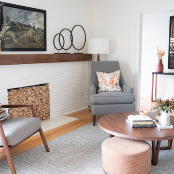
The entry flows seamlessly into this connected living area, which is adorned with ample seating strategically arranged to host and accommodate joyful conversations. With the fireplace and wood mantel as the focal point, these natural elements and hues warm up the room to make it feel beautifully lived-in (not like an untouchable museum).
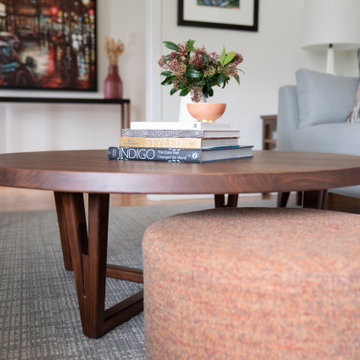
Another colourful work of art graces the space above Jon’s and Anna’s sofa, and we used decorative pillows and a throw blanket to tempt those colours into the rest of the room. A simply styled coffee table keeps the space feeling open and engaged. Reading material, anyone?
Just beyond this living area, you get a glimpse of the second space our clients requested on their main floor...
A Collected Space for Children to Work + Play:
When Jon and Anna realised that their formal dining area wasn’t being used to its full potential, they imagined creating a work and play space for their boys instead. We came up with a plan to create a shared desk area with plentiful storage.
This timeless natural wood desk was the perfect way to maximise surface area and give the boys plenty of space to do homework during the school year, or spend time crafting or building LEGOs during the summers. The drawers provide storage for all the wonderful items that fuel their productivity or creativity. Or both.
I also love how the white floating shelves display a collection of nostalgic toys, providing just the right amount of childhood endearment to this sophisticated and functional space. This workspace now has endless possibilities for the boys, and it helps Jon and Anna keep their minds and spaces clear, too. Which brings us to...
Basement Family Room & Home Office:
In general, we knew we had to maximise surface area in this ‘50s home, and this was especially true for our clients’ basement. I’m happy to say that we designed an effortlessly comfortable space that focuses on family and makes it simple to settle in and work… or leave the workday behind.
Welcome to this dual-function office and family room. Toward the back of the room, we strategically positioned Anna’s wraparound desk facing out into the room and gave her a wallpaper-and-art backdrop for stunning Zoom calls (she has already received glowing compliments). There is plenty of storage for easy organization including a space to store the family’s shared printer near the door… so they don’t have to interrupt “Mom” to get to it.
Anna also wanted the freedom to be able to relax in this space with her family and turn her back on the work day — quite literally! The sofa is perfectly positioned backing onto the desk allowing her to do just that.
We relocated an existing mustard yellow chair and used pops of the same colour to integrate it into the overall scheme. The wood armrests on this modular sectional provide surfaces for snacks and drinks where there was no room for an end table. The walnut finish carries the theme of natural comfort from the upstairs spaces down into the family room.
The view from the sectional is less business and more pleasure, featuring cosy seating and throw pillows in cheerful colours and patterns.
The highlight of this space? A wallpapered accent wall where we were able to achieve the high-end feel of custom built-in shelving with a simple IKEA hack. The shelves and cabinetry around the television offer plenty of much needed storage space to house family games and movies at a budget price point.
This fun room is the perfect balance of work and play, accommodating and supporting our clients’ daily family adventures.
What Our Clients Had to Say...
Our clients could not be happier with their warm yet functional new rooms. With thoughtful consideration and a plan of action, we were able to transform two areas of their home into spaces that function well and feel good. In fact, they had this to say:
“Lori and her team were everything we were looking for: great listeners, wonderfully creative and highly professional. We couldn't be happier with our interior makeover.” — Clients
That is why we do what we do. If you're ready to start your redesign project, we would love to help. Reach out to us here, and let's get to know more about each other.
 Nautilus Architects
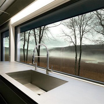
Located on a marsh in the upper reaches of the Lieutenant River in Old Lyme, the existing house was well-sited and well-built, but the design failed to exploit the views and more importantly was a confused combination of contemporary and traditional elements. The new homeowners, a successful businesswoman and an accomplished artist and photographer, were interested in creating a fully-contemporary environment to open up space, connect indoors with outdoors, display artwork and showcase the husband’s distinctive photographs.
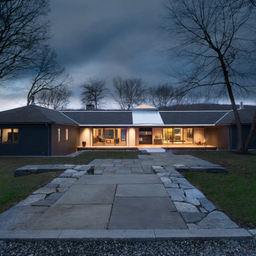
One glaring deficiency was the curb appeal and approach sequence: the grade sloped down and the path to the house followed, but this led to an uncomfortable dip and abrupt rise to the front door. By creating a virtual “moat,” occupied by a grid of raised-bed grasses contained in aluminum-clad boxes, and spanning the moat with an ipe bridge, the approach becomes level and engaging. The façade of the existing house was blank and bland, and with no cover. Adding a deep overhang with a wide porch creates a welcoming, covered condition, accentuated by a 6’ wide pivoting front door that feels more like a moving piece of wall.
Another deficiency was the connection to the outdoors. By adding glass to the front and back of the house, and removing interior walls selectively, the house takes on a diaphanous quality that allows one to see through to the marsh beyond, even when in the driveway. The raised-bed grasses act as abstract, geometric versions of the marsh beyond. A large, pyramidal skylight establishes a spatial hierarchy around which the rooms revolve.
The house featured several tray-ceilinged spaces – living room, kitchen, and master bedroom – that were poorly-proportioned and with panels at the top that resembled inset flat panel doors. The solution was to use a different strategy for each: the bedroom turns the ceiling into an eggshell through the use of a creative trim detail; the living room has an oversized sculptural, backlit lighting element; and the kitchen has a collage of painted rectangular forms that support or include lighting pieces.
A palette of concrete, blackened steel, stainless steel and colors carefully chosen by homeowner and architect create an interior and exterior environment punctuated by moments that are as artistic as the featured works in the black-ceilinged gallery.
 Otogawa-Anschel Design-Build
There is always an easy way out. A simple, uninteresting solution that neither challenges nor engages the mind or the soul. The 50s rambler is a simple structure that lacks character and charm. Its greatest contribution to architecture was the single floor living concept. We came to this project because the homeowners believed their home had the potential to be something more and had invested their time and creativity into developing ideas for what it could become. We embraced the opportunity to collaborate with the homeowner to create a home that was unique, thoughtful, customized for their use, and cared for.
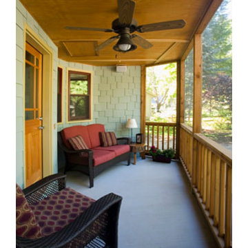
The curved exterior shell of this addition wraps around to accommodate a screen porch under a lifted peak. Inside, the new kitchen follows the curve with custom cabinets and honed granite creating a dynamite space for a chef. Shade tree, bamboo and honed slate flooring weave the living room, dining room, bathroom and kitchen together. Walls jog and jump with color and dimension.
One of the major challenges was to ensure that the space could accommodate large family gatherings of 12 – 16 people yet still feel intimate and comfortable for two people when guests were not present. As you move through the home you will notice that none of the spaces feel cavernous or restrictive. Careful attention was paid to mapping out the space to create areas that were cozy and appropriate while taking traffic patterns into consideration. The dining room entrances are staggered which creates the illusion of two separate spaces. The warm red halogen lights further encourage a sense of scale. One can easily extend the dining room table to accommodate a large crowd without causing guests to feel uncomfortable or confined.
The use of color is an often noted feature in our projects. Our philosophy is that the selection of color for the walls is as important as the selection of all the other materials. Color influences everything we do and gives us direction for how to feel, where to go, where to stop, and how to interact. It is the binding component between all the elements in a design. It bends, bounces, twists, manipulates light and the eye, and is required to fully develop and design a space.
This project was an exciting and rewarding challenge, and we are grateful to the homeowners for asking us to be a part of it and to opening up their home to the public. We hope that you will enjoy your time visiting this remarkably transformed home.
highlights
Re-use of existing housing stock
Icynene insulation
Super-insulated ceilings
Remnant granite countertops
Energy Star windows
Shade tree floors
Bamboo floors
Hardishingle siding
Halogen lights
Dimmers and separated task lighting
Energy efficient Panasonic fans
Locally manufactured cabinets
FSC certified millwork
Energy Star appliances
Dual flush toilet
Find the right local pro for your project
 Nautilus Architects
Located on a marsh in the upper reaches of the Lieutenant River in Old Lyme, the existing house was well-sited and well-built, but the design failed to exploit the views and more importantly was a confused combination of contemporary and traditional elements. The new homeowners, a successful businesswoman and an accomplished artist and photographer, were interested in creating a fully-contemporary environment to open up space, connect indoors with outdoors, display artwork and showcase the husband’s distinctive photographs.
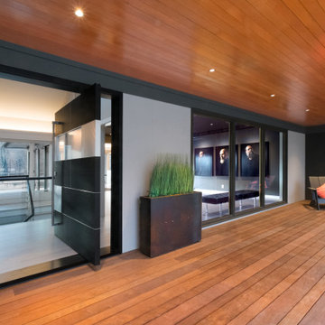
One glaring deficiency was the curb appeal and approach sequence: the grade sloped down and the path to the house followed, but this led to an uncomfortable dip and abrupt rise to the front door. By creating a virtual “moat,” occupied by a grid of raised-bed grasses contained in aluminum-clad boxes, and spanning the moat with an ipe bridge, the approach becomes level and engaging. The façade of the existing house was blank and bland, and with no cover. Adding a deep overhang with a wide porch creates a welcoming, covered condition, accentuated by a 6’ wide pivoting front door that feels more like a moving piece of wall.
Another deficiency was the connection to the outdoors. By adding glass to the front and back of the house, and removing interior walls selectively, the house takes on a diaphanous quality that allows one to see through to the marsh beyond, even when in the driveway. The raised-bed grasses act as abstract, geometric versions of the marsh beyond. A large, pyramidal skylight establishes a spatial hierarchy around which the rooms revolve.
The house featured several tray-ceilinged spaces – living room, kitchen, and master bedroom – that were poorly-proportioned and with panels at the top that resembled inset flat panel doors. The solution was to use a different strategy for each: the bedroom turns the ceiling into an eggshell through the use of a creative trim detail; the living room has an oversized sculptural, backlit lighting element; and the kitchen has a collage of painted rectangular forms that support or include lighting pieces.
A palette of concrete, blackened steel, stainless steel and colors carefully chosen by homeowner and architect create an interior and exterior environment punctuated by moments that are as artistic as the featured works in the black-ceilinged gallery.
 Simply Home Decorating
There are not many things better than a room full of your favourite people. As you gather you smell dinner cooking in the kitchen and music playing in the background, as joyful conversation and laughter fill the room. I feel so grateful that we are inching our way back to these days. How about you?
The project I’m sharing with you today has beautiful moments like these at its heart. Spaces that invite people in, foster connection, and make everyday living so simple that it’s impossible not to enjoy...
Meet our Delightful Clients:
The family behind this 1950s North Vancouver home transformation enjoy entertaining friends just as much as cosying up to watch a movie together. A professional couple (I'll call them Jon and Anna) with two elementary school-aged sons, Anna and Jon approached us with the task of furnishing the main floor living spaces and the basement of their family home.
Anna is a busy lawyer who is now working almost full time from home, and Jon works in the film industry. With full careers, two active boys, and a love of gathering, they craved a home that could support their everyday lifestyle.
Design and Lifestyle Goals:
Our central goal for this project was simple: to uncover the hidden potential in their home and create a family-friendly space that functioned well and flowed seamlessly.
On the main floor, our clients tasked us with creating an area for the family to relax and entertain, along with crafting a work and play space for the boys. They also dreamed of a more functional and bright basement, which they envisioned as a dual purpose family room and home office for Anna.
Reveal: Comfortable and Welcoming Entryway & Living Room:
Imagine you are coming home, and you walk through a bright, sunny front door like this one. You are met by this entryway of calming earth and sea tones, paired with warm, natural wood flooring. You feel instantly welcomed and eager to venture further inside... The same is now true for our clients!
The simple details in their entryway are thoughtfully arranged with clean lines and colourful art as the focal point, achieving a timeless and friendly aesthetic. Dried wheat brings movement into the space and plays up the beauty of nature, while the vibrant yet warm colours and textures evoke feelings of comfort and homecoming.
The entry flows seamlessly into this connected living area, which is adorned with ample seating strategically arranged to host and accommodate joyful conversations. With the fireplace and wood mantel as the focal point, these natural elements and hues warm up the room to make it feel beautifully lived-in (not like an untouchable museum).
Another colourful work of art graces the space above Jon’s and Anna’s sofa, and we used decorative pillows and a throw blanket to tempt those colours into the rest of the room. A simply styled coffee table keeps the space feeling open and engaged. Reading material, anyone?
Just beyond this living area, you get a glimpse of the second space our clients requested on their main floor...
A Collected Space for Children to Work + Play:
When Jon and Anna realised that their formal dining area wasn’t being used to its full potential, they imagined creating a work and play space for their boys instead. We came up with a plan to create a shared desk area with plentiful storage.
This timeless natural wood desk was the perfect way to maximise surface area and give the boys plenty of space to do homework during the school year, or spend time crafting or building LEGOs during the summers. The drawers provide storage for all the wonderful items that fuel their productivity or creativity. Or both.
I also love how the white floating shelves display a collection of nostalgic toys, providing just the right amount of childhood endearment to this sophisticated and functional space. This workspace now has endless possibilities for the boys, and it helps Jon and Anna keep their minds and spaces clear, too. Which brings us to...
Basement Family Room & Home Office:
In general, we knew we had to maximise surface area in this ‘50s home, and this was especially true for our clients’ basement. I’m happy to say that we designed an effortlessly comfortable space that focuses on family and makes it simple to settle in and work… or leave the workday behind.
Welcome to this dual-function office and family room. Toward the back of the room, we strategically positioned Anna’s wraparound desk facing out into the room and gave her a wallpaper-and-art backdrop for stunning Zoom calls (she has already received glowing compliments). There is plenty of storage for easy organization including a space to store the family’s shared printer near the door… so they don’t have to interrupt “Mom” to get to it.
Anna also wanted the freedom to be able to relax in this space with her family and turn her back on the work day — quite literally! The sofa is perfectly positioned backing onto the desk allowing her to do just that.
We relocated an existing mustard yellow chair and used pops of the same colour to integrate it into the overall scheme. The wood armrests on this modular sectional provide surfaces for snacks and drinks where there was no room for an end table. The walnut finish carries the theme of natural comfort from the upstairs spaces down into the family room.
The view from the sectional is less business and more pleasure, featuring cosy seating and throw pillows in cheerful colours and patterns.
The highlight of this space? A wallpapered accent wall where we were able to achieve the high-end feel of custom built-in shelving with a simple IKEA hack. The shelves and cabinetry around the television offer plenty of much needed storage space to house family games and movies at a budget price point.
This fun room is the perfect balance of work and play, accommodating and supporting our clients’ daily family adventures.
What Our Clients Had to Say...
Our clients could not be happier with their warm yet functional new rooms. With thoughtful consideration and a plan of action, we were able to transform two areas of their home into spaces that function well and feel good. In fact, they had this to say:
“Lori and her team were everything we were looking for: great listeners, wonderfully creative and highly professional. We couldn't be happier with our interior makeover.” — Clients
That is why we do what we do. If you're ready to start your redesign project, we would love to help. Reach out to us here, and let's get to know more about each other.
 Nautilus Architects
Located on a marsh in the upper reaches of the Lieutenant River in Old Lyme, the existing house was well-sited and well-built, but the design failed to exploit the views and more importantly was a confused combination of contemporary and traditional elements. The new homeowners, a successful businesswoman and an accomplished artist and photographer, were interested in creating a fully-contemporary environment to open up space, connect indoors with outdoors, display artwork and showcase the husband’s distinctive photographs.
One glaring deficiency was the curb appeal and approach sequence: the grade sloped down and the path to the house followed, but this led to an uncomfortable dip and abrupt rise to the front door. By creating a virtual “moat,” occupied by a grid of raised-bed grasses contained in aluminum-clad boxes, and spanning the moat with an ipe bridge, the approach becomes level and engaging. The façade of the existing house was blank and bland, and with no cover. Adding a deep overhang with a wide porch creates a welcoming, covered condition, accentuated by a 6’ wide pivoting front door that feels more like a moving piece of wall.
Another deficiency was the connection to the outdoors. By adding glass to the front and back of the house, and removing interior walls selectively, the house takes on a diaphanous quality that allows one to see through to the marsh beyond, even when in the driveway. The raised-bed grasses act as abstract, geometric versions of the marsh beyond. A large, pyramidal skylight establishes a spatial hierarchy around which the rooms revolve.
The house featured several tray-ceilinged spaces – living room, kitchen, and master bedroom – that were poorly-proportioned and with panels at the top that resembled inset flat panel doors. The solution was to use a different strategy for each: the bedroom turns the ceiling into an eggshell through the use of a creative trim detail; the living room has an oversized sculptural, backlit lighting element; and the kitchen has a collage of painted rectangular forms that support or include lighting pieces.
A palette of concrete, blackened steel, stainless steel and colors carefully chosen by homeowner and architect create an interior and exterior environment punctuated by moments that are as artistic as the featured works in the black-ceilinged gallery.
 Tharanga Hewage Chartered Architect
Urban Family Retreat at Gampaha | A Vision of Seamless Flow
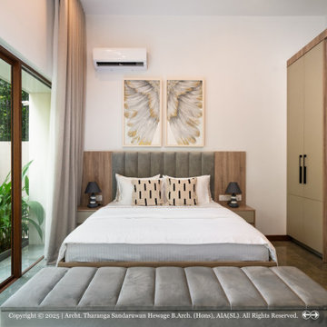
In the heart of Gampaha, an extraordinary residential project has emerged—a refined family retreat that balances modern design with comfort and functionality. The "Pass By Spaces" concept, central to this architectural vision, ensures that each area of the home flows seamlessly into the next. This thoughtful design approach creates a sense of unity and connection throughout the home, offering a sophisticated yet tranquil living experience for its residents.
The Design Concept: "Pass By Spaces"
The underlying philosophy of the project centers on the concept of “Pass By Spaces”—a circulation strategy that serves as the spine of the home. By utilizing this continuous circulation, the design allows the different spaces to interact with one another naturally. From the family living room to the study, guest areas, and private bedrooms, each function flows into the next through this unified circulation, creating a harmonious journey through the home. This approach not only enhances spatial connectivity but also fosters a sense of movement, encouraging ease and fluidity in daily living.
Architectural Team & Project Details
• Principal Architect | Archt. Tharanga Hewage contact | 076 869 0315
• Junior Architects | Sewwandi Nayanathara / Isuri Hettiarachchi
• Structural Engineer | Mr. Mahinda Rathnasiri
• Contractor | Mr. Lal Anura | Lal Construction
• Interior Architecture | Tharanga Hewage Chartered Architect
• Interior design and Contractor | Monara Creations
• Furniture | Singhe Furniture
• Window Fashion | Dilshan Drapers
• Wall Arts | Chakad Creation
• Land Extent | 25.01 perches
• Total Floor Area | 5059 sqft
• Ground Floor | 2802 sqft
• First Floor | 1878 sqft
• Roof Slab & Terraces | 379 sqft
• Photography | Ganidu Balasuriya photography
• Videography | Neyomal Rangeeth
Key Features of the Residence
Exterior and Car Porch:
The home’s exterior is marked by a sleek, modern design that complements its surroundings. A two-vehicle car porch provides ample space and easy access, while maintaining an elegant, minimalistic aesthetic.
Main Circulation:
The hallmark of this design is its single-spine circulation, which connects all key areas of the home. This circulation serves as the backbone of the house, facilitating smooth transitions between private and social spaces. The careful placement of rooms ensures that the flow is intuitive and unobtrusive, allowing each space to remain distinct while still being interconnected.
Interior Layout:
• Bedrooms: The home features five generously sized bedrooms, each designed to offer privacy and comfort. Some bedrooms include private terraces, providing residents with an intimate outdoor space.
• Family & Guest Areas: The expansive family living room is a central gathering space, complemented by a mini pantry for convenience. A dedicated guest living and dining area ensures that visitors enjoy a separate, comfortable space.
• Work & Study: A tranquil study room offers a quiet area for focus and reflection, while a flexible meeting room is perfect for professional engagements or personal gatherings.
• Private Spaces: In addition to the main living areas, the home includes a maid’s room, a laundry room, and four well-appointed bathrooms, including a powder room for guests.
• Storage & Utility: Thoughtful planning includes a generator room and ample storage space to meet the needs of modern living.
Design Considerations
A primary focus of the design is to maximize natural light and ventilation throughout the home. The strategic placement of windows, terraces, and open spaces ensures that every room benefits from an abundance of daylight and fresh air, creating an airy and welcoming environment.
Sustainability also plays a key role in this design. Eco-friendly materials are incorporated to ensure energy efficiency, while landscaping is carefully integrated to maintain harmony between the indoors and the surrounding environment. These design elements allow the home to feel like a serene retreat amidst the urban landscape of Gampaha.
Conclusion
The “Pass By Spaces” design concept not only elevates the architectural experience but also fosters a sense of connection and tranquility for the residents of this urban family retreat. With a seamless flow between spaces, thoughtful use of materials, and an emphasis on sustainability, this home exemplifies a modern approach to residential design that prioritizes both style and functionality. For prospective homeowners looking to create a space that embodies both beauty and practicality, this project serves as a testament to what can be achieved through innovative design and meticulous attention to detail.
Principal Architect | Archt. Tharanga Hewage
contact | 076 869 0315
Website | Design portfolio
https://www.tharangahewage.com/
https://www.behance.net/tharangaon71a4
Facebook Page | Instagram
https://www.facebook.com/Archt.tharangahewage
https://www.instagram.com/architect_tharanga_hewage/
YouTube Channel
https://www.youtube.com/channel/UCZLpclw5H62sOfvBz94XFOA
Linkedin
http://www.linkedin.com/.../archt-tharanga-hewage-aia-sl...
Copyright © 2025 | Archt. Tharanga Sandaruwan Hewage, B.Arch. (Hons), AIA(SL). All Rights Reserved.
Sponsored
Delaware, OH

Buckeye Basements, Inc.
Central Ohio's Basement Finishing ExpertsBest Of Houzz '13-'21
 Refresh Renovations Auckland West
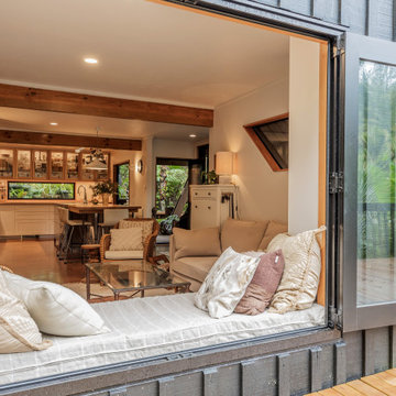
It takes a special kind of client to embrace the eclectic design style. Eclecticism is an approach to design that combines elements from various periods, styles, and sources. It involves the deliberate mixing and matching of different aesthetics to create a unique and visually interesting space. Eclectic design celebrates the diversity of influences and allows for the expression of personal taste and creativity.
The client a window dresser in her former life her own bold ideas right from the start, like the wallpaper for the kitchen splashback.
The kitchen used to be in what is now the sitting area and was moved into the former dining space. Creating a large Kitchen with a large bench style table coming off it combines the spaces and allowed for steel tube elements in combination with stainless and timber benchtops. Combining materials adds depth and visual interest. The playful and unexpected elements like the elephant wallpaper in the kitchen create a lively and engaging environment.
The swapping of the spaces created an open layout with seamless integration to the adjacent living area. The prominent focal point of this kitchen is the island.
All the spaces allowed the client the freedom to experiment and showcase her personal style.
 Aranelli Design
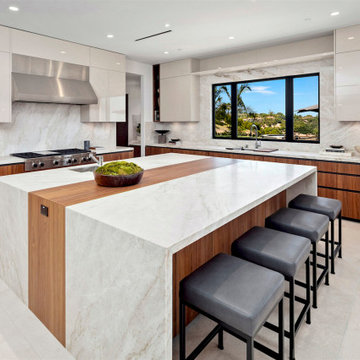
Welcome to a striking modern kitchen, a delightful interplay between the rich, natural beauty of slab walnut doors and the contemporary allure of cashmere gloss slab doors. This thoughtfully designed space embodies both warmth and luxury, creating an ambience that is stylish yet welcoming.
Immediately upon entering, one is drawn to the stunning walnut slab doors. Their beautifully organic grain patterns and deep, warm hues introduce a touch of nature into the space, providing an inherent homeliness. The broad, flat surfaces of the slabs accentuate the walnut's unique texture and coloration, creating an appealing contrast to the sleek, modern lines of the kitchen's overall design.
Paired with the walnut's earthy tones, the cashmere gloss slab doors present a contemporary elegance. Their soft, neutral shade exudes a sense of serene luxury, akin to the fine texture of cashmere. The high-gloss finish reflects light beautifully, infusing the room with a bright, spacious feel. The slab design keeps the aesthetic clean and modern, subtly mirroring the simple geometry seen throughout the kitchen.
The interplay between the textured walnut and smooth cashmere gloss creates a captivating visual dialogue. The natural warmth and richness of the walnut balance the chic, contemporary vibe of the cashmere gloss, achieving a harmonious blend of styles. The result is a kitchen that feels both cozy and sophisticated, traditional yet cutting-edge.
In this stylish space, integrated state-of-the-art appliances blend seamlessly into the design, their modern lines enhancing the room's minimalist aesthetic. Clever storage solutions within the slab doors ensure the kitchen remains uncluttered, reinforcing its sleek, streamlined look.
This kitchen, with its fusion of slab walnut and cashmere gloss doors, offers an engaging mix of warmth and modernity. Every element of its design, from the choice of materials to the color palette, creates a welcoming atmosphere that doesn't compromise on style or functionality. It's a room that invites you to relax, cook, dine, and celebrate the beauty of contemporary kitchen design.
 E. F. San Juan
Published in Coastal Lifestyle Magazine, March 2021
www.coastallifestylemagazine.com/alys-beach-home
Photography by Colleen Duffley
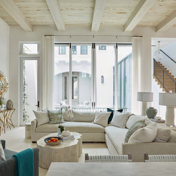
When Marianne Temple and Robyn Prince, the principals of Home Design Group of Atlanta and Santa Rosa Beach, were brought in to work their magic on a home in Alys Beach, the design phase and much of the construction was complete. They welcomed the opportunity to get involved in the important final stage and to bring fun and whimsy along with casual elegance to the project. The owners – a young family with children and dogs – knew what they were looking for in a long-term vacation destination. They had engaged the services of Domin Bock Architects of Rosemary Beach and general contractor Hufham Farris Construction of Santa Rosa Beach to design and build a home that is child-friendly and low maintenance, but timeless and welcoming at the same time. When Temple and Prince came aboard, their mission was to make the Alys Beach home a reflection of the owners’ personality and lifestyle. “I like to think we were successful,” says Temple. “We were able to source all the bedding, draperies, and other soft goods, and to assist in selecting lighting, art, and accessories throughout the home.”
The home is located on the south side of 30A and enjoys access to all of the Alys Beach amenities. In addition, it has a pool, which quite literally seems to be the center – and the heart – of the home. The square pool can be accessed directly by steps from the private courtyard patio and is anchored by a stunning water wall and oversize stepping stones along one side. The expansive great room has unobstructed views of the pool through floor-to-ceiling glass panels. The room is furnished with low, plush upholstered pieces with rich blue accents, and an oval dining table with a stunning chandelier above. The bleached pecky cypress ceilings by E.F. San Juan are punctuated with substantial white-painted beams. Set apart by a sleek oversized island with a farmhouse sink, the open kitchen provides plenty of room for gathering or dining and is topped off by three matching gold-trimmed white pendant lights. The restaurant-quality six-burner cooktop in the arched wall opposite is flanked by tall cabinets and topped by four clerestory windows that admit wonderful light to the entire space. There is one guest bedroom on the main level, with a full bath, spacious closet, and a private sitting area.
E. F. San Juan of Youngstown, Florida, supplied all the woodwork details that provide finishing touches to the residence’s crisp white canvas in this quintessential courtyard home. Like many of the community’s buildings, this private residence contains minimal woodwork, maintaining the clean, elegant Alys Beach vision; still, the interior and exterior trim and brackets offer a sleek yet natural feel reflecting the beaches that are steps away from the front door. Their team worked with Weather Shield to provide stunning and functional custom impact-rated windows and Loewen to create custom doors that protect the house from the Gulf Coast elements.
“We have had the privilege of creating wood parts and custom doors, railings, and gates for many of the gorgeous homes in Alys Beach,” says E. F. San Juan president Edward A. San Juan. “This home’s minimal trim makes the other wood elements stand out, like the pecky cypress ceilings. The windows and doors are often-overlooked elements that we love collaborating on with our vendors like Loewen and Weather Shield because they make such good-looking products. They open up this home to the beautiful natural light, the courtyard pool, and the stunning views of the town just outside while also protecting from high winds, rain, and U.V. rays.”
The broad wooden staircase with open metal handrails leads to the sleeping quarters. The second floor houses the master suite with custom barn doors, also by E.F. San Juan, leading into the master bathroom with its luxurious bath and unique freestanding tub. A second guest room with a king-size bed and full bath also occupy the second floor. “The master bath is definitely my favorite feature of the home,” says Temple. “It is beyond all expectation – a true luxury.” The adult bedrooms are serene and sophisticated, with sleek lines and restful blue hues throughout. Cathedral ceilings, arched openings for the beds, sun-drenched sitting areas, plenty of natural light, and luxurious baths contribute to the feeling of peaceful elegance.
The children’s areas are in direct and happy contrast to the adults’ retreats. The bunk room, also on the second level, is just plain fun, with two sets of custom-built marine blue bunks piled high with pillows and whimsical stuffed animals, flanking a tall set of shelves full of toys and books. Oversize baskets provide storage for more toys, and colorful throw rugs provide plenty of sitting space for floor playtime. This kid-friendly space can grow and change with the children who occupy it – it will work well for tweens, teens, and beyond. “We designed the bunk room,” says Prince, “and I think it is a huge success. It may be my favorite feature of the home.”
The top floor is dedicated to the children’s den/playroom/media room and the dramatic rooftop lounge. The children’s space is furnished with beanbag chairs, a low game table, a big-screen television mounted on a custom-fabricated aqua wall, and arched French doors leading to the rooftop lounge area. “This area is, quite literally, the icing on the cake,” says Temple. “It boasts a view of the Gulf and great views down South Charles Street.” This secluded deck features a gas fireplace and comfy furnishings for enjoying beautiful evenings year-round.
HOME DESIGN GROUP
(229) 347-6052
homedesigngrp.com
E.F. SAN JUAN
(850) 722-4830
efsanjuan.com
 Michael Norpell's Wall To Wall
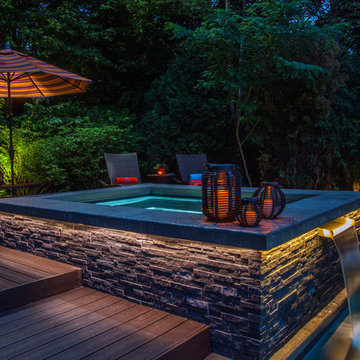
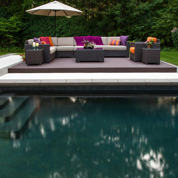
Using the existing shell, we were able to transform the look and feel of the pool and its surroundings. Poured concrete, Trex decks, planters, and a fly-over bridge create an engaging space with intentional poolside social areas. Linda Oyama Bryan Photography
 Carlton Edwards
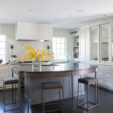
The Cherry Road project is a humble yet striking example of how small changes can have a big impact. A meaningful project as the final room to be renovated in this house, thus our completion aligned with the family’s move-in. The kitchen posed a number of problems the design worked to remedy. Such as an existing window oriented the room towards a neighboring driveway. The initial design move sought to reorganize the space internally, focusing the view from the sink back through the house to the pool and courtyard beyond. This simple repositioning allowed the range to center on the opposite wall, flanked by two windows that reduce direct views to the driveway while increasing the natural light of the space.
Opposite that opening to the dining room, we created a new custom hutch that has the upper doors bypass doors incorporate an antique mirror, then led they magnified the light and view opposite side of the room. The ceilings we were confined to eight foot four, so we wanted to create as much verticality as possible. All the cabinetry was designed to go to the ceiling, incorporating a simple coat mold at the ceiling. The west wall of the kitchen is primarily floor-to-ceiling storage behind paneled doors. So the refrigeration and freezers are fully integrated.
The island has a custom steel base with hammered legs, with a natural wax finish on it. The top is soapstone and incorporates an integral drain board in the kitchen sink. We did custom bar stools with steel bases and upholstered seats. At the range, we incorporated stainless steel countertops to integrate with the range itself, to make that more seamless flow. The edge detail is historic from the 1930s.
At the range itself, there are a number of custom detailed incorporated for storage of cooking oils and spices, in a pullout. A custom knife block that's in a pull out as well.There is a concealed sort of office for the homeowner behind custom, bi-folding panel doors. So it can be closed and totally concealed, or opened up and engaged with the kitchen.
In the office area, which was a former pantry, we repurposed a granite marble top that was on the former island. The walls have a grasscloth wall covering, which is pinnable, so the homeowner can display photographs, calendars, and schedules.
 Vetter Architects
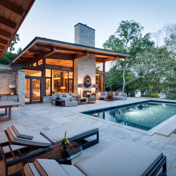
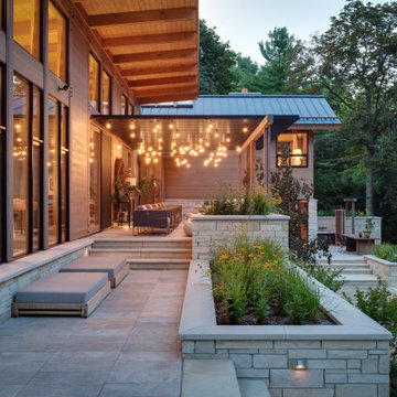
The owners requested a Private Resort that catered to their love for entertaining friends and family, a place where 2 people would feel just as comfortable as 42. Located on the western edge of a Wisconsin lake, the site provides a range of natural ecosystems from forest to prairie to water, allowing the building to have a more complex relationship with the lake - not merely creating large unencumbered views in that direction. The gently sloping site to the lake is atypical in many ways to most lakeside lots - as its main trajectory is not directly to the lake views - allowing for focus to be pushed in other directions such as a courtyard and into a nearby forest.
The biggest challenge was accommodating the large scale gathering spaces, while not overwhelming the natural setting with a single massive structure. Our solution was found in breaking down the scale of the project into digestible pieces and organizing them in a Camp-like collection of elements:
- Main Lodge: Providing the proper entry to the Camp and a Mess Hall
- Bunk House: A communal sleeping area and social space.
- Party Barn: An entertainment facility that opens directly on to a swimming pool & outdoor room.
- Guest Cottages: A series of smaller guest quarters.
- Private Quarters: The owners private space that directly links to the Main Lodge.
These elements are joined by a series green roof connectors, that merge with the landscape and allow the out buildings to retain their own identity. This Camp feel was further magnified through the materiality - specifically the use of Doug Fir, creating a modern Northwoods setting that is warm and inviting. The use of local limestone and poured concrete walls ground the buildings to the sloping site and serve as a cradle for the wood volumes that rest gently on them. The connections between these materials provided an opportunity to add a delicate reading to the spaces and re-enforce the camp aesthetic.
The oscillation between large communal spaces and private, intimate zones is explored on the interior and in the outdoor rooms. From the large courtyard to the private balcony - accommodating a variety of opportunities to engage the landscape was at the heart of the concept.
Overview
Chenequa, WI
Size
Total Finished Area: 9,543 sf
Completion Date
May 2013
Services
Architecture, Landscape Architecture, Interior Design

Sponsored
Columbus, OH

Hope Restoration & General Contracting
Columbus Design-Build, Kitchen & Bath Remodeling, Historic Renovations
 User
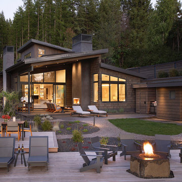
UserThe large Lift and Slide doors placed throughout this modern contemporary home have superior sealing when closed and are easily operated, regardless of size. The “lift” function engages the door onto its rollers for effortless function. A large panel door can then be moved with ease by even a child. With a turn of the handle the door is then lowered off the rollers, locked, and sealed into the frame creating one of the tightest air-seals in the industry.
The Glo A5 double pane windows and doors were utilized for their cost-effective durability and efficiency. The A5 Series provides a thermally-broken aluminum frame with multiple air seals, low iron glass, argon filled glazing, and low-e coating. These features create an unparalleled double-pane product equipped for the variant northern temperatures of the region. With u-values as low as 0.280, these windows ensure year-round comfort.
 Vetter Architects
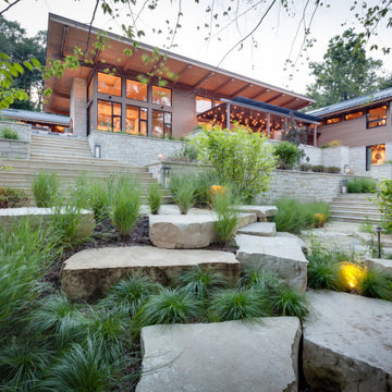
The owners requested a Private Resort that catered to their love for entertaining friends and family, a place where 2 people would feel just as comfortable as 42. Located on the western edge of a Wisconsin lake, the site provides a range of natural ecosystems from forest to prairie to water, allowing the building to have a more complex relationship with the lake - not merely creating large unencumbered views in that direction. The gently sloping site to the lake is atypical in many ways to most lakeside lots - as its main trajectory is not directly to the lake views - allowing for focus to be pushed in other directions such as a courtyard and into a nearby forest.
The biggest challenge was accommodating the large scale gathering spaces, while not overwhelming the natural setting with a single massive structure. Our solution was found in breaking down the scale of the project into digestible pieces and organizing them in a Camp-like collection of elements:
- Main Lodge: Providing the proper entry to the Camp and a Mess Hall
- Bunk House: A communal sleeping area and social space.
- Party Barn: An entertainment facility that opens directly on to a swimming pool & outdoor room.
- Guest Cottages: A series of smaller guest quarters.
- Private Quarters: The owners private space that directly links to the Main Lodge.
These elements are joined by a series green roof connectors, that merge with the landscape and allow the out buildings to retain their own identity. This Camp feel was further magnified through the materiality - specifically the use of Doug Fir, creating a modern Northwoods setting that is warm and inviting. The use of local limestone and poured concrete walls ground the buildings to the sloping site and serve as a cradle for the wood volumes that rest gently on them. The connections between these materials provided an opportunity to add a delicate reading to the spaces and re-enforce the camp aesthetic.
The oscillation between large communal spaces and private, intimate zones is explored on the interior and in the outdoor rooms. From the large courtyard to the private balcony - accommodating a variety of opportunities to engage the landscape was at the heart of the concept.
Overview
Chenequa, WI
Size
Total Finished Area: 9,543 sf
Completion Date
May 2013
Services
Architecture, Landscape Architecture, Interior Design
 Vetter Architects
The owners requested a Private Resort that catered to their love for entertaining friends and family, a place where 2 people would feel just as comfortable as 42. Located on the western edge of a Wisconsin lake, the site provides a range of natural ecosystems from forest to prairie to water, allowing the building to have a more complex relationship with the lake - not merely creating large unencumbered views in that direction. The gently sloping site to the lake is atypical in many ways to most lakeside lots - as its main trajectory is not directly to the lake views - allowing for focus to be pushed in other directions such as a courtyard and into a nearby forest.
The biggest challenge was accommodating the large scale gathering spaces, while not overwhelming the natural setting with a single massive structure. Our solution was found in breaking down the scale of the project into digestible pieces and organizing them in a Camp-like collection of elements:
- Main Lodge: Providing the proper entry to the Camp and a Mess Hall
- Bunk House: A communal sleeping area and social space.
- Party Barn: An entertainment facility that opens directly on to a swimming pool & outdoor room.
- Guest Cottages: A series of smaller guest quarters.
- Private Quarters: The owners private space that directly links to the Main Lodge.
These elements are joined by a series green roof connectors, that merge with the landscape and allow the out buildings to retain their own identity. This Camp feel was further magnified through the materiality - specifically the use of Doug Fir, creating a modern Northwoods setting that is warm and inviting. The use of local limestone and poured concrete walls ground the buildings to the sloping site and serve as a cradle for the wood volumes that rest gently on them. The connections between these materials provided an opportunity to add a delicate reading to the spaces and re-enforce the camp aesthetic.
The oscillation between large communal spaces and private, intimate zones is explored on the interior and in the outdoor rooms. From the large courtyard to the private balcony - accommodating a variety of opportunities to engage the landscape was at the heart of the concept.
Overview
Chenequa, WI
Size
Total Finished Area: 9,543 sf
Completion Date
May 2013
Services
Architecture, Landscape Architecture, Interior Design
 Michael Norpell's Wall To Wall
Using the existing shell, we were able to transform the look and feel of the pool and its surroundings. Poured concrete, Trex decks, planters, and a fly-over bridge create an engaging space with intentional poolside social areas. Linda Oyama Bryan Photography

Sponsored
Delaware, OH
Buckeye Basements, Inc.
Central Ohio's Basement Finishing ExpertsBest Of Houzz '13-'21
 Soundesign Group Architects, PLLC
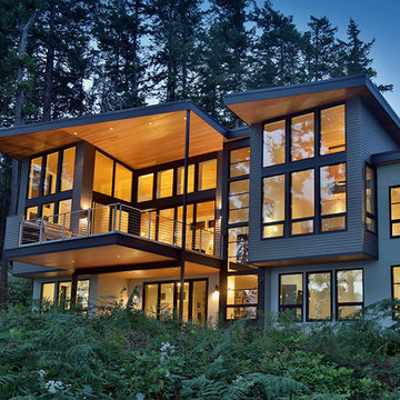
Large minimalist multicolored two-story mixed siding house exterior photo in Seattle with a shed roof
 BEVOLO GAS & ELECTRIC LIGHTS
TENNESSEE RIVER HOUSE
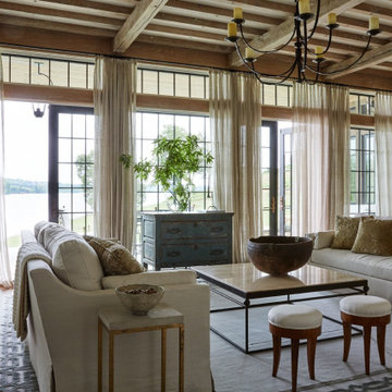
A successful businessman sold his company, and as part of the deal, was required to move to Knoxville, Tennessee. Having long been used to lake living in his native Alabama, he and his wife wanted to find a spot that would allow them to continue their life long love of being close to the water. They located such a site on the Tennessee River in a place appropriately called “Lake Loudon”. The rolling pasture-like site had great water access and views, and few trees creating a wide open kind of scenery. They hoped to make a place for their grown children to return to them with their grandchildren. The design engages and embeds the house into the hillside to become part of the landscape rather than sit in the middle of the field. The house was rotated slightly away from a straight on view of the river to shield from western sun, in favor of the northern exposure which opened up longer views of the Tennessee River, also allowing for more liberal use of windows in the main living space.
 Vetter Architects
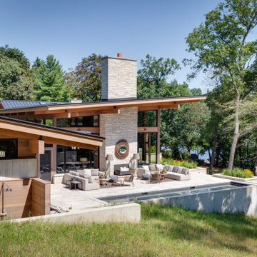
The owners requested a Private Resort that catered to their love for entertaining friends and family, a place where 2 people would feel just as comfortable as 42. Located on the western edge of a Wisconsin lake, the site provides a range of natural ecosystems from forest to prairie to water, allowing the building to have a more complex relationship with the lake - not merely creating large unencumbered views in that direction. The gently sloping site to the lake is atypical in many ways to most lakeside lots - as its main trajectory is not directly to the lake views - allowing for focus to be pushed in other directions such as a courtyard and into a nearby forest.
The biggest challenge was accommodating the large scale gathering spaces, while not overwhelming the natural setting with a single massive structure. Our solution was found in breaking down the scale of the project into digestible pieces and organizing them in a Camp-like collection of elements:
- Main Lodge: Providing the proper entry to the Camp and a Mess Hall
- Bunk House: A communal sleeping area and social space.
- Party Barn: An entertainment facility that opens directly on to a swimming pool & outdoor room.
- Guest Cottages: A series of smaller guest quarters.
- Private Quarters: The owners private space that directly links to the Main Lodge.
These elements are joined by a series green roof connectors, that merge with the landscape and allow the out buildings to retain their own identity. This Camp feel was further magnified through the materiality - specifically the use of Doug Fir, creating a modern Northwoods setting that is warm and inviting. The use of local limestone and poured concrete walls ground the buildings to the sloping site and serve as a cradle for the wood volumes that rest gently on them. The connections between these materials provided an opportunity to add a delicate reading to the spaces and re-enforce the camp aesthetic.
The oscillation between large communal spaces and private, intimate zones is explored on the interior and in the outdoor rooms. From the large courtyard to the private balcony - accommodating a variety of opportunities to engage the landscape was at the heart of the concept.
Overview
Chenequa, WI
Size
Total Finished Area: 9,543 sf
Completion Date
May 2013
Services
Architecture, Landscape Architecture, Interior Design
20