
Search results for "Crucial checks" in Home Design Ideas
 RAJ Kitchen and Bath, LLC
**Check out the video of this transformation on our website**
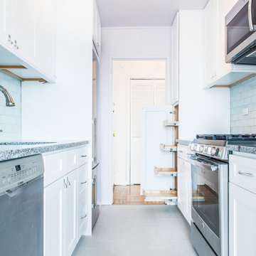
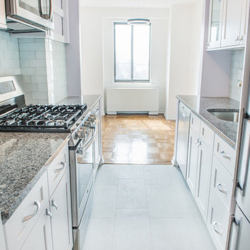
This small kitchen was way too small for this 2 bedrooms, 2 bathrooms apartment. Not only was it a very small kitchen, but the physical location of it made it very difficult to make it any bigger. There wasn't much that could have been done without incurring astronomical cost, which would get little or no return on the investment. The client wanted a kitchen that can be optimized in its current location to add a ton of value for resale.
This was difficult to do, because there was no moving of any mechanical around in the kitchen and even if we wanted to, the management of the building would not allow. For those of you who live in condos, co-ops or apartment building, you know how difficult it is to rework these foot prints. When we showed up, we saw the problems, but we also saw a huge opportunity where we can achieve those goals in the small space. This was accomplished by making some key changes and to incorporate some new things that was not possible when this kitchen was built years ago.
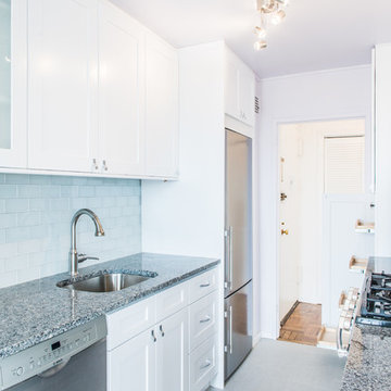
The crucial part of the design that would drive the entire new layout, was selecting the only appliance; that was the Refrigerator. Once we nailed down that refrigerator, we then proceeded to design the kitchen around it. We moved it to the other side of the wall where the sink was so that we can tap into the water line from the sink plumbing. It was crucial that it stays exactly 24" deep, not an inch more because we had to keep the entry as open as possible. Also, it was going to be directly in front of another big storage unit - The pantry. It is not ideal in most cases, but we needed the rest of the space to ramp up the design and open feel towards the side where all of the activities would take place, which happend to be the dining room and the view.
Once all that was figured out, we re-positioned the sink, dishwasher and the range and proceeded to wrap the cabinets around the columns to integrate them into the space. Thirty- six inches cabinets height was used so that they can be installed higher towards the ceiling height to give more room rather than the standard 18" required height between the counter tops. This was done to make the room feel a lot bigger than it really was. Not to mention, we also didn't want the faucet to be buried under the cabinets so that was also a necessary design detail for the space.
We then lowered both knee walls so that the counter top can sit on top of them, by removing that stop point that would have otherwise defined the kitchen area. This allowed us to pick up that extra footprint into the room for added prep space and enabled us to create the illusion of a kitchen that is looking longer than it really is. Every inch mattered when designing this kitchen and we made a conscious decision to use every one of that inch.
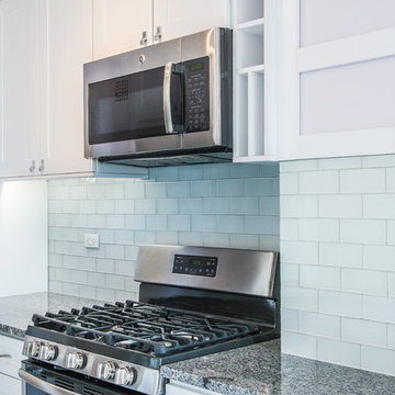
White cabinets were selected to do just what white cabinets are design to do; make a small or dark room appear bigger, brighter and more open. In this kitchen, this was amplified the more because of the kitchen location. It was perfect! We knew we did justice to the space because while we were there taking some photos, a few potential buyers walked in and went straight for the kitchen! They said its design just to fit the apartment.
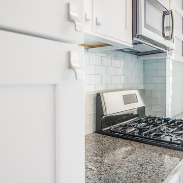
Pantry roll out shelving, Double recycle bin, fancy handles, LED lighting, Quartz counter top, beautiful backslash tiles and grey linen floors finished off the kitchen which looked over a beautiful view of the George Washington Bridge from the top of this lovely 4th floor apartment.
Credit to Masterpiece Tile and Marble (Annmarie on the selection of Tiles and countertop and Val on the Construction to complete this project).
Davor Kokic Photography
 RAJ Kitchen and Bath, LLC
**Check out the video of this transformation on our website**
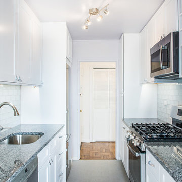
This small kitchen was way too small for this 2 bedrooms, 2 bathrooms apartment. Not only was it a very small kitchen, but the physical location of it made it very difficult to make it any bigger. There wasn't much that could have been done without incurring astronomical cost, which would get little or no return on the investment. The client wanted a kitchen that can be optimized in its current location to add a ton of value for resale.
This was difficult to do, because there was no moving of any mechanical around in the kitchen and even if we wanted to, the management of the building would not allow. For those of you who live in condos, co-ops or apartment building, you know how difficult it is to rework these foot prints. When we showed up, we saw the problems, but we also saw a huge opportunity where we can achieve those goals in the small space. This was accomplished by making some key changes and to incorporate some new things that was not possible when this kitchen was built years ago.
The crucial part of the design that would drive the entire new layout, was selecting the only appliance; that was the Refrigerator. Once we nailed down that refrigerator, we then proceeded to design the kitchen around it. We moved it to the other side of the wall where the sink was so that we can tap into the water line from the sink plumbing. It was crucial that it stays exactly 24" deep, not an inch more because we had to keep the entry as open as possible. Also, it was going to be directly in front of another big storage unit - The pantry. It is not ideal in most cases, but we needed the rest of the space to ramp up the design and open feel towards the side where all of the activities would take place, which happend to be the dining room and the view.
Once all that was figured out, we re-positioned the sink, dishwasher and the range and proceeded to wrap the cabinets around the columns to integrate them into the space. Thirty- six inches cabinets height was used so that they can be installed higher towards the ceiling height to give more room rather than the standard 18" required height between the counter tops. This was done to make the room feel a lot bigger than it really was. Not to mention, we also didn't want the faucet to be buried under the cabinets so that was also a necessary design detail for the space.
We then lowered both knee walls so that the counter top can sit on top of them, by removing that stop point that would have otherwise defined the kitchen area. This allowed us to pick up that extra footprint into the room for added prep space and enabled us to create the illusion of a kitchen that is looking longer than it really is. Every inch mattered when designing this kitchen and we made a conscious decision to use every one of that inch.
White cabinets were selected to do just what white cabinets are design to do; make a small or dark room appear bigger, brighter and more open. In this kitchen, this was amplified the more because of the kitchen location. It was perfect! We knew we did justice to the space because while we were there taking some photos, a few potential buyers walked in and went straight for the kitchen! They said its design just to fit the apartment.
Pantry roll out shelving, Double recycle bin, fancy handles, LED lighting, Quartz counter top, beautiful backslash tiles and grey linen floors finished off the kitchen which looked over a beautiful view of the George Washington Bridge from the top of this lovely 4th floor apartment.
Credit to Masterpiece Tile and Marble (Annmarie on the selection of Tiles and countertop and Val on the Construction to complete this project).
Davor Kokic Photography
 Carolyn Reyes
Photo: Carolyn Reyes © 2016 Houzz
Design: Kelly Mack Home
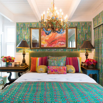
Bedroom - eclectic carpeted bedroom idea in Los Angeles
Bedroom - eclectic carpeted bedroom idea in Los Angeles
Find the right local pro for your project
 RAJ Kitchen and Bath, LLC
**Check out the video of this transformation on our website**
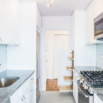
This small kitchen was way too small for this 2 bedrooms, 2 bathrooms apartment. Not only was it a very small kitchen, but the physical location of it made it very difficult to make it any bigger. There wasn't much that could have been done without incurring astronomical cost, which would get little or no return on the investment. The client wanted a kitchen that can be optimized in its current location to add a ton of value for resale.
This was difficult to do, because there was no moving of any mechanical around in the kitchen and even if we wanted to, the management of the building would not allow. For those of you who live in condos, co-ops or apartment building, you know how difficult it is to rework these foot prints. When we showed up, we saw the problems, but we also saw a huge opportunity where we can achieve those goals in the small space. This was accomplished by making some key changes and to incorporate some new things that was not possible when this kitchen was built years ago.
The crucial part of the design that would drive the entire new layout, was selecting the only appliance; that was the Refrigerator. Once we nailed down that refrigerator, we then proceeded to design the kitchen around it. We moved it to the other side of the wall where the sink was so that we can tap into the water line from the sink plumbing. It was crucial that it stays exactly 24" deep, not an inch more because we had to keep the entry as open as possible. Also, it was going to be directly in front of another big storage unit - The pantry. It is not ideal in most cases, but we needed the rest of the space to ramp up the design and open feel towards the side where all of the activities would take place, which happend to be the dining room and the view.
Once all that was figured out, we re-positioned the sink, dishwasher and the range and proceeded to wrap the cabinets around the columns to integrate them into the space. Thirty- six inches cabinets height was used so that they can be installed higher towards the ceiling height to give more room rather than the standard 18" required height between the counter tops. This was done to make the room feel a lot bigger than it really was. Not to mention, we also didn't want the faucet to be buried under the cabinets so that was also a necessary design detail for the space.
We then lowered both knee walls so that the counter top can sit on top of them, by removing that stop point that would have otherwise defined the kitchen area. This allowed us to pick up that extra footprint into the room for added prep space and enabled us to create the illusion of a kitchen that is looking longer than it really is. Every inch mattered when designing this kitchen and we made a conscious decision to use every one of that inch.
White cabinets were selected to do just what white cabinets are design to do; make a small or dark room appear bigger, brighter and more open. In this kitchen, this was amplified the more because of the kitchen location. It was perfect! We knew we did justice to the space because while we were there taking some photos, a few potential buyers walked in and went straight for the kitchen! They said its design just to fit the apartment.
Pantry roll out shelving, Double recycle bin, fancy handles, LED lighting, Quartz counter top, beautiful backslash tiles and grey linen floors finished off the kitchen which looked over a beautiful view of the George Washington Bridge from the top of this lovely 4th floor apartment.
Credit to Masterpiece Tile and Marble (Annmarie on the selection of Tiles and countertop and Val on the Construction to complete this project).
Davor Kokic Photography

 RAJ Kitchen and Bath, LLC
**Check out the video of this transformation on our website**
This small kitchen was way too small for this 2 bedrooms, 2 bathrooms apartment. Not only was it a very small kitchen, but the physical location of it made it very difficult to make it any bigger. There wasn't much that could have been done without incurring astronomical cost, which would get little or no return on the investment. The client wanted a kitchen that can be optimized in its current location to add a ton of value for resale.
This was difficult to do, because there was no moving of any mechanical around in the kitchen and even if we wanted to, the management of the building would not allow. For those of you who live in condos, co-ops or apartment building, you know how difficult it is to rework these foot prints. When we showed up, we saw the problems, but we also saw a huge opportunity where we can achieve those goals in the small space. This was accomplished by making some key changes and to incorporate some new things that was not possible when this kitchen was built years ago.
The crucial part of the design that would drive the entire new layout, was selecting the only appliance; that was the Refrigerator. Once we nailed down that refrigerator, we then proceeded to design the kitchen around it. We moved it to the other side of the wall where the sink was so that we can tap into the water line from the sink plumbing. It was crucial that it stays exactly 24" deep, not an inch more because we had to keep the entry as open as possible. Also, it was going to be directly in front of another big storage unit - The pantry. It is not ideal in most cases, but we needed the rest of the space to ramp up the design and open feel towards the side where all of the activities would take place, which happend to be the dining room and the view.
Once all that was figured out, we re-positioned the sink, dishwasher and the range and proceeded to wrap the cabinets around the columns to integrate them into the space. Thirty- six inches cabinets height was used so that they can be installed higher towards the ceiling height to give more room rather than the standard 18" required height between the counter tops. This was done to make the room feel a lot bigger than it really was. Not to mention, we also didn't want the faucet to be buried under the cabinets so that was also a necessary design detail for the space.
We then lowered both knee walls so that the counter top can sit on top of them, by removing that stop point that would have otherwise defined the kitchen area. This allowed us to pick up that extra footprint into the room for added prep space and enabled us to create the illusion of a kitchen that is looking longer than it really is. Every inch mattered when designing this kitchen and we made a conscious decision to use every one of that inch.
White cabinets were selected to do just what white cabinets are design to do; make a small or dark room appear bigger, brighter and more open. In this kitchen, this was amplified the more because of the kitchen location. It was perfect! We knew we did justice to the space because while we were there taking some photos, a few potential buyers walked in and went straight for the kitchen! They said its design just to fit the apartment.
Pantry roll out shelving, Double recycle bin, fancy handles, LED lighting, Quartz counter top, beautiful backslash tiles and grey linen floors finished off the kitchen which looked over a beautiful view of the George Washington Bridge from the top of this lovely 4th floor apartment.
Credit to Masterpiece Tile and Marble (Annmarie on the selection of Tiles and countertop and Val on the Construction to complete this project).
Davor Kokic Photography
 RAJ Kitchen and Bath, LLC
**Check out the video of this transformation on our website**
This small kitchen was way too small for this 2 bedrooms, 2 bathrooms apartment. Not only was it a very small kitchen, but the physical location of it made it very difficult to make it any bigger. There wasn't much that could have been done without incurring astronomical cost, which would get little or no return on the investment. The client wanted a kitchen that can be optimized in its current location to add a ton of value for resale.
This was difficult to do, because there was no moving of any mechanical around in the kitchen and even if we wanted to, the management of the building would not allow. For those of you who live in condos, co-ops or apartment building, you know how difficult it is to rework these foot prints. When we showed up, we saw the problems, but we also saw a huge opportunity where we can achieve those goals in the small space. This was accomplished by making some key changes and to incorporate some new things that was not possible when this kitchen was built years ago.
The crucial part of the design that would drive the entire new layout, was selecting the only appliance; that was the Refrigerator. Once we nailed down that refrigerator, we then proceeded to design the kitchen around it. We moved it to the other side of the wall where the sink was so that we can tap into the water line from the sink plumbing. It was crucial that it stays exactly 24" deep, not an inch more because we had to keep the entry as open as possible. Also, it was going to be directly in front of another big storage unit - The pantry. It is not ideal in most cases, but we needed the rest of the space to ramp up the design and open feel towards the side where all of the activities would take place, which happend to be the dining room and the view.
Once all that was figured out, we re-positioned the sink, dishwasher and the range and proceeded to wrap the cabinets around the columns to integrate them into the space. Thirty- six inches cabinets height was used so that they can be installed higher towards the ceiling height to give more room rather than the standard 18" required height between the counter tops. This was done to make the room feel a lot bigger than it really was. Not to mention, we also didn't want the faucet to be buried under the cabinets so that was also a necessary design detail for the space.
We then lowered both knee walls so that the counter top can sit on top of them, by removing that stop point that would have otherwise defined the kitchen area. This allowed us to pick up that extra footprint into the room for added prep space and enabled us to create the illusion of a kitchen that is looking longer than it really is. Every inch mattered when designing this kitchen and we made a conscious decision to use every one of that inch.
White cabinets were selected to do just what white cabinets are design to do; make a small or dark room appear bigger, brighter and more open. In this kitchen, this was amplified the more because of the kitchen location. It was perfect! We knew we did justice to the space because while we were there taking some photos, a few potential buyers walked in and went straight for the kitchen! They said its design just to fit the apartment.
Pantry roll out shelving, Double recycle bin, fancy handles, LED lighting, Quartz counter top, beautiful backslash tiles and grey linen floors finished off the kitchen which looked over a beautiful view of the George Washington Bridge from the top of this lovely 4th floor apartment.
Credit to Masterpiece Tile and Marble (Annmarie on the selection of Tiles and countertop and Val on the Construction to complete this project).
Davor Kokic Photography
Sponsored
Columbus, OH

Hope Restoration & General Contracting
Columbus Design-Build, Kitchen & Bath Remodeling, Historic Renovations
 RAJ Kitchen and Bath, LLC
**Check out the video of this transformation on our website**
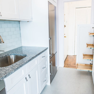
This small kitchen was way too small for this 2 bedrooms, 2 bathrooms apartment. Not only was it a very small kitchen, but the physical location of it made it very difficult to make it any bigger. There wasn't much that could have been done without incurring astronomical cost, which would get little or no return on the investment. The client wanted a kitchen that can be optimized in its current location to add a ton of value for resale.
This was difficult to do, because there was no moving of any mechanical around in the kitchen and even if we wanted to, the management of the building would not allow. For those of you who live in condos, co-ops or apartment building, you know how difficult it is to rework these foot prints. When we showed up, we saw the problems, but we also saw a huge opportunity where we can achieve those goals in the small space. This was accomplished by making some key changes and to incorporate some new things that was not possible when this kitchen was built years ago.
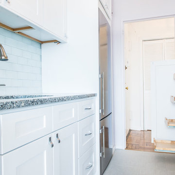
The crucial part of the design that would drive the entire new layout, was selecting the only appliance; that was the Refrigerator. Once we nailed down that refrigerator, we then proceeded to design the kitchen around it. We moved it to the other side of the wall where the sink was so that we can tap into the water line from the sink plumbing. It was crucial that it stays exactly 24" deep, not an inch more because we had to keep the entry as open as possible. Also, it was going to be directly in front of another big storage unit - The pantry. It is not ideal in most cases, but we needed the rest of the space to ramp up the design and open feel towards the side where all of the activities would take place, which happend to be the dining room and the view.
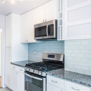
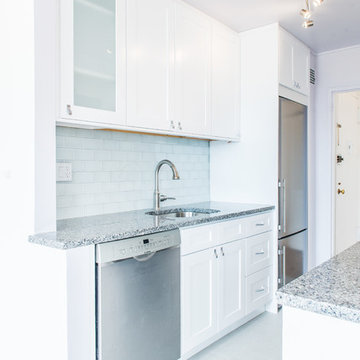
Once all that was figured out, we re-positioned the sink, dishwasher and the range and proceeded to wrap the cabinets around the columns to integrate them into the space. Thirty- six inches cabinets height was used so that they can be installed higher towards the ceiling height to give more room rather than the standard 18" required height between the counter tops. This was done to make the room feel a lot bigger than it really was. Not to mention, we also didn't want the faucet to be buried under the cabinets so that was also a necessary design detail for the space.
We then lowered both knee walls so that the counter top can sit on top of them, by removing that stop point that would have otherwise defined the kitchen area. This allowed us to pick up that extra footprint into the room for added prep space and enabled us to create the illusion of a kitchen that is looking longer than it really is. Every inch mattered when designing this kitchen and we made a conscious decision to use every one of that inch.
White cabinets were selected to do just what white cabinets are design to do; make a small or dark room appear bigger, brighter and more open. In this kitchen, this was amplified the more because of the kitchen location. It was perfect! We knew we did justice to the space because while we were there taking some photos, a few potential buyers walked in and went straight for the kitchen! They said its design just to fit the apartment.
Pantry roll out shelving, Double recycle bin, fancy handles, LED lighting, Quartz counter top, beautiful backslash tiles and grey linen floors finished off the kitchen which looked over a beautiful view of the George Washington Bridge from the top of this lovely 4th floor apartment.
Credit to Masterpiece Tile and Marble (Annmarie on the selection of Tiles and countertop and Val on the Construction to complete this project).
Davor Kokic Photography
 RAJ Kitchen and Bath, LLC
**Check out the video of this transformation on our website**
This small kitchen was way too small for this 2 bedrooms, 2 bathrooms apartment. Not only was it a very small kitchen, but the physical location of it made it very difficult to make it any bigger. There wasn't much that could have been done without incurring astronomical cost, which would get little or no return on the investment. The client wanted a kitchen that can be optimized in its current location to add a ton of value for resale.
This was difficult to do, because there was no moving of any mechanical around in the kitchen and even if we wanted to, the management of the building would not allow. For those of you who live in condos, co-ops or apartment building, you know how difficult it is to rework these foot prints. When we showed up, we saw the problems, but we also saw a huge opportunity where we can achieve those goals in the small space. This was accomplished by making some key changes and to incorporate some new things that was not possible when this kitchen was built years ago.
The crucial part of the design that would drive the entire new layout, was selecting the only appliance; that was the Refrigerator. Once we nailed down that refrigerator, we then proceeded to design the kitchen around it. We moved it to the other side of the wall where the sink was so that we can tap into the water line from the sink plumbing. It was crucial that it stays exactly 24" deep, not an inch more because we had to keep the entry as open as possible. Also, it was going to be directly in front of another big storage unit - The pantry. It is not ideal in most cases, but we needed the rest of the space to ramp up the design and open feel towards the side where all of the activities would take place, which happend to be the dining room and the view.
Once all that was figured out, we re-positioned the sink, dishwasher and the range and proceeded to wrap the cabinets around the columns to integrate them into the space. Thirty- six inches cabinets height was used so that they can be installed higher towards the ceiling height to give more room rather than the standard 18" required height between the counter tops. This was done to make the room feel a lot bigger than it really was. Not to mention, we also didn't want the faucet to be buried under the cabinets so that was also a necessary design detail for the space.
We then lowered both knee walls so that the counter top can sit on top of them, by removing that stop point that would have otherwise defined the kitchen area. This allowed us to pick up that extra footprint into the room for added prep space and enabled us to create the illusion of a kitchen that is looking longer than it really is. Every inch mattered when designing this kitchen and we made a conscious decision to use every one of that inch.
White cabinets were selected to do just what white cabinets are design to do; make a small or dark room appear bigger, brighter and more open. In this kitchen, this was amplified the more because of the kitchen location. It was perfect! We knew we did justice to the space because while we were there taking some photos, a few potential buyers walked in and went straight for the kitchen! They said its design just to fit the apartment.
Pantry roll out shelving, Double recycle bin, fancy handles, LED lighting, Quartz counter top, beautiful backslash tiles and grey linen floors finished off the kitchen which looked over a beautiful view of the George Washington Bridge from the top of this lovely 4th floor apartment.
Credit to Masterpiece Tile and Marble (Annmarie on the selection of Tiles and countertop and Val on the Construction to complete this project).
Davor Kokic Photography
 RAJ Kitchen and Bath, LLC
**Check out the video of this transformation on our website**
This small kitchen was way too small for this 2 bedrooms, 2 bathrooms apartment. Not only was it a very small kitchen, but the physical location of it made it very difficult to make it any bigger. There wasn't much that could have been done without incurring astronomical cost, which would get little or no return on the investment. The client wanted a kitchen that can be optimized in its current location to add a ton of value for resale.
This was difficult to do, because there was no moving of any mechanical around in the kitchen and even if we wanted to, the management of the building would not allow. For those of you who live in condos, co-ops or apartment building, you know how difficult it is to rework these foot prints. When we showed up, we saw the problems, but we also saw a huge opportunity where we can achieve those goals in the small space. This was accomplished by making some key changes and to incorporate some new things that was not possible when this kitchen was built years ago.
The crucial part of the design that would drive the entire new layout, was selecting the only appliance; that was the Refrigerator. Once we nailed down that refrigerator, we then proceeded to design the kitchen around it. We moved it to the other side of the wall where the sink was so that we can tap into the water line from the sink plumbing. It was crucial that it stays exactly 24" deep, not an inch more because we had to keep the entry as open as possible. Also, it was going to be directly in front of another big storage unit - The pantry. It is not ideal in most cases, but we needed the rest of the space to ramp up the design and open feel towards the side where all of the activities would take place, which happend to be the dining room and the view.
Once all that was figured out, we re-positioned the sink, dishwasher and the range and proceeded to wrap the cabinets around the columns to integrate them into the space. Thirty- six inches cabinets height was used so that they can be installed higher towards the ceiling height to give more room rather than the standard 18" required height between the counter tops. This was done to make the room feel a lot bigger than it really was. Not to mention, we also didn't want the faucet to be buried under the cabinets so that was also a necessary design detail for the space.
We then lowered both knee walls so that the counter top can sit on top of them, by removing that stop point that would have otherwise defined the kitchen area. This allowed us to pick up that extra footprint into the room for added prep space and enabled us to create the illusion of a kitchen that is looking longer than it really is. Every inch mattered when designing this kitchen and we made a conscious decision to use every one of that inch.
White cabinets were selected to do just what white cabinets are design to do; make a small or dark room appear bigger, brighter and more open. In this kitchen, this was amplified the more because of the kitchen location. It was perfect! We knew we did justice to the space because while we were there taking some photos, a few potential buyers walked in and went straight for the kitchen! They said its design just to fit the apartment.
Pantry roll out shelving, Double recycle bin, fancy handles, LED lighting, Quartz counter top, beautiful backslash tiles and grey linen floors finished off the kitchen which looked over a beautiful view of the George Washington Bridge from the top of this lovely 4th floor apartment.
Credit to Masterpiece Tile and Marble (Annmarie on the selection of Tiles and countertop and Val on the Construction to complete this project).
Davor Kokic Photography
 RAJ Kitchen and Bath, LLC
**Check out the video of this transformation on our website**
This small kitchen was way too small for this 2 bedrooms, 2 bathrooms apartment. Not only was it a very small kitchen, but the physical location of it made it very difficult to make it any bigger. There wasn't much that could have been done without incurring astronomical cost, which would get little or no return on the investment. The client wanted a kitchen that can be optimized in its current location to add a ton of value for resale.
This was difficult to do, because there was no moving of any mechanical around in the kitchen and even if we wanted to, the management of the building would not allow. For those of you who live in condos, co-ops or apartment building, you know how difficult it is to rework these foot prints. When we showed up, we saw the problems, but we also saw a huge opportunity where we can achieve those goals in the small space. This was accomplished by making some key changes and to incorporate some new things that was not possible when this kitchen was built years ago.
The crucial part of the design that would drive the entire new layout, was selecting the only appliance; that was the Refrigerator. Once we nailed down that refrigerator, we then proceeded to design the kitchen around it. We moved it to the other side of the wall where the sink was so that we can tap into the water line from the sink plumbing. It was crucial that it stays exactly 24" deep, not an inch more because we had to keep the entry as open as possible. Also, it was going to be directly in front of another big storage unit - The pantry. It is not ideal in most cases, but we needed the rest of the space to ramp up the design and open feel towards the side where all of the activities would take place, which happend to be the dining room and the view.
Once all that was figured out, we re-positioned the sink, dishwasher and the range and proceeded to wrap the cabinets around the columns to integrate them into the space. Thirty- six inches cabinets height was used so that they can be installed higher towards the ceiling height to give more room rather than the standard 18" required height between the counter tops. This was done to make the room feel a lot bigger than it really was. Not to mention, we also didn't want the faucet to be buried under the cabinets so that was also a necessary design detail for the space.
We then lowered both knee walls so that the counter top can sit on top of them, by removing that stop point that would have otherwise defined the kitchen area. This allowed us to pick up that extra footprint into the room for added prep space and enabled us to create the illusion of a kitchen that is looking longer than it really is. Every inch mattered when designing this kitchen and we made a conscious decision to use every one of that inch.
White cabinets were selected to do just what white cabinets are design to do; make a small or dark room appear bigger, brighter and more open. In this kitchen, this was amplified the more because of the kitchen location. It was perfect! We knew we did justice to the space because while we were there taking some photos, a few potential buyers walked in and went straight for the kitchen! They said its design just to fit the apartment.
Pantry roll out shelving, Double recycle bin, fancy handles, LED lighting, Quartz counter top, beautiful backslash tiles and grey linen floors finished off the kitchen which looked over a beautiful view of the George Washington Bridge from the top of this lovely 4th floor apartment.
Credit to Masterpiece Tile and Marble (Annmarie on the selection of Tiles and countertop and Val on the Construction to complete this project).
Davor Kokic Photography
 RAJ Kitchen and Bath, LLC
**Check out the video of this transformation on our website**
This small kitchen was way too small for this 2 bedrooms, 2 bathrooms apartment. Not only was it a very small kitchen, but the physical location of it made it very difficult to make it any bigger. There wasn't much that could have been done without incurring astronomical cost, which would get little or no return on the investment. The client wanted a kitchen that can be optimized in its current location to add a ton of value for resale.
This was difficult to do, because there was no moving of any mechanical around in the kitchen and even if we wanted to, the management of the building would not allow. For those of you who live in condos, co-ops or apartment building, you know how difficult it is to rework these foot prints. When we showed up, we saw the problems, but we also saw a huge opportunity where we can achieve those goals in the small space. This was accomplished by making some key changes and to incorporate some new things that was not possible when this kitchen was built years ago.
The crucial part of the design that would drive the entire new layout, was selecting the only appliance; that was the Refrigerator. Once we nailed down that refrigerator, we then proceeded to design the kitchen around it. We moved it to the other side of the wall where the sink was so that we can tap into the water line from the sink plumbing. It was crucial that it stays exactly 24" deep, not an inch more because we had to keep the entry as open as possible. Also, it was going to be directly in front of another big storage unit - The pantry. It is not ideal in most cases, but we needed the rest of the space to ramp up the design and open feel towards the side where all of the activities would take place, which happend to be the dining room and the view.
Once all that was figured out, we re-positioned the sink, dishwasher and the range and proceeded to wrap the cabinets around the columns to integrate them into the space. Thirty- six inches cabinets height was used so that they can be installed higher towards the ceiling height to give more room rather than the standard 18" required height between the counter tops. This was done to make the room feel a lot bigger than it really was. Not to mention, we also didn't want the faucet to be buried under the cabinets so that was also a necessary design detail for the space.
We then lowered both knee walls so that the counter top can sit on top of them, by removing that stop point that would have otherwise defined the kitchen area. This allowed us to pick up that extra footprint into the room for added prep space and enabled us to create the illusion of a kitchen that is looking longer than it really is. Every inch mattered when designing this kitchen and we made a conscious decision to use every one of that inch.
White cabinets were selected to do just what white cabinets are design to do; make a small or dark room appear bigger, brighter and more open. In this kitchen, this was amplified the more because of the kitchen location. It was perfect! We knew we did justice to the space because while we were there taking some photos, a few potential buyers walked in and went straight for the kitchen! They said its design just to fit the apartment.
Pantry roll out shelving, Double recycle bin, fancy handles, LED lighting, Quartz counter top, beautiful backslash tiles and grey linen floors finished off the kitchen which looked over a beautiful view of the George Washington Bridge from the top of this lovely 4th floor apartment.
Credit to Masterpiece Tile and Marble (Annmarie on the selection of Tiles and countertop and Val on the Construction to complete this project).
Davor Kokic Photography
 LOREC Ranch Home Furnishings
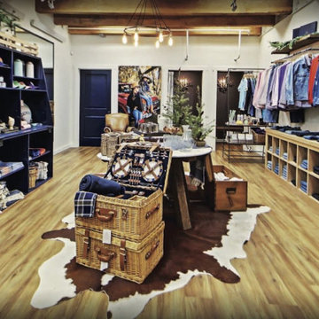
Cowboy Kitchen
LOREC Ranch is renowned for its artisanal approach to creating cowboy kitchen table cabinets, a tradition deeply rooted in both craftsmanship and rustic charm. The ranch’s approach to woodworking melds time-honored techniques with innovative methods, producing cabinets that epitomize the rugged elegance of cowboy culture.
Selecting the Wood
The process begins with the selection of high-quality wood. At LOREC Ranch, the choice of lumber is critical to the final product. They use a variety of hardwoods such as oak, pine, and walnut. Each type of wood offers unique characteristics—oak for its strength and durability, pine for its workability and warm hue, and walnut for its rich, dark tones. The wood is carefully sourced from sustainable forests, ensuring both environmental responsibility and superior quality. Once procured, the wood undergoes a thorough drying process to reduce moisture content, which is crucial for preventing future warping or cracking.
Design and Craftsmanship
Design is a pivotal stage in the creation of cowboy kitchen table cabinets. LOREC Ranch's designs often draw inspiration from traditional cowboy aesthetics, incorporating elements like sturdy, rugged lines and intricate detailing that reflects the essence of Western life. The design phase involves detailed planning and sketching, ensuring that the cabinets not only serve their functional purpose but also enhance the rustic charm of any kitchen. Cowboy Kitchens are a stable of the American Midwest.
The next step is crafting the cabinet frames. Skilled artisans at LOREC Ranch use a combination of modern and traditional techniques. While some aspects of the construction process involve high-tech machinery for precision cutting and joining, much of the fine detailing is done by hand. This includes hand-carving and finishing touches that give each cabinet a unique, handcrafted feel. The artisans' expertise ensures that every joint is perfectly aligned and every surface is smooth and ready for finishing.
Assembly and Finishing
Once the components are cut and shaped, they are assembled using time-tested joinery techniques. LOREC Ranch favors methods such as dovetail and mortise-and-tenon joints, which not only enhance the strength and durability of the cabinets but also align with the traditional craftsmanship that defines their products of the Cowboys Kitchen. The assembly process is meticulous, ensuring that each piece fits together seamlessly and stands the test of time.
Finishing is where the cabinets truly come to life. LOREC Ranch uses a range of techniques to achieve a finish that complements the wood’s natural beauty while providing protection against wear and tear. This often involves multiple coats of stain or varnish, each applied with care to enhance the wood’s grain and texture. The finishing process is both art and science, requiring a delicate balance to ensure the cabinets not only look beautiful but are also resistant to daily use.
Quality Control and Delivery
Before any cabinet leaves the workshop, it undergoes rigorous quality control. Every detail is inspected to ensure that the cabinet meets LOREC Ranch’s high standards. This includes checking for structural integrity, finish consistency, and overall craftsmanship. Only after passing this thorough inspection are the Cowboys Kitchens cabinets prepared for delivery.
At LOREC Ranch, the journey of creating cowboy kitchen cabinets is a blend of tradition and innovation. From selecting the finest wood to the final touches of finishing, every step is executed with precision and care. The result is a product that is not only a testament to the rich heritage of cowboy craftsmanship but also a functional and stylish addition to any kitchen.
The Cowboy Kitchen by LOREC Ranch Home Furnishings is a celebration of the rustic, western lifestyle, offering a unique blend of rugged charm and modern practicality. Designed for those who appreciate the simplicity and warmth of western living, the Cowboy Kitchen collection includes a variety of furniture and decor that can transform any kitchen into a western oasis. Central to this collection are the cowboy kitchen tables and cowboy kitchen cabinets, which feature solid wood construction, intricate detailing, and finishes that reflect the natural beauty of the materials used. These pieces are ideal for creating a western style kitchen that feels both authentic and welcoming.
LOREC Ranch's cowboy kitchen tables are crafted with both functionality and style in mind. Whether you’re looking for a cowboy dining table for family meals or a cowboy kitchen fold-up table for smaller spaces, these pieces are designed to meet a variety of needs. The hideaway kitchen tables and Murphy kitchen tables offer innovative solutions for maximizing space without sacrificing the rustic aesthetic. For those interested in DIY projects, cowboy kitchen table plans are available, allowing you to customize your table to suit your specific preferences and space requirements.
In addition to tables, the cowboy kitchen cabinets and cowboy kitchen armoires are key elements in creating a cohesive western style kitchen. These cowboy cabinets are made from high-quality wood and feature designs that are both practical and decorative, with ample storage space and a style that echoes the rugged charm of the American frontier. The western style kitchen cabinets are perfect for those who want to bring a touch of the wild west into their home while ensuring their kitchen remains functional and organized.
To complete the look, cowboy kitchen decor items, such as western-themed accents and accessories, are available to enhance the overall atmosphere of the western kitchens. These decor pieces complement the larger furniture items, tying together the rustic aesthetic and creating a warm, inviting space that feels like a true cowboy's kitchen. Whether you’re looking to create a completely western-themed kitchen or just want to add a few rustic touches, LOREC Ranch’s Cowboy Kitchen collection offers everything you need to bring your vision to life
Sponsored
Westerville, OH

Custom Home Works
Franklin County's Award-Winning Design, Build and Remodeling Expert
 RAJ Kitchen and Bath, LLC
**Check out the video of this transformation on our website**
This small kitchen was way too small for this 2 bedrooms, 2 bathrooms apartment. Not only was it a very small kitchen, but the physical location of it made it very difficult to make it any bigger. There wasn't much that could have been done without incurring astronomical cost, which would get little or no return on the investment. The client wanted a kitchen that can be optimized in its current location to add a ton of value for resale.
This was difficult to do, because there was no moving of any mechanical around in the kitchen and even if we wanted to, the management of the building would not allow. For those of you who live in condos, co-ops or apartment building, you know how difficult it is to rework these foot prints. When we showed up, we saw the problems, but we also saw a huge opportunity where we can achieve those goals in the small space. This was accomplished by making some key changes and to incorporate some new things that was not possible when this kitchen was built years ago.
The crucial part of the design that would drive the entire new layout, was selecting the only appliance; that was the Refrigerator. Once we nailed down that refrigerator, we then proceeded to design the kitchen around it. We moved it to the other side of the wall where the sink was so that we can tap into the water line from the sink plumbing. It was crucial that it stays exactly 24" deep, not an inch more because we had to keep the entry as open as possible. Also, it was going to be directly in front of another big storage unit - The pantry. It is not ideal in most cases, but we needed the rest of the space to ramp up the design and open feel towards the side where all of the activities would take place, which happend to be the dining room and the view.
Once all that was figured out, we re-positioned the sink, dishwasher and the range and proceeded to wrap the cabinets around the columns to integrate them into the space. Thirty- six inches cabinets height was used so that they can be installed higher towards the ceiling height to give more room rather than the standard 18" required height between the counter tops. This was done to make the room feel a lot bigger than it really was. Not to mention, we also didn't want the faucet to be buried under the cabinets so that was also a necessary design detail for the space.
We then lowered both knee walls so that the counter top can sit on top of them, by removing that stop point that would have otherwise defined the kitchen area. This allowed us to pick up that extra footprint into the room for added prep space and enabled us to create the illusion of a kitchen that is looking longer than it really is. Every inch mattered when designing this kitchen and we made a conscious decision to use every one of that inch.
White cabinets were selected to do just what white cabinets are design to do; make a small or dark room appear bigger, brighter and more open. In this kitchen, this was amplified the more because of the kitchen location. It was perfect! We knew we did justice to the space because while we were there taking some photos, a few potential buyers walked in and went straight for the kitchen! They said its design just to fit the apartment.
Pantry roll out shelving, Double recycle bin, fancy handles, LED lighting, Quartz counter top, beautiful backslash tiles and grey linen floors finished off the kitchen which looked over a beautiful view of the George Washington Bridge from the top of this lovely 4th floor apartment.
Credit to Masterpiece Tile and Marble (Annmarie on the selection of Tiles and countertop and Val on the Construction to complete this project).
Davor Kokic Photography

 John
JohnCoco coir is a versatile and sustainable growing medium that is gaining popularity among gardeners. Made from the fibrous husk of coconuts, it’s an eco-friendly alternative to peat moss and can greatly enhance the quality of your soil. In gardening, it is often utilized in systems like Coco Coir Hydroponic, where it helps create an efficient water and nutrient delivery system.
What is Coco Coir?
Coco coir is a natural fiber extracted from coconut husks. It has a neutral pH, excellent water retention, and is reusable, making it a favorite among gardeners who prefer organic and sustainable practices. It is available in different forms such as blocks, bricks, or loose coir, each requiring some preparation before use in gardening.
Benefits of Using Coco Coir in Gardening
Coco coir offers several advantages for gardening. Here are the benefits of using coco coir in gardening:
Holds up to 10 times its weight in water, ensuring plants have consistent moisture.
Promotes oxygen flow to plant roots, leading to healthier root systems.
Coco coir is a renewable and eco-friendly alternative to peat moss.
It can be washed, rehydrated, and reused, reducing waste.
Naturally pH neutral, making it suitable for various plants without major adjustments.
Enhances the texture and moisture retention of garden soil.
How to Prepare Coco Coir for Planting
Preparing coco coir for planting involves a few essential steps. First, you need to hydrate the coir block, as it typically comes in a compressed form. Place the block in a large container and add warm water, allowing the block to expand and absorb the water. Once fully expanded, the coir should be fluffed up by breaking it apart with your hands or a tool to ensure it becomes loose and airy. After the coir has been fluffed, it is important to drain any excess water, as overly wet coir can lead to root suffocation. Finally, since coco coir is inert and does not contain nutrients, it’s a good idea to add organic compost or liquid fertilizer to enrich the coir before planting.
Do You Need to Soak Coco Coir Before Planting?
Yes, soaking coco coir before planting is necessary. Since it comes in a compressed form, it needs to be broken down and hydrated for proper use. The soaking process allows the coir to expand and release the fibers, making it usable as a growing medium. After soaking, the coir should be fluffed to ensure the water is evenly distributed. Draining any excess water is crucial because overly wet coir may impede plant root health.
How to Prepare Coco Peat for Planting
Coco peat, a fine, powdery form of coco coir, is highly beneficial for seed starting and improving water retention in soil. To prepare coco peat, it first needs to be hydrated, similar to how you prepare coir blocks. Slowly add water to the peat in a container and allow it to absorb and fluff up. Once hydrated, coco peat can be used on its own or mixed with other growing media such as perlite or vermiculite for added aeration and drainage. It is advisable to check the pH level of your final mix, as coco peat generally has a neutral pH, but adjustments may be necessary depending on the plants being grown.
Can You Use Just Coco Coir for Plants?
Yes, coco coir can be used by itself to grow plants, especially in hydroponic systems or as a seed-starting medium. However, because coco coir does not naturally contain nutrients, you will need to provide regular fertilizer to support plant growth. This makes it particularly suitable for plants grown in controlled environments, such as hydroponics, where nutrient solutions can be carefully managed. In traditional soil-based gardening, mixing coco coir with other organic materials like compost is recommended to provide essential nutrients and improve the overall soil structure.
How to Use Coco Coir in Hydroponics
Coco coir is widely used in hydroponic systems due to its water retention and aeration properties. To use coco coir in hydroponics, it first needs to be soaked and hydrated, as discussed earlier. Once the coir is fully prepared, it can be placed in the hydroponic system. Since coco coir does not contain natural nutrients, you will need to supply a balanced nutrient solution tailored for hydroponic plants. Regular monitoring of water and nutrient levels is essential to prevent nutrient imbalances or root rot. One of the benefits of coco coir in hydroponics is its reusability. After completing a growing cycle, the coir can be washed, rehydrated, and used again in future plantings.
Using Coco Coir as a Soil Amendment
Coco coir is also an excellent soil amendment, as it improves the texture and moisture retention of garden soil. To use coco coir in this way, mix loose coir with your existing garden soil at a ratio of one part coco coir to two parts soil. This will help retain moisture without compacting the soil, improving both water drainage and root growth. For optimal results, you can also add organic compost to the mix, ensuring that the nutrient levels are sufficient for plant growth. Coco coir works particularly well in raised beds, where it helps maintain proper soil structure over time.
Advantages of Using Coco Coir Over Peat Moss
While peat moss has been traditionally used as a growing medium, coco coir offers several advantages over it. Coco coir is a renewable resource, as it is a byproduct of coconut processing, while peat moss is harvested from peat bogs that take centuries to regenerate. Coco coir is also more durable, as it can be reused multiple times without breaking down, while peat moss disintegrates after a single use. Another key benefit is its neutral pH, whereas peat moss is more acidic and may require balancing to meet the needs of specific plants.
Conclusion
Coco coir is a highly versatile and sustainable growing medium that benefits both novice and experienced gardeners alike. Whether you are using it for hydroponics, as a soil amendment, or as a standalone medium for growing plants, knowing how to properly prepare and use it is key to maximizing its benefits. By following the steps detailed above, you can improve water retention, aeration, and overall plant health in your garden, all while contributing to eco-friendly gardening practices.
 RAJ Kitchen and Bath, LLC
**Check out the video of this transformation on our website**
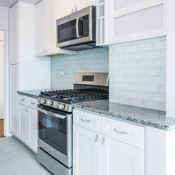
This small kitchen was way too small for this 2 bedrooms, 2 bathrooms apartment. Not only was it a very small kitchen, but the physical location of it made it very difficult to make it any bigger. There wasn't much that could have been done without incurring astronomical cost, which would get little or no return on the investment. The client wanted a kitchen that can be optimized in its current location to add a ton of value for resale.
This was difficult to do, because there was no moving of any mechanical around in the kitchen and even if we wanted to, the management of the building would not allow. For those of you who live in condos, co-ops or apartment building, you know how difficult it is to rework these foot prints. When we showed up, we saw the problems, but we also saw a huge opportunity where we can achieve those goals in the small space. This was accomplished by making some key changes and to incorporate some new things that was not possible when this kitchen was built years ago.
The crucial part of the design that would drive the entire new layout, was selecting the only appliance; that was the Refrigerator. Once we nailed down that refrigerator, we then proceeded to design the kitchen around it. We moved it to the other side of the wall where the sink was so that we can tap into the water line from the sink plumbing. It was crucial that it stays exactly 24" deep, not an inch more because we had to keep the entry as open as possible. Also, it was going to be directly in front of another big storage unit - The pantry. It is not ideal in most cases, but we needed the rest of the space to ramp up the design and open feel towards the side where all of the activities would take place, which happend to be the dining room and the view.
Once all that was figured out, we re-positioned the sink, dishwasher and the range and proceeded to wrap the cabinets around the columns to integrate them into the space. Thirty- six inches cabinets height was used so that they can be installed higher towards the ceiling height to give more room rather than the standard 18" required height between the counter tops. This was done to make the room feel a lot bigger than it really was. Not to mention, we also didn't want the faucet to be buried under the cabinets so that was also a necessary design detail for the space.
We then lowered both knee walls so that the counter top can sit on top of them, by removing that stop point that would have otherwise defined the kitchen area. This allowed us to pick up that extra footprint into the room for added prep space and enabled us to create the illusion of a kitchen that is looking longer than it really is. Every inch mattered when designing this kitchen and we made a conscious decision to use every one of that inch.
White cabinets were selected to do just what white cabinets are design to do; make a small or dark room appear bigger, brighter and more open. In this kitchen, this was amplified the more because of the kitchen location. It was perfect! We knew we did justice to the space because while we were there taking some photos, a few potential buyers walked in and went straight for the kitchen! They said its design just to fit the apartment.
Pantry roll out shelving, Double recycle bin, fancy handles, LED lighting, Quartz counter top, beautiful backslash tiles and grey linen floors finished off the kitchen which looked over a beautiful view of the George Washington Bridge from the top of this lovely 4th floor apartment.
Credit to Masterpiece Tile and Marble (Annmarie on the selection of Tiles and countertop and Val on the Construction to complete this project).
Davor Kokic Photography
 Talon Construction Inc.
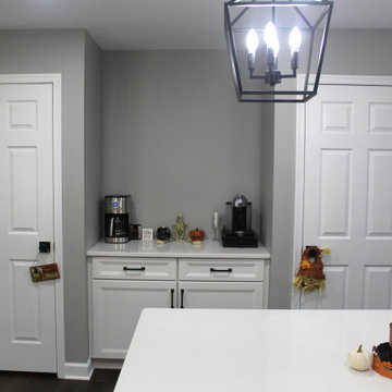
Designing and building a kitchen addition is a complex process that involves multiple steps and considerations. Here is a general outline to help you get started on your kitchen addition project:
Define Your Goals and Budget:
• Determine the purpose of the kitchen addition. Is it for more cooking space, a dining area, or a combination of both?
• Establish a realistic budget for your project. Consider all costs, including construction, permits, materials, and furnishings.
Hire a Design Professional:
• Seek the services of a design build company who specializes in kitchen additions.
• Discuss your vision, needs, and budget with the design professional to create a design concept.
Site Evaluation:
• Assess the existing space and structural condition of your home to ensure it can support the addition.
• Consider factors like zoning regulations, setbacks, and building codes.
Design Development:
• Collaborate with your design professional to refine the concept, including the layout, size, and architectural style.
• Choose materials, finishes, and fixtures that fit your design and budget.
Obtain Permits:
• Consult with your local design build contractor to determine the necessary permits and approvals.
• Prepare and submit all required documents, including architectural drawings and engineering plans.
Create Construction Documents:
• Work with your design build professional to develop detailed construction drawings and specifications.
• These documents will serve as a guide for contractors during construction.
Hire a design build contractor:
• Check references, credentials, and licenses before selecting a contractor.
• Sign a detailed contract that outlines the scope of work, timeline, and payment schedule.
Construction Phase:
• Demolition: If needed, remove any existing structures or walls.
• Foundation: Construct the foundation for the addition.
• Framing: Build the structural framework of the addition.
• Plumbing, Electrical, and HVAC: Install or update utilities as required.
• Insulation: Ensure proper insulation for energy efficiency.
• Drywall and Finish Work: Complete the walls and ceilings.
• Flooring and Cabinetry: Install flooring and kitchen cabinets.
• Appliances and Fixtures: Add appliances, plumbing fixtures, and lighting.
• Paint and Finish: Apply paint and finishes to achieve the desired look.
• Final Inspection: Schedule inspections to ensure compliance with building codes.
Final Inspections and Approvals:
• Arrange for final inspections to ensure the addition meets all safety and code requirements.
• Obtain any necessary certificates of occupancy or compliance.
Move In and Enjoy:
• Once all inspections and approvals are received, you can move into your new kitchen addition and start enjoying it.
Remember that every kitchen addition project is unique, so adapt this outline to your specific needs and circumstances. Consulting with professionals and obtaining the required permits and inspections is crucial to a successful and safe project.

Sponsored
Columbus, OH

Snider & Metcalf Interior Design, LTD
Leading Interior Designers in Columbus, Ohio & Ponte Vedra, Florida
 W.L. Heating & Cooling LLC
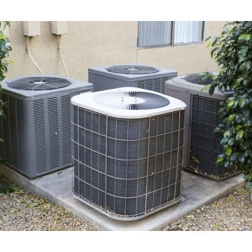
Air Conditioning System Installation And Repair, Heating Unit Installation And Repair, Ventilation Services, Refrigerator Installation And Repair, HVAC Maintenance Services, Air Quality Services, Refrigerator Maintenance, Ice Machine Repair, Freezer Services, Cooler Repairs And Replacements, Air Quality Testing, Custom Work, Estimates, Inspections, System Cleaning, Custom Work, Humidifier Installation
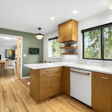
 Schulte Design Build
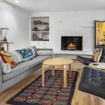
For this full-home remodel, the homeowners were looking for a design-build firm with strong credentials, sustainable practices, and a personal touch. After an extensive search, they chose Schulte Design Build for our expertise, approachability, and commitment to high-quality craftsmanship.
From the beginning, collaboration was essential. The homeowners had a well-defined vision but remained open to professional insights, allowing us to create a design that balanced functionality, sustainability, and budget-conscious decisions. Energy efficiency played a key role in the project, with strategic upgrades such as relocating the water heater and switching to a hybrid model. We also adjusted the backup furnace to side vent, reducing roof penetrations and improving overall efficiency.
Accessibility was another priority, and our team incorporated thoughtful ADA-friendly solutions throughout the home. The material selection process was equally intentional, ensuring that finishes aligned with the homeowners’ aesthetic goals while staying within budget. Our design team worked closely with them to achieve a refined and cohesive look without compromising quality.
Project management and clear communication were crucial to the success of this remodel. With regular check-ins and project tracking software, we kept the process organized and transparent, providing a seamless experience from start to finish. The construction phase lasted six months, during which the homeowners stayed actively involved while trusting our team to bring their vision to life.
The end result is a beautifully transformed home that integrates modern efficiencies, accessibility, and timeless design. Beyond the renovation itself, the homeowners gained a deeper understanding of their home’s functionality and feel more connected to their space than ever before. At Schulte Design Build, we take pride in guiding homeowners through the remodeling journey with expertise, integrity, and a collaborative spirit.
 Schulte Design Build
For this full-home remodel, the homeowners were looking for a design-build firm with strong credentials, sustainable practices, and a personal touch. After an extensive search, they chose Schulte Design Build for our expertise, approachability, and commitment to high-quality craftsmanship.
From the beginning, collaboration was essential. The homeowners had a well-defined vision but remained open to professional insights, allowing us to create a design that balanced functionality, sustainability, and budget-conscious decisions. Energy efficiency played a key role in the project, with strategic upgrades such as relocating the water heater and switching to a hybrid model. We also adjusted the backup furnace to side vent, reducing roof penetrations and improving overall efficiency.
Accessibility was another priority, and our team incorporated thoughtful ADA-friendly solutions throughout the home. The material selection process was equally intentional, ensuring that finishes aligned with the homeowners’ aesthetic goals while staying within budget. Our design team worked closely with them to achieve a refined and cohesive look without compromising quality.
Project management and clear communication were crucial to the success of this remodel. With regular check-ins and project tracking software, we kept the process organized and transparent, providing a seamless experience from start to finish. The construction phase lasted six months, during which the homeowners stayed actively involved while trusting our team to bring their vision to life.
The end result is a beautifully transformed home that integrates modern efficiencies, accessibility, and timeless design. Beyond the renovation itself, the homeowners gained a deeper understanding of their home’s functionality and feel more connected to their space than ever before. At Schulte Design Build, we take pride in guiding homeowners through the remodeling journey with expertise, integrity, and a collaborative spirit.
2