
Search results for "Current suggestions" in Home Design Ideas
 Saikley Architects
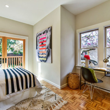
We updated this 1907 two-story family home for re-sale. We added modern design elements and amenities while retaining the home’s original charm in the layout and key details. The aim was to optimize the value of the property for a prospective buyer, within a reasonable budget.
New French doors from kitchen and a rear bedroom open out to a new bi-level deck that allows good sight lines, functional outdoor living space, and easy access to a garden full of mature fruit trees. French doors from an upstairs bedroom open out to a private high deck overlooking the garden. The garage has been converted to a family room that opens to the garden.
The bathrooms and kitchen were remodeled the kitchen with simple, light, classic materials and contemporary lighting fixtures. New windows and skylights flood the spaces with light. Stained wood windows and doors at the kitchen pick up on the original stained wood of the other living spaces.
New redwood picture molding was created for the living room where traces in the plaster suggested that picture molding has originally been. A sweet corner window seat at the living room was restored. At a downstairs bedroom we created a new plate rail and other redwood trim matching the original at the dining room. The original dining room hutch and woodwork were restored and a new mantel built for the fireplace.
We built deep shelves into space carved out of the attic next to upstairs bedrooms and added other built-ins for character and usefulness. Storage was created in nooks throughout the house. A small room off the kitchen was set up for efficient laundry and pantry space.
We provided the future owner of the house with plans showing design possibilities for expanding the house and creating a master suite with upstairs roof dormers and a small addition downstairs. The proposed design would optimize the house for current use while respecting the original integrity of the house.
Photography: John Hayes, Open Homes Photography
https://saikleyarchitects.com/portfolio/classic-craftsman-update/
 Saikley Architects
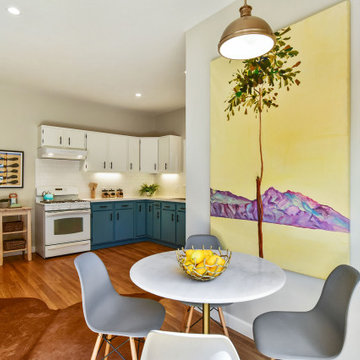
We updated this 1907 two-story family home for re-sale. We added modern design elements and amenities while retaining the home’s original charm in the layout and key details. The aim was to optimize the value of the property for a prospective buyer, within a reasonable budget.
New French doors from kitchen and a rear bedroom open out to a new bi-level deck that allows good sight lines, functional outdoor living space, and easy access to a garden full of mature fruit trees. French doors from an upstairs bedroom open out to a private high deck overlooking the garden. The garage has been converted to a family room that opens to the garden.
The bathrooms and kitchen were remodeled the kitchen with simple, light, classic materials and contemporary lighting fixtures. New windows and skylights flood the spaces with light. Stained wood windows and doors at the kitchen pick up on the original stained wood of the other living spaces.
New redwood picture molding was created for the living room where traces in the plaster suggested that picture molding has originally been. A sweet corner window seat at the living room was restored. At a downstairs bedroom we created a new plate rail and other redwood trim matching the original at the dining room. The original dining room hutch and woodwork were restored and a new mantel built for the fireplace.
We built deep shelves into space carved out of the attic next to upstairs bedrooms and added other built-ins for character and usefulness. Storage was created in nooks throughout the house. A small room off the kitchen was set up for efficient laundry and pantry space.
We provided the future owner of the house with plans showing design possibilities for expanding the house and creating a master suite with upstairs roof dormers and a small addition downstairs. The proposed design would optimize the house for current use while respecting the original integrity of the house.
Photography: John Hayes, Open Homes Photography
https://saikleyarchitects.com/portfolio/classic-craftsman-update/
 Bath Emporium & Castle Kitchens
 Carmichael Ave: Custom Modern Home Build
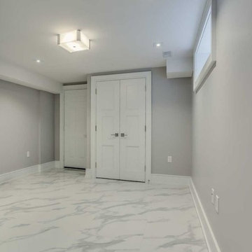
We’re excited to finally share pictures of one of our favourite customer’s project. The Rahimi brothers came into our showroom and consulted with Jodi for their custom home build. At Castle Kitchens, we are able to help all customers including builders with meeting their budget and providing them with great designs for their end customer. We worked closely with the builder duo by looking after their project from design to installation. The final outcome was a design that ensured the best layout, balance, proportion, symmetry, designed to suit the style of the property. Our kitchen design team was a great resource for our customers with regard to mechanical and electrical input, colours, appliance selection, accessory suggestions, etc. We provide overall design services! The project features walnut accents all throughout the house that help add warmth into a modern space allowing it be welcoming.
Castle Kitchens was ultimately able to provide great design at great value to allow for a great return on the builders project. We look forward to showcasing another project with Rahimi brothers that we are currently working on soon for 2017, so stay tuned!
Find the right local pro for your project
 Bath Emporium & Castle Kitchens
 Carmichael Ave: Custom Modern Home Build
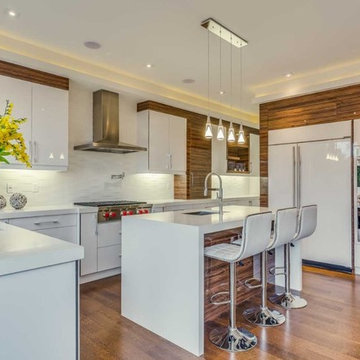
We’re excited to finally share pictures of one of our favourite customer’s project. The Rahimi brothers came into our showroom and consulted with Jodi for their custom home build. At Castle Kitchens, we are able to help all customers including builders with meeting their budget and providing them with great designs for their end customer. We worked closely with the builder duo by looking after their project from design to installation. The final outcome was a design that ensured the best layout, balance, proportion, symmetry, designed to suit the style of the property. Our kitchen design team was a great resource for our customers with regard to mechanical and electrical input, colours, appliance selection, accessory suggestions, etc. We provide overall design services! The project features walnut accents all throughout the house that help add warmth into a modern space allowing it be welcoming.
Castle Kitchens was ultimately able to provide great design at great value to allow for a great return on the builders project. We look forward to showcasing another project with Rahimi brothers that we are currently working on soon for 2017, so stay tuned!
 Norfolk Kitchen & Bath
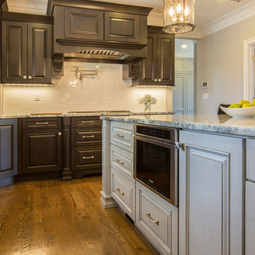
Eat-in kitchen - large traditional l-shaped medium tone wood floor eat-in kitchen idea in Boston with a single-bowl sink, raised-panel cabinets, dark wood cabinets, granite countertops, white backsplash, paneled appliances and an island
 TVL Creative Ltd.
Cramped kitchen be gone! That was the project motto and top priority. The goal was to transform the current layout from multiple smaller spaces into a connected whole that would activate the main level for our clients, a young family of four.
The biggest obstacle was the wall dividing the kitchen and the dining room. Removing this wall was central to opening up and integrating the main living spaces, but the existing ductwork that ran right through the center of the wall posed a design challenge, er design opportunity. The resulting design solution features a central pantry that captures the ductwork and provides valuable storage- especially when compared to the original kitchen's 18" wide pantry cabinet. The pantry also anchors the kitchen island and serves as a visual separation of space between the kitchen and homework area.
Through our design development process, we learned the formal living room was of no service to their lifestyle and therefore space they rarely spent time in. With that in mind, we proposed to eliminate the unused living room and make it the new dining room. Relocating the dining room to this space inherently felt right given the soaring ceiling and ample room for holiday dinners and celebrations. The new dining room was spacious enough for us to incorporate a conversational seating area in the warm, south-facing window alcove.
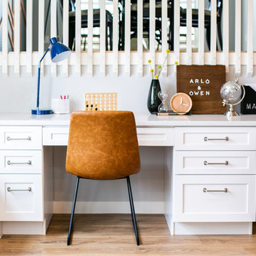
Now what to do with the old dining room?! To answer that question we took inspiration from our clients' shared profession in education and developed a craft area/homework station for both of their boys. The semi-custom cabinetry of the desk area carries over to the adjacent wall and forms window bench base with storage that we topped with butcher block for a touch of warmth. While the boys are young, the bench drawers are the perfect place for a stash of toys close to the kitchen.
The kitchen begins just beyond the window seat with their refrigerator enclosure. Opposite the refrigerator is the new pantry with twenty linear feet of shelving and space for brooms and a stick vacuum. Extending from the backside of the pantry the kitchen island design incorporates counter seating on the family room side and a cabinetry configuration on the kitchen side with drawer storage, a trashcan center, farmhouse sink, and dishwasher.
We took careful time in design and execution to align the range and sink because while it might seem like a small detail, it plays an important role in supporting the symmetrical configuration of the back wall of the kitchen. The rear wall design utilizes an appliance garage mirrors the visual impact of the refrigerator enclosure and helps keep the now open kitchen tidy. Between the appliance garage and refrigerator enclosure is the cooking zone with 30" of cabinetry and work surface on either side of the range, a chimney style vent hood, and a bold graphic tile backsplash.
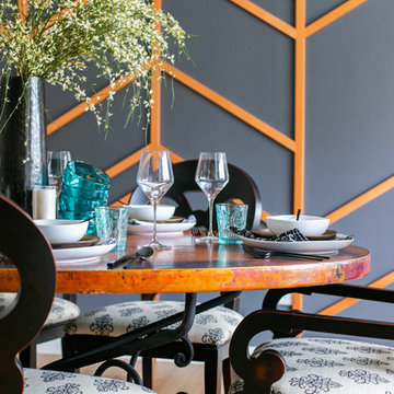
The backsplash is just one of many personal touches we added to the space to reflect our client's modern eclectic style and love of color. Swooping lines of the mid-mod style barstools compliment the pendants and backsplash pattern. A pop of vibrant green on the frame of the pantry door adds a fresh wash of color to an otherwise neutral space. The big show stopper is the custom charcoal gray and copper chevron wall installation in the dining room. This was an idea our clients softly suggested, and we excitedly embraced the opportunity. It is also a kickass solution to the head-scratching design dilemma of how to fill a large and lofty wall.
We are so grateful to bring this design to life for our clients and now dear friends.
 TVL Creative Ltd.
Cramped kitchen be gone! That was the project motto and top priority. The goal was to transform the current layout from multiple smaller spaces into a connected whole that would activate the main level for our clients, a young family of four.
The biggest obstacle was the wall dividing the kitchen and the dining room. Removing this wall was central to opening up and integrating the main living spaces, but the existing ductwork that ran right through the center of the wall posed a design challenge, er design opportunity. The resulting design solution features a central pantry that captures the ductwork and provides valuable storage- especially when compared to the original kitchen's 18" wide pantry cabinet. The pantry also anchors the kitchen island and serves as a visual separation of space between the kitchen and homework area.
Through our design development process, we learned the formal living room was of no service to their lifestyle and therefore space they rarely spent time in. With that in mind, we proposed to eliminate the unused living room and make it the new dining room. Relocating the dining room to this space inherently felt right given the soaring ceiling and ample room for holiday dinners and celebrations. The new dining room was spacious enough for us to incorporate a conversational seating area in the warm, south-facing window alcove.
Now what to do with the old dining room?! To answer that question we took inspiration from our clients' shared profession in education and developed a craft area/homework station for both of their boys. The semi-custom cabinetry of the desk area carries over to the adjacent wall and forms window bench base with storage that we topped with butcher block for a touch of warmth. While the boys are young, the bench drawers are the perfect place for a stash of toys close to the kitchen.
The kitchen begins just beyond the window seat with their refrigerator enclosure. Opposite the refrigerator is the new pantry with twenty linear feet of shelving and space for brooms and a stick vacuum. Extending from the backside of the pantry the kitchen island design incorporates counter seating on the family room side and a cabinetry configuration on the kitchen side with drawer storage, a trashcan center, farmhouse sink, and dishwasher.
We took careful time in design and execution to align the range and sink because while it might seem like a small detail, it plays an important role in supporting the symmetrical configuration of the back wall of the kitchen. The rear wall design utilizes an appliance garage mirrors the visual impact of the refrigerator enclosure and helps keep the now open kitchen tidy. Between the appliance garage and refrigerator enclosure is the cooking zone with 30" of cabinetry and work surface on either side of the range, a chimney style vent hood, and a bold graphic tile backsplash.
The backsplash is just one of many personal touches we added to the space to reflect our client's modern eclectic style and love of color. Swooping lines of the mid-mod style barstools compliment the pendants and backsplash pattern. A pop of vibrant green on the frame of the pantry door adds a fresh wash of color to an otherwise neutral space. The big show stopper is the custom charcoal gray and copper chevron wall installation in the dining room. This was an idea our clients softly suggested, and we excitedly embraced the opportunity. It is also a kickass solution to the head-scratching design dilemma of how to fill a large and lofty wall.
We are so grateful to bring this design to life for our clients and now dear friends.

Sponsored
Columbus, OH

Structural Remodeling
Franklin County's Heavy Timber Specialists | Best of Houzz 2020!
 TVL Creative Ltd.
Cramped kitchen be gone! That was the project motto and top priority. The goal was to transform the current layout from multiple smaller spaces into a connected whole that would activate the main level for our clients, a young family of four.
The biggest obstacle was the wall dividing the kitchen and the dining room. Removing this wall was central to opening up and integrating the main living spaces, but the existing ductwork that ran right through the center of the wall posed a design challenge, er design opportunity. The resulting design solution features a central pantry that captures the ductwork and provides valuable storage- especially when compared to the original kitchen's 18" wide pantry cabinet. The pantry also anchors the kitchen island and serves as a visual separation of space between the kitchen and homework area.
Through our design development process, we learned the formal living room was of no service to their lifestyle and therefore space they rarely spent time in. With that in mind, we proposed to eliminate the unused living room and make it the new dining room. Relocating the dining room to this space inherently felt right given the soaring ceiling and ample room for holiday dinners and celebrations. The new dining room was spacious enough for us to incorporate a conversational seating area in the warm, south-facing window alcove.
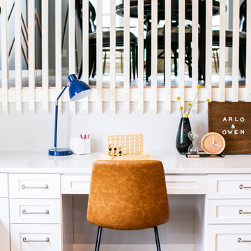
Now what to do with the old dining room?! To answer that question we took inspiration from our clients' shared profession in education and developed a craft area/homework station for both of their boys. The semi-custom cabinetry of the desk area carries over to the adjacent wall and forms window bench base with storage that we topped with butcher block for a touch of warmth. While the boys are young, the bench drawers are the perfect place for a stash of toys close to the kitchen.
The kitchen begins just beyond the window seat with their refrigerator enclosure. Opposite the refrigerator is the new pantry with twenty linear feet of shelving and space for brooms and a stick vacuum. Extending from the backside of the pantry the kitchen island design incorporates counter seating on the family room side and a cabinetry configuration on the kitchen side with drawer storage, a trashcan center, farmhouse sink, and dishwasher.
We took careful time in design and execution to align the range and sink because while it might seem like a small detail, it plays an important role in supporting the symmetrical configuration of the back wall of the kitchen. The rear wall design utilizes an appliance garage mirrors the visual impact of the refrigerator enclosure and helps keep the now open kitchen tidy. Between the appliance garage and refrigerator enclosure is the cooking zone with 30" of cabinetry and work surface on either side of the range, a chimney style vent hood, and a bold graphic tile backsplash.
The backsplash is just one of many personal touches we added to the space to reflect our client's modern eclectic style and love of color. Swooping lines of the mid-mod style barstools compliment the pendants and backsplash pattern. A pop of vibrant green on the frame of the pantry door adds a fresh wash of color to an otherwise neutral space. The big show stopper is the custom charcoal gray and copper chevron wall installation in the dining room. This was an idea our clients softly suggested, and we excitedly embraced the opportunity. It is also a kickass solution to the head-scratching design dilemma of how to fill a large and lofty wall.
We are so grateful to bring this design to life for our clients and now dear friends.
 Kitchen Solvers of Fort Lauderdale
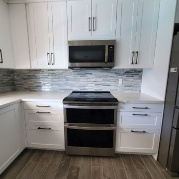
For this kitchen remodeling project, the homeowner was looking to make some much needed changes to the layout of the kitchen. We proposed a change that would optimize her storage capacity and the functionality of the cabinets. We suggested changing the pantry that was currently in the hallway and moving it to the kitchen. To do this, we removed the wall that divided the kitchen from the hallway. We also removed the existing desk that was in the kitchen and converted it into a coffee station with additional cabinets and a wine cooler. All the new cabinets were done in a Matte white color. To complete the new look, we installed a new quartz Calacatta Laza countertop, a glass tile backsplash, LED lights and a porcelain tile floor. Now this homeowner has the kitchen of their dreams.
 TaylorPro Design and Remodeling, Inc.
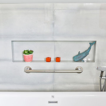
"Kerry Taylor was professional and courteous from our first meeting forwards. We took a long time to decide on our final design but Kerry and his design team were patient and respectful and waited until we were ready to move forward. There was never a sense of being pushed into anything we didn’t like. They listened, carefully considered our requests and delivered an awesome plan for our new bathroom. Kerry also broke down everything so that we could consider several alternatives for features and finishes and was mindful to stay within our budget. He accommodated some on-the-fly changes, after construction was underway and suggested effective solutions for any unforeseen problems that arose.
Having construction done in close proximity to our master bedroom was a challenge but the excellent crew TaylorPro had on our job made it relatively painless: courteous and polite, arrived on time daily, worked hard, pretty much nonstop and cleaned up every day before leaving. If there were any delays, Kerry made sure to communicate with us quickly and was always available to talk when we had concerns or questions."
This Carlsbad couple yearned for a generous master bath that included a big soaking tub, double vanity, water closet, large walk-in shower, and walk in closet. Unfortunately, their current master bathroom was only 6'x12'.
Our design team went to work and came up with a solution to push the back wall into an unused 2nd floor vaulted space in the garage, and further expand the new master bath footprint into two existing closet areas. These inventive expansions made it possible for their luxurious master bath dreams to come true.
Just goes to show that, with TaylorPro Design & Remodeling, fitting a square peg in a round hole could be possible!
Photos by: Jon Upson
 Bath Emporium & Castle Kitchens
 Carmichael Ave: Custom Modern Home Build
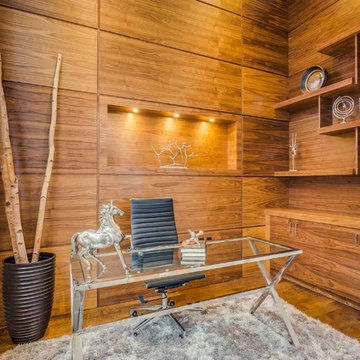
We’re excited to finally share pictures of one of our favourite customer’s project. The Rahimi brothers came into our showroom and consulted with Jodi for their custom home build. At Castle Kitchens, we are able to help all customers including builders with meeting their budget and providing them with great designs for their end customer. We worked closely with the builder duo by looking after their project from design to installation. The final outcome was a design that ensured the best layout, balance, proportion, symmetry, designed to suit the style of the property. Our kitchen design team was a great resource for our customers with regard to mechanical and electrical input, colours, appliance selection, accessory suggestions, etc. We provide overall design services! The project features walnut accents all throughout the house that help add warmth into a modern space allowing it be welcoming.
Castle Kitchens was ultimately able to provide great design at great value to allow for a great return on the builders project. We look forward to showcasing another project with Rahimi brothers that we are currently working on soon for 2017, so stay tuned!
 Bath Emporium & Castle Kitchens
 Carmichael Ave: Custom Modern Home Build
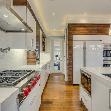
We’re excited to finally share pictures of one of our favourite customer’s project. The Rahimi brothers came into our showroom and consulted with Jodi for their custom home build. At Castle Kitchens, we are able to help all customers including builders with meeting their budget and providing them with great designs for their end customer. We worked closely with the builder duo by looking after their project from design to installation. The final outcome was a design that ensured the best layout, balance, proportion, symmetry, designed to suit the style of the property. Our kitchen design team was a great resource for our customers with regard to mechanical and electrical input, colours, appliance selection, accessory suggestions, etc. We provide overall design services! The project features walnut accents all throughout the house that help add warmth into a modern space allowing it be welcoming.
Castle Kitchens was ultimately able to provide great design at great value to allow for a great return on the builders project. We look forward to showcasing another project with Rahimi brothers that we are currently working on soon for 2017, so stay tuned!
 Interior Art
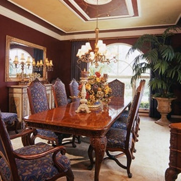
Dining Room, Red Wall & Ceiling Glaze/Faux,
Gold Transitional Ceiling & Gold Leafed "marble veins" in Center Red Ceiling
Laguna Niguel, CA
Interior Designer, Shan Luvisa of Obvious Flair www.obviousflair.com
Shan asked for an elegant red faux finish to coordinate with her chosen fabrics in this room. She also wanted a very subtle veined effect on the center portion of the red ceiling, and glazed to match the rest of the red. It was a lovely effect; it's elegance lasts and lasts. Our client absolutely loved her soft suede-like walls. This room was designed in 2001 - back in the day of old-school film in cameras! The date stamp showed these finishes were performed in 2001. I have seen this circumstance over and over..... A well-designed & exceptionally performed faux finish will last for MANY years. A well-chosen finish is rarely tiring. Our clients tend to grow into them; they fall in love with these great finishes each time they enter an area.
A Story:
A few years ago, I entered a home in a prominent area in Newport Beach called One Ford Road in which we had added extensive finishes throughout for the original owner when the home was newly built. We were called in to perform touchups by this home's current and fourth owner, readying the house to put it on the market for Owner #5! All of our faux finishes throughout were still intact, and in fact were key selling points to the home; which had one the Gold Award for the ASID/OC Home Under 3,500 square feet designed by the late Stephen L. Stein of SLS Designs in 2001.
Another Story:
Interior Art was called into see a new home in Coto de Caza, CA years ago; our new client a busy real estate agent in the area. He asked me what I could do to their new home to create a dazzling space for his wife. He made it his point to let me know of his promise to his wife that he would make it extraordinarily comfortable for her. My client was in the dog house, bigtime. He sheepishly explained he needed to save his marriage by vowing to his wife he'd NEVER make her move again. She was tired of moving; this home was the 11th house they'd lived in within the past 10 years! We suggested approximately $30,000 in artistic/faux finishes. They said yes to all of it, "Whatever Julie wants", my client said. Once we completed adding artistic & faux details throughout, both of my clients were extraordinarily happy - their comments, "Everything is so beautiful; it feels so comfortable. You've made our house into a home."
To my surprise; within the year, my client called me and excitedly told me, "Julie is about to kill me! I just sold the house!"
My client had one of HIS clients walk through his home. "Jackie, she gave me an offer I couldn't refuse! I just set a record! I sold my house for the highest $$ amount per square foot in Coto de Caza! She saw the house, went wild for it, turned to me and said, 'whatever it costs, I don't care, I HAVE to have this house' ." His buyer felt an emotional pull towards the house. "It was because of your finishes, Jackie". I was thrilled to hear his excitement, and afraid for his wife. My client did, indeed find a beautiful, much bigger home for his wife in another part of Coto de Caza, which presented us with a whole new canvas to play with throughout.
I've witnessed countless of these stories firsthand. Interior Art's finishes which we performed well over 10 years ago are still fresh and remain an elegant addition to a beautiful space. The longevity of these finishes is a consideration on choosing your wall colors/artistic details. The upgrades will pay off, both emotionally and in equity.

 B Designs Interior's
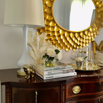
When we decided to stay here and not move, the office dilemma needed to be solved. I suggested my hsiuband move his home Office upstairs, and i'd take his current smallish office. He decided he wanted the Man Cave on the basement and gave me his old space. not going to bother posting before's, you truly wouldn't believe how cluttered a space could be. But here is my new office and i just love coming to work every morning! Its not %100 yet so stay tuned but enjoy something pretty for now.
 Saikley Architects
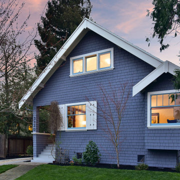
We updated this 1907 two-story family home for re-sale. We added modern design elements and amenities while retaining the home’s original charm in the layout and key details. The aim was to optimize the value of the property for a prospective buyer, within a reasonable budget.
New French doors from kitchen and a rear bedroom open out to a new bi-level deck that allows good sight lines, functional outdoor living space, and easy access to a garden full of mature fruit trees. French doors from an upstairs bedroom open out to a private high deck overlooking the garden. The garage has been converted to a family room that opens to the garden.
The bathrooms and kitchen were remodeled the kitchen with simple, light, classic materials and contemporary lighting fixtures. New windows and skylights flood the spaces with light. Stained wood windows and doors at the kitchen pick up on the original stained wood of the other living spaces.
New redwood picture molding was created for the living room where traces in the plaster suggested that picture molding has originally been. A sweet corner window seat at the living room was restored. At a downstairs bedroom we created a new plate rail and other redwood trim matching the original at the dining room. The original dining room hutch and woodwork were restored and a new mantel built for the fireplace.
We built deep shelves into space carved out of the attic next to upstairs bedrooms and added other built-ins for character and usefulness. Storage was created in nooks throughout the house. A small room off the kitchen was set up for efficient laundry and pantry space.
We provided the future owner of the house with plans showing design possibilities for expanding the house and creating a master suite with upstairs roof dormers and a small addition downstairs. The proposed design would optimize the house for current use while respecting the original integrity of the house.
Photography: John Hayes, Open Homes Photography
https://saikleyarchitects.com/portfolio/classic-craftsman-update/
 Ambient
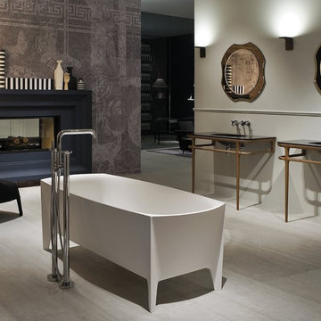
Design: Roberto Lazzeroni.
A highly emotional collection characterized by the material nature of the woods, by the skillful lacquering , retro style of the mirrors and the metal reflections: ILBagno describes an intimate and refined atmosphere with a return to origins, a project that looks to the past to explore the future.
A proposal less rigorous and minimal which allows you to recover the memory of familiar images, the style of a noble past, the suggestions that come from different styles.
Not nostalgic but rather current, a reworking of content obtained through the antoniolupi style almost maniacal attention to detail, the excellence of the workmanship and materials used.
 Saikley Architects
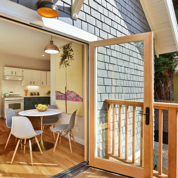
We updated this 1907 two-story family home for re-sale. We added modern design elements and amenities while retaining the home’s original charm in the layout and key details. The aim was to optimize the value of the property for a prospective buyer, within a reasonable budget.
New French doors from kitchen and a rear bedroom open out to a new bi-level deck that allows good sight lines, functional outdoor living space, and easy access to a garden full of mature fruit trees. French doors from an upstairs bedroom open out to a private high deck overlooking the garden. The garage has been converted to a family room that opens to the garden.
The bathrooms and kitchen were remodeled the kitchen with simple, light, classic materials and contemporary lighting fixtures. New windows and skylights flood the spaces with light. Stained wood windows and doors at the kitchen pick up on the original stained wood of the other living spaces.
New redwood picture molding was created for the living room where traces in the plaster suggested that picture molding has originally been. A sweet corner window seat at the living room was restored. At a downstairs bedroom we created a new plate rail and other redwood trim matching the original at the dining room. The original dining room hutch and woodwork were restored and a new mantel built for the fireplace.
We built deep shelves into space carved out of the attic next to upstairs bedrooms and added other built-ins for character and usefulness. Storage was created in nooks throughout the house. A small room off the kitchen was set up for efficient laundry and pantry space.
We provided the future owner of the house with plans showing design possibilities for expanding the house and creating a master suite with upstairs roof dormers and a small addition downstairs. The proposed design would optimize the house for current use while respecting the original integrity of the house.
Photography: John Hayes, Open Homes Photography
https://saikleyarchitects.com/portfolio/classic-craftsman-update/
 Saikley Architects
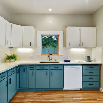
We updated this 1907 two-story family home for re-sale. We added modern design elements and amenities while retaining the home’s original charm in the layout and key details. The aim was to optimize the value of the property for a prospective buyer, within a reasonable budget.
New French doors from kitchen and a rear bedroom open out to a new bi-level deck that allows good sight lines, functional outdoor living space, and easy access to a garden full of mature fruit trees. French doors from an upstairs bedroom open out to a private high deck overlooking the garden. The garage has been converted to a family room that opens to the garden.
The bathrooms and kitchen were remodeled the kitchen with simple, light, classic materials and contemporary lighting fixtures. New windows and skylights flood the spaces with light. Stained wood windows and doors at the kitchen pick up on the original stained wood of the other living spaces.
New redwood picture molding was created for the living room where traces in the plaster suggested that picture molding has originally been. A sweet corner window seat at the living room was restored. At a downstairs bedroom we created a new plate rail and other redwood trim matching the original at the dining room. The original dining room hutch and woodwork were restored and a new mantel built for the fireplace.
We built deep shelves into space carved out of the attic next to upstairs bedrooms and added other built-ins for character and usefulness. Storage was created in nooks throughout the house. A small room off the kitchen was set up for efficient laundry and pantry space.
We provided the future owner of the house with plans showing design possibilities for expanding the house and creating a master suite with upstairs roof dormers and a small addition downstairs. The proposed design would optimize the house for current use while respecting the original integrity of the house.
Photography: John Hayes, Open Homes Photography
https://saikleyarchitects.com/portfolio/classic-craftsman-update/
 Saikley Architects
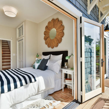
We updated this 1907 two-story family home for re-sale. We added modern design elements and amenities while retaining the home’s original charm in the layout and key details. The aim was to optimize the value of the property for a prospective buyer, within a reasonable budget.
New French doors from kitchen and a rear bedroom open out to a new bi-level deck that allows good sight lines, functional outdoor living space, and easy access to a garden full of mature fruit trees. French doors from an upstairs bedroom open out to a private high deck overlooking the garden. The garage has been converted to a family room that opens to the garden.
The bathrooms and kitchen were remodeled the kitchen with simple, light, classic materials and contemporary lighting fixtures. New windows and skylights flood the spaces with light. Stained wood windows and doors at the kitchen pick up on the original stained wood of the other living spaces.
New redwood picture molding was created for the living room where traces in the plaster suggested that picture molding has originally been. A sweet corner window seat at the living room was restored. At a downstairs bedroom we created a new plate rail and other redwood trim matching the original at the dining room. The original dining room hutch and woodwork were restored and a new mantel built for the fireplace.
We built deep shelves into space carved out of the attic next to upstairs bedrooms and added other built-ins for character and usefulness. Storage was created in nooks throughout the house. A small room off the kitchen was set up for efficient laundry and pantry space.
We provided the future owner of the house with plans showing design possibilities for expanding the house and creating a master suite with upstairs roof dormers and a small addition downstairs. The proposed design would optimize the house for current use while respecting the original integrity of the house.
Photography: John Hayes, Open Homes Photography
https://saikleyarchitects.com/portfolio/classic-craftsman-update/
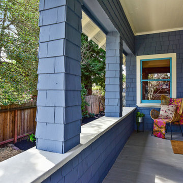 Saikley Architects
We updated this 1907 two-story family home for re-sale. We added modern design elements and amenities while retaining the home’s original charm in the layout and key details. The aim was to optimize the value of the property for a prospective buyer, within a reasonable budget.
New French doors from kitchen and a rear bedroom open out to a new bi-level deck that allows good sight lines, functional outdoor living space, and easy access to a garden full of mature fruit trees. French doors from an upstairs bedroom open out to a private high deck overlooking the garden. The garage has been converted to a family room that opens to the garden.
The bathrooms and kitchen were remodeled the kitchen with simple, light, classic materials and contemporary lighting fixtures. New windows and skylights flood the spaces with light. Stained wood windows and doors at the kitchen pick up on the original stained wood of the other living spaces.
New redwood picture molding was created for the living room where traces in the plaster suggested that picture molding has originally been. A sweet corner window seat at the living room was restored. At a downstairs bedroom we created a new plate rail and other redwood trim matching the original at the dining room. The original dining room hutch and woodwork were restored and a new mantel built for the fireplace.
We built deep shelves into space carved out of the attic next to upstairs bedrooms and added other built-ins for character and usefulness. Storage was created in nooks throughout the house. A small room off the kitchen was set up for efficient laundry and pantry space.
We provided the future owner of the house with plans showing design possibilities for expanding the house and creating a master suite with upstairs roof dormers and a small addition downstairs. The proposed design would optimize the house for current use while respecting the original integrity of the house.
Photography: John Hayes, Open Homes Photography
https://saikleyarchitects.com/portfolio/classic-craftsman-update/
17