
Search results for "Current suggestions" in Home Design Ideas
 Murphy Bros. Design | Build | Remodel
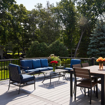
This project is a perfect example of why our unique “programming” approach with early identification of investment limits is so essential to a successful remodel. At the start, these homeowners wanted to explore the possibility of 3 season porch addition off the back of their home. The goal was to expand gathering and entertainment space for their family and friends, addressing the current cramped porch and uncovered deck.
It became clear to everyone after diligent time spent in phase one of programming that also addressing other concerns in the home, such as the front entry porch and fixing the windows in the existing 4 season porch, would blow the budget.
We worked through a re-design with the homeowner over the next months and eventually created a large deck, an updated porch with new windows and patio door, and a front entry deck. We installed a water drainage system underneath the deck with LED lighting, so the homeowner could finish an additional patio space underneath the new deck.
This couple made the decision early on that this was their last home and therefore the investment was more than mere ROI would suggest is proper. However, they also wanted to remodel within their means, and we wanted that too.

 TVL Creative Ltd.
Cramped kitchen be gone! That was the project motto and top priority. The goal was to transform the current layout from multiple smaller spaces into a connected whole that would activate the main level for our clients, a young family of four.
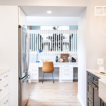
The biggest obstacle was the wall dividing the kitchen and the dining room. Removing this wall was central to opening up and integrating the main living spaces, but the existing ductwork that ran right through the center of the wall posed a design challenge, er design opportunity. The resulting design solution features a central pantry that captures the ductwork and provides valuable storage- especially when compared to the original kitchen's 18" wide pantry cabinet. The pantry also anchors the kitchen island and serves as a visual separation of space between the kitchen and homework area.
Through our design development process, we learned the formal living room was of no service to their lifestyle and therefore space they rarely spent time in. With that in mind, we proposed to eliminate the unused living room and make it the new dining room. Relocating the dining room to this space inherently felt right given the soaring ceiling and ample room for holiday dinners and celebrations. The new dining room was spacious enough for us to incorporate a conversational seating area in the warm, south-facing window alcove.
Now what to do with the old dining room?! To answer that question we took inspiration from our clients' shared profession in education and developed a craft area/homework station for both of their boys. The semi-custom cabinetry of the desk area carries over to the adjacent wall and forms window bench base with storage that we topped with butcher block for a touch of warmth. While the boys are young, the bench drawers are the perfect place for a stash of toys close to the kitchen.
The kitchen begins just beyond the window seat with their refrigerator enclosure. Opposite the refrigerator is the new pantry with twenty linear feet of shelving and space for brooms and a stick vacuum. Extending from the backside of the pantry the kitchen island design incorporates counter seating on the family room side and a cabinetry configuration on the kitchen side with drawer storage, a trashcan center, farmhouse sink, and dishwasher.
We took careful time in design and execution to align the range and sink because while it might seem like a small detail, it plays an important role in supporting the symmetrical configuration of the back wall of the kitchen. The rear wall design utilizes an appliance garage mirrors the visual impact of the refrigerator enclosure and helps keep the now open kitchen tidy. Between the appliance garage and refrigerator enclosure is the cooking zone with 30" of cabinetry and work surface on either side of the range, a chimney style vent hood, and a bold graphic tile backsplash.
The backsplash is just one of many personal touches we added to the space to reflect our client's modern eclectic style and love of color. Swooping lines of the mid-mod style barstools compliment the pendants and backsplash pattern. A pop of vibrant green on the frame of the pantry door adds a fresh wash of color to an otherwise neutral space. The big show stopper is the custom charcoal gray and copper chevron wall installation in the dining room. This was an idea our clients softly suggested, and we excitedly embraced the opportunity. It is also a kickass solution to the head-scratching design dilemma of how to fill a large and lofty wall.
We are so grateful to bring this design to life for our clients and now dear friends.
Find the right local pro for your project
 Ambient
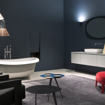
Design: Roberto Lazzeroni.
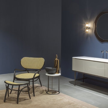
A highly emotional collection characterized by the material nature of the woods, by the skillful lacquering , retro style of the mirrors and the metal reflections: ILBagno describes an intimate and refined atmosphere with a return to origins, a project that looks to the past to explore the future.
A proposal less rigorous and minimal which allows you to recover the memory of familiar images, the style of a noble past, the suggestions that come from different styles.
Not nostalgic but rather current, a reworking of content obtained through the antoniolupi style almost maniacal attention to detail, the excellence of the workmanship and materials used.
 Saikley Architects
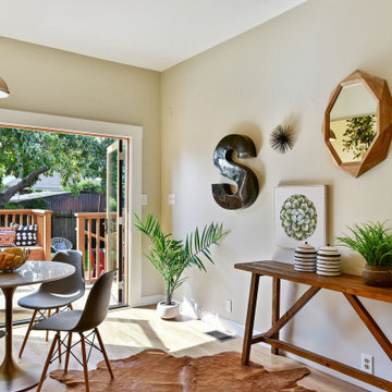
We updated this 1907 two-story family home for re-sale. We added modern design elements and amenities while retaining the home’s original charm in the layout and key details. The aim was to optimize the value of the property for a prospective buyer, within a reasonable budget.
New French doors from kitchen and a rear bedroom open out to a new bi-level deck that allows good sight lines, functional outdoor living space, and easy access to a garden full of mature fruit trees. French doors from an upstairs bedroom open out to a private high deck overlooking the garden. The garage has been converted to a family room that opens to the garden.
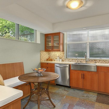
The bathrooms and kitchen were remodeled the kitchen with simple, light, classic materials and contemporary lighting fixtures. New windows and skylights flood the spaces with light. Stained wood windows and doors at the kitchen pick up on the original stained wood of the other living spaces.
New redwood picture molding was created for the living room where traces in the plaster suggested that picture molding has originally been. A sweet corner window seat at the living room was restored. At a downstairs bedroom we created a new plate rail and other redwood trim matching the original at the dining room. The original dining room hutch and woodwork were restored and a new mantel built for the fireplace.
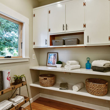
We built deep shelves into space carved out of the attic next to upstairs bedrooms and added other built-ins for character and usefulness. Storage was created in nooks throughout the house. A small room off the kitchen was set up for efficient laundry and pantry space.
We provided the future owner of the house with plans showing design possibilities for expanding the house and creating a master suite with upstairs roof dormers and a small addition downstairs. The proposed design would optimize the house for current use while respecting the original integrity of the house.
Photography: John Hayes, Open Homes Photography
https://saikleyarchitects.com/portfolio/classic-craftsman-update/

 Ambient
Design: Roberto Lazzeroni.
A highly emotional collection characterized by the material nature of the woods, by the skillful lacquering , retro style of the mirrors and the metal reflections: ILBagno describes an intimate and refined atmosphere with a return to origins, a project that looks to the past to explore the future.
A proposal less rigorous and minimal which allows you to recover the memory of familiar images, the style of a noble past, the suggestions that come from different styles.
Not nostalgic but rather current, a reworking of content obtained through the antoniolupi style almost maniacal attention to detail, the excellence of the workmanship and materials used.

 Saikley Architects
We updated this 1907 two-story family home for re-sale. We added modern design elements and amenities while retaining the home’s original charm in the layout and key details. The aim was to optimize the value of the property for a prospective buyer, within a reasonable budget.
New French doors from kitchen and a rear bedroom open out to a new bi-level deck that allows good sight lines, functional outdoor living space, and easy access to a garden full of mature fruit trees. French doors from an upstairs bedroom open out to a private high deck overlooking the garden. The garage has been converted to a family room that opens to the garden.
The bathrooms and kitchen were remodeled the kitchen with simple, light, classic materials and contemporary lighting fixtures. New windows and skylights flood the spaces with light. Stained wood windows and doors at the kitchen pick up on the original stained wood of the other living spaces.
New redwood picture molding was created for the living room where traces in the plaster suggested that picture molding has originally been. A sweet corner window seat at the living room was restored. At a downstairs bedroom we created a new plate rail and other redwood trim matching the original at the dining room. The original dining room hutch and woodwork were restored and a new mantel built for the fireplace.
We built deep shelves into space carved out of the attic next to upstairs bedrooms and added other built-ins for character and usefulness. Storage was created in nooks throughout the house. A small room off the kitchen was set up for efficient laundry and pantry space.
We provided the future owner of the house with plans showing design possibilities for expanding the house and creating a master suite with upstairs roof dormers and a small addition downstairs. The proposed design would optimize the house for current use while respecting the original integrity of the house.
Photography: John Hayes, Open Homes Photography
https://saikleyarchitects.com/portfolio/classic-craftsman-update/
 TVL Creative Ltd.
Cramped kitchen be gone! That was the project motto and top priority. The goal was to transform the current layout from multiple smaller spaces into a connected whole that would activate the main level for our clients, a young family of four.
The biggest obstacle was the wall dividing the kitchen and the dining room. Removing this wall was central to opening up and integrating the main living spaces, but the existing ductwork that ran right through the center of the wall posed a design challenge, er design opportunity. The resulting design solution features a central pantry that captures the ductwork and provides valuable storage- especially when compared to the original kitchen's 18" wide pantry cabinet. The pantry also anchors the kitchen island and serves as a visual separation of space between the kitchen and homework area.
Through our design development process, we learned the formal living room was of no service to their lifestyle and therefore space they rarely spent time in. With that in mind, we proposed to eliminate the unused living room and make it the new dining room. Relocating the dining room to this space inherently felt right given the soaring ceiling and ample room for holiday dinners and celebrations. The new dining room was spacious enough for us to incorporate a conversational seating area in the warm, south-facing window alcove.
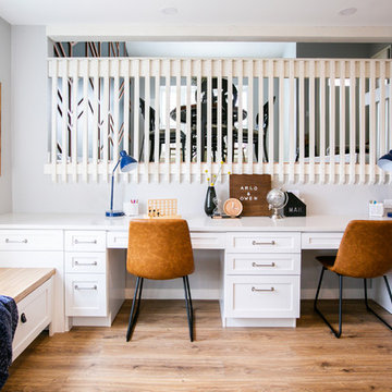
Now what to do with the old dining room?! To answer that question we took inspiration from our clients' shared profession in education and developed a craft area/homework station for both of their boys. The semi-custom cabinetry of the desk area carries over to the adjacent wall and forms window bench base with storage that we topped with butcher block for a touch of warmth. While the boys are young, the bench drawers are the perfect place for a stash of toys close to the kitchen.
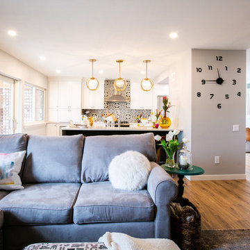
The kitchen begins just beyond the window seat with their refrigerator enclosure. Opposite the refrigerator is the new pantry with twenty linear feet of shelving and space for brooms and a stick vacuum. Extending from the backside of the pantry the kitchen island design incorporates counter seating on the family room side and a cabinetry configuration on the kitchen side with drawer storage, a trashcan center, farmhouse sink, and dishwasher.
We took careful time in design and execution to align the range and sink because while it might seem like a small detail, it plays an important role in supporting the symmetrical configuration of the back wall of the kitchen. The rear wall design utilizes an appliance garage mirrors the visual impact of the refrigerator enclosure and helps keep the now open kitchen tidy. Between the appliance garage and refrigerator enclosure is the cooking zone with 30" of cabinetry and work surface on either side of the range, a chimney style vent hood, and a bold graphic tile backsplash.
The backsplash is just one of many personal touches we added to the space to reflect our client's modern eclectic style and love of color. Swooping lines of the mid-mod style barstools compliment the pendants and backsplash pattern. A pop of vibrant green on the frame of the pantry door adds a fresh wash of color to an otherwise neutral space. The big show stopper is the custom charcoal gray and copper chevron wall installation in the dining room. This was an idea our clients softly suggested, and we excitedly embraced the opportunity. It is also a kickass solution to the head-scratching design dilemma of how to fill a large and lofty wall.
We are so grateful to bring this design to life for our clients and now dear friends.
 TVL Creative Ltd.
Cramped kitchen be gone! That was the project motto and top priority. The goal was to transform the current layout from multiple smaller spaces into a connected whole that would activate the main level for our clients, a young family of four.
The biggest obstacle was the wall dividing the kitchen and the dining room. Removing this wall was central to opening up and integrating the main living spaces, but the existing ductwork that ran right through the center of the wall posed a design challenge, er design opportunity. The resulting design solution features a central pantry that captures the ductwork and provides valuable storage- especially when compared to the original kitchen's 18" wide pantry cabinet. The pantry also anchors the kitchen island and serves as a visual separation of space between the kitchen and homework area.
Through our design development process, we learned the formal living room was of no service to their lifestyle and therefore space they rarely spent time in. With that in mind, we proposed to eliminate the unused living room and make it the new dining room. Relocating the dining room to this space inherently felt right given the soaring ceiling and ample room for holiday dinners and celebrations. The new dining room was spacious enough for us to incorporate a conversational seating area in the warm, south-facing window alcove.
Now what to do with the old dining room?! To answer that question we took inspiration from our clients' shared profession in education and developed a craft area/homework station for both of their boys. The semi-custom cabinetry of the desk area carries over to the adjacent wall and forms window bench base with storage that we topped with butcher block for a touch of warmth. While the boys are young, the bench drawers are the perfect place for a stash of toys close to the kitchen.
The kitchen begins just beyond the window seat with their refrigerator enclosure. Opposite the refrigerator is the new pantry with twenty linear feet of shelving and space for brooms and a stick vacuum. Extending from the backside of the pantry the kitchen island design incorporates counter seating on the family room side and a cabinetry configuration on the kitchen side with drawer storage, a trashcan center, farmhouse sink, and dishwasher.
We took careful time in design and execution to align the range and sink because while it might seem like a small detail, it plays an important role in supporting the symmetrical configuration of the back wall of the kitchen. The rear wall design utilizes an appliance garage mirrors the visual impact of the refrigerator enclosure and helps keep the now open kitchen tidy. Between the appliance garage and refrigerator enclosure is the cooking zone with 30" of cabinetry and work surface on either side of the range, a chimney style vent hood, and a bold graphic tile backsplash.
The backsplash is just one of many personal touches we added to the space to reflect our client's modern eclectic style and love of color. Swooping lines of the mid-mod style barstools compliment the pendants and backsplash pattern. A pop of vibrant green on the frame of the pantry door adds a fresh wash of color to an otherwise neutral space. The big show stopper is the custom charcoal gray and copper chevron wall installation in the dining room. This was an idea our clients softly suggested, and we excitedly embraced the opportunity. It is also a kickass solution to the head-scratching design dilemma of how to fill a large and lofty wall.
We are so grateful to bring this design to life for our clients and now dear friends.
 B Designs Interior's
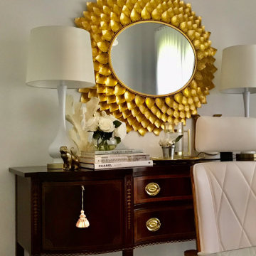
When we decided to stay here and not move, the office dilemma needed to be solved. I suggested my hsiuband move his home Office upstairs, and i'd take his current smallish office. He decided he wanted the Man Cave on the basement and gave me his old space. not going to bother posting before's, you truly wouldn't believe how cluttered a space could be. But here is my new office and i just love coming to work every morning! Its not %100 yet so stay tuned but enjoy something pretty for now.
 Bath Emporium & Castle Kitchens
 Carmichael Ave: Custom Modern Home Build
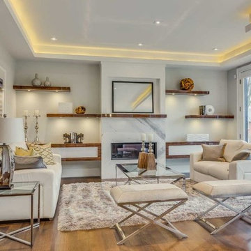
We’re excited to finally share pictures of one of our favourite customer’s project. The Rahimi brothers came into our showroom and consulted with Jodi for their custom home build. At Castle Kitchens, we are able to help all customers including builders with meeting their budget and providing them with great designs for their end customer. We worked closely with the builder duo by looking after their project from design to installation. The final outcome was a design that ensured the best layout, balance, proportion, symmetry, designed to suit the style of the property. Our kitchen design team was a great resource for our customers with regard to mechanical and electrical input, colours, appliance selection, accessory suggestions, etc. We provide overall design services! The project features walnut accents all throughout the house that help add warmth into a modern space allowing it be welcoming.
Castle Kitchens was ultimately able to provide great design at great value to allow for a great return on the builders project. We look forward to showcasing another project with Rahimi brothers that we are currently working on soon for 2017, so stay tuned!
 Bath Emporium & Castle Kitchens
 Carmichael Ave: Custom Modern Home Build
We’re excited to finally share pictures of one of our favourite customer’s project. The Rahimi brothers came into our showroom and consulted with Jodi for their custom home build. At Castle Kitchens, we are able to help all customers including builders with meeting their budget and providing them with great designs for their end customer. We worked closely with the builder duo by looking after their project from design to installation. The final outcome was a design that ensured the best layout, balance, proportion, symmetry, designed to suit the style of the property. Our kitchen design team was a great resource for our customers with regard to mechanical and electrical input, colours, appliance selection, accessory suggestions, etc. We provide overall design services! The project features walnut accents all throughout the house that help add warmth into a modern space allowing it be welcoming.
Castle Kitchens was ultimately able to provide great design at great value to allow for a great return on the builders project. We look forward to showcasing another project with Rahimi brothers that we are currently working on soon for 2017, so stay tuned!

Sponsored
Columbus, OH

Structural Remodeling
Franklin County's Heavy Timber Specialists | Best of Houzz 2020!
 H.F Smith Lumber Home Hardware Inc
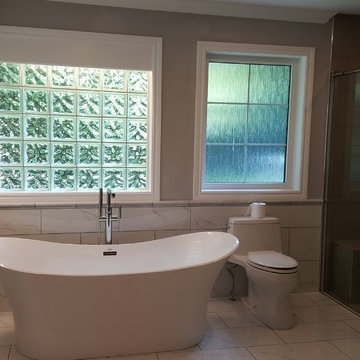
Inspiration for a mid-sized transitional bathroom remodel in Other with a two-piece toilet, beige walls and a hinged shower door
 Ambient
Design: Roberto Lazzeroni.
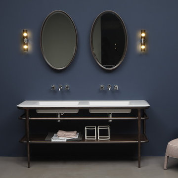
A highly emotional collection characterized by the material nature of the woods, by the skillful lacquering , retro style of the mirrors and the metal reflections: ILBagno describes an intimate and refined atmosphere with a return to origins, a project that looks to the past to explore the future.
A proposal less rigorous and minimal which allows you to recover the memory of familiar images, the style of a noble past, the suggestions that come from different styles.
Not nostalgic but rather current, a reworking of content obtained through the antoniolupi style almost maniacal attention to detail, the excellence of the workmanship and materials used.
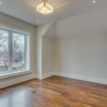 Bath Emporium & Castle Kitchens
 Carmichael Ave: Custom Modern Home Build
We’re excited to finally share pictures of one of our favourite customer’s project. The Rahimi brothers came into our showroom and consulted with Jodi for their custom home build. At Castle Kitchens, we are able to help all customers including builders with meeting their budget and providing them with great designs for their end customer. We worked closely with the builder duo by looking after their project from design to installation. The final outcome was a design that ensured the best layout, balance, proportion, symmetry, designed to suit the style of the property. Our kitchen design team was a great resource for our customers with regard to mechanical and electrical input, colours, appliance selection, accessory suggestions, etc. We provide overall design services! The project features walnut accents all throughout the house that help add warmth into a modern space allowing it be welcoming.
Castle Kitchens was ultimately able to provide great design at great value to allow for a great return on the builders project. We look forward to showcasing another project with Rahimi brothers that we are currently working on soon for 2017, so stay tuned!
 TVL Creative Ltd.
Cramped kitchen be gone! That was the project motto and top priority. The goal was to transform the current layout from multiple smaller spaces into a connected whole that would activate the main level for our clients, a young family of four.
The biggest obstacle was the wall dividing the kitchen and the dining room. Removing this wall was central to opening up and integrating the main living spaces, but the existing ductwork that ran right through the center of the wall posed a design challenge, er design opportunity. The resulting design solution features a central pantry that captures the ductwork and provides valuable storage- especially when compared to the original kitchen's 18" wide pantry cabinet. The pantry also anchors the kitchen island and serves as a visual separation of space between the kitchen and homework area.
Through our design development process, we learned the formal living room was of no service to their lifestyle and therefore space they rarely spent time in. With that in mind, we proposed to eliminate the unused living room and make it the new dining room. Relocating the dining room to this space inherently felt right given the soaring ceiling and ample room for holiday dinners and celebrations. The new dining room was spacious enough for us to incorporate a conversational seating area in the warm, south-facing window alcove.
Now what to do with the old dining room?! To answer that question we took inspiration from our clients' shared profession in education and developed a craft area/homework station for both of their boys. The semi-custom cabinetry of the desk area carries over to the adjacent wall and forms window bench base with storage that we topped with butcher block for a touch of warmth. While the boys are young, the bench drawers are the perfect place for a stash of toys close to the kitchen.
The kitchen begins just beyond the window seat with their refrigerator enclosure. Opposite the refrigerator is the new pantry with twenty linear feet of shelving and space for brooms and a stick vacuum. Extending from the backside of the pantry the kitchen island design incorporates counter seating on the family room side and a cabinetry configuration on the kitchen side with drawer storage, a trashcan center, farmhouse sink, and dishwasher.
We took careful time in design and execution to align the range and sink because while it might seem like a small detail, it plays an important role in supporting the symmetrical configuration of the back wall of the kitchen. The rear wall design utilizes an appliance garage mirrors the visual impact of the refrigerator enclosure and helps keep the now open kitchen tidy. Between the appliance garage and refrigerator enclosure is the cooking zone with 30" of cabinetry and work surface on either side of the range, a chimney style vent hood, and a bold graphic tile backsplash.
The backsplash is just one of many personal touches we added to the space to reflect our client's modern eclectic style and love of color. Swooping lines of the mid-mod style barstools compliment the pendants and backsplash pattern. A pop of vibrant green on the frame of the pantry door adds a fresh wash of color to an otherwise neutral space. The big show stopper is the custom charcoal gray and copper chevron wall installation in the dining room. This was an idea our clients softly suggested, and we excitedly embraced the opportunity. It is also a kickass solution to the head-scratching design dilemma of how to fill a large and lofty wall.
We are so grateful to bring this design to life for our clients and now dear friends.
 D2 Architects
"We often rush to divide everything as white and black and store them separately in a separate place. But seemingly opposing things that are inseparable - that is the world - are a mixture of different things." _Matisyahu_
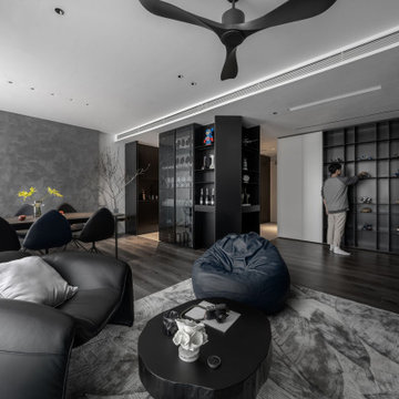
The contrast between black and white is not only a choice but also a way to make it special. When stepping into an all-white or all-black living space, it is easy to feel purity or luxury, but it can also suggest a little skepticism about the monotony or oppressiveness it brings. So using black and white is therefore not difficult but definitely not easy.
In the apartment project at Vinhomes Symphony apartment that we implemented this time, white and black are no longer just two opposing colors, but they are combined and mixed, intertwined creatively to create a unity. As an expression of day and night, brilliance and mystery, white and black have adopted tricks and materials, arrays of blocks and light, blending together with the goal of creating living spaces with comfort, convenience and luxury.
"This is probably a very special and interesting project for me and my colleagues, right from the first approach, the investor is also a sister, a person with a young, dynamic way of thinking with a very special and very own taste. After each actual project, we keep a diary of the conceptualization, design and execution process. Join us to look back on the process of project formation as well as better understand the philosophy, ideas and functions that have been sent in the project" - Kts. Dang Duong - Founder of D2Architects.
The current status of the project is 2 apartments located at location A-20 and A-21 in S6A building of Vinhomes Symphony apartment. With an east-facing façade, the apartment is endowed with the advantage of natural light as well as excellent panoramic views. The highlight of this apartment is the view opening to the Phuc Loi lotus lagoon with a large area, more than 10 hectares and airy landscape by the Duong River.
These are not merely apartments, but they are also places to express creativity and make harmonious use of natural light and surrounding nature. Every view from these apartments not only opens up amazing scenery but also a lifestyle full of relaxation and tranquility amidst the noisy city.
With the special importance of location and unique views, making perfect use of space and light here is not only an advantage but also a great potential to create a sophisticated and classy living space. The sophistication in design and handling of space has been put on top by us, in order to make the most of these extremely special advantages.
In order for a living space to truly become a place called "Home" – a place where we want to return and feel peaceful while there, we have carefully researched the preferences and desires of the owner. Sharing with me about her hobby, Ms. Yen expressed that she loves a modern space with minimalist style and cool tones, creating a sense of tranquility and elegance. This is clearly reflected in the original idea for the apartment.
What's even more interesting is his teenage son's hobby of playing Lego. This is not only a personal preference but also a special source of inspiration for the design process. From these data, we built a preliminary idea for the comprehensive living space of the apartment.
The combination of the requirement of modern, minimalist space and cool tones along with creative elements from his son's personal hobby of playing Lego has created a unique living space, both reflecting the owner's own personality and meeting the needs of living and personal preferences. This is the foundation for creating a real home, where each member of the family feels content and peaceful every time they return.
The project uses the main tone of industrial wood painted in dark gray, white and dark veneer. Versatile combination with other modern materials such as smoke glass and artificial stone,... Create a work of architectural art where everything intersects harmoniously with natural light like a great symphony.
The contrast between the bass of the cool tone and the warm, gentle touch of the light creates an impressive picture of a delicate blend of opposing elements. The soft, beautiful touch of this space is hidden in the strength and modernity of the materials used. This is not only a house, but also a mirror that clearly reflects the personality and philosophy of life of the owner.
The modern, youthful spirit is clearly shown from the moment you cross the threshold to enter the house. Flexibility, creativity and the harmonious intersection of materials and light have created a colorful and sophisticated living space, while celebrating the beauty of modernity and youthful vitality.
LIVING ROOM:
The living room is not merely a living area or common living space of the family, but according to feng shui concept, this is the place where the best energy of the house is concentrated. Therefore, creating a special living room space is extremely important.
Neutral gray-white tones are made in the background, creating the foundation for sophistication and elegance. Color accents are subtly applied, creating a unique touch for the house, increasing the creativity and style of the owner.
Maintaining the spirit of LEGO - unlimited creativity - through every corner, every architectural line has created an interesting space experience right in the living room. It stimulates the imagination of all ages, opening up space for each person to freely create, build and connect with each other through the common language of LEGO.
KITCHEN & DINNING ROOM:
The kitchen is an indispensable piece in every family, this place is likened to the heart of the whole house. All one needs to create great taste is love and creativity in the kitchen. Because the kitchen with family meals is the emotional bond between members. Therefore, designing a beautiful and functional kitchen requires a delicate combination of colors, shapes and meticulousness in choosing the right materials.
Today's kitchen is invested by many people in both form and quality, so a beautiful, luxurious, modern, comfortable kitchen that fully meets the needs of each family is the design criterion D2 Architects aims for.
The Lego House project is not just a project anymore but it is really the result of sending all our core values and creative spirit to create a living space that symbolizes the interconnectedness of design, art and soul.
D2Architects
A : Khuat Duy Tien -Thanh Xuan Bac - Ha Noi – Viet Nam
M: d2architects.vn@gmail.com
W: d2architects.vn
P: 0965551101 - 0965554792
 TVL Creative Ltd.
Cramped kitchen be gone! That was the project motto and top priority. The goal was to transform the current layout from multiple smaller spaces into a connected whole that would activate the main level for our clients, a young family of four.
The biggest obstacle was the wall dividing the kitchen and the dining room. Removing this wall was central to opening up and integrating the main living spaces, but the existing ductwork that ran right through the center of the wall posed a design challenge, er design opportunity. The resulting design solution features a central pantry that captures the ductwork and provides valuable storage- especially when compared to the original kitchen's 18" wide pantry cabinet. The pantry also anchors the kitchen island and serves as a visual separation of space between the kitchen and homework area.
Through our design development process, we learned the formal living room was of no service to their lifestyle and therefore space they rarely spent time in. With that in mind, we proposed to eliminate the unused living room and make it the new dining room. Relocating the dining room to this space inherently felt right given the soaring ceiling and ample room for holiday dinners and celebrations. The new dining room was spacious enough for us to incorporate a conversational seating area in the warm, south-facing window alcove.
Now what to do with the old dining room?! To answer that question we took inspiration from our clients' shared profession in education and developed a craft area/homework station for both of their boys. The semi-custom cabinetry of the desk area carries over to the adjacent wall and forms window bench base with storage that we topped with butcher block for a touch of warmth. While the boys are young, the bench drawers are the perfect place for a stash of toys close to the kitchen.
The kitchen begins just beyond the window seat with their refrigerator enclosure. Opposite the refrigerator is the new pantry with twenty linear feet of shelving and space for brooms and a stick vacuum. Extending from the backside of the pantry the kitchen island design incorporates counter seating on the family room side and a cabinetry configuration on the kitchen side with drawer storage, a trashcan center, farmhouse sink, and dishwasher.
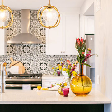
We took careful time in design and execution to align the range and sink because while it might seem like a small detail, it plays an important role in supporting the symmetrical configuration of the back wall of the kitchen. The rear wall design utilizes an appliance garage mirrors the visual impact of the refrigerator enclosure and helps keep the now open kitchen tidy. Between the appliance garage and refrigerator enclosure is the cooking zone with 30" of cabinetry and work surface on either side of the range, a chimney style vent hood, and a bold graphic tile backsplash.
The backsplash is just one of many personal touches we added to the space to reflect our client's modern eclectic style and love of color. Swooping lines of the mid-mod style barstools compliment the pendants and backsplash pattern. A pop of vibrant green on the frame of the pantry door adds a fresh wash of color to an otherwise neutral space. The big show stopper is the custom charcoal gray and copper chevron wall installation in the dining room. This was an idea our clients softly suggested, and we excitedly embraced the opportunity. It is also a kickass solution to the head-scratching design dilemma of how to fill a large and lofty wall.
We are so grateful to bring this design to life for our clients and now dear friends.
 Cure Design Group
CURE Senior Designer, Cori Dyer's personal home. Takes you through a home tour of her exquisitely designed spaces. Recently Renovated Kitchen, here is what Cori has to say about that process...Initially, I had to have the "upgrade" of thermafoil cabinets, but that was 25 years ago...it was time to bring my trendy kitchen space up to my current design standards! Ann Sachs.... Kelly Wearstler tile were the inspiration for the entire space. Eliminating walls between cabinetry, appliances, and a desk no longer necessary, were just the beginning. Adding a warm morel wood tone to these new cabinets and integrating a wine/coffee station were just some of the updates. I decided to keep the "White Kitchen" on the north side and add the same warm wood tone to the hood. A fresh version of the traditional farmhouse sink, Grohe faucet and Rio Blanc Quartzite were all part of the design. To keep the space open I added floating shelves both on the north side of the white kitchen and again above the wine refrigerator. A great spot in incorporate my love of artwork and travel!
Cure Design Group (636) 294-2343 https://curedesigngroup.com/
26