
Search results for "Decided" in Home Design Ideas
 Kevin K. Ho, Esq.
Vanguard Properties
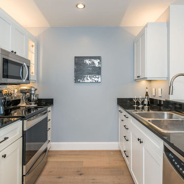
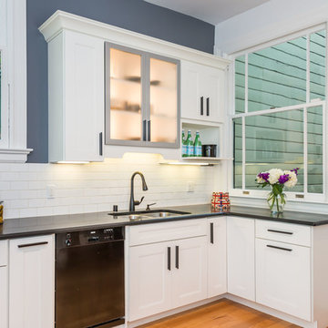
Small trendy galley light wood floor enclosed kitchen photo in San Francisco with a double-bowl sink, shaker cabinets, white cabinets, granite countertops, metallic backsplash, metal backsplash, stainless steel appliances and no island
Small trendy galley light wood floor enclosed kitchen photo in San Francisco with a double-bowl sink, shaker cabinets, white cabinets, granite countertops, metallic backsplash, metal backsplash, stainless steel appliances and no island
 Cantoni Irvine
Designed By: Sarah Buehlman
Marc and Mandy Maister were clients and fans of Cantoni before they purchased this harbor home on Balboa Island. The South African natives originally met designer Sarah Buehlman and Cantoni’s Founder and CEO Michael Wilkov at a storewide sale, and quickly established a relationship as they bought furnishings for their primary residence in Newport Beach.
So, when the couple decided to invest in this gorgeous second home, in one of the ritziest enclaves in North America, they sought Sarah’s help in transforming the outdated 1960’s residence into a modern marvel. “It’s now the ultimate beach house,” says Sarah, “and finished in Cantoni from top to bottom—including new custom cabinetry installed throughout.”
But let’s back up. This project began when Mandy contacted Sarah in the midst of the remodel process (in December 2010), asking if she could come take a look and help with the overall design.
“The plans were being drawn up with an architect, and they opted not to move anything major. Instead, they updated everything—as in the small carpeted staircase that became a gorgeous glass and metal sculpture,” Sarah explains. She took photographs and measurements, and then set to work creating the scaled renderings. “Marc and Mandy were drawn to the One and Only Collection. It features a high-gloss brown and white color scheme which served as inspiration for the project,” says Sarah.
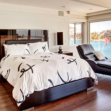
Primary pieces in the expansive living area include the Mondrian leather sectional, the Involution sculpture, and a pair of Vladimir Kagan Corkscrew swivel chairs. The Maisters needed a place to house all their electronics but didn’t want a typical entertainment center. The One and Only buffet was actually modified by our skilled shop technicians, in our distribution center, so it could accommodate all the couple’s media equipment. “These artisans are another one of our hidden strengths—in addition to the design tools, inventory and extensive resources we have to get a job done,” adds Sarah. Marc and Mandy also fell in love with the exotic Makassar ebony wood in the Ritz Collection, which Sarah combined in the master bedroom with the Ravenna double chaise to provide an extra place to sit and enjoy the beautiful harbor views.
Beyond new furnishings, the Maisters also decided to completely redo their kitchen. And though Marc and Mandy did not have a chance to actually see our kitchen displays, having worked with Sarah over the years, they had immense trust in our commitment to craftsmanship and quality. In fact, they opted for new cabinetry in four bathrooms as well as the laundry room based on our 3D renderings and lacquer samples alone—without ever opening a drawer. “Their trust in my expertise and Cantoni’s reputation were a major deciding factor,” says Sarah.
This plush second home, complete with a private boat dock right out back, counts as one of Sarah’s proudest accomplishments. “These long-time clients are great. They love Cantoni and appreciate high quality Italian furnishings in particular. The home is so gorgeous that once you are inside and open the Nano doors, you simply don’t want to leave.” The job took almost two years to complete, but everyone seems quite happy with the results, proving that large or small—and in cases necessitating a quick turnaround or execution of a long-term vision—Cantoni has the resources to come through for all clients.
Find the right local pro for your project
 TKS Design Group
Download our free ebook, Creating the Ideal Kitchen. DOWNLOAD NOW
This homeowner’s daughter originally contacted us on behalf of her parents who were reluctant to begin the remodeling process in their home due to the inconvenience and dust. Once we met and they dipped their toes into the process, we were off to the races. The existing bathroom in this beautiful historical 1920’s home, had not been updated since the 70’/80’s as evidenced by the blue carpeting, mirrored walls and dropped ceilings. In addition, there was very little storage, and some health setbacks had made the bathroom difficult to maneuver with its tub shower.
Once we demoed, we discovered everything we expected to find in a home that had not been updated for many years. We got to work bringing all the electrical and plumbing up to code, and it was just as dusty and dirty as the homeowner’s anticipated! Once the space was demoed, we got to work building our new plan. We eliminated the existing tub and created a large walk-in curb-less shower.
An existing closet was eliminated and in its place, we planned a custom built in with spots for linens, jewelry and general storage. Because of the small space, we had to be very creative with the shower footprint, so we clipped one of the walls for more clearance behind the sink. The bathroom features a beautiful custom mosaic floor tile as well as tiled walls throughout the space. This required lots of coordination between the carpenter and tile setter to make sure that the framing and tile design were all properly aligned. We worked around an existing radiator and a unique original leaded window that was architecturally significant to the façade of the home. We had a lot of extra depth behind the original toilet location, so we built the wall out a bit, moved the toilet forward and then created some extra storage space behind the commode. We settled on mirrored mullioned doors to bounce lots of light around the smaller space.
We also went back and forth on deciding between a single and double vanity, and in the end decided the single vanity allowed for more counter space, more storage below and for the design to breath a bit in the smaller space. I’m so happy with this decision! To build on the luxurious feel of the space, we added a heated towel bar and heated flooring.
One of the concerns the homeowners had was having a comfortable floor to walk on. They realized that carpet was not a very practical solution but liked the comfort it had provided. Heated floors are the perfect solution. The room is decidedly traditional from its intricate mosaic marble floor to the calacutta marble clad walls. Elegant gold chandelier style fixtures, marble countertops and Morris & Co. beaded wallpaper provide an opulent feel to the space.
The gray monochromatic pallet keeps it feeling fresh and up-to-date. The beautiful leaded glass window is an important architectural feature at the front of the house. In the summertime, the homeowners love having the window open for fresh air and ventilation. We love it too!
The curb-less shower features a small fold down bench that can be used if needed and folded up when not. The shower also features a custom niche for storing shampoo and other hair products. The linear drain is built into the tilework and is barely visible. A frameless glass door that swings both in and out completes the luxurious feel.
Designed by: Susan Klimala, CKD, CBD
Photography by: Michael Kaskel
For more information on kitchen and bath design ideas go to: www.kitchenstudio-ge.com
 Abbas Rachaman, Designer, Board&Vellum
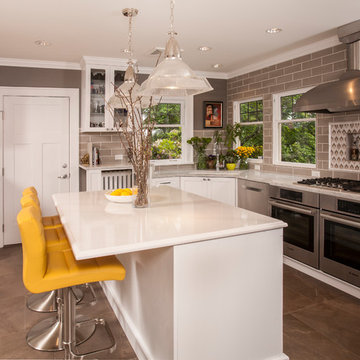
This is major kitchen remodel done on a tight budget!
1st thing I noticed in the original kitchen (please refer to before pictures) was that the ceiling height was lower than both the adjacent rooms, and of course the soffit cabinets made everything lower so I suggested we take the ceiling height up the match the other rooms. Through process of elimination I found the best place for the sink was in the corner because she would now have 2 windows for views of the neighborhood and a place to put the plants that once sat on the floor in the “breakfast nook”. Moving the gas cook top the exterior wall allowed for ease of installation and venting out also this was the best place to put it given the amount of windows. It is very important to me to design every kitchen with surface space on either side of the cook top so that you have enough room for baking racks, cookie sheets, etc.. to spread out. The solution to the double oven request was to put 2 of them under the counter instead of stacking them which would have taken up surface space. During the design meeting I asked how often to you close that door to the dining room? To which they replied “never, we always leave it open”. I knew then that door was a waste of space so I decided to toss that to make a bigger opening to make the kitchen more inviting as you enter from the dining room. Another thing I always talk about during kitchen designs is “landing zone”. You must have a surface to place things on once you enter the kitchen, be it groceries, keys, phone, wallet, etc.. But I find it functional and it keeps you from walking into a room with large things on either side of you. Again relating back to making sure the kitchen felt inviting. Definitely wanted make sure we had as much pullout kitchen accessories and deep drawers for ease of use because we did not have room for a lot of upper cabinets. I decided to take full advantage of those large open windows buy taking the tile to the ceiling and picture framing them with tile liners. The effect is that you see more light coming in because of the contrast of the darker tile. My solution to the clients request to get as much light in from the adjacent family room was to take out that kitchen desk and frame in a large opening. I needed to make sure that opening made a statement so instead of doing a standard door casing I added architectural details of molding around the doorway and highlighted by insetting the molding into the wall and painting the inset a different color. Once I was able to achieve bringing in the most light, I decided I could bring in a little drama by going with a dark wall color! It is okay to use dark wall colors as long as you have enough light so it still feels inviting. My solution to the radiator was to move it over to give us just enough room to squeeze in another cabinet for capturing as much storage as I could. I needed to make sure I had that “landing zone” so I wanted to place a counter top over the radiator, but how? I used a decorative post to give the kitchen a little something extra and to tie back in with the cabinets. Then I added a counter top above the wine refrigerator but both had to be the same height because they were across from each other. So what a great challenge this turned out be. Because of me needing to make the wine refrigerator counter top higher to match the other counter top, I was able to fit in a little drawer for wine accessories above the wine refrigerator. More storage! Yes!! Painting the radiator white to give it a fresh new look added a lot and was relatively simple in the grand scheme of things. Solution to pantry was to make it a cabinet pantry so that we didn’t have to work around the thickness of walls and a door. Island size was determined by NKBA standards of having enough room for traffic flow around the kitchen which allowed us 3 chairs. And if someone ever wanted to, they could use the counter above the radiator as a surface to work on. Of course we updated all the lighting, made sure we had under counter lighting, and they are all LED. Lastly porcelain floor tiles , ceramic backsplash and quartz counter tops were the material of choice for ease of maintenance and budget.
 San Luis Kitchen Co.
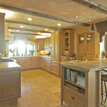
When the homeowners decided to move from San Francisco to the Central Coast, they were looking for a more relaxed lifestyle, a unique place to call their own, and an environment conducive to raising their young children. They found it all in San Luis Obispo. They had owned a house here in SLO for several years that they had used as a rental. As the homeowners own and run a contracting business and relocation was not impossible, they decided to move their business and make this SLO rental into their dream home.
As a rental, the house was in a bare-bones condition. The kitchen had old white cabinets, boring white tile counters, and a horrendous vinyl tile floor. Not only was the kitchen out-of-date and old-fashioned, it was also pretty worn out. The tiles were cracking and the grout was stained, the cabinet doors were sagging, and the appliances were conflicting (ie: you could not open the stove and dishwasher at the same time).
To top it all off, the kitchen was just too small for the custom home the homeowners wanted to create.
Thus enters San Luis Kitchen. At the beginning of their quest to remodel, the homeowners visited San Luis Kitchen’s showroom and fell in love with our Tuscan Grotto display. They sat down with our designers and together we worked out the scope of the project, the budget for cabinetry and how that fit into their overall budget, and then we worked on the new design for the home starting with the kitchen.
As the homeowners felt the kitchen was cramped, it was decided to expand by moving the window wall out onto the existing porch. Besides the extra space gained, moving the wall brought the kitchen window out from under the porch roof – increasing the natural light available in the space. (It really helps when the homeowner both understands building and can do his own contracting and construction.) A new arched window and stone clad wall now highlights the end of the kitchen. As we gained wall space, we were able to move the range and add a plaster hood, creating a focal nice focal point for the kitchen.
The other long wall now houses a Sub-Zero refrigerator and lots of counter workspace. Then we completed the kitchen by adding a wrap-around wet bar extending into the old dining space. We included a pull-out pantry unit with open shelves above it, wine cubbies, a cabinet for glassware recessed into the wall, under-counter refrigerator drawers, sink base and trash cabinet, along with a decorative bookcase cabinet and bar seating. Lots of function in this corner of the kitchen; a bar for entertaining and a snack station for the kids.
After the kitchen design was finalized and ordered, the homeowners turned their attention to the rest of the house. They asked San Luis Kitchen to help with their master suite, a guest bath, their home control center (essentially a deck tucked under the main staircase) and finally their laundry room. Here are the photos:
I wish I could show you the rest of the house. The homeowners took a poor rental house and turned it into a showpiece! They added custom concrete floors, unique fiber optic lighting, large picture windows, and much more. There is now an outdoor kitchen complete with pizza oven, an outdoor shower and exquisite garden. They added a dedicated dog run to the side yard for their pooches and a rooftop deck at the very peak. Such a fun house.
Wood-Mode Fine Custom Cabinetry, Barcelona
 User
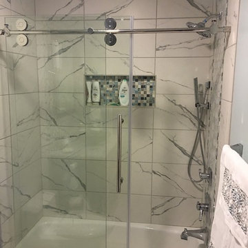
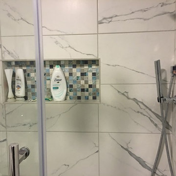
UserAlcove bathtub - mid-sized contemporary kids' white tile and porcelain tile ceramic tile alcove bathtub idea with furniture-like cabinets, gray cabinets, a one-piece toilet, blue walls, a vessel sink and marble countertops
Sponsored
Columbus, OH

Hope Restoration & General Contracting
Columbus Design-Build, Kitchen & Bath Remodeling, Historic Renovations
 Kevin K. Ho, Esq.
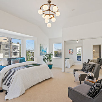
Making a bright sunny room more dramatic and inviting with new ceiling cladding and lighting
 Kevin K. Ho, Esq.
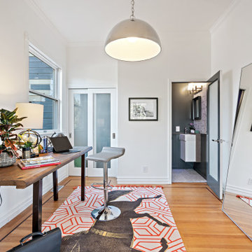
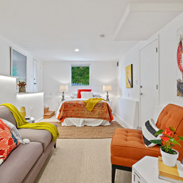
Turning a cold, dark space into something inviting with more display and storage space.
Inspiration for a contemporary basement remodel in San Francisco
Inspiration for a contemporary basement remodel in San Francisco
 Kevin K. Ho, Esq.
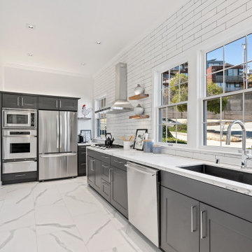
Galley kitchen with painting of cabinets, new counter tops, floating shelves with embedded lighting, new recessed cans, new floor, solid mahogany counter, black sink, quartz counters, new faucet, new tile floor.
 User
UserAlcove bathtub - mid-sized contemporary kids' white tile and porcelain tile ceramic tile alcove bathtub idea with furniture-like cabinets, gray cabinets, a one-piece toilet, blue walls, a vessel sink and marble countertops
Sponsored
Columbus, OH
Hope Restoration & General Contracting
Columbus Design-Build, Kitchen & Bath Remodeling, Historic Renovations
 Kevin K. Ho, Esq.
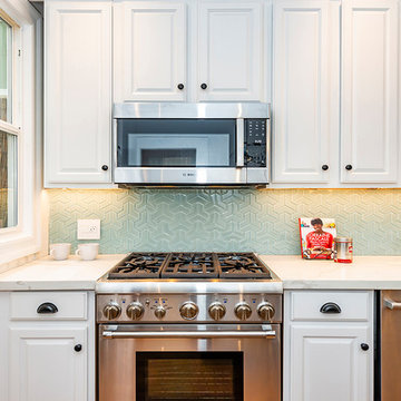
Mid-sized transitional galley eat-in kitchen photo in San Francisco with an undermount sink, raised-panel cabinets, blue cabinets, quartzite countertops, green backsplash, glass tile backsplash, stainless steel appliances, an island and white countertops
 User
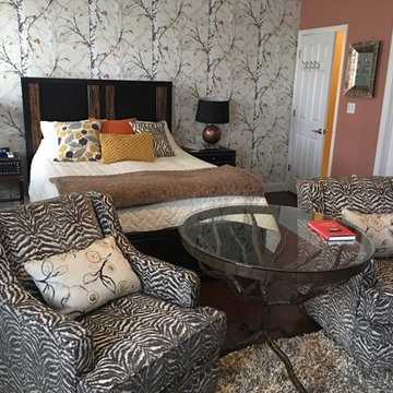
UserWe totally transformed this master bedroom with new flooring, feature wallpaper behind the headboard, new wall color on the other walls. All new furniture was purchased to create a nice sitting area at the end of the bed. The last part of the project to be completed was the built in feature wall. This started with the built in lower cabinetry with leather granite tops. Then the electric fireplace wall was built out to the depth of the cabinetry and covered in reclaimed wood. We used white weathered wood horizontally and the brown weathered wood on the corners. The floating shelves balance out the space with accessories
 User
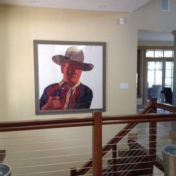
UserThe cable system railing on this staircase creates an open but modern look to this open space. The dark stain on the railings really stands out against the neutral walls and tile floor. The John Wayne picture by Andy Warhol is again a masculine but modern look in this space
 Inspired Closets Baton Rouge
One morning, you’re starting your day as you normally would. Then you take a look at your closet, and it’s all the same.
There’s not much room for anything, and everything is a mess.
That was the daily routine for Mary, one of our recent Baton Rouge clients, until she decided she had finally had enough.
Little to No Closet Space: The Start of a Solution
Mary and her family moved into their new home in 2020, and they quickly realized they had had little to no closet space. Knowing that she needed that space for herself, she was inspired and wanted to see if she could turn a 10x12 office in her home into a closet.
Mary took charge and found us through an online search for closet installations, and she decided to give us a call. After speaking with our expert designer Felicity and sharing some photos she saw online, she decided to trust us with her closet installation.
“We had an instant connection and relationship,” Mary said. “Felicity was so down-to-earth and personable that a relationship was built immediately.”
Get the Ball Rolling: Designing and Constructing the Closet
Mary thought that the process was beautiful and simple. Felicity provided a 3D interactive design of the project and based it on Mary’s needs.
Mary said, “It felt like she was trying to accommodate my needs by using her knowledge of what I would need in my closet. It felt very natural.”
Felicity had a contractor she worked with closely. Together, they handled the project in two days, even with the crown molding that needed to be removed for the projected closet cabinets to reach the ceiling.
Once we finished, Mary was amazed at how quickly we finished the closet.
The Final Product: When Fashion and Functionality Work Together
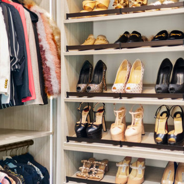
“I love how everything has a place, is very organized, and can all be seen very quickly,” Mary said. Along with the closet’s functionality, Mary loves that her closet looks like a boutique showroom.
We were able to bring fashion and functionality to this closet with:
Showroom lights; makes it look more like a boutique rather than a closet
Hidden hamper
Separate space to see her purses and shoes
Jewelry drawer
Display cabinet for belts and scarves
Small closet for her four-year-old daughter to put her items in
See for yourself!
Saving Time and Stress Through The Day
Now Mary has cut down on both her time and wardrobe. Thanks to her new closet, finding an outfit each day is “quick and easy.”
She even entertains guests in her closet space, thanks to the showroom look we gave her closet.
What makes it better? The small closet inside helps her daughter find her things and keep organized.
Let Us Make Your Dreams Come True
Our work has Mary making plans to work with us for the future. She is already planning to convert another room into a closet, design her pantry, and renovate her garage.
Let us help you achieve your dream pantry, laundry room, or even a closet space like Mary’s!
34