
Search results for "Deciding locations" in Home Design Ideas

 KITCHEN SOLVERS - La Crosse
Transitional remodeling project where we not only updated the kitchen, but also the bar area and dining room. The homeowners decided to go with new cabinets in the kitchen because of the removal of false beams and bulkheads as well as re-arranging the appliance locations. We opted to reface the bar area, book shelf, dining room built-in and fireplace built-in because of the unique architectural elements of each. The bar area has a curved wall and cabinets on it that was much easier to reface with WalzCraft wood-backed-veneer than to replace with new cabinets. We removed a bulkhead above the bookshelf and built two new custom wall cabinets to help better utilize the bar area. We were able to match a door and drawer style from WalzCraft to the new Portland door from Bridgewood that was used in the kitchen so that when walking from room to room, no one can tell the difference. The kitchen cabinets were done in the color snow while the bar area and dining room were done in Pearl. To complete the new look we installed a MSI Quartz countertop in Zeal Soul Shine, a Carrera glass arabesque mosaic backsplash and a pre-finished dark stained oak floor.

 Jarrett Design
Entertaining friends and family doesn't work well when rooms are small and closed off. So when our clients decided to remodel, they knew they wanted to open up the space to accommodate large gatherings. Also important were ample storage and quality appliances that would hold up to the demands of cooking creative meals several nights a week.
As is sometimes the case with remodeling, solving one problem can create another. Opening up the space involved removing a wall, which sacrificed critical square footage for cabinetry and appliances. We knew the wall needed to come down so we were challenged with making sure every available cabinet space in the kitchen was being utilized as thoughtfully and creatively as possible. A tall pantry was added next to the refrigerator to allow for storage of pots and pans, as well as food, while another pantry in the adjacent dining room housed all dishes and silverware. A small bar area was created in an unused section in the back of the home to store coffee and tea accessories and drinkware. Finally, a small island in the center of the kitchen offered the ideal location for the microwave and most-used pots and pans.
With the expanded space, smart use of storage options and top-notch appliances, our clients are enjoying working in their new kitchen and have already hosted a ravioli-making class!
Matt Villano Photography

 Sharer Design Group LLC
House hunting for the perfect home is never easy. Our recent clients decided to make the search a bit easier by enlisting the help of Sharer Design Group to help locate the best “canvas” for their new home. After narrowing down their list, our designers visited several prospective homes to determine each property’s potential for our clients’ design vision. Once the home was selected, the Sharer Design Group team began the task of turning the canvas into art.
The entire home was transformed from top to bottom into a modern, updated space that met the vision and needs of our clients. The kitchen was updated using custom Sharer Cabinetry with perimeter cabinets painted a custom grey-beige color. The enlarged center island, in a contrasting dark paint color, was designed to allow for additional seating. Gray Quartz countertops, a glass subway tile backsplash and a stainless steel hood and appliances finish the cool, transitional feel of the room.
The powder room features a unique custom Sharer Cabinetry floating vanity in a dark paint with a granite countertop and vessel sink. Sharer Cabinetry was also used in the laundry room to help maximize storage options, along with the addition of a large broom closet. New wood flooring and carpet was installed throughout the entire home to finish off the dramatic transformation. While finding the perfect home isn’t easy, our clients were able to create the dream home they envisioned, with a little help from Sharer Design Group.
Find the right local pro for your project

 E_ Designs
The homeowners of this 1906 home in East Harriet are returning customers of Castle. They remodeled their hallway bath style a few years ago with a similar vintage; which went viral via Houzz. Check out project details and photos on our website: http://www.castlebri.com/bathrooms/featured-project-7/ The clients were so pleased with Castle’s work on the last project, they chose to work with us again for their 2nd bathroom remodel.
After seeing the home and space we had to work with, the designer and homeowners decided an en suite would bring the biggest return of enjoyment and return on investment. By taking an existing dressing room, we were able to make this happen. We relocated the original hall bedroom entry into the new dressing room space. We were able to create a really beautiful entry to both the bedroom and the new master bath as well as a new more appropriately sized dressing space. We were able to salvage the original bedroom and bath doors to be reinstalled at new locations, and then new French doors were installed for a grand entry into the bedroom. By having the glass French doors between the bedroom, new dressing room/en suite entry and bath, the bedroom now has a 2nd source of natural lighting. For this new bathroom, we wanted to create a similar vintage feel to coordinate with the hallway bath. A new clawfoot tub was installed with vintage inspired shower and curtain rod, a salvaged cast iron radiator, new built-in storage at the attic knee wall, new vanity with carrara marble counters, and to complete the space 1” hex tile floor and beautiful millwork to match the original style in the home.
The homeowners are incredibly happy with their new space and proud to have a Minneapolis home with an en suite!

 Lindsey Markel
Photo By: Lindsey Neumann
Cabinetry; Dura Supreme, Camden door style, Maple, Natural, Counters; Zodiaq Quartz, Nutmeg, Sink; Blanco Precision, Faucet; Hansgrohe Focus 2-spray, Tile; Gendai Natural, Color Sanna Natural, Hardware; Top Knobs, Hood; Broan Elite

 TKS Design Group
This project is a good example of what can be done with a little refresh. Sometimes parts of your space work well and parts don’t, so a full gut and replace might not make sense. That was the case here.
After living with it for a decade or so realized they would really prefer two sinks in the vanity. Since there were two windows in the bathroom, we decided to eliminate the window to the left of the current vanity and replace with it with a longer run of cabinets.
The other window is to the right of the vanity let’s in beautiful morning light. The window we removed was a northern exposure and its location under an eave didn’t allow for much light, so it was the perfect solution!
In addition to the new vanity, we also changed out the countertop, added new mirrors and lighting, and changed out the tile floor to a larger hex with fewer grout lines. This adds a brighter more modern look while still maintaining the vintage feel of the room.
The shower was in great shape, so we left that as is except for swapping out the shower floor tile to match the main floor and adding a more updated decorative mosaic tile. We added a new toilet and for a bit of luxury a heated towel bar.
Designed by: Susan Klimala, CKD, CBD
Photography by: LOMA Studios
For more information on kitchen and bath design ideas go to: www.kitchenstudio-ge.com
Project Year: 2020
 Sharer Design Group LLC
House hunting for the perfect home is never easy. Our recent clients decided to make the search a bit easier by enlisting the help of Sharer Design Group to help locate the best “canvas” for their new home. After narrowing down their list, our designers visited several prospective homes to determine each property’s potential for our clients’ design vision. Once the home was selected, the Sharer Design Group team began the task of turning the canvas into art.
The entire home was transformed from top to bottom into a modern, updated space that met the vision and needs of our clients. The kitchen was updated using custom Sharer Cabinetry with perimeter cabinets painted a custom grey-beige color. The enlarged center island, in a contrasting dark paint color, was designed to allow for additional seating. Gray Quartz countertops, a glass subway tile backsplash and a stainless steel hood and appliances finish the cool, transitional feel of the room.
The powder room features a unique custom Sharer Cabinetry floating vanity in a dark paint with a granite countertop and vessel sink. Sharer Cabinetry was also used in the laundry room to help maximize storage options, along with the addition of a large broom closet. New wood flooring and carpet was installed throughout the entire home to finish off the dramatic transformation. While finding the perfect home isn’t easy, our clients were able to create the dream home they envisioned, with a little help from Sharer Design Group.
Sponsored
Columbus, OH

Structural Remodeling
Franklin County's Heavy Timber Specialists | Best of Houzz 2020!

 Alair Homes Plano
These clients debated moving from their dated 1979 house but decided to remodel since they loved their neighborhood and location of their home. We did a whole house interior and exterior remodel for them and they are so happy with their decision. The homeowners felt that reading floorplans was not so easy, so they loved our ability to provide 3D renderings and our personal touches and suggestions from our in-house designers.
The general layout of the home stayed the same with a few minor changes. We took the 38 year old home down to the studs and transformed it completely. The only thing that remains unchanged is the address. The popcorn texture was removed from the ceiling, removed all soffits, replaced all cabinets, flooring and countertops throughout the home. The wet bar was removed from the living room opening the space. The kitchen layout remained the same, but the cook surface was moved. Unneeded space was removed from the laundry room, giving them a larger pantry.
The master suite remained the same but additional lighting was added for reading. We made major improvements in the master bath by adding a rain shower, more storage and a bench to their new shower and gave them a larger bathtub.
All new cedar siding was replaced on the exterior of the home and a fresh coat of paint makes this 1979 home look brand new!
Design/Remodel by Hatfield Builders & Remodelers | Photography by Versatile Imaging
 Sharer Design Group LLC
House hunting for the perfect home is never easy. Our recent clients decided to make the search a bit easier by enlisting the help of Sharer Design Group to help locate the best “canvas” for their new home. After narrowing down their list, our designers visited several prospective homes to determine each property’s potential for our clients’ design vision. Once the home was selected, the Sharer Design Group team began the task of turning the canvas into art.
The entire home was transformed from top to bottom into a modern, updated space that met the vision and needs of our clients. The kitchen was updated using custom Sharer Cabinetry with perimeter cabinets painted a custom grey-beige color. The enlarged center island, in a contrasting dark paint color, was designed to allow for additional seating. Gray Quartz countertops, a glass subway tile backsplash and a stainless steel hood and appliances finish the cool, transitional feel of the room.
The powder room features a unique custom Sharer Cabinetry floating vanity in a dark paint with a granite countertop and vessel sink. Sharer Cabinetry was also used in the laundry room to help maximize storage options, along with the addition of a large broom closet. New wood flooring and carpet was installed throughout the entire home to finish off the dramatic transformation. While finding the perfect home isn’t easy, our clients were able to create the dream home they envisioned, with a little help from Sharer Design Group.
 KITCHEN SOLVERS - La Crosse
Transitional remodeling project where we not only updated the kitchen, but also the bar area and dining room. The homeowners decided to go with new cabinets in the kitchen because of the removal of false beams and bulkheads as well as re-arranging the appliance locations. We opted to reface the bar area, book shelf, dining room built-in and fireplace built-in because of the unique architectural elements of each. The bar area has a curved wall and cabinets on it that was much easier to reface with WalzCraft wood-backed-veneer than to replace with new cabinets. We removed a bulkhead above the bookshelf and built two new custom wall cabinets to help better utilize the bar area. We were able to match a door and drawer style from WalzCraft to the new Portland door from Bridgewood that was used in the kitchen so that when walking from room to room, no one can tell the difference. The kitchen cabinets were done in the color snow while the bar area and dining room were done in Pearl. To complete the new look we installed a MSI Quartz countertop in Zeal Soul Shine, a Carrera glass arabesque mosaic backsplash and a pre-finished dark stained oak floor.
 E_ Designs
The homeowners of this 1906 home in East Harriet are returning customers of Castle. They remodeled their hallway bath style a few years ago with a similar vintage; which went viral via Houzz. Check out project details and photos on our website: http://www.castlebri.com/bathrooms/featured-project-7/ The clients were so pleased with Castle’s work on the last project, they chose to work with us again for their 2nd bathroom remodel.
After seeing the home and space we had to work with, the designer and homeowners decided an en suite would bring the biggest return of enjoyment and return on investment. By taking an existing dressing room, we were able to make this happen. We relocated the original hall bedroom entry into the new dressing room space. We were able to create a really beautiful entry to both the bedroom and the new master bath as well as a new more appropriately sized dressing space. We were able to salvage the original bedroom and bath doors to be reinstalled at new locations, and then new French doors were installed for a grand entry into the bedroom. By having the glass French doors between the bedroom, new dressing room/en suite entry and bath, the bedroom now has a 2nd source of natural lighting. For this new bathroom, we wanted to create a similar vintage feel to coordinate with the hallway bath. A new clawfoot tub was installed with vintage inspired shower and curtain rod, a salvaged cast iron radiator, new built-in storage at the attic knee wall, new vanity with carrara marble counters, and to complete the space 1” hex tile floor and beautiful millwork to match the original style in the home.
The homeowners are incredibly happy with their new space and proud to have a Minneapolis home with an en suite!
 KITCHEN SOLVERS - La Crosse
Transitional remodeling project where we not only updated the kitchen, but also the bar area and dining room. The homeowners decided to go with new cabinets in the kitchen because of the removal of false beams and bulkheads as well as re-arranging the appliance locations. We opted to reface the bar area, book shelf, dining room built-in and fireplace built-in because of the unique architectural elements of each. The bar area has a curved wall and cabinets on it that was much easier to reface with WalzCraft wood-backed-veneer than to replace with new cabinets. We removed a bulkhead above the bookshelf and built two new custom wall cabinets to help better utilize the bar area. We were able to match a door and drawer style from WalzCraft to the new Portland door from Bridgewood that was used in the kitchen so that when walking from room to room, no one can tell the difference. The kitchen cabinets were done in the color snow while the bar area and dining room were done in Pearl. To complete the new look we installed a MSI Quartz countertop in Zeal Soul Shine, a Carrera glass arabesque mosaic backsplash and a pre-finished dark stained oak floor.

 VRA Interiors, LLC
Melodie Hayes Photography
We completely updated this two-bedroom condo in Midtown Atlanta from outdated to current. We replaced the flooring, cabinetry, countertops, window treatments, and accessories all to exhibit a fresh, modern design while also adding in an innovative showpiece of grey metallic tile in the living room and master bath.
This home showcases mostly cool greys but is given warmth through the add touches of burnt orange, navy, brass, and brown.
Home located in Midtown Atlanta. Designed by interior design firm, VRA Interiors, who serve the entire Atlanta metropolitan area including Buckhead, Dunwoody, Sandy Springs, Cobb County, and North Fulton County.
For more about VRA Interior Design, click here: https://www.vrainteriors.com/
To learn more about this project, click here: https://www.vrainteriors.com/portfolio/midtown-atlanta-luxe-condo/


 Kaplan Thompson Architects
Context
After retiring from their careers in New Jersey, an active professional couple decided to move to Vermont to be closer to their family. They wanted to take advantage of the opportunity to sensibly plan for the future by building a sunlit home in which they could comfortably age in place with predictable, low energy costs through the harsh Vermont winter. A spacious, open lot near a historic river village provided the perfect backdrop for the couple’s favorite hobbies: gardening, woodworking, and yoga. The couple’s son, owner of Shelterwood Construction, would have the chance to showcase his meticulous craftsmanship in a home lovingly built for his parents.
Response
The home was built using very local natural materials that blend into the surrounding landscape. Cor-ten steel weathered clapboards transition from the earth to the wood clapboards above and the entire exterior has no finish, allowing the house to change and weather with the seasons. Many of the interior finishes, including the decorative stair wall, were made from locally-milled white pine that was harvested from the site.
This certified Passive House is designed to be lived in for a lifetime with wheelchair accessibility, wide doorways, accessible fixtures, and everything the couple needs located on the main level. Framed by large south-facing windows, the light-filled main living area includes a lofted ceiling transected with a glass bridge that connects the guest bedrooms above and looks out onto the garden and fruit trees below.
The attached barn, which creates a courtyard for gardens, houses a yoga studio and woodworking shop. With an ample array of solar panels and airtight construction to keep the heat in, the house is predicted to be net zero with no energy bills even in the coldest of Vermont winters. A Tesla Powerwall stores backup electricity for this all-electric home.

 Kathleen Jennison
An Arts & Crafts Bungalow is one of my favorite styles of homes. We have quite a few of them in our Stockton Mid-Town area. And when C&L called us to help them remodel their 1923 American Bungalow, I was beyond thrilled.
As per usual, when we get a new inquiry, we quickly Google the project location while we are talking to you on the phone. My excitement escalated when I saw the Google Earth Image of the sweet Sage Green bungalow in Mid-Town Stockton. "Yes, we would be interested in working with you," I said trying to keep my cool.
But what made it even better was meeting C&L and touring their home, because they are the nicest young couple, eager to make their home period perfect. Unfortunately, it had been slightly molested by some bad house-flippers, and we needed to bring the bathroom back to it "roots."
We knew we had to banish the hideous brown tile and cheap vanity quickly. But C&L complained about the condensation problems and the constant fight with mold. This immediately told me that improper remodeling had occurred and we needed to remedy that right away.
The Before: Frustrations with a Botched Remodel
The bathroom needed to be brought back to period appropriate design with all the functionality of a modern bathroom. We thought of things like marble countertop, white mosaic floor tiles, white subway tile, board and batten molding, and of course a fabulous wallpaper.
This small (and only) bathroom on a tight budget required a little bit of design sleuthing to figure out how we could get the proper look and feel. Our goal was to determine where to splurge and where to economize and how to complete the remodel as quickly as possible because C&L would have to move out while construction was going on.
The Process: Hard Work to Remedy Design and Function
During our initial design study, (which included 2 hours in the owners’ home), we noticed framed images of William Morris Arts and Crafts textile patterns and knew this would be our design inspiration. We presented C&L with three options and they quickly selected the Pimpernel Design Concept.
We had originally selected the Black and Olive colors with a black vanity, mirror, and black and white floor tile. C&L liked it but weren’t quite sure about the black, We went back to the drawing board and decided the William & Co Pimpernel Wallpaper in Bayleaf and Manilla color with a softer gray painted vanity and mirror and white floor tile was more to their liking.
After the Design Concept was approved, we went to work securing the building permit, procuring all the elements, and scheduling our trusted tradesmen to perform the work.
We did uncover some shoddy work by the flippers such as live electrical wires hidden behind the wall, plumbing venting cut-off and buried in the walls (hence the constant dampness), the tub barely balancing on two fence boards across the floor joist, and no insulation on the exterior wall.
All of the previous blunders were fixed and the bathroom put back to its previous glory. We could feel the house thanking us for making it pretty again.
The After Reveal: Cohesive Design Decisions
We selected a simple white subway tile for the tub/shower. This is always classic and in keeping with the style of the house.
We selected a pre-fab vanity and mirror, but they look rich with the quartz countertop. There is much more storage in this small vanity than you would think.
The Transformation: A Period Perfect Refresh
We began the remodel just as the pandemic reared and stay-in-place orders went into effect. As C&L were already moved out and living with relatives, we got the go-ahead from city officials to get the work done (after all, how can you shelter in place without a bathroom?).
All our tradesmen were scheduled to work so that only one crew was on the job site at a time. We stayed on the original schedule with only a one week delay.
The end result is the sweetest little bathroom I've ever seen (and I can't wait to start work on C&L's kitchen next).
Thank you for joining me in this project transformation. I hope this inspired you to think about being creative with your design projects, determining what works best in keeping with the architecture of your space, and carefully assessing how you can have the best life in your home.

 AquaTerra Outdoors
A new homeowner of a beautiful Mediterranean style home requested a pool combining a variety of outdoor living amenities. The request included an infinity edge pool and spa that would accommodate an area for a volleyball net, bar top, and fire pit all within a natural environment; and of course, a budget. Needless to say, it was a challenging process combining all of these requests and blending them into a space dedicated for a pool that led us to the aquatic environment seen in these images. The project resulted in building a large free form pool with strong classical lines, shapes, and symmetry. The shape allows the pool to blend within the natural environment as well as continue to be a strong architectural element that compliments the beauty of the Mediterranean home. The infinity edge spa includes 14 waterway jets with the nearest possible equipment location that is more than 100’ away. The pool was not only an aesthetic design challenge but also required mutual respect for the project’s complex hydraulic and construction details. In the process of construction, the homeowner decided the infinity edge basin should also be designed to function as a secondary spa. This secondary basin/spa can be used in large entertaining situations or if the family wants to take advantage of the fire pit while soaking. The glass tile was selected to magnify the beauty of the infinity edge spa and the overall design. The vessel was carefully cleaned and sealed to minimize efflorescence and staining that typically occurs over time. The decorative pedestals and urns seen around the pool edge are equipped for irrigation and drainage to allow for ease of year around maintenance and combine the elegance of the landscape with the hardscape. This Mediterranean inspired project blends some of the best materials available today and is the focal point of the home owner’s new property.
Photography: Daniel Driensky
 Alair Homes Plano
These clients debated moving from their dated 1979 house but decided to remodel since they loved their neighborhood and location of their home. We did a whole house interior and exterior remodel for them and they are so happy with their decision. The homeowners felt that reading floorplans was not so easy, so they loved our ability to provide 3D renderings and our personal touches and suggestions from our in-house designers.
The general layout of the home stayed the same with a few minor changes. We took the 38 year old home down to the studs and transformed it completely. The only thing that remains unchanged is the address. The popcorn texture was removed from the ceiling, removed all soffits, replaced all cabinets, flooring and countertops throughout the home. The wet bar was removed from the living room opening the space. The kitchen layout remained the same, but the cook surface was moved. Unneeded space was removed from the laundry room, giving them a larger pantry.
The master suite remained the same but additional lighting was added for reading. We made major improvements in the master bath by adding a rain shower, more storage and a bench to their new shower and gave them a larger bathtub.
All new cedar siding was replaced on the exterior of the home and a fresh coat of paint makes this 1979 home look brand new!
Design/Remodel by Hatfield Builders & Remodelers | Photography by Versatile Imaging

 Sissela Malmstrom Architect
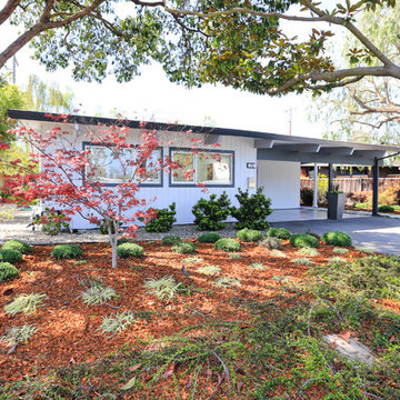
View of front of house
Home design - modern home design idea in San Francisco
Home design - modern home design idea in San Francisco

 Deslaurier Custom Cabinets
Cory Residence
Decidedly Scandinavian influence, and minimalist details make this sleek kitchen shine.
When the owners purchased this property, it was dramatically different from the new layout.
All very closed off – with only small openings between each room, making the space feel dark and small. Walls were removed, and the kitchen was moved from the original dining location to create a better a relationship from room to room. This enabled a large wrap around peninsula that transitions into a bar with wine cooler and use as a dining server. Ample seating for casual eating flanks the living room side of the peninsula, with simple post details. The overall result has dramatically improved the look and function of the space which can accommodate several helpers at one time.
The Warm grey cabinetry and walnut accented hood and floating shelves a moody, masculine palate and adds feeling of warmth to the space, while the white upper cabinets provide the needed lightness to balance it all off. Blending the combination of shaker styled upper cabinetry provides just enough detail to the design. The thermofoil dark grey slab door base cabinetry adds the right touch of modern, and ensures ease of clean up of base cabinetry for a busy household. The hexagonal tile backsplash carried up to the ceiling draws the eye upward giving the illusion of more height in the space, and adds texture and added warmth. Accessories such as the spice pull out cabinetry which flank each side of the range providing easy access storage for need at hand items.
 Alair Homes Plano
These clients debated moving from their dated 1979 house but decided to remodel since they loved their neighborhood and location of their home. We did a whole house interior and exterior remodel for them and they are so happy with their decision. The homeowners felt that reading floorplans was not so easy, so they loved our ability to provide 3D renderings and our personal touches and suggestions from our in-house designers.
The general layout of the home stayed the same with a few minor changes. We took the 38 year old home down to the studs and transformed it completely. The only thing that remains unchanged is the address. The popcorn texture was removed from the ceiling, removed all soffits, replaced all cabinets, flooring and countertops throughout the home. The wet bar was removed from the living room opening the space. The kitchen layout remained the same, but the cook surface was moved. Unneeded space was removed from the laundry room, giving them a larger pantry.
The master suite remained the same but additional lighting was added for reading. We made major improvements in the master bath by adding a rain shower, more storage and a bench to their new shower and gave them a larger bathtub.
All new cedar siding was replaced on the exterior of the home and a fresh coat of paint makes this 1979 home look brand new!
Design/Remodel by Hatfield Builders & Remodelers | Photography by Versatile Imaging
96