
Search results for "Decision businesses" in Home Design Ideas
 S-Squared // Architecture + Interiors + Landscape
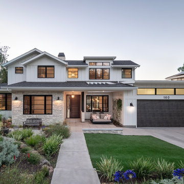
front elevation
Example of a cottage exterior home design in San Francisco
Example of a cottage exterior home design in San Francisco
 Drury Design
The Setup:
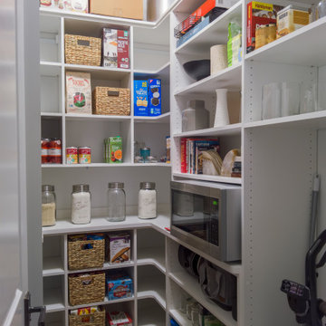
After purchasing this home, the homeowners faced a unique opportunity to reimagine their kitchen and nearby spaces. Water damage from a burst pipe had left much of the home’s interior in need of repair, and while the existing kitchen was functional and in relatively good shape, it didn’t align with the family’s vision for their new home. The layout included a peninsula that wasn’t ideal, and there were some druthers with the nearby pantry.
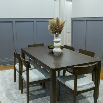
Since the space needed to be rebuilt anyway, the homeowners saw this as a chance to create a kitchen that was both highly functional for their four young children and timeless in its design. The project also included a refresh of the adjacent message center and dining room — spaces that play key roles in the family’s daily life. The goal was to create a cohesive flow between these areas, balancing modern functionality with the craftsman-inspired character of the rest of the home.
Design Objectives:
- Replace the outdated peninsula with a large island to maximize counter space and create new seating options.
- Open up the space visually by removing soffits and rethinking the cabinetry layout.
Incorporate concealed refrigeration and freezer units to provide significant storage for the family while maintaining a streamlined aesthetic.
- Integrate black cabinetry into the design without making the space feel harsh or heavy.
- Ensure the lighting plan balances functional task lighting with ambient accent lighting.
- Avoid visual clutter in the cabinetry design while still giving a nod to the craftsman aesthetic.
- Incorporate a slab backsplash as a key design feature.
Design Challenges:
- The outdated peninsula left dead space in the kitchen and lacked sufficient seating for the family.
- The cooktop wall was cramped, with small cabinets flanking the hood, limited storage, and soffits that made the space feel closed-in.
- The family needed significant refrigeration space (two refrigerators and a freezer) but wanted to avoid a cluttered look with visible stainless steel appliances.
- Adding black cabinetry risked making the space feel too dark or heavy.
- The original lighting plan was insufficient, particularly over the dining table where a decorative fixture proved too dim.
- The family wanted shaker-style drawer fronts to match the home’s arts-and-crafts design but worried that too much shaker cabinetry might look overly busy.
- Prioritizing a slab backsplash in the wish list priority planning.
The Renewed Space
Design Solutions:
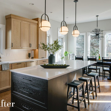
- A functional island: The peninsula was replaced with a large island that provides continuous countertop space for prepping and serving. The island also features seating for four people, creating a central hub for informal meals and activities.
- Streamlined cooktop wall: The soffits were removed, and the upper cabinets on the cooktop wall were eliminated to create a more open, streamlined design. A custom oversized hood became the focal point of the wall, with the blower unit offset inside it to align with the cooktop while maintaining exterior visual symmetry.
- Concealed refrigeration: Two column refrigerators and one freezer were integrated into the cabinetry, concealing them behind wood paneling that blends seamlessly with the overall design.
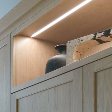
- Warm black cabinetry: The black cabinetry was crafted from hickory with a visible grain, softening its appearance and adding warmth. The grain detail gives the cabinetry a rich, textured look that avoids feeling stark or overpowering.
- Additional lighting: In the dining area, recessed can lights were added during an additional installation phase to supplement the gorgeous decorative fixture’s dim output. The new lighting plan creates a layered effect, combining functional task lighting with softer ambient lighting.
- Simplified cabinetry details: Slab drawer fronts were used on the upper drawers, while five-piece shaker fronts (with slightly less prominent rail and stile pieces) were reserved for the middle and lower drawers. This approach simplified the overall look while maintaining the craftsman-inspired aesthetic.
- Slab backsplash priority: The slab backsplash was prioritized by making thoughtful adjustments elsewhere, like opting not to extend cabinetry to the ceiling, which also helped visually prioritize the gorgeous slab backsplash. This decision also enhanced the kitchen’s furniture-like feel, aligning with the home’s craftsman character.
- This kitchen perfectly balances practicality with timeless style. By addressing the family’s functional needs — ample seating, smart storage, and effective lighting — while incorporating thoughtful design elements like warm black cabinetry and a striking slab backsplash, Alicia created a space that works beautifully for a busy household. The result is a cohesive, inviting kitchen that honors the home’s craftsman roots and will serve the family well for years to come.
 Way-Mar Inc.
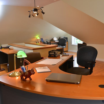
A growing percentage of Canadians work from home in some capacity. For one of Way-Mar's clients who work full-time running a home-based business, having the right workplace setup is an important factor in the decision to work from home.
After working for about 10 years in their basement office - a large but dark space with limited natural light - the home owners decided to convert their partially finished walk-up attic into a bright and comfortable office space. Their first decision was an easy one. They contacted Rob Martin from Way-Mar. The Elmira couple have lived in an older two-storey brick home for 20 years during which time they have completed a number of small and large renovations.
About 15 years ago, they were introduced to WayMar when they replaced some windows and doors. Since then, Way-Mar has completed a long list of projects from outside railings to a complete kitchen renovation. The owners gave Rob an idea of the end result she had in mind for the new office space - one that would take advantage of the attic’s natural light and provide overall comfort for her and her assistant to work in everyday. Their conversation began in the fall with a goal of completing the renovation the following spring. The owner notes that planning ahead is important and, as with previous projects, she told Rob when she wanted the work to be completed and he built a plan based around that.
photo: jeff brubacher
Find the right local pro for your project
 Legendary Escapes Pools
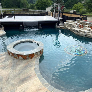
The design strategy included working within the footprint created by the home and backyard, wanting to incorporate a swimming pool “destination” within the backyard that would be large enough to fit the “larger than life” criteria, but without taking away any of the natural beauty or obstructing the view of the horse pastures, barn and nature surrounding the home.
Once the design work began, and the pool area was able to incorporate one of every feature the customer could have wanted, Curtis had some steel grates from a former tilt-a-whirl carnival ride that gave him the idea of suspending a stage over the pool. The initial idea was a modest stage with some waterfall/sheer decent features. With the idea of using steel to form the framework, the stage idea grew into something much more that would include a full stage set up, lighting trusses, a “green room” and staging area. Once the stage was designed to be so large, the pool size and scope needed to match including the patio surround, area underneath the stage, and all the additional features.
The home architecture is a Ranch with a full finished walkout basement adjacent to the pool area. An existing deck had to be removed to allow for the pool build and new Trex deck, as well as a 3 story tall observation tower that overlooks the pool and surrounding horse pastures.
The design strategy was to work within the footprint the house and decks provided to create an extension of the home for outdoor entertaining. Since the exterior of the house was quite long (and dull, the owner equating it to a 1970’s motel), our team needed to incorporate elements to make the space feel more like a backyard resort. The goal was maintaining a cozy at home feel in a grand expanse of space.
It takes a team and a unique blend of artistry to build this project. Sandi Maki, co-owner of the company is responsible for the business side of things, and marketing to reach exceptional customers who allow us to build these backyard dreams. The construction side of our company boasts a diverse, multi-geneational family business. Allan Curtis is the designer/builder and comes up with the fantastic pool plans and ideas. His team consists of his daughter Jesse Curtis, who is high right hand and manages the project just as much as Allan does. She is instrumental in everything from dig day, to tying the steel, pouring the concrete, stonework and tile work, forming the waterfall, applying ecoFinish, pouring and stamping patio, and everything in between. Allan’s nephew Mark Curtis installed and plumbed the three pool filtration systems. Allan’s wife Annie has become very good at stonework on walls and waterfalls adding the unique accents our projects have become known for. Allan’s sister-in-law, Karen Olson also does tile and stonework on the jobs and created the rockstar mural on the patio. Frank DiPiazza assists with structural elements and built the new deck, and college student Brendan Schafer assists where needed and maintains the pool and equipment during the summer on a weekly basis.
As with many homeowners who reach out to Legendary Escapes, this owner, Dale Walter, knew he wanted a “custom” pool without knowing what that really meant. He was able to show Curtis the space, and his initial ideas, and then allowed Allan and his team the freedom to dream and build. The majority of Legendary Escapes customers make the decision to hire the company after the first meeting with Curtis. As long as the project and design are challenging and interesting, the customer meets the criteria of being easy to work with, and is special in their own unique way Curtis will consider taking on their project. From the beginning it is important to Curtis that the customer understands they need to allow the project to take on a life of it’s own, and for Curtis to create without interference or asking too many questions – working together becomes a reality.
The design is typically presented on paper, a hand-colored, hand drawn design that outlines only the large elements, and an accompanying budget which outlines the structural elements and budgets and has a “theme” budget for items to be determined but doesn’t change once it is set.
Once that contract is signed, Curtis and his team over-deliver on what the customer could only have dreamed up in their wildest imagination. Projects proceed in an organic way- not every element is planned before the project begins. As the space begins to take shape, so do the details and finishing elements. When the Rockstar project began, there was no plan for the guitars on the fences, or guitar fire features. The VIP seating area wasn’t added until mid way through the patio pours as the space began to take shape. The murals both in the grotto and on the pool floor were planned just moments before each of them was to be installed. It’s this free-flowing combination of the customers and team’s dreams, ideas, elements and the Legendary Escapes team that creates backyard pools that are as much art as they are design and engineering masterpieces.
 Drury Design
The Setup:
After purchasing this home, the homeowners faced a unique opportunity to reimagine their kitchen and nearby spaces. Water damage from a burst pipe had left much of the home’s interior in need of repair, and while the existing kitchen was functional and in relatively good shape, it didn’t align with the family’s vision for their new home. The layout included a peninsula that wasn’t ideal, and there were some druthers with the nearby pantry.
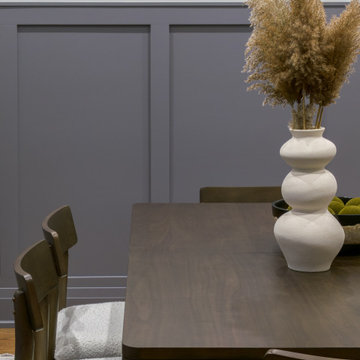
Since the space needed to be rebuilt anyway, the homeowners saw this as a chance to create a kitchen that was both highly functional for their four young children and timeless in its design. The project also included a refresh of the adjacent message center and dining room — spaces that play key roles in the family’s daily life. The goal was to create a cohesive flow between these areas, balancing modern functionality with the craftsman-inspired character of the rest of the home.
Design Objectives:
- Replace the outdated peninsula with a large island to maximize counter space and create new seating options.
- Open up the space visually by removing soffits and rethinking the cabinetry layout.
Incorporate concealed refrigeration and freezer units to provide significant storage for the family while maintaining a streamlined aesthetic.
- Integrate black cabinetry into the design without making the space feel harsh or heavy.
- Ensure the lighting plan balances functional task lighting with ambient accent lighting.
- Avoid visual clutter in the cabinetry design while still giving a nod to the craftsman aesthetic.
- Incorporate a slab backsplash as a key design feature.
Design Challenges:
- The outdated peninsula left dead space in the kitchen and lacked sufficient seating for the family.
- The cooktop wall was cramped, with small cabinets flanking the hood, limited storage, and soffits that made the space feel closed-in.
- The family needed significant refrigeration space (two refrigerators and a freezer) but wanted to avoid a cluttered look with visible stainless steel appliances.
- Adding black cabinetry risked making the space feel too dark or heavy.
- The original lighting plan was insufficient, particularly over the dining table where a decorative fixture proved too dim.
- The family wanted shaker-style drawer fronts to match the home’s arts-and-crafts design but worried that too much shaker cabinetry might look overly busy.
- Prioritizing a slab backsplash in the wish list priority planning.
The Renewed Space
Design Solutions:
- A functional island: The peninsula was replaced with a large island that provides continuous countertop space for prepping and serving. The island also features seating for four people, creating a central hub for informal meals and activities.
- Streamlined cooktop wall: The soffits were removed, and the upper cabinets on the cooktop wall were eliminated to create a more open, streamlined design. A custom oversized hood became the focal point of the wall, with the blower unit offset inside it to align with the cooktop while maintaining exterior visual symmetry.
- Concealed refrigeration: Two column refrigerators and one freezer were integrated into the cabinetry, concealing them behind wood paneling that blends seamlessly with the overall design.
- Warm black cabinetry: The black cabinetry was crafted from hickory with a visible grain, softening its appearance and adding warmth. The grain detail gives the cabinetry a rich, textured look that avoids feeling stark or overpowering.
- Additional lighting: In the dining area, recessed can lights were added during an additional installation phase to supplement the gorgeous decorative fixture’s dim output. The new lighting plan creates a layered effect, combining functional task lighting with softer ambient lighting.
- Simplified cabinetry details: Slab drawer fronts were used on the upper drawers, while five-piece shaker fronts (with slightly less prominent rail and stile pieces) were reserved for the middle and lower drawers. This approach simplified the overall look while maintaining the craftsman-inspired aesthetic.
- Slab backsplash priority: The slab backsplash was prioritized by making thoughtful adjustments elsewhere, like opting not to extend cabinetry to the ceiling, which also helped visually prioritize the gorgeous slab backsplash. This decision also enhanced the kitchen’s furniture-like feel, aligning with the home’s craftsman character.
- This kitchen perfectly balances practicality with timeless style. By addressing the family’s functional needs — ample seating, smart storage, and effective lighting — while incorporating thoughtful design elements like warm black cabinetry and a striking slab backsplash, Alicia created a space that works beautifully for a busy household. The result is a cohesive, inviting kitchen that honors the home’s craftsman roots and will serve the family well for years to come.
 Drury Design
The Setup:
After purchasing this home, the homeowners faced a unique opportunity to reimagine their kitchen and nearby spaces. Water damage from a burst pipe had left much of the home’s interior in need of repair, and while the existing kitchen was functional and in relatively good shape, it didn’t align with the family’s vision for their new home. The layout included a peninsula that wasn’t ideal, and there were some druthers with the nearby pantry.
Since the space needed to be rebuilt anyway, the homeowners saw this as a chance to create a kitchen that was both highly functional for their four young children and timeless in its design. The project also included a refresh of the adjacent message center and dining room — spaces that play key roles in the family’s daily life. The goal was to create a cohesive flow between these areas, balancing modern functionality with the craftsman-inspired character of the rest of the home.
Design Objectives:
- Replace the outdated peninsula with a large island to maximize counter space and create new seating options.
- Open up the space visually by removing soffits and rethinking the cabinetry layout.
Incorporate concealed refrigeration and freezer units to provide significant storage for the family while maintaining a streamlined aesthetic.
- Integrate black cabinetry into the design without making the space feel harsh or heavy.
- Ensure the lighting plan balances functional task lighting with ambient accent lighting.
- Avoid visual clutter in the cabinetry design while still giving a nod to the craftsman aesthetic.
- Incorporate a slab backsplash as a key design feature.
Design Challenges:
- The outdated peninsula left dead space in the kitchen and lacked sufficient seating for the family.
- The cooktop wall was cramped, with small cabinets flanking the hood, limited storage, and soffits that made the space feel closed-in.
- The family needed significant refrigeration space (two refrigerators and a freezer) but wanted to avoid a cluttered look with visible stainless steel appliances.
- Adding black cabinetry risked making the space feel too dark or heavy.
- The original lighting plan was insufficient, particularly over the dining table where a decorative fixture proved too dim.
- The family wanted shaker-style drawer fronts to match the home’s arts-and-crafts design but worried that too much shaker cabinetry might look overly busy.
- Prioritizing a slab backsplash in the wish list priority planning.
The Renewed Space
Design Solutions:
- A functional island: The peninsula was replaced with a large island that provides continuous countertop space for prepping and serving. The island also features seating for four people, creating a central hub for informal meals and activities.
- Streamlined cooktop wall: The soffits were removed, and the upper cabinets on the cooktop wall were eliminated to create a more open, streamlined design. A custom oversized hood became the focal point of the wall, with the blower unit offset inside it to align with the cooktop while maintaining exterior visual symmetry.
- Concealed refrigeration: Two column refrigerators and one freezer were integrated into the cabinetry, concealing them behind wood paneling that blends seamlessly with the overall design.
- Warm black cabinetry: The black cabinetry was crafted from hickory with a visible grain, softening its appearance and adding warmth. The grain detail gives the cabinetry a rich, textured look that avoids feeling stark or overpowering.
- Additional lighting: In the dining area, recessed can lights were added during an additional installation phase to supplement the gorgeous decorative fixture’s dim output. The new lighting plan creates a layered effect, combining functional task lighting with softer ambient lighting.
- Simplified cabinetry details: Slab drawer fronts were used on the upper drawers, while five-piece shaker fronts (with slightly less prominent rail and stile pieces) were reserved for the middle and lower drawers. This approach simplified the overall look while maintaining the craftsman-inspired aesthetic.
- Slab backsplash priority: The slab backsplash was prioritized by making thoughtful adjustments elsewhere, like opting not to extend cabinetry to the ceiling, which also helped visually prioritize the gorgeous slab backsplash. This decision also enhanced the kitchen’s furniture-like feel, aligning with the home’s craftsman character.
- This kitchen perfectly balances practicality with timeless style. By addressing the family’s functional needs — ample seating, smart storage, and effective lighting — while incorporating thoughtful design elements like warm black cabinetry and a striking slab backsplash, Alicia created a space that works beautifully for a busy household. The result is a cohesive, inviting kitchen that honors the home’s craftsman roots and will serve the family well for years to come.
 User
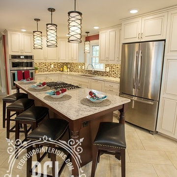
UserOur approach to the dining room wall was a key decision for the entire project. The wall was load bearing and the homeowners considered only removing half of it. In the end, keeping the overall open concept design was important to the homeowners, therefore we installed a load bearing beam in the ceiling. The beam was finished with drywall to be cohesive so it looked like it was a part of the original design. Now that the kitchen and dining room were open, paint colors were used to designate the spaces and create visual boundaries. This made each area feel like it’s its own space without using any structures.
The original L-shaped kitchen was cut short because of bay windows that overlooked the backyard patio. These windows were lost in the space and not functional; they were replaced with double French doors leading onto the patio. A brick layer was brought in to patch up the window swap and now it looks like the French doors always existed. New crown molding was installed throughout and painted to match the kitchen cabinets.
This window/door replacement allowed for a large pantry cabinet to be installed next to the refrigerator which was not in the old cabinet configuration. The replaced perimeter cabinets host custom storage solutions, like a mixer stand, spice organization, recycling center and functional corner cabinet with pull out shelving. The perimeter kitchen cabinets are painted with a glaze and the island is a cherry stain with glaze to amplify the raised panel door style.
We tripled the size of the kitchen island to expand countertop space. It seats five people and hosts charging stations for the family’s busy lifestyle. It was important that the cooktop in the island had a built in downdraft system because the homeowners did not want a ventilation hood in the center of the kitchen because it would obscure the open concept design.
The countertops are quartz and feature an under mount granite composite kitchen sink with a low divide center. The kitchen faucet, which features hands free and touch technology, and an instant hot water dispenser were added for convenience because of the homeowners’ busy lifestyle. The backsplash is a favorite, with a teal and red glass mosaic basket weave design. It stands out and holds its own among the expansive kitchen cabinets.
All recessed, under cabinet and decorative lights were installed on dimmer switches to allow the homeowners to adjust the lighting in each space of the project. All exterior and interior door hardware, hinges and knobs were replaced in oil rubbed bronze to match the dark stain throughout the space. The entire first floor remodel project uses 12x24 ceramic tile laid in a herringbone pattern. Since tile is typically cold, the flooring was also heated from below. This will also help with the homeowners’ original heating issues.
When accessorizing the kitchen, we used functional, everyday items the homeowners use like cutting boards, canisters for dry goods and place settings on the island. Ultimately, this project transformed their small, outdated kitchen into an expansive and functional workspace.
Sponsored
Columbus, OH

Wannemacher Interiors
Customized Award-Winning Interior Design Solutions in Franklin Cnty OH
 Drury Design
The Setup:
After purchasing this home, the homeowners faced a unique opportunity to reimagine their kitchen and nearby spaces. Water damage from a burst pipe had left much of the home’s interior in need of repair, and while the existing kitchen was functional and in relatively good shape, it didn’t align with the family’s vision for their new home. The layout included a peninsula that wasn’t ideal, and there were some druthers with the nearby pantry.
Since the space needed to be rebuilt anyway, the homeowners saw this as a chance to create a kitchen that was both highly functional for their four young children and timeless in its design. The project also included a refresh of the adjacent message center and dining room — spaces that play key roles in the family’s daily life. The goal was to create a cohesive flow between these areas, balancing modern functionality with the craftsman-inspired character of the rest of the home.
Design Objectives:
- Replace the outdated peninsula with a large island to maximize counter space and create new seating options.
- Open up the space visually by removing soffits and rethinking the cabinetry layout.
Incorporate concealed refrigeration and freezer units to provide significant storage for the family while maintaining a streamlined aesthetic.
- Integrate black cabinetry into the design without making the space feel harsh or heavy.
- Ensure the lighting plan balances functional task lighting with ambient accent lighting.
- Avoid visual clutter in the cabinetry design while still giving a nod to the craftsman aesthetic.
- Incorporate a slab backsplash as a key design feature.
Design Challenges:
- The outdated peninsula left dead space in the kitchen and lacked sufficient seating for the family.
- The cooktop wall was cramped, with small cabinets flanking the hood, limited storage, and soffits that made the space feel closed-in.
- The family needed significant refrigeration space (two refrigerators and a freezer) but wanted to avoid a cluttered look with visible stainless steel appliances.
- Adding black cabinetry risked making the space feel too dark or heavy.
- The original lighting plan was insufficient, particularly over the dining table where a decorative fixture proved too dim.
- The family wanted shaker-style drawer fronts to match the home’s arts-and-crafts design but worried that too much shaker cabinetry might look overly busy.
- Prioritizing a slab backsplash in the wish list priority planning.
The Renewed Space
Design Solutions:
- A functional island: The peninsula was replaced with a large island that provides continuous countertop space for prepping and serving. The island also features seating for four people, creating a central hub for informal meals and activities.
- Streamlined cooktop wall: The soffits were removed, and the upper cabinets on the cooktop wall were eliminated to create a more open, streamlined design. A custom oversized hood became the focal point of the wall, with the blower unit offset inside it to align with the cooktop while maintaining exterior visual symmetry.
- Concealed refrigeration: Two column refrigerators and one freezer were integrated into the cabinetry, concealing them behind wood paneling that blends seamlessly with the overall design.
- Warm black cabinetry: The black cabinetry was crafted from hickory with a visible grain, softening its appearance and adding warmth. The grain detail gives the cabinetry a rich, textured look that avoids feeling stark or overpowering.
- Additional lighting: In the dining area, recessed can lights were added during an additional installation phase to supplement the gorgeous decorative fixture’s dim output. The new lighting plan creates a layered effect, combining functional task lighting with softer ambient lighting.
- Simplified cabinetry details: Slab drawer fronts were used on the upper drawers, while five-piece shaker fronts (with slightly less prominent rail and stile pieces) were reserved for the middle and lower drawers. This approach simplified the overall look while maintaining the craftsman-inspired aesthetic.
- Slab backsplash priority: The slab backsplash was prioritized by making thoughtful adjustments elsewhere, like opting not to extend cabinetry to the ceiling, which also helped visually prioritize the gorgeous slab backsplash. This decision also enhanced the kitchen’s furniture-like feel, aligning with the home’s craftsman character.
- This kitchen perfectly balances practicality with timeless style. By addressing the family’s functional needs — ample seating, smart storage, and effective lighting — while incorporating thoughtful design elements like warm black cabinetry and a striking slab backsplash, Alicia created a space that works beautifully for a busy household. The result is a cohesive, inviting kitchen that honors the home’s craftsman roots and will serve the family well for years to come.

 Elite Construction and Remodel Corp
Building a large outdoor structure in your backyard or at your business is a big decision to make. You have to factor in location, size, material, and usually, you’ll need a budget in mind. Building a pergola has many benefits. This week, we’d like to share with you a few reasons why building one may be one of the best decisions you’ll ever make.
 Drury Design
The Setup:
After purchasing this home, the homeowners faced a unique opportunity to reimagine their kitchen and nearby spaces. Water damage from a burst pipe had left much of the home’s interior in need of repair, and while the existing kitchen was functional and in relatively good shape, it didn’t align with the family’s vision for their new home. The layout included a peninsula that wasn’t ideal, and there were some druthers with the nearby pantry.
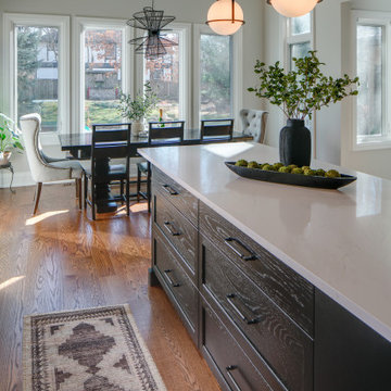
Since the space needed to be rebuilt anyway, the homeowners saw this as a chance to create a kitchen that was both highly functional for their four young children and timeless in its design. The project also included a refresh of the adjacent message center and dining room — spaces that play key roles in the family’s daily life. The goal was to create a cohesive flow between these areas, balancing modern functionality with the craftsman-inspired character of the rest of the home.
Design Objectives:
- Replace the outdated peninsula with a large island to maximize counter space and create new seating options.
- Open up the space visually by removing soffits and rethinking the cabinetry layout.
Incorporate concealed refrigeration and freezer units to provide significant storage for the family while maintaining a streamlined aesthetic.
- Integrate black cabinetry into the design without making the space feel harsh or heavy.
- Ensure the lighting plan balances functional task lighting with ambient accent lighting.
- Avoid visual clutter in the cabinetry design while still giving a nod to the craftsman aesthetic.
- Incorporate a slab backsplash as a key design feature.
Design Challenges:
- The outdated peninsula left dead space in the kitchen and lacked sufficient seating for the family.
- The cooktop wall was cramped, with small cabinets flanking the hood, limited storage, and soffits that made the space feel closed-in.
- The family needed significant refrigeration space (two refrigerators and a freezer) but wanted to avoid a cluttered look with visible stainless steel appliances.
- Adding black cabinetry risked making the space feel too dark or heavy.
- The original lighting plan was insufficient, particularly over the dining table where a decorative fixture proved too dim.
- The family wanted shaker-style drawer fronts to match the home’s arts-and-crafts design but worried that too much shaker cabinetry might look overly busy.
- Prioritizing a slab backsplash in the wish list priority planning.
The Renewed Space
Design Solutions:
- A functional island: The peninsula was replaced with a large island that provides continuous countertop space for prepping and serving. The island also features seating for four people, creating a central hub for informal meals and activities.
- Streamlined cooktop wall: The soffits were removed, and the upper cabinets on the cooktop wall were eliminated to create a more open, streamlined design. A custom oversized hood became the focal point of the wall, with the blower unit offset inside it to align with the cooktop while maintaining exterior visual symmetry.
- Concealed refrigeration: Two column refrigerators and one freezer were integrated into the cabinetry, concealing them behind wood paneling that blends seamlessly with the overall design.
- Warm black cabinetry: The black cabinetry was crafted from hickory with a visible grain, softening its appearance and adding warmth. The grain detail gives the cabinetry a rich, textured look that avoids feeling stark or overpowering.
- Additional lighting: In the dining area, recessed can lights were added during an additional installation phase to supplement the gorgeous decorative fixture’s dim output. The new lighting plan creates a layered effect, combining functional task lighting with softer ambient lighting.
- Simplified cabinetry details: Slab drawer fronts were used on the upper drawers, while five-piece shaker fronts (with slightly less prominent rail and stile pieces) were reserved for the middle and lower drawers. This approach simplified the overall look while maintaining the craftsman-inspired aesthetic.
- Slab backsplash priority: The slab backsplash was prioritized by making thoughtful adjustments elsewhere, like opting not to extend cabinetry to the ceiling, which also helped visually prioritize the gorgeous slab backsplash. This decision also enhanced the kitchen’s furniture-like feel, aligning with the home’s craftsman character.
- This kitchen perfectly balances practicality with timeless style. By addressing the family’s functional needs — ample seating, smart storage, and effective lighting — while incorporating thoughtful design elements like warm black cabinetry and a striking slab backsplash, Alicia created a space that works beautifully for a busy household. The result is a cohesive, inviting kitchen that honors the home’s craftsman roots and will serve the family well for years to come.
 Talon Construction Inc.
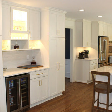
Finding a reputable contractor to design and build your kitchen remodel in Maryland with quality results involves several steps. Here are some general guidelines to help you find the right professional for your project:
1. Ask for Recommendations: Start by asking friends, family, neighbors, or colleagues who have recently completed kitchen remodels for recommendations. Personal referrals can be a valuable source of trustworthy contractors.
2. Check Online Reviews: Websites like Yelp, Angie's List, and Google Reviews can provide insights into the experiences of previous clients. Look for contractors with consistently positive feedback.
3. Check Credentials: Verify that the contractor has the necessary licenses and insurance to work in Maryland. You can typically check this information on your state's licensing board website.
4. Ask for References: Request references from the contractor and contact previous clients to inquire about their experiences. Visit some of their completed projects if possible.
5. Review Portfolios: Examine the contractor's portfolio of past kitchen remodels. Look for examples of work that match your style and preferences.
6. Check for Permits: Ensure that the contractor will handle any necessary permits and inspections for your remodel. Avoid contractors who suggest bypassing required permits, as this can lead to legal and safety issues.
7. Discuss Communication: Clear communication is crucial throughout the project. Discuss how the contractor will keep you updated on progress and address any concerns or changes during the remodel.
8. Get Everything in Writing: Never rely solely on verbal agreements. Ensure that all project details, warranties, and expectations are documented in a written contract.
9. Check for Red Flags: Be wary of contractors who pressure you into making quick decisions, lack a physical business address, or have a history of disputes or legal issues.
10. Trust Your Instincts: Choose a contractor you feel comfortable working with. Trust your instincts and select someone who listens to your ideas and concerns.
11. Visit Completed Projects: If possible, visit some of the contractors’ completed kitchen remodels to assess the quality of their work in person.
Once you've completed your due diligence and gathered all the necessary information, you'll be better equipped to make an informed decision about which contractor to hire for your kitchen remodel in Maryland. Remember that quality results often come from working with experienced, licensed professionals who prioritize clear communication and transparency throughout the project.
 Drury Design
The Setup:
After purchasing this home, the homeowners faced a unique opportunity to reimagine their kitchen and nearby spaces. Water damage from a burst pipe had left much of the home’s interior in need of repair, and while the existing kitchen was functional and in relatively good shape, it didn’t align with the family’s vision for their new home. The layout included a peninsula that wasn’t ideal, and there were some druthers with the nearby pantry.
Since the space needed to be rebuilt anyway, the homeowners saw this as a chance to create a kitchen that was both highly functional for their four young children and timeless in its design. The project also included a refresh of the adjacent message center and dining room — spaces that play key roles in the family’s daily life. The goal was to create a cohesive flow between these areas, balancing modern functionality with the craftsman-inspired character of the rest of the home.
Design Objectives:
- Replace the outdated peninsula with a large island to maximize counter space and create new seating options.
- Open up the space visually by removing soffits and rethinking the cabinetry layout.
Incorporate concealed refrigeration and freezer units to provide significant storage for the family while maintaining a streamlined aesthetic.
- Integrate black cabinetry into the design without making the space feel harsh or heavy.
- Ensure the lighting plan balances functional task lighting with ambient accent lighting.
- Avoid visual clutter in the cabinetry design while still giving a nod to the craftsman aesthetic.
- Incorporate a slab backsplash as a key design feature.
Design Challenges:
- The outdated peninsula left dead space in the kitchen and lacked sufficient seating for the family.
- The cooktop wall was cramped, with small cabinets flanking the hood, limited storage, and soffits that made the space feel closed-in.
- The family needed significant refrigeration space (two refrigerators and a freezer) but wanted to avoid a cluttered look with visible stainless steel appliances.
- Adding black cabinetry risked making the space feel too dark or heavy.
- The original lighting plan was insufficient, particularly over the dining table where a decorative fixture proved too dim.
- The family wanted shaker-style drawer fronts to match the home’s arts-and-crafts design but worried that too much shaker cabinetry might look overly busy.
- Prioritizing a slab backsplash in the wish list priority planning.
The Renewed Space
Design Solutions:
- A functional island: The peninsula was replaced with a large island that provides continuous countertop space for prepping and serving. The island also features seating for four people, creating a central hub for informal meals and activities.
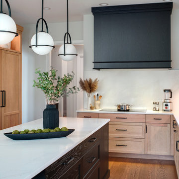
- Streamlined cooktop wall: The soffits were removed, and the upper cabinets on the cooktop wall were eliminated to create a more open, streamlined design. A custom oversized hood became the focal point of the wall, with the blower unit offset inside it to align with the cooktop while maintaining exterior visual symmetry.
- Concealed refrigeration: Two column refrigerators and one freezer were integrated into the cabinetry, concealing them behind wood paneling that blends seamlessly with the overall design.
- Warm black cabinetry: The black cabinetry was crafted from hickory with a visible grain, softening its appearance and adding warmth. The grain detail gives the cabinetry a rich, textured look that avoids feeling stark or overpowering.
- Additional lighting: In the dining area, recessed can lights were added during an additional installation phase to supplement the gorgeous decorative fixture’s dim output. The new lighting plan creates a layered effect, combining functional task lighting with softer ambient lighting.
- Simplified cabinetry details: Slab drawer fronts were used on the upper drawers, while five-piece shaker fronts (with slightly less prominent rail and stile pieces) were reserved for the middle and lower drawers. This approach simplified the overall look while maintaining the craftsman-inspired aesthetic.
- Slab backsplash priority: The slab backsplash was prioritized by making thoughtful adjustments elsewhere, like opting not to extend cabinetry to the ceiling, which also helped visually prioritize the gorgeous slab backsplash. This decision also enhanced the kitchen’s furniture-like feel, aligning with the home’s craftsman character.
- This kitchen perfectly balances practicality with timeless style. By addressing the family’s functional needs — ample seating, smart storage, and effective lighting — while incorporating thoughtful design elements like warm black cabinetry and a striking slab backsplash, Alicia created a space that works beautifully for a busy household. The result is a cohesive, inviting kitchen that honors the home’s craftsman roots and will serve the family well for years to come.
 Bloomin Blinds of North Charlotte
Discover how premium light-filtering materials and smart-home automation can secure street-level entryway glass without losing natural daylight.
Choosing the right window treatments for a home's front entrance is one of the most challenging design decisions a homeowner can face. The front door is the focal point of a home's curb appeal, often featuring expansive glass panels or side-by-side double doors designed to make a grand architectural statement.
During the day, these large glass features are an asset, flooding entryways and foyers with beautiful natural daylight. However, for homes situated on busy local roads or highly trafficked street-level lots, the dynamic completely changes once the sun goes down.
The moment interior lights are switched on in the evening, a stark contrast is created with the dark outdoors. This creates a severe privacy issue, leaving the entire foyer completely exposed to passing traffic and pedestrians. Finding a solution that delivers absolute evening privacy without permanently plunging the front entrance into darkness during the day requires understanding how modern window treatment materials and operating systems interact.
Light-Filtering vs. Blackout Fabrics
The first step in solving street-level privacy is selecting the correct fabric type. Many homeowners mistakenly assume they need heavy, opaque blackout shades to secure their home from outside eyes at night. While blackout fabrics certainly block 100% of the view, they also block 100% of the natural daylight during the day, forcing you to constantly raise and lower the shades just to see inside your own foyer.
A more effective approach for entryways utilizes premium light-filtering materials. These specialized fabrics are engineered with a precise, tight weave that operates on the principles of directional light and optical density.
Daytime Functionality: When the sun is shining outside, the exterior light levels are significantly higher than the interior light levels. The light-filtering fabric diffuses the intense, direct sunlight into a soft, ambient glow throughout the entryway. This keeps the home bright, eliminates harsh glares, and protects interior hardwood flooring, paint, and trim from damaging UV rays.
Night-Time Functionality: At night, the lighting dynamic reverses. The interior foyer lights make the inside bright, while the outside is dark. Because of the specialized tight weave, the fabric blocks the transmission of clear shapes and details. To a person standing out on the street or driving by on a busy road, the view inside is completely obstructed, delivering total privacy when the family is home for the evening.
Challenges of Front Door Installations
Securing privacy for a double wide front entrance introduces unique structural hurdles that standard windows do not face. Traditional blinds with hanging cords or manual pull chains are poorly suited for front doors. They disrupt the clean architectural lines of a grand foyer, create a safety hazard, and can easily get tangled or damaged when the doors are opened and closed.
The window treatments must be mounted high and wide enough above the door trim to ensure that the front doors can swing open and close freely without ever catching on the fabric or the lower hem bar.
How We Applied These Principles in Sherrills Ford, NC
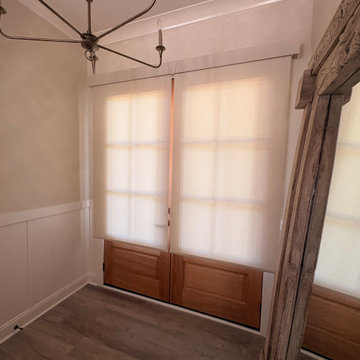
Applying these exact educational principles to real-world homes is what Cole and I do every day at Bloomin' Blinds of North Charlotte. We recently worked with a homeowner in Sherrills Ford whose beautiful new construction property sat on a highly trafficked road. They loved their double wide front door entrance but felt entirely too exposed to the street at night.
We brought our mobile showroom directly to their driveway. This allowed us to hold up premium light-filtering fabric samples directly against their entryway glass, matching the materials perfectly to their home's natural lighting, interior paint, and trim before making a single cut.
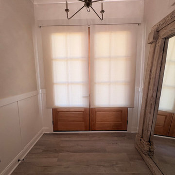
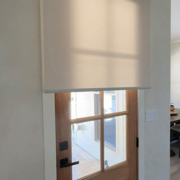
To solve their street-level privacy issue, we custom-built and installed two matching light-filtering roller shades, mounting them flawlessly side-by-side above the front door frame. To keep the home’s interior design completely cohesive, we carried the exact same style to the back of the house, installing a matching single roller shade on the rear door.
Smart Home Window Automation at Your Fingertips
Because entryway windows can be tall and awkward to reach manually, our family team integrated advanced smart-home motorization into this Sherrills Ford project.
Beyond the convenience of a handheld remote control, these automated roller shades feature seamless Wi-Fi integration. The homeowners can control their privacy through a dedicated smartphone app or link the system directly to their existing voice-activated smart home networks, including Amazon Alexa, Google Assistant, and Apple HomeKit.
This allows for complete hands-free window automation. The clients can program custom daily routines—such as setting the front entry shades to automatically lower exactly at sunset—or simply use a voice command to secure the foyer instantly from the comfort of the couch.
Sponsored
Columbus, OH
Wannemacher Interiors
Customized Award-Winning Interior Design Solutions in Franklin Cnty OH
 User
UserOur approach to the dining room wall was a key decision for the entire project. The wall was load bearing and the homeowners considered only removing half of it. In the end, keeping the overall open concept design was important to the homeowners, therefore we installed a load bearing beam in the ceiling. The beam was finished with drywall to be cohesive so it looked like it was a part of the original design. Now that the kitchen and dining room were open, paint colors were used to designate the spaces and create visual boundaries. This made each area feel like it’s its own space without using any structures.
The original L-shaped kitchen was cut short because of bay windows that overlooked the backyard patio. These windows were lost in the space and not functional; they were replaced with double French doors leading onto the patio. A brick layer was brought in to patch up the window swap and now it looks like the French doors always existed. New crown molding was installed throughout and painted to match the kitchen cabinets.
This window/door replacement allowed for a large pantry cabinet to be installed next to the refrigerator which was not in the old cabinet configuration. The replaced perimeter cabinets host custom storage solutions, like a mixer stand, spice organization, recycling center and functional corner cabinet with pull out shelving. The perimeter kitchen cabinets are painted with a glaze and the island is a cherry stain with glaze to amplify the raised panel door style.
We tripled the size of the kitchen island to expand countertop space. It seats five people and hosts charging stations for the family’s busy lifestyle. It was important that the cooktop in the island had a built in downdraft system because the homeowners did not want a ventilation hood in the center of the kitchen because it would obscure the open concept design.
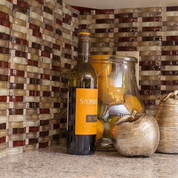
The countertops are quartz and feature an under mount granite composite kitchen sink with a low divide center. The kitchen faucet, which features hands free and touch technology, and an instant hot water dispenser were added for convenience because of the homeowners’ busy lifestyle. The backsplash is a favorite, with a teal and red glass mosaic basket weave design. It stands out and holds its own among the expansive kitchen cabinets.
All recessed, under cabinet and decorative lights were installed on dimmer switches to allow the homeowners to adjust the lighting in each space of the project. All exterior and interior door hardware, hinges and knobs were replaced in oil rubbed bronze to match the dark stain throughout the space. The entire first floor remodel project uses 12x24 ceramic tile laid in a herringbone pattern. Since tile is typically cold, the flooring was also heated from below. This will also help with the homeowners’ original heating issues.
When accessorizing the kitchen, we used functional, everyday items the homeowners use like cutting boards, canisters for dry goods and place settings on the island. Ultimately, this project transformed their small, outdated kitchen into an expansive and functional workspace.
 Drury Design
The Setup:
After purchasing this home, the homeowners faced a unique opportunity to reimagine their kitchen and nearby spaces. Water damage from a burst pipe had left much of the home’s interior in need of repair, and while the existing kitchen was functional and in relatively good shape, it didn’t align with the family’s vision for their new home. The layout included a peninsula that wasn’t ideal, and there were some druthers with the nearby pantry.
Since the space needed to be rebuilt anyway, the homeowners saw this as a chance to create a kitchen that was both highly functional for their four young children and timeless in its design. The project also included a refresh of the adjacent message center and dining room — spaces that play key roles in the family’s daily life. The goal was to create a cohesive flow between these areas, balancing modern functionality with the craftsman-inspired character of the rest of the home.
Design Objectives:
- Replace the outdated peninsula with a large island to maximize counter space and create new seating options.
- Open up the space visually by removing soffits and rethinking the cabinetry layout.
Incorporate concealed refrigeration and freezer units to provide significant storage for the family while maintaining a streamlined aesthetic.
- Integrate black cabinetry into the design without making the space feel harsh or heavy.
- Ensure the lighting plan balances functional task lighting with ambient accent lighting.
- Avoid visual clutter in the cabinetry design while still giving a nod to the craftsman aesthetic.
- Incorporate a slab backsplash as a key design feature.
Design Challenges:
- The outdated peninsula left dead space in the kitchen and lacked sufficient seating for the family.
- The cooktop wall was cramped, with small cabinets flanking the hood, limited storage, and soffits that made the space feel closed-in.
- The family needed significant refrigeration space (two refrigerators and a freezer) but wanted to avoid a cluttered look with visible stainless steel appliances.
- Adding black cabinetry risked making the space feel too dark or heavy.
- The original lighting plan was insufficient, particularly over the dining table where a decorative fixture proved too dim.
- The family wanted shaker-style drawer fronts to match the home’s arts-and-crafts design but worried that too much shaker cabinetry might look overly busy.
- Prioritizing a slab backsplash in the wish list priority planning.
The Renewed Space
Design Solutions:
- A functional island: The peninsula was replaced with a large island that provides continuous countertop space for prepping and serving. The island also features seating for four people, creating a central hub for informal meals and activities.
- Streamlined cooktop wall: The soffits were removed, and the upper cabinets on the cooktop wall were eliminated to create a more open, streamlined design. A custom oversized hood became the focal point of the wall, with the blower unit offset inside it to align with the cooktop while maintaining exterior visual symmetry.
- Concealed refrigeration: Two column refrigerators and one freezer were integrated into the cabinetry, concealing them behind wood paneling that blends seamlessly with the overall design.
- Warm black cabinetry: The black cabinetry was crafted from hickory with a visible grain, softening its appearance and adding warmth. The grain detail gives the cabinetry a rich, textured look that avoids feeling stark or overpowering.
- Additional lighting: In the dining area, recessed can lights were added during an additional installation phase to supplement the gorgeous decorative fixture’s dim output. The new lighting plan creates a layered effect, combining functional task lighting with softer ambient lighting.
- Simplified cabinetry details: Slab drawer fronts were used on the upper drawers, while five-piece shaker fronts (with slightly less prominent rail and stile pieces) were reserved for the middle and lower drawers. This approach simplified the overall look while maintaining the craftsman-inspired aesthetic.
- Slab backsplash priority: The slab backsplash was prioritized by making thoughtful adjustments elsewhere, like opting not to extend cabinetry to the ceiling, which also helped visually prioritize the gorgeous slab backsplash. This decision also enhanced the kitchen’s furniture-like feel, aligning with the home’s craftsman character.
- This kitchen perfectly balances practicality with timeless style. By addressing the family’s functional needs — ample seating, smart storage, and effective lighting — while incorporating thoughtful design elements like warm black cabinetry and a striking slab backsplash, Alicia created a space that works beautifully for a busy household. The result is a cohesive, inviting kitchen that honors the home’s craftsman roots and will serve the family well for years to come.
 Bloomin Blinds of North Charlotte
Discover how premium light-filtering materials and smart-home automation can secure street-level entryway glass without losing natural daylight.
Choosing the right window treatments for a home's front entrance is one of the most challenging design decisions a homeowner can face. The front door is the focal point of a home's curb appeal, often featuring expansive glass panels or side-by-side double doors designed to make a grand architectural statement.
During the day, these large glass features are an asset, flooding entryways and foyers with beautiful natural daylight. However, for homes situated on busy local roads or highly trafficked street-level lots, the dynamic completely changes once the sun goes down.
The moment interior lights are switched on in the evening, a stark contrast is created with the dark outdoors. This creates a severe privacy issue, leaving the entire foyer completely exposed to passing traffic and pedestrians. Finding a solution that delivers absolute evening privacy without permanently plunging the front entrance into darkness during the day requires understanding how modern window treatment materials and operating systems interact.
Light-Filtering vs. Blackout Fabrics
The first step in solving street-level privacy is selecting the correct fabric type. Many homeowners mistakenly assume they need heavy, opaque blackout shades to secure their home from outside eyes at night. While blackout fabrics certainly block 100% of the view, they also block 100% of the natural daylight during the day, forcing you to constantly raise and lower the shades just to see inside your own foyer.
A more effective approach for entryways utilizes premium light-filtering materials. These specialized fabrics are engineered with a precise, tight weave that operates on the principles of directional light and optical density.
Daytime Functionality: When the sun is shining outside, the exterior light levels are significantly higher than the interior light levels. The light-filtering fabric diffuses the intense, direct sunlight into a soft, ambient glow throughout the entryway. This keeps the home bright, eliminates harsh glares, and protects interior hardwood flooring, paint, and trim from damaging UV rays.
Night-Time Functionality: At night, the lighting dynamic reverses. The interior foyer lights make the inside bright, while the outside is dark. Because of the specialized tight weave, the fabric blocks the transmission of clear shapes and details. To a person standing out on the street or driving by on a busy road, the view inside is completely obstructed, delivering total privacy when the family is home for the evening.
Challenges of Front Door Installations
Securing privacy for a double wide front entrance introduces unique structural hurdles that standard windows do not face. Traditional blinds with hanging cords or manual pull chains are poorly suited for front doors. They disrupt the clean architectural lines of a grand foyer, create a safety hazard, and can easily get tangled or damaged when the doors are opened and closed.
The window treatments must be mounted high and wide enough above the door trim to ensure that the front doors can swing open and close freely without ever catching on the fabric or the lower hem bar.
How We Applied These Principles in Sherrills Ford, NC
Applying these exact educational principles to real-world homes is what Cole and I do every day at Bloomin' Blinds of North Charlotte. We recently worked with a homeowner in Sherrills Ford whose beautiful new construction property sat on a highly trafficked road. They loved their double wide front door entrance but felt entirely too exposed to the street at night.
We brought our mobile showroom directly to their driveway. This allowed us to hold up premium light-filtering fabric samples directly against their entryway glass, matching the materials perfectly to their home's natural lighting, interior paint, and trim before making a single cut.
To solve their street-level privacy issue, we custom-built and installed two matching light-filtering roller shades, mounting them flawlessly side-by-side above the front door frame. To keep the home’s interior design completely cohesive, we carried the exact same style to the back of the house, installing a matching single roller shade on the rear door.
Smart Home Window Automation at Your Fingertips
Because entryway windows can be tall and awkward to reach manually, our family team integrated advanced smart-home motorization into this Sherrills Ford project.
Beyond the convenience of a handheld remote control, these automated roller shades feature seamless Wi-Fi integration. The homeowners can control their privacy through a dedicated smartphone app or link the system directly to their existing voice-activated smart home networks, including Amazon Alexa, Google Assistant, and Apple HomeKit.
This allows for complete hands-free window automation. The clients can program custom daily routines—such as setting the front entry shades to automatically lower exactly at sunset—or simply use a voice command to secure the foyer instantly from the comfort of the couch.
 Drury Design
The Setup:
After purchasing this home, the homeowners faced a unique opportunity to reimagine their kitchen and nearby spaces. Water damage from a burst pipe had left much of the home’s interior in need of repair, and while the existing kitchen was functional and in relatively good shape, it didn’t align with the family’s vision for their new home. The layout included a peninsula that wasn’t ideal, and there were some druthers with the nearby pantry.
Since the space needed to be rebuilt anyway, the homeowners saw this as a chance to create a kitchen that was both highly functional for their four young children and timeless in its design. The project also included a refresh of the adjacent message center and dining room — spaces that play key roles in the family’s daily life. The goal was to create a cohesive flow between these areas, balancing modern functionality with the craftsman-inspired character of the rest of the home.
Design Objectives:
- Replace the outdated peninsula with a large island to maximize counter space and create new seating options.
- Open up the space visually by removing soffits and rethinking the cabinetry layout.
Incorporate concealed refrigeration and freezer units to provide significant storage for the family while maintaining a streamlined aesthetic.
- Integrate black cabinetry into the design without making the space feel harsh or heavy.
- Ensure the lighting plan balances functional task lighting with ambient accent lighting.
- Avoid visual clutter in the cabinetry design while still giving a nod to the craftsman aesthetic.
- Incorporate a slab backsplash as a key design feature.
Design Challenges:
- The outdated peninsula left dead space in the kitchen and lacked sufficient seating for the family.
- The cooktop wall was cramped, with small cabinets flanking the hood, limited storage, and soffits that made the space feel closed-in.
- The family needed significant refrigeration space (two refrigerators and a freezer) but wanted to avoid a cluttered look with visible stainless steel appliances.
- Adding black cabinetry risked making the space feel too dark or heavy.
- The original lighting plan was insufficient, particularly over the dining table where a decorative fixture proved too dim.
- The family wanted shaker-style drawer fronts to match the home’s arts-and-crafts design but worried that too much shaker cabinetry might look overly busy.
- Prioritizing a slab backsplash in the wish list priority planning.
The Renewed Space
Design Solutions:
- A functional island: The peninsula was replaced with a large island that provides continuous countertop space for prepping and serving. The island also features seating for four people, creating a central hub for informal meals and activities.
- Streamlined cooktop wall: The soffits were removed, and the upper cabinets on the cooktop wall were eliminated to create a more open, streamlined design. A custom oversized hood became the focal point of the wall, with the blower unit offset inside it to align with the cooktop while maintaining exterior visual symmetry.
- Concealed refrigeration: Two column refrigerators and one freezer were integrated into the cabinetry, concealing them behind wood paneling that blends seamlessly with the overall design.
- Warm black cabinetry: The black cabinetry was crafted from hickory with a visible grain, softening its appearance and adding warmth. The grain detail gives the cabinetry a rich, textured look that avoids feeling stark or overpowering.
- Additional lighting: In the dining area, recessed can lights were added during an additional installation phase to supplement the gorgeous decorative fixture’s dim output. The new lighting plan creates a layered effect, combining functional task lighting with softer ambient lighting.
- Simplified cabinetry details: Slab drawer fronts were used on the upper drawers, while five-piece shaker fronts (with slightly less prominent rail and stile pieces) were reserved for the middle and lower drawers. This approach simplified the overall look while maintaining the craftsman-inspired aesthetic.
- Slab backsplash priority: The slab backsplash was prioritized by making thoughtful adjustments elsewhere, like opting not to extend cabinetry to the ceiling, which also helped visually prioritize the gorgeous slab backsplash. This decision also enhanced the kitchen’s furniture-like feel, aligning with the home’s craftsman character.
- This kitchen perfectly balances practicality with timeless style. By addressing the family’s functional needs — ample seating, smart storage, and effective lighting — while incorporating thoughtful design elements like warm black cabinetry and a striking slab backsplash, Alicia created a space that works beautifully for a busy household. The result is a cohesive, inviting kitchen that honors the home’s craftsman roots and will serve the family well for years to come.
Sponsored
Columbus, OH
Wannemacher Interiors
Customized Award-Winning Interior Design Solutions in Franklin Cnty OH
 Bloomin Blinds of North Charlotte
Discover how premium light-filtering materials and smart-home automation can secure street-level entryway glass without losing natural daylight.
Choosing the right window treatments for a home's front entrance is one of the most challenging design decisions a homeowner can face. The front door is the focal point of a home's curb appeal, often featuring expansive glass panels or side-by-side double doors designed to make a grand architectural statement.
During the day, these large glass features are an asset, flooding entryways and foyers with beautiful natural daylight. However, for homes situated on busy local roads or highly trafficked street-level lots, the dynamic completely changes once the sun goes down.
The moment interior lights are switched on in the evening, a stark contrast is created with the dark outdoors. This creates a severe privacy issue, leaving the entire foyer completely exposed to passing traffic and pedestrians. Finding a solution that delivers absolute evening privacy without permanently plunging the front entrance into darkness during the day requires understanding how modern window treatment materials and operating systems interact.
Light-Filtering vs. Blackout Fabrics
The first step in solving street-level privacy is selecting the correct fabric type. Many homeowners mistakenly assume they need heavy, opaque blackout shades to secure their home from outside eyes at night. While blackout fabrics certainly block 100% of the view, they also block 100% of the natural daylight during the day, forcing you to constantly raise and lower the shades just to see inside your own foyer.
A more effective approach for entryways utilizes premium light-filtering materials. These specialized fabrics are engineered with a precise, tight weave that operates on the principles of directional light and optical density.
Daytime Functionality: When the sun is shining outside, the exterior light levels are significantly higher than the interior light levels. The light-filtering fabric diffuses the intense, direct sunlight into a soft, ambient glow throughout the entryway. This keeps the home bright, eliminates harsh glares, and protects interior hardwood flooring, paint, and trim from damaging UV rays.
Night-Time Functionality: At night, the lighting dynamic reverses. The interior foyer lights make the inside bright, while the outside is dark. Because of the specialized tight weave, the fabric blocks the transmission of clear shapes and details. To a person standing out on the street or driving by on a busy road, the view inside is completely obstructed, delivering total privacy when the family is home for the evening.
Challenges of Front Door Installations
Securing privacy for a double wide front entrance introduces unique structural hurdles that standard windows do not face. Traditional blinds with hanging cords or manual pull chains are poorly suited for front doors. They disrupt the clean architectural lines of a grand foyer, create a safety hazard, and can easily get tangled or damaged when the doors are opened and closed.
The window treatments must be mounted high and wide enough above the door trim to ensure that the front doors can swing open and close freely without ever catching on the fabric or the lower hem bar.
How We Applied These Principles in Sherrills Ford, NC
Applying these exact educational principles to real-world homes is what Cole and I do every day at Bloomin' Blinds of North Charlotte. We recently worked with a homeowner in Sherrills Ford whose beautiful new construction property sat on a highly trafficked road. They loved their double wide front door entrance but felt entirely too exposed to the street at night.
We brought our mobile showroom directly to their driveway. This allowed us to hold up premium light-filtering fabric samples directly against their entryway glass, matching the materials perfectly to their home's natural lighting, interior paint, and trim before making a single cut.
To solve their street-level privacy issue, we custom-built and installed two matching light-filtering roller shades, mounting them flawlessly side-by-side above the front door frame. To keep the home’s interior design completely cohesive, we carried the exact same style to the back of the house, installing a matching single roller shade on the rear door.
Smart Home Window Automation at Your Fingertips
Because entryway windows can be tall and awkward to reach manually, our family team integrated advanced smart-home motorization into this Sherrills Ford project.
Beyond the convenience of a handheld remote control, these automated roller shades feature seamless Wi-Fi integration. The homeowners can control their privacy through a dedicated smartphone app or link the system directly to their existing voice-activated smart home networks, including Amazon Alexa, Google Assistant, and Apple HomeKit.
This allows for complete hands-free window automation. The clients can program custom daily routines—such as setting the front entry shades to automatically lower exactly at sunset—or simply use a voice command to secure the foyer instantly from the comfort of the couch.
 Drury Design
The Setup:
After purchasing this home, the homeowners faced a unique opportunity to reimagine their kitchen and nearby spaces. Water damage from a burst pipe had left much of the home’s interior in need of repair, and while the existing kitchen was functional and in relatively good shape, it didn’t align with the family’s vision for their new home. The layout included a peninsula that wasn’t ideal, and there were some druthers with the nearby pantry.
Since the space needed to be rebuilt anyway, the homeowners saw this as a chance to create a kitchen that was both highly functional for their four young children and timeless in its design. The project also included a refresh of the adjacent message center and dining room — spaces that play key roles in the family’s daily life. The goal was to create a cohesive flow between these areas, balancing modern functionality with the craftsman-inspired character of the rest of the home.
Design Objectives:
- Replace the outdated peninsula with a large island to maximize counter space and create new seating options.
- Open up the space visually by removing soffits and rethinking the cabinetry layout.
Incorporate concealed refrigeration and freezer units to provide significant storage for the family while maintaining a streamlined aesthetic.
- Integrate black cabinetry into the design without making the space feel harsh or heavy.
- Ensure the lighting plan balances functional task lighting with ambient accent lighting.
- Avoid visual clutter in the cabinetry design while still giving a nod to the craftsman aesthetic.
- Incorporate a slab backsplash as a key design feature.
Design Challenges:
- The outdated peninsula left dead space in the kitchen and lacked sufficient seating for the family.
- The cooktop wall was cramped, with small cabinets flanking the hood, limited storage, and soffits that made the space feel closed-in.
- The family needed significant refrigeration space (two refrigerators and a freezer) but wanted to avoid a cluttered look with visible stainless steel appliances.
- Adding black cabinetry risked making the space feel too dark or heavy.
- The original lighting plan was insufficient, particularly over the dining table where a decorative fixture proved too dim.
- The family wanted shaker-style drawer fronts to match the home’s arts-and-crafts design but worried that too much shaker cabinetry might look overly busy.
- Prioritizing a slab backsplash in the wish list priority planning.
The Renewed Space
Design Solutions:
- A functional island: The peninsula was replaced with a large island that provides continuous countertop space for prepping and serving. The island also features seating for four people, creating a central hub for informal meals and activities.
- Streamlined cooktop wall: The soffits were removed, and the upper cabinets on the cooktop wall were eliminated to create a more open, streamlined design. A custom oversized hood became the focal point of the wall, with the blower unit offset inside it to align with the cooktop while maintaining exterior visual symmetry.
- Concealed refrigeration: Two column refrigerators and one freezer were integrated into the cabinetry, concealing them behind wood paneling that blends seamlessly with the overall design.
- Warm black cabinetry: The black cabinetry was crafted from hickory with a visible grain, softening its appearance and adding warmth. The grain detail gives the cabinetry a rich, textured look that avoids feeling stark or overpowering.
- Additional lighting: In the dining area, recessed can lights were added during an additional installation phase to supplement the gorgeous decorative fixture’s dim output. The new lighting plan creates a layered effect, combining functional task lighting with softer ambient lighting.
- Simplified cabinetry details: Slab drawer fronts were used on the upper drawers, while five-piece shaker fronts (with slightly less prominent rail and stile pieces) were reserved for the middle and lower drawers. This approach simplified the overall look while maintaining the craftsman-inspired aesthetic.
- Slab backsplash priority: The slab backsplash was prioritized by making thoughtful adjustments elsewhere, like opting not to extend cabinetry to the ceiling, which also helped visually prioritize the gorgeous slab backsplash. This decision also enhanced the kitchen’s furniture-like feel, aligning with the home’s craftsman character.
- This kitchen perfectly balances practicality with timeless style. By addressing the family’s functional needs — ample seating, smart storage, and effective lighting — while incorporating thoughtful design elements like warm black cabinetry and a striking slab backsplash, Alicia created a space that works beautifully for a busy household. The result is a cohesive, inviting kitchen that honors the home’s craftsman roots and will serve the family well for years to come.
 Drury Design
The Setup:
After purchasing this home, the homeowners faced a unique opportunity to reimagine their kitchen and nearby spaces. Water damage from a burst pipe had left much of the home’s interior in need of repair, and while the existing kitchen was functional and in relatively good shape, it didn’t align with the family’s vision for their new home. The layout included a peninsula that wasn’t ideal, and there were some druthers with the nearby pantry.
Since the space needed to be rebuilt anyway, the homeowners saw this as a chance to create a kitchen that was both highly functional for their four young children and timeless in its design. The project also included a refresh of the adjacent message center and dining room — spaces that play key roles in the family’s daily life. The goal was to create a cohesive flow between these areas, balancing modern functionality with the craftsman-inspired character of the rest of the home.
Design Objectives:
- Replace the outdated peninsula with a large island to maximize counter space and create new seating options.
- Open up the space visually by removing soffits and rethinking the cabinetry layout.
Incorporate concealed refrigeration and freezer units to provide significant storage for the family while maintaining a streamlined aesthetic.
- Integrate black cabinetry into the design without making the space feel harsh or heavy.
- Ensure the lighting plan balances functional task lighting with ambient accent lighting.
- Avoid visual clutter in the cabinetry design while still giving a nod to the craftsman aesthetic.
- Incorporate a slab backsplash as a key design feature.
Design Challenges:
- The outdated peninsula left dead space in the kitchen and lacked sufficient seating for the family.
- The cooktop wall was cramped, with small cabinets flanking the hood, limited storage, and soffits that made the space feel closed-in.
- The family needed significant refrigeration space (two refrigerators and a freezer) but wanted to avoid a cluttered look with visible stainless steel appliances.
- Adding black cabinetry risked making the space feel too dark or heavy.
- The original lighting plan was insufficient, particularly over the dining table where a decorative fixture proved too dim.
- The family wanted shaker-style drawer fronts to match the home’s arts-and-crafts design but worried that too much shaker cabinetry might look overly busy.
- Prioritizing a slab backsplash in the wish list priority planning.
The Renewed Space
Design Solutions:
- A functional island: The peninsula was replaced with a large island that provides continuous countertop space for prepping and serving. The island also features seating for four people, creating a central hub for informal meals and activities.
- Streamlined cooktop wall: The soffits were removed, and the upper cabinets on the cooktop wall were eliminated to create a more open, streamlined design. A custom oversized hood became the focal point of the wall, with the blower unit offset inside it to align with the cooktop while maintaining exterior visual symmetry.
- Concealed refrigeration: Two column refrigerators and one freezer were integrated into the cabinetry, concealing them behind wood paneling that blends seamlessly with the overall design.
- Warm black cabinetry: The black cabinetry was crafted from hickory with a visible grain, softening its appearance and adding warmth. The grain detail gives the cabinetry a rich, textured look that avoids feeling stark or overpowering.
- Additional lighting: In the dining area, recessed can lights were added during an additional installation phase to supplement the gorgeous decorative fixture’s dim output. The new lighting plan creates a layered effect, combining functional task lighting with softer ambient lighting.
- Simplified cabinetry details: Slab drawer fronts were used on the upper drawers, while five-piece shaker fronts (with slightly less prominent rail and stile pieces) were reserved for the middle and lower drawers. This approach simplified the overall look while maintaining the craftsman-inspired aesthetic.
- Slab backsplash priority: The slab backsplash was prioritized by making thoughtful adjustments elsewhere, like opting not to extend cabinetry to the ceiling, which also helped visually prioritize the gorgeous slab backsplash. This decision also enhanced the kitchen’s furniture-like feel, aligning with the home’s craftsman character.
- This kitchen perfectly balances practicality with timeless style. By addressing the family’s functional needs — ample seating, smart storage, and effective lighting — while incorporating thoughtful design elements like warm black cabinetry and a striking slab backsplash, Alicia created a space that works beautifully for a busy household. The result is a cohesive, inviting kitchen that honors the home’s craftsman roots and will serve the family well for years to come.
11