
Search results for "Decision led" in Home Design Ideas
 RAJ Kitchen and Bath, LLC
**Check out the video of this transformation on our website**
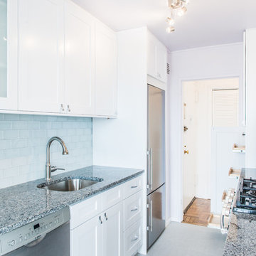
This small kitchen was way too small for this 2 bedrooms, 2 bathrooms apartment. Not only was it a very small kitchen, but the physical location of it made it very difficult to make it any bigger. There wasn't much that could have been done without incurring astronomical cost, which would get little or no return on the investment. The client wanted a kitchen that can be optimized in its current location to add a ton of value for resale.
This was difficult to do, because there was no moving of any mechanical around in the kitchen and even if we wanted to, the management of the building would not allow. For those of you who live in condos, co-ops or apartment building, you know how difficult it is to rework these foot prints. When we showed up, we saw the problems, but we also saw a huge opportunity where we can achieve those goals in the small space. This was accomplished by making some key changes and to incorporate some new things that was not possible when this kitchen was built years ago.
The crucial part of the design that would drive the entire new layout, was selecting the only appliance; that was the Refrigerator. Once we nailed down that refrigerator, we then proceeded to design the kitchen around it. We moved it to the other side of the wall where the sink was so that we can tap into the water line from the sink plumbing. It was crucial that it stays exactly 24" deep, not an inch more because we had to keep the entry as open as possible. Also, it was going to be directly in front of another big storage unit - The pantry. It is not ideal in most cases, but we needed the rest of the space to ramp up the design and open feel towards the side where all of the activities would take place, which happend to be the dining room and the view.
Once all that was figured out, we re-positioned the sink, dishwasher and the range and proceeded to wrap the cabinets around the columns to integrate them into the space. Thirty- six inches cabinets height was used so that they can be installed higher towards the ceiling height to give more room rather than the standard 18" required height between the counter tops. This was done to make the room feel a lot bigger than it really was. Not to mention, we also didn't want the faucet to be buried under the cabinets so that was also a necessary design detail for the space.
We then lowered both knee walls so that the counter top can sit on top of them, by removing that stop point that would have otherwise defined the kitchen area. This allowed us to pick up that extra footprint into the room for added prep space and enabled us to create the illusion of a kitchen that is looking longer than it really is. Every inch mattered when designing this kitchen and we made a conscious decision to use every one of that inch.
White cabinets were selected to do just what white cabinets are design to do; make a small or dark room appear bigger, brighter and more open. In this kitchen, this was amplified the more because of the kitchen location. It was perfect! We knew we did justice to the space because while we were there taking some photos, a few potential buyers walked in and went straight for the kitchen! They said its design just to fit the apartment.
Pantry roll out shelving, Double recycle bin, fancy handles, LED lighting, Quartz counter top, beautiful backslash tiles and grey linen floors finished off the kitchen which looked over a beautiful view of the George Washington Bridge from the top of this lovely 4th floor apartment.
Credit to Masterpiece Tile and Marble (Annmarie on the selection of Tiles and countertop and Val on the Construction to complete this project).
Davor Kokic Photography
 Klopf Architecture
Set in a quiet neighborhood and framed by mature trees, this residence presented a unique opportunity: to thoughtfully evolve a custom mid-century modern home into a space that supports the everyday rhythms of a growing family. With a deep respect for the home’s original architecture, Klopf Architecture reimagined the house to better meet the needs of its owners—introducing functional improvements while preserving the spirit and character of its mid-century roots.
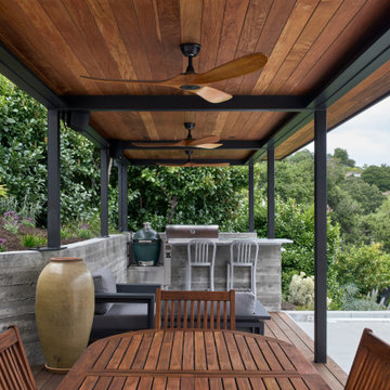
The clients approached Klopf Architecture with a clear vision: refresh their home while seamlessly integrating new programmatic elements. Key goals included clarifying and enhancing the entry sequence; connecting the detached garage to the main house with a practical yet architecturally intentional intervention; adding functional spaces such as a mudroom and laundry room; expanding and remodeling the primary suite’s bathroom and closet; and creating a more engaging outdoor space that capitalized on the site’s impressive views, featuring a fire pit and outdoor kitchen.
As a couple with distinct yet complementary perspectives—one focused on modern functionality and technology, and the other dedicated to preserving the home’s architectural integrity—their collaboration with Klopf Architecture resulted in a solution that harmonized both ideals. Their shared commitment to improving the livability of their home led to a design dialogue rooted in balance. This dynamic partnership shaped the direction of the renovation, ensuring that every decision honored the spirit of the original home while aligning with the practical needs of their growing family.
Designing within the constraints of the sloped site posed one of the project’s central challenges. The detached garage sat at a higher elevation than the main house, requiring a solution that ensured architectural and geometric compatibility between the two structures. Rather than create a purely utilitarian link, Klopf Architecture introduced an intentional connection that contributes to the overall architectural language. A notable pinch point in the plan—where differing geometries converged—was treated as a hinge point, turning a potentially awkward juncture into an architectural feature. This area now functions as both a transition and a moment of design interest that unifies the overall plan.
The design also addressed the underutilized outdoor area, which was located in a shadowed portion of the site with geometrical limitations. A new connection to the rear deck was created in this same area, making the outdoor space more useful and inviting. Klopf Architecture introduced carefully positioned openings and spatial improvements that forged a strong visual and functional connection between indoor and outdoor spaces. The outdoor area now reads as a deliberate extension of the home, embracing natural light and emphasizing the dramatic views.
Working through multiple design iterations, Klopf Architecture crafted a solution that preserved the architectural language of the original home while supporting the functional needs of modern life. The garage-to-house connection became more than a passage—it evolved into an architectural moment of transition. A new mudroom and laundry space enhanced convenience without compromising the clean lines of the design. The primary suite was expanded to create a private, serene retreat. The reimagined backyard, complete with fire pit and kitchen, now plays a vital role in the family’s daily routine and social life.
Outcomes and Lasting Impact
The result is a home that balances heritage with contemporary design, technical precision with design sensibility. The redesign not only met the clients’ initial goals but also exceeded expectations in its ability to seamlessly blend past and present, function and beauty, making the outdoor kitchen a favorite gathering place.
Beyond aesthetics, the renovation has significantly improved daily life for the family. The newly integrated garage connection has streamlined routines, providing a seamless transition between arriving home, storing belongings, and entering the main living spaces. The expanded primary suite offers a retreat-like atmosphere, creating a private space to unwind at the end of the day. The redesigned outdoor areas have also become an extension of their lifestyle—whether it's casual family dinners around the fire pit, entertaining friends in the outdoor kitchen, or simply enjoying the view from the reimagined backyard.
Through a thoughtful and strategic approach, the house has been successfully evolved into a home that remains true to its mid-century modern roots while enhancing livability, functionality, and the overall quality of life for the modern-day owners.
Klopf Architecture Team: Geoffrey Campen, Fernanda Bernardes
Architectural Interior Design: Klopf Architecture
Structural Engineer: Base Design Inc.
Contractor: Golden Snail Builders
Photography: Mariko Reed
Year Completed:2022
 Modern Citi Group: Renovations & Remodeling
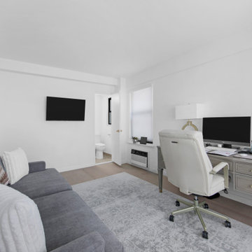
Modern Citi Group worked with Robyn on remodeling her newly purchased professional space in Murray Hill. This exciting renovation project included a full remodel of two bathrooms, kitchen, and three offices as well as the main waiting area. The primary objective was to modernize the space for professional aesthetics and functionality while adhering to the strict timeline and budget.
Every renovation project starts with the planning phase led by the project planners. During the in-person visit, Anna captured a 360 tour of the space to get accurate measurements and fast-track the project as well as align with the client on their design vision, remodeling priorities and budget.
The design challenge was to deliver modern aesthetics and functionality for a professional office while keeping the project within budget. The designers worked on several layouts and design visualizations so the client had options. Finally, the choice was made and Robyn felt confident in her decision.
The construction team transformed every corner of the space, breathing new life into it. They replaced the floors, refinished the walls and ceilings, installed new doors and windows, upgraded plumbing and electrical systems, and redesigned the office layout for optimal functionality and flow. Updated closet configuration with custom shelving, light fixtures and sliding barn doors enhanced the ergonomics of the work space.
The newly remodeled kitchen featured sleek matte white cabinetry and stunning quartz countertops, enhancing both functionality and storage. The bathrooms were masterfully renovated with exquisite new tiling, stylish fixtures, and upgraded plumbing and lighting.
In just a few weeks, Modern Citi Group has redefined the old apartment, transforming it into a sophisticated and professional space through this meticulous remodel. The result is a stunning blend of style, comfort, and efficiency. This remodel enhanced both employee satisfaction and new business for Robyn.
Find the right local pro for your project
 Green Gorge Construction
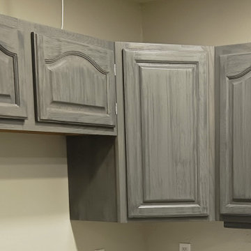
A fantastic find at the local Habitat for Humanity store led to the decision to repurpose a complete set of high-quality oak cabinets. These cabinets boast superior construction compared to what is typically available at large retail chains, featuring solid oak and plywood instead of inferior pressed materials. With only minor repairs required, the main task was to apply a finish that would complement the new kitchen design. The cabinets underwent a thorough cleaning, sanding, staining, and lacquering process, resulting in a distinctive and impressive look achieved affordably without compromising on quality.
 Living with Lolo
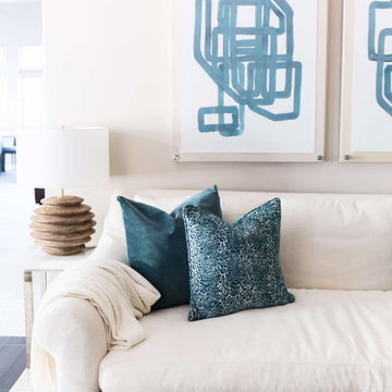
Living Room in West Trail Drive | Moody Modern Home in Scottsdale, AZ |
Room Type: Full home remodel and furnishings |
Project Name: West Trail Drive Residence |
Key Feature: A moody, modern aesthetic built from the ground up through renovation and furnishings, where every finish, fixture, and piece of furniture was selected to work as a cohesive whole rather than a collection of separate decisions.
Challenge: The home had good bones but felt generic. The clients wanted something that reflected a specific point of view, not a safe Scottsdale palette. The risk with moody, dark interiors is that they can feel heavy or disconnected if the layering isn't right.
Solution: Living with Lolo led both the remodel and the furnishings, which meant the design intent carried through from the walls and floors all the way to how the room actually lives. Because Lauren holds both an interior design credential and an active Arizona ROC general contractor license, there was no handoff between designer and contractor. That single point of accountability kept the vision intact and the project on track.
Materials: Custom cabinetry, natural stone surfaces, designer lighting, curated furniture and textiles sourced through Living with Lolo's trade relationships.
Budget: $150,000 to $400,000 |
Timeline: 4 to 8 months.
 Klopf Architecture
Set in a quiet neighborhood and framed by mature trees, this residence presented a unique opportunity: to thoughtfully evolve a custom mid-century modern home into a space that supports the everyday rhythms of a growing family. With a deep respect for the home’s original architecture, Klopf Architecture reimagined the house to better meet the needs of its owners—introducing functional improvements while preserving the spirit and character of its mid-century roots.
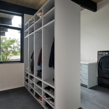
The clients approached Klopf Architecture with a clear vision: refresh their home while seamlessly integrating new programmatic elements. Key goals included clarifying and enhancing the entry sequence; connecting the detached garage to the main house with a practical yet architecturally intentional intervention; adding functional spaces such as a mudroom and laundry room; expanding and remodeling the primary suite’s bathroom and closet; and creating a more engaging outdoor space that capitalized on the site’s impressive views, featuring a fire pit and outdoor kitchen.
As a couple with distinct yet complementary perspectives—one focused on modern functionality and technology, and the other dedicated to preserving the home’s architectural integrity—their collaboration with Klopf Architecture resulted in a solution that harmonized both ideals. Their shared commitment to improving the livability of their home led to a design dialogue rooted in balance. This dynamic partnership shaped the direction of the renovation, ensuring that every decision honored the spirit of the original home while aligning with the practical needs of their growing family.
Designing within the constraints of the sloped site posed one of the project’s central challenges. The detached garage sat at a higher elevation than the main house, requiring a solution that ensured architectural and geometric compatibility between the two structures. Rather than create a purely utilitarian link, Klopf Architecture introduced an intentional connection that contributes to the overall architectural language. A notable pinch point in the plan—where differing geometries converged—was treated as a hinge point, turning a potentially awkward juncture into an architectural feature. This area now functions as both a transition and a moment of design interest that unifies the overall plan.
The design also addressed the underutilized outdoor area, which was located in a shadowed portion of the site with geometrical limitations. A new connection to the rear deck was created in this same area, making the outdoor space more useful and inviting. Klopf Architecture introduced carefully positioned openings and spatial improvements that forged a strong visual and functional connection between indoor and outdoor spaces. The outdoor area now reads as a deliberate extension of the home, embracing natural light and emphasizing the dramatic views.
Working through multiple design iterations, Klopf Architecture crafted a solution that preserved the architectural language of the original home while supporting the functional needs of modern life. The garage-to-house connection became more than a passage—it evolved into an architectural moment of transition. A new mudroom and laundry space enhanced convenience without compromising the clean lines of the design. The primary suite was expanded to create a private, serene retreat. The reimagined backyard, complete with fire pit and kitchen, now plays a vital role in the family’s daily routine and social life.
Outcomes and Lasting Impact
The result is a home that balances heritage with contemporary design, technical precision with design sensibility. The redesign not only met the clients’ initial goals but also exceeded expectations in its ability to seamlessly blend past and present, function and beauty, making the outdoor kitchen a favorite gathering place.
Beyond aesthetics, the renovation has significantly improved daily life for the family. The newly integrated garage connection has streamlined routines, providing a seamless transition between arriving home, storing belongings, and entering the main living spaces. The expanded primary suite offers a retreat-like atmosphere, creating a private space to unwind at the end of the day. The redesigned outdoor areas have also become an extension of their lifestyle—whether it's casual family dinners around the fire pit, entertaining friends in the outdoor kitchen, or simply enjoying the view from the reimagined backyard.
Through a thoughtful and strategic approach, the house has been successfully evolved into a home that remains true to its mid-century modern roots while enhancing livability, functionality, and the overall quality of life for the modern-day owners.
Klopf Architecture Team: Geoffrey Campen, Fernanda Bernardes
Architectural Interior Design: Klopf Architecture
Structural Engineer: Base Design Inc.
Contractor: Golden Snail Builders
Photography: Mariko Reed
Year Completed:2022
 Modern Citi Group: Renovations & Remodeling
Modern Citi Group worked with Robyn on remodeling her newly purchased professional space in Murray Hill. This exciting renovation project included a full remodel of two bathrooms, kitchen, and three offices as well as the main waiting area. The primary objective was to modernize the space for professional aesthetics and functionality while adhering to the strict timeline and budget.
Every renovation project starts with the planning phase led by the project planners. During the in-person visit, Anna captured a 360 tour of the space to get accurate measurements and fast-track the project as well as align with the client on their design vision, remodeling priorities and budget.
The design challenge was to deliver modern aesthetics and functionality for a professional office while keeping the project within budget. The designers worked on several layouts and design visualizations so the client had options. Finally, the choice was made and Robyn felt confident in her decision.
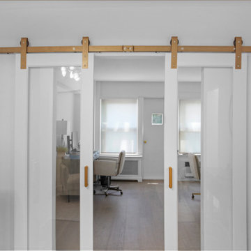
The construction team transformed every corner of the space, breathing new life into it. They replaced the floors, refinished the walls and ceilings, installed new doors and windows, upgraded plumbing and electrical systems, and redesigned the office layout for optimal functionality and flow. Updated closet configuration with custom shelving, light fixtures and sliding barn doors enhanced the ergonomics of the work space.
The newly remodeled kitchen featured sleek matte white cabinetry and stunning quartz countertops, enhancing both functionality and storage. The bathrooms were masterfully renovated with exquisite new tiling, stylish fixtures, and upgraded plumbing and lighting.
In just a few weeks, Modern Citi Group has redefined the old apartment, transforming it into a sophisticated and professional space through this meticulous remodel. The result is a stunning blend of style, comfort, and efficiency. This remodel enhanced both employee satisfaction and new business for Robyn.

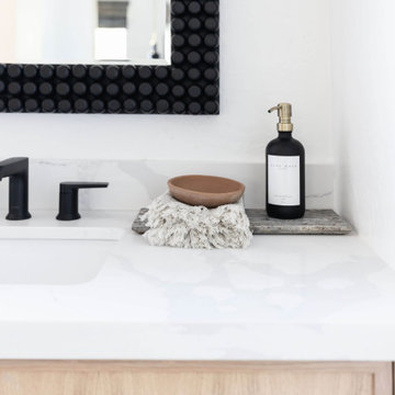 Living with Lolo
Bathroom in Ironwood Drive | Warm Modern Home in Scottsdale, AZ |
Room Type: Whole Home Remodel and Furnishings |
Project Name: Ironwood Drive Residence |
Key Feature: A Tuscan home transformed into a warm modern interior through a full remodel and furnishings, highlighted by a custom hand-painted terracotta tile backsplash, custom cabinetry, and a new fireplace clad in basalt black stone that anchors the living space with drama and elegance.
Challenge: Tuscan homes in Scottsdale are everywhere, and the design language that defined them, heavy wood, ornate details, dark iron, and rustic stone, does not transition gracefully on its own. The goal was to shed that Old World weight and move the home into something warmer and more current without losing the character that makes a remodeled home feel intentional rather than generic.
Solution: Living with Lolo led the full remodel and furnishings as a single integrated project, which meant every decision from the custom cabinetry to the final throw pillow was made in service of the same design vision. The hand-painted terracotta tile backsplash brought artisan character into the kitchen in a way that felt fresh rather than Tuscan, and the basalt black stone fireplace gave the living space a bold focal point that reads as distinctly modern. Because Lauren holds both an interior design credential and an active Arizona ROC general contractor license, the construction and design were managed under one roof with no gap between the two.
Materials: Custom hand-painted terracotta tile backsplash, custom cabinetry, basalt black stone fireplace, curated warm modern furnishings and textiles sourced through Living with Lolo's trade relationships.
Budget: $250,000 to $550,000 |
Timeline: Approximately 5 to 9 months from design through completion.
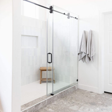 Living with Lolo
Bathroom in Ironwood Drive | Warm Modern Home in Scottsdale, AZ |
Room Type: Whole Home Remodel and Furnishings |
Project Name: Ironwood Drive Residence |
Key Feature: A Tuscan home transformed into a warm modern interior through a full remodel and furnishings, highlighted by a custom hand-painted terracotta tile backsplash, custom cabinetry, and a new fireplace clad in basalt black stone that anchors the living space with drama and elegance.
Challenge: Tuscan homes in Scottsdale are everywhere, and the design language that defined them, heavy wood, ornate details, dark iron, and rustic stone, does not transition gracefully on its own. The goal was to shed that Old World weight and move the home into something warmer and more current without losing the character that makes a remodeled home feel intentional rather than generic.
Solution: Living with Lolo led the full remodel and furnishings as a single integrated project, which meant every decision from the custom cabinetry to the final throw pillow was made in service of the same design vision. The hand-painted terracotta tile backsplash brought artisan character into the kitchen in a way that felt fresh rather than Tuscan, and the basalt black stone fireplace gave the living space a bold focal point that reads as distinctly modern. Because Lauren holds both an interior design credential and an active Arizona ROC general contractor license, the construction and design were managed under one roof with no gap between the two.
Materials: Custom hand-painted terracotta tile backsplash, custom cabinetry, basalt black stone fireplace, curated warm modern furnishings and textiles sourced through Living with Lolo's trade relationships.
Budget: $250,000 to $550,000 |
Timeline: Approximately 5 to 9 months from design through completion.
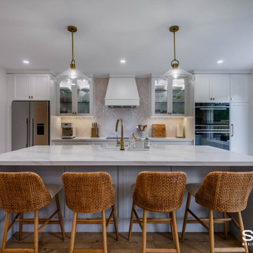
 Sosna Inc
Our clients, a vibrant young family with two energetic kids and a playful dog, were feeling the constraints of their outdated, cramped house. The Main Floor was divided by walls, fragmenting the Kitchen, Dining Room, and living areas, making family time and entertaining a bit of a struggle.
The Kitchen was small and dim, lacking counter space and storage. The kids' study/play table was squeezed into a tight corner, emphasizing the lack of space. The dark hardwood floors were scratched and worn, and the foyer felt cramped and uninviting. The powder room was also
The idea of a major renovation brought both excitement and a bit of anxiety. The couple was unsure about design decisions and worried about the challenges of dealing with structural columns and beams.
Collaborating with Sosna designer Camila, the family embarked on a journey to transform their outdated house into a bright, functional home.
To open up the space, walls were removed, creating a seamless flow between the foyer, living room, dining room, and kitchen.
The kitchen was relocated and expanded to include generous counter space and a large island, providing the ideal spot for the kids to help prepare meals—a task they’ve come to enjoy since the renovation—or work on their homework. Additionally, the addition of a cozy window bench offers extra seating for hanging out with the family. It’s also the perfect place to curl up with a good book.
The once dark and gloomy powder room was completely refreshed with new fixtures, a white oak vanity, and beautiful floor tiles, which significantly brightened it up.
Additionally, the dark hardwood floors were replaced with a lighter, more modern option, brightening the entire main floor.
The renovation wasn't without its hiccups. A mix-up with the hardwood flooring led to a last-minute scramble for a replacement. But in the end, the family fell in love with the new flooring, proving that sometimes unexpected changes can lead to even better outcomes.
The renovation completely transformed the home. What was once a cramped and segmented main floor is now a bright, open space perfectly suited to the family's lifestyle. The new kitchen island became the heart of the home, providing a place for the kids to do homework while their parents cooked, fostering a sense of togetherness. The open layout also made hosting gatherings effortless.
Throughout the renovation, the kids and their dog brought a playful energy to the construction site, forming a special bond with the crew. Despite the challenges of living through a renovation, the family managed to maintain a sense of normalcy, working from home when possible and appreciating the crew's efforts to keep things tidy.
What started as a simple update turned into a full-scale transformation that reflects the family’s needs and personal style. Their willingness to embrace bold design choices, such as blush pink tiles and bright floral patterns, adds a unique touch to the space. And that hardwood flooring mix-up? It turned out to be a happy accident, resulting in a floor they love even more.
In the end, this renovation was more than just a home makeover; it was about creating a space that truly feels like home, nurturing family connections, and bringing joy to everyday life.
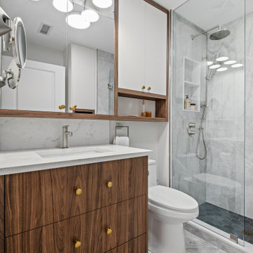 Sosna Inc
This project centered on helping a wonderful client and her equally fantastic dog transform her condo into a space that truly reflected her style and simplified her life. Eager to create a home that was both beautiful and functional, she envisioned a haven in the heart of the city.
Before: Feeling Disconnected
Before the renovation, our client felt disconnected from her condo. The builder-grade kitchen was a constant source of frustration, with an awkward peninsula that hindered the flow of the space. The condo overall felt outdated and no longer captured her vibrant personality. The foyer and laundry areas were cramped and lacked organization, while the mismatched hardwood flooring only added to the disjointed atmosphere. As for the bathrooms, they felt frozen in time, desperately needing an update.
Worries and Concerns
Like many homeowners, our client had heard her fair share of renovation horror stories—tales of projects gone awry and the frustrations of managing multiple contractors. She was understandably cautious and needed a trustworthy, experienced team she could rely on to handle the project with care and expertise.
The Solution: A Personalized Transformation
We took the time to listen carefully to our client’s needs and concerns and developed a tailored plan to address each of her pain points. For the kitchen, we preserved the existing layout but reimagined the space entirely. The awkward peninsula was redesigned to improve traffic flow and provide much-needed storage and counter space. Clever storage solutions, such as pull-outs, shelving, concealed drawers in the toe kicks, and an appliance garage, were incorporated. The kitchen now boasts a warm and inviting atmosphere, with light wood-tone lower cabinetry, off-white upper cabinets, and brushed nickel hardware that ties it all together.
The laundry room, once cramped and chaotic, was transformed into an organized, efficient space. We added custom cabinetry with pull-outs for hanging clothes, open storage above, a laundry sink, and a spacious counter for folding—no more piles of laundry!
Both the en-suite and shared bathrooms underwent complete renovations. Custom cabinetry was installed, including a floor-to-ceiling linen closet, and light grey and brown-toned tiles were selected, with contrasting hexagonal tiles for the shower floor. A heated flooring system was added for luxury and comfort year-round.
The mismatched flooring throughout the condo was replaced with cohesive vinyl and porcelain tiles, creating a seamless, modern aesthetic throughout the space.
Overcoming Challenges
As with any renovation, there were challenges to navigate. One of the key obstacles was managing the condo board’s renovation rules and policies while coordinating the delivery schedules for finishes and fixtures, especially during the busy holiday season. With careful planning, we ensured the project stayed on track. Additionally, we encountered a height variation between the tile and vinyl flooring. To resolve this, we used self-leveling material under the vinyl, ensuring a smooth and seamless transition between the two flooring types.
The Grand Reveal: A Dream Come True
The final result is simply stunning. The kitchen is now a chef’s dream, with custom-built cabinets, smooth quartz countertops, and a matching stone backsplash. Brushed nickel and stainless steel plumbing fixtures, elegant cabinet hardware, and LED lighting under the upper cabinets add the perfect finishing touches. Custom organizers in the foyer and laundry closets provide ample storage and keep everything neatly in place. The bathrooms have been transformed into spa-like retreats, with beautiful porcelain tiles and custom cabinetry. The new vinyl flooring throughout the main living areas and bedroom unifies the space, creating a cohesive and modern atmosphere.
Life Transformed
Our client’s life has been completely transformed. As a passionate cook, she now relishes spending time in her beautiful and functional kitchen. The single-bowl sink makes cleanup a breeze, and the thoughtfully designed storage solutions have brought a sense of calm and order to her home. The refreshed flooring and neutral paint palette have created a relaxing, comfortable environment she truly loves.
A Memorable Journey
This project was more than just a renovation—it was a collaboration. Our client valued our guidance throughout the design process, particularly when faced with the overwhelming number of decisions. We built a strong relationship with her, and we are immensely grateful for the trust she placed in our team.
 NoviDesignHub
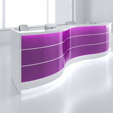
The collection ‘Valde’ by MDD Office Furniture is high functional and beautifully crafted product. The company presents a huge variety of products for all industrial office interiors. Unique industrial reception desks from this collection are customizable for any preferences. Straight, convex and concave elements are at your disposal in any of the numerous wavy, circular and upright arrangements, which perfectly create the feeling of style and integrity for the reception area. Being a superb workspace, Valde also stands out for its creative design and cogent elegance emphasized by the precision of details. Horizontal slats made of aluminum emphasize a shape and a modern character of the body. The desk top made of tempered white glass perfectly matches the glittering frontal part of the counter. LED lighting located under the upper desk top and at the basis of the counter makes the reception desk presenting perfectly in darker rooms. The variety of products presented in this collection doesn’t leave anything to be desired. The collection ‘Valde’ by MDD Office Furniture is the best decision to be installed in any interior.
 Living with Lolo
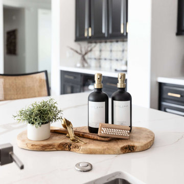
Kitchen in Ironwood Drive | Warm Modern Home in Scottsdale, AZ |
Room Type: Whole Home Remodel and Furnishings |
Project Name: Ironwood Drive Residence |
Key Feature: A Tuscan home transformed into a warm modern interior through a full remodel and furnishings, highlighted by a custom hand-painted terracotta tile backsplash, custom cabinetry, and a new fireplace clad in basalt black stone that anchors the living space with drama and elegance.
Challenge: Tuscan homes in Scottsdale are everywhere, and the design language that defined them, heavy wood, ornate details, dark iron, and rustic stone, does not transition gracefully on its own. The goal was to shed that Old World weight and move the home into something warmer and more current without losing the character that makes a remodeled home feel intentional rather than generic.
Solution: Living with Lolo led the full remodel and furnishings as a single integrated project, which meant every decision from the custom cabinetry to the final throw pillow was made in service of the same design vision. The hand-painted terracotta tile backsplash brought artisan character into the kitchen in a way that felt fresh rather than Tuscan, and the basalt black stone fireplace gave the living space a bold focal point that reads as distinctly modern. Because Lauren holds both an interior design credential and an active Arizona ROC general contractor license, the construction and design were managed under one roof with no gap between the two.
Materials: Custom hand-painted terracotta tile backsplash, custom cabinetry, basalt black stone fireplace, curated warm modern furnishings and textiles sourced through Living with Lolo's trade relationships.
Budget: $250,000 to $550,000 |
Timeline: Approximately 5 to 9 months from design through completion.

Sponsored
Sunbury, OH

J.Holderby - Renovations
Franklin County's Leading General Contractors - 2X Best of Houzz!
 RAJ Kitchen and Bath, LLC
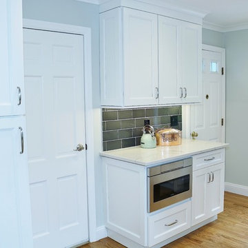
This is a perfect example of how we work, and why our clients choose to work with us once they meet us. Kitchen remodel is not only about buying Cabinets. It’s much, much more than that. It’s finding the right people who can think on the fly/outside the box. Who can design/re-design and execute the details even when they have to make delicate and complicated decisions in the field to help keep the project on time.
White solid Wood Cabinets, double crown moldings, Drawer microwave, pot filler, and large 30” undermount stainless steel sink with a tall faucet to anchor it. Bold backsplash tiles, elegant 36” professional hood, light rail moldings, pull out Drawers and organizers inside of the cabinets, LED lighting on dimmer switches all combined with new matching wood flooring made this kitchen stand out in this space.
Cabinets, Countertop and design were provided by RAJ team, along with other collaborative team work between our recommended General Contractor and our client. The entire team was awesome and the project was beautifully executed!
 RAJ Kitchen and Bath, LLC
**Check out the video of this transformation on our website**
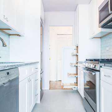
This small kitchen was way too small for this 2 bedrooms, 2 bathrooms apartment. Not only was it a very small kitchen, but the physical location of it made it very difficult to make it any bigger. There wasn't much that could have been done without incurring astronomical cost, which would get little or no return on the investment. The client wanted a kitchen that can be optimized in its current location to add a ton of value for resale.
This was difficult to do, because there was no moving of any mechanical around in the kitchen and even if we wanted to, the management of the building would not allow. For those of you who live in condos, co-ops or apartment building, you know how difficult it is to rework these foot prints. When we showed up, we saw the problems, but we also saw a huge opportunity where we can achieve those goals in the small space. This was accomplished by making some key changes and to incorporate some new things that was not possible when this kitchen was built years ago.
The crucial part of the design that would drive the entire new layout, was selecting the only appliance; that was the Refrigerator. Once we nailed down that refrigerator, we then proceeded to design the kitchen around it. We moved it to the other side of the wall where the sink was so that we can tap into the water line from the sink plumbing. It was crucial that it stays exactly 24" deep, not an inch more because we had to keep the entry as open as possible. Also, it was going to be directly in front of another big storage unit - The pantry. It is not ideal in most cases, but we needed the rest of the space to ramp up the design and open feel towards the side where all of the activities would take place, which happend to be the dining room and the view.
Once all that was figured out, we re-positioned the sink, dishwasher and the range and proceeded to wrap the cabinets around the columns to integrate them into the space. Thirty- six inches cabinets height was used so that they can be installed higher towards the ceiling height to give more room rather than the standard 18" required height between the counter tops. This was done to make the room feel a lot bigger than it really was. Not to mention, we also didn't want the faucet to be buried under the cabinets so that was also a necessary design detail for the space.
We then lowered both knee walls so that the counter top can sit on top of them, by removing that stop point that would have otherwise defined the kitchen area. This allowed us to pick up that extra footprint into the room for added prep space and enabled us to create the illusion of a kitchen that is looking longer than it really is. Every inch mattered when designing this kitchen and we made a conscious decision to use every one of that inch.
White cabinets were selected to do just what white cabinets are design to do; make a small or dark room appear bigger, brighter and more open. In this kitchen, this was amplified the more because of the kitchen location. It was perfect! We knew we did justice to the space because while we were there taking some photos, a few potential buyers walked in and went straight for the kitchen! They said its design just to fit the apartment.
Pantry roll out shelving, Double recycle bin, fancy handles, LED lighting, Quartz counter top, beautiful backslash tiles and grey linen floors finished off the kitchen which looked over a beautiful view of the George Washington Bridge from the top of this lovely 4th floor apartment.
Credit to Masterpiece Tile and Marble (Annmarie on the selection of Tiles and countertop and Val on the Construction to complete this project).
Davor Kokic Photography
 My Kitchen And Bath
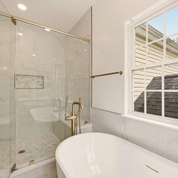
A complete primary bathroom remodel in Springfield, Virginia, designed around three priorities our clients came in with: a real walk-in shower, a freestanding tub by the windows, and a proper double vanity with storage that actually worked.
The original layout had everything in the wrong place. The tub sat against an interior wall away from the natural light. A small stall shower took up real estate across the room. The vanity was squeezed into whatever space was left over. Three windows on the back wall were doing nothing for the room because the layout was fighting them. Our solution involved knocking down the dividing wall between the old shower and vanity area, relocating plumbing for both the tub and the new vanities, and placing the freestanding tub directly under the bay of windows so morning light became part of the experience.
Design Approach
We anchored the room around contrast: deep navy cabinetry against soft white walls, warm brushed gold against cool marble tile, sharp Shaker lines against the curved silhouette of the freestanding tub. Navy was the design decision the rest of the room was built around — the clients knew they wanted color but didn't want anything that would feel dated in five years. Navy reads bold without being loud, pairs with virtually any metal finish, and has staying power that trendier choices don't.
We used Fabuwood Galaxy Indigo for the vanities — all-plywood construction with solid wood doors and drawer fronts, soft close throughout. Shaker-style flat panels keep the navy from feeling heavy. The brushed gold (Jeffrey Alexander 635-96SBZ in satin bronze) shows up across hardware, faucets, lighting, the tub filler, and the shower trim, creating a quiet continuity throughout the room.
The Shower
Removing the wall between the old shower and old vanity area created room for a proper walk-in. We tiled the entire shower floor to ceiling in Decovita Calacatta Suave 24x48" porcelain — large format installed in a 50% offset horizontal pattern, with cement board and redgard underneath. The marble-look porcelain gives the visual depth of natural marble without the maintenance.
A built-in shower bench, custom-built into the corner, is wrapped in the same wall tile on the front with a quartz top matching the vanity counter. The shower niche is detailed with MSI Arabescato Carrara 2" honed hex mosaic at the back, the same tile used on the shower floor. All tile edges are finished with Schluter in satin bronze to match the room's metal finishes. The shower door is custom frameless 3/8" tempered glass with a satin bronze pull — no metal frame interrupting the sight line.
The Vanities and Countertops
The new double vanity gives both clients their own space for morning routines. Counter tops are MSI Calacatta Miraggio Cielo quartz with pencil edging and a 4" backsplash — a soft white with subtle gray veining that reads like real Calacatta marble without the porosity issues. Two undermount square porcelain sinks finish the surface cleanly.
The Tub
A 60" freestanding soaker tub sits under the bay of three windows. The floor-mounted tub filler is satin bronze with a handheld sprayer. We relocated the drain and supply lines to make the centered placement work. The tub is the room's quietest feature and its strongest — clients tell us they use this bathroom differently than they used the old one.
Flooring
MSI Sande Ivory 12x24" matte porcelain runs throughout the bathroom floor in a 50% offset pattern parallel to the vanity wall. Cement board underneath, 4" white wood baseboard, Whisper Grey grout that handles daily use without showing wear.
Paint and Lighting
Walls are Benjamin Moore Chantilly Lace 2121-70 in satin — a true crisp white that doesn't lean cool or warm. The ceiling uses Benjamin Moore Aura Bath and Spa White, which is formulated to resist mildew in high-humidity spaces. Lighting is layered: three new 6" LED recessed lights on a dimmer, two satin bronze vanity sconces above the mirrors, and the existing three windows providing the daytime ambient light.
Project Specs
Location: Springfield, Virginia
Project type: Full primary bathroom remodel
Project duration: Approximately 5 weeks
Style: Modern, Transitional
Color palette: Navy, white, brushed gold, marble
Materials
Cabinetry: Fabuwood Galaxy Indigo, Shaker-style flat panel maple, all-plywood construction
Cabinet hardware: Jeffrey Alexander 635-96SBZ Satin Bronze pulls
Vanity counter and bench top: MSI Calacatta Miraggio Cielo Quartz, pencil edge with 4" backsplash
Sinks: Undermount white porcelain BR-202 square (x2)
Wall tile: Decovita Calacatta Suave 24x48" porcelain
Floor tile: MSI Sande Ivory 12x24" matte porcelain
Shower floor + niche back: MSI Arabescato Carrara 2" honed hex mosaic marble
Edge trim: Schluter satin bronze
Shower door: Custom frameless 3/8" tempered glass
Tub: 60" freestanding acrylic soaker (Ferguson)
Tub filler: Floor-mounted satin bronze (Ferguson)
Vanity faucets, mirrors, sconces, toilet: Satin bronze coordinated finishes (Ferguson)
Wall paint: Benjamin Moore Chantilly Lace 2121-70 Satin
Ceiling paint: Benjamin Moore Aura Bath and Spa White
Grout: Whisper Grey (floor), Standard White (walls and shower)
Designed and built by My Kitchen and Bath out of our Alexandria showroom at 5710 General Washington Drive. We've been designing and building kitchens, bathrooms, and full home renovations across Northern Virginia and the DMV since 1994.
 Design Matters
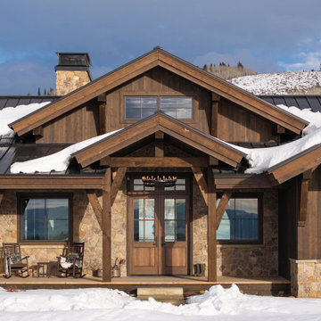
Perched in the rolling landscape of Alta, Wyoming, this legacy home was thoughtfully designed to belong to the land, not dominate it. Nestled into the hillside with sweeping views of the elk migration path and the Teton Range, every decision was made with future generations in mind. Led by Julie Cavanaugh, this project reflects her passion for designing legacy homes...places that honor family history, respect the land, and are built to be passed down for generations. With roots on this property dating back to the late 1800s, the homeowners envisioned a home that would tell their family’s story well into the future.
As featured in the latest edition of Mountain Living Magazine, this home is more than a retreat, it’s a promise to the past and a gift to generations to come.
With 70 acres of land, this timber framed home totals 5,752 sf. - 4 bed, 4.5 bath
Sponsored
Westerville, OH

Inspired Closets Columbus
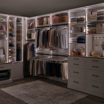
Innovative & Creative Custom Closet Designer Servicing Franklin County
 Klopf Architecture
Set on a narrow hillside lot overlooking the San Francisco Bay in Point Richmond, California, Bay Heirloom is a Mid-Century Modern family home restored, modernized and adapted for contemporary living. Oriented south-southwest toward the Marin Headlands, with views of the Golden Gate Bridge, the residence captures shifting Bay light throughout the day, from fog-muted mornings to vivid, glowing sunsets.
The home was built by Karlyn Neel’s grandfather, the owner of the construction company Flo-Crete, one of the Bay Area’s early concrete pumping firms. Flo-Crete completed the foundation and structural concrete work, with family photographs documenting the original cinderblock walls and pours. The firm also contributed to major regional infrastructure projects, including the Transbay BART tube and Candlestick Park, situating the house within a broader legacy of Bay Area construction. Growing up, Neel spent considerable time in the home, developing an early appreciation for mid-century modern principles. Instead of parting with this family heirloom, she purchased the home from her grandfather’s estate.
While her grandfather continued to live in the Point Richmond house, Neel purchased a Mid-Century Modern residence in Palm Desert. In contrast to the Bay Area’s cool temperatures, salt air, and persistent winds, the desert home is shaped by heat and sun and requires a different material response. A substantial renovation she led there emphasized thermal performance, filtered light, and restrained detailing. The experience later informed the restoration of her Bay Area family home.
What began as a modest Mid-Century Modern update expanded when decades of exposure to marine conditions revealed leaks and significant structural and seismic deficiencies. Neel was determined to honor her grandfather’s perseverance and without hesitation pivoted to a much more intensive project. Addressing these challenges required close coordination between Neel, Klopf Architecture and Kasten Builders, with architectural restraint and construction precision guiding each intervention. Rather than alter the home’s defining features, the project focused on reinforcing the structure from within. Discreet beams were embedded along the rear facade and in an upstairs wall, strengthening the building while maximizing the wall of glass facing the Bay and opening the wall between the kitchen and the living space. These structural interventions allowed the space to open fully to the Bay without visual interruption, with the kitchen repositioned as the social and functional core of an open, continuous living space. The building envelope was updated using weather- and corrosion-resistant materials appropriate to the marine environment.
The house unfolds vertically from the street, beginning with a modest garage level and workshop, with the main living spaces located below. Original slate flooring at the entry was preserved, along with select furnishings and artwork collected by Neel’s grandfather, anchoring the restored interior in its past. A restrained palette of black accents and pale, natural finishes replaces darker wood tones, reinforcing openness and calm. A naturally illuminated stair connects to the lowest level, where a former basement was transformed into a guest suite and family room opening onto a deck. From there, steps lead directly to a small concrete boat ramp at the water’s edge.
Throughout the project, decisions were guided by continuity rather than transformation for its own sake. Lessons drawn from both desert and coastal climates informed a material strategy rooted in performance and restraint. Bay Heirloom stands as a measured evolution of a family house, structurally renewed and carefully modernized, grounded in the discipline and care that first shaped it.
Klopf Architecture Project Team: John Klopf, AIA, Angela Todorova and Fernanda Bernardes
Landscape Architect: Huettl Landscape Architecture
General Contractor: Kasten Builders
Photography: ©2025 Mariko Reed
Year Completed: 2022
Location: Point Richmond, CA
 Modern Citi Group: Renovations & Remodeling
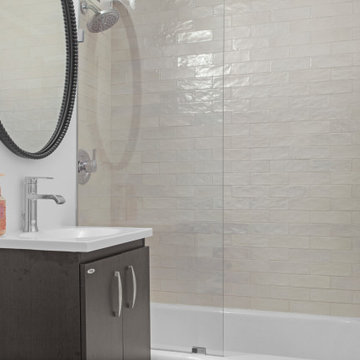
Modern Citi Group worked with Robyn on remodeling her newly purchased professional space in Murray Hill. This exciting renovation project included a full remodel of two bathrooms, kitchen, and three offices as well as the main waiting area. The primary objective was to modernize the space for professional aesthetics and functionality while adhering to the strict timeline and budget.
Every renovation project starts with the planning phase led by the project planners. During the in-person visit, Anna captured a 360 tour of the space to get accurate measurements and fast-track the project as well as align with the client on their design vision, remodeling priorities and budget.
The design challenge was to deliver modern aesthetics and functionality for a professional office while keeping the project within budget. The designers worked on several layouts and design visualizations so the client had options. Finally, the choice was made and Robyn felt confident in her decision.
The construction team transformed every corner of the space, breathing new life into it. They replaced the floors, refinished the walls and ceilings, installed new doors and windows, upgraded plumbing and electrical systems, and redesigned the office layout for optimal functionality and flow. Updated closet configuration with custom shelving, light fixtures and sliding barn doors enhanced the ergonomics of the work space.
The newly remodeled kitchen featured sleek matte white cabinetry and stunning quartz countertops, enhancing both functionality and storage. The bathrooms were masterfully renovated with exquisite new tiling, stylish fixtures, and upgraded plumbing and lighting.
In just a few weeks, Modern Citi Group has redefined the old apartment, transforming it into a sophisticated and professional space through this meticulous remodel. The result is a stunning blend of style, comfort, and efficiency. This remodel enhanced both employee satisfaction and new business for Robyn.
 Klopf Architecture
Set in a quiet neighborhood and framed by mature trees, this residence presented a unique opportunity: to thoughtfully evolve a custom mid-century modern home into a space that supports the everyday rhythms of a growing family. With a deep respect for the home’s original architecture, Klopf Architecture reimagined the house to better meet the needs of its owners—introducing functional improvements while preserving the spirit and character of its mid-century roots.
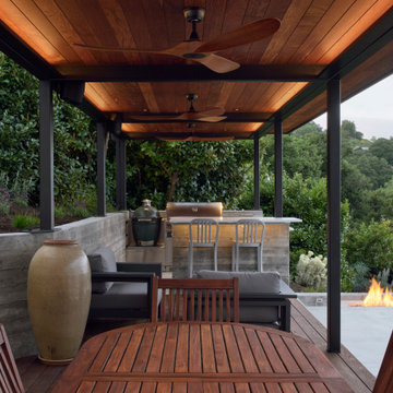
The clients approached Klopf Architecture with a clear vision: refresh their home while seamlessly integrating new programmatic elements. Key goals included clarifying and enhancing the entry sequence; connecting the detached garage to the main house with a practical yet architecturally intentional intervention; adding functional spaces such as a mudroom and laundry room; expanding and remodeling the primary suite’s bathroom and closet; and creating a more engaging outdoor space that capitalized on the site’s impressive views, featuring a fire pit and outdoor kitchen.
As a couple with distinct yet complementary perspectives—one focused on modern functionality and technology, and the other dedicated to preserving the home’s architectural integrity—their collaboration with Klopf Architecture resulted in a solution that harmonized both ideals. Their shared commitment to improving the livability of their home led to a design dialogue rooted in balance. This dynamic partnership shaped the direction of the renovation, ensuring that every decision honored the spirit of the original home while aligning with the practical needs of their growing family.
Designing within the constraints of the sloped site posed one of the project’s central challenges. The detached garage sat at a higher elevation than the main house, requiring a solution that ensured architectural and geometric compatibility between the two structures. Rather than create a purely utilitarian link, Klopf Architecture introduced an intentional connection that contributes to the overall architectural language. A notable pinch point in the plan—where differing geometries converged—was treated as a hinge point, turning a potentially awkward juncture into an architectural feature. This area now functions as both a transition and a moment of design interest that unifies the overall plan.
The design also addressed the underutilized outdoor area, which was located in a shadowed portion of the site with geometrical limitations. A new connection to the rear deck was created in this same area, making the outdoor space more useful and inviting. Klopf Architecture introduced carefully positioned openings and spatial improvements that forged a strong visual and functional connection between indoor and outdoor spaces. The outdoor area now reads as a deliberate extension of the home, embracing natural light and emphasizing the dramatic views.
Working through multiple design iterations, Klopf Architecture crafted a solution that preserved the architectural language of the original home while supporting the functional needs of modern life. The garage-to-house connection became more than a passage—it evolved into an architectural moment of transition. A new mudroom and laundry space enhanced convenience without compromising the clean lines of the design. The primary suite was expanded to create a private, serene retreat. The reimagined backyard, complete with fire pit and kitchen, now plays a vital role in the family’s daily routine and social life.
Outcomes and Lasting Impact
The result is a home that balances heritage with contemporary design, technical precision with design sensibility. The redesign not only met the clients’ initial goals but also exceeded expectations in its ability to seamlessly blend past and present, function and beauty, making the outdoor kitchen a favorite gathering place.
Beyond aesthetics, the renovation has significantly improved daily life for the family. The newly integrated garage connection has streamlined routines, providing a seamless transition between arriving home, storing belongings, and entering the main living spaces. The expanded primary suite offers a retreat-like atmosphere, creating a private space to unwind at the end of the day. The redesigned outdoor areas have also become an extension of their lifestyle—whether it's casual family dinners around the fire pit, entertaining friends in the outdoor kitchen, or simply enjoying the view from the reimagined backyard.
Through a thoughtful and strategic approach, the house has been successfully evolved into a home that remains true to its mid-century modern roots while enhancing livability, functionality, and the overall quality of life for the modern-day owners.
Klopf Architecture Team: Geoffrey Campen, Fernanda Bernardes
Architectural Interior Design: Klopf Architecture
Structural Engineer: Base Design Inc.
Contractor: Golden Snail Builders
Photography: Mariko Reed
Year Completed:2022
16