
Search results for "Decision making process" in Home Design Ideas

 Giffin & Crane General Contractors, Inc.
Bathroom.
Tuscan alcove bathtub photo in Santa Barbara with an undermount sink, dark wood cabinets and recessed-panel cabinets
Tuscan alcove bathtub photo in Santa Barbara with an undermount sink, dark wood cabinets and recessed-panel cabinets

 Adrienne DeRosa
Adrienne DeRosa © 2014 Houzz Inc.
Along with the living room, this dining area has received a style overhaul. "Everything in the informal dining space as well as the living room is new," Jennifer explains. "I changed it all; the walls used to be grey and the furniture used to be off white. I had antique chippy paint cabinets and all kinds of french decor ... I have evolved from that and now want simple, fun and bright."
Starting with painting the walls white, Jennifer let the room evolve as she went. "Then I started to move the furniture around to see what I had, to make sure it worked," she describes. From there it became a process of eliminating and adding back in. The brass shelving was a "picking" find that Jennifer retrieved from the side of the road.
By emphasizing the large windows with white drapery, and adding in soft textural elements, Jennifer created a fresh space that exudes depth and comfort. "I would never want anyone to ever come in and say they don't feel comfortable. I feel I have created that chic, fun, eclectic style space that anyone of any age can enjoy and feel comfortable in."
Curtain rods, pendant lamp: West Elm; chairs: vintage Russell Woodard, Etsy
Adrienne DeRosa © 2014 Houzz

 Advance Design Studio, Ltd.
After six years of living in their Huntley IL home, Chris and Meghan were tired of their dark, dingy, outdated kitchen and it was finally time for a long-anticipated change. “The kitchen is the place where we live, it’s where we do everything,” Meghan said. “It was important that it be a space where we wanted to be.” Meghan loves cooking and enjoys including their girls in healthy meal prepping, this led them to want a brighter, more enjoyable kitchen with increased functionality and improved storage.
For Chris especially, the laundry room was an entirely dysfunctional eyesore. “We had a washer and a dryer, but it was all kind-of cobbled together!” Chris said. “There were always laundry piles everywhere, we weren’t really sure what we wanted to do in there, but it was time for us to make a change.” The mess of the space was stressful every time they walked in the door from the garage each day. Kids’ backpacks and shoes piled up haphazardly in the makeshift boot-bench closet left the family feeling disorganized and stressed. They needed space for folding clothes and locker cubbies to help keep the family organized.
Having known Christine and Todd in the Huntley community for years, Chris and Meghan were familiar with their work. “We already trusted them personally and having seen their projects for years we knew they did top notch work. After we reviewed the initial round of designs, we knew that hiring them was definitely the right choice,” Meghan and Chris said. Although Chris had done a lot of work in their home himself, the kitchen and laundry room renovation was such a large undertaking that he didn’t want to steal time away from his family to spend what would surely be many long weekends doing the job himself. “That would not have been a wise choice for us,” Chris laughed.
“Our designer, Michelle was very, very, easy to work with; anything we wanted to see or weren’t sure about, she went above and beyond to make this easy for us. She was easy to get hold of and always quick to respond,” the couple said. Michelle pulled ideas that mirrored the couple’s taste and style and was adept at directing the couple to limited choices that didn’t overwhelm them and kept the process moving. “I have a hard time making decisions. Michelle made the decision-making process so easy. I loved how she listened to what I liked and then presented three great options for me to choose from,” Meghan said.
The main objectives for the kitchen were better storage solutions, they wanted the space to reflect their lifestyle and taste, and they wanted it to last for years with low maintenance. One of the first steps in creating a more functional kitchen was relocating the refrigerator, creating an improved workflow for the busy family.
“We didn’t know that we could even move the refrigerator to a new location where it is now, that was something that we never would have thought of,” Chris said. “The new refrigerator location makes the kitchen feel so much bigger. We didn’t add any space, but our whole kitchen with the new design just seems like it’s so much larger than before!” Meghan said.
The perimeter mist colored cabinets helped warm and brighten the entire room, while the graphite colored cabinets on the island added contrast. Using this fresh, clean color palette satisfied the couple’s desire for a bright space that was the exact opposite of what they had before. Organization accessories were also added to the cabinets such as a spice drawer tray and roll outs to create hidden convenience.
“I absolutely love the hidden spices – it makes cooking so much more enjoyable!” Chris said. “And all the pull outs, and the double trash bin, who would think you could get so excited about organization!” the couple said in unison.
One thing they hated in their original kitchen was how dark the space felt. Added lighting on the ceiling with the new light fixtures combined with the lighter cabinetry colors throughout solved this problem. “Our new kitchen has this warm, almost cozy feeling that our old kitchen never had, it’s just a space that I love spending my time in now,” Meghan said. The light airy feeling was accentuated with the use of floating white shelves on either side of the decorative range hood. “We have so much cabinetry space, the new design is amazing we actually have more storage space than we will ever need,” Meghan said.
The island was extended to create more work surface and added space for stool seating. “The new island changes how we live. Now the kids can be in the kitchen with us, doing homework, eating breakfast, and the three of us have special dinners there when Chris is working late,” Meghan said.
The Carrara Marmi Quartz countertops were chosen because they are, not only beautiful, but are made from hard-working material that doesn’t require maintenance. The white subway tile backsplash that wraps to the ceiling behind the focal point cooktop range/hood compliments the crisp white countertops perfectly, while brushed brass hardware and light fixtures keep the design fresh and new.
The couple had a few fears at the beginning of the project, as most homeowners do. Their biggest fear was being out of their kitchen and laundry room for an extended time. The crew made it very easy for the family to work in a limited space keeping the washer and dryer hooked up the majority of the time, and also getting appliances working with minimal downtime.
“They above and beyond accommodated us to get us through the process,” Meghan said. “They did a great job making sure we were as comfortable as possible throughout the process,” Chris added.
“Our project manager DJ did a great job. He was very good at updating us on schedule changes, getting guys in as quickly as possible. Everyone that stepped in the house was nice and did great work,” said Chris. They thought Advance’s carpenter was phenomenal and were impressed when he took a conceptual idea from a photograph and worked with designer Michelle to create a one of a kind range/hood that has become the topic of conversation with friends and family who visit the new kitchen. “He was in our house literally every day for several weeks. He was easy to work with and good at what he did,” Meghan and Chris said.
The focal point of the kitchen; a hand-crafted, custom-built ventilation hood was clad with handpicked reclaimed barnwood. Advance Design’s carpenter built the framework and the cladding to create a one-of-a-kind design element that the couple loves.
“I think it was especially fun for him to create something unique from scratch, showcasing his talent in this area,” Meghan said. “I love that my kitchen is not like everyone else’s. I got to pick out the wood on my hood and watch it being built and was able to choose what pieces of wood went where on it. It’s totally unique.”
Red Oak flooring was toothed-in throughout the kitchen and the rest of the first floor anywhere changes were made. Then the whole floor was refinished to tone down the orange undertones in the existing floor stain, ultimately changing the color complexion of the entire first floor. The result is a completely new feeling to the entire home.
Renovating the laundry room was extremely important to Meghan and Chris, but they had trouble visualizing what the possibilities were for the seemingly small space. Michelle produced beautiful 3D illustrations that helped them envision the space in a whole new way.
“I must have told Michelle 100 times that I am a visual person, seeing the designs in 3D made it so easy to make decisions and see what we could really do with our space,” Meghan said.
A dividing wall and doorway were removed between the existing laundry room and hallway formerly containing a coat closet, providing space to design specialized graphite colored cabinetry matching the kitchen island to house custom storage cubbies for each family member. Adding the tall utility cabinetry in the new laundry area helped solve the storage issue, tucking away cleaning supplies, household items, and even the cat got its own cubby.
“I love how everything is now hidden in its own space. I can’t tell you how much I hated coming home and seeing everything sitting around on counters,” Chris said.
Electrical outlets were planned for the inside of utility cabinets, so devices could charge in hidden locations. Stacking the washer and dryer allowed for wider countertop space to provide a folding area and a special space for clothes to hang. “The way I do laundry has been completely transformed! I can actually fold clothes and hang them now right out of the washer and dryer,” Meghan said.
“The end result in the kitchen and the laundry/mud room was an updated light and bright space, with a smarter work flow that better meets the needs of this family,” Michelle said.
“I would totally recommend Advance Design,” Meghan said. “Sometimes I sit and just look at my kitchen and laundry room and think ‘Wow, I can’t believe I get to live here!’ It’s an understatement to say we love our new space.”
Find the right local pro for your project

 Francois & Co
Each and every one of the François & Co. Period Reproduction pieces is born from the original antique – “The Master Piece”. We scrupulously follow molding techniques and the exacting processes used by museums to capture and preserve the integrity of master works of all kinds. We “seal” details down to the tiniest blemish —a labor-intensive process our skilled mold makers follow to deliver a product that is a beautiful thumbprint from the original artist.
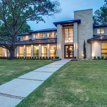
 Ron Davis Custom Homes
This beautiful Dallas Modern Home was just completed in North Dallas near Hockaday and the Lamplighter School. Contact Ron Davis Custom Homes at 972-680-0365 to learn how we can make your dream home a reality in Dallas, University Park, Frisco, Prosper and Southlake.

 TBS Construction Inc.
Bathroom is a place where you start and end your day. So how could it be anything short of perfection?! We took this inspiration and transformed one Stanford home’s master bathroom from outdated to sleek and elegant place. Designed according to its function bathroom is also well suited to homeowner’s style preferences. It was a great pleasure working on this project! Owners were highly involved in decision making process and their taste in design turned out to be exquisite!
High end custom materials from leading names:
Caesarstone US, Crystal Cabinet Works Inc., Da Vinci Marble Inc, AKDO, California Faucets, Isenberg Water Experience
Designed and built by TBS Construction Inc
Interior Designers: Krishna Shah & Michelle Talley
Project Manager: Doug Mszanowski
Thanks to Agnieszka Jakubowicz Photography for these gorgeous photos!

 Irwin Outdoors
Patio kitchen - mid-sized traditional backyard concrete paver patio kitchen idea in Tampa with a gazebo


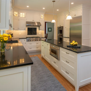
 Blackdog Design Build Remodel
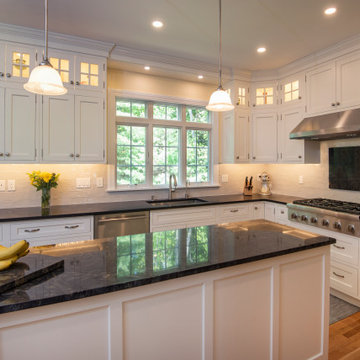
We achieved much better function for cooking and storage as well as bringing more natural light and updated lighting to the kitchen. The old layout was a struggle with fragmented storage spread out around the kitchen. It was difficult for two people to be in the kitchen at the same time and it didn’t flow well when cooking as the island was positioned as an obstacle on one end near the stove. The ceilings are high, and original wall cabinets were low with a soffit above them and this made the kitchen look dated. The new wall cabinets include transom cabinets and take full advantage of the high ceiling. By reconfiguring a soffit over the windows, we were able to include a transom window that brings more light into the kitchen. The client was careful about making decisions and took a long time to go through our process because any other project they hired someone to do in the past felt too rushed and they always had regrets and buyer's remorse after. We took our time and it was well worth it.The cabinets are Plato cabinets, full inset. The island top and wall inset behind the stove are special features-the stone is Blue Fusion Quartzite while the perimeter is Silestone Tebas Black. The new space is more beautiful, bright and has high function for the client's lifestyle in the kitchen.

 Klopf Architecture
Klopf Architecture and Jesse Ososki Art remodeled an existing Eichler atrium home into a brighter, more open, and more functional version of its original self.
The goals were to preserve the Eichler look and feel without the need to strictly adhere to it. The scope of work included re-configuring the master bedroom/bath, the kitchen, and the hall bath/laundry area, as well as updating interior finishes throughout to be more sophisticated.
The owners are detail-oriented and were very involved in the design process, down to the selection of lighting controls and stainless steel faceplates.Their design aesthetic leans toward the Scandinavian — light and bright, with simple straight lines and pure geometric shapes.
The finish flooring is large porcelain tile (24” x 24”) in a neutral grey tone, providing a uniform backdrop against which other materials can stand out. The same tile continues into the shower floor (with a different finish texture for slip-resistance) and up the shower/tub walls (in a smaller size). Heath Classic Field ceramic tile in Modern Blue was used sparingly, to add color at the hall bath vanity backsplash and at the shampoo niches in both bathrooms. Back-painted soda glass in pale blue to match the Heath tile was used at the kitchen backsplash. This same accent color was also used at the front entry atrium door. Kitchen cabinetry, countertops, appliances, and light fixtures are all white, making the kitchen feel more airy and light. Countertops are Caesarstone Blizzard.
The owners chose to keep some of the original Eichler elements: the concrete masonry fireplace; the stained tongue-and-groove redwood ceiling decking; and the luan wall paneling. The luan paneling was lightly sanded, cleaned, and re-stained. The owners also kept an added element that was installed by a previous owner: sliding shoji panels at all bedroom windows and sliding glass doors, for both privacy and sun control. Grooves were cut into the new tile flooring for the shoji panels to slide in, creating a more integrated look. Walnut was used to add warmth and contrast at the kitchen bar top and niche, the bathroom vanities, and the window sill/ledge under the kitchen window.
This Burlingame Eichler Remodel is a 2,121 sf, 4 bedroom/2 bath home located in the heart of Silicon Valley.
Klopf Architecture Project Team: John Klopf, Klara Kevane and Yegvenia Torres Zavala
Contractor: Jesse Ososki Art
Structural Engineer: Emmanuel Pun
Photography ©2018 Mariko Reed
Location: Burlingame, CA
Year completed: 2017

 Donald Lococo Architects
©️Maxwell MacKenzie Slate countertops and wood hood are features in the kitchen. THE HOME, ESSENTIALLY A RUIN WAS PRESERVED THROUGH NEGLECT. A CLARIFIED HISTORIC RENOVATION REMOVES BAY WINDOWS AND 1950’S WINDOWS FROM THE MAIN FAÇADE. TWO WINGS AND A THIRD FLOOR AND A SYMPATHETIC STAIRWAY ACCOMMODATE MODERN LIFE. MASONS WERE TASKED TO MAKE THE STONE WORK LOOK AS THOUGH “A FARMER BUILT THE WALLS DURING THE NON-PLANTING SEASON,” THE FINAL DESIGN SIMPLIFIES THE FIRST FLOOR PLAN AND LEAVES LOGICAL LOCATIONS FOR EXPANSION INTO COMING DECADES. AMONG OTHER AWARDS, THIS TRADITIONAL YET HISTORIC RENOVATION LOCATED IN MIDDLEBURG, VA HAS RECEIVED 2 AWARDS FROM THE AMERICAN INSTITUTE OF ARCHITECTURE.. AND A NATIONAL PRIVATE AWARD FROM VETTE WINDOWS
WASHINGTON DC ARCHITECT DONALD LOCOCO UPDATED THIS HISTORIC STONE HOUSE IN MIDDLEBURG, VA.lauded by the American Institute of Architects with an Award of Excellence for Historic Architecture, as well as an Award of Merit for Residential Architecture

 Robert Paige Cabinetry LLC
Photography by William Quarles. Designed by Shannon Bogen. Built by Robert Paige Cabinetry. Contractor Tom Martin
Mid-sized transitional l-shaped medium tone wood floor eat-in kitchen photo in Charleston with stainless steel appliances, an undermount sink, recessed-panel cabinets, gray cabinets, quartz countertops, red backsplash and an island
Mid-sized transitional l-shaped medium tone wood floor eat-in kitchen photo in Charleston with stainless steel appliances, an undermount sink, recessed-panel cabinets, gray cabinets, quartz countertops, red backsplash and an island

 In Detail Interiors
Small coastal condo gets a new life!
This project started as a consultation that really focused on whether or not it was feasible to maximize functionality out of a tight kitchen area in a condo on the beach. The cabinetry was sort of dated but not terrible terrible.
Refresh or total gut of this small kitchen
The client wanted to give it a refresh worked but we had worked with her before…so she could not quite decide how far to go. Maybe just repaint the existing cabinets? She needed some furniture. She wanted a little more ambiance and pizazz. And she wanted the Cheryl magic.
Ok finally, decision made. Kitchen had to go@!
Decision made- a new kitchen to go with the new living!
After further review on site with her during the consult meeting, and pitching a few inquiries around for bids on cabinetry and countertops – she ultimately decided to gut and re-do the whole layout. And man-oh-man what a difference some well executed design makes!!
This layout was unique and truly optimized every inch we could muster from the kitchen. (Working around that spiral staircase and navigating the soffit that wrapped the entire kitchen and adjacent living room!!) Colors needed to be bold while still feeling fresh so we paired a deep aubergine and a sort of “matte” Caribbean blue which laid the groundwork for a stunning living area palette.
Tough layout to enlarge much
There were a lot of other “givens” in this space that made the execution of the design a highly strategized process. We knew we had to work around the large wall space that starts the kitchen because it had the laundry room hiding on the other side… the awkward nook with windows on all sides that was a small breakfast area before the remodel… oh, and did we mention that dang spiral staircase?! Multiple site visits to plot the cabinetry and countertop curve paid off all said and done, though!
Living space that work with the open floor plan kitchen
Designing the furnishings then became the fun part! With a smaller living space flanked by windows and sliders – but one that needed to balance the kitchen in substance – we had to break a few preferred design rules to make up the amount of seating desired.
The deep grape-y purple barrel swivels were the perfect “transition” piece by the slider offering access to the views while being versatile enough to still afford safe use of the slider and passage outside. Adding some graphic punch with the droplet shaped, stone and brass cocktail table and bold multicolored rug we love the balance of these weightier aesthetic choices with the adjacent kitchen.
Signature pieces make all the difference
Carrying through little pops of that blue green between the counter stools (I die! Seriously! SO GORGEOUS) and the sofa (with those brass nails!) — these colors really created a sturdy but eclectic tonal feel that the client was just over the moon for. The art and grasscloth on the walls throughout developed the architecture of the space in an overall structure that was really lacking – it feels warm, inviting, comfortable – BEAUTIFUL – but not too priss and pomp.
Now if we could just keep the pup off the sofa!

Sponsored
Columbus, OH

Hope Restoration & General Contracting
Columbus Design-Build, Kitchen & Bath Remodeling, Historic Renovations

 Sunbrella
In a tonal world, it’s all about texture.
This loft’s main living area is a blend of tonal greys and charcoals. The look is a perfect fit within the loft’s cool, masculine and industrial aesthetic.
When creating this space with tonal fabrics, texture played a key role in providing depth, warmth and a feeling of home. And, the nearly 20-foot-long plunging draperies layered over sheers provide a sense of grandeur and cohesion throughout the loft.
When designing, you don’t always have to use bright colors and ornate patterns to create interest. Smartly mixing textures and different types of fabrics also creates depth and interest in a room. And by including a piece of art (like the moon series) or reupholstering a vintage chair, you can add authentic stories and character that make the end result over the moon.
You can watch designer Alex Gaston’s transformation of the entire loft at perspective.sunbrella.com. Included on the site are eight episodes chronicling Alex’s design process, design tip videos, articles about the project, a photo gallery and a full décor guide.

 RoomService 360
Our 3D design division is working on various renderings meant to assist our customers in their decision making process by incorporating comprehensive solutions into their actual spaces. Images show different stages of collaborations between the customer and the designers, resulting in stunning, highly functional and thoughtful interiors.

 ZeroEnergy Design
This renovated brick rowhome in Boston’s South End offers a modern aesthetic within a historic structure, creative use of space, exceptional thermal comfort, a reduced carbon footprint, and a passive stream of income.
DESIGN PRIORITIES. The goals for the project were clear - design the primary unit to accommodate the family’s modern lifestyle, rework the layout to create a desirable rental unit, improve thermal comfort and introduce a modern aesthetic. We designed the street-level entry as a shared entrance for both the primary and rental unit. The family uses it as their everyday entrance - we planned for bike storage and an open mudroom with bench and shoe storage to facilitate the change from shoes to slippers or bare feet as they enter their home. On the main level, we expanded the kitchen into the dining room to create an eat-in space with generous counter space and storage, as well as a comfortable connection to the living space. The second floor serves as master suite for the couple - a bedroom with a walk-in-closet and ensuite bathroom, and an adjacent study, with refinished original pumpkin pine floors. The upper floor, aside from a guest bedroom, is the child's domain with interconnected spaces for sleeping, work and play. In the play space, which can be separated from the work space with new translucent sliding doors, we incorporated recreational features inspired by adventurous and competitive television shows, at their son’s request.
MODERN MEETS TRADITIONAL. We left the historic front facade of the building largely unchanged - the security bars were removed from the windows and the single pane windows were replaced with higher performing historic replicas. We designed the interior and rear facade with a vision of warm modernism, weaving in the notable period features. Each element was either restored or reinterpreted to blend with the modern aesthetic. The detailed ceiling in the living space, for example, has a new matte monochromatic finish, and the wood stairs are covered in a dark grey floor paint, whereas the mahogany doors were simply refinished. New wide plank wood flooring with a neutral finish, floor-to-ceiling casework, and bold splashes of color in wall paint and tile, and oversized high-performance windows (on the rear facade) round out the modern aesthetic.
RENTAL INCOME. The existing rowhome was zoned for a 2-family dwelling but included an undesirable, single-floor studio apartment at the garden level with low ceiling heights and questionable emergency egress. In order to increase the quality and quantity of space in the rental unit, we reimagined it as a two-floor, 1 or 2 bedroom, 2 bathroom apartment with a modern aesthetic, increased ceiling height on the lowest level and provided an in-unit washer/dryer. The apartment was listed with Jackie O'Connor Real Estate and rented immediately, providing the owners with a source of passive income.
ENCLOSURE WITH BENEFITS. The homeowners sought a minimal carbon footprint, enabled by their urban location and lifestyle decisions, paired with the benefits of a high-performance home. The extent of the renovation allowed us to implement a deep energy retrofit (DER) to address air tightness, insulation, and high-performance windows. The historic front facade is insulated from the interior, while the rear facade is insulated on the exterior. Together with these building enclosure improvements, we designed an HVAC system comprised of continuous fresh air ventilation, and an efficient, all-electric heating and cooling system to decouple the house from natural gas. This strategy provides optimal thermal comfort and indoor air quality, improved acoustic isolation from street noise and neighbors, as well as a further reduced carbon footprint. We also took measures to prepare the roof for future solar panels, for when the South End neighborhood’s aging electrical infrastructure is upgraded to allow them.
URBAN LIVING. The desirable neighborhood location allows the both the homeowners and tenant to walk, bike, and use public transportation to access the city, while each charging their respective plug-in electric cars behind the building to travel greater distances.
OVERALL. The understated rowhouse is now ready for another century of urban living, offering the owners comfort and convenience as they live life as an expression of their values.
Photography Eric Roth Photo
 Blackdog Design Build Remodel
We achieved much better function for cooking and storage as well as bringing more natural light and updated lighting to the kitchen. The old layout was a struggle with fragmented storage spread out around the kitchen. It was difficult for two people to be in the kitchen at the same time and it didn’t flow well when cooking as the island was positioned as an obstacle on one end near the stove. The ceilings are high, and original wall cabinets were low with a soffit above them and this made the kitchen look dated. The new wall cabinets include transom cabinets and take full advantage of the high ceiling. By reconfiguring a soffit over the windows, we were able to include a transom window that brings more light into the kitchen. The client was careful about making decisions and took a long time to go through our process because any other project they hired someone to do in the past felt too rushed and they always had regrets and buyer's remorse after. We took our time and it was well worth it.The cabinets are Plato cabinets, full inset. The island top and wall inset behind the stove are special features-the stone is Blue Fusion Quartzite while the perimeter is Silestone Tebas Black. The new space is more beautiful, bright and has high function for the client's lifestyle in the kitchen.

Sponsored
Columbus, OH
Hope Restoration & General Contracting
Columbus Design-Build, Kitchen & Bath Remodeling, Historic Renovations

 Structural Associates
Wet bar - transitional single-wall light wood floor wet bar idea with an undermount sink, shaker cabinets, black cabinets, mirror backsplash and white countertops

 Urban Casa
Living room - mid-century modern formal and open concept carpeted and gray floor living room idea in New York with white walls


36