
Search results for "Decision pick" in Home Design Ideas
 Klopf Architecture
Built for the Bluff, A Sea Ranch Home is Remade from the Inside Out
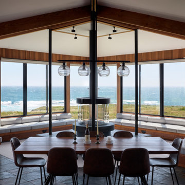
The house had always been grounded, on an ocean bluff at The Sea Ranch. It sits unencumbered, adjacent to one of the most dramatic stretches of the Sonoma coast with protected commons meadow to the east, uninterrupted Pacific views to the west, and a bluff trail running alongside. What it lacked was the feeling of home, one that could hold up its own against the natural landscape.
The owners are entrepreneurs with deep involvement across tech, real estate, and development and they know how things are built. The Sea Ranch house had been in their lives for years, a second residence and a place for family to gather. Built for a different time, it felt more compromising than comfortable. Sitting in a closed off nook, the kitchen fit one cook at a time and turned its back on the rest of the house. The entry was dim and compressed, divided by a structural column that presented itself at exactly the wrong moment. The primary suite was small relative to the view outside it. A large rear bedroom sat behind a lowered ceiling with a bathroom that had never been added. The house was certainly worth the trouble of doing it right.
What followed was not one project but four, each with its own design challenge, each addressed over a period of time.
Where the House Meets the Ocean
The most complex piece of the project, in both structural and spatial terms, was the kitchen expansion. The existing room was a single-person galley squeezed in as an afterthought with no meaningful connection to the dining room, the living space, or the deck outside. To make it useful for a family that cooks and gathers, it needed to grow outward into an existing patio and flow into the rooms around it.
A big challenge was the roofline. Several planes at different pitches and angles converged directly where additional volume was needed. A new form had to join that geometry without reading as a correction. The solution found the simplest possible connection between the existing angles, a roofline that from outside the structure, appears entirely original. From the bluff trail where the addition is visible, there is no discernible seam.
Inside, the kitchen is now open to the living and dining rooms without interruption. A large sliding glass door connects the space onto the rear deck. The deck itself was expanded and oriented so that the body of the house shields it from the coastal wind which is a common consideration that determines whether outdoor space at The Sea Ranch actually gets used. The result is a room that works for large family gatherings where no one feels cutoff, and one that makes the boundary between being inside and outside easy to ignore.
Welcoming Light
A structural column stood at the convergence of eight distinct roof planes in the entry. It was load-bearing, but it was also the reason the entry had always felt like a hallway rather than a welcoming arrival.
With the structural engineer, a custom steel connector was designed to receive beams from six separate directions, redistributing the load through a single new continuous beam. The column was surgically removed. Three triangular skylights were then cut into the roof above, their shapes drawn from the
existing geometry of the planes around them. The entry is now bright and open. The skylights feel native to the structure because they follow the logic already present in the roof.
Two Suites, Two Views
At opposite ends of the house, the two bedroom suites were each reconfigured, and each found a different way to introduce more of the landscape into the room.
An addition to the primary suite extended the structure outward to create a wraparound plan with a loop from the bedroom through bath and closet that had not been possible before. The expansion opened a slot view from the tub and shower toward the ocean. The view is precise and private. The ocean view is present and deliberate.
The rear bedroom absorbed an adjacent storage room to transform it into a full second suite with a vaulted ceiling, a large bathroom with a tub, a shower, and a sauna. A private fenced garden courtyard sits just beyond the glass bringing the outdoors inside. The tub was placed so that, looking past the courtyard and through the bedroom beyond, the ocean is visible at the far end. It is a long view and it makes the room feel larger and more settled than its footprint would suggest.
Glass on Four Sides, Fire at the Center
The main living and gathering room had always been caught between two competing facts: glass on four sides meant exceptional views but at The Sea Ranch, it also meant a cold room. A 360-degree cylindrical fireplace was added at the center on a raised stone base, providing radiant heat in every direction and giving the room a focal point around which a group naturally orients itself, whether that means two people at the end of the day or the whole family after dinner.
Owners Who Picked Up the Tools
The owner was not a passive client. they came with construction knowledge, specific ideas, and the desire to be an active part of the process, a dynamic that other architects may had found difficult, which Klopf Architecture accepted as an asset. They took it upon themselves to complete some of the work during construction, including the installation of a new radiant heating system beneath the floors.
The radiant system added to the older and less-desirable forced-air setup. At The Sea Ranch, that change matters as the house sits close enough to the ocean and moving air competes with the sound of it, where radiant heat does not. Solar panels were added to the roof as part of the new system. Insulation was upgraded throughout the walls, roof, and crawl space. The house that had always had the right setting now holds warmth the way a house on the bluff should.
They were also deeply involved in the design and selections throughout, and the finished house reflects both of them in ways that are specific rather than generic. The process took longer and moved through more iterations than a more arms-length relationship might have allowed. The result is more defined and personal because of it.
The Landscape Holds Priority
Every exterior decision was shaped by The Sea Ranch Design Standards, which require that buildings defer to the landscape around them rather than compete with it. Because this house sits on the bluff and is visible from the public trail, the additions faced a close review. Existing materials were matched. Geometries were resolved. The additions had to become indistinguishable from the original building.
From the trail, the house reads exactly as it always has — low, cedar-clad, secondary to the meadow and the water. The setting holds priority. Inside, the house has been remade.
Klopf Architecture Project Team: Geoff Campen and Trenton Jewett
Contractor: Shawn Bettega Construction
Photography: ©2025 Mariko Reed
Year Completed: 2023
Location: The Sea Ranch, CA
 Charleene's Houses, LLC
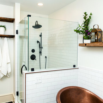
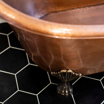
With private space at a premium in relatively narrow rowhomes, our client in Bolton Hill made the decision to transform their home’s third floor one-bedroom apartment into a private master ensuite retreat. Rustic elements including rough-hewn floating wood shelves, a cleverly- exposed distressed support stud, and dark rubbed bronze hardware on plumbing and lighting fixtures, storage hooks and built-in cabinets marry seamlessly with classic features such as fluted window casings with bullseye rosettes, oversized baseboards capped with coved base cap trim and 4-panel solid wood pockets doors. Perched on the black hexagon tile floor punctuated by white grout that picks up on the room’s light palettes, the gorgeous hammered copper soaking tub and uber-sleek Scandinavian style teak double vanity stand out as the biggest stars of this master bath build out.
 Charleene's Houses, LLC
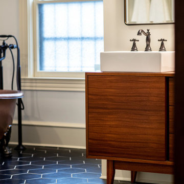
With private space at a premium in relatively narrow rowhomes, our client in Bolton Hill made the decision to transform their home’s third floor one-bedroom apartment into a private master ensuite retreat. Rustic elements including rough-hewn floating wood shelves, a cleverly- exposed distressed support stud, and dark rubbed bronze hardware on plumbing and lighting fixtures, storage hooks and built-in cabinets marry seamlessly with classic features such as fluted window casings with bullseye rosettes, oversized baseboards capped with coved base cap trim and 4-panel solid wood pockets doors. Perched on the black hexagon tile floor punctuated by white grout that picks up on the room’s light palettes, the gorgeous hammered copper soaking tub and uber-sleek Scandinavian style teak double vanity stand out as the biggest stars of this master bath build out.
Find the right local pro for your project
 Klopf Architecture
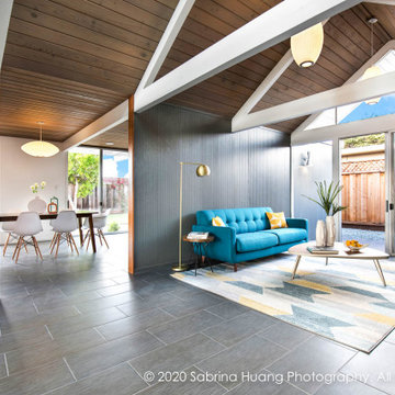
Joseph Eichler developed his moderately priced houses for the mass-market starting in 1949. His homes were designed using affordable materials and simple construction techniques. Nearly 70 years later these homes are in need of updating and remodeling an Eichler home today can become an imposing and costly project if you’re not careful. For this project the clients, who had undergone several previous house renovations, were determined to stick with an established budget from the beginning. Klopf Architecture helped them modernize their Eichler with a premium appearance on a reasonable budget.
The clients challenged the Klopf team to create a design that had a high-end feel and nicely done while adhering to their budget. That meant not all of the initial project scope could be built. Like many other Eichler homes, the original floor plan did not meet the family’s needs leaving them feeling disconnected from one room to another. While an early goal was to expand the house into a carport and create a larger garage, it did not survive the contractor pricing phase of the project.
The goals that did survive through to the end of the project included blurring some of the boundaries and opening up some of the spaces, making them more functional and creating a smoother flow in the house. The Klopf team joined the former separate kitchen and formal living room into one large space and shift the dining room where it is now connected to the kitchen. Klopf swapped the family room to the front alongside the living room, so the spaces feel more cohesive and are now better suited for family activities. The functional layout of the master bathroom was changed to include a large, curbless shower.
Installing a complete IKEA kitchen including cabinets, countertops, appliances, light fixtures, and furnishings was key to staying within budget. Bath fixtures in this house are also exclusively IKEA. Klopf Architecture has designed many homes using IKEA products, which are quite compatible offering an affordable, contemporary take on Eichler homes. The clients saved additional money from the simplicity and availability of IKEA products and by orchestrating the orders and purchases themselves. Following each construction meeting, the clients would make a run to IKEA and purchase items, pick up needed spare parts, and bring them back right away to stay ahead of the contractor’s schedule and minimize the chance of delays and bottlenecks.
Klopf balanced material selections by retaining some of the original woodwork and simply refinishing the mahogany paneling. They were able to retain the original windows and sliding doors which were still in good shape, avoiding some of the most costly replacement expenses. Additionally interior doors were simply refinished and the exterior siding cleaned up and repainted. Formerly dark interiors are now illuminated with new slimmer semi-recessed lighting eliminating the need for costly roof work.
Attention to design details allowed the Klopf team to ensure the house ended up with a high quality feel. Key visual elements were strictly aligned and Klopf worked with the clients to select a unified materials palette throughout the spaces so the house flows seamlessly together. Aligning the tile layout with the trusses and keeping it level with the concrete slab outside allowed them to achieve a level of quality that may otherwise be missed.
The clients were able to keep their budget on track by determining clear goals and making critical decisions upfront, choosing materials and furnishings wisely, working with the right design and construction teams in place and to a large part, their willingness to participate throughout the process. In the end the clients were much happier with their reconfigured Eichler home and Klopf Architecture managed to keep their remodeling costs to about $325/sf – a good amount below the average Bay Area Eichler remodel.
Project Team: John Klopf, Angela Todorova, Sherry Tan
Contractor: Keycon Construction
Structural Engineer: Sezen & Moon
Photography: Sabrina Huang
Year Completed: 2020
 Klopf Architecture
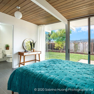
Joseph Eichler developed his moderately priced houses for the mass-market starting in 1949. His homes were designed using affordable materials and simple construction techniques. Nearly 70 years later these homes are in need of updating and remodeling an Eichler home today can become an imposing and costly project if you’re not careful. For this project the clients, who had undergone several previous house renovations, were determined to stick with an established budget from the beginning. Klopf Architecture helped them modernize their Eichler with a premium appearance on a reasonable budget.
The clients challenged the Klopf team to create a design that had a high-end feel and nicely done while adhering to their budget. That meant not all of the initial project scope could be built. Like many other Eichler homes, the original floor plan did not meet the family’s needs leaving them feeling disconnected from one room to another. While an early goal was to expand the house into a carport and create a larger garage, it did not survive the contractor pricing phase of the project.
The goals that did survive through to the end of the project included blurring some of the boundaries and opening up some of the spaces, making them more functional and creating a smoother flow in the house. The Klopf team joined the former separate kitchen and formal living room into one large space and shift the dining room where it is now connected to the kitchen. Klopf swapped the family room to the front alongside the living room, so the spaces feel more cohesive and are now better suited for family activities. The functional layout of the master bathroom was changed to include a large, curbless shower.
Installing a complete IKEA kitchen including cabinets, countertops, appliances, light fixtures, and furnishings was key to staying within budget. Bath fixtures in this house are also exclusively IKEA. Klopf Architecture has designed many homes using IKEA products, which are quite compatible offering an affordable, contemporary take on Eichler homes. The clients saved additional money from the simplicity and availability of IKEA products and by orchestrating the orders and purchases themselves. Following each construction meeting, the clients would make a run to IKEA and purchase items, pick up needed spare parts, and bring them back right away to stay ahead of the contractor’s schedule and minimize the chance of delays and bottlenecks.
Klopf balanced material selections by retaining some of the original woodwork and simply refinishing the mahogany paneling. They were able to retain the original windows and sliding doors which were still in good shape, avoiding some of the most costly replacement expenses. Additionally interior doors were simply refinished and the exterior siding cleaned up and repainted. Formerly dark interiors are now illuminated with new slimmer semi-recessed lighting eliminating the need for costly roof work.
Attention to design details allowed the Klopf team to ensure the house ended up with a high quality feel. Key visual elements were strictly aligned and Klopf worked with the clients to select a unified materials palette throughout the spaces so the house flows seamlessly together. Aligning the tile layout with the trusses and keeping it level with the concrete slab outside allowed them to achieve a level of quality that may otherwise be missed.
The clients were able to keep their budget on track by determining clear goals and making critical decisions upfront, choosing materials and furnishings wisely, working with the right design and construction teams in place and to a large part, their willingness to participate throughout the process. In the end the clients were much happier with their reconfigured Eichler home and Klopf Architecture managed to keep their remodeling costs to about $325/sf – a good amount below the average Bay Area Eichler remodel.
Project Team: John Klopf, Angela Todorova, Sherry Tan
Contractor: Keycon Construction
Structural Engineer: Sezen & Moon
Photography: Sabrina Huang
Year Completed: 2020
 Klopf Architecture
Built for the Bluff, A Sea Ranch Home is Remade from the Inside Out
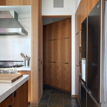
The house had always been grounded, on an ocean bluff at The Sea Ranch. It sits unencumbered, adjacent to one of the most dramatic stretches of the Sonoma coast with protected commons meadow to the east, uninterrupted Pacific views to the west, and a bluff trail running alongside. What it lacked was the feeling of home, one that could hold up its own against the natural landscape.
The owners are entrepreneurs with deep involvement across tech, real estate, and development and they know how things are built. The Sea Ranch house had been in their lives for years, a second residence and a place for family to gather. Built for a different time, it felt more compromising than comfortable. Sitting in a closed off nook, the kitchen fit one cook at a time and turned its back on the rest of the house. The entry was dim and compressed, divided by a structural column that presented itself at exactly the wrong moment. The primary suite was small relative to the view outside it. A large rear bedroom sat behind a lowered ceiling with a bathroom that had never been added. The house was certainly worth the trouble of doing it right.
What followed was not one project but four, each with its own design challenge, each addressed over a period of time.
Where the House Meets the Ocean
The most complex piece of the project, in both structural and spatial terms, was the kitchen expansion. The existing room was a single-person galley squeezed in as an afterthought with no meaningful connection to the dining room, the living space, or the deck outside. To make it useful for a family that cooks and gathers, it needed to grow outward into an existing patio and flow into the rooms around it.
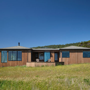
A big challenge was the roofline. Several planes at different pitches and angles converged directly where additional volume was needed. A new form had to join that geometry without reading as a correction. The solution found the simplest possible connection between the existing angles, a roofline that from outside the structure, appears entirely original. From the bluff trail where the addition is visible, there is no discernible seam.
Inside, the kitchen is now open to the living and dining rooms without interruption. A large sliding glass door connects the space onto the rear deck. The deck itself was expanded and oriented so that the body of the house shields it from the coastal wind which is a common consideration that determines whether outdoor space at The Sea Ranch actually gets used. The result is a room that works for large family gatherings where no one feels cutoff, and one that makes the boundary between being inside and outside easy to ignore.
Welcoming Light
A structural column stood at the convergence of eight distinct roof planes in the entry. It was load-bearing, but it was also the reason the entry had always felt like a hallway rather than a welcoming arrival.
With the structural engineer, a custom steel connector was designed to receive beams from six separate directions, redistributing the load through a single new continuous beam. The column was surgically removed. Three triangular skylights were then cut into the roof above, their shapes drawn from the
existing geometry of the planes around them. The entry is now bright and open. The skylights feel native to the structure because they follow the logic already present in the roof.
Two Suites, Two Views
At opposite ends of the house, the two bedroom suites were each reconfigured, and each found a different way to introduce more of the landscape into the room.
An addition to the primary suite extended the structure outward to create a wraparound plan with a loop from the bedroom through bath and closet that had not been possible before. The expansion opened a slot view from the tub and shower toward the ocean. The view is precise and private. The ocean view is present and deliberate.
The rear bedroom absorbed an adjacent storage room to transform it into a full second suite with a vaulted ceiling, a large bathroom with a tub, a shower, and a sauna. A private fenced garden courtyard sits just beyond the glass bringing the outdoors inside. The tub was placed so that, looking past the courtyard and through the bedroom beyond, the ocean is visible at the far end. It is a long view and it makes the room feel larger and more settled than its footprint would suggest.
Glass on Four Sides, Fire at the Center
The main living and gathering room had always been caught between two competing facts: glass on four sides meant exceptional views but at The Sea Ranch, it also meant a cold room. A 360-degree cylindrical fireplace was added at the center on a raised stone base, providing radiant heat in every direction and giving the room a focal point around which a group naturally orients itself, whether that means two people at the end of the day or the whole family after dinner.
Owners Who Picked Up the Tools
The owner was not a passive client. they came with construction knowledge, specific ideas, and the desire to be an active part of the process, a dynamic that other architects may had found difficult, which Klopf Architecture accepted as an asset. They took it upon themselves to complete some of the work during construction, including the installation of a new radiant heating system beneath the floors.
The radiant system added to the older and less-desirable forced-air setup. At The Sea Ranch, that change matters as the house sits close enough to the ocean and moving air competes with the sound of it, where radiant heat does not. Solar panels were added to the roof as part of the new system. Insulation was upgraded throughout the walls, roof, and crawl space. The house that had always had the right setting now holds warmth the way a house on the bluff should.
They were also deeply involved in the design and selections throughout, and the finished house reflects both of them in ways that are specific rather than generic. The process took longer and moved through more iterations than a more arms-length relationship might have allowed. The result is more defined and personal because of it.
The Landscape Holds Priority
Every exterior decision was shaped by The Sea Ranch Design Standards, which require that buildings defer to the landscape around them rather than compete with it. Because this house sits on the bluff and is visible from the public trail, the additions faced a close review. Existing materials were matched. Geometries were resolved. The additions had to become indistinguishable from the original building.
From the trail, the house reads exactly as it always has — low, cedar-clad, secondary to the meadow and the water. The setting holds priority. Inside, the house has been remade.
Klopf Architecture Project Team: Geoff Campen and Trenton Jewett
Contractor: Shawn Bettega Construction
Photography: ©2025 Mariko Reed
Year Completed: 2023
Location: The Sea Ranch, CA
 Klopf Architecture
Built for the Bluff, A Sea Ranch Home is Remade from the Inside Out
The house had always been grounded, on an ocean bluff at The Sea Ranch. It sits unencumbered, adjacent to one of the most dramatic stretches of the Sonoma coast with protected commons meadow to the east, uninterrupted Pacific views to the west, and a bluff trail running alongside. What it lacked was the feeling of home, one that could hold up its own against the natural landscape.
The owners are entrepreneurs with deep involvement across tech, real estate, and development and they know how things are built. The Sea Ranch house had been in their lives for years, a second residence and a place for family to gather. Built for a different time, it felt more compromising than comfortable. Sitting in a closed off nook, the kitchen fit one cook at a time and turned its back on the rest of the house. The entry was dim and compressed, divided by a structural column that presented itself at exactly the wrong moment. The primary suite was small relative to the view outside it. A large rear bedroom sat behind a lowered ceiling with a bathroom that had never been added. The house was certainly worth the trouble of doing it right.
What followed was not one project but four, each with its own design challenge, each addressed over a period of time.
Where the House Meets the Ocean
The most complex piece of the project, in both structural and spatial terms, was the kitchen expansion. The existing room was a single-person galley squeezed in as an afterthought with no meaningful connection to the dining room, the living space, or the deck outside. To make it useful for a family that cooks and gathers, it needed to grow outward into an existing patio and flow into the rooms around it.
A big challenge was the roofline. Several planes at different pitches and angles converged directly where additional volume was needed. A new form had to join that geometry without reading as a correction. The solution found the simplest possible connection between the existing angles, a roofline that from outside the structure, appears entirely original. From the bluff trail where the addition is visible, there is no discernible seam.
Inside, the kitchen is now open to the living and dining rooms without interruption. A large sliding glass door connects the space onto the rear deck. The deck itself was expanded and oriented so that the body of the house shields it from the coastal wind which is a common consideration that determines whether outdoor space at The Sea Ranch actually gets used. The result is a room that works for large family gatherings where no one feels cutoff, and one that makes the boundary between being inside and outside easy to ignore.
Welcoming Light
A structural column stood at the convergence of eight distinct roof planes in the entry. It was load-bearing, but it was also the reason the entry had always felt like a hallway rather than a welcoming arrival.
With the structural engineer, a custom steel connector was designed to receive beams from six separate directions, redistributing the load through a single new continuous beam. The column was surgically removed. Three triangular skylights were then cut into the roof above, their shapes drawn from the
existing geometry of the planes around them. The entry is now bright and open. The skylights feel native to the structure because they follow the logic already present in the roof.
Two Suites, Two Views
At opposite ends of the house, the two bedroom suites were each reconfigured, and each found a different way to introduce more of the landscape into the room.
An addition to the primary suite extended the structure outward to create a wraparound plan with a loop from the bedroom through bath and closet that had not been possible before. The expansion opened a slot view from the tub and shower toward the ocean. The view is precise and private. The ocean view is present and deliberate.
The rear bedroom absorbed an adjacent storage room to transform it into a full second suite with a vaulted ceiling, a large bathroom with a tub, a shower, and a sauna. A private fenced garden courtyard sits just beyond the glass bringing the outdoors inside. The tub was placed so that, looking past the courtyard and through the bedroom beyond, the ocean is visible at the far end. It is a long view and it makes the room feel larger and more settled than its footprint would suggest.
Glass on Four Sides, Fire at the Center
The main living and gathering room had always been caught between two competing facts: glass on four sides meant exceptional views but at The Sea Ranch, it also meant a cold room. A 360-degree cylindrical fireplace was added at the center on a raised stone base, providing radiant heat in every direction and giving the room a focal point around which a group naturally orients itself, whether that means two people at the end of the day or the whole family after dinner.
Owners Who Picked Up the Tools
The owner was not a passive client. they came with construction knowledge, specific ideas, and the desire to be an active part of the process, a dynamic that other architects may had found difficult, which Klopf Architecture accepted as an asset. They took it upon themselves to complete some of the work during construction, including the installation of a new radiant heating system beneath the floors.
The radiant system added to the older and less-desirable forced-air setup. At The Sea Ranch, that change matters as the house sits close enough to the ocean and moving air competes with the sound of it, where radiant heat does not. Solar panels were added to the roof as part of the new system. Insulation was upgraded throughout the walls, roof, and crawl space. The house that had always had the right setting now holds warmth the way a house on the bluff should.
They were also deeply involved in the design and selections throughout, and the finished house reflects both of them in ways that are specific rather than generic. The process took longer and moved through more iterations than a more arms-length relationship might have allowed. The result is more defined and personal because of it.
The Landscape Holds Priority
Every exterior decision was shaped by The Sea Ranch Design Standards, which require that buildings defer to the landscape around them rather than compete with it. Because this house sits on the bluff and is visible from the public trail, the additions faced a close review. Existing materials were matched. Geometries were resolved. The additions had to become indistinguishable from the original building.
From the trail, the house reads exactly as it always has — low, cedar-clad, secondary to the meadow and the water. The setting holds priority. Inside, the house has been remade.
Klopf Architecture Project Team: Geoff Campen and Trenton Jewett
Contractor: Shawn Bettega Construction
Photography: ©2025 Mariko Reed
Year Completed: 2023
Location: The Sea Ranch, CA
 Charleene's Houses, LLC
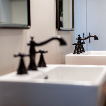
With private space at a premium in relatively narrow rowhomes, our client in Bolton Hill made the decision to transform their home’s third floor one-bedroom apartment into a private master ensuite retreat. Rustic elements including rough-hewn floating wood shelves, a cleverly- exposed distressed support stud, and dark rubbed bronze hardware on plumbing and lighting fixtures, storage hooks and built-in cabinets marry seamlessly with classic features such as fluted window casings with bullseye rosettes, oversized baseboards capped with coved base cap trim and 4-panel solid wood pockets doors. Perched on the black hexagon tile floor punctuated by white grout that picks up on the room’s light palettes, the gorgeous hammered copper soaking tub and uber-sleek Scandinavian style teak double vanity stand out as the biggest stars of this master bath build out.
 Simply Perfect
Advice on interior design is available everywhere—from TV shows and websites to books, magazines and apps.
We love seeing people become engaged in design and educated on the wide range of possibilities. But we hope you’ll proceed with caution.
It’s not that style errors are a matter of life and death. It’s just that it’s easy to choose designs that aren’t necessarily reflective of your own personality and character. And since you’re typically stuck with your interior design decisions for years, styles that don’t quite fit can tend to grate on you.
Interiors that give one person comfort may unleash chaos in someone else. This goes beyond favorite colors or hot trends, right to the heart of interior design, where you find questions of composition, balance, repetition, space and more.
The goal is to find that unique combination of design elements that gives you comfort, support and balance.
In one home, that perfect balance was struck through the use of symmetry. A pair of comfortable swivel chairs sit beneath matching indigo patterned paintings. Matching bookcases below the paintings contain similar, but not identical, arrangements of books, vases and bowls. Woods and bronzes help warm up the simple white bookcase shelving.
Two matching poufs in front of the fireplace provide additional seating. The sofa is accented with a pair of pillows with a blue pattern that echoes the artwork.
The effect of the symmetry is to achieve order and simplicity, which I promote at every opportunity. After all, your home interiors should be the setting or the backdrop of your life—not center stage.
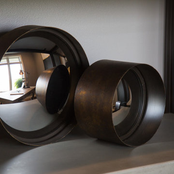
Antique bronze and blue are complementary colors. Together, they offer a rich palette of richness and depth, which brings out the beauty of wood and stone.
In the home office, a unique, whitewash-stained wooden desk rests on metal, Sawhorse-inspired legs for a warm, rustic look. The black leather chair features a contemporary silhouette with an antique brass frame. An adjustable desk lamp has bronze accents.
The bookcase combines a sleek, black metal frame with concrete shelves, for another unusual pairing. It’s kept uncluttered for an orderly, peaceful look. Items on the shelves include a bronze-accented lamp and a pair
of high gloss-finished wooden bookends.
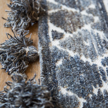
The elegant artwork behind the desk is a simple midnight-blue and bronze with mottled white. Deep blues are again picked up in the rug, which adds a stately vibe with a modern pattern and satisfying texture.
Within the framework of symmetry, the living room repeats the blue-and-bronze color scheme.
A large midcentury brass clock above the fireplace keeps the natural stone visible, rather than hidden behind a painting or television, while its straight lines and color create a beautiful contrast.
The sofa is a soft, neutral blue. The pattern on the round brass side table features echoes the darker blue-patterned rug, as well as the rug in the office, tying the rooms together.
Indigo blue books adjacent to bronze vases on the shelves repeat the color scheme. The soapstone-topped coffee table echoes the shape of the fireplace. A pair of tall, matching floor lamps with long wooden bases, brass pulls and simple linen shades combine both the colors and symmetry found throughout the home.
 Charleene's Houses, LLC
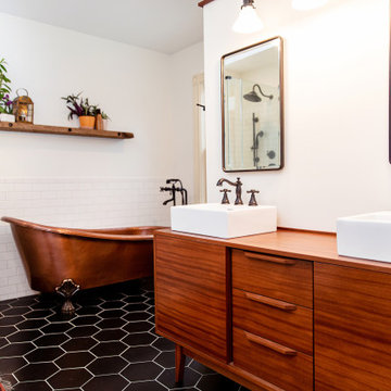
With private space at a premium in relatively narrow rowhomes, our client in Bolton Hill made the decision to transform their home’s third floor one-bedroom apartment into a private master ensuite retreat. Rustic elements including rough-hewn floating wood shelves, a cleverly- exposed distressed support stud, and dark rubbed bronze hardware on plumbing and lighting fixtures, storage hooks and built-in cabinets marry seamlessly with classic features such as fluted window casings with bullseye rosettes, oversized baseboards capped with coved base cap trim and 4-panel solid wood pockets doors. Perched on the black hexagon tile floor punctuated by white grout that picks up on the room’s light palettes, the gorgeous hammered copper soaking tub and uber-sleek Scandinavian style teak double vanity stand out as the biggest stars of this master bath build out.
 Simply Perfect
Advice on interior design is available everywhere—from TV shows and websites to books, magazines and apps.
We love seeing people become engaged in design and educated on the wide range of possibilities. But we hope you’ll proceed with caution.
It’s not that style errors are a matter of life and death. It’s just that it’s easy to choose designs that aren’t necessarily reflective of your own personality and character. And since you’re typically stuck with your interior design decisions for years, styles that don’t quite fit can tend to grate on you.
Interiors that give one person comfort may unleash chaos in someone else. This goes beyond favorite colors or hot trends, right to the heart of interior design, where you find questions of composition, balance, repetition, space and more.
The goal is to find that unique combination of design elements that gives you comfort, support and balance.
In one home, that perfect balance was struck through the use of symmetry. A pair of comfortable swivel chairs sit beneath matching indigo patterned paintings. Matching bookcases below the paintings contain similar, but not identical, arrangements of books, vases and bowls. Woods and bronzes help warm up the simple white bookcase shelving.
Two matching poufs in front of the fireplace provide additional seating. The sofa is accented with a pair of pillows with a blue pattern that echoes the artwork.
The effect of the symmetry is to achieve order and simplicity, which I promote at every opportunity. After all, your home interiors should be the setting or the backdrop of your life—not center stage.
Antique bronze and blue are complementary colors. Together, they offer a rich palette of richness and depth, which brings out the beauty of wood and stone.
In the home office, a unique, whitewash-stained wooden desk rests on metal, Sawhorse-inspired legs for a warm, rustic look. The black leather chair features a contemporary silhouette with an antique brass frame. An adjustable desk lamp has bronze accents.
The bookcase combines a sleek, black metal frame with concrete shelves, for another unusual pairing. It’s kept uncluttered for an orderly, peaceful look. Items on the shelves include a bronze-accented lamp and a pair
of high gloss-finished wooden bookends.
The elegant artwork behind the desk is a simple midnight-blue and bronze with mottled white. Deep blues are again picked up in the rug, which adds a stately vibe with a modern pattern and satisfying texture.
Within the framework of symmetry, the living room repeats the blue-and-bronze color scheme.
A large midcentury brass clock above the fireplace keeps the natural stone visible, rather than hidden behind a painting or television, while its straight lines and color create a beautiful contrast.
The sofa is a soft, neutral blue. The pattern on the round brass side table features echoes the darker blue-patterned rug, as well as the rug in the office, tying the rooms together.
Indigo blue books adjacent to bronze vases on the shelves repeat the color scheme. The soapstone-topped coffee table echoes the shape of the fireplace. A pair of tall, matching floor lamps with long wooden bases, brass pulls and simple linen shades combine both the colors and symmetry found throughout the home.
 Charleene's Houses, LLC
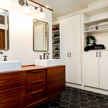
With private space at a premium in relatively narrow rowhomes, our client in Bolton Hill made the decision to transform their home’s third floor one-bedroom apartment into a private master ensuite retreat. Rustic elements including rough-hewn floating wood shelves, a cleverly- exposed distressed support stud, and dark rubbed bronze hardware on plumbing and lighting fixtures, storage hooks and built-in cabinets marry seamlessly with classic features such as fluted window casings with bullseye rosettes, oversized baseboards capped with coved base cap trim and 4-panel solid wood pockets doors. Perched on the black hexagon tile floor punctuated by white grout that picks up on the room’s light palettes, the gorgeous hammered copper soaking tub and uber-sleek Scandinavian style teak double vanity stand out as the biggest stars of this master bath build out.
 Charleene's Houses, LLC
With private space at a premium in relatively narrow rowhomes, our client in Bolton Hill made the decision to transform their home’s third floor one-bedroom apartment into a private master ensuite retreat. Rustic elements including rough-hewn floating wood shelves, a cleverly- exposed distressed support stud, and dark rubbed bronze hardware on plumbing and lighting fixtures, storage hooks and built-in cabinets marry seamlessly with classic features such as fluted window casings with bullseye rosettes, oversized baseboards capped with coved base cap trim and 4-panel solid wood pockets doors. Perched on the black hexagon tile floor punctuated by white grout that picks up on the room’s light palettes, the gorgeous hammered copper soaking tub and uber-sleek Scandinavian style teak double vanity stand out as the biggest stars of this master bath build out.
 lavish
These two adjoining girls' rooms — a show-stopping nursery and a dreamy toddler bedroom — are among the most enchanting children's spaces imaginable. Each room has its own distinct personality while sharing a thread of botanical wonder, soft femininity, and elevated design that refuses to talk down to its young inhabitants. These are spaces designed not just for children, but with genuine artistry — rooms that will inspire wonder for years to come.
The Nursery
Step into this nursery and feel immediately transported into a secret garden at dusk. The design decision that sets the entire room apart is breathtakingly bold: a large-scale dark floral wallpaper — blooming with oversized peonies, roses, and wildflowers in dusty pink, peach, sage, and cream against a deep slate blue ground — wraps every wall from chair rail to ceiling, creating an immersive, almost painterly environment that feels simultaneously dramatic and deeply soft.
The ceiling is painted a warm, powdery pink that picks up the blush tones within the wallpaper perfectly — a "fifth wall" design moment that makes the room feel like a complete, considered installation rather than a decorated room. The transition from wallpapered walls to pink ceiling at the crown molding line is seamless and intentional, wrapping the baby in a floral garden overhead and all around.
Anchoring the room with genuine design authority is a spectacular gold and crystal chandelier — its circular brass frame hung with vertical crystal rods that catch and scatter light like a garden in rain — elevating the nursery from charming to genuinely luxurious. Beneath it, a natural oak arched spindle crib sits against the wallpapered feature wall, its warm honey wood grain providing organic contrast to the moody floral backdrop. Pink velvet pillows and a soft crib mobile of plush clouds and moons complete the crib vignette with gentle whimsy.
A boucle glider chair and matching stacked ottoman in cream provide the nursing corner, paired with a small brass side table for midnight essentials. A soft blush pink area rug anchors the seating area and echoes the ceiling color. Linen drapery panels in soft ivory frame the windows without competing with the wallpaper, their pinch-pleat heading adding a refined tailoring detail.
The Toddler Bedroom
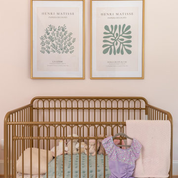
The connecting bedroom takes the botanical theme in a softer, sunnier direction — all blush pink walls (matching ceiling and walls in the same warm rose tone for a cocooning effect), botanical print drapery in cream with red and green wildflowers, and brass curtain hardware that ties to the nursery's gold palette. A gold spindle crib — the metallic version of the nursery's wooden one — grounds the room with warmth, while a sage green upholstered glider provides a reading corner. A white dresser with brass hardware doubles as a changing table, topped with art prints and a Matisse-inspired framed poster in a gold frame that adds a touch of grown-up gallery sensibility.
Floating acrylic shelves hold a curated collection of board books at child-height — a detail that communicates that this room was designed for a child who will love and use it, not just admire it. A whimsical wicker llama toy basket, an indoor olive tree, and a fluffy white boucle child's armchair complete a room that balances magic with livability.
 TV Lift Cabinet by Cabinet Tronix
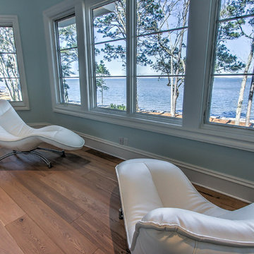
Gorgeous master bedroom has an amazingly beautiful view and interior designer and client agreed if you want a TV it has to be hidden with a TV lift cabinet system. There are a few pictures of not only the bed but also the view.
This is one of our favorite examples of foot of the bed use to hide the TV.
The TV is an 55 inch OLED LG flat screen. Their is a compartment that also hides the BluRay and cable box. The operation of the lift kit, TV, cable box, Blue Ray is controlled by a single Universal remote. Push one button and TV, electronics turn on and rise at the same time. Client also uses Apple TV, Roku and their smart TV together to maximize viewing pleasure.
The furniture design made by Cabinet Tronix is called the Oceanaire. This one in particular has a very high end piano grade white lacquer finish. This is more expensive however the clients expectations were thankfully exceeded.
Cabinet Tronix who has specialized in high end furniture in combination with motorized remote controlled pop up lift furniture since 2002. These systems are made to order based on clients needs versus having units ready to pick from. This type hand holding makes it so the client can have any design, the TV size they want and understand the difference of what their decisions reflect the proportions of the furniture and its size.
Have a system particularly at the foot of the bed brings on a few instant situations. The client here wanted a component section to hold the DVD player. Now, I suggested against it as the furniture would be taller than the bed... however that is what he wanted. Most do other suggested ideas I propose with the DVD player so the furniture can be up to 4.5 inches lower.
Anyways, loved this project and client was so kind to provide the pictures.
These systems are popular in all aspects of homes such as room dividers, in great rooms, side of fire places, center of the room out side by itself and under verandas.
These are shipped all around the world to places like:
Miami Florida
San Diego, California
Orange County
Las Vegas, Nevada
Connecticut
Houston Dallas Austin Texas
North and South Carolina
Atlanta Georgia
Seattle Washington
Silicon Valley
Northern California
New York City Manhattan
Boston
maryland
Washington DC
and many others.
 lavish
These two adjoining girls' rooms — a show-stopping nursery and a dreamy toddler bedroom — are among the most enchanting children's spaces imaginable. Each room has its own distinct personality while sharing a thread of botanical wonder, soft femininity, and elevated design that refuses to talk down to its young inhabitants. These are spaces designed not just for children, but with genuine artistry — rooms that will inspire wonder for years to come.
The Nursery
Step into this nursery and feel immediately transported into a secret garden at dusk. The design decision that sets the entire room apart is breathtakingly bold: a large-scale dark floral wallpaper — blooming with oversized peonies, roses, and wildflowers in dusty pink, peach, sage, and cream against a deep slate blue ground — wraps every wall from chair rail to ceiling, creating an immersive, almost painterly environment that feels simultaneously dramatic and deeply soft.
The ceiling is painted a warm, powdery pink that picks up the blush tones within the wallpaper perfectly — a "fifth wall" design moment that makes the room feel like a complete, considered installation rather than a decorated room. The transition from wallpapered walls to pink ceiling at the crown molding line is seamless and intentional, wrapping the baby in a floral garden overhead and all around.
Anchoring the room with genuine design authority is a spectacular gold and crystal chandelier — its circular brass frame hung with vertical crystal rods that catch and scatter light like a garden in rain — elevating the nursery from charming to genuinely luxurious. Beneath it, a natural oak arched spindle crib sits against the wallpapered feature wall, its warm honey wood grain providing organic contrast to the moody floral backdrop. Pink velvet pillows and a soft crib mobile of plush clouds and moons complete the crib vignette with gentle whimsy.
A boucle glider chair and matching stacked ottoman in cream provide the nursing corner, paired with a small brass side table for midnight essentials. A soft blush pink area rug anchors the seating area and echoes the ceiling color. Linen drapery panels in soft ivory frame the windows without competing with the wallpaper, their pinch-pleat heading adding a refined tailoring detail.
The Toddler Bedroom
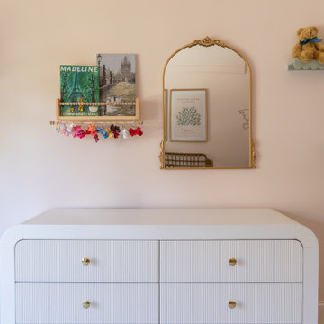
The connecting bedroom takes the botanical theme in a softer, sunnier direction — all blush pink walls (matching ceiling and walls in the same warm rose tone for a cocooning effect), botanical print drapery in cream with red and green wildflowers, and brass curtain hardware that ties to the nursery's gold palette. A gold spindle crib — the metallic version of the nursery's wooden one — grounds the room with warmth, while a sage green upholstered glider provides a reading corner. A white dresser with brass hardware doubles as a changing table, topped with art prints and a Matisse-inspired framed poster in a gold frame that adds a touch of grown-up gallery sensibility.
Floating acrylic shelves hold a curated collection of board books at child-height — a detail that communicates that this room was designed for a child who will love and use it, not just admire it. A whimsical wicker llama toy basket, an indoor olive tree, and a fluffy white boucle child's armchair complete a room that balances magic with livability.
 Charleene's Houses, LLC
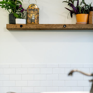
With private space at a premium in relatively narrow rowhomes, our client in Bolton Hill made the decision to transform their home’s third floor one-bedroom apartment into a private master ensuite retreat. Rustic elements including rough-hewn floating wood shelves, a cleverly- exposed distressed support stud, and dark rubbed bronze hardware on plumbing and lighting fixtures, storage hooks and built-in cabinets marry seamlessly with classic features such as fluted window casings with bullseye rosettes, oversized baseboards capped with coved base cap trim and 4-panel solid wood pockets doors. Perched on the black hexagon tile floor punctuated by white grout that picks up on the room’s light palettes, the gorgeous hammered copper soaking tub and uber-sleek Scandinavian style teak double vanity stand out as the biggest stars of this master bath build out.
 Klopf Architecture
Built for the Bluff, A Sea Ranch Home is Remade from the Inside Out
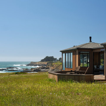
The house had always been grounded, on an ocean bluff at The Sea Ranch. It sits unencumbered, adjacent to one of the most dramatic stretches of the Sonoma coast with protected commons meadow to the east, uninterrupted Pacific views to the west, and a bluff trail running alongside. What it lacked was the feeling of home, one that could hold up its own against the natural landscape.
The owners are entrepreneurs with deep involvement across tech, real estate, and development and they know how things are built. The Sea Ranch house had been in their lives for years, a second residence and a place for family to gather. Built for a different time, it felt more compromising than comfortable. Sitting in a closed off nook, the kitchen fit one cook at a time and turned its back on the rest of the house. The entry was dim and compressed, divided by a structural column that presented itself at exactly the wrong moment. The primary suite was small relative to the view outside it. A large rear bedroom sat behind a lowered ceiling with a bathroom that had never been added. The house was certainly worth the trouble of doing it right.
What followed was not one project but four, each with its own design challenge, each addressed over a period of time.
Where the House Meets the Ocean
The most complex piece of the project, in both structural and spatial terms, was the kitchen expansion. The existing room was a single-person galley squeezed in as an afterthought with no meaningful connection to the dining room, the living space, or the deck outside. To make it useful for a family that cooks and gathers, it needed to grow outward into an existing patio and flow into the rooms around it.
A big challenge was the roofline. Several planes at different pitches and angles converged directly where additional volume was needed. A new form had to join that geometry without reading as a correction. The solution found the simplest possible connection between the existing angles, a roofline that from outside the structure, appears entirely original. From the bluff trail where the addition is visible, there is no discernible seam.
Inside, the kitchen is now open to the living and dining rooms without interruption. A large sliding glass door connects the space onto the rear deck. The deck itself was expanded and oriented so that the body of the house shields it from the coastal wind which is a common consideration that determines whether outdoor space at The Sea Ranch actually gets used. The result is a room that works for large family gatherings where no one feels cutoff, and one that makes the boundary between being inside and outside easy to ignore.
Welcoming Light
A structural column stood at the convergence of eight distinct roof planes in the entry. It was load-bearing, but it was also the reason the entry had always felt like a hallway rather than a welcoming arrival.
With the structural engineer, a custom steel connector was designed to receive beams from six separate directions, redistributing the load through a single new continuous beam. The column was surgically removed. Three triangular skylights were then cut into the roof above, their shapes drawn from the
existing geometry of the planes around them. The entry is now bright and open. The skylights feel native to the structure because they follow the logic already present in the roof.
Two Suites, Two Views
At opposite ends of the house, the two bedroom suites were each reconfigured, and each found a different way to introduce more of the landscape into the room.
An addition to the primary suite extended the structure outward to create a wraparound plan with a loop from the bedroom through bath and closet that had not been possible before. The expansion opened a slot view from the tub and shower toward the ocean. The view is precise and private. The ocean view is present and deliberate.
The rear bedroom absorbed an adjacent storage room to transform it into a full second suite with a vaulted ceiling, a large bathroom with a tub, a shower, and a sauna. A private fenced garden courtyard sits just beyond the glass bringing the outdoors inside. The tub was placed so that, looking past the courtyard and through the bedroom beyond, the ocean is visible at the far end. It is a long view and it makes the room feel larger and more settled than its footprint would suggest.
Glass on Four Sides, Fire at the Center
The main living and gathering room had always been caught between two competing facts: glass on four sides meant exceptional views but at The Sea Ranch, it also meant a cold room. A 360-degree cylindrical fireplace was added at the center on a raised stone base, providing radiant heat in every direction and giving the room a focal point around which a group naturally orients itself, whether that means two people at the end of the day or the whole family after dinner.
Owners Who Picked Up the Tools
The owner was not a passive client. they came with construction knowledge, specific ideas, and the desire to be an active part of the process, a dynamic that other architects may had found difficult, which Klopf Architecture accepted as an asset. They took it upon themselves to complete some of the work during construction, including the installation of a new radiant heating system beneath the floors.
The radiant system added to the older and less-desirable forced-air setup. At The Sea Ranch, that change matters as the house sits close enough to the ocean and moving air competes with the sound of it, where radiant heat does not. Solar panels were added to the roof as part of the new system. Insulation was upgraded throughout the walls, roof, and crawl space. The house that had always had the right setting now holds warmth the way a house on the bluff should.
They were also deeply involved in the design and selections throughout, and the finished house reflects both of them in ways that are specific rather than generic. The process took longer and moved through more iterations than a more arms-length relationship might have allowed. The result is more defined and personal because of it.
The Landscape Holds Priority
Every exterior decision was shaped by The Sea Ranch Design Standards, which require that buildings defer to the landscape around them rather than compete with it. Because this house sits on the bluff and is visible from the public trail, the additions faced a close review. Existing materials were matched. Geometries were resolved. The additions had to become indistinguishable from the original building.
From the trail, the house reads exactly as it always has — low, cedar-clad, secondary to the meadow and the water. The setting holds priority. Inside, the house has been remade.
Klopf Architecture Project Team: Geoff Campen and Trenton Jewett
Contractor: Shawn Bettega Construction
Photography: ©2025 Mariko Reed
Year Completed: 2023
Location: The Sea Ranch, CA
 Charleene's Houses, LLC
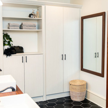
With private space at a premium in relatively narrow rowhomes, our client in Bolton Hill made the decision to transform their home’s third floor one-bedroom apartment into a private master ensuite retreat. Rustic elements including rough-hewn floating wood shelves, a cleverly- exposed distressed support stud, and dark rubbed bronze hardware on plumbing and lighting fixtures, storage hooks and built-in cabinets marry seamlessly with classic features such as fluted window casings with bullseye rosettes, oversized baseboards capped with coved base cap trim and 4-panel solid wood pockets doors. Perched on the black hexagon tile floor punctuated by white grout that picks up on the room’s light palettes, the gorgeous hammered copper soaking tub and uber-sleek Scandinavian style teak double vanity stand out as the biggest stars of this master bath build out.
 Simply Perfect
Advice on interior design is available everywhere—from TV shows and websites to books, magazines and apps.
We love seeing people become engaged in design and educated on the wide range of possibilities. But we hope you’ll proceed with caution.
It’s not that style errors are a matter of life and death. It’s just that it’s easy to choose designs that aren’t necessarily reflective of your own personality and character. And since you’re typically stuck with your interior design decisions for years, styles that don’t quite fit can tend to grate on you.
Interiors that give one person comfort may unleash chaos in someone else. This goes beyond favorite colors or hot trends, right to the heart of interior design, where you find questions of composition, balance, repetition, space and more.
The goal is to find that unique combination of design elements that gives you comfort, support and balance.
In one home, that perfect balance was struck through the use of symmetry. A pair of comfortable swivel chairs sit beneath matching indigo patterned paintings. Matching bookcases below the paintings contain similar, but not identical, arrangements of books, vases and bowls. Woods and bronzes help warm up the simple white bookcase shelving.
Two matching poufs in front of the fireplace provide additional seating. The sofa is accented with a pair of pillows with a blue pattern that echoes the artwork.
The effect of the symmetry is to achieve order and simplicity, which I promote at every opportunity. After all, your home interiors should be the setting or the backdrop of your life—not center stage.
Antique bronze and blue are complementary colors. Together, they offer a rich palette of richness and depth, which brings out the beauty of wood and stone.
In the home office, a unique, whitewash-stained wooden desk rests on metal, Sawhorse-inspired legs for a warm, rustic look. The black leather chair features a contemporary silhouette with an antique brass frame. An adjustable desk lamp has bronze accents.
The bookcase combines a sleek, black metal frame with concrete shelves, for another unusual pairing. It’s kept uncluttered for an orderly, peaceful look. Items on the shelves include a bronze-accented lamp and a pair
of high gloss-finished wooden bookends.
The elegant artwork behind the desk is a simple midnight-blue and bronze with mottled white. Deep blues are again picked up in the rug, which adds a stately vibe with a modern pattern and satisfying texture.
Within the framework of symmetry, the living room repeats the blue-and-bronze color scheme.
A large midcentury brass clock above the fireplace keeps the natural stone visible, rather than hidden behind a painting or television, while its straight lines and color create a beautiful contrast.
The sofa is a soft, neutral blue. The pattern on the round brass side table features echoes the darker blue-patterned rug, as well as the rug in the office, tying the rooms together.
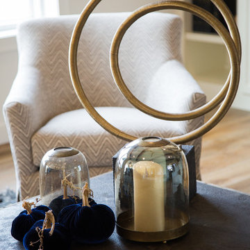
Indigo blue books adjacent to bronze vases on the shelves repeat the color scheme. The soapstone-topped coffee table echoes the shape of the fireplace. A pair of tall, matching floor lamps with long wooden bases, brass pulls and simple linen shades combine both the colors and symmetry found throughout the home.
14