
Search results for "Decision pick" in Home Design Ideas
 lavish
These two adjoining girls' rooms — a show-stopping nursery and a dreamy toddler bedroom — are among the most enchanting children's spaces imaginable. Each room has its own distinct personality while sharing a thread of botanical wonder, soft femininity, and elevated design that refuses to talk down to its young inhabitants. These are spaces designed not just for children, but with genuine artistry — rooms that will inspire wonder for years to come.
The Nursery
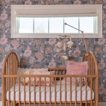
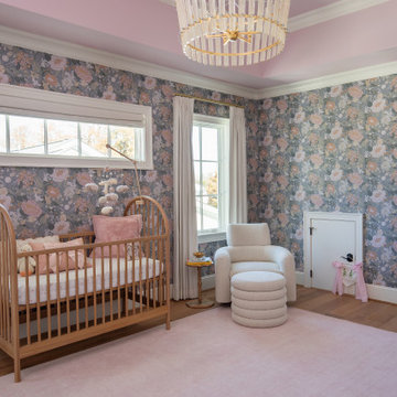
Step into this nursery and feel immediately transported into a secret garden at dusk. The design decision that sets the entire room apart is breathtakingly bold: a large-scale dark floral wallpaper — blooming with oversized peonies, roses, and wildflowers in dusty pink, peach, sage, and cream against a deep slate blue ground — wraps every wall from chair rail to ceiling, creating an immersive, almost painterly environment that feels simultaneously dramatic and deeply soft.
The ceiling is painted a warm, powdery pink that picks up the blush tones within the wallpaper perfectly — a "fifth wall" design moment that makes the room feel like a complete, considered installation rather than a decorated room. The transition from wallpapered walls to pink ceiling at the crown molding line is seamless and intentional, wrapping the baby in a floral garden overhead and all around.
Anchoring the room with genuine design authority is a spectacular gold and crystal chandelier — its circular brass frame hung with vertical crystal rods that catch and scatter light like a garden in rain — elevating the nursery from charming to genuinely luxurious. Beneath it, a natural oak arched spindle crib sits against the wallpapered feature wall, its warm honey wood grain providing organic contrast to the moody floral backdrop. Pink velvet pillows and a soft crib mobile of plush clouds and moons complete the crib vignette with gentle whimsy.
A boucle glider chair and matching stacked ottoman in cream provide the nursing corner, paired with a small brass side table for midnight essentials. A soft blush pink area rug anchors the seating area and echoes the ceiling color. Linen drapery panels in soft ivory frame the windows without competing with the wallpaper, their pinch-pleat heading adding a refined tailoring detail.
The Toddler Bedroom
The connecting bedroom takes the botanical theme in a softer, sunnier direction — all blush pink walls (matching ceiling and walls in the same warm rose tone for a cocooning effect), botanical print drapery in cream with red and green wildflowers, and brass curtain hardware that ties to the nursery's gold palette. A gold spindle crib — the metallic version of the nursery's wooden one — grounds the room with warmth, while a sage green upholstered glider provides a reading corner. A white dresser with brass hardware doubles as a changing table, topped with art prints and a Matisse-inspired framed poster in a gold frame that adds a touch of grown-up gallery sensibility.
Floating acrylic shelves hold a curated collection of board books at child-height — a detail that communicates that this room was designed for a child who will love and use it, not just admire it. A whimsical wicker llama toy basket, an indoor olive tree, and a fluffy white boucle child's armchair complete a room that balances magic with livability.
 lavish
These two adjoining girls' rooms — a show-stopping nursery and a dreamy toddler bedroom — are among the most enchanting children's spaces imaginable. Each room has its own distinct personality while sharing a thread of botanical wonder, soft femininity, and elevated design that refuses to talk down to its young inhabitants. These are spaces designed not just for children, but with genuine artistry — rooms that will inspire wonder for years to come.
The Nursery
Step into this nursery and feel immediately transported into a secret garden at dusk. The design decision that sets the entire room apart is breathtakingly bold: a large-scale dark floral wallpaper — blooming with oversized peonies, roses, and wildflowers in dusty pink, peach, sage, and cream against a deep slate blue ground — wraps every wall from chair rail to ceiling, creating an immersive, almost painterly environment that feels simultaneously dramatic and deeply soft.
The ceiling is painted a warm, powdery pink that picks up the blush tones within the wallpaper perfectly — a "fifth wall" design moment that makes the room feel like a complete, considered installation rather than a decorated room. The transition from wallpapered walls to pink ceiling at the crown molding line is seamless and intentional, wrapping the baby in a floral garden overhead and all around.
Anchoring the room with genuine design authority is a spectacular gold and crystal chandelier — its circular brass frame hung with vertical crystal rods that catch and scatter light like a garden in rain — elevating the nursery from charming to genuinely luxurious. Beneath it, a natural oak arched spindle crib sits against the wallpapered feature wall, its warm honey wood grain providing organic contrast to the moody floral backdrop. Pink velvet pillows and a soft crib mobile of plush clouds and moons complete the crib vignette with gentle whimsy.
A boucle glider chair and matching stacked ottoman in cream provide the nursing corner, paired with a small brass side table for midnight essentials. A soft blush pink area rug anchors the seating area and echoes the ceiling color. Linen drapery panels in soft ivory frame the windows without competing with the wallpaper, their pinch-pleat heading adding a refined tailoring detail.
The Toddler Bedroom
The connecting bedroom takes the botanical theme in a softer, sunnier direction — all blush pink walls (matching ceiling and walls in the same warm rose tone for a cocooning effect), botanical print drapery in cream with red and green wildflowers, and brass curtain hardware that ties to the nursery's gold palette. A gold spindle crib — the metallic version of the nursery's wooden one — grounds the room with warmth, while a sage green upholstered glider provides a reading corner. A white dresser with brass hardware doubles as a changing table, topped with art prints and a Matisse-inspired framed poster in a gold frame that adds a touch of grown-up gallery sensibility.
Floating acrylic shelves hold a curated collection of board books at child-height — a detail that communicates that this room was designed for a child who will love and use it, not just admire it. A whimsical wicker llama toy basket, an indoor olive tree, and a fluffy white boucle child's armchair complete a room that balances magic with livability.
 Charleene's Houses, LLC
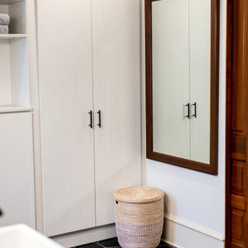
With private space at a premium in relatively narrow rowhomes, our client in Bolton Hill made the decision to transform their home’s third floor one-bedroom apartment into a private master ensuite retreat. Rustic elements including rough-hewn floating wood shelves, a cleverly- exposed distressed support stud, and dark rubbed bronze hardware on plumbing and lighting fixtures, storage hooks and built-in cabinets marry seamlessly with classic features such as fluted window casings with bullseye rosettes, oversized baseboards capped with coved base cap trim and 4-panel solid wood pockets doors. Perched on the black hexagon tile floor punctuated by white grout that picks up on the room’s light palettes, the gorgeous hammered copper soaking tub and uber-sleek Scandinavian style teak double vanity stand out as the biggest stars of this master bath build out.
Find the right local pro for your project
 Paintzen, Inc.
When it comes to finding inspiration for your house or apartment design, there are a variety of routes you can take. For some, it is important to dive into the latest trends in fashion and art, using only the most popular decor pieces and embracing the color palettes seen on runways or in home and garden magazines. But for others, it’s simply about discovering what feels most like “home.”
Ashley Steele, the creator of A Styled Affair, was part of the latter group. “Since my husband and I were moving into a space that was previously owned, I needed a way to make it feel like it was truly ours, and unique to us,” she told our team.
A Styled Affair sprang from Ashley’s passion for fashion, and need for a creative outlet. But it soon became more than that. She developed a following, and it quickly became a place where she could share her personal style, travel adventures, and lifestyle tips. “While the blogging industry has become overwhelmed with people sharing their favorite home decor or make-up tips, I think what sets A Styled Affair apart is my commitment to stay true to my unique taste. I have always marched to the beat of my own drum – and that carries through in the clothes I wear, the decor I select for our home, and the travels I plan.”
Paintzen connected with Ashley as she was settling into her new home in Boston’s Seaport District. Although she and her husband have lived in Boston for almost 8 years, they were used to smaller, more traditional spaces. Their new home is much bigger, and more modern, than any place they lived before. “I wanted to select colors of comfort, simplicity, and sophistication so we could elevate the space and make it feel more like a home.” Ashley also accurately pointed out that new construction can sometimes feel a little cold and sterile, almost industrial. “I wanted our home to feel like a peaceful oasis after coming in from the bustling city.”
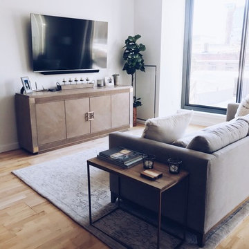
Ashley chose soft white paint for her walls to bring a sense of comfort and zen. With lots of wall decor, art work and carefully selected furniture, the walls serve as a clean and comfortable palette, and allowed her more freedom when making her other design decisions throughout the space. Ashley kept the overall palette fairly neutral, and incorporated “modern bohemian” inspired decor throughout the home; the final product was clean and simple, and catered to her style.
We asked Ashley what she was most excited for now. “I’m most excited to continue to find new decor pieces to compliment the paint colors and decor we’ve already found for the space. We have been really patient with decorating and selected each piece really careful to make sure it is cohesive and flows from room to room. I’m looking forward to enjoying the space with my husband and dog, and entertaining friends and family in the spring and summer!”
A few final questions for Ashley on her experience with Paintzen:
“I would highly recommend Paintzen to anyone, especially those that live in the city. There are so many different paint companies and contractors to choose from but going through Paintzen simplified the process and made me feel comfortable that we had the right team working on our space. Their platform for booking services and choosing paint colors made the process seamless and was a great way to keep track of what we booked and chose for colors. Most importantly, the customer service team was outstanding whenever we had a question or needed to make an adjustment.”
And advice she would give someone repainting their home:
“Patience. I would recommend taking your time and doing your research before selecting paint colors. Lighting changes every color so make sure to bring paint swatches and samples into the space and look at it throughout the day to see the different tones that the light will pick up. I would also recommend researching color trends and recommendations for colors in the family you are looking for. We found our living room color through a blog post listing top-used colors by interior designers and it looks amazing.”
 lavish
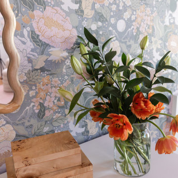
These two adjoining girls' rooms — a show-stopping nursery and a dreamy toddler bedroom — are among the most enchanting children's spaces imaginable. Each room has its own distinct personality while sharing a thread of botanical wonder, soft femininity, and elevated design that refuses to talk down to its young inhabitants. These are spaces designed not just for children, but with genuine artistry — rooms that will inspire wonder for years to come.
The Nursery
Step into this nursery and feel immediately transported into a secret garden at dusk. The design decision that sets the entire room apart is breathtakingly bold: a large-scale dark floral wallpaper — blooming with oversized peonies, roses, and wildflowers in dusty pink, peach, sage, and cream against a deep slate blue ground — wraps every wall from chair rail to ceiling, creating an immersive, almost painterly environment that feels simultaneously dramatic and deeply soft.
The ceiling is painted a warm, powdery pink that picks up the blush tones within the wallpaper perfectly — a "fifth wall" design moment that makes the room feel like a complete, considered installation rather than a decorated room. The transition from wallpapered walls to pink ceiling at the crown molding line is seamless and intentional, wrapping the baby in a floral garden overhead and all around.
Anchoring the room with genuine design authority is a spectacular gold and crystal chandelier — its circular brass frame hung with vertical crystal rods that catch and scatter light like a garden in rain — elevating the nursery from charming to genuinely luxurious. Beneath it, a natural oak arched spindle crib sits against the wallpapered feature wall, its warm honey wood grain providing organic contrast to the moody floral backdrop. Pink velvet pillows and a soft crib mobile of plush clouds and moons complete the crib vignette with gentle whimsy.
A boucle glider chair and matching stacked ottoman in cream provide the nursing corner, paired with a small brass side table for midnight essentials. A soft blush pink area rug anchors the seating area and echoes the ceiling color. Linen drapery panels in soft ivory frame the windows without competing with the wallpaper, their pinch-pleat heading adding a refined tailoring detail.
The Toddler Bedroom
The connecting bedroom takes the botanical theme in a softer, sunnier direction — all blush pink walls (matching ceiling and walls in the same warm rose tone for a cocooning effect), botanical print drapery in cream with red and green wildflowers, and brass curtain hardware that ties to the nursery's gold palette. A gold spindle crib — the metallic version of the nursery's wooden one — grounds the room with warmth, while a sage green upholstered glider provides a reading corner. A white dresser with brass hardware doubles as a changing table, topped with art prints and a Matisse-inspired framed poster in a gold frame that adds a touch of grown-up gallery sensibility.
Floating acrylic shelves hold a curated collection of board books at child-height — a detail that communicates that this room was designed for a child who will love and use it, not just admire it. A whimsical wicker llama toy basket, an indoor olive tree, and a fluffy white boucle child's armchair complete a room that balances magic with livability.
 Charleene's Houses, LLC
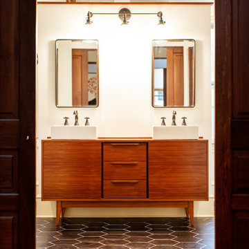
With private space at a premium in relatively narrow rowhomes, our client in Bolton Hill made the decision to transform their home’s third floor one-bedroom apartment into a private master ensuite retreat. Rustic elements including rough-hewn floating wood shelves, a cleverly- exposed distressed support stud, and dark rubbed bronze hardware on plumbing and lighting fixtures, storage hooks and built-in cabinets marry seamlessly with classic features such as fluted window casings with bullseye rosettes, oversized baseboards capped with coved base cap trim and 4-panel solid wood pockets doors. Perched on the black hexagon tile floor punctuated by white grout that picks up on the room’s light palettes, the gorgeous hammered copper soaking tub and uber-sleek Scandinavian style teak double vanity stand out as the biggest stars of this master bath build out.
 Tim Lawlor Construction
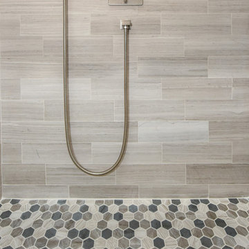
Inspiration for a transitional gray tile and porcelain tile bathroom remodel in San Francisco
 TaylorPro Design and Remodeling, Inc.
"The home remodeling process, from concept to a finished product, can be a long and stressful time for many couples. An endless number of questions always come to mind and timely decisions must be made if a successful project is desired. This is why we picked Taylor Pro Design and the reason we are so happy with the finished product! Kerry clearly explained what could and couldn’t be done from a design standpoint and the cost implications of the various options we were considering. In terms of the end product we couldn’t be happier. The attention to detail by his contractors is superb and Kerry’s willingness to make sure we were completely satisfied with everything is genuine and trustworthy. We would recommend Kerry Pro Design to anyone."
~ Julie S, Client
Designer: Kerry Taylor
Photos by: Jon Upson
 RAJ Kitchen and Bath, LLC
**Check out the video of this transformation on our website**
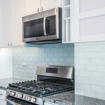
This small kitchen was way too small for this 2 bedrooms, 2 bathrooms apartment. Not only was it a very small kitchen, but the physical location of it made it very difficult to make it any bigger. There wasn't much that could have been done without incurring astronomical cost, which would get little or no return on the investment. The client wanted a kitchen that can be optimized in its current location to add a ton of value for resale.
This was difficult to do, because there was no moving of any mechanical around in the kitchen and even if we wanted to, the management of the building would not allow. For those of you who live in condos, co-ops or apartment building, you know how difficult it is to rework these foot prints. When we showed up, we saw the problems, but we also saw a huge opportunity where we can achieve those goals in the small space. This was accomplished by making some key changes and to incorporate some new things that was not possible when this kitchen was built years ago.
The crucial part of the design that would drive the entire new layout, was selecting the only appliance; that was the Refrigerator. Once we nailed down that refrigerator, we then proceeded to design the kitchen around it. We moved it to the other side of the wall where the sink was so that we can tap into the water line from the sink plumbing. It was crucial that it stays exactly 24" deep, not an inch more because we had to keep the entry as open as possible. Also, it was going to be directly in front of another big storage unit - The pantry. It is not ideal in most cases, but we needed the rest of the space to ramp up the design and open feel towards the side where all of the activities would take place, which happend to be the dining room and the view.
Once all that was figured out, we re-positioned the sink, dishwasher and the range and proceeded to wrap the cabinets around the columns to integrate them into the space. Thirty- six inches cabinets height was used so that they can be installed higher towards the ceiling height to give more room rather than the standard 18" required height between the counter tops. This was done to make the room feel a lot bigger than it really was. Not to mention, we also didn't want the faucet to be buried under the cabinets so that was also a necessary design detail for the space.
We then lowered both knee walls so that the counter top can sit on top of them, by removing that stop point that would have otherwise defined the kitchen area. This allowed us to pick up that extra footprint into the room for added prep space and enabled us to create the illusion of a kitchen that is looking longer than it really is. Every inch mattered when designing this kitchen and we made a conscious decision to use every one of that inch.
White cabinets were selected to do just what white cabinets are design to do; make a small or dark room appear bigger, brighter and more open. In this kitchen, this was amplified the more because of the kitchen location. It was perfect! We knew we did justice to the space because while we were there taking some photos, a few potential buyers walked in and went straight for the kitchen! They said its design just to fit the apartment.
Pantry roll out shelving, Double recycle bin, fancy handles, LED lighting, Quartz counter top, beautiful backslash tiles and grey linen floors finished off the kitchen which looked over a beautiful view of the George Washington Bridge from the top of this lovely 4th floor apartment.
Credit to Masterpiece Tile and Marble (Annmarie on the selection of Tiles and countertop and Val on the Construction to complete this project).
Davor Kokic Photography
 lavish
These two adjoining girls' rooms — a show-stopping nursery and a dreamy toddler bedroom — are among the most enchanting children's spaces imaginable. Each room has its own distinct personality while sharing a thread of botanical wonder, soft femininity, and elevated design that refuses to talk down to its young inhabitants. These are spaces designed not just for children, but with genuine artistry — rooms that will inspire wonder for years to come.
The Nursery
Step into this nursery and feel immediately transported into a secret garden at dusk. The design decision that sets the entire room apart is breathtakingly bold: a large-scale dark floral wallpaper — blooming with oversized peonies, roses, and wildflowers in dusty pink, peach, sage, and cream against a deep slate blue ground — wraps every wall from chair rail to ceiling, creating an immersive, almost painterly environment that feels simultaneously dramatic and deeply soft.
The ceiling is painted a warm, powdery pink that picks up the blush tones within the wallpaper perfectly — a "fifth wall" design moment that makes the room feel like a complete, considered installation rather than a decorated room. The transition from wallpapered walls to pink ceiling at the crown molding line is seamless and intentional, wrapping the baby in a floral garden overhead and all around.
Anchoring the room with genuine design authority is a spectacular gold and crystal chandelier — its circular brass frame hung with vertical crystal rods that catch and scatter light like a garden in rain — elevating the nursery from charming to genuinely luxurious. Beneath it, a natural oak arched spindle crib sits against the wallpapered feature wall, its warm honey wood grain providing organic contrast to the moody floral backdrop. Pink velvet pillows and a soft crib mobile of plush clouds and moons complete the crib vignette with gentle whimsy.
A boucle glider chair and matching stacked ottoman in cream provide the nursing corner, paired with a small brass side table for midnight essentials. A soft blush pink area rug anchors the seating area and echoes the ceiling color. Linen drapery panels in soft ivory frame the windows without competing with the wallpaper, their pinch-pleat heading adding a refined tailoring detail.
The Toddler Bedroom
The connecting bedroom takes the botanical theme in a softer, sunnier direction — all blush pink walls (matching ceiling and walls in the same warm rose tone for a cocooning effect), botanical print drapery in cream with red and green wildflowers, and brass curtain hardware that ties to the nursery's gold palette. A gold spindle crib — the metallic version of the nursery's wooden one — grounds the room with warmth, while a sage green upholstered glider provides a reading corner. A white dresser with brass hardware doubles as a changing table, topped with art prints and a Matisse-inspired framed poster in a gold frame that adds a touch of grown-up gallery sensibility.
Floating acrylic shelves hold a curated collection of board books at child-height — a detail that communicates that this room was designed for a child who will love and use it, not just admire it. A whimsical wicker llama toy basket, an indoor olive tree, and a fluffy white boucle child's armchair complete a room that balances magic with livability.
 Charleene's Houses, LLC
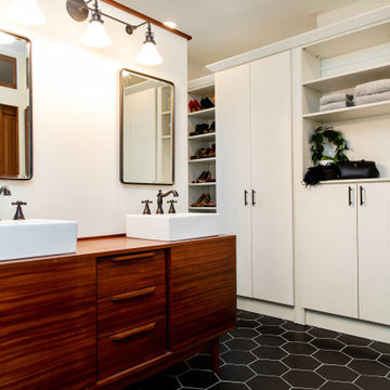
With private space at a premium in relatively narrow rowhomes, our client in Bolton Hill made the decision to transform their home’s third floor one-bedroom apartment into a private master ensuite retreat. Rustic elements including rough-hewn floating wood shelves, a cleverly- exposed distressed support stud, and dark rubbed bronze hardware on plumbing and lighting fixtures, storage hooks and built-in cabinets marry seamlessly with classic features such as fluted window casings with bullseye rosettes, oversized baseboards capped with coved base cap trim and 4-panel solid wood pockets doors. Perched on the black hexagon tile floor punctuated by white grout that picks up on the room’s light palettes, the gorgeous hammered copper soaking tub and uber-sleek Scandinavian style teak double vanity stand out as the biggest stars of this master bath build out.
 Klopf Architecture
Built for the Bluff, A Sea Ranch Home is Remade from the Inside Out
The house had always been grounded, on an ocean bluff at The Sea Ranch. It sits unencumbered, adjacent to one of the most dramatic stretches of the Sonoma coast with protected commons meadow to the east, uninterrupted Pacific views to the west, and a bluff trail running alongside. What it lacked was the feeling of home, one that could hold up its own against the natural landscape.
The owners are entrepreneurs with deep involvement across tech, real estate, and development and they know how things are built. The Sea Ranch house had been in their lives for years, a second residence and a place for family to gather. Built for a different time, it felt more compromising than comfortable. Sitting in a closed off nook, the kitchen fit one cook at a time and turned its back on the rest of the house. The entry was dim and compressed, divided by a structural column that presented itself at exactly the wrong moment. The primary suite was small relative to the view outside it. A large rear bedroom sat behind a lowered ceiling with a bathroom that had never been added. The house was certainly worth the trouble of doing it right.
What followed was not one project but four, each with its own design challenge, each addressed over a period of time.
Where the House Meets the Ocean
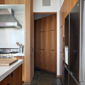
The most complex piece of the project, in both structural and spatial terms, was the kitchen expansion. The existing room was a single-person galley squeezed in as an afterthought with no meaningful connection to the dining room, the living space, or the deck outside. To make it useful for a family that cooks and gathers, it needed to grow outward into an existing patio and flow into the rooms around it.
A big challenge was the roofline. Several planes at different pitches and angles converged directly where additional volume was needed. A new form had to join that geometry without reading as a correction. The solution found the simplest possible connection between the existing angles, a roofline that from outside the structure, appears entirely original. From the bluff trail where the addition is visible, there is no discernible seam.
Inside, the kitchen is now open to the living and dining rooms without interruption. A large sliding glass door connects the space onto the rear deck. The deck itself was expanded and oriented so that the body of the house shields it from the coastal wind which is a common consideration that determines whether outdoor space at The Sea Ranch actually gets used. The result is a room that works for large family gatherings where no one feels cutoff, and one that makes the boundary between being inside and outside easy to ignore.
Welcoming Light
A structural column stood at the convergence of eight distinct roof planes in the entry. It was load-bearing, but it was also the reason the entry had always felt like a hallway rather than a welcoming arrival.
With the structural engineer, a custom steel connector was designed to receive beams from six separate directions, redistributing the load through a single new continuous beam. The column was surgically removed. Three triangular skylights were then cut into the roof above, their shapes drawn from the
existing geometry of the planes around them. The entry is now bright and open. The skylights feel native to the structure because they follow the logic already present in the roof.
Two Suites, Two Views
At opposite ends of the house, the two bedroom suites were each reconfigured, and each found a different way to introduce more of the landscape into the room.
An addition to the primary suite extended the structure outward to create a wraparound plan with a loop from the bedroom through bath and closet that had not been possible before. The expansion opened a slot view from the tub and shower toward the ocean. The view is precise and private. The ocean view is present and deliberate.
The rear bedroom absorbed an adjacent storage room to transform it into a full second suite with a vaulted ceiling, a large bathroom with a tub, a shower, and a sauna. A private fenced garden courtyard sits just beyond the glass bringing the outdoors inside. The tub was placed so that, looking past the courtyard and through the bedroom beyond, the ocean is visible at the far end. It is a long view and it makes the room feel larger and more settled than its footprint would suggest.
Glass on Four Sides, Fire at the Center
The main living and gathering room had always been caught between two competing facts: glass on four sides meant exceptional views but at The Sea Ranch, it also meant a cold room. A 360-degree cylindrical fireplace was added at the center on a raised stone base, providing radiant heat in every direction and giving the room a focal point around which a group naturally orients itself, whether that means two people at the end of the day or the whole family after dinner.
Owners Who Picked Up the Tools
The owner was not a passive client. they came with construction knowledge, specific ideas, and the desire to be an active part of the process, a dynamic that other architects may had found difficult, which Klopf Architecture accepted as an asset. They took it upon themselves to complete some of the work during construction, including the installation of a new radiant heating system beneath the floors.
The radiant system added to the older and less-desirable forced-air setup. At The Sea Ranch, that change matters as the house sits close enough to the ocean and moving air competes with the sound of it, where radiant heat does not. Solar panels were added to the roof as part of the new system. Insulation was upgraded throughout the walls, roof, and crawl space. The house that had always had the right setting now holds warmth the way a house on the bluff should.
They were also deeply involved in the design and selections throughout, and the finished house reflects both of them in ways that are specific rather than generic. The process took longer and moved through more iterations than a more arms-length relationship might have allowed. The result is more defined and personal because of it.
The Landscape Holds Priority
Every exterior decision was shaped by The Sea Ranch Design Standards, which require that buildings defer to the landscape around them rather than compete with it. Because this house sits on the bluff and is visible from the public trail, the additions faced a close review. Existing materials were matched. Geometries were resolved. The additions had to become indistinguishable from the original building.
From the trail, the house reads exactly as it always has — low, cedar-clad, secondary to the meadow and the water. The setting holds priority. Inside, the house has been remade.
Klopf Architecture Project Team: Geoff Campen and Trenton Jewett
Contractor: Shawn Bettega Construction
Photography: ©2025 Mariko Reed
Year Completed: 2023
Location: The Sea Ranch, CA
 Charleene's Houses, LLC
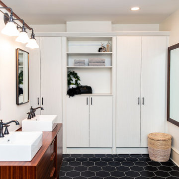
With private space at a premium in relatively narrow rowhomes, our client in Bolton Hill made the decision to transform their home’s third floor one-bedroom apartment into a private master ensuite retreat. Rustic elements including rough-hewn floating wood shelves, a cleverly- exposed distressed support stud, and dark rubbed bronze hardware on plumbing and lighting fixtures, storage hooks and built-in cabinets marry seamlessly with classic features such as fluted window casings with bullseye rosettes, oversized baseboards capped with coved base cap trim and 4-panel solid wood pockets doors. Perched on the black hexagon tile floor punctuated by white grout that picks up on the room’s light palettes, the gorgeous hammered copper soaking tub and uber-sleek Scandinavian style teak double vanity stand out as the biggest stars of this master bath build out.
 User
UserIn All Weather’s latest episode of the hit HGTV series Celebrity IOU, comedian, actor and producer Kevin Hart gives back to his close friend and personal trainer Ron, aka “Boss.” who helped him walk after his serious 2019 car crash. The 42- year old comedian expresses his deep gratitude by transforming his “brothers” backhouse into a sleek man cave complete with a barber shop, as a nod to how they met nearly 19 years ago.
“My life got flipped upside down by a tragic accident and Boss was there with me every step of they way,” said Kevin. “This is a small token of my appreciation that Boss won’t see coming and that will hopefully floor him, This renovation is well-deserved because of the person that he is.”
Kevin combines forces with the Property Brothers and All Weather to turn Boss’ crumbling backhouse into a stylish retreat where he can relax with friends. Not only did Kevin take part in the demo by taking apart rotted floors and knocking down cabinets with a sledgehammer, he also helped pick out tile and floor colors. Kevin told Drew and Jonathan Scott that he has watched a lot of design shows and was 1000% confident in all his choices.
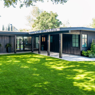
Kevin’s smart design decisions helped create a space reflective of Boss’s style. The dramatic transformation includes a modern kitchen with a hidden bar, large stone island and expansive All Weather Series 8100 Pocket Sliding Doors; an open living space and barber shop with large All Weather Series 5000 casement windows; All Weather Series 7000 Swing Door for the exterior entry door to the barber shop. See the amazing project photos here.
Celebrity IOU gives celebrities a chance to show their gratitude to someone special in their life or career by giving their space a complete redesign. Working together with the Property Brothers, the celebrities get their hands dirty to surprise their deserving friends and mentors with the stunning home renovations.
 Klopf Architecture
Built for the Bluff, A Sea Ranch Home is Remade from the Inside Out
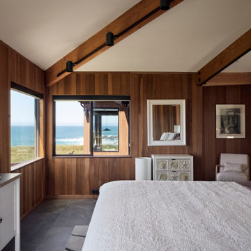
The house had always been grounded, on an ocean bluff at The Sea Ranch. It sits unencumbered, adjacent to one of the most dramatic stretches of the Sonoma coast with protected commons meadow to the east, uninterrupted Pacific views to the west, and a bluff trail running alongside. What it lacked was the feeling of home, one that could hold up its own against the natural landscape.
The owners are entrepreneurs with deep involvement across tech, real estate, and development and they know how things are built. The Sea Ranch house had been in their lives for years, a second residence and a place for family to gather. Built for a different time, it felt more compromising than comfortable. Sitting in a closed off nook, the kitchen fit one cook at a time and turned its back on the rest of the house. The entry was dim and compressed, divided by a structural column that presented itself at exactly the wrong moment. The primary suite was small relative to the view outside it. A large rear bedroom sat behind a lowered ceiling with a bathroom that had never been added. The house was certainly worth the trouble of doing it right.
What followed was not one project but four, each with its own design challenge, each addressed over a period of time.
Where the House Meets the Ocean
The most complex piece of the project, in both structural and spatial terms, was the kitchen expansion. The existing room was a single-person galley squeezed in as an afterthought with no meaningful connection to the dining room, the living space, or the deck outside. To make it useful for a family that cooks and gathers, it needed to grow outward into an existing patio and flow into the rooms around it.
A big challenge was the roofline. Several planes at different pitches and angles converged directly where additional volume was needed. A new form had to join that geometry without reading as a correction. The solution found the simplest possible connection between the existing angles, a roofline that from outside the structure, appears entirely original. From the bluff trail where the addition is visible, there is no discernible seam.
Inside, the kitchen is now open to the living and dining rooms without interruption. A large sliding glass door connects the space onto the rear deck. The deck itself was expanded and oriented so that the body of the house shields it from the coastal wind which is a common consideration that determines whether outdoor space at The Sea Ranch actually gets used. The result is a room that works for large family gatherings where no one feels cutoff, and one that makes the boundary between being inside and outside easy to ignore.
Welcoming Light
A structural column stood at the convergence of eight distinct roof planes in the entry. It was load-bearing, but it was also the reason the entry had always felt like a hallway rather than a welcoming arrival.
With the structural engineer, a custom steel connector was designed to receive beams from six separate directions, redistributing the load through a single new continuous beam. The column was surgically removed. Three triangular skylights were then cut into the roof above, their shapes drawn from the
existing geometry of the planes around them. The entry is now bright and open. The skylights feel native to the structure because they follow the logic already present in the roof.
Two Suites, Two Views
At opposite ends of the house, the two bedroom suites were each reconfigured, and each found a different way to introduce more of the landscape into the room.
An addition to the primary suite extended the structure outward to create a wraparound plan with a loop from the bedroom through bath and closet that had not been possible before. The expansion opened a slot view from the tub and shower toward the ocean. The view is precise and private. The ocean view is present and deliberate.
The rear bedroom absorbed an adjacent storage room to transform it into a full second suite with a vaulted ceiling, a large bathroom with a tub, a shower, and a sauna. A private fenced garden courtyard sits just beyond the glass bringing the outdoors inside. The tub was placed so that, looking past the courtyard and through the bedroom beyond, the ocean is visible at the far end. It is a long view and it makes the room feel larger and more settled than its footprint would suggest.
Glass on Four Sides, Fire at the Center
The main living and gathering room had always been caught between two competing facts: glass on four sides meant exceptional views but at The Sea Ranch, it also meant a cold room. A 360-degree cylindrical fireplace was added at the center on a raised stone base, providing radiant heat in every direction and giving the room a focal point around which a group naturally orients itself, whether that means two people at the end of the day or the whole family after dinner.
Owners Who Picked Up the Tools
The owner was not a passive client. they came with construction knowledge, specific ideas, and the desire to be an active part of the process, a dynamic that other architects may had found difficult, which Klopf Architecture accepted as an asset. They took it upon themselves to complete some of the work during construction, including the installation of a new radiant heating system beneath the floors.
The radiant system added to the older and less-desirable forced-air setup. At The Sea Ranch, that change matters as the house sits close enough to the ocean and moving air competes with the sound of it, where radiant heat does not. Solar panels were added to the roof as part of the new system. Insulation was upgraded throughout the walls, roof, and crawl space. The house that had always had the right setting now holds warmth the way a house on the bluff should.
They were also deeply involved in the design and selections throughout, and the finished house reflects both of them in ways that are specific rather than generic. The process took longer and moved through more iterations than a more arms-length relationship might have allowed. The result is more defined and personal because of it.
The Landscape Holds Priority
Every exterior decision was shaped by The Sea Ranch Design Standards, which require that buildings defer to the landscape around them rather than compete with it. Because this house sits on the bluff and is visible from the public trail, the additions faced a close review. Existing materials were matched. Geometries were resolved. The additions had to become indistinguishable from the original building.
From the trail, the house reads exactly as it always has — low, cedar-clad, secondary to the meadow and the water. The setting holds priority. Inside, the house has been remade.
Klopf Architecture Project Team: Geoff Campen and Trenton Jewett
Contractor: Shawn Bettega Construction
Photography: ©2025 Mariko Reed
Year Completed: 2023
Location: The Sea Ranch, CA
 TOC design & construction inc.
Designed by: TOC design - Tania Scardellato
Construction by : TOC design & Construction inc.
Pictures by: Mathieu Laflamme
Like clothing or furniture, kitchens come in many styles. Since a new kitchen costs the most and last the longest, choosing a kitchen style requires serious thought.
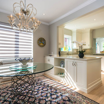
Speaking broadly, it helps to know if you prefer a more classic or more modern look. Making that decision will help you start to narrow down choices on everything from wall color to cabinet doors. Picking a very specific design theme, such as French Colonial or Art Deco, gives you even more of a design road map. Mixing and matching styles typically is called eclectic, while a look that blends traditional and contemporary elements is considered transitional.
The design for this home is Transitional
Transitional kitchens include elements of both traditional and contemporary design. Eclectic in nature, they mix natural and man-made materials as well as finishes and textures.
For example, an Arts & Crafts or Shaker kitchen can be made transitional rather than traditional by lightening the color palette, adding bamboo flooring, and showcasing appliances rather than hiding them behind wooden panels.
Molding and fixtures aren't elaborate but do have some ornamentation.
 Charleene's Houses, LLC
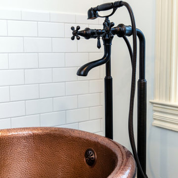
With private space at a premium in relatively narrow rowhomes, our client in Bolton Hill made the decision to transform their home’s third floor one-bedroom apartment into a private master ensuite retreat. Rustic elements including rough-hewn floating wood shelves, a cleverly- exposed distressed support stud, and dark rubbed bronze hardware on plumbing and lighting fixtures, storage hooks and built-in cabinets marry seamlessly with classic features such as fluted window casings with bullseye rosettes, oversized baseboards capped with coved base cap trim and 4-panel solid wood pockets doors. Perched on the black hexagon tile floor punctuated by white grout that picks up on the room’s light palettes, the gorgeous hammered copper soaking tub and uber-sleek Scandinavian style teak double vanity stand out as the biggest stars of this master bath build out.
 Charleene's Houses, LLC
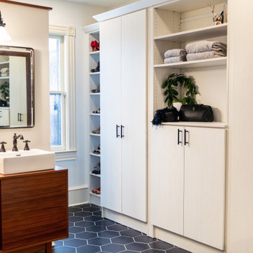
With private space at a premium in relatively narrow rowhomes, our client in Bolton Hill made the decision to transform their home’s third floor one-bedroom apartment into a private master ensuite retreat. Rustic elements including rough-hewn floating wood shelves, a cleverly- exposed distressed support stud, and dark rubbed bronze hardware on plumbing and lighting fixtures, storage hooks and built-in cabinets marry seamlessly with classic features such as fluted window casings with bullseye rosettes, oversized baseboards capped with coved base cap trim and 4-panel solid wood pockets doors. Perched on the black hexagon tile floor punctuated by white grout that picks up on the room’s light palettes, the gorgeous hammered copper soaking tub and uber-sleek Scandinavian style teak double vanity stand out as the biggest stars of this master bath build out.
 lavish
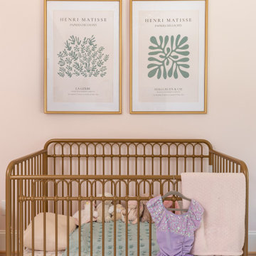
These two adjoining girls' rooms — a show-stopping nursery and a dreamy toddler bedroom — are among the most enchanting children's spaces imaginable. Each room has its own distinct personality while sharing a thread of botanical wonder, soft femininity, and elevated design that refuses to talk down to its young inhabitants. These are spaces designed not just for children, but with genuine artistry — rooms that will inspire wonder for years to come.
The Nursery
Step into this nursery and feel immediately transported into a secret garden at dusk. The design decision that sets the entire room apart is breathtakingly bold: a large-scale dark floral wallpaper — blooming with oversized peonies, roses, and wildflowers in dusty pink, peach, sage, and cream against a deep slate blue ground — wraps every wall from chair rail to ceiling, creating an immersive, almost painterly environment that feels simultaneously dramatic and deeply soft.
The ceiling is painted a warm, powdery pink that picks up the blush tones within the wallpaper perfectly — a "fifth wall" design moment that makes the room feel like a complete, considered installation rather than a decorated room. The transition from wallpapered walls to pink ceiling at the crown molding line is seamless and intentional, wrapping the baby in a floral garden overhead and all around.
Anchoring the room with genuine design authority is a spectacular gold and crystal chandelier — its circular brass frame hung with vertical crystal rods that catch and scatter light like a garden in rain — elevating the nursery from charming to genuinely luxurious. Beneath it, a natural oak arched spindle crib sits against the wallpapered feature wall, its warm honey wood grain providing organic contrast to the moody floral backdrop. Pink velvet pillows and a soft crib mobile of plush clouds and moons complete the crib vignette with gentle whimsy.
A boucle glider chair and matching stacked ottoman in cream provide the nursing corner, paired with a small brass side table for midnight essentials. A soft blush pink area rug anchors the seating area and echoes the ceiling color. Linen drapery panels in soft ivory frame the windows without competing with the wallpaper, their pinch-pleat heading adding a refined tailoring detail.
The Toddler Bedroom
The connecting bedroom takes the botanical theme in a softer, sunnier direction — all blush pink walls (matching ceiling and walls in the same warm rose tone for a cocooning effect), botanical print drapery in cream with red and green wildflowers, and brass curtain hardware that ties to the nursery's gold palette. A gold spindle crib — the metallic version of the nursery's wooden one — grounds the room with warmth, while a sage green upholstered glider provides a reading corner. A white dresser with brass hardware doubles as a changing table, topped with art prints and a Matisse-inspired framed poster in a gold frame that adds a touch of grown-up gallery sensibility.
Floating acrylic shelves hold a curated collection of board books at child-height — a detail that communicates that this room was designed for a child who will love and use it, not just admire it. A whimsical wicker llama toy basket, an indoor olive tree, and a fluffy white boucle child's armchair complete a room that balances magic with livability.
 Klopf Architecture
Built for the Bluff, A Sea Ranch Home is Remade from the Inside Out
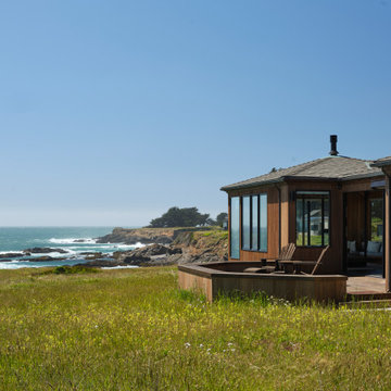
The house had always been grounded, on an ocean bluff at The Sea Ranch. It sits unencumbered, adjacent to one of the most dramatic stretches of the Sonoma coast with protected commons meadow to the east, uninterrupted Pacific views to the west, and a bluff trail running alongside. What it lacked was the feeling of home, one that could hold up its own against the natural landscape.
The owners are entrepreneurs with deep involvement across tech, real estate, and development and they know how things are built. The Sea Ranch house had been in their lives for years, a second residence and a place for family to gather. Built for a different time, it felt more compromising than comfortable. Sitting in a closed off nook, the kitchen fit one cook at a time and turned its back on the rest of the house. The entry was dim and compressed, divided by a structural column that presented itself at exactly the wrong moment. The primary suite was small relative to the view outside it. A large rear bedroom sat behind a lowered ceiling with a bathroom that had never been added. The house was certainly worth the trouble of doing it right.
What followed was not one project but four, each with its own design challenge, each addressed over a period of time.
Where the House Meets the Ocean
The most complex piece of the project, in both structural and spatial terms, was the kitchen expansion. The existing room was a single-person galley squeezed in as an afterthought with no meaningful connection to the dining room, the living space, or the deck outside. To make it useful for a family that cooks and gathers, it needed to grow outward into an existing patio and flow into the rooms around it.
A big challenge was the roofline. Several planes at different pitches and angles converged directly where additional volume was needed. A new form had to join that geometry without reading as a correction. The solution found the simplest possible connection between the existing angles, a roofline that from outside the structure, appears entirely original. From the bluff trail where the addition is visible, there is no discernible seam.
Inside, the kitchen is now open to the living and dining rooms without interruption. A large sliding glass door connects the space onto the rear deck. The deck itself was expanded and oriented so that the body of the house shields it from the coastal wind which is a common consideration that determines whether outdoor space at The Sea Ranch actually gets used. The result is a room that works for large family gatherings where no one feels cutoff, and one that makes the boundary between being inside and outside easy to ignore.
Welcoming Light
A structural column stood at the convergence of eight distinct roof planes in the entry. It was load-bearing, but it was also the reason the entry had always felt like a hallway rather than a welcoming arrival.
With the structural engineer, a custom steel connector was designed to receive beams from six separate directions, redistributing the load through a single new continuous beam. The column was surgically removed. Three triangular skylights were then cut into the roof above, their shapes drawn from the
existing geometry of the planes around them. The entry is now bright and open. The skylights feel native to the structure because they follow the logic already present in the roof.
Two Suites, Two Views
At opposite ends of the house, the two bedroom suites were each reconfigured, and each found a different way to introduce more of the landscape into the room.
An addition to the primary suite extended the structure outward to create a wraparound plan with a loop from the bedroom through bath and closet that had not been possible before. The expansion opened a slot view from the tub and shower toward the ocean. The view is precise and private. The ocean view is present and deliberate.
The rear bedroom absorbed an adjacent storage room to transform it into a full second suite with a vaulted ceiling, a large bathroom with a tub, a shower, and a sauna. A private fenced garden courtyard sits just beyond the glass bringing the outdoors inside. The tub was placed so that, looking past the courtyard and through the bedroom beyond, the ocean is visible at the far end. It is a long view and it makes the room feel larger and more settled than its footprint would suggest.
Glass on Four Sides, Fire at the Center
The main living and gathering room had always been caught between two competing facts: glass on four sides meant exceptional views but at The Sea Ranch, it also meant a cold room. A 360-degree cylindrical fireplace was added at the center on a raised stone base, providing radiant heat in every direction and giving the room a focal point around which a group naturally orients itself, whether that means two people at the end of the day or the whole family after dinner.
Owners Who Picked Up the Tools
The owner was not a passive client. they came with construction knowledge, specific ideas, and the desire to be an active part of the process, a dynamic that other architects may had found difficult, which Klopf Architecture accepted as an asset. They took it upon themselves to complete some of the work during construction, including the installation of a new radiant heating system beneath the floors.
The radiant system added to the older and less-desirable forced-air setup. At The Sea Ranch, that change matters as the house sits close enough to the ocean and moving air competes with the sound of it, where radiant heat does not. Solar panels were added to the roof as part of the new system. Insulation was upgraded throughout the walls, roof, and crawl space. The house that had always had the right setting now holds warmth the way a house on the bluff should.
They were also deeply involved in the design and selections throughout, and the finished house reflects both of them in ways that are specific rather than generic. The process took longer and moved through more iterations than a more arms-length relationship might have allowed. The result is more defined and personal because of it.
The Landscape Holds Priority
Every exterior decision was shaped by The Sea Ranch Design Standards, which require that buildings defer to the landscape around them rather than compete with it. Because this house sits on the bluff and is visible from the public trail, the additions faced a close review. Existing materials were matched. Geometries were resolved. The additions had to become indistinguishable from the original building.
From the trail, the house reads exactly as it always has — low, cedar-clad, secondary to the meadow and the water. The setting holds priority. Inside, the house has been remade.
Klopf Architecture Project Team: Geoff Campen and Trenton Jewett
Contractor: Shawn Bettega Construction
Photography: ©2025 Mariko Reed
Year Completed: 2023
Location: The Sea Ranch, CA
16