
Search results for "Decision" in Home Design Ideas

 Penza Bailey Architects
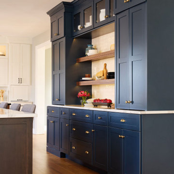
PBA was brought in to solve many issues throughout the first floor of this home, the most pressing of which was to create a larger and more functional kitchen. After examining several options, the decision was made to create a narrow addition to the side of the house which allowed the design to meet all of the clients objectives. The floor plan was also opened up to allow for entertaining, and a long corridor was enhanced with trim-work to visually break up the length of the corridor, including the creation of a focal point wall at the end of the corridor. Other renovations included a new mud room, and a guest bathroom and awkwardly proportioned music room were completely reconfigured to create a formal powder room, a significantly improved guest bathroom, and a more intimate music room / sitting room.
Photographer: Anne Gummerson


 DK Homes
Uniquely situated on a double lot high above the river, this home stands proudly amongst the wooded backdrop. The homeowner's decision for the two-toned siding with dark stained cedar beams fits well with the natural setting. Tour this 2,000 sq ft open plan home with unique spaces above the garage and in the daylight basement.
Find the right local pro for your project

 Jason Straw Woodworker
As soon as our clients saw our sample of the straight grain quarter sawn Teak the decision was pretty easy. They have a mid century furniture aesthetic and good taste = a no brainer.
 Penza Bailey Architects
The owners of this home located in a historic Baltimore neighborhood wanted a much larger kitchen, and because they regularly entertained large numbers of guests, they wanted to improve flow throughout the house. The decision was made to create a gallery addition across the rear of the house, anchored at one end by a new kitchen addition. A dynamic 1-1/2 story breakfast room was created on axis with the entrance hall, and serves to bridge the kitchen and the gallery. A series of french doors allows the gallery to flow gracefully out to a new terrace, and a richly detailed coffered ceiling gives detail and rhythm to the fairly narrow gallery space. The design included a new mud room, and the creation of a new serving pantry, powder room, and bar.
Photographer: Anne Gummerson

 La Cuisine Appliances
Choosing the right refrigerator for your kitchen can be challenging, but Liebherr makes the decision much simpler. Whatever your requirements are, whether it is as much storage space as possible or innovative yet timeless design, Liebherr can exceed all your expectations.
 Sherwin-Williams
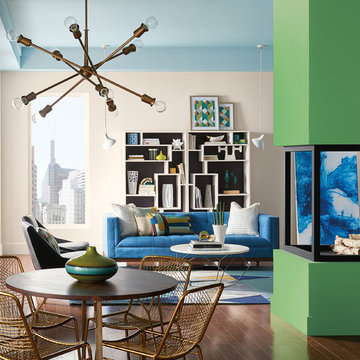
We’re each moving to the beat of our own algorithm. From choosing a dry cleaner to choosing a college, data powers nearly every decision we make. In Silicon Valley, Austin, Berlin and Beijing, techies are the new hippies, full of breakthrough ideas and utopian ideals. A generation is waving the flag of color freedom, and Instagramming every moment. This high-tech palette is pixelated in orange, violets, digital greens and high-def yellow.
INFLUENCES:
Pop/Youth Culture
Techies
Virtual Reality
Productivity
Environmentalism
Main Walls: Ibis White SW 7000,
Ceiling:Billowy Breeze SW 9055,
Fireplace: Organic Green SW 6732
Fireplace Trim: Black Swan SW 6279
 JuniperOats Studio
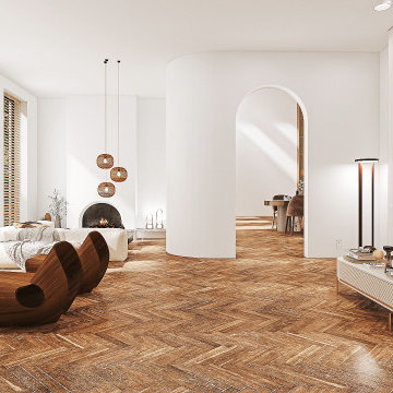
A new take on Japandi living. Distinct architectural elements found in European architecture from Spain and France, mixed with layout decisions of eastern philosophies, grounded in a warm minimalist color scheme, with lots of natural elements and textures. The room has been cleverly divided into different zones, for reading, gathering, relaxing by the fireplace, or playing the family’s heirloom baby grand piano.

 Black Forest Design and Build
For this project the customer wanted a unique, one of a kind vanity made out of reclaimed wood. To create this piece our designer collaborated with the homeowner, to pick the materials, design, and finish of this furniture-like piece. After the design decisions were made, the designer personally selected the reclaimed hemlock pieces and worked directly with the cabinet maker to utilize the most interesting parts of this hand picked hemlock. The results speak for themselves!!
Joel Hess
 Lindy Design Build
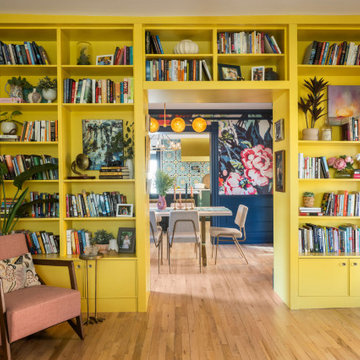
What was once a blank canvas in the living room has now become a warm and energizing focal point. Our clients, lovers of literature, needed a home for their beloved book collection—and we delivered a space that’s as functional as it is beautiful. A full wall of custom built-ins now houses a thoughtful mix of open and closed storage, perfect for books, games, and personal treasures.
But this isn’t just a bookcase. It’s an experience. By using the depth of the shelves to frame the passage into the dining room, we created a dramatic, immersive portal that draws you through the home. The shelves wrap you in a golden hug, painted in Sherwin-Williams Quilt Gold—a late-in-the-game color decision that ended up being one of the most joyful in the house.
We paired Tedd Wood cabinetry with Amerock hardware to bring a polished, heritage feel to the built-ins while honoring the old-world charm we envisioned. It’s a nod to the classic libraries of another era, but with a vibrant twist that invites you to linger, explore, and get lost in a good book.

 Glow Lighting
OCTOBER 2014
The dining room of the Bayview Project and foyer was an open concept space. The decision was to use the same style of lighting creating a flow in the two areas. The combination of Mother of Pearl shell, Swarovski® ELEMENTS and the shimmer sheer taupe shade created an elegant and tranquil dining room.
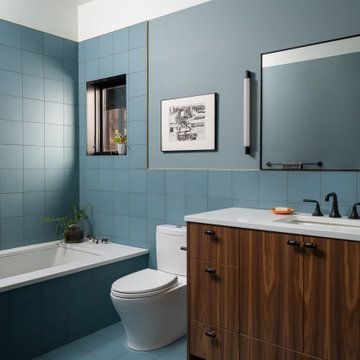
 Susan Yeley Homes
We approached this new build as a seamless, full-service collaboration between architecture and interiors. Every decision—structural, spatial, and aesthetic—was shaped with intention, not to mention collaboration, since our contractor was also our client. Our contractor said, “make the rooflines simple and direct the water away.” His wife said, “I like color.” Check, and check. The bold exterior lines of the home both contrast with and recede into the woods around it, and the interiors are layered with cheerful hues, custom details, and playful patterns. Each room carries its own moment of cheer, while the overall palette ties together into a cohesive, uplifting whole, not unlike its namesake rainbow.
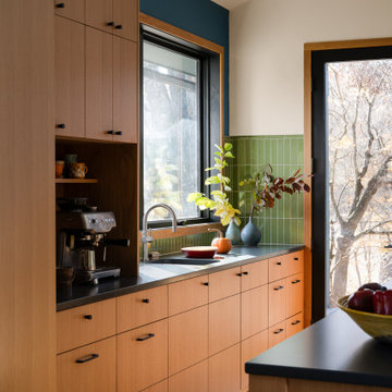 Susan Yeley Homes
We approached this new build as a seamless, full-service collaboration between architecture and interiors. Every decision—structural, spatial, and aesthetic—was shaped with intention, not to mention collaboration, since our contractor was also our client. Our contractor said, “make the rooflines simple and direct the water away.” His wife said, “I like color.” Check, and check. The bold exterior lines of the home both contrast with and recede into the woods around it, and the interiors are layered with cheerful hues, custom details, and playful patterns. Each room carries its own moment of cheer, while the overall palette ties together into a cohesive, uplifting whole, not unlike its namesake rainbow.

 Morrone Interiors
High Res Media
Inspiration for a contemporary great room remodel in Orlando with beige walls
Inspiration for a contemporary great room remodel in Orlando with beige walls
 Glamorous Kitchens & Bath
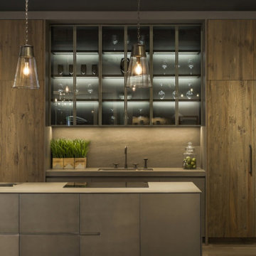
Innovation, elegance, quality, … Furniture has definitely reached a climax in evolution and the leading company Muebles DOCA has created some exquisite designs and avant-garde solutions illustrating just that.
Our team of young active professionals possess clear ideas, a positive vision, constructive criticism, zeal for improvement and masses of experience.
They work in coherence with the reality around us whilst always looking to the future, with confidence in their abilities which is guaranteed by their extensive experience.
Muebles DOCA is one of the most impressive, highly valued there is when making the decision to purchase kitchen furniture and cupboards.
 Visionary Home Remodeling Inc.
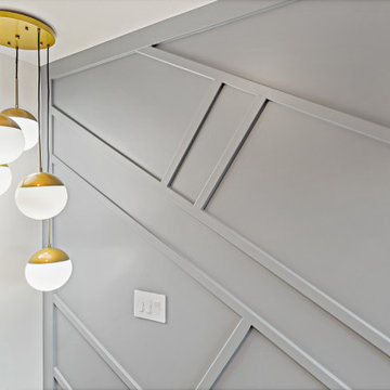
THIS WALL WAS STRATEGIZED BY OUR DESIGN TEAM// WE BELIEVE EVERY HOUSE NEEDS TO HAVE A MONEUMENTAL ACCENT WALL. THIS IS IT! THIS IS IN THE GUEST ROOM AT OUR CLIENTS HOME. THE DECISION TO PUT THE LIGHTING IN A CORNER AND MAKING IT A SYMBOL FOR THE ROOM WAS MADE LAST MINUTE. ENJOY

 cityhomeCOLLECTIVE
One of the first decisions that we made was to swap the fireplace surround with Violetta marble, wanting a stone with lots of movement and in a color that compliments the warm tone of the home’s wood details. Because the client loves patterns, we paired a small scale pattern in the living room with a larger scale in the entry. We chose a dark color for the remaining walls to ground these layered patterns and allow our modern and mid-century furniture pieces to pop. Because the ceilings aren’t super high, we chose a feature ceiling light to compensate.

 Arredoclassic
The Rossini bedroom is a simple, sober and elegantly formal space. The finishes delineate large polished surfaces with timeless geometric decorations. Furniture based around important and decisive lines which also accommodate the right space for a sense of wonder with small and precious touches of light, to make the place of your dreams unique.
 Arredoclassic
The Rossini bedroom is a simple, sober and elegantly formal space. The finishes delineate large polished surfaces with timeless geometric decorations. Furniture based around important and decisive lines which also accommodate the right space for a sense of wonder with small and precious touches of light, to make the place of your dreams unique.
 Dwell by Cheryl Interiors
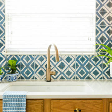
Probably the biggest surprise to many in this project was my decision to NOT paint my honey oak cabinets. Do I regret it? NOT A CHANCE! I love the warmth and depth they add to the space. The modern black hardware from Schaub made such a difference! There is so much to love about my kitchen redo. The beautiful Tile Shop blue patterned backsplash, new white countertops from Stoneworks, and new brass and black hardware. It's bold but I couldn't love it more. It makes me so happy.
148